Transcripts
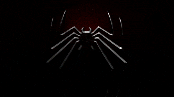
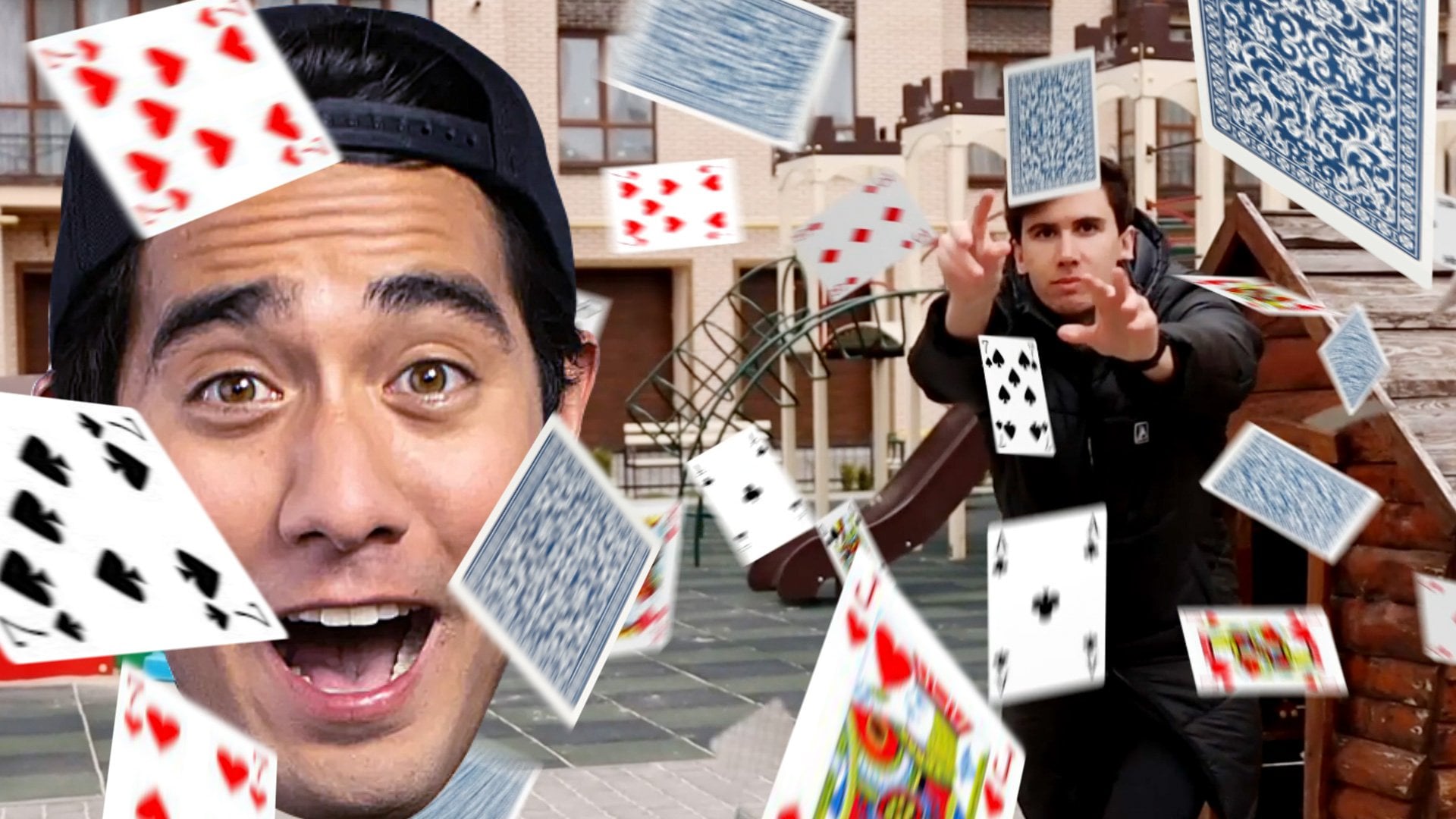
1. Introduction: Hi, I'm Jake. And in this
class we are going to create this really cool
Spider Man logo review inspired by Spider Man
two Playstation game. The best part of this class is that you don't need to have any experience in V effects or even using any editing apps. I'll provide you all
needed knowledge to complete this effect
from start to finish. All needed footage is provided in research
step To this class, I'll explain each and
every step we shall make. You can always write
your questions in discussion sections under any of my classes to get help from me while creating effects
from my videos. You can download the
free trial version of Adobe After Effects. If you don't have
the software yet, we will start right away. I'm excited to see your projects after completing this class, and it means a lot to me. When you leave your
positive reviews, I think it's the
best way to learn the software while creating
interesting effects of fun. And to complete this class, our goal is to create this
cool Spider Man logo review. I'll be happy to see
you in my class, as also your result, after following all the steps. So let's get started.
2. Complete Logo: I'm using Adobofects 2021, but you pretty much
can use any version of Adobofects for this
effect. It will work fine. As you can see, I'm
using standard layout, Your panels should
be similar to mine. But if for some reason
you cannot see some of the panels which you
can see on my screen, you can enable it from here. For example, character, you can go to window and
enable it from here. Character and pretty much any panel which I'm going
to use in this class. First of all, let's create
our new composition. We can here, or this little I can hear or
go to Composition. New composition.
I'm going to set the resolution to Les D, which is 1920 by 1080. Let's call it Main composition, 30 frames per second and
maybe 8 seconds long. This pretty much frames
seconds, minutes, and hours. Let's set to 8 seconds
duration. And click Okay. First of all, we need to have a composition in which we
are going to drop our logo. Let's import our logo. Go to import file. This footage will
be available in resource type to this
class. Just import it. Select both of them, logo and texture because
this texture we're also going to use click
import, select both of them. Letmost, click hold and drop on this folder to create
new folder our footage, we can call it Footage
and click Enter. In this main composition, we are going to drop
all of our effects. We can create another
composition in which we are going to
drop only our logo. Basically, we can just select this main composition and
press control D. In this way, we'll get all the specs
of the main composition. But we can now select it and
press Enter to rename it. Let's call it your logo. Let's open it. In
this composition, your logo just left, most double click on this,
your logo composition. To open it here, we can drop any logo on which we are going to apply
all of these effects. Let's drop our logo here. We can also click here to toggle Transparency grid
and see it better. You can pretty much use text
or wherever logo you have. After completing this class, you'll get this effect. Let's get back to our
main composition. Select here main or just left double click here
on Main Composition. To open the main composition, let's close this folder here. Left click and hold your
Logo Composition and drop inside of this Main
composition and release it. Now we have our logo inside
of this composition, which means that we can
change at any time. And now on top of this logo, we can apply some effects. First thing which I want to
do is to add the background, this famous red
gradient background. Let's go to layer New solid. We can name it
background or short BG. And click key. Just
make sure that you have the same dimensions
of your composition. Can basically select this layer and press control shift Y. As you press control shift Y and just click here,
make come size, it will automatically
take the resolution of our main composition
and click Key. Now we need to apply
some effects on it. For applying effects, we can go to Effects in Precess panel. If you cannot see the spanel, you can go to a window and enable it from here,
Effects and presets. And then just type here ramp. We're going to use
gradient ramp, left most leak hold
drag on this Gilayer. Drop it here. We want to change the
ramp shape from linear to radial ramp selected and
you'll get this result. We want to swap the
colors because we want to have this bright
spot around here. You can just select this
literal point and move it. Or just change by this second
value of start of ramp. This is basically y value
and this is x value. At any time, you can
press control Z to undo some unwanted
motion, for example. I don't want to place it here, so I'm going to press
control Z and it gets back to place
where it was just now. For this star color, I
want to click here on this color picker and change
it to this reddish color. You pretty much can use
any color which you want, but in my case, I just
want to use this color. Or you can just type these
numbers here and you'll get the same red as I'm
using on my screen. And click a key, the brightest point we can move it
a bit down like this. I'm going to set here 272. If you want to have
exact same result, you can also type here 272. Second point, this one. I want to set it to the corner, to the left corner. So I'm going to press
here and type four. Maybe move it a bit up. Let's type here 1066 to
get the same results. You can just repeat these
values or use any other, if you want to get
your more unique look. The second color here, I don't want to use just
simple black color. We can just mostly
here and change it. This dark red color. Once again, you can just copy this value if you want to
get exactly the same color. Include key, We can also
increase the Ram scatter. If you have some lines here, let's set it to 50. It will add a bit of noise but
it will reduce some lines. Okay, basically this
is our background, we can set it below, because the order of
these layers matter. As you can see, if I'm
set this logo on top, it will be on top
of our background. If I'm going to set it below, it will be under our background. Let's set it on top. Let's
apply a few effects, get this look on our logo. This is pretty
advanced technique, but it's not hard to repeat. I'm going to try to
explain every step so you would get the understanding
how this effect works. First of all, we want
to add this kind of three D feel of our edges. We need to explain
to our software where these edges should be. Let's create a new
composition in which we are going to
isolate only edges. I'm going to create
new composition. Click here to create
new composition. Let's call it Bevel because this is pretty much the effect
which we are going for. And click okay here we
can just drop this, your logo, inside of
this Bevel composition. And let's also click here on Toggle Transparency
Grid to see it better, let's write most, Click in
it and go to Layer Styles. We want to use
inner glow because this effect working exactly on the edges and it's
exactly what we want. Let's click inner Glow. Basically, here appears
this inner glow effect. We can scroll it down
and set it to multiply. Then we can set opacity to 100% it would be fully visible. Finally, we need to change
this color to black. Now if we are going to zoom into our picture using
scroll on the mouse, you can out if I'm going to scroll it down here as well
and change the size to 11. You can also change it to 11. You can see that we have
this inner shadow effect, which is exactly what we want. Because with this size, we are going to tell to
the software how much of Beverly we want to apply to these edges, which
you can see here. Basically, if we are
going to reduce it, this amount will be
reduced as well. Let's do exactly this. We can go back to our main composition and drop this bevel
composition inside here. We can even disable it because we are going
to use as a source. We don't need to
see it next thing. Which you probably noticed
that besides the bevel, we can see this metal
texture on our logo. We can also apply to our effect. To create this metal texture, we need to create an
auto composition. We can click here, let's
call it logo texture. We can also rename it this Bel. Let's press Enter on keyboard, and let's call it Logo Babel. We would know that these
compositions are about logo. We can also select them and
drop inside of this folder. And let's call it just comes. We will not get to messy inside here of
this project panel. Once you've opened
this logo texture, you'll be able to
see it right here. Now we can just
go to our footage and drop this texture
which we imported earlier. You can go to a file
file and import this texture which also available in resource
step to this class. Let's select this texture, let most click and hold and drop it here in logo
texture composition. We can also press S on keyboard and change the
scale a bit higher. In my case, I've set it to
152 to cover all the screen. And now we will
be able to change this logo texture to any
other texture which you want. Basically, you can use
any other texture, not just the metal one, you can use any art which will be applied on top of our logo. Maybe you want to
have it colorful and not this texturized
in logo texture. You can always change this
image to any other texture, maybe wood or anything else. Now we need to go back
to our main composition. Let's drop this logo
texture composition inside of our folder comps. Let's select this logo
texture and drop it on top of your logo
composition, just here. We can close it here and here. Now we need to apply
a bunch of effects. We would see this texture
on top of our logo. Let's first of all go
to effects and presets. And type here glass effect, selected the C glass under stylize and drop it
on our logo texture. Go to surface and change this bump map to your
logo level composition. As you can see, it
already starts to work. Basically, to get
rid of this frame, we can apply effect called set Effect type here and
effects and presets. Set mat and drop below this CC glass effect
here. We can just select. Instead of logo texture. This your logo composition. As I can see, we already applied our texture on top of our logo. But we can tweak it a bit more. It would look a lot
prettier than this. Tweaks which we need
to apply are going to be on this softness,
height, and displacement. Let's change this
softness to seven. But you can pretty much play around with
this value as you like. As you can see as I'm
changing this value, you can get this tighter edges. I'm going to set it to seven. You can also play
around with the height. In my case, I've set
it mine to 100 to get this smooth but a
bit stretched look. But you pretty much can play with this value to any other. You can set it to 55 if
you want displacement, I'm going to set it to 170. If I'm going to set
it to 100% this is basically exact value which
I've used for my preview, But you can pretty
much experiment with this and maybe set
it here to 55, here maybe to 50. And get this look, I'm going to stick to
100.170 and as you can see, it already has this
three D field to it, but it has horrible lighting. To fix this, we can first of all apply some course effect here. In effect, in process,
you can just select this course effect and
set it below set mat. Maybe let's make it brighter
with this course effect. As you can guess, you can change the lightness of our logo. You can even go
dark if you want, which also looks
pretty interesting. In my case, I've said
it lighter like this. Also we can use this
light tugle inside of C glass effect to change from effect light to effect light. You can see we cannot
see any changes. But once we are going to add some lights into our
composition, it will change. Let's go to new layer,
new light immediately. To get some results on lighting. You can start with
the point light. We can set intensity to 50 and color change
to white. Click K. We already have some
changes to get. The more por light. We can select our
point light and press P and change the position. In my case, I just move
my light up a lot. So if you want to set
exact values as I've, I've used -1,400 As you can see, we already have
this dramatic look. We can also change this value to 930 to get exact overhead light. It looks pretty good, but we can see pretty
harsh shadows. To fix this, we can go to layer new light and change
this one to ambient. Basically, with
this ambient light, we are going to feel
the darkest spots. Ambient light should be as 100% which basically means that it will get the
normal ambient light, which you can get by depolt. Make sure to change the
intensity to 100% and click a key if I'm going to disable this point light
and this ambient light. You can see that with these
two lights we are getting pretty interesting look which basically repeats our preview. As you can guess,
we also need to add some shadows to complete this
three D feel for shadow, we are going to use
your logo composition. We can just simply add
CC radial blow effect. Just select it and drop it
on your logo composition. Let's change this
type to fading zoom. I'm going to set it
to maybe 24 amount. As you can see,
it already works. Just by changing
the second value, we can set it above. Once again, we would
get these shadows below to get the
exact same value as I've used in my preview, you can just simply type
here -124 As you can guess, our shadows should be
not white but black. Let's apply feel effect. Select here under generate fell, and drop it under radio blower and change the color to
black. And click a key. As you can see, we already have this pretty cool shadow which
completes our three D feel. As you can guess, we can
select our shadow effect. We can also select this composition, your
logo composition. Press Enter A. Let's
rename it to Logo Shadow. We know that this for Texture discposition,
this is for shadow. We can select it and
press on keyboard to opacity and we can set it
to 77 to drop it a bit. It would be more natural
and not too harsh. Basically, you can just play
around with this value and add exact amount of shadow
which you want to apply. In my case, it was 77. And I also decided to
animate this radial blurer. Let's also add this animation
about at 4 seconds. I want to animate this center of radial blurer just left
mostly on this stopwatch. You can also press on keyboard
to see this key frame. What is keyframe? Keyframe
is basically the point in time which remembers the
value of certain property. In our case, this keyframe
remembers this point in time which is 4 seconds,
as you can see here. It remembers these values
of the property center. For example, if I'm
going to scroll to this moment at 0 seconds, I can change this value. So it would go up this slide, this center value will go up. Let's change it maybe to
really dramatic look like -2,200 So we would get this really stretched
shadow basically. Now it created
another key frame. Now after effects, we'll try to go from this keyframe
to this key frame. In this key frame,
we have this value of the stretched shadow. And if I'm going
to scroll through, you can see that this
keyframe changes until it gets to this
keyframe right here, which we've said it earlier. Basically, this is
how animation works. You can just set a
keyframe for a value, observing property
and here other value, and it goes from this
value to this value. If I'm going to press
zero Numpad to preview, we can also set this
resolution to auto, so it would work faster. And press zero Numpad
to see how it looks. If you'll pay attention, you can see that this shadow shrinks down from this
value to this value. I'm going to also change this
work area by clicking on this edge here and press zero
up to see this animation. You can see our shadow shrinks. We can also select these both
keyframes and press nine, which basically means that this animation will start
slower at the start, faster here in the middle, and slower by the end. To get even fancier, we can go to graph editor
and select this keyframe. Select just center effect. Select this keyframe
by this tuggle, you can drag it to the left a bit and here
maybe to the right. Basically, this graph shows
us that it will start slowly, then faster and slower till now. If I'm going to press zero pad, you can see a bit more interesting
movement in our shadow. By the way, if you
cannot see this graph, make sure to select this effect. Also, make sure to click
here on this icon. Click here on this icon
to choose graph type and options and make sure that
you are an added speed graph. Click here and you'll be able to see this kind of
graph and manipulate it. Let's go out from
this graph editor. Maybe you are interested
why we did this animation, our shadow basically for dramatic effect of
operation of our logo. If I'm going to go to layer
new adjustment layer, we can set it above
of all layers. We can rename it to C, which basically means
color correction. But in our case, we
are going to use as a dramatic reveal. Maybe you can just call it
exposure, because this effect, we are going to go to effects in presets and type here exposure, select it and drop it
on this exposure layer. Just by changing this
Gara correction value, we can get this dramatic
reveal of our logo, which looks pretty cool. I'm going to press reset
about at 2 seconds, we can set a key frame
for our gamma correction. Press U to see this keyframe
here at the beginning. Let's change it
to minimum value, which is 0.1 We can also
select these, both key frames. Press nine to get more
interesting animation, and let's press zero Numpad
to see how it looks. We already have this
really interesting effect. By the way, when we are going to render out your animation, it will be full resolution. From time to time, you can
check full and press zero. It will take some
time to render. You can just check if everything looks right from time to time. Just switch to full to see if it looks
just like you want. Now, as you can see
by this light reveal, this shadow makes more sense. It looks even more
interesting with animation of this
shadow, this premium. Okay, now we created
this logo operation, our screen, which already
looks pretty cool. The next video, we
are going to create the venom things which are going to cover our logo
in the next video.
3. Venom Basic Animation: Now we have this really
cool animation of our logo. In this video, we are
going to focus on this venom effect which
will cover our logo. As you can see, it
looks pretty cool, but it's quite interesting
that it's made with simple line of shape layer. Let's, let's click here to
create new composition. Let's call it a line
animation because it's basically the animation
of simple line and click. Okay, now we have
this line animation. We can drop it inside our composition folder,
enclose it basically. In this line animation
composition, we want to create a simple line. But before let's save
our project because it dot effects can crash
from time to time. Let's go to file save, S and save wherever you
want on your computer. Okay, let's create
this first line. Let's click on this Pen tool, lets click on it,
basically around here. From this corner, we want
to create a first point. More to the middle
of our screen, we want to create another point. If you're going to click here and enable this
title action save, you can see that this point is around the center
of our screen. It doesn't have to
be super precise, just somewhere
center of our logo, It should be this line
should go from this angle. Basically what we want to
achieve is that thing of the venom will go from here
to center of our logo. Basically you can just remember
where your logo is and create this first line which
will go from here to center. Now we need to change this field to non
existent basically to non in click stroke
change to black. So we would be able
to see our line. Also we want to make
it a lot bicker. Let's set to 413. Now it's really visible. We can just open it, by the way. We can just select
it and press Enter and call it line Inherent, Contents, shape, stroke, taper. We can change the taper and
length to 100% Basically, we want to have this first
thing at this point, we want to achieve this
look, as you can see. We want to create
these things from all sides with a bit of
light on top of them. First of all, we want
to have some animation. Let's crawl up here. We can add trim path. We can just select it and move it up just below this path. Open it with this end value. We can just animate this
stretching movement. In my case, I want to go to 1 second and maybe
ten frames here. And change this end to 15% which basically
is not visible. You can change to
any other value. But as you can see, my point here is to get
rid of from our screen, in my case, 15% is exactly
where we cannot see it. Let's create a keyframe for it. At 3 seconds and 14 frames. We want to fully extend
this path like this. Let's select both
of these keyframes. Press nine and go
to Graph Editor. Here we can just select
the second key frame, movies a bit like this, These handles which basically will make this movement a bit slow at the start then faster
here and slower by the. We will have this first
movement of our line. Once we'll get this movement, we want to stylize it more. To stylize it more,
we can go to stroke. You can just scrawl it
and find the stroke. Then we can close the taper
because we don't want it and we want to use this
wave effect amount. I'm going to set to 44, which basically will
get this weird waves. But if we are going to
change from pixel to cycles, if we will change
these cycles to five, already will get more
presentable look. With this space, we can
animate it even more. As you can see, we can get
this P equal animation. In my case, I want to go
to 1 second and 20 frames, as you can see here. And create a keyframe for phase first value I'm
going to set to zero. And here at 4 seconds
and 11 frames, let's set it to -250 We
can also select these, both key frames just like this. And press nine, just simply add a bit of
movement like this. It will start slow
then faster here. And slower here.
Basically, as you can see, by changing from zero to -250 we are adding this movement
where it still goes in, which makes it more
interesting and more alive, which is exactly what we want. As you can see, we are getting more interesting effects
just from simple line. The next step will
be to add repeater. Let's scroll up. We can go out from Graph Editor. While you scroll up, you'll be able to
see this Add button. Let's add repeater.
Let's open it. Let's maybe make
eight copies here. And transform. We can
just basically repeat, not in x position. We can set it to zero, but we can change the
rotation just like this. If I'm going to set it to 45, you can see that we are getting this pretty cool Piator
effect of this line. Finally, what we want to do is go down to this transformer can see it doesn't look exactly like you can
see on this screen. It doesn't go really
to the center. To get this effect, we need to select our line and press P and move it a bit up. Set the second value to our 20. After this, you can just simply
select this pen tool and change this point where it
was about here. This one. We can select this one but
just by using pen tool, but use selection tool instead. As you can see, by changing
the position of this point, we can make sure that it
goes in a circle like this. We can even move it like this. If you want to intersect, which is pretty cool results, you can get a little dance. And basically you can
just manipulate as you want to get the
look which you like. In my case, I'll leave it as is. Maybe I'm going to change
this position like this. If you want to get
the exact same look, just make sure that
you are setting your playhead here where
all animation is over. And just move around to get the same look as you
can see on my screen. Something like this
should work fine. Finally, what we want to apply is the inner shadow effect. Let's go to layer styles. Write mostly on your line. Go to layer styles and
select inner shadow effect. Open it here, we can set
blend mode to normal. What we want to do is to go
to 4 seconds and six frames. Lick here and set a key
frame to our color. At 3 seconds and two frames, we want to change
to reddish one. If you want to get this exactly
same color as I'm using, just repeat this value and
click the key why we did this. Because with this effect, we are going to add
a bit of shadows on our edges at the point where all of our
animation will go darker. As you can see in our
original example, have the shadows on our venom
which gives this illusion. Background is reflecting
on our effect, but in case when here
is completely dark, we don't want to have this look. This is basically why we are animating the edges which
we are going to apply. It would go from red to black. This is why we created
these key frames. Making simply select
them and press nine. Let's tweak it a
bit so we actually can see our inner shadow effect. First of all, we want
to set this capacity to 100% And size here lower, we need to change to 14. Basically, if I'm going
to scroll through or just disable this Tuggle
transparency grid, you'll be able to
see a lot better. Which we did basically. As you can see we already
added this feel to it, like our background will be
reflected on our effect. For now, I'm going to enable this toggle transparency grid. Our final touch will be to add a bit of highlights
on top of our effect. Basically, we can just select this line effect and press
control to duplicate it. This top one, we can press Enter and rename it
to Line Highlights. And as you can guess, we need to change a bunch of things. First of all, for highlights
it should be a lot brighter. So let's set it to white
color here and stroke. We can also open it and delete this in a shadow effect because
we don't want it. We can actually go to our
contents, shape and stroke. We want to animate
this stroke with, we will get only these
highlights on top of it. 3 seconds and 17 frames. We want to set this
stroke width to 15. Let's create a key pram. Here at 2 seconds
and six frames. We want to have it even thinner. Let's set it to
nine, by the way, the same thing, we want to do, the main effect as well. Let's open this line
because as you can see, it's really thick here at
the beginning and it's not exactly what we
want. Let's open here. Shape stroke at 2
seconds and two frames. We want to change this stroke to something
smaller, like 100. We will get this really thin
and nice looking effect. Click on this stopwatch
to create a key frame about at 6 seconds
and 27 frames. We want to set it to
real big value on 700. We can also select
these key frames, press nine and go
to graph editor. And select this last one and
bring it a bit to the left. Why we did this, because
as you can guess here at the beginning we want
to have the thinner lines. Then it will have to cover
pretty much all of our screen. If I'm going to show
you our preview, that by the end of this effect, it should pretty much cover all of our logo and our screen. To achieve this effect, we are animating
this stroke width. It would be thin
and then thicker, and thicker, and
thicker by the end. Okay, so let's go back
to our line highlights. Let's see what we can also change to get the
highlights more valeable. Open this shape layer, let's maybe close
the stream path. I'll go to stroke and let's
see what we can change here. And wave, basically we want
to change to 88 amount, we will get the thinner parts, so it will resemble the main
form of our effect cycles. Let's increase it to seven, basically we will get
a bit more of them. Basically, with the highlights, we want to create a
feel like it is three D dimensional and has some
highlights on top of it. So like it has some texture, it would not look this clean. We want to apply a few
effects on top of it. Let's close it to
see only highlights. Let's add Gaussian blur. Let's drop it on top of it
and change it to maybe nteen. As we blurt it out more, we can already see that it gives more like
three D feel to it. But we can do even more. We can add a bit of
texture on top of it, it will not be so clean. Let's add turbulent
displace effect, change this amount to 70, so as you can see we already have this effect on top of it. But we can change the size to
2.5 which is really small. It gives the storablin
displace inside of them. You see we are adding this rough texture on
top of our venom effect. Because if I'm going to
disable this effect, you can see it's really smooth and looks more
computer generated. With this storablin displace, we are getting these
imperfections which makes it look even a
bit more believable. Then we can add some sharpened
effect and drop it here. We can set it to 50. See with this effect we are adding even more
visibility to it. These imperfections
are more prominent. Finally, we can add course
effect with this alpha curve. We can play around a
bit just like this just to cut off some
parts of our effect. If I'm going to disable and enable you can see
that we can just focus on these highlights and play around between the
transition here in these parts. Basically, with a bunch
of these effects, we can get a lot more control on how you want to it to look. Finally, by using
tritone effect, we can change the
colors which we want. Basically. You can even go
with the other kind of color and introduce more colors
to your highlights. But in our case, we want to
get to the grayish one here, also to gray one, in this way also
change the brightness. Let's disable this
triton effect for now. Let's enable this course effect. Basically, you can just
manipulate with these effects. Maybe we don't want tritone effect because we
don't want to use any colors. But with this colors effect, you can always
manipulate how much of light you want to
apply on your effect. Also, make sure to set
it to full to be able to see the right amount of
light which you are getting. As a result, you can also go to RGB channel and
decrease it like this. Maybe something like
this should work fine. In this video we are created this venom effect
basic animation. The next video, I want
to show you how you can create this more organic look. Also, we are going to add this connection points to make this effect even more valuable. See you in the next video.
4. Venom Advanced: We already created
this basic effect. Now we can create
another composition in which we are going to apply a lot more organic
than this linear look. We just want to select
these both layers and press control shaped
C to precompose it. Let's call it line source. To add this more organic look, we can use once again turbulence display effect
which is pretty cool. Select it and drop
it on top of it. As you can see, it already gives this more natural
interesting look. What we can do is to
change this amount to maybe 70 to get more wisps. Also, if we will reduce
this size to 80, we will get even more
waviness to our effect. We can always change this
evolution to any other angle. Change this, look, in my case, I've said it to 42. But you can pretty much change any other angle to get the
variation of this effect. If I'm going to press zero lmpd, you can already see
that we can get this more interesting and more organic look of our effect. The next step will be just simply duplicating
this line source. Just press control D to
duplicate it at 16 frames. Just a bit later, we
want to move it here. We'll go first one, then we'll go second one. To see second one we can just simply flip vertical just
right most licking it. And go to transform
flip vertical. Also what we can do is to
change this evolution. Maybe to lick 211. Get a bit other look. Just by simply these two steps, you can get more
variation to it, which already looks
pretty interesting. It will help to cover
more of our logo. As you can guess,
we can just even duplicate one more
time or two times, then go to 1 second. Maybe five frames
also move it further. This one we can just
transform, flip vertical, and then go to transform
right mostly and go to horizontal to
get another look. If I'm going to
enable and disable, you can see that we are
adding even more of them with this one to
get more variation. We can also change this
evolution to maybe 97. It would look a bit more
different at this time. You can just even rotate it a bit selected and press
R to see rotation. And let's rotate
to five degrees. As you can see, I
rotated to five degrees. But we can see the edge
of this composition. To fix this issue, you
can just simply click here under this collapse
transformation. Just click here. As you
can see it extended. Now we can get this look. It also a bit made
different look, but it's exactly what we want. We want to get more
variation to it. Finally, let's maybe
duplicate one more time. Let's select it and press
control D. Duplicate it. Set your play head to 1
second and 17 frames. Move it further. Let's
change this evolution to other value like 161 or any
other value which you want. We can write more slick in
it and go to transform. Flip, Horizontal, enable disabled to see
what we're working on. And we can press R
and rotate it to other -16 we would see
these ones as well. Basically, this is how
you can easily add a lot of them and get this pretty cool
result where they are not exact timing of operation, which gives this illusion of really organic look and more variation in
timing and movement. As you can see, it already
looks pretty cool. We can get a lot of them, but as you remember
from our preview, we also have the
connection points where we can get this
infection of venom. Let's now work on this. Look, you can see
I call it star. We are going to create this star for our connection point. Let's also create
a new composition. And let's call Star Source. Click Okay for the star source. We can also use the same technique which we
used here in line animation. Let's open this line source. Basically, we can just
simply select this line. Press control C to copy it, and go to Star Source and
press control V to paste it. We would not have to repeat all this process and have
something done already. What is different about this star source is that we
want to have this movement, which we have here,
a lot faster. For example, we want
to press on keyboard to see our key frames
of this trend path. We want to select this
keyframe and hold control. As you can see, I'm holding
control or command on Mac and left most click
on this key frame, then select this keyframe
and go to Graph Editor. And move by this
handle to the left, which will basically make
this movement a lot faster. As you can guess,
we want to have this movement from
center outwards. Let's select this pen tool
and select this point, and move in like this. Then select the
selection tool and move this outer
point out like this. To get this similar look which I've created in my
original example, we can go to Title Action Safe, and make sure that this
point is above of center. This outer point is
somewhere around here. Let's go out from Graph editor. And as you can guess,
we will need to change this stroke width
because it's too high. We don't need this animation
of stroke width anymore. We can just select
this stroke with key frames and press Delete. Let's change this stroke width to something
smaller, like 24. Now we can see it better. And we can even use
this pen tool to make sure that it goes from
center, like this outwards. It already looks pretty cool. As you can guess, we don't
need this layer styles effect. Let's select it and delete it, because we don't need any
reflections on this one. Scroll it down here
and wave it cycles. Let's set it to four because
we don't want to have too much of this
wavingess and this space. We also can change, let's set this
second key frame to about 6 seconds,
maybe two frames. And move it, this
keyframe right here, to this point in time. Let's change it to -50 As you
remember with this space, we are getting the
secondary animation with this Bulvness which travels
through this cinci. I'm going to press control Z to not create any key frames. Basically we want to make
sure that it goes far off, so as you can see, a bit of
motion is more than enough. What we want to do is
to select it and go to graph editor and make sure that it goes
slower by the end. Here at the start,
we want to see this, a bit of this motion.
It's basically enough. We just want to have
this little hint of this motion we can go
out from graph editor. Also, what we want to do is to highlights which we've
added to our line animation. Just basically
duplicate this line. Let's call it highlights. Let's change the stroke to
white color and reduce it. Just basically the same
technique which we used earlier. We can go to shape
stroke and here a wave, we want to change the
cycles to maybe 12. To add more of them.
Amount, let's say it to 100% We'll get a lot
more of this effect. We can tweak it later. Basically, we want to add this line highlights which
we created in light source. Open this line source composition
here in line animation. You can just open
this line source and go to line highlights. And copy all of these effects, because we want to apply
all of them as well. Select one of them, whole shift, select
the last one. Press control C to copy. Go to Star source control V
to paste on line highlights. As you can see, it
all disappeared because we need to
tweak these values. First of all, we want to reduce
this Gazan blow to five. Then we want to
change this size to two to make it a
bit even smaller. We want to add more amount, maybe like to 116 sharp, And we can decrease it or
just simply delete it, so we would have just barely noticeable this
effect at this point. We can leave it as is and go back in a few moments if
we will need to change the amount of the
highlights because what we actually
want to do is to go to line animation and see how it looks with our venom effect. Let's go to Project and select the star source and
drop it inside. And by the way we want
to go to star source and go to layer new
adjustment layer. And we want to add
turbulence displays on top of it as well
because we want to Add this effect inside
of this composition. Also because on this
connection point, we want to have
more waviness than to these lines itself
here in star source. On this adjustment
layer we can also call it this place and
set it this amount to 62 and says to 15
basically before and after. You can see that we already
adding more waviness. It would look more
organic at this point. Also now we can go to
line animation here. We just need to solow this star source and we need
to see where it starts. Animation starts about here. Let's cut off to this
moment just simply by left click on this edge and
cut off to this moment. If you hold shaped, it will snap to our playback just like this. From this moment we will
get this animation. We can also apply
to balance displays here and change this amount
to 136 and size to 14. Basically, with these
values we want to add this even more organic look. Let's change this to
42 or basically to any other value to give
the shape which you like. In my case, this
looks pretty cool. I'm going to leave
is what we can do is just simply click on
this collapse tool. Because if I'm going to change
the size just by pressing S on keyboard and
make it a lot bigger, like for example, to 261. If I'm not going to
click on this icon, you can see that it will get this really bad quality effect. If you want to scale up more than 100% it's a
good idea to click here. It will preserve the
quality as you can see. And now we can just move around and place it
wherever we like. In our case, what
we can do is just simply place them at any
position which you want. It's better to unsolow
to see how it looks. With other effect, My goal
is to set the first one with the original size at
the place where the first of these lines
connects with our surface. As you can see, if we
follow exactly this one, when it stop growing
like about here, we want to select
this star source. Move it just so it will
connect with this line. Also move it here. It will grow from it like
this, as you can see. Now it grows from this
line and expands it. Basically, this is main idea. You can just make five
copies of this star source. Let's press control D
and move it around. And make sure to cover some of these connection points here. And what you can
also do is to go to -144% on the amount and
maybe set the size to 20. Change on this evolution until you'll get some
blob which looks fine. And what you like, as you can see I've already created
something like this. You can also press
and change the size. And move it around with
Lek five copies of this. Just press control D and
move it somewhere here. Change the size to even
bigger size like this. And by play around
with these values of amount, rotation, and size, what we want to do is
to cover as much as we can of our logo here
in Main composition. Once we are going to
drop our line animation. If I'm going to go to come Composition into composition
folder line animation. And if we were to drop it
here and move it further, you can see that it
connects with our logo. Just jump from main
composition to line animation. Let's close this one.
This one, this one. And leave line animation
and line source. We can also close it. Basically with these
two compositions, we can jump from one to
another and make sure that these lines are
covering our logo. And then just duplicate
and move it around here. You can just even rotate them a bit and add some
variation in size. Duplicated. Move it around here, also rotated a bit. Jump into Main Composition. See how it looks and if
you like how this looks, you can just simply make as
many copies as you like. In my case, I've
used five of them. Simply after that, you can just move around in
timing just like this. They will not appear
at the same time. If I'm going to go
to Main Composition and set this to auto, it will render faster and change this work area here and
press zero pad to previous. We can change if it looks right. Basically by changing the timing of these connection points, you can just time it
exactly as you like. It will get this really
believable effect like these venom effects
connects with our logo. As you can see, let's
see how it looks. It looks already pre cool. As you can see, we have a lot of these highlights which
we can always adjust. So we can go to star source, to this highlights, we can
decrease it a bit, curves, go to main and see
how it decreases here if you're feeling
like it's too much here. In line animation, we can also open line source and decrease this amount as well to manipulate the highlights
of entire effect. We can also press and change this size a bit further because as you
can see on these edges, you can see the artifacts. Change this scale to 101, it's enough to cover up and
you can always jump into a line source and
tweak how much of these highlights you want
to see on your effect. It looks pretty cool.
What we also want to add is the shadow contact points
of this venom effect, which is super easy to add. Just simply select
this line animation. Press control D and
select this bottom one. And let's call it line shadow. Just select it and
press Enter to rename it and call
it Line Shadow. We can go to Logo Shadow and simply select these
both effects. Press control C to copy and go to Line Shadow and press
control V to paste it. In our case, we want to click on this center to delete
these keyframes. This animated key
frame, it will be gray. Then just move down
the center point. Just simply let click on this centerpoint and set it
to the center of our screen. As you can see from the center, we are adding these shadows, contact shadows
with our surface, which looks pretty cool. What I also want to do is to
increase this amount to 73. These shadows would be more
noticeable and visible. It's a good idea to press on this line shadow and change
it to link 77 because we don't want to have it
too prominent here by the end where the lines
connection point appears. What we want to do is to
create a key frame here. We want to set it to
lower value length 55 because it will
also get darker. There is no point to make
these shadows too dark. Finally, when it
goes really dark, we want to do the same
with this exposure. Select it and press U, and select these key frames. And press control C and control
V to copy and paste it. Then right, most click and go to keyframe assistant time,
reverse key frames. This is exactly what we want. We want to reverse
these key frames, 3 seconds and 23 frames here. When it's start to
cover up our logo, we want to move it
here, this keyframe. And maybe at 5 seconds and 21 frame when it completely
cover up our logo. We want to have the
second key frame. Let's select these
both key frames and go to graph editor. And just press F nine to have this basic
but smooth motion. As you can see, it's just simply dark and it's not
exactly what we want. We want to see the
highlights from our effect. This is why we want
to set this exposure just below our line
animation, just like this. In this way, it looks more dramatic and a lot
more interesting. Make sure to place your
exposure below line animation. We would see highlights. It would look a lot more interesting than just
simply go to dark. Let's press zero umpt
to see how it looks. And it looks pretty cool. Okay, we already did a
lot of cool things here. The next step will be
in the next video, we are going to add this
pretty cool glow effect, which will shine
light through it and basically destroy this venom
effect as you can see here. And go back to the text
which you want to apply. Venom parts will be
destroyed and go out. Exactly this we
are going to make in the next video.
See the next video.
5. Final Text and Flash: Now what we want
to do is to choose the moment where
we want to apply the glow effect before destroying all of
our venom effect. In my case, it was six
frames and 1 second, it's pretty easy to remove
this effect because we just simply will cut off this
exposure just like this. Then we will cut
off our background. We can just simply control
shave D to split the layer. And this second one we are going to change
to other color. Basically this will go to black. This one I want to change it to something like more dark san. Once again, you can copy these values to get the exact
same color if you want. And click key or use any
other color which you want. Also the next step will be is to cut off this line shadow
and line animation effect. Just like this. Basically it
will be completely cut off. And we are going to go
to our logo itself. Basically, you can just
select this logo shadow, double clicking it to
get access to this logo. Cut to this moment because from this moment we can just simply add any text
which we like. For example M J class,
you're watching right now. In my case, I center my
text in here in paragraph, you can just simply go to window and enable this paragraph panel. Also, you can enable this
Align panel in Window Align. Let's make sure that
it's in the center. We can change the size. I've said mine to 218. I've used bebas fund, which you can download from Internet for free, regular one. I've said this to bolt. I've made it a bit
taller to 125, but it's not necessary
and squish it a bit to -21 here in spacing
and tracking, I guess. Let's also make sure
that it's in a center. By the way, we want to
change it a bit down because here at top we can have
Marvel logo if you want. Also cut this text
layer to this moment. It will switch
from this to this. To move it down just a bit, go to Main, basically,
as you can see, it will just switch to our
text to add this Marvel logo. We can just go to Project Panel, Go and create new
composition and call it marble if you
want or just text. Click a key basically
here we can just type any other text.
Let's get started. As I did in my original class, I've made it a lot smaller. Make sure that it's
white here in logo. Also, make sure it's white. It would be bright and
nice here in a line panel. We can just make sure
it's in a center here. With this rectangle tool, we want to make sure
that we didn't select this layer with this
rectangual tool just left mostly and hold. And this rectangulal
tool and create this frame behind
our text stroke. Let's set it to non fail. Let's set it to dark red
color, just like this. And make sure it's below our text, make sure
it's centered. And go to main composition. Basically, you can just
drop this text here above our background and move it up by using arrow
keys on keyboard. And simply go to effects
and presets and apply a drop shadow effect in
perspective on our text. Move this direction to 180. It would be also
overhead shadow. As you can see, by
changing this distance, we can just soften it a bit. We'll get this nice shadow below of our text
if you want to. You can press and change the size and move
it as you like. This is basically how
you can easily change this logo to any other text
and switch to our final shot. As you can guess, we
want to remove it, this text so it will appear after our flesh which
we are going to create. We already have the spinal shot, which is perfect for us. If you don't want to
see these outlines, you can just press
Control Shift and H. It will remove or
appear back on screen. These outlines control
shift H to remove it, control shift H to enable it. Okay, we have already this final shot which
we want to have. Now let's work on this really nice looking glow just before our venom
effect will be destroyed. Let's create this
global composition. Or flesh, let's call it flesh. And click a key in this
flash composition, which we can also drop
inside this folder. We can open it and drop
here line animation. What we want to do,
we want to go to about 6 seconds where it
completely covered our screen, or most of our screen, just like this right mouth clicking it and go to
time freeze frame. In this flash composition, we want to have these parts to shine through all
of this darkness. We can go to layer new slid
and also call it flesh, make sure it's white, Make comp size and click
a key, set it below. And then click here on
toggle switches and modes To be able to
see this track mat, Let's set to alpha inverted. Basically what it
allows us to do, if we are going to click on this Tuggle transparency grid, you can see that
we are isolating only these parts from which
we want to shine the light. Basically, this is all what we want to do in
this composition. We can just close this
flash composition. We don't need this
text composition, lower composition as well. We can just close all of these compositions because we want to work now in
our main composition, what we want to do is to
select this flesh and drop it above all of our layers. Just about at 5
seconds and 24 frames. We can cut this
layer or just move it to this moment
here at 6 seconds. To cut it to this moment, we want to hold old
key on keyboard. As you can see, the old and
then close square bracket. You can see here what I'm
pressing on once again. Old, close square bracket. As you can see as I've
selected this layer, it cut it to this moment. What we want to do,
we want to press about here at 5
seconds and 28 frames, it will be fully visible here. We want to set it to zero. It will flash and
then just disappear. Here we want to select
another key, prim. Create a key prim, basically. Here by the end, once
again disappear. Basically we are creating this simple animation
transition flash and disappear. To stylize the flash, we want to use C radial blower
and drop it on our flesh. Let's change it to fade in zoom exactly as we did
with our shadows. And change this amount to
zero here at the beginning. Let's state at zero. Create a key frame at 6
seconds and three frames. We want to set it to
really high value 250. We have this really
bright flash of light. What we want to do is to select this animation of capacity. We can press F nine. Also, we can press U to
see all of the key frames. Let's also select this first
key frame, impressive nine. So it will start slower
and faster up til the end. It will flash like this, which looks pretty cool. As you can see, it's
pretty cool flash, but it's not that bright. For this, we want to
use course effects, type course effect and
drop it on this flash. And about 5 seconds and
26 frames like this. Let's click on this course
to create a key frame as a basic curve at 6
seconds and three frames. As you can see here,
we want to go to alpha curve and boost it
a lot. Just like this. Maybe closer to this
line here here. Let's make a little
curve like this. So we'll have these
nice highlights. As you can guess, we
just don't want to use only just simple
flash of white light. We want to have this
transition from red to the bluish tone or more san. Let's add a bit of
this color into it. Let's go to effects
in press panel and type feel and drop it here. In my case, I've used
this bluish san color. You can just copy these
values if you want to get exactly the same
look and click a key, we want to still have some
highlights with white color. To achieve it, we
can just simply select this and press
control D to duplicate it. On this tough one, we want
to delete our field effect. Now as you can see, we have this really nice highlights
just by doing this. You can see already that we added this nice
colors to our light. We can just manipulate
this slide even further by this technique
which I'm showing right now. First of all, we can press U on keyboard to see
these key frames. We can press F nine. This chose effect will start slower by moving this
course effect to the left. We can manipulate our
bright spot as we like. We can move it like
this if we want to introduce more color
and then bright spot or move it to the left
if you want to introduce highlights a lot sooner in
this way as you can guess, if I'm going to press you
on this layer as well, Let's select this key
frame, impressive nine. We can manipulate our
colors even more. We can tweak this
amount of this flesh on top just like this and manipulate
how this light behaves. As you can see, it gives us a lot more interesting
variation than if you would just simply use
on one layer tritone effect. This is pretty much
advanced technique. This is how you can really get this advanced flash and
variation and colors, which you can see on
my screen right now. Okay, now we get this
really nice flash. This is really cool transition
point before making this final thing which we want to do is to destroy
venom effect. Exactly this, I'm
going to show you in the next video. See
in the next video.
6. Venom Destroy: Now let's destroy
our venom effect. We left off here where
we have only our flesh, which already looks pretty cool, to destroy our venom effect. As you can guess, we need
to have it on our screen. As you remember, we
just cut it off. We need to take
some parts of it so we could be able
to destroy them. This is pretty easy to do. What we want to do is to use this line animation composition. We can just drop it here. What we want to do is to
write mouse click in it and go to time free scram. As you can see here, we
have some time code. In our case, we can
just basically change this time code to zero
here to 3 seconds. Basically, it's a time code. If I'm going to just open
this line animation, basically it means that it will freeze at these
3 seconds mark. This is perfect
for us because we don't have the
connection points, but we already have these lines. This is why we are just freezing this moment exactly
at this time. What we want to do is to
colorize it differently. Because we don't want
to have this light from background which was red
and now it's not red. We want to use tritone effect. Select this tritone effect and apply to this line animation. It's a good idea to call it now this line animation
composition as destroy. We know that this is
our destroy layer. What we want to do is to change this midtone color
to bluish tone. It would reflect our background. And then that red color
which we had, basically, you can copy these numbers and letters if you want to get
the same color and click key before and after it blends with our
background a lot better. Next step which we want to do
is to apply shutter effect, which is pretty cool
effect, let's drop it in. What we need to do is to
change it to rendered. To see this effect beta, you can just simply move it. This layer, as you can see, it already works at this moment, it's a good idea to
Solow only this layer. Also, let's slow
this background, maybe we can just solow
our text and our logo. We would see how
it looks here at the strained part as
you can see it already. Pretty interesting. But we need to make some changes
to the shape. For example, I've used
repetitions of five in depth I reduced to 0.1 because
I'm going to zoom in. If we will leave
at 0.2 you can see that we have some not
believable effect. Let's reduce it or just play around to get the effect
which looks good. 0.1 works for me. Direction. I also
want to change to 28. It will fly around
everywhere origin point. I want to move it a bit, up to maybe 493. And we can open this force and increase the depth
to 0.90 Basically, you can just want to manipulate this death and
repetitions to see how it play around
with this value to get different results and see what works best
on your footage. In my case, I thought
this looks pretty cool. One thing which you
can notice that it didn't destroy these parts. This is why we want to
change this radius to higher 0.55 Now it destroys
all tweak it. This strength also
maybe change it to 15 if you want this
violent destruction. Or maybe leave at 19, it's up to you how
you want it to look. What we also can do is to go to physics and change
this gravity to 15. They will fall a lot faster. As you can see, this is why I've changed the strength to 15 to see also this destruction with more rotations
of each piece. This is how pretty
easy you can add this destruction of
our venom effect. In my case, I didn't really like the clean lines
because I wanted it to feel not just like
something made of wood or a brick or a glass, I just wanted to have
more organic look. This is why I've also
added mat choker effect. Let's apply it. As you can see, it makes the edges smoother. And we can even increase this softness to
9.5 As you can see, it makes even more
smooth chocolates, change it to 90, it
will cut off even more. Basically, with this effect, I've cut it a lot
of these edges and highlights to make it look even prettier as you can
see before and after. We left with this really
nice and clean result. As you can guess, you can
get more variation with it. If you select your destroy layer and press in Shoal D
with the second one, you can go to shape and
change from bricks, for example, to this one, to this one, and change the
repetitions to a lot higher. Basically, if I'm going
to only slow this one, you can see that we have more smaller pieces to
get more variations. This effect would look more
complex and believable. We can also go to force
and change this depth to maybe 0.01 to get
more variation. Basically, by tweaking
these values, you can see that we are getting more variation
in this effect. What we can also do is just to move it to the left a
bit more and cut it. And as you can see, we
can get this cool effect. You can also right
mouse clicking it and go to transform,
flip horizontal. Now these animations are
completely different and we can get more complex result
with two of these layers. Now it looks really cool. I also thought that
it's a good idea, it's not just to
destroy it like this. If I'm going to unsolo, all of these layers
goes away too fast. As you can see, I thought
it's a good idea to have some of these venom effects
go out of the screen slower. Let's do exactly this. Basically what we want to do
is to select this destroy two and press control D to duplicate to have
destroy three layer. Set it below, let's call
it move out animation. We don't need this shadow effect and this match shocker effect, we can just simply
select it and delete it. What we need is to write
most look in it and go to time enable time
remapping basically. Now I'm going to see all
of this layer at once. If I'm going to move it here, right, most lick once again. And go to enable time remapping. And let's sollow this
layer. What we want to see? We want to see this
moment where we have these lines appear on
our screen, but not fully. Basically, I want to take only this part where these
lines goes from this moment, let's create a keyframe
to this moment where they completely left off our frame
and create a key frame. These keyframes we want to select and delete this
one and this one, we can just simply move
these keyframes here. If we look at them, you can see that it appears
on our screen. And I want to have
opposite of that, let's select them and
write mostly on them. And go to keyframe assistant and select this time
reverse key frames. In this case, they will
go out from our screen, which is exactly what we want. We can even speed up
a bit if we want. We can also press on
keyboard and scale it up so they will go
out a bit faster. Let's cut it to this moment and close it and unsolow this. We would see all these
layers together. Now as you can see, it not
only destroys our effect, but some part of it
retrieves from our logo, which makes it look
even more interesting. You can always press on
keyboard and expand or decrease the spacing between these key frames to make
it slower or faster. It looks much more
interesting because it not only but makes this organic look like it retrieves and goes away, which looks pretty cool. In the last video, I want
to show you how you can add this pretty cool camera
shake, see on the next video.
7. Cool Camera Shake: At this point, we finally
created all of our effect. Let's press zero pads. It looks pretty cool. It looks actually really cool. But without any camera shake, it doesn't have this impact to have this really
dramatic effect. Let's add the camera
shake basically. Now we can just select
all of these layers. You can just basically
select one of them and press control A to select all of them and press control shaft to
precompose all of them. Let's call it final effect or Effects and click Key to add a camera shake,
believable camera shake. We can add a camera, go to Layer New camera
and click Okay. That wording means
that we need to have at least 13d layer. Let's select this
final ex Composition, and click here on Tuggle
switches to be able to see this Make three D button. Now we clicked here. We've created this three
D layer by click here. And now it will work
with our camera. First thing which we can do with this three D layer is to
move in three D space. Let's press P to
see this position. And about 3 seconds
and 26 frames, just L here, we can create
a key frame for position. And move it a bit
to us like this, maybe just a touch, we will change this x, y, z value to -15 This value, we have said it to -15
here at the beginning. We can move it a
lot closer to us, to -814 This value can
also change to 660. To move it a bit up, basically we will have
this zoom out animation, which will be this
dramatic reveal. Let's select these
key frames and press F nine to make it
smoother animation. And go to Graph Editor. Here in graph editor
we want to have this reveal pretty dramatic,
something like this. If I'm going to a
press zero numpad, you can see how it looks. Now we have this
really nice reveal. Now let's add the
camera shake itself. To control our camera shake, we can apply slider control on top of our final
Vx composition. Let's hear an effect
in presets type slider control and drop it
on our final Vx composition. And with this layer,
we are going to control the amount
and the timing, where it will appear. The camera shake itself. How to apply this really
cool camera shake is to go to camera layer and open it here and
go to transform Here. We want to animate this
point of interest. You need to hold old
key on keyboard. As you can see, I'm holding old. Then leftmost lick on this stopwatch on
point of interest, leftmost lick and type
wiggle 115, for example. As you can see with
this expression, we've added this
nice camera shake. It's not too violent, but
it's just an example. As you can see, we have
a literal problem. It goes out from our frame. One of the things
which we can do is to decrease this amount
because this is frequency, how much it would wiggle. This is the space it
will take to wiggle. Let's set to five. As you see, it goes out not too much. To still cover up these parts, we can just select
this final effect shot and apply here and
effects in precess, panel motion tile effect. Drop it here. We can set
the slighter control below. And let's expand here and width
to 125 and height to 125. As you can see, we've
covered our edge and what we want to do is
to mirror our edge. If I'm going to zoom, you can see that with
this mirror edge, we are getting more believable
extension of our screen. This is how we are
going to cover all imperfections on the edges. Now we want to control
with this lighter control. When we want to have
this camera shake, what we want to do, we want to select this final ex layer. Click on this lock button. Now we can just simply go to camera and select
this first value, which is frequency, which we've typed here. You
need to select it. Then with this Peak Web, we need to connect to this
slider just like this. As you can see, it will automatically right
this expression. If I'm going to click
anywhere just here, it will connect
it to the slider. If we will change the slider
to really high value, you can see that we have
this violent camera shake, which is pretty cool. We are going to set it to zero. We will not have
any camera shake. Now I'm going to explain how to use this slider
control properly. Because if you are
just simply will select and create a key
frame and then increase it, it will just start
animate violently. Arrow control here is a
little tips how to use it. I'm going to delete
this key frame, set it to zero here. What we want to
do, we want to go to the moment where we want to have steel camera movement here to maybe 2
seconds and 27 frames. Here we want to
create new key frame. If I'm going to press
you on keyboard, we will see this keyframe. By the way, we can
unlock this panel. Now we can see this keyframe which represents
zero camera shake. And here at 3 seconds
and five frames, or maybe even 3 seconds
and seven frames, basically you want
to find the moment where this contact
animation appears. Camera shake will
start immediately at this contact animation,
just like here. We already want to change it to maybe 6.5 as I
mentioned earlier, you can see that
this camera shake starts really violently. If I'm going to
cut this work area to this moment and press zero, Ump, you can see that it doesn't really work
as we would want. What we want to do,
we want to select these both keyframes
and right mouse, click on it and go to
Tuggle hold key frame. What it does, it
basically will go 0-6 just by increments. As you can see if I'm moving it changes just
literal by literal. This selecting and white most licking and go to
tuggle hold key frame. It basically will
switch from this zero. As you can see it still stays
at zero and at this moment it will just switch to our
amount which we've set. Basically, it's
switched immediately to 6.5 which we've set. And you can always,
at any point, just simply set your
playhead above of this keyframe and change it to any other value
which you want to see here where it
gets really dark. Like at 5 seconds, 21 frames, we can create
another key frame. And I want this moment to
have less camera shake. I'm going to set it to
five around 6 seconds. When this flashes, I want this camera shake to switch to
really high value L 12. It will shake a lot on
this flash moment at 6 seconds and maybe nine frames when everything I want
to set it to zero. This camera shake
will be just a bit, basically at this
moment where it, it will have a lot
more of camera shake. And then this kind of simple, nice shake at the end. As you can see now with
this slider control, we are adding these
cool camera shakes. Feel free to follow me
here on skill share. I have a bunch of
classes on V effects, as also, I have new classes this month
on any kind of effects, fundamentals of
do after effects, which basically covers all you need to know about
text animation, complex V effects,
logo animation, even Devin resolve classes. I recommend you to watch
this really short one, which takes only 12 minutes, but you'll get really
nice results at the end. And pretty much you can watch any of classes
which I have. If you can actually
hear Seymour, you'll see that I
have a bunch of classes on any kind of subject. Also, it really helps
when you leave reviews to my classes and also
submit your projects. If you want me to share my opinion or give some
tips on your work, I always watch them. And if you want, I can leave some comments or
provide any help. Also in discussions, you
can leave requests on the facts which you want me
to make in my next classes. Feel free to follow me
here on skill share. I post classes
every week and I'll see you in my next class.
Thank you for watching.
 M Jake, Lets Create VFX & Cool Stuff Together