Transcripts
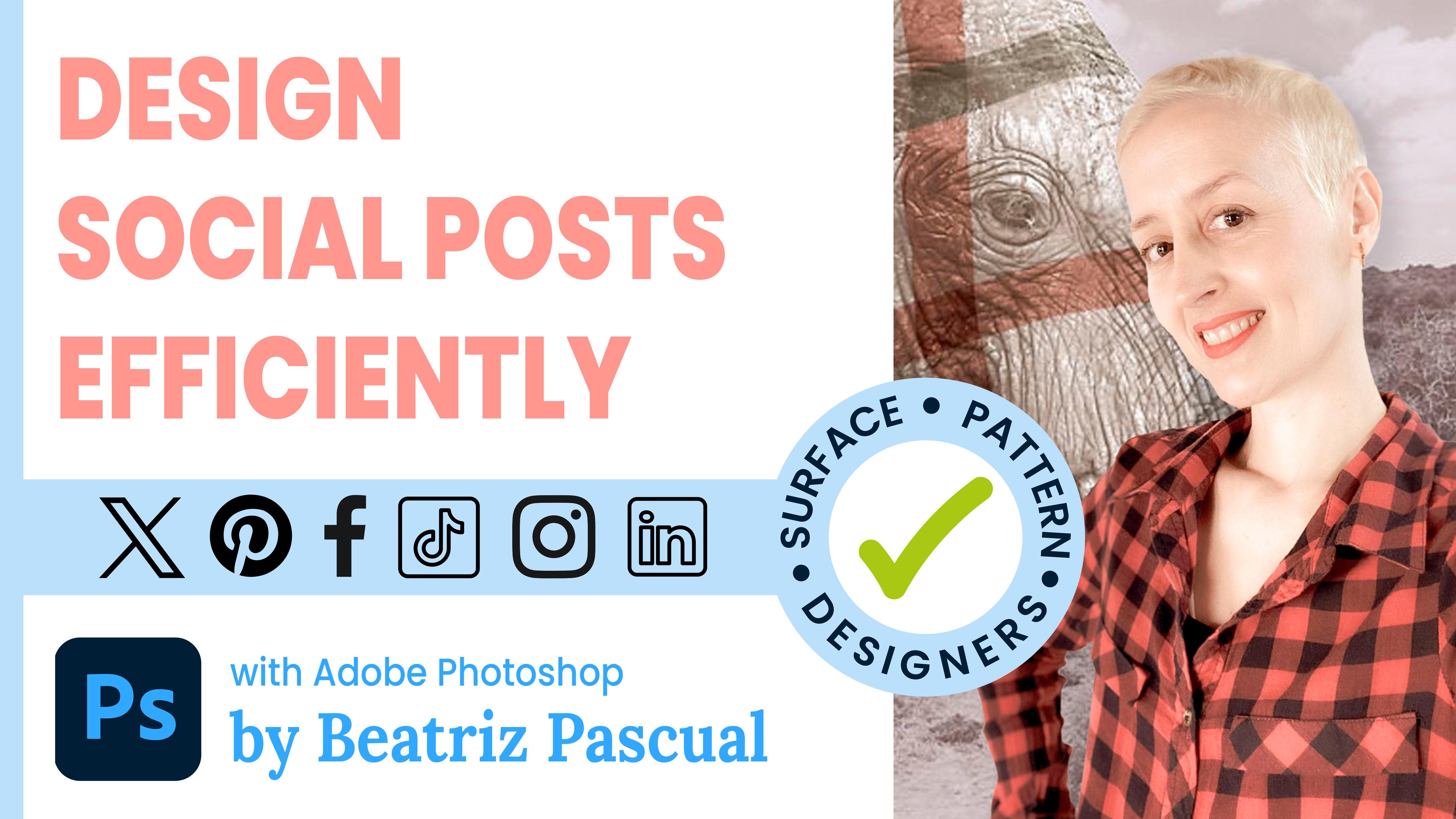
1. Introduction and Project of the Class: Hello, and welcome
to this class. One of the biggest challenges
we face as print designers is optimizing our time when we want to show our
designs publicly, either for our website
or social networks. To do this, we can create work templates that will
improve our workflow. In this class, I am going
to teach you how to make a specific template for social
networks with photoshop. This template will
allow you to create audio post for social networks in a very fast and peaceful way, always keeping a cohesive
look in audio publications. My name is Beatriz Pascual, and I am a surface pattern
designer from Spain. I consider organization is
a key part of our workflow. I teach ways to get
better on these. During this class, we
will pay attention to the creation of the base
with appropriate parameters, and we will include different
artboards for each type of publication that we use more commonly in our social networks. I will show you how to
include your prints, as well as images
to highlight them, adding details that will
enhance their presentation. Whether you design with
vectors or with pixels, photoshop is perfect
for this purpose, and I will show you how to
omit a common mistake that happens with vectors when coping vector
patterns into pixels. Finally, I will show
you how to export your post in a very
actual and efficient way. As a project, you
will have to design your own social
media template and generate your post for
one of your prints. So are you ready to speed up your design for
social media post? Let's get started with a class.
2. Designing The Master Template: Hello again. In this lesson, we are going to start creating our master template
in Photoshop. For that, we are going to
create a new square document of 3,200 by 3,200 pixels with
a resolution of 300 DPI. Well, here we have our document. Now I am going to open
the layers panel, which is not active
at the moment. In the top menu, I go to the window menu and
I select layers. So the new panel pops up. That's perfect. Next, what I'm going to do is create
my first artboard. To do this, I go to the top of the layers window and click on the three horizontal lines. And select the new
artboard option from the dropdown menu. Let's call it, for
example, base source. I click, and then we create three folders by pressing
this icon at the bottom. I will name the first one as artwork as this will
contain my patterns. I will name the
second one as images, and the third one will be logo. Great. Now I am going to give each one of these
folders a color. I right click on the first one, go down on the drop
menu and select color. I will get this
fuctia, for example. Then I do the same for
the other two folders. All right. Now I'm going to
select the three folders, click in on one of them, and then pressing
command on the others and drag them into the
Hardware base source. Next, I am going to
reorganize the folders as I want to have at the
bottom, the artwork folder. On top of this one, I will
place the images folder. Finally, on top of
them, the logo folder. Great. Now we need to start including some layers
in the folders. I am going to put layer zero inside the artwork folder
and I right click on it. In the menu, I will select
convert into a smart object. Then I click on
the images folder and I'm going to
create another layer, pressing the icon with a
plus sign at the bottom. I right click on
the layer and I am going to convert it into
another smart object. Fine. Now, to have
everything well organized, I can rename these two layers
as artwork a smart object, and images a smart object. For the logo folder, I need to have my logo at home. I like working with the
libraries as they are very handy to have all the icons
or symbols ready to use. You can open the library, going to the top menu bar, window, and select libraries. If your logo is not
placed in the libraries, you will have to go to choose File Place embedded
or file place link. Select the file
you want to place, and then select place. Well, from my library, I am going to grab
my logo and drag it into the artboard
and logo folder. As you can see, this
element is going to get the same yellow
color of the folder. Therefore, with this system, it will be very easy to
identify all the layers that are contained within
each folder. All right. Now I am going to transform
the size of my logo. I selected and I pressed command and t. I can transform it directly on the top
of the workspace where I see the measurements
of the selected element. I am going to make sure
that the chain is sloped, so the proportions will be kept. I am going to select the new
size percentage of my logo, and I'm going to
reduce it 100-30%. I think this could be perfect, so I click enter. Now I am going to move it to the right button corner
of the artboard. My purpose is to put it
exactly at the edge. For that, it is important to
have the adjustment active. To be sure that it is active, I go to the menu bar, and I make sure that
adjust is active. Then inside the
adjust to option, all the options have
to be active as well. Then what I need
to do is to place my logo with a little distance, leaving the same length of the right edge as
the bottom edge. It is here where I need
the properties panel that can be opened from the menu
bar window properties. In this panel, I can see the dimensions of the
selected object or layer, as well as the position it
occupies within the artboard. To leave the same distance
from the right and left edge, I simply have to subtract
the same number of pixels from the current position
of each x and y axis. I will subtract 50
pixels and click enter. Great. Now, we have
the same distance on the right side as
on the bottom side. I will convert this logo
into a smart object, and I will also rename the
layer as logo a smart object. To have everything
perfectly organized. However, since my
logo is transparent, it might not be very visible when I put a print on the back. I am going to show
you how to put a white rectangle behind it. To show you this effect, I'm going to fill
the smart object of the pattern with some color. To do this, I double click on the small icon of the
artwork Smart object. A new window will open, showing me the content
of the smart object, which right now
has a white fill, as we can see in
the layers panel. I am going to double click on the layer zero small window, and the color picker will open. I am going to take, for
example, a pink color. Now, with command and S, I save the changes and they will automatically be
reflected in my document. Speaking of saving, I have
not yet saved this document. I'm going to go to
file and select Save. I'm going to save it as social media post
creator template. Now, let's create
a wide rectangle to put underneath the logo. I think I'm going to
make one that will span the entire
length of my Canvas. To do it with exact
measurements, I will need my rulers
and my guides. I already have them visible. But if you haven't, just go to the view
menu and select rulers. Now I can bring my cursor to the rulers and by
clicking on them, I will drag some guides to
the four edges of my cavas. As you can see, they
automatically stick to the edges without me having
to enter deposition manually. Well, now, what I need is to
have one more guide above my logo with the same separation that the logo has
with the lower guide. For this, I simply have to
keep two things in mind. On the one hand, the pixels of lower separation that I introduced previously,
which were 50, and on the other hand, the total height
that the logo has, which in the property
spanel shows me 175 pixels. The next guide will have to
be at a distance of 50 plus 175 plus 50 pixels
from the lower guide. That is a total of 275 pixels. I go now to the ew menu
and select the option, guide new guide composition. In a new window, I have to enter the
following parameters. In column and row, I will leave one,
and at the bottom, in the merging option, I will enter zero in
left bottom and right. And in the top merging, I am going to enter the
total height of my combas, which was 3,200 pixels, minus the 275 pixels that
we have to subtract. That gives us 2,925 pixels. I hit ok and now
I'm going to create a new layer and place
it under my logo layer. Then I am going to select
the rectangular frame tool. Click on the top left
corner that has formed the new guide composition and drag to the opposite
bottom corner. Next, I make sure that
the background color is white and with
command plus delete, the selection will be
filled with white color. With command and D, I will di select the rectangle, and with this, we will finish the first part of our template. All right, see you
in the next lesson.
3. Creating Social Media Artboards: D. Hello again. In this lesson, we are going to create
the artboards for the most common social media
post that I work with. But obviously, you
can adapt this to your own needs when
you learn how to do it. First, I am going to duplicate
the existing artboard in the layer sanel by selecting it and dragging it to the
icon with a plus sign. I am going to keep this new
artboard under the first one. By clicking on the name, I am going to call it Instagram, Facebook, Linkedin Square Post. It is fundamental that all
the artboards are correctly named as this will be very useful later
when we export them. As you can see, it's
going to have inherited the folder structure from
my original artboard. The standard square post for these three social networks
vary with their dimensions, but our artboard size is
200 pixels by 3,200 pixels, which will give us
enough quality to export the post with
a higher quality, allowing us to use
it in all of them. Next, I am going to duplicate the latest artboard and place it in the third position
in the layers panel. I will rename this
artboard as Pinterest post vertical as this is another common social
network that I use. The dimensions of the
social post is 1,000 pixels width by
1,500 pixels high. We have to make numbers to get the proportions right
with our primary combas. We always have to take
the highest number here as the reference and
make a rule of three. My combat is 3,200
pixels by 3,200 pixels. So I will take the 1,500
pixels as it was 3,200. I will multiply
1,000 by 200/1500. So I will leave in the number
two than 104 pixels with. Since the dimensions of
the width have changed, my logo now is hidden. Therefore, I need to
move it to show it. Sometimes you will
find that photoshop has moved to the top
of the layers panel, the hidden elements when you click on the layer
like in this case. But that's okay. I
am just going to grave it and drag it
into its proper folder. Now when I move it, you will see that
photoshop automatically will help you to find the
right position for it. Thanks to the automatic
adjustment we have set. I only need to find the right position of my
logo on the right edge. I am going to refer again
to the properties panel and subtract 50
pixels on the x axis. Fine, let's create another
social media artboard for another type of post. I am going to duplicate
my latest artboard, move it to the bottom of
the list and rename it. The common tweets are 600
width by 335 pixels height. Firstly, I will enter 3,200 pixels again in
the width section, and then let's do the
rule of three again. I have to multiply 335 by
3,200 and divide it by 600. That's 1786 pixels
height. All right. But there is another
thing I should do here, and it is to place
the artboard align at the bottom with the others. To do that, I have to pay
attention to the y axis. At the moment, it is a zero as all the artboards
have created, move along the x axis, but maintain the same
y axis, which is zero. All right. This is
going to change now. Firstly, I have to subtract the new height
of the artboard, 1786 to the previous height, 3,200, and that is one and 14. I enter the new value and now my artboard is aligned to
the bottom with the others. Now let's remove the guides
and fix the logo position on the right as we did previously with the
pinters artboard. 00 and we are good. I am going to create
the last artboard and this will be for
Instagram stories. Again, I will duplicate the latest artboard and
repeat the process. Instagram stories post
have a dimension of one and 80 by 1920 pixels. I will introduce 200
in the height section, and with this change, I also need to change the
Y axis back again to zero. And then the rule of three,
therefore, 1,800 pixels. Finally, I have to
move to the bottom, the logo, and the
white rectangle. And with this, I have
finished with the template. You can, of course, add more social media according to your needs regarding
social media. So let's continue with a
fun part. See you now. O.
4. Adding Raster Patterns: Hello again. In this lesson, we are going to put
our template to work. For that, we will start
with raster patterns. A aster pattern is
created with pixels, and I have here one of my raster patterns that
I made with watercolor, and then I digitalized. When we want to use raster
patterns in our template, we only have to insert it into the patterns
panel in Photoshop. You can open this panel from the window menu and
then click on patterns. Then in the panel, if you press the icon
with a close sign, a new pop up window will open, and we can give this
pattern a name. When we click, it will be directly included into
the pattern panel. Now, if I go back to the
social media creator template, I am going to open my
artwork Smart object placed in the base source
artboard by clicking it twice. The smart object will open
in a different window, and now I can simply
grab my pattern from the pattern panel and
drag it onto my Canvas. In the layers panel, I can double click on the
small window with a slider, and the pop up
window will show up, where I can play around with a scale and angle
to show my pattern. When I'm happy
with how it looks, I heat ok and save the
changes with command and S. Now the changes will
appear in my template across the different
art words. That's cool. If I duplicate this layer
in the smart object, I will be able to test and keep different
scales or angles for the same template
to decide which one I like the most depending
on the final uses I need. Of course, this is the key thing about creating a
template because now I can simply choose any pattern and apply
it to my canvas, which will improve
the productivity of my work and make my life easier. All right, let's move on to
the next lesson. See you now.
5. Adding Vector Patterns: Hello again. If you normally create
vector patterns, I will teach you a
trick to use them in photoshop without
showing the white lines that sometimes you
might have noticed when you copy vector artwork
into a aster program. Obviously, there are different
ways to avoid this error, but I have found that this one is the
quickest way to do it. Let's get to work. I have here a vector
pattern that I created, the same pattern with
different colors, but one of them is trimmed on
the edges of the artboard. This is how we need to have our vector patterns to
take them to photoshop. Although this is not the
scope of this class, I am going to show
you how to quickly trim a vector pattern
in Illustrator. I will duplicate the
rectangle that is my tile. This rectangle cannot
have a feel or a stroke. Then I will grab it and
move it to the top of the groups or different elements that belong to that pattern. Next, I will lock it. Now, I am going to select
all the elements of the pattern and group
everything with command Y. Then I unlock the
rectangle on the top. All right, now I select both
the rectangle and the group, and I go to the bar menu
object, clipping mask Create. It looks like it is
strimmed already, but nope, we still have to
take a farther step here as this is just
a clipping mask. I have to open my
pathfinder panel, and now I am going
to press divide. With this, I can see that the pattern has been
perfectly trimmed. Now I can select
the pattern and we should always check that the size of the
pattern is accurate. For that, I will refer
to the transform panel. This one is 20 by
20 centimeters. So there are no
errors with decimals. It has to be exactly
the same number. Now, I press command C to CP it, and then I go to photoshop
and I open a new document. This document has to have
the same size as my pattern. In this case, it was
20 by 20 centimeters. All right, I'm going to
change the resolution to 300 RGB color mode and create. Now I press Command B
to paste the pattern. And Photoshop will display
this little window, so I'm going to choose
paste as a smart object. Click. Now in the layers panel, I am going to right click
on the smart object, and in the drop down menu, I will select rasterized layer. With this, I have transformed
this layer into pixels. Therefore, I can refer
to my patterns panel and add it to my patterns as we did before in
the previous lesson. Es right. Okay, let's
test this pattern. I am back in my
smart object tap. Let's do the same with this one. I'm just going to grab it
and take it into the cavas, and now I can play around
with the size of it. When I'm happy
with how it looks, I press command and as to save the changes and the smart object will be updated in my template. And I think this looks great. All right, let's move
on to the next lesson. See you now. O
6. Adding Other Elements: Hello again. Normally, if
you create patterns like me, you might be
interested in showing people how they look
on different surfaces, like apparel, stationery,
wallpaper, et cetera. I like to create mockups for my patterns as they
are more visual. In this lesson, I will include them as part of our template. I'm not going to teach
here how to create a mockup as that is way beyond
the scope of this class. But instead, I'll focus on different options for
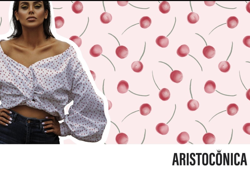
displaying it in your posts. I have here a mockup where I have applied the pattern
with the cherries. For this example, I will use this image with a
transparent background. But of course, you could use a mockup with a
solid background. The important part
here is the process. All right, so I am going to copy this image
with command and C, and now I go back
to my template. I will open the folder images contained in the base
source artboard, and I double click the small thumbnail
of the smart object. A new window will open, and I can see that
at the moment, my smart object is empty. I am going to press command V
and my mockup will show up. Now I can play around
with deposition of it. As depending on what I prefer
to show to my audience, I can focus only on the
shirt with a pattern or I can reduce the size of
the mockup to show it all. All right, I think I'm going
to reduce it and place it in the center to test
how it looks like this. When I'm happy with it, I press command an S to
update my smart object. Now back in my template, I can see the changes. As this is the first time here in the template applying images, we will need to make some
minor adjustments to get a better position for this smart object on
each one of my posts. At this moment, it could work
as it is in some of them, but I don't like how it performs on the x Twitter
post, for example. When this first
adjustment is done, probably you won't need to make major changes in
the template later. So let's start with the x post. In the x Twitter artwore, I am going to select the smart object in
the images folder. With command T, I am going to adjust the position
and the size of it. Since we are working
with a smart object, the quality of the mockup image
won't be affected at all. All right. I think it looks
better if I place it here. Now, I think I will move it to the side into the pras post. Again, I will open
the folder containing the smart object of the
mock up and adjusted. Next, I will the square
Instagram and Facebook post, and I think I will
place it on the left. Having an overall
view of the template will help you to see if you need to make
any more changes. All right, I think I might
need to make my main Mk up in the primary source smart
object, a bit bigger. Also, I can add some
nice details to my Mu, like, including some effects. If I click on this icon
on the layers panel, I can select the drop
shadow option on this menu. Now in the new window, I can determine the type of shadow I prefer for my layout. I can play with color, opacity, angle,
distance, et cetera. When I'm happy with the result, I click okay and
save the changes. Now I can check how it
looks in my layout. Another option that looks
very good in this type of mockups is to draw a thick stroke around the
silhouette of the image. To do that, back in my
smart object window, I can feel a layer underneath with a contrasting
color like this red. Then I am going to create a new layer and place
it behind my mockup. Now I am going to
select a white color and pick a bold brush
with a big size, and start contorning the
silhouette of the model. When I have finished, I deactivate the red layer and save the changes
on the smart object. Okay. Testing the results, I can see that I better
use a thicker stroke. So I'm going to a bit. Fine. I think it looks
much better now. Alright, let's dive on
to the next lesson. See you now.
7. Exporting and saving: Hello again. In
this last lesson, we will learn how to
export and save our posts. Once I am happy with how
it looks everything, I will go to the main menu, file export to files. Then in the new window, we have to set the
destination of the files. It is convenient to export the post to the specific
folder of the pattern. I have a full class
about how to set and organize your portfolio of patterns that you can check out. All right, so I click on E, and now I'm going to
select this folder. P 20 30s. That is the specific SQ number I set for this pattern
when I designed it. Fine. Next, in the
prefix section, I will delete the
name of the document. Instead, I will write down
the queue of the pattern. You can add a slash
or a minus sign as this will mark the separation
with each artwor name. Then I am going to
select this option, Export selected arts, and I will leave the
rest as it is now. Finally, on the file type, you have multiple
options to select. But I am going to keep JPEG
and the maximum quality 12. Now I click on Execute and
Photoshop will do the rest. I love this part. As you can see, all the images
have been ex correctly, and each one of them has
kept the title of it. So now it will be very
easy for me to pose them in their corresponding
social media network. All right. This was all. I really hope that you have enjoyed this class
and found it useful. If so, please leave a review
about your experience as this helps me to continue creating
practical content for you. I can't wait to see your
project so we can all c. Also, I invite you to follow me. So you will always be
updated about new classes. Thank you very much for
choosing this class, and I will see you
very soon. Bye bye.
 Beatriz Pascual, Pattern Designer & Entrepreneur