Transcripts
1. Welcome to 10 Days of Winter Painting: Winter is a season of
stillness and gentle light, making it the perfect time
to slow down and paint. Hello, friends. My
name is aninNapil. I'm an artist, an art
instructor, and an author. There is something that
is really peaceful about winter soft light, muted colors, and moments
that invite us to slow down. In this class, we'll
embrace that stillness and translate it into watercolor through soft dreamy
winter landscapes. Over the next ten days, we'll gently explore
light, atmosphere, and more using simple
calming techniques that allow you to paint
with ease and intention. This journey is
about slowing down, embracing the
process, and finding peace through soft
winter paintings. Before we begin every painting, I'll first walk you
through the color palette and the techniques we'll
be using for that day. This will help you understand
the process clearly and make painting feel
easier and more relaxed. The lessons are short
and easy to follow, so you really don't need
long blocks of time. You can paint along in real time or pause whenever you need, or you can return
to a lesson later. We will focus on soft washes, limited color palette,
and minimal details. This class is perfect
if you're new to VerticorRturning after a break or simply looking for a
calming creative routine. You don't need fancy
supplies or advanced skills, basic verticular materials and a willingness to show
up is all we need. Most importantly, this challenge is about the process
and not perfection. Some days your painting may turn out just as you imagined, and other days, it
may surprise you. Both are part of the
creative journey. By the end of these ten days, you will have a beautiful collection
of winter landscapes. Now just that, you will also have more confidence
with watercolor, and renewed sense some joy
in your daily art practice. So grab your paints,
find a cozy spot, and let's begin this peaceful
winter journey together.
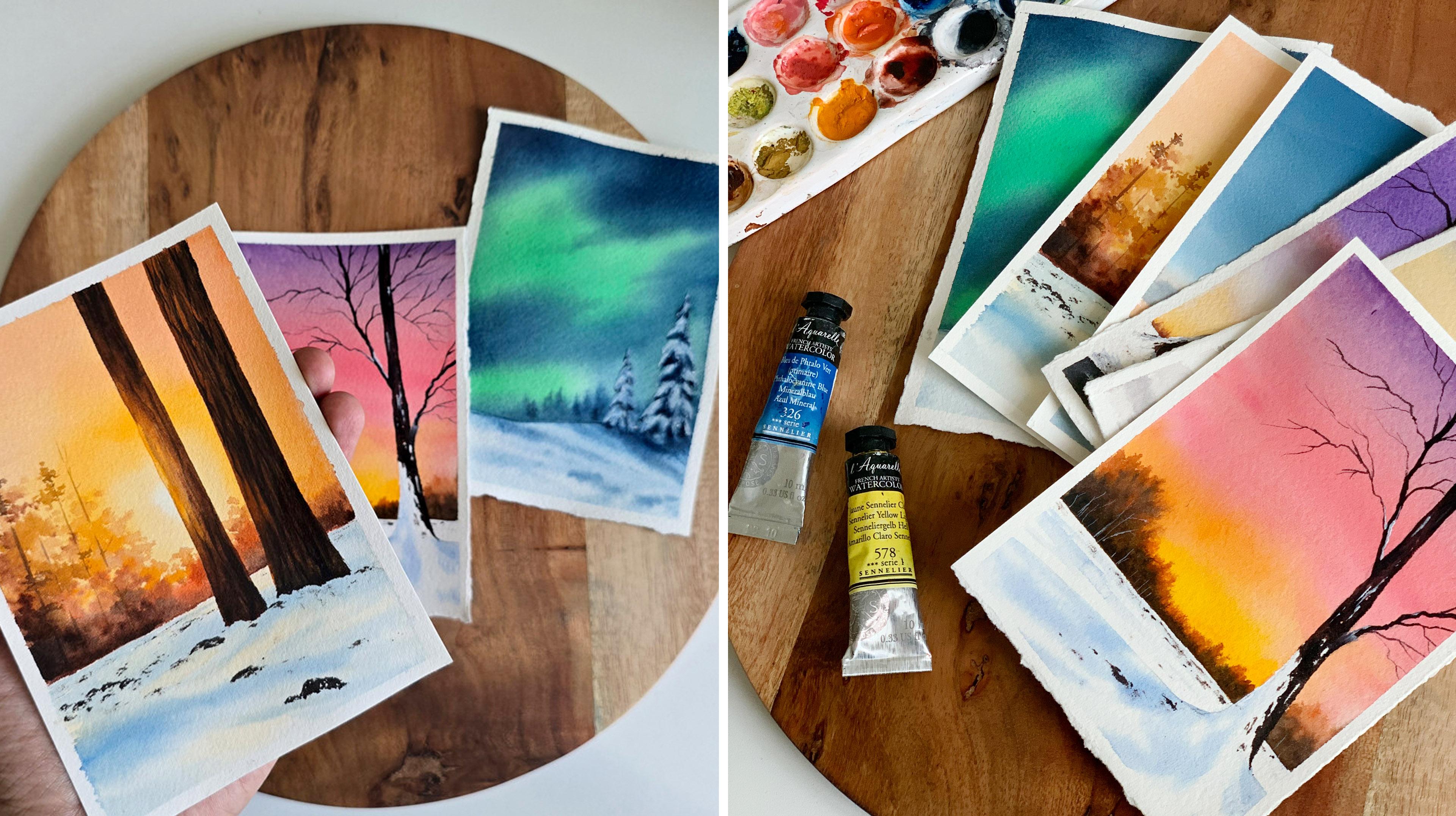
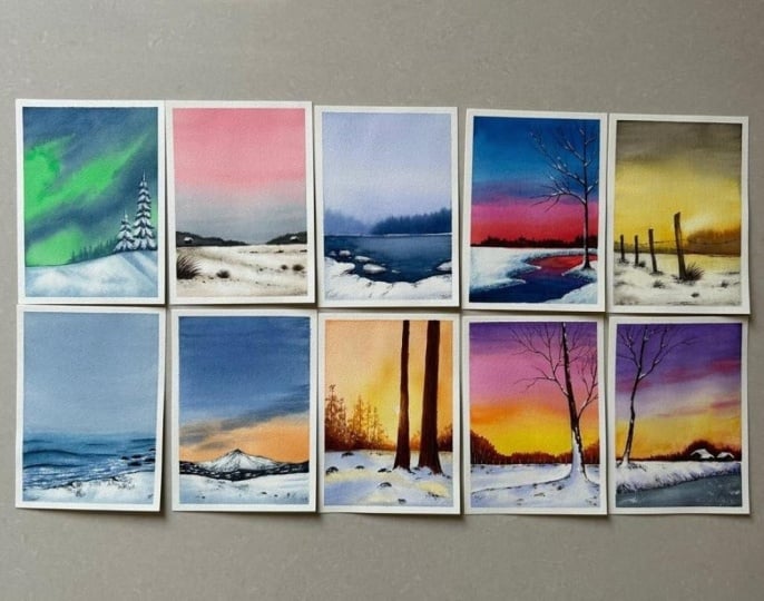
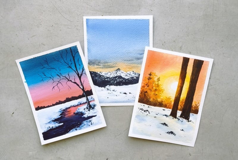
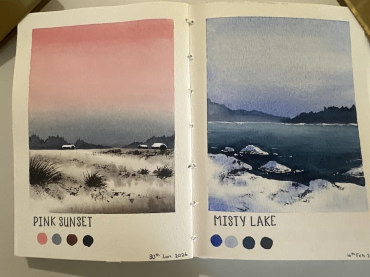
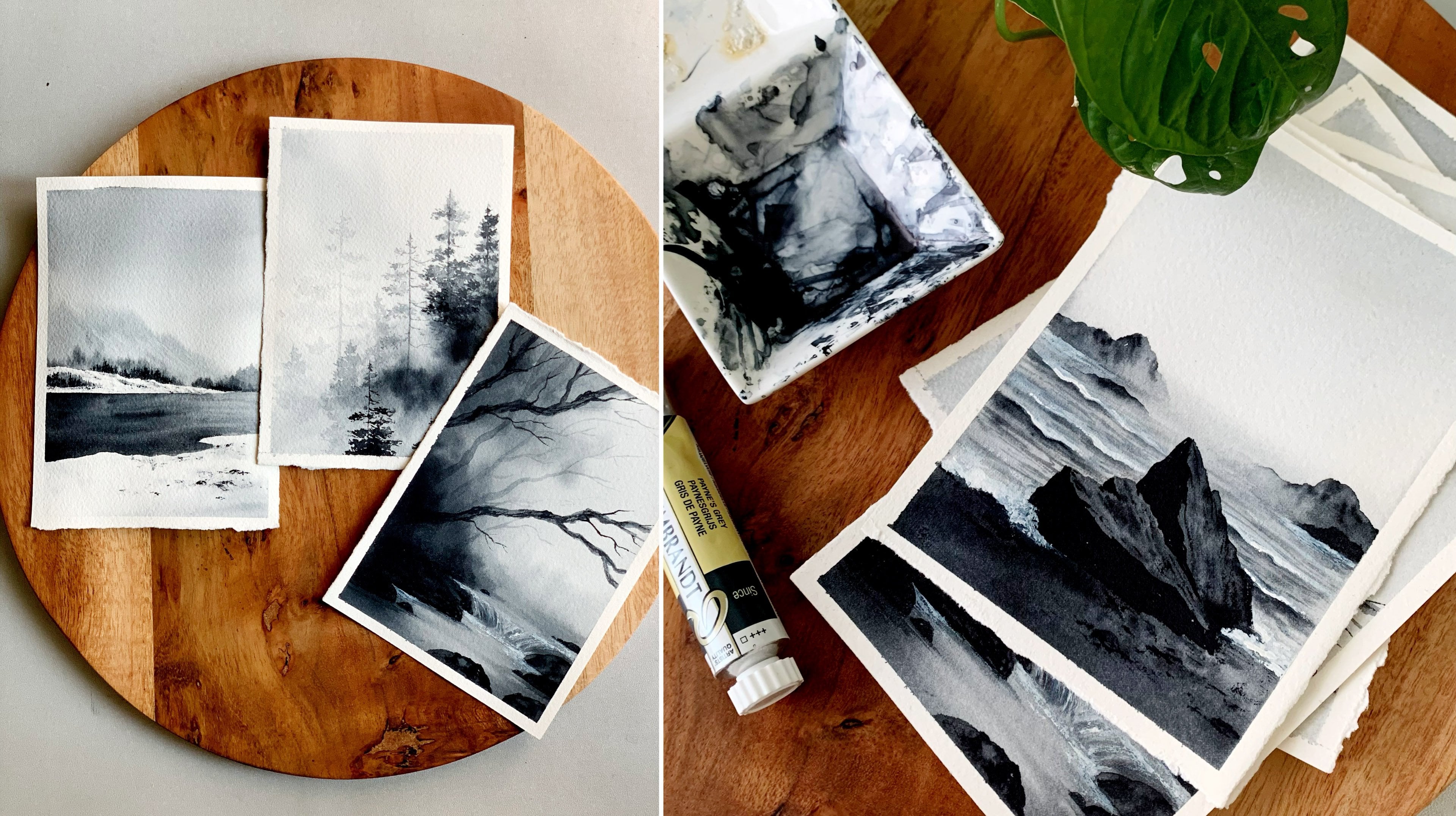
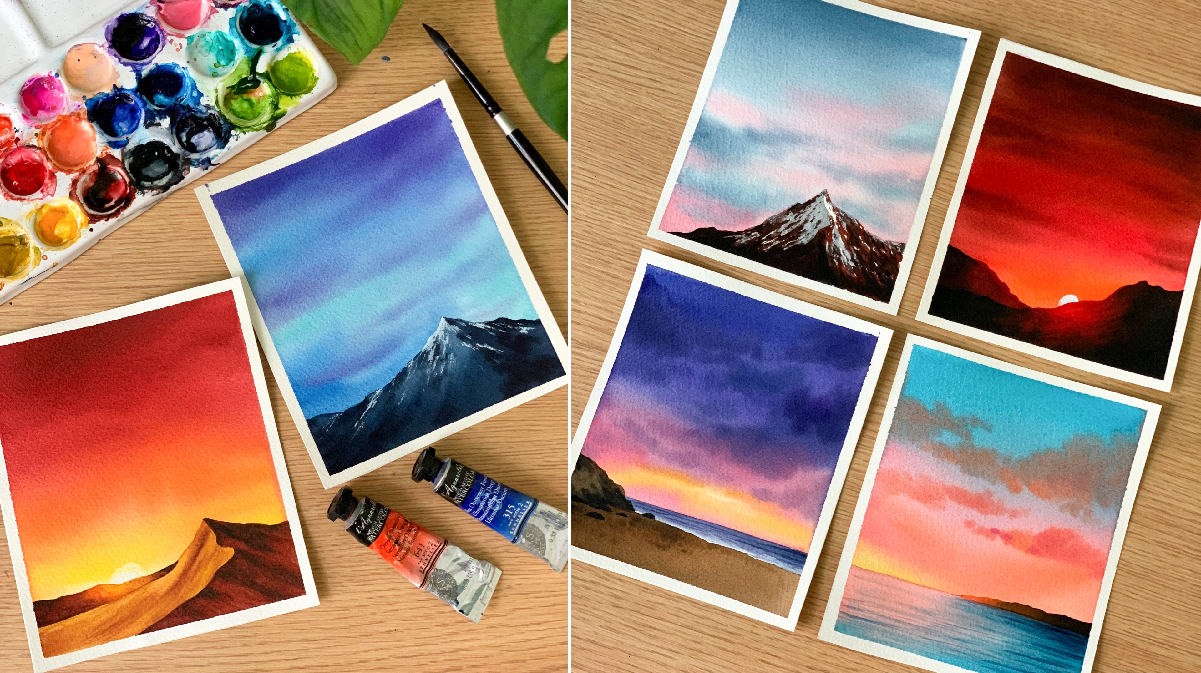
2. A Glimpse of What We’ll Paint: So before we start,
let's have a look at what we will be painting
in the coming days. Our focus will be on soft color combination
and minimal details. There won't be any dramatic
elements or overworking. All the paintings
are going to be soft and simple and beautiful. So we'll have a look
at this one here. We have a really
beautiful sky here with a soft blue
and a soft orange. To elevate the
beauty of the sky, I have added some clouds as
well. So that's a pretty sky. And then to enhance that, I have added some
snowy mountain here. So that's one of the
painting we'll be doing. Then we have a
little more brighter color combinations
like this one here. It's a really beautiful
colour combination, as well. I have used three different
colours for the sky, and I really love the
glow behind these trays. That's my favorite part
about this painting. And also the snowy tray here. Okay. So that's another one, which is included
in the challenge. The next one I want
to show is, again, a glowing sunset, but the
colours are not too bright. It's again, a soft colour
combination. See that? So it's a combination
of gray and yellow. There's, again, a glow behind the trees, but in a softer way. And as the foreground subject,
we have a fence here. Okay. Now I will show
you another one. It is another minimal sky. The color combination is gray
and pasil pink. See that? It's a simple blend of
pastel pink and pasil gray. And here we have pastel
gray and yellow. The foreground is
nearly similar. We have a snowy ground
and some grassy pattern. But here we have some
tiny houses far away. They are really small and you
can see how cute they are. This one is actually one of my favorite from the collection. I just love the way
it has turned out, especially the
color combination. Now going on to
another favorite, it's a beautiful
Northern lights, a soft and dreamy
Northern lights. Usually, I always
tend to go with bright and bold colors
for the Northern lights. But for this one, I tried a soft color combination
and some soft snowy trees. And I think the painting
can speak for itself. The colors are beautiful, and it turned out really dreamy. The colors and the
techniques we'll be using for this painting
is quite interesting. So keep a lookout for that. Now coming to the next one, it's a minimalist and a
moody winter painting. You can see the
atmospheric effect I have got in this painting. It is quite easy to do. We'll be painting the
entire background in one single layer. Then we will paint
the snowy ground and add all the textures. So this one is going to be
another interesting painting. I'm not gonna show the antique collection and
kill the surprise. Otherwise, what's the fun right? Maybe I will show you a few more so that you will
stick to the challenge, and you will come back. So here is another one
that we're going to try. It's a gorgeous
color combination, and I love that pink clouds in the sky and also the road
and these checkos here. So yeah, we're going to try
beautiful color combinations in this winter challenge. I'll show you another one, which is almost in the
similar language. But here, I have added a lake. Then there is a tree here, similar to the previous one. Then there's a different
colour combination. Then we have another one, a glowy winter forest. I just love the glow in this painting. You
can see this part. It's beautiful and dreamy. And also the ground, you can see that subtle hint of
yellow on the ground. Even that is a beautiful detail. So yeah, there is
a lot to explore, and I cannot really wait
to paint with you all. So yeah, I'm officially
inviting you all to this beautiful
winter magic days. Just join along, and I will make sure you all have a magical
time painting with me.
3. Art Supplies You'll need: Alright, so let's start by having a look at the
materials you will need. I will start with
the paper as usual. So here's my most favorite
paper for watercolor. It is from the brand
called arches. And it say coal
price aticula paper, which is 140 LB and this
one is 100% cotton. So there are lots and lots of brands available in the market. You can go with any
brand that you prefer. It doesn't need to be arches. Just go with any artist
grade watercolor paper, which is specifically made
for watercolors, okay? Because in the market, you'll find different
variations of paper. There'll be cellulose
paper. So in order to have a beautiful experience
working with watercolor, it is very important to go with a paper that is specifically
made for watercolor, and that is artist
grade quality. Now coming to the
size of the paper, I'm going to go with an A six
size for all the paintings. I have just cut that A four
paper into four pieces, and that's the
size you see here. You can go the different size, preferably in the
same orientation. It can be a little more
bigger or smaller. Next, let's talk
about the watercolor. So for this entire challenge, I'll be using watercolor tubes. Now, here is my mixing palette. It's a ceramic mixing palette. You can go with any
palette you prefer. Now, at the beginning
of every painting, I will be explaining the colors you will need for that
particular painting. So we'll talk more about
the colors over there. Okay, so you will need your watercolors and
a mixing palette. Now coming to the brushes, these are the five
different brushes I'll be using for
this entire class, not five. I think six. Okay, there are
six brushes here. The first one is
a 1 " wash brush. I'll be using this one to apply water onto the background. Then the next one I have
here is and the flood brush. Which one is a half
inch flat brush. I'll be using this one to
paint the skies mostly. Whenever I need a
beautiful blend, I'll be using this one. Now I have four
different round brushes. The first one is size number
eight for the bigger areas. Then I have three other
brushes, size number six, size number two, and also a detailing brush
for all the fine details. Okay, so these are the
brushes I'll be using. Now, I missed about something earlier when I spoke
about the colours. Along with the watercolors, you will also need some
white gouache. If you don't have white gouache, you can just go with
white watercolor. Both will work. Okay. We'll
be using white gouache to add the snow and highlights onto some of our paintings. Okay, so that's one thing you will need, which
I missed earlier. Next, you will need
two jars of water. One has to stay
clean all the time, and the next one is to rinse off the paint
from your brush. So we'll be using clean
water to make the color lighter or to add water
onto the background. For those kind of purpose,
we will need clean water. Alright. Now, coming to the
final set of materials, we will need a masking tape
to formally fix the paper. Then you will need a
pencil and an eraser. We just have little
sketching involved. Okay, so we'll need a
pencil and an eraser. And then finally, you will
need a piece of paper towel to dab off the excess amount the water or paint
from our brush. Alright, so those are
the things you will need for this cozy window challenge. Now keep all the supplies ready and join me in the next video.
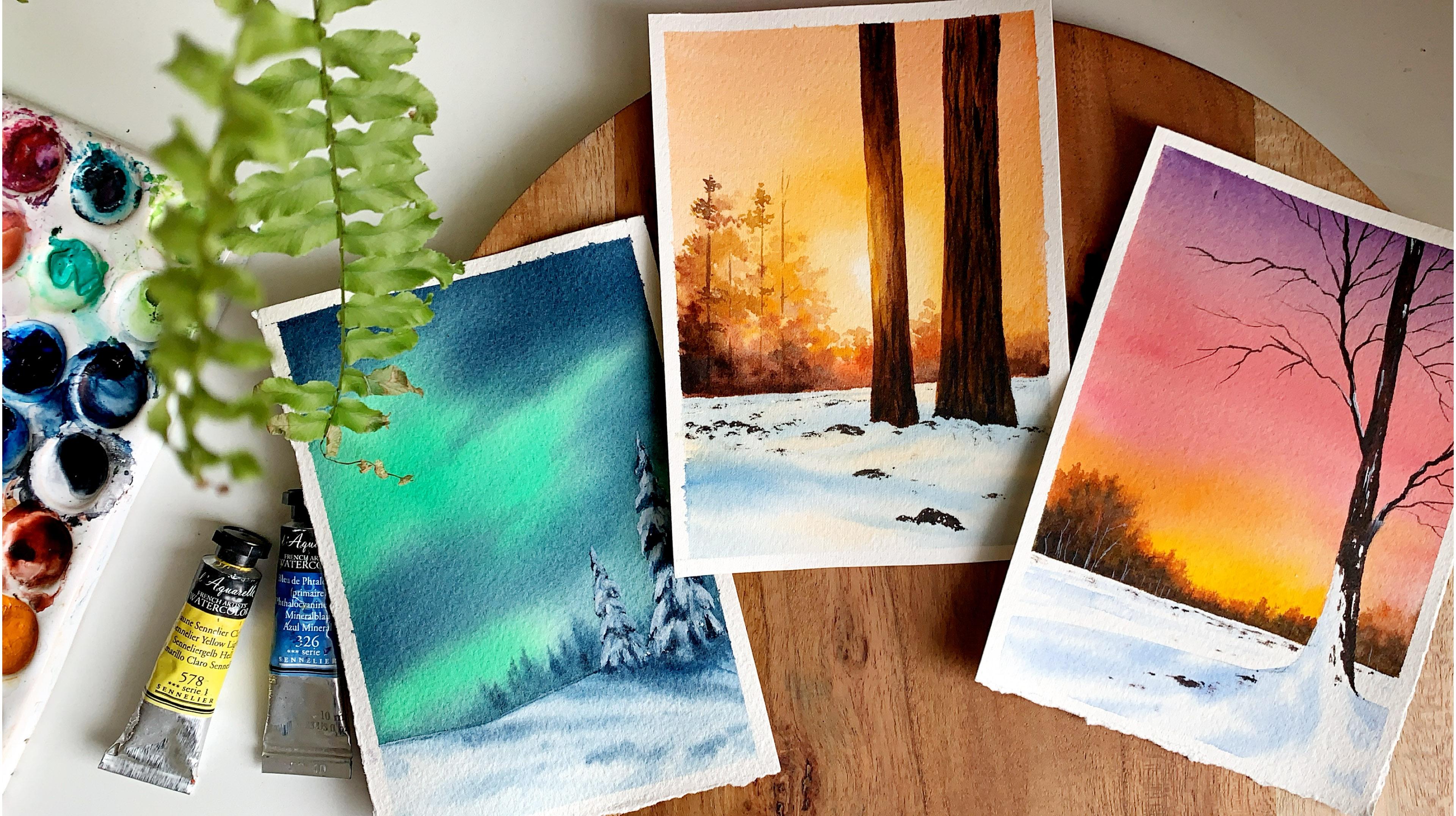
4. Day 01 - Northern Lights: Hello, dear friends.
Welcome to day one of painting Soft and beautiful
winter landscapes. Our painting for the day is
a dream in Northern Lights. One of my most
favorite subjects to paint in watercolor
is Northern Lights, and I'm glad we are starting this challenge with a beautiful
Northern Lights painting. Now, we'll start by having
a look at the colors. You can see here I used
two colors for the sky, a lighter tone and
a darker tone. The darker tone is indigo. That's a color you
see on the top, as well as in between. This one is from art philosophy. Go with any indigo you have got. Depending on the
brand, your intigo might look a bit
bluish or grayish. That's totally fine.
Don't worry about it. This one is a bluish intigo. Slight difference to the
colors are totally okay. So that's a color I'm using. It is indigo from
art philosophy. Now, coming to the second color, which you see in
between, it is actually a mix of cobal green
and some bright green. These are the two colors. So to get that color,
I will be mixing some cobal green and
carmum green together. So this one is bal creen. Next, I will swatch out
cadmium green light. It's a bright green, more like a neon green. Okay. Now, I'm going to go over the mix of
these two colors. I will mix it and show you the color I'm getting,
so that's green. Now, I'm going to add a bit
of cobal green into this. See that? You can add more cobalcreen or more lead green according to
the color you need. So that's a color I will
be using for the sky, this one, and Itko. Now, just in case if you don't
have cadmium green light, you still can make this color by adding some lemon yellow
with your cobal green. I will show you that as well, because I guess many of you
may not have cadmium green. So what you can do is pick
a little of lemon yellow, which I'm hoping you all have. Now, add a bit of
that into bal green. Now you're going to get
almost the same color, which I created earlier
by mixing these two. Now, there is one more option. If you don't want to use
that greenish color, you can use bal green acets. Okay? So these are just some options which you can use in your
Northern Light sky. But the color choice is
totally yours. See that? It's almost the
same right. So just mix some cobal green and
lemon yellow together. Then you're going to
get a color which is exactly the same
as the one above. I think in this, the bal
green is a bit less. Okay. Now you can see
they are almost the same. So if you want to
use a similar color, and if you don't have
cadmium green light, you can add some lemon
yellow into cobal cream, and that's a color you
can use for your sky. Okay, so the colors
for the sky is sorted. For the snowy grown, as
well as for the pine trees, we'll be using intico. Now to add the deeper tones
and the final details, we will need some
paints gray as well. So that's our last color. Okay. So you spoke about
the color palette. Before we get into the process, let's quickly try
one snowy tree. That snowy pine tree is one of the major element
in this painting. So trying that out beforehand
will be really helpful. So first, I will add a sketch. I'll go with a
slightly bigger size, so it's easy to understand. So it's a snow
covered pine tree. We don't need to show all the foliage and
all the details. So these are the kind of
shape I'm going with. See that? So you just need to add these drooping gars kind of a shape. There are three sections, one on either side, then
one at the center. Okay. So keep on adding them
until you reach the bottom. And as you're coming
towards the bottom, you can make it a
bit more wider. So overall, we have
a conical shape, a long conical shape. I think I will go with one
more section at the bottom. So one section on the left, then at the center,
then on the right. Okay, so that's the shape
we are going to go with. We'll be adding two trees, a taller one and a shorter one. Now, at the bottom
part of the foliage, I'm going to add some shadow. I'm going to do that
with my pencil now. So basically, this tree is
all about these shadows. When you add the
shadow, the shape will be a lot more defined. And then along the top part, we will add some white
paint to show the snow. Okay, so along the bottom, we'll be adding all the shadows. Maybe I will just
add some paint and show you how you can do
this in a very quick way. So first, I'm going
to pick some blue, a light tone of blue, and I will apply that onto the
interior shape first. Then we will slowly start
adding all the shadows. So it's a light tone
of ultramarine blue, adding that onto
the interior shape. Okay, so we have a
background color there and the background is wet. Now, at this time, we're going to go with
a smaller brush, and we're going to go with a mix of pinks gray and indigo. And along the bottom, we're introducing some shadow. Okay, so we're going to emphasis on each and
every shape we have here. Now, along the bottom, introduce your shadows and
define all the shapes. So just follow that pencil
sketch and define the shape. When we're painting, we won't be going in
this much detail. We'll be doing that
in a quick way. Okay. I just want you guys to have a better idea on how to paint this
snowy pine tree. Maybe you can use it in your
future paintings as well. Okay. So that's the
first round of shadow. Now, I'm going to make
the color more darker. We can add a bit more
paints gray into the mix, and then introduce
your second layer of shadow only along the bottom. So we have medium tone
and also a darker tone. And along the top, we have
that light blue. Okay. You can see how the shape
is getting more polished. Now it looks like a pinetree. So right now for this pine tree, we don't have a
background color. But when you have painted
your sky and when you add the white paint
to show the snow, it will look really beautiful. Maybe I will just add
some snow onto this tree, even though there is
no background color. Okay, so with the same brush, I'm picking some white quash. And then I'm going to add that along the top line
of all these sections. Okay, so that's a
step we're going to follow when we're doing
our class project. We can add some white paint onto all the sections
along the top part. So at the bottom, we
have the shadows and along the top, we have the snow. Okay. You can also give it a good shape when
you're doing this. Okay. So that's how we are
going to paint the pine tree. When you have a
background color, it will be a lot more visible. Right now, I don't think the
color is really visible. Never mind. I just want you guys to get an idea before
we get into the process. Alright, so we spoke
about the colors, and we also tried
a snowy pine tree. That's all we need. Now we
can start with the process. Okay, so keep all the colors ready, and let's give it a try. Okay, so I have my
paper ready here. I have taped it
down onto a board. Now, I'm going to
start with a sketch. So first, you have to
draw irregular line at the bottom to show
the snowy ground. So I'm going to go
the slopy line, which is a bit higher on the right side and
lower on the left. Okay. Now, I'm going
to add two trees, a taller one and a shorter one. So you can go with any
number of trees you like. It can be just one or two
or three or even more. Now I'm going to go
with a shape like this. Okay. So for now, you
just need to add a shape, which is similar to this. We can modify that
as we're painting. It doesn't need to
be a perfect sketch. Okay. So it's more
like a conical shape. Then I have added
big bulky groups of foliage on either side. So yeah, just go the
similar sketch for now. You don't need to
put a lot of effort. We can modify that
as we're painting. Alright, so that's a sketch. If you want to add one more
tree on the other side, you could do that, or you
can just go with two, a taller one, and a shorter one. For this painting,
we'll be using some white gouache to clean
up the shape of your tree. So even if it's not in a perfect shape,
that's totally fine. We can always fix it. Okay. Now, I'm hoping you guys have the colors
ready on your palette. If you don't have them
ready, just keep them ready. We need some cobal green and a bit of green or lemon
yellow, then some indigo. So these are the three colors
you will need for the sky. Now, I'm going to start
by applying a coda water. Then I will go with my round
rush to apply the paint. The colors are ready
here. I have some green, cobal green, and some indigo. Okay? As we already discussed, if you don't have green, you can just go with a
bit of lemon yellow. Okay. So my paper is fixed
tightly onto my board. This is very important, as well. You have to fix your paper onto any drawing board or any surface that you
can move around. That's how you're gonna get
that beautiful sky. Okay. Now, I'm going to
start by applying a coat of water onto the sky. As much as I can, I'm
gonna leave the tree. I won't be adding
any water onto that. Alright, so I've applied a quatter water onto
the entire sky, and I have tried my best
to leave the trees. Now I'm going to go
with my entrech. This one is size number eight, and I'm picking
some cobble green, and I'm going to add a tiny
bit of green into that. So you can modify the
color as you like. You can add more green
or more cobal green. That's totally up to you. So that's the kind of
color I'm going with. I wanted to have a
fluorescent tone. That's why I'm adding green. If you want to use
Coval green acets, you can use it that way. You can see that greenish tone. That is exactly what
I need to bring in that fluorescent dancing lights. Okay, so that's the kind
of shape I'm going with. It is not a very fixed shape. I have randomly added
the paint onto the sky. Now, onto this in
between spaces, I'm going to add some indigo. So I'm cleaning my
brush and I'm picking some indigo go with
a bolder tone. Then add that onto the top. For now, just add that onto
your paper in a random way. Your background is wet, so the paint will float
into each other, leaving a beautiful blend. Okay, so I'm leaving
the tree in between, and I'm adding paint
onto those in between spaces. Also at the bottom. Okay. If you accidentally add some paint onto the tree,
that's totally fine. Don't worry about it.
Don't try to clean up. We can do that as
we paint the trees. Now I'm going to till
tant on my paper, and you can see how the paint
is getting into each other, leaving a beautiful
natural blend. Usually, when I paint
Northern Lights, I go with very bold
and bright colors. I used to make it so
much more darker. But this time, I
want a soft blend, and I don't want
the colors to be too bright and dramatic. But if you want to
make them more darker, you can do that while the
background is still wet. I'm adding some color
on this corner. I added some paint
onto the tree. Never mind. We can fix that. Okay, so keep on
tilting your paper in all direction until you feel like you have got
a beautiful blend. So the blend will
totally depend on the way you are tilting and
turning around your paper. Do that in all direction. Okay. So that's
how it turned out. Now, thinking of dropping
in a bit more paint, maybe a little of indico. Onto this corner and also
a little into the sky. I wouldn't really recommend
doing this because most of the times I have done this
and I have ruined my sky. I used to overwork and I have ruined my decent looking sky. So only if your background
is still wet, do this. Otherwise, leave it as
it is. Don't touch it. Okay. You can see the paint
is not really floating. That's why I said earlier. It wasn't a good move. Away, I'm hoping to get a decent result because I just love the colors and
the way they have blended. Okay, so that's how
it has turned out. There is some excess water here. I'm just spreading
that into the sky. In a very light moment, I'm not putting a
lot of pressure. It is more like a feather touch. Alright. So that's it. I'll just clean up the tree. You can clearly see the shape is mostly gone, which is fine. We can fix it. Alright,
so that's our sky. Now, I think I should start
putting in more paint, and I should leave
it for drying. Now, just in case if your
paint is still spreading, there is one thing you
can do to stop them. Go with a dry brush
without any paint on it, and gently move
your brush back and forth wherever you want to smudge that a bit or try
to stop the spreading. So this trick will stop your paint from
further spreading. Now, there is one
more thing we have to do before we leave
this for drying. And for that, I'm going
with a bit of indico. Add a few drops of
water and turn that into a medium tone and use
any of your smaller brush. Now, we're going to add some
trees in the background. The trees have to be blurry. I'm adding a little
of paints gray asphal because I don't want
that to be too bluish. Okay. Now, while the
background is still wet, we're going to add some
trees in the background. I'm adding that closer
to these two trees. So just add some lines
onto the background. On the top, you can see it has
a pine tree kind of shape, and at the bottom, you
can simply fill it. Okay, so just add some
lines, and at the bottom, you can just add the paint
and fill that portion. Okay. The lines can be
taller at some places, and it can be shorter
at some places. This will give a natural
effect to your background. Okay. We have to do this while the
background is still wet. So if it is starting to dry, you will have to
rush a little bit. Okay, I'm adding
some more pinscreen and I'm leaving some taco
tones at the bottom. Also adding some
lines in between. Alright, so that is it. If you want to add some more
trees, you could do that. Only if your background
is still wet. Otherwise, don't take a chance. We're trying to make it look
like these are far away. That's why it has a blurry look. Okay, so that is it. I think it's in good shape how we can leave
this for drying. You can either use a blow dryer to speed up the process or you can leave it
for some time so that it dries naturally. Okay, so take a break and come back when the sky has
dried completely. Okay, so that's how the
sky has turned out. You can see how magical
the colors are looking. Now we are going to go ahead with the snowy
trees in the background. We have two trees. We will
start with them first. So first, I will apply
a lightn of blue, a lightn of indigo. I will apply that onto
the entire shape. So add some water into your paint and turn that
into a lighter tone. Now gently apply that
onto the entire sheep. Right now, you can see
the shape is quite messy. It doesn't have a proper
shape, which is totally fine. Simply apply that light
tone or to the sheep. Then we can start adding more shadows and more textures to make it look like a tree. Right now, it doesn't
look like a tree. Alright, so I have
applied a light tone of indigo or to the entire shape. Next, I'm going to go with a mix of pinks grey and
a bit of indigo. I want it to be a bluish
gray, sort of a color. Okay, so that's a
color I'm using. Mix of indigo and paint screen. And I'm using a smaller brush. Okay. Now with this, I'm going to add some textures and some shapes onto
this wet background. I'll add some more
water onto the top. Looks like it has dried a bit. Okay, so it's wet again. Now I'm starting to add
the shapes from the top. Then I will go
towards the bottom. So on either side, I'm
just adding a shape. Okay. Now at the bottom, I'm
adding the same again. So we're dividing that
into three sections, one at the middle, then
two on either side. See that? So in a similar way, I'm adding another
shape at the bottom. So the background is wet,
so it'll spread a little, which is exactly
what we need here. Still, it doesn't
look like a tree. Now, what I'm going to do is I will make the color more darker, and I'm going to repeat the
same thing using a Tako tone. So right now, what
we're doing is we are dividing
that into sections. We had tried a sketch
in the beginning, so we are trying to
follow that process. So first, we have a shape, then using a mix of
Pains gray and intco, we are dividing
that into sections. Next, we are doing the same
thing with Pains gray. Okay. Now I'm adding similar four lead
sections at the bottom. Okay, so one on either side,
then one at the center. Alright, so that's how
it has turned out. Next, what I'm going to do is I'm switching to
some white quash. It can be white quash
or white watercolor. Go with whichever
you have with you. Okay, so I'm going
to take a bit, and I'm using my smaller brush
again for this exercise. Now, this is the stuff
which is going to make all the difference
in your tree. Now, what I'm going
to do is I'm going to pick some white quash
with my smaller brush. Then I'm going to add
that onto the top. So I'm starting from here
onto all the sections, I'm adding some white quash, and I'm fixing the
shape as well, and also introducing the
snow onto these foliage. See that? So on either side, add a nice curvy shape and fill the top part with
some white paint. The background is
still a bit wet. This will be really
helpful for us because the white paint won't be too
prominent if it's a bit wet, and it will have that cool, icy blue kind of color. Okay. So on the top, go
with smaller shapes. Then as you're coming
towards the bottom, you can make it more
bolder and bigger. I'm doing the same over here, adding that curvy
shape on either side. Along with that, I'm also
fixing the shape. Okay. Actually, when you add that
white paint on either side, when you add that curvy shape, your tree will
instantly look better. Just by doing that itself, your tree will look polished and it would have
a finish to look. Okay. So I'm going to
do this on either side. Then also, I will add some
white paint at the center. So we have one section at the center, then on either side. Let's do the same onto all
the sections we have here. I think you can already
see the difference here. Early, the tree was not
looking very polished. It wasn't looking like a tree. Now you can see the difference. You can see all the
snow covered foliage. Now we have two more set left. I'm adding some white
paint onto this one, extending that
towards the bottom. Now at the center
and also over here, similarly at the bottom. So you can keep modifying
the shape of your tree. You can make it more bigger, bolder or you can alter
the shape as you like. So that's how it turned out. You can clearly see the
difference it made. Now in a similar way, I'm
going to paint the other tree. This one is much more smaller. But before that,
if you want to add some more shadows and textures, you can go back with some paints gray and add them at the bottom. So we have some white paint on the top, which is the snow. Towards the bottom
part, you can add some paint screy to
show the leafy pattern, the shadows, and the textures. Okay, don't cover the
snow I let that stay. Only along the bottom part, you can introduce
some more paint to give it a more finished look. Okay, I'm really happy
with the first tree. Now in a similar way, I'm going to paint
the second one as well. It is the same process. The only difference
here is the size. It is smaller than
the first one. So yeah, I'm hoping
the idea is clear. Now in a similar way, I'm gonna paint the second one. So first, we're going to apply
a clean layer of intigo, a light one of indigo
onto the entire shape. Then we will start
dividing the sections. So right now, we have the
shape and the sections. Next, we have to go in
with some white paint. It can be either white
quash or white watercolor. Now we're going to
apply that onto all the sections on either
side and at the center. That's when your tree
will get a proper shape. If you want to make the
white more intense, you can pick some more
paint and add that again. Maybe at some places, it can be more whitish
or maybe more bolder. I'm adding a little more onto the bigger tree.
Only at some places. The rest can stay as
that lighter blue. I think that is more beautiful. It has a natural touch. If we make it really
white and bright, it will look a bit artificial. I want that icy
blue kind of color. So let it staray as it is. Okay, so that part is done. Next, I'm going to
go the snowy ground. And for that, I'm
starting by applying coat of water onto the
entire bottom area. Then we will use in
ticom and we will start adding some textures
onto the wet background. Okay, so apply a coat of water. Try to be a bit
careful when you're applying paint
along the top line. Don't add any water
into the sky. Maybe you can leave a
tiny cap in between. Okay. So I have applied
a coat of water. I think there was some
blue on my brush. Never mind. I won't
be a problem, as I'm going to go with blue. Now using my medium
sized round brush, I'm going to pick a
little of indico. More like a medium tone, not
too light, not too dark. Okay. Now with that, I'm going to start adding some textures onto
the wet background, adding some next to the tree to show the shadows
and all the textures. We can make it a bit
more darker, I guess. So I'm picking more paint, and I'm adding that
again along the bottom. Okay, now I'm going to
add them along this line. So just keep on
adding some lines and some shapes and textures
onto the background. Leaving some white
gap in between, don't fill up the
anterior area and also go with a little paint and try
to use a smaller brush. If it's a bigger
brush, you will end up adding bigger shapes
and bigger lines. And that will cover
the entire background as the background is wet. So try to go the smaller
brush and carefully add some lines and some
random shapes onto the background using
a medium tone. Okay, I have added some
shapes and textures. Now, I have dabbed my
brush on a paper towel. It's a bit dry,
with a dry brush, I'm smudging them to
give it a softer look. I don't want them to be too
prominent and dramatic. So in order to give
them a softer look, I'm smudging them with a
clean dry brush. Okay. I'm quite happy
with the textures, but if you want to add more, you can add a few more, but don't cover the
entire paper white. That paper white is what
gives it a snowy character. So that has to stay, only add
few shadows here and there. Next, I'm picking a
little white paint, and I'm going to add
that along the top line. I feel there's a
strong line there. So just to cover that, I'm
adding some white paint there. Okay, just a little only to cover that strong line I
have in the background. That happened when these
two sections overlapped. We had paint on the sky, then we painted
the snowy ground. So when both of that overlapped, we got a line in between. So I just covered that. Next, I'm going to add some more darker tones
underneath the tree. The shadow is not
very prominent, so just added that again, maybe one more line there. My background is still wet, so I'm just making
use of the time, and I'm adding one more
line at the bottom. Okay, so that is it.
Maybe I will drop in a little paints grass
underneath the tree. Only along the bottom most area. So these things are
completely optional. You can have a look
at your painting, and if you feel you need to add more textures or shadows,
you could do that. Otherwise, you can
leave with the ways. Now, there's one more
thing that I want to do, and for that, I'm going to go
back with some white paint. I think I can make
the tree look a little more better,
especially at the bottom. So I'm just picking
some more white paint, and I'm fixing the
shape at the bottom. Actually, I'm pulling
that a bit down. Only at the bottomst area, the rest is okay.
It is looking good. So only these sections
at the bottom, I'm making them longer, and I'm extending them towards
the bottom, a little more. Okay. Same for the other one as well, I'm extending these
ones at the bottom. Now they are looking like they are standing on the ground, and you can see that
shadow underneath. Honestly, earlier
it was a bit weird. It wasn't looking like they
are standing on the ground. Now it is a lot better, and I think it looks
really beautiful. Alright, so with that,
we are done with our first pinning of
this winter series, and I hope you all enjoyed it. Now it's time to peel
up the masking tape. And here is the
finished painting. You can see the beautiful
Northern light sky and the snowy trees. Give it a try if
you get to try it. I love it if you liked it.
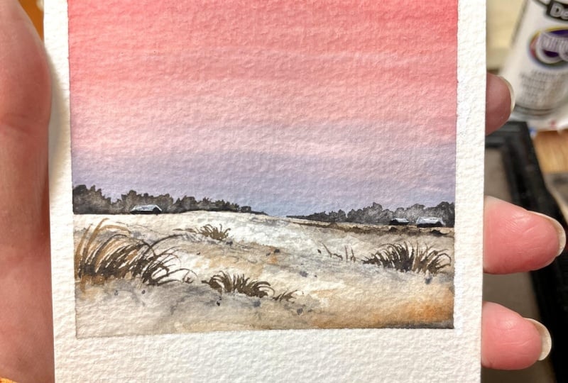
5. Day 02 - Pink Sunset: Hello, hello. Welcome back, and welcome to day two of painting soft and beautiful
winter landscapes. Here is our painting
for the day. We'll be working
with a very simple and minimal color palette, as well as simple details
for this painting. It's a really gorgeous and
a frameworthy painting. Okay, so let's start by
having a look at the colours. The sky is a combinihnaf, a basil pink and a basil gray. It's a clean blend
of these two colors. And then over here
towards the ground, have used a companiesed nav, brown and paints gray. So the color palette
is quite simple. We don't need a lot of
colors for this painting. If you don't have
pastel pink and pastel gray, that's
not a problem. You can easily create them. Now, these are the
colors I will be using. The pink is called
brilliant pink and then gray is called gray. These two are from a
brand called Shinhan. Now, I will swatch
out these colors so you get a better idea. I will start with the pink. So that is brilliant pink. It's a really beautiful pink. Next, I will show
you the gray I have. So pitil colors are
not really common. If you don't use them a lot, there is no need to buy them. You can just add some
white watercolor to any of your colors and turn
them into pencil colors. So this gray here
is quite light. I realized that while
I was painting, so I've just added some more
pink gray into the mix, and this is the color
I went in with. So yeah, that's what you can
do to create your own gray. Just pick some pinks grey, then add some white
watercolor into that. Then go with any kind of
tonal value you prefer, whether you want a lighter
tone or a darker tone, change the amount of white
according to what you prefer. Okay. Now, to create
your own pisel pink, you can go with any
kind of red or rose and then add some white watercolor
into any of these. Okay? So your pink will
depend on the pigment you're using and
also the quantity. A little difference
is totally fine. Okay. You can see
the color here. This one says PR 209 and PW six. PR is red pigment and
PW is white pigment, which clearly means
it's a combination of red pigment and
white pigment. Same goes with gray. PBK is pigment black, then PW six is pigment white. So it's a combination
of gray and white. Okay. Now, along
with these colors, you will also need some
brown or burn Sina. Then you will also
need some pains gray. All these colors are
from various brand. The pastel pink and pastel gray. They both are from Shinhan. Then my brown is
from art philosophy. Then the paints gray I'm using here is from a brand
called Rembrandt. So the brand doesn't
really matter. Go with the colors you have with you, which is
nearly similar. Alright, so the final color
you will need is pains gray. We'll be using this one to add the textures and the details. Okay, so that is our color
palette for the day. It's really simple and
minimal color palette. As I said earlier, if you
don't have a pisel pink, just add some white
watercolor into red or rose. Then you can add some white with pinscrey to create a pasil gray. And along with
that, you will also need some brown or bunsena. So, yeah, that's
our color palette. Keep the colors ready
on your palette, and let's give it a try. Alright, so my paper
is ready here. Now, I'm going to
start with the sketch. First, I will add a horizon line a little below the
center of the paper. Now I'm going to
add a few lines, some irregular lines to show the slope on
the snowy ground. When I'm adding here. Next, I'm going to add another
one over here. We'll be adding paint on the snowy ground,
following these lines. So wherever you want
to add some slope or some shadows, you
can add these lines. Okay, so that's a sketch. It is just about adding horizon line and some
irregular lines on the ground. We'll be adding some
grassy patterns and some plants
following these lines. Okay. So that's all
you need to add. Now I'm hoping you guys have the colors ready on your palette. We are going to start
with the ground. And for that, we are going with a mix of pink gray and brown. Okay. Now I'm starting by applying coda water
onto the ground. Then we will go with a
mix of paints gray and brown to add all the
shadows and the textures. Apply only even layer of water. Don't add a lot of water. If there's a lot of
water, the paint will start spreading everywhere, and you won't be able
to add those lines. Okay. So apply the water, and then you can run
your brush back and forth and make sure there is no much water on your paper,
and it's an even coat. Okay. So my background
is evenly wet. Now we can start
applying the paint. So just like I
mentioned, I'm going to go with a mix of
paints gray and brown. I'm taking my smaller
brush and I'm picking some paint screen
and mixing that with brown. That's the color I'm going with. It's more like burnt umber. The color should not be too
grayish or too brownish. It should be
something in between. I'm going to try
adding this color onto the background.
That's too grayish. There isn't any brown in it. So I'm going to add a bit
more brown into the mix, and also the paint is quite dark. So I'm adding
some more water. Okay, that looks
nice. So go with a mix of gray and brown. It can be slightly different. Those things are totally fine. Okay. Now I'm going to
add some paint over here, but it looks like my background
has almost dried up. I will just add this line. Then I think I will
quickly make it wet again. Otherwise, it is going
to be a difficult task. I will just quickly
add some water and I will smudge that
into the background. I'm adding some more water only on the top.
The bottom is wet. Now going back with
the mix of pins, gray and brown, adding them
again onto the background. So we have added some
lines on the background. I'm following those lines when
I'm adding these textures. We'll start with a light tone. Then gradually we will keep
on building the tonal values. Don't go the darker tone
and the force layer itself. So you can see here the color
I'm using is quite light. And I'm adding a combination of thicker and thinner lines
onto the background. Now I'm going to go
with a medium tone, and I'm doing the same thing, especially along the top line of these sections we have here. So to make it look natural, we have to play with
different tonal values. We have to see the lighter
tone, medium tones, and darker tones, and then
some darker textures as well. So I'm going to go
with the same mix. So this time, the mix is
a bit more pigmented. It is not as light as earlier. If it's too watery, dab
it on a paper towel. Now we can add some more
shapes onto the background. Earlier, it was more like lines. Now I'm going to go with more
random shapes than lines. Okay. So you can divide your snowy land into
different sections. And then according
to that, add in some lighter tones and
then some medium tones. These different
sections are really important to bring in a
depth in your painting. It will bring a
sense of distance. Maybe right now you
might not feel it, but as we add all the textures
and the deeper tones, you will slowly
start to feel it. Now I'm adding some medium
tones in the background. Maybe we can make it
a bit more darker. The color is not really visible. We're adding some lines here. Okay, so we have introduced
the medium tone. Next, I'm going to go with
one more tone darker, and I'm doing the same thing. You can see how it
is building up. Now you can see those
different tonal values of gray and brown
in the background. Along with that, you can
also see the paper white. So it's a combination
of all these different tonal values
and the paper white, which makes your snowy
ground look more snowy. Next, I'm going to go with
one more tone darker, and I'm going to add some
textures onto the background. Right now, the background
is not that wet. So when we add these
textures, it will stay there. It won't spread a
lot. Okay? So just go with a darker tone. If it's too watery, dab it on a paper towel and then introduce these textures
onto the background. The paper white is
also really important. Don't try to cover that
entire paper white. So yeah, along the top line of these different sections
we have created here, add some taco tones. It can be a combination of some torts and some small
lines and random shapes. Okay, try to go with
smaller shapes and sizes. Also take very little
paint on your brush. If you take a lot, you
will end up adding bigger and bolder patterns,
which we don't need. So try to go with
very little paint, and if you feel there's
a lot of paint, dab it on a paper towel, and then add these textures. So this is just the base layer. We'll be adding
more details like some grassy patterns and some small stones or when
everything has dried up. Okay. So right now, just play with these medium
tones and lighter tones. The rest of the details we can
add as we are progressing. Our only idea is to make it look more natural and realistic, more like a muddy texture. So in order to achieve that, we have to play with
different tonal values of grays and browns. And that's what we
have done here. We took quite a lot of
time to paint the ground, but I think it turned
out really nice. We can see all the textures
and tonal values there. Next, I'm going to apply
coda water onto entire sky, and then we can start
applying our colors. We already spoke
about the colors. We're going to go with a
combination of pink and gray. You can change the colors as you like. That's not a problem. Okay. Now, to apply the paint, I'm gonna go with a flat brush. This one is a half
inch flat brush, and I'm starting
with a pastel pink. I will apply that at the top. You can see how
beautiful this color is. It can be a bit more brighter or it can be a bit more lighter. So just got the tonal
value that you prefer. It doesn't need to
be exactly the same. It can also be a pastel orange. Even that will be a
beautiful color combination. I will add some more. So it's going to be a simple
gradient wash. I won't be adding any clouds or any other details
onto the sky. It's going to be a simple
sky. Okay, so that is pink. Now I'm going to clean my brush, and I'm going with gray. So I have a color called gray in my collection. I'll
be using that. If you don't have gray, you
can just mix some pinks gray and white watercolor
and create your own color. Again, the tonal value is totally according
to your choice. It can be lighter or
it can be a bit more darker. This one
is pretty light. So maybe once I have
done with the blend, I will make it a bit more
darker along the bottom line. You can see this one
is really light. I think I will just pick
some more pinks grey, the normal pinks gray and
I'm mixing that with gray, make it a little more darker. Okay, this one is far better. The one I used earlier
is really, really light. So maybe when the
colors dries up, it will be even more lighter. Now I'm going to
give it a blend. So just run your brush
back and forth only in one single direction and make
it the best blend possible. You have to do this while
your background is still wet and you can see the
gorge blend have got here. Now, I think I will add some
more gray at the bottom. It is still looking
really light to me. So for the same brush, I will
pick some more paints gray, and I'm going to add that
only along the horizon line. I think this will make my sky look a bit more interesting. Now, this is gorgeous. So I'm just adding that
along the bottom. Then I will blend that
with a background again. So, as I said
earlier, I don't want any clouds or any other
details on the sky. I want it to be a soft blend. But if you want to
add some streaks or some clouds,
you could do that. It's a gorgeous
color combination. So whether you add some clouds or whether you
leave it as it is, it is still going to
be really beautiful. Now, I have cleaned my brush, and I'm going to give
it a quick blend. Only at the bottom, I want
the gray to be a bit darker. The rest, I'm really happy. Again, I'm running
my brush only in one single direction,
and that's it. It's a beautiful blend.
Now, let that dry. In the meantime, we can start adding some textures
on the ground. To add the textures, I'm
using a smaller brush, and I'm going to go
with a darker tone. I'm using the same mix, mix of pinks gray and brown. And then once I've taken
paint on my brush, I'm dabbing that
on a paper towel, and I'm making sure the
paint is not really watery. I want some dry textures. Okay. Now with that, I'm adding some textures
wherever I have added these medium tones
in the background. So these textures doesn't
need to be like, perfect. It can be some small
textures and some lines. So keep on adding them where you have these medium
tones in your background. Okay, and don't overdo it. We only need a little
here and there, that's all, just to give
it a finished look. So these will look
like some stones or some things on the ground. Okay. Now, let's add that everywhere we have applied
these medium tones. Every time you pick the paint, make sure to dab it
on a paper towel so that the paint is really dry. Okay, now let's go ahead and
add some patterns over here. I'm adding that
along the top line. You can see a blurry line there where I have
applied the medium tone. So I'm following that line, and I'm adding some
random textures. So try to go with
smaller textures. If you use a bigger
brush, you will end up adding bigger and
bolder textures. So it's better to go the
smaller brush so you have a better control
on the sizing. Okay, let's add a few more. Then we will proceed
to the bottom part. It's a really simple
straightforward step, and you don't need to
put a lot of your word. That's the most interesting
part. You can simply go with a dry paint and add
stextures Wherever you like. Okay. Now I'm going to go with the bottom section,
picking more paint. Then I'm adding some
textures over here. So this is where I'm going to add some grass and plants later. So I want more textures here. I will also be adding
some stone like sheps. Okay. So those are the
textures I have added. I think I will pick
more paint and I will add some small stones
using paints gray. You can see the difference
those textures made. Earlier, it didn't have that
finished and polished look. Now everything's starting
to look more finished. Okay. Now I'm going to
pick some paints gray. And I'm going to add some small rocks and stones on the ground. This will make it even more
beautiful and realistic. So pick some paints gray
on your brush and simply add some teeny tiny patterns
like this. See that? So go with a combination of medium and small sizes.
Don't make it too pick. It can be a small tart, or it can be a shape which
is a little more spread out. Okay. Over here, I'm adding
some smaller stones. Now a bigger one there. Okay, so just go with some random shapes. Try to go the paint
which is not too watery. If you use a dry paint, you are automatically
introducing some texture. So it will look like there
is some snow on these rocks. The rocks can be a bit more bigger if you prefer that way. I will add a few more. Then I will go ahead with the grass. Okay, so that is it.
Those are the textures. Now I'm going to pick
some more pinks grey. Maybe we can go a mix
of brown and pink grey, let it be more brownish. And I'm going to add some grassy patterns
on this side first. So here, I'm going to
go with a bigger group. Then I'll be adding
one more next to this. Then I'm thinking of
adding another one along the top section. So
let's start with this. Now for this, you have to go
with a brush that has got a pointed tip so that you
can get those nice crispy, long lines and also add
a few drops of water. Otherwise, the lines will
look very dry and cracky. Okay, so go with a mix
of pinks gray and brown. Then keep on adding these lines. So I'm going to go with
a big cluster over here. Then right next to this,
I will add another one, maybe a smaller cluster. There's a lot of
gaps in between. I'm going to add in more lines, and I will make it more denser. Okay, so that's the first set. Now, I'm going to add
another one over here. I think I will go
with shorter lines, but you can compose your
painting however you like. If you want to go with a bigger group,
that's totally fine. So let me quickly finish this. Then we can go ahead
with the next set. Okay, so that's done.
Now the same brush, I'm going to add
some more stones and textures at the bottom. So these textures
and grassy patterns, they are totally up to you. If you feel you have a lot
already on your background, you don't need to add anymore, or if you want to
add few in between, you can go ahead and add
them wherever you like. You don't need to follow
the same spot and the same size and
same composition. Do that according
to your choice. Next, I'm going to add
some grassy pattern over here along
this top section. I'll make it a bit more smaller to bring in a sense of
distance in our painting. Okay, so let's do this. All right, so that's
done. We have added all the textos and
the grassy pattern. Next, I'm going to add
some landscape far away. And for that as well,
I'm going to go with a mix of paints
gray and brown, go with a darker tone, and we're going to go with really
small shapes here. So try to go with any
of your smaller brush. This is really important. If you make it
bigger, your painting will lose that
sense of distance. You won't be able to bring in that depth in your painting. So the size is really
important here. So add some super
tiny shapes here. So these are just
some rough shapes. It doesn't need to be perfect.
Here's a closer look. You can see the simple shapes. That's all you have to add. Okay. So that part
is done as well. Now we have to add
the horizon details. And for that, I'm going to go with a medium tone of pins gray. This one is darker tone, but along the horizon line, we're going to go
with a medium tone. So add few drops of
water into pins gray. And then, again, we are going
to go with a rough shape, but it's going to be a bit
more bigger than this. Okay. So let's add some
water into pains grey. And let's go with a medium tone. Now, I'm going to
start with this side. First, I will add a
line at the bottom. Then simply I will
add some shapes on the top to show those
landscape far away. Okay, so go with a
similar tonal value, or you can even make it lighter. Don't use a darker tone.
Keep that in mind. We'll be adding a few
tiny houses over here. So if you use a darker tone, the walls won't be visible. So try your best to go
with a medium tone, or you can make it
even more lighter. Okay, so that's the first set. Now in a similar
way, I'm going to add another set on the right, and then I'm going to
leave some gap in between. You can either make
it a continuous line or you can break
that into two sections. Both are okay. So you can make
it higher on the left end. Then towards the
center, you can make it a bit shorter. Okay. Now in a similar
way, I'm going to add another group
on the right side. I'll make it shorter
at the center. Then as I'm going away to the right side, I
will make it higher. Okay, so let's finish this off. Oh. All right, so that's
a landscape far away. Honestly, at this point, if you're happy
with your painting, you can stop it here
or you can just go ahead and add some
textures on the ground again. If you feel there isn't enough. There is some leftover
paint on my brush. So I thought of adding some
more textures on the ground. Ove is completely optional. If you feel like you have enough textures and
everything there, that's a good place to stop it. Okay. Now, next thing I'm
going to do is I'm going to add two or three houses far
away, super tiny houses. This step is also
completely optional. We already have some
plants far away. If that's enough for you,
you can stop it here or you can go ahead and add
some tiny cabins far away. That's going to be
the size. I think this sketch is not
going to be visible. So let's go with
a darker tone of pains gray to add the walls. It can be just pains
gray or it can be a dark brown mix of
brown and paint gray. You can go with any color that will be visible
in your background. Okay, so first I'm starting
by adding a rectangle. Then on the other
side, I will introduce the other wall with a
trancular shape on the top, then I will fill the rest. Okay. So that's the first house. I haven't added the roof. Now I will go with the second
one right next to that. Then maybe I will add one
more towards the left side. You can go with any number
of houses you like, but the size is really
important here. The number is not important. That's totally your
choice. The size has to be really small to bring in
that depth in your painting. Otherwise, you won't get
that sense of distance. Okay? So I've added
two on the right. Now I'm going to add
another one over here. Again, I'm starting
with the rectangle. Then I will finish
the other side. It's a very simple basic house. These are super far, so
you don't need to show the doors or the windows
or any other details. Just that plain wall
is all we need. Okay, so those are the houses. Next, I'm going to
clean my brush, and I'm going with
some white gouache. It can be white gouache
or white watercolor. Just go the paint
that is kind of opaque. Don't add much water. So I'm taking out a
little of white gouache. Then we are simply going to add the roof using this white paint. As I said, it can be white
gouache or white watercolor. Go with the paint that
is slightly opaque. Okay. Now, let's
simply add the roof, and that will be the last
step in this painting. Try to go with a smaller
brush as this is far away, and using a bigger brush, you might not really
have a control. It will end up being big. Okay, so go a smaller brush
or a detailing brush. So that's the first roof.
Okay. Now in a similar way, I'm going to add roof onto the other two
houses I have here. The second house is
facing the other way, and it's a bit more smaller. So these kind of
little things will add realistic touch
to your painting. Okay. Now I'm going to
go with the last one. The size and orientation is
similar to the first one. Alright. So those are our
tiny houses far away. I think the last two houses, the roof isn't really visible. So I'm just adding
some more paint. I'm just going to
override it with a bit more paint to
make it more visible. And that's the last
step. Over that, we'll be done with our
painting for day two. If you want to add one
or two extra houses, you could do that. I think these are
really nice and cute. Alright, so that is it.
That's our painting. Now it's time to peel
off the masking tape. So here is our
painting for the day. I cannot tell you
how much I love those houses and the sky. It's a beautiful
colour combination. It is simple, as well. So yeah, if you haven't tried it
yet, do give it a try. I'll let me know if
you liked it. Oh
6. Day 03 - Misty Lake: Hello, dear friends.
Welcome back. Today we are on day three of painting soft and dreamy
winter landscapes, and here is our gorgeous
painting for the day. It's a really simple
misty painting. Now, as usual, I will
start with the colors. Looking at the painting itself, you can see it's
all about blues. So the first blue I'm going
to use is ultramarine blue. I'll go with the light tone. I'll be using that
for the snowy ground, as well as for the sky. So this one is a lighter
of ultramarine blue. I have only added some water. Now, I'm going to
try scratching out the same color by adding some
white particular into it. Okay. So this one has a
more pastel character. And that's a color I'll
be using for the sky. You can go with
any of these two. You can just add water, or you can also add a bit
of white watercolor. Okay, so that's the first
color you will need. Now, along with
that, the next color you will need is indigo. We'll be using indigo to add those trees in the background
and also for the leak. Okay? If you want to use indigo for the sky,
that's totally fine. You don't need to use
ultramarine blue. You can just go with indigo. So it will be just one blue. Alright. Now there's one
more color you will need. Why is paints gray.
We'll be using this one to add all the
textures and the deeper tones. Okay, so those are the colors you will
need for this painting. Along with these,
you will also need a little white gouache
or white watercolor. You can see that horizon line and also some
highlights on the leak. So to add those little details, you will need some white
gouache or white watercolor. So yeah, along with the
blue and pink screen, you will also need some white gouache or white watercolor. I'll be using guache,
but let me tell you, white watclo will also work. Okay, so keep all the colors ready, and let's give it a try. Alright, so I'm hoping you have the colors ready
on your palette. Now let's start with the sketch. I will first add
the horizon line. A very light line. Okay? This one is
almost at the center. You can place it a bit more higher or lower.
That's totally fine. Okay. Next, I'm going
to add a line at the bottom to separate the
snowy ground and the lake. A simple irregular line. Okay. Maybe you can add some rocks as well to make it more beautiful. Maybe like three
or four of them. You can go with any shape
and sizes that you prefer. I will add one more on the top. Then maybe another one here. So go in different
shapes and sizes. This will make it extra pretty.
Okay, so that's a sketch. Now, the first thing
we're going to paint is a snowy ground. And for that, I'm gonna
go with ultramarine blue. We'll make the
bottom section wet. Then we'll apply a light one of ultramarine blue to show all
the shadows and textures. Same goes with the rocks.
Okay, so let's start. I'm starting by applying a
coat of water on the ground. Okay, a nice gentle
coat of water. Don't add a lot. Okay, now I'm going to go with
my small ron trash, and I'm going with a light
tone of ultramarine blue. And I'm just adding that
in a very random way onto this wet background
to show all the shadows. Okay, make sure to
go with a light tone or a medium tone or just not too watery and simply add some lines and shapes
onto this wet background. So go the similar tonal value. Don't make it too
dark. So wherever you feel like you can drop
in some paint like this. We have these little
sections here, so I'm adding some paint onto all those corners and grooves. Okay. Don't add a lot and
cover the entire paper white. So the snow is the paper white, and then we are just
adding some shadows and textures using a
light tone of blue. So we need these blue tones as well as the color
of your paper. Okay, so that's a ground. Next, I'm going to paint
the rocks in a similar way. If you want to add some
more blue in between, you could do that. As the background is still wet, maybe we can drop a little more some random
shapes and textures. And if it's too much, pick
some water and smudge it off. Okay, so that's a snowy ground. Now let's paint the rock. And for that as well, I'm
starting with a little water. Just a little. Then only along the top part, I'm adding some blue. Okay. For this one, later we'll be
adding some black, not black, paints
gray at the bottom. So we just need some shadow
on the top, and that's it. So those are the rocks
and the snowy ground. Maybe a little bit of blue
can be applied on the top, because, you know,
with watercolor, when it dries, it tends
to fade a little. So if you use a
really light tone, nothing will be there
when everything dries. Alright, so that's the
snowy ground and the rocks. Now let the dry, and after that, we can paint the
sky and the lake. Alright, so that is
completely dried. Now we can paint the
sky and the lake. We're going to paint
everything together. Okay. So we'll start by applying a coat of water onto
the entire area. Be a bit careful when you're applying water around the rocks. Maybe you can skip that part. As you're applying
the paint, we'll take our brush around the rocks. So you don't really need
to apply water that area. Okay, so I'm skipping
that bottom part and I have applied water
onto the rest of the area. Next, for the sky, I'm going to go with
a light tone of blue. I want a nice pastel icy blue. So I have some white
watercolor on my palette. I'm mixing that with
ultramarine blue. And that's the color I'm
going to use for the sky. If you want to use
your blue aceds, you can just add water
and go with a light tone. So this one is more
like a pastel blue. I have added some
white watercolor. That's completely optional. Okay? So that's the
color I'm going with. Instead of ultramarine blue, you can use any other
blue. All right. Next I'm making it a bit more darker as I'm coming
towards the horizon line. Okay, so you can see a
light tone on the top. Then it's a bit darker
towards the horizon line. I think the blue can be a little more darker towards
a horizon line. So I'm just adding more
blue into the mix. Okay. And I'm adding
that over here. So we're going to continue
the same color into the lake. And as we are
reaching the ground, I will add more indigo. Okay. So that's how the
sky has turned out. Now, I'm gonna clean my brush, and I'm dabbing that
on a paper towel, and I'm making
this part lighter. So the part where the sky
and the lake is mating, I want this part to be lighter. Okay. Now, I'm going to
continue with the same color, leaving a tiny gap in between, I'm adding that color again. Next, I'm picking some indigo. Now for the rest of the
area, I will add indigo. Then I will blend that with
the blue we have on the top. Okay? The brush I'm using
here is size number eight. If you want to go
with a smaller brush, you could do that. So carefully apply that along the shape of the
ground as well as the rocks. Okay, you can see
the tonal value I'm going with.
It's pretty dark. So carefully apply your indigo. Then roughly just march
or blend both the colors. Okay, so that's how the
background has turned out. You can see it's not
a perfect blend, and that's totally fine. You can add some lines as well to make it look
like the water. Okay, so that's how
it has turned out. Next, I'm going to add
the horizon details, and for that, I'm adding a little of pinks
gray into this mix. So I'm starting
with a light tone. We're going to add
that as two sections. So on the left side, I will
go with a lighter tone. If your paint is watery,
dab it on a paper towel. We don't want this to
spread a lot. Okay. So using that color, I'm adding some shapes
on the left side. I will add this until
the center of the paper. See that? We can make it a
bit more bigger, I guess. Alright, so that's a left side. Now on the other side, I'm
using a slightly daco tone. So I'm adding some more intco
and I'm making it daker. Now with that color, I'm adding a similar shape on
the right side. So by playing in
different tonal values, we are trying to
make it look like the landscape on the
left side is quite far, whereas this one is much closer as we are
using a taco tone. Now, I think I will go
with a smaller brush, and I'm just adding
some shapes on the top. With a smaller brush,
you have better control. So just add some lines
and some shapes on the top to make it look
like there are some trees. Okay, so you can
see the difference. On the left, we have
a lighter tone. Then on the right, we
have a darker tone. Now, I'm going to
clean my brush. And I'm dabbing that
on a paper towel. So this one is a
clean dry brush. Now, you can see here how
the paint is spreading. To stop that, I'm pushing
the paint back and forth, using a dry brush, and you can see the way
how it has turned out. Now the paint is
not spreading much. There is one more
thing which you can do or it is picking
up some paint. See that? So just run
your clean dry brush along the horizon line and
pick some paint from there. So you have a nice blurry
horizon line there. Okay. Now, before this
completely dries, we need to add some more
indigo at the bottom. It is more like the
shadows and reflection. So go with any of
your smaller brush and pick a darker
tone of indigo. Then add that
underneath the rocks, more like some lines. Okay, we are trying to
show the water movement as well as the reflections. So just add a few lines,
especially at the bottom. Now, I'm picking some water and I'm making the paint a bit lighter and I'm adding a few more lines to
put some metal part. Okay. Now, make it a bit more
lighter and then add a few lines onto the top
closer to the horizon line. The lines are too bold, I think I will go with
my smaller brush. Actually, the bottom part
had almost dried up, but this part is a bit wet. So you can see here we have some light lines closer
to the horizon line. Then towards the bottom, we
have made it more darker. Now, I think we can go with a lot more darker
tone and we can add some more shadows only
underneath the rocks. The rest is looking
very beautiful. So with the same brush,
I'm going to pick some more inticoO maybe
let's pick Pains gray. I think pain's gray is better
so that it is more darker. Now, underneath the rocks, I'm just adding a few lines. Just a few, don't add a lot. Okay. Now for this one, Alright, so those
are the reflection. I'm really loving that misty atmosphere we have created here. Now, we need to add some
textures onto snowy ground, as well as onto the rocks. But before that, I'm going to go with some white quash paint, and I will add a line
along the horizon line. It can be white gouache or white watercolor.
Both will work. We only need a little paint and go with any of
your smaller brush. So pick some paint
on your brush, and we're going to
add a broken line, a subtle broken line
along the horizon. It should not be too prominent and it should not be
too bold and thick. Okay, so just add a simple
line like this along the horizon to define it. Also, we can make it look like
there is some snow there. We're just showing that
snowy ground far away. Okay. So that is it. If it's too much,
maybe you can go with some water and then
spread it a bit. It's far away, so we
don't want to use that creamy white bold opiu paint. It can be a little lighter
to bring in a soft effect. Okay. Does it look too soft? I think I will add
some more white paint. It is not really visible. So I'm just adding
a little more. Okay, so that's a horizon line. Next, we're going to
add some textures onto the ground and the rock. And for that, we'll have
to clean up our brush, and we have to go towards
some paints gray. So I'm just going
to clean my brush. Then I'm picking a darker
tone of paints gray. Once you have taken the
paint on your brush, dab it on a paper towel, and then make your
paint kind of dry. We need to add
some dry textures. I'm starting with the rocks, and I'm adding some textures along the bottom
part of the rock. It's a really small area, so it's good to go
with a smaller brush and add your dakotns
along the bottom line. So we're trying to show it's a black rock and there is
some snow covered on it. That is what we're trying
to show here by doing this. Okay, so only along the bottom, you can add some dry textures using a Darko tune
of paint's gray. The rest can't stay as it is. So on the top, we
have some snow. And at the bottom, we
have the rocky texture. See that? Similarly, I'm going to add some textures onto the
other rocks asphalt. It's a very simple task. The only thing you
have to make sure is that you're
using a dry paint. If you feel your
paint is watery, dab it on a paper towel, and then go with a
dark tone of paints gray and then add these
textures as simple as that. Okay. If you use a smaller brush, you have a better control, and those textures will
stay inside the rock. If you use a bigger brush, it will be very difficult to control the shape
and the spread. Okay, so go with
a smaller brush. Now we have one more left. On the top, we still
have the snow, and at the bottom, we
have these textures. Now we can see how three
dimensional they look. Earlier, they were
looking very flat. Now it is looking like
they are real rocks. I add a little more. Okay.
So those are the rocks. Now we need to add some
patterns on the ground as well. This one can be super random. You can add some textures
wherever you like. I will start with
this corner here. So on this part, I'm going
to add some textures. I just the same way how
I did for the rocks. Then in a very random way, I will add some textures
here and there. Okay, so let's do this. You can see the instant
difference to textures made. Now, everything is starting
to look more complete. Earlier, everything was
quite flat and lifeless. But now the entire
thing has changed. It looks a lot beautiful
and with full of life. So yeah, some steps may
seem very small and silly, but it has a great
impact on your painting. You can definitely
see the result here, especially on the rocks. With the textures, it looks
more three d. Earlier, it was like a flat
white base on the lake. Okay, so those are the textures. If you want to add
some grassy texture or some rocks on the
ground, you could do that. I think I'm going to
leave it the way it is. Now, we have one
more thing to do. So for that, I'm
cleaning my brush, and I'm switching back
to white quash paint. We're going to add
some small shapes and lines on the water
to show the snow. Okay, so I have taken some white paint on my smaller brush. And I'm going to add some
dots and some small lines. So that's the size
I'm going with. They're not too big. Okay. This will again
give our painting a finished and polished look. So just add a few lines
and some small dots. Don't overdo it. We
don't need a lot. It's just a few here and there. I will add one line here. And I think that's all we need. This one turned out
really beautiful. Actually, much beautiful
than I imagined. Anyway, that's our
painting for the day. Now it's time to peel
off the masking tape. And here's the
finished painting. You can see how beautiful all the details have turned out. It was a really quick painting. We've finished this one
in less than 20 minutes. So you know what to do. If you haven't tried it yet, do give it a try and let
me know if you liked it.
7. Day 04 - Dreamy Sunset: Hello, friends.
Welcome to day four of painting beautiful
winter landscapes. So here is our
painting for the day. It's a multi colored
sunset sky and a lake. Okay, so without
wasting any time, let's start by having a look
at the colors we will need. For this car just dreamy
winter landscape. I used three colours
for the sky. You can see a blue
here, then some pink, and then some orange
at the bottom. So those are the three colours
I'll be using for the sky. Same for the lake Asper. Okay, so the blue I have
used here is bright blue. Then I have also
used a little of indigo on the top to
make it more dark. You can go with Prussian blue, ultramarine blue, or any
blue of your choice. This one is bright blue
from white knights. Now the next color you
will need is indigo. We'll be using that on the top, and also for the snowy ground,
as well as for the lake. Okay, so that's
our second color. The next one is pink and orange. We'll be using pink and orange along with these
two for the sky. I will be using a pasil pink. If you don't have pasil pink, you can use a light
tone of rose, or you can just add
some white into rose and turn that
into pasil rose. Okay, so that's a
color I'll be using. Now, the last color you'll
need for the sky is orange. We'll be using that along the horizon line to make
the color more bright. Okay. So we'll just add
some pink with orange, and that's what we're going to use along the horizon line. I won't be using orange acets. I'll be going for a mix
of pink and orange. It's a very beautiful color, especially to use
in your sense sky. So that's the color
I'll be going with. Okay. So those are the colors
you will need for the sky. We'll be using the
same for the lake. Now, coming to the
last color you will need, which is paints gray. We'll be adding all the
textures, the tree, and all the horizon
details using paints gray. So that's the last color you
will need for this painting. And along with this,
you will also need a white gouache or
white watercolor. We will be adding some snowy
texture onto the tree, and for that, you will
need some white gouache. Okay, so that's
all the colors you will need for this
gorgeous sunset. Now keep all the colors
ready, and let's get a dry. Alright, so I have
my paper ready here. Now, we're going to
start with the sketch. So first, we have to
add a horizon line, which is a bit below the
center of the paper. Now, I'm going to add
an irregular line in the middle on either side. Okay, so the top part
is a snowy ground. Then what we have in
the middle is a river. So there's a first
line on the top. You can go with any
shape. It doesn't need to be exactly like this. Now below that, I will
add another line. Okay. So what we have in
the middle is a river, then we have a snowy
land on either side. Alright. Now, as we're painting, we will be adding one or two
trees on the right side. I'm not going to add the sketch. I think we can do that
as you're painting. Okay, so that is it.
Now we can start by applying a coat of
water onto the ground. So we have a section on
the top and the bottom. I'm applying a clean coat of water onto both the sections. Using my round trash. Okay, so just apply some water. Now I'm going to go with a medium tone of
alta Marine blue, and I'm going to add
that along the bottom. Okay, so go the medium tone. We're painting an evening scene, so the colors can be a bit dark. It doesn't need to be too light. Okay, so along the bottom line, add in this medium tone to show all the
shadows and textures. See that? So simply add some lines and some
paint along the bottom. It doesn't need to be perfect. When it dries, it will
leave a beautiful texture. Okay? So along the bottom, add in that medium tone. Now, the same I'm going
to do on the other side. Okay. We can add more textures and more
deeper tones later. We'll be using paint screen
to add all the textures. We'll add some dried textures
when this has dried. For now, simply apply
a medium tone of ultramarine blue or
ItikoOt wet layer. Okay, so that's a ground. If you want to add
some more paint along the bottom,
you could do that. If you want to add some more
paint or some more texture, you could do that as the
background is still wet. Okay, so that is it. Now we can go with the sky. So I'm starting by
applying a coat of water onto the entire sky. We already spoke
about the color, so I'm hoping you guys have
it ready on your palette. Once you have it ready, apply a nice tingle coat of
water onto the sky. The ground part hasn't
dried completely. So when I'm applying the water, I will make sure I will leave a tiny cap in between. Okay? By the time we apply the paint
and we reach the bottom, I hope that part would have
been tried completely. Okay. So I have applied a
at of water onto the sky. Now, the first
color I'm going to start with is this bright blue. You can go Prussian blue or any other blue you have caught. This one is a really bold and bright blue, just
like the name says. Okay. Now I'm going to apply that on the
top part of the sky. Then gradually I will switch to pink and then some orange. Okay. So that's a blue I'm using. I think it can be
a bit more bolder. I have two similar kind
of blue on my palette. I'm not really sure which
one is bright blue. So yeah, it doesn't
matter. You can go with any bright and bold
blue you have got. It can be Prussian
blue, ultramarine blue, or any other blue,
even indigo will work. I think the color
is pretty light, so I'm just going to
pick a lot of indigo, and I will apply
that on the top. Okay, so we just
want the blue to be quite dark as it's
an evening sky. So just go prussian blue or indigo and apply
that onto your sky. Now it's time to
clean your brush and go with the second color. W is patel pink. My brush had quite
a lot of blue, so I cleaned it again and
I'm going to pick pink. This one is more
clean. Earlier, it was looking more like violet. Okay, now, I'm going to
blend these two together. So we have a bold
blue on the top, then some pink at the bottom. Now I'm going to clean my brush again because there is
a lot of blue on it. Now picking pink, adding that again onto the
wet background. Now we can go with orange. So with the same brush,
I'm picking some orange. And I'm going to add that
along the horizon line. So whenever you're
painting an evening sky, it's good to use some bright and bold colors around
the horizon line. It will make your sunset look more beautiful and realistic. Okay. So with the same brush, you can pick some orange and apply that along
the horizon line. If you want to
make it more bold, you can even apply
a little of red. Okay. So that's a base layer. Next, I'm going to add
some clouds using blue. So go with any of
your smaller brush and go with some indigo
or any blue you prefer. Now, add a few lines onto the sky right where the
pink and blue is minting. If there's a lot of
paint, dab it on a paper towel and add in
a few lines onto the sky. I'm not going to make
it too dramatic. I want some soft cloud, so I won't be picking
any more paint. I'm just trying to make use
of the leftover paint on my brush. See that? There are some soft clouds. It is not too dramatic or too
bold. Go in a similar way. Okay, so that the sky. Now,
before I leave it for drying, I'm going to add some
horizon details. And for that, I'm
going to go with a mix of brown and pains gray. For this, we need a dark brown, so make some burn
cena or brown with a bit of pains gray and
create a darker brown. And then simply add a shape
along the horizon line. Okay, I'm not going
to make it too big. Maybe on one side, I
will make it higher. Then towards the center,
I will make it shorter, just to create a sense
of distance and depth. Okay. So add a line
using that dark brown, then onto the top, simply introduce some shapes like this. Okay, so that's a
landscape far away. Next, we can paint the lake. But maybe before
that, we can add some textures onto
the snowy ground and then go to the lake. Okay? So for that, I'm going
to go back with indico, and I will just add
some dry textures. So pick some paint
on your brush, then dab it on a paper towel. We just need some dry textures. So if you feel your
paint is still wet, dab it on a paper
towel, I and I can. Then add some dry textures
along the bottom line. Okay. So with that dry paint, simply add some patterns and
textures along the bottom. These textures will give
it a polished look as well as it will look like there's some
thickness for that. Okay. So this is a very important step whenever you're painting a snowy ground. First, you need to add the
shadows using a medium tone. It could be indigo
or ultramarine blue, depending on the mod
of your painting. If it's a daytime, you can
just go with ultramarine blue. If it's evening or night, it's good to go with
indigo or any darker blue. Then add these textures. Okay. Now I'm going to do the same thing for the
other part of the land. Honestly, I'm not really very happy with the snowy ground. I feel the colors
are quite light. I should have gone with a much
more darker tune, I feel. It doesn't look like
those evening colors. I should have been
a bit more darker. Anyway, I will go with the lek, and then maybe we can apply some more paint onto the ground. So I'm going to go
with some pink first, and I'm adding that
onto the center. Then onto the top, I will
have to add some orange. Then towards the bottom, I will have to go
with a darker blue. So first, I'm starting
with some pink, and I'm applying that
onto the center. I mean the center
part of the lake. Okay, now with the same brush, I will pick some orange, and I will add
that onto the top. So we have to use the same
colors we use for the sky. It's just going to
be a mirror image. So on the top over here, you have to add some orange. Then at the center,
we need some pink. Then towards the bottom,
we have to go with blue. I will add some more pink, then I will go with blue. Okay. For the lake, I think I will just use indigo. I'm not going to go
with the bright blue because I want the
color to be quite dark. Okay, so I'm taking some
indigo on my brush, and I'm adding that
along the bottom. You can see the color.
It's quite dark. I'm adding that
along the outline. Then gradually I will
plent that with pink. It doesn't need to
be a clean blend, smudge the paint
into each other. Okay. We can have some lines on the water.
That's totally fine. Okay. So gently
smudge the paint into each other without
putting a lot of effort. Just like I mentioned earlier, it doesn't need to be a
clean, perfect blend. Along with that, you can
add some shadows and reflection along
the bottom line. Okay? It's a really small, narrow river, and the major
part we have used blue. Only on the top, we have a
little of orange and pink. Try to make them
stay. Don't cover the entire pink and orange. Be careful when you're adding
the shadows and reflection. Okay. Now, I'm adding that along the bottom
of the snowy ground. This is what makes
it more realistic. Now, let's add some lines as well to show the water movement. So there's a lot of
paint on your brush, dab it on a paper towel and simply add some lines
mostly towards the bottom. Let's not disturb
the pink and orange. Okay, so dab it
on a paper towel. Don't forget about
that. Especially if there's a lot of
paint on your brush. On the top, we don't
need the reflections to be too strong. Go
with a lighter tone. But at the bottom, we can
add some more taco tones. So I'm going to go
back with indigo, and I'm adding some at the bottom to make it
more dark and intense. Along with that, I'm
adding some lines as well. We don't need a lot of lines on the top. Focus on the bottom. Okay, so just go the
Darko tone of intigo or any other bloom and simply add some lines along the bottom line and
also a few in between. These lines are
really important to show the water movement
and reflection. Otherwise, your lake will
look very plain and pouring. Okay, so just add a few
lines at the bottom. And that's it. So that's a leak. Now we'll have to
wait for this to dry. Our next step is to add some more textures
and then the tree, but I feel like the snowy
ground is very light. The color could have been a bit more darker. That's what I feel. So what I'm going to
do is, I will apply another coat of water on
top of the snowy ground. Then I will introduce
some more blue. So that's the next thing
I'm going to do which is completely optional if you're happy with your snowy ground, and if you feel the
colour is good enough, you don't need to
add any extra blue. Okay, so I'm just
adding a coater water. And then I'm going
to go with some in ticom more like a medium tone. Then I'm going to add that
along the bottom parts. Just the same way
how I did earlier, but this time the color is a bit more darker. That's
only different. Earlier also, I
used a medium tone, but when it dried up,
it became quite light. So I'm just adding a medium tone along the shape at the bottom. Then I will spread it
out using some water. Okay, so that's a turnal
value I'm going with. It is not too light and
it is not too dark. And I'm adding that along the shape we have at the bottom. Similarly, I will do the same thing on the
other side as well. Only because I felt the
color is quite light. You can still see
that fresh white. I mean, the paper white. As we're painting
an evening scene, the colors should be a
bit more dull and dark. That's the only reason
why I'm doing this. But if you're happy
with your painting, you can totally skip this step. Now I'm spreading it out.
You can see the difference, the top part, the one
I'm painting right now, it is looking much better than the one at
the bottom I feel. The bottom one is really white. Okay. So I'm just adding
some more blue over here. Then I will do the same thing on the other section we
have at the bottom. Okay, so this side is done. Similarly, I'm
going to apply coat of water onto the other section. Then I will add some intigo onto that wet layer, and
then I will smudge it. Okay, so I have made it wet. Now I'm going to go
with some intigo. Now I'm going to add that along the bottom sheet and
with some water, I will gently smudge it. Okay, so that's done. Now, let's leave it for drying. Next, we're going to add some
textures onto the ground. And for that, I'm going
to go with pink gray. Okay, so once you've taken
the paint on your brush, dab it on a paper towel. We need the paint
that is kind of dry. Okay, now simply
add some textures. I'm adding them over here first because that's a place where
I'm going to add the tree. And for the same reason, I'm going to add some
extra textures here. For the rest, I'm just adding a few along the bottom line. Okay. It's only on the top where I'm
going to add the tree, I'm going to add
some extra textures. The rest is just a little. Okay, so pick enough of
pinks grey on your brush. Once you have taken the paint, dab it on a paper towel and
make sure it is not too wet. Then just add these patterns. So first focus on
the bottom line along that shape of
the snowy ground. Then you can add a
few here and there. Okay, so let's finish this. All right, so we
have the textures, and you can see the
difference they made. Now everything look
complete and polished. Alright. Now the next task
we have is to add the tree, and I'm going to add
that on the right side. You can place it
wherever you like. And for that as well, I'm
going to go with pain screen. To add the tree, I'm going to
go with the smaller brush. This one is size umber two, and I'm picking
some pain screen. First, I will add a tree trunk. Then onto that, I will
add some branches. So you can go with any
shape that you prefer. You can add your branches
however you like. So first, decide on a place where you
want your tree to be. So this is where I'm
going to add my tree, and I'm starting
from the bottom. Then I'm going to
take it till the top. Okay. So first add
your tree trunk. The textures we have added over here is covering the root part, and that's why I told you wherever you're adding the tree, add some extra textures. Okay. So the tree that I'm
adding here is kind of thin. It is not a super huge tree. But you don't need
to follow the same. You can add your tree
however you like. It can be a huge thicker tree, or it can be a similar one. Alright? So let's quickly finish the tree trunk and
start adding the branches. Okay, so the tree
trunk is ready. Now we can add the branches. You can add them
wherever you like. Add them in a nice
organic sheave so that it will
look more natural. Okay. First, we will add
the thicker branches, and then we can add
some thinner ones. I have added a few branches, but the tree is looking quite empty, so we have to add more. Okay, so wherever you want to
add them, you can add them. It doesn't need to
be the same as mine. So add some thicker
branches first, then go within
your thinner brush and add some thinner branches. O Alright, so that's how it has turned out. I think there is lots
of gaps in between. So wherever I feel
there's a lot of gap, I will simply add some
thinner branches. Okay, and with that, we'll
be done with the tree. Then after that, we can add some snowy texture
onto the tree. Now, I have some leftover
paint on my brush, so I'm just going to dab
that on a paper towel and I will add some more
texture along the bottom. This is completely optional. If you already have
enough texture, you don't need to add any. Only because I have some
leftover paint on my brush. I'm doing this. Okay. I will add a few on the
other side as well. And then we can add the
snow textures using some white paint.
Okay, so that is it. Now, clean your
brush properly and go with white gouache
or white watercolor. I'm going to use
some white gouache. So squeeze out a bit of paint onto your palette. We
only need a little. We're not going to
add a lot of snow, only a little onto the branches and also onto the tree trunk. And for this step, go with
any of your smaller brush. So first, I'm going to add that onto the tree
towards the bottom. Okay, so just add
an irregular shape onto one side of the tree. I'm adding that onto the left. Then along with that, I
will also add some texture. Then a few onto these branches. So wherever you have
these tiny pockets, you can add some
thicker white paint. Then onto the branches, you can add a thin
line in a broken way. It doesn't need
to be too opaque. Similarly, I'm going to add
snow onto all these branches. So first I'm focusing
on all these pockets. Then I will add a thin line onto the branches along the top. Mm. You can also add a few lines on the tree just to show the snowy textures. Just a few dry lines.
And that's it. So that's how our
painting has turned out. Now, if you have missed
any of the branches, you can add some snow onto them. Okay, so that's our
painting for the day. I hope you all enjoyed it. Now it's time to peel
off the masking tape. And here is the
finished painting. It's a beautiful
color combinations, and I just love the way the snowy ground and the
lake has turned out. Tree is not really my favorites. Anyway, if you
haven't tried it yet, do give it a try and let me
know your thoughts about it.
8. Day 05 - Soft Sunset: Welcome to Day five of painting Soft and Dreamy
winter landscapes, and here is a Dreamy
Sunset for the day. It's a very simple
and minimal painting, which you can finish in
less than 20 minutes. The color palette is
also quite simple. We need a gray and a
yellowish orange for the sky. If you have gray, you
can use it as it is, or you can just make
some paints gray and white together and use
that colour for the sky. I'll just show you
the gray I have. It is a really
light tonal value, so I won't be using it as it is. This is the I have got. You can see the color. It
is quite light. So what I'm going to
do is I will just add a bit of paint gray into the scene, and I'll
be using that. Okay. So this one is a gray, a bit more darker gray, which obviously better
than the first one. Now for the sky, I'll also be adding a little
of brown to this. Okay. So create a gray and then add a little of brown. You
can see the difference. The first one is light gray, then a darker gray,
and a brownish gray. So that's a color we'll
need for the sky. We'll be using this
color for the sky, and along with that, we will also need a
yellowish orange. And that's a color you see
here, cadmium yellow orange. So you just need a
yellowish orange. So we have a gray on the top, then some yellowish orange. And at the center, we have
made the color lighter. Then towards the bottom,
we'll use a brighter tone. Then for these trees,
we will go with a mix of brown and pink gray. And even for the ground, we'll be using a li
tunal value of the same. We will also need
a bright orange to add around these rays. So that's the color
you see here. This one is brilliant orange. You can also use scarlet. Okay, so that summarize all
the colors you will need. Ob is a pasel gray, and then some brown, yellowish orange and
a bright orange. Then you will need some
brown and pink grey. Okay, so that summarize all
the colors you will need. Keep them ready, and
let's give it a try. Alright, so let's start
with this sketch. The first thing I'm going
to add is a horizon line. Then I'm going to add another irregular line a
little below that, just to show some
separation in the ground. So the other side is
in the background. The one you see here
is in the foreground. Okay. Next, I'm going
to add a fence. So first, I will
add a bigger one. I mean, a taller one over here. Then I will add some
shorter ones next to that. It is not really shorter. It
is nearly the same height, but to show that perspective
and sense of distance, you have to make it shorter
as it's going away from you. Okay. I'm just going to
go with three or four. Maybe three is good.
Or let's go with four. I'm going to add a
shorter one here. Okay, so that's a fence. Now, as you painting,
we can add the strings. For now, this all we need. Now, as you painting,
we'll also be adding a landscape here along
the horizon line, which you don't need
to add the sketch. Okay. So that's a sketch. Now we can start painting. I'm hoping you guys have the colors ready
on your palette. Once you have them
ready, start by applying a coat of water
onto the anterior sky. We are starting
with the sky, then we will paint the snowy ground. Okay? So to begin with, I'm applying a clean coat of water onto the anterior paper. We're going to paint the sky and the snowy ground together. So apply a nice general coat.
Don't add a lot of water. We only need a shiny coat. So make it evenly wet. Okay, so the paper
is evenly wet. Now, I'm going to
go with my rounfh a medium sized Runfish. And the color first
I'm going to go with is a mix up gray
and a bit of brown. I have some gray on
my palette already, and I'm going to take
a little of that. And then a little brown. So I want a brownish gray
kind of a color for the sky. It can be a bit different.
That's totally fine. Okay, so that's the color
I'm going with on the top. Alright. Next, I'm going
to go with orange. I'm cleaning my brush, and
I'm picking some orange. This one is a yellowish orange. I'm so sorry my phone got
switched off in between. Anyway, I'm going to continue
with some yellowish orange, and I'm adding that onto
the wet background. So we have a gray on the top, then some yellowish orange. Now, I'm going to
leave some gap at the center just to
create a glowing sun. I will just leave
out that space, and then I will continue
with the yellowish orange. Okay, I'm picking more paint, adding that on either side, while leaving some
gap at the center. See that? So that's
your paper white. Try to leave a little gap at the center to show
the glowing sun. Now towards the bottom, you can make your color
more rich and more intense. Only if you make that orange more intense around
the horizon line, the glow will be more
brighter and more beautiful. Okay, now, I'm going to pick
a little of gray again, and I'm going to add
that onto the top. There is some bleed
on the top corner. I'm covering that up. Maybe we can also add some
strokes onto the sky. This is not really necessary. Only if you want to,
you can add them. Otherwise, just
leave it as it is. Okay, so that's the sky. A
little more gray, maybe. Okay, now that's really the sky. I'm not going to touch it again. Next, I'm going to
clean my brush, and I'm dabbing that
on a paper towel. Then I'm picking a little
of yellowish orange again, just a little, and I'm going to add a few
lines onto the ground, just to show the
reflection on the ground. So I'm just adding a few lines. Leaving some white
gap in between, don't cover the entire
area. Okay, so that is it. Now I'm going to
go back with gray. The same color I
use for the sky, and I'm adding some
lines on the ground. If you want to make it more
darker, you could do that. So simply add some lines and
some shapes onto the ground. We have added a shape
there. Maybe you can follow that line and then add some
irregular shapes and some lines onto the ground, while the background
is still wet. Okay, so go with the
color similar to this. It's a mix of paints
gray and brown. Start with a similar
tone and value. Don't make it too dark
in the beginning. We can gradually
add more textures and details using a Taco tone. But to begin with, go
with a similar tone. I'm also adding a few
lines in the background. Now you can see how it's
all coming together. So just a few lines of
gray in the background. We need that yellow asphll. So the sunlight is
reflecting on the ground. That's why we have that golden yellow, and along with that, we're also adding
some shadows using a brownish gray or
a grayish brown. Now I'm using a medium tone, and I'm adding a few
more shapes there. So when we're adding
these shapes in the foreground,
using a medium tone, it will look like this
place is closer to us, and the other part in the
background is far away. So that's why we're
focusing on this part. We're adding more textures
and shadows and shapes here. We won't be adding a lot of
details in the background. Okay, so that's
how it turned out. Next, before the
background dries up, we need to add the
horizon details. And for that, I'm going to
go with the same color, which is a mix of
pinks, gray and brown. And I'm going to add
a small shape here. Okay. So we have to be a little quick if your background
is drying out especially. So add a shape here with that
same gray color you used. Maybe it can be a bit
more darker than earlier. Otherwise, it may be too dull when the
background dries up. Okay, so simply add a shape
like this from left to right. At some places,
it can be higher. I'm making it higher
on the right. Try not to cover the white
space we have in the sky. That's where we have the
sun. So let that stay. Now, quickly, I'm going to dab off my brush
on a paper towel. And with that dry brush, I'm going to dab off some paint from the horizon line
to make it clean. Now I'm going to
go back with gray, and I'm adding
some shapes again, making it a bit higher on the right, and
also a bit darker. Okay. Maybe on the left, it can stay in the same tonal
value only on the right. I'm making it a bit darker. Okay, now, there is one
more thing we have to do. So clean your brush, dab between a paper towel and pick
a little of orange. Now, we're going
to add that behind these trees to create
a sun glow effect. So just take a little of
paint on your brush and add them around the
trees, only on the top. This one is a very simple step, but it will create a beautiful
glow in your paintings. Okay, so just pick
a little of orange, add them around the
trees, only on the top. Now, I'm going to go
back with dark brown, and I will add a little
more at the bottom, adding some shapes
on the top as well. Okay, so that is it. Now, I
will clean my brush again. Then I'm going to
lift up some paint at the bottom to make
that line clean. The paint is still spreading. I don't want it to spread a lot. I want a clean line there. So I'm gently running
my brush in a line to clean it and to stop the spreading. You can
see the difference. Okay, so that's a base layer. Now let that dry. Okay, so let us dry completely. Next, we're going
to add the rest of the details on snowy ground. We are going to use the same colour we used
in the background, mix of paints gray and brown, but we will use a medium tone. So pick some paints gray, add a love burnsina
or brown with it. Then make your
paint kind of dry. Once you have taken the paint,
dab it on a paper towel, and then start adding some
dry textures on the ground. There is no rule
or anything here. You can add it however you like. I'm going to focus on the
area where I have the fence. Okay? So the color you see
here is a medium tone. After this, I'll
repeat the same with a darker tone to add
more crisp textures. Okay? We can also add a few
lines in the background. Be sure you're using
a medium tone. We don't need very bright and prominent patterns
in the background. Okay. So just add a few lines as well
along with the textures. You can see the
lines are have ad. They're using a medium tone. Now, I will add some
more patterns at the bottom over here. Then I will go with
a darker tone. So go with a mix of
pinks gray and brown. Make sure it's a medium
tone or too dark. Then tab it on a paper towel
and make your paint dry. Then simply add some textures to bring in some
realistic features. Okay, so let's do this. Next, I'm going to do the
same thing using a taco tone, and then we have the fence left. So let's go with
some pants gray. Again, dab it on a paper towel. Then add some more textures, especially where
you have the fence. Okay? A Okay, so those are the
darker textures. If you want to add more
textures, if you do that, or let's go ahead with the fence and come
back to this later. Now for the big
layer, I'm going to go back with a mix of
pinks, gray and brown. I've used a medium tone first, then I'm going to apply that
onto these wooden locks. So starting from this one here. This color is more
like bird umber, and I'm using a medium tone, and I'm filling the shape
using that tonal value. So for the first three, I will just use
this color acetis. And for the bigger
one, we have to introduce some yellow
asphalt to create the glow. We have to create the effect of light heating on
this wooden fence. So start with the same
color on the top. Then on the right
side, leave some gap. And that's where we're
going to add some yellow. Okay? So I'm cleaning my brush, and I'm picking some yellow, a light tone, the same yellowish orange
I use for the sky, and I'm adding that on this
place on the right side. And for the rest, I
will just use brown. I mean, brown and
pinks gray mix. I will add that
towards the bottom, and also a little onto the top. Then I will gently
smudge it all. So just on the right side, where the light is hitting, we have a yellowish color. Rest is the same
color I used earlier. Now with a clean brush, gently dab it off and smudge it. Only for this one, I'm
creating this effect. For the rest, I will just
use a mix of pins gray and brown without any yellow
or any other effects. Okay, so that's how
it has turned out. Next, I'm going to add
some lines onto these. So I'm just using a mix
of pinks gray and brown. And I'm adding a few lines
to bring in some texture. Go with any of your smaller
brush when I'm doing this. So make some pinks grey and some brown and create a darker tune. Then simply add some lines
onto the wooden log. I just some irregular lines. This will add a
beautiful texture, and it will really
look like wood. Okay, so that's the
first one. Now the same onto the second one. Now we have one more left. So it's just some simple
lines, nothing else. And when you add
them, it will have a beautiful texture,
a wood like texture. Okay, now we have one more left, the main one in the foreground. And for that as well, I'm
going to add some lines, but make sure it's
not completely wet. Mine is still a bit wet,
which I think is okay. So I'm just focusing on
the top and the bottom. And I'm adding some lines. I'm not going to touch
the yellow part. I'm leaving that place as it is. So only on the top
and the bottom, I'm adding some thin lines
to create those texture. Okay, so that's how
it has turned out. Now you can really see the glow. Maybe we can add few
more lines towards the bottom. And,
yeah, that's it. When we add those
darker textures, the glow is really prominent, and I think it has turned
out really beautiful. Now, with the same brush, I'm going to add some more
pattern at the bottom. I'm dabbing that
on a paper towel. And you seeing
those darker tone. I'm gonna add some more. So wherever you feel like
adding, you can add this. You don't really need to follow the same way how I'm adding it. Wherever you feel you want to add some more textures,
you could do that. Okay, so those are the textures. Now with the same brush, I'm going to add some
grassy pattern. This one is completely optional, but it will give your painting a finished and a polished look. So maybe you can
give it a watch. And if you feel
like adding them, you can go ahead and add
them wherever you like. Go with any of
your smaller brush or a brush with a pointer tip for this tip and use a mix
of pink gray and brown. Now, wherever you want to
add these grassy pattern, you can add them. So over here, I'm going
to go with a big group. Okay. Now I will add some
smaller groups as well. Don't overdo this. We only need a few groups
here and there. Next time I'm going to add one here, you can see
the difference. That's a shorter group.
So in a similar way, go with different groups
of different height. Add a few in the background, and also a few in
the foreground. Okay, so that's how
it has turned out. If you want to add
more grassy pattern or more textures on the
ground, you could do that. And after this, we have
to finish of the fence. We need to add some strings connecting all the wooden posts. Okay, so add in some textures and some
more grassy pattern. And finish off that part. Okay, so this one is done. Now for the last step
to add the string, I'm going to go with a
much more smaller brush, more like a detailing brush. You can also use a pin,
if you prefer that. Choose your brush and go
with some paint screen. The strings has to
be really thin. So go with any of
your detailing brush or a miniature brush. This is the one I'll
be using. Okay. Now with this, I'm
starting by adding a line. Maybe we can start with the first one here, the bigger one. So first, I will add a line
around the wooden post. Now, from this point, I'm
adding a line. See that? My lines are really
thin and crisp. There's a good part
about a detailing brush. You can also use a
fine liner brush. Similarly, I'm adding
another line at the bottom. And also make sure your
pin is not too dry. If the pin is dry, the line will be really cracky and dry. Next onto this, I'm just
adding a cross mark, a tiny cross mark at
regular interval. Okay? Just to make it
look like a fence. Se on the bottom one. I just a tiny cross mark. Nothing else. Okay, similarly, we have to finish off
all the other ones. We have to connect
the wooden post, add a line, then we add
a cross mark on it. Okay, so that is it. If you are nearly done,
I just need to add a cross mark on
the last few fins. When I started off
with this painting, I wasn't really sure it will
end up looking this good. When I was halfway through, I was thinking of giving up
and starting all over again. But good that I
trusted the process. And here is our gorgeous
painting for the day. I'm really loving the glow here. And before you wrap it up, if you want to add some
more grassy pattern or texture, you could do that. And there you have it. I painting for day five. Now it's time to peel
up the masking tape. So here's our soft and
dreamy winter sunset. Hope you all enjoyed the process and had a good
time feeling this. If you haven't tried it yet, do give it a try.
Alumina you liked it.
9. Day 06 - Snowy Seascape: Hello, dear friends.
Welcome today's six of painting Dreamy
winter landscapes. Our painting for
the day is a very dreamy, moody, Snowy Seascape. It's a simple
minimalist painting, which we can finish in
less than 20 minutes. So as usual, let's start by
having a look at the colors. So for this painting, you
will only need three colors. The first one is indigo. I've seen really light one
of Intigo for the sky. So indigo is the first
color you will need. Then for the sea, I will mix some indigo and
turquoise blue together. So turquoise blue is
our second color. Okay. The mix of turquoise
blue and indigo, it looks really beautiful. It's a perfect color
to paint the sea. Okay, so that's turquoise blue. Now, along with this,
you will also need some pinscrey to add all
the textures and the rocks. Okay, so that's our next color. You will need some pinks grey. So indigo for the sky, turquoise blue and
indigo for the water. Then we will need
some paint scre to add all these textures
and the rocks. And finally, you will also need some white quash
to add the waves. Okay, so keep all the colors ready, and let's give it a try. Alright, so the
first thing we have to do is to add the sketch. I'm starting with
the horizon line. I'm going to go with
a very light line. Okay. Next, we have to add an irregular line at the bottom
to show the snowy ground. You can go with
any shape. We just need an irregular
line. That's all. Okay. As we're painting, we'll be adding thickness
onto these areas. I will change shape
a little bit. Okay, so we'll add thickness
like this also over here. We'll be doing this
as we're painting. For now, this is all we need. Okay? So we already
discussed about the colors. We'll have to go with a light
tone of indigo for the sky. Then for the sea, we will introduce a bit
of turquoise blue. We'll mix turquoise blue
and indigo together, and that's what we're
going to use for the sea. Okay? So I'm hoping you guys have the colors
ready on your palette. Once you have it ready,
we can start right away. So the very first step
is to add a coat of water onto the sea
and the sky together. We are going to paint
that in one go. So apply a gentle coat of water. Don't add a lot. We only
need a shiny coat. Okay? So just run your
brush back and forth and make sure you don't
have pools of water. We need a shiny even layer. Okay. So my sky and
the sea is evenly wet. Now we can start
applying the paint. Now, the color I'm going to go with is a light tone of indigo, and I'm using my flat brush
to apply paint onto the sky. So add some water into indigo and turn that
into a lighter tone. Okay. Now let's apply
that onto the sky. So go the similar tonal value. Don't make it too
dark. Looks like there is some violet or some
other color on my brush. The intego looks
a bit different. Okay, now it's fine.
So just go with a similar tonal value and apply an even layer
onto the entire sky. Once you're reaching
the horizon line, we will add some turquoise
blue into the same color. Okay, so we can
apply a little more. There is our horizon line.
Okay, so that's the sky. It is a plain, simple layer, no clouds, no
gradients, nothing. So just add Itko
onto the entire sky. Now, along the horizon line, we are going to go with
a slightly darker tone. So into the same, I'm going
to add some turquoise blue. I'm mixing these two together. See that? So that's the
color I'm going with. Well, start from the bottom, and then I will go
towards the top. Otherwise, the
colors will spread into each other quite a lot. Okay, so we'll start
with the bottom, apply that around
the snowy ground. Now let's gently take that to the top because we need
a blurry horizon line, and we don't want the color
to spread into each other. Okay, so carefully, apply
your paint back and forth. Until you have got a
blurry horizon line, a soft horizon line. We don't want a sharp line tear. Okay. So that's how the
background has turned out. We have the sky and the sea. Now we can add some
more taco tune, especially at the bottom. Along the horizon line,
the color is perfect. So only at the bottom,
I'm adding some lines, using a mix of turquoise
blue and indigo again. But this time, the
color is a bit darker. See that? So simply
add some lines to show all the textures and the
waves, add them at the bottom. Then you can also add
some lines in between. But don't go with the
paint that is too watery. If it's too watery, they will
spread into the background, and the base color
will all disappear. So in case if you feel
your paint is too watery, dab it on a paper towel
and then add these lines. Okay. Next, I'm going to
go with the smaller brush, and I'm going to
add some more lines which are more definite, like some more ways, which
has got a better shape. I'm using the same color mix up turquoise blue and intco. Okay. Again, if your
paint is too water, dab it on a paper towel. Now, introduce some waves, especially towards the bottom. The background is
still a little wet. So the lines you're adding,
they will spread a little. Which is completely okay. You can see how it
is turning out. I'm leaving a gap in between, and I'm adding some waves. So far away, closer
to the horizon line, go with a medium tone,
and at the bottom, you can make it a
bit more darker. See that? That's how you bring in a depth
in your painting, darker tones in the foreground, lighter tones in the background. Alright, so those are the waves. Now we can leave it for trying, and after that, we can be in the snowy ground and
add the final details. Okay, so dry completely. Next, let's pin
the snowy ground. And for that, we're going to
apply a coat of water first. So go with any of your armtrs and apply a nice
shiny coat of water. Be careful not to add
any water into the sea. So follow that outline and
apply a light layer of water. Okay. Okay. So that part is evenly wet. Now for this, we're going to go with the light tone of indigo. So go with any of your smaller
brush, pick some indigo. It can be a light tone
or a medium tone. Okay. Now, let's
drop in that color onto the wet background
in a very random way. So we just need some shadows
and textures here and there. No particular order or anything. So simply drop in some
random shapes using indigo onto that
wet layer. Okay. Maybe we can add a
little of paints gray. It's looking so bluish. So I'm just adding little
of paints gray into indigo. Okay. And this looks better. So make your blue a little grayish by adding
some pinks gray, and then use that color when you're adding these
shapes and textures. Alright, so that's how
it has turned out. If you want to add more,
you could do that. Now, let that dry.
In the meantime, we can start adding the rocks. And for that, I'm
going with pinks gray. We need a dark tune of
pins grey for this. Okay. And also try
to go with any of your smaller brush or
a medium size brush. We are going to add
some small rocks. They're not really small. We are trying to show them
as if they are far. Okay. So go with pink grey and add in your
rocks wherever you feel like. And you can go with any shape. It doesn't need to be
exactly like mine. Maybe you can add one here, one in the background,
wherever you like. And whatever shape you want
to go with, just do that. Okay. But when
you're doing this, try to go with
different shapes and sizes so that it will
look more realistic. So you can see here,
one is smaller, and the other one is
bigger and longer. So in a similar way, add
them however you like. Oh Okay, so those are the rocks. Now with the same brush, I'm going to add the thickness. We have a small piece here and also another
one towards the bottom. So first, let's
fill in this gap. So just add some paint onto that corner in a very messy way. It doesn't need to be
a very proper shape. You can add them in an
irregular messy way. Okay. Same goes here. So just add some
paint and create that corner or that split. Okay. Now, I'm going
to grab a paper towel, and I'm tapping my brush on that paper towel to
make the paint dry. Now with a dry brush, I'm going to add some textures. So for this as well, there
is no rule or anything. Wherever you want to
add these textures, you can add them, but try
to go with the dry paint. The textures will be really beautiful if you
use a dry paint. Okay. Now we can add a few more pattern with
the same dry paint. This step is really simple, but it has got a real
impact on your painting. Instantly, your painting will
look complete and polished. So don't skip this. Along
with the dry textures, you can also add
few small shapes, just some small
dots or something to show the rocks or the stones. Now, the next step we
have is to add the waves. And for that, I'm going to
go with some white quash. And for this step,
you will need any of your smaller brush or
a detailing brush. The waves that
we're adding should not be too thick and prominent. So try to go with any
of your smaller brush. Now, take some paint
onto your palette, add a few drops of water. And then we can start
adding some lines. I'm starting with this side
where I have the rocks. So pick some white paint on your brush and simply
add some thin lines. We don't need to have
any particular length or size or anything. You can simply keep
on adding them. You have to add a lot. So you just keep on adding
lines like this. And then when you
add a lot of them, you will get a C
kind of a texture. Okay? So first, let's focus on the area where we
have these rocks. We will add some lines
underneath them. Then also, we can
spread that a bit. Okay, so let's keep
on adding them. At the beginning, when you
only have added a few lines, it won't look that nice. But when you add
a lot of them and when you add lots of textures, it will really look beautiful. So keep going won't stop. On top of the waves, I'm
just adding a thin line. I'm not going to add
a lot of lines here. Okay. And I'm adding that
line in a broken way. It's not a very strong,
prominent line. Okay? So on top of the
wave, add broken line. Then underneath the rocks, you can add many more lines. Oh. If you look at the painting, I only have a few lines. This is not enough. We need to add more and more and create a very
beautiful texture. So just keep on adding them
in a very random, weird way. So just run your brush back and forth and add these lines. Okay, I'm focusing at the bottom part and also
underneath the rocks. Then maybe we can add a few in the background as well,
one or two lines. Not a lot. Alright,
so let's do this. D I'm nearly done. You can see the way
how it has turned out. Now, take a look
at your painting, and if you feel you need to add more white lines,
you could do that. Maybe a few in the background
or a few in the foreground. I'm adding some thicker lines at the bottom. Okay, so that is it. Now, there is one last
task I want to do. So for that, I'm
cleaning my brush. And I'm going to go back with
a bit of turquoise blue. I think we can add a
little of indigo as well. So it's the same
color we used again, mix of indigo and
turquoise blue. And I'm adding this wave. Right now, the color
is not very prominent. So I'm just defining
that wave again, only these two, the
ones at the bottom. So adding a line. Then pick some water and gently smudge
that into the background. So I have added the line.
Now I'm picking some water, and I'm gently smudging it. See that? Now, these two
waves are really prominent. You can really see the shape. So that is the last
thing I wanted to do. This one is not necessary. Only if you want to add
a little more definition to your waves, you
could do that. Otherwise, you can just
leave it as it is. It is not a necessary task. Alright. And with that, we are done with our
painting for the day. Alright, so that's how the
painting has turned out. It was a really simple painting. I think we took less than 20 minutes for this
entire painting. So yeah, now it's time to
peel off the masking tape. And here is a simple, snowy sea scheme for the day.
I hope you all enjoy it. It's a very simple, moody,
beautiful painting. So in case, if you
haven't tried it yet and you have some time
to spare, give it a try. I'm very sure you will enjoy the process and love
your painting as well.
10. Day 07 - Mountain Far away: Hello, dear friends.
Welcome today's seven of painting dreamy
winter landscapes. Our painting for the day is
absolutely soft and dreamy, just like the name of the class. So we'll start by having
a look at the colours. I have used pastel
colours for the sky. As you can see here,
it's a combination of pasil blue and pasil orange. The pastel blue you see in this painting is a mix
of indigo and white. Then towards the bottom, closer to the mountain, I
have used a pastel orange. So these are the two
colors we'll be using for the sky. I mean,
for the background. Then to add the clouds, I will also be using
some paints gray. I have some pastel
colors with me, but I don't have a pastel blue. So the easiest option
is just mixing some white watercolor
with some blue. You can go with any blue. I'm going to use indigo. As I want a dull blue, I don't want a bright blue. So pick some indigo, then add a little white watercolor.
And that's our blue. Okay. So here's the
color I'll be using. The color can be a bit
more darker or lighter according to the amount
of white and blue you're mixing.
That's totally okay. Next color I have here
is a pastel orange. This one is from
Shen watercolors. But just like how
we created blue, you can also add some white with orange and create a similar
color quite easily. Okay, so those are
the two colors I'll be using for
the background. So I'll just make some
orange with white. And you can see the color. They are quite similar. Okay, so just go with any kind of basil
orange you prefer. Again, depending on the
orange you're using, the color can be
slightly different, which is, again, totally fine. Okay. Now the next color you
will need is pains gray. Into the pastel
blue we have made, we will add a little
of pink gray, and that's the color we'll
be using for the clouds. So yeah, first, we will go with a blend of blue and orange, pastel blue and orange. Then we will add some
clouds using gray. Then for the mountains,
it's all pains grey. We will use lighter tone for the background and Dako
tone for the full ground. Now for the snowy
ground, we will use lighter tone of indigo
for the background layer. Then we will add some
textures using pinks gray. Okay, so those are the
colors you will need. Keep them ready, and let's
give it a try. All right. So, let's start by
adding this sketch. First, we have to
add an irregular line to show the snowy ground. Okay, so that's
our snowy ground. Now we have to add two layer of mountains in the background, one in the foground and
other one in the background. So I'm starting with the
one in the background. So that's a one in
the background. Now, in front of this, I'm
going to add another one. You can go with any other shape. It doesn't need to be
exactly like this. Okay, so this is the
one in the foreground. For the one in the
background, we will go with lighter tones, and for the one in the fgroun
we will use darker tones. That's how we're going to
create a depth in our painting. Alright, so that's a sketch. Now we can start painting. We already had a
look at the colors. So I'm starting with a snowy
ground and then the sky. Oh, let's start
with the sky first. I think coming from the top to the bottom is the better way. So I'm hoping you guys have
the colors ready for the sky. We're going with a pastel
indigo and a pasil orange. I have a pasil orange with me, but to create a pastel indigo, I'm squeezing out a little of white watercolor onto
my palette first. Okay, now, I'm going to
apply a cotter water onto the sky to
make it evenly wet. The color combination
that we're going to use for the sky is a
really gorgeous one. I guess at least some of you
may have witnessed the sky. I mean, the colour combination
in your real life. Anyway, let's give it a try. So I've made my
background evenly wet. So first start by mixing some
intigo and white together. If you want to go with a different blue,
that's totally fine. It doesn't need to be indigo. We just need a pastel blue,
which is not too bright. That's why I chose indigo. I think at the beginning,
I picked a different blue, but indigo is my choice. Okay, so that's a color I'm
going to use for the sky. We'll apply this on the top. I'm applying this
color on the top of the sky using a round Brush. You can go the Rundbsh
or a flat brush. It doesn't matter.
Okay, so that's a mix of indigo and
white watercolor. Now, as I'm reaching
towards the center, I'm cleaning my brush, and I'm making the color
lighter by adding more white. Then gradually we will go with a patel orange and we will apply that around the mountain. Then we will blend
them together. Okay? So I've made the color lighter by adding some
white watercolor. Now, let's clean the brush. I'm picking some more white,
making it lighter again. Okay, so you can see on the
top, we have a medium tone. Then as I'm coming
towards a mountain, I made the color lighter. Now I'm picking
the pasil orange. You can go a brighter orange
or lighter orange like this. It's totally up to you, and I'm applying that
around the mountain. So the major part of the
sky is going to be blue. Only towards a mountain, I'm using a pasil orange. So carefully apply that
around the mountain. I'm only adding a
little see that? Now I'm going to gently
blend that with the blue, but there's a lot of
paint on my brush. So I'm cleaning it first. Then I'm blending it
with a clean dry brush. I'm not putting a
lot of pressure. I'm not running my
brush too many times. Okay. So that's a base layer. You can see the colors. It's a very pretty
color combination. Now we can start
adding the clouds. And for that into the
blue I have created, I'm going to add a
little lot pink gray. So it's going to be more
like a grayish blue, and I'm using a smaller brush. The one I used earlier
was a bit bigger. This one is a smaller brush.
It's size number two. Now, I'm just going to add
few streaks onto the sky, few on the right,
and few on the left. So that's the first
cloud. In a similar way, I will add one or two on
the other side as well. I don't want to make
it too dramatic, so I will just go with
a soft grayish blue. You can see the color. It is not too dark.
And the clouds are also not too dramatic. The shape is very small, and they are more
like some lines. That's what I want. I
don't want to make it too dramatic and too busy. See that? Maybe we can add one
more Okay, so that's it. That's how the sky
has turned out. If you want to add more
clouds, you could do that. Maybe I will add one more there. Alright, so that's a
beautiful color combination. Now, let that dry. In the meantime, I'm going to
start with a snowy ground. So first, we will
apply a coda water, just a shiny layer, not a lot. Then we will use some indigo. We will add the
shadows and textures. Okay, so we'll start by applying coda water. Just one swipe. That's all. Don't
add a lot of water. Now go with any of
your smaller brush. Don't use a bigger brush. This is very important. If
you use a bigger brush, you will end up
adding more paint, and it will just
spread everywhere. Okay, so use a smaller brush, preferably two or three or four. Now onto this wet layer, that seems too hard. Okay, so I'm adding some
paint at the bottom. Go with a similar tonal value. Now we could add some lines and some small shapes over here and also closer
to the mountain. If it's too wet, dab it on a paper towel, because
if it's too wet, it will spread a lot, and you will end up having
no paper white. It is the white
color of your paper, which makes it look snowy. So it's really important
to have that blue color as well as the color of your paper, which
is the white color. Okay? So just keep on
adding some lines in the background and also
in the foreground. Maybe at the bottom, the color
can be a bit more darker. But far away, closer
to the mountain, be sure to make it lighter. See that? So we have some
white space in between, as well as some blue
lines and shapes. Don't overdo it. Go
in a similar way. You can add some dots and some small shapes to make
it look more natural. Okay, so that's how
it has turned out. Now we can leave it for drying. Let it dry completely
the sky and the ground. And then we can
paint the mountain. There is some bleed on the
top. I'm just fixing it. It is still a little wet,
so it's easy to fix. Okay, so that's our sky. Now let's take a quick break. C come back when this
has dried completely. Okay, so that has
dried completely. Now we can start
with the mountains. We will first pin the
one in the background, then the full ground. And for the one in
the background, I'm going to go with a
light tone of pin screy. So go any of your smaller brush, and use a really light
tone of pins green. I'm going to add some lines and some small shapes
onto this mountain, Leaving some paper
white in between, you can give it a watch and
then start your mountain, so you have better idea
on how to approach it. You can see the gaps
I'm leaving in between. It is the color of the paper, and that will end up
looking like the snow. So just keep on
adding some shapes and some lines
onto the mountain, leaving some gap in between. Do this for the
interior mountain. I'm leaving the white
gaps mostly on the top. Towards the bottom, I
will add more gray, and also try to
add your lines in a sloping way just to make it look like the
mountain is also sloping down. Okay. Now I'm going to add
some gray at the bottom, and I'm adding them from
the bottom towards the top. See that? So when
you're doing this, don't pick a lot of
paint on your brush, go with very little paint, and also be very careful about the tonal value. Go
with a light tone. Okay, so that's the first
layer. Now leather dry. And after that, we
can add some texture. So at the bottom, I'm
adding more gray, and on the top, we have
some white caps in between. Okay, so that's done. Now,
I'll wait for that to dry. Alright, so that is
right completely. Now to add the textures, I'm going to go with a slightly darker tone of paints gray. So we need to use a dry
paint to add the textures. Once you have taken the
paint on your brush, dab it on a paper towel and
make sure it is a dry paint. Okay. So go within if
your smaller brush, pick the paint, dab
it on a paper towel. Now, we're going to
add some dry textures in a very random way. And we don't need a lot. We
only need here and there. Again, I'm following
the same pattern. I'm adding them from the top to bottom in a slightly
inclined way. You can see the patterns I'm adding. They're not too dark. It is still a medium tone, maybe slightly darker
than the color we have used in the background. I'll take a bit more paint. Again, if it's too dark, make it lighter,
and if it's watery, dab it on a paper towel. And then add these patterns. Don't cover the
entire background. We need to see some white space, as well as the
light one of gray, and then some darker
patterns in between. This mountain is far away. It's in the background. So
don't add a lot of patterns. We want to keep it very
simple and minimal. Now, I'm going to quickly
add some more patterns, and with that, we'll be done with the
background mountain. Then we have the
foreground one left. All right, so that's the
one in the background. Now let's go with the
one in the full ground. For this one, we're going to
use a slightly darker tone, add a few drops of water into your pinkcray and turn that
into a slightly darker tone. I'm using the same
brush. Go with any of your medium sized
brush or a smaller brush. Now, I'm starting
from the bottom. You can start from the top
and come towards the bottom, or you can start from the
bottom and go towards the top. Either way can be done. So the same technique, again, leaving some gaps in between, but not as much as colo, and the color is quite dark. So my idea is to use a
medium tone on the top. Then towards the bottom, I
want to make it more dark. So in case if you're
starting from the top, go with a medium tone first. Then when you're
applying the paint, leave some gaps in between. Then towards the bottom,
make it more dark. So that's a technique
we're going to follow throughout
the entire mountain. Now, just in case if
you are not able to leave white gaps in between,
that's totally fine. You can come back and
add some white lines and some shapes using white
quash or white water glove. So don't worry about
that. Okay, so I'm going to continue
with a mountain. I think I will go with
a medium tone first. I will add those shapes
and lines on the top. Then towards the bottom, I
will introduce a darker tone. I think that would be easier. Okay. So add some water into your pinscrey and turn
that into a medium tone. Then add some lines and shapes, leaving some white
gap in between. It is just some random
shapes and lines. No particular rule
or method here. While you're adding
the paint, leave some white caps. That's all. Okay, so that's how
it has turned out. Now in a similar way,
I'm going to continue, and I'm going to finish
up the entire mountain. This one is a really
simple and easy technique, especially when your
mountain is far away and it doesn't require
a lot of details. You just have to leave
some shapes and some lines in between when you're
adding your paint, and that will look like
the snow on the mountain. Now with the same
brush, I'm going to pick a slightly darker
one of pain screy, and I'm going to add
that towards the bottom. So you can see on the top,
I have a medium tone, and there are some
whie gaps in between. Now at the bottom, I'm
introducing a taco tone. So first, I'm adding the shape. Now I will just much
the paint towards the top to blend the colors into each
other in a natural way. So first, let's add the paint. Now I will dab it
on a paper towel. Then with the dry paint, I
will just lightly smudge. So this will also
create some texture, which will add more
beauty to our mountain. Okay, so that's how
it has turned out. You can see how easily we
painted two mountains, one in the background and
one in the foreground. And you can see the depth
we have created here, just by playing with
different tonal values. We're nearly done. Now,
just in case if you want to add more textures and more taker tones,
you could do that. Once we're done with
this, we're going to add some textures
on the ground as well. And that would be
the final step. Alright, so the
mountains are done. Now with the same brush, I'm going to add some
textures on the ground. We don't need a lot of textures, just a few here and there. So pick the paint. If
you feel it is watery, dab it on a paper towel, and then simply introduce a few patterns.
Wherever you feel like? Go the combination of
bigger patterns and smaller patterns to
make it look more natural and be sure to take only a little amount of paint on your brush and also
go the smaller brush. Okay, so let's quickly
add some patterns, and let's finish it off. Along with the patterns,
I'm also adding some bigger shapes to make it look like there are some
rocks or stones there. So I've taken some more
paint on my brush, and I'm adding a
little bigger pattern using that dark tone
of paints gray. Just a few here and there.
I'm not going to add a lot. And I'm adding them in
different shapes and sizes to make it
look more realistic. Okay, so that's done. Now, if you want to add some more patterns or
some more textures, you could do that, and that
would be the last task. I feel like adding
some more darker patterns on the mountains. So picking some
more paint screen, and I'm adding some dry
textures using a darker tone. This step is
completely optional. Only if you feel
like you need to add some more patterns,
you could do this. Otherwise, just call it done. I'm adding them
only at the bottom. I think the rest
is looking fine. Okay, so all the textures
are in over that, we're done with our
painting for the day. Here is our painting. You can take a closer look at all the details and the
gorgeous mountains and the sky. It's a quick painting.
You can finish this in less than 15 minutes
or 20 minutes. So give it a try if you to try it, and I'll let you
know if you liked it. Thank you so much for
joining and happy painting.
11. Day 08 - Golden Hour: Hello, my dear friends.
Welcome to the eight of painting gorgeous
winter landscapes. And here is our pretty
sunset for the day. It's a golden hour. You can see all the beautiful
textures and the details. It's a wonderful painting, and I'm really excited to try
this painting with you all. So as usual, let's start
by having a look at the colours you
will need to paint this gorgeous window sunset. So the first color you will
need is a yellowish orange. You can see that
in the background. This one is permanent
yellow orange. If you don't have
a similar color, you can just mix some orange or scarlet with any of the
yellow you have got. So this one is more
like a golden yellow. Now the second color you will
need is any kind of orange. This one is brilliant
orange from Shinhan. You can also go with
scarlet or vermilion. Okay, so that's
our second color. Now, along with that, the third color you will
need for the sky is burn Sina or brown.
This one is brown. It can also be burn Sina. Okay, so these are
the three colors we will mainly use for the sky. Then towards the bottom, to add those landscape, we will use some paints gray. Alright? So these are actually the major colors we
will need for this painting. Now, along with that, to
paint the snowy ground, we will also need a bit of indigo to add all those
shadows and texture. Okay. So that's our final color. Okay, so that's some rice, all the colors you will
need for this painting. We will need some
yellowish orange, then a bright orange, then some brown or Brzena
then paints gray and indigo. Okay, so keep all
the colors ready, and let's give it a try. All right, so let's
start with this sketch. First, I'm going to add a line a little below the
center of the paper. Now, the major element of
this painting are two trees. You can place it
wherever you like. I'm thinking of adding
them on the right side. So I'm just going to add
another irregular line here. Just to make it look like
this place is a bit elevated. Now, on top of that, I'm
going to add the trees. One is going to be a
bit huge and bulky. Okay. And right next to that, I will add another one, maybe
slightly thinner than this. So if you want to go with just one tree,
that's totally fine. Or you can go with three.
It's totally up to you. Okay, so that's all we
need to add for now, the rest of the branches or the other things we can
do as we are painting. Okay, so that is it. I'm hoping you guys have the colors ready
on your palette. When you have them ready,
start by applying a coat of water onto the bottom area. We are starting with the ground. Then we will go up to the sky. Okay, so make it evenly wet. If you feel like
there's a lot of water, run your brush multiple times. And just to be sure we only need a shiny coat of water,
not a pool of water. Now, I'm going to grab
my medium size brush. And the first thing I'm
going to do is I'm going to add a bit of yellowish
orange onto the ground. It is a golden art,
and we will have that beautiful sunlight
reflecting on the ground. So that is what I'm trying
to achieve by doing this. So go the yellowish orange, more like a medium tone and apply some lines
on the ground. Don't add a lot. Just a
few lines here and there, with enough of white
gaps in between. Onto those gaps, we're going to introduce
some blue later. I'm going to add few lines
in the background as well. Be very careful about
the tunal value. Go with a similar tonal value. Don't make it too bright. Okay. So that's the ground. The first layer. We
have more task left. Now, to speed up the process, I'm going to use my blow dryer, and I'm going to
quickly dry this spot. And then I will paint the sky. Alright. Now we can go the sky and the
background elements. So I'm starting by
applying a coat of water. Again, a very gentle
coat of water. Don't add a lot of water. So run your brush multiple
times back and forth, just to be sure you haven't
added a lot of water. I think I missed
this color earlier. So to begin with, you will
need some sort of yellow. You're going to add
some yellow around the sun. So it can
be any yellow. The one I'm going to
use is naples yellow. Go with a light tone or a medium tone. Don't
make it too bright. Now, leaving some white gap, apply that yellow. Okay. Now around that, we can start applying more yellowish
orange than a bright orange. So at the center, we
need a light tone. So that's where I have the sun. I have added that
in a circular way. And I have left some paper
white at the center. Now, around that, we can
apply our yellowish orange. Start with a light tone, then gradually make it more intense. Otherwise, it won't be
easy to blend them. Okay. So we have some naples
yellow at the center, then a yellowish
orange around that. We'll apply a bit more, and then we can
switch to orange. Go with any of your medium
size brush or a bigger brush. This way, it will be easier
for you to apply the paint. If it's a smaller brush,
you will have to run your brush multiple times
to fill up the space. Next I'm picking some orange, and I'm adding that
to a leftover area. So at the center, we
need lighter tones, and when we are going
away from the sun, the colors can be
more bright and dark. Okay. So that's a first layer. We have a circle at the
center, which is the sun. Then around that, we
have a light yellow, then a yellowish orange, and then some brighter orange. Now, I'm going to quickly
run my brush very gently to make the colors look a bit more smooth and soft. And then I will make the
colors more brighter. Okay, so now it looks
more clean and smooth. Next, I'm going to
pick some more orange, a more intense and
bright orange. And I'm going to apply that
onto the outer corners. So only if you make the colors more intense around the sun, the glow will be more beautiful. If it's all lighter
tone, that glow won't be more intense. Okay, so I'm going to add a
bit more orange over here. And I think with that,
we can coll it down. The colors are
looking very pretty. Next, I'm going to
grab a bit of brown, and I'm going to add the
landscape at the bottom. We have to do this before
the background dries up. So I'm switching to
a smaller brush. This one is size number six, and I'm picking some brown. We want the landscape
to have a blurry look, so we have to apply this while the background is
still wet. Okay. So I'm going to add
that over here. I just a very
random rough shape. You don't need to put a lot
of effort right now. Okay. So simply start by adding a rough shape using
brown or burn ena. Go with a similar tonal value. Don't pick a lot of pigment. You can apply that
over the tree. No problem. Now, when
I'm at the center, I'm picking some orange, and I'm adding
that at the center because that's where
we have the sun. So obviously, the
sunlight will be reflecting onto the
plants as well. So on either side, you can
use brown and at the center, add some orange asp. Okay, we can add more orange at the center to
make it more intense. And on the top, you can add some shapes like
leaves and plants. Okay. I'm going to
make it higher on the left side because on this
side, we don't have a tree. On the right, we have two trees. Okay. So start with orange. Then as you're going
away from the sun, make it into more
brown and taco tones. So the trick to create a glow
in your painting is using lighter tones and yellowish
colors closer to the sun. And when you're
away from the sun, use more taco tones
and brighter tones. So over here, I'm
using a lighter tone. We can add some yellowish
orange when we're adding these plants and trees
and leaves and everything. Okay? Now the same thing
I will do with a taco tone onto
the farther end. See that? You can already see a glow here.
So that's a trick. When we are painting
the tree as well, we will follow a similar trick. For the tree that is
far away from the sun, we will use darker tones. And for the one that is
touching the sun, I mean, closer to the sun, we will use lighter tones and more
yellowish and orangish tones. Okay, so I'm just going to add some more leafy
patterns here. Looks like the
background has already dried up. Never mind. Add some shapes using a
lighter tone or a medium tone. Don't make it too
dark at this point. I'm adding some
yellowish orange leaves here as it is closer to the sun. Now only at the bottom, we
can introduce a taco tone. The rest can stay as it is. I'm loving all the colors
and the glow here. I'm picking a little
of pink green, mixing that with brown. Looks like that is too dark. Only on the outer corners, I'm adding a taco tone. The rest I'm not
even going to touch. I'm picking some brown and
I'm trying to smudge it. You can see the difference now. So it's only when you
add that darker tones, the colors will look more glowy. Otherwise, you won't be able to bring in that glow
in your painting. So onto the outer ends, introduce some taco tone, and at the center, leave your
orange and yellow acets. Looks like the background
has already dried up. So I'm making my
brush a bit damp, and I'm smudging it very gently. I don't want the colors
to be too strong. I want them to have a blurry
look, so I'm smudging it. Okay, so with that,
we're done with the sky and the landscape
in the background. Next, we are going to
go with the ground. We are yet to add the
blue on the ground. So what I'm going to do is I will add a coat of water again. Pick only a little of water and make your
background evenly wet. Be sure to leave a tiny gap
between the landscape and the ground so that you won't accidentally mix up
the colors. Okay. Now I'm going to go
with my smaller brush, and we'll pick some indigo Okay, the first color I
picked was an tigo. Go with some intigo
more of a medium tone. Don't make it too
light or too dark. Now we're going to
add some shadows onto the ground
using this color. So we have some
yellow in between. We're not going to
cover that. We will leave those spaces as it is. And in between, we are
going to introduce some lines using intigo Okay. This can be super random. You can add them
however you like, but don't overdo it. We need some yellow aspher, so don't cover that up. That should be your
primary focus. The yellow applied at the
beginning has already dried up, so it's not going to mix up with your blue. Don't
worry about that. Okay? So introduce some
lines very carefully, especially when you
are over this area. And if the blue is
looking really light, you can make it a
bit more intense. I think it is quite light. When it dries up, it
will be one ton lighter. So let's make it a
bit more brighter. Okay, so introduce some lines, some shadows onto the ground, leaving some yellow in between. I still feel the blue slide, so I will go with
one more tone daker, and I will introduce
some more lines. If you feel yours is perfect, you don't need to
add any extra lines. Leave it as it is.
I'm going to add some lines here and
also along the tree. Okay, this is the
color I wanted. The one I used
earlier was clearly. So I'm just going
to add a curvy line there to create a pump. Similarly, I will add
a line on the top as well where we have the trees, adding some lines to
the bottom as well. Okay, so that's it. Now the color is clearly
visible. Earlier, it wasn't. Alright. So that's
our snowy crowd. Now we can leave the
entire thing for drying and then we
can pin the trees. Okay, so it's time
for a short break. Okay, so that has
dried completely. Now, before I go
ahead with the trees, I think I will add some stems and branches in the background. So I'm using my smaller brush, and I'm going with brown. And I'm going to add some
thin stems and branches, not a lot, just a few. So first, I will
add one over here. I'm starting by adding
a straight line. I'm not going to do
that continuously. I will break that in between. Then I will also add
some leafy patterns. Okay. So first, add
a stem like that. Then onto that, you
can add few patterns. So this one is
completely optional. If you're happy with your
trees in the background, you need to add these
stem sun branches. Just leave it as it is. The
process is still the same. When you're away from the sun, you can use brown
or a Daco toon. As you're going
closer to the sun, the color have to be more
orangish or yellowish. So over here, when you're adding the leafy patterns and the
branches, you can use brown. For the next one as
well, I will use brown. Then as I'm going
towards the sun, I will use orange. Okay, so that's the first one. I have also added
some leafy pattern. Now I will add another
one in a similar way. Onto this, I'm not going
to add any patterns. I will just leave it as it is. Now adding another one here. Okay. Now on the top, I will just add a few branches
and some leafy pattern. You can see the color. It's a bit lighter than the
color I used earlier. Now using a yellowish color,
I'm adding another one. Maybe we can add some
leafy patterns as well. But be sure as you're
closer to the sun, use a color that is lighter, which can be more
yellowish or orangish. Don't use brown acetas. The color I used is
more like brownish. So I have added some water,
and using a lighter tone, I'm adding some patterns on it. Just a few, we already have
enough in the background. So we don't need a
lot of leafy pattern. Okay, so that's how
it has turned out. If you want to add
more patterns, you could do that, but be very careful about the tuna
value you're using. Okay, next, we can go
ahead with the trees. And for that, I'm going to go
with the medium size brush. This one is size number six. And I'm mixing some brown
and pinks crit together. Okay. And that's the color I'm using for the bigger tree
I have on the right side. Don't add a lot of pins
cree just a little bit. Now apply that color
onto the entire tree. Maybe onto the
left, you can add a little of orange, only a little. So I'm just adding
that over here. So that's the area
closer to the sun, and I'm adding that
only on the left side. The rest can be all brown. Okay. So this one is
just a base layer. We have to add all the textures
and details onto this. We have some space
left at the bottom. And for that, I'm going to
go with the darker tone. So I'm picking more pinks gray and I'm adding
that with brown. I will also add some onto the right side and
also at the bottom. Okay, so simply introduce
that darker tone on the right side and smudge
it into the background. So I'm adding that
darker tone on the right side and
also at the bottom. Okay. So first, I will add an
irregular shape at the bottom. Then I will fill that space. So just add an
irregular line Okay. Then fill up whatever
space you have left over there, then smudge it all. It doesn't need to be perfect. It doesn't need to
be a clean blend. We're trying to add
some texture here. So just push and pull your brush and leave some textures like
this. It's totally fine. It doesn't need to be clean. Okay. Maybe we can add some more textures before
the background dries. So I'm picking some more paints gray, adding that with brown. I will add some
more at the bottom. The color is not really dark, so I will add that
irregular line again. Then just like I did earlier, I will push and pull the
paint into the background, and I will create some texture. You can also add some lines. So have some paint on my brush. I'm pushing that onto the top. Along with that, I'm
also adding some lines. See that? So simply add some
lines onto the background. This will leave a
beautiful texture. Okay. You can do that
onto the entire tree. Just some irregular lines. There is nothing to worry here. You don't need to think a lot. Simply add some irregular lines. They can be long or short. They can be thick or
thin. It doesn't matter. Okay. Now in a similar way,
we will pin the other tree, and then we can
come back and add the final details when the
background has dried up. The other tree is much
more close to the sun, so we have to introduce
some yellowish tones and orange asphalt. We cannot directly go
with brown and pink gray. So clean your brush
properly and go with a light tune of
yellowish orange or yellow. Then add that over here. It has to be much more lighter. So I'm picking some water. Okay, so start with a really light tone
of yellowish orange or yellow and add that
where you have the sun. Okay, this is a perfect color. If needed, we can make
it more brighter later, but start with a
really light tone of yellow or yellowish orange. Next, I'm going to
pick some orange, and I will add that next to this color I have
applied earlier. Then I will smudge
it. After this, we can make the
color more brighter. So onto the area
closer to the sun, the color has to be yellow
or yellowish orange. Then as you're going
away from the sun, we can add more brown. So next I'm picking some brown, and I'm adding that onto the other end and also onto
the top and the bottom. So on the top and bottom,
I'm adding brown. Then also on to the right side. Then we have to very
gently smudge it all. It should not look like
different sections. It should all look
like one single tree. Just like I did earlier, I'm adding an irregular
line at the bottom, and I'm applying the paint from the bottom toward the top. Now, I'm going to continue
this paint on the right side. You can see that I have
left a gap in between. Onto that gap, I'm going
to add some orange. Okay, so pick that
bright orange you used earlier and add that in between. Right now, the colors are looking like different sections. We need to smudge it all to look like one single background. So that's our next task. I will need to add
some more orange, then some yellow again
to make it look clean. So I'm adding orange
next to brown. Now cleaning my brush. Then I'm picking some
yellowish orange, adding that again
right next to the sun. So over here, we need
a really light tone. Be careful about
that. Don't introduce your brown and
orange everywhere. You can already
feel the glow here, but I think I need to lift off some paint from here.
There is some brown there. I will add the orange again. Okay. So right next to the sun, you have to go with a
yellowish orange or yellow. Then you can add some orange, then brown, then
your darker tones. That's a trick to create
that glow in your painting. So that's a base layer. You can see how beautiful
it has turned out. Next, I'm going to add some
textures onto both the trees. It is nothing much.
We are simply going to add some
lines onto the tree. So onto all the areas which
is away from the sun, you can go with a medium
tone or a darker tone of brown and simply introduce
some irregular lines. Okay. And when you're adding
them closer to the sun, go with the color that
is a bit lighter. So have this darker tune. With that, I'm adding some lines onto the other tree as well. Or maybe let's just
finish the first one. So I'm adding some
orange into the mix, and I'm going to add some
lines onto this tree here. So yeah, it is very important to play with different
tonal values, especially if you want to create that glow
in your painting. Now, I'm going to go with the
next one, the bigger one. And for that, we can just
use a darker tone of brown and we can
simply add the lines. These are just some
irregular line. There is nothing to worry here. Add them as if your
hands are shivering. Okay? You can see the
kind of lines I'm adding. They can be long or short. Just some messy irregular lines. That's all we need. You can clearly see the
difference they made. Now in a similar way,
I'm going to add some textures onto the
other tree as well. Close to the sun,
I'm not adding much. I'm only adding them
on the right side. I think the rest is
looking quite good. We don't need any more texture. Okay, so that's how
it has turned out. You can see the glow
and all the texture. Next, we're going to add
some rocks on the ground, and that's our last task. So go with any of
your smaller brush and pick some paints gray. Then simply add some dry textures on
the ground like this. It doesn't need to be a
completely painted rock. You can leave some
cap in between. So it will look like there
are some snow textures on it. That's the first rock.
In a similar way, wherever you want to
add them, you can add. They can be of different
shapes and sizes. I hope you can see
the white patches, which is actually the
color of your paper. This way, you don't need to add any extra white textures
on it. See that? So you can add some rocks
and also some textures. I will add a few
in the foreground and also few in the background. You can see the
difference they made. Now in a similar way,
I will add a few more. You can also add
some dry textures. So when you're
painting these rocks, go with the minimum
paint on your brush. Don't pick a lot of paint and try to go with the paint
that is kind of dry. If you feel there is
water on your brush, dab it on a paper towel, and then add these
textures and rocks. When the paint on your
brush is nearly dry, it will leave a
beautiful texture which looks really natural. Okay, I'm adding some
textures in the background. I think I will add
a few more rocks. I'm really loving this
part of the painting. I will add a big
rock at the bottom. Then I'm thinking of adding a cluster of rocks
in the background. If you're happy with your
painting, you can call it down. You don't need to
add any extra rocks. Okay. So this one is going
to be the last task, and with this, we'll be done with our
painting for the day. Okay, so that's done. Now finally, I'm going to add some more textures
onto the tree. It looks like they are
not really visible. So I'm going with pains
gray acets and I'm going to add some more lines mainly
onto the big tree here. So I'm just adding
some thicker lines, just the same kind of
lines I added earlier. These are thicker
and more darker. Okay. Maybe we can
add one or two onto the other triaspob especially onto the bottom
and onto the top. Alright, so that is it. Initially, when I started, I was thinking of
adding some branches. But I think this one is looking very pretty the way it is. So I'm not going to
add any more branches. If you want to add some
branches, you could do that. Or you can just leave
it the way it is. Okay, so now it's time to
peel off the masking tape. And here is our
golden winter sunset. You can see all the
beautiful textures. The tree is looking
really beautiful and also the rocks
on the ground. You try if you get to try it. I'm very sure you're
going to love it.
12. Day 09 - Colorful Sunset: Hello, dear friends.
Welcome to D nine of painting Dreamy
Winter landscapes. And here is our
painting for the day. It's a beautiful
color combination, and I'm so happy with the
way this one has turned out. So as usual, let's start by having a look at the
colours you will need. So as you can see here, we will need three
colors for the sky, starting with violet on the top, then a pastel pink, and then a yellowish
orange towards the bottom. So these are the three colors
you will need for the sky. Then for the landscape
in the background, you will need some
pink gray and brown. Okay. So these are the colors
you will need for the sky. I will spatch out one by one. So this one is violet. It is permanent
violet from Shinhan. So that's the first color
you will need for the sky. Then the second one
is a pastel pink. Instead of violet, you can
also use blue on the top. That will also make a
beautiful color combination. Okay, so that is violet
and pastel pink. Next one is permanent
yellow orange. It's a yellowish orange. So these are the three colors
we will need for the sky. Now for the landscape elements, you will need some pinks
gray and burn ina or brown. So this one is pains gray. Next, you will need some
brown or burned ina. I don't think I have
enough brown here, so I'm just mixing
that with burn sienna. You can go with either one
of the burn sina or brown. Okay, now there's one
more color you will need. You can see here this orange
globe behind the trees. That is what makes
the sunset more beautiful, the
color you see here. So to add that, you will
need any bright orange. This one is brilliant
orange from Shinhan again. You can use vermilin
or any similar color. Just a bright, dark
orange. That's all. Okay? Now, finally,
you will need one more color O is
ultramarine blue. We'll be using a medium tone of ultramarine blue to add all
the shadows on the ground. Okay, so that some rice, all the colors you will
need for this painting. We will need some violet, pink, a yellowish orange, then
some paints gray and brown. Then we will need
a bright orange and finally some
ultramarine blue. So keep all the colors ready,
and let's give it dry. Okay, so let's start with the sketch. We need
to add a tree. I'm just going to
go with one tree, and I'm going to add
that on the right side. So I'm starting by adding
a line, then a tree. Okay, so that's the
size I'm going with. You can make it more
thicker or thinner. That's totally up
to you. So that is the basic shape of the tree. Now, I'm just going to add
one or two branches for now. The rest we can add
as you're painting. So I'm just going to
add the major branches for now, adding one there. We will have some
thicker branches which are going to be
the main branches. Then along with that, we
will add some thin branches. So the next one, I
will add over here. I think for now, these
two are all we need. Next, I'm going to add
another line here. So that's the horizon line. Okay. Now over here, we will add some
shadows and everything. And in the background,
we will add some plants. Okay. So that's a sketch. We can add all
these things as we are painting. We don't
need to sketch them. So for now, you just need a
tree and the horizon line. Now, I'm going to start by
painting the snowy part. So first, I will add a
qua of water over here. I'm adding that only
at the bottom section, adding a bit of water into
the tree as well. Okay. I haven't added any water
onto the top section. I have left that dry. Okay? Now, I'm going to grab my medium sized runfrsh and I'm going with
ultramarine blue. I'll go with a medium tone. Otherwise, when it dries, everything will look
very light and pale. So let's pick a medium tone. So we have the right tonal
value when it dries. If it's too water, dab
it on a paper towel. Now, I'm going to add
some random shapes and lines onto the
wet background. I'm focusing on the
bottom part first. Then we can add some lines
onto the background part. Add a little of blue
onto the tree as well. Now simply add some
bigger and smaller shapes and lines and patches. I'm picking a bit of
water on my brush. Looks like the
background has dried up. So I'm quickly smudging them
to give it a softer look. Okay, so go a
similar tonal value. Don't make it too light.
Add some lines and shapes, but don't forget to leave
some wide gap in between. That is really important
when you're painting snow. Now with a light tonal value, I'm adding few lines in
the background asple. I'm not going to add
any water there. I'm simply adding few lines,
just a few, not a lot. Okay. So that's how
it has turned out. You can see here the front
part looks a bit elevated, and the background looks
like it's a bit far. That is exactly what we're
trying to create here. Okay. Now let's go with the
sky and the background. I will just add a bit
more blue into the tree. Okay, so that is it. Next,
let's go with the sky. We spoke about the colors. I hope you guys have them
ready on your palette. Once you have them ready, start
by applying coater water. So we need the
colors for the sky. Along with that, we will
also need some brown to add all the landscape
in the background and also a bit of pinks gray. Now, when you're applying water, try to leave a little part
of the tree at the bottom. To be specific, leave that part where we applied
blue onto the tree. Don't add any water
onto that area. Okay. So I have made
the sky evenly wet. Now, the first color I'm
going to go with is pink. Then onto the top, I
will add some violet, and towards the bottom, I will introduce some yellowish orange. So first, I will pick
some pastel pink, and I'm applying that
right at the center. I'm using a size
number eight runrsh go with a similar
size or a bigger one. This way, we can apply paint onto a larger area
quite quickly. I'm making it a
bit more brighter. Okay, so that is pisel pink. Now I'm applying
that until the top, and then we can just apply
violet on top of it. So with the same brush,
I'm picking some violet, and I'm adding
that onto the top. It looks like that
is too bright. I have cleaned my brush, and I'm trying to give
it a quick blend. Okay, so we have violet on
the top, then some pink. Now I'm going to clean my brush. Then I'll pick some more pink, a bright pink, and I'm
going to add that again. I feel the colors
are not too bright, so I'm just adding that again. Okay. Now I'm going to go with a yellowish orange, adding that. Now, at this point, I have
to be really careful. Don't add any paint onto
the tree. It has dried up. So I'm just adding
paint around the tree. Okay. So that is
yellowish orange. Now, towards the bottom, I will make it a
little more brighter. So I'm picking some
more intense orange, and I will finish up that area. Honestly, I'm not really
happy with the colors, especially the ones on
the top, violet and pink. I feel they are quite dull. So once I'm done
filling this part, I might add one more
layer on the top, just to make it a
bit more brighter. If you're happy with the
colors and the blend, you don't need to
add any other layer. You can leave it as it is. For me, I feel some more violet can make it better
and also some pink. So I'm going to do that
next. I'll clean my brush. Then I will pick some violet. I will apply that on the top. Then I will also add
some pasil pink. Such a beautiful
color combination, and I think the colors are looking much more
prettier than Heier. Now, there is a bit
of space over here. I'm going to fill
that with pink. I can see some white gap there. So I'm just adding some more paint and
I'm smudging it all. You can see the way how
I have left the tree. You will see how it's
going to turn out when we start adding
brown onto the tree. Next, I'm going to switch to my smaller brush and I'm
going with some brown. We're going to add the landscape while the background
is still wet. I'm adding a little of
pinks gray as well to make it a bit darker. Okay. Now, let's add the landscape. It is just some random shape. We have to add this while
the background is still wet. That's the only thing.
I'm using brown here. If you don't have
brown, you can go with burnt ina as well. So let's add a very basic shape here, using a smaller brush. And don't go with a
really watery paint. The paint will spread a
lot if it's too watery, and you won't get a
small shape like this. Okay, so go with a smaller brush and also be sure your paint
is not too watery. Now, I'm going to
continue the shape until I reach the other end. But at the center, I'm
making them shorter, and on either end, they
can be a bit higher, just to give it a
realistic touch. Okay? You can see on either end, they are a bit higher, and at
the center, it is shorter. Now I will make it a bit
more higher on the side. Okay, so simply add
a shape like this. It can be much more bigger. That's totally up
to you. But try to go the similar tonal value. Alright. Now with the same dish, I'm going to pick some orange. So first, let's clean it and go with the vermilion or any
other dark orange act. And let's add that around
the trees, only on the top. This tab will instantly
give your painting a sunset glow. So
don't skip this. Once you have added that shape
using brown, right away, go with some orange and add
that only onto the top. You can see the
difference it made. Beautiful ride. So it's
a very simple trick. Anytime when you're
painting a sunset, you can add some orange around the trees to give it an
instant sunset glow. Okay, I'm loving the
colour combination and the way this is turning out. Now before this rise, I think I will
just make it a bit more higher only
on the left side. So I'm going back with a mix of brown and I will make it
a bit higher on the left. Then I will add
the orange again. Okay, so that is it. That's our sky. Now let's
leave it for trying. Okay, so that has
dried completely, and the colours are
looking really gorgeous. Next, let's paint the tree. Or maybe I will just add some
textures in the background. It is looking quite empty. So I'm just picking a mix
of brown and paint gray. I have some leftover paint here, which I used for the landscape. So if your paint is wet, dab it on a paper
towel and make it dry. Now, simply add some dry
textures in the background. Go with small patterns. This area is quite far. So try to go with a
similar tonal value and similar kind of textures. Don't make it too
big and prominent. So go with very little
paint on your brush, make it dry, and then add some
small teeny tiny patterns. Okay. Along with that, I'm also adding a few
patterns at the bottom. Let's add a few now, then
the rest we can add later. Okay, so I'm picking
some more paint, adding some teeny,
tiny lines and dots. Even though there are some
simple messy patterns, you can see the
difference they made. Now, I will add similar
patterns at the bottom. Over here, it can
be more bigger and prominent as this area is
much more close to us. But for now, I will
just add a little. Then once I'm done with the
tree, I will add some more. Okay, so I'm going
to stop it here. Now, I'm going to
go with some brown. And I'm going to paint the tree. Maybe we can go with
brown and pinks grey, a mix of brown and pinks grey. If we use brown acets, it will be too bright. So let's go with a mix
of pinks grey and brown. Like I said earlier, if
you don't have brown, go with burn ina. We have that snow
detail at the bottom. So let's start from the top. Okay. Just make sure it has dried completely before you
start painting your tree. Now I'm starting from the
top. You can see the color. It's quite dark. It can be a bit more lighter if you
prefer that way. Okay. Now, as you're reaching the
snow part, be a bit careful. Now, from here, I'm going to
add an irregular line first. A messy broken kind of a
line, not a straight line, not a curvy line, an irregular
broken kind of a line. Okay. I'm going to continue that until I reach
the bottom. See that? So we have some snow
on the left side. Okay, so that's a major element. Once you're done with that part, the rest is quite simple. You can simply fill
that entire tree and also add the branches. Later, once we're
done with everything, we can add some snow patches
using some white gouache. Or if you can, you can also leave some caps in
between like this. Only if you can, we
are anyway going to add some snow patches at the
end using white gouache. Okay, I'm adding some teeny, tiny lines and dots to
make it look more natural. Okay. So that's the
snowy part of the tree. Now I'm going to fill
up the entire tree. I'm also going to add the
branches, the bigger ones. Then for the smaller ones, I will go with a smaller brush. Okay, so let's finish up the
basic shape of the tree. Oh Okay, so that's a tree
and few branches. I have some leftover
paint on my brush, so I'll just add some more
patterns at the bottom. So these patterns
doesn't need to have any particular shape
or size or anything. You can simply add them
wherever you prefer. At the bottom, I'm going to introduce some
bigger patterns as well to make it look like there are some
rocks and some stones. All you have to do is
just add some messy, irregular shapes, which will look like some stones
or rocks. See that? Don't cover the entire shape, leave some gaps in between. You can also add some
patterns in the background. Don't overdo this.
At any point you feel you have added enough of textures and patterns,
just call it down. Don't add anymore. Next, I'm going to add some more
branches onto the tree. The tree looks quite empty. So I'm going with my size number two onrech and I'm going to add as many
branches as I can. Go with nice irregular shapes when you're adding
these branches, don't add all of them
in the same way. And the more the branches, the more beautiful
your tree will be. So add as many as you can. Okay, so I have added
enough of branches. You can see the
difference it made. Early the tree was quite empty. Now I have added enough of branches, but I'm not done yet. I'm going with a much
more smaller brush, and I'm going to add some
teeny tiny branches, some super thin ones. When you're adding
these branches, add them as if your
hand is shivering, so it will have a
very natural shape. Okay, so keep going and add in as many branches as you can to make your tree
the most prettiest one. Boom. Okay, I'm done
adding the branches. Next I'm going with
some white quash to add some snowy
textures onto the tree. If you don't have white gouache, you can also use
white watercolor. Just be sure not to
add a lot of water. We need the white to be visible. So we have to use the
paint in a thicker manner. Okay, so I'm picking some
paint directly from the tube, and I'm adding some lines and some small dots onto the tree. See that? We're not
going to add a lot, some dry lines and
dots. That's it. Okay. Similarly, we will also add some snow onto
the branches as well, only onto the major ones. I have no patience to add
snow on all the branches. So I'll just focus on the
bigger ones like this one here. Maybe a little onto this. You know, we have
one at the bottom. So onto that pocket, I'm adding a bit of white
paint. That's it. If you need to add snow
onto all the branches, it will take forever, and they're super tiny,
so it's not an easy task. Now, there's one
more thing we can do with this white paint. We're just adding some thin
trees in the background, but my paint is super dry, so I'm adding a few
drops of water. Okay. This doesn't
need to be too prominent and also go with a
very thin brush like this. Pick a little of white paint, and a few drops of water. Then simply add some thin
trees in the background. This step is
completely optional. Only if you can add them
in a thin way, add them. Otherwise, don't add them. Don't make it too
thick and prominent. Okay, I will add a few more. And with that, we'll be done with our
painting for the day. Now, in case if you want to
add some more textures on the ground or some snowy
textures on the tree, you could do that, or
some more branches. And if you feel
like you're done, you can peel out the
masking tape with me. And here is the
finished painting. You can see our soup
or gorgeous sunset. The details are
just stunning and the color combination
is amazing, as well. You can see the glow
around the trees. So that's why I said that orange can make a
lot of difference. So, yeah, that's
all for the day. If you haven't tried it
yet, do give it a try. Alumin if you liked it. Um,
13. Day 10 - Purple Sunset: Hello, dear friends. Welcome to the final painting of the
Dreamy Winter landscape series. And here is our Dreamy
landscape for the day. It's a really beautiful
color combination, and we have some
lovely details there. Okay, so without
wasting any time, let's start by having
a look at the colours, and then let's get
into the painting. So the colour compinon
is more or less similar to what we tried earlier
in our previous painting. We have violet, but
for this painting, we're going to use
violet a bit more. In the previous one, we have
only used a bit on the top. Then we don't need
any pink for this. Instead, we need some
red to add the clouds. Okay. Then towards the bottom, as you can see here, you will again need some
yellowish orange. Then some pinks grey and brown
for the landscape details and also some orange to add the glow
around the landscape. Then for the road, again, you will need some
pinks grey so yeah, those are the colors you
will need for this painting. Now, just in case if you don't want to use
violet for the sky, you can swap this with blue. You can go with any
blue of your choice. So intra Volet maybe you can use blue or just stick to violet. The choice is totally yours. So yeah, you will
need some violet, some yellowish orange, then red, then some paints gray and brown and
also some orange. Finally, to add some snow
textures on the tree, we will also need a bit of white gouache or white parlour. Okay, so that's some rice,
all the colors you will need. Now, let's start by
adding the sketch. It's a pretty basic sketch. We will start by adding a line. Okay, now another line at the bottom to separate the
road and the snowy ground. Okay. Next, we need
to add a tree. When we are painting, we'll add some shadows and textures here. So that's all we need for now. The major part of this painting
is going to be the sky. Next, we have to add the tree and also some cabins far away. So I'm going to
add the cabins on the right side and the
tree on the left side. You can flip it
if you feel like. Okay. So that's the
size I'm going with. They're super tiny. That's where we're going to bring the sense of distance in our painting. If it's big, it will
look like they are near. And then we will have to
add a lot of details. So by making them small, we are actually making it
look like they are far away. And also, we don't need
to add a lot of details. Okay, so I have
added three cabins, a taller one, the
two smaller ones. Next, I'm going to add the
tree on the left side. If you want to add
more than one tree, that's totally fine.
Not a problem. I'm adding an irregular shape. I'm just adding
the shape for now. The rest of the details we
can add as we're painting. Okay, so that is the sketch. Next, we can start painting. I'm starting with
a snowy ground. First, I'll apply a coat
of water with an presch. Looks like there was
some brown on it. Okay, so I'll just
add a coat of water. Now to add the textures and
the shadows on the ground, I'm going with a mix of violet and a bit of
ultramarine blue. Okay. Don't add a lot of violet, just a little and a bit
of ultramarine blue. Now, just add some lines
and textures at the bottom. You can see the way
how I'm adding it. Add them from the bottom towards the top and go a
similar tonal value. Don't make it too
dark and too light. Let's add a bit next
to the tree as well, and also onto the tree. Okay. So that's how the
snowy crown has turned out. Be sure to go the
similar tonal value. If it's too light, when
the background dries up, it won't be visible. Okay. Now, I think I will add a few more lines in between, and then we can
leave it for drying. So I'm adding some more
shadows and textures. Okay, maybe we can pick a
slightly darker tone and add few more lines to
make it more prominent, especially at the
bottom most area. That's where we have
all the shadows and the dakotns next to
the tree as well. Alright, so that is it. Next, I'm going to go ahead with the sky and then the road. We already spoke
about the colors, so I'm hoping you have them
ready on your palette. Once you have them ready, start by applying a qua of water onto the entire sky using
any of your clean brush. If you can try to leave
out the houses, Okay. And also leave a tiny gap in between when you reach
the snowy ground. We just painted that portion, so it might not be
completely dried. So for the safer side, it's good to leave a
tiny gap in between. Now, I'm starting with violet. I'm using a size number
eight round brush, and I'm applying
that on the top. Maybe we can make it
a bit more brighter. Okay, that's a pretty color. I love this violet.
It's from Shinhan. It's called permanent violet. Now I'm going to clean my brush, and with a clean brush,
I'm making it lighter. Okay. So start by adding
a bright tone of violet, then make it lighter
using a clean brush. Next, I'm going to go with
permanent yellow orange, and I'm adding that
towards the bottom, leaving some gap in between. Okay. Over here, we have
to leave out the tree. Don't add any paint
onto the tree, especially onto the bottom part. The top part is fine because this is where we are
going to add the snow. So it's better to
leave out that area. Now I'm applying this
color around these cabins. If you want to make it
a bit more brighter, you could do that. I feel the color is quite dull. Maybe we can make it a bit more brighter by adding
some more paint. I'm adding that as some lines. So this way, there
will be some textures and some clouds on the sky, and it will make it more
beautiful and a bit dramatic. Okay, next, I'm going to
pick a little of red, and I'm adding a few lines. Just a few in between, again to make our sky
more interesting. Now with the same color,
I will add few clouds in between where we have violet
and this yellow orange. Not a lot, one or two
clouds. That's it. Maybe we can add
a few over here. So when you're
adding the clouds, you have to be sure the
background is still wet. If it is starting to dry, it is not a good idea
to add them. Okay. Because the clouds have to be
soft, it has to be blurry. Only when your
background is still wet, they will have a blurry
and a soft look. If it is still wet, you can add a few more clouds
wherever you feel like. I'm adding some onto the top. I'm really loving this
color combination, especially the clouds
on the violet part. Now, towards the bottom,
I think I will add a few more around the cabin. To make it a fewer sunset. Alright, so that's how
it has turned out. Now I'm going with brown. We need to add the landscape
in the background. That also has to be done while the
background is still wet. So go the darker tone
of brown or burn Sina. Now, add some shapes
around the cabin. If you want to continue till the other end, you
could do that. Or if you want them
only on this side, you can just add them here
and stop it midway. See that? So simply add some
lines just to make it look like some of the trees are tall, some of
them are short. Okay. Now, I'm gonna continue
that till the other end. We can also add a bit
of paint screen in between to make it
more prominent. See that? So I have made it shorter towards the left side, and they are higher
around the cabin. So these kind of little details will make it more realistic. Don't add them in the same way. Next I'm picking
some pink screen, and I'm adding them
at the bottom. I'm really loving the color
combination of the sky, especially those red clouds, which is pready into
the violet background. That looks really beautiful. In a way, I'm going to
continue adding these trees. In between, I'm adding
some lines as well. So when you're
adding these lines, it will spread a little and it will look like a
tree, which is far away. We're not going to add
a lot of details here. Simply add a few
lines in between. Don't add a lot, add
a few in between. The rest can be some
shorter plants. Okay. So that's how
it has turned out. Now, quickly, I'm going
to clean my brush, and I'm switching to
a little of orange. And I'm going to add that around these trees to create
that glow behind them. We have tried this in some
other paintings as well. I think when I add orange, the trees, they just spread. They don't look
like trees anymore. So I'm switching back
to some paints gray, a mix of paints gray and brown. And I'm going to
add some more lines here because the ones
I added earlier, they are barely visible. So I'm just adding
a few in between. And I'm not going to
add any more orange. I think we have enough
there. Okay, so that is it. That's the sky and
the snowy ground. Now, before I go
ahead with the root, I'm going to add some textures. There's already some
leftover paint on my brush, a mix of paints gray and brown. I think I'll make it a bit more darker by adding
more paint gray. So once you've taken the paint, dab your brush on a paper towel to make sure the paint is dry. Now with this dry paint, I'm going to add some
textures on the ground. Okay, so just dab it
on a paper towel. Now, from the bottom, add
some textures to the top. Just the same way how we
added those lines earlier. Okay. If there's a lot
of paint on your brush, dab it on your
paper towel again, and then continue adding these textures from the
bottom towards the top. Okay. So keep doing that until you're happy
with the results. Adding these textures are a
really small and simple step, but it makes your
painting look complete. Otherwise, it won't have
that finished look. So even though you're
not adding a lot, don't skip this step. At some places you
can add some dots and some small lines and
also some dry textures. Okay. For now, don't add a lot. If needed, we can
add them later. Okay. So that's
how it turned out. Next, we can go
ahead with the road. I'm starting with this
leftover paint on my brush. I have a mix of paints
gray and brown. That's what I'm
going to add first. Or maybe we can add a bit of
intigo onto the entire road. Like a medium tone of intigo. Just add that onto
the entire area. And then we can add some
pink gray on top of it. Now, when you're
adding pink grey, leave some cap in between. Now, that indigo in between will make it look like
a real snowy road. Okay, so leave some
indigo in between. When you're adding pains grey, you can make it more darker on all the corners
and at the bottom. Also add some shapes and
textures in between to make it look more realistic. See that? So we have some
indigo in between, a really light tone, and
also some paints gray. You can see the color
of the road and also the beautiful
textures we have got here. It looks like a real road. Alright. Now, I'm going to dab
my brush on a paper towel, and with that paints gray, I'm going to add
some more textures. I'm not going to add a lot. We have already added enough. Only at some places, I want to introduce some textures,
especially at the bottom. Okay? So I'm just adding
some thicker textures here. Alright, so that is it. Now, let's leave it for drying. Okay, so that has
dried completely. Next, I'm going to go
ahead with the cabins. So first, I will paint the roof, and for that, I'm going to go with a light tone of pink gray. I will add that
paint at the bottom. Then I'm simply dragging
that towards the top. So we just need
some shadow here. It doesn't need to be
painted completely. Okay. Same goes to the other one. So I've taken very little
paint on my brush, and I'm just adding some shadows onto the roof. That's it. The rest, we can paint later. Now, in the meantime, we're
going to start with the tree. For the tree, we need a mix
of paints gray and brown. Okay, so make some paints
gray and brown or burn sina. We just need a darker brown. First, we're going to
paint the bottom area. That's where we have
the snow detail. Okay. So we have left
some space here. First, I'm going to
add an irregular line. And then I'm filling
up the right side. So on the left, what we
have there is a snow. There is some snow on the tree. That is what we're
trying to show here. And on the right side, I'm
simply applying the paint. Okay? Now we're going
to continue with brown. But before that, we can
add some textures as well onto the bottom part
where we have the snow. So I'm just adding some dots and some small lines onto it, just to make it look
more realistic. Okay. So that's it. That's all we need. Next, I'm going to continue
with the rest of the tree. So first, add the
basic tree trunk, go with an irregular shape to make it look more beautiful. Okay. So the tree trunk
has to be thicker. Then you can add one
or two thick branches, then some thinner branches. You can paint the tree
however you like. It can be much more
thicker or thinner, and it can be in any shape. Those things are
totally up to you. Okay. So first, go ahead
and add the tree trunk. So that's our tree,
the major tree trunk. Now onto this, I'm going to add one or two
thick branches. The first one I'm going
to add over here. So just like I said earlier, you can add the branches
however you like. You don't need to
follow the same shape and the same thickness. Add that however you like. Okay. Now, I'm going to
add some more branches. Alright, so that's it. I'm done adding
all the branches. You can see how beautiful
the tree has turned out. Next, we're going to
paint these cabins. So I'm going to start with
a slightly darker brown. I'm mixing some paints
gray and brown together. And I'm going to add that
onto one of the walls. Then using pains grey, we can
add some dakotns as well. We just need a dark
brown. If you have a similar brown with you,
you can use it directly. Okay. So this one is a mix
of pins grey and brown, and I'm adding that
onto the first wall. Then using pins grey, I will
be adding some Taco tones. Okay? So that's the
color I'm using. I'm using a small brush here. So carefully apply that
paint onto the entire wall. Now, I'm going to add same
color onto this wall. I'm not going to show
any other details like the windows or the doors. We can just assume they are there maybe on the other side. Okay. Now with the same brush, I'm going to pick a
little of paints gray, and I'm going to add that
onto one of the side, just to add some taco tones. So I just add some pain screen underneath the roof line
and also onto the left. Okay? Now, similarly, I'm going to paint the
other cabin as well. Now, using a dark brown, I'm going to fill the leftover
walls. We have to left. So simply fill them in
a similar tonal value. I felt this wall can
be a bit more darker. So I'm just adding some more
pain scree, and that's it. So these are the cabins. Now for the last task, I'm going to grab
some white quash, and I'm going to add
some white textures onto the tree to show the snow
patches on the tree. So pick very little paint on your brush and add some dry textures
wherever you feel like. So onto the tree, I'm just adding textures,
some dry textures. And after that, we can add some thicker snow patches
onto these pockets here. Okay. Similarly, I will add that onto the other
branches as well. You can see the
difference it made. So don't skip this step.
Go with the dry paint. It can be white quash,
white watercolor and add some lines and some
textures onto the tree. Now, in case, if you
could not preserve that white area at
the bottom earlier, you can add that with some
white quash, white watercolor. Okay, now I'm adding some
white onto this pocket here and see onto the top one. Also adding some textures
onto the branches. Don't add the snow as a very
thick, continuous line. Add that in a broken way, and we only need
some textuy lines, not continuous thick
opaque lines. Okay. So that's it. That's a snow. It made our tree really
beautiful and super snowy. Also, I forgot to mention, go with a smaller brush
when you're doing this so that you won't accidentally add a lot of paint
onto the tree. Okay. So that's a tree. We have added enough
of snow onto the tree. Now with the same brush, I'm going to add some
lines onto the road. I'm picking some white paint on my brush and I'm dabbing
that on a paper towel. We don't need a thick,
watery opaque paint, go with a dry paint, and just add some textures and
some lines onto the road. We only need some
bits and pieces. We don't need a lot. See that? So just add some tiny shapes and some textures, and that's it. Over that, we are done with our last painting of the series. Now it's time to peel
off the masking tape. Alright, so here is a gorgeous
painting for the day. It is really
beautiful and dreamy. I hope you all enjoyed it. If you're here to try,
you know what to do. Give it a try and let me
know your thoughts about it. Thank you so much for
joining and happy painting.
 Zaneena Nabeel, Top Teacher | Artist | Author