Transcripts
1. Welcome to Watercolor Spring Sunsets: As an artist, I
feel watercolor and spring share the
same kind of magic, soft colors, fresh beginnings and moments that bloom slowly. Hello, friends. My
name is nina Napil. I'm an artist, an art
instructor, and an author. There is something so
charming and beautiful about painting spring
landscapes in watercolor. In this class, we will paint two soft and colorful
spring sunsets using simple watercolor techniques
that are easy for beginners and relaxing for
anyone who loves painting. These projects are quick, fun, and perfect for creating beautiful art in
under 30 minutes. I will guide you
step by step through the tier process from choosing colors and blending soft skies to adding simple
landscape details. Along the way, you
will learn useful verticlour techniques
like smooth blending, wet on wet painting, layering, and creating soft
atmospheric effects. We'll use a small and beginner
friendly color palette, so you don't need many
supplies to follow along. I'll also share simple
tips throughout the class to make the
process easy and enjoyable. By the end of the
class, you will have two beautiful sunset
paintings and more confidence with verticular techniques and
color combinations. So grab your paints, take a little creative
break and let's paint some calming spring
skies together. U
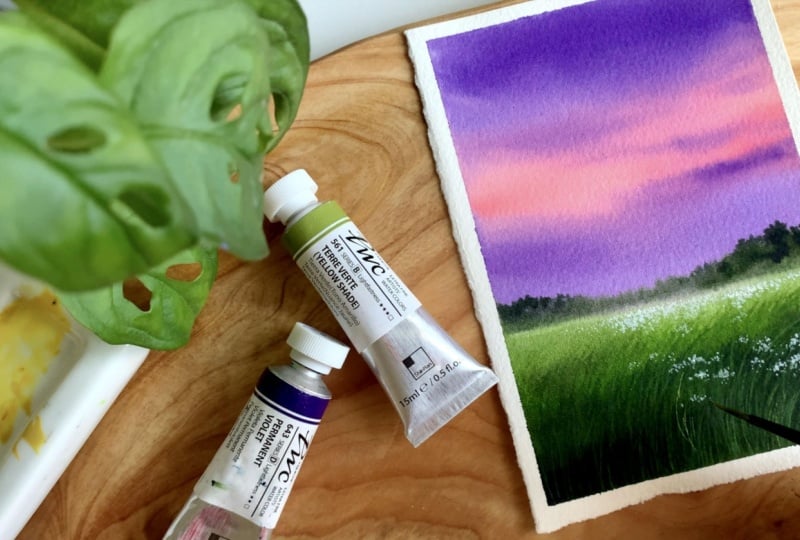
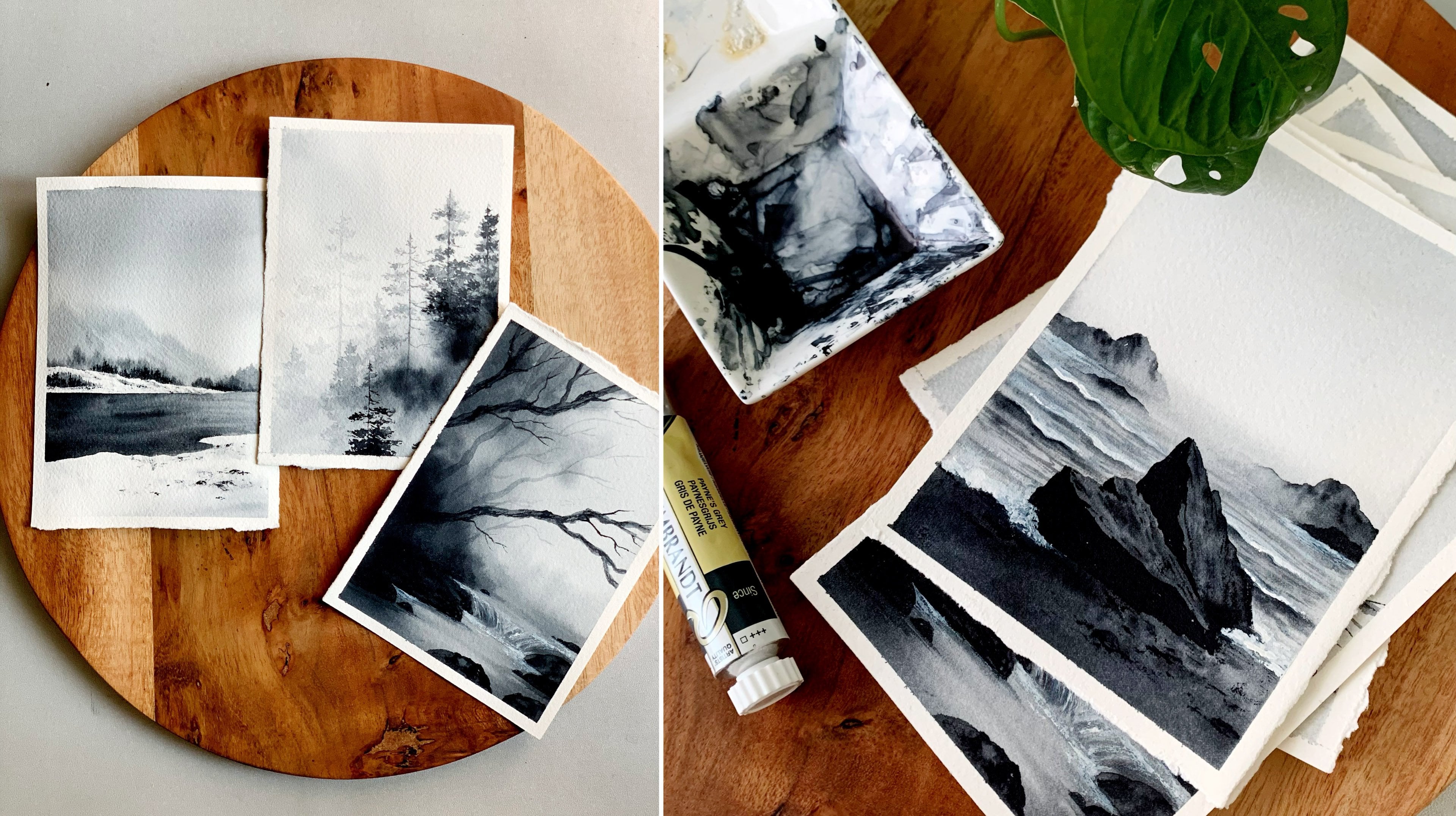
2. Art supplies : Alright, so thank you
so much for joining. Now, let's start by having a look at the materials you will need to create these
core spring landscapes. I will start with the
watercolor paper. So this one here is my most
favorite watercolor paper. It is from arches. It's a cold press
watercolor paper. You can go with any brand. It doesn't need to be arches, so it is cold press
watercolor paper, and it is a 140 L B, which means the paper
is kind of thick. You know, handle all the
washers and all the details. Then, most importantly,
it is 100% cotton. Okay, so go with any artists
grade watercolor paper. It can be any brand. I'm sure you may have
some favorite brands. So just go with that. Okay, now coming to the
size of the painting, you can see it is quite small. Have cut this paper
into four pieces. So the actual paper is AFO size, which means the painting
you see here is just a six. But you can go with any kind of size and proportion you like. It doesn't need to be
the same way. Okay. So these are the
two paintings we're going to try in today's session. They're kind of quick and easy, and the color combination
is really beautiful. Okay, so let's next
talk about the colors. At the beginning of every video, before we jump
into the painting, I'll be explaining
about the colors you will need for that
particular painting. We'll swetch them
out, and we'll see the alternate options if you don't have the same
colors I'm using. Okay, so don't worry about the paint and the
pigment number. I'll be providing you
all those details. So these are the watercolor
tubes I will be using. If you prefer using pans,
you can go with that. Again, the brand doesn't matter. These ones are from Shin hen. According to the brand, the name of the colors will be different. Sap green will be sub green, but the brilliant orange will be something different
in other brands. So don't worry.
I'll be providing the Pigmen number and the
name and all the details. So you can just use the colors you have with you, which
is nearly similar. Alright. Now, to mix your paint, obviously, you will
need a mixing palette. This one is a ceramic
mixing palette, and I've got enough space
to mix all the colors. So just go with plastic or ceramic or any palette
that you normally use. Even a dinner plate will work. Okay, we just need
to mix the colors. That's all. Ceramic
palettes are easy to clean, and also it doesn't
get that paint steam. That's a major reason why I
love using a ceramic palette. Okay, now coming to the brushes. The paintings we are going
to do are quite small, so we don't need
a lot of brushes. These are the only
brushes I'll be using. The first one is a
wash brush. It is 1 ". I'll be using those brush to apply water onto the background. Then I have three
round brushes here. The first one is
size number eight, then I have size number
six and size number two. Okay, so these are
the only brushes I'll be using for painting. For the brush as well,
the brand doesn't matter. You can go with any
of your fury brushes. Now coming to the next
material you will need, which is two jars of water. So the first jar of water is to run off the paint
from your brush, and the other one has to stay clean whenever we are in need of clean water to make
the paint lighter or to apply a wash of
water onto the background. We can use the second
jar. So always keep two jars of water next to you whenever you're
working with watercolor. Now, if your water
container is really big, I think one would be okay. Now the next thing
you will need is a tissue paper or
a kitchen towel. We'll be using this
one to dab off the excess amount of
paint from our brush. Okay. So keep this also handy. For these paintings, we don't
need to add any sketch. It is just a matter of
adding a horizon line. And for that, you
will need a pencil. Now finally, you will
need a masking tape to fix your paper onto your
board or onto your table. It can be any kind
of masking tape. This one is a very normal one. I got from a stationery store. You can go with
an artist tape or washi tape or anything
that you prefer. Okay, so that summarize all the materials you will need for this watercolor session. Keep them ready. Let's start
with our first painting.
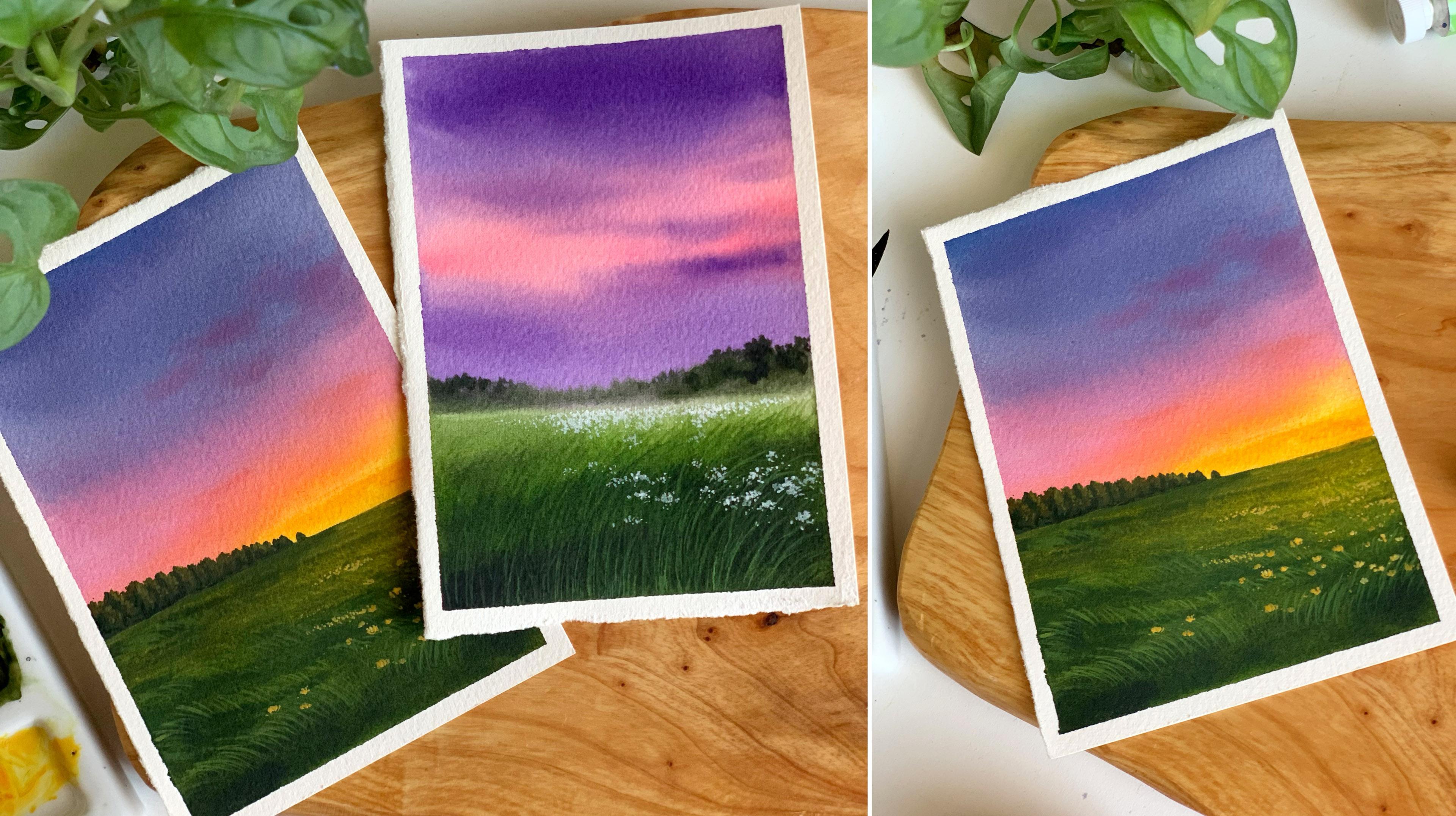
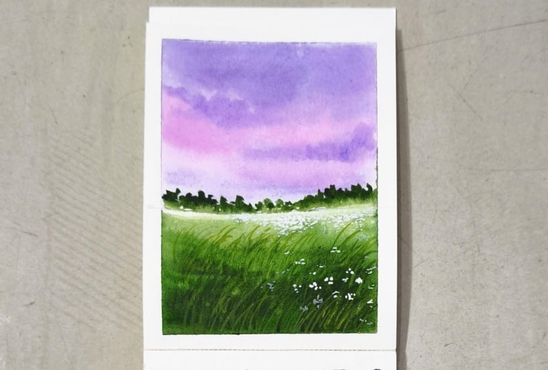
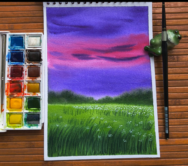
3. Painting 1 - Purple Sunset PART 1: Okay, so it's time to try
our first spring landscape, and this is what
we're going to try. It's a quite easy, simple spring landscape with a
beautiful color combination. We have a blurry horizon line, then a flower bed far away. Altogether, it's a
beautiful painting, and I'm sure you guys
are going to love this. Alright, so let's start
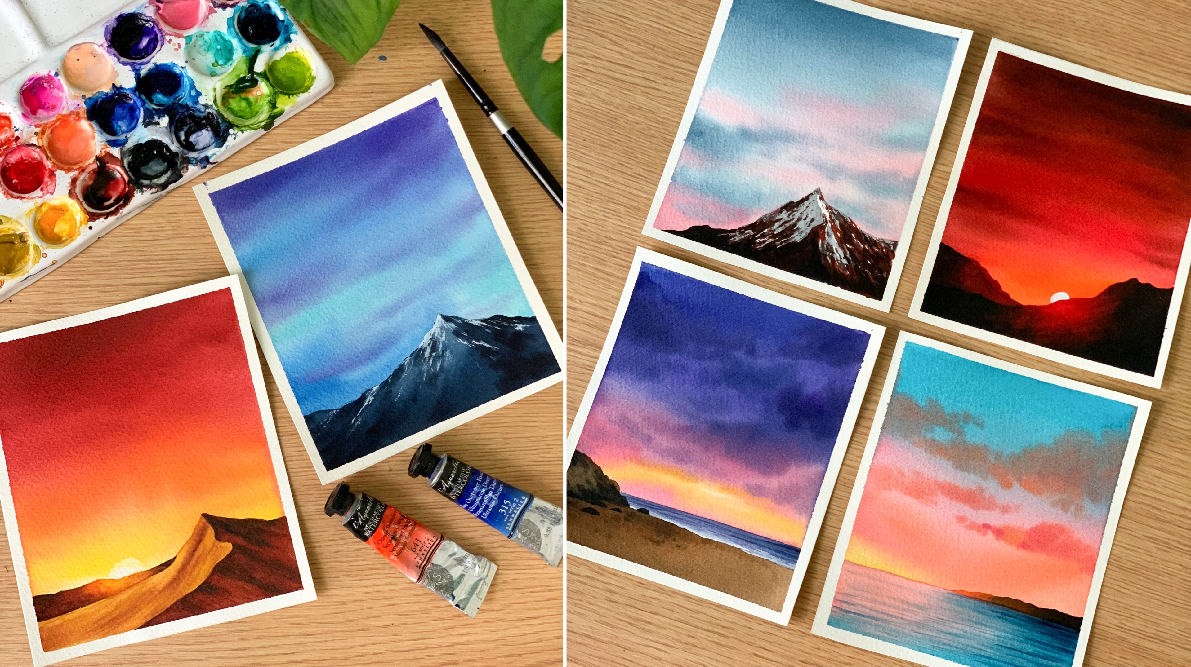
by having a look at the colors you will need for this car, your spring landscape. I'll start with the sky. As you can see here, I have used a combination
of pink and violet. No doubt it is one of my favorite color combination
to use for sunset skies. So these are the two
colors I will be using permanent violet and brilliant
pink. It is a pistel pink. So if you don't have
a similar color, you can just add some
white watercolor with crimson or any kind
of rose color. Pastel shades are
easy to create. You just need to add
some white watercolor. This way, you can turn any
color into a pistil color. So I'm starting by swatching
out this beautiful pink. It is called Brilliant pink. It is from Shinhan. You can
see how beautiful it is. So that's the first color
you will need for the sky. Now the second one
is permanent violet. You can go with any
violet you have got. It doesn't need to
be permanent violet. There are different kinds of violet available in the market. You can go with bright violet, inocron violet or any
violet of your choice. It doesn't need to
be permanent violet. Okay. So these are the two colors we'll
be using for the sky. We will use violet on
the top and the bottom, and at the center, we
will add some pink. Then using violet, we
will add some clouds. So that's how the
sky is going to be. Now the next color you
will need is sap cream. To make your painting a bit more moody, instead of sap cream, you can also use wolve green, and even viridian
green would work. Okay. So, this one is
sap cream from Shinhan. It's a beautiful sap cream. I've tried mini brands, and I always come
back to Shinhan. Okay, now the next
color you will need is any sort of light green. I'll be using
cadmium green light. This one is also from Shinhen. But again, go with any
brand you have got. It doesn't need to be the same
brand and the same color. We just need a light
green. That's all. So this is a sap cream
I was talking about. Then I will show you the
cadmium green light. Okay. So here's the
green so I'll be using. We'll be using the light green
to add some grassy lines, so it can be any light green. If you don't have a light green, can just add some
lemon yellow with sap cream and create your own. Now, the last color you
will need is pinks gray. We'll be using this one to
add all the deeper tones. You can see some dark
green at the bottom. And also the landscape far away. So for all those darker tones, I'll be using pinks gray. So these are the colors you
will need for this painting. We will need some pastel pink, violet, sap cream, then
light green and pink gray. So keep all the colors ready. Oh, sorry, I missed something. There is one more
color you will need. Over some white aticolor
or white quash. You can see all those teeny tiny flowers in the background. To add them, I will be
using some white quash. If you don't have white gouache, you can use your
white watercolor. Both will work perfectly.
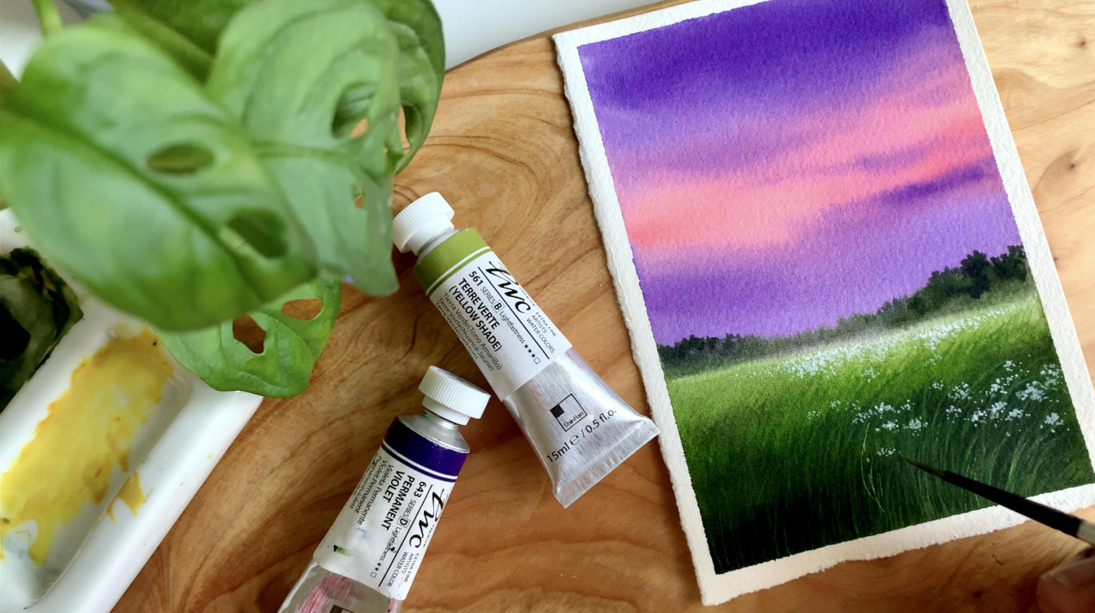
4. Purple Sunset - PART 2: Alright, my dear friend. So we already spoke about the colours, and I'm hoping you guys have
it ready on your palette. Just in case if you want to try a different color combination,
that's totally fine. Just follow the process
and the techniques and use your favorite colors. Okay, so let's start. I have my paper
ready here already. I also have the
colours ready here. I have permanent violet, brilliant pink, sap
green, and pink gray. So keep all the colors
ready before you start. Now I'm starting by
adding the horizon line a little below the
center of the paper. Go the very light line. Okay, that's all. That's a sketch we
need. Now we can start by applying a qua
of water onto the sky. Not just the sky.
We are going to apply water onto
the entire area. Okay, so the
anterior background, we are painting in one go. So pick some clean water on a clean brush and apply that
onto your entire paper. Don't add a lot of water.
Keep running your brush across all the direction and make sure it is
just an even layer. We don't need pools of water. Okay. Looks like my
paper is evenly wet. Now we can start
applying the paint. So I'm going to keep
this one aside, and I'm going with my size
number eight roundtrh. Go with any of your
medium sized ntrche. The first color I'm
going to pick is pink. I'll apply this at the
center of the sky. Then on the top and the bottom, I will introduce some violet. So simply add that onto
your wet background. Okay. Now with the same brush, I'm going to pick some violet. I'll go the medium tune. I want the color to
be a bit bright. So if you're going
to use a light tone, when it dries, it
will look dull. So that's the kind of tonal
value I'm going with. You can make it a bit more lighter if you
prefer it that way. The same color I'm applying
at the bottom, as well. So we have violet on
the top and the bottom, and at the center, we
have some pink. Okay. Now, what I'm going
to do is I will clean my brush and I will dab
it on a paper towel. Then I'm going to
grab a bit of pink. And then I'm gently smudging
the colors into each other to make it look
more soft and natural. We don't want any strong lines. So gently smudge the
color into each other. This will create a nice texture. Okay, you can see the
difference it made. Now we're going to
add some clouds. So I'm again, dabbing
that on a paper towel, and I'm picking a bit of violet. Now, the paint should not be too watery when you're
adding the clouds. So if you feel it's too watery,
dab it on a paper towel, and then add some lines onto
the sky wherever you prefer. I'm adding a few at the bottom, and also at the center
and some at the top. We only have some
pink at the center. So be very mindful when you're adding these clouds.
We don't need a lot. If you add a lot, you will end up covering the entire thing. Okay, so that's how this
sky has turned out. If you want to add some more
clouds, you could do that. When you're adding
the clouds, be very sure that you're using a
paint that is not too watery. If it's too watery, it will
spread into the background, and you won't get them as lines. Okay. So that's our sky. Now I'm going to
apply some more paint at the bottom along
the horizon line. And then we can go
with the meadow. It's not a straight line here. So I'm just adding
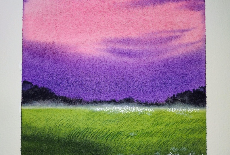
some more paint to make it even and straight. Okay? That's a pretty sky. And before I go with the meadow, we have to do one quick thing. So clean your brush and
dab it on a paper towel. Now lift off some paint from the horizon line to make
it a straight line. Okay. Next, we can
go the meadow. So I'm picking some sap green. And I'm adding that onto
almost the entire area. As you can see here, I have left some gap at the horizon line. I will come to that part later. Now I'm picking some pink green, and I'm adding that at the
bottom to make it darker. Now, before the
background dries, let's quickly go over
the horizon line. I'm adding some pint
here, not a lot. We still need a little gap between the sky and the meadow. So be very careful when
you're adding the paint and go with the pin that is
not too watery. See that? So we need a blurry
line over there. Next, I'm going to go with
some more pin screen, and making it more
darker at the bottom, and also adding some textures and some lines into
the background. Okay. Now, let's
clean up a brush, and let's dab it
on a paper towel. And let's go over this line. Let's lift off some paint. You can see the
blurry horizon line. So to create a foggy effect, and to create a depth, we need to add a
blurry line like that. Okay. Next, I'm going to
go with a smaller brush, and I'm going to
add some landscape far away along the horizon line. So this brush here
is size number two. Now I'm going with a dark green, mixing some paint gray
and sap green together. Okay, try to go with any
of your smaller brush and start adding
an irregular shape above the horizon line. That Guri line is still there. So we above that, add an
irregular shape like this. Go with an irregular shape. At some places, it
can be shorter. And at some places,
it can be taller. This will make it
look more realistic. As you can see here, I have only added a shape on the top. At the bottom, I
have left some cap. So I'm dabbing my brush on a paper towel to get rid of
the excess amount of paint, and I'm making it softer
towards the bottom. So we need to retain that
blurry line along the horizon. So I'm not going to add a lot of paint along that horizon line. Okay. Now in a similar way, I'm going to add a
shape at the other end. Then at the center, I
will make it shorter. Okay, so I'm going to
repeat the same step, going back with a dark green, adding an irregular
shape on the top. I'm going to continue this
until I met the other section. Okay? At the center, I'm making it a bit
lower. All right. So I have added a
shape on the top. So we need a very soft blurry
line along the horizon. So I'm not going to add
much paint over there. I will dab my brush
on a paper towel, and I will gently smudge this part to get a
soft blurry line. I'm not adding a lot
of paint over there. Addmon a sharp line. So very gently, I'm adding the paint to make it
look soft and blurry. Now I'm going to take
off some paint from this part. See that? So be very gentle when you're adding
the paint over there. Go very light handed. Don't put a lot of pressure. Now I'm going to pick a
little of paints gray, and I'm going to add some teeny tiny dots and shapes
onto this landscape. I just a few here and there. I'm adding them
mostly at the top. I think at the bottom, we
can retain that blurry line. We don't need to add
much details over there. So only on the top, I'm adding some dots and some tiny shapes. Okay. Now, similarly, I will add some details on
the other side as well. So with this, we are
actually done with the sky and the horizon details. Next, we're going to go
ahead with the meadow. That's where we have
most of the task left. We need to add the grassy
pattern and then the flowers. So let's quickly finish this part and then
go with the meadow. The meadow part is still a
bit wet, but that's okay. We can start adding the
grassy patterns right away. So I'm going with
some paint screen. And I'm just pushing
and pulling the paint, and I'm creating some
grassy lines here. You can see at the bottom,
I have a dark layer, and it's still wet, and I'm gently pushing
that towards the top, and I'm creating these
long grassy lines. I won't be adding much along the horizon line where
I have the light green. I'm focusing mostly
at the bottom. We can add a few in between
where we have sack cream, but let's focus mostly
at the bottom part. Okay? So I'm mixing some
green and pink grey. And I'm adding
more grassy lines. We'll be doing this again
with a light cream. But first, let's go
with a dark cream. At the bottom, we can
use a darker tone, but when you're
adding them along the horizon line or closer
to the horizon line, please be sure to go
with a lighter tone. We should not be using a
darker tone over there. Okay. That's the only thing
you have to keep in mind. Other than that, this is quite
easy and straightforward. You can just keep on adding these grassy lines. How
much would you like? So to create a sense of depth and distance
in your painting. You have to focus on
the area at the bottom. That's where we have to add lots and lots of grassy lines. Far away, you can add but using a lighter tone
or a medium tone. It should not be too prominent. I think this one is still dark. I need to make it lighter
by adding some water. Okay, so don't add
darker lines far away. Go with a medium tone
or a lighter tone while you're adding
your grassy lines over here. And we
don't need a lot. Just add a few
using a light tone. And then let's go
with the bottom part. Okay. I think this is enough. Now I'm switching
back to dark green, and then I'm going to add the
grassy lines at the bottom. There is no rule
or anything here. Go with any of
your smaller brush or a liner brush or any
brush with a pointed tip, and keep on adding some long, nice curvy lines like this. Okay. You can add as
many as you want. You can see the kind of
depth we have achieved here. That is just because we played with the right tones of green. We have a darker green
at the bottom and a medium and light green as we are approaching
the horizon line. Okay. Next, I'm going to
go with a light green. This one is camium green light. You can go with any light
green you have got. If you don't have
any light green, you can just make some
lemon yellow with saccrem and you can use that. Okay. Now, when you're
using light green, don't add a lot of water. We need a pain that is
a little bit of opaque. Otherwise, when we add
the grassy lines on top of a darker layer,
it won't be visible. Okay? So just make some sap
cream and lemon yellow, and try adding the lines
on the background. If it is still not visible, you can add a teeny
bit of white into it to make it more opaque. See that? So that's
a color I'm using. It is called cadmium green
light from Shinn watercolors. For me, it is quite visible, but for you, I'm not really
sure if it's visible or not. So if it's not visible, just add a teeny bit
of white into it, and then you can achieve a
similar tonal value. Okay. So keep adding some grassy
lines using a light tomb. For this, as well,
there is no rule. You can add them
wherever you like. We only have some dark lines in the background, so
don't cover them up. You can add a few in
between. See that? You can see how beautiful
they are turning out. So you have to go over
different tonal values of green whenever you're
painting a landscape. Never ever use the same
kind of green throughout. So that's how when you make it look more natural and realistic. Okay. Now, I'm going to add
a few more lines like this. And I think with that,
we can call it down, and we can go with
the final step, which is adding the flowers. I have to show you a closer
look of the grassy patterns. Now you can see them clearly. You can see the
wonderful texture and the depth we have got here, just by playing with different
tonal values of green. I will add a few more. Some
nice, curvy, grassy lines. I'm really loving this. Such
a beautiful green right. Just a few more
on the left side, and with that, we'll be done. Okay, so that is it. We
are done with the meadow. Now, if you feel like at this point, you
can call it done. I'm thinking of adding
some flowers as well. But before that, we'll have to wait for this to dry completely. So let's take a quick break and come back when this
has dried completely. Alright, so the break is
over, and we're back. And it's time to
go with some white gouache or white watercolor. Okay, we're going to squeeze out a little of paint
onto a palette. Then we will add a
few drops of water. We're going to use the
paint in an opaque way. Okay. So if you don't have guar, as I said earlier, white
watercolor will also work. Squeeze out some
onto your palette. Then just add a few
drops of water. Don't add a lot and go with any of your small size brush or
a bush with a pointed tip. Now, I'm starting from here, this part where we
have the horizon line. And I'm simply going to keep
on tapping onto the paper. And I'm creating these
teeny tiny dots. I'm going to create a
cluster of flowers. So it's more like a
flower bed far away. You can keep on
adding some dots. And create a flower
bed far away. See that? Try to go
with a similar size. Don't add big dots. This is white is really important to go with a smaller size brush. Okay? Now, keep on adding
these teeny tiny dots. You don't need to
cover the entire area, add few here and there. At some places, you can
add a lot of white dots and make it a very densely
packed flower bed. And at some places add only a little and make it
scattered as well. It should not be in a very
properly organized manner. Okay. You can see
the way how I'm scattering the dots to
make it look more natural. Now, in a similar way,
I will add some more. Then I will come to the bottom. You can see how I added some at the bottom to make it
look more natural. So yeah, don't
follow any pattern. Make it as organic as possible. Oh. Okay, so those are the flowers far away. You can see how beautiful
it has turned out. They're looking very
soft and blurry. Now I'm going to pick
some more paint, and I'm adding the
flowers at the bottom. So these flowers can be a
bit more thicker and bolder. I accidently added some
paint at the bottom. Never mind. I'll fix it. So go with some
more extra paint. And then, again, we're
going to add dots. But this time, we're
not going to add, like, a bigger group. We're going to add
some here and there. Okay. We're not going to
cover that tentio area. We will only add them
in a scattered manner. So go ahead, pick some
more white paint, and then add some bigger dots. You can add them
as some group of flowers here and there. Okay? I'm not planning to add a lot. I'm focusing on the right side. That's where I'm going to
add most of the flowers. But if you want to add a lot
more, you could do that. I'm loving the way this
one is turning out. Now, before I go
ahead with the rest, I think I will fix the
white patch at the bottom. So I'm cleaning my brush, picking some dark green, and I'm going to cover this up. Then if needed, we can add
some more grassy lines, I think, just a few
with the light cream. Those ones are not
really visible. Anyway, let's add
some more flowers, and then we can add
the grassy line. So I'm going back with white, and I'm adding
some more flowers. So just like I said earlier, this one doesn't have
any rule or any order. If you want to add more
flowers, you could do that. And if you only want to add few here and there, even
that is totally fine. Okay, you can see how
pretty it is turning out. Such a beautiful
spring landscape. And I think so far,
we have only taken less than 20 minutes or
a little more than 20. And for a 20 minute, I think this one's a
wonderful painting. We can try this with a different color for the sky as well. Maybe something more
like a golden sunset and maybe some yellow
flowers or orange flowers. So, yeah, that's how you explore new color combinations
and compositions. So always take this
one as a guide, and you guys have to explore your own way. And
that's how you learn. Not just learning, that's how you get confident
with watercolors. Okay. Now, as I said earlier, I'm going to go back with
a bit of light green, and I'm going to add some
grassy lines at the bottom. So from the bottom part,
I'm adding a few lines. That is super prominent. I want a line that is kind
of soft, not this prominent. So I'm adding a few
drops of water. Okay, this is fine. So just add a few at the bottom,
only if you feel like it. Otherwise, you can
leave it as it is. I think it's in
good shape already. So yeah, take a look
at your painting, and if you feel like the
lines are not visible, you can go back with
light green and add a few more lines
only at the bottom. And also, if you want to
add some more flowers, you could do that as
well. Okay, nearly done. I will add a few
more lines towards the left, and that is it. So this is how it
has turned out. It's a beautiful little
spring landscape, and now it's time to peel
off the masking tape. So always peel off your
masking tape at an ankle. Okay. So peel it off at
an ankle very gently. Don't just pull
it off. This way, you will get a clean border. And always always make
sure your painting has dried completely before you
peel off the masking tape. That's when you
rip off the paper. So here is our
finished painting. You can see the beautiful flowers we have in
the background, the pretty sky, and
the wonderful meadow. So give it a try if
you get to try it. And once you're done with
it, you know what to do. Upload them here and
share your thoughts.
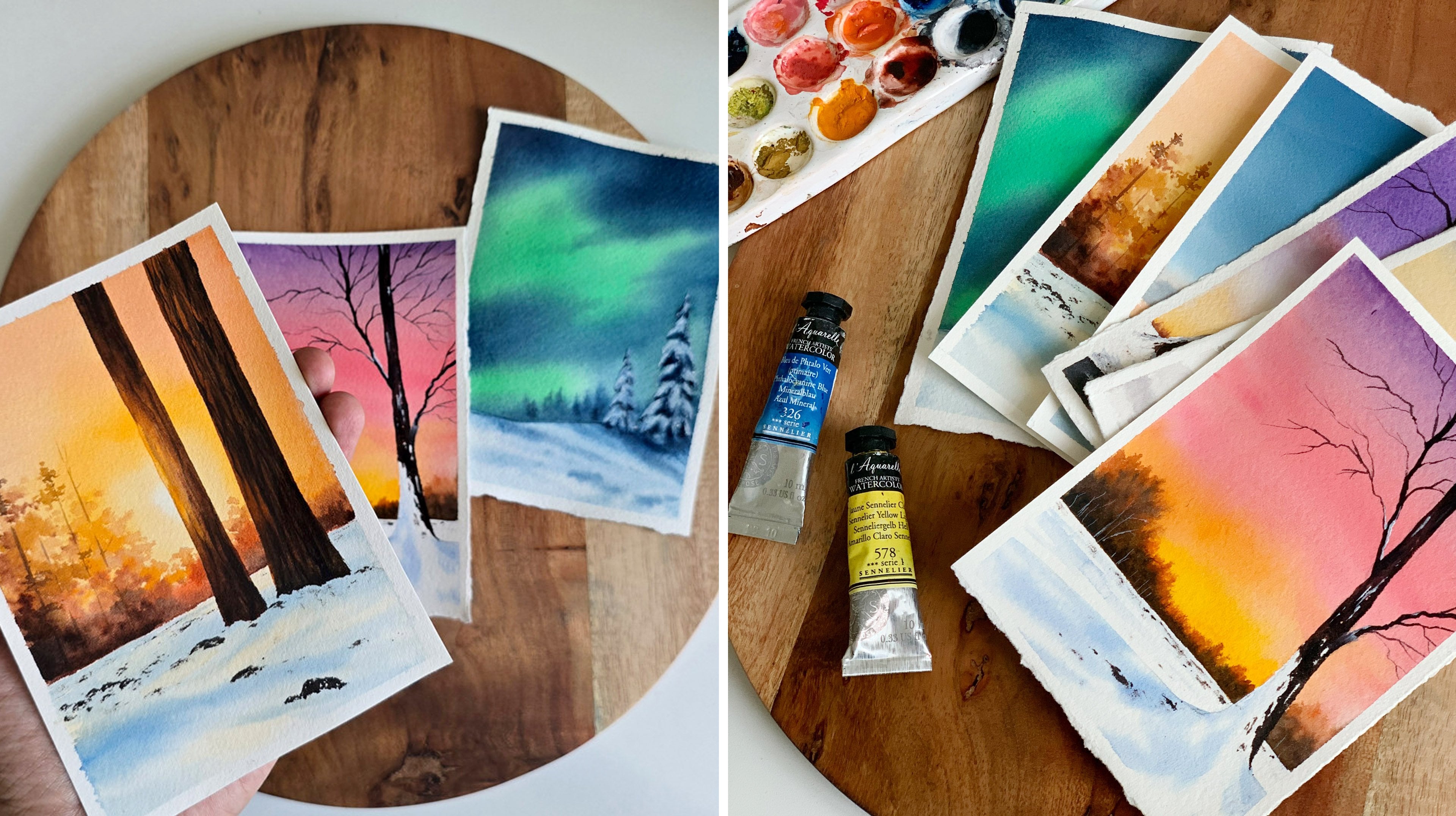
5. Painting 2 - Colorful Sunset PART 1: Hello, hello, so now it's time to try our second
spring landscape. This one is a multi colored sky. We have some yellow flowers and some g just trees
in the background. So let's start by having
a look at the colours you will need for this G
just spring sunset. I will start with the sky. So for the sky, I
have used three, no, four different colours here. There's a violet
color on the top, then some pink
orange and yellow. The violet is a mix of
pink and cerulean blue. I had some pink from
the previous painting, so I just mix some blue with it to create a purple,
a pastel purple. Okay, if you want to use purple acedus, you
could do that. Or if you want to
use blue acids, you can do that as well. So this one is a mix of
brilliant pink and serlean blue. And that's a color I'll be
using for the sky on the top. Okay. Now the second
color is pink. It's the same pink I used
in the previous painting. This one is brilliant pink. So that's a second color.
Now the next one is orange. This one is called
Brilliant orange from Shin hin watercolors. You can go with any
orange you have got. Now finally, we will need one more color for the
sky, which is yellow. I'll be using Indian yellow. You can go with any
yellow you have cut. So those are the four colors
I'll be using for the sky. We have a pastel purple, which is a mix of pink and blue, then some pastel pink
orange and yellow. Now for the meadow and
the landscape far away, you will need some sap
green and some paints gray. So those are the next two colors you will need for this painting. For the flowers, I
have used yellow. I've used a mix of
yellow and a bit of white quash because yellow
is a very transparent color. To make it opaque, I have added some white
gouache with it. Okay, so the next color you
will need is sap green. And finally, to add
the deeper tombs, we will need some paint gray. Okay. So those are the colors you will
need for this painting. You are free to go
with a different color choice for the sky. Instead of pastel purple, you can go with blue or violet or any other
color of your choice. And for the flowers as well, if you want to go with
a different color, you could do that. So those are the swatches. Now before we start
with the painting, let me show you the colors. As I mentioned
earlier, the color you see on the top is a mix of cerulean blue and pastel pink.
These are the two colors. Both are from Shinhan, Cerulen blue hue
and brilliant pink. You can go with any other
blue of your choice. It doesn't need to
be cerulen blue. Mix that with some pastel pink, and you will get
a similar color. Now, coming to
orange and yellow. These are again from Shinhan, brilliant orange
and Indian yellow. You can go with any orange
and yellow you have got. It doesn't need to be the same. Okay. We will only need a
little of orange for the sky. It can be ermelin or scarlet
or any other orange. If it's too dark, you
can add a little of yellow to it to make
it more orangish. Okay, so those are the
colors you will need. Keep them ready, and
let's give it a try.
6. Colorful Sunset - PART 2: So we finished our
first painting, and now it's time to try
our second spring sunset. We have a colorful sky,
some pretty yellow flowers, and a beautiful
landscape detail. So let's give it a try. Alright, so let's
start with a sketch. Now for this one, as well, we don't have a lot of sketching. We need to add the horizon line, and I'm adding that a little
below center of the paper. Now we can add some
landscape on the left side. This one is not necessary, but to get the size
and shape of it, maybe you can add a
rough sketch like this. That's it. So that's our sketch. Now it is ready to be painted. Now, before we start,
it is very important to make sure you have all the
colors ready on your palette. This can save a lot
of time in between, and you can avoid confusion. Okay, so you have to
make sure of that first. We already spoke
about the colors. I have all the colors
ready on my palette, except for some yellow. I'm going to squeeze out some Indian yellow
onto my palette. Alright, now it's all set. Okay, so we're going
to start by applying a coat of water onto the sky. Use any of your clean brush and apply a nice
shiny coater water. Don't add a lot. Once you
put the water on your paper, run your brush across multiple times to be sure
the coat of water is even. Okay, so the sky is evenly wet. Now we can start
applying the paint. And for that, you
can go with any of your medium sized
rantrs or a flat brush. So I'm keeping this brush aside, and I'm switching to a
medium sized rantrh. This one is size number eight. And I'm starting off by mixing some cerulean blue
over a little of pink. Now, just in case if you want to use blue acids, you can do that. I wanted a slight pinkish blue
or maybe a pinkish purple. That's why I'm mixing
these two colors together. So I'm taking a little pink, a pastel pink, mixing
that with cerulan blue. Okay, so this color
is slightly pixlaspo. Now, according to the
color you prefer, if you want it to
be more pinkish, you can add more
pink, or if you want it to be more bluish,
add more blue. Okay, now I'm going to
apply this color on the top of the sky.
That's the color I got. It's very much bluish. So I'm adding some more pink. Okay, lovely color, right. So that's the color
I'm using on the top. If you want to add more
pink, you could do that. So I have added this color almost until the
half of my paper. I think I will make it
a bit more pinkish. Okay. Now I'm going
to clean my brush. Then I'm going with pink
acets without any blue. So clean your brush properly, dab it on a paper towel, then pick pink again. Also, another thing you can
choose the proportions. So over here, you can see I have used a lot of blue on the top, then a little of pinkish
color in between. And now I'm switching to pink, then orange and
then some yellow. The room will be a lot
of yellow and orange. I'm adding that only
towards the right side, just to create a sun
glow kind of an effect. Okay. But if you want
more pink in your ska, you can add that accordingly. Now, I've cleaned my brush
and I'm picking more pink, and I'm adding that
towards the bottom. Still, I have left some cap on the right side that
is really important. That's where we're
going to add yellow. Next I'm picking a little of orange, adding that over here. A little more. Okay, so still we have some space
left at the bottom, and I've cleaned my brush,
picking some yellow. And I'm adding that on to the left over space we
have on the right side. So you can see that
space is very little. We only need that much
yellow in the sky. That's how we create a contrast. If there's a lot of yellow, it will look just
like a normal sky. It won't have that contrast. Okay, so to build
in that contrast, you have to only use a little of lighter tone at the bottom. This will also create
a beautiful glow. Okay. So that's a base layer. We have applied a bluish
color on the top, then pink, then orange,
and then some yellow. Before I add the clouds, I think I will add a bit
more orange at the bottom. Only over here. So we have a
yellow streaks in between. That is exactly what I want. I'm loving the base layer. Anyway, before this dries, we have to quickly
add the clouds. And for that, I'm switching
to a small brush. I'm not going to make
it a very dramatic sky. I want a few streaks at the bottom where we
have orange and pink. Then some pink clouds
on top of blue. So first I'm starting by
mixing a little of yellow, not yellow, orange and pink. Okay, and I'm
adding a few lines, very soft blurry lines. I don't want to make
it too prominent. So I'm just adding a few. Next, my focus is
on the blue part. So I'm picking a little of pink, mixing that with blue again. This time, the color
is more pinkish. And I'm dabbing that
on a paper towel to be sure the paint
is not too watery. Now with this, I'm going
to add some clouds. I think it can be more pinkish. So I'm picking more pink. Adding them again. You see that? We have a soft pink cloud
on top of the blue layer. This is not really a
watercolor technique. In the traditional
watercolor method, they don't really use
lighter sheets on top of darker sheets unless and until it is just for
some highlights. But for me, I don't really
care about the rules. I just want a pretty sky, and that's what I have got here. You can see how gorgeous
it has turned out. So give it a try, go with some pastel pink and add some
clouds on the blue part. You will really have a
beautiful cotton candy sky. Okay. Now, I'm going
to clean my brush, and I'm trying to fix this part. I think it's not a good idea. It has almost dried, so I'm
gonna leave it as it is. Let's see how it
is gonna dry out. I'm hoping it will be nice because other than that
patchy orange at the bottom, I'm really happy with the sky. Okay, so with that,
the sky is done. Now, let's wait for this to dry. Alright, so the sky
has dried completely, and it is looking
really beautiful. The only regret I have got is not adding too many pink clouds. Anyways, that can't
be changed right now, so let's focus on the rest. Now our next task is
to paint the meadow. And for that, I'm going to go with an olive green,
sort of a color. If you have olive green with
it, you can use it directly. For me, I prefer mixing and
creating my own olive green. So I'm taking a
little of sap cream and I'm mixing some
orange with it. This is the easiest
way to create a very earthy kind
of green. See that? So, depending on
the color you want, you can add more
green or more orange. That's a olive green
I have created. Just a mix of orange
and sap green. It can be any orange.
Okay. Now when you're applying this
paint onto the meadow, be sure to leave some cap
along the yellow part. Okay. Over there,
we have to make the color slightly
lighter to create a glow. So you can use this color
on the entire area, but not underneath
the yellow sky. Okay. So this is a mix of
sap green and orange, and I'm applying that
on the left side. Then towards the bottom, we have to make the color more darker. We will finish the right side
and we'll make it darker towards the bottom.
First, let's do that. Okay. So to add
that into the same, I'm going to add some yellow. Just a little bit of yellow. And I'm applying that over here, right where we have
the yellow sky. Okay. And then smudge
that into the background. It doesn't need to be
a clean perfect blend. It can have some textures
and some rough patches. That's totally fine. Okay.
Now we can go with the rest. I'm applying some green. Then towards the bottom, I will introduce some pinks gray
as well to make it darker. That's how you
create a contrast. So I'm picking some paints gray, adding that onto the
bottom most areas. And I'm gently pushing and pulling that
into the background. I'm creating some texture
here. This is very deliberate. See that? If it's a
very clean even blend, it won't look very
natural and realistic. So it should have some textures, and I'm adding some
patches in between, also to create textures. And you can see on the right, I still have that yellowish color. The rest is all medium
tones and darker tones. I think the right side
looks a bit patchy. So I think I will introduce
some more paint over there. I'm going with the same mix, adding that again, I felt
there was gaps in between. That's the reason
why I'm doing this. Now I'm going to gently
smudge all the colors. So dab you brush on a paper
towel and gently push and pull the colors into each other to make it a bit soft. We don't want any harsh
lines and strong shapes. So give it a very gentle smudge. Please remember not to put a lot of pressure,
be very gentle. You just need to light handedly smudge the colors
into each other. As I said earlier, it can have some lines and some
marks and textures. That's totally
fine. We just want to get rid of those strong
shapes and harsh lines. That's it. We're
not making it even. Okay, so that's how
it has turned out. Now, while it is
still a little wet, we're going to go ahead
and add our grassy lines. And for that, I'm switching
to my small brush. In the previous painting,
to add the grassy lines, we used to cadmium green light. Now for this painting, as we are looking at an evening glow, I want the color to be
a little different. So what I'm doing here is
into cadmium green light, I'm adding a little
bit of orange. Just to go in the same pattern of the colors we used
in the background. If it's too orangish, you can
add a little of sap cream. Okay. So that's the
color I created. It's a mix of orange and
cadmium green light. I feel it is a bit too orangish. So the easiest thing to
do is add a little of sap cream to make it more
greenish, but not a lot. Now let's add the grassy lines. For this painting, I'm going to add smaller groups
of grassy lines. For the previous one, we added
longer ones at the bottom, then shorter ones
in the background. But for this, I'm going to add
similar groups everywhere. You will see that in some time. So I'm just adding some grassy
lines at the bottom now. Okay. I'm not going to
cover the entire area. I'm adding similar groups
now in the background. Okay. Picking more cream,
adding them again. So what I'm doing here is I'm adding a group of grassy lines. Then I'm leaving
some cap in between, then adding the next group. Okay, so I'm continuing
that in a similar pattern. I'm not going to add very
dense thickly grassy pattern. Now, I'm adding them over here. Now, again at the bottom. So between every group,
there is a little gap. So when I'm seeing
there's a gap in between, it doesn't need to be well
calculated or thought about. So add your grassy
pattern first. So imagine I'm adding this one. Then I will leave
some gap in between. Then I'm adding the next set. See that? So this is
slide gap in between. That's all. We should not go with a very thick
and dense pattern. That's all. Okay? I will bring the camera closer.
Okay, here it is. Now you can see the
patterns very clearly. So there is one group here, and there's a little gap, and there is another
one on the top. That gap in between will make it look more beautiful
and realistic. So just follow this pattern. Okay, I'm going to add some
more grassy lines here. These grassy lines are
looking very soft. They're not too prominent. It is because of the color I'm using
here, it is not too light. So go with a similar
tonal value. This will make it more pretty. Okay. Now, wherever you want to add some more grassy
lines, you could do that. The color is really important. And also that little
gap in between. Look at how beautiful
it has turned out. I think you can feel a
wind and a moment here just because we added the grassy lines as
separate groups. So follow a similar pattern. This will give you the
best kind of meadow. Actually, we did not
add a lot of patterns. We focused mostly at the bottom, and in the background, it is just those textures
we added earlier. If you compare this to the
painting we did earlier, the grassy pattern
is much different. Here we added them
at the bottom. It was more densely packed. But in the one we
are doing right now, we simply added different groups in between,
and that's it. But they both have
different kind of identity, and they
both are beautiful. Anyways, with that, we're
done with the meadow. Now we're going to go ahead
with the landscape far away. So we're going to
add a landscape far away along the horizon line. That's our next
task. And for that, I'm starting off
with a light green. Or maybe it's better to go
with a dark green first, and then we can add
the light tones. Okay, so I'm going to
keep this pressure aside. And I'm switching to my
slightly bigger brush. This one is size number six. And I'm mixing
some sap cream and pins cream to create
a dark green. Okay. Now with this, I'm going to add a very
simple shape far away. I'm starting from this point. For now, I'm just adding a very simple rough shape to show the pine trees far away. So first, I will add a line at the bottom, then onto the top. I'm simply adding some
shapes like this. So on the left side,
I'm making it higher. Then as I'm coming
towards the center, I'm making it shorter. See that? So simply add some
shapes on the top, using the tip of your
brush, and then fill it. You can see the
varying height here. This will create a sense of
distance in your painting. Now I'm going to add some
more shapes on the top. Then another tree with
some gap in between. These kind of details
are really important to create a sense of distance
and depth in your painting. Okay, so that's a basic shape. I have simply used a dark green, which is a mix of sap
green and paint screen, and I've added a shape there. If you want to
make it a bit more higher towards the left,
you could do that. Okay, so that's a foot step. We have only added a
very simple shape. Now I'm going to keep
this pressure aside, and I'm switching
to the other one. I had already taken
some light green on it. Now, with that, I'm
going to define each and every tree by adding some
highlights on the right side. I think that green
is a bit too bright. It's the same color I use
for the grassy lines, but that felt a bit brighter. So into the mix, I have
added a bit of orange. And with that color, I'm adding the highlights
on the right. See that? So we're defining each and every tree
by doing this. On the left, we have
that dark green, and on the right, we're adding some dots and we're defining
the shape of the tree. You can see the
difference it made. So just go with any
of your small brush and add some orangish
green on the right side. I'm going to do that for
all the trees I have here. So it's just a matter of adding
some dots, nothing major. And by doing that, we're defining each
and every tree. We're introducing the shadows
and the glow onto the tree. See the difference it made. Okay. Now the trees are looking
more three dimensional. Earlier, it was
looking quite flat. You can clearly see
a difference here. Now, to make it a bit
more interesting, into the same mix, I'm adding a little light green, the same color I used
earlier, but not that light. And with that I'm adding some highlights again
onto the right. So we have a dark
green on the left, then some orangish color
towards the right. Now onto the same spot, I'm adding few more dots. Not a lot, just a few to make it more beautiful or make
it more prominent. So just a few dots
only on to the right. We're not going to cover the to highlights we added earlier. I'm picking only a few trees, and I'm adding a few
dots here and there. That's it. Okay. I
think that's enough. I don't want to add a
lot of light green. Now, just in case if you feel like you have added
a lot of highlights, either the light green
or the orange green, you can go back with your dark
green and fill that part. Now, there's one more
thing I'm going to do. And for that, I'm going
with a bit of pinks gray. And then I'm adding some
darker tunes at the bottom. This will make it
more beautiful. So you're adding
some contrast at the bottom, just a little bit. Don't add a lot. I'm adding
a little in between asp. This will make each and
every tree pop out. Okay, so this is how
it has turned out. You can see how
beautiful it is looking. Now, there is one
last task left, which is adding the flowers, and that is completely optional. Honestly, I'm still contemplating
whether I should add them or not because I'm really happy
with the way it is looking, and I don't want to ruin
it by adding the flowers. So I'm just thinking
one more time before I go ahead with that. Anyway, I'm going
with some yellow, and I'm adding some white
quash with it because the yellow was a
little transparent. So to make it opaque, I'm
adding a little of white quash. Okay, so mix up
some white gouache and yellow or some
white aticolor and yellow if you're adding the flowers and go with
any of your small brush. Now, let me start
adding the flowers, and let's see how it's
going to turn out. I'm still a bit confused, even though I have
made up my mind. Anyway, I'm starting off
with the first flower. I'm adding some tiny lines
close to each other, and I'm creating a
very rough shape. Okay, so that's a flower
shape I'm going with. It's a very simple shape, not very well defined. Okay. But these are a bit more bigger than the ones we tried in the previous painting. It was just dots,
but this one is a bit more flowery shape. Okay. And I'm just adding
a few here and there. I won't be adding a lot
like the previous one. And if you want to go
with a different color, that's totally up to you. I thought of using yellow because we have some
yellow in the sky, and I thought it would be beautiful to pick up
a color from the sky. Maybe an orange will be
nice or just too white. So pick up your favorite
color to add the flowers, and then add some rough
shapes like this. I'm focusing mostly
at the bottom area. I won't be adding much
in the background. Okay. So that's how I'm
adding the flowers. Again, it's completely optional. Maybe you can scroll to the
end and see the end result, and then you can decide on whether you want to
add them or not. When you're adding the flowers, go with different sizes. Some of them can be just a dot, and some of them can be
a bit more bigger shape. This will make it look more
beautiful and realistic. Okay, I'm going to add
few more bigger flowers. Then I think I will
add some dots in the background like a group of tiny dots to show the
flowers far away. Okay, so that's a plan.
Now let's go ahead and add the flowers and
finish off our painting. So those are the big
flowers in the foreground. Now, I'm going to
pick more paint, and I'm going to add some
tiny dots in the background, the same way how we did
in the first painting. So keep on adding some tiny dots to show the flowers far away. Okay, so those are
the flowers far away. I'm adding them only
on the right side. I'm leaving the left acetus. Now, before I finish it off, I will add some more flowers at the bottom, some
more bigger ones. And then with that
we can call it done. You can see the flowers, the grassy lines, and
all the textures here. It's a very simple shape. I'm not putting a
lot of effort here. You don't need to think a lot. Simply, add a very basic shape. And in the background,
it is just some dots. Okay, so that's how
it has turned out. It's a gorgeous painting with a beautiful
color combination. I hope you all enjoyed painting this gagous spring landscape, and now it's time to peel
off the masking tape. So when you're peeling
off your masking tape, always do that at an ankle and don't rush and pull it off. Be very gentle. And pull
it off at an ankle. This will prevent your
paper from ripping off. And always make sure
your painting has dried completely
before you do this. Okay. One last side, and I'm hoping I have
got a clean border. Yes, it is a clean border. So that's our second
spring landscape. You can see how
beautiful those plants and the trees and
everything is looking, and the ska is extra pretty. My little one has
grabbed my brush, and she's exploring my
palette in the background. So, yeah, you guys
give it a try to try it and an if you liked it. Mm
7. Thank you for joining: Thank you so much for
watching this class. I hope you enjoyed painting these soft spring sunsets and found the process
relaxing and inspiring. I would absolutely love to
see what you have created. Please feel free to
upload the projects and share your beautiful work
with the class community. If you enjoy the class, leaving a review would
mean so much and helps support my work and allows me to create
more classes for you. Alright, so that's all for now, wishing you many more peaceful
painting moments ahead, and I can't wait to
see your creations.
 Zaneena Nabeel, Top Teacher | Artist | Author