Transcripts
1. Welcome to the Challenge: I'm often asked, how do I create such simple yet stunning
color combinations for my verticlar skies. Last year, I poured
my passion into a book titled Bold and
beautiful vertical kis, where I explored countless color palettes and compositions. The book showcases
30 otic skies, but there is so much more I have discovered that I
can't wait to share. Hello, friends. My
name is Danna Apeel. I'm an artist, an art
instructor and an author. My first encounter with tclor happened when I
was at the age of five, and ever since I'm always fascinated with bold
and beautiful colors. I love playing with vibrant
color combinations. And every time I come across a photograph
or a movie scene, I can help but mentally draft
a color palette in my mind. I'm thrilled to invite everyone
to a brand new tcl cellen where we will be painting 30 quick and easy
vertical skies. And you know the exciting twist, every sky can be finished
in just 15 minutes. Ah. Since my classes
cater to beginners, we will take the time to go over the materials and detail. Also before we start
with every project, I will guide you
through the colors required to bring
your artwork to life. This class isn't just
about painting 30 skies. With each project, you
will also learn how to create various foreground
and background elements. We'll explore different
type of mountains, meadows, and so much
more along the way. If you're all set for 30 days
of creating quick and easy, beautiful tic skies,
gather your art supplies, and let's get started
on this journey. H
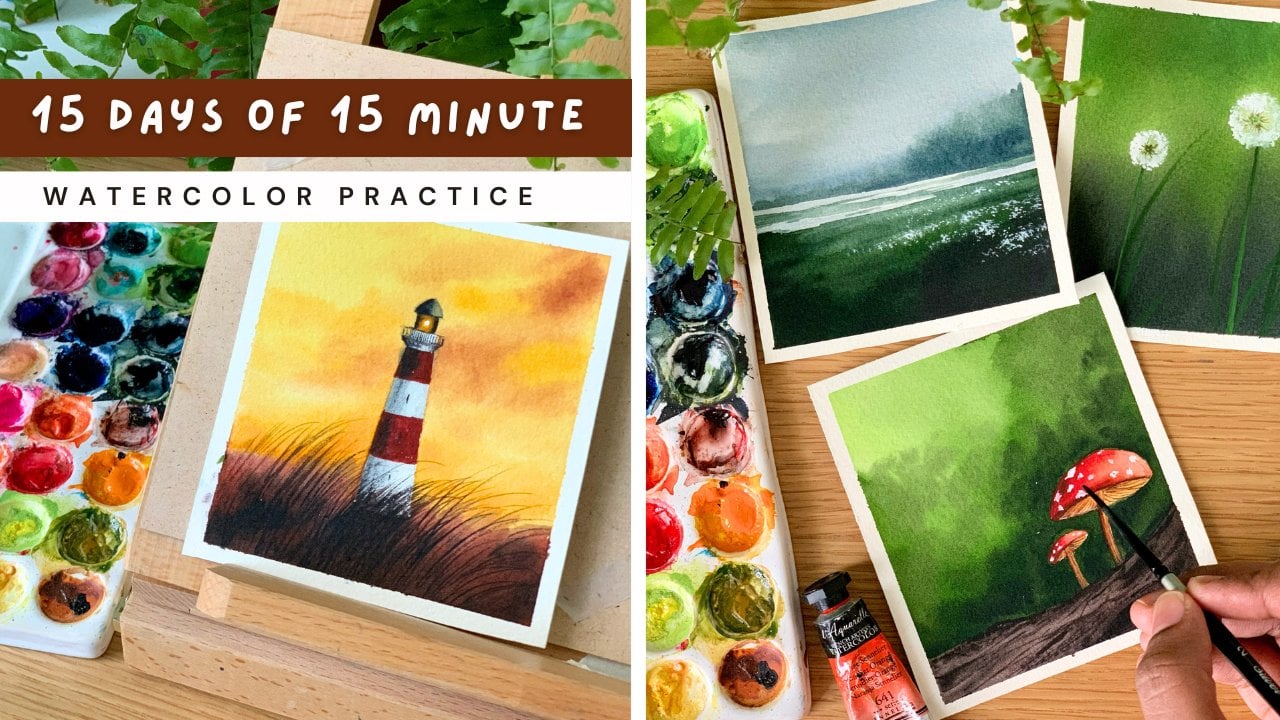
2. Class Overview: Painting verticar
skies can be a bit tricky, particularly
for beginners. From getting the
paper properly wet to knowing exactly when
to drop the colors, it takes practice to
get the hang of it. Skies are an integral part
of any verticar landscape. Learning to paint them is a key skill in your
aticar practice. That's why I'm here
to guide you through a vertcar challenge designed to help you master
painting skies. This class is designed as a daily challenge,
and starting today, for the next 30 days, we'll be painting quick
and easy verticar skies. Being a mom homemaker
and an artist, I know how difficult
it can be to find time for your
hobbies every day. That's why each
painting is designed to be completed in
under 15 minutes. Before we start
with every project, I will walk you through
the reference image I have considered and the
color palette. We'll also have a look
at the different steps involved in the process. This will give you a better idea on how to approach the painting. Altogether with the
prepan everything, the video will be
somewhere 17-18 minutes. But the actual
painting time would be only less than 15 minutes. These paintings are not
just about the skies. We'll explore different
subjects like mountains. Over here, you can see
three different varieties of mountains with
different kind of skies. We'll be exploring all of
them in the coming days, and they're going to
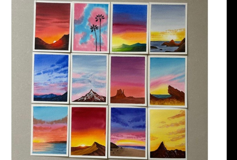
be a wonderful asset to your vertical practice. Now, I just want to
show you some of my favorites from
the tie collection. This is one of them. I love the way the sky has turned out, especially this yellow
streak in between. Then another one is this
beautiful piece sky. I love the color combination
and those clouds. We'll be trying
out another one in a similar color combination with a totally
different approach. So with each painting,
you will learn a lot about colors and how to use
them in different ways. We'll also try some
glowing sunsets. This one is my another favorite. There is another one
in a similar approach. In this one, the
colors are different. It is more intense. So yeah, with each and every artwork, you will get to try
different color combination and how to incorporate them
in your future artworks. This one here is another interesting sky that
we're going to try. And the best part about
these paintings is that they can be done
in just 15 minutes. So if you have some time
to spare and want to level up your at color skies,
you are in the right place. Let's not wait any longer. Let's officially start
this exciting journey.
3. Materials you'll need: Okay. So before we start
with the first gorgeous y, let's have a look at the
materials you will need. I will start with the paper. Arches is one of my
most favorite brand when it comes to aticar paper. I have been using this
paper for a while now. This one is the cool
press aticor paper, which is 140 LB, and it is also 100% cotton. You can go with any
aticar paper that you normally use preferably a co press tic paper that is
of 140 LB and 100% cotton. Now, here's the size of
paper that I'm going to use for all the paintings we'll be doing throughout
this challenge. It is 12 centimeter
by 14 centimeter. I wanted to show you the
texture of this paper. As I mentioned earlier, this one is a core pressed
watercolor paper, and you can see the texture. It is just moderately textured. So this level of texture is perfect for
watercolor paintings. Before I go the next material, I will show you one
of the painting to give you a better
idea about the size. Here's the first painting
that we're going to do. You can compose your painting in a similar orientation or you can go with a square or
a landscape format. That's all about the paper. Now coming to the next material. I will talk about
the watercolors. I'm someone who prefer
watercolor tubes or watercolor pants, and I'll be using colors
from various brands. There's a wide range
of brands here, there is Rmprant, Shinhan, art philosophy, and cenar. I'll be just picking colors from different brand according to the painting
that we're doing, and I'll be explaining
all the colors in detail at the beginning
of every painting. Then to mix your colors, you will need a mixing palette. This one is a ceramic mixing
palette. I love this pallet. It has got two bigger
divisions to mix the colors and so many small sections
to squeeze out your paint. You can go with any palette
that you normally use. It can be plastic or ceramic. The shape and the
material doesn't matter. All of them serves
the purpose well. Next, I'm going to talk about
the watercolor brushes. For this entire challenge, I'll be using five
different brushes. Here I have two flat brushes
and three round brushes. The first one is
a 1 " flat brush. I'll be using this
brush mainly to apply water onto the background. Okay. Now the second one
is a half inch flat brush. Again, to apply paint
onto the background, especially wherever you
need a clean plant. And then I have
three round brushes. One is size number eight. Then the second one
is size number six, then I have size number two. All of these brushes are
from the brand silver brush. We spoke about the paper, the brush, and the paint. Now, coming to the
next material, which is a masking tape. This one is a very
normal masking tape. I got it from a
stationary store. This one is a 1 " masking tape. You can go with any tape
that you normally use. It can be washi tape or painter
tape or any other tape. Just go with the one
that works for you. Next, will need
two jars of water. Whenever I'm working
with watercolor, I prefer using two jars of
water at the same time. Whenever I'm in need
of clean water, I can pick water from one jar. And whenever I want to resolve the paint from my brush,
I can use the other one. If you only have one
jar, not a problem, just remember to replace your water whenever
it is getting dirty. The next thing you will need
is a pencil and an eraser. There isn't a lot of
sketching involved, but for things like
adding mountain, maybe a horizon line, you will need a
pencil and an eraser. And last but not the least, you will also need
a paper towel. We'll be using a paper
towel to dab off the excess amount of paint
or water from our brush. And also at times, we might need to create dry
brush patterns. So we'll be rubbing
off our brush on the paper towel to
make the paint dry. Okay, that's the purpose
of a paper towel. And that summarize
all the materials you will need for
this tire challenge. So keep them ready, and let's officially start this
vertical challenge.
4. Color Palette - Pastel Colors: Before we start, let's have a
look at some of the colors. You will require for this
water color challenge. At the beginning
of every painting, I will take you through a
detailed walk through of the colors you will require
for that particular painting. So I'm not going to go
over them and repeat the same information
to e. In this section, my intention is to give you an idea about the pastel colors, which you might
not have with you. You can see the colors I have
used in these paintings. These colors doesn't come in
the normal watercolor sets. You have to either
buy them separate, or you have to mix
and create them. So that is what I'm going to
show you in this section. I just love using pasal colors
when I'm doing a ac sky, and I think you
will love it, too. Let me take you
through those special beautiful colors and
how to create them. Over here, I have brilliant
pink, then shell pink. These two are two
gorgeous Pasal pinks. Then I have John
Brilliant number two, which is a patel orange, then Naples yellow and gray. All of these colors are
from the Branch Shinhan. I think now all the brands
have a set of Pacel colors. These colors are
actually very simple. You don't need to
buy them separate. You can easily create them. So let's consider Naples yellow. And if you look at
the pigment number, you can see that
information here. It says PY 35 and P W six. PY is a pigment for yellow, and PW is a pigment for white. To make it easier, I will show you the pigment
number for white. This one is a white watercolor. Now, if you look at the
pigment number information, you can clearly see
it's written PW six. That means to create
Naples yellow, you just have to make some
yellow and white together. Same goes with pink. If you look at the
pigment number, you can see it's a red pigment, pr209 and P W six, which means you
just have to make some white pigment and
red pigment together, to create a basil pink. Anyway, let's do that. I think that is a better
way of explaining. Right now I have taken
some brilliant pink. It's a gorgeous pink. I love using this
color in my sky. It's a beautiful soft pink. Now let's have a look at the Pigment number
information again. Let's see how we can create it. Okay. Here we are. It
says pr209 and P W six, which means you just have to
mix some red watercolor and white watercolor together
to create this color. Let's give it a try. I'm
going to grab a red color. This one is spiral red
again from Shin Hin. I will take out a
little of that. Also, we need some
white watercolor. Let's see the color that
we're going to end up with. I have the colors ready here, I have some red and white. I'm picking a little of red. Then I'm adding some white
with it. Let's add more white. See that? Is he right? The color looks so much similar to the one we have swatched out. Maybe let's swatch it out
and see how close they are. Right here, I have
used pyrol red. Instead of that, you
can also use crimson or carmine or any
other kind of red. The color will be
a little different according to the red
and white you're using. I mean, the quantity
and also the pigment, but those things
are totally fine. We just need a Pasal pink. This one is very much similar. These two are very similar. If you're not someone
who don't use pasal colors a lot, you
don't need to buy it. You can mix and create. Next I'm going to show you
how to create Naples yellow, which is a beautiful,
soft yellow. This is one of the
painting where I'll be using Naples
yellow for the sky. The major color here
is Naples yellow. Then I'll be adding some
clouds on top of it. Now your guess is right.
You just have to mix some white with yellow to
create a Naples yellow. First, I will swatch
out Naples yellow. Then we'll see the
mixing options. This one is Naples yellow. It's again from Shinhan. It's a soft basal yellow. Now, let's try mixing
some white with the yellows we have got and
see which one is closer. First, I will pick
some primary yellow. Then into that, I'm adding
some white waterclor. I think this one is very bright. It doesn't look like
Naples yellow much. Maybe we have to add more white and see how that's
going to turn out. Still it is looking
quite bright. Maybe we will have to
change the yellow. Anyway, I will switch it out. And then we can try creating the same with a
different yellow. For Naples yellow,
the pigment number they have used is P y 35. I don't have a color which
is nearly similar to that. So I'm going to go
ahead and try mixing some yellow ochre with
white watercolor. For yellow ochre, the
pigment number is P Y 42, and that is the
nearrest one I have. So I'm mixing some yellow
ochre with white watercolor. And here's the color
I have caught. L et's swatch it out and see whether it's closer
to Naples yellow. Quite obviously, this one is so much better than the
one we tried earlier. So yeah, just try
and experiment with the colors you have got.
I mean the yellows. Try adding some white with it, and see which one is
closer to Naples yellow. If you look at the
pigment number, it says P it 35 and P W six. P Y 35 is the pigment
number for cadmium yellow. So if you have it with
you, try mixing that with white and see if it's
similar to Naples yellow. Next, I'll show you
one more color, which is a pastel orange. The one I'm going
to swatch out is called John Brilliant
number two. This one is a really light
and soft pasel orange. It's not a bright
one like the pink. See that? To be honest,
I don't use it much. I prefer a brighter
pasel orange. Mostly I mix and create
my own pasel orange. Here's the color I
just swatched out. It's called John
Brilliant number two, and here's a pigment number, P 20 and P W six, which means it's orange pigment and a white pigment
mixed together. Now let's try
creating this color. I have a bit of orange here. This one is brilliant
orange from Shinhan, and I'm missing that with white. Just a bit of orange
and more of white. So if you're looking
for a really light and soft basal color, you can add more
white into the mix. And if you want it
to be more brighter, you will have to
add more pigment. It could be yellow or orange or pink or any other color you want to turn
into a basal color. This one is a mix of
orange and white. If you don't have
orange, just mix some vermin with white, and you will get a
very similar color. Now, I'm going to add more
orange into the same mix. This one here is a
painting where I have used a brighter
pastel orange. So Let's try swatching it out. See that. It is much more
brighter and beautiful. Earlier, we only used a little of orange and we
added more white, and right now we have
added more orange into the same mix, and
that is a difference. All right, so I'm
guessing you all got a better idea about how to create pasal colors,
if you don't have one. There is no need
to rush and buy. If you don't have it, you can easily create it with the
colors you have with you. But if you're someone who enjoy working with Pasal colors, don't even think
about it, go get them, especially Pasal pink. The kind of color
combinations and artworks you can create with
them are super stunning. Okay, so it's time to
wrap up this video and start with the
first gorgeous sky.
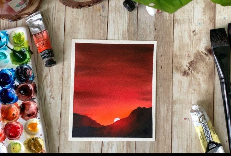
5. DAY 01 - Fiery Sunset: Hello, hello. It's a lovely day to paint a gorgeous sunset. We are starting
off this challenge with this gorgeous
color combination. It's a bold and
beautiful sunset. Now here's the reference
mate I considered. Obviously, I have changed
the colors a little bit, according to the ones
that I have with me, and also considering the
properties of watercolor. Before we start, let's have a quick look at all these colors. It's a bright red
and orange sunset. Obviously, you will need
some red and orange. But along with those, I have
also used one more color, which you can see on the top. Maybe I will start
with orange and red. Then you will also
need some brown to introduce some darker
tones onto the sky. The orange I'm using here
is orange from cenar. Then I have pyrol
red from Shinhan. Then I also have some permanent brown from art philosophy. I will swatch out one by one, so you have a better
idea about these colors. You can go with any
orange you have caught. If you don't have orange,
just go with vermilion. It will be a bit more
darker than this. That's only difference,
but that's still okay. This one is orange from cenar. Now coming to the
second color is red. It's another bold
and beautiful color. This one is called pyrol red. It's from the brand Shinhan. See that? It's a very
bright and bold red. Now, there's one more
color you will need for the sky, which is brown. I won't be using brown
acids for the sky. I'm going to make
some brown and red together to create a
dark reddish brown. That's a color you
see on the top. Now along with
this, you will need one more color, which
is paints gray. We'll be using this
color for the mountain. Now, along with
these four colors, you will also need some
white watercolor or white case to add the sun. Okay that's some rise, all the colors you will need
for this gorgeous sunset. Here is a closer look
of all the swatches. You will need some orange, red, brown or burn
Cena, and paints gray. And also a little of white. Now, before we start, I'm going
to explain all the steps. We will first add the sketch, and then we will
start with the sky. So towards the bottom over here, we'll be applying some orange. And then write about that, we will introduce
some red over here. Then towards the top to
make the sky more intense. We will introduce
some taco toones. Using the same taco toon, we'll also be
adding some clouds. We'll be using a
mix of brown and red to add those taco
toons and the clouds. That's the first step
painting the sky. Keep in mind the
colors can be slightly different as we're mixing
and creating them. Now the second step is to paint this part of the mountain. Onto this side, which
is closer to the sun, we will introduce some
brown and reddish tones, and towards the extreme end, we will add some taco toones. Okay, that's a first
set of mountain. Now we have one more to paint. Once that is dried, we will go with a second
set of mountain, which is in the foreground. For this over here,
we will use more red to create that
glowing effect. For the rest, we will
introduce some brown and some paints gray to make
the contrast more intense. Finally, once we are done
adding the mountains, we will introduce that sun using white gash or
white watercolor. So those are the steps involved. It's a quick and
beautiful sunset. Now, if you're ready
to give it a try, keep all the colors ready on your palette and
let's give it a try. We already spoke
about the colors. I'm hoping you guys have
it ready on your palette. Now, the very first step
is to add the sketch. We need to add two
sets of mountain. I'm starting with a
one in the f ground. This is where I
will add the sun. Now I'm going to take
that to the top, giving it an interesting shape. Now finishing it off. Next, we can add the second
mountain in the background. That's a sketch. It's
a very simple one. You can modify the shape of your mountain,
however you like. It doesn't need to
be exactly the same. Before I start
applying the paint, maybe I will add
the sun as well. That's where we're going
to introduce a sun. When you're applying the paint, you have to keep that in mind. As we discussed, you
will need some orange, red, and brown for the sky. Keep all the colors ready on your palette before you start. Once you have them
ready, you can start by applying
a coat of water onto the entire sky using
any of your clean brush. This one is a 1 " white brush, and I'm applying a gentle
coat of water onto the sky. I'm leaving the
mountains as it is. See that. I'm
applying water around the mountain. That
is evenly wet. Now I'm going to keep
this pressure aside, and I'm switching to my
size number en tres. This is the one I'll be using to apply the paint onto
the background. The first color I'm
going to pick is orange, go the bright tone of orange, and apply that over here
where I have the sun. Carefully apply the paint along the outline
of the mountain. Only over here, we
need some orange. Go the brighter tone,
don't make it too light. We want a bold and
beautiful sunset. Make sure to go
the brighter tones in the first layer itself. Otherwise, by the time it
dries, the colors will be dull. I'm adding some more orange. I want it to be really intense. That's our first color. I'm
spreading that a bit more. Now with the same brush,
I'm picking some red, and I'm going to introduce
that next to orange. It doesn't need to be a
clean, perfect blend. For now, simply introduce the
paint onto the background. Then we can fix it later. We have applied orange and red. Now with the same brush,
I'm picking some brown, and I'm mixing that with red, and I'm going to add that color into the sky next. See that. The red is much
more intense now. We started off with
orange then red, and now we're using a
mix of red and brown. I think we can
make it a bit more darker by adding a
little of paints gray, not a lot, just a little. Into the same mix
of red and brown, I'm adding a little
of paints gray, and that's a color
I'm using on the top. Compare to the bottom, I want the colors to be more
intense on the top. That's why I'm using a mix of
paint scrape brown and red. That's a footstep. Now
with the same brush, I'm going to add some
lines onto the background. If the color is not dark enough, we can add some more
brown into the mix. Now, simply add some lines
onto the background. I feel there isn't much
red in my background. I'm going to clean my brush and I'm switching back to red. I will introduce some
more red over here. The color is not too bright. Now I'm happy with the red, but not that happy with orange. So I'm going to clean
my brush again. Then I will go with orange. And I will add that as well. This is just to make the
colors more intense. Otherwise, with
watercolor when it dries, it will tend to fade a little. I want the colors to be
really bright and intense. Even after the
background has dried up, that is the main reason why I'm introducing the paint again. If you want to add
some more lines or if you want to
blend the colors, you could do that at this point. Our background is
still very wet. Maybe if you want to
add some more lines and clouds onto the background, you could do that using
that darker tone. Or if you want to leave it acts, and that is totally fine. Don't touch the orange part. That is the most important
part of this painting. The rest you can
modify as you like. So I'm picking more brown
and I'm mixing that with red to create a darker
brown or a reddish brown, and with that color, I'm going to add some more
lines onto the background. In a very random way. I'm not disturbing
the bottom part much where we have
orange and red. I'm focusing more
on the top part. You can add them
however you like. If you're already
happy with the result, you don't need to
add them again. I don't have any paint
scy left on my palette. For the time being, I'm
taking a little of indico because by the
time I square some paint scray and mix the color, my background might dry up, so I don't want
to take a chance. That's why I'm
using indico here. I'm really loving the
vibrancy of the colors here. We have some bold and beautiful orange and red at the bottom. On the top to create
that contrast, even more beautiful, we're
introducing some darker tones. That's how the sky
has turned out. I'm really happy
with the vibrant colors we have got here. Now let's wait for this to dry before we go
to the next step. Okay, so that's completely. Now, we're going
to paint the set of mountain in the background. And for that, you will need
some brown and paints gray. This is the one
I'm talking about, and after that, we can paint
the F ground mountain. But I don't have enough
paints gray on my palette. So let me squeeze
out that first. For this mountain, we're
going to use three colors, a little of red, then
brown and paints gray. If you don't have brown,
go with burn Cena. I'm starting off by
picking some brown. I will go with a darker tone, and I'm adding that
along the outline. That's the tonal value I'm going with. Don't
make it too light. Go with a similar tonal value. Before I go with paints gray, I think I will add some
red onto the right side. Just a little over here. This side is closer to the sun. Only on this side,
introduce some red. The rest is going to be brown
and paints gray. All right. Now I'm going to
pick more brown. I will add that again.
Then for the rest, I'm going to add paints gray. This side has to be darker
compared to the right. For the mountain in
the Fokrond asphalt, we're going to follow
a similar pattern. Closer to the sun, we will
introduce some red and orange, and for the rest, we will
use brown and paints gray. It is much more bigger compared to the mountain we
painted right now, so we have to be quick. Let's leave this for drying before we go to the
Forond mountain. Oh. All right, so
that has dried. Now it's time to paint
the other mountain. This is the major area you
have to be careful about. And to paint that,
I'm going with a mix of orange
and a bit of red. Okay, so just make
some orange with red and use that
color over here. So only to this area, which is closer to the sun, we have to introduce
this reddish color. Follow the outline and
add some paint over here. You can see the color is quite intense. It is not too light. We can add a bit more, and
then we can go with brown. That's a foot step. Now with the same brush, I'm
picking some brown. Again, I'm going with
an intense tote. It's not too light. Around
the area where we have red. Keep on adding some brown. If you don't have
brown, just like I mentioned earlier,
go with burn Cena. Once you have added
red and brown, maybe before you go ahead with the next color, you can smug it. I'm picking my other brush, and I'm picking a little of red and I'm smudging this part. If it dries, it will
be difficult to smudge it. I think
this is the best time. Right now, we have
smudged red and brown, and that is looking really nice. Now we can introduce more brown, and gradually to the
extreme corners, we can add some
pins gray as well. Okay. I'm picking
some pins gray, and I'm adding that onto
these extreme sides. See that. Only when you introduce paints gray,
it will look complete. Earlier the contrast
wasn't very visible. Now it is starting
to look better. Now onto the other side asphle, we have to add some paints gray. I think we will have
to smudge it again because the colors are
looking too weird. It doesn't look like a mountain. It is looking like
different color patches. I'm going to quickly
switch back to my other brush and I'm
picking some brown, I'm going to smudge the color
quickly before it dries up. I think we'll have to
introduce some more right to smudge it. I'm cleaning my brush,
picking some clean brown, and I'm adding that over here. Next, I will have to
clean my brush again. And then I will go with red. And I'm adding that
over here to smudge it. It doesn't need to be a
smooth, perfect plant. Overall, it has to
look like a mountain. It shouldn't look like
different patches of colors. That's
the only thing. If you want to introduce
more orange or red, you could do that. That's
how it has turned out. I think it is looking
quite decent. I don't want to
overdo and ruin it. I'm going to call it done. That's how it has turned out. It is already glowing. Now, there's one more step
left, which is adding the sun. But before that, we'll have
to wait for this to dry. All right, my dear friend,
so that is dried completely. Now we're going to go ahead with the final step, which
is adding the sun. For that, you can either go with some white gas or white
water color. Both will work. We just need to go
with an opaque paint. Don't add a lot of water. I'm picking some paint
directly with my brush. I haven't added much water. We ad a paint,
which is in opaque. You can add one or two
drops of water just so that you can pick the
paint, but not so much. Now with that white paint,
I'm going to add the sun. On the top, you have
a semi scar shape and towards the bottom, you have to follow
the same shape of your mountain. See that. Now we can fill it
up. Be careful. Don't make it too big,
go the similar size. I'm nearly done, filling it up. I'm super happy with the result. The colors are really beautiful. Also, I feel adding
that setting sun, give it a finished look and it is looking more gorgeous now. I feel the shape is not clean. I'm making that a
clean half circle. If you would like
to, you can also add some birds
flying in the sky. Even that will be
a great addition. You can add a group of
three or four pers. Small ones. Anyway,
that's all for the day, we are done with our painting. I cannot tell you how much I
love this color combination. It is bright and beautiful. Anyways, now it's time to
peel off the masking tape. Peel it off only when you're sure your painting
has dried completely. Otherwise, it might
rip off your paper. Also peel off the masking
tape at an ankle very gently. All right, so here is our
gorgeous sunset for the day. Beautiful ride. If you are
still watching the video, and if you haven't tried it yet, go give it a try right away, and let me know if you liked it. Okay, so thank you so much
for joining me today. I'll be back soon with
our next gorgeous sky.
6. DAY 02 - Pink Clouds: Hello, dear friends.
Welcome to day two of painting quick and
beautiful watercolor skies. Now, here's the paint that
we're going to try today. It's a beautiful
pink cloudy sky. I just loved the way
it has turned out. So here's the reference
image I came across. I wasn't really sure
whether I'll be able to pull off
those pink clouds. I gave it a try and
I really liked it. And then I thought
of adding that into this class because it's
unusual color combination, and it's really pretty too. Anyway, let's have a look at
the colors you will need. And then let's give it a try. For this painting, you will
only need three colors, and I think they
are quite obvious. For the sky, you will need
pink and turquoise blue. These are the two colors
you will need for the sky. The turquoise blue I'm going to use here is
from white knight. We will use a medium
tone for the sky, and we'll apply that
color around the clouds. Okay. So that's the kind of
tonal value I will be using. Now, the second
color is basal pink. This one is called
brilliant pink. It is from Shinhan. If you
don't have a Pasal pink, just have a look at the
color palette section. I have explained how you can create a Pasal
pink quite easily. So that's a second
color you will need. Now, there's one more color
you will need for the sky. OI is a mix of these two colors. I'll just be mixing
some pink with turquoise blue to create a shadow violet kind
of a color. See that? Just to add some shadows
and textures onto the sky. I will be using a mix of
turquoise blue and pink, and here's the color you will get when you mix
these two colors. The color can be a bit different according
to the amount of pink turquoise blue you're adding, and that's totally fine. Don't worry about
it. Now, there's one more color you will
need, which is pins gray. To add those palm trees, you will need a daker tone. It could be black or pins gray. That summarize the colors you will need for today's painting. Here is a closer look. You will need turquoise blue, pastel pink, and
also paints gray. I will quickly explain the steps that we will follow
before we start. So first, I'm going to
start the turquoise blue. We'll apply that onto a wet background by leaving
some shapes in between, and that will eventually
turn into the clouds. Onto those gaps, we are
going to apply some pink. Then we will introduce
some shadow sapo. Okay. So you can go with any kind of shapes that
you need for your clouds. It can be similar shape
or a different one. That's totally fine.
Once the sky is ready, we will use paint
scray and we'll add those palm trays onto the background to give
it a more complete look. Okay, so those are the steps involved. Now, let's
give it a try. Okay, so my paper is ready here. Now, before you start,
you have to make sure you have the colors
ready on your palette. You will need turquoise
blue and pink. Those are the first two
colors you will need. Okay, so keep them
ready on your palette. I also have a rough idea about how you want to
place your clouds. How big you want them to be or what is the kind of
shape you want to go with? Okay, so the preps
over. Now, I'm going to start by
applying coat of water onto the entire
sky. Don't add a lot. We just need a gentle
coat of water. Make sure your brush is clean before you start applying water. And run your brush
multiple times just to be sure the
coat of water is even, and it has reached everywhere. My background is evenly wet. Now, before you start, you
have to make sure you have a paper towel next to
you or a cotton cloth. Just in case if you're
paint is two watery, you can dab it on a paper
towel and make it perfect. Now let's start
applying the paint. I'm going to use my
size number eight on tres I'm starting by picking a medium tone
of turquoise blue. Add some water and turn
that into a medium tone. If it's to watery dab
it on a paper towel. Now I'm going to add
some paint onto the sky, leaving some shapes in between. I'm starting from the
top right corner, and I'm leaving some
space in between. It is these white
spaces which will eventually turn
into pink clouds. So whatever kind of
the shape you want, leave it that way. I have one on the left, and then I have another
one on the right. You can modify the
shape as you like. Now I'm going to bring
that paint down, and then I will add an
irregular shape here. Then I will also leave
some space at the bottom. Okay, that's a kind of
shape I have gone in with. You can modify it
however you like. If you want to introduce
some more paint in between, if you feel it's too light, you could do that as well. Okay, so that's the first step. I need to switch to pink
before the background dries. Okay. Now I'm going
to clean my brush. Then I'm going to
switch to pink, dab it on a paper towel
and be sure it is clean. Okay. Now I'm picking some
pink paint on my brush. I will go with a lighter tone, and I'm going to introduce
that onto these in between spaces. So
simply add that in. That's the kind of tonal
value I'm going with. Now, when you're over here,
closer to turquoise blue, it will automatically create
a violet color over there, and that is totally fine. It will end up looking like
the shadow of the clouds. It's actually a good thing
while we're adding the paint, we are automatically
introducing some shadows there. But there are chances your brush might have become a bit dirty. So dab it on a paper towel
before you pick pink again, or you can wash it off. I'm adding some more
pink over here. The background is
still very wet. Now I'm going to
add that over here. Onto that space, we
have in between. Add some pink paint.
Simply add that in. As the background is still wet, they will nicely spread
into each other. Leaving a beautiful cloud. Don't put a lot of pressure. Simply add that in.
That's a second cloud. Now let's apply paint
at the bottom as well. Whenever you're adding the
paint, be very gentle. Don't put a lot of pressure. That will leave
some brush marks. Use the tip of your brush
and add in the paint. Looks like this part
has dried a bit. I'm just going to push
that paint into the blue. Anyway, I'll be adding
some shadows over here. So it doesn't really matter. You can add the pink
paint on top of blue as well. It's
not a problem. Okay. So we have some
more area left here. All right. So we have
introduced pink everywhere. Now, to give it more
three dimensional feel, we need to add some
shadows using violet. Mix some chircise blue and pink, and then keep on adding some
shadows onto the clouds. We can add few at
the bottom and also over here along the
bottom side of the cloud. So mix up some
irquise blue and pink together and create
a piecel violet. Here is how the color
should look like. Now, simply add that in along the bottom
side of the cloud. The background is still wet. So it just dropped that
in onto the background. Let's add few over here as well. Okay. You can add them
however you want to. It doesn't matter. If you
add more darker shadows, it will look more dramatic. If you go with lighter violet, it will look simple
and minimalist. So it's your call. You can't decide on how you want
your clouds to be. Now, I'm going to
pick a slightly darker tone of the same color, and I will add that
at the bottom again. And also a few over here. Okay. Wherever you
have the clouds, you can introduce some
shadows like this. You can spread that a bit
into the blue part as well to give it a
more natural feel. That's how I have
introduced all the shadows. Now it is looking
a bit prominent. I'm going to clean my brush. I will dab it on a paper towel. Then I'm going to pick a little of pink with the same brush. Just a little, not a lot. Again, make sure it
does not do watering. Now with that paint,
gently smug these areas. Don't touch the top,
leave it acid is. Gently smudge the paint over here, to give it a softer look. Make sure you're not
rubbing and scrubbing the paint too vigorously,
be very gentle. That's how it has turned out. Now let's do the same
thing over here. I think the rest is
looking quite good. Maybe we can introduce
some more shadows there. I love the color combination and that let shadow is
going very well together. All right, so that's a sky. I don't want to
overdo and row in it. So I'm going to call it done. Now, when the
background dries up, the clouds are going to turn
really soft and fluffy, and I'm really waiting for that. So let's take a short break and come back when this
has dried completely. The background has
tried completely, and you can see how beautiful
they have turned out. Now the next task is to
add some palm trees. For that, I'm going to
pick some paints gray. I will go the darker tom, and the brush I'm using
here is size number six. Go any of your smaller
or medium sized brush. Now the first step
is to add a line. It can be a straight line or
a slightly irregular line. That's the height
of your palm tree. Towards the bottom,
you can make it slightly thicker and
towards the top, it has to be a bit thinner. Okay. I'm making it a little more thicker
towards the top. If you don't have pin screen,
you can also use black. You can add your tree
wherever you want to. It doesn't need to be
on the same location. You can add that on to the left or maybe
towards the center. I have added a line there. Now towards the top, I'm going to add some
irregular shapes. We're adding that tree texture. Just add some irregular
lines and some palms on either side and make
it look rough and messy. See that? We just
need them on the top. Keep adding some lines onto either side and turn it
into something like this. The kind of palm
tree we're painting here is called fan palm. Now on the tip, I'm going
to add some curvy lines, some simple curvy lines. I'm picking more paint. And I'm going to add five
or six coveer lines. The first one goes over there. Now next to that, I'm
adding another one. In a similar way, you can add five or six or seven
or eight of them. I've added three, four, five. I think I can add one
more towards the left. I have added six lines. It can be seven or eight.
It doesn't matter. Now onto these
lines onto the tip, I'm going to add
some messy lines. Onto either side, keep
on adding some lines. They don't need to
be perfectly shaped. It can be messy. Now
in a similar way, we need to fill
up all the lines. Let's go the next one. Only on the tip add these lines and
leave half of it empty. That's a third one. Keep on adding these messy
lines and fill it up. This kind of palm tree is much more easier than
the coconut trees. It's easy and it will look more realistic
than the other one. You can do it quite
quickly as well. Maybe we can add one
more line in between. I'm adding one there to
make it look more tense. That's a first palm tree. Now you can add more lines
like this to make it look fuller. This one is done. I think it turned out
really beautiful. Now, I'm going to
add one more maybe towards the left side,
closer to this tree, I'm placing it over here, and this line is
slightly irregular, not a straight line like Da one. And it is shorter as well. That's a high time going. Now, just like I
mentioned earlier, you can place your tree
wherever you want to. You can go with a taller
tree or a shorter tree. Just follow the same technique and add a tree
wherever you like. Now I'm adding those irregular
shapes onto the top, and I'm making
this part thicker. Now the next step is to add those curvy lines onto the top. You can add as many as you like. Then right after
that, we need to introduce those messy
lines onto the tip. And with that, we'll be
done with our painting. Now it looks like a spider. We need to introduce
those lines onto the tip to make it
look like a pump tree. This one is a very easy
way to paint a palm tree. You can use it on your
other painting sap. You can paint some nice
skies and add these trees. You can actually
paint a bright blue, cloudy sky with
some white clouds and then paint the
same tree in green. Use different tonal values of Sap creen when you're adding these palm leaves and use burn Cena or brown
for the tree trunk. I think that will also
be really beautiful. So yeah, give it a try
if you're interested. Anyway, with this, we are done with our
painting for day two. Here's a finished painting. I just loved it. Now if you want to add another
tree, you could do that. Maybe onto this corner, you can add a tall tree. All right, so that's
all for the day. Now it's time to pull
up the masking tape. And here is the
finished painting. You can see those beautiful
pink clouds. Lovely, right. It's a stunning
color combination. So give it a try if
we get to try it. And let me know if you enjoyed painting this
beautiful, cloudy sky.
7. DAY 03 - Colorful Sky: Hello, Lowes. Welcome
to Day three of painting quick and
beautiful at color skies. Our painting for the day
is a multi colored sky. It's a super standing sky, and you could do
this quite easily. It is just a matter of
applying those five colors onto the sky and adding some clouds
while it is still wet. Now, before I take you
through the colors, let me show you
the reference mes I considered. Here it is. The colors are absolutely
inspired from this photograph. There are more foreground
elements in the photograph. I simplified them to fit
in our 15 minute scheduo. But yeah, I tried to bring out the same kind of
vibe for the sky. And I think I did maybe 60%
gestice to the photograph. Anyway, now let's have a look at the colors
you will need. As you can see here,
it's a multicolored sky. On the top, I have some blue, then some violet here, then some rose,
orange and yellow. So for the sky, we're
going to use five colors. I will start with the blue. This one is Cobalt blue. Here is the color. It
is from art philosophy. You can go with any
blue of your choice. It could be Prussian blue, ultramarine blue, cellu blue, or any other blue. So
that's a first color. Now, coming to the second color, it is permanent rose. If you don't have
rose, you can go with crimson or carmine. Now, the color you
see in between, that violet is a mix
of these two colors. All right, so we have cobalt
blue and permanent rose. Now the next color you
will need is orange. This one is called brilliant
orange. It is from Shinhan. You can go with any
orange you have caught, or you can use some
vermilion instead. So we spoke about blue rose. Then there we have a mix
of these two colors. Then we also have orange. Now the last color you
will need is yellow. Towards a mountain, I'll
be using some yellow. This one is cadmium
yellow light. You can go with any yellow. It doesn't matter. For the sky, you will need five colors, blue, rose, violet, orange and yellow. Okay. Now, for the
mountain, over here, I will be using some yellow, then towards the other end, I will use some cabal blue. And in between, when those two colors are getting
mixed, you will get a green. And for the meadow, I
will use some sap cream. For the meadow as well, we will need some yellow
towards the left side. To add those lighter tones. Okay. Now, along with this, we will also need
some paints gray to add the deeper tones
towards the right side. All right. So that summarize
all the colors you will need for this beautiful
multiclored sky. We will need some blue, rose, orange, yellow, sap
green, and paints gray. Before we start, let's quickly have a look at the
steps involved. We already spoke
about the colors. We'll apply blue on the top, then some pink, orange, and some yellow
towards the bottom. The major focus is
on the left side. When we're painting
the mountain, and in the meadow, we'll
make that area lighter. We'll start with the sky, then the mountain,
and then the meadow. It is not a
complicated painting. The only thing you might
feel a bit tricky would be the sky because of the
colors we are using, there are too many colors, but we'll be adding clouds only on the top, using
these two colors. We'll go with a mix of rose and blue to create a color
which is more like purple, and using that color, we
will add some clouds. That's it. Now,
let's give it a try. I'm starting by
adding the sketch. We need to add a line
and irregular line, which is sloping
towards the left. Next, we need to add a
mountain right behind this. That's a mountain
in the background. Go with the really
light pencil sketch. Don't make it too dark, especially on the left side. If it's too dark, the
pencil sketch will be seen even after we have
applied the paint. Over here, go with a very
light pencil sketch, or can just erase this part and you can
add it as painting. So that's a sketch.
Now, make sure you have all the colors
ready on your palette. You will need some blue, rose, orange and yellow. It is very, very
important to have all the colors ready on your
palette before you start. So when you have them ready, you can start applying a coat of water onto the entire sky. Apply a nice general
coat of water. And make it even wet. That's my sky. I have applied
a clean coat of water. Now, what I'm going to do is, I will go with my size number e tron press and I'm picking
a medium tone of Copal plu. This is the first color
I'm starting with. I'm applying that on the
top part of the sky. Okay. So apply that onto
the wet background. Go the similar tonal value. Don't make it too
light or too dark. You can apply the paint,
however you like. It can be a straight line
or an irregular shape. Now, I'm going to
clean my brush, and I'm going to pick some
rose with the same brush, and I will mix that with blue to create a violet
or more light purple. I have added more rose into it. Now, I'm adding that
color right next to blue. You can go with
violet or purple. It's roly your choice. I want a purplish color, so I'm adding more
rose into the mix, and that's a color
I'm going with. Now let's clean up brush again. This time, let's pick some clean rose without
any blue in it. And I'm adding that
right after this purple. Now blended gently. We have blue, purple, and rose. Next, we are going
to switch to orange. Let's clean up brush again. And I'm going to
pick some orange. I'm adding orange only
towards a right over here. Onto the other side, I
will be introducing some yellow. There is orange. I have added some
over the right side. There is a lot of
paint on my brush. I'm dabbing that
on a paper towel. I'm gently smudging
that with rose. Okay. Next, we have
to go the yellow. It's time to clean
the brush again. Let's pick some yellow,
some clean yellow. This one is cadmium
yellow light. Go with any yellow
of your choice. Now, introduce some yellow
closer to the orange. Don't fill the tire area. Towards a mountain, we
have to make it lighter. Okay. So just add a little. Now clean your brush. And go with some water and make it lighter
towards a mountain. That's a base layer. It
turned out really beautiful. Now, in case, if you
want to introduce some orange or rose or violet, you can do that right now. Our next step is
to add some clouds onto this background,
mostly onto the top. And for that, I'm going
back with purple. I'm using a smaller brush, this one is size number six, and I'm picking some purple, the same color we
created earlier. And with that, I'm adding some clouds onto the
area where I have blue. Just a few smaller clouds. I'm not going to add a lot. Now, just in case if
we don't want to add any clouds onto the sky,
that's totally fine. I think it's already
looking very pretty. So there is no real
need to add the clouds. Only if you want to make
it a little more dramatic, you can go with some clouds. Okay. So I've added
some clouds on the top. I'm adding more
pink into the mix. I mean rose into the mix, and I will add a few
more clouds over here. Okay. So it's more like a
darker rose than purple. L et's add a few more here, and maybe towards
Other side ash. Maybe with the same color, we can add some
clouds on to the top. I'm really liking this color, and my background is still wet, which is very important. If you feel like your
background is starting to dry, you can call it done. It is always better not to touch it if it is
starting to dry. I've added some
clouds on the top. I think I can add a few
more towards the bottom. I'm cleaning my brush, and I will pick some more rows. I'm just adding one or two
clouds towards the bottom. Just a few, not a lot. I'm very happy with the
way has turned out, so I don't want to
overdo and ruin it because I have the habit of over working on things and ruining, which was looking
decent as Hawaii. So that's my sky. It's a
beautiful color compoion, and it turned out really well. I loved the clouds as well. Now we have to wait for this to dry before we go
to the next step. Okay, so that is
right completely. Now, our next task is
to paint the mountain. Now, for the
mountain, over here, we will use more of
yellowish colors, and towards the other
end, we will use blue. I'm starting with blue. It's the same blue
I use for the sky. It's Cobal blue,
and I'm going to apply that onto the
right most side. As we have other colors
in the background, some orange and yellow, the color might look
a bit different. It wouldn't look
exactly like blue, and that is totally fine. You can see the result here. This one is more like a
darker green than blue. Now I'm going to
use the same color, and I will apply
that a bit more. After that, I will
co with yellow. Over here, we have a lighter
yellow in the background, and that's the reason why the color is looking
a little lighter. On the right side, it
is more of orange, and the color is
much more darker. Now with the same sh, I'm picking some yellow. The same yellow I
use for the sky. This one is cadmium yellow. Take a little of that and
start applying that from here. First apply yellow and
smudge that with blue. You can see we have
got a green there. Now I'm applying the same
color towards the bottom. Now, let's clean up the brush, and towards the top, we can
introduce some clean yellow. Go with a lighter tone. Don't make it too bright. So the only two
colors we have used here is Cobalt Plue and yellow. We started off with Cobalt blue. We applied that
towards the right. Then towards the left, we
introduce some yellow, and this is how it
has turned out. Applying a lighter tone
of yellow over here is really important to create
that glowing effect. So that is one thing you
have to be careful about. The rest isn't that complex. Now we'll have to
wait for this to dry before we go
with the meadow. Okay, so we have the sky
and the mountain ready. Next, we can paint the meadow. The first color you will
need is a lighter green, so I'm picking some yellow, and I'm mixing that with a bit
of Sab green a little bit. Now I'm going to apply
that color onto the left. I'm planning to make
this side lighter and the right side is going to be darker compared to the side. To retain that glowing effect, it is really important to use lighter tones on the left side. Okay. So that's a
lighter tone of green. Now with the same brush, I will pick some more sap cream, and I will apply that
onto the right side. So on the left, go the
similar tonal value. Don't use some medium
tone or darker tone. Now I'm picking some sap cream, and I'm retaining some
of the lighter tone over here. See that. Simply introduce your sap cream on to the rest of the area. Then after that, we'll have to add some
more tucker tones. For now, simply fill
that in with sap cream. Okay. So we have a
lighter tone on the left, a medium tone on the right. Next, we need to
smudge the colors to give it a more softer look. I'm dabbing my brush
on a paper towel, and with a slightly dry brush, I'm smudging the
paint in and out. Let's pick some
more green and add a few lines to introduce
some textures. But around the top line, you still have to retain
those lighter tones. Okay. Now I'm going to
pick some pain screen, and I will add that
towards the right. The idea is to
have lighter tones on the left, where
you have the sun. Then onto the other
side, you can add more taco tones
and medium tones. In order to make that glowing
effect more prominent, you need to add more taco tones. Only if you have that contrast, it will look more beautiful. Now I'm going to add
in a few more lines. I'm not going to
touch the top part. I want to retain the
lighter tones actus. You can add the darker tones on the right and some medium
tones towards the center. So I'm adding a few
more lines using green. I think that's it. It looks quite good. We retain that glowing
effect on the left, and then we have added
some medium tones and darker tones
towards the right. Maybe just onto the right side, I can add some
more darker tones. I'm picking some
more paints gray. I feel this area is
not dark enough. The rest I will leave
actus only over here. I'm adding some paints gray. Okay. So that is said, that's our painting for the day. I just loved the way
it has turned out, especially the glowing effect. I hope you all enjoyed it, too. Now it's time to peel
off the masking tape. Before you peel off
the masking tape, always make sure your painting
has dried completely. Otherwise, when you peel
off the masking tape, the paper can come
off along with that, and you won't be able
to get a clean border. Also when you're peeling
off the masking tape, gently peel it at
an ankle like this, Don't peel off in a rush that
might spoil your painting. Always be very gentle and
peel it off at an ankle. All right, so here is our
painting for the day. It's a beautiful sky. We have used five
colors for the sky, and it turned out
really beautiful. And even the mountain
and the meadow, I think the fou
ground elements are going very well with
the colors of the sky. I absolutely loved it. Give it a try if
I get to try it, and I would love to know
if you enjoyed it, too.
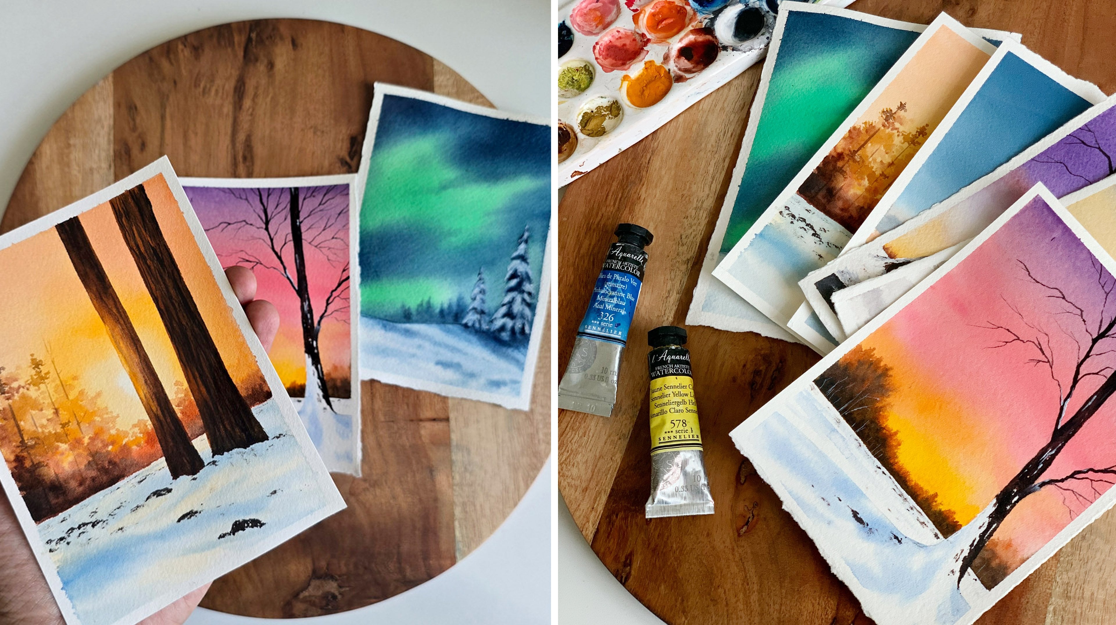
8. Day 04 - Seaside Sunset: Hello, dear friends. Welcome to Day four of painting
beautiful watercolor skies. Here's the painting that
we're going to try today. First, I'll show the
reference MT considered. The major difference
here is that I introduced some
indico on the top. Otherwise, our painting
will quite dull. Okay. Now let's have a look at the colors we will need
for this painting. The sky is a color combination
of indico and yellow. Then on to that, we will
add some cloud orange. Okay. So the first color you will need for
the sky is indico. For the C as well, we'll be using a medium tone of indico. This one is indigo
from art philosophy. If you don't want to use indigo, you can use press blue or any
other blue of your choice. Now, for this painting, I
will be using two yellows. One is Naples yellow. Naples yellow compared
to other yellows, is a safer color to use along
with the blues for the sky. This is the second color.
It's a pasil yellow. Now the next yellow
you will need is any of the bright
yellows you have caught. You can also go with one yellow that can be Naples yellow. This one here is
cadmium yellow light. I wanted a brighter yellow
as well for the sky. That's why I thought
of using two yellows. Okay, so we have Naples
yellow and dmu yellow. Now the next one you will
need is any kind of orange. This one is brilliant orange. You can use vermilion or any
other color you have caught. Okay, so these are
the four colors we will be using for the sky. Now the next two colors
are quite obvious. You will need brown and
paints gray for the rocks. This one is permanent brown. Again, from art philosophy. If you don't have brown,
just go with boncena. The next one you will need is paint scray to add
all the deeper tones. Okay, so that summarize all the colors you will
need for today's painting. Here is a closer look
of the swatches. You will need indico,
Naples yellow, and one brighter yellow, then some orange, brown or
Burnsena, and paints gray. Now, I'm going to quickly
explain the steps involved so that you have a better idea on how to approach the project. The first step is
to paint the sky. We will start with indico. On the top, we'll
use a medium tone, then we'll make it lighter. Then over here, we
will use yellow. Only around the
mountain over here, we'll have to use a
lighter tone of yellow. The rest is going to
be a medium tone. It's just to create
that glowing effect. Then onto that layer, we will add in these
clouds using orange. That's how the sky
is going to be. Then we will go with the sea. For that asphalt,
we will use indico. We'll use a medium tone, then we will add in
all those textures. Then finally, we will
paint these rocks. Only for this one at the center, we will have to put
in some more effort to create that gluing effect. Over here, we'll use orange, brown, and paints gray. The rest is going to
be just paints gray. Those are the steps
we have to follow. I hope we all got a better idea. Now let's give it try. Let's start with the sketch. First, you will need to
add the horizon line. Okay? Now we need to add some
rocks onto the background. First, I'm adding a
huge one at the center. So you can go with
any shape and you can compose your painting
however you want. Okay. Go with an irregular shape to make it look more natural. That's the first one.
Now, right next to this, I'm going to add
another one over here. We can modify the sheep
when we're painting. For now, just add some
random shapes like this. That's a sketch.
We have it ready. Now, before you start,
make sure you have all the colors ready
on your palette. We will need indico,
in Aples yellow, then a bright yellow,
and also some orange. These are the colors we
will need for the sky. When you have them
ready, start by applying coat of water onto
the entire sky. Don't add a lot. We only
need a shiny coat of water. Okay, so my sky is evenly wet. Now we can start
applying the paint. And for that, I'm
going to go with my size number eight ram brush. Go with a flat brush or ram
brush, any brush you prefer. Make sure it is
clean. Now, start by applying a medium tone
on the top of the sky. That looks a bit dark. I'll just make it a
bit more lighter. Okay. So start with the medium tone and make it
lighter as you come down. Towards the bottom, we want
the blue to be really light. Otherwise, when we're
applying yellow, it will turn into a muddy green. Okay, so that is indico. Now, I'm going to
thoroughly wash my brush. Once you're sure, there is no leftover indico
on your brush. Pick some Naples yellow and start applying that at the
bottom part of the sky. When you're applying yellow, there is one thing you
have to be careful about. We are going to apply color from either side
toward the center. At the center, we're going to leave some white space acids. Over here, right
about the huge rock. We need some white space. Keep applying your paint from either side towards the center. You can simply add some lines
onto that wet background. And also start with a
light tone of yellow. If you dab a brush
on a paper towel, you will see some
greenish color, see that. Always start with
a lighter tone, and then gradually, you can keep on building the
intensity. See that. Begin with a lighter
tone always, and then keep on
building the color. You still have to retain that
lighter tone at the center. That is really important. Next, I'm going to pick
some brighter yellow and I will apply that onto
the sky from either side, just the same way
how I did earlier. See that. I'm not going to
apply any onto the top. Over there, I want
that lighter yellow. Okay. So that is
yellow and blue. Next, I'm going to clean my brush and I'm
switching to some orange. We're not going to use
an intense orange. We need a patel orange. So with my smaller brush, I'm going to pick some
Naples yellow first. And then into that, I will
add a drop of orange. So that's a color I'll be
using to add the clouds. If it's too watery, dab
it on a paper towel. Now, let's add in the clouds. I want some smaller
clouds here and there. I'm not going to add a lot. I want a simple sky. So go the similar tonal value. We don't need a bright orange. And also remember to retain that lighter tone at the center. Don't add any paint over there. So with all the skys
that you're painting, you have the chance to make
it dramatic or simple. If you added more
clouds, more bigger, and darker clouds, it
will become dramatic. And on the other hand, if you're using some soft pasal colors, your sky will look more
simple and minimalist. Okay, over here, I'm just
adding a few clouds, using a pasal orange. You can see they are
not very dramatic. Now, I will add a few
towards the top as well. Okay. Over here. I will just add one or
two smaller clouds. I don't want to make
it look too dramatic. Okay. Maybe a smaller
one right next to that. And also, if you have noticed, I'm adding these clouds, only where I have
a lighter blue. I'm not adding them
towards the top. Okay. So this way, it doesn't create a muddy
color in my sky. It will stay as nice,
beautiful colors. Okay. Now if you want to add some more, you
could do that. Otherwise, we have
done with a sky. Okay, so the sky has
dried beautifully. Next, we can go with the sea. Use any of your
medium sized trush and go with the medium
tone of indico. Go with the medium
tone. It should not be too dark or too light. That looks really dark. I'm adding some more water.
This one looks fine. Go the similar tonal value and apply that onto
the entire background. First, we'll apply
a solid wash of indico onto the
entire background. Then we can start introducing some textures and some
waves onto the background. For now, simply go with a similar tonal value and fill
up the entire background. If you accidentally
add some paint onto the rocks,
that's totally fine. But the one right
next to the sky, the bigger one here,
try to leave it actus. Don't add any paint onto that. The other ones are
fine, you can just ignore it. That is indico. I will quickly smudge it the way I have applied
the color doesn't look really nice.
That is indigo. Now I'm going to go
with my smaller brush. This one is size number six, and I'm picking a slightly
darker tone of indico. Not too dark, just
one to darker. With that, I'm adding some
lines onto the background. The same with background. See that? Simply add some
lines to create some texture. We'll be adding more at the end when this
layer has dried. For now, you don't need
to put a lot of effort. You can simply co a
slightly darker tone and add some lines
onto the background. Maybe we can add
one more round of lines using a little more
darker tone of int Code. Okay, Let's add some more lines. They can be longer
ones or shorter ones. It doesn't matter. And
the background is wet, so they will spread a little, and that is also fine. Okay, I think for now,
this is looking fine. Now, the only task left
is to paint the rocks, but for that, we'll have
to wait for this to dry. Okay, so that has
dried completely. Next, we can start
painting the rocks. So first, I'm going to paint
the one next to the sky, and I'm starting with orange. I will apply orange
along the top line. So this is the area which
is closer to the sun, and there will be some
sunlight hitting on it. So to represent that, we'll have to start with some orange. And then you can go with
brown or burn Cena. Go the slightly darker tome. Don't add a lot of water because we're painting
an evening scene, so the colors will
be more darker. Now apply that next to orange
and smudge it together. Only on the top, we
need some orange. The rest is going to be
brown or burn scena. O, which will be the
color you have caught. Now, gradually, we will
add some takton asp. We will make some paint
scray with brown, and we will add that along the bottom to make the
contrast more intense. Right now, we have only
used orange and brown. You can smudge the colors. It doesn't need to
be a proper blend or anything, just mudg it. That is orange and brown. Now I'm going to pick some paint scray with the same brush. And apply that along the
bottom part right over here. On the top, we have to retain that orange and brownish tones. Only towards the bottom, we want to introduce
some taker tones. This will create a nice contrast and make that glue
more prominent. Simply apply some taker tones on either side and
also at the bottom, then smudge it into
the background. I'm picking some brown to make
the smudging more easier. If there is a lot of paint, you can dab it on a paper
towel and then smudge it. Be very gentle when you're
smudging the paint. Don't put a lot of pressure. That will leave
some brush marks. That's how it has turned out. If you want to add
some more darker tones towards the bottom,
you could do that. Or I think we can continue
with the rest of the rocks. I'm picking paints gray actus, and I'm going to apply
that for this rock here. Only for the one at the top, which is closer to
the sun and the sky, I have some brown and orange. For the rest, I'm just
going with a darker tone. I feel I didn't add
much darker tones, especially at the bottom. I'm introducing rag.
Just along the bottom, I will add some ataco tones. Then I will continue
with the rest. I'm adding some paint
scray for this one here. Now, maybe for the rest, we can go the Daco brown. For the next one, the
one on the left side, I'm just adding
paints gray acts. I'm not adding any brown. Goth in irregular shape and simply fill that an tire
rock and paints gray. You can see the way
it is turning out. Only for the one at the center, we used orange and brown to
create a glowing effect. For the rest, we didn't
put much effort. Now, I'm picking some brown and I'm filling up
this remaining area. I won't be adding any more
textures or details onto this. It's a simple painting and our
major focus is on the sky, not on the f ground elements. I think this one is
looking quite good. We'll need to add
some more textures on the sea using a taco tone. But before that, if you
want to modify your rocks, if you want to change
the shape a little, you could do that right now. Also, if you want to add one or two extra rocks
using a taco tone, that also can be done. This is how it is
looking right now. I think I will modify
the shapes a little, and also I might add a smaller
rock towards the left. I'm just modifying the shape. Go to the very messy
irregular line to make it look more realistic. I'm actually very much
impressed with the sky. The color combination
is really stunning. Earlier, honestly, I wasn't that impressed when we have
only painted the sky. But with the full
crown elements, I think it is looking
really beautiful. Anyways, that is done. Next I'm going to
add one more rock towards the left side over here. A smaller one. You can go
with any shape and any size. I'm going with a smaller one. All right, so that's done. We have all the rocks in place. Now, I'm going to keep
this pressure side, and I'm going with
a smaller brush, the smaller size number two. And I'm going back with indigo. And with that, I'm going to add some more lines onto
the background. You can just randomly add some straight lines or wavy
lines onto the background. I feel the s lacks texture. There isn't enough texture
in the background. To introduce those textures, we are adding some lines. They can be longer or
shorter. It doesn't matter. But go to the smaller brush
and add as many as you can. I'm adding few on the top. Few over here onto
the small part. Now at the bottom as well. The rocks are still wet. It hasn't dried, and I'm
being very careful here. Okay, so simply add
some lines onto the background to
introduce some texture. If you want to wait
for the rocks to dry, you can add this after
that has dried up, or it can be a bit careful because all of
these are darker tones, so there's no way you're
going to ruin it. All right. So that's
how it has turned out. I cannot tell you
how much I love the color combination
and those rocks. It is literally glowing. Now that we are done, it's time to pull up
the masking tape. Okay, so here we are, here
is our painting for the day. I think it's a color
combination that we all have witnessed
in our life. It's a simple, yet a
beautiful color combination. So if you're here to try, be sure to try it out and
let me know if you liked it.
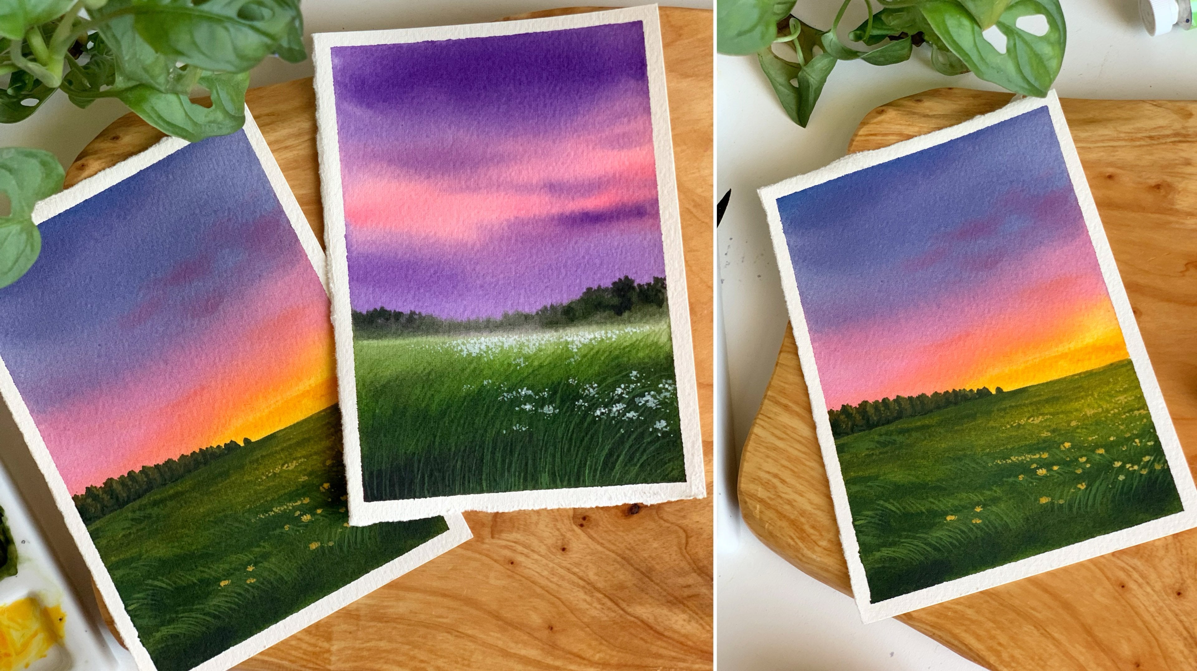
9. Day 05 - Blue and Pink Sky: Hello, dear friends. Welcome to Day five of painting
quick verticle skies. And here's our gorgeous
sky for the day. I love the softness over here and also the bright
colors on the top. Even the mountains and
the whole composition. It's a really simple, yet
a beautiful painting, and I'm very sure you guys
are going to love it. For this painting, I didn't
use any reference image. It was straight out
of my imagination. So let's start by having
a look at the colors. The very first color you will
need is obviously a blue. The one I'm going to use here is Cabal blue from art philosophy. You can't change that with any
other blue of your choice. It could be Prussian blue, ultramarine blue, or any
other blue you have got. This one is a very
bright and bold blue, and I'll be using the same
color to add the cloud t aspo. So that's a first color. Now, the second one you will
need for the sky is a pink. This one is called brilliant
pink. It's a basal pink. It is from the brand Shinhan. So Tse are the two colors
I'll be using for the sky. If you don't have petal
pink, it's absolutely okay. You can easily create
that color by adding some white water color with
crimson or any kind of red. Okay. So These are the first
two colors you will need. The next one is a patel violet. I'll be using that color for the mountain, the one
in the background. O is actually a mix of
cobal blue and Pasal pink. So the color will look
something like this. Okay. So we need a color which is more
like a Pasal violet. If you have a similar color in your palette, you
can use it directly. You don't need to mix
and create this color. That one is a mix of Pasal
pink and cobal blue. Now, there's one
more color you will need, which is Indigo. I'll be using this color mostly
for the Fucron mountain. The one you see in the front. It has caught more taker toons. The color you see
there is Indigo. I'll be using indico
to atom textures for the mountain in the
background as well. A little. You will lead Cabal
blue or any other blue, Pasal pink, then indico
for the mountains. Okay, so that summarize all the colors you will
need for today's painting. Here is a closer look.
Please don't worry, if you don't have the
exact same colors. Go the ones you have with you, which are nearly similar. Now, I will quickly walk
you through the steps to follow before we start so
that we have a better idea. Now, the first step
is to paint the sky. We'll start with
blue. We will use Cobal blue on the top and
some pink at the bottom. Then on to that background, we will introduce some clouds using a darker value of blue. That's how the sky is
going to turn out. You can place your
clouds, however you like. And also, it's not necessary
to add these mini clouds. After that, we'll
co the mountain. First, we'll co with this
one in the background, and after that, we'll paint
the one in the foe round. So those are the
steps to follow. It's a simple painting.
Now, let's give it a try. The very first thing we have
to do is to add the sketch. The sketch is a simple one. We need to add a mountain
in the background. A simple one. Now we need to add another
one in the fe round. So right below that, add
another irregular line. Okay. So this is all
we need for now. We can modify the
shape as we paint. I mean in case necessary. Now, these are the two colors
we'll need for the sky, cabal blue and pasil pink. I hope you guys have them
ready on your palette. Once you have them
ready, start by applying a coat of water onto
your entire sky, using any of your clean brush. Always make it a habit to
make sure your brushes clean before you apply a
coat of water onto the sky. For me, I rarely use
this brush for painting. I mostly use it for
wetting the paper. Okay, so it is clean. Now to apply the paint, I'm going to use my size
number eight ron tres. And I'm starting by
picking some blue paint, a medium tone of cabal crane, and I'm directly applying
that onto the sky. I want the color to be
really bold and bright. So I'm going with a color
which is not too light. You can go the
similar tonal value. Because by the time
the color is dry, it will tend to fade a little. So if you want a
brighter result, it is good to go
with a brighter tone in the beginning itself. Okay. It's a beautiful blue, and this one is Copal
blue from art philosophy. So I have applied blue onto
a major part of the sky. Now, towards the bottom
with the same brush. I'm just adding a few
lines in between. Is just some random lines. Now I'm going to clean
my brush. Os see. So clearly, your art
teacher made a mess, but I think I handled the
situation quite well. I used a paper towel, and I quickly wiped
off all the water. And this is how it is
looking right now. I'm not going to
give up. I'm going to continue with
the same painting. Now, I'm picking some pink. A lighter to of pink, and I'm going to apply that
right above the mountain. Let's add a little over here, and also in between the
blue we have applied. Okay. Just add the
pink in between. We don't need a lot, add a
few in between. That's all. You don't need to put
a lot of pressure, simply add that pink in between. That's it. Now,
leave it as it is. You don't need to smart
jo blend or anything. You can still see
some blue in between, and that is exactly
what we need. Now I'm going to
switch back to blue. Apply some paint
on the top first, and then we can continue
with the clouds. Luckily, my background
is still wet. Maybe some of you may
know, I reside in Dubai, and right now it is summer here, and it's super humid
and super hard. Every time I start with
my watercolor painting, it dries up so quickly. Anyway, that's a base layer. The most interesting part about the sky is this area where
we have pink and blue. In a way, before this dries, let's quickly go
with the clouds. To add the clouds,
I'm going to go with my size number six rush. The other one was
size number eight. Now I'm picking a
dark tone of blue. And I'm going to start
adding the clouds. Now, every time if you feel
your paint is too watery, dap it on a paper towel, before you start
adding the clouds, Be if your paint is too wet, they will start spreading a lot, and it will be very difficult to control the way
they are spreading. Now I'm planing to add
clouds mostly on the top. There we have blue. I won't be adding much
towards the bottom. Quickly, go with any of
your medium size fresh. It could be five or
six or even four and add some clouds using a taco tone onto
that wet background. You have the complete
freedom to go with any kind of shape that
you want for your clouds. They can be smaller
ones, or bigger ones. They can be rounded
ones or linear ones. Go with any shape
that you prefer. Just use a darker tone and quickly add them before
your background dries. Also be sure your paint
is not too watery. Those are the things you
have to keep in mind. I think my paint
is a bit watery, so I'm dabbing it
on a paper towel, and I will continue
adding a few more clouds closer to the pink area. I'll just add a few smaller ones here with a very little paint. I don't want them to
float into the pink part. I don't want to make
this area look too busy, so I will only add one
or two smaller clouds. See that? That's a bottom. Maybe we can add
one or two clouds on to the top using
a darker tune. The rest, I'm really
happy with the result. I'm picking some more blue, and I will add some darker
clouds onto this corner. Okay. That looks really good. I'm really happy
with the colors, the clouds, and the blend. Right now, as the background is wet and with that paper texture, it might not be that appealing, but by the time it dries, it will look really beautiful. So yeah, just like I
mentioned earlier, the Spink and blue part is my favorite thing about the sky. I love the way it
has turned out. Anyway, now let's take a short break and come
back when this has dried. That's how it has
turned out. You can see how beautiful it is looking with the pink
and the blue clouds. I'm really loving the
color combination. Anyway, our next task is to paint the first mountain
we have in the background. For that, as we discussed a o, I'll be using a mix
of pink and blue. There is some paper
texture here. I think it came off
from my paper towel. Anyways, let's go
the first mountain. I already have the
colors on my palette, so I'm just going to
mix them together. According to the amount of pink you're adding into the mix, the color can be a bit different,
and that's really fine. Those things doesn't
really matter. Just make some pink with bal
blue or any blue you were using and use that color for your mountain. We have
an outline there. Simply fill that shape. So this one doesn't
have a lot of pink. It is still bluish, not really a pastel
violet, that's okay. We are painting nature ide, so every color has
its own beauty. The mountain can be
a bit more purpish, or violetish, or even bluish. Those things are totally fine. Okay, so that's a base layer. I have applied that color
onto the tire mountain. Now, with the same sh, I'm
picking a bit of intco. Mostly like a medium
to darker tone, and I'm dabbing that
on a paper towel because I don't want the
paint to be true watery. Now, with that, I'm just adding some textures onto the mountain. From the tip towards the
bottom in an angular way, I'm adding some daker
tones. See that? Let's do the same thing
onto the left side as well. From here, I'm adding some random lines and
shapes to at the bottom. It doesn't need to be perfect. We're creating
some texture here, and they can be rough and
messy. That's totally fine. That's a mountain in the
background. That's it. You don't need to add any
more texture or detail. This is it, but now we'll
have to wait for this to dry before we go the Focn
mountain. So it's break time. All right. Now it's time to
paint the Fu ground mountain. And for that, the only color
you will need is intco. We'll start with a
medium tone of Itco. Then using a Daco tone, we will add some
textures onto it. Okay. Go with any of your medium sized presh and
pick a medium tone of Indico. Now apply that onto
the tire shape. I think it's a bit d. Okay. So go the medium tone, don't make it too dark
in the first layer. If it's too dark, the
textures won't be visible. The indico I'm using here
is from art philosophy. This one is more like
a bluish indico. You can go with any
indico you have got. It can be a bluish indico
or a darker grayish indico. It doesn't really
make a difference. Now, apply that paint
on to the tier shape. Then we will have to
add some textures onto the layer while
it is still wet. At this time, if
you want to modify the shape of your mountain,
you could do that. That's a base layer. Now,
to add the textures, I think I will go with
my smaller brush. I'm just going to
keep this one aside, and I'm picking my
size number en brush. I'm picking some
dark ern of indico. Now, with that color,
I'm just adding some lines and some
textures onto the mountain. I think the color is
not really visible, because my medium tone
wasn't really a medium tone. It was more of a dacker tone. I mean, the color I
used in the background. I think it's still okay. So just drop in some darker tones
onto that wet layer. It can be some lines or shapes. Also, if you want to
modify the shape of your mountain, do
that right now. I want to change the
profile of the mountain. I want to turn that into a more irregular line to
give it better character. So I'm just making that
line slightly irregular. All right. That's it. That's
how it has turned out. I'm very happy with the result, especially the color combination of the sky and the mountains, they're going very
well together. I hope you all had a fun time painting this beautiful sky. Anyway, now it's time to
peel off the masking tape. I'm not really sure
if I messed up. This area is still a little wet. Anyway, I'm going
to go ahead and I'm going to peel off
the masking tape. It's a really beautiful
color combination. I love that bright blue
with the Pasal pink, that contrast is
really beautiful. If you are here to
try, give it a try, we finish this painting in
less than 12 minutes, I think. I'm a little nervous
to peel off the side. In away, let's give
it a try. Oh, wow. I got a clean border there, which I wasn't expecting. Now the last side.
Alright, so here we are. That's a gorgeous
sky for the day. It took us less than 12 minutes to paint
the entire thing, and it turned out
really beautiful. This part is still my favorite. I love that softness
of blue and pink. In a way, give it a try I yet to try it and let me
know if you like it.
10. Day 06 - Majestic Mountains: Hello, dear friends.
Welcome today six of painting
beautiful aticor skies. And here's a painting that
we're going to try today. It's a soft and simple sky
with a stunning mountain. For this one, I didn't
use any reference image. I wanted to include
this stunning mountain. So I just thought of going with a pink and blue sky because
it goes very well together. Anyway, let's start by
having a look at the colors. For the sky, I will
be using two colors. You can see it is a soft
blue and a soft pink. The blue is indico, and the pink is brilliant pink. It's a pastel pink.
I'll be using a really light one of indico
to get this softness. If you want to try
a different blue for your sky, that's
totally fine. It doesn't need to be indico. You can also go with her cooise blue or any other
blue of your choice. You just need to watch
out the tonal value. Okay? So we need a lighter
tone of indico for the sky. The next color is a patel pink. This one is brilliant
pink from Shinhan. Go with any of the patel
pink you have caught. Okay, so those are the two colors you
will need for the sky. Next, coming to the mountain to paint the mountain,
you will need two colors. The first one is paints gray. Then along with
that, you will also need some brown or burn scena. It's a simple color palette. You will only need four colors
for this entire painting. Okay. The last color is brown. If you don't have brown,
there's nothing to worry, just go with burn sina. All right, so that summarise all the colors you will
need for today's painting. It's a really soft,
simple, and beautiful sky. Keep all the colors ready. Now, before we start, let's have a quick look at the steps that we have to follow to
create this gorgeous painting. First, we will add the sketch, and then we will
start with the sky. For the sky, as I
mentioned earlier, we will be using
indico and pink. We'll apply indico
onto a wet layer. By leaving some gap in between. Then onto those gaps, we will add some pink. The method of painting
the sky is quite similar to the one we tried
in the previous painting. For this one as well,
we left some gap in between and there
we introduced pink. For this one, we will play with lighter and softer colors. We won't be using
intense colors. That's only difference. Once
we're done with the sky, we will go with the mountain. We will start by
adding the shadows. Then in between, we will add
some brown and some paints gray to introduce all the
textures and details. Okay, so that is a process
we are going to follow. Now, let's give it a try. The very first thing we have
to do is to add the sketch. We need to add a snowy mountain. You can add it however you like. I'm going to go with
a very simple shape. So from here, I'm adding
an irregular line. And then from there,
I'm taking that down. We need a pointed tip.
Now from that tip, add an irregular line. That's a basic shape
of the mountain. As to your painting, we can add more textures and more
details onto this. For now, this is all we need. Now I'm hoping you guys have the colors ready
on your palette. For the sky, we will
need indico and pink. Once you have them
ready, start by applying a coat of water
on to the entire sky. Leave the mountain as it is. If you can try not to
add any water onto it. Apply a nice gentle
coat of water. Don't add a lot. We only
need a shiny coat of water. My sky is almost wet. There is some more space
left at the bottom, closer to the mountain,
and that's it. Now we can start applying
the paint onto the sky. For that, I'm using a size
number eight to fresh. Before you start picking the
paint, make sure it's clean. Now, pick a lighter
tone of indico, add in water and turn
that into a lighter tone. That's the kind of
tonal value we need. Now, I'm going to apply
this onto the sky. I will apply that on the top. See the tonal value, go with the similar one.
Don't make it too dark. I'm applying the paint on
to the wet background. Now, as I'm coming down, I'm going to simply apply some lines using the same paint. We have a lighter
tone on the top. Now with the same tonal value, I'm going to add some
lines onto the background. You can add them,
however you like. Leave some white spaces in
between and add some lines. That's how it has turned out. I know it looks very messy, but that is part of the process. Now, clean your brush
quickly and switch to pink, go with a lighter tone
or a medium tone. We need a soft color. Now we're going to
apply this color onto these in between
spaces we have here. First level started
from the bottom. That's too bright, so
I'm adding some water. You don't need to smudge the
paint or blend the paint. Just add that onto
these in between spaces. Be very gentle. Don't put a lot of pressure, and don't disturb the blue. You just have to
introduce them onto the whiter space. Okay. Now I will add a
little onto the top. All right, so we have some
pink and blue on the sky. It looks quite messy. I can see that too. But
please trust the process. It is going to look really
beautiful when it dries. I'm going to add some
more pink towards the top. Just a little. Okay. Now wipe your
brush on a paper towel, and gently smudge it if needed. Otherwise, don't touch it. Now I'm picking a
little more blue, and I'm introducing
that in between. Okay. Only a little, and I'm picking the
same tonal value. It's not too dark. I feel there's a lot of pink over here. That's why I'm
adding this again. The idea here is to gently apply the colors onto the
wet background. You have to go with
soft and lighter tones. Don't go the daker tone. We start off with blue. Then onto the in between spaces, we introduce some
pink and that's it. If you're introducing
paint again, just like what I'm
doing right now, you have to be very gentle. Only use the tip of your brush. Don't put a lot of pressure. That will disturb
the base layers, and the colors won't
look soft when it dries. Okay. This is how
it has turned out. I'm quite happy with the result. Now we'll have to wait for
this to dry to see the magic. Oh, my card, look at that
soft, beautiful sky. It is looking so much
beautiful than I expected. It's a calm and peaceful
sky, and I'm loving it. Anyway, next we can
start with the mountain. We are going to paint the
mountain in two steps. For the first step, we will need a lighter tone of paint sc. Use any of your medium sized h and pick a lighter
tone of paint scary. Now we're going to apply
that on the left side. That looks a bit dark.
I'm adding more water. Okay. Make sure it
is a lighter tone. This one looks fine. So go
with the similar tonal value. Now, start applying
that from the top onto the left side.
These are the shadows. Carefully follow that
irregular line we have added. Don't fill up the anterior area. Just give it a watch.
Now, as I'm coming down, I'm leaving the paint in
some irregular shapes. I'm not going to fill the
interior section. See that? Add some lines or some
shapes like this. Towards the bottom. Let
that paper wide stay actus. Okay. We can add some
more shapes in between. But try to leave
some white space. That is the left side.
Now in a similar way, I'm going to add some
shadows onto the right asph. Onto the right, we're
not going to add much. We will just need to add
few shapes in between. Don't worry if it is not looking very nice,
that's totally fine. We're going to cover this with some brown and paints gray. It is going to turn
out really beautiful. Just in a similar pattern, add some shapes using a
light ton of paints gray. Remember to leave
a lot of white. We only need some
gray in between. That's it. I think this is looking perfect
for the time pain. We can make it so much better and beautiful in the next step. With that, the
first step is done. Now before we go ahead, we'll have to wait
for this to dry. Okay, that is dried up. Next, we're going to add some textures onto
this background. And for that, you
will need two colors. One is brown or burn cena, and also some paints gray. Okay? So we're going to
start with the left side. I'm picking some brown, and I'll add some
paints with that. To turn that into a darker tone. Okay. Now, I'm going to apply this onto these in
between spaces. When you're adding them, try to leave some gaps in between. Don't simply fill it up. Okay? Maybe you can leave some
tiny white spaces as well. No allow, just a few in between. Just add that in a
very random way, leaving some spaces in between. Next, dab a brush on a paper towel and make sure you have a dry
paint on your brush. Then add some textures
onto the background. Using that dry paint. If you feel your paint is water, dab it on a paper towel and add some dry textures
onto the background. These dry textures
are really important. This is what defines
your mountain and also give it a
better character. Simply keep on
smudging the paint. Be sure it is a dry paint. And in between, you can see that gray spaces and
also some white. That's how it has turned
out. This is the left side. Now we can go with a
little more darker tone. I'm going to pick
paints gray acts, and I will introduce
that in between. Again, it's a dry paint. I'm not adding much water. Now in between, I'm
dropping that in. Just to show a darker tone. I'm not going to cover up
those gray and white spaces. We need to retain them. I think we can add some more textures before we go with the next side. So I'm just adding some more
dry patterns in between. Just a few here and there.
I'm not adding a lot. That is a left side. Now I'm going to go with the right side. For that, first, I
will pick some brown as it is without adding
any paints gray. I'm going to add that onto
these white spaces we have. I'm starting from the bottom, I'm simply filling those spaces. See that. Don't add
any paint over here. Along the tip of the mountain, we have to retain most of
the white spaces. See that. Leave some white
spaces in between when you're adding brown onto
the top of the mountain. Towards the bottom, you
can simply fill it up. You really don't need to
leave any white spaces. Let the gray stay as it is. But only on the top
of the mountain, we need some white space. Okay, so right now I'm
using brown acetus. I'm using a medium tone. It's not too light,
and I'm adding that color onto these
in between spaces. Now, onto the tip of
the mountain over here, I'm going to add some
teeny, tiny textures. Only add a few
patterns like this. The white space has to stay. That's how
it has turned out. Now with the same brise, I'm going to pick some paints gray, and I'm going to start
adding some taco patterns. I will start from the bottom. I'm randomly adding that onto
these shapes I have here. I know at this point,
it looks really messy, but don't worry about it. It is part of the process. Next, dab a brish
on a paper towel, and just push and pull
the paint into each other to create some texture. Along with that,
you can also add some right textures
onto the gray areas. A little onto the top asphalt. Right now, our task is to add some right textures,
using paints gray. You can see the
weight is turning out, really beautiful, right. Keep on adding those
right textures onto the background until you're
happy with the result, but don't cover the
entire background. We want to see some gray, some white, and some
brown in between. That is the beauty of this
mountain. There is no rush. You can take it
slow. I think I'm doing this step a little
fast because it's very easy. You just need to get
a hang of it and you just need to know how to use the colors, and that's it. You can paint this beautiful
mountain quite easily. I would add some more
darker tones at the bottom. But if you want to take a
break in between, do that, not a problem, you can come back and add
your textures later. That's how it has turned out. You can see how beautiful
those textures are looking. Those tiny white spaces is adding a lot of beauty
to our mountain. I will add some more taco
toones at the bottom. Then maybe some
more dry textures. I'm not adding a lot. I'm
quite happy with the result. I want to retain most of
the gray and the whites. So if I add more textures
and darker tones, I might end up covering
those gray and white spots. We are nearly done. Only if you want to add more textures,
you could do that. Otherwise, it's in a good shape. It is just a matter of
building those layers. So first, you have to
add in your shadows. I mean that light
to tone of gray. Then you need to go
with brown and paints gray and keep on
introducing your textures. You just have to keep on
introducing those patterns and textures to give it
a more realistic feel. You will get hang of it for sure once you are
into the process. I'm going to modify
the shape a little. And with that, I'm
going to call it darn. I'm really happy
with the result. I think it looks very realistic
and three damage now. I might be biased, but I want to know what
you guys think about it. I hope you are
loving the process. Okay, so with that, we are
done with our mountain. I think the colors
of the sky and the mountain is going
very well together. Anyway, now it's time to
peel off the masking tape. Okay, so here is our
cotton candy sky and the snowy
mountains for the day. You can see how beautiful
it has turned out. It was a really quick one. You can actually try
the same mountain against a different sky. Alright, so that's
all for the day. I hope you all had a fun time painting this gorgeous
sky and snowy mountains.
11. Day 07 - Purple Sky: Hello, dear friends.
Welcome to Day seven of painting Quick and
EC at color skies. So here's our
painting for the day. It's a beautiful sunset. The reference Ms considered had a different color
combination for the sky. I modified that into this one. Okay, as usual, let's start by looking at the
colors we all need. For the sky, I will be
using three colors mainly. There is a purple,
pink, and some orange. It is more like a pinkish
purple, and to create that, I will make some violet
with some permanent rose. Okay. So in this mix, you will have to add more
rose and less violet, and that's a color I have got. I will swatch it out
for you. See that? It's a gorgeous color. I don't have this color
in my collection. If you have a similar color in your collection, you
can use it directly. You don't need to
mix and create it. Okay? Now, the second color
you will need is pink. This one is brilliant
pink from Shin Hen. So that's our second color. Now, the next one you
will need is an orange. Towards the bottom
part of the sky, we will add some orange. This one is a bright orange. It's again from Shinhan. It is called brilliant orange. It's a beautiful color. Now, towards the bottom
part of the sky over here, I will also be
adding a bit of red. This one is completely optional. Maybe you can use
the same orange. You can go with a brighter tone, or you can just add
one or two lines onto the sky using some red. This one is piral red. Okay, so those are the four colors I will
be using for the sky. Now for the other structure, we will need a brownish
color and some paints gray. I will be using brown. You can go with brown or burn Cena. That's a major color we
will use for the structure. Then to add the deeper tones, we will use some paints gray. It's a beautiful purple sky. You can actually use it
against a green meadow. That will be a nice combination. Anyway, these are the colors you will need for
today's painting. You will need some purple, pink, orange, red, brown or burn
Cena, and paints gray. All right, so those are
the colors you will need. Now let's have a
look at the process involved in creating
this beautiful sunset. The first thing is
to add the sketch, and then we will paint the sky. The major part of the sky is going to be a pinkish purple. We'll go with a mix
of rose and violet. Right after the purple,
we will use some pink, then some orange, and a bit
of red towards the bottom. Then using the same purple, we will add some clouds
onto the wet background. That's how the sky
is going to be. You can also use violet actus. It doesn't need to be purple. Then after that, we will
paint the fu ground elements. The major color is
going to be brown. Then to show some highlights, we'll use some orange and for the deeper tones,
we'll use paints gray. Those are the steps involved.
Now let's give it a try. For this painting,
unlike the others, we will need to add a sketch. I'm starting with that.
First, I will add a line over here to separate
the sky and the ground. Next, I'm going to add
that rocky structure. Okay so start by adding
a line like this. Now, in between the space, we're going to add
our structure. To make it easier, I'm
attaching a picture here. I haven't followed
the exact same shape, but if you'd like to, you
can follow the same shape. Or you can simply
go the rough shape, like what I'm doing here. It doesn't need to be exact same as the original structure. This place is in Arizona, and this anterior valley has so many red sandstone
structures like this. Okay? Now I'm going to add another small
shape next to that. So that's my sketch.
If you want to make it a little different,
that's totally fine. Now, we spoke about
the colors already. On the top, we will use some
purple then pink and orange. Okay. So make sure you have all the colors ready on your
palette before you start. And when you have them ready, start applying coat of
water onto the entire sky. You can apply water
on that structure. That's totally fine.
My sky is evenly wet. Now I'm going to start applying the paint onto this
wet background. The first color we
will need is a purple. To create that, I'm
picking some violet, and I'm adding some
permanent rose with it, and that's a color
I have created. You can add more violet, according to the color you like. Now I'm going to apply
this on the top of my sky. The color can look
a little different. It can be more purplish or
violetih. That's totally fine. Go with a medium tone and apply that on
the top of your sky. You can apply this color
almost to half of your sky. Okay. Maybe you can make
it a bit more brighter. I'm adding more violet, and I'm adding that on the top. Maybe there's a similar
color available in the market. I don't have it. That's why I chose to create it. Okay. So that's half of the sky. It's a gorgeous color right. Maybe we can add a bit more. Okay. So that's a purple part. Now, I'm going to
clean my brush. And I'm going to pick the
second color is the basal pink, and I'm adding that right
next to this color. And we need to blend them. Give it a gentle blend. You don't need to
put a lot of effort. Okay. So that is
purple and pink. Now, I will quickly run my
brush toward the top in a horizontal
direction to give it a better blend. All right. So that is purple and pink. I'm loving this color
combination already. Now it's time to go
with the third color. So let's clean up brush, and let's pick some orange. So I'm actually mixing
that with pink. I want the color to be more like a peach, not really orange. If you want to use orange
acts, that's totally fine. Over here, I'm mixing
some pink with orange, and that's a color I'm
using at the bottom. So the base layer is a
blend of three colors. We have used purple on the top, then pink, and then orange. Now, I'm picking some more pink, and I'm blending this part. Okay, that's a base layer. Now, just like I
mentioned earlier, if you want to add some
more contrast to your sky, you can pick a little of red
and add that at the bottom. This one is completely optional. Only if you want to
add some highlights or some drama into your sky, you can go with a step. So with the same
sh, pick some red and add one or two lines
closer to the horizon. So that's the base layer. Now I'm going to keep
this pressure aside, and I'm picking
my smaller brush. This one is size number six, and I'm going back
with the same purple. The tonal value
can be a bit more brighter than the
color we used earlier, which means add less water. Okay. Now, with this color, I'm going to add some
clouds onto the sky. You can add them
wherever you like. I'm starting from here. That's a color. It's a bit more darker than the color
we have in the background. With the same tonal value,
they won't be visible. Now, add a clouds, however you like before the
background dries up. You can go with just one or
two clouds, some simple ones, or you can add a cluster of smaller and bigger clouds
and make it too dramatic. You can choose to add
wherever you like. The only thing here is to go with the paint, which
is not too watery. If it's too watery, dab
it on a paper towel, before you add these clouds. I'm not going to add any
clouds towards the bottom. I'm focusing on the top part where I have purple
in the background. So the same color I'm using here in a slightly darker tone, and I'm adding some clouds
onto these corners. Go with bigger clouds
or smaller clouds, add them however you like. You have to do this before
the background dries up. It's a beautiful
color combination. As we're using the same color to add the clouds. I mean purple. We have used purple
in the background, and we're using the same color
to add the clouds as well. This way, your sky won't
look too dramatic. If you're using a
different color, maybe a violet or any
other daker toons, the clouds will
be too prominent, and that will turn your
sky into very dramatic. But over here, even though
I have added many clouds, the sky is still looking
soft and subtle, and that's the beauty of
this color combination. Okay. That's how the
sky has turned out. Now, I'm going to
leave it for drying. So the sky has dried completely. Next, I'm going to go ahead with the structure here
and also the ground. I'm starting by
picking some orange, a bright tone of orange, and I'm going to apply that
onto the sandstone structure. Okay? So first, I will
apply this color. Then onto that, I will introduce some brown
and some taker tones. So onto that entire
shape, add some orange. Okay. Only onto the structure, the rest can be all brown. For now, we can focus
on the structure. Okay, so that is orange. Now, with the same brush, I'm going to pick some brown. It can be brown or burn cena. This one is permanent brown. Go with a medium tone, and just add some lines and some shapes
onto the structure. Don't cover it up entirely. We need to see that
orange color in between. You could add some
lines like this. So what we're trying
to do here is to add some textures and tonal
values onto the structure. So once we're done adding brown, we will repeat the same
step using a taco tone, and that will give it
a more finished look. Right now, it looks
quite unfinished, and that's truly fine. It is part of the process. Now onto this part as well. I'm adding some brown. I will quickly add some more medium tones onto the structure, and then I will start
with the ground. I'm picking a little more brown, and I'm adding some more of
that onto the structure. So this is super ntom. I'm not looking at any
reference picture. I'm adding some medium
tones in between, and I'm still retaining
some of the orange. It's just some lines.
I'm adding onto the structure, and
I'm smudging it. Okay, so for now,
this is all we need. Next, I'm going to
start with the ground. So I'm picking more brown, and I'm going to add
that on to the bottom. Just fill up the tia part. Okay. So the color I'm
using here is brown. If you don't have brown,
go with burn Cena. Now we have another small structure towards
the right side. I will apply the same
color onto that asphalt. Okay. So just follow
the shape and fill that anterior area in
brown or burn Sina. Go with the similar tonal value. Don't make it too light. We
need a medium tone here. Okay. Now what I'm going to do is I will dab my brush
on a paper towel, and then I'm smudging this
color into the structure. So drag your brush towards the top and make it look
like one structure. All right. That's a base layer. Now onto this, we're going
to add some taker tones. But before that, I'm going to
modify the shape a little. That's done. Next, we're going
to add the deeper tones. First, I will go with a
darker tone of brown. I will add that at the bottom. I'm simply dropping that
onto the wet background. We're trying to create
some texture here. It doesn't need to be perfect. It doesn't need to be a
clean blunt or anything. So keep on dropping
that taco tones onto the background.
That is brown. It's a darker tone of brown. I'm switching to
a smaller brush, this one is size number six, because with the other one, the shapes were looking to pick. With this, I can add
small spots and shapes. Keep on dropping some taco tones onto the background.
However, you like. All right. That's a
daker toone of brown. Now, let's go with a
much more taco toon. For that, we can pick
some paints gray. Let's add that onto
the outer corners. I'm dropping in a bit over here and also onto
the left corner. And in between as
well. See that. So I'm just roughly adding them. Now I'm cleaning my brush. Now we can pick some more brown. This will make the
smudging easier. Now quickly smudge those colors. As I mentioned earlier, it doesn't need to
be a clean blend. It doesn't need to look perfect. We want some textures here. So leave it rough and messy. All right. Now we need to add some more textures onto the structure. That's
the only thing left. Using a taco toon, I'm adding some shadows in
between. See that. Onto these in between pockets, I'm adding some taco toons. Now we can add some here. The idea is to have some
orange then some medium tone, which is brown, and also some darker tone
on the structure. So go with your intuition and add them wherever
you feel like. Just keep in mind, we only need some darker
tones in between. It is already looking
quite pretty. Onto these pockets, add some lines or some small
shapes using that darker tone. Don't add a lot and cover up all the brown and orange tones. I think those deeper
tones I have added. They're looking very prominent. So let's gently smudge it
to give it a better look. Okay. Be very gentle. You don't put a lot of pressure. I think we'll have to go with a dam brush and do that again. So I have made my brush wet, and I have dabbed it
on a paper towel. And with that damp brush, I'm smudging them again. I think this is
looking far better. Okay. This is how
it has turned out. Now, I'm going to add
some more daker tones onto these in between pockets. And with that, I'm
going to call it done. I think it lacks
some taco toones. That's why I'm doing that again. If you feel like you have
enough daker toones already, you don't need to
add them again. I'm just adding a
few in between, some lines, and that's it. In order to give this sandstone structure
a finished look, you have to introduce your
daker toones. All right. So I've just added some lines onto the structure
using a taco tone. Anyways, with that, we're done with our
painting for the day. Now it's time to peer
up the masking tape, and then we can
take a closer look at this beautiful painting. I'm loving this
color combination and even the composition. That brown structure is going very well with
the colors of the sky. So take a closer look. Here is our gorgeous sky and the sandstone structure.
I hope you all loved it. If you're here to
try, do give it a try. Let me know
if you liked it. Okay, that's all for the day. Thank you so much for joining. I'll be back here soon with
our next beautiful sky.
12. Day 08 - Seaside Evening: Hello, dear friends.
Welcome to day eight. Our painting for the day is
a lovely seaside evening. Now, here's a reference
image I considered. Obviously, I changed
the colors of the sky, but I really like
the landscape and the composition, so
I retained that. Now, let's have a
look at the colors we will need for this
gorgeous painting. For the sky, I will be
using three colors. The first color is
turquoise blue. That's the color
you see on the top. I'll start with that. If you want to use a different
color, you could do that. It doesn't need to
be turquoise blue. It can be Precian blue, cobalt blue, or any
other blue of a choice. Okay, that's the first color
you will need for the sky. Now the next one is pink. This one is brilliant
pink from Shinhan. You can also go with a
lighter tone of crimson or carmine or even
permanent rose. Now, the third color you will
need is a yellowish orange. Over here you can see
some yellowish orange. This one is bum yellow orange. If you don't have a
yellowish orange, it's totally fine, just use
any yellow you have got. Now the next color we
will need is indico. We will use a little
of this color to add some textures onto the sea. For the base layer,
we will use is blue, and then to add the textures, we will use some intc. Now for the foreground, you
will need three colors, a little of yellow ocher. Then some brown or burn scena. And also some paints great
to add the deeper tones. Okay, so that summarize all the colors you will
need for today's painting. It's a quick, but a really
beautiful painting. Here's a closer look
of all the colors. You will need
turquoise blue, pink, a yellowish orange, indico, yellow ochre, brown or
burn sina and paints gray. Okay, so keep all the colors
ready on your palette. Now let's have a quick
look at the steps involved so that you have a better idea before we start
with the project. The first step is
to paint the sky. We're going to go
with some turquoise blue, pink, and yellow. It's a very soft and simple sky. We're not going to add any
clouds or any other details. We're going to simply drop in these three colors
onto wet background. And right after
that, we'll paint the sea and then the
focron elements. Even the focron elements
are quite simple. We'll create a base layer
of yellow ocher first, then onto that, we'll add some medium tones
and daker tones. That's how the process
is going to be. Now let's give it a try. Let's start with the sketch. We need to add the
horizon line first. I'm adding the horizon line a little below the
center of the paper. The top part is
going to be the sky. Now over here, I'm going
to add an irregular line. The space you see in
between is a s. Now, we need to add a
rocky structure. I'm going for an irregular shape to make it look
more interesting. You can go with any
shape that you prefer. It doesn't need to be like this. We have a big rocky
structure on the right side. You can modify the
shape however you like. First add a horizon line, then you will have to add an
irregular line over here. Then finally, we have to add a rocky structure.
That's a sketch. Now we can start painting. For the sky, we will need
three colors, turquoise blue, pink, and a yellowish
orange or a yellow. Make sure you have these three colors
ready on your palette. Once you have them
ready, start by applying a coat of water onto
the entire sky. We only need a clean coat
of water, don't add a lot. Run a brish multiple times and make sure it isn't
even coat of water. So my sky is evenly wet. Now I'm going to start
applying the paint. To apply the paint, I'm going to go with my size
number e tron brush. First make sure it is clean. I'm starting with this
yellowish orange, and I'm applying that
along the horizon. Or if you want a similar color, you can just add some orange with any of the yellow you have. It is an easy color
to mix and create. That is yellowish orange. I have applied that
along the horizon. Now I'm going to spread
it out a bit more. This will make my sky
more interesting. Just keep pushing and pulling the color and make it
look more natural. Now I'm going to clean my brush and I'm going with the
second color which is pink. Now let's apply this
color into these in between spaces as
well as onto the top. Just keep on adding the color. It doesn't need to be a
clean blend in between, you can introduce
some lines to make your sky look more
interesting and natural. I'm going to add some more
pink towards the top. Again, I'm adding that
in an irregular way. I'm just adding some lines
and some shapes in between. Don't add the paint in a
straight horizontal line. Add them in an angular way. This will make your sky
look more interesting. Next, I'm picking
some turquoise blue. Go at the medium tone. And apply that on
the top of your sky. First, apply them on the top. Then as you're coming down, add some lines,
some angular lines. I'm not putting a
lot of pressure. I'm just using the
tip of my brush, and I'm adding some
angular lines. See that. If there is a lot of
paint on your brush, dab it on a paper towel, and then add in a few
more lines into the pink. See that. I'm only adding
these lines where I have pink. I won't be taking
that into the yellow. Okay. Now if you want
to add some more lines, you could do that
because that is what makes your sky
more interesting. I'm going to stretch
these lines a bit more into the pink. All right. And that's how my
sky has turned out. I'm really happy with it. It is soft, simple,
and beautiful. I don't want to
overwork and ruin it, but I think I can
introduce some more pink. My background is still wet. I think I will pick
my other brush. This one a size number six. If your background
has started to dry, you don't need to do this. I'm thinking of adding some
more lines using pink. Just a few over here. I'm being very gentle. I'm not putting a
lot of pressure. I just want a few lines towards the bottom,
and that's it. That's how my sky
has turned out. Now, I'm going to leave it for drying. Look at that. The colors are looking
really soft and beautiful. I'm loving the colors. I think the colors could have
been a bit more brighter. But never mind
what's done is done. Our next task is
to paint the sea, and for that as well, I'm going to go with
turquoise blue. But into that, I'm adding
a pinch of indico. This way, the color
will be a bit more dull and darker. It
won't be too bright. Go with the medium tone and apply that under
this entire section. We need to have a
straight horizon line. So be careful about that. That's a tonal value
I'm going with. It can be a bit more lighter,
but don't make it dark. If you want to use intco
actus, that's totally fine. You can apply a medium
tone of intco onto the entire C. That's a base layer. Now onto this wet layer. We will have to add some
lines to introduce a texture. Let's do that before this dries. For that, let's pick
some more intco. Let's add some lines
onto the wet background. Just add a few here and there. We don't need a lot. The
background is still wet, so don't add a lot of lines. You will end up covering
that base layer. Just add a few lines in
between. And that's it. We can add more
when it has dried. For now, this is all we need. So let this dry, and after that, we can paint the bottom part and also the rocky structure. That is right completely. Now, before we coat the crown
and the rocky structure, let's add some texture onto the sea and let's get it done. And for that, I'm going to
use the same color in deco. But this time, I will
coat the smaller brush. The lines we added earlier, they are not at all visible. Let's add some thin lines
onto the background. It doesn't need to be
a very darker tone. Go with the medium tone. As you're applying that on a dried up background,
they will be visible. Now, simply add some
irregular lines onto the background using
any of your smaller brush. You can add some wavy lines. Some of them can be thicker, some of them can be thinner. Just add a few lines onto the
background, and that's it. That's all we have to
do. Don't overdo it. We only need a few lines. Now let's go the ground
and the rocky structure. I will paint this in two steps. This side, I will paint later. First, I'm going to start
with other section. On the left side, I'll be
using more of medium tones, and for the rocky structure, I'll use more of darker tones. First, I will squeeze out
some brown onto my palette. For this big structure,
we will use brown first, and then using a taco tone, we will introduce some texture. But over here, we're going to start with
the yellow ocher. First, pick up a medium tone of yellow ocher and apply that
onto this entire area. Or you can skip the top
and apply some paint towards the bottom like
this in an irregular way. Now with the same brush
and picking some brown. It can be brown or burn scena. Now apply that on the top. It doesn't need to
be a clean blend. We are trying to create
some texture here. Push and pull the
paint into each other and create some
rough messy textures. For the time being, I'm only
considering this mach area, the other structure we
can paint after this. Now I'm going to pick a little
more darker tone of brown, and I'm going to add
that onto the top again. I'm just dropping in that
paint as some dots and some small shapes. See that? As I said earlier, we are trying to create
some texture here. You don't need to
blend it. Now, maybe we can dab it on a paper towel and we can gently smudge it. See that. Just keep
pushing and pulling the paint into each other and create a rough messy texture. I think for the rest, I
will use a smaller brush. I'm going to keep
this one aside, and I'm picking my size
number six n brush. I'm going to repeat
the same step, but using a slightly
darker tone. Mix some paints gray
with brown or burn scena and add that paint onto
the top. See that. It's a bit more darker than
the color we used earlier. You can give it a better shape, make it slightly irregular. Towards the bottom, we have some lighter tones and medium tones. And on the top, we are
adding some taco tones. We can drop some in
between as well. This will make it
look more natural. Now I'm going to dab my
pressure on a paper towel, and with that kind of dry brush, I'm smudging the paint. I think this is looking fine. Next, we can go with
the other section. And for that, I'm
picking some brown, a darker tone, and I'm going to apply that onto
this entire shape. It's a darker tone. It could
be brown or burn Sina. Give your rock a nice
irregular shape. This will make it
look more realistic. Don't go for a curvy shape. I've just applied brown
on to the entire shape. Next, I'm going to pick
some paint scrape. I'm going to add that
at the bottom first. You can just randomly
drop in that darker tone. You don't need to follow any
specific shape or anything. Also drop in some darker tones onto the structure asphole. See that? Can clearly
see the difference here. The structure is more
prominent than the ground. Now, if needed, you can add some more taco toon
onto the structure. I'm just adding a few
more lines in between. They're very rough
irregular lines. You can add them
onto these corners and pockets. See that. Now, to add some final touches, I will again dab my
pressure on a paper towel, and then I'm smudging
the paint a little. Also, I will add some
textures on the other side. Just a few random textures
using that taco toon. You can add them
wherever you like. You don't need to smudge it. You can just leave it as it is. I will pick some more
paint and I will add some more
textures and shapes. Earlier the background
was too wet. So the darker tots we applied
is not really prominent. I'm just going to go
for one more round. And I'm adding some shapes and small tots onto the background. This time they will be prominent as the background
has almost dried up. Now I'm really liking it. I think there's a
beautiful contrast between this brown structure and
the soft colors of the sky. Anyways, with that, I'm
done adding the textures, and here's the
finished painting. Now we can peel off
the masking tape. The background is
still a little wet, but I'm going to go ahead and
peel off the masking tape. You can wait for a few more
minutes until it has dried completely before you peel off the masking tape so that you
won't rip off your paper. So here's the finished painting. I'm really loving the colors of the sky and that
rocky structure. It's a beautiful
color combination. Give it a try if I get to try it and let me
know if you liked it.
13. Day 09 - Pastel Sunset: Hello, my lovely friends.
Welcome to Day nine. Today's painting is one of my most favorite from
the tie collection. The best part about
this painting is obviously the colors. It took me a few tries to
land on the perfect one. So if you're not really happy with your first try,
that's totally fine. Don't worry about it,
give it another go. It's a color combination which I have never explored earlier. So even though I failed twice, I thought of giving
it another go, and I'm glad I did it. Now, here is a reference
I Mas considered. It is mostly inspired
by the colors. It's a color combination
that I really wanted to try. The rest I modified to fit
into our 15 minute schedule. Eight ways as usual, let's have a look at the colors. The first color you will
need is turquoise blue. Then you will need some
pink orange and yellow. Actually, the color
combination is quite similar to the one we
tried on day eight. But it's kind of
a different take. For that one, we went in
with a very simple wash. We didn't add any clouds or we didn't add
any extra details. So the first color you will
need is tircoise blue. Next, you will need some pink. Tyrocise blue and pink is a very beautiful
color combination. You can use some
El hone as well. Now the next color you will
need is a peach color. And to create that,
I'm going to add some pink with orange. Pick some orange and
mix that with pink. You can add a bit more pink. That's a third color I'll
be using for the sky. We'll start with turquoise
blue, then pink. Then the third color is going to be a mix of pink and orange. See that? It's a
beautiful color. You will just need to add
some orange with pink. That's a third color. Now you
will need one more color. O which is Naples yellow. We only need a little
towards a horizon line. If you don't have Naples yellow, go with any yellow you have got. Okay, so those are the colors
you will need for the sky. To add the clouds, we will use the same peach color
we have created. And for the sea asphal, it is just pink and
turquoise blue. Now, coming to the mountain
you have in the background. For that, I'm going to go with a mix of orange and
turquoise blue. You can see that muddy
brown are created here. So it is just a mix of
orange and turquoise blue. I wanted to limit the colors
I'm using for the painting. That's why I don't
use any brown. But if you have brown on your palette, you
can just use that. You don't need to
take the effort and mix and create a new color, just use brown or
burn Sena actus. This one is a mix of
orange and turquoise blue. Now, you will need one more
color, which is indico. We will use that color to add some deeper tones onto the sea. All those lines and
textures you see. That is using indico. That summarize all
the colors you will need for this
cargos painting. You will need
turquoise blue, pink, some orange, Naples yellow, and also some indico. Now let's have a quick look at the seps before we start
with the painting. So just like I
mentioned earlier, it's a color combination that
we have already explored. For the other one, we
didn't add any clouds, and for this one, the most interesting
part is the clouds. Okay, so we'll start
with the base layer. We'll have tirquis blue on
the top, then some pink, then a bit of orange, and towards the bottom, we will introduce some yellow over here. So that's going to
be the base layer. Then onto that wet layer, we will add some clouds. Now for the sea as well, I'll be using pink
and tirquoise blue. Then when the
background dries up, we will add some lines and
some textures onto that. And finally, we will go
with the mountain far away. Towards the center, we will use orange to create
that glowing effect, and the rest is going to be more of brown and tucker tones. Okay, so that was a quick
overview of the steps. I hope you all got a rough idea. Now, let's give it a try. All right, my dear friends, I have my paper ready here. Now let's start with the sketch. First, we can add
a horizon line. A little below the
center of your paper. Okay. Now, I'm going
to add a mountain. I'm starting it from here. Now, I'm going to take it to the other end.
That's our sketch. Now we have to
make sure you have all the colors ready
before you start. For the sky, we will need
some turquoise blue, pink, orange, and Naples yellow. Keep all the colors ready. Now, once you have them ready, start by applying a coat of
water onto the entire sky. We only need a shiny
coat. Don't add a lot. Keep running your brish back
and forth multiple times, just to be sure the
coat of water is even. So my sky is evenly wet. Now to apply the paint, I'm going to go with my
size number e tron tres. Make sure it's clean
before you start. The very first color I'm going
to pick is turquoise blue. We'll have to go with
the medium tone. Now apply this on
the top of your sky. That's the kind of tonal
value I'm going with. Don't make it too light. Okay. So that is turquoise blue. Now, I'm going to
clean my brush, and I'm going to make this
color slightly lighter. So clean your brush. Now
with that clean brush, make this part lighter. And now we can go
the second color, which is pink. Pick some pink. Apply that right next to turquoise blue and
blend them in. It doesn't need to
be a proper blend. Just give it a rough
blend for now. That's all we need. Next,
I'm picking more pink, and I will apply that
towards the bottom. Okay. Maybe you can
quickly run your brush one more time towards the top
to make it a decent plant. Next, I'm going to go with
a mix of pink and orange. So I'm picking some orange,
mixing that with pink. The same color we
spoke about earlier. Now I'm going to apply
that color over here. The color can be a bit different according to the amount
of orange you're adding, and that's totally fine.
Don't worry about it. Even for me, if I try the
same sky one more time, I might not get the
exact same colors, those things are totally fine. Now, I'm going to
take some more water. I will just fix this part, then onto the leftover area. I will add some yellow.
So let's clean up brush, and let's go with the final
color, which is yellow. I'm using Naples yellow here. You can go with any
yellow of your choice, or you can even skip using
yellow if you don't want it. I'm only adding a
little onto the left. That peach color is
coming into the yellow, so I'm just going to
wipe it off a bit. Okay. Think it looks better
now, so we only have a little of yellow
towards the left side. So that is the base layer. We have some turquoise
blue on the top, then some pink, then peach,
and a bit of yellow. Now I'm going to keep
this pressure side, and I'm switching
to a smaller brush, and I'm going to pick the
same color I created earlier. Maybe we can make it a bit more brighter by adding more
orange and more pink. So the paint is not
as loose as before. Now, I'm going to
dip my brush on a paper towel before I
start adding the clouds. I don't want the paint to
be too watery. See that. So the same color
we used earlier, but this time, I have
made it more pigmented. Now you can start adding the
clouds wherever you want to. But just be sure the
paint is not too watery. If it's too watery, dab it on a paper towel before
you add the clouds. I'm focusing more on this part and also the top
where we have turquoise blue. I'm starting from the center. The color is a mix
of pink and orange. I haven't added much water. That's where the color
is more pigmented. Now, I'm going to
add a few clouds on to the turquoise blue part. Again, I'm using the same color. There is no change in the color. Now, there is one thing
here, when you're adding these clouds on the area where
you have turquoise blue, the color will appear
a little different. You can see the
difference. I will add some clouds on to
the top. See that. The color will look
slightly muddy, and that is totally fine. In fact, that slight muddy color will add a lot of
beauty to our clouds. It will end up
looking more natural. Don't worry about
it at all. Okay. Now, I'm picking the
same color again, and I will add a few
more clouds onto the top where I have turquoise
blue. I will add some here. You can add the clouds wherever you like and however you like. You don't need to
follow the same shape and the same pattern. Those things are
totally up to you. At any point, if you feel your background is
starting to dry, it would be a good idea to
stop adding the clouds. Okay. I'm just going to
add a few more over here. You can see my paint
is not to watery, and in the background,
it is not to watery. That's where the clouds
are staying in shape. It is not spreading a lot. Just like the water content, using a good quality
watercolor paper is also very important. No matter how much effort
you're putting into it, if you're not using right
quality watercolor paper, you won't be able to get a result that
you're looking for. Even if you're a beginner, if you want an
excellent watercolor, use the right quality
watercolor paper. I'm done adding the clouds. I'm very much impressed with
the way it has turned out. Now let's leave it for drying. And that's a gorgeous
sky we have painted. I'm very happy with the result. Now it's time to paint the sea. For the sea as well,
we're going to go with the same
color combination. So I'm starting by
applying a coat of water. Go with any of your clean brush and apply a gentle
coat of water. You can leave a tiny cap in between so that you
won't ruin your sky. Now let's start
applying the paint. I'm going to go back with
that mix of pink and orange. But this time, I'm not adding
orange. It is mostly pink. Okay. I'm applying the
color mostly on the left. From the left side,
start applying the paint almost to the center. For the rest, I'm going
to use turquoise blue. The color is looking
like pure pink. It doesn't have any
orange tint in it. Maybe we can add a bit of orange to match it with the sky, not a lot, just a little. Okay. So we have added this color focusing
on the left side. Now, for the rest, I'm going
to introduce tercise blue. So let's clean up brush, and then we can go with a
medium tone of tircise blue. The brush I'm using here
is size number eight. You can go with any of your
smaller or medium size brush. Now, dive it on a paper towel if you feel the
pain is too watery, and then you can start applying the paint from the right
towards the center. I took a lot of pain,
that is quite dark. From the right, keep on dragging the paint inward like this. You can keep on pushing
and pulling that paint. So we have some peach
color on the left, and on the right, we have
some turquoise blue. So once you have
added the paint, dab it on a paper towel, Now, that dry brush, keep on adding some lines
onto the background. At this point, there might not be a lot of
paint on your brush, and that is exactly
what we need. I'm hoping you guys have
reached this point. Now, I'm going to keep
this precis side, and I'm switching
to a smaller one. We're going to add
some more lines and textures onto
the background. Pick a medium tone
off to is blue again. Dp it on a paper towel
before you add these lines. We don't want them
to spread a lot. Me sure your paint
is not too watery. Now, from the right
side, keep on adding some lines into the pink. Remember to use a medium
tone, don't make it too dark. Also pick a very
little amount of paint when you're
adding these lines. Don't pick a lot of
paint. See that. Keep on adding few lines onto the background to
introduce some texture. Don't get rid of the pink. We want that color to
be in the background. That's how it has turned out. I think towards the
right, we can add some more lines
using a Daco tone. I'm picking some indico, mixing that with turquoise blue. It's not too dark. It is
more like a medium tone. Now onto this part, I'm going
to add some more lines. This is where we're going
to introduce the mountain. So over here, we'll
have some more darker tones and shadows, and that is what I'm
introducing right now. So only going to the
right, I'm adding a few more lines using
a slightly darker toon. I'm not touching the left. That is going to stay hazardous. Okay, so that's our C. Now let's wait for this to dry before we go with
the final steps. Our next step is to add
the mountain far away. And for that, I'm
starting with orange. Go with the medium tone. Now, apply that onto this
side of the mountain. Okay. That's the kind of
tonal value I'm going with. It is not too dark. It's a medium tone of orange. Now, for the rest
of the mountain, we want to introduce
a muddy brown. I'm picking more orange, and I'm missing that
with turquoise blue. See that? I'm going to apply that for the
rest of the area. Only on the left, I need
some orangish color. The rest is going to be
more of brownish tunes. You can use brown acts. You don't need to mix
and create this color. I just wanted to
limit the amount of colors I'm using
for this painting. That's why I chose to mix it. But if you already
have some brown on your palette, just use it. There is no need to mix
and create this color. Okay. This one is a simple mix of turquoise
blue and orange. Now, towards the end to
make the color more darker, I will add some intco. So let's pick some intco
and add that into this mix. Now I'm going to apply
that on to this end. Instead of indico, you
can also use paints gray. No matter which
color you're using, we just need this
part to be darker. Now introduce those
darker tones onto the right side of your
mountain and finish it off. You can modify the shape
of your mountain as well. Okay, that is it. Now, there's one more
thing that I want to do before I call it done. And for that, I'm
using a smaller brush. I'm going back with a mix of
turquoise blue and indico. Go with a medium tone,
don't make it too dark. Now with this
color, I'm going to add some more lines
onto the background. I feel there is
no much textures. So I'm just adding
some more lines. Go with any of your
smaller brush. Don't make it too bold, go with a similar thickness. Now keep on adding
some lines onto the background,
using a medium tone. Be sure not to make
it too prominent and too dark. All right. So I'm just adding
some random lines. Some of them are long,
some of them are short. So just keep on adding some wavy irregular line
onto the background. Mostly onto the area where you have turquoise blue
in the background. You don't need to add
much onto the pink part. The tonal value that you're
using is really important. Don't make it too dark, add some water and
with a medium tone. Otherwise, they will
be too prominent. We want some very
subtle textures. I'm adding some more water. I'm using a lighter tone, I'm going to add a few more
lines onto the background. At any point, if you feel you're satisfied with your painting,
you can stop it there. Just because I'm adding
some extra lines, doesn't mean you
have to do the same. I will add a few more, and
then let's call it done. When you're adding lines on
the left side over here, try to go the lighter tone. Don't make it too prominent. I think I have added
enough of lines. Maybe we can add a few
more on the right side. Using a medium tone. I'm picking some more paint, adding a few far away. Maybe I can add a few more
using a slightly darker tone. I'm picking a little
more integral. And some turquoise blue, mixing them together, and I'm adding a few more
lines onto the right. Closer to the mountain mostly. It's a really pretty
color combination, and I'm loving the way
it is progressing. Actually, I wanted
to try the same with guage with watercolor. I wasn't really sure
it's going to work. But I'm glad that I tried
even after failing tice. Okay, so that's our
painting for the day. You can see how gorgeous
it has turned out. Now it's time to peel
up the masking tape. This one is a color combination that I have never tried earlier, and I'm really, really
happy with the result. Give it a try if
I had to try it. It's a gorgeous
color combination, and I'm sure you're going
to love the process. Okay, so give it a try and
let me know if you like it.
14. Day 10 - Desert Sunset: Hello, dear friends.
Welcome to Day ten of painting quick and
easy vertical skies. And here's a standing sunset that we are trying out today. It's a very simple sky, but the foreground
element is very strong, and that is what makes this
painting really special. For this one, I didn't
use any reference me. I had tried a similar
one earlier and I knew how easy it is to
create the standing sunset. So I wanted to include a
similar one in the series. I'm very sure this
painting will make you either happy or
proud at the end. Anyway, let's start by
having a look at the colors. For the sky, I'm going
to use three colors. The first color you
see on the top, it is actually a mix
of brown and red. This one here. Let me show
you how to create that color. So these two colors, this one is piral red. And into that, I'm going to add some permanent brown. Se that. You will get a
rich brownish red, and that's a color I'll
be using on the top. Okay. So just make some brown with any of the red you have cat and create a similar color. Or in case if you have Madlke
red or Alisar and crimson, or any other kind of darker
red in your collection, you can use it directly. I'm adding some swatches
here of similar kind of reds available in the market
to give you a better idea. The next color you
will need is orange. This one is brilliant orange. You can go with ermalin, or any other kind
of orange you cut. Now, the third color
we need is yellow. This one is cadmium
yellow light. It's a beautiful bright yellow. You can go with ambo yellow, primary yellow or any
other yellow cut. You will need one more
yellow with a yellow ochre, to paint the lighter
side of the sand tunes, we'll be using yellow ochre. And then to add the
textoes, we will use brown. Okay, so this one
is yellow ochre. We already spoke about brown. So I think I don't
need to swatch it. Now, there's one more
color you will need, which is paints gray. To add the deeper tunes. We will mix some paints
gray with brown. You can see on the taco
side of the sand tune. So that darker brown is a mix
of brown and paints gray. All right, so that summarize
the colors you will need for this beautiful sunset.
Here is a closer look. The first color is a
mix of brown and red. Then you will need some orange, some kind of yellow, then
yellow ocher, and paints gray. Before we start, let's have a quick look at the
steps involved. We have tried a similar
painting on day one. It was a slightly different
color combination, and it wasn't this detailed, but the technique is
going to be similar. We have the sketch ready.
We will start with the sky. On the top, we will
use a reddish tone, then some orange and towards the bottom, we
will add some yellow. Then to create the sun, we
will lift off some paint, and that's the most interesting
part about this painting. We'll be painting the sand tunes as three different sections. First, we will go over
this one at the center. For this section, we
will use medium tones, and for the other two, we will
use more of darker tones. Overall, it's an easy painting. You just have to
play with different tonal values to create that contrast to retain
the glowing effect. That's all. I hope you all got a rough idea on how to
approach this painting. Now let's give it
a try. Now, I'll start by adding the sketch. We need to add a sand tune. I'm going to add
only one sand tune, a huge one right at the center. From here, I'm adding a line, and then I'm taking that down. Now, from the tip, I'm
adding an irregular line, a nice flowy line. So this line is very important. It is based on this line, we'll add the deeper tunes
and the lighter tones. Okay. So make it nice
flowy and curvy. All right, so that is our main
element in this painting. Now, right behind this, I'm going to add another
santune over here. It is just a simple line
add that over here, and that's it.
That's our sketch. I think I will slightly
modify this line. All right, so we have
the sketch ready. I hope the colors are ready
on your palette as well. For the sky, we will need brown, red, orange, and yellow. Now, when you have
the colors ready, start by applying coat of
water onto the entire sky. Don't add a lot of
water onto your sky. We just need a shiny coat. And I'm not adding any
water onto the mountain, I'm leaving it acid is. All right, so the
sky is evenly wet. Now we can start
applying the paint. And for that, I'm going to go with my size number
eight tron brush, and I'm mixing some red
and brown together. This one is permanent
brown and pyrol red. Mix them together. Now let's apply that onto the
top of the sky. If you want to make the
color more reddish, you can add more
red into the mix. If you want to make it more
brownish, add more brown. Okay. So those kind of
modifications are okay. It's not going to
affect your painting. It can be more reddish or brownish according
to your choice. All right, so that's
a first color. Now I'm going to clean my brush and I will co with orange. I'm really loving this color. It's a bright reddish brown. Lovely, right. Okay, so
I have added enough. Now, let me clean my brush. And then let's co with orange. This one is brilliant
orange. It's from Shinhan. It's a beautiful color.
Again, a bright color. Now, gently blend that with red. Let's apply a bit more. I'm not putting a
lot of pressure. I'm gently blending the colors. Now let's clean the brush again. There might be some red on it, and I'm picking
some more orange, and I'm adding
that into the sky. Now, I have some leftover
space along the bottom. Over there, I'm going
to introduce yellow. Okay, so let's clean the brush, and I'm going to
pick some yellow. Go with any yellow you have got and apply that onto
the remaining area. So closer to the mountain, I mean, the sand
tunes, we need yellow. We have a little on the sy asp. Okay. Just blend that in. Now for the remaining area, I'm going to go with
the lighter yellow. So I will clean my brush, and I will make yellow
lighter towards a sanune. Okay. I'm dipping my
bush in some water, then dabbing it
on a paper towel. Now I'm making this
part slightly lighter. Okay. So that's a base layer. We have a brownish
red on the top, then some orange, as well as some yellow
towards the bottom. Now, I'm going to quickly
grab a paper towel, and then I'm going to dab
off some paint from the sky. So before the
background dries up, quickly lift off some
paint using a paper towel. So we need a white semicircle
kind of a shape over there. Do it until you're
happy with the result. All right so here's
our sky and the sun. Next, we are going to
paint the sand tones. There are three sections here. The one on the top
and the bottom is going to be the darker tones. And this one here, for that, we are going to
use yellow ochre. So with any of your
medium size fresh, grab some yellow ochre. Go with the medium tone and first apply that
onto the entire section. Follow that shape carefully. The shape is really
important here. Go the similar tonal value,
don't make it too light. Now, carefully apply that
along the line we have here. The shape that curve
line is really important to get the
character of a sand tune. Don't rush applied carefully,
follow the outline. I have some more space
left at the bottom. Then right after that, I'm
going to go in with some brown and I will add some lines onto this background, while
it is still wet. The base layer is almost ready. Now with the same brush, I'm
going to pick some brown. It could be brown or burn Sena. Go with any color you have got. Pick only a little. Go
with a medium tone again. If it's too dark,
add some water. Now, add a few lines onto the
surface in a sloping way. See that? Don't add a lot. The major color still
has to be ellow ochre. We need some lines in between. So I've added some lines
using a medium tone of brown. The lines needs to
be in a sloping way and make sure to apply them before the
background dries up. Okay so that's a background
and the brown lines. Now with the same brush,
I'm going to pick some yellow ochre
again a little bit. And with that, I'm going
to smudge these lines. To give it a softer
look. Be sure your paint is not too watery. If it's too watery, dab
it on a paper towel. Okay. Now with a
slightly dry paint, smudge those lines.
Be very gentle. You don't need to put
a lot of pressure. Just run your brush
one or two times until they are looking
soft and smooth. Okay, so that is said. That's the first section. Now we'll have to
wait for this to dry. And after that, we can paint
the other two sections. All right, so that is dried up. Now we have two more
sections to paint. We have one top section
and a bottom section. I'm going to start
with a top section. And for that, I'm
using a smaller brush. The first color I'm
picking is some yellow. I will add that onto the
top closer to the sun. Just a little of
yellow over here. Next, I will pick some orange. And I will add that
next to yellow. Okay, just a bit of orange. So only onto the area
closer to the sun, we are introducing some
yellows and oranges colors, and for the rest, we
will go with brown. Okay. Over here, add some yellow and a bit of
orange. Then smudge it. Next with the same brush, I'm going to pick some brown, and I will introduce
that onto either side. If you don't have brown, just go the burn sena, that
will also work. Again, go the medium tone. Now let's apply that right next to orange,
and let's mudg it. That's the kind of tonal
value I'm going with. It's not too light. I want to really dark and in
dense one of brown. Now carefully follow the outline and introduce some brown. So the sun is towards
the right side. Over the left, we
have a lot more space to apply brown. Say that. Whereas on the other side, we only need to add a little. Anyways, first
level smudge this, I'm picking a little of orange, and I'm spreading that
into the background. Now onto the other side, I will add a bit of brown
onto this corner here. Okay. Now towards the top, we
need to smutch the colors. It is looking like a patch. So gently cleaner brush, don't pick a lot of water. Now you can go with a light
orange or just orange acts. And then apply that over here. Onto the area, which is
right underneath the sun. We need a yellow orange
sort of a color. Then onto either side,
we can add some brown. So that's how it has turned out. It is looking quite impressive. Now, to make that
contrast more intense, I'm going to add a
little of darker brown. I'm picking a tiny bit of paint sky and I'm
mixing that with brown, and I'm adding that darker
brown on either side. Only a little, especially on the right side,
there isn't much space. So just add a little over here. Okay, this will make that
contrast more intense. That's how it has turned out. You can see the
difference it made. Now we have one more
section to paint, and for that, I will
simply go with brown. First, I will apply
a medium tone of brown onto the entire area. Then onto that, I
will add some lines, some sloping lines using
a darker tone of brown. This one is pretty simple. This one is simple compared
to the other two sections. I pick some orange instead
of brown. Nver mind. So go the similar tone value and apply that onto the
entire section. It can be brown or burn sna. Then after that, we
will go a darker brown, and we will introduce the
darker tone san shadows to give it more character. For this one as well, the
shape is really important. We need a nice curvy
shape at the center, a free flowing shape. Carefully follow that line. Using any of your
smaller brush or a medium size brush
will be perfect. This way you have
a better control. See that. This line
is super important. When you're painting a san tune. Now onto the remaining area, I'm going to introduce
the same color. This one is just the base layer. We used a medium to
taco toe of brown. Now, with the same brush, I'm going to pick
some taco tone, which means I will add some
paints gray into brown. Let's pick some paints gray, and a bit of brown
mix them together. Now, simply add some sloping
lines onto this side. You can add in as many
lines as you want. Be sure they are sloping down. Add them in a similar direction. We can add a few more
towards the bottom, one there, and
another one there. Along that Cove line, add some darker tones like this. Once you're done adding them, we will need to smudge it
to give it a softer look. Right now, those lines
are very prominent. Adding the lines quickly, then clean your brush. Pick some brown again. Make sure it's not too watery. Now, smudge those lines very gently, to get a softer look. It's the same trick we did
earlier for the lighter side. Over there, we
used yellow ocher. Right now we're using brown,
that's only difference. The rest is all the same. Be very gentle when
you're smudging them. Also, you will have to do this while the background
is still wet. All right, so that's
how it has turned out. It's a gorgeous sunset. The sky was just a simple
blend of three colors, but the sun made the difference. Anyway, now it's time to
peel up the masking tape. Peel off your masking
tape at an ankle. Don't quickly pull it off. Gently, peel it at an ankle. I'm really loving this painting, especially the glue
we have created here. It was a quick one. I I get to try it,
give it a try. Here is a closer look
of this painting. I just love the glue and the contrast we
have created here. It's a lovely artwork. There isn't a lot of elements, it is looking very beautiful. As I said earlier, the sun
made a lot of difference. Give it a try, if I had to try it and let me
know if you like it.
15. Day 11 - Sunset by the Sea: Hello, dear friends. Welcome to day 11 of painting quick
and easy Vertica skies, and here's a gorgeous
sky for the day. This color combination is one of my favorite from
the tie collection. I just love the way the
sky has turned out. Here's a reference
I Maj considered. I didn't go by the
colors exactly. I added some more
pink into the sky, and I reduced the
amount of yellow. Now let's have a
look at the colors you will need for
this gorgeous sky. The very first color you
will need is violet. But I won't be
using violet acids. I'll be just adding a
bit of blue with violet. First I'll swatch out violet. If you want to use violet, you can use it acts. No problem. What I'm going to do
is, I will add a bit of Cobal blue with violet. To make the color
a bit more bluish. See that? That's a color
I'll be using for the sky. Just to give it a
change because I've been using violet four
other skies as well. I thought of changing
the color a little. Anyway, that's a first color. You can either choose to go this way or you can just
use violet actus. The next color you will
need is basal pink. This one is my very favorite brilliant pink from Shin hem. Okay. Now there's one more color
you will need for the sky, which is any yellow
or yellowish orange. This one is cadmium yellow, towards the bottom, I'll be
adding a little of this. The rest is going to
be violet and pink. Now the next two colors you
will need is burn Cena, which is the color I'll be
using for the scanty part. And then you will also need some pain screen to add the
details and the taco tones. Okay, that summarize all the
colors you will need for this gorgeous sky.
Here is a closer look. You will need violet or a
mix of blue and violet, then pink, mum yellow or
any yellow you have caught, then burn Cena, and pink s gray. Before we start, let's have a quick look at the
steps involved. We will start with the bluish
violet, then some pink. Then a bit of yellow
at the center. Again, a bit of pink. That's how the base
layer is going to be. Then onto that layer, we will add some clouds. I have added quite a lot of clouds here to make
it a bit dramatic. You can add a few clouds
or too many like this. Next, we will go with the S. The base layer is the same
color you see on the top, then we will add some
texture into it, and then we will
go with the sand and these rocky structure. Finally, we will add a wave
to make it look complete. Okay, so those are
the various steps. Now it's time to get a try. The first thing we have to
do is to add the sketch. We need to add the horizon line. I'm adding that a little below
the center of the paper. Now we need to add
an irregular line to separate the
sea and the sand. Finally, we need
to add some rocks. I'm adding that
onto the left side. That's a size I'm going with. I'm adding a huge rock here. Then next to that, we can
add some smaller ones, which we can add as painting. We'll be just adding
some smaller ones right next to the bigger rock. You can give it a better shape either now or as
you're painting. That's a sketch. Now we can
start applying the paint. I'm starting with a sky. Just like I mentioned earlier, the first color I'm going
to use is violet and Plue. It's going to be a mix
of these two colors. You can choose to use
it actus or even blue. Then you will need pink
and a bit of yellow. When you have the colors ready, apply a code of
water onto the sky. We only need a shiny coat
of water, don't add a lot. If there's a lot of
water on the background, the colors we are adding
will start floating around, and you won't be able
to get a decide result. Only apply an even shiny coat of water, not more than that. Okay, my sky is evenly wet. Now to apply the paint, I'm going to go with
the round brush. This one is size number eight, and I'm picking
some violet first. Then I'm going to
add a bit of blue. This one is cobalt blue. You can use precim blue
or any other blue, or you can just
use violet actus. Now, I'm going to apply
this color on the top. According to the amount of
blue or violet you're adding, the color can be a little different and that
is totally fine. Don't worry about it. That's a color I have
used from the top. We can add a bit more, and then we can go
with pink. Okay. I just wanted the color to be different because we use
violet for all the skies. I thought the color can be a
little different than that. That's the color I have used. Next, I'm going to clean my brush and I'm
going with some pink. Properly clean it. Make sure there is no leftover
paint on it. Now I'm adding pink right next to this color,
and I'm blending it. Then I'm going to
leave some gap in between and I will apply pink again towards
the horizon line. So clean your brush properly, pick some more clean pink. Now towards the bottom along the horizon, I'm
adding that color. Now onto that in between space, we're going to
introduce some yellow, and that is the most
interesting part about the sky. It can be a normal yellow
or a yellowish orange. I'm using cadmium
yellow orange here, and I'm adding that onto this
in between space we have. You can see I'm not
filling the entire area. There is still some
gap on the top. I want the color to be
lighter over there. I'm cleaning my brush,
dabbing it on a paper towel. Then with a clean dry brush, I'm just muging it very gently. We have a lighter
tone on the top, be very gentle when
you're smudging it. Now, this yellow streak will add a nice character
to your sky. Maybe we can add
some more paint. If we can try to leave some
lighter tones at the center, If you cannot,
that's totally fine. Don't worry about it. Okay. That's how my sky
has turned out. I'm really loving this part. We have some violet,
pink, and yellow. I'm thinking of adding some more yellow into the background. To make it a bit more intense. Only at the center, I
want a lighter tone. The rest can be a
little intense. I will clean my brush again, and I will make the center
part a bit more lighter. That's how the base
layer has turned out. Next, we're going to add some
clouds onto the background. It's been a couple of minutes since we have painted
the background, so all the colors have settled. It is not too watery, and this is the perfect
time to add a new clouds. They will stay in a shape. Now, to add the clouds, I'm going to go with
a smaller brush. I always feel I have better
control with a smaller brush. To add the clouds, we need a Darko toon of the same
shade we created earlier, and to make it darker, I'm adding a little of
indico into the mix. You can just add more
blue or more indico. Either way is fine.
Now I'm going to start adding the clouds onto this
wet background. See that? The clouds are not
spreading a lot. They are staying in shape. It is just because my
background is not overly wet, and with the paint that
I'm using right now, so be very careful not to
use a very watery paint. And also wait for a
couple of minutes. Don't add the clouds right
away on a very wet background. Now I'm going to add a
few more onto the top. Towards the bottom, I'm
not planning to add much. I want these clouds on the
top and towards the bottom. I want the pink and
yellow to stay actus. Maybe we can add a few towards the bottom using a lighter tone. Let's try that. I'm
cleaning my brush, and I will pick some pink again, and I'm going to add a little
of this color into the mix. Okay, so this one is more
like a pistol violet. Now using that color, I'm adding a few
clouds over here. On this part where I have
pink in the background. I don't want the clouds
to be too prominent. That's why I'm using
a lighter tone. You can see the difference. On the top, we have used
a very prominent color. Now over here, we're
using a Pasal violet. Just to give it a continuation. Otherwise, it will
look quite weird. That's how the clouds
have turned out. Now, I'm going to add a
few more towards the top, and with that, will
be done with a sky. I need to be really quick. The background is
starting to dry. I'm switching back
to that taco toon. To add a few more clouds. If you're happy with the result, you don't need to add
any extra clouds. You can leave the weights. And also, be sure your
background is still wet. If it is starting to dry, I would say it's a good point
to stop adding more clouds. In my case, it is
still a little wet. So just because
your instructor is adding more clouds or more
details onto the background, doesn't necessarily mean
you have to do the same. You always have to take a call according
to your situation. I mean, if your
background is still wet, you can go ahead
and add them in. But if it is starting to dry, it's always a good
choice to stop it there. Okay. So that's how my
sky has turned out. I'm really happy with the colors and the way the clouds
are looking right now. Now, there's one last thing
that I would love to do, which is completely optional. So have cleaned my brush. Now, with a dry brush, I'm just lifting off some paint to add a streak. See that? I wanted a lighter
tune over there, and by the time the paint
dried up, it's gone. I'm just lifting off some
paint from the background. That's my sky. Now let's
leave it for drying. That has dried completely. Next, we're going
to paint the sea, and for that as well,
I'm going to use the same color we
use for the sky. I have some leftover paint,
I'm going to use that. It's a mix of violet and
a bit of cabal blue, and I'm applying that
color onto the sea. Okay. Now I'm going
to pick some water, and towards the bottom, I'm going to make the color lighter. Okay. Start with
the medium tone, then towards the bottom,
make it lighter. Now we can add some
more taco toones onto the same background. So I'm picking some more violet and mixing that with Itco. And I'm just adding some
lines from either side. I won't be adding a lot.
It's a very small space. So don't add a lot of lines, add a few to introduce some textures and different
tonal values. And that's it. Now, let's wait for that to dry. Okay, so we're done with
the sky and the sea. Next, we're going
to paint the sand. And for that, you
will need two colors. You will need burn
Cena and paints gray. I'm going to use a mix of these two colors
for the base layer. Then using a taco toon, I will add some textures. So first, we're going to mix some burn scena
with paints gray. It's more like a
burn timber color. If you have burned timber,
you can use it at. So pick some burn cena. Now, pick a little of paints
gray and mix them together. We are painting a
sunset by the beat, so the colors has to be
a little moody and dull. That's why I'm mixing
these two colors together. Usually, if it's a daytime, I used to go with burns in asts. That's the color I'm using. You can make it a bit lighter. Now apply that onto
this entire area. Then we can start
introducing some textures. Follow that short line and apply the paint
onto the background. That's a base
layer. Now let's go the taker tone
Into the same mix. I'm going to add
a bit more paint scray to make it darker. Now, I'm just going to
drop in some lines and some shapes onto the
background. See that. As the background
is wet, they will nicely spread into
the background. Leaving a beautiful texture. I think we can add few more
patterns using a taco toon. It's not really visible. I'm adding that onto the left side where
I have the rocks. Either you can call it done or you can add
some more patterns. I'm going to go with
a smaller brush, and I'm picking a little
more paint screen. Now I will add few more
patterns onto the background. Okay, so that's it. I think
it's in a good shape now. I don't want to
overdo and ruin it. I'm marrying them
only on the left. Now we can leave
this for drying. Now it's time to
go the last step, which is painting the rocks. For the base layer, I'm using the same color we
created earlier, W is a mix of paints
gray and burn cena. I'm going to apply that
onto this shape first. Then we can add some
taco tones to give it more textures and
realistic character. For now for the base layer, use that color as it is, and just apply that
onto the shape. Okay. Now with the same brush, I'm going to pick
some paints gray, and I'm going to add some
textures onto this structure. So from the top, I'm adding some lines, some inclined line. We can add them at
the bottom as well. In between, you have
that brownish tone and on the top at the bottom, we have some darker tones. Add these darker tones, while the base
layer is still wet. Drop in some at the bottom
and some on the top, and maybe a few onto
the surface as well. That's it. You don't need to
put a lot of effort here. This is all we need. Next
with the same color, I mean, paints gray,
we're going to add some tiny rocks
onto the ground. We just need to add a
few here and there. Pick paints gray or a
darker tone of brown, and simply add some small
shapes, wherever you feel like. So we have a huge rock, then some tiny ones
right next to that. A Adding them only on the left. There is no rule
or anything here. You can place them
wherever you want to. On the left side, we have added some taco toones on the ground. It will look really nice when we add the
stones over there. On the right, we haven't
added any taco toones. I think it's good to stick on the left side.
I'll add one more. Be sure to add them in
different shapes and sizes. Now we have one more task left. We're just adding some more
textures onto the background, and also adding a way. I'm going to go back with a
mix of violet and Indico. And with that, I'm adding a few lines onto the background. To introduce some more textures. Just a few, I'm
not adding a lot, and it's a medium tone. It's not too dark. See that. Adding a few lines,
and that's it. That looks really beautiful
now with those textures. Now it's time to go with
the very last task, which is adding a wave to
give it a more finished look. For that, we will
need either some white guage or white watercolor. Go with any of your clean brush, preferably a smaller brush. Now add a wave. Right over here. Using that white paint. I'm using white watercolor. If you have guage,
you can use that asp. Introduce a white line. And maybe some textures asp. And that's it. So that's
our painting for the day. I can tell you how much I love this color combination and
the way has turned out. It's really beautiful. Now I will peel off
the masking tape, and I will show you a closer
look of the gorgeous sky. I'm really happy with that yellow streak we
have at the center. I think that little element
made the sky very beautiful. Anyway, here is our
painting for the Day. I hope you all enjoyed the process and loved the
painting how created. If you haven't tried it yet, be sure to give it a try and let me know your
thoughts about it. Okay, so that's all for the day. Thank you so much for joining. I'll be back here soon with
our next beautiful sky.
16. Day 12 - Yellow Sunset: Hello, dear friends.
Welcome to A 12. Our next sky is a really
gorgeous yellow sky. It is not a very regular color
combination that you see, and here's the image I followed. In the mag, the sky is
more dramatic than mine. I wanted to keep it
more simple and soft. So just in case, if you want
to make it more dramatic, you can add more dates and
you can add more clouds. Okay? Now let's have all
the color colors you will need for this
beautiful sky and mountain. So for the sky, I'll be using a variety of oranges
and yellows. The major color for the sky
is going to be Naples yellow. But towards the bottom, that
orangish color you see, that is cadmium yellow orange. So towards the bottom, you
will need a yellowish orange. That's a color. Next
one is Naples yellow, which is a pastel yellow. We spoke about Naples yellow in the color
palette section. So if you don't have one,
please have a look at that. Now the next one is orange. This one is brilliant orange. We won't be using this
color in this intensity. We'll be mixing that
with Naples yellow. We only need a lighter
orange in between. And finally, for the
other set of clouds, we will use a darker brown, and that's going to be a mix
of brown and pinks gray. For the mountain asphalt, we'll be using the same color. For the clouds is going
to be a lighter tone, and for the mountain, it is going to be an
extreme darker tone. All right. So that summarize all the colors you will need for this gorgeous sky and
a gorgeous mountain. You will need a yellowish
orange, Naples yellow, then some orange,
brown or burn Cena, and also some paints gray. Okay, so keep all the colors
ready on your palette. Now before we start, let's have a quick look at the steps. Step one is obviously
to paint the sky. We will add the sketch first, and then for the base layer, we will use Naples
yellow mostly. And only towards the bottom, we will introduce
more brighter yellow. The major color you see
here is Naples yellow. Then onto that layer,
we will add some clouds using orange and a bit of brown
to make it look dramatic. You can choose to
add more clouds or less clouds that's
totally up to you. Then we'll go the mountain. I've used brown and paint
scray for the mountain. Then in between to create
a snowy character. I have left some cab while
I'm applying the paint. Okay so that's how the
painting is going to be. It is actually a very
simple painting, but really gorgeous one. I'm hoping you guys have all the colors ready on your palette. Now it's time to give a try. So the first thing I'm going
to do is to add the sketch. We need to add the mountain. Go with an irregular shape. You can add the mountain
however you like. It doesn't need to
be in the exact same profile or the shape. This is the kind of
shape I'm going with. We have a mountain
in the foreground, and then we have a gorgeous sky. I feel like changing the
shape of the mountain a little bit towards
the left side. If you want to add
such modifications, you can do that right now, or you can do that
as your painting. Okay. So that's my sketch. We have the mountain ready. Next, you have to
make sure you have all the colors ready on your
palette before you start. You will need a
yellowish orange, some Naples yellow,
then other orange, brown or burn Cena,
and paints gray. Now, I'm starting by applying a pot of water onto the sky. We only need a nice
shiny coat of water, don't add a lot, and also run your brush back and
forth multiple times. Now let's start
applying the paint. The first color I'm going to pick is the sello wish orange. And I'm adding that right
next to the mountain. So towards the mountain,
I want the color to be more brighter and intense. And for the rest, I will
introduce Naples yellow. Then we have to add some
clouds on top of it. Only over here, I'm using this
brighter yellowish orange, and I want the rest to be
quite soft and subtle. We can add a little
more. I'm spreading that into the sky. Okay. So I just randomly drop in the
paint onto the background. It doesn't need to have
any particular pattern or any particular wave.
Just add the paint. Okay. That is yellowish orange. Now I'm going to go
with Naples yellow. So let's clean up brush. Then dab it on a paper towel
and pick some Naples yellow. And for the rest, I'm going
to add the color. Okay. Only at the bottom, we
have a brighter yellow. The rest is a soft pasil yellow. All right. That's a base layer. Now I'm going to go with my smaller brush to
introduce the clouds. Make sure it is clean, and
I'm picking some orange. First, I will add
some orange towards the bottom, closer
to the mountain. See that. Onto this corner, I'm adding some orange. It is not too bright and
it is not too light. It's more like a medium tone. Now we could add some clouds
using the same color. As we have Naples yellow
in the background, the clouds we are adding
will look a little lighter, and that is exactly
what we need here. See that. It's a gorgeous shade. It is not too bright.
It's a soft orange. As we all know, Naples
yellow is a pasil yellow. That's why the color
you're applying on top of it is looking a little
softer, it is not too bright. Now, add the clouds,
however you want to. You can add as many as you want. This one is going to
be quite dramatic. So I'm just adding some
more on to the top. Be careful about
the tonal value. Don't make it too bright. It can be lighter
or a medium tone. I'm happy with the
orange clouds. Now with the same brush, I'm
going to pick a little of brown and a teeny bit
of pins gray as well. I'm mixing them together. This one also has to be a
lighter tone or a medium tone. Be really careful
about the tonal value. We don't want the
clouds to be too dark. Also remember to pick
only a little paint. If there's a lot of
paint on your brush, dab it on a paper towel. Now, simply add a few more
clouds onto the background. You can see the color here
is a really lighter tone. In between, add few more clouds
using this brownish tone, and marring them
closer to orange. This will make it
look more beautiful. Add those clouds
wherever you want to. You have two choice here. You can either keep
it simple by adding only a few clouds
or you can make it super dramatic by adding a
lot of clouds onto the sky. The choice is yours.
I'm adding a few more over here then
to a to bottom. There is some paint
missing on this corner. I'm fixing that up. One of the tricky part with
aclar is to know when to stop adding the clouds or any details onto
your background. Because when the
background has dried up, there is no point
in adding clouds. Those extra strokes
can ruin your sky. Whenever you feel, your
background is starting to dry, Don't add in more clouds, leave it the way it is because I have the habit of
overdoing things. Yeah, whenever you're feeling
happy with your result, whenever your
background is drying out, that's the right time. Call it done, and
leave it for drying. In my case, this last cloud, which I'm trying to fix right now, was absolutely unnecessary. I'm trying to fix it up by adding some more yellowish
orange over there. That is it. Let's see how that's going to turn out
when it dries up. Hopefully, it will turn
out good. That's a sky. Now, let's leave it for drying. Okay, so the sky has dried up. Next, we are going to
paint the mountain. And for that, the
only two colors you will need is
brown or burn cena, and also some paints gray. I'm starting of
worth paints gray. I'm using a taco toon. I'm applying that towards a top. Next with the same brush, I'm going to pick some brown. Add a der water, then
pick some brown, and add that next
to paints gray. On the mountain, we need
different tonal values of brown and paint gray. We don't want the same
tonal value throughout. At some places,
it can be darker, and at some places, it can
be more of a medium tone. That's the top part
of the mountain. Now, as I'm coming down, I'm going to leave
some gaps in between. So linear and some smaller gaps. On those gaps, you can see the
white color of your paper, which will eventually look
like snow on the mountain. See that? Like this, leave some gaps in between. Those gaps can be of any shape. It can be linear, or it can
be a little more bicker. It can be however you want to. But don't leave a lot. We only need a letter. Next, I'm going to
pick some more paints gray and Daco brown. Now I'm going to fill this
part in that dakotne. Okay. So in between, we have some caps, then the rest is all darker
brown and paints gray. So that's the first
side of the mountain. Now, I'm going to continue
with the other one, I'm picking some
more paints gray, adding that over here. So it doesn't need to be a
clean blend or anything. Just keep on dropping the
paint onto the background. It can be rough and messy. The only thing we need here
is some caps in between, which will look like the snow. Now, even if you could not leave that, that's not a problem. We can come back and
add these shapes later using some wide
ash or white watercour. So don't worry about it. If you could not leave any caps. Now, for the rest, I'm going
to use my smaller brush. First of I will pick some brown, and I'm adding that over
here. Then towards the top. I think I will use a
bit more taco too. You can see the tonal
value I'm using. Go for a similar tonal value. Don't make it lighter.
If it's lighter, you won't have that contrast between the sky
and your mountain. You see taco tone is
really important. Now, just like I did earlier, I'm leaving some
gaps in between. See that? Some of
them are linear, some of them are just add. They are super random. That's the second
part of the mountain. Now with the same rush, I
will pick some pain screen, and I will introduce
that in between. Just to give the
mountain more textures and more realistic character. Right now it's mostly
brown. All right. I'm in love with the
color combination. I think the colors of the sky is going very well
with the mountain. I'm really happy with the dakotons we have
on the right side. But I think on the left, we
don't have enough dakotons. So what I'm going to do is that my bridge on a paper towel. And then I will add some dry
patterns onto the left side. If you already have enough
dakotons on your background, you can just ignore the step. It is not necessary. I'm just adding
some tacoons here. Mostly some dry patterns. And I'm trying not to
fill up those white caps. Even if I did, it's okay. We can come back with
white watercolor or ash and add them again. So I'm just adding
some dry patterns to give it more textures. See that? It can be rough and
messy, that's totally fine. In fact, those dry
and messy patterns will add a lot of character
to your mountain. Here is a closer look
of the mountain. If you want to add in more
tagotons or textures, you could do that right now. After that, I will show you how to add those
white patterns. In case, if you could not
add any caps in between. Okay, I'm nearly done
adding the textures. I'm really, really happy with the colors and the
weight has turned out. Some color combinations
are unbelievable. They are like match
made in heaven. And this one is one of a kind. I hope you guys are loving
the process as well. Okay, so we're done
with the mountain. Now, let's leave it for trying. Okay, so that is
right completely, and you can see the gage the
textures we have got here. Next, I'm going to go with
some white watercolor. You can either use guage
or atacar, both will work. And I'm going to show you how to add some textures
onto the mountain. By textures, I mean the white snow patches
that we're going to add. For that, I'm going to go
with the smaller brush, and I'm picking some paint
directly from the tube. I'm not adding much water. Now with that smaller brush, I'm going to add some lines and some small shapes
onto the background. Don't add a lot of water, goth
an opaque paint. See that. So simply add some shapes
onto the background. Wever you want to, add them
in a sloping way. See that. If you want to modify
the sheaps you added earlier, you
could do that as well. You can give them
a better shape. Keep in mind not to
add a lot of them. We only need few
patterns here and there. Don't make it look too busy. I'm adding some on the top. You can see they are
not too prominent. I'm adding somethin
irregular lines. That's my mountain. I think
it is in a good shape. I don't want to
over and ruin it. That's our painting for the da. Now, let's peel up
the masking tape. Take a closer look at
this gorgeous painting. Okay, so here we are. Here is the finished painting. I just loved the
color combination and the weight has turned out. I hope you guys enjoyed
the process as well. We finished the tire painting
in less than 15 minutes. It's a quick, had a
beautiful painting. So if you haven't tried it yet, do give it a try and let
me know if you liked it.
17. Day 13 - The Lighthouse: Hello, friends. Welcome today 13 of Painting Gorgeous
Watercolor Skies. And here is our
painting for the day. For this one, I didn't
use any reference image. I had done a similar
painting earlier. So I just changed the colors and turned that into
a new painting. Okay, so let's start
today's painting by having a look at the colors. So for the sky, I'll
be using two colors. The first one is Indigo, and the second one is pink. You can see on the
top of the sky, that darker blue you see, that is intco, then
towards the bottom, I'll be using a pasil pink. Even for the clouds, I
will be using intco. This one is from art philosophy. Okay, so that's fs color. The second one is pink.
It's a pasil pink. You can either go
with Pasal pink, or you can use elate
a tone of rose or crimson or any other
color you have caught. Now, coming to the
next color. It is red. We'll need a little of
red for the lighthouse. This one is pyro red. You can go with crimson or even vermilion, if
you don't have red. Now the last color you
will need is paints gray. We'll be using paint
screen to add the rocks and also to add some
textures on the lighthouse. Okay, so that summarize all the colors you will
need for this painting. I wanted a moody
blue for the sky. That's why I choose
to go with Indico. If you want more of
a pleasant blue, you can go with precian blue as well, even that will work. Okay. Now let's have a look at the different steps involved in creating this gorgeous painting. The color combination
is nothing new. We have tried a similar
color combination earlier, but the approach was different. You guys might remember this
painting we did on das sex. The color combination
is the same, it's pink and indico. But over here, we use them in
a very soft and subtle way, whereas in this new painting, we're going to make it
look more dramatic. For the base layer, we
will use indico and pink. Then onto that wet layer, we will add to many clouds
again using Indico. Then we will paint the sea. The base layer is indico, then we will add some
textures onto that. Finally, we will
paint these rocks and also the small lighthouse. It's a simple, tiny lighthouse. I haven't added much details so that I can fit into my
15 minute schedule. Now let's give it try. Now that if you have discussed about the colors and the steps, we can start with the sketch. I'm adding the horizon line. Now, onto the right side, I'm going to introduce
some rocky structure. This one is quite far. So you have to add them
in a smaller size. First add a huge rock. Then right next to
that, you can add temptini t ones. Okay. Now, on top of this rock, we're going to add
our lighthouse. So first start by adding
two angled lines, narrow on the top,
wider at the bottom. So that's the basic
shape of the lighthouse, and that's all we have
to add right now. The rest we can add
as we're painting. Okay, that's a sketch. Now I'm hoping you guys have the colors ready
on your palette. For the sky, you will
need indico and pink. You can go the different color combination if you prefer that. I have the colors ready here. I'm starting by applying
a coat of water. You see my 1 " white brush. Make sure your brush
is clean before you apply water onto
your background. And we only need a
shiny coat of water. Don't add a lot. And I'm trying
to leave the lighthouse. I'm not adding any
water onto that. Okay. So my sky is evenly wet. Now we can start
applying the paint. So the base layer is going to be a blend of pink and intco. I think I will start with pink. I will go from the
bottom to at the top, and to apply the paint, I'm going to go with a
size number eron rush. So first I'm picking some pink. And I'm going to apply
that along the horizon. Okay. Carefully
add in the paint. Don't add any paint
onto the lighthouse. Just follow the shape
of your lighthouse and that rock while you're
applying the paint. Okay? You can go the brighter
tone or a lighter tone. And if you don't have pink, just go with crimson or carmine
or any kind of rose tone. You just have to
use a lighter tone. Okay. So that is pink. I have applied that
around the lighthouse. I have added enough pink. Now it's time to go with indico. So I'm going to clean my brush. And I'm switching to indico. As I mentioned earlier,
if you want to go with prussian blue or any other
blue, you could do that. It doesn't need to be indico. This one is from art philosophy. It's a very beautiful
bluish indico. I have another one from Shinhin. It is more of a grayish one. It doesn't look this beautiful. For my skies, I prefer using this indico,
which is more bluish. Even the one from
Cenllar is more blueish. That's how it has turned out. I have some indico on the top and some pink at the bottom. Maybe we can make it a bit
more darker on the top. I'm not going to
blend it. I'm just going to leave it as it is. Anyway, I'm going to add some clouds onto
this background. So it doesn't really matter whether it's a
clean blend or not. Okay, so that's a base layer. Now, to add the clouds, I'm going to go
the smaller brush. This one has size number six. I'm picking more intco. It's more of a medium tone. Now I'm going to grab a piece of paper towel and I will
dab my brush on it. Just to be sure, the
paint is not too watery. Okay. Now let's start
adding the clouds. You can add them
wherever you want to, and you can add as
many as you want. See that. So the pressure I'm using here is
size number six, and the pain is not too watery. That's why they're
staying in shape. If your background or the pain that you're
using, if it's too watery, they will start spreading a lot, and you won't get that definite
shape for your clouds. It will just spread
into the background. If you back to to water,
you can wait for a minute. And then you can
add in your clouds. You can add them
wherever you want to. There is no particular
rule or order here. Just go with your intuitions and add them however you want. They can be bigger clouds or
smaller clouds. All right. Now, towards the bottom, I will add a few
around the lighthouse. I'm using a medium tone here. It's not too dark.
Towards the top, I will add in more darker tones. Okay. It's a beautiful
color combination. Pink and indico, they
go very well together. I can see how cargos
it is turning out. For today's sky, I'm thinking
of adding too many clouds, but the choice is yours. If you only want a few clouds here and there,
that's totally fine. Now I'm going to add a
few more at the bottom. Then I will add them on Itco. Okay. This part is
looking quite nice. I'm loving that pink
and indico clouds. And I'm using a
lighter tone here. I don't want them to be too prominent at the bottom,
where we have pink. So keep changing the tonal value according to the colors you
have in the background. Now we can add some
more taker clouds on to the top. This
one is optional. Only if you want to add them, and only if your
background is still wet, you can add more clouds. Otherwise, you can just stop it there and
leave it for drying. Okay. So only on the top, I'm introducing some more
clouds, using a taker tone. I'm really loving the colors and the way the clouds
are turning out. It's a beautiful
color combination. I'm someone who always love a pink t shirt and a blue denim, and this one is
exactly the same. Anyway, I'm going to add
a few more clouds onto the top over here,
using a Tako toon. Just to add a bit more drama
into the sky. All right. I think it's in a good place. I don't want to
overdo and row in it. The major key here is to use
a good quality aticar paper, especially if you're
exploring on a technique, no matter whether you're a beginner or an
intermediate artist. Go with a good
quality aticar paper. Otherwise, you won't
really enjoy the process. Anyway, that the sky. Now
let's leave it for drying. The sky has dried
up beautifully. I'm loving the colors. Now, the next step is to
paint the lighthouse. We'll paint the base layer, and then we can paint the sea. So for the base layer, I'm going to go with
the paint screen. We'll have to go
with a lighter tone. Apply that on to the left side. Okay. Now, pick some water and make it lighter
towards a right. Maybe we can make it
a bit more darker, the color is not visible. Add that onto the left. Only on the left, we have some medium
tones towards the right, we have made it lighter.
Now, let that dry. In the meantime, we can
start with the C. For the C, I'm going to go with tico. I will pick a medium tone, and I will apply that
onto this entire area. You don't need to worry
about those smaller rocks. You can just fill in the paint. For them, we'll be using
a taco tone of paint sc. We can easily add
them on top of this. Now, add in a similar tonal
value on to the entire C. That's a base layer. Now I'm going to pick a
slightly darker toone of indico to add some lines and some textures
onto the background. Right now it is
just a solid wash. We have to bring
in more textures to make it look more beautiful. Pick a slightly darker tone of indico and add
some darker tones. We can add a few on this
side underneath the rock. And also a few random lines onto the background to
introduce those textures. Just add in a few, we'll
be adding more later. Okay. I think the sky is
starting to look more beautiful. When we painted the sea
because of the contrast, earlier, it was
looking a little dull. Anyway, I'm going to
pick some more indico, and I'll add in a
few more lines. And then we can leave
this for drying. Right now, I'm using a
slightly darker tone, and I'm adding a few
random lines onto the sea. I want a dark blue sea, and I think for the time being, it is looking pretty decent. So let's leave it for drying before we go ahead
with the next steps. Okay, so that's done.
Now, the next step is to paint the lighthouse. We have only added a base layer. And for that I'm
picking some bread. I think the color
is super bright, so I'm adding a little
of brown into the mix. Okay, this looks better. Now, using this color,
I'm going to add a section on the top
and also at the bottom. I'm dividing this lighthouse
into three sections. We'll have one section
at the center, which is white in color, and on the top and the bottom, we have this reddish tone. Now, if you don't have
red, you can just go with crimson or carmine
or even vermin, or even brown, all
those colors will work. It doesn't need to be red. Okay. So have left some
space at the center. Now I'm adding
another section at the bottom again in red. Okay. So that's a basic
shape of the lighthouse. Now, I'm going to
pick a little of paints gray, just a little, and I'm going to add
some shadows on to the left. Don't add a lot. We only need some
dakotones on the left. Now smudge it. See that? Now it is looking more
three dimensional. Now we're going to
start with the rock. To paint the rocks, I'm going
to go with paint scray. First, I'm going to
add some darker tones in a very random way. I will add few on the
top, few at the bottom. Then using some water,
I will smudge it. So simply add some lines and some shapes onto
the background, using a dakotone of paints gray. We'll add a little at
the bottom as well. So you can either start with
a lighter tone and then add new taco toones
or can go this way. This one is a very
small painting, and the rocky structure
is also quite small. So we don't need to put
in a lot of effort here. That's why I'm adding
the dakotones first. Okay. So that's a dakotones. Now with the same brush, I'm picking some water. First I will fix the shape. Okay. This looks fine for now. Now, let's clean the brush
and pick some water. And with that watery brush, I'm smudging these
in between areas. This will instantly
give you some textures. I think I have added
a lot of darker tone. For that reason, the textures
are not really visible. Maybe when it dries up,
it will look better. I think it is better now. Anyway, now I'm going to add some more smaller
rocks next to this. I'm picking paints gray, and I will add fi tiny rocks next to the bigger structure. After that, we have to add in some more textures onto the sea, and then we'll have to add the final details
onto the lighthouse. With that, we'll be
done with our painting. So just add few more
tiny rocks around the bigger structure to give
it a more realistic feel. Also, we can modify the shape
of your rocky structure. Maybe we can add few more rocks. I will add one here, and then maybe another one
towards the bottom corner. Okay, so this is it. We have added enough of rocks. Now I'm going to add the rest of the details onto the lighthouse. First, I will add two
lines on either side, then a triangle on the
top, and that's a roof. That's all I'm going to add. I won't be adding
any more details. It's a tiny painting, and our focus here is a sky. We can also add a tiny opening. It's more like a tiny rectangle. Add that onto all
these three sections. All right, so that's
a lighthouse. Now we have one last task left, which is adding some more
waves onto the background. For that, I will use
a smaller brush. I'm going back with indico. It's more like a medium to
Daco toon not to light. Now using that color,
I'm adding some lines. Just some wavy irregular lines. Add them wherever you want to. First, we can add a few
underneath the rocks, and then you can add
a few here and there. We already have
enough textures on the background. We
don't need a lot. Just adding a few here
and there to give it a complete look. That is it. I'm really happy with
the way has turned out. The color combination
is really cteous. Here is about
painting for Day 13. Now I'm going to peel
of the masking tape. And there is our
painting for day 13. I'm loving the sky and even
the full crown elements. It turned out really beautiful
more than what I imagined. I'm not sure if you guys are painting along or just
watching the video. If you haven't tried it yet, do give it a try, and let
me know if you liked it.
18. Day 14 - Snowy Mountains: Hello, dear friends.
Welcome to Day 14 of painting Quick
and Easy tic skies. Our painting for the day is a simple blue sky and
a snowy mountain. For this painting, I haven't followed any reference image. I wanted to include a painting
with a snowy mountain. Honestly, the sky was a
result of an experiment. I was just playing
round with some colors, and it just happened. Okay, so as usual, let's start this journey
by having a look at the colors for the simple
sky and gorgeous mountain. The very first color you
will need is tircise blue. For the sky, I will be
using three colors. You can see some
violet on the top, then another blue, and
also some turquoise blue. It's a combination
of three colors. I will start with
turquoise blue. That's the first
color you will need. Then along with that, you
will also need another blue, which can be any
blue you have got. I'll be using some cobal blue. If you don't have cobal blue, just go with ultramarine blue or Priscian blue
or any other blue. The third color you
will need is violet. This sky is going to be a
combination of turquoise blue, Cabal blue and violet. Now, coming to the mountain, you will need two colors
for the mountain. One is indico. We will start off with a
medium tone of Itco. We'll apply that on to
the entire mountain. Then to add the deeper tones. We will co with paints gray. The other colors you will
need for this painting. Now, along with these, you will also need one more
color, which is white, and I think it is quite obvious to add that snowy texture
onto the mountain. You will need some white
watercolor or white gage. Both will work. I'll be
using some white watercolor. If you have gage,
you can use that because it's more
opaque than watercolor. The other colors you will
need for this gorgeous sky. You will need turquoise
blue, cabal blue, or any other blue,
then some violet, indigo, and paint screen. Now, let's quickly
take a look at the various steps before we
start with this artwork. We will start with
the sketch, we will add a simple mountain, and then we'll go
in with the sky. The sky is quite simple. Onto we background, I will be adding some lines using violet, Cobalt blue and turquoise blue. Your sky will totally depend on the way you're
adding the colors. If you go for more tacotons, it will look a bit
more traumatic. Now coming to the mountain, we will go with Indigo and Paint scree for the base layer. And to create the snow,
we will use white paint. If you remember this
painting with it, over here, we leave some gaps in between while we're applying the paint to create that snowy character. Whereas over here, we are going in directly
with white paint. We're not going to leave
any gaps in between. If you want to follow this
method that's totally fine, you can leave some gaps while
you're applying the paint, or you can simply add some white paint to create
the snowy character. Okay, so that's how the
painting is going to be. Now, let's give it a try. Okay, so I'm going to start
with the pencil sketch. We need to add a mountain, and that's the only
thing we need to add. I'm starting from the left, and it's going to be
tapering towards the center. Now I'm going to take it down. Okay. Now, from the center, I'm going to add
an irregular line. The rest of the details we
can add as we're painting. For now I add a simple
sheep like this. That's our sketch. It is ready. Now I'm starting by applying
coat of water onto the sky. We only need a shiny coat
of water, don't add a lot. Run your brush multiple
times just to be sure, the coat of water is even. We don't need a pool of water. I have left the mountain actus. I haven't added any
water onto that. Now the first color I'm going to start with is tercise blue. We need a medium turn
of turquoise blue. Now I'm going to apply this
color closer to the mountain, leaving some gaps in between. Simply add in that paint onto the background in
an irregular way. For now, don't worry
about how it's going to turn out,
apply your paint. I will add some more
turquoise blue. I'm just adding some lines and some random shapes by
leaving some cap in between. I'm not going to fill
up that entire area. Next with the same brush, I'm going to pick some blue. I'm going to use cobal blue. You can go with any
blue of your choice. Again, go with a medium tone and apply that in
between Tyquise blue. Just like I said earlier, don't worry about anything
at this point. Just drop in your paint
in between Tyquise blue. Let it create a natural blend. For now, your only
task is to introduce the paint onto those
in between spaces. I'm adding some blue closer to the mountain onto the left side. Follow the shape
of your mountain and introduce some blue. Now on to the top, I'm
going to add some violet. For now, this is all we need. We have some turquoise blue and cobal blue on the background. Now, pick some violet
with the same brush. I'm mixing that with cobal blue. And I'm adding
that onto the top. You can either use violet actus or you can just mix that
with a little of blue. Either ways, it's fine. On the top, we have
that bluish violet, then Twittis center,
we have some turquoise blue and Cobal blue. Now onto this background, I'm going to add some
more lines using violet. I'm switching to a smaller
brush to have better control. I'm adding more
violet into the mix. Now I'm dabbing my brush on a paper towel because I don't want the paint
to be too watery. I'm adding a few lines
onto the background. Using that darker tone. You can add them
wherever you want to. There is no restriction,
there is no rule. Just add them the way you like. Let's see how that's
going to turn out. My background was over watery, and all the colors
spreading to each other. I could not really retain any turquoise blue
and cabal blue. It is all mixed up. Anyway,
we will add some more lines. Let's see how that's
going to turn out. I hope it will be decent enough. Onto this wet background, I'm simply adding
some more lines to give it some
interesting character. You can add the lines
however you want to. You don't need to follow
the same pattern. While your background is
still wet, add in some lines. If your paint is too watery, dab it on a paper towel, before you add these lines. That's the only thing you
have to keep in mind. By the time it dries up, it
will look really beautiful. Don't worry about
this messy state in between when the colors are wet, it will look a little messy. But by the time it dries up, it will look really
soft and beautiful. That's how my sky
has turned out. Now let's wait for this to dry. Let's see how that's
going to turn out. Look at that. That's why I
told you when it dries up, it will look really beautiful. I wish I could have added
some more turquoise blue. That's the only thing I regret. Anyway, now let's proceed
with the mountain. To paint the mountain, I'll be using indico
and paint screen. First I'm going to
start with indico. Go with a medium to darker tone. Okay. Now I'm going to apply
that onto the mountain. Maybe let's start
with the medium tone and gradually let's
make it darker. It's a bit dark, so I'm adding
some drops of water. Okay. This looks fine. Now apply
that color onto your mountain. Let's start with
the medium tone, and then we can gradually
introduce the darker tones. For now, I'm just using indico. Now gradually, we will
add some dakotons using paints gray and also
a dakoton of indico. I'm adding this color onto the tire mountain.
That's a base layer. Now, let's keep on
adding more taco toons before the base layer dries
and to add the darker toones, I think it's a good idea
to use my smaller brush. I'm switching to my
size number six brush. First I'm picking some indico, then adding a little
of pain screen to that to make it darker. I'm minding that at the bottom. I'm just adding some lines, and I'm dragging that
towards the top. As the base layer is wet. It will blend into
the background and create a natural effect. You don't need to put
a lot of effort here. You don't need to try
and blend or smudge it. Let it be the way it is. Now, let's add more taker tones. I'm adding that from
the bottom towards the top. See that? It's quite messy at the stage, but let me tell you it is going to turn out
really beautiful. Now I'm going to add
some more taker tones from the tip of the mountain, I'm adding that on the
right side. See that. Add an irregular line at the center and add some taco
tones onto the right side. Maybe we can drop in a
few over here as well. In between, drop
in some tacones. Don't cover up the
entire base layer. We want different tonal
values of blue here. Just drop in some taker
tones in between. You can see the weight
is turning out. We have some beautiful
textures here. Now towards the bottom, we can introduce some more taco tones. I'm picking more paint screen, and I'm going to add
that towards the bottom. The top part is
looking quite nice. Let's pick more paint screen. Now let's add some
irregular shapes and lines onto the background
to introduce more texture. You can clearly see that
varying tonal values here. On the top, we have
a medium tone. Then towards the bottom, we
have added more taco tones. Now we can lead this for drying, and then we can come back and add the final
textures and details. The background has dried up. Next, we're going to add some snowy textures
onto the mountain. I'm going to use some
white watercolor. You can either use white
gas or white acor. Squeeze out some paint
onto your palette. We need an opaque paint, so don't add a lot of water. Just few drops is all we need. The brush I'm going to
use is size number two. Now I'm picking some white
acor with this brush. Okay. It is still an opaque paint. I haven't added much water. Now, with the smaller brush, I'm going to add some lines, some irrecular lines
onto the mountain. We don't need too many patterns. We just need some white
patches here and there. You can see the way
how I'm adding it. I'm adding that in a broken way. It's not a thick big patch. See that? I'm madding them in a sloping manner to give
it a more realistic feel. Let's add a few onto
the tip as well. See that. Go the
paint that is dry, don't add a lot of water. No matter whether
it's white gas or white watercolor, go
in a similar way. Only add a drop of water just so that you can pick the
paint, not more than that. Now simply add some small shapes and textures onto
the background. You can add them
wherever you want. You don't need to follow
the same pattern. S that. It's a very dry paint. Only with a dry paint, you can achieve this textural look, you won't be able
to get this result with a loose or a watery paint. Be sure to go the dry paint and add some textures
onto the background. I'm adding them
mostly on the top, and I'm adding them
in an inclined way. I'm going to pick
some more paint, and I will add some
more textures. Maybe some more thicker
textures. So that. This time I'm adding
more white paint, and I'm introducing some
bigger patches of snow. You can add them
however you like. As I mentioned earlier, you don't need to
follow the same way. You can add them
wherever you want to. If you want to go for bigger patches, that's totally fine. Or if you only want to
add few lines in between, even that is also fine. So go ahead and add in the snowy patches according to what you have in your mind. I will add some more
thicker patches, especially onto
the tip over here. I'm picking more white paint, and I'm making this
part more snowy. For this painting, I haven't followed any reference image. I wanted to include a
blue snowy mountain, and I thought about going with different color
combinations for the sky. This is what striked my mind. I'm merely done adding the snow. Maybe we can add a
little towards the left. The right side is
looking quite nice. But over here, we
don't have any snow. Let's add some onto the left. And then we can call it done. I'm adding some thicker patches. We did a similar snowy
mountain on day 12. It was a yellow sky
and a brown mountain. To create the snow patches, instead of going in with white, we'll have some gaps in between as we're
applying the paint. That is one method, this one is another way of
doing the same thing. You can use these techniques
in your future painting. Whenever you're doing
a snowy mountain, you can either go with this
method or the other one. Anyway, I'm going to add some more white patches along
the tip of the mountain. This is just to emphasize
on that snowy character. Only onto the tip, I'm adding
some more white paint. That is it. With that, we are done with our
painting for the day. I'm lowing the color combination and the way the mountain
has turned out. It was a quick one. Now it's time to peel up
the masking tape. I think it's a really
beautiful sky. The only thing I regret is not adding a little more
of turquoise blue, but I'm still happy with
the way it has turned out. Alright, so if you
haven't tried it, give it a try and let
me know if you like it.
19. Day 15 - Calm Evening: Hello, lovelies. Welcome to Day 15 of Painting aticor skies. And here is our gorgeous
Sunset sky for the day. We're going to try some
basal colors for this sky. And for this one, I haven't
used any reference image. It is actually a sky I witnessed when I was at
the beach some days back. Now I'm going to explain
about the colors you will require to paint
this gorgeous pas sky. For the sky, I'm going
to use three colors. There is a pastel
orange on the top, then a pastel pink
and some violet at the bottom along
the prison line. The pastel orange I have
used here is called John Brilliant number
two from Shinhan. It's not a common color, but it's a very
simple pastel orange. You just need to add
a bit of orange and a lot of white to
create a similar color. We have tried this in the
color palette section. It can be a bit more brighter if you prefer that,
it's totally fine. Now, the second color
is a patel pink, which is a color
I have been using for most of the paintings. This one is brilliant
pink, again from Shin hen. Now you will need
one more color for the sky, which is violet. This one is permanent violet. You can go with any
violet you have caught. Those are the three colors
I'll be using for the sky, Basel orange, patel
pink, and violet. The next two colors you will
need is burn Cena or brown, and also some paints gray. We'll need to paint the
sand and also those rocks. For those two, you will need
burn scena and paint scray. Okay. So that summarize all
the colors you will need for this gorgeous painting.
Here is a closer. You will need pastel orange, pastel pink, violet, burn
cena, and paint scray. Now, before we start, let me walk you through the
various steps involved. The very first step is
obviously to paint the sky. We will add some
orange on the top, then pink, and towards the bottom, we will
add some violet. Then onto that
layer, we will add some lines using violet again. That's how the sky
is going to be. It's a simple layer
gorgeous sky, which you can paint
quite easily. Next, we will paint the
sea using the same colors. We will paint the base layer, and we will add some
textures on top of it. Finally, we will paint
the sandy area using a mix of burn Cena
and paints gray. We need a darker
brown for this part. Then we will use paint
scray to add the rocks. Those are the steps involved.
It's a simple painting. It might look a bit
tricky, but it is not. A way without wasting any time, let's give it a try and you can find out how simple it is. I'm going to start
with a sketch first. We need to add a horizon line. Then we need to add
another irregular line to separate the s and the sand. Add a horizon line a little below the
center of the paper. Next to that, add
an irregular line, more like a wavy line. The shape of your line can
be a little different. It doesn't need to
be exactly the same. Now, in between, I'm
going to add some rocks. We need to add one or two over here and also along
the horizon line. First, I will add along
the horizon line. These are some rocky mountains. Next, I'm going to
add some tiny rocks over here. All right. That's a sketch. You can add
more rocks if you want to, or you can add them
as we're painting. I'm going to add
one more over here. Okay, that's a sketch. Now, make sure you have all the colors ready before you start. For the sky, you will
need a pastel orange, then a pastel pink and violet. Those are the three colors you will need for the first step. Now, let's start by applying
coat of water onto the sky. Apply a shiny coat of water. Don't add too much water. The basic idea is that, there shouldn't be any water
floating around. It just has to be a
shiny, nice coat. That's all we need.
My sky is evenly wet. Now to apply the paint, I'm going to go my size
number e tron brush. First, I'm making
sure it is clean. Now I'm picking
some pastel orange. We already spoke
about this color in the color palette section. If you don't have
a similar color, you can just add some
white watercolor with any of the
orange you have got, and you can easily
create a similar color. In your mix, you should have
less orange and more white. Now, I'm picking some
pink with the same brush, and I'm adding that
at the center. And I'm blending that
with the pastel orange. Give it a nice blend. Now towards the bottom, you'll have to introduce some violet. I think I will add
some more pink, then I will go with violet. I don't want a lot of
violet in the sky. Next I'm picking some violet, and I'm mixing that
with a bit of pink, and I'm adding that at the
bottom along the horizon. Only over here, I want the
color to be a bit darker. For the rest, we
have a beautiful pastel orange and a pastel pink. Add a straight line first, then blend that into
the background. Make sure you're not
adding a lot of violet. We only need a little
along the horizon. The rest has to be some
soft and nice colors. Okay. So add violet and gently blend that
into the background. So I've added a line there. Now with the same brush, I'm just smudging that
into the background. It doesn't need to
be a perfect blend. Just spread it and smudge it. That's all you have to do.
Now with the same color, I'm going to add some
lines onto the background. Maybe before that, I feel like making the colors
a bit more brighter. I feel the pink is quite dull, and even the orange
we have on the top. So let me quickly do that first. And then I will come
back and add the lines. So I'm cleaning my brush and I'm going back
with some pink. So what I'm doing right now
is totally unnecessary. I just felt like adding some more paint onto the background. But if you feel you
have enough pink and orange on your background already, you don't
need to do this. Okay. So I just
made the colors a bit more brighter,
especially pink. Now I'm going to keep
this prescie side, and I'm going with
a smaller brush, and I'm picking violet again. First, I will add some
more paint at the bottom, and then I'm going to
add some lines onto the background to make
the sky more interesting. Right now it is just
a simple blend of three colors to make
it more interesting. I'm adding some lines while
the background is still wet. You can add them
however you want. It's more like a medium tone. Using that color, I'm just adding some lines
onto the background. You can add them
however you like. They can be thick or thin, they can be longer or shorter. It doesn't matter. Simply add them on to the wet background. I think towards the
top, we can go with a pinkish tone,
not really violet. I'm picking more pink,
adding that with violet, to make it a little lighter, and I'm using that color on the top, where we have orange. I think I have added
enough of lines. It is looking really beautiful. Now I need to smudge it before it spreads a lot
into the background. Dab your brush on a paper towel, if there is a lot of water
or paint on your brush, then keep smudging it until
you're happy with the result. If you want to
introduce more lines onto the background, you
could do that as well. It's just a matter of
painting that base layer and adding some lines onto
it, and that's my sky. Now I'm going to
leave it for drying. Okay, so that is right. Next, we're going
to paint the sea. And for that as well, we're
going to use the same colors. We'll start with a
bit of pastel orange. We'll add that along the
horizon nine. Just a little. Then we will go with
pink and then violet. The brush I'm using here
is Size number six, go with any of your
smaller brush. Now I'm going with pink, adding that next to orange. We don't need a lot of
orange in the background. The major color we need
here is pink and violet. I leave only a little on
the top. That is pink. Next, I'm picking some
violet with the same brush. We have some leftover
violet here. Add that onto the bottom section and also onto either side. So just add some lines from either side towards
the center to introduce a bit of violet onto the background. Then smudge it. Now onto the bottom
section asple, I'm adding some violet. This violet is more
like a patel violet. It's the color we
use for the clouds. It's a mix of pink and violet. It's not a dakotne, go
the similar tonal value. That is really important. I think I have added enough of violet onto the background. Now I'm going to go back
with pink, just a little. I want to extend
this part to give it a more organic
shape. That is it. That's a base layer. Now
we'll have to wait for this to dry before we go
ahead with the next steps. All right. So the
base layer is ready. Now, I'm going to add a few more lines onto
this background, using a medium tone or violet. Just a few lines
onto either side. That looks a bit dark. It has to be thin lines. Don't make them too prominent. So go with a medium tone and add a few lines
onto the background, especially onto either side. Now I'm going to add a few
at the bottom as well. After that, we can
start with the sand. Be sure to go with
the medium tone, don't make it too dark. You can add in as many
lines as you want, but be sure to go
with the medium tone. Don't make it too prominent. This one is done. Next,
we can paint the sand. For that, I'm going to go with a mix of burn scena
and paints gray. I want a color which is
more like burnt umber. If you have burnt umber,
you can use it directly, or you can just make
some burn scena with paints gray and create
a similar color. I'm using a medium tone here. It is not too light. See that. That's the color I'm using. Now on to this Nior area, I'm going to add this color. We have some space
in between asp. Now, just in case if you
couldn't leave this gap earlier, you can introduce
that right now. It's not a problem.
Okay. Onto that in between space introduces burn timber and also at the bottom. While you're applying the paint, you can give it a better shape. So the color I'm using here is a mix of burn scena
and paint scy. According to the mix
you are creating, the color can be
a bit different. That's totally fine.
It can be a bit more darker or lighter.
Don't worry about it. Now, let's fill up the rest in this color and give
it a proper shape. Okay. If you use a lighter
tone for the sand, the entire painting
will look quite dull. So be sure to go with
the similar tonal value. Don't make it lighter. I'm
altering the shape a little, I'm making it a better shape. Okay. So that's a base layer. I have just used a mix of burn Cena and paints
gray for the background. Now we have to
introduce some dakotnes onto the same background. Maybe I will add some
more paint on the top. Now with the same brush, I'm going to pick some paints gray, and I will add
that into the mix. Now I will add that
onto the background. So just drop in
some dakotne onto the wet background,
whereever you feel like. We have to do this while the
background is still wet. It can be some small
lines and small dots. They will spread
into the background and leave a nice texture. You can see the instant
difference those dakotons made. It is looking more
beautiful now. Earlier, it was quite dull. Okay, I will add a bit more. So I'm just adding some dots in between and they're spreading
into the background, leaving a beautiful texture. You can also modify
the shape if there is a need. That's done. We have done adding
those darker tones. Now, the only task left is to add those mountains
in the background, and also the rocks
in the foreground. For that, I'm going to go
back with paints gray. I will use a darker tone. I'm going to add some
small mountains along the horizon line
using paints gray. That's the size I'm going with. You can make it a bit more
bigger but not too big. If it's too big, your painting
will go out of proportion. Try to follow a similar size. I'm adding two, a smaller
one and a bigger one. Maybe we can add one
more next to that. Okay. Now I'm going to add
the rocks in the foreground. I'm going to add them over here. Starting with a smaller one. Now adding a bigger
one next to that. To give it more natural look, go for an irregular
shape. See that? First, I'm adding the outline, and then I'm filling that up. You can go with any shape. They can be bigger or smaller,
that's totally up to you, but place them in
a very random way, and don't add them all
in the same shape. Okay. I added a smaller
one and a bigger one. Now I will add another one, add the rocks in
a very random way so that it will
look more natural. I'm adding the next one
here. It's a smaller one. Okay. Now another
smaller one over here. That looks quite good. I
don't want to add a lot. Next, I'm dabbing my
brush on a paper towel. And with that dry paint, I'm adding some texture on the ground. Just a
few here and there. I won't be adding a lot. We already have enough
daker tones over there. So just in between, I will add some try patterns
using that taker tone. Okay. Now we have
one more task left. And for that, I'm
making my paint wet. I'm using the same tone, mix of brown and paints gray. And with that, I'm
going to add some lines underneath these rocks
to show the reflection. So pick some dako brown, and add a few lines
underneath the rocks, go with any of your
smaller brush, and add a few lines. See that? We only need a few, don't add a lot and add
them underneath the rocks. Some of them can be wider and some of them can be shorter. Okay. Now we have
one more rock here. F that asphalt, I'm
adding a few lines. If you want to add another rock or change the shape or anything, you can do that right now. I think this rock here
is a bit smaller, so I'm just going to
extend the lines first. Then I will make it
a bit more bicker. I feel the lines are more
wider than the rock. So I'm just going to extend
the shape a little more. It looks better now. Okay.
That's how it has turned out. If you want to add more
rocks, feel free to do that. You can add more along the horizon or onto
the sandy part. Okay. So that's my
painting for the day. I really like the way
it has turned out, especially the sky
and the reflection. Now it's time to peel
off the masking tape. Always peel your masking tape at an ankle without rushing. Make sure your
painting has dried completely before you peel
off your masking tape. Here is a gorgeous basal
sunset for the day. It's a lovely sky and an EC 12. Give it a try if I had to try it and let me know if
you liked it. Oh.
20. Day 16 - Stormy Sky: Hello, dear friends.
Welcome today 16 of painting Gorgeous skies. And today, we're going to paint a quick and easy stormy sky. First, we will have a look
at the colors we will need. For this one, I don't
use any reference image. It goes straight out
of my imagination. For this painting, you
will only need two colors. Paints gray and white. You can actually skip using
white watercolor and just go with paints gray if that
is something that you prefer. The purpose of white here
is to create a patel gray. If you don't want
to use patel color, you can just add water. I have a similar color
with me already. This one is from
Shinhan, and it's a combination of
paints gray and white, and it is not a common color, and that is why I'm choosing to mix some white with paints gray. Also, if you're choosing to
mix white with paints gray, we can go with
different tonal values. If I'm using that ready
made passel gray, I won't have much choices. First of all swatch
out paints gray acid is in its darkest form. We'll be using that color
for the trees as well. This one is paints gray. Now I'm going to add some white
watercolor along with this. This one is more
like a medium gray. Then I will add more white. Let's see how that's
going to turn out. I'm seeing this again, there is no need to
add white ticar. If you want to go
with just water, you can make your color
lighter by adding water. You don't
need to add white. Because some artists may
not prefer this way. It's not the traditional
watercolor method. In a way, these
are the swatches. The first one is
paints gray acids. For the next two, I have
added some white watercolor. Keep all the colors ready. Now, before we start, let's have a look at the
various steps. Step one is to paint the sky. We will start with the
darker gray on the top, then we'll make it lighter
as we're coming down. Towards the bottom,
we have a lighter gray and on the top,
we have a darker gray. Then on todd wet background, we will add these clouds, and finally, we will
add these trees. It's a really quick
and easy stormy sky. Now let's give it a try. For this painting, we
don't need any sketch. We can start
painting right away. I'm hoping you guys have the colors ready
on your palette. We will need paint
screen and white. Once you have it ready,
start by applying a coat of water to
the entire paper. Don't add a lot of water. We only need a shiny
coat of water. And run your brush
multiple times. Just to be sure the
coat of water is even. Okay. So my paper is evenly wet and I have the colors
ready on my palette. I have some white watercolor, and also some paint scray, which are the only two colors you will need for this painting. Now the brush I'm going
to use is a flat brush. This one is a half
inch flat brush. You can go with a flat brush or a round brush. It
doesn't matter. And I'm picking a little of
paint scy with this brush, and then I will add a bit of white to make it
into a patel color. You just need white watercolor, it doesn't need to be white ase. I'm starting off with a
darker tone, a darker gray. Then gradually I will
make it lighter. Now I'm going to apply
this on the top of the sky. You can see the color. It is quite dark. We're
creating a stormy dark sky. Go the similar tonal value.
I will add a bit more. Then I will introduce more
white to make it lighter. If you don't want to use
white, that's totally okay, just go with water and
make your color lighter, if you prefer that way. I have made the gray lighter and I'm adding that
onto the background. Now I'm going to
blend the colors. Now towards the bottom, I will make it
even more lighter. We started off with
a medium tone, then we are making it lighter by adding more white watercolor. I'm picking more, adding that. So it's more like a
gradient wash of gray. We have a medium
tone on the top. Then towards the
bottom, we have made it lighter by adding more
white watercolor. Now, I'm going to give it
a good blend by running my brush back and forth in
a horizontal direction. It's a beautiful color. I have a similar color in
my color palette. It's a basal gray from Shinhan, but it's not a common color, so I thought of
adding some white water color with paints gray, to create a similar color. The background is almost ready. Maybe we can add a bit
more paint to smoothen it. That looks like a
perfect background. Now onto this wet layer, we're going to start
adding some clouds. Again, using paints gray. I'm going to keep
this pressure side, and I'm going to go
with a round brush. This one is size number six. Now I'm going to pick
some gray again. Maybe we can make it
a bit more darker. If you pay this to water,
dab it on a paper towel, before you start
adding the clouds. Now let's start
adding the clouds. You can add them
however you want to. You can add some linear
lines or some fluffy clouds. You can add them
wherever you like. All these things are
totally up to you. You don't need to
follow the same pattern or the same shape. Just add them while your
background is still wet. That is the only thing
matters. See that. I'm just adding some lines, some randomly shaped lines onto the background to
create the clouds. I will add some more towards the top and towards
the bottom as well. I want the sky to be
a bit more dramatic. Just add them however you like. Like I said, it doesn't
need to be in the same way. If you only want to add a
few, that's totally fine. Or if you want to make
it look too dramatic, even that is totally okay. As we have used white
in the background, the background will
be a little more creamy than just watery. That's the reason why at the moment, it
looks a bit weird. But when it dries, it will
look very smooth and soft. I'm really happy
with the bottom. But the top part is
starting to dry. I'll quickly add some more
clouds at the bottom. Then I will add a
few on to the top. Onto the top, I will need
to go with a taco toon. Otherwise, it won't be visible. This one has nearly dried. I'm not really sure if
this was a good idea. See that it's not
spreading at all. It has almost dried up. Never mind. I will just
add one more cloud. There is some cap in between, which just looking a bit weird. I will need to add some
clouds over here. Just a few. I'm not going to add a lot
as it has dried up already. Okay, so that's the sky,
that's how it has turned out. I'm hoping when it dries, it will look a bit better. Right now, I'm not really impressed. Anyway, that's a sky. Now we'll have to
leave this for drying. So that is completely, and it is so much
better than I expected. A way, the next task is
to add some palm trees. And for that, we will need a
darker tone of paints gray. I'm using the same brush. This one is sized number six. Go with any of your smaller
brush or a brush with a pointed tip so that you can add the palm
leaves quite nicely. First, we can start
with a tree trunk. I'm adding the first one over
here. It's a longer one. Then next to that, I will add
some shorter ones as well. I'm thinking of
adding four trees. You can go with four
or five e three. That's a really long tree, and I have come in with
an irregular shape to make it look more natural. I'm adding some thickness
now. That's a first one. Now, right next to
that, I'm adding another one in a similar
way, but a shorter one. Okay. Now we can add a few more. I will add one towards the right and one towards the left. First, I will add one here. Maybe a shorter one. To make the composition
more interesting. Don't add them in the same way. Some of them can
be a little curve, and some of them
can be straight, some of them can be slanted. Go with different shapes
to make it look more interesting. That's a last one. I'm going with four. If you want to add more,
that's totally fine. We have the tree trunks ready. Now we need to add
the palm leaves. I'm picking some more paint. First, we can add the lines, add some curvy line on the top. You can add six
or seven of them. Now we'll need to fill this up. For that, I think I will
go with the smaller brush. If I add the lines with this, it might turn out a bit thicker. That's a basic shape. You can actually go with these
palm trees as well. I guess this one will
be much more easier. Choose the one that
you want to go with. Now I'm using a smaller brush
and I'm filling this up. These ones are the
normal coconut palm. The other one is
the Mexican palm, which is much more
easier, I guess. Fel free to go with the
tree of your tires. Now we need to
fill all of these. The brush I'm using here
is size number two. Try to go with a similar size so that the lines will be
really thin and delicate. Okay. Now, keep on adding these lines along that curvy
line and fill up your tree. So once you have
those curvy lines, you just need to fill it in. When you add them
close to each other, it will automatically look nice, so don't think too much. I'm almost done
with the first tra, then we have three more to go. We could also add some
birds onto the sky. I think even that will be a nice addition.
Some smaller ones. If you want to add some birds, feel free to do that.
This tree is done. Now, I will add some more
lines to make it look denser. At some places I feel
there isn't enough leaves. So I'm just filling
all those gaps. That's my first tree. Now we can go the second one. For the second one, I will
add some details here, just adding some messy shapes
to show the tree bark. Now adding some curvy
lines, only on the top. I want the stree to be
different from the first one. I won't be adding
a lot of lines. I will just add some to the top. Next, I'm going to fill that in. The same way how I did earlier. Following that curvy line, add some tiny lines like
this and fill it up. I remember earlier,
maybe a few years back. I was really afraid
to try palm trees. I always felt
whenever I add them, it never looked realistic. That's when I started to paint Mexican palm trees
instead of these ones. That was much more
easier than this. Anyway, here is my second tree. I will just extend
this line a bit more, adding some more lines. This one also we
can extend at more. This one too. All right. The second tree is also done. Now we have two more to go. I'm starting with the third one. For this, I'm adding the
lines in a different way. I'm adding them to a right. So start by adding
these curvy lines, add them however you like. And then fill in those
lines and finish your tree. I'm going to quickly finish this, then I have
one more to go. All right. So with that,
we're done with our trees. Now, take a look at your
painting, and in case, if you feel like
adding another tree or adding some more palm
leaves, you could do that. Initially, I thought of adding another tree onto the left. Then I didn't want to
overdo and row in it. So I thought of just keeping. But maybe we can add
some more leaves onto this to make
it look more dense. I will add one more
line over here. If I had followed a similar
pattern for all the trees, it would look like there
is some wind blowing. But right now it
looks like the wind is blowing onto only
one single tree. That cannot happen. I'm just going to add some
more lines over here. I really like the other version, but then I should have followed a similar pattern
for all the trees, which I didn't really
notice at first. Anyway, that's how
it has turned out. I hope you all liked it. Now it's time to peel
up the masking tape. It was a very simple painting. I think we did this in less than 40 minutes or 13 minutes. If you're okay in
using white vertical in your paintings.
It's a beautiful sky. It's a beautiful stormy sky. Or instead of using white, you can just got water. Even that will give
you a good result, but it won't be this
creamy and opaque. It will be more transparent.
That is only difference. Anyways, here's our painting. You can see those trees and the gorgeous sky
we have painted. I hope you all like it. Thank you so much
for joining me. I'll be back here soon with
our next gorgeous sky. Oh Oh
21. Day 17 - Stunning Sunset: Hello, dear friends.
Welcome today 17 of painting Quick you
see aticor skies. And here's a stunning sky that
we are going to try today. Now, here's a reference
image I have considered. Obviously, I have
changed quite a lot, but I tried to capture that glowing effect
in our painting. Because to me, that was
the most catchy part about this reference image. As usual, let's start by
having a look at the colors. For the sky, you will
need four colors. You will need some violet, rose orange and
yellow for the sky. So the color you see on the top, it is permanent
violet from Shinhan. That's the first color you
will need for the sky. This one here. That's the first color you
will need for the sky. Now, the second color
is permanent rose. If you don't have
permanent rose, you can go with crimson or carmine or any kind of
rose or pink color. You can also use opera
pink if you prefer that. This one is permanent
rose again from Shinin. It's a really bright
and bold rose. The closer color
would be crimson or carmine. That's a second color. The next one is an orange. This one is also a
very bright orange. It's called brilliant
orange. Again from Shin hun. I have been using Shin hen
watercolors for a while now. It's a Korean watercolor brand. They're highly pigmented, I'm quite happy with the colors. And compare to the other colors, they are quite cheap as well. Now the last color you have
here is arm yellow orange. Again, from Shinhan. Those are the four colors
I'll be using for the sky. You can change them according
to what you've got. Next, coming to the
landscape and the meadow. Obviously, you will need some
sap green and paints gray. But along with that, I will also be using some orange
at the center, the same orange I have
used for the sky. The next two colors
you will need is paint scray and sap green. I will start with sap green. Now, the final color you
will need is paint screy. We'll be using paint screy
to add all the deeper tones. All right, so that
summarize the colors you will need for
today's gauge sky. Here is a closer look
of all the swatches. You will need some
violet, rose or crimson, then a bright orange
and a yellowish orange, and some sap green
and paints gray. Okay, so keep all
the colors ready. Now, before we start,
let me quickly explain how the process
is going to be. We'll obviously
start with the sky. We will use some
violet on the top, then some rose at the center, then a bright orange, and a yellowish
orange at the center. The focal point of
this painting is the center where we are
creating that glowing effect. Over here to retain
that glowing effect, we have to make
the color lighter. Then on to the same background, we will add some clouds. Right after the sky, we
will paint the ground. We will simply use some sap
green and paint screen, and we'll just paint this part. After that, we will go
with the landscape. At the center, we will use
some orange, around that, we will use some sap
green and paint screy to paint the rest of the area. The only part you have to put a little extra focus on is
the center. But don't worry. I will guide you through. It's a really interesting
color combination and an interesting painting. Without wasting any more time, let's give it a try. Let's
tag with the sketch. The first thing you have to
add is the horizon line, and placing it a bit below
the center of the paper. Now we need to add some landscape
along the horizon line. Go with any kind of shape. At some places, make it
higher, and at some places, make it lower to
make it look more natural. The sketch is ready. Now, for this sky, you
will need some violet, permanent rose, some orange, and a yellowish orange. So make sure you
have all the colors ready on your palette
before you start. And when you have them ready, start by applying a coat
of water onto the sky. We'll be using four different
colors for the sky, and we need them one
after the other. Be sure you have
all of it ready on your palette. All right. My sky is evenly wet. Now, to apply the paint, I'm going to go with my
size number eight on brush. First, I will make
sure it is clean, and I'm going to
start with violet. I'm using a lighter tone. It's not too dark. Go the similar tonal value. Now, apply that
shade on the top. That's a nal value
I'm going with. Maybe it can be a
bit more brighter, but not at. That is violet. Next, I'm going to clean my brush and I'm
going to pick rose. If you don't have
rose, you can go with crimson or carmine. I choose to add
some more violet. All right. Now I'm going
to clean my brush again, and I will pick rose. This one is permanent
rose from Shinhan. It's a beautiful color. It's really bright. I'm
adding that over here, and I'm blending
that with violet. So we have violet and rose. Now cleaning my brush again, adding some more roast,
what's a bottom. Now, after this, we have to
introduce two more colors, some yellow over here,
and for the rest, we have to use orange. So I'm cleaning my brush and
I'm picking some orange. This one is brilliant orange. If you don't have
any kind of orange, you can use vermilion. Okay. Now we have some
more area left over there. Onto that space, I'm going to
add some yellowish orange. So we have to clean
up bridge again. And then this is the
color I'm going with. It's cadmium yellow orange. You can use yellow or a yellowish
orange. Both will work. Now, towards the bottom, I want the color to be
really light over here. So I'm leaving some space
there and with water. I'm making that part lighter. Only that part. So on the top, I have a brighter
yellowish orange and towards the bottom, have made it a bit lighter. That's a base layer.
Now I will clean that a bit by spreading the
colors into each other. Then we need to add the
clouds before the clouds, I need to add some
paint over here. Okay, that looks clean now. Now the next task is
to add the clouds, and for that, I'm going to
go with a smaller brush. This one is size number six. Now, the color I'm
going to use for this task is a mix
of rose and violet. It's more like a purple,
a gorgeous purple. Now, before you start
adding the clouds, dab it on a paper towel. If the paint is too watery, they will start spreading and the clouds won't
have any shape. You can see how cargo
is that color is. Now, I'm going to add the
clouds mostly towards the top where I have
pink and violet. I won't be adding A
towards the bottom. This is the area
I'm focusing on. And I'm adding them
only at the center. I won't be adding
a lot of clouds. Right where we have
pink and violet. I mean, that junction,
I'm adding the clouds. I won't be adding A towards the top or towards the bottom. That is going to stay actus. I'm really happy
with the colors. It's a nice color combination. I will add some more clouds, then we can call it done. So at any point, if
you're feeling happy with your sky, don't overdo it. I might be adding more clouds, but that should not bother you. You have to take decision
for your painting. And also, whenever you feel, it is starting to get dried up, you have to stop it there. Otherwise, you will end
up ruining your sky. Okay, so that's how my
sky has turned out. Now, let's leave it for drying. The sky has dried completely, and the colors are still
looking very pretty. Next, we're going to
paint the grassy land. For that, you will
only need two colors, Sap green and paints gray. First, I will pick
some sap green. I will add that on the top. Then towards the bottom, I will introduce some darker
tones, which is paints gray. Go with a medium tone.
Apply that on the top. I will add a bit more. Then I
will switch to paint scray. I won't be adding
any grassy patterns or any extra details
onto the ground. I'm just going to go
with this base layer. But if you want to add
some grassy pattern or something, you could do that. Next I'm picking some
paint scy I'm going to add that at the bottom
to make it more darker. Then with the same
color, I will add one or two lines onto the background to
give it some texture. That's all. I won't be
adding any other details. Okay. So just add a few lines. Onto the green part and add some darker toones
at the bottom asper. Okay, that's it.
That's our background. The next step is to paint the landscape in the background. But before that, we'll
have to wait for this to try. Okay. Now the only task left is
to paint the landscape, and that's the most interesting
part about this painting. This landscape is going to make a huge difference
to your painting. We're going to start
with some orange, we'll add that over here
where we have the sun. First, make sure your
bridge is clean, and then pick a bit of orange. Over here where we have yellow, start by adding some orange. See that. On the top, you can add some
irregular shapes. Then towards the bottom. You can simply add in the paint. Next, I'm going to
pick some paints gray, and I will add
that below orange. You can also use brown in between to make that
transition more easier. Anyways, I have taken
some pain scray. First, I will
continue with this. Then I will introduce brown in between to make that
smudging more easier. Right now, it looks like
two different colors. So I'm cleaning my brush. I have taken a bit of brown. Now I'm smudging this
part where we have orange and pain scra Earlier, it was looking like
two different colors. That transition wasn't smooth. That's why I chose
to add some brown in between to make it look better. Now it is clearly better. We have some orange on the top, then some brown in between
and some paints gray. Now I'm going to
pick more paints gray and I'm adding that
towards the bottom. For either sides for
the left and right, I will use more green, but towards the center
where we have the sun. You have to retain these colors to create that glowing effect. Okay. I'm cleaning my brush. I will pick a bit more
brown to smudge it. Be very gentle when you're
smudging the paint. All right. So that's how it has turned out. You can see it is
already glowing. If you want to add some more
orange or some more brown, you could do that at this point. After this, we won't
be touching this area. So just add a few more
patterns onto the top. If you feel it is needed, if you're adding orange again, be sure not to cover up that light yellow we have in the sky. That is really important
for this painting. Okay. Next, I'm going to
pick more paints gray, and I will add that
along the horizon line. After that, I will go with green and I will
finish of the shape. I'm going with a straight line. I'm not going to add any
patterns at the bottom. My major focus here is the sky, and I want to make it
very simple and short. I'm not going to add
a lot of details, but you can use the same
sky and the same elements, and you can try different
compositions on your own with more details. I have added some paints gray on either side in a
very random way. Now it's time to go with sacren, because some brighter tone, don't add a lot of water
and add that on to the top. I'm using a really darker
tone of paints gray here. I want it to be greenish, but I don't want that
to be too light. Smudge that with paincray,
then onto the top, add a few patterns
like this. Okay. So on this side, I'm choosing
to make it more higher, and on the other
side, it is lower. You can go with any
kind of arrangement. Maybe both the sides can be higher or lower, that's
totally up to you. Now, over here, Asp, I'm
adding some sap green. And with this, we can
finish off our painting. So at the bottom, we can
simply add the paint and smudge that
with paints gray. Only on the top, you need to add these tiny, tiny patterns. The major part is the center where we have yellow in the sky. The rest is quite easy. You don't need to
put a lot of effort. But at the center to create
that glowing effect, you have to start with orange, then some brown and paints gray. Next, I will pick a
bit more paints gray, and I will smudge this part. Maybe on the other side asp, we can add in some taco toons. It doesn't need to
be well detailed. This one is in the background, and the colors are quite dark. So it's not really visible. You can simply drop
in your taco toons, and that's how it
has turned out. Now, just in case
if you want to, you can add some
extra patterns onto the top to give it a more
finished and fine look. That's the only task left. With this, we are
going to call it done. Also if you want to add
some birds on the sky, I think it's a nice
sky to add some birds. If you want to add them,
you could do that. All right, so that is it. That's our painting for the day. Now it's time to peel
up the masking tape. It's a really beautiful
color combination and a beautiful sky. This one is one of my favorite
from the te collection, and we haven't added much
details onto this painting, so you can easily finish this
in less than 15 minutes. And here's a gorgeous
sky for the Da. I hope you all liked it. Be sure to give it a try
if you are to try it. Alright? So that's
all for the day. Thank you so much for joining. I will be back here soon with the next gorgeous vertical sky.
22. Day 18 - Sunset by the Sea: Hello, dear friends. Welcome to Day 18 of Painting Quick
and easy vertical skies. And here is our calm and
peaceful sky for the day. It's a really easy
and a quick one. This one is actually a remake of one of my guache paintings. It's a color combination
that I loved. So there is no
reference picture. Anyway, let's start by having a look at the colors
we will need. The sky is a combination
of blue and orange. The blue I have used
as Prussian blue. This one is from art philosophy. It's a gorgeous blue. You can go with any
blue of your choice. Preferably any darker blue. The next one is a patel orange. You can go with any
orange or even vermilion, and add that with a bit of white to turn that
into a patel color. This one is the original color. It's brilliant
orange from Shinhan. It's a beautiful bright orange. Now into that, I'm
going to add a bit of white watercolor to turn
that into a patel color, and that's a color I'll
be using over here. I won't be using orange in its original intensity
because blue and orange are complimentary
colors on the color wheel. If you are blending them, you have to be really,
really careful. Otherwise, you will end up
having a muddy green in your sky, which we don't need. Okay? Now, there's one
more color you will need for the clouds.
O is indico. I'll be using a mix of indico
and blue for the clouds. That summarize the colors
you will need for the sky. For the sea as well,
I'm going to go with a mix of indico and blue. Now, there's two more
colors you will need, which is burn Sina
and paints gray. For the sandy area,
we'll go with a mix of paint screen
and burn scena. Finally, for the palm trees far away, we will use paint screen. Okay, so that summarize
all the colors you will need for this
gorgeous painting. Here is a closer look. We will need prussian
blue or any other blue, then some orange, indigo, Busina, and paints gray. Okay, so keep all the colors
ready on your palette. Now before we start, let's
have a quick look at the various steps involved
in the painting process. As usual, we will
start with the sky. We will go the blind
of Prussian blue and a pastel orange.
That's a base layer. Then onto that background, we will add some clouds
using a dacotn of blue. You can choose to add more
clouds if you want to. And after that, we will
go the s. Base layer, we will use prescie
blue and to add the deeper tones,
we will use indico. And after that, we
will paint the sand, for which we will use a mix
of burn Cena and paints gray. We will simply apply that
color onto the background, and we'll also add some deeper tones to create some texture. And finally, we
will go this loud along the horizon
line, and that is it. It's a really simple
and a quick one. Now let's give it
a try. All right. First, we have to add the
sketch. It is nothing much. We need to add a horizon line. I'm going to place it over here. Okay. Next, we need to add an island towards
the right side. We also need to
add the shoreline. Maybe I will start
with the shoreline. You just have to add
an irregular line. I'm adding that from here
toward the other side. Next, I'm going to add
the island over here. So just add an
irregular shape first. Then on top of it, we are
going to add some palm trees. They're going to
be really small. For now, I'm just adding some lines. So
that's our sketch. Now we can start painting. We already spoke
about the colors. I'm hoping you guys
have it ready. I don't have any
white watercolor, so I'm going to squeeze out a bit to create
that basal orange. The rest of the colors
I have on my palette. Now, I'm starting by
applying a coat of water onto the entire sky. A nice general coat of water. I'm not adding a lot. We
only need a shiny coat. My sky is evenly wet. Now we can start
applying the colors. The first two colors
you will need for the base layer is brushing
blue and apasal orange. To apply the paint,
I'm going to go with my size number
eight ron brush. First, I'm making
sure it is clean. Next, I'm picking
some prescient blue. I will go with a medium tone, and I'm applying that on the
top of the sky. See that? It's quite bright because
when watercolor dries, it will become one tone lighter. In order to get a
vibrant result, I'm applying a brighter tone. That is Prussian blue.
We can apply a bit more, and then we have to
make it lighter. It's a really beautiful blue. This one is from art philosophy.
That is Prussian blue. Now I'm going to clean my brush. And I'm going to make
the rest a lighter. Because we have to introduce
orange along the bottom. Orange and blue are
complimentary colors. So if you mix them together, you will end up
getting a muddy mix. It will be more like
a muddy orange. Okay. That's the main reason why I'm going with a pasil
orange to avoid that. Okay, so we have
applied brushing blue. I'm making it lighter again. Now I'm going to clean
my brush one more time. There is some blue on my brush. Now I'm going to
pick some orange, and I will mix that with white. D. It's a really
light tone of orange. Now I'm applying that
along the horizon line. The color is really light. This won't give you a muddy Mx. Now I'm going to
gently blend it. First, I will clean my brush, then I will dab it
on a paper towel. Now gently I'm blending them. It doesn't need to be
a proper clean blend. We're going to add some clouds where these two
colors are meeting. It doesn't really matter whether it's a
clean blend or not. Now I'm going to switch
to a smaller brush. This one is size number six. Now, to add the clouds,
I'm going to go with a mix of indico
and prussian blue. I want the blue to be
a bit more darker. If you paint this to watery, dab it on a paper towel. I'm going to add the clouds over here where we have the
junction of these two colors. I wouldn't be adding any
towards the top or the bottom. I'm just focusing on the area where these two
colors are meeting. You can add in your
clouds however you like. It doesn't need
to be in the same pattern or the same shape. At any point, if you feel
your paint is to watery, dab it on a paper towel. Otherwise, they will spread a lot and your clouds
wouldn't have any shape. We can add a few towards
orange part, but not a lot. As we have used a pastel orange, it won't create a mademx. I'm just adding a
few smaller ones to make it look interesting. I won't be adding any towards the bottom. That's my limit. Now we can add
some onto the top. If you're happy with
your result already, you can stop it here. I just thought of adding
some more over here. I don't want to make
the sky too dramatic. That's why I'm going
with a medium tone. If you want to use some darker
tones that's totally fine, you can add some more
intego into the x. Maybe a little more darker than this color I'm
using right now. That's how my sky
has turned out. I'm really happy with the
colors and the clouds. Now let's leave it for drying. Okay. Our next task
is to paint the sea. And for that as well, I'm going to go with a mix
of indico and Prussian blue. We can use a medium
tone along the horizon. Then towards the bottom. As we are approaching the
shore, we can make it lighter. Okay. So go with any of your smaller brush as the
space is quite small. So that's the color I'm
using. It's a medium tone. It's not too dark. Now, apply
a straight line carefully. Next I'm picking some water, and I'm making it lighter
towards the bottom. We'll be adding some lines and some textures on top of it. This one is just the base layer. For now, simply start
with a medium tone, then make it lighter
towards the bottom. Even the shape, we can modify that as we're painting the sand. I'm adding a wavy line at the bottom to give it
more interesting look. I'm thinking of making
it a bit more wider. I'm picking a little more paint, and I'm going to
modify the shape. Okay. This one is
completely optional. If you want to keep it narrow, that's totally fine,
leave it that way. Okay. Now we have to add in
some more textures onto this. Right now, it is
just a plain layer. But first, I will make
the bottom part lighter. Okay. That's how
it has turned out. Next, I'm going to pick
a slightly darker tone, and I'm adding some lines
onto this wet background. It's the same color, but this time I'm adding some
more intco into the mix, and only along the horizon line, I'm adding a bit of darker tone. Then a few towards
the bottom as well. They are just some random
lines. They're not detailed. This is all we need for now. I think we can add a few more
lines using that taco tome. We'll be adding some
more textures at the end when all of
these has dried. For now, this is
looking good enough. Now the next task is to paint that island far away and also
to paint the sandy area. But before that, we'll have
to wait for this to dry. Okay, that is dried. Now let's go to the next task, which is painting the sand. Now, the color I'm going
to use for the sand is a mix of burn
scena and paint gray. We need a color which is
more like burnt umper, and I'm using my size
number eight brush here. I've taken some burn scena. Mixing that with paint scra. Maybe we can add a
bit more burn sa, the color. All right. Now I'm going to
apply that color on to the entire bottom area. We can start from the top, give that shoreline
a nice shape. I'm just pushing that into the sea to give it
a better shape. All right. Now let's fill it up. So go with an irregular line and define the shape of the wave as you're applying the paint. The rest you can
simply fill it up. The color is a mix of burn
scena and paint scra. It can be a bit more darker or lighter. That doesn't matter. Now I'm going to pick
a bit more paint scre I'm applying that
towards the bottom. This spin is just a solid layer, but we have to add some
more darker tones onto it, and for that, I will
use a smaller brush. I'm adding some
more paint screen to the mix to make it darker. And then I'm just dropping in that darker toe onto
that background. Mostly along the way, and also I'm modifying
the shape a little. This spin is a size
number six brush, I have better control
with this brush. It has got a pointed tip. The other one doesn't. Give it a nice shape first. Then drop in some
darker tones on that bed background to
create some texture. You don't need to
add a lot. Just add a few along the top. You can leave the
bottom part as it is, go with the Dako tone, and you can just add some dots
or some small sheapes. It will spread into
that bed background and leave a nice texture. That is it. That
was our next task. Next I'm going to paint
the island far away. For that as well, I think
I will go a daco brown. I want to try this color. If it's looking too dull, I will go with paint screen. But first, I will
try this color. The same color I
use for that sand. I feel it's quite dull. We should use paints
gray instead. I'm picking some paints
gray with the same brush. And first I will add that shape. It's an irregular shape. You can give it a different
shape if you want to. You can extend that
a little more. So those things are
totally up to you. I'm using paints gray
acts. It's a darker tone. And first I will
show that island. Then we need to add
the palm trees. Okay. That's the
shape I'm going with. On the top, I'm adding some irregular shape to
make it look more natural. Now, when I'm looking
at the painting, I feel like I should have made the orange
a bit more brighter. It looks quite dull. I'm happy, but I just would have preferred a
bit more brighter tone. Anyway, what's done is done. I'm really happy with the blue, but I think when it dried, the orange became a
bit more lighter. Anyway, there is nothing
we can do about it. So let's just go
to the next task, which is adding the palm trees. For that, I will use
a smaller brush. First, I will add some lines, and then we can add
the palm leaves. Just add some tiny,
tiny lines like this. They have to be
thin and delicate. Watch your brush. Go the brush, which has got a pointed tip. And add as many
lines as you want. I'm going to add maybe
five or six of them. I think this is more than six. There is nine of them there. Next, I'm going to add the
palm leaves. See that? Simply add a flowery
shape on the top. These ones are quite far. You don't need to add
a lot of details. This is all we need. Just add some messy
lines on the top, maybe a messy flower,
and fill it up. Okay, be sure to go
the smaller brush. That is really important here. This one is far far away. So the size really matters. If you want to add more palm
trees, you could do that. You can see I haven't
put any effort here. I just added a simple
messy flower kind of shape on the top,
and that was it. If you want to add
some more lines, you could do that, to
give it a better shape. Okay, that's how
it has turned out. Next, I'm going to
clean my brush, and I'm going with
a mix of indico and prussian blue to add some
more textures onto the sea. I'm picking some indico. Now, I'm dabbing my
brush on a paper towel. I want to dry a paint. Now with this, I'm going to
add some lines onto the sea. Just some irregular dry lines. My intention is to
create some texture. Right now that sea
texture is missing. We need to introduce that to
make it look more realistic. Go the dry paint and simply
add some avi lines like this. They don't need to
be well detailed. You can simply add a few. We are nearly done
with our painting. But before I peel up
the masking tape, there is one thing
that I want to change, which are these palm trees. I want to add some
more details onto it. I like it, but I also feel they can be a
bit more detailed. I'm going back with paint scray, and then I'm going
to extend some of those lines in a very quick way. See that, and I'm giving
it a better shape. I feel this is looking
much more better. Earlier, they were
quite rough and messy. I'm quickly extending
some of those lines. Even this is messy, I'm not
putting a lot of effort, but I feel they are
definitely better. Now I have one more ft. I'm just extending those lines. The brush I'm using here
is size number two. It is really important to use a smaller brush to
get the best results. That is it with that. We are done with our
painting for day 18. Now it's time to peel
off the masking tape. And here is our calm and simple
beat sunset for the day. You can see those palm trees. They are definitely better now. And the color combination
is really peaceful. So give it a try forget to try it and let me
know if you liked it.
23. Day 19 - Vibrant Sunset: Hello, dear friends.
Welcome to Day 19. Our painting for the day
is bright and bold sunset. You can see the color palette. It's not the usual
kind of colors I use. So let's start this journey by having a look at the colors. For this, actually, I haven't
used any reference image. It was just out of
my imagination. Now, for the sky, I will
be using three colors. I think they are
quite evident here. You will need a violet, then some praping,
and also some orange. Okay. So the first color
you will need is violet. I'll be using permanent violet. The sky is kind of
bright and bold, so we have to go
at a medium tone. This one is from Shinhan,
it's called permanent violet. That's a first
color. Now, coming to the second color,
it's opera pink. It's again a bright pink, more like a neon pink. If you don't have opera pink, go with crimson or any kind of rose color
you have caught. Next is orange. Again,
a bright orange. This one is brilliant
orange from Shinhan. Those are the colors we
will need for the sky. The next color you
will need is indico. I'll be adding indico
with violet for the sea. And then for the ground, you
will need some sap green, paints gray, and also
a lighter green. So for the medium green,
I will use sap green. Then for the darker tones, I will use paints gray, and for the lighter tone, you can see some colors on
the top, some highlights. For that, I will use
car name green light. You can go with
any lighter green, or you can just add
some lemon yellow with sap green to create a
lighter tone of green. I don't have space for paints gray, I'm not
swatching that out. And here's a closer
look of the colors. You will need permanent violet, any kind of rose and orange, some indigo, a lighter green, sap green, and paints green. Now let's quickly take a look through the various
steps involved. The first step is to paint
this bright and bold sky. On a wet background, we
will drop in some violet, then some pink and also some
orange in a very random way, and we'll let them blend
and bleed into each other. That's how the sky
is going to be. After that, we will
paint the sea. We will start with a base layer. For that, we will make some
violet and indico together. Then we will add
some textures asper. Then we will go with
the grassy land. We will start with sap green
and to add the darker tones, we will use some paints gray. Then we will introduce
some textures and some highlights using
a lighter green. And finally, we will paint these elements along the
horizon line, and that's it. Now let's work on it, and let's see how that's
going to turn out. Okay. The very first step
is to add the sketch. We need to add a horizon line. Then we need to add
an irregular line right below that to separate
the sea and the ground. So we have the horizon
line in place. Next, from here, I'm
adding an irregular line. Taking that down. It's just
a simple irregular line. The space you see in
between is a s and the bottom part is the
ground. That's our sketch. Now, make sure you
have all the colors ready on your palette
before you start. For the sky, we will
need three colors. We'll need violet,
opera pink, and orange. Those are the three colors
we'll use for the sky. Now I'm starting by applying a coat of water onto the sky. Apply a general coat of water. Don't add a lot. Make
your sky evenly wet. Then onto the wet background, we'll be adding the colors. My sky is evenly wet. Now we can start
applying the paint. I'm using a medium sized dran fresh and I'm starting
off with violet. I will use a medium tone. Now onto this wet background, I'm going to randomly apply
some lines of violet. So thicker and thinner
lines in a very random way. On the top, I have added some violet now with
the same tonal value. I'm simply adding some
random lines. See that. Leave some gap in between when
you're adding these lines. You can add them
however you like. You don't need to follow
the same pattern. Now, in between, I'm going to
introduce some opera pink. So let's clean the brush and
switch to our second color, which is opera pink. If you don't have opera pink, you can go with crimson or carmine or any kind
of rose color. I'm using a brighter tone here. It is more like a neon pink. Now I'm going to apply
this color onto the sky. First, I will add a
little at the bottom. Then I will introduce that in
between those violet lines. I'm using the same brush. This one is size number eight. I've applied pink at the
bottom along the horizon line. Now let's add them
in between violet. Towards the bottom, you will
also be adding some orange. That's why I have left
some gaps in between. Now simply drop in that pink
onto your wet background. The colors will blend
into each other and create a beautiful
texture on its own. You don't need to
put a lot of effort. You can drop the color,
however you like. I think the violet
is pretty less. We have to add some more to
make it look interesting. With the same brush, I'm
picking some violet. I'm going to add
that in between, mostly the same places
where I introduced earlier. Now over here. That
is pink and violet. Now I'm cleaning my brush, and I'm going with orange. This one is brilliant
orange from Shinhan. Now, I'm applying
that at the bottom. If it's do watery dab
it on a paper towel, and then introduce
onto your background. I'm adding orange
only at the bottom. On the top, we have
violet and pink. I'm not touching those areas. Let them stay tous. I'm adding orange
only at the bottom. Okay. We're almost
done with the sky. If you want to add
some more colors. I mean, if you want to add some more violet or some more pink. You could do that right now. You can make them more intense, and you can make your
sky look more dramatic. I think I will add some more
pink and some more violet. I'm cleaning my brush, and I'm going back with pink. I'm picking a brighter tone, and I'm adding a few more
lines onto the background. It is still wet so I can
make use of the time. I'll add some on the top. Next, I will go with violet. I will add some
violet lines as well. Just a few. I'm adding
some paint on the top. Now a little over here. Okay, we are nearly
done with a sky. It's a very bright and bold sky. I'm really loving the
vibrant colors here. It's not the usual
color palette we use. Anyways, now it's time
to lead for trying. The sky has dried
and the colors are still looking very
vibrant and beautiful. Now our next task is
to paint the sea. For that, I'm going
to go with a mix of indico and a bit of violet. I don't want to
use violet acids, so I'm mixing a little
of indico with violet. To turn that into
a bluish violet. That's a color I'm going to use. It's a mix of indico and violet. You can go in any proportion. Now I'm adding that color
on to the background. I'm using a size
number six pressure. First, you can fill up that
entire area in this color. Then we can gradually start
adding more textures onto it. Okay. The color you see here is a mix of
violet and indico. Instead of indigo, you can use any other color
of your choice. I mean, any other blue. It will still give you a similar color. The base layer is almost ready. I'm following that outline and I'm filling up
that space in between. Now onto this, I'm going
to add some lines using a Taco tome to bring
in some texture. Right now it is
just a solid wash. First I will make the
horizon line straight. The base layer is ready. Now I'm picking a little more indico. And I'm going to add some
lines onto the background. If you paint this to wet,
dab it on a paper towel, and then add in these lines. Otherwise, they will spread
into the background a lot, and they won't look like lines. Just add a few lines for now. We'll be adding more textures
later when it has dried. I think for now this is
looking good enough. If I add a lot, they
will just spread into the background
as it is quite wet. Let's leave it for drying and come back when it has
dried completely. Oh. The base layer has dried up. Now, I'll call the same
tonal value we used earlier, and I will add some
more lines and textures onto the background
before we go with the ground so that we can finish it off and
then go the next step. If you paint a super watery, dab it on a paper towel, before you add these lines,
I'm using the same color, mix of violet and indico, and a slightly darker tone. I'm using that paint,
I'm adding some lines. So are thicker,
some are thinner, some of them wavy. I'm just going with
different combinations. See that. We don't
need a lot of lines, just add a few in between. This one is in the background. You don't need to put
a lot of effort here. It is good to go
with a dry paint. If you feel like your
paint is to water, dab it on a paper towel, and then add these lines. The dry paint will lay a texture and it will make
it look more beautiful. I will add a few more, and
then I will go the next step. See that? Don't add a lot, leave enough of
space in between. We want to see that background
color asph. That's done. Now, let's go with
the last task. What's is painting the ground? The first color I'm going
to go with is Sap crane. I'm taking enough of
paint on my brush. Okay. Now let's apply
that onto the background. I don't know, I feel this
color is quite bright. We can make it a bit dull
by adding some orange, so it will be more like
an olive green color. O, which is so much better
for evening landscapes. This one is a mix of
orange and sap cream. Now I'm going to apply this
color onto the background. It of sap green. If you have olive
green with you, you can use it directly. You don't need to mix
orange with Sap cream. The color will be similar. Just drop in that paint
onto the background. It's a mix of orange
and sap green. You can use any orange. Okay. I'm just adding that
paint onto the background. Now we need to add
some darker tones. For that, I'm picking
some paints gray. Mix some paints gray and green together and create
a darker tone. Then towards the bottom,
introduce that darker tones, and also a little in between. This one is super Atom, you
can just add the paint. On the top, we need
some medium tones, and towards the bottom, we
are making it more darker. I will need to add some
more paint onto the top. I'm going back with olive green, mixing orange and
green together. And I'm adding that
along the topmost line. There is some paint
missing here and also on the other end. I'm
just adding that in. Then I will go back
with the darker tone. All right. I have
added olive green. Now I'm going to pick
paints gray again, adding that onto these
in between spaces, and also adding a
few lines. See that? Just introduce some lines in between to give it more texture. Now onto this corner. Now you can clearly
see a difference. It is starting to look
like a grassy hand. Earlier, it wasn't. Once you have added
your olive green, go with pines gray and
make your greener. Now introduce some lines
onto that wet background, and also some textures
at the bottom. That's how it has turned
out. If you want to add some more daker
toe, you could do that. Now, there's one
more task we have to do before we call it done. For that, I will need
a lighter green. This tip is completely optional. If you have any kind of
lighter green, go with that. This one is Cadmium green light. If you don't have
any lighter green, mix a little of lemon
yellow with sap green. Then use that color to
add some high lights. I'm just adding a line there, and irregular line, and a bit over there as well. Now here. I'm just adding some
lighter green onto the background while
it is still wet. Just add a few random lines like this from the top
towards the bottom. Now, Dab brush on a paper towel, and with that dry brush, smudge it into the background. This will leave a nice texture. It will add some realistic
character to your painting. See that. We have different
tonal values of green here. We have a medium
green, a darker green, and a lighter green
and look at that. Go is right. That lighter green
made a lot of difference. You can really feel
that grassy land here. It's so beautiful. Initially, I thought of leaving the horizon line actus
without adding any elements. But I'm thinking of adding
a small mountain far away, just to give it a
more complete look. I'm picking some paints gray. I'm going to add a small
mountain onto this right end. It is super small, go with a similar size, if
you're adding it. Otherwise, you won't get
that perspective right. The elements which are
far away has to be small to get a
sense of distance. I'm just using
paint screy actus. I'm adding a teeny
tiny mountain here. Maybe we can add one
more next to that. I'm leaving a little gap, and I'm adding
under tiny mountain next to that one. Super tiny. That is it. That's our
painting for the day. I hope you all liked it.
I'm really happy with it. It's not the usual
color combination, but it turned out
really beautiful. Now it's time to peel
off the masking tape. My background hasn't
dried completely, but I'm going to go ahead. I will do it carefully. If your paint is still wet, maybe you can give it a couple
of minutes and peel off your masking tape at an ankle only after your background
has tried completely. Here is our painting for Day 19. It's a gorgeous sky, and I really like the way how the grassy land has turned
out with those lighter tones. Beautiful ride. Give it a try if I get to try it and let
me know if you liked it. Thank you so much
for joining me. I'll be back soon with
our next gorgeous sky.
24. Day 20 - Dusk by the Ocean: Oh Hello Lovelys. Welcome to Day 20 of painting
beautiful watercolor skies. Our painting for the day is a
lovely sunset by the beach. Now, here's the reference
image I considered. It's quite different. There are more elements in
this photograph. I just took inspiration from the color combination and kept it simple so that it can fit
into our 15 minute schedule. Anyway, let's start by having a look at the
colors we will need. To paint the sky, you
will need three colors. The color you see on the top, the blue, that is Prussian blue. You can go with any
blue of your choice. It doesn't need to
be Prussian blue. You can use Indigo or ultramarine
blue or any other blue. Okay. So that's the first color you
will need for the sky. Now, there are two more
colors you will need, which is a yellowish orange. This one is mu yellow orange. For the base layer,
we'll go the blender of blue and the s ellish orange. Then to create some clouds, we will use a brighter orange. This one is brilliant orange. Okay, those are the three colors you will
need for the sky. Now, for the sea, I will
use prussian blue again. And then finally, for
the sandy ground, I will co with burn Cena, and also some paint scray. So for the base
layer, I will mix up some burn scena
with paint gray, to create a color which
is more like burnt umber, then to add the deeper tones, I will co with a darker
tone of the same mix. Okay. You can also use
brown instead of burn cena. Okay, so that summarize
all the colors you will need for this
gorgeous evening. You will need prussian
blue or any other blue. Then a yellow or a
yellowish orange, a bright orange, burn
Cena, and paint gray. Alright, so keep all
the colors ready. Now, before we start, let's have a quick look at the
various seps involved. The first step is
to paint the sky. We will start with
brushing blue. Then towards the bottom, we will introduce a yellowish orange. So the base layer is a
blend of these two colors. Then onto that, we will add some clouds using
a brighter orange. After the sky, we will
paint the ground. We will start with a mix of
burn Cena and paints gray. Then using a darker
tone of the same color, we will add some textures. And then finally,
we will co the sea. We will use prushing
blue for the background. Then onto that, we will
add some deeper tones. And finally, we will add these grassy patterns
and also a wave. Okay, so that is it. Now
it's time to give it a try. I'm starting with a sketch. First, we have to
add a horizon line. Then another line below that, an irregular line to separate
the sea and the sand. The sketch and the
composition is similar to the one we
tried in the previous day. That's how the sketch
is going to be. Over here, we have the sand and that in between
space is the sea. We'll be adding
some textures and all those details onto
this as to your painting. For now, we just need a
rough line like this. Now you have to
make sure you have all the colors ready
before you start. We need a yellowish
orange or yellow, then orange and prussian blue, and also a little of white. I have all the
colors ready here. Now I'm starting by applying a coat of water onto the sky. As I always say, we only
need a general coat. Don't add a lot of
water onto your sky. The only thing we need
is a shiny coat of water and make sure it is even. We don't need pools
of water in between. So run a brush multiple
times back and forth, just to be sure the water
is even. All right. Now I'm going with my size
number eight un brush, and the first color I'm going to go with
is brushing blue. We'll go this
slightly darker tone, and we can apply that
on the top of the sky. As we're coming down, we have
to make the color lighter. So start off with a
similar tonal value, which is slightly darker
than a medium tone. Now I'm going to wash my brush. And I'm going to
make it lighter. So along with blue, we're going
to use orange and yellow, which are complimentary colors. So if you mix orange
or yellow with blue, you will end up creating a
muddy green in your sky. To avoid that, I'm
going to go with a pastel yellow before you
go with yellow or orange, make sure your brush is clean. Now, I'm picking a little
of cadmium yellow orange, mixing that with white. It is a pastel color. Now I'm going to add that color
along the bottom. Along the horizon line,
introduce that basal color. You can also use Naples
yellow if you have one. Next, with your clean
brush, gently blended. Don't put a lot of effort, be very gentle, and don't run your brush downwards,
only go upwards. This way you won't mix
yellow and blue together. That's a base layer.
Now, we're going to add some clouds onto this background to make it look
more interesting. I think I've added
too much blue. I will just need to
make it lighter. With a clean brush, I'm
gently smudging this part. All right. That looks fine. Now, I'm going to keep
this brush aside, and I'm going to go
with a smaller brush. I'm using the same color, Cadmum yellow orange, but
this time without any white. And with that color, I'm adding some lines
onto the background. I won't be touching
the blue part. I will just concentrate
on the yellow section, and I'm just adding
some lines over there. So we're not going to add any
clouds onto the blue part. We are just focusing on the
yellow section at the bottom, and add a few lines like that. Next, we can add a few
using orange as well. Mostly along the horizon line, to give it a contrast. So pick up some orange. It could be vermin
or any other orange, and add some lines and blend
that into the background. Okay. Now with the same color, maybe you can add one
or two clouds on to the top, right above yellow. This one is completely optional. Only if you're confident
enough, you could do this. Otherwise, just skip it. I'm not taking a lot of paint. I've taken a little with
the tip of my brush, and I'm adding a few lines here. It's more like a basal orange. It's not a bright orange. Okay. You can see have taken bare minimum
amount of paint, and I'm adding one
or two clouds here. Okay, so that's how
this has turned out. It's a beautiful sky. It's a
beautiful color combination. But as there are
complimentary colors, you just have to be careful. That's all. Anyway, now
let's leave it for trying. Okay, the sky is done. Next, I'm going to go
with a sandy part. And for that, I'm
going to go with a mix of burn scena
and paints gray. So pick up more burn scena and less paints gray and
mix them together. To create a color which
is more like burnt umber. Here's the color I'm using. It's more like a lighter tone. We can add more taco tones once we have added
the base layer. Okay, go the similar color and apply that onto the ia area. I'm using a size number
eight brush here. Go within your your
medium size brush and apply that e onto the ia area. The base layer is ready.
Now, I'm going to go with a smaller brush to
add the rest of the details. This one is size number six, and I'm picking the
same colors again. Burn Cena and pins gray. But this time the tonal value is darker than earlier,
it's not too light. Now with that taker to, I'm going to add some
shapes and some lines onto the background to
create some texture. So you have to do this. Earlier
background is still wet. There can be some small
and some small shapes. See that? I'm adding
them at the center now. Maybe we can make the
color a bit more darker. I'm picking a little
more paints gray, and I'm adding
that into the mix, and with that color asple, I'm adding few shapes
at the center. It's more like some dots
and some small lines. I'm just trying to create
some texture here. Next, I'm going to do the
same thing onto either side. From the top, I'm adding some
lines towards the bottom. See that? Now, similarly
on the other side as well. It is elevated on either side, and that's what we're
trying to achieve here. Just drop in some
darker tones on either side and drag your
brush towards the bottom. Maybe we can make it
a bit more darker. In a similar way, I did here. I'm adding some more paint
screen into the mix. With that color, I will add some more lines from the
top towards the bottom. See that. Use a smaller
brush for this step. We don't need bigger patterns. Go with size number six
or four or five and add some patterns like this from the top towards the bottom. If you're failing
they are too much, you can smudge it to
give it a softer look. First, I will apply some
paint onto this corner, then I will show you
how to smudge it. Okay. Now, I'm just going
to smudge those lines. See that. I don't have any
darker toone on my brush. I have taken that lighter tone, and I'm just spreading that
colors into the background. Very gently, I'm not
putting a lot of pressure. Be very light handed and
drag those lines down. I think this one is
better than lier. Earlier, those darker
toes we too prominent. This one is definitely better. That's how it has
turned out. Now we'll have to wait for this to try. Okay, so that is right. Now,
before I go with the C, I think I will add some more textures onto the background. And for that I'm going to go
back with the same color, mix of paints gray and brown. Now, I'm going to dab my
brush on a paper towel. We need to add some
right textures here. Okay. Now, from the top
towards the bottom, I'm adding some random
right textures. To give it more character. Make sure your brush is dry. If there's a lot of
paint on your brush, dab it on a paper towel
before you do this step. Only from the top, add some irregular lines
towards the bottom. It doesn't need to be perfect. We're just trying to
create some texture here so they can be
rough and messy. So don't worry a lot. Go that dry paint and
add some textures in between to give it
a more finished look. I'm adding some towards
the center as well. So the only thing you
have to keep in mind is that you should be having
some dry paint on your brush. It should not be watery. And with that dry paint,
you can create as much as textures as you want. Okay. So that's how it has turned out. We are nearly done with this. We'll be adding some
grassy pattern at the end. For now, this is looking fine. Next, we're going to go with the s. So I'm cleaning my brush, and I'm going back
with prussian blue. We can use a medium tone
just like the one we used on the top and apply that
onto this entire shape. It's a small section,
so be very careful. Use a smaller brush and apply that paint onto that section
we have at the center. Then gradually, we can introduce some textures using Intego. For now, just apply a solid
layer. That's a base layer. I was thinking of using Indigo, then I thought we could use
some paint scray and mix that with blue to create a color which is very
similar to Indigo. I'm paying a little
of paint scra and I'm mixing that
with Prussian blue, and the color is very
much similar to Indigo. Now with this color, I'm
adding a few lines onto the background. Don't add a lot. It will turn quite dark. So just add a few in between. We'll be adding one
more set of waves once this has dried. Let that dry. In the meantime, we can start
with the grassy pattern, and to add them in, I think I will go with
a smaller brush. I will use my size
number two on brush. And the color I'm going to
go with is paints gray. Enough of pain scre
on your brush. Now, this one is more like the reds you see on the beaches. I'm adding them on either side. So go with any of your
smaller brush or a brush with a pointed tip and pick up some pain scre simply add
some lines like this. I won't be adding
a lot of details. I'm just adding some
taller ones and some shorter ones
onto either side. I won't be adding any grains or any extra details onto it. It is just going to be
some free hand lines. Towards the bottom, you can add some smaller ones. See that? And with a top, you can
make them long and cov. These are just some free hand
lines, nothing complicated. But in order to get them right, you have to go with
a smaller brush or a brush with a pointed tip. The brush I'm using here
is size number two, and it's a perfect brush. It has got a real really
nice pointed tip, and I can add these free hand
curvy lines quite easily. See that. Try to add them in different direction
and different height. Some of them can be long, some of them can be short, and some of them
can be really cov. These little details will
make it really beautiful. Okay. I'm nearly
done adding this. If you want to add more,
you could do that, maybe some more longer ones, and you can atom
grains on the top. Anyway, I'm stopping it there, and I'm going to go
back with Indigo. The indigo I created by mixing some prussian
blue and paints gray. And with that
color, I'm going to add some more texture
onto the sea. The ones we added earlier, it's not really visible. So I'm just adding
a few more lines to make it more prominent. It is a really small
section, so be careful. Don't add a lot of lines. We want to see some medium
tones in between as well. So just a few lines
are all we need. Next, there is one more task for which I'm going with
some white watercolor. And with that, I'm adding
some waves in between. This one is completely optional. Only if you want to add a
wave, you could do this. Otherwise, asphal, our painting is in a quite decent condition. This one is just
an extra detail. Only if you want to add a
wave, you could do this. And you don't need gas you can just go with
white watercolor. You can use the
leftover paint you use for the sky and just add one or two waves
using a smaller brush and don't add much water to the paint when
you're doing this. Try to go the dry paint. Okay. So that is it. That's a C and the waves. With that, we are done with
our painting for date 20. Now it's time to peel
off the masking tape. It's a lovely color combination, and even the composition
turned out really pretty. I loved it. I hope
you all liked it too. And here is a closer look of
our gorgeous beat sunset. Look at all those details. I think those grassy pattern
add a lot of difference. So, that's all for the day. Thank you so much for joining. I'll be back here soon with
our next beautiful sky.
25. Day 21 - Grey Sunset Sky: Hello, friends.
Welcome to day 21 of painting quick and
easy watercolor skies, and here's our sky for the day. It's a simple, yet
a gorgeous sky. In the reference image,
the sky is a moody brown, but I used a gray, and also I changed some
of the details. Anyway, let's start by
having a look at the colors. For the sky, you will need a patel gray and a patel orange. Those are the two major
colors you will need. And then along with that, you will also need a
brighter orange. So the patel gray is a mix of paints gray and a bit
of white watercolor. If you have a similar gray with you, you can
use it directly. I have a similar
gray from Shinhan. Here it is, but I'm
choosing to mix my own gray by adding some paints gray
with white watercolor, and that's the
color you see here. That's a color you see
on the top of the sky. For the C as well, I'll
using a similar color. The second color is
a pastel orange. This one is John
Brilliant number two. It is not a common color, but you can make
it quite easily. You just have to add
some white worth orange. We need a lighter orange, which means you have to add a
less orange and more white. Now, along with that, you will
also need one more color, which is a brighter orange. If you're choosing to
create basal orange, you can use the same
orange for both the steps. For the first one,
you will need to add white along
with your orange, and then for the next step, you can use your orange actus. In short, you will
only need paints gray, a brighter orange, and
some white watercolor. But just to complete
the color palette, I will swatch out paints gray
in its original intensity. Without adding any
white or any water. We'll be using a similar tonal
value for the mountains, and also to add the textures. These are the colors
you will need. Paint s gray. If you
have a petal orange, you can use that, or
you can just go with a brighter orange and
some white watercolor. Now let's discuss about the
various steps involved. The very first step
is to paint the sky. We will go with a blend of
pastel orange and pastel gray. We will also introduce
some brighter orange along the horizon line, and then onto that base layer,
we will add the clouds. Right after that, we
will go with the sea. We will start with the
base layer, which is gray. Then we'll add some textures onto that using a darker tone. Finally, we will add these
mountains and rocks. That's how the painting
is going to be. It's a really interesting
color combination and a really beautiful painting. Now let's give it a try. Let's start with the sketch. I'm adding the horizon line. I'm placing that over here. Next, we have to
add some mountains. I'm adding the first
one on the right side. Next, I will add another
one on the left, a little below the horizon line. That's a sketch. We can modify the shape
as we're painting. For now, simply add a
rough line like this. Now we can start painting. I hope you all have the
colors ready on your palette. We're going to use basal
colors for the sky. I have some white here,
then some paint screen, basal orange, and also
some bright orange. Those are the colors you
will need for the sky. Now I'm starting by applying
a coat of water onto the entire sky using
my 1 " flybrush. Apply a nice gentle
coat of water, don't add a lot, and make
sure it is an even coat. If there's a lot of water
on your background, the colors will float and you won't get the
decided result. It is very important to have
a clean even coat of water. My sky is evenly wet. Next, I'm going to switch to a flat brush to apply the paint. If you have a gray with you,
you can use it directly. I mean some pastel gray, something like this one here.
I won't be using this one. I will just make some
paints gray with white aclar because this
one is not a common color, and I want to be on
track with you all. I'm just picking up
some paints gray, mixing that with white, and that's a color I'm going
to use for the sky. I'm going to start
applying this color onto the top of the sky. I will apply this almost
three fourth of the sky. Then towards the horizon, I will introduce a basal orange. You can go the lighter gray or a darker gray,
totally up to you. If you don't want to
add white watercolor, you can just make
your paints gray lighter and use that
color for your sky. The major reason why I'm
adding white is that. Paints gray has some
granulating property. It tends to leave some texture
while the paint has dried. That's why I'm adding
some white with it. Next, I'm going to
go the sinc color. I'm washing of the
paint from my brush. I'm going with John
Bul number two. This one is a really
light basal orange. You can just add some
white watercolor with any of the orange and create
a very similar color. Now, I'm applying that
towards the bottom. I will just fill up this area. Then I will blend
that with gray. I really like this
color combination, gray and pistol orange. There is some gray on my brush. I'm going to clean it up, then I will tap it on a paper towel. I will pick some more orange, and I will apply that
along the horizon line. To make it a bit more brighter. I'm again blending
that with a gray. That's our base layer. We have a pasel gray and
a pistol orange. Now let's keep this
pressure aside, and I'm going to
pick another brush, this one is size
number six brush, and I'm going with some orange, a brighter orange, and I'm going to add that
along the horizon line. A will bring in some contrast and we'll also make our sky look
more interesting. You can also use red if you
don't want to use orange. You can just add a few lines and then smudge that
into the background. The background is still wet. You don't need to
put a lot of effort. Just add a few brighter tones
along the horizon line. To make our sky look more interesting. We
don't need a lot. I'm focusing mostly
on the left side. I don't want to cover
up that lighter orange. That's how it has turned out. If you want to add some more
orange, you can do that. I'm adding a little
on to the right side. And then I will go
ahead with the clouds. I'll just add one or
two lines over here. That's all. I'm
not adding a lot. Okay. The base layer is ready. Now we can add in some clouds to make it look
more interesting. To add the clouds, I'm going to go with a mix of
orange and gray. I want the color to be more like a moody brown or
maybe a moody gray. That's a color I'm using.
It's a middy color. Now let's start
adding the clouds. If your paint is to water,
dab it on a paper towel before you start so that
it can have a shape. If it's too watery, they will start spreading into
the background, and they will end
up having no shape. Make sure your paint
is not too watery. Now you can add in your
clouds however you like. I'm not going to add
much towards the bottom. I'm focusing on the
area where I have gray. Also that area where the
orange and gray is mating. Okay. So the shape and the way you're adding the
clouds is totally up to you. You can add some smaller
clouds or bigger clouds. It doesn't matter. Just add them while your
background is still wet. Go the combination of
smaller and bigger clouds. This way, your sky can
look more natural. Okay. I'm really
loving the color. Next, I'm going to
pick a bit more gray, a darker tone, and I'm
adding that onto the top. Only onto this cloud. So towards the bottom,
I have a brownish tone, and onto the top, I have introduced a much
more taker tone. I'm kind of happy with the sky, but I also feel like
adding some more clouds. So if you're happy with the sky, you don't need to
add any more clouds. You can just call it done. For me, I always have the
habit of overdoing things, and that is exactly what
I'm doing right now. I'm adding them only on the top. The bottom area, I'm
leaving it actus. Okay. It's a really beautiful
color combination. You definitely have
it to give it a try. You can use this in your
future painting successful. It's a very calm and
peaceful color combination. You might have seen a
similar color combination when you have been to beaches. I have witnessed this, especially this bottom
part is really beautiful. Anyway, I will just drop in
some more paint over here, and with that, I'm
going to call it done. But I think that
wasn't a good idea. The background has almost
dried up there. That's it. That's my sky before
I overdo and ruin it. I'm going to leave
it for drying. Oh. The sky has
dried completely. Only this part is
looking a little weird because that part has
dried up when I have applied the clouds.
But never mind. I'm quite happy with the rest, so I'm just going to continue. Now, the next step
is to paint the sea, and for that as well, I'm
going to go with a gray. The same peel gray
we used earlier. Mix up some paints gray with white watercolor and apply
that color onto the entire s. Then gradually we can add
more lines and more textures. Here's the color I'm using. It's a mix of paint scray,
and white watercolor. I'm using a size
number six press here. Now I'm going to apply
this color on to the entire area. See that. It's slightly darker than
the color I use for the sky, and I'm filling that
entire area in this color. You can leave out the shape. You don't need to
leave out the shape in a very precise exact
manner. That's really fine. We'll be using a dakot
of paint screen for these mountains. So
we can cover that up. This is actually for us to understand where
we have to add the dakotons. That's
a base layer. Now, I'm going to grab some
dakoton of pain scray to add the remaining textures
and details onto the water. I'm using a dakoton
of paint scray. With that color, I'm
adding some lines and some textures onto the background,
while it is still wet. Underneath the mountains
to show the shadows, you can drop in some taco toone. Then along with that, you can simply add some
lines as well. This is just the base layer. We'll come back to this and
we will add more details. For now, we are just introducing
some random textures. I'm adding some more
taco toe over here, and also along the horizon line, where I have the other mountain. Right now, we're adding these
lines on a wet background. Once it dries, it
will look blurry, it won't be too prominent. We'll have to add more once the background has dried up
to give it more texture. For now, we're simply adding some lines on
a wet background. You can add them
however you like. They don't need to be perfect. I will add a few more lines. Then we can leave it for drying. After that, we have the
mountains to paint, and also we need to add some
final textures onto the sea. Okay. So I have added some
daker toones underneath the mountains to
show the shadows. Now I will add a few more
lines. And that's it. So that's a base layer.
Now let that dry. Now let's go the
rest of the details. Before we go the mountains, I think we can add the textures onto the sea and finish it off. So I'm going to go the
darker tone of paints cray. I'm using a size
number six press here. Go to the medium to darker tone. Now using that color, let's simply add some
lines onto the background. They can be thicker
lines or thinner lines. They can be wider or sh. You can add them
however you like. Just keep on adding them
onto the background, using a smaller brush or any of your brush
with a pointed tip. We're trying to create
some texture here. More the lines, your background
will look more realistic. For this tip, there
is no rule or order. You can simply add
in these lines. See that? Right now, the lines are adding,
they are quite thin. But in between, I will also
add some thicker lines to get more texture or to make it look like
the water is moving. Okay. Let's add
some thicker lines. See that. In between, I'm adding some thicker lines. This can be the waves as well. Go with a little more paint and add in a few thicker lines, some thicker wave lines. You can add in as much as you want until you're happy
with the texture. But don't overdo. We still want to see that
background color. Now I'm going to add a
few along the horizon, just a few thinner
lines, and that's it. That's how the background
has turned out. Now our only task is to
paint the mountains. For that, I'm going to go with a darker tone of paints gray. I'm simply going to
fill in that shape. So go with an irregular shape. You can add the shape first, and then fill that in with a
darker tone of paints gray. Same goes to the other one. We have one more mountain
on the left side. You don't need to go the same shape and the same location. You can add them
wherever you want to. Okay, over here, I have a
huge mountain far away. Now after this, I'm going
to paint the other one. This kit is not entirely
visible, but that's fine. We can just go with
an irregular line and then fill that
and paints gray. Okay, so I'm going to
go the second one. I will start with the outline. Then just like the other
one, I will fill it up. All right, so I have added
the far away mountain and the rocks and the painting
is looking quite nice. But I think this line
is not straight. I will just made
a straight line. I think the sky
turned out really beautiful when we
added this allloud. Maybe it is because
of the contrast. Anyway, the only thing I'm not really hay with is
this cloud here. I shouldn't have added that. Now I'm going to add a
smaller mountain far away. Just a teeny tiny one along the horizon line.
Yeah, that's it. That's our painting for the day. If you want to add some birds or some other elements,
you could do that. I'm going to go ahead and
peel up the masking tape. It's a beautiful
color combination. To make it even
more interesting, maybe you can add some red along the horizon line when you're trying the same color
combination next time. That's all for the day. Here is a closer look of our painting. Beautiful, right. I just love the color combination and the
way the sky has turned out. Except for that one
cloud on the top. Okay, so thank you
so much for joining. I'll be back here soon with
our next gorgeous sky.
26. Day 22 - Turquoise & Pink Sky: Hello, dear friends.
Welcome to date 22. Today, we're going
to paint a simple at a gorgeous beach sunset with
some rocks at the bottom. For this painting, I didn't
use any reference image. It was something I saw
while watching a movie. Anyway, let's start by
having a look at the colors. So for the sky, you
will need three colors. You can see a blue on the top, that is turquoise blue. Then we have some pink
here and also some indico. So the first color you will
need is stercoise blue. We will paint the base layer using turquoise blue and pink. And then using indico, we will add some clouds onto the background while
it is still wet. Okay those other colors you
will need for the ball layer. Now to add the clouds, you will need some indico. We will use indico
for the C as well. We have turquoise
blue, pink, and intco. For the C, we will use
a metium tone first, then using a taco toon,
we will add the textures. Finally, for the rocks, you will need some paints gray. Just like the C, we will use a metium tone for
the base layer, and then using a taco toon, we will introduce some textures. Those are the colors you will
need for today's painting. If we want to change
turquoise blue with some other blue,
you could do that. It's totally up to
you. Anyway, here is a closer look
of the swatches. You will need turquoise blue, pink, indico, and
some paints gray. Now before we start, let's have a quick look at the
various steps involved. First, we're going
to start with the sky for the base layer, as we discussed, we'll use
turquoise blue and pink. Then onto that layer, we will add some lines using indico. That's how the sky
is going to be. It's a simple, yet
a beautiful sky. Then right from there,
we will go with the S. We will start with
the metam turn off indico for the base layer. Then onto that, we will add some lines to bring
in some texture. And same goes for
the rocks as well. We will go with a
medium tone first. Then to add the textures, we will use a darker tone. It's a really quick painting, which you can do in
less than 15 minutes. Anyway, now let's give
it a try. All right. Let's start with the
sketch. First, we need to add the horizon line. I'm going to add that a bit below the center
of the paper. Then we need to add some
rocks at the bottom. It just need to be
a simple outline. You don't need to put
a lot of effort now. We can add all the details and everything later
as we're painting. For now, I'm just adding
some sheats like this. You can add some
bigger rocks and some smaller rocks, add
them however you like. I'm just adding
some shapes here. The space in between is
going to be the sea. The major part of the
painting is the sky. Then we have some sea in between and some rocks at the bottom. I have added plenty of rocks. If you don't want to add this much, that's certainly fine. That's my sketch,
The sketch is ready. Next, we can start applying
paint onto the sky. We already spoke
about the colors. For the sky, you will
need turquoise blue, some pink, and also a bit of
indico to add the clouds. I'm hoping you have the
colors ready on your palette. I have them ready
here. I'm going to start by applying a t
of water onto the sky. Using my 1 " flat brush. Make sure your brush is
clean before you start and apply a nice even t of
water onto the entire sky. So my sky is evenly wet. Now I'm going to start applying
the paint onto the sky. For that, you can either use a flat brush or a round brush. First, we're going to
paint the base layer. I'm going to use a round brush. This one is size number eight. It's a medium size brush. First, I will make
sure it is clean. Now, I'm going to go
with a medium tone of cise blue first. I'll be applying this color
on the top part of the sky. Then towards the bottom, I
will introduce some pink. Don't make the color too light, go with a medium tone. We want a brighter sky. So that's a tonal
value I'm using. This one is turquoise
blue from white nights. If you want to use any other
blue that's totally fine, you can go with Prussian blue or cabal blue or any other
blue of a choice. It doesn't need to
be turquoise blue. Next, I'm going to
clean my brush, and I'm switching to pink. This one is a pastel pink. Again, I'm picking
a medium tone, and I'm going to apply
this along the bottom. Then I will blend that
with turquoise blue. We need a straight line
along the horizon, so carefully apply your paint. Now I'm going to blend
this with turquoise blue, give it a gentle blend. And I'm running my
brush toward the top to make it even. That's
our base layer. Now I'm going to keep
this pressure side, and I'm going to
go with a smaller brush to add the clouds, this one is sis six. The color I'm going
to go with is intco. I only have a little paint here, but that would be enough. Pick up some indico on any
of your medium side brush. If it's too watery, dab
it on a paper towel. Now using this
color, we're going to add some lines onto the sky. Just some random lines. See that? We need to add them while the
background is still wet. That's a major thing you
have to be careful about. Don't wait for a longer time. Add these random
lines onto your sky. While the background
is still wet. Okay, I will add some
more onto the top. You can add them
however you like. If you don't want to add this
much, even that is fine. Maybe you can just
add one or two at the bottom and another
12 at the top. Now, I'm going to dab my
brush on a paper towel. I have added enough of lines, but they are quite messy. I'm dabbing it on a paper towel. Now, with this brush, I'm gently smudging those lines
to give it a better look. So there isn't any
paint on my brush, and it is kind of dry. And with that dry brush, I'm just smudging those lines. You can see the way
they are spreading. So this step will
prevent that further spreading and give those
lines a better shape. Okay, so that's how my
sky has turned out. If you want to add some more
lines and make your sky look more interesting or
dramatic. You could do that. Maybe you can go
the dakoton and add some more lines onto
the top like this one. But I'm quite happy with
the weight has turned out. So I won't be adding much. I'm going to call it done, and I'm going to
leave it for trying. So the sky has dried. Next, we can go the sea, and for that, I'm
going with Itco. I will go with the medium tone, and I'm going to apply
that onto the entire area. Then we can add some
textures onto it. Otherwise, it will
look plain and empty. So go the medium tone of Indigo first and fill up this area. That looks a bit dark. I'm adding some water
to make it lighter. Then carefully run your brush along that son line,
give it a straight line. And also, you can follow
the same outline of the rocks and fill up
the space in between. It's still quite dark. I'm picking some more
water to make it lighter. I'm not going to
add any textures or any lines onto the
background right now. Once I've done applying the
paint onto the background, I will leave it for trying, and when it has
dried completely, I will add in those textures. For now, I'm just going to leave it as a background layer, a solid wash of
indico, nothing more. I will add some more
paint at the bottom. You can see some patches here. To cover that up, I'm
adding some more paint. Okay, that's the base layer. It's a medium tone of indico. It's not too light
and not too dark. Go the similar tonal value. Once you're done
applying the paint, take a break and
leave it for trying. Next, we're going to add some textures under
the same background. It has dried completely.
And for that, I'm going to go with a
medium tone of indico again. And I'm simply going to add some lines onto the background. If the paint is to water,
dap it on a paper towel. Now we just keep on adding some lines onto the background. This brush here is
size number six, go with any of
your smaller brush or a brush with a pointed tip, and just add some lines onto
the background. That's all. It is nothing complicated. Some of the lines can be longer, some of them can be shorter. It doesn't matter. Just keep on adding some lines
to create a texture. Then later, we can add
some thicker lines as well to make it look like there are
some waves in between. For now, just focus on
adding these kind of lines. And fill that entire area. We have used a similar
technique for many paintings. It's the same. First, you
have to paint the background. In this case, it is indico. Then you need to
add some lines onto that background to
bring in some texture. Now, I'm going to add
some thicker lines in between to show the waves. See that. Just add some
random thick wavy lines. You don't need to add a lot, just three or four
lines in between. That's all we need. That's
how it has turned out. We have our C ready. Next we're going to
paint the rocks. For the rocks, I'm going
to go the paints gray. We will start with
the medium tone, then we'll add some textures
onto it using a taco tone. I'm really loving the
textures we have got here, and those v lines made
a lot of difference. This one is real really done. Next we can go the rocks. I'm cleaning my brush, and I'm picking a medium
tone off paints gray. And I'm going to apply that
onto this entire area. Then we can gradually
add more textures. Go with the medium tone.
Don't make it too dark. The base layer has to be a
lighter tone or a medium tone. Initially, I thought of
using brown for the rocks, but I wasn't really impressed, and then I decided to go with different tonal
values of pains gray. Let's start with the medium
tone of paints gray. Let's apply that to
the entire background. Then we can gradually start introducing some textures
using a darker tone. Carefully follow the
outline and fill that in. This one is more
like a medium tone. Initially, my plan was to
go with a lighter tune. But then if I make
it really light, the color will be much more dull and lighter when it dries. That's why I'm using
a medium tone here. The color won't be too
faded. This side is done. Similarly, I'm applying paint
on the other side as well. Okay, so we have nearly
done adding the paint. Next onto this wed background, I'm going to introduce
some taco toones to bring in more textures. Okay. So I have taken some taco toon. And I'm adding that in between. So while you're adding
these darker toones, try to create a rough
shape for the rocks. It doesn't need to be perfect. Simply add in a shape like this, using that taco toone. And along with the shape, you can drop in some taco
tones in a random way. Okay. I'm not really following
the skits I added earlier. I'm just adding that,
however, I feel like, I'm picking more paint, adding some more taco
toons over here. Now onto the other side. Give it a of sheep and
then add your tacotons. We have to do this
while the background is still wet, so make it quick. That is the second step. I
have added some taco toones. You can see the instant
difference to taco toons made. Now how they are
starting to look like rocks with all those
textures and everything. Now, if you want to add
some more taco toons, you could do that. I'm picking some more taco toon, and I'm going to add that along the bottom side of the rocks. So just take a look
at your painting and wherever you feel, you need to add some
more taco toons and textures. You could do that. You don't need to worry much. Even if you overdo this step, it is still going to
look very pretty. Okay. Paints gray has a
granulating property on its own. So automatically, it will add some textures
onto your rocks, and that is one of
the major reason why I switched from brown to paints gray so that I can make use of its natural
properties as well. Anyways, that's how
it has turned out, if you want to add
one more rock or if you want to add more
textures, you could do that. I'm kind of happy
with the result, so I'm going to call it done, and I'm going to peel
off the masking tape. It was a very simple painting, and the color combination we use for the sky is
really beautiful. And I loved the rocks as well. It was a very simple process. But we managed to paint a
beautiful set of rocks. Here is a closer look. I
hope you all liked it. If we get to try, do give it a try and let me know
if you liked it.
27. Day 23 - Sunny Beach Day: Hello, lovely. Today,
we're going to try a simple a cogeous
day at the beach. It's a bright blue sky. I think so far, we haven't
tried any bright blue sky. So here is one for a change. Anyway, let's start by having a look at the
colors you will need. The first color you will need is turquoise blue to paint the sky. We will make use of
the paper white, and also some turquoise blue. For the s as well, we'll
be using turquoise blue. So that is our first color. If you want to try
a different blue for your sky, you could do that. That's not a problem. Okay.
Now, the second color you will need is Cabal green. We'll be using this color for the sea along with
turquoise blue and some indico. That's
our second color. Now the next color you
will need is indico. We will only need a
little of indico to add some deeper tones and
textures onto the sea. That's our third color.
Now, along with this, you will also need one more
color, which is burn scena. We'll be using burn
scena to paint the sand. That's our last
color burn scena. You can also use brown instead. We will only need
a lighter tone. Those are the colors
you will need for this bright day at the beach. If you want to go for a
different color for your sky, you could do that.
That's not a problem. You can use Cabal blue or cilian blue or any other
blue of your choice. What I have here
is turquoise blue, cabal green, indigo,
and burn sina. Okay, so keep all
the colors ready. Now let's have a look
at the various steps involved before we start
with this painting. The first step is to paint the
sky onto a wet background. We will introduce
some turquoise blue by leaving some gaps in between. Those shapes will eventually
turn into clouds. After the sky, we will
go with the sand. We will use a light to turn off burn sina and then we
will paint the sea. For the base layer, we will
use Cis blue and Coval green, and then we will add the
waves using white what color. It's a simple yet
engorgeous blue sky, which you can use in your
future paintings as well. Now, let's give it a try. I'm starting by adding
the horizon line and also a wavy line to separate
the sea and the sand. That's my horizon line. Next, I'm going to add an
irregular wave line over here. The top part is
going to be the sea, the bottom is going
to be the sand. That's all the sketch
we need to add. Now we can start
applying the paint. The only color you will
need for the sky is turquoise blue or any
other blue of your ise. I'm starting by
applying a coat of water onto the entire sky. I have my color ready here. Once you have it ready, you
can apply a coat of water onto the entire sky and
make it evenly wet. Make sure your brush is
clean before you start. Now apply a nice even quart of water and make your
sky evenly wet. When you're painting
wet on wet skies, it is really important not
to add pools of water. We only need a shiny at of
water. That's all we need. So run your brush
multiple times back and forth to make sure the
t of water is even. Now, I'm going to go with my size number six on
brush to apply the paint. Whenever I'm painting
a cloudy sky, I go a smaller brush to
get a better control. And in this case,
it's a smaller paper. Size number six
works quite well. You can go with six or eight
or any similar number. Okay, I have taken enough of
turquoise blue on my brush. Now I'm going to drop in that
onto the wet background. And when I'm adding that,
I will leave some shapes. Se that. That's going
to be my cloud. As the background is wet, the pain will start spreading. So eventually, the shape of the cloud will start getting
smaller and smaller. At the beginning itself,
leave a bigger shape. Okay. Now onto the
remaining area, I'm adding turquoise blue. So only on the left side,
I have left some shapes. Now towards the bottom asple, I will leave some clouds, and for the rest, I will just
introduce turquoise blue. I'm leaving some shapes here as well, some smaller shapes. You can leave the shape,
however you like. It can be smaller clouds or bigger clouds. It
doesn't matter. While your background
is still wet, drop in your paint while
leaving some shapes in between. Don't use a two watery paint. If it's too watery, dab
it on a paper towel. Be our background is too watery. If the paint is
also really watery, they will start spreading, and you won't be able to
leave those shapes. That's how it has turned out. I won't be adding any
shadows for these clouds. Maybe we can try another
one or some shadows. To start with, let's just
leave some white caps. I'm almost done with my sky. Whenever I'm painting a
cloudy sky like this, where I have to retain
the paper white, I don't normally
leave it for drying. I mean, natural drying. I use a blue dryer to
speed up the process. Otherwise, the paint will
start spreading too much, and by the time it dries up, the clouds will be really small. I always use a blue dryer when I'm painting
white cloudy skies. And here's the result. We can still see
those paper white, and the clouds
have turned really beautiful. That's my sky. Next, I'm going to
start with the sand. To paint the sand, I'm using
a lighter tone of burn cena. I will add that onto the
entire background first. Then we can drop
in some textures using a slightly darker tone. First, pick some lighter
tone of burn scena or brown. Both the colors will work.
I'm adding some water. This is the tonal
value I'm going with. Simply fill in that area. We have a wavy line there. You can follow that outline
and fill in that space. You can also use yellow
ocher if you want a lighter tone. This
one is Burn scena. Now I'm going to pick a
tiny bit of paint sra, and I will mix that with burn scena to create a
slightly darker tone. Okay. Let's pick
that paint screen. Literally a little bit. Mix that with some burn cena. Now, drop in that paint
onto the background. You can see the tonal
value. It's not too dark. It's more like a medium
tone or a lighter tone. Just add in some small
shapes and dots onto the wet background to
create some texture. We don't need a lot.
This is looking fine. That's a sand. Now, I'm going
to leave it for trying, and after that, we can
start with the scene. Okay, so we have the
sky and the sand ready. Next, we're going
to paint the sea. And for that as well, I'm going to start with
some turquoise blue. Then I will go with
some cobal creen, and to add the tex soes, I will use some indico. Okay. So let's go with a medium tone of
turquoise blue first. Now, I'm adding that paint
along the horizon line. We need a straight
line over here, and you can see the tonal value. It's a medium tone. Go with
the similar tonal value. Now, add that along
the horizon line and also add a few random
lines onto the background, and then clean your brush
and go with Coval crane. Now, for the rest, you can
introduce Coval crane. Okay. We started off
with turquoise blue, and now we're adding some cabal green onto the background. You can add that
until that wavy line. Okay. We can also introduce
some more taco toons. I think the turquoise blue
is not really visible. And also, this is
not a straight line. So I need to fix that as well. It is kind of a
straight line now, and with the same
color, I'm going to add some lines
onto the background. The one I added earlier, it's not really visible. Now I'm going to quickly
go back a cobal crea, and I'm going to
fill up the rest. I'm cleaning my brush, and I'm picking some
more cobal cream, and I'm filling up this area. It doesn't need to
be a clean blend. In a way, we're going to add some textures and
waves onto this. It doesn't really matter whether it's a
clean blend or not. I will add some more lines
onto the background. The color I'm using
here is turquoise blue, and I'm adding a
few more lines onto the background while
it is still wet. Then later, we can add some
more lines using intc. For now, this is all we need, so we can leave it for trying. Now, the next step is
to paint the waves. We're going to add a
nice wave over here. And for that, you
will either need some white guache or
white watercolor. I'm going to use some
white watercolor. If you have gase, you can use that as it is more
opaque than watercolor. It doesn't matter you're using white guache or
white watercolor. Don't add a lot of water. We need an opaque paint. Now, to add a wave, I'm going to go with
the smaller brush. This one is size number two. I'm adding few drops
of water, not a lot. Just so that I can
pick the paint. Okay. Now, I'm going to
start by adding a wave. So it's going to be a
thicker white line. And then we can add some
more textures onto it. So right where you
have that boundary, you can add a thick
line using white paint. See that. I'll make it a bit more thicker
towards the left side. The first step is to
introduce this wavy line. Then with the same paint, we can add some
random lines like this onto the upper side. See that. There are some
simple messy wavy lines. We are trying to create
some texture here. Keep on adding them until you feel like you have got
that wave like texture. You can also go the dry paint
and add some dry patterns, if that is what you prefer. I'm just adding some lines here. So messy lines. Okay. You can keep on adding these textures until
you're happy with the result. Also if you want to make the way more thicker, you
could do that as well. Next I'm going to add a wave far away with the same paint. I'll just add a wave
line over here. Just to show there is
a wave approaching. Okay. You can make your paint dry and give it
some textures like this. That's all. I'm just
adding one wave far away and another
wave at the bottom. That's it. I don't want
to overdo and row in it. Now, before I call it done, I'm going to go with some indico to add textures onto
the background. Right now, I don't think
there is enough textures. So I'm going with a
medium tone of indico. I'm using the same brush. This one is size number two. Before I add the lines, I think I will add a
mountain far away. This one is along the horizon. And I'm adding a small
mountain far away. Now, maybe we can add another
one right next to that. Over here, I'm
adding the next one. Now with the same
color, I'm going to add some lines onto
the background, to give it more textures. Don't use a darker tone,
go with a medium tone. First I will add some
textures undernea the wave, and also a few random lines.
You can see the color. It is not too dark, it's
just a medium tone. Go with the similar tonal value. That is it. We don't
need to add much. Maybe we can add a few along
the horizon. And that's it. I don't think we need
to add any extra lines. This one is looking quite good. Now, there's one more
thing that I want to do. I feel like these mountains
are not dark enough. I'm just going to add one
more layer on top of it. Using a slightly
taco toon of indico. I'm just going to cover
that up. Now it is visible. Earlier, it wasn't
really visible. Okay. That is it. That's
our painting for the day. I'm really, really
happy with it. It's a simple, yet
a beautiful sky. You can use the same sky in your future
paintings as well. Anyway, it's time to peel
off the masking tape. Next time, we can
try another sky, another blue sky
with some shadows. For this painting,
we didn't introduce any shadow for the clouds. That could be the next one. Anyway, here is our painting. It's a really calm
and pretty sky. If you want to add some palm
leaves hanging from the top, that would be a great addition. So give it a try if I had to try it and let me know
your thoughts about it.
28. Day 24 - Colorful Sunset: O. Hello, dear friends. Welcome to Day 24 of painting
Quick and es atic skies, and here is a gorgeous
sky for the day. It's a multicolred sky. And here is the
photograph I considered. I know they look
entirely different. Initially, I had plans of adding more clouds
and more details, but I like the sky and I
thought of keeping it this way. In a way, let's have a look at the colors we will need
for this gorgeous sky. For the sky, you will
need three colors. There is some blue,
then some rose, and a yellowish orange. I will start with the blue. You can go with any
blue of your choice. The one I'm going to
use is Cobal Blue. This one is from art philosophy.
It's a gorgeous blue. Next, you will need
rose or crimson. This one is permanent rose. It is from a brand
called hinhan. It's a beautiful, bright pink. Next, you will need some yellowish orange or
any orange or yellow. This one is Came yellow orange, that's a color I
used at the center. Okay. Te are the three colors
you will need for the sky. Blue, rose, and some
yellowish orange. You can see some violet here. It's actually a mix
of these two colors. These are the colors you
will need for the sky. Now, coming to the meadow, you will need some sap green, and for the deeper tones, you will also need
some paints gray. That actually
summarize the colors you will need for this painting. Now the last color you
will need is paints gray. We will use this color
to add the deeper tones, and also to add
those details along the horizon line, landscape. Here's a closer look
of all the swatches. You will need cobal
blue or any other blue, then some rose or crimson, then some yellowish orange, sap green, and paints gray. Keep all the colors ready. Now before we start, let's have a quick look at the
steps involved. Just like all the
other paintings, we will start with the sky. We will start with
blue on the top. Then we have some
permanent rose here, then a yellowish orange. Toward the center, I
will make it lighter. Then I will again go with
some rose at the bottom. So that's how the base
layer is going to be. Then to that, I will simply add some clouds using a brighter
orange and also some rose. To make it look
more interesting. You can choose to add more
clouds or less clouds. Now coming to the meadow, at a simple blender of sap
green and paints gray. We will also add some lines onto the background to
create some texture. Then we have these final
elements along the horizon line. For that asphalt, we
will use paints gray. Okay, so those are
the various steps. It's a quick and an
interesting sky. Now let's give it a try. First, I'm going to
start with the sketch. The sketch means nothing,
just a straight line. We only need to add
the horizon line, and placing that a bit
below the center of the paper. That's a sketch. Now the top part is
going to be the sky, and at the bottom,
we have a meadow. Now, before you start,
you have to make sure you have all the colors
ready on your palette. We will need a blue,
then some rose, and also some yellowish
orange for the sky. I have them ready here. Now, when you have
these colors ready, you can start by applying a coat of water onto the entire sky. Apply clean even cot of water. Don't add a lot and also make
sure your bridge is clean. Before you start applying
water onto your background, My sky is evenly wet. Now I'm going to start applying the colors onto this
wet background. Using a round brush. This
one is size number eight. Go with any of your
medium size brush. I'm starting off
with Cobal blue. I think I picked the wrong blue. That one is clean blue. I'm going to clean it off, and I'm picking Coal blue. Maybe I will need some more
paint that won't be enough. First, I will squeeze
out some paint. I'm hoping my
background will stay wet. I have the color ready. I'm going to pick
some more blue. I want a brighter tone. So it's more like a
medium to darker tone. And I'm applying that
on the top of my sky. You can see the kind of
tonal value I'm going with. It's kind of bold and bright. That is Cobal blue. You can go with any blue of your choice. It could be prussian blue or ultramarine blue
or any other blue. Next, I'm going to
clean my brush, and I'm going with
permanent rose. I'm again going with
a brighter tone, and I'm applying
that next to blue, and I will blend them together. It doesn't need to
be a straight blend. You can blend them
however you like. You can go for act motion
or angle lines or anything. It doesn't need to be that
straight line a blend. That is rose and blue. Now I'm cleaning my brush again, and then I'm going with a third color which is
cadmium yellow orange. You can go with a
yellow or orange. This is the color. It's
a yellowish orange. I will apply this color, and I will roughly
blend that with a rose. Wherever that bright rose and this yellowish
orange is mixing up, I'm getting a brighter tone. But at the center, I want
the color to be lighter. Over here, I want a
fresh yellowish orange. I will add some more
yellowish orange, and then I will go with
permanent rose again. Next, I'm going to
clean my brush. And I'm picking some
permanent rose. If you don't have
rose goth crimson, the result will be a little different, but
that's totally fine. It is not going to
affect too much. Okay. I'm adding that bright
rose along the horizon line. Then I will roughly blend that
with the yellowish orange. Let it be a rough blend. Don't put a lot of effort. This way, we can have some lines and some clouds on
the background. See that. Just keep
smudging the colors. You don't need to
blend it really. That's how it has
turned out. Now, I'm going to go with a smaller brush and I will add some
more clouds onto the background
before it dries up. I'm using a size
number six brush here, and I'm picking a bit of rose, not a lot, and I'm
adding some lines onto the background to create
some interesting clouds. At the center, I want to
retain that yellowish orange. So I'm not going to add
any clouds over there. Now I'm going with a mix
of yellowish orange and a bit of rose. See that. It's more like a
brighter orange. Using that color asphalt, I'm adding some clouds
onto the background, but I'm leaving
the center actus. I'm not adding any
clouds over there. That's how it has turned out.
I'm pretty happy with it. If you want to add
some more clouds or some more colors
onto the background, you could do that right now. Only if your background
is still wet. I feel like adding some
more clouds over here. This way, I can introduce some violet into the background, but that's not necessary. Yeah, that's a sky. If you
want to add some more clouds, you could do that, or I can call it done and
leave it for drying. I'm thinking of adding some more clouds towards the bottom. I'm going to clean my brush and I'm picking some more rows. Again, I'm telling you, this
one is completely optional. Only if your background
is still wet and if you want to make it more
interesting and dramatic, you can add a few more clouds. But otherwise, as well, we are in a decent stage. If you want to call it done, you're more than welcome. I'm not adding any
clouds at the center. I'm just adding few
around that area. Now I'm smudging it
with a dry brush. Luckily, my background
is still wet and that's why I'm able to smug these colors quite easily. It hasn't dried yet. That's
a gorgeous sky for the day. Now I'm going to
leave it for drying. Okay, so the sky has
dried completely, and the colors are
still quite beautiful. Next, we're going to
paint the meadow. And for that, you will need some sap green and paints gray. As it is an evening scene, I'm thinking of adding some yellowish orange with sap green. The mix of these two
colors will give me a color which is similar
to O olive green. So I'm picking some
sap green first. And then I'm going to pick
some yellowish orange. And I'm mixing them together. This one is more like
a light olive green. Now I'm going to apply this
color along the horizon line. See that? You don't
need to go with this color if you want to use sap green acts,
that's totally fine. Or if you have olive green with you, you can
use it directly. Next, I'm going to drop
in some sap green. Only along the horizon line,
I have a lighter tone. Now I'm using a medium tone. Then towards the bottom, I'm going to add
some paints gray. Take enough of paints gray on
your brush and drop that at the bottom to bring in all those deeper
tones and textures. I'm not planning to add
any grassy textures or any other details
onto the meto. I will just add few lines
onto the background, using the stacker
tone, and that's all. I'm wiping off
that excess paint. I'm just pushing and pulling that paint into the background, and I'm just adding
some lines. See that? This is just to give
it some texture. You don't need to add a lot. Along the top, we
need a lighter tone. Then a medium tone and
then a darker tone. And then onto that background, you can simply add
few lines like this. To introduce some texture. Okay. That is it.
That's our meadow. If you want to introduce
more deeper tones, you can do that. I'm adding a little
more at the bottom. I'm quite happy with the rest. That's a meadow. Now I'm
going to it for drying. Now, coming to the last
age of this painting. We're just adding
those landscape far away along the horizon line. For that, I'm going to go
with paints gray as it is. If you want to go with
a darker toon of green, you can do that, or just
go with paints gray. This is a very simple step. You just have to
add an irregular shape along the horizon line. Using a dakoton of green. I'm going to add that along
the end horizon line. At some places, I will make it higher, and at some places, I will make it lower to give it some
interesting character. Only if you add some details
along the horizon line, your painting will
look complete. Otherwise, it will look
quite plain and empty. Even though this one
is a very simple step, it will give you painting
a finished look. Okay, so don't skip it. If you want to add some trees or something, you could do that. Now over here, I'm going to go with a slightly bigger shape. Maybe next to that, I
will add a smaller shape. Go these details. Don't make it look
the same throughout. At some places, you can
go for a bigger shape, and at some places you
can make it smaller. That way, it will
look more natural. Now I'm going to continue the same till I reach the other end. I've added a basic shape. Now at some places,
I'm going to introduce some more details
and be more paint. And I'm going to
add a shape here. A bigger shape. Start by
adding an irregular shape, then you can fill
that in a darker tone of green or paints gray. You can make it even more
higher if you want to. I'm going to stop
it here. I'm quite happy with the result,
especially the sky. That's our painting for the day. Now it's time to peel
off the masking tape. If you want to add some birds onto the sky, you could do that. I think birds would
be a great addition. Anyway, it's totally up to you. I'm going to call it done. For me, it's time to peel
off the masking tape. Other than the sky, we haven't added much details
onto this painting. It's quite simple and empty. But you can try the same sky
in your future paintings. It's a very interesting sky, and it's a beautiful
color combination, too. So give it a try for
you to try it and be sure to incorporate
this gorgeous sky in your future paintings. My favorite part
about the sky is this lighter area we
have at the center. So just by playing around
with the tonal values, you can create gorgeous
effects in your sky. All right, so that's
all for the day. Thank you so much for joining. I'll be back here soon with
our next beautiful sky.
29. Day 25 - Glowing Sunset: Hello, dear friends.
Welcome to Day 25 of Painting Quick
Kane Watercolor skies. And here is a gorgeous
sky for the day. Now, here's a reference
image I have considered. Obviously, it is not
entirely the same. I simplified that a little. Anyway, let's start by having a look at the colors
we will need. So for the sky, I will be
using four different colours. The first color you
will need is violet. You can see that
color on the top. Then there is some rose, some
orange, and some yellow. So those are the four colors
you will need for the sky. I will start with violet. This one is permanent
violet from Shinhan. Okay. Instead of violet,
you can also use blue. For the sky, we'll be using
more like brighter tones. You can see the
tonal value here. Okay, so that is violet. The next one you will
need is permanent rose. If you don't have
permanent rose, go with crimson or carmine. This one is a bright rose. Next, you will need some orange. This one is brilliant orange. Again, a really bright orange. Go with any orange or vermilion. Next, you will need yellow
or a yellowish orange. This one is cadmium
yellow orange. So these are the four colors
you will need for the sky. We'll be applying that
onto wet background, and we'll add some
clouds onto it. Okay, so that's
all about the sky. Now for the rest, you
will need some brown. This one is permanent brown. If you don't have brown,
go with burn Sina. Then finally, you will
also need some paint gray to add in all
the deeper tones. Okay, so that summarize
the colors you will need for this
beautiful sunset sky. Here is the swatches. So you will need some
violet, rose or crimson, orange, yellow or
yellowish orange, burn sina or brown,
and paints gray. Okay, so keep all
the colors ready. Now before we start,
I'm going to quickly explain the steps involved
in the painting process. The very first step is to paint the sky onto a white background, we will introduce some violet, then some rose orange
and a yellowish orange. Only at the bottom over here, we need to use a lighter tone. And that's the only area
you have to focus on. The rest you just need to drop in your color
however you want to. Okay, so that's how the
sky is going to be. Next, we have to paint the
landscape at the bottom. For this as well,
we have to focus on this area where
we have the sun. Over here, we will
use orange brown, and the rest is
just paints gray. Okay, it's a simple, yet an interesting painting. Creating that glowing effect is the major part
about this painting, and I'm very sure you guys
are going to enjoy it. So let's give it a try. Okay, so let's start
with this sketch. You just need to add a line, an irregular line at the
bottom to show the landscape. The rest is going to be the sky. So for now, simply add a
rough shape like this. Okay, so that's our sketch. Now, over here, we
are going to show the sun right over here. So only this area, we'll
go with a lighter tone. The rest is going to be very
bright and bold colors. That's the only thing you
have to keep in mind. Now, before you start,
make sure you have all the colors ready
on your palette. We will need violet,
some permanent rose, orange, and a bit of
yellowish orange. Those are the colors we
will need for the sky. Okay, so when you have
the colors ready, start by applying a coat of
water onto the entire sky. We only need a shiny
coat of water. Don't add too much of water. When there's a lot of
water on the background, the colors will start
spreading too much, and it would be very difficult to control the way
they are spreading. Okay, so my sky is evenly wet. Now to apply the color, I'm
going to go with an brush. This one is size number eight. Now, the first color I'm
going to go with is violet. I'm picking a really
bright tone of violet. Okay. Now I'm going to apply
this onto the top. You can see the tonal value. It is quite dark. Go
with the similar tone. I will apply some more. It doesn't need to be
in a straight line. Simply apply the paint
onto the top of your sky. Go with the similar tonal value, so that when it
dries up, it will be still bright and bold. Okay, so that is violet. Now, I'm going to clean my brush and I'm going to go
with the second color. Which is permanent rose. If you don't have
permanent rose, go with crimson or carmine
or any kind of rose color. I'm applying this
right next to violet, and I'm going to blend
them in a very rough way. See that? So I'm just pushing and pulling the paint
into each other, and I'm creating a very
rough blend there. It's not in a straight
line or it's not a perfect blend. Okay. Now, I'm going to
clean my brush, and I will pick some clean rose. Right now, there is some
violet on my brush, and I'm applying that again
onto the wet background. You can see I'm leaving
some gaps in between. Onto those gaps, I will
introduce some orange. Okay, so that is
violet and rose. I will add some more paint
onto the top. All right. Next, let's clean the brush, and we can go with orange. I'm really loving the
way it is turning out. Now it's time for
the third color, which is brilliant orange. You can go with any
orange you have got preferably a
brighter orange. Pick enough of paint and introduce that onto
the wet background. Okay. So towards the center where we are planning to place a sun, I wouldn't be adding much paint. I'm leaving some gap over there, now cleaning my brush. And I'm going with
the last color, which is a yellowish orange, and I'm adding that
onto the background. Still, I'm retaining
some space over there. Okay, now let's clean
the brush again and go with a slightly wet brush and smudge the paint over here. So this is where we are
going to place the sun, and that area has to be slightly lighter compared
to the other area. Okay, so only over here, you need a lighter
tone of yellow. The rest can be brighter. If you want to add
some more paint onto the background,
you could do that. I'm picking a
little more orange, and I'm adding that
onto the background. But I'm retaining some
lighter tone at the center. See that? So that's the only thing I have
to be careful about. The rest can be very
bright and bold. You can add more clouds or more details onto
the background, but the center has
to be lighter. Okay, so that's how the
background has turned out. Now, before I call it done, I'm going to add some
more clouds using rose with the same brush. I'm picking some rose, and I'm going to add some clouds onto the background over here. I feel like there's a lot of
orange in the background. So I'm just adding a few
lines at the center. My background is still wet. Okay, so that's our sky. I don't want to overdo and ruin it. So gonna call it done. So only towards the bottom, you have to introduce
a lighter tone. The rest can be as bright
and bold as you want. No problem. Okay, so this is
the area I'm talking about. Go with a lighter tomb
towards the bottom, where you're going
to place your son. Now, let's leave it for drying. All right, so the rest
dried completely. Next, we are going to
paint the landscape. Now for the landscape as well, there is one thing
you have to be careful about, which
is this place. Over here, we are going
to add some orange. The rest is going to be more
of paint's gray and brown. It is something similar
to the technique we have used in this painting. So right where you
have your son, you have to go with orange or
yellow or any lighter tone. The rest can be
all darker tones. So I'm starting
with some orange. The same orange I
use for the sky. This one is brilliant orange. And I'm going to add some
teeny tiny patterns over here. Okay. You can go with vermilion or any other orange
you have got, the same one you use for
your sky and add some teeny tiny patterns like this
to show the leaves. Okay. Okay, so
I've added orange. Next with the sin brush, I'm picking some brown, and I'm adding that next to orange. And then gradually we
will go with pinks gray. So only over here, we have to
introduce orange and brown. The rest can be just pains gray. This is to create
that glowing effect. If we go with pains
gray right away, you won't be able to
create that effect. Okay, so we started
off with orange. Then we used some brown. I'm adding some more orange. I'm just pushing that
into the brown. Okay. I will add some extra
paint over here. Otherwise, by the time
we add Pink's gray and all those darker tones,
it will be missing. So right now, I'm using
a taco tone of brown, and I'm adding that
to what's the bottom. Alright, so that is
brown and orange. Next, I'm going to
pick some pains gray, a really darker
tone of pinks gray, and I'm going to
add that to what's the bottom. I'm
just adding that. Then we can smudge it. Then
onto either side as well, we can go with Pink's gray. I will take some more brown,
then I will smudge it. Okay. So I'm just adding some
dots and some small shapes, and I'm smudging the paint. So once we are done
with this part, we can go with the rest
because only over here, we have to put a little focus. The rest is just pains gray. Okay. Now I'm going to
add more pains gray. I'm going to add some
teeny tiny shapes onto the top to show the
leaves and all that. Then you can smudge it again if you feel those colors
are very rough. I'm picking some more
brown with another brush. And I'm just smudging
this part. Okay. I think this one is
looking kind of okay. Now, we can go the other side. So in a similar way, I'm just going to pick
some pinks gray, and I'm going to
fill the other side. I have painted the left side, but I still feel this area
is not looking perfect. So I'm going to add
some more brown, and I'm smudging
that one more time before the background
dries out. Okay. Because this is the only area
where you have to focus on. The rest is just paints gray. I've cleaned my brush, I'm
picking some more orange, and I'm smudging this area
again to make it look better. If yours is looking perfect, you don't need to do this again. I just felt like it needs
a little more fixing. And that's what I'm
doing right now. Okay, so that looks fine. Now, I'm going to go
back with paints gray, and I will add some
more leafy pattern onto the top in a better shape. Earlier, I added them in a rush. So those patterns are
not looking very nice, so I'm just adding
them one more time. At some places, you
can make them higher, and at some places,
it can be lower. This will make your painting
look more realistic. Similarly, if you want to add some more leafy pattern onto the ends, you could
do that, as well. Okay. So in less
than 10 minutes, we are actually done
with our painting, and you can see the glow
we have created here. It looks really stunning. So at this point, actually, we are done
with our painting, but just in case if you want
to add some more orange or some more details onto your background,
you could do that. I'm going to wash my brush, and I'm going with some
more orange again. And I'm smudging this
part one more time. And also, I will add some
more leafy pattern over here. I will only be adding a little. I feel like there isn't
enough orange over here. So that's why I'm adding
some more leafy pattern. Maybe onto the other side
asphll, I will add a little. Not too much, just a
few patterns. Okay. This one has kind of dried up, so I cannot smudge it, but only onto the
top, I'm adding them. Alright, so that is it. That's
our painting for the day. I'm really happy with the glow and the colors we have got here. It is very vibrant and a
very beautiful sunset. So that is it. That's
all for the day. I hope you all enjoyed painting this quick canasy
glowing sunset. Now it's time to peel
off the masking tape. Sometimes you don't
need a lot of colors or a big paper or a lot of time to create a soul
fulfilling artwork, and this one is an example. I really enjoyed creating this. I hope we all did as well. Anyways, here is our
artwork for the day. You can see how gorgeous
those colors have turned out, and I'm really loving
that glowing effect. It wasn't that
difficult to create. You can use the same technique in your future
paintings as well. See that? So only at the center, you have to use some
orange and brown. The rest is just pinks gray. Okay, so if you're here to try, do give it a try and let
me know if you liked it.
30. Day 26 - Cloudy Sky: Hello, dear friends. Welcome to day 26 of painting quick
and easy watercolor skies. Our sky for the day is a
beautiful, cloudy sky. We're going to try painting these beautiful clouds,
and it is very easy. It's a sky that you can use in your future
paintings as well. Let's start by having
a look at the colors. For the sky, the color I'm going to use is turquoise blue. You can go with any
blue of your choice. It doesn't need to
be turquoise blue. You can use Prussian
blue or cobal blue or Cerulem blue
or any other blue. Then to add these shadows, I'll be using a lighter
tone of Pains gray. So those are the two colors
you will need for the sky, any blue of your
choice and pinks gray. I'm using turquoise blue
from white knights. But just like I said earlier, go with any blue of your
choice. Any bright blue. Okay, so that's the first color. Now the second one
is paints gray. We'll be using that
color to add the shadows and also the deeper tones onto the mountain
and the meadow. For the cloud, we will
use a lighter tone, but for the meadow
and the mountain, we will need to
use a darker tone. The next color you will
need is a light green. This one is cadmium green light. If you don't have a similar
green, that's totally fine. You can just add some
lemon yellow with sap green and
coming to the next, which is sap cream Okay. So that summarize the colors you will need for
today's painting. We'll also be using
some paints gray for the mountain and the meadow. And here's a closer
look of the swatches. You will need a bright,
pretty blue for the sky, some pinks grey, a lighter
green, and sap green. Okay, now before we start, let me quickly explain the process. Once we have this sketch ready, we will start by
painting the sky. I'll be using turquoise blue. And while I'm
applying the paint, I will leave some
shapes in between, which will eventually
turn into clouds. So the major part
about this painting is leaving those shapes. It is actually the paper white. I'm not adding any
white paint over there. So while you're adding your
paint, leave some shapes. Then we will add
in these shadows, using a lighter tone of paints gray to give it more
three dimensional feel. Okay. So that's the sky. Next, we will go the meadow. We will use a lighter
tone, a medium green and a darker green
for the meadow. Then finally, we will
go with the mountain. Okay, so that is how the
painting is going to be. Now let's give it
a try. Alright, so as usual, let's start
with the sketch. You will need to add
a sloping meadow. Just a gentle slope. Okay, now right about this, I'm going to add a mountain. Over here, we can add it
towards the right side. Okay, so that is a sketch. All the rest of the details
we can add as we're painting. So we need a meadow
and a mountain. Now, let's start
preparing the colors. So as we discussed,
you can go with any blue of your
choice for your sky. I'm going to go with
turquoise blue, and to add the shadows
of the clouds, you will need some paints gray. Okay, so these are the
two colors you will need. Once you have them
ready on your palette, you can start by
applying a at of water onto the entire sky. Please be sure not to
add a lot of water. If you add a lot of water, the clouds won't stay in shape. So we just need a shiny
coat. That's all. And run your brush
multiple times just to be sure the
coat of water is even. All right. Next, I'm going to start applying paint
onto the background. The brush I'm going to
use is size number six, go with any of your
medium size brush and start out with a
medium tone of blue. In my case, it is
turquoise blue. You can go Kobal blue, Prussian blue, cerulean blue, or any blue of your choice. Okay. Now, as you're
applying the paint, we need to leave some
gaps in between. That is a major thing you
have to keep in mind. I'm applying the
paint on the top. Now, as I'm coming down, I will leave some
shapes in between. Okay. So that's my first cloud. Just leave an irregular
shape. See that? You can place your clouds
wherever you want to, and you can go with any shape. It doesn't need to be
in the exact same way. If you buy around a super wet, the colors will start spreading and you won't be able to control the way
they are spreading. So maybe if you're trying out
clouds for the first time, you might not get it right in the first try, but that's okay. You can give it
one more try once you're familiar with your
paper and the water control. Okay, now, I'm going to add another cloud
towards the bottom, and then we can start
adding the shadow. So it's just a matter of leaving those shapes while you're
applying the paint. You'll get a hang of it
once you give it a try. Okay. So the only color I have used so far
is turquoise blue, and I will have some
gaps in between, which are going to
turn into clouds. I'm not really happy
with this clouds, so I'm just splitting that
into two smaller ones. Alright, so that's a background. Now I'm going to clean my brush. And I'm going to introduce the shadows before
the background dries. So clean your brush, and go with the lighter
tone of paint's gray. Be careful. You have to go a lighter tone,
not a medium tone. And if your paint is too watery, dab it on a paper towel. Now, only at the bottom side, introduce the shadows. See that? So along the shape
of your cloud, introduce a lighter
tone of pink gray. I'm adding a little
at the bottom, but it looks like it has dried,
so I'm just munching it. Okay, so I have added
three clouds here, and I have added the shadow asp. Now, I'm going to dap my
brush on a paper towel, and I'm going to lift off some
paint from the background. Okay, so wherever you feel, the clouds are not
having a good shape, you can lift off some paint. This needs to be done while
your background is still wet. So we don't have much
time in our hands. You need to act promptly and lift off some paint
wherever you feel like it. I have cleaned my brush again. Now with a clean brush, I'm just mudging this part asp. See that. So this will
give it a better shape. The colors will be a little
more smoother and softer. Make sure to go with a
dry or a damp brush, not a watery brush
and gently smudge it. Don't put a lot of pressure. Go with a light hand. Okay, so that's how the sky
has turned out. Now let's leave it for drying. Okay, so that is
right completely. Now our next task is
to paint the meadow. And for that, you
will need three different tones of green. You will need a lighter green, a medium green, and
a darker green. For the lighter green, I'm going to go with
cadmium green light. Then for the medium green,
I will use sap cream. And to introduce
the darker tones, I will use some paints gray. You can go with any
kind of lighter green. And if you don't
have lighter green, you can just add some lemon
yellow with sap green. Okay. So I have the colours
ready on my palette. Now, I'm starting with
this lighter green. I'm using a medium size brush. Now, I'm going to
apply this bright lighter green along
the top line. So just follow your outline and add in that lighter green. Okay. We can also add some
lines towards the bottom. Then gradually we can introduce some sap cream onto
the same background. I'll apply some more green. Then I will go with sap cream. Okay, next, I'm going
to pick some sap cream, and let's add that onto
the remaining area. Then towards the
bottommost area, we have to add some
more tarkotnes. I'm adding sap cream from
the bottom towards the top, and I'm adding some lines
as well along with that. Okay. We are trying to show
that slope in our painting, and that's why
we're adding these lines in an inclined way. So just keep dragging your brush from the top towards the bottom, or from the bottom towards
the top and smudge the paint. I'll add some more green. Then I will go with
a darker tone. So only along the top, we
want that lighter green. Towards the bottom,
we want to introduce more of medium and darker tones. Alright, so that is lighter
green and medium green. I will add a few more lines onto the top while the
background is still wet. Then I will go with
a darker green, which is going to be a mix
of sap cream and pink grey. Okay, so I'm picking some pink
gray with the same brush, and I will mix that
with sap cream. To create a Darko tone, and I will add that
along the bottom. See that? So we have three different
tonal values of green here. This dako tone is really important to give
it a better look. Otherwise, it will
look quite incomplete. So only at the bottom, introduce these lines using a Dako tone. And then with a clean
brush, you can smudge it. So clean your brush, dab
it on a paper towel, make it dry or damp. Now smudge it very gently
to give it a better look. Okay, so you can see the way
how I'm running my brush. I'm running them
back and forth in an inclined way to
replicate that slope. I think the colors are
looking quite good. Now we can leave it for trying. Now, the next step is
to paint the mountains. That's the only step left. I'm going to start
with some sap green. I will pick some sap green
on my medium sized brush, and I'm going to apply that
onto the entire mountain. Then gradually I will
introduce some darker tones. So follow that outline and introduce a medium tone of sap green onto the
Entire mountain. This color is
looking pretty dark. So pegging some water, and I'm going to
make it lighter. Okay, so this looks fine. Now I'm gonna fill it up. Early, the green was quite dark. I'm carefully applying that
paint along the outline. So right now we
have a medium tone of green on the entire mountain. Now we're going to
introduce the darker tones once we have the
base layer ready, you can make it more bigger or you can modify
the shape right now. Okay, so we have the
base layer ready. I will just fix
this line as well. Alright. So we have a medium tone of green
on the entire mountain. Now with the same brush, I'm going to pick some paints gray. I'm going to add that onto the mountain from here
towards the bottom. On this side, I'm
just introducing some darker tones and
over here as per. The idea is to introduce
some shadows and some deeper tones onto the mountain to bring
in more texture. It cannot be just
a single layer. So introduce some darker tones here and there in
a very random way. This will give it
more realistic look and also a three
dimensional feel. You can see the instant
difference it made. Now, I'm going to tap my
brush on a paper towel and I'm going to add some more dry patterns onto the mountain. It doesn't need to be
clean and perfect. You can simply add
that patterns onto the background. See that? Wherever you feel like you
need to add some Daco tunes, you can add that
in. And that is it. That's our mountain. So it's just a matter of
adding those deeper tunes onto the bass layer. And this how it has turned out. Now it's time to peel
off the masking tape. So this one was a really
quick, cloudy sky. If your paper is bigger,
you can add more clouds. You just need to leave
out those shapes and then add the shadows to give it
more three dimensional feel. Here is a closer look of
the painting we have done, and you can see those
fluffy white clouds. You can go with any shape and you can place them
wherever you want to. Okay, so that's all for the day. I hope you all loved
this cloudy sky. Thank you so much for joining, and I'll be back here soon with our next beautiful sky. Oh.
31. Day 27 - Seaside Sunset: Hello, dear friends. Welcome to Day 27 of painting quick
and easy Watercolor skies. And our sky for the day
is a really gorgeous one. I cannot tell you how much I
love this color combination. There is no reference image. I just tried it out and
it came out really well. And here we are. Anyway, let's start by having a
look at the colors. To paint the sky, we
will need full colors. You can obviously change them according to what
you have with you. It doesn't need to
be exactly the same. So the first color you will
need is Prussian blue, then some rose, then
opera pink and orange. I'm hoping all of you
have Prussian blue. Or you can also go with any
other blue of your choice. So the very first color you
will need is fresh in blue. This one is from art philosophy. Now the second color
is permanent rose. It's a very bright
and bold rose. You can also use
crimson instead. Now the third one is opera pink. It's more like a neon pink. I'm not really sure how
many of you have this. So if you don't have it, go
with any other brighter pink. Even a piece we think will work. And finally, you will
need one more color for the sky, which is orange. This one is brilliant orange. You can use any kind
of orange or vermilin. So those are the four colors
you will need for the sky. To add the clouds, we'll go with a mix of rose and prussian blue. Okay, now coming to the next
color, it is burned Sina. To paint the ground,
we'll be using burned ina and a mix
of prussian blue. Usually, I go with a mix of
burned ina and pink gray. But today, as I have some
prussian blue on my palette, I thought of mixing
them together. It will give me almost
a similar color. We just need a darker tone. So you can mix your burn
ina with prussian blue, paints gray, or even intico. All of them will give
us a darker tone, and that's all we need. Okay, so that's
rice, all the colors you will need for
today's painting. You will need Prussian blue or any other blue
of your choice. Then permanent rose or
crimson or Para pink, orange, and burn senna. Okay, so keep all
the colors ready. Now, as we do for
every painting, let's start by having a look at the various steps involved. We will start with the
sky, which is quite obvious onto a wet background. We will add some
Prussian blue first. That's a color you
see on the top. Then we will go
with some permanent rose, then opera pink. Then also some
orange in between. And then onto that layer, we will introduce some clouds. Okay. So that's how the
sky is going to be. Next, we will go with the sea. And for this as well, we will
go with purple and blue. We will add some textures
onto that layer, and then we will
paint the sand and also this mountain far
away. And that is it. It's quite simple. It isn't
anything complicated. We have already tried
similar compositions. It is just that the colors
are different today. That's all. Okay. So that is it. Now
let's give it a try. Let's start with
a pencil sketch. I'm going to add the
horizon line first, which I'm placing a little
below the center of the paper. Next, we need to add
an irregular line to separate the
sea and the sand. Okay, so that's our sketch. You just need to add
a rough line for now. We can modify that
as we're painting. So the sketch is ready.
Now, you have to make sure you have all the
colors ready on your palette. We need some Prussian blue, rose, orange, and a
bit of opera pink. Okay. Choose to go with the
colors you have with you. It doesn't need to
be exactly the same. So yeah, once you have
the colors ready, we can apply a coat of
water onto the sky. I'm applying a nice
gentle coat of water, and I'm making my
sky evenly wet. Don't add a lot of water. We only need a gentle coat. If there's a lot of water,
run your brush multiple times until the coat of
water is even. Okay. So my sky is evenly wet. Now we can start
applying the paint. For that, I'm using
my size number Ant. First, I'm making
sure it is clean. Now, the first color I'm going to go with is brush and blue. I'm using a Dako tomb and I'm applying that on
the top of the sky. This one is from art philosophy. It's a gorgeous blue. You can see the pigmentation, now I'm cleaning my brush, and I'm going with
a second color, which is permanent rose. As I mentioned earlier, go with crimson or carmine if
you don't have rose. Now blend them together. I will wash my brush again and I
will pick some clean rose, and I will add that
towards the bottom. Okay. Next I'm going
with opera pink, and I'm adding
that next to rose. So this one is more
like a neon pink. Apply that over here and
also along the horizon line. Okay. If you don't
have opera pink, continue with the same rose. Now I'm adding that
along the horizon line, leaving some gap in between. Now onto that gap in between, I will introduce some
orange. That's a plan. Okay. Before that,
I will apply some more opera pink. It
is not bright enough. Okay. Next, I'm going
to wash my brush, and I will go with orange. Go with any orange you have got. The one I'm going to use
is brilliant orange. It's a bright
orange. I have used this color in my previous
paintings as well. You can also use a yellow or a yellowish orange
instead of orange. Okay. Now, in between, I'm applying orange and roughly spreading that
into the background. It doesn't need to be
a clean, proper blend. Just introduce those colors onto the background and let
it blend on its own way. Okay, so that's a background. Now, I'm gonna keep
this brush aside, and I will go with
a smaller brush. And I'm going to introduce the clouds onto the background. To add the clouds, I'm going
to go with the purple tone. So I already have some
prussian blue here. Into that, I'm adding
some more rose, and I'm creating a
bright and bold purple. Now, if your paint
is watery, dab it on a paper towel before you
start adding the clouds. Your purple might look
a little different if you're using different colors,
but that's totally fine. Go with any kind of
color of your choice. Okay, now add in your clouds
onto that wet background. If you don't want
to add the clouds, that is totally
fine, I think the sky's looking already
quite beautiful. So if you want to skip
adding the cloud, that's totally fine. Okay. I'm going to add some
clouds where I have opera pink and permanent rose. I won't be adding any
towards the bottom. I'm going to leave the
bottom part as it is. Okay. So I'm just adding
some smaller clouds onto the background using that purple color
I have created. I'm just randomly adding the
clouds wherever I feel like. There is no particular
order or rule here. You can add them
however you like. It can be bigger clouds
or smaller clouds, but just be careful
about the water content. If it's too watery, dab
it on a paper towel. Otherwise, the
clouds will spread a lot and they won't
stay in shape. Okay. I think the bottom
area is looking good enough. I'm going to add some
more onto the top. So into the same mix, I'm adding more Prussian blue to make
the color more darker. And I'm adding some
more clouds where I have this rose and
Prussian blue meeting. This one is completely optional. Only if you want to
make your sky more dramatic, you can
add these clouds. Okay. So whenever you're
painting a cloudy sky, never ever completely
follow your instructor. Everything totally depends upon the water control and the
wetness of your paper. If you feel like your
background is drying out, that would be a
good point to stop, and sometimes less is more. You don't need to
add more clouds just because I'm adding it. Okay, so that's how the
sky has turned out. I'm quite happy with the
colors and the clouds. Now let's leave it for trying. Okay, so the sky has
dried completely, and the colors are still
looking quite beautiful. Next, we are going
to paint the sea. To paint the sea,
first, I'm going to use the same purple
I created earlier. Maybe can be a
little more pinkish. Okay. Now that's a color I'm
going to use for the base. I will apply this color
onto the entire layer. Okay, so this one is a mix
of Prussian blue and rose, only a little prussian
blue and more rose. I'm adding that onto the
background as a base layer. Towards the bottom,
we can make it a little lighter
compared to the top. So I have picked a little water, and I'm making it lighter. Okay, so that's our base layer. Now onto this, I'm going to add some lines and some
textures using a Daco tone. And for that, I'm
picking some purple. So this time, I have added
more prussian blue into the mix. You can see the color. It's quite dark. Now I'm randomly adding some lines
onto the background. I think I have added too much. The rose is not much visible,
so don't add this much. We want some rose
in the background. Okay. So start with
the base layer, which can be rose or purple and towards the
bottom, make it lighter. Then onto that, introduce some textures using
a Darko tone. Now I will add a few more lines, especially along
the horizon line. First, I have to
make this straight. Then I will add some more lines. And then we can
leave it for drying. At the end, when everything
has dried completely, we will add one more set of lines to bring in more texture. So this one is
just a base layer. When it dries, it won't
be that prominent. Now I'm picking a
little more rose, and I'm going to add that
into the background. I think at some places the
blue is quite prominent, especially over here.
Alright, so that is it. Now, let's leave it for drying. So we have painted the
sky and the scene, and next we're going
to paint the sand. And for that, like usual, I'm going to go with a mix
of burn ina and pains gray. That's a color I usually like. For some reason, I don't like
to use brown for the sand. I feel burned ina
is more earthy. I guess I will just mix that with this prussian
blue I have here. I'm not picking any pains gray. It will still give me
a similar tonal value. If you have pinks gray, you can just mix sad with pinks gray. But even indigo or
prussian blue will work. We just need a darker
tone of brown. Okay, now, I'm going to apply
that along the shoreline. So I'm giving a nice shape here. Then towards the bottom, I
will add more burn senna, and I will make
the color lighter. Okay, so just make
some burn ina with pink gray or indigo or Persian blue and turn that into a darker tone, something
similar to this. Now towards the bottom, I'm going to add more burn
ina into the mix. Now let's fill up the rest. So on the top, along
the shoreline, we have a darker tone, and towards the bottom, we
have made it lighter. I'm introducing more burn
ina towards the bottom, but the colors are still quite dark. It's not a lighter tone. Okay. Now I'm going to pick
that darker tone again. It's a mix of prussian
blue and burn senna. Now I'm dropping in some taco
tones onto the background, especially closer to the wave. The bottom part, I'm
leaving it as it is. Now I'm also giving
it a better shape. If you want to fix the shape of your wave, this is the time. Do that before the
background dries up. Okay. So that is my shoreline. We have the sky, the sea, and the sand ready, but we haven't added more
details on the sea. It still looks quite incomplete. So that is our next task. Maybe we can also add a mountain far away
using the same color. I have a Daco tone here. So using the same color, I'm adding a mountain
along the horizon line. A low lying mountain,
it's not huge. Go a similar size.
If it's too huge, your painting will go
out of proportion. So be very mindful
about the size. Okay. So the color I
have used here is a mix of Prussian blue and burn
sina. And that is it. Next, the only task left is to add the textures onto the sea. And for that, I'm going
back with the purple tomb. I'm mixing some prussian
blue and rose together. Okay. Now using this color, I'm going to add some more waves and lines onto the background. We're just trying to
introduce some texture here, so we can simply add some
lines onto the background. They can be wavy lines, shorter lines, or longer lines. It doesn't matter. If
your paint is too watery, dab it on a paper towel and also go with a smaller brush or
a brush with a pointed tip. Now simply add some lines
onto the background, using that taco tone. Go with some thin lines. Only in between, some
of the lines can be thicker to represent the waves. The rest has to be thinner. Okay, so just keep on adding similar lines
onto the background. You can add them until you're
happy with the result. Take a look at your painting. If you feel you have got
enough textures there, you can stop it at any point. I have made the color
a little lighter, and I'm going to continue adding the lines towards the bottom. After I'm done
adding these lines, I will go back with a Dako tone, and I will add some more. Okay. So right now, the color I'm using
is a medium tone. It's not a darker one. Now I'm switching back
to the Dako tone, and I'm going to add
some waves in between. Okay. So it's just
a matter of adding some lines onto the background
to bring in some texture. If we don't add those lines, our C will look quite empty. It won't have that
natural texture. So these lines are
very important. And don't add too much. And also, you can use
different colors. It can be purple or it can be a rose color or
even a darker tone. So keep changing those colors according to your
background values. If it's a darker one, if you have a medium tone
in the background, you will have to go
with the darker tone when you're adding these lines. And if it's a lighter tone, you just need to go with
the medium tone. So those things will totally depend on your
background colors. Okay, so that's how
it has turned out. I'm quite happy with the colors and the interior look and
feel of this painting. Now, there is some leftover
paint on my brush. So what I'm going to do is I will dab it on a paper towel. And that dry paint, I'm going to add some more
textures on the ground. Just a few random dry textures, which is completely optional. I had some leftover paint. I thought of making use of it. Okay, so that is it. Now it's time to peel off
the masking tape. It's a really beautiful
color combination. The colors are very
vibrant and bold. I hope you all liked it.
My favorite part is this, where we have the lighter
tone along the bottom. It's a gorgeous
colour combination, so give it a try if
you had to try it, and let me know if you liked it.
32. Day 28 - Countryside Road: Hello, dear friends.
Welcome to Day 28 of painting Quick
Easy Watercolor skies. And here is a gorgeous
sunset for the day. It's a really easy one, and I'm sure you guys
are going to love it. Anyway, as usual, let's start by having a
look at the colors. For the sky, you will
need four colors. The first color you will
need is naples yellow. Naples yellow is
a pistil yellow. If you don't have naples yellow, you can go with any other
yellow of your choice. Then you will need some orange, red, and also some
brown for the sky. I will start with naples yellow. It's a lovely colour
to use for your sky, especially when you don't want the yellow
to be too bright. Okay. So that's a color I'll be using for the
root marking as well. Now the second color you
will need is orange. It can be any orange. The one I'm going to use
is brilliant orange. It's a bright orange. Now the third one
is red and brown. I'll be using a mix of
red and brown for the top of the sky to create
a darker red. Okay, so that is red, Pyl ride. Now the last one you
will need is brown. Okay, so those are the four colors you
will need for the sky. Now, along with
that, you will need two more colors for the grassy
land and for the mountain. Oh, which is sap
green and pinks gray. I'll be using Pains gray
for the road as well. Okay, so that summarize all the colors you will
need for Tory's painting. Like I said earlier,
for the road marking, you will need some
naples yellow or pastel yellow and also a bit of
white. These are the swatches. You will need naples
yellow, orange, red, brown, sap green,
and pink green. Okay, now before we start, let's have a look at the
steps involved. And then we can get
straight into action. The first step is
to paint the sky. We will start with
naples yellow, and then some orange
at the center. Then towards the top, we will introduce some red and brown. Then onto that, we
layer, we will be adding some lines in
a very random way. Towards the bottom, we will
use orange to add the lines, and to the top, we will
use a Darko tone of red. Okay, so that's how the
sky is going to be. Next, we will paint the
road using paints gray. After the road, we will cover these grassy land and also
the mountain far away. And finally, we will
add the road marking. And that is it. It's
a simple painting. Now let's give it a try.
Let's start with the sketch. We need to add a
curvy road first. Narrow at the far end
and wider at the bottom. Okay, so add a nice
curvy road like this. Then add the horizon line. And right about that,
add a new mountain. It's not a huge mountain. I'm going with a small size. Okay, so that's the sketch. Now we can start painting. It's a simple sketch,
so add in that first. And next, you have
to make sure you have all the colors
ready on your palette. We need some naples yellow, then some orange, red, and also a little of brown. So those are the colors
we'll be using for the sky. If you don't have naples yellow, you can go with any other
yellow of your choice. Okay, so once you have the
colors ready on your palette, start by applying a coat of
water onto the entire sky. We only need a gentle
coat. Don't add a lot. I know I keep saying
this all the time, because the water
content on your paper, it is really important. If there is a lot of
water on your paper, the colors will float around. Okay, so my sky is evenly wet. Now to apply the paint, I'm going to go with a
medium sized ran brush. I will use size
number six brush, go with any of your
medium sized ran brush. First, make sure it is clean, and the color we're going to
start with is naples yellow. This one is a pasil yellow. If you want to go
for a pastel yellow, you can just add some
white watercolor with any of the yellow
you have caught. And you can go the
pastel yellow, or you can use any
other brighter yellow you have caught. Okay. Next time picking some orange. I don't want the orange
to be too bright, so I'm adding that
with naples yellow. So this one is more
like a pastel orange, and I'm going to add that
onto the wet background. See that? It doesn't need to
be a clean, perfect blent. Just add in the paint,
however you can. Now I'm picking a
brighter orange. Next time going with some red, and I will add that
right after orange. And then finally toward the top, I'm going to go with
a mix of brown and red to make the color
a bit more darker. I'm picking some brown,
mixing that with red, and I'm applying that
onto the leftover area. See that? So we have some
yellow at the bottom, then a lighter orange, a medium orange, red,
and a darker red. That's a base layer. But I'm not quite happy with the
intensity of the orange. So I'm going to
pick a little more, and I'm going to add that
onto the background again. Over here. Okay, now the
color is much more vibrant. Towards the bottom,
I want to retain that lighter orange and
also naples yellow. Now I'm dabbing my
brush on a paper towel. And the same color, I'm going to add some lines onto
the background, especially where I have yellow. I have added a few lines. Now I'm cleaning my brush. And I'm dabbing it on
a paper towel again, and with a dry
brush, I'm smudging it to give it a softer look. Otherwise, it will
start spreading. Okay. Next, we're going
to add some more lines onto the top of the sky. And for that, I'm going
back with a mix of red and brown. We
need a darker tone. So mix up in red and brown together and create
a darker tone. If you have a similar
color with you, you can use it directly. You don't need to mix
and create this color. Now let's add some lines onto the sky using this dako red. I'm simply adding some lines
onto the wet background. They don't have any
particular length or thickness or anything. I'm randomly adding them. See that? So while your
background is still wet, you have to add these lines. Otherwise, they won't look soft. So go ahead and add in some
lines wherever you feel like. Sometimes more than
adding clouds, I like to add these
kind of lines. It is so much easier than
adding those rounded clouds, and it always turns
out to be better. You can try the same with any other color combination
of your choice. Okay, so that's how this
car has turned out. Now, let's leave it for drying. The sky is looking so lovely. Next, we are going
to paint the road, and for that, the only color
you will need is pins gray. I'm going to start
with a medium tone. Then towards the bottom, I
will add some taco tones. Okay, so simply go with
a medium tone of pinks gray and apply that
onto the entire road. The color I'm using right
now is a medium tone. Maybe towards the horizon line, you can make it a
bit more lighter. I'm picking some water, and I'm making this part lighter
compared to the bottom. Okay. Now carefully apply
that color along the outline. We have a nice curvy road. Don't let go of the shape. Paints gray has a
granulating property, and for the same reason, it's a good color to paint roads. It will automatically add in some textures
onto the background. Okay. So that's how the
background has turned out. Now, I'm going to pick slightly darker tone of pinks gray, and I will drop in that
onto the background, especially onto the bottom. So with the same brush, I'm going to pick more pinks gray, and I'm adding that
only at the bottom. So along the horizon line,
we have a medium tone, and towards the bottom, I have turned it darker, and that's it. Now we can leave it for drying. And after that, we can pin
the rest of the details. All right, so that is dry tube. Now the next task is to paint the grassy land and
also the mountain. We'll first go with the
grassy land on either side. And for that, the
colors you will need is sap cream and pink gray. I'm starting off with sap cream and picking a medium tone. And I'm going to apply that
onto either side first. Then to introduce
the deeper tones, I will go with pink gray. I have added sap cream
onto the terire area. Next, I'm going to keep
this precious eye, and I will go the smaller one, and I'm picking
some paints gray. Now we can introduce
the darker tones. I'm adding this only
along the bottom, and towards the top, I'm going
to retain sap grain acets. So go with Pains gray and apply that along the bottom part of
the grassy land over here. So this will introduce more
shadows and textures onto your ground and will make
it look more realistic. Okay, so onto either side, introduce the deeper
tones towards the bottom. I'm not planning to add
any other grassy lines or any other details onto this. Maybe we can add
a few lines onto the background to
give it more texture. Okay, only onto the bigger part. The other one is too
tiny to add the lines. So only on the left side, I'm adding some lines as well. We are painting
an evening scene, so the colors has to
be slightly darker. That's why I'm using a
medium tone of green here. I haven't made it lighter.
And then towards the bottom, I'm adding more darker tones. Maybe we can add a few
more on the other side, only along the bottom line, and then we can call it done. Now we have one more task left, which is painting the mountain. Okay, I'm not going to
wait for this to dry. I'm going with the
mountain right away. So first, I will go
with some pinks gray, and I will add that
along the bottom. Then towards the top, I will
introduce a darker green, which is, again, a mix of
pink gray and some sap green. Okay. And that is
our final task. So along the bottom, introduce a darker tone of pins gray. You can just add a simple
line then along with that, drop in some taco tones onto the mountain asphalt
in a very random way, we can add a bit here, then over here and a
little here as well. Okay. Now I'm going to clean my brush and I'm picking some sap cream. And for the rest, I'm going
to introduce sap cream. So we already have some darker
tones on the background. And when you
introduce sap cream, all the colors will
smudge into each other and we'll create
a natural texture. And that's all we need. We don't need to add any extra details. You can already see how
beautiful it is looking. So we simply added some pinks grey onto the background first, and then we finished
off the shape using some sap cream and that's it. That's our painting for the day. If you want to modify the shape of your mountain,
you could do that. Go with a darker green and add just the shape
of your mountain. So for me, I have
made it higher on the left side and have made
it shorter towards the right. You can make it a bit more
bigger if you prefer that. Otherwise, keep it this way. Okay, so at this point, if you want to stop your painting,
you could do that. Or you can add
some road markings to give it more complete look. So that's what I'm
going to do next. I already have some naples
yellow on my palette. Using that, I'm going
to add a road marking. Okay. This one is
a pastel yellow, so it is kind of opaque. If you don't have
a pastel yellow, just add some white watercolor with any of the
yellow you have cut. And then using that color, you can add in the road marking. So using naples yellow, I'm going to add two curvy
lines at the center. Over here, you don't need
to show that entirely. Just go a very thin
and delicate line. Then towards the bottom, you
can make it more thicker. The brush I'm using here
is size number two. Go with any of your smaller
brush to get it perfectly. Otherwise, they will end
up looking thick and your painting will go out
of proportion. See that? I have been using this
brush for a while now, and it's so wonderful. You can see the kind of
precision I'm getting here. It is size number two
from silver brush. Okay, so that's the first line. Now, right next to
that, I'm going to add one more
line using yellow. I have added two lines, and you can see the
difference they made. I will just make it a bit
more thicker at the bottom. So I'm showing it properly
only at the bottom. As you can see, along the turn, I have just dropped the line. I haven't continued that. Now I'm cleaning my brush and
I'm going with some white. I have some leftover
paint on my palette. Now with that, I'm going to add another line on either side, closer to the grassy land. I'm using the same brush.
This one is size number two. Go with any of your smaller
brush or a detailing brush. Now, add a thin line on either side, following
the same curve. You don't need to show
the line along the curve. So just add that on either side. It has to be very
thin and delicate. Okay, so those are
the root markings, and they really made a
difference to our painting. Earlier, it wasn't
looking that complete. Now with these root markings,
it has a finished look. I'll just extend the line
here. Okay, so that is it. That's our painting for the
day. I'm very happy with it. If you want to add some
birds onto the sky or an electric line,
you could do that. I'm going to call it done, and I'm going to peel
up the masking tape. And here is a beautiful
sky for the day. It was a really simple one. I hope you all liked it. Give
it a try if I to try it. Maybe you can make
the colours more intense to add some more
drama to your painting. So yeah, that's all for the day. Thank you so much for joining. I'll be back here soon with
our next gorgeous sky.
33. Day 29 - Evening by the Lakeside: Hello, dear friends.
Welcome to Day 29 of Painting Quick
ending Supertica Skies. And here's our
painting for the day. It's a gorgeous evening
by a lake side. Now, we'll start by having a look at the colours
we will need. For this one, I haven't
used any reference image. I just tried it out
from my imagination. Now, the first color you
will need is a purple, which is the one
I'll be using for the sky, as well
as for the water. Have mixed and
created that color. It is actually a mix
of violet and rose. So I'm going to pick
some violet first. Now into this, I'm adding
some permanent rose. If you have a similar
color with you, you can use it directly. This one is a very
bright purple. So that's a color I'll
be using for the sky, as well as for the lake.
I will swatch it out. It's a beautiful color, more like a grape wine. Now, the second color you
will need is any pink. The one I'm going to use is
brilliant pink from Shinhan. I have been using this color
for other paintings as well. So I'm guessing you guys are
familiar with this color. That's the second color
I'll be using for the sky. Now, along with this,
you will also need some pastel orange
towards the center. It's a light pastel orange. So those are the three colors I will be using for the sky. Now, along with this for
the rest of the details, you will also need
some pink gray for the grassy lines
at the bottom, as well as for the silout
at the background. Okay, so that summarize all the colors you will
need for today's painting. You will need a purple, a pink, a pastel orange, and
some pinks gray. Okay, so keep all the colors
ready on your palette. Now before we start, let's have a quick look at the
steps involved. As usual, we will
start with the sky. For this one, I will go from
bottom towards the top. Towards a bottom, I
will use pink first. Over here, then I will
go with pastel orange, then some rose again,
and then purple. And then onto that
layer, we will be adding some clouds using purple. So that's how the
sky is going to be. Then we will go with the lake. We will use purple and
pink for the base layer. Then using a Daco
tun, we will add some lines and textures
onto that layer. And finally, we will go with the silo and also
the grassy pattern. Okay. So that's how the
painting is going to be. It's a gorgeous color combination
and it's an easy one. If you want to add more
clouds, you could do that. So keep that in mind
as you're painting. I'll be just adding a few. Okay, now let's give it a try. Let's begin with
the sketch. All you have to add is just
a horizon line. So add a straight line a little below the center of
your paper, and that's it. Now let's prepare the colors. So for the sky, you
will need three colors. We already had a look at them. We will need some
pink, violet and rose. We'll be mixing
these two together. Then along with that, you will also need
some pistil orange. So these are the colors
you will need for the sky. Keep them ready on your
palette before you start. Once you have them
ready as usual, apply a clean coat of water onto the entire sky. Don't add a lot. We only need a shiny
coat of water. And before you apply water, make sure your brush is clean. Okay, so my sky is evenly wet. Now, to apply the paint, you can either go with a
flat brrush or a round tush. I'm going to use a
flat brush today. This one is half
inch flat brush, and I'm making sure
it is clean first. Then I'm picking some pink. Now, I'm going to apply this color along the horizon line. If you don't have pastel pink, you can just add some
white watercolor with carmine or crimson or even red, and it can easily
create a similar color. So don't worry if you
don't have a patel pink. So that is brilliant pink. Next, we can go with
our second color, which is a pastel orange. You don't need to clean your
brush, pick it up directly. Now I'm going to
apply this color right next to pink,
and I will blend them. So at the bottom, we
have a pastel pink, then we have some pastel orange. Now, I'm again going
to go back with pink, and I will apply that next. Now we have some more
space on the top, and I'm going to clean my brush before I go the next color. Now, the final color
we will need is a mix of violet and rose. We need a bright rosy purple. So mix up some rose and violet together and create
a similar color. If you don't have
rose, go with crimson, you can just mix
that with violet. Okay, so that's the
color I'm going with. Now I'm applying that
onto the remaining area. Then I will blend
that with pink. The color can be a bit
different, that's totally fine. It will all depend on the
colors you're mixing together, so don't worry about it at all. It might be a bit different,
and that's totally fine. It is not going to
affect your painting. Now I'm going to
blend that with pink. What looks like my
drch is quite dirty. I'm cleaning that damming
it on a paper towel. Then I'm going back with pink, and I'm trying to
blend that again. Okay. So that's our bist layer. I'm very much happy with
the colors and the blend. It looks quite good
enough already. But I want to add some
clouds onto this background. So I'm going to go
with a smaller brush, a smaller round brush, and the color I'm going
to go with is the same purple I
created earlier. It's a mix of violet
and permanent rose. If you paint is too
watery, dab it on a paper towel before you add these lines
onto your background. I'm adding few lines
along the bottom. I'm adding them only over here. The rest, I'm just
leaving it as it is. I want that blend of colors. I don't want to make
it too dramatic. Okay. I will pick some rose acetus and I will add a few lines
using rose asphalt. Just to give it more
interesting look. I want to bring in
some more colors here. So first, I added a
line using purple. Now I'm using rose. Okay. If you want to add some more
lines, you could do that. Whether using purple or rose,
it's totally your choice. But don't add a lot and go
the similar tonal value. Don't make it too
bold and prominent. If you want to add
few more lines onto the top, you could do that. I'm actually quite impressed
with the way it is looking, so I don't want to
add any more lines. Let it be a soft, simple sky, but I will just blend this part. And also, there is some
paint missing on the top. I will smudge that as well. Over here and also
on the left side. And that's it. So that's
how my sky has turned out. I'm really happy with the
colors and the clouds. Now let's leave it for drying. The colors are looking so good. I'm really happy with it. Next, we can paint the lake. And for that as well, I'm going to go with similar colors. First, I think I
will go with purple. The same purple we use
for the top of the sky. We'll start with that color. Then towards the bottom,
we will add some pink, and we'll go for a blend
of those two colors first. And then gradually we can
introduce some textures. So mix up some violet
and rose together, or just go with any
color you were using before and apply that
color along the horizon. That's a color I'm going with. I'm applying that along
the horizon line. We need a straight
horizon line here. So be careful when you're
applying the pink. And the brush I'm using
here is size number eight. Go with any of your
medium size brush. Okay. I will add in some more. Then I will switch to pink. I cannot tell you how
much I allow the sky. Looking at it, I'm really proud. Anyway, I'm going to clean my brush and I'm
going back with pink, and onto the leftover area, I'm going to add this color, and I will roughly
blend that with purple. Okay, so this is
just the base layer. We'll have to
introduce more taco tunes and more textures onto it. While it is still
wet, then at the end, when everything has
dried up completely, we will add another
set of lines. Okay. So the base
layer is ready. I will just much
the colors again. Looks like there
is a lot of pink, maybe better if I
use a smaller brush. Okay. So this one
is size number six. Now I'm adding some lines using a darker tone onto
that wet background. My background is quite
watery, especially over here. Anyway, I'm just pushing
and pulling the color into each other to
bring in some textures. Okay. So just like
I said earlier, the colors can be
a bit different. Don't worry about it, or it can even be a totally
different color palette. Okay, so that is a base layer. It looks quite decent
now. Earlier, it wasn't. Now I'm going to pick
up more darker tone, and I'm going to add some more
lines onto the background. The ones I added earlier
is not visible at all. So let's add in a few more. And then we can
leave it for trying. Okay. So on the top, we already have a darker tone. You can introduce
these lines towards the bottom, where you have pink. But don't cover it up entirely. We need to see those
background colors as well to give it a
more realistic feel. So be very mindful
when you're adding the lines and also make sure your paint
is not too watery. If it's too watery, dab it on a paper towel before
you add in these lines. Otherwise, they
will spread a lot and everything will
turn into purple. Okay, so that is it. Now,
let's leave it for drying. The base layer has dried up. Now we're going to add some
more textures onto this, and after that, we can
go the final details. So I'm going to go back
with the same color, mix of violet and rose. I'm using a medium tone. And what I'm going to do is I'll simply add some lines
onto the background. They can be of any length, but make sure they're not
too thick and too dark. You can go the
similar tonal value. Now simply keep on
adding some lines onto the background to bring in
some water like textures. Okay. When you're adding them,
leave some cap in between. Don't add a lot of them
close to each other. Now keep on adding these lines
until you hit the bottom. The brush I'm using here
is size number six. It has got a nice pointed tip. Try to go a similar brush. It can be a smaller brush or any brush with a pointed tip. See that? The lines
can be long or short. It doesn't matter, but
please use a medium tone. Okay, so that's how
it has turned out. We have added some lines
onto the background, and it has got
some nice texture. If you want to add
some more using a taco tone, you can do that. Earlier, we used a medium tone. Now the color I'm using is a bit more darker
than earlier, and I'm adding few lines in between to bring in more
realistic character. See that? Only a few. Majority of the lines
are using a medium tone. I'm adding only a few
using a taco tone. Okay, so that's done, too. Now we have only task left, which is to add this out. We will add some
landscape far away, and we'll also add some
details at the bottom. And for those two tasks, I'm using a darker
tone of pink gray. First, I will add a rough
sheath along the horizon line. Towards the right side, you can choose to go with any side, or you can add them along
the enterire horizon line. I'm adding that only over here. The color is more like black because it's a darker
tone of pink gray. So first, I will add a
very rough shape there. Then we can add some teeny tiny patterns onto the top
to give it more character. Right now, it's a
very rough shape. Okay, so that's the shape
I have gone in with. Now on the top, I'm adding some teeny tiny
patterns using the tip of my brush to make it look
like it's a landscape. It could be some trees
and some plants. So using the tip of your
brush, add in some teeny, tiny patterns, and finish
up that entire line. So this one is super far. You don't need to put
a lot of effort here. Just add some tiny dots
and some tiny patterns. Add them close to each other so that it will look
like a landscape. So we're done with
this, we need to add some grassy lines at
the bottom as well. That is the last
task. It is actually the slout which brings in a contrast and create a
complete look to our painting. Otherwise, it will look
quite plain and empty. So this aloud is
really important. It can be any salot. It doesn't need to
be the same detail. Anyway, next, I'm going
to add some grassy line at the bottom, using
the same brush. These are just some
free hand lines. You can add them
in any direction, and they can be of
any length as well. And also, you can add
as many as you want. You can fill up the
entire bottom line. I'm going to add them only onto the right side because this side is more
convenient for me. Please make sure to
go the smaller brush or a brush with a pointed
tip for this step. Otherwise, the lines
will be very thick. Okay. It will look more beautiful if the lines
are thin and delicate, so that's something you
have to be careful about. Now, I'm going to quickly add some more lines onto
the right side. I think I've added enough. Now, I'm going to
fill up these gaps in between, especially
at the bottom. There is a lot of
gap, so I'm just covering them up by
adding more lines. On the top, they
have to look like individual lines,
but at the bottom, to give it more tense
and thicker look, we can fill up those extra gaps, and that is exactly what
I'm doing right now. And maybe along with that, you can introduce
few more lines, only if you feel like, maybe
I will add a few more. And with that, I
will call it done. Otherwise, I might go overboard. I always have the habit
of overdoing things, which I don't want to
do with this painting because I'm really happy with
the weight is progressing. So I'm just adding
some extra lines, some longer one, and maybe
a few more on to the left. So at any point, if you're happy with your painting,
you can call it done. You don't need to add more lines just
because I'm doing it. As I said earlo, I have the
habit of overdoing things. For me to get that
sense of satisfaction, it is quite difficult. So to make myself feel better, I will add some more
lines to the left side. It's the same kind of lines. They are just some
free hand lines. Some of them are short,
some of them are long. Some of them are more curvy. Okay, I think
that's good enough. I should call it done
before I ruin it. If you want to add some
birds onto the sky, I think even that will
be a good addition. Anyway, that's all for the day. I'm gonna call it done, and I'm going to peel
off the masking tape. And here is a lovely
sunset by the lake. The colors are really pretty, especially that
cloud in the sky. Thank you so much for joining. I'll be back you soon with
the final sky of the series.
34. Day 30 - Shimmery Sunset: Hello, dear friends. Welcome to the final day of painting
beautiful watercour skies. And here is the painting that we are ending this session with. It's a gorgeous teamery evening. I've tried a similar
one using gouache, and I thought of trying
the same with watercolor. Let's start by having
a look at the colours you will need for this
gorgeous painting. So on the top of the sky,
I have used some pink. Then there is some
permanent rose over here. Then at the center,
there is a bit of orange and towards the bottom,
I have used purple. The pink is the same
old brilliant pink. It is one of my favorite color. I love to use this
color for sunset skies, and I think you guys
have seen it already. So that's the first color
you will need for the sky. Now the second one
is permanent rose. If you don't have
permanent rose, go with crimson or carmine
or any bright rose color. Now, the third one you
will need is violet. I'll be mixing some violet
with rose to create a purple. And finally, you will
need some orange. Okay, so those are the four colors you
will need for the sky. You will need some
pink, a bright rose, violet, and some orange. The next color you
will need some yellow. We'll be using this for the water over here
at the center. And along with that,
you will also use some orange, purple and rose. Okay. Now, there are two
colors you will need, which is brown and pinks grey, which will be the colors
we'll be using for the rocks. This one is permanent
brown from art philosophy. It's another favorite of mine. And finally, you
will need some pinks gray to add all the
deeper tunes and details. Okay, so that summarized the colors you will need
for this gorgeous evening. It's a really beautiful one, and I'm so excited
that we're going to end this session with
this gorgeous painting. So here's a closer look of
all the colors you will need. Pink, permanent rose,
violet, orange. In yellow. This one is cadmium yellow, then some brown or burned
ina and pink grey. Now it's time to take a look at the various steps involved. As usual, we will
start with the sky. We will go with pink,
then permanent rose, then some orange at the center, and purple towards the bottom. Okay. So that is just going to be a simple
blend of these colors. We will also add a
sun at the center when the background
has dried up. And after that, we will
go with the water. We will start at the
center. We'll add some yellow and
orange over here. Then onto either side,
we will add some purple, and onto that layer, we will add some lines to introduce some texture and
the water moment. And finally, we will
add these rocks. For the ones at the center,
which are closer to the sun, we will introduce some brown
and some orange tones. And for the rest, we will
just use paints gray. Okay, so that's how
it is going to be. It's a very
interesting painting. Now let's give it a try. Let's start with the
sketch. We need to add a horizon line and also
some rocks at the bottom. So I'm placing my horizon line a little below the
center of the paper. Okay. So we have the
horizon line in place. Next, I'm going to add
some rocks at the bottom. It can be of any
shape and any size. You can add them
wherever you want to. You don't need to
follow the exact same shape or location. You can add them in
different shapes and sizes. Some of them can be
close to each other, and some of them
can be far away. I will add one more here. Maybe another one over here. Okay, so that's it. I have
added enough of rocks. Maybe another one there. Okay, the sketch is ready. We already spoke
about the colors, so make sure you
have all the colors ready on your palette
before you start. And when you have
them ready, start by applying a quat of water onto the entire sky.
Don't add too much. We only need a shiny coat. Run your brush in all direction, just to make sure the
coat of water is even. We don't need pools of water. Okay, so the sky is evenly wet. Now we can start to
apply the colors. And for that, I'm
using a round brush. This one is size number eight. The first color I'm
going with is pink. It's a pasil pink. It's called brilliant pink from Shinhan. I'm using a brighter tone, and I'm applying this on the
top of my sky. See that? I have taken a good
amount of paint, and it is quite bright and
vibrant. It's not too light. Next with the same brush, I'm going to pick some rose. This one is permanent
rose again, from Shinhan. And I'm going to apply
that next to pink, and I will blend them together. Maybe we can add in some more. And then towards the bottom, I will introduce violet. First, let me blend these two. Okay, so we have
some pastel pink and a bright pink
in the background. I'm taking more permanent rose, and I'm adding that
at the bottom. So the colors I have chosen
for this car is quite vibrant than the other
ones we have tried. Now, I'm gonna clean my brush
before I go with twolet. There is one task that I
need to do before that. And for that, I'm
picking some orange, and I'm adding that at
the center right over here onto that wet layer. Okay, we can add a bit more. So just introduce
some reddish or orangish tone onto
the background. That's where we're
going to place our sun. We don't need a lot. We just need a little
change in the color. Now, I'm going to
go back with rose, permanent rose, and I'm
going to finish off the sky. Then gradually I will
introduce some violet along the horizon line to
bring in some contrast. You can see that orangish
color at the center. That is something I really
wanted for the sky. I'm adding more rose at the
horizon line, and that's it. So that's our base layer. So we have a lighter
pink on the top, then some brighter
pink at the bottom, and some orangish
tone at the center. I'm adding some more rose around that orange, and that is it. So that's the base layer. We're not done yet. Now I'm
picking a little of violet, and I'm mixing that with rose. So this one is more
like a purple. Now, I'm adding that
along the horizon line. I'm just adding a straight line, and I will smudge that
paint into the background. So go the similar tonal value. Don't make it too dark, into the same rose you were using, you can add a little of violet, and then use that color
along the horizon line. Now clean your brush
and smudge this part. Just push and pull the
color into the background. You can see how beautiful
the colors are looking. That gradient of
colors from light to dark is really courageous. Here is a closer
look of the colors. You can see how beautiful
they have turned out. I'm really loving it,
especially the center. Okay, so that's a sky. Now, let's leave it for drying. Alright, so the
background has dried up. Next, we will add a
sun at the center. And for that, I'm going
to use white watercolor. If you want to go with
gouache, that's totally fine. I'll go with this one. It
is just white watercolor. Okay. So at the center, I'm going to add a tiny circle. The paint is super dry, so
I'm adding a drop of water. Don't add a lot. If
you add a lot of water, it will look transparent. Okay, so I have added a circle
using white watercolor. Next into this, I'm going
to add a bit of yellow. I'm going to use
cadmium yellow orange. You can go with any yellow
or yellowish orange. If there's a lot of paint on your brush, I mean, white paint, you can wash it off, and then pick some yellowish
orange or yellow. Now, I'm going to draw
another circle around the sun just to create
a glowing effect. We don't want a clean
outline for the sun. So just go the yellowish color and add another line like this. Just follow that shape and
add a circle, and that's it. So that's how it has turned out. Next, we are going
to paint the water. We will start with the center. Over there, we will add some
yellow and orange first, and then we will
introduce some purple. Okay, so the first step
is to apply a coat of water onto the background. You can use a round brush
and you can leave the rocks. If you accidentally
add some water or paint onto the
rocks, that's fine. Okay. So go with any of your round fresh
and apply a qua of water. Don't add any water
onto the sky. The colors will smudge. Alright. So the
background is evenly wet. Now, I'm going to pick
some yellow first. This one is not a pure yellow. It's a yellowish orange. Now using that color,
I'm adding a line at the center right below the sun. Okay, you can spread that a
little into the background. Now with the same brush, I'm going to pick a
little of orange, and I'm going to add that next
to this yellowish orange. Don't take a lot of paint. Take a little and try
to leave some yellow at the center and add orange
onto either side like this. We need to see both the
colors in the background. Okay. So there's some
yellow and some orange. Next, I'm going to
go with purple. So let's clean the brush and go with the same
purple we used earlier. Mix of permanent
rose and violet. Add more rose and less violet. We want the colour to be
more bright and purplish. We don't want it to be too
much into violet side. It is such a gorgeous color. Now, from either side, I'm going to apply this color
towards the center. I'm using a smaller round brrush here because the
paper is quite small. So it's good to go with a size which is five or six or seven. Now from other side as well. So just from the outer side, I'm dragging my brah
towards the center. And that's how I'm
applying the paint. I know, at this
point it is looking really messy, but
don't worry about it. We are going to
fix it. Just focus on adding the colors while
your background is still wet. Then we will create
that beautiful glowing effect in some time. Okay, so I have added purple. Now, I'm going to dab my
brush on a paper towel. And with that clean dry brush, I'm just adding some lines over here just to give
it a better look. The same we have to do from
the other side as well. So push that paint
into the center. You can see the difference
it made. Be very gentle. We want to retain that
yellowish color at the center, which falls right
underneath the sun. That is really important. Okay, so that's how
it has turned out. You can see the
difference it made. Now, we have to introduce
more deeper tones into the background to give it more contrast and
realistic effect. So I'm going to go
with the same purple. This time, I'm
making it a bit more darker by adding
some more violet. And I'm going to add that
below the rocks first, and also a little
onto either side. So this will create the
shadow underneath the rocks, and we're also adding
some lines onto the background to
introduce a texture. This will also bring
in some contrast and will make that glow
even more interesting. Now, we have one
rock at the center. Over there, I'm not going to
add a lot of deeper tone. I will just add one
small line. That's it. Now, adding few more
lines in the background. I cannot tell you how much
I'm loving that effect here. Earlier, it wasn't
this prominent because we didn't use
any darker tones. Now it is really prominent as we made the colors more
darker on either end. Okay, now, I'm going
to clean my brush, and I'm going to pick a lighter
tone of the same color. And using that
lighter tonal value, I'm going to add some more
lines onto the background. Our background is
still a little wet, which is totally fine, but
don't use a darker tone. Go with the color
which is more like a medium tone and add a few
lines onto the background. Don't add too many
at the center. You can add them on either
side and leave out the center. If you add too many
lines at the center, we will cover up all
the yellow and orange. That's why I told you
to limit the lines at the center. I will
add a few more. Then we can leave
this for trying. Okay, so this is how
it has dried up. Now we're going to add some more lines onto the background. We have added them while
the background was wet, so the lines are
not too visible. So I'm going to go back
with the same color, and I'm going to add few
more lines on either side. First, I will add some
lines underneath the rocks. Then I will add a few onto
the background as well. Go the smaller brush or a
brush with a pointed tip. We don't want those lines to
be too thick and prominent. Okay, so simply add
a few lines onto the background to
create some texture. Otherwise, it won't look nice. And don't add ink
towards the center. Leave it as it is. Just add them where you have
purple in the background. Okay. I think this is
looking good enough. I have added enough of lines. I don't want to
make it too busy. Maybe a few more. You can clearly see the difference
those lines made. Earlier, it was looking
quite plain and empty. Now there is some texture, and it looks like water. Earlier, it wasn't.
Okay, so that is it. We are done with the water. Next, we are going
to paint the rocks. For the rocks, I'll be
using two colors mainly, which is pains gray and brown. I will start with pains gray and I'm going to start with the
ones in the outer corner. Maybe I will go with this
one first, the bigger one. As they are small, we can
paint all of them together. So first, I'm adding some pain
scree towards the bottom. Just add them in a messy way. You don't need to
put a lot of effort. Same goes to this one. You can start by
adding a line at the bottom and define
the shape of your rock. Then add some more on
the top in a random way. Okay. So that's the second one. Next I'm going with
this one here. In a similar way, I'm adding some paint
screy at the bottom. Okay. Now for this one, as well. And for this one. Now, we have two more
left, which I'm not going to touch right
now because for those, we will need to add
more of brownish tones. Okay, so I'm cleaning my brush, and have taken some
brown on my brush. Now, I'm adding that onto
the top part of the rocks. So in a similar way, how
we added paints gray. Next, go with brown or burn ina and add them
onto all the rocks. Okay, so we started
off with paint screen. Now we have added some brown. Now on to the rest of the area, I'm going to add some orange. So clean your brush again
and pick some orange. If it's too bright, you can add some brown
along with that. Now add that onto the top part to create
a very subtle glue. We have to do the same
for all the other rocks. You can start from the
bottom or from the top. If you're starting from the top, you have to start with orange. And if you're starting
from the bottom, go with pins gray first and apply the color and smudge it. Okay. So I'm done
with two rocks. Now in a similar way, we have to paint the others as well. I'm not adding too much
of orange onto the other three because it's a
bit away from the sun. So I'm just adding
a little of orange, maybe more like brown. Okay. Now we have
three more left. Maybe for this, we will
go in the reverse order. I'm cleaning my brush, and I'm starting
off with orange, adding that onto the top. That's where we
have the sun glue. Now dabbing my brush on a paper towel and
switching to brown. Once you have added the
colors, just much it. You don't need to
put a lot of effort. Just a gentle smudge
is all we need. It doesn't need to be
a perfect blend or anything. These are super tiny. We only want to go in
that order of colors. On the top, you
have to use orange, then brown and
towards the bottom, introduce some pinks gray. That's it. Okay. So
these two are done. Now we have one
more on the corner. Okay, so let's go to
the last one here. This one is a little
away from the sun, so I'm just going to use
brown and then paints gray. So over here, I'm
adding some brown, towards the bottom, I
will introduce some paints gray. Okay, so that's it. We are done with our painting. You can see how gorgeous
it has turned out. I'm loving that beautiful
glow we have achieved here. I hope you guys are happy
with your painting as well. Now it's time to peel
off the masking tape. And here is our super
gorgeous shimmery evening. I cannot tell you how much
I love this painting. The colours are
really beautiful, and I'm super happy to end this series with this
gorgeous painting. Thank you so much for joining my 30 day Watercolor Challenge. I hope you all enjoyed
painting with me. Thanks again and happy painting.
 Zaneena Nabeel, Top Teacher | Artist | Author