Transcripts
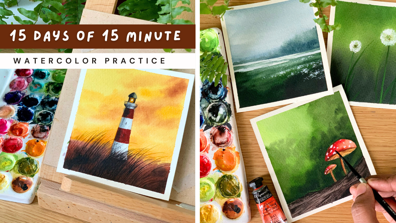
1. Class Intro + Class Overview: Life gets busy, but your creativity
deserves a spot in it. Even small moments spent creating can make your
whole day feel brighter. And that's why I have created this 15 day
Watercolor challenge, where all you need is 15
minutes a day to show up, paint, and reconnect with
your art. Hello, everyone. My name is AninaNabu. I'm an artist, an architect, an author, and a top
teacher on Skillshare. My first encounter
with watercolor happened when I was
at the age of five. Ever since that first discovery, what colors have
become my escape? I love creating small pieces that doesn't require
hours of work. And there is something deeply
satisfying about watching a painting come to life from start to finish all in one go. It's calm, it's joyful, and every finished piece
feels like a little win. We'll start the class by having
a look at the materials. Then before each painting, we will chat about the
colors you will need. Each painting is designed to be completed in 15 minutes or less. Whether you're a busy parent, a student or someone just trying to squeeze
in a little U time, this challenge was created
with that in mind. Even though each
painting is tiny, we'll be going on a mini
adventure every day. We'll paint soft meadows,
rolling waves, lighthouses, cozy little mushrooms,
foggy forest, a misty lake, and many more. So, yes, I'm officially
inviting you all to this 15 day 15 minute
aticula practice. A gentle, joyful way to show up for your creativity
every single day. So grab your brushes,
set a timer, and let's make these 15 minutes the best
part of your day.
2. Before We Begin :): First, let me tell you a little about how this
class was created. If you have been following me
on Skillshare for a while, you probably know how much I
love doing art challenges. But this time, I'll be honest, I was completely out of ideas. So I sat down with my
5-year-old daughter, and we just started
seeing random words that came to our minds. It was such a fun and
spontaneous moment, and from that list, I picked 15 prompts to build
this challenge around. And that's how this
class came to life. Simple, playful and
from the heart. Now before we dive in, I want to quickly go over a few
important points. First step is the paper size. For this entire challenge, we'll be working on small
piece of watercolor paper. That's a format I have used to design and compose
all the paintings. So to give you an idea,
here's an example. This painting is
more of a rectangle with longer side measuring around 11 centimeter and the shorter side,
ten centimeter. I recommend using something
of a similar size. It helps keep things
quick and manageable. If you prefer working
on a square format, that's totally fine, too. Just keep it on
the smaller side, so the painting stays doable within the 15 minute time frame. Before we start each painting, I'll briefly walk you through
the colours we'll be using. This way, you know
exactly what to have on your palette for
that particular artwork. To help you get a
feel of the palette, I'll also be doing a quick swatching exercise at the start. It's a simple way to preview how the colors will
work together. Next, I want to talk
about the importance of clean brushes and
a clean palette. I have learned
this the hard way. There were times I rushed into painting and forgot to
properly rinse my brush. Then I used to accidentally mess up my sky or my background. So make sure to thoroughly
clean your brushes, especially when switching
between colors. A clean brush gives you fresh, vibrant results
every single time. There is one more thing I want
to mention about brushes, particularly the wash brush. We used to apply a layer of
clean water onto the paper. This is the brush I
typically use for that step. I don't use it for
painting or mixing color, so it stays mostly clean and ready whenever I need it
for wetting the background. There is nothing wrong in
using the same brush for painting as well as
wetting the background, but just be sure it is clean
before you do that step. Just like clean brushes, a clean palette is
equally important. My palette has two
larger sections for mixing and several smaller
ones for individual colors. After each painting session, I always give it a quick clean using a wet cloth or a wipe, so it's fresh and ready
for the next session. Working with a dirty palette often leads to
muddy dull colors, and you lose that
beautiful vibrancy we all love in watercolor. And finally, let's talk
about the water jars. I highly recommend
using two jars, one for rinsing off pigment
and one for clean water. If you're able to change
your water frequently, then one jar might be fine. But for paintings
like this, where we need clean water
midway through, having two jars helps you act quickly without drying
out your background. So those are a few key
points to keep in mind. I know most of you are
familiar with them already, but a quick reminder
never hurts. Alright, so it's time to officially get started with
our watercolor challenge.
3. Materials you'll need: Alright, so let's start
by having a look at the materials we will need for
this particular challenge, and I will start with the paper. So this is the particular paper I'll be using for
this challenge. It is from St. Cuthbertsmll, and this is the paper series. It's saunters Waterford. You can go with any
paper you normally use. Just be sure it is
artist grade quality. And here's the size
I'm going with. It is ten centimeter
by 11 centimeter. I just divided that sheet
of paper into small pieces, and that's the size
I have come up with. You can go with a different size or a different orientation, even that is totally fine. Okay, so that's all
about the paper. Just be sure to go with
any good quality is grate watercolor paper so that you can enjoy the
process to the fulest. Now, coming to the colors, I will be using watercolor
tubes from various brands. I just mix and use various
brands. That's what I prefer. And at the beginning
of every painting, I will be explaining
particular colors required for that painting. Now the next thing you will
need is a mixing palette. This particular
palette has a lot of divisions and I have squeezed
out some paint in advance. So whichever is empty, I will squeeze out
as I'm painting. So mixing palette
is just for mixing. You can go with any palette
It can be plastic or ceramic. Even a dinner plate will work. Okay. Now let's talk
about the brushes. So here I have five
different brushes. The first one is
a 1 " wash brush to apply water onto the paper. Then I have a half
inch flat brush. This is to apply paint onto
the backgrounds mostly. Then I have three
different round brushes, size number eight, size number
six, and size number two. The paintings that
we're doing in this challenge are very small. So just go with any brushes that works for a smaller
scale painting. Okay? The next thing you will
need is two jars of water. One has to stay clean, and the other one is to run off the paint
from your brush. Now, coming to the
last set of materials, you will need a masking tape. I will be fixing my paper
directly onto my table. But if you prefer fixing that onto a board, that
is totally fine. You could do that. Okay.
Now the next thing you will need is a
pencil and an eraser. There isn't a lot of
sketching involved, but for some of the paintings, we have to do some
minor sketches. Now the last thing you will
need is a paper towel. You can also use a cotton cloth
instead of a paper towel. Alright, so that summarize, all the materials
you will need for this 15 days of 15 minute
verticular practice. So keep them ready, and
let's start with Day one.
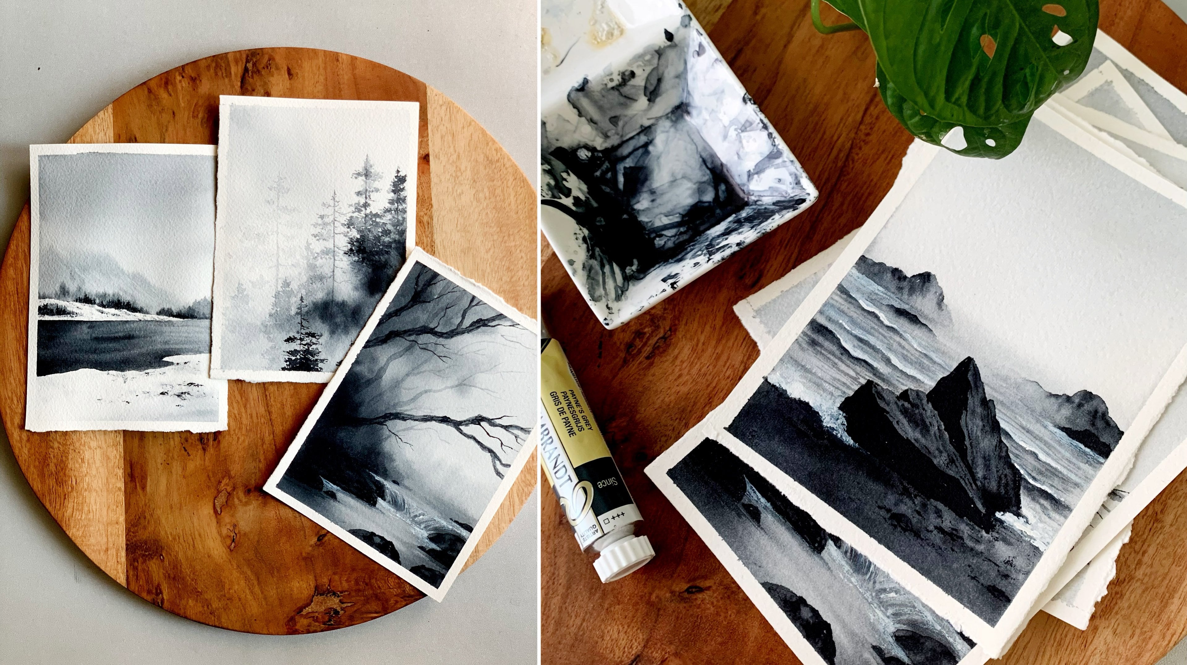
4. Day 1 - Foggy Forest: Hello, dear friends. Welcome to another brand new
watercolor challenge. And here's the first painting we are doing in this challenge. It's a really quick,
mysterious, foggy forest. Now we'll start by having
a look at the colors. I think you can already
guess the colors. It is indigo and pinks grey. For the background,
I have used indigo, and along the bottom, have used a mix of pains grey and intigo. Then for the trees as
well, it's a mix of both. But instead of
using indigo acets, I have added a bit of
pressio blue into it. I tried the same
painting with indigo. It was looking very dull, and I tried the same
with Prussian blue. It was very bright. So I want a mix of both, and that's a color
I'm going to go with. So it's a mix of Prussian
blue and indigo. You can use indigo acetus. You don't need to mix
and create this color. Okay. Now the second color
you will need is paints gray. Add the trees and all
the deeper tones. So those are the only two colors you will need for this painting. It's a really quick one. We can finish this in less
than 15 minutes. So keep your colors ready. Either you can go with indigo or a mix of Persian blue and
indigo, then some paint's gray. So keep the colors ready on your palette, and
let's give it a try. All right, friends. So I
have my paper ready here. Now, I'm starting by applying a clean coat of water
onto the entire paper. First, make sure
your brush is clean. Now apply a gentle coat. Don't add a lot of water and run your brush
multiple times, just to be sure the water has reached everywhere and
it's an even coat. Now to apply the paint, I'm going to go with the
size number Etron brush. You can go with any
medium sized brush. Now, I want a color which is not too dull and not too bright. So I'm thinking of going with a mix of Prussian
blue and intiko. If you want to go
with a different blue of your choice,
you could do that. It doesn't need to be the
same color I'm using here. Okay. So this one
is prussian blue. I'll just apply this to the top. See? The color is a bit bright. I want a blue that
is a bit moody. So what I'm going
to do is I will add some intigo over the same
to give it a moody look. If I use indigo acets, it will be super moody. I would a color in between. So that's why I'm choosing to mix Prussian blue and indigo. Okay. Now I'm applying that
onto the anterior paper. Next, I'm picking
some more indigo, and I'm going to add
that at the bottom. So at the bottom, I want the
color to be really dark. This one is the grassy area
or the landscape part. The top is the sky.
So at the bottom, we want that dark
and intense colors. Okay, you can keep
on adding more and more as your background
is still wet, you can keep doing this and it will nicely spread
into the background, leaving a beautiful effect. Okay. So that's how
it has turned out. We have a lighter
tone on the top, then a darker tone
towards the bottom. Now, I'm going to add
some more darker tones onto the background
using a smaller brush. But before that, I
will quickly fix this. There is some paint
missing on the top. And also, there's
a lot of water, so I'm just spreading
that out to make it even. Now with the smaller brush, I'm picking some paints gray, and I'm going to add
that at the bottom. This is just to bring
in more darker tones. So randomly add that in between. It can be just a random
shape like this. As it is wet, it will spread. So no matter what
shape you're adding, it will spread into
the background. So you can go with some
indigo and some paints gray and add in all those
darker tones at the bottom. I love doing tiny paintings. For some reason, it gives you a different kind
of satisfaction. I will add some more
paint over here. So be sure the paint
is not too watery. Otherwise, it'll
spread too much, and the sky will be very little. Now, I think I can add some more darker tones before this dries. I'm picking some paints gray, and I'm adding that
at the bottom, just to make it more intense. Okay. So that is it. The bottom part is done. Now, I'm going to go back
with my other brush. Then I'm thinking of adding some foliage on the
top, just a little. I won't be adding too much. I want it to have a
clean and a soft look. So with my bigger brush, I'm adding some
paint on the top. So this one is indigo. I'm using a medium tone, and I'm dropping
that on either side. You can see the color.
It is not too dark. It's more like somewhere between
medium and lighter tone. It is not too light, and it is not really a
medium tone as well. So I'm just adding
some random marks and spots on the background. If you want to make
it more dramatic, you can add more marks using
a slightly darker tone. I'm just adding a few more.
The background is still wet. So when your paper is smaller, it is a bit more
easier to control. If it's a bigger piece, it will have to work quite quickly. Now, before it
dries, I'm going to add some more darker
tones at the bottom. So just dropping in a
little more paints gray, and that is it. So that's our background. Now we can leave
this for drying. Okay, so that's how
it has turned out. Everything has dried completely. Now we can start
adding the trees. And for that, I'm going to go with the size number
six arm Brush, and I'm going back with a mix
of paints gray and intco. Now for the background trees, we are going to play with
different tonal values of the color we
have created here. We will start with
the lighter tone, then we will go with
the medium tone. And for the foreground trees, we will use a darker tone. And that's how we are going to create a depth in our painting. So let's begin with
the first tree. So these trees are
just some lines. You can add them
wherever you like. That's my first one. You can see the color I have
used. It's a medium tone. So rather than going
with the straight line, make your line a bit irregular
like this. See that? Now in a similar
way, you can add in your trees wherever you like. I won't be adding
a lot of branches. Right now, I'm just
looking at the tree trunk. So some of them can be thicker, some of them can be thinner. Some of them can be straight, some of them can be leaning. Add them however you like,
and wherever you like. I'm adding the next
one over here. So don't make them too dark, go with a similar tonal
value or even lighter. Now the next one can be here. As we have used a darker
tone at the bottom, we don't really need to
show any other details. That is a trick. You can see the color I have used right
now. It's a lighter tone. Then I'm again back
with a medium tone. So just keep on adding your
trees in a similar way. At some places, use
a lighter tone. Then at some places you
can go with a medium tone. I think I will add one
more. And that is it. So I have added enough of trees. Now, I'm going to
turn one or two into a foreground tree by
introducing some taco tone. Okay, I just added
a branch here. The other one is still wet, but I think it won't do a
lot of damage, so it's fine. Okay. Now with the same brush, I'm going to pick a Darko tone. I'm using pinks grey.
Now, I'm going to add that onto the tree
in a very random way. So just add some lines and some spots. We have
a branch here. Be careful about that. Okay, you can see the difference it made. Now in a similar way,
I'm going to turn one more tree into fucrow
tree. I'm picking this one. Now just add some taco
tons here and there. It is just some
lines and some dots, nothing much, but it makes
a lot of difference. I think I will add some bumps in between to give it
a realistic touch. Now, maybe one or
two branch we can add onto these two trees. Now, when you're
adding the branches, you have to be sure the
background trees have dried up. Otherwise, they will
spread into each other. So be careful about that. So I'm going to add the first
branch over here. It's a safe spot. There
is no tree there. Now I'm going to add another
one here, again, no tree. Likewise, wherever you
want to add branches, you can add them
in a similar way. If you want to add one
or two extra trees, you could do that as well. Okay. Now to add the
rest of the branches, I'm going to go with
a smaller brush. This one is size number zero. Now, I'm going to add the
rest of the branches. This will give you more
thin and crisp branches. So right now I'm adding branches only for the
foreground trees. In a similar way, you can add a few for the background
trees as well, but you have to go with a
lighter tone or a medium tone, depending on the color you
have used for the tree. Okay? So with the same
tonal value, I mean, pins gray, I will add
a few more branches. Then I will add few branches for the background
trees as well, using a different tonal value. Now, there's one more
thing that you can do which's not really necessary as we have some paint on our brush before you
go with a medium tone. Or you can do is you can just add some texture at the bottom. See that? I already have
some pinks gray on my brush. If it's too wet,
you can dab it on a paper towel and then
introduce these dry texture. Okay. This one is not necessary, only if you want to
add them to bring in some more texture and
character, you could do that. Otherwise, you can
totally skip this step. So in between, you can add some texture
using a taco tone, few at the bottom, then maybe
a few closer to the tree. It is just some random
texture using a taco tone. Okay, I think that's enough. Now I'm going to
add the remaining branches using a medium tone. And with that, we'll be
done with our painting. Oh. Alright, so that is it. Now we can peel off
the masking tape. I'm really happy with the
way it has turned out. It's a small yet a
beautiful painting. The colors are really nice. It has got a moody,
mysterious feel. I hope you all enjoyed it, too. The only thing I'm not
happy about is the border. I was wishing for
a clean border, but clearly it isn't,
but it's okay. I will use some white
gouache and I will fix it. It's actually a very
beautiful painting. You can try this
with a different color combination as well. I think purple will
look really nice. Anyway, here is a closer look. Beautiful ride. So give it
a try if I get to try it, and let me know if you liked it.
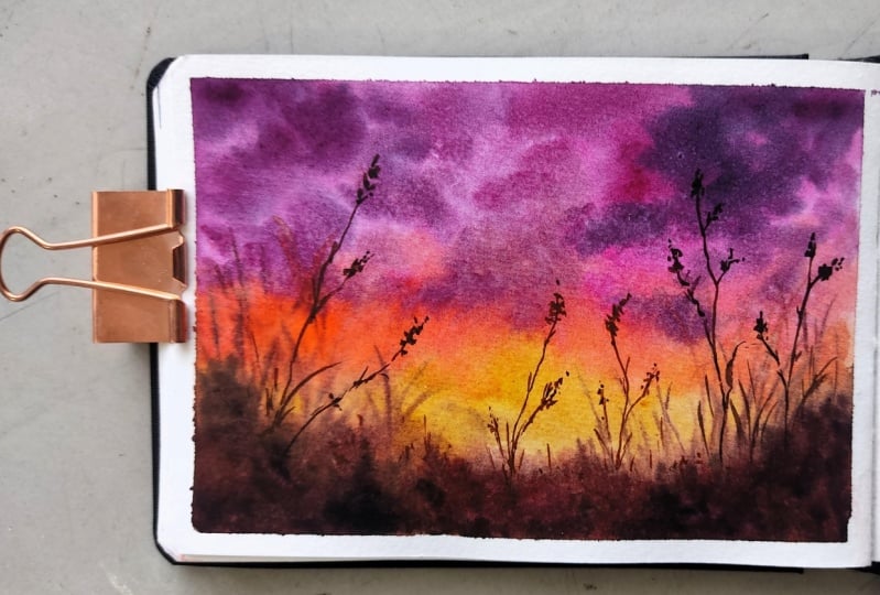
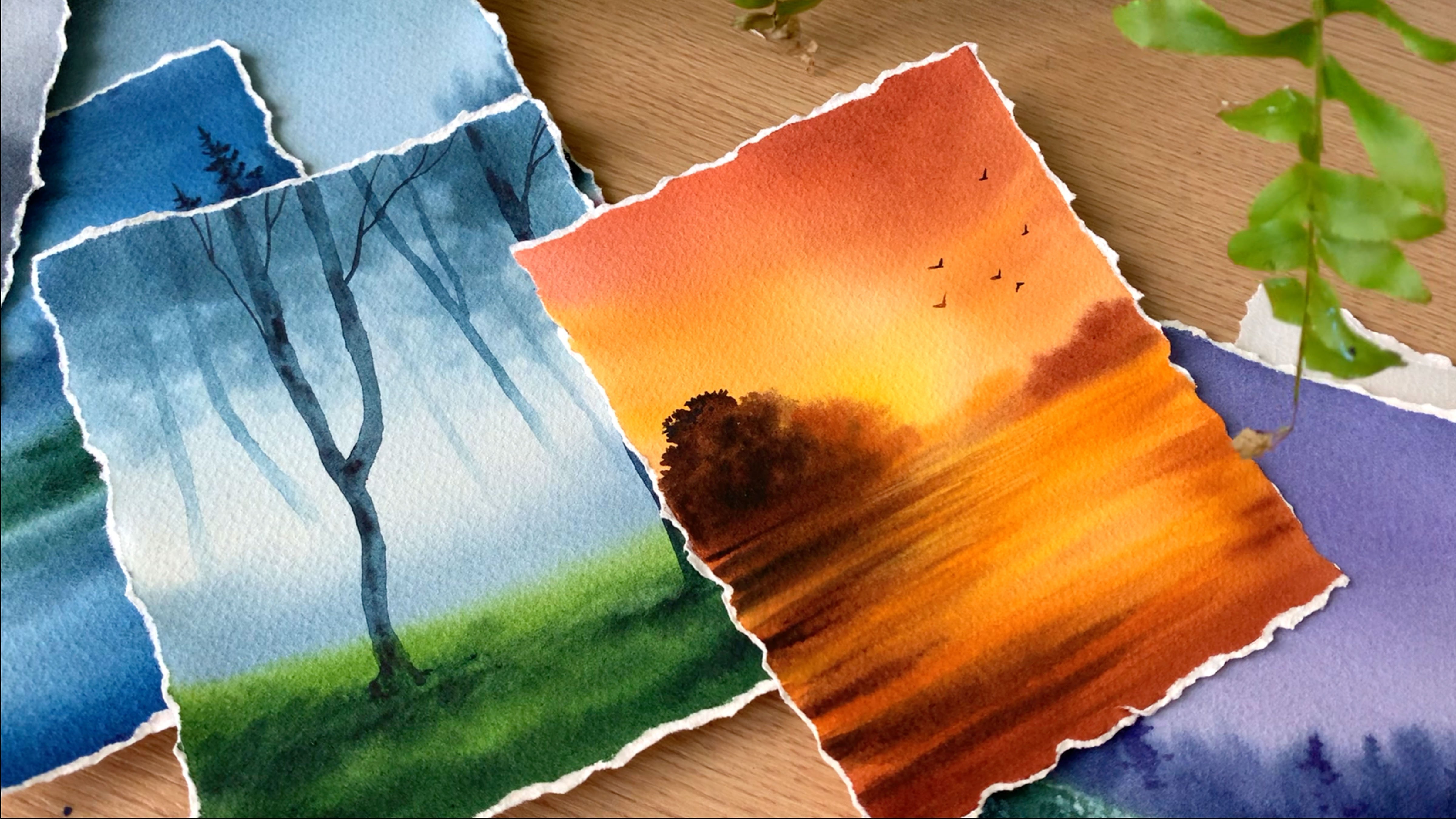
5. Day 2 - Dreamy Sunset: Hello, my creative
friends. Welcome back. So today, our 15 minute
painting session is going to be this one here. It's a gorgeous sunset. First, we will have a look
at the colors you will need. The color you see on the top, that pinkish purple, it's
a mix of violet and rose. You can go the different color
combination of your choice. So what I'm going to
do is I will take some permanent violet
and permanent rose, and I will mix them together. And that's how I'm going
to create this color here. But you can go with just
violet or just rose, or maybe even blue. So I will start with
the purple on the top. Then right after that, I
will go with some rose. If you don't have
permanent rose, you can go with
crimson or carmine. So that's the color
you see here. It's a very bright rose. Now, the third one you
need is an orange. This one is cellar orange. It can also be ermelin. Then the last color
you will need for the sky is any yellowish orange. This one is cadmium
yellow orange. Okay. So those are the four colors
you will need for the sky. Now, along with these, you
will also need some brown, as well as paints gray. Add the rest of the details. I don't have enough space for paints gray, but
along with these, we'll also need that to add the deeper tones and
the final details. Okay. So that summarize all the colors you will need
for this gorgeous sunset. For this painting, we'll
create a base layer, and then the final details. So for the base layer, you
will need all these colors. Okay, so your task is to keep all the colors ready,
and let's give it a try. So I have fixed my paper and have the colors
ready on my palette. Make sure you have
all the colors ready. Once you have them ready, start by applying a clean coat of water onto your entire paper
and make it evenly wet. Remember not to add
a lot of water. We only need a shiny coat. Okay. So my paper is evenly wet. Now we can start
applying the colors. And for that, I'm
using a round brush. Go with any of your
medium sized round rush. This one is size number A. Make sure it is clean
before you start. Now, the first color
I'm going to go with is a mix of violet and rose. I want a color which
is more like a purple. Here is the color. So it has
more rose and less violet. But you can go with violet as it is, if that
is what you prefer. Now apply that color on the top. It's a very bright and
beautiful color. Okay. Next, I'm going to
clean my brush, and I'm going with
rose as it is. So clean your brush, dab it on a paper towel. Now
pick some rose. If you don't have
rose, you can go with crimson or carmine. Now apply that right
next to purple and gently push and
pull that into each other to give it
a natural blend. Now clean your brush again
and then go with orange. Apply that next to rose, and again, push and pull
the paint into each other. Okay. I will add a
little on either side. Then I will go with
yellowish orange. Also use yellow, leave
some gap at the bottom. Okay. Now towards that gap, I'm going to
introduce some brown. If you don't have brown,
you can go with burn ina. Now apply that paint at the
bottom on this leftover area. Don't go with the paint
that is too watery. It will spread into the sky, and you won't have any
yellow in your sky. So go the paint that is not too watery and apply
that at the bottom. Also try to go with
an intense color. Don't use a lighter tone. Now, at the center, I'm not
going to add a lot of brown, but on either side, I
will add some more paint. Okay, so on either side, I'm just taking that
towards the top. Now we can add some paints
gray at the bottom, just to bring in
some more taco tone. But try not to add
much at the center. Okay. So that's how
it has turned out. Now, I'm going to keep
this pressure aside, and I'm going to go
with a smaller brush. I'm planning to add some
clouds using a darker purper, but this one is
completely optional. The sky is looking quite
beautiful the way it is. So decide on whether you want
to add the clouds or not. I'm using the same color I
used earlier for the sky, but this time in a
slightly darker tone, and I'm adding a few random
clouds onto the wet layer. See that? But let me tell you, if your background
is starting to dry, you don't need to
add these clouds. It will be a better idea
to leave it as it is. But if your background is still wet and if you want
to give it a try, go ahead and try adding your
clouds, however you like. Okay. So whenever I'm
adding the clouds, I always try to go
with a smaller brush. This way, you have a better
control with the shape of the clouds as well as the
way they are spreading. If you're using a bigger
brush, obviously, you will end up taking
a lot of paint, and the clouds will
become bigger and bigger. So I always prefer using a smaller brush over
a bigger brush, especially when
I'm adding clouds. Okay, so I have
cleaned my brush. Now, I'm going to go back with brown and I will add some
more shapes at the bottom, spreading that out
a little more. Now the water and the
paint has settled. So the shapes I'm adding will
stay a little prominent. Earlier, it was spreading a lot. Okay, so let's add some
more dark o tones at the bottom so that it
stays. I won't go dull. Okay. Now, there is one more thing we have to do before the
background dries out. Now for that, you have
to clean your brush, that bite on a paper towel. Make sure it is dry.
Now, just keep pushing the paint from here towards the top and create some lines. This would be blurry lines. Okay. If the paint is
not really coming off, you can pick some
paint on your brush, but don't pick a lot of paint. This one has to stay blurring. These are the plants
in the background. So when these dry, it will have a really
nice blurry look, and they will look like
they are in the background. We'll be adding another set
of plants in the foreground, which will be more
prominent and more clear. Okay, so just add a
few lines like this. You just need to
pull that paint into the sky, and that is it. Okay, I will add a few
more on the other side. Then we can leave
this for drying. The paint is not
really coming off, so I'm picking some
paint on my brush, and I'm going to add a few
more plants in the background. Don't go with the
paint which is not too watery. They will spread a lot. That is something you
have to be careful about. Okay. And that is it. So the background layer is done. Now, we can lay this for drying. Alright, so the background
layer has dried completely. Now, we can add the
fu ground details. And for that, I'm
using a smaller brush. This one is size number zero. And the color I'm going to
go with is a darker brown. I'm mixing some
pink gray and brown together to make it
into a darker tone. Now start adding some thin
branches onto the background. See that? You can see the lines. They are very thin and crisp. So only if you use
a smaller brush or a brush with a pointed tip, you will get lines like this. Don't use a bigger brush. You can use a liner brush
or a rigger brush or any other detailing brush
and add in some thin lines. So on either side, I'm using a taco tone while I'm
adding these branches, but towards the center, I will use a color that
is more brownish. Okay. That's the only thing
you have to be careful about. The rest is quite
straightforward. Okay. Towards the bottom, I'm making it more darker by adding more
paint screen to it. Okay, so towards the center, whenever we are
adding the branches, the color has to be more
brownish on either side, when it is away from the center, you can use pain acets. Okay. Along with that, I'm adding some
grassy lines as well. I will add a few more lines. Then we can add the plants at the center using
a brownish tone. Okay, so this one
is done for now. Now I'm cleaning my brush and I'm picking a brownish tone. You can see the difference here. The color is more brownish. The one I used earlier
was more blackish. Now, you can add in as
many plants as you want. The only thing you
have to be careful is to use a brownish
tone at the center, then darker tones
on either side. The rest is all the same. Okay, so I'm going to quickly
add a few more branches. Then onto these, we have
to add a tiny detail. Okay, so all the plants
and the branches are in. Now, what I'm going to do
next is I'm going to add some teeny tiny dots onto
the tip of these branches. So just add some dots and
create a grain like texture. See that? In between, you can add some tiny leaves. So just keep on
adding some dots, then some tiny leaves. Just like we did earlier, for the ones which are
away from the center, you can use pain screen
or a darker brown. And for the ones at the center, you have to use a brownish tone. It's the same way
how we did earlier. I really like those blurry
plants in the background. It is creating a nice
depth in our painting. Otherwise, it will
look quite flat. So it is good to
introduce some depth, even though it's
a tiny painting. Now in a similar way,
I'm going to add those grains and leaves
on the left side. Then we can go the
ones at the center. For those, we have to
use a brownish tone. Okay, so let's finish
the left side first. Okay, so that's done.
Now it's time to go with brown and it would be the
same thing at the center. We only have a few
plants at the center. So go back with brown. It has to be a
lighter to. Then add in those tiny details. You can see the
difference it made. At the center, we used brown. Then on either side,
we used a darker tone. Okay, so that's how
it has turned out. I hope you all
enjoy the process. Now it's time to peel
off the masking tape. For this painting, luckily, I got a clean border, and I'm really happy about it. And here is the
finished painting. It's a simple yet
a gorgeous sunset. I hope you all enjoy the process and love the
painting you have created. If you haven't tried it yet, do give it a try and let me know your
thoughts about it. Oh
6. Day 3 - Wild Mushrooms: Hello, dear friends. Welcome to day three of painting
15 minutes a day. So today in our 50 minutes, we're going to try painting
some cute mushrooms. It's a cute little painting. So let's start by having a look at the colors
we will need. I will start with
the background. So for the background,
I have used a lighter green on the top, then some sap cream, and also some paints gray to
add the deeper tones. The light green
you see on the top is cadmium green light. If you don't have any
sort of light green, you can just add some
lemon yellow with your sap cream and create a similar colour. So
that's a fist colour. Now the second one is sap cream, which I'm guessing
you all might have. If you don't have sap cream, you can go with viridian
green as well. It will look a bit different,
but that's totally fine. And also olive green will
also be a good choice. Okay. Now the third
one is pains gray. We'll be using pains grey to add all the deeper
tones at the bottom. So these are the three colors you will need for
the background. Now, coming to the
mushroom and the wood, the first color you
will need is red. This one is permanent red. Okay. Now, along with that, you will also need some brown, as well as orange. This one is cellar orange. You can go with ermelin if
you don't have any orange. Next, you will need some brown. We'll use brown to add some deeper tones
on the mushrooms, as well as for the wood. Okay, so those are the
colours you will need. You will need some greens, then some red, orange and brown. Alright, so keep all the
colors ready on your palette and let's give it a try.
Hello, dear friends. Welcome to another day of
painting little landscapes. And here's our
painting for the day. We're going to paint
two cute mushrooms. It's a very easy yet
a pretty painting. So let's start by having a look at the colours
you will need. Alright, so let's start
by adding the sketch. Unlike the other
paintings we did so far. For this one, we need
a cute little sketch. So first time starting by
adding a line over here, that's gonna be the tree,
the part of the tree. Now, on top of it, I'm going
to add two tiny mushrooms. I'm going to go with two.
If you just want one, that's totally fine, and
you can go with any size. I'm going to add two
mushrooms towards the right side.
That's the first one. Now another tiny
one next to that. No, on top of it, I'm adding
something like an umbrella. It's a very simple one. I'm not going to a lot of details, so just add a shape like this. That's the first one.
Now in a similar way, I'm adding a smaller
one next to that. Okay, so that's a sketch.
This is all we need. Now we can start painting. The rest of the details we
can add as we are painting. For now, this is all we need. Now, make sure you have the colors ready
before you start. For the background, we will need green and a bit of paints gray. You can go with any
green of your choice. I'm starting by picking
some cadmium green, and I'm not adding any
water onto the background. I'm directly applying the paint. So start with any light
green of your choice. If you don't have
any light green, just add some lemon
yellow with sap cream. Next I'm adding some sap cream. So I'm simply applying the
paint onto the background. We need to create a
blurry background. So just keep on applying the
paint however you feel like. I'm using a size
number A tranush here. Now, as I'm coming
towards the bottom, I'm going to make the
color more darker. So I'm picking more green
without adding much water, and I'm adding that
around the mushrooms. Now I'm going to add a
bit of pinks gray with sap cream to make the
color more darker. And that's a color I will
be using at the bottom. See that? So make the bottom part a bit
more darker than the top. Now carefully apply that
around the mushrooms. Maybe you can go
the smaller brush. I made a mistake here, so I have to fix the
shape of the mushroom. I will just change the shape. Okay, now let's apply this darker tone onto
the leftover area. Now, it doesn't
need to be perfect. You can keep on
applying the paint. The only thing here is apply the paint while the
layers are still wet. Okay. And when you're applying the paint around the mushroom, you have to be a bit careful. Now, I'm going to fill
up this part quickly. Then we can add some leafy
patterns onto the top. Just like this, some
random shapes to make it look like
there are some trees and plants in the background. Okay. This part is
starting to dry. So I will fix this part first. Then I will add paint
onto ecto area, and then we can
leave it for drying. Okay. I'm really loving
the way it has turned out. Now I will add
those taco tones to the bottom using
a smaller brush. I'm mixing sap cream
and pink gray together. Now I will add that dakotne along the bottom part
around the mushrooms. And also, I will add a few leafy pattern
in the background. Okay, so let's quickly do this before the
background dries out. I have added paint everywhere. Now with the same
color, I'm going to add some patterns
in the background, only onto the areas
where it is still wet. I won't be touching the
top part, the top corner. That part has
completely dried up. So only at the bottom
around the mushrooms, I will add some random patterns like this using a taco tone. If your background
has started to dry, it won't be a good
idea to add these. You can leave it for trying. Already we have added
some taco tones. I think that would
be good enough. Okay, so that's a background. Now we can leave
this for trying. Alright, the background
has dried completely. Now we can paint the tree part. And for that, I'm
going to go with a mix of brown and a bit of pink grey. I want more, like,
a grayish brown. So just mix a little of brown
or burn ina with pink gray. And apply that color onto
the interior area first. You can see the color I'm using. It's a medium tone. It's not
too dark, not too light. Apply that onto
the interior area. Try to go with a dull
brown like this. Don't make it too
bright and pleasant. Okay. So this one is a mix
of brown and pink grey. And I have applied that
onto the interior area. Now I'm going to go
with a smaller brush, and I'm going to add some
deeper tones in between to bring in some textures
and character. So go with your smaller brush. This one is size number six. And I'm using the same
color in a darker tone, and I'm adding some lines and some shapes onto
the background. See that? So go with a mix of pinks gray and
black without adding much water and add some lines
and shapes onto the tree. Don't fill up the entire area. We want that lighter tone in between and then
some taco tone taso. This is just to bring
in some textures and some realistic character. All right. So that's how it has turned out. Now let that dry. In the meantime, we can
start with the mushrooms. First, I will paint the stem. So I'm picking a bit of brown and adding a little
of orange into that. So the color we need is
more like a light tone. Now apply that onto the stem, as well as onto the inner part. Go the similar tonal value. Don't make it too
dark or too light. Okay, now apply that carefully onto the inner
part, also onto the stem. Paint both the mushrooms. Be careful when you're
almost reaching the tree. It hasn't dried
completely, but it's okay. You can still
manage to paint it. Or if you want to
be extra careful, you can wait for that to dry and then paint
this afterwards. Now, I'm picking
some more brown, and I'm adding
some highlights on the left side.
Just a little bit. Same goes to the other one. Now also on the top over
here along this line. Okay. Now I'm going to clean my brush and I will
dab it on a paper towel. And I'm just spreading
this a little. Right now, it is
looking like a line, so we need to smudge that a little to give it a softer look. Okay, now let that dry. In the meantime, we can
go back with a tray, and the next step is
to add some textures, some more darker textures. So with the same brush,
I'm going to pick some paint gray in a darker tone without
adding much water. And I'm adding some textures. It's more like some dry texture. So if you feel like
your paint is watery, dab it on a paper towel before
you add these textures. Now, simply add them in
wherever you feel like. There is no rule or anything
that to be followed. You can simply add
some textures. But try on to cover up
that background layer, that lighter and medium tones,
they have to be visible. Otherwise, it will
look quite flat. It wouldn't have that
textures and character. See that? So simply add some
darker tones in between. We'll be adding another
round of details, some lines and some textures while it has dried completely. I think in the meantime, we
can go back to the mushroom. So I'm cleaning my
brush properly, and I'm picking some read. This one is a very bright red. It is permanent
red from Shin han. Now I'm going to apply that onto the left side. You can
see the brightness. It's super bright. Now I'm
going to pick some orange. Maybe I will do the same onto the other one so that I don't need to
pick the paint again. Okay, so I've added red onto either side
of the mushrooms. Now, I'm going to
clean my brush, and I will pick some orange. This one is vermilin and I'm
adding that next to red. Same onto the other one. There is some more area left. Now pick some water and then make it a bit lighter
towards the right side. See that? So that's how the
base layer is going to be. Now, we need to
add some more taco tones onto the left side. So I'm picking some brown, and I'm adding that
onto the left side. We don't need a lot, just
a little only on the left. So one side has to be darker and the other side
has to be lighter. Now, along that line also, we can add some taco tones. Now, there are some
caps at the bottom. Using brown, I will
fix that as well. Okay. So we have the base
layer of the mushrooms ready. Now, that has to dry
before we add the details. Let that dry. I think by the time we can
finish of the tree. So I'm going to go
back with pains gray, and I'm using my smaller brush. This one is size number two. I'm picking some
pains gray acts. And I'm going to add some
lines onto the tree, some irregular, very natural
looking lines. See that? So just keep on adding
some lines like that. It can be thicker and thinner. Try to use a dry paint so that it will automatically
leave a texture. Okay, so just keep on adding
some lines onto the tree. They can be very
rough and messy. That's totally fine. If
it's rough and messy, it will look more natural rather than those
crisp and clear lines. So go with a dry paint and just simply add these lines
onto the surface. Okay. So that's how
it has turned out. You can see how natural
it is looking right now with all those textures and
different tonal values. If you're happy with the
result, you can leave it there. Or if you feel like you need to add a few more lines,
you could do that. I'm adding a circular
shape here to make it look like there is a dent.
Okay, so that's a tree. I'm really loving those textures and the look and feel of it. Now I'm going to clean my brush, and I will pick
some brown first. We can add the
textures on the stem, as well as that inner
part of the mushroom. Then we can go onto the
top, the umbrella part. So I'm picking some brown. For this step, you have to use a smaller brush because we're going to add some thin lines. Now onto the surface. I'm simply adding some lines. They are super thin.
So try to go with a smaller brush or a detailing
brush for this step. Do the same on both
the mushrooms. So that's a stem.
Now, I'm going to add some lines
over here as well. So from the outer sheep,
atom lines towards the stem, and you have to finish
off that circle. It is just some simple lines, you don't need to think a lot. Okay. Now let's do the
same onto the other one. It's a super tiny mushroom. The shape is not very clear, so I'm going to add
a line over here. This will make the shape better, and we'll also add some shadows. Okay. So that part is done. Now we have only one task
left for which you will need some white aticul or white
quash. Don't add much water. We need an opaque paint. So with my smaller brush, I'm picking some paint. And I'm going to add some random shapes onto the mushroom. This will make it look complete. See that? So add some
random shapes like this. It doesn't need to be circle or oval or any particular shape. It can be super random and add them wherever you like.
But don't overdo it. You can just add a few here
and there, and that's it. Don't add too many. It
should not look too busy. Okay. Now, similarly, I will add a few spots
on the other one, and with that, we'll be done
with our cute mushrooms. It's a simple yet a
beautiful, cute painting. I have never tried
mushrooms with watercolor. I have done them using gouache, but this is the first time I'm trying them with watercolour, and I really loved it. So here is the
finished painting. I hope you all enjoyed it. If you haven't tried it
yet, do give it a try. I'm very sure you're
going to love it. Alright, so that's
all for the day. I will see you back here
with the next painting.
7. Day 4 - Misty Lake: Hello, dear friends.
Welcome to Day four. Today we are painting
a gorgeous misty like, which is well under 15 minutes. Now, let's start by having
a look at the colors. It's a very moody
color combination, and you would only need three colors for this
entire painting. You would need
intigo, sap cream, and a bit of paints gray to add all those textures
and darker tones. Okay, so the very first color
you will need is indigo. I'll be using a
really light tone of indigo for the sky, as
well as for the lake. Okay. You can also
use pains grey, a light tone of paints
gray for the sky. Even that will work. Now the next color you
will need a sap cream. You can also use variant
green if you prefer that. And the last color you
will need is pains gray to add all the deeper tones
and textures at the bottom. Okay. So these are the three major colors you
will need for this painting. Along with this, you will also
need some white watercolor or white quash to add all
the flowers at the bottom. That is not necessary. I mean, these little dots here.
Those are the flowers. So to add them, you will need white quash
or white watercolor. Otherwise, you are good to
go with these three colors. Now, the first thing
we have to do is to add some lines
in the background. So first, I will add
the horizon line, which is at the
center of the paper. Now we need to add
some thin strips, which is going to be the lake
or the water body far away. It doesn't need to be
like a straight line. I'm adding a picture here of the finished painting so
that you know how to add it. I'm not really sure the
sketch is properly visible. Okay, so add in some
lines like this. Onto these shapes
I have added here, I'll be using a light
tone of intigo. Then around that, we will add
greens and more taco tones. Okay, so for now, simply
add some lines like this. That's how we need. The rest we can fix as we are painting. So once you have
the sketch ready, make sure you have all the
colors on your palette. The very first thing I'm
going to paint is the lake. So first, make sure
your brush is clean, and I'm starting off
with a very light tone of intigo Okay, so we want a moody color. Don't use any other
blue, go with anticho. The tonal value is
very important here. So go with a lighter
tone or a medium tone. Don't make it too dark. So that's the color
I'm going with. I'm applying that
onto the entire leg. This one is a very simple step. Even if the shape is not proper, we can fix it as you're
applying the greens around it. Just be careful about
the tonal value. Okay. Go with a
similar tonal value and apply that
onto those strips, and then we can
eve it for drying. The rest all happens after
this has dried completely. I know, at this point, it
might look a bit weird, but trust me, we are
going to make it a very beautiful
misty lake painting. So for now, just add these strips and
leave it for trying. Okay, so that is
right completely. Next, we can start
painting the sky. And for that, I'm using
a medium sized downfrsh. This one is size number eight. Again, make sure it is clean before you start
applying the paint. Now, I'm starting off
with a medium tone of intiko then towards
the horizon line, I will make it a
bit more darker. That's the color I'm going with. It is one tone darker
than the color I have used for the lake.
Don't make it too dark. Go with a similar tonal
value or even lighter. Okay. Now towards
the horizon line, I'm going to make the
color a bit more darker. So for most of the sky, I have used a medium tone
or maybe a lighter tone. Now towards the horizon line, I'm making it a bit more darker. You can see the color I'm using. It is slightly darker. The tonal values are
really important for this painting to get
that misty effect. Don't make it too dark. Go
with a similar tonal value. Now I'm making it a
straight line along the horizon. Be very careful. Maybe you can go with
a smaller brush. Okay, so that's a base
layer. That's a sky. Now onto this layer, while
the background is still wet, we need to add the
landscape far away. So that's our next task. Okay, so with the same brush, I'm going to go with a mix
of indigo and sap cream. That's a color I'll be using to add the landscape details. So I'm picking some sap cream, mixing that with
a bit of indigo. Okay. Now I'm going to add
some shapes over here. You can see the color.
It's a medium tone. Mix up some sap cream
and indigo together and create a similar color and
add some shapes like this. On the left side,
I'm not adding much. I'm focusing more
on the right side. Maybe we can just add a
very low lying landscape there, just a line, and onto the right, I'm
making it a bit more higher by adding some lines to make it look like there
are some pine trays. Now I'm picking a darker tone, adding that only at
the bottom. Okay. So that's how it has turned out. Now, let that dry.
In the meantime, I'm going to start
with the bottom part. For which I'm still going to
go back with the same color, mix of indigo and sap cream. Use a bigger brush
for this exercise. Now I'm going to apply that
onto the bottom. See that? So it's a mix of
indigo and sap cream. Go with a medium tone. Towards the bottom, we
will make it more darker. Okay, so carefully apply that along that lake
we have added earlier. We have to retain those
strip like shapes. So carefully apply the
paint along that outline. When you're applying the paint, you can alter the shape. If you want it to
be thin or if you want it to be more irregular,
you could do that. Now I'm adding paint in
between these lines. Maybe I will do that
with a smaller brush. First, I will apply
paint at the bottom. I'm again mixing
indigo and sap cream. This time, the color
is a bit more darker, I'm adding that at the bottom. See that? It's a
beautiful color, especially when you paint
moody and misty landscapes. So to create that moody
effect, this color is perfect. Now I'm going to go
with the smaller brush and I will fill in these spaces. It's the same color, but
it's a lighter tone. And you can see the way
how I'm applying it. As I'm applying the paint, I'm shaping out those lake. At some places, I'm
making it thinner. Now I'm adding another line over here closer to the horizon.
So that's a basic thing. Now, if you want to
add more textures and more taco tones,
you could do that. With the same brush, I'm
going to add some more paint. I think I can make
a bit more taker. Otherwise, when it dries, it will look very
dull and very light, and I'm adding some lines in between to make it
look more realistic. That's how I turned out. Now,
I'm going to go back with my bigger brush and I will add some more taco
tones at the bottom. I'm using the same mix. I'm mixing intiko and sap cream together
to make it darker, and I'm dropping in some
taco tones at the bottom, and also some in between. Okay. I won't be adding any darker tones
closer to the horizon, only at the bottom, I'm
adding more taco tones. It is not dark enough, so I'm going to pick some pink gray and I'm going to add that at the bottom
most area only over here. The rest is going
to stay as it is. The color I used earlier was
a mix of indigo and green, and it was more
like a dark green. Now I'm using pink grey and I'm adding that at the bottom
in a very random way. I have added enough
of darker tones. Now, I'm going to smudge this and I'm going to
make it look better. So first, I will drop in some green and I will smudge
the bottom part. And then I will clean my brush. And with the damp brush, I will smudge this
part again. Okay. So that's how it has turned out. I'm really happy
with the colors. At the bottomost area, I want the colors to be
darker and along the horizon, I want them to be more
like a medium tone. I'm really happy with
the tunal values. It really looks moody. But I want to fix this part. So with my smaller brush, I'm just fixing this area
by smudging the paint. Okay. So that is it.
That's our base layer. Honestly, at this
point, if you're happy with your painting,
you can call it done. But I'm thinking of adding some flowers to the background,
mostly at the bottom. Let this dry and
we'll think about it. Anyway, I'm picking
a bit more paint, and I'm adding that
on either side, a little over here, and
also on the other side. Okay, so that is it. Now I'm going to leave
this for drying. Okay, so the top part has dried. Now, I'm thinking of
adding another layer onto the leak because the indigo we added earlier,
it's not visible. It looks like white right now. So I'm going to add another
layer on top of it. I will still go with
a lighter tone. I don't want to
make it too dark. So it's something like
the color I use for the sky, and I'm
adding that again. But trust me, this one
is completely optional. If you're happy with
that lighter tone, you can leave it as
it is. See that? I only added few on either
side and some in between. I did not completely
cover it up. And it's still a lighter tone. It is not a medium tone. Alright, now the background
has mostly dried up, so we can add the flowers. Again, this one is
completely optional. Maybe you can give it a wash and see whether you
want to add it or not. So I've taken some
white gouache, and I'm using my
smallest brush here. This one is sized
number two roundtrh. It has got a really
nice pointed tip. Okay. Now, towards the bottom, I'm simply going to add some
dots close to each other. Those are the flowers. See that? So at the bottom, I will add
them in a thicker manner, and towards the background, I will just add a few dots.
I won't be adding a lot. I'm just focusing on
this side where I have the taco tomes and
also some over here. When you add some dots
in the background, it will look like there are some flowers in the
background as well, and it will add a more natural
touch to your painting. So just add a few
dots over here. Okay. Now I'm going to add some more towards
the foreground. It is just a matter of adding some dots close to each other. So go with any of
your smaller brush or a brush with a pointed tip, and then you can use white
gouache or white watercolor. Now, keep on adding these white dots close to each other, especially
at the bottom. Over here, we want them to
be more dense and thick. Add these dots in
a scattered way. Don't add them all
at the same place. That will make it more natural. Now I'm going to add a few
towards the left side. See that? You can add
as many as you like. I'm just focusing on this area. I won't be adding much
towards the left. Okay, so I'll just
add a few more over here where I have that Daco
tone in the background. Then some more over
here, and that's it. With that, I will call it done. So just like I said earlier, this step is not
completely necessary. Only if you want to
add some flowers into your background,
you could do that. Otherwise, it is in a
good shape already. You don't need to
add these flowers. Maybe you can add some
teeny tiny birds far away. That also will be
a nice addition. In a way, I'm almost
done adding the flowers. I think I have added enough. In case, if you're
adding flowers, white would be the
best color choice. Okay, so that is it. That's our painting for the
day. I hope you all liked it. It's a really quick, had
a beautiful painting. Give it a try if
I have to try it. And let me know if you liked it.
8. Day 5 - Blue Ocean: Hello, dear friends.
Welcome to Day five. Our painting for today is a
quick and easy blue seascape. It's a painting that you
can do in 10 minutes, and you will only
need one single color for this painting. It can be any blue of your choice. This is
the one I'm going with. It is hilo blue from Cenlar. You can go Thilo blue, Prussian
blue or ultramarine blue, any other blue you have cut. We'll be playing with
different tonal values. So the first one you
see is a medium tone. Then we'll play with
a darker tone to add all the details
and the waves. Okay, so just grab any blue you have card, and let's
give it a try. So before you start,
make sure you have the color ready
on your palette. Now, once you have
the color ready, you can apply a clean coat of water onto the entire paper. We don't need a lot of water. Just a shiny coat
is all we need. So don't pour in a
lot of water onto your paper and make
it so much wet. Okay, so run your
brush back and forth, just to be sure the
water has reached everywhere and
it's an even coat. Okay, so the paper is wet. Now, I hope you guys
have the colors ready. First, we need to
create a background. And for that, I'm
using a flat brush. So on the top, it's going
to be a medium tone, and towards the bottom, I'm
going to make it darker. For this step, you can use a
flat brush or a arm brush. It doesn't matter. I feel there's a lot of water
on my background. You can see them floating
around. Never mind. I will just keep running my brush and I will
just spread it out. Now, towards the
bottom, I'm using the same color, but
in a darker tone. See that? It's a
beautiful color. You can add this in your palette if you love painting seascapes. It's called Thilo blue. Alright. I will
add a bit more and make it more darker
because when it dries, it will go one tone lighter. So it's better to
go with a darker tone in the first layer itself, so that we get vibrant result. Now, I'm going to keep
this brush aside, and I'm going to go
with a roundtrh. This one is sized
number six roundish. Go with any of
your smaller brush or a medium sized brush. Now go with the same paint,
but in a darker tone. And if your paint is too watery, dab it on a paper towel
before you start. The color is kind of dark.
You can see that here. Now, at the bottom, I'm adding some thicker lines.
That's the first one. Now I'm adding another
one over here. Leaving a tiny gap in between. That is really,
really important. Loom cover the entire space. Whenever you're
adding this line, leave some gap in between, so you can see that
background color. And also, whenever you feel
your paint is too watery, dab it on a paper towel. Otherwise, the paint
will spread everywhere, and you won't be able to
retain that gap in between. Now I'm adding another
one on the top. See that? So in a similar
way, we have to add thicker lines at the
bottom using a taco toe. But as we go towards the top, we have to make them
thinner and lighter. So right here, the
paper is quite small, and you can do
this quite easily. But if your paper is bigger, you'll have to act in a
little quicker manner. Otherwise, by the time you reach the top, your
background would dry out. Okay. So depending
on the size of your paper, act accordingly. Now I'm adding some more
lines onto the top. My background is too
watery, but never mind. I will just add them in, then
I will come back again with another round when the paint
and the water has settled. See that? So this is
what I said earlier. If your paint is too watery or your background
is too watery, the lines you're adding will just spread into the background. It won't stay as a line. So the water control
is really important. You have to know the right
time when you have to add in your paint or
add in those waves. Okay. The bottom
part is still okay. I mean, the top part
is quite watery. So that's how it has turned out. Now, I'm going to go with one more round of adding
the same kind of lines. So I'm picking the
same color again. I will start with the taco tone, and I'm adding that onto the same places I
have added earlier. See that? So it's a
much more taco tone, and I'm making those
waves more prominent. It's the same technique.
At the bottom, they can be more
thicker and darker. And then towards
the top, we have to make it thinner and lighter. So these waves are
much more closer, so they will appear in
a very dramatic way. The other ones are quite far. So they have to be
soft and subtle. I'm adding more lines
towards the top because the ones I added
earlier, it's not there. So this time the
water has settled a bit and they are
appearing to be lines. I need to add them
until I reach the top. Okay, so go to any of
your smaller brush or a medium sized brush and add these lines onto
your background, thicker at the bottom
and thinner on the top, and be sure to leave
some cap in between. Okay, so that's how
it has turned out. Now, what I'm going to
do is I will just dap my brush on a paper towel and make sure it is kind of dry. And then I'm spreading
out these lines to give it a softer
and a blurry look. So wherever you
feel the lines are hard, the lines are rough. You can go clean
brush, a dry brush, and then spread it out a little to give it a
much more softer look. So that's how it is
looking right now. But I think we can go
for one more layer and being a much
more darker tone, and I'm going to repeat
the same exercise, making them more darker and more prominent
at the bottom first. So just add that thin onto your wet background,
make it more prominent. You can see how the waves
are turning out right now. Earlier, they were
not really prominent, and you can still see
that gap in between. Which is really,
really important. Okay. So only at the bottom, I will go with a taco tone. As I'm going towards the top, I will make it more softer. I don't want them to be too dark and bold towards the top. So dab your brush
on a paper towel and then add some thin
lines along the top. See that? Now you can really see the difference earlier because the background was super wet. The color and the lines
were not really visible, but now there's a
lot of difference. I'm doing the same thing
as we did earlier. Just because the background
is not super wet, they are staying as lines. I tried the same
painting with Tu green, even that was looking
really beautiful. So if you want to try the same thing with any other color, Thalo green is a
beautiful choice. Okay, I will add some
more lines onto the top. Then I will go with a dry brush and I will smudge them all. So once you're done
adding the lines, dab your brush on a paper
towel and make it dry. Okay. And then go
along these lines. I mean, those gaps in between, in a very gentle way,
go very light handed. Don't put a lot of pressure, and then make those lines
look soft and blurry. You just need to drag
your brush back and forth and spread those lines. See that? This makes
a lot of difference. Those hard and rough lines
will appear soft and smooth. Now, just in case
if you want to add more paint, I mean,
darker toons, you could do that as well,
especially at the bottom, to make those waves appear
more dramatic and more bold. Okay. The paint has
almost settled. It is not super wet right now. So the color you're adding
onto the background will stay as it is.
Keep that in mind. I'm really loving the
way it is turning out. So the major thing
here is playing with that dark and
lighter tones. That's the only
way you can create that depth and dimension
in your painting. So at the bottom,
they have to be thicker and bolder
using a taco tone, and towards the top, you
have to use a lighter tone, and the lines have
to be thinner. Okay. Now, if your backgon
is still super wet, you can wait for a minute
or two. Not a lot. We are going to go back
with a smaller brush, and we are going to
add a few more lines. So my painting is kind
of in the right moment. So I'm going to go with
a smaller brush and I'm picking a dakone
of the same blue. Now, along the top line, I'm adding a few
lines. See that? So only for the bigger waves, I'm doing this
using a taco tone, and I'm adding them
only along the top. Now, for the top ones, we have to use a medium tone
and then spread it out. So you have to do this
only along the top. Along the bottom part, it has
to have that blurry look, and it should have
that lighter tone. Okay. And you don't need
to do this everywhere, just a few lines in between
to give it more emphasis. Okay, so that's it. That's how it has turned out. I really love the depth
and dimension we have created here using
just a single color. Now it's time to peel
off the masking tape. So the ultimate key here is making your background stay
wet for a longer time. And that would be only possible if you use a good
quality watercolor paper. Then go over again and
again when you add those waves until you feel you have got that
dimension and depth. Play with that contrast, use dako tones at the bottom, and medium tones on the top. Okay, so that's our little
piece of ocean for the day. I hope you all enjoyed
creating this mini piece. Give it a try and let
me know if you like it.
9. Day 6 - Blue Mounatins: Hello, dear friends. Welcome to the six hour 50 minute
Vertical practice. And here's our
painting for the day. It's a gorgeous sky and a stunning mountain,
and guess what? You can finish this painting
in less than 10 minutes. So first, I'll talk about
the colors you will need, and then we can
start right away. Alright, so for the sky, you
will leave three colours. It's a combination
of Prussian blue, pastel pink, and
a bit of orange. In case, if you want to try a different colour combination, purple works really well
instead of Prussian blue. I'm just giving you ideas. Okay, so that's a first color. The prussian blue I'm using
here is from art philosophy. You can go with any blue you have got if you don't
have prussian blue, or you want to try
using a different blue. Now, the second color you
will need is a pastel pink, but it is not a common color. Maybe some of you may not
have it, but that's okay. It is easy to make. Just add some white verticoor
with red paint. It can be red or crimson. Trito it's really easy. Now, the third color you
will need is orange. What I'm going to do is
I will just add a bit of orange with pink. And that's a color I'm going
to use along the mountain. The mix of these two colors
look really beautiful. But if you want to use orange
acetas, you can do that. The orange I'm using
here is from Cenllar. It's called CenlliarOange. If you don't have
any sort of orange, you can go with vermilion. Okay. So these are the three colors I'll
be using for the sky. Now, coming to the mountain, you will need two colors
for the mountain. The first one is indigo. We'll be using indigo
as a base color. And then to add the deeper
tunes and the textures, we will use Pains gray. Now, just in case
if you don't have indigo, that is, again, okay. I'm hoping you have pains gray. What you can do is
you can add a bit of pains gray with
prussian blue, and you can create a gorgeous
indigo quite easily. Alright, so those are
the colors you will need for this quick
mountainscape. Here is a closer look
at the swatches. You will need prussian
blue, basal pink, any orange, then
indigo and pinks gray. Okay, now let's give it a try. Okay, so let's start
by adding the sketch. We just need to add a simple
sketch of a mountain. That's all. You can add
that however you like. You can go with
one huge mountain or a set of two like this. Okay, so that's a sketch. The rest we can add
as we're painting. I mean, the rest of the details. For now, this is all we need. Now, I hope you guys have the colors ready on your palette. We'll be going with three
colors for the sky. We'll be using Prussian blue, then some pastel pink
and also some orange. So keep them ready
on your palette. And when you have them
ready, start by applying a coat of water onto
the entire sky. Don't add any water
onto the mountain. Try to leave it clean. Now apply a clean even a of
water onto the entire sky. If you accidentally
add some water onto the mountain,
that's totally fine. Don't worry about it. Okay,
so my sky is evenly wet. To apply the paint, I'm going to go with the
medium sized Ram Trish. You can go the flat
brush or a Ram Trish. First, make sure it's clean. Now, let's pick
some prussian blue. I'm missing a darker tone. It's not a light tone
or a medium tone. It's quite dark. See that? So that's the tonal
value I'm going with, and I'm applying that on
the top of the sky. Okay. As I come towards the center, I will wash my brush. Then I will cope with pink. Maybe I can apply a little more. Okay, so that is prescient blue. Now I'm going to clean my brush, and I'm going with pastel pink. If you don't have pastel pink, just add some white with
crimson or even red, and you'll get a similar
color. It's easy to make. So don't worry if you don't
have pastel pink with you. Okay, now I'm cleaning
my brush again. Then I'm picking some
clean and fresh pink. So that is prescien
blue and pink. Now, closer to the mountain, I'm going to add some
orange into the same color, which means I'm mixing some
orange along with pink. Okay. I love mixing
orange pink together. It gives a nice peach
kind of a color. Okay, so that's what I'm
applying closer to the mountain. You can apply orange assets without mixing that with pink. To me, personally, I just love the mix of orange and pink. It looks like a
nice peach color. I use that in my
sunsets quite a lot. Anyway, that is blue on the top, Bussian blue, then
pink and orange. Now, I'm going to
give a quick blend from the bottom towards the top, and that's how it
has turned out. Now we can add some clouds before the background dries up. And for that, I'm going
back with Bussian blue. And I'm just adding a
few lines onto the sky. See that? Make sure your
paint is not too watery. If it's too watery, dab it on a paper towel before
you add these lines. I'm adding them only
where I have that pink canned blue junction right where those two
colors are mating. I won't be adding
them anywhere else, especially towards the bottom. I'm not going to add any
towards the orange part. There was a lot of
paint on my brush. I'm dabbing it on a paper towel, and I'm spreading
those lines a little bit to give it a softer
and smoother look. Okay. So that's how
it has turned out. If you want to add more
clouds, you could do that. But I would say, keep
it over here only. Don't bring it
towards the bottom. Maybe you can go the Darko tone and add a few lines
towards the top. That could be done, but don't
add any towards the bottom. This one is really gorgeous
color combination. Have tried the same
with purple instead of blue when that looks amazing. Anyway, I'm going to add a
few soft lines over here. I haven't taken any new paint. I'm just making use of the
paint I have on my brush. This way, they will
look very soft. They won't be too prominent. Okay, so just add a few more lines like
that, and that's it. So that's how the
sky has turned out. I think there is some paint
missing at the center. I can see a big
white spot there, so I'm just spreading that
a bit to make it even. And I'm also thinking of
adding few lines onto the top, using a darker tone of blue. I'm not really sure if I
should be doing that or not. Anyway, let's give it a try. If you're happy
with your painting, you can leave it as it is. This one is not
at all necessary. I just felt like adding a
few more clouds over here, using a darker tone, as my
background is still a bit wet. Okay, so I'm just
adding some lines here. I actually love
adding these kind of clouds rather than those
round fluffy ones. Theise ones are
much more easier. It's an easier shape to
handle. That's what I meant. Anyway, I will add
a few more lines, and with that, we'll
be done with our sky. And then we can
paint the mountain. As I said earlier, the same
sky looks very beautiful with purple on the
top. Instead of blue. Maybe you could
try that as well. Alright. So that's how
the sky has turned out. Now I'm going to
leave it for drying. I hope you guys are happy
with your sky as well. So let it dry, and after that, we can paint our mountain. Alright, so that has
dried completely. Now we can paint the mountain. And for that, I'm starting off with a light tone of indigo. Maybe you can call it a
medium tone, not too light. Okay, so pick some indigo, add some water, and turn
that into a medium tone. Now apply that onto
the anterior mountain. So the brush I'm using
here is size number eight. Go with any of your medium
sized brush and apply it nicely onto the entire shape,
following that outline. So right now it is
just a plain wash. Don't worry about anything else. Just apply that onto
the entire mountain. Now, in case if you
don't have intigo, you can add a bit of pinks grey with your brush in blue
and use for your mountain. Next, I'm going to go
with a darker tone, and I'm simply adding
that onto random places. Also on the right side of
the mountain. See that? So from the center, go
with an imaginary line and add some taco tone onto the right side and
also at the bottom. Now, either clean your
same brush and make it dry or go with another brush which
is clean and totally dry. And with that, gently smudge those paint you
have applied earlier. To give it a softer look. Right now, they are
very prominent. So just push and pull the paint. Very lightly without
putting a lot of pressure. You can see the
texture. Now again, go back with the taco tone. But this time, I'm
going with pink gray. I'm using a smaller
brush this time. Okay. Now, I'm going to
repeat the same exercise. So go with that taco tone. If it's too watery, dap it
on a paper towel and add some shapes and some lines onto the right side of
the mountain. See that? This can be super random. It can be some lines
and some spots, but add them only onto the right side and
also at the bottom, the same way how we did earlier. We are trying to
create some texture, some natural looking textures. Honestly, this is one
of the easiest and the prettiest mountain
you can ever paint. So I have added
the dark curtains. Now clean your brush, dab it on a paper towel, make it dry, and then spread
that out a little bit very gently. See that? So the same thing
how we did earlier. Earlier, we did the same
thing using indico, and now it is pints gray. So just push and pull the
paint and make those textures soft in case if they are
prominent. See that? Go in a very light
handed manner. Otherwise, you will end up disturbing the anterior layers. The paint might come off. Okay? Now, if it's still wet, you can add some more
texture if you feel like. Otherwise, this is it. I'm just going to alter
the shape a little. I'm giving it an
irregular shape onto the right side, where
I have the taco too. The rest, I'm quite happy. Maybe I will add some
textures at the bottom. The top part has kind of dried, so I'm not gonna touch it. Okay, so that's it. We are done with our
gorgeous mountains. I cannot tell you how much I love this colour combination. We finished this painting
in less than 10 minutes. Can you imagine? And it turned out
really beautiful. I hope you enjoyed it. Thank you so much for joining.
If you'll get to try this. Do give it a try and be sure to share it
with me, as well.
10. Day 7 - Misty Pines: Hello, dear friends.
Welcome to Day seven. Today, we're going to
paint a very simple, very beautiful, misty pines. And the only two colors you will need is paint screen
and sap green. The painting is
simple, but it can be a bit tricky if you are
a complete beginner. So I would recommend you
watching the video before you give it a try so that
you're well prepared. The major color is going
to be pink's gray. We only need a little of green. So instead of sap cream, if you want to use
viridian green, that is totally fine or hookers green or any other
green you prefer. Okay. Now let's give it
a try. Alright, so I hope you guys have the
colors ready on your palette. I have fixed my paper. Now for this painting, we
don't need any sketch. We're going to start
applying a quarter of water onto the
entire background, and we're going to
start right away. So I'm going to go with
three layers of pine trees. One goes over here, then next one here, then
another one at the bottom. So we have two layers in the background and one
in the foreground. All right. So when you
have your paper ready, start by applying coated
water onto the entire paper. Make sure it is an even coat. Don't add a lot of water. Run your brush back and forth, multiple times just to be sure the water has reached everywhere
and it's an even coat. Okay. And also make sure your brush is clean
before you do this. My background is evenly wet. Now we can start
applying the paint. So the first color I'm going
to go with is pains gray, and to apply the paint,
I'm using a smaller brush. Make sure it is clean. Now, we need a light tone of
pains grey first, and we're going to apply
that onto the sky. Then we'll go with a combination
of pinks gray and green. I mistakenly took some green. For the first step,
we don't need a mi soft paints gray and green. It is only for the second
step we need this color. So I think I will just go with another brush and I will
pick some paints gray. It's a lion and then
apply that on the sky. So I'm just adding that onto
the top corner over here, and then a bit
towards the bottom. It's just a little.
Don't add a lot. Okay, so that's the sky. You can just randomly add
the paint onto the sky. Okay. Now with the next brush, I have already taken a mix
of paints gray and green. With that, I'm going
to add the pine trees. It's, again, a light tone. Now simply add a shape
onto the right side. Your paint is not too watery. If it's too watery, dab
it on a paper towel. Now add that shape in
onto the wet background. Okay, I'm adding a little
more paint screen to the mix, and I'm adding that onto the same shape to bring in
some texture centural values. Again, if your paint
is wet, I mean, if it's too wet, dab
it on a paper towel. Now, simply add some lines onto the top to make it look
like they are pine trees. It's a very rough shape.
It is not detailed, but so you can add
some lines onto the top to make it look
more like a pine tree. Otherwise, it will just
look like a shape. Now I'm making it lighter
towards the bottom. Okay, so that's our
restaurant out. Now I'm going to add
the next section. I'm picking some
more pink gray and green, mixing them together. This time, the color is a little more darker than earlier. First, I'm adding that
random shape first. Then onto the top, I will add some lines to make it
look like pine trees, clean your brush, grab some
water, and then smudge it. I think I will more
water. See that? So start by adding that shape, then go with a clean brush, pick some water, and
smudge it a little. I think I will go
with a bigger brush. It is much easier to smudge the paint
with a bigger brush. Okay. Now I'm spreading that
water towards the bottom. So we have two layers right now. They are very light. They
are the background layers. Next, I'm going to
go the same mix, but this time the color is
going to be a bit more darker. So I'm picking some paint
screen and some sap cream. Mixing them together. Now I'm applying a shape at the bottom. So randomly add a shape first. And then we can add some
lines onto the top. Try to go smaller brush, and also don't add a lot
of water to your paint. If it's too watery, it
will start spreading. Okay, so dab it on a paper towel and keep adding
some lines onto the top. See that? You just have to
push and pull your paint. It doesn't need to
be a straight line or it doesn't need to have
any particular shape. For now, it can be
just a rough shape like this. See that? So just spread the paint towards the top and add
some rough lines. I wanted to add some more
darker tones over here, but before that, I'm going to add some pine trees
onto the top. So I'm going to go back with
a mix of green and black. And I'm going to add
few textures over here. I feel it has become too light. Then I'm just spreading
that into the background. This one is completely optional. If your background
has started to dry, I wouldn't recommend
touching that again. And also, if you're
happy with your results, you don't need to add
these textures again. So I'm just adding
a few shapes here. Similarly, I will add the
same on the other side. I will add some medium tones. Then I will just much it, and I will also add
some tree shapes, just some rough shapes. They are not very well detailed. So first, I'm
adding some shapes, then I'm spreading that into the background to
create some textures. I think that's enough. I'm
not going to add any trays. Now, I'm going to go back
with black and green mix, and I'm adding
that at the bottom to make this part more darker. Now, I'm not going to
touch the top part again. That's going to stay as it is. Next I'm pushing that onto the top to create some
tree like shapes. Next I'm going to add
some darker tones, so I'm picking some more pains gray and adding
some green aspham. And I'm going to add
that at the bottom to create some more textures. So do this only at the bottom. The rest has to stay acetus. Maybe you can add in some
rough shapes as well. Okay, I think I can drop
in some more taker tones. So I'm picking some
more pink screen. And I'm going to add
that before it dries up. So on the top, we
have a lighter tone, and towards the bottom, we
have made it more darker. So add the paint and then
smudge it very lightly. It is still wet, so I think
I can drop in some more. I'm adding more
taker tone only at the bottom part.
Okay, so that is it. Now, let's leave it for drying. Alright, so that is
right completely. Now we're going
to add some trees in a little more proper
shape than earlier. So first, I will start
with the top two sections. And for that, we'll have
to use a lighter tone. So for this exercise, try to
go with the smaller brush, as we're going to add
some teeny tiny trees. Okay, so we're going to
add them on the top first. I'm going to go back with a
mix of green and pink gray, but the color I'm
using is quite light, so add a few drops of water. Now start by adding a line. Be very sure about
the tonal value. Go with a similar tonal value. So first add a line, then add some shapes
onto either side. Just a messy rough shapes, and it will look like a tree. You don't need to
put a lot of effort. Simply run your brush onto
either side in a messy, rough manner. That's all. The most important thing
here is the tonal value. Try to use a similar
tonal value. See that? So simply run your brush onto either side and
create a rough shape. Now in a similar way, I will add a few trees onto
the top as well. There is one more trick
that I want to show you. I will just add some
more paint over here. Okay, so I have added a tree. Now, in case if you feel like that tree is very
loud or prominent, you can grab a paper towel
and just quickly dab over it, and then it will look very soft. Now in a similar way,
I'm going to add a few trees onto
the top section. You can still see
the tonal value, and I'm only adding a few. It's a very rough shape. Don't put a lot of effort.
All right, so that's enough. I'm done with the top section. Now I'm going to go
with the darker tone, mixing some paint
screen and green again. And I'm going to
add my first tree. I'm adding a line first. I
think that's a bit dark. I'm adding some more water. Now, the same way
how I did earlier, I'm going to add some messy
shapes onto either side. So just run your brush onto either side quickly
without thinking much. So on the top, they
have to be shorter. And as you come
towards the bottom, you can make them more wider. That's the only thing. See that? So just run your brush back and forth and add some
patterns like this. And then eventually it will
look like a pine tree. Towards the bottom,
you can just dab off that paint to create
some texture. If you want to add more foliage, you can add them as well. Okay. So that's a
very quick pine tree. I haven't put a lot of effort here, and that's all we need. Now in a similar way, I'm going to add a few
more pine trees. So right now, the
color I'm using here, it's more like a medium tone. It's not too dark. We'll go the darker tone and
we'll add another tree. Now, I'm going to dab
off the amount of paint, and I'm creating
some texture here. Okay. So those are two trees. For the next one, I'm going
to go the darker tone. So I'm picking some
more paints gray, and I'm adding
that into the mix. This one can be a
bit more taller. Now, you can place your
tree wherever you want. It doesn't need to be like mine. But as we have added more taker tones towards
the right side, I think that would be the area where you have to
be focusing on. Okay. So I'm starting
by adding a line. Decide on the height
you want to go with, and then add in your
line according to that. Okay. Now onto this, I'm going to add
some messy shapes onto either side. See that? So keep running from
top towards the bottom, and as you come towards the
bottom, make it more wider. It is just some messy
shapes, give it a try. Maybe you can try it on a
scrap piece of paper first, and then add it onto your
painting. It's very easy. These are very small, and they don't need to
be well detailed. So give it a try. Maybe it won't come right
in the first try, but in one or two tries,
you will get it right. Okay. So that's my next tree. Now I'm creating
some texture here. I'm just spreading that
out and I'm creating some dry textures. Alright. Now, if you want to
add more trees or if you want to make it more
denser, you could do that. I think I will make
it more denser. So I'm adding some
more foliage in between to give it more
thick and dense look. And after this, I will add a few more trees in the
background using a lighter tone. I don't want to add a lot,
so I will just go with a lighter tone and I will
add some in the background. But if you want to
add more bigger trees with a darker tone,
you could do that. So that's the color
I'm going with, and I'm adding some in between, some smaller trees which
are not well detailed. So at any point,
if you feel a tree is very loud or very dark, you can dab it off with a
paper towel very gently. Don't put a lot of
pressure. Okay. Now I'm adding another
one right next to that, using the same tonal value. So it is just a line and then some irregular
lines onto either side. See that? So just keep
running your brush back and forth and create
those messy patterns. Now I will add one
more tree over here. So tonal values are very important in these
kind of paintings. Otherwise, your painting
will look quite flat. It won't have a sense
of distance and depth. Okay? So playing with different tonal values
are very important. And that is it. That's
our painting for the day. If you want to add some
words, you could do that. I think I'm going to
leave it as it is. You can see those textures
and those pine trees. It's a quick and
simple painting, but we managed to create a
beautiful misty effect here. Give it a try if I get to try it and let me
know if you liked it.
11. Day 8 - Pastel Sky: Hello, my dear friends.
Welcome to Day eight of painting 15 minute
watercolor paintings. And here is our gorgeous
landscape for the day. It's a very easy yet, a very pretty painting. My most favorite part about
this painting is the sky. I love the colour combination. Anyway, let's start by having a look at the colours
you will need. Now for the sky, you
will need two colours. You can see a violet on the top, then some pink
towards the bottom. Then I'm going to
go with a mix of these two colours
to add the clouds. Okay. So the very first color
you will need is violet. This one is permanent
violet from Shin han. We'll use a lighter tone on the top, so that's
the first color. Now the second one
is a pasil pink. If you don't have a pasil pink, you can just add some
white with red or crimson, and you can easily
create a similar color. It's easy to just
make some white or watercolor with
red or crimson. Okay. For the meadow, I'm going to go with a mix of
yellow ochre and sap green. I want the green to
be a little dull and more earthy, as it's
an evening scene. By mixing yellow ochre
and sap cream together, you will get a green which
is more like olive green. So that was yellow ochre. Now the next color you
will need is sap cream. Now, in case if you
have olive green, you can use it astus. You don't need to mix
these two colors together. Now finally, you will need some pink gray to add the
deeper tones and the textures. That's the last
color you will need. Alright, so you
will need violet, patel pink, yellow ochre, sav green, and pink grey. Now keep all the colors ready,
and let's give it a try. Okay, so I have my
paper ready here. Now, I'm starting by
adding a horizon line. Which I'm adding a little
below the center of the paper. So the top part is
going to be the sky, and the bottom is a soft meadow. Okay? All the details we
can add as we're painting. For now, we just
need a horizon line. Now, once you have
this sketch ready, you can start by applying
coated water onto the sky, using any of your
clean white brush. Okay, a shiny coat. That's all we need. Don't
add a lot of water. Now, I'm hoping
you guys have the colors ready on your palette. The first color we're
going to use is violet. We're going to use violet
on the top of the sky. Then towards the bottom,
we will use pink. Now, I'm going to
use a flat brush to apply the paint, first, make sure it is clean, then go with a medium tone of violet. You can also use un
Brush. It doesn't matter. So just apply the paint
on the top of the sky. Go with a medium
tone. Don't make it too light or too dark. Okay, so that is violet. Now, I'm going to kill my brush. Then I'm going with pink. So this one is a pastel pink. If you don't have
any pastel pink, you can also use a light one of crimson or carmine or
any color you prefer. Or you can just add some
white watercolor with crimson or red and create a
beautiful pastel pink. Okay. Now I'm going to
give it a good blend. You just need to run your
brush back and forth in a horizontal direction
until you have got a good blend and
go very light handed. Don't put a lot of pressure. Okay. I think I will
give it one more go. So starting from pink, I'm running my brush
from left to right, only in one single direction. Okay, so that's a blend. We have got a nice blend of
violet and pink. Now, to add the cloud, I'm going to go with a
smaller round brush. This one is size number six. And to add the clouds, I'm going to go with a
mix of violet and rose. So I'm picking some rose, and I'm mixing that with violet. Okay, so that's the
color I'm using. Now I'm going to play some
clouds on this wet background. First, I'm adding right at the center where violet
and pink is mating. For some reason, whenever
I'm adding clouds, I always add that where
the colors are meeting. So if it's not a good blend, the clouds will just cover it up. That's what I always do. I will add some more clouds. But at any point, if you
feel your pin is too watery, dab it on a paper towel
before you add the clouds. Otherwise, they will spread a lot and it will
cover the entire sky. It won't stay as a proper shape, so always dab it on a paper towel if you feel
like it is too watery. Okay. I'm really loving this
color combination. I think I will add
some more clouds. It's a very small painting, so let's not overdo it. We still have to see
that background colors. Don't cover the entire
background with so many clouds. I'm really happy with the sky, but I think I will drop
in a bit of darker tone. So I'm picking a little violet, and I'm adding that
only over here. It's just that I
won't be adding much. The rest can stay as it is. So in between, I
added some taco tone. Okay, so that is it. I don't
want to overdo and ruin it. The sky is looking very pretty, so let it dry. And then after that, we
can paint the meadow. Okay, my dear friend,
so the sky has dried. Next, we can start
with the midow. For the mio, I'm not going
to use sap green acetys. I will mix some
yellow ochre with sap green to create more like an earthy green or you
can call it olive green. If you have olive
green, you can use it acetys because during evening, the colours won't
be that bright and pretty. It will
be a little dull. So to create that dull green, I'm going to pick
up some sap green, and then I will add some
yellow ochre along with that to create a color which
is more like olive green. Okay, so pick some yellow ochre, mix that with sap cream. See that? So that's the
color I'm going to go with. According to the color you like, you can add more sap cream
or more yellow ochre. Or if you have olive green,
you can use it tastus. So first, I'm adding this
color onto the entire area. Then I will add
some darker tones at the bottom, and
also a few lines. Otherwise, it will look
quite flat and plain. So the color I'm using here is a mix of yellow
ochre and sap cream. And I have added that
onto the anterior area. Almost. Okay, so right now, I have added that onto
the anterior area. Now, to add the darker tones, I'm going to pick some pinks grey and I'm mixing that
with sap cream again. First, I will add
that at the bottom. Then in between, I will
add some lines as well. It is still not dark enough. So first, maybe I will
add with this color. Now adding more paint
green to the same mix. Maybe I will use the
smaller brush for that. Okay, so I'm picking
some more pains green, mixing that with sap cream. Now adding that at the bottom, and also some in between. Go the smaller brush and just
add a few lines like this, some irregular lines to
create some texture. As the background is still wet, it will leave a
beautiful texture. I'm adding some
lines onto the top. Okay. You can see there is some background
color seen in between, which is really,
really important. Don't cover the entire area. Here's a closer look. If you want to add some more darker
tunes, you could do that. Maybe some at the
bottom or in between. I think I will add a little
more only at the bottom. So I'm just dropping in
some paint over here onto this corner and also over here. It looks very lush. I'm really loving the effect we
have created here. We can see that medium
tones in between, and then some darker tones. Okay, so that's how
it has turned out. Now, for the next step, I'm going to keep this brush aside, and I'm going to go
with a smaller brush. This one is size number two. Now with this brush, what I'm going to do is
I will just create some grassy pattern with the same paint I have
in the background. Only if necessary, you
can pick more paint. Otherwise, just
use that paint in the background and create
some grassy texture. The background is still wet, so they might not be
really prominent. I mean, the shape won't be
too visible, which is okay. That's all we need. We just need a soft texture in between. They don't need to be
too prominent or loud. So the first round is
using the paint in the background and
adding these textures. Now for the second round, you
can pick a little of paint, not a lot, just a little. And then again, add
some more patterns. Again, you don't
need to add a lot. We just need a few in between. Add some at the
bottom, and also over here where you have added
those darker tones, so add them along that line. Don't make it too busy. You can see the way
how it has turned out, go in a similar way. Okay, so that is it. I
think I have added enough. I don't want to overdo.
Now, the only thing missing is defining
the horizon line. Right now, we don't
have any elements along the horizon line, so
we have to define it. And for that, we need
to add some landscape. We're not going to
add a lot of details. So first I'm going
to go with a mix of sap cream and a
bit of pains gray. Maybe you can add a bit
of yellow ochre, as well. So if you have some leftover
paint, you can use a same. Don't add too much of
pains grey right now. The color we're using for the background has
to be more like a medium tone without
too much of pain screen. I think the color is quite dark. I'm adding some water. And I'm again continuing that shape. Still, it's dark. Okay, so go
with a similar tonal value, which is more like a medium tone and add a simple
shape on either side. I'm going to leave
some gap in between, then I'm adding this
detail on either side. If you want to go for
a continuous line, you could do that.
That's not a problem. Now in a similar way, I'm adding a shape on
the other side. Then we can add some details
on it with the darker tone. Okay, so go the
similar tonal value. It's a mix of yellow
ochre and sap cream. Then I have added a bit
of pink cream to it. Otherwise, it will be too light. So simply add a shape
like this, a rough shape. Now go with any of
your smaller brush and pick some pinks gray. Then what I'm going to do is
I will just add some teeny tiny dots onto it to
create some texture. These texture of what makes
it look more realistic. Otherwise, it will look flat. It doesn't have that three
dimensional feel to it. So simply add some dots on it. You can add some at
the top and some at the bottom in a very random way. Now in a similar way, let's add some texture
on the other side. It is nothing but just some
dots and some small shapes, but it makes a lot
of difference. Alright, so that is it. That's our little
anscape for the day. I had tried this
color combination earlier, and I just love it. I think the color of the sky and those greens go
very well together. And here is a finished painting. I think we did this in
less than 12 minutes. I think it's a
wonderful painting to be done in less
than 12 minutes. I hope you all
enjoy the process. Now, let's beat up
the masking tape. Alright, so here is
the finished painting. It's a beautiful,
cute little painting, and the colors are lovely. I hope you all enjoyed it. Give it a try if you get to try it and let me know
if you liked it. Thank you so much for joining, and I'll be back soon
with our next painting. I
12. Day 9 - Dandelions: Hello lovelies.
Welcome to another day of painting 50 mint
watercolor paintings. And here's a gorgeous gorgeous
painting for the day. It is so easy to paint, and the process is
even more interesting. In ways, as usual, let's start by having a
look at the colours. So for this painting, you can see it's a combination
of greens. There's a light green, a medium green, and
a darker green. So the light green I'm going to use is cadmium green light. You can use any light
green you have cught. If you don't have
any light green, you can just make some sap cream and lemon yellow together. And create your own light green. Now the second color you
will need is sap cream, which is the medium
green I'm going to use. Now to create a darker green, I will mix some sap green
and pink grey together. So the third color is pink gray. So these are the three
colors you will need for this painting, and
along with that, the most important thing is have some white watercolor
or white quash. Okay? So that summarize all the colors you will
need for this painting. Now, here's the light
green I'm going to use. It's called cadmium green
light from Shinhan. So just like I said earlier, you can go with any
green you have got. Now, before we start
with the process, keep the colours ready, and also a facial tissue
or a cotton cloth. We need that to lift off some
paint, so keep it ready. Alright, so I have my paper
ready and the colors as well. Now for this painting,
we don't need any sketch. We can
start right away. I'm planning to go two
Dantlons on the right side. You can place them
wherever you want. Okay. Now I'm going
to start by applying a quad of water onto
the anterior paper. We always spoke
about the colors. I hope you have them
ready on your palette. We need a light green, sap
cream, and some paints gray. Those are the first three colors you will need for
the background. Okay, so my background
is evenly wet. Now to apply the paint, I'm going to go with a
medium sized Dontrese. This one is size number eight, and I'm starting now
with the light green. If you don't have
any light green, you can just mix some sap
cream and lemon yellow together and create
a light green of your own and use that
for your background. So randomly apply some
light green onto the top. You don't need to follow any specific pattern
or anything. Next, I'm going to
go with sap green. And again, in a very random way, I will add that onto
the background. Okay, so simply apply
that in between. So we need some light green on the top and also some
sap green in between. So we only need light
green on the top. We don't need to take
it towards the bottom. Okay. Now I'm going to pick more sap green. This
one is super dry. I should have sprayed
some water earlier. Anyway, I'm just going to apply that onto the anterior
area at the bottom. Okay, now gradually, we're going to apply more taco tones. So just like I said earlier, only on the top, we need
some lighter green. Towards the bottom, we have
to make it more darker. Now with the same brush, I'm going to pick some paints gray, and I'm going to apply that at the bottom onto the
wet background. Again, in a very random way, we can just drop in that paint and create some rough textures. Okay, go the darker tone. If the background
is not dark enough, the dantlons won't
be that pretty. So apply some darker
tones at the bottom. Okay. You can drop in more. I'm picking more pinks gray, and I'm adding that at
the bottomst corners. And I'm just spreading
that into the background. Okay. So that's how
it has turned out. Now I'm gonna dab my
brush on a paper towel. And I'm picking a bit of sap
cream with the same brush, and I'm trying to spread
this out a little more and creating some patterns. I'm not going to test
the light green. Let it stay hazardous. Only on the right
side, I'm adding more deeper tones and textures. Okay, so that's how
it has turned out. Now I'm going to keep
this brush aside, and I'm going to grab
a facial tissue, try to go the soft tissue
paper or even a cotton cloth. Now I'm going to dab off
some paint from the paper, crumble the paper,
and then dab it off. Okay. It doesn't need to
be any perfect shape. You can just roughly
dab off the paint. You can see the shape
of how it got here. I need two dantlons. So in a similar way, I'm
going to pick one more shape. You can see how messy that shape is. That is totally fine. It doesn't need to be perfect. You have to do this while
the background is still wet. Otherwise, you won't be
able to lift up the paint. Okay, that's the only
thing. It doesn't need to be a perfect
shape at all. Okay, so that's how
it has turned out. Now, before the
background dries out, I feel like adding
some more taker tones. So I'm going to grab my smaller brush and I'm
picking some sap cream, mixing a little of paint
screen along with that. And I'm dropping in some
textures and some shapes onto the background.
Mine is still wet. That's the only reason
why I'm doing this. If a background is
starting to dry, don't add any more patterns. Let it stay the way it is. So I'm just adding some
small shapes and some dots. See that? I think
that's good enough. Now I'm dabbing that
on a paper towel. And then I'm spreading the paint to give
it a blurry look, I don't want the patterns
to be too prominent. So I'm just smudging them.
And maybe on the top, I will drop in some
sap cream over here, but it has dried out. So I'm just dropping some water, and I'm spreading that
with a wet brush. Maybe some more
dacatons over here. Alright, so that is it. I'm not going to drop in any more paint. I might end up ruining it. So this is it now let's
leave it for drying. Alright, so the
background has dried up, and this is how it is
looking right now. I know it looks a bit
weird, but that's okay. To fix it, we need
some white quash. So squeeze out some
white gouache or white verticour
onto your palette. Now go with any of
your small brush or medium sized brush,
pick some white paint. It can be white
watercolor or quash, but don't add any water.
We need a dry paint. If your paint is watery,
dab it on a paper towel. Now, create some rough
texture around that shape. Pick some paint
without any water. Then only you will get
that rough texture. Otherwise, the paint
will be a little watery. See that? So around that shape, simply add some rough paint. Now, we need to
do the same thing for the other shape as well. So the very first
step is to go with some dry paint without
adding any water, create some texture like this. Try to make it a
rough scar shape. It doesn't need to be perfect. You can see it is
not perfect here, and that's totally fine, but try to make it roughly a
scular shape. That's all. So it's just a matter of
scrubbing that dry paint against the paper and
creating these patterns. So over here, I have only
went in with two danlons. When you are doing this
in a bigger scale, maybe you can go with
three or four. Okay. Now with the same brush, I'm
going to pick more paint. This time, it's not a dry paint. I'm adding few drops of water. And with that, I'm adding some dots around
that circular shape. So simply keep on adding
some dots. See that? We have to do this
for both the shapes. It is only when you add the dot, the shape will have
a finished look. Otherwise, it will
look quite messy. So go ahead and add
these dots around that shape to give it
a more complete look. Okay, so that's the first one. Now in a similar way,
I'm going to add dots onto the other one as well. You can see how beautiful
it is turning out. Now I'll let's do the same
for the second dandelion. I think I will add
some more dot. So I'm picking more paint, and I'm adding a few more dots around that circular shape. You can do this until
you're happy with the result. Okay,
so that's done. Next, we're going to add
the rest of the details. So I'm cleaning my brush and
I'm picking some sacrem. With that, I'm adding
some dots at the center. See that? So leave a circular
shape at the center. Then around that, you can add some dots in a very
rough and messy way. It doesn't need to look
like a perfect circle. It can be more like
a very rough shape. Okay. So that is
green at the center. Next, I'm going to pick some
brown with the same brush. You don't need to clean your
brush, pick up some brown. It has to be a medium tone.
Don't make it too dark. And with that, simply
add some lines like this. It has to be super thin. So go with any of your deating
brush or a smaller brush, or any brush with a pointed tip. Okay. Similarly, let's add
some lines onto the other one. So from the center, keep
on adding some lines. Towards the outer shape. You can add as many as you want. You can see how
beautiful it turned out. Earlier, it was looking
very messy and weird. Now I think it looks
like a dantlon. Anyway, now for the next step, I'm going to pick some green. We have to add the stem. So
I've taken some light green, and I'm adding a line. So, this one is
more like a mix of green and sap cream and a
bit of pins grey I guess. There was some
leftover paint there. I mixed them all up,
and I'm adding a line. So the paint I'm using here, my green, the light green. It's a bit opaque. If
yours is not opaque, maybe you can add a
bit of white into it. Otherwise, this line won't be visible because we are adding that on a
darker background. So just cob with any green that will be visible
on the background. You can add some lemon
yellow or white. Now, I'm going to pick
some pains green, and I'm going to add some
highlights onto the left side, a little on the top, and
also some on the left side. Similarly, I will add for
the other one as well. Now I think I will go
with some light green. And I will add some
highlights on the right. So yeah, just go with any green. That will be visible
on that darker background and add this stem. Then you can add
some darker tones on the left and lighter tones on
the light, and that is it. So here is our guard just
painting for the day. I really cannot believe we did this in less
than 10 minutes, and I think it's a
wonderful painting. Give it a try if
you were to try it, and be sure to upload them
onto the Pritt gallery. Thank you so much for
joining and happy painting.
13. Day 10 - Lighthouse: Hello, dear friends. Welcome to Day ten
off painting cars just little anscapes and here is our painting
for the day. It's a really
beautiful painting. It is one of my favorite
from the antique collection. So let's start by having a look at the colours
you will need. The very first color you will
need for this painting is naples yellow. It's
a pastel yellow. If you don't have naples yellow, you can just add some
white watercolor with any of the yellow, and then you can create a
similar color quite easily. So don't worry if you
don't have naples yellow. Now, the second color
you will need is any yellowish orange
or just orange. You can mix some yellow and
make it a yellowish orange. The third one is
brown or burn sina. And then you will need some
red for the lighthouse. This one is permanent red. Then finally, you will need some paint screen to add all
the tetons and the details. Okay, so that summarize all the colors you
will need for this. G just little painting.
Now let's give it a try. Alright, so I have this
sketch ready here. It's a very simple lighthouse. There isn't a lot of details. Go a similar sketch, or if you want to modify it,
you could do that as well. Okay, so keep the sketch ready. And once you have it
ready, take out a piece of masking tape and
paste it over it. Now trace out the outline. Okay. Now I'm going
to take that out. Then I will cut it
and paste it again. Okay. So we're going to
preserve this part so that we can paint the sky
without worrying a lot. If you want to use
masking fluid, that's also totally okay. Now, I'm going to stick it back to preserve this much
area of the lighthouse. Okay. When we're painting, we'll be adding lots of
grassy lines and details. For now, we just need the
shape of the lighthouse, and we have to
preserve that area using a masking tape
or a masking fluid. Okay. Now, using my Y brush, I'm going to apply a quarter of water onto the entire paper. As I have applied masking tube, the water won't go
inside the lighthouse. So that area is masked. Now using another brush.
This one is a round brush. I'm applying naples yellow
onto the terire area. Naples yellow is
a pastel yellow. If you don't have naples yellow, you can just add some white
watercolor with any of the yellow you're using and use that as a background color. Now with the same brush, I'm picking a bit of orange. This one is cadmium
yellow orange, and I'm adding some clouds
onto the wet background. You can add them
wherever you want to. You don't need to follow
the same pattern. I'm adding some at
the bottom as well. Okay, so start by adding a yellow background and add some clouds while the
background is still wet. Okay. The color can be
a bit more brighter. You can use any kind of orange
according to your choice. Alright, so that is
yellow and orange. Now I'm picking a bit of brown and I'm adding some
clouds as well. It's not a very darker tone. It's more like a medium tone. If you're painting
this too watery, dab it on a paper towel and
then add your clouds again. So there is no
particular pattern or rule you have to follow here. You can add your clouds
wherever you want to. We need some orange and
some brownish clouds. Okay, if you want to
make it more intense, you could do that,
or you can go in a similar soft and subtle way. I'm going to add a few
more clouds using brown. Then maybe I will make
it slightly brighter. I'm really loving
the colors here. Maybe a bit more orange. So add the clouds only if
your background is still wet. Otherwise, it won't be a
good idea to add them again. Okay. And I'm hoping the masking tape is
really set there. I guess there won't
be any surprises. Now, I'm adding some
more brown clouds. I feel the brown is not
very prominent enough, so I'm just adding
a few more clouds. Now I will just gently smudge it to give
it a softer look. And I think with that,
I will call it done. I don't want to
overdo and ruin it. Right now, it's in a good stage. Sometimes what I do is I overdo and I used to ruin a
decent looking painting. Okay, so here is how
it has turned out. So wherever I feel the
colors are a bit prominent, I'm gently smudging it to
give it a softer look. And that's the only
thing I'm doing here. Okay. Next, with the same brush, I'm going to pick more brown, and I'm adding that
at the bottom. If you don't have brown, you
can go with burn ina Asper. Brown is more reddish. That's the only difference, but both the colors will work. No, I'm adding that
at the bottom. Okay. Now I will pick
some paints gray, and I'm adding that along the bottomost area to bring
in all those arco tones. Okay, so we have used brown
and paints gray here. Maybe we can add some more. It has to be very intense. Okay, now it's time to
keep this brush aside, and let's go with
a smaller brush. Now I'm just pushing
this paint at the top and I'm creating
some grassy lines. For now, I'm just using that paint in the
background itself. I'm not picking any new paint. But once this has dried, we'll go with a much
more darker tone, and we'll add more grassy lines. For now, I'm just spreading out the same paint in
the background. So just do a quick round, and that is it.
Now, let that dry. Alright, so the background
has dried completely. Now I'm going to
peel off that tape. Okay, it clearly worked, and I'm so happy. Now, let's start
with the lighthouse. The first color I'm going
to go over is paints gray. We need a lighter
tone of paints gray. Use any of your smaller brush. Now start by adding
some paint on the left side. So
it's a medium tone. Don't make it too dark.
Add that on the left side. Once you have added
that pains grey, pick some water and then make it lighter
towards the right side. Okay, so that's pains grey. Now I'm picking some water, and I'm making it lighter. So on the left, we
need a medium tone, and towards the right,
we need a lighter tone. Maybe we can drop in some
more paints gray on the left. Some picking some more paint. Adding that only on the left. I think I picked a lot of paint. Never mind. I will
just smudge it. So picking some water,
and I'm smudging that. Okay, so that's how
it has turned out. It's a base layer.
Now, let that dry. Okay, so that is dry.
Now, our next task is to add in some more textures. And for that, I'm picking
some more paints gray. We need a paint that
is kind of dry, so don't add a lot of water. And if you feel your
paint is watery, dab it on a paper towel and pick only a very little amount of
paint. We don't need a lot. Now, just add some textures
onto the lighthouse. We want to create
that old rustic look, so these textures are
really important. Okay, so go with a dry paint, then add some
textures like this. Just like I mentioned earlier, don't pick a lot of paint, go with very minimal amount. Otherwise, you
will end up having big patches and shapes of paint. That is not what we
want. Now the next step is to introduce
those red divisions. So I have taken some
red paint on my brush, and I'm going to add two
sections in between. You can use red or
vermilion or even brown, go with any color
of your choice. Maybe you can first
give an outline, then fill those sections. I'm going to add one here, then there will be a white
section in between. Then I will add another
red towards the bottom. Okay, so first add an outline that's easier. Then
you can fill it up. The color I'm using
here is permanent red. You can go the reddish or
brownish or an orangish color. Okay, so that's a first section. Now I'm going to leave some gap. Then I'm adding the
second section. Okay, so I have painted
the red sections. Now I'm going to pick
a bit of paints gray. So just like we did earlier, we have to introduce
some textures on the red sections as well. So pick very little amount of paint and add some
textures and darker tones, mostly on the left side. Okay. So go with the dry paint and
add some lines and textures. Next, I'm going to add
the rest of the details. We need to add the
details over here. So first, I will add some
textures on the top. Then I'm going to add
these sections on either side, the
trangular pieces. Okay. Now adding a
line at the center. I think that's enough. I don't want to add a lot of
details. It's super tiny. So this much is fine, I guess. Here is a closer look. We have some more details to add that we can add in some time. But before that, I'm going
to add the light on the top. So the first color I'm going to go with is that
yellowish orange. Now, this one is
going to make a lot of difference to
your lighthouse. So pick some yellowish
orange or any orange. Now, add some paint, leaving a circular shape at
the center. See that. Now with the same brush, I'm going to pick some pinks gray, and I will add that
on either side. Then some brown. Okay, so pick some pinks gray
or a darker brown. Now add that on either side. See that? It's super dark. We need to introduce a brownish
color in between as well. So wash your brush,
clean it off, then pick some brown
and smudge it. So at the center, we need
that orangish color. Don't cover that up. So be very careful when
you're doing this. Go with the damp brush
which is not overly wet and very gently smudge it. See that? Now, let it dry. In the meantime, we can add the grassy lines at the bottom. So I'm going back with pinks gray or maybe a darker brown. Let's mix pinks gray
and brown together. Okay. Now go with any of your smaller brush or a
brush with a pointed tip, and keep on adding these kind of long Cove lines at the bottom. We have to add plenty
of lines here. We have to cover
that emptio bottom. So this might take
a bit of a time, especially that white
band at the bottom. They have to cover that
up. So at the center, you have to add plenty. Otherwise, it will
look like a line. We need to get rid
of that. So keep on adding some lines here first. Let's focus on this part. Then we can add some
on either side. Adding them on either side is quite easy compared
to the center. So keep on adding
them at the center, so that the white line
won't be visible. Okay, let's focus
on this part first. You can see it's almost gone. This part is not visible now, so that is how it should be. Now you can focus on
the rest of the area and you can keep on adding
more and more grassy lines. They can be long and curvy. It will add a natural
touch to your painting. Don't add them in
a straight way. Okay, so go with any of your smaller brush or a brush with a pointed tip and add these kind of nice
long curvy lines. You can see the difference
these lines made. Now it looks really beautiful. So keep on adding them until you're happy
with the result. Okay, so that is it. I think I covered
them all nicely. Next, I'm going to go back to the lighthouse to add
the rest of the details. And for that, I'm
using paints gray. First, I will add
this line here. Okay, now, I'm going to
add some vertical lines. Make it as thin as possible. We are trying to make it look
like the metal railings. So make it as thin as possible. Maybe you can use the
gelpin a black elpin Okay. Now I'm going to add the
roof with the same paint. I'm using a dark tone of
paints gray on the left side. Then I will use some water and I will make it lighter
towards the other side. Okay? You can see how beautiful
everything's turning out. I'm really loving
that light effect. Okay, so that's a roof. Now, I'm going to go
back with pains gray. We need to add that openings. It is just some small
vertical opening. Add them on all the sections. Alright, so that's a lighthouse. Now, there is one task left for which I'm going to grab
some white gouache. It can be white gouache
or white verticular. We are just going
to add a tiny dot here to show that
light, and that is it. Here is our painting
for the day. It's a really beautiful
painting. It is super tiny. It is not that easy as compared to the other
paintings we have done so far, but give it a try and let
me know if you liked it.
14. Day 11 - Yellow Meadow: Hello, dear friends.
Welcome to Day Levin of painting 15 minute
watercolor landscapes. And here is a gorgeous
landscape for the day. Before we start, I will quickly talk about the colors
you will need. For the sky, you will need any color of blue and
some paints gray. The blue I'm going to
use is cerulean blue. You can use Kobal blue, Persian blue, or any other
blue of your choice. Okay. Now the next
color you will need is lemon yellow
and sap green, which are the two
major colours I'll be using for the meadow.
So, yeah, that's it. The rest is all a
mix of these colors. So you will need a
blue of your choice, pins grey, lemon yellow, and sap cream. Now,
let's give it a try. Okay, so my paper is ready here. Now, let's start by
adding this sketch. This sketch is pretty simple. You need to add
the horizon line. I'm adding that over
here a little lower. Now we need to add a mountain. Okay, so the mountain
is far away, so go with a similar size. Next, we can start painting. So first, you have to choose
the color for your sky. You can go with any
blue you have got. I will be using Cerradan blue. Now, I'm going to
apply a clean coat of water onto the entire sky. Along with blue, we will
also need some paint screen. So before you start applying
water onto your sky, make sure you have it
ready on your palette. Okay, don't add a lot of water. Just run your brush
multiple times back and forth and make sure
it's an even coat. Alright, so I have applied a shiny coat of
water onto my paper. Now, I'm going to
go with a round brush to apply the paint. This one is size number eight. And as I said earlier, the color I'm going to go with
is cerulean blue. Go with a medium tone. Now apply that onto your
sky, starting from the top. Now, as you're
applying the paint, you have to leave some
shapes in between, which will eventually
turn into the clouds. Okay. So as I'm painting, I'm leaving some shapes. So over there, you should
not be adding any paint. You have to leave
the paper white. Now I'm adding some
paint at the bottom. Again, in a weird shape, okay? Maybe we can leave some
sheaps at the bottom as well. So I'm adding some paint
around the mountain, leaving some cap in between. Okay, so we have some blue
and some white spaces. Now, what I'm going to do is
I'm gonna clean my brush, and I will go with some pinks
gray to add the shadows. So these are the shapes
I'm gonna go with. You can see we have
some white spaces and some blue in between. Now it's time to go
with pinks gray, or maybe I'll just
drop in some paint on the top to make the blue
a bit more brighter. Okay, looks better now. Now I will go with Pinks gray. Now, to add the shadows, I'm going to go with
the smaller brush. This one is size number six. Okay. Make sure your
brush is clean. Now pick a light
tone of Pinks gray. You can either go
with pains gray acets or you can mix a
little blue with it. Either way, it has
to be a light tone. Okay? Now, towards the
bottom part of the cloud, I'm going to drop in that paint. See that? That's the kind of tonal value you have to go with. Just drop in along the bottom
side and create a shape. Same goes to the other one. The side has almost dried up. I have to be really quick. Now, I'm gonna quickly smudge that shadows to give
it a softer look. You can see the
color I have used. It's a very light tune.
It is not too prominent. When you're smudging the paint, be very gentle, go light handed. Okay. So that's how
it has turned out. I think I can drop
in some more paint over here. It is still wet. But I'm not gonna
touch the bottom part. That has dried completely. Now I will smudge it again. Before you start smudging, make sure you dab your
brush on a paper towel, so there won't be a lot of paint or water content on your brush. This will make it a
little more easier. Now, if you want to
alter the shape of your cloud, there is
one thing you can do. Grab a piece of paper towel. And then you can start
lifting off some paint. I'm just showing
you the things you can do. You don't
need to do this. If your background
has dried completely, maybe next time when
you're trying another sky, you can try this exercise. So just go with a clean paper
towel or a cotton cloth, and you can lift off some paint. See that? Be very gentle. Don't put a lot of pressure and don't smudge the paint,
gently lift it off. Alright, so that's the sky. Now we can leave it for drying. I think this has
already dried up, so maybe I can start
with the meadow part. If yours is still wet, maybe give it some time,
let it dry completely. Okay. Now to paint the meadow, I'm going to go with lemon
yellow and sap cream. Those are the two major
colors I'll be using. So I'll start with
some lemon yellow. I will apply that almost
onto half of the section. Then towards the bottom, I
will introduce some green. I pick the wrong yellow. Let me switch to lemon yellow. Now go with that
rich creamy paint, which is very bright
and prominent. Don't add a lot of water. If you add a lot of water, it will end up looking dull. You can see the color
I'm using here. It's quite bright. Go in a similar way and
add that along the top. Just add that in a very rough
manner like this. Okay. Now, I'm going to go
with a smaller brush, and I'm switching
to green sap cream. This one is size
number six entrus. I'm picking some green, and I'm adding that at the bottom. Okay. Then gently smudge
that with yellow. Just keep pushing and pulling
the paint into each other. I think I have added
a lot of yellow here. The paint is
spreading everywhere. Never mind. I will
just smudge it. Okay, so you can see some
yellow along the top. Nice, clean yellow.
Don't mess it up. Let it be that way. I will
pick some more green. I will add that at the bottom. Then gradually I will go
with some paints gray. We want the bottom part
to be really dark. Okay, so I'm picking
some paints gray, adding that at the
bottom most area. Still, there is a lot of yellow. You can see the way
it is spreading. Anyway, now I'm going to
pick a little of green, and I'm going to add some shapes and some texture
in the background. Don't pick a lot of paint.
We only need a little. And then add some lines
and some shapes like this in the
background. See that? Otherwise, our background will look quite plain and boring. So to give it some
realistic character, it is very important to
bring in these textures. And don't cover up
the entire yellow. We need that yellow
to be visible. So just in between, add some shapes and some lines. Okay. If it's too much, you can just smudge it
and make it look softer. Alright, so that's how
it has turned out. There's one more thing
we have to do for that, I'm going to go with
a smaller brush, and I'm picking some paints gray and mixing that with green. Now, I'm adding some
lines at the bottom, only at the bottom most area
where we have this dakotne. So I'm just adding
some grassy lines while the background is
still wet. See that. So from the bottom, just add
some lines towards the top. Only where you have the green, you don't need to take
it to the yellow part. So only at the bottom, introduce these lines using any
of your smaller brush. This will introduce a nice, realistic touch
to your painting. You can see that floral
meadow in the background, the yellow floral meadow, then some grassy
lines at the bottom. And you can see how well
they are going together. See that? You can try the same with any other
color of your choice. Maybe some orange
flowers will also be nice and maybe red or even pink. Okay, so that's how to **** out. If you want to add some
more grassy lines, you could do that. I think it's in a good stage. We can leave it for trying. Alright, so we have the
sky and the meadow ready. Now the last part is
to paint the mountain. And for that, I'm
going to go with a mix of blue and a
bit of sap cream. You can use that leftover paint you have used for the sky, add a bit of sap cream. Okay. Now, we're going to
go with a medium tone, and we're applying that onto
the entire mountain first. Then we can gradually start introducing some textures
using a darker tone. Okay. So mix up some
green and blue together. You can add more blue into
the mix and less green. Now let's add that onto the mountain. This
is the base layer. Go with a similar
tonal value and apply carefully onto the mountain.
It's a small shape. So maybe you can go the smaller
brush to be more precise. Now, once you have
the base layer ready, we are going to go with the
same paint in a dako tone, and we're going to add some
textures along the top part. So starting from the top, we're going to drop in some darker tones in
between like this. Then if it's too
much, just much it. So along the top,
just in between, you can drop in some taco tone. It doesn't need to be in a
particular way or anything. I'm adding a bit more paint scree into the mix to
make it more darker. And along the top
onto the right side, I'm adding some taco tone. There's a lot of paint
dab it on a paper towel, and then gently smudge it
and create those textures. See that? These darker tones
make a lot of difference. You can see how easily we
made it look more realistic. So drop in those taco
tunes in between. We don't need a lot. Don't
cover the entire area. You can add some dots or some
small shapes in between, and also along the top line. Okay. So that's how
it has turned out. I'm quite happy with the result. If you want to drop in more
taco tone, you could do that. Now, let's peel out
the masking tape. I can't believe we did this
painting in 10 minutes. Maybe before I call it down, I will add a little more
Takatun just over here. All right. So that's it. That's how our painting
has turned out. I hope you all enjoyed it. Give it a try if
I get to try it, and let me know if you liked it. Thank you so much for
joining and happy painting.
15. Day 12 - Mountain Sunset: Oh Hello, dear friends. Welcome to another
day of painting 15 minute Vaticular landscapes, and here is our little
landscape for the day. So as usual, we'll start by
having a look at the colours. The very first
color you will need for the sky is naples yellow. Naples yellow is
a pastel yellow. If you don't have naples
yellow, don't worry. Add some white watercolor
with any yellow you have got, and you can easily
create a similar colour. So that's a colour we'll
be using for the base. Then onto that, we'll introduce
some clouds using orange. This one is a yellowish orange. It's called cadmium
yellow orange. Then you will also need a brown, which we'll be using
for the cloud, as well as for the mountain. We will also need
a brighter orange. You can see the
color I have used over here closer to the sun. So to create that effect, you will need a brighter orange. This one is ennelar orange. If you don't have any
sort of orange like this, you can just go
with the vermilion. Now, the last two
colors you will need is brown or bunsena. Then also some paints gray
to add all the deeper tones. Alright, so that's some rice, all the colors you will
need for this painting. You will need naples yellow, then a yellowish orange
and a brighter orange, then some burnina or
brown and paints gray. Okay, so keep all
the colors ready on your palette, and
let's give it a try. Now, I'm going to start
by adding a sketch. We need to add some mountains. I'm going to go
with three layer. I'm adding the first
layer over here. Then another one
right behind that. And then one more
in the background. You can go with any
shapes that you prefer. You don't need to follow the
exact same curves and shape. Okay, so that's a sketch.
Now we can start painting. So the first step
is to apply a coat of water onto the
anterior paper. Then we will apply
naples yellow. Then onto that layer, we will start
introducing some clouds. Okay. So apply a clean even coat of water onto
the anterior paper. Don't add a lot. We only
need a shiny coat of water. Alright, so my paper
is evenly wet. Now, to apply the paint, I'm going to go with a
medium sized ran fresh. This one is size number eight, and I'm picking some
naples yellow first. I'm applying that onto
the wet background. Okay. You can apply this until
you reach the mountains. Only towards the right side, I will leave a little
of white gap over here. The rest is gonna be all yellow. Okay, so only towards the right, make your paint a bit lighter. Next with the same brush, I'm going to pick some
pastel orange. If you don't have pastel orange, just pick a little
of orange with the same brush without
washing the paint off. Okay. So pick a little of paint. Now introduce some
clouds in between. This is just to bring
in more textures and more character to the sky. So just add some
paint in between. You can use normal
orange as well. It doesn't need to
be a pastel orange. Okay. I'm still retaining that light space
over the right side. That's where we're going
to introduce the sun. Now with the same brush, I'm
going to pick some brown. There is some pastel
yellow on my brush. So the color I'm picking will
turn into a pastel brown. Now let's introduce
some clouds again. I'm focusing on the
top right corner, adding more clouds over here. But you can add them
however you like. You don't need to follow
the same pattern. Just add them by your
background still wet. That's the only thing.
I'm picking more brown, adding some more clouds. So the only thing I
have to keep in mind is not to cover the entire
yellow background, leave some gaps in between, so that all the different colors and tonal values
will be visible. Now I will add a few over
here closer to the mountain. Still, I'm retaining
that whiter space. I'm not going to cover that up. Now I'm cleaning my brush and dabbing it on a paper towel. And I'm switching
to some orange, adding that over
here around the sun. Just a little. I want
a soft and subtle sky. That's why the colors I'm
using here is quite light. If you want to make
it more dramatic, you can go with much
more intense colors. Okay. Now, what
I'm going to do is I will add a little
more orange over here. It's not really visible. So let's add a bit more. Then there is one more
thing that I want to do, which is making the clouds a
bit more darker on the top. We'll have to lift up some
more paint from here. But before that, let's
add other clouds. So I'm pat a little
of paints gray, and I'm mixing that with brown. And I'm going to add
some more clouds over here. It is
still a medium tone. It's not too dark.
Go in a similar way. And I'm adding that
only on the top. Now, I'm gonna clean my brush and I'm dabbing it
on a paper towel. Then I'm gently smudging
these colors to give it a softer and smoother
look. See that? You can see all those
different tonal values and textures we have got here. I'm really loving the colors. Now, before I call it done, I'm going to grab a
piece of paper towel, and I'm gonna lift
off some paint from here to create the sun, crumple your paper, and just take off some
paint like this. And, yeah, that's the sun. So the sky's dare. Now,
let's wait for this to dry. After that has dried up, we
have to paint the mountains. Alright, so the sky
has dried completely. Now, let's start
with the first set of mountain in the background. And for that, the
color I'm using is a mix of brown and pains gray. I will pick some brown, then a bit of pains gray. So it's more like a muddy color, like a dull muddy colour. Closer to the sun, we will
have to introduce some orange. The rest is all going
to be this color. Okay. That's the
color I'm using. It's more like a burnt umper. I'm adding that everywhere, but not closer to the sun. So I'm cleaning my brush and
I'm picking some orange. Go with any brighter orange
or vermilion and add that over here and just
blend that with a brown. Okay. Now I'm going to pick more brown and I will
finish up the shape. Okay, so just closer to the
sun, introduce some orange. The rest is all brown. Now I will just pick some water, and I will just add
that over here. If you want to add
some more paint, you can add that towards the edges over here and maybe
on the other side as well. Okay, retain the orange. The rest you can add
however you like. Alright, so that's
the first mountain. Now, let this dry, then we
can add the second one. Initially, I had plans of
adding three set of mountains, but I think I will
just go with two. Anyway, let's wait until this
one has dried completely. All right, so that one
has dried completely. Now we can go the
second set of mountain. O, which is in the
fuegroundT one here. And for that, I'm
using the same color, mix of brown and pinks grey, but in a little
more darker tone. So I'm picking more
pins grey and more brown without adding much water. And I will use this
color for the shape. Then closer to the sun,
just like I did earlier, I will introduce some orange. I'm not really going to follow the outline I did earlier.
I mean, the sketch. I'm going in a different way. So right now, the
color I'm using is a mix of brown and pinks gray. I will add some paint on
the other side as well. Then I will gradually introduce some orange at the center. Okay, so be very careful. Right at the center, we have
to introduce some orange. Now, clean your brush,
pick some orange, add that right over here, the same way how we did earlier, and then just rg
it into the brown. Okay, we can add
some more paint onto both the sides and
retain the orange. This one is a very
easy technique to create that sunset
glow in your painting. At the place where it
is closer to the sun, introduce some yellowish
color or orange. The rest you can use some
dark and bright colours and create that contrast. You can see how easily
we created this effect. Maybe we can introduce
some more paint and picking some paints gray, adding that onto the edges. Okay. This will create more contrast and will make
that glow more beautiful. Okay. So just add some more
darker tones onto the edges. At this point, if you're
happy with your painting, you can call it done, or you can introduce some more taco
tones onto the edges. First, I think I will
smudge the paint over here. Then I will add some more
taco tones onto either side. Don't add any paint at the
center where we have orange. The rest, if you want to add more taco tones,
you could do that. I'm going to grab
some paints gray, and I'm dropping that
again on either side. My background is still wet, so I'm just dropping
in some paint here and there to
create some texture. Same goes on the other side. Okay, so that is it. I think it's in a
good condition. I don't want to add
more andro in it. Now, let's wait for this to dry. Alright, so here's a
finished painting. I hope you all enjoyed it. We finished this painting
in less than 10 minutes. Give it a try if
you get to try it, and let me know if you liked it.
16. Day 13 - Colorful Sunset: Hello, dear friends. Welcome to Day 13 of painting 15
minute vertical landscapes. Our painting for the day
would only take 10 minutes, and here is the gorgeous
sunset we are painting today. So as usual, let's start by
having a look at the colors. It's a multiclored sky, and you can see the colours
I have used here already. On the top, I have some violet, then some rose
orange and yellow. So these are the four colors
you will need for the sky. The violet I'm using,
it's from Shinhan. It's permanent violet. You can also go with blue if you don't want to use violet. Next is permanent rose. If you don't have
permanent rose, you can use carmine or crimson. So we sweat it out
violet and rose. Next we need is orange. This one is cenllar orange. You can also go with vermilion
or any bright orange. And finally, we will
need some yellow. This one is cadmium
yellow light. Okay, so these are the full colors you'll
need for the sky. The next color you
will need a sap green and some paint screen to
add the deeper tones. It's a really gorgeous painting, and you can finish this
in less than 10 minutes. So, yeah, that's green. Now finally, you will need some paint screen to add
all the deeper tones. If you would like to,
you can experiment with a different color combination,
as I said earlier. Instead of violet,
you can go with a deep brown or maybe blue. Anyways, these are the
colors I will be using. Here is a closer look
at the swatches. I'll be using violet,
permanent rose, orange, yellow, sap
green, and pink green. So keep all the colors ready on your palette, and
let's give it a try. Alright, so I hope you guys have the colors ready
on your palette. When you have it ready,
start by applying coated water onto
the anterior paper. Apply a nice gentle wash
of water. Don't add a lot. Okay, so my paper is evenly wet. Now we can start
applying the paint. To apply the paint, you can go with a flat brush
or a round rush. I'm choosing to go
with the roundtrs. This one is size number eight. Now, the first color I'm
going to go with is violet. I'm going to apply this on
the top part of the sky. If you want to go with
blue, that is also okay. That also make a beautiful
color combination. So just go with violet or blue, apply that on the
top of your paper. You can decide on the intensity you want to go with if you want a very bold and bright
sky, add in more paint. Now I'm going to clean my brush, and I'm switching
to permanent rose. If you don't have
rose, you can go with crimson or carmine. Now apply that next to
violet and blend them. I will wash my brush again. Then I will pick
some clean rose. Then I will add that
towards the bottom. Okay, so I'm going to pick some more paint,
adding that over here. Next, I'm going to
go with orange, so cleaning my brush again
and I'm switching to orange. This one is cellar orange. Go with any orange
of your choice. Let's add in some more orange. I'm cleaning my brush, picking some more paint, adding that over here. Next, it's time to
go with yellow. So clean your brush, pick any of the yellow
of your choice. Then add that next to orange. At the center, you have
to lay some white cap. See that? Don't add
any paint over here. Now clean your brush, dab it on a paper towel and try
to gently smudge it. But don't get rid of that white space we have
at the center. That is really important
to create the glue. So dab your brush
on a paper towel, then you can lift off
some paint as well. Okay. So that's a glowy part. Now, if you want to
add some clouds, you could do that, as well. Just in case if you don't
want to add any clouds or if your background
is starting to dry, you can leave it this way. Okay. Now I'm going to add
some clouds on the top part. And I'm going with a
mix of violet and rose. I want a purple sort of a color. So picking some violet and
rose, mixing them together. Now let's add some clouds over here where these two
colors are mating. I think it can be a
bit more pinkish. The mix can be a bit different. It can be more violet ish or pinkish. That's totally fine. Now, add some clouds
wherever you like. I wouldn't be adding
much towards the bottom. I'm focusing on this part.
Then also a few onto the top. Okay. So that's how
I want my sky to be. Maybe we can add a
small cloud over here. But I'm not adding any
towards the bottom. I want the orange and
yellow to stay acetus. Alright, so that's how
my sky has turned out. Now, in case if you feel like those white
space is not enough, you can grab a paper towel and then gently lift
off some paint again. Just to introduce
those white streaks, be sure not to overdo it. We only need a little of
white space over there. Okay, so that's it. Now
let's leave it for drying. Alright, so this sky has dried completely, and that's
how it has turned out. The colors are looking a
bit dull, but that's okay. Next, we're going to
add in the landscape. Only over here,
the area which is closer to that white
space, we will use orange. The rest is all going to be
paints gray and dark green. Okay. So I'm going to start
with a bit of orange. You can go with any of
your smaller brush. I'm going to go with
a yellowish orange. You can just mix some
yellow and orange together and create
a similar color. Or if you have it with you,
you can use it directly. Okay, so we need a
light yellowish orange. Now I'm going to add
some shapes over here closer to that white space. See that? So this
is the top part. Towards the bottom, we'll
be filling that up. Along the top, we need some
leafy patterns like this. Okay. So there is the
area closer to the sun. Now I'm going to
pick some green. So the rest is going
to be dark green. So I'm mixing some paints
green and green together. And I'm going to
add that over here. But I think I will need to introduce some brown in between. These two colors are not
really blending well. So I'm going to clean my brush and I'm picking a bit of brown. And I'm just adding
that over here, and I'm gently smudging it
to give it a softer look. Okay. So only over here, we have to introduce
this detail. The rest is all going to be
dark green and paints gray. To make it look better,
I'm cleaning my brush, dabbing it on a paper towel. And then with a clean dry brush, I'm just smudging
this part again. I'm going in a way like I'm adding some top,
I'm smudging it. This will leave some leafy
patterns as well. Okay. So this is the only
area we have to focus where it is closer
to that white space. The rest, we can just
fill in the paint. Okay, so I'm picking
some paint screen, adding that at the bottom, also onto the other side. Then gradually I will
introduce some green. Now, I'm going to pick some
grain with the same brush, and I'm going to add
that onto the top. Okay, so along the top line, you have to add those
teeny tiny patterns to make it look like
there are some leaves. The rest towards the bottom,
you can just fill it up. Okay. Similarly, I have to add some paint onto the
other side as well. So the only area you have
to focus is at the center, where you have to
add that orange. The rest is pretty easy. You can just add in the
paint and smudge it. Then towards the top,
introduce that leafy pattern. Okay, so I'm adding
some green over here. It is just sap
cream. Then I will add some pinks gray as well
to add those darker tones. Okay, so that is just green. Now with the same brush, I'm going to pick some pink grey, and I will mix that with green. Now I'm adding some
at the bottom. Now I will add some leafy
pattern onto the top as well. And with that, we'll be
done with our painting. So go with any of
your smaller brush when you're adding
these patterns. That will make it
look more beautiful. And also don't add them
in the same height. At some places, you
can make it higher, and at some places you
can make it lower. This will add a realistic
character to your painting. Okay? I have added those teeny
tiny patterns on the top. I think I will go
back with green and I will add some more
patterns on the top. Alright, so that's how
it has turned out. That's our glowing
sunset for the day. You can see how easily we
created that glowing effect. It is just a matter of playing
with the right colors. Okay, so here is our
painting for the day. I hope you all enjoyed
creating this quick landscape. You can try the same painting with different
color combinations. The only area you have
to focus is right here. Over here, you have to introduce some orangish color and make it lighter in
the background. The rest you can
go with any color, maybe towards the top, you can go with a
dark brown or a blue. Alright, so that's
all for the day. Give it a try if
I get to try it, and let me know if you liked it.
17. Day 14 - Foggy Day: Hello, dear friends. Welcome to another day of painting
quick vertcular landscapes. And here is our most gorgeous
landscape from the series. It's a simple yet
a stunning one. Anyway, I'll start by having
a look at the colors. So the very first color you will need for this
painting is indigo. I'll be using indigo for the mountains as
well as for the sky. Then along with that, I will also be using
some naples yellow. We'll be using
really light tones. You can see that from
the picture itself. We'll be using indigo for the mountains as well as for
the pine trees far away. Okay, so that's our first color. Now the second color, as I mentioned earlier,
is naples yellow. If you don't have naples yellow, there is nothing to worry. It is just a pastel yellow. You can add some
white watercolor with any yellow and create
a similar color. The next one is orange. You can go with any orange. We only need a very
little amount of paint. I'll be mixing that with naples yellow to create a lighter tone. Okay, it has to be
even more lighter. So that's our third color. The next one is yellow ochre. For the meadow, I won't
be using green acets. I'll mix some yellow
ochre with sap cream. To create a color that is
more like an olive green. Okay? If you want your
green to be more fresh, you can just use
sap cream acets. You don't need to mix
yellow ochre with it. Now, the last color
we will need is pains gray to add all the deeper
tones and textures, we will need some pains grey. Okay, so that is pains grey
and that's our last color. Here is a closer look
at the swatches. We will need indigo,
naples yellow, any orange, yellow ochre, sap cream, and pink grey. Okay, so these are the
colors we will need. Keep them ready, and
let's give it a try. Alright, my paper is ready here. Now, I'm going to
start by applying coda water onto
the entire paper. So the first two colors
we are going to use is indigo and naples yellow. I hope you have them ready
on your palette Okay. So I'm applying some water
onto the entire paper. We're going to do the
sky first. Anyway, I'm just applying water
on the entire paper. Now, the first color I'm
gonna pick is indigo, and I'm using a size
number eight ramrsh. Okay. So let's go with
a light tone of indigo, and I'm going to apply
that onto the top. Then towards the
right side, I will introduce a bit
of naples yellow. Okay. So that's the kind of
tonal value I'm going with. It's really light. I'm
adding that on the top, and also a little on the left. Okay. Now, I'm gonna
clean my brush, and I'm picking a little
of naples yellow, and I'm adding that on the side. Go the really light tone. So naples yellow doesn't make a green when you mix with blue. That's the main reason why
I'm using naples yellow here. If you don't have naples yellow, you can just add some
white watercolor with in yellow and create
a similar color. So use that for your sky. I will pick a little more indigo and I will add that on the top. But oh, I think I'll
need to make it lighter. The color was quite bright. Okay, so that's a sky. We have used intico
and naples yellow. I will just make it even on
the top. Okay, so that is it. Now let's leave it for drying. All right, so the sky
has dried completely. Next, we can paint a mountain. That's the most interesting
part about this painting. Now, here closer to the yellow, we have to introduce
some orange. The rest, I will be using a mix of indigo and paints gray. Okay, I don't want the
orange to be too bright, so I'm going to pick a little of naples yellow and mix
that with orange. I'm taking a little of orange, now some naples yellow,
mixing them together. Okay, so that's the
colour I'll be using. Now using this color, I'm going to add the shape
over here first. So this is the area closer to that yellow part of the sky. So to create the glue, I'm
adding some orange here. Okay. So this is how
I have added orange. Now I'm cleaning my brush, and I'm going with a mix of indigo and a bit of paints gray. I don't want the colour to
be too grayish or bluish. That's why I'm mixing
them together. It's a lighter tone or
maybe slightly medium tone. Now I'm adding the rest of the
mountain using this color. See that? Don't use a pain
that's too watery because it will spread into orange and you won't be
able to retain that. Okay, so retain the orange and add some paint like this
around that orange. Now I'm going to
pick a little water, and I'm making
this part lighter. Now to make the color softer, let's much it,
especially this part. So dab your brush on a
paper towel and make it dry and gently much the
paint. See that? Don't put a lot of
pressure. Be very gentle. Now, let's add pink
towards the bottom. I think the mountain
is looking quite nice. So I'm picking the same color, and I'm adding that
towards the bottom. Now picking some water. And I'm continuing
that until the bottom. Okay, so that's a mountain. Now, if you want to
add some deeper tones, you can drop in a
little bit, not a lot. Now to add the deeper tones, I will pick a little of
indigo and Pinskra again. And I'm adding that
only over here. Now let's much it again. So dab your brush on
a paper towel and ent lease much it with a
dry brush or a dam brush. Just be sure your brush
is not too watery. Okay, so that's how
it has turned out. Now, before this
background dries up, we have to paint the meadow. And for that, I'm
going to go with a mix of yellow
ochre and sap cream. I don't want the green
to be too bright. I want a dull green. That's why I'm mixing yellow ochre
along with sap cream. If you want a brighter
green, you can use sap cream acetsO even viridian green. It's your choice. Okay. So let's pick some yellow
ochre and sap cream. Let's mix them together. Now, this color is
more like olive green. If you have olive green,
you can use it directly. So that's the kind
of color I have created by mixing yellow
ochre and sap green. Now, towards the bottom, we have to make the
color more darker. But I think I will just
add the background color. Then we can gradually
make it darker. More yellow ochre, mixing
that at the bottom. Okay, so that's a
background layer. Now, let's add in
more deeper tones to make it more attractive. Now to add the deeper tones, I'm picking some pains grey, mixing that with green. And I'm going to drop in
that onto the background, mostly towards the bottom. I'm adding some lines
and some shapes. I won't be adding
any towards the top. We want to create that
blurry line over there. So let's not disturb that part. Pick more pains grey and
add that at the bottom. I don't have much paint
left on my palette. I think I will just
use indigo instead. Now, before I add
more deeper tones, there is one thing
that I want to do. For that, I'm going to go with a clean brush. It
is totally dry. Now I'm gently running my
brush back and forth in a horizontal direction along that horizon to make
it more softer. I don't want the paint to
be spreading too much, so this will prevent it
from further spreading. Now, I'm going to pick
more paints gray. And I'm adding some more
darker tones at the bottom. In order to create that
depth in of a painting, the background details have
to be very soft and light, and the full grown has
to be more darker, and that is what I'm
trying to do right now by adding more deeper tones. There isn't enough paints
gray left on my palette, so I'm just picking some indico, and I'm adding that
at the bottom. Okay, now the color is really intense, especially
at the bottom. That is exactly what I needed. Now I will just much it. As you can see here,
I haven't added any deeper tones
closer to the horizon. I'm adding those deeper
values only at the bottom. Okay, now let's
gently smudge it, and then we can go with
the final details. So I'm dabbing my brush
on a paper towel, and I'm gently
smudging those lines. I cannot tell you how
much I w those mountains. It was simple and it
looks really beautiful. Anyway, that's how
it has turned out. Now we can leave
this for trying. Our painting has
dried completely. Now we can add some
horizon details. That's our last task.
It is nothing major. I'm just going to add some pine trees along the horizon line, some soft blurry ones. For this, you can
use the same mix, mix of paints gray and intigo. Go with a medium tone, and also use a smaller brush. The pine trees we are going
to add are super tiny. They're not going to
be very well detailed. I have added some water, and I think that's the
perfect color. Okay. Now, I'm
starting by adding a line. No, that's too dark. I need to add some more water. Okay, this seems fine. Now, onto this line,
I'm going to add some messy lines onto
either side. See that? On the top, they
have to be shorter, and towards the bottom,
they have to be wider. Don't add the entire shape. I mean, don't finish it off. Now pick some water, and then towards the bottom,
make it lighter. Okay, so that's how the
tree is going to be. Now I'm going to
add another one, starting by adding a line. Then onto either side, I'm creating some messy
shapes like this. Now picking some water. And making it lighter. Okay, so that's how the
tree is going to be. You can add as many as you want. It doesn't need to
be well detailed. Now in a similar
way, I'm going to add few more trees,
maybe two or three. I won't be adding a lot. Okay, I think I will
add a shorter one next, then maybe a taller one
towards the left side. But if you want to add
more, you could do that. You don't need to
follow the same number and the same location. You can add them
wherever you like. So that's the next one. Now
I'm picking some water. And I'm making it
lighter towards the bottom to give it
that soft, blurry look. Okay? We already have
a blurry line here, that horizon line is not sharp, and by making the pine
trees lighter over here, you can easily create a foggy mystery effect in your painting. So this is the last tree. I think there's a lot
of water on my brush, and it is too light, so I'm picking some more paint, and I'm adding some more
lines on either side. Then towards the
bottom, I'm making it lighter. Easy, right? Now, if you want to add more
trees, you could do that. You don't need to
follow the same number. I will just add some
more paint onto the top. Okay, so that's my
last pine tree. Okay, so here is the
finished painting. I really enjoyed painting this. It was quick and
it is beautiful. I hope you all enjoyed it, too. Give it a try if I get to try it and let me know
if you liked it.
18. Day 15 - Autumn Morning: Hello, dear friends. Welcome to the final day of 15
minute Verticula series. And here is our car just
painting for the day. We're trying an autumn morning. It's a quick and
stunning painting where you will learn to create
that glowing effect. So as usual, let's start by
having a look at the colours. As you can see from here, you will need some yellow, orange and brown for
this entire painting. The first color is
cadmium yellow. You can go any yellow
of your choice. The next one is a
yellowish orange. So basically, we just need
some yellow, orange and brown. You can go with the
colors you have with you. It doesn't need to
be exactly the same. The next one I have here
is cellular orange, which is a brighter orange. You can go with armilin aspo. So that's our third color. Next, you will need some
brown or burn sina. Okay, we'll be using this color for the tree and
also some at the bottom. And finally, to add
all the deeper tones and the final details,
we need some pin screy. Okay, so that summarize
all the colors you will need for this
gorgeous autumn morning. Keep them ready, and
let's give it a try. You don't need any sketch
for this painting. I'm hoping you have
all the colors ready. So once you have it
ready, start by applying a coat of water onto
the anterior paper. So the only element
here is a tree, which we don't need to sketch. We can add that as
we're painting. Now, I'm starting
with the yellow, and the brush I'm using is
a medium sized down brush. This one is size number eight. Now I'm picking some yellow. This one has cadmium
yellow light, and I'm applying that
over here at the center. And I'm creating some shapes. So I started off with
a bright yellow, then I'm making it lighter
towards the center. See that? So just keep on
adding some shapes and some dots onto the paper. Now, with the same brush, I'm going to pick some orange, and I will continue
doing the same. So at the center, you're
trying to create a sun. So the colors have to be
lighter at the center. That is really important. Maybe we can add
some more yellow, then switch to orange. I'm adding some
more at the bottom. So you can see the color
I'm using right now. It's bright, but onto the
top, I'm making it lighter. It is right at the center
where I'm going to introduce the sun. We
won't be showing the sun. We're just trying to create an illusion that there is a sun, and for that reason, the
colors will be lighter. Okay. So that is yellow. Now, this is where
we are going to create that sun glow effect. Next, let's pick some orange, and I'm going to
do the same thing. But I won't be adding
much towards the center. See that? So let's
keep the center part lighter and we can introduce more brighter
tones on either side. Let's pick some more and add
that towards the bottom. Then towards the
bottom most area, once we are done with orange, we will introduce more brown. Maybe we can add that now. Then in between, maybe we can introduce some brighter
orange Jaquel. Okay. So as you can see here on the top,
we have some yellow. Then towards the bottom, we are making the
color more darker. Now while you're
adding the paint, you can add some dot assu
to create that texture. Okay, so just keep on
adding some dots and some tiny patterns to
create that leafy texture. We have to make it more
darker towards the bottom. So once I'm done
with this, I will introduce some paint
screy towards the bottom. Onto the top, I'm pretty
happy with the colors. Only towards the bottom, you
have to make it more darker. Maybe I will add some
paint onto this corner. I still have that lighter
tone at the center, which I'm not going to touch. We're going to add
a tree over here. So I thought it's nice to
add some leaves on the top. So right now, the color I used
is a light tone of brown. Now, I'm going to make
it a bit more darker. Let's not cover the entire area, drop in some darker
tones in between. It is still not too dark. I haven't added any
pinks grey or anything. It is just brown. I used that
in a bit more darker tone. Okay. And I'm adding some teeny tiny patterns as well to make
it look like the foliage. If you want to make
it a bit more darker, maybe onto the top corner, you can add that darker tones. Otherwise, I think
it's in a good stage. Now I'm going to pick
some pinks grey. And I'm adding that
at the bottom. Have some brown as well, and that's the color
you see right now. I'm adding that along
the bottom most area. So mix some pink gray and brown together, then make it darker. Don't add any towards the top. We want to retain that
yellow and oranges. Only at the bottom,
drop in some taco tone. Once you have added that paint, you can dyeh on a paper towel. Then gently add some
teeny tiny patterns. Maybe we can drop in those
patterns using orange. We haven't added
much of orange here. So just drop in some
small shapes and patterns using orange or
maybe a medium tone of brown. So it's just a matter
of adding those teeny tiny dots to make it
look like the leaves. We are creating that
kind of a texture here. Okay. Now, towards the bottom, I think we can drop in
some more darker tones. These colors will dry up
and it will look dull. So I'm going to grab
some more paints gray, and I will add that over here
onto the bottom most areas. And along with that, I'm adding some tiny dots and patterns. You can see the
difference it made. Now, everything is
looking really beautiful. Alright, so that
is the base layer. Now, let's wait for this to dry. Everything has dried properly, and that's how it
has turned out. Next, we're going
to add the tree. I'm going to add the tree almost towards the left side over here, and I have taken some
yellow on my brush. It's a light tone of yellow. That's a color I'm
starting with. Okay. So first, I'm going to add some yellow over here, and
I'm adding a line. Now towards the left side, we're going to make
the color more darker. On the right, we have
to retain the yellow. Next I'm picking some orange,
some yellowish orange, adding that next to yellow, and I'm gently blending them. Okay. Next, we can go with a brighter
orange and then brown. Adding that next to yellowish orange and I'm blending them. My paint is kind of dry, so I'm picking a bit of water and I'm blending the colors. So on the right side,
we have yellow. Then we have used a
yellowish orange, then a brighter orange. Now I'm picking
some brown and I'm adding that towards the
bottom and also onto the top. Once we are done
adding the brown, you will see the difference. Then you will see
a real glow here. Introduce some brown onto the
top and also at the bottom. Then we have to blend
that into the background. Right now it is not
really blended. So I'm going to introduce
some more orange over here, and I'm smudging
that with brown. Okay, now to blend it, I'm going to pick
a little water. I'm cleaning my brush.
Then with the damp brush, I'm smudging this area. I'm trying my best not to
cup over the yellow part. We have to retain that. Okay. So that's how
it has turned out. I think the top part of the
tree became a bit wider. So I will have to just extend
that towards the bottom. So I'm picking some yellow,
and I'm extending that. Okay. Now, after
we're done with this, we will have to introduce
some pinks gray as well onto the top and bottom. Once we have the darker tones, this area will start to glow. Okay? So I fix the shape. Now I'm going to pick some
pink gray and I will add that onto the top and bottom before the
base layer dries up. Okay. I'm adding that over
here and also at the bottom. Then I need to smudge it into
the background. See that? You can see the
difference. The yellow is more glowy right now. Now, I'm going to dip my
brush on a paper towel. I have cleaned it. Now, maybe a little of orange
will help in smudging. Okay. So I'm just pushing and pulling that paint
into the background, and I'm smudging the colors. We still have to retain
the yellow part. So be careful when you're
adding paint over here. Try not to disturb that part. Okay. Now at the bottom, I'm just merging this
and I'm creating some dry textures so that the tree will just
merge into the background. We can drop in some
taco tuna as well. So this is some dry paint. Once you've taken the paint,
you can dab your Bahn a paper towel and create
some dry texture here. This way, you don't need to show the roots or any other
parts of the tree. Okay. Now, if you want to add some more darker tone or
textures, you could do that. I'm adding a bit more
dakotne at the bottom. Then with that, I'm done with
the base layer of the tree. Then we have to
introduce the branches and then some more textures. I think this is
looking quite nice. I'm really happy with the
textures and everything. Maybe I will drop
in some more dots and a few more things here. Okay, so this is how
it has turned out. Next, I'm going to add
a branch onto the left. Then I will add another
one onto the right. So for this one, I'm
going to go with a mix of pinks grey and brown. I need a darker brown
for this branch here. This one is away from the sun, so we can just use a brown, a darker brown or a medium tone. Okay. So that is
the first branch. Now, I'm going to add another
one onto the right side. For that, we have to play
with different colors. We have to go with
yellow, then orange, and then brown to create
the glowy effect. But before that, I think we can introduce some texture
onto the tree. So I'm using a smaller
brush here and I'm going back with the mix
of pink gray and brown. Okay. And I'm going
to add some lines onto the tree to
create some texture, just some irregular thin lines. Add them however you
like. And if you don't want to add them,
even that is totally fine. So this will bring
in a light texture, and it will make your
tree look more beautiful. You can go with the dry
paint and simply add some lines onto the tree
and also some dry textures. Okay, I will add
a few more lines, then I will go with
the other branch. When you're adding the texture, try not to add much
over the yellow part. You can leave that area acetus. Okay, so those are the textures. Now, I'm going to add
few more branches. I will add some more onto the left side. Then I
will go with the right. I'm adding another one here. Then one more on the other side. You can place your branches
wherever you like. You don't need to follow the
same shape or the same spot. Okay. Go with an irregular shape to make it look more
beautiful and realistic. I think I will add one more
tiny branch onto the top. Initially, I thought of
adding one in between, but I think this one is better. Now we can go with
the one on the right, so clean your brush properly
and go with yellow. So I'm going to start from here this point, I'm
using yellow here. The same color I used
earlier for the tree. Okay. I'm going to
extend that a bit more. Then I will go with orange. Okay, so this one is yellow. Start your branch using yellow. Now pick a bit of
yellowish orange. Add that over here
next to yellow. Next I'm going to
go with a brighter orange using that next. And then towards the
end, I will use brown. Okay, so that is
yellow and orange. Now I have taken some brown, and I'm using that over here
to finish off the shape. Now dab your brush on a paper
towel and gently smudge this part so that the colors won't look
like separate sections. It should look like
a one whole branch with that glowing effect. So smudge it very lightly
with a damp brush. Okay. You can clearly
see the glow here. It is a magic of the colors. So when you use the
colors in the right way, you can create
beautiful effects. And this painting
is a clear example. I'm adding one more branch here. If you want to add more,
you could do that. Maybe you can add some
more teeny tiny branches. Now I'm going back
with some pinks gray, and I'm introducing some
dry textures over here. I felt like this area
looks a bit more dakotn. So I'm just adding some dry
patterns using paints gray. If you feel like yours
doesn't require this, you don't need to do that.
You can leave it as it is. Okay, so with that, we are done with our gorgeous
autumn morning. Here is our painting. And with this, we are
finishing off this challenge. I hope you all enjoyed it. Thank you so much for
joining and happy painting.