Transcripts
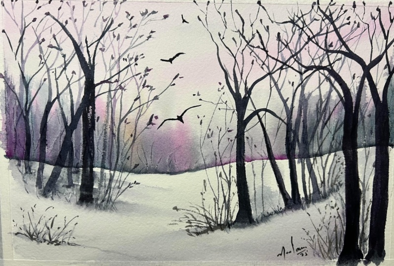
1. What is this class about?: Hello. It's a nice, cozy, wintery day here in Germany. It snowed a few days ago and everything turned magical. I go for walks to this beautiful forest and it looked like a winter wonderland. Hi, my name is Sushma Hegde. I'm a watercolor artist, and everything I paint is heavily inspired by nature around me. In today's class I'll be teaching you how to paint a sunlit, snowy forest landscape. We'll start with a rough sketch where I talk about composition and perspective. Then we'll paint some sunlit bushes and learn to play with warm and cool colors. We'll also be painting a lot of trees and branches and learn how to make them look natural. Depicting snow can be challenging with watercolors, since we generally don't use white, right? I'll walk you through the whole process step-by-step. It's all about the gentle touches and using the correct strokes in a few places. This will highlight the presence of snow without even painting it explicitly. At the end of the class, I will explain how we can generalize the techniques learned here to paint a wide variety of snowy landscapes. I want to do that because I don't want you to limit yourself to just this one painting. I want you to have the techniques and the confidence to make your own snowy compositions after this class. So, OK then, let's get started.
2. What do I need?: Before we get started with the painting, I'll just talk about all the art supplies that I'll be using in this class. This doesn't mean you have to use the exact same paints or paper or brushes that I use. You can absolutely use what you have. And I'm just showing this for your reference. First thing is the paper. I'm using a 300 GSM, a 100 percent cotton paper. This is Fabriano artistico. And I've cut it into a A5 size. And you can absolutely use any size. But I would say start from A5, not something smaller, because it's easier to make confidence strokes with a bigger size paper than a smaller one. And I think this is a nice size, it's not too small, nor too big. And you'll need brushes. So I'm using a size six from Princeton heritage, a size six round brush. And then I have another one from Princeton, velvet touch. And this is a liner brush, size one. And you can see that the hair is much longer than the other one. And this is used for painting branches and other finer details. And I absolutely love liner brushes. You can use liner brushes from any brandy, they all perform the same. I think it's good to own a liner brush. And you will see how I use it for branches. Another brush that I like is this size four from Rosemary and co. It's a samble blend brush and it has a very sharp tip which is nice to add the branches as well. And we also need one broad brush. It can be a flat brush or a round brush, but something which is big so that it takes a lot of water and then you can wet the whole sheet with that. So it doesn't have to be any specific one. It just needs to be a little big and hold a lot of water. This is a hake brush from Princeton. It's a one inch brush. And the colors that I'll be using, we'll be using very few colors for this one because it's a snowy landscape. And as you know this there is not much color other than white in a snowy landscape. Especially that's what we want to focus on. This one is from white nights. This is a yellow ochreo to add a warmish tint to the painting. And this is one of the important colors that I'll be using for this class. And it's called moonglow from Daniel Smith. And you can use any dark color. In this case you can even use sepia or you can use indigo or payne's gray or any of the dark colors that you have with you, or even a dark shade of green. And I'm using quinacridone violet rose to just add tinges of pink into the painting. Then we need guache, white guache. Or you can use white watercolors as well, Just to add highlights to depict snow. And for this I'm using Winsor and Newton designers guache, but you can absolutely use any white. And of course you'll need a pencil and an eraser for the sketching part. And you need a jar of clean water, as we're painting with watercolors and you need plenty of water for that. And to dab off some of excess paints from the brush or to lift off some paints we'll need a kitchen towel or a tissue paper or even an old cotton cloth will do. Yeah, I think that's it. So we have all the supplies with us. We can just get started with the painting. We'll start with a sketch first and then we'll move on to the actual painting.
3. Let's sketch first: Before we start painting, lets make a rough sketch so that we know where the different elements will be. And for that I have taped down my paper onto a thick cardboard. And you can tape it down onto anything. It can be a hardbound book or a block of wood or anything. Just make sure it's not taped directly down to the table because we will want to move it in different angles so that the water flows in different directions. So it should be something movable. I've taped it down using masking tape. This helps us to hold down the paper and when we add too much water to it, the paper tends to buckle. And we don't want that while painting because we want an even surface. And that's why we tape it down. So I've taped it down almost to the end of the paper, just leaving only this much gap on all sides. Ok. Now for the sketch, just have a normal pencil. And I want to first differentiate the sky and the land. So I'll just add, somewhere in the middle, not too much, not exactly in the middle. We'll leave more sky because let there be more white space on this. So it will be a little more than half. Somewhere here. This is good. So I'm just going to draw a very rough line, a little uneven. We don't want one straight line like that and something that goes down like that You know, it's not... it's slopy land basically. And I want trees here and trees here. And I want to keep the middle a little empty, to show depth, and we don't want to make it look very crowded and like a dense forest or anything. So I want some trees here like that in different angles. I'm just make a very rough sketch here because I won't be tracing those lines. I'll just, I just want an idea where the trees will go. And there'll be trees here as well, and here they will be a little further away. So these are closer to the base, which makes it look like it's closer to us. And these which are, which we want to make it look like it's further away from us. Like that. Somewhere further away from us here. And these branches will be much thicker than these. And that will make us feel like these trees are closer to us. because the trees which are closer to us, we can see them in more detail, compared to the trees further away from us. So maybe I'll start them from here, and these here. Some random trees here as well Maybe I'll make it do down like that Let's see, let's see how we do that. I'll add some grass and between here and all of that we can add later. So that's all is the sketch. It's a very simple sketch. We are just separating the sky and the land, and then just adding rough elements here for the trees. That's it. So let's get started with the painting.
4. Sun-lit bushes: Okay, so we'll begin with the sky and leave the land for later which means this region we will not touch at all right now We'll only focus on this. We'll also be adding a few bushes here and for that we'll be using different colors, not just one color, because we also want to showcase that there is mild sunlight falling on it. Which means there will be a little bit of warm tone. And a little bit of a cold tone on this. So yeah, let's get started. We'll first wet this whole region with water. I'm taking my Princeton one-inch hake brush here. You can use any big brush here, it doesn't matter. You just need to wet this whole region. So I'm just adding water, clean water on this, making sure every part of it wet. So you can actually tilt in different angles to see if the paper is completely wet or not So I'm leaving the land and just doing over the line and making this region wet. And it should be properly soaked in water so feel free to go over it a few times. You should make sure there's no puddle let on it. The layer should be even, even after applying the water. Let this stay for some time, till then I'll mix my colors. So, I'm just going to water down this moonglow adding drops of water. Making it into a model based actually Americans much. Because for the sky, the sky pulled up, we want it touches of justice and give it back. Okay, so let's get started. Some bread and adding lots of water of the mix of more glue. And it's already, since we've assumed that the sun is on the Saints all we make sure this region is a lot more. Now that the papers were more susceptible to damage, I'm using the six bushes here for the aggregate mixture. So as you can see here, thicker than before. Yeah. You can make it look like on the background of this yellow ochre. Because I want the warm color here. Because the trees would become yours. I want to make this lighter for short distance. Because if all of them look like one big, long stretch of bushes here, but we don't want to make it look like. So I'm going to stay. What?
5. Background trees: And just make this a little sharp at the ends to make it look like bank cheese? Yeah. A little bit plus this moon glue and a few more. It a bit like this tended to the other side, it will flow smoothly. You can pull up some of the covenant steel where if you think that's too much. So pull it and wipe it on your tissue. Make sure you don't add too much water because you will see patches or water them to pull it off and wiped off. So now before this drains, I have a little trick which make it look like that are very distant. Dom, to exhort little branches written these bushes. So what I'm gonna do is I'm digging another brush which has a sharper endure so joules any brush which has nice sharp end, or you can use a twig or straw, like the end of straw or a Ben. And Ben would show the Incas and just stick something pointed like that and just click it up. So you can see it leaves these white marks when you flick it up. And you can just wait The Dorf on this. So me, these little branches by swiftly flicking my badass. Somebody. You don't get these wavelengths, but you'll just get some lines here. And that's totally okay because once it dries because it's formed a little dent on the paper. Although Carlos flowing fluid as it's drying. And you'll see that doors become narco, which gives the domains affect. And do the same thing here. For this technique actually, the amount of brightness of this layer is very important. So if its door drive and you don't get nice clean streets benefits still read the colors, just flow back into it. So it's a little tricky, but you'll figure it out if you need a field trial in narrows. So see this. It wasn't dumb giving me those white lines before now, after sometime it does. And you can also dilute it a little bit to get the carbons like that. Most of these will be covered by trees on daps or it's okay if you don't get proper lines, it's just in the background to give it a hint of streets. There. It forms a slight dent in your bit bar and that's totally okay. But just make sure you're using gum 300 years and paper or above. Because if you use something, deny them that the paper may seem this lighter region, it's not solved VS that I'm doing this, but we'll just do it. How the colors will dry and then it's always nice to have liberty hints of the trees even though it's not billboard. So I'm not just doing straight lines and until doing lanes on the sates tall, short branches, diagonal ones labor. We have to wait for this to dry completely. There shouldn't be any hint of bordeaux in this. So let's just wait for that for sometime. And I'll meet you back in the next lesson.
6. Foreground Trees: Okay, now that we're finished with the background, we'll start working on our trees. And we will start from the left side because I'm lay tended. So it's better for me to start here in sort of starting cured and then I won't be able to rest my hand here or by painting this, I'll have to weed them this dress. So it's always better to start from the same. When you're at 800 and the other wave and you're left handed. I want the trees to be a little dark. Saw lots of food with less water. And start with this one. Straight line. Can do the same thing again. I don't want to be the same color. The same thing. Just some crooked lines. Branches to ban. These can just leave it like this for now. So I don't want just in one line, I just wanted to look random. So these genes making them lighter. So we'll add the branches later to this. Right now we're just fixing this region. Then we move on to the side.
7. Even more trees: Let's repeat the same thing on the right side as well. Here will be painting the same trunks in similar stay. But we make sure that the colors are a little lighter than he and because they are further away from us. And also because there's like between the bushes there where the yellow is seen. And I want that to be seen through the trunk so and just keep them a little lighter. So remember that? And I'm going to speed up the next few parts of this video because it's the same repeated moment and I don't want you to get too bored. So I think this is enough number of trees late now, we can always go back and sit. Fancier, monotone maybe or maybe not. So for now this is enough.
8. Adding texture with branches: Okay, so let's start by adding the branches for this, I'm using a size four brush, which has a nice long dip. So it really pointed and i want exactly that for the branches. But as for bidding the trunks, we didn't need anything that's sharp. But for this, choose a brush which has a nice by dictatorship. And I'm going to do the same colors that we used previously. So the dog, along with a little bit of windrows, I'm just going to add little branches here. So me, crooked lines when you're doing this, don't make one straight line. So you can see when I'm painting and making these abrupt two branches. So try doing that to get these crooked lines like that to slip motion. And it's not done in any specific direction. Just morning it upwards. And I don't have a perfect line or something that I need to dress. Tiran there I wanted to look and wanted to look random. So nothing can go wrong when you're building these branches because they saw Dan, the Man. They're going eyelid actions. So just be brave when you're making on your lane. And keep reading the thickness for your brush. So you can see sometimes I'm pressing it completely down and pulling it, and sometimes I'm just using the tip of the brush. Let's do the same thing on the side. And wonderful Diego hint or yellow ochre will give us a nice brownish color. For the cell. Do the same thing. Just some point boiling. Okay, let me speed up this part of the video, but I'm painting all of these branches because it's the same moments that we did earlier, the same Swift moments to get the branches. So you can go back and see the earlier part if you want to see it in much more needed. Otherwise you can just watch mean action right now as I speed up this, but I'm interchanging the colors here. Sometimes I'm taking more of the more glue and sometimes the prom don't hesitate. It's going to overlap. Actually, it's better if these branches overlap on one and ando makes it look dense that we're solving. Go back to burst. And a few details here. I want to now branches coming out of these nine inches. And for that I can add convened with this as well. But it it takes a lot of work to being each of this. So I'll be switching to a different brush tool being the finer details on these branches.
9. Making the trees look natural: So I'm switching to a liner brush now, which is used mainly for the ds. And this is really great to paint them branches. And as you can see, the head is a little long going this compared to other brushes. And the b's is a large dinner. So for example, if you see this broach, the base is too good and as it goes to the anode tapers down. But in this, even the beers is almost the same size as this. So which gives it when your paint it snaps like that, easily, goes all the way back, which makes it nice to blend all of these branches. And you will see that now. So I'm just going to use it like any other brush, Dharma Doors Carlo that Tunis. And make sure you dip your whole brush into the Cologne on just that dip. You can start from there. So you'll get to know details at this. And you have less control over this brush, which is actually good in the scarce. I generally keep one finger down when I'm doing this. So it gives me the right angle. So I keep this as an alignment and then my hand like that saw. It gives me the right angle doping these branches. You can try that and see if that works for you. I don't know. I just do it that way. Networks for means so you can give it a try. And so as we go on top of the trees that are more of these tiny branches then at the bottom. So I'm going to add more details on doping just ready like details at the bottom. Sometimes it's nice to press your whole brush like that and get these tariff lines. Doors. Make it look more natural. Again, you can see I do a little radiation and the colors on the branches. I love doing these because it, so because you don't follow any rules or anything. The swift strokes, let's try not to do that. A little bit of this brown. Actually these dry brush strokes so that you can get tickets strokes, but you'll get nice and dry ones too. The tips. Some dabs here, make it look like there are some stream leaves hanging onto the tree. And do the same thing. And that's it. So we're done with these trees now, especially the branches. We can go back and add more details if meaning, but for now I think this is announced.
10. Learning about shadows: As this painting trace, I just wanted to show you what we'll be doing next. We have been mainly focusing on this NOR, and especially on the shadows of these trees. So in this case me was young, but the sunlight does from the same saw, which means follow the shadows will be pointing to the right because the Sun labors here, falling on the trees and the shadows are here. And I want the shadows to be diagonally downward like that. And one thing that is that this unlike does not do harsh. It's not very strong sunlight, it's not already clear D, It's a cloudy day, so there's reading light, sunlight, which means I don't want very strong shadows. As those days let me just show you what I blanked little. Yeah. So just being did these trees here resembling these. So I just want to show your work. We'd be doing QA on this piece of paper. So the first thing that I'm sure you imagine, there's ready strong sunlight and you need strong shadows. So then I would just dig a bit of this color and I will overdo it. And if I wanted downwards like that, I would just do that with a lighter shade or so, something like that. But when you do this, what happens is you can see though edges ready sharply. And that means it shows that there is already strong shadow and you can see exact shape of the tree. But in this case, we don't want that. We want the shadows to be betty, Sadie, and very soft on this node. So instead of doing this, what we will do is we'll just read that whole region saw four. Most important thing is this should be completely dry so that we can go with it and add a layer of water. So I'm just adding a layer of water over this. Because I want the shadows to be solved. And just going to do a little bit of this. And deca ten brushed on, they could pick crash because once you add on the water it's going to spread a lot. So we prefer to add very little offspring. So I'm just going to do I mean, this sharp, so just wipe off somewhere. And this makes it look like it's a really soft shadow. And you can see the difference here. This one is such a strong shadow, matured somebody soft, gentle one. And we want to do that here because we want the shadows to be very subtly and just give hints of that and that it also portrays the snow and the way the snores shipped as well. So let's try that on this.
11. Let's get snowy: Okay, so the most important thing is we have to make sure that all of these tree trunks are fully dry. Whatever stretching the snowy surface is completely drained, shouldn't be even mildly wet or even a little bit cooler than the rest of the beach should be completely dry. So what we'll do now is we take our hockey brush and dig a lot of water in it. Clean water and just go over this region. You can see him doing it ready gently. So the color from This is not moving so much. Really gently, more dense spread of the color here, but that's totally okay. We can use it to our advantage here. Don't rub it too much, and then you will activate the colors. Middle one bad. So I'm going to take this brush, the thin brush, and just take a little bit of Gallo and water, watered it down a lot. And I'm just going to do that. I don't want that. And just stick it off later. But I just pull it and making all of them diagnosed in the same angle. This is a little too much and spread it around. And here I want these to be like that. I wanted to be sharp. So I'm going to clean my brush completely white and then just pull it out. So you're literally rubbing the color. And the color is pretty much fixed steadily. For now. We'll just drag it around and make some channels for this one. Some random shadows of things which are outside the frame. It's ready satellites, you can see it's not too dark. And then I add a little bit of the shadow here. Portray that this law is like that. That it's flowing beard and the shadow of the snow itself. So very sad, very light. And take off some of it is just hints of it. And since this side is getting less sunlight than the side, so we can make this side and knitting dot-com. Remember all of this region is still wear. And we wanted Daqri so that we can get these very delicate shadows. And a few shadows hubris, we take the same kernel, add lots of water, put it the string. Try making them all in the same angle. Just make sure you leave these wide gaps between them in short, making one Clang lakebed. You make individual lines. To depict the shadows. Just pull off some offered to still leave hints of it. Just more of that. Make it a little darker, the tips of the trees. Because the shadow strongest at the tips of the trees and just allow it to spread. And do the same thing on the other side. Just dips. Ready little Moodle wanted me to strong. If you think it's spreading, DO much like this. Since it's weird, you can actually pull off some of the Gulf from the BBA. Once it's dry, it gets harder because it's going to leave these tick blank. When you pull it off, would shoot a one. So I'm just taking that color off and dropping it to mandible. Here. I don't want this to be so dark, so just levered and pull it off. While doing all of this, I'm making sure my brush is damn. It's not soaking wet. Does not or do as you can see him completely wiping it off, but it still damps so it makes it easier to pull off all of these colors. You don't want to pull off too much color. It will leave the streaks flying instead, which should have one.
12. Little details here and there: Okay, now that we've finished painting the shadows and this whole region is completely dry. I add a fuel grass elements here and there and there one morning as you can see that some sports of these trees, the gallows have come off well, I binded the shadows, but we fixed this leader. Once we finished the graphs. For now, let's leave it like this. So two being the grass, I'm taking this liner brush again are the ones which we painted the branches whip and we'll be using the same technique to print the grass here, just some stria grass here and there. I'm taking the same moon. And I'll mix a little bit of this yellow ochre brush and not just the DEP. Let me start with. I feel this region is a little too empty, so I'll add some grass here and add a few stray ones here. Just a few, just a few lines. And some dots here. Just to show which is coming from. The same thing next to the board strokes. Like it's coming out of the three. Just make sure you're more than we can add some some, not just a few dots like some of them are poking out of the snow. Some of them are liberal long stalks. That makes it look more wires. Just a few strokes, and add a few clustering tool as well. Now, I think we're done with adding the virus. We don't want to add too much and overcrowd this. Let's leave a lot of the whitespace GO TO depict this norm. And we'll come back in the next lesson and fix some of this and add a few highlights to showcase nor on this.
13. Falling snow: Okay, now that we are almost done with this beam, we just need to add a few highlights to snore staying on some of the three plans and on these bushes. So for that I have taken wash light and that's this one wins and Newton designer backwash rate. But you can even use whitewater Fellow for this, but you just need to take a thicker consistency. So what I'm going to do now is let me put this essay. Taking my ten brush size for brash. In these regions where there's less column, I'm going to make it look like this nor there. You can make it look like store anywhere. It need not be just on those specific regions. So I'm just adding not too much. Just some lines horizontal and we'll go over the tongue to give it some texture and to make it look like this, just some snow Justin cresting over there. Do the same thing here. To pseudo-random strokes. I don't want to be a need blind. I wanted to look like this to snore here and there. Just only is dark trees. I'm adding more because I don't want it to be just one plane column. Let's do the same thing here. I don't want this to be pulled up. Some think there's a little dementia. So that dark color scene toward yeah, let's add some snowing elements here. So I'm just going to do more of the column and add a little bit more water to it. Let me cover this region. And I just want some more snow here. And so I'm just going to hold it like this topic very gently. I'm not holding it to diet, holding a glues and that if you take the drops are too big. I think some of these drops are like this one and just stick it off and on. So going to take more weight in the brush and add a few few grass elements like that. In. It says, not just for him to start here and there. Maybe someone says, well, it's not really obvious on this. Covers some of the ball length and that's good. Maybe add a few drops of snow. So I'll just take a little bit more because the colors to pick on my brush and it's not falling. So just hold it like that. There are some drops on this as well. And that's OK. We don't have too much of that, so that's good.
14. More examples and conclusion: Okay, now that we're done painting, I hope you enjoyed this class and learned a lot. I just want to show you a few variations of this painting so that you need not just copy exactly what I've painted and be done with it. You can try different variations from what you've learned in this class. So I just want to show you different things that I have made using the same concept. So for example, this one. In this one you can see that it's a warmer atmosphere like there is still some autumn feel left in the scene. So I've chosen a brown yellow ochre color here and a little bit of orange to show there are some leaves still left. And you can see the snow is painted similarly, but only here I've added a layer of the color here, the same color I have used here. This way is shows that there's overlapping layers of snow in this region. Another painting with the same concept, and same techniques as this one, which is very similar to this one. And here you can see that I've painted the trees here which make it look like further away And these look closer here. And as you can see, the closer ones have a thicker trunk and these have thinner ones, so remember that. And you can also see that I've added again, a shade of the color here, whatever color I've used here and here, so it makes it look like there is another bumpy region of snow here. And there's one region away from that. And I think that makes it look like there's dense snow in that region. And you can see I've added a lot of these grassy elements here. And even here. And in this, the thing was the trees don't have so much texture on it, which makes it look very striking and very dark and takes away all the attention to these trees. So that's why in our painting, I've made sure that we add lots of texture and snow so that the attention is not only on some specific trees. Another one with the same concept. Here, I've just added a few of the other colors, like I've added some green and some yellow here, and then I've added a pathway. But the concept is the same. And here are the shadows are a little stronger than the previous one. And that shows that this stronger sun light in the scene. And here you can see the shadows are slightly lighter to show that the sunlight is not so much on this side and that's why this region is a little darker. And another one that the same concept or similar concept as this one. But here I've made sure the background is warmer on this region and cooler here. And also the shadows are much stronger in this one. But other than that, the concept is very similar. Another one, which is one of my favorite painting is this one. Here you can see that the tree trunks have snow all over them. And to get this effect, I've used masking fluid. So when you use masking fluid, you can just add a layer before you paint. And when you paint with that fluid and wait for it to dry and then paint over it. You can just peel it off and that region is left as it is without any paint over it. So I've done that and then I added slight traces of the paint to make it look like the barks have some snow on it. Yeah, I've done the same thing here as well. And you can see the trees closer have a lot more texture compared to these. because I want to show that we can see it clearly for the trees that are closer to us. So as you can see, there were so many attempts and I was trying different variations of this same concept. So you can totally try different things with all that you've learned in this class. And I'm very much hoping to see what you'll paint and what your try from what you've learned in this class. If you share it on social media and don't forget to tag me On Instagram my handle is @sushhegde And you can use the hashtag #skillsharewithsush If you liked this class and enjoyed painting with me, then please leave a review so that more people can see this class. And if you have any questions, feel free to drop them in the discussion section so that I can answer them and others can see it as well. So that's it. Bye.
 Sushma Hegde, Watercolor Artist