Transcripts
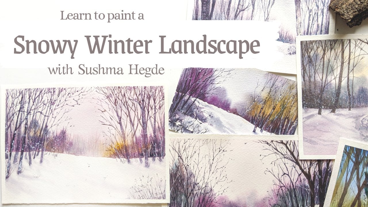
1. Introduction and class outline: Hi, My name is Sushma Hegde on Welcome to My Skin, she class. I'm a watercolor artist who has been totally inspired by nature, and everything in nature allows me to keep creating. In this class will be learning how to paint two different kinds off green landscapes using watercolors. Painting greens could be a little tricky, especially when in nature there are so many different varieties of greens. Capturing all of them in our paintings can be a little hard, and sometimes they condone muddy or sometimes they just to Brighton artificial. So in this class we'll be talking all about that and also learning a lot of different other techniques. So first we start over the simple landscape, mainly focusing on the sky and the greens, and then we'll dive a little deeper, add more elements and give it some perspective, which means we'll get several opportunities. Toe actually practise the techniques we learn and get better at it. So let's get started
2. What we'll need for the class: before we begin painting, we'll talk about all the supplies that we need first, And the most important thing is the watercolor paper. Here. I'm using Fabbri, an artistic A 100% cotton paper, 300 GSM. So for this class, it's highly important that you use 100% cotton paper because 100% cotton people has great absorbency. That means it takes more water, which means it stays red for a longer time. On. That is absolutely necessary when we work so much on Britain Red now talking about the colors. So I'm using off your greens off your blues and one brown on a few yellows, so we'll add the names of all the colors. After this. Let's talk about the brushes. Now I'm using one big brush. It is a size 12 brush from Princeton Heritage on the other door, Chinese brushes that I got from Only Express one is a size six and the otherness around size Fool. What's written. There is something which I don't understand, but it's approximately size for everything, and then we'll also need a pencil. So start with the sketch. First I'm using in Arreaza and a white Ben. Why gel pin, and if you need to add a few days, you can use a black gentlemen as well, and then off course. You'll need a jar of water and some kitchen double or a tissue paper or a cotton cloth so that you can dab off your excess pain from your brush. Since we'll be working a lot with the wet and red technique, that means we'll be adding a lot of water on the paper. There is a chance that the paper will buckle. I mean, it'll become bomb be when you add water, so award that we try to deep down people. So basically, you use masking tape to tape down the paper. You can find masking tape in any art stores, or you can also use what she tapes as well, anything that sticks to paper and comes off easily. Basically. So, yeah, that's all the things that we need. So let's not waste any more time and get started with the classes
3. Warm up techniques: okay, Before we start with the main painting, I think it's important for I still learn off. Use the basic techniques and especially the trees and the grass. I just want to show you how I paint the coconut trees and also the grass on. I'm just preparing a green mixture here. I'm just adding a little bit off our timbering toe the sap green to get a cool green on. I'm taking a tin brush the size for brush, and I'm just like this with a line. Make sure that your brush has a nice 10 point and you can get these lines. You can observe that I'm moving my brush very swiftly, so I'm holding it almost like holding a pencil very much closer to the tape. And I'm just very swiftly brushing Ben up on in the brush there on, so just be aware of that. Don't grow very need 10 lines or anything that's going to make it look artificial. We just need the swift strokes there so make up thin line first. And then on all the strokes, you can observe that in each of these, the direction off the leaves are a little different. Basically, it's towards the line that I drew first, so make sure bent accordingly. So as we go up, it calls a little less l. So I'm just going to add some more. Doctor collide the tips. Basically, I'm doing this when it's still better, so it just blends and smoothly, we'll make a line a quick line and then on the strokes in the same direction as that first line. You can see many off. These strokes are overlapping on one another, and that's totally okay. Gives it a nice, rougher look. And that's what we want. Okay, I'll continue adding these brush strokes and making more leaves. And you conjoined me on practice as much as you can with these, because initially, even you're starting it. This can be a little tricky, especially if you have difficulty losing control. So just don't worry too much about the outcome. Just enjoy the process off, making these swift strokes and just give it a go. I've also made the center little ticker basically have taken a little more off the darker green and just added it in the middle to make it look nice and complete. Okay for this one Since it's pretty much on top, we will be able to see both sides off the middle line. So basically, I'm going toe. Add brushstrokes onboard sites in instead of just on one side, like we did for others. If you're not getting very fine lines like your what you can do is you can switch to a smaller brush. Maybe the brush that you're using doesn't have a very fine They play the one that I'm using . So switch to a size to brush, perhaps, and try to might get in a strokes. And sometimes it also could be that you have less water on you paint mixture. So you might be getting very dry strokes to try adjusting your paint mixture so that you get a nice consistency and these brush strokes flow easily from your brush on. One more thing. Yes, I said, are you make sure you hold it closer to the tip. So basically, when you're adding fine lines like this, you hold your brush closer to the depth, and when you want very loose strokes, you move your hand away from the brush. Okay, I think that's enough number off leaves and enough number of brush drugs for this, and we'll just add the drunk off the tree and we'll be done with the coconut tree here. So this is a ready, quick and easy way off adding coconut trees, especially when you're adding these in your background for your painting. This will give it a lot of life. I just took some brown green mixture and swiftly added the trump there. Okay, maybe we'll try this again one more time so that you get a better idea and you can see it more clearly. Let's start with one swift stroke. Of course, the line first and then briskly on the brush strokes there so you can see that I'm moving my brush pretty fast, but I'm holding it as close to the tip as possible, so try not doing this very slowly. Try moving it very quickly, and as you go down, you bend. Oh, leave strokes towards the inside so we can try this again one more time. Before that, I just add a few dark sport on dog to give it more texture there. So this time, without drawing the line, we can just add the brush strokes. This gives it a more natural look, actually. So pride this if this is easier for you than go for this. So basically we're practicing and making on hand you in such a way that we get these brush strokes on. This is important when we are painting the grass as well. So basically, in that where there's an a port motion off brush into off downward and you can see it's again very swift, and it's taking the bottom. And as you go up, it becomes to know Andi. I think this requires a bit of practice, and you have to do this before you would under find your painting. Once we get a hand off these techniques, I just want to show you another technique, and this adds a lot off texture to our painting. So what I'm doing is I'm just taking submarine on a little bit of ultra Marine, and I'm taking the pain completely in my brush. I'm going to splatter something, basically just tapping on my brush and just holding it there and tapping over it, and you can see how it's praised some off the pain. There you can cover some off the regions that you want to spring on with your hand, or you can keep a piece of paper and just springing on back. So if you're finding it hard to do this with one hand, what you could do is dig one brush and in your left hand I mean your non dominant time on back. You brush on that one. I mean, back to me brush, which has painted it on this one. So you hold up brush on your left hand still and won't be this one, so he wouldn't get a more scattered splatter. And I think that looks pretty good. So that said, we've learned some off the basic techniques, which are very essential for the spending. You can also see that I have made a sky cloudy sky painting on top, which I was practicing on Leo, and we'll be learning all off all of that in the next two lessons. So get ready and join me as we start painting
4. Landscape 1: Quick sketch: okay, We'll start over the first painting. So first we have a love sketch so that we have an idea where are elements will be. And before we start sketching, we'll have toe down on people to something. So here we have a big sketchbook as a base. Andi, since it's a hardbound one. So I'm just stepping my people to dart. You can take down a paper on anything, and you're amusing masking tape and just taping. You don't all decided. Okay. Based on how you want your border to be, you can adjust. How much off the tape you're sticking to the paper. So here I don't want a very take border because first of all, this is not a very big sheet. It's a little less than a five size, so I don't want you nice. Most offered as the borders. So I'm keeping keeping the back borders to the bare minimum. So what's up to you? And if it's a bigger sheet, a bigger border would look good. So you are based on what size you have. You can use how much ever you want. Okay, now that we have done taping down the paper just make sure there are no loose ends and it's not open in some places and it's completely secure. Just you can press over it once and check that and we'll start off with the sketch. So I'm using a normal hedge B pencil here and dividing the paper into the land in the sky. Basically, I want my sky to be bigger here. And that's why, first of all, I used people like this in portrayed more if you would call it because I want this guy to be the highlight in this painting. And yeah, so I started by a buried off sketch, especially of the bushes and on the land. I just need some uneven nurse. So I'm just adding those lines there. Nothing in particular. So yeah, that's it. That's a rough sketch, and we can want toe painting now.
5. Landscape 1: All about sky and clouds: we start by painting those guys for this as we discussed earlier, it involves a lot of weight and wreck technique. So which means we'll be applying a lot of water and in orderto award the water from drying . I'm preparing the pains beforehand and would be after that, apply water to the people. So I'm taking our two machine on blue and a little bit off in the go on the side. And I want to make some Quinn draws to it. So I get a publish British mixture, maybe add a little more to go on a little bit off to Marine. Do it. So this guy also we don't want it to look very bright. So I'm just darling it down a bit within Nicole. I clean my brush completely and I'm using the big brush here toe apply some water on the people. You can see this Some Carlo in my brush left so conceal a little bit off green color. There a boy doing this because you want to get a green sky. So try washing your brush, studly on. Only then apply a proper wash. It's okay. Like now? I think so. But yeah, make sure that your brushes completely clean before the first wash. So basically, I'm applying water like I'm applying pain or owner. Would it just make sure they know are dry sports in between? And the whole region is completely buried. I'm trying to award the bushy region him. Let's keep that as dry as we can and apply ward on the rest because we want the sky there. Now I'm taking a smaller brush and yeah, I take this are two million mixture first, and I'm going on very gently. Little strokes. And as you can see, the papers where So the color is spreading very beautifully over the paper. And yeah, it's flowing a little down and let's not allowed that to happen too much. So I'm just lifting my people that the side so it floors to the other side as well. You can just keep keep something below him, keeping this masking tape down so that I could be as it is, throwing the side. Andi, this is like something like a negative painting. Basically, we're leaving out white spaces for the clouds on. We're painting the rest. So, as you can see, I'm just adding little dabs off pain, and that's not a line or it's no big stroke or anything, so be gentle with your brush. When you're doing this, you can also observed that I'm not dipping my brush every time in the paint. So which means it's like their own some regions and DR on some regions on, especially as we go down, I'm keeping it lighter as possible. And if you observe the sky, that's how you see usually it's docker about as you go down. It gets lighter and white dress you see down I live in the clouds are much bigger on dog. Then they're down. So keep that in mind. I just made the blue one top a little bit more taco because, as you know, once it dries. It's going to drive a little lighter than what we can see now. So just in some regions are going to add a little bit off more blue. Okay, now we can add the shadow regions off the clouds. What I mean is, the clouds are not just plane. While when you actually carefully look at it, it has these gray sports on, and basically its own shadow is what we see. So I'm adding this population creates mixture on the white region. But just be careful when you're ironing this. You don't want the whole region to become great. So take a 10 Russian on very gently, and I watered down that mixture. Or Lord, as you can see, I'm just adding little sports there and mostly at the lower region off the cloud. And I'm going to pull off some off the color because I don't want to drive very dark, especially I don't want to dry like this, right? I wanted to look a little fluffy, and I wanted to look very settled, so I just clean my brush and I'm just pulling it off. So why are you doing this? You have to be. I read that that your papers completely wait. I mean, that's why we need 100 person courting paper for this because it stays bread longer on. You can do this at that time. You can actually lift off color like this. And if it's semi dry, you can't do this. It's gonna look bad if you do this. So you are very gently. I'm taking off the color. So you can barely see that Great. But even whatever you see makes a big difference. So just check how much greater need. Just look back and I mean more away from the paper and see if it looks natural and, yeah, that's it. We're done with this now. One more thing that I want to mention here is whenever I have in person workshops and the students are learning to paint the sky, I see many of them struggling a lot with this, especially if they're starting get off as the first thing. But remember, that is completely normal. Maybe you added too much gray, and it's very dark or it's covered all the white region with the great Oh, maybe the blue is you have a lot of hard lines because you're not lifted off the color correctly or the papers are legal dry. So all that is completely normal. So don't worry too much about it. And paintings. Guys is not that easy, and it's like a hit or miss case, So don't be too hard on yourself. Value painting this, and if it didn't come out well, it's OK. You can give it another try
6. Landscape 1: Foreground and blending greens: Now that we're done with this guy, let's more painting the land. The sky region is not fully dry here, but that's OK because we won't be meddling with their too much. So first, before we apply water, we're going to prepare the colors. So I'm taking lots of SAB Green was that is I mean, follow you and I'm gonna take some new gun Borj and make it of Amish green because I wanted to look more somebody as I'm mixing the colors, you can also see that I'm adding a lot of water toward and I'm making it pretty 10. Let's keep osa preet mixture off Sakhalin here, not just the yellowish mixture. And I want a little darker mixture. So to the orderly, prepared publish mixture going to add some green or you can just add some and we go to the green that you have, and I'm going to take some quick gold your and prepare a green off my own. Basically, I'm taking our two Marine and Quinn gold and this gives a nice or the green, which I actually like. Okay, now that our basic colors are very, we can start by waiting the paper and we can make small colors as in my need need. So taking Clearwater and waiting that whole region similar to what we didn't with this guy . Just make sure the entire region is completely wait. I'm going to switch toe smaller brush to paint the grassy regions. Yeah, it's fully right now, so I need a little bit more off the yellow, and I want the base layer to be a little more yellowish, so I'm mixing. It's a greatly that the side, and it's a greenish yellowish mixture with more yellow on it and the further away the land is from us. It's going to be lighter because there's more sunlight falling on that region. That would be us. You, for this sin agile, and the one decide closer to us is a little taco. I'm taking the green that were previously mixed on adding gentle strokes over that, And as you can see, when I entered the yellow as well, I left a lot of white regions. I didn't make it one complete wash off yellow, but I left white regions in between, and as we add the green, it's gonna mix and we're going to get a better idea of green because some off the green makes on the white of the paper and some on the yellow, so naturally give us a different. I feel that the whole thing in stuff one complete wash off green. I'm making the side closer to us Little taco and I want the right side to be your little bushy. So I'm going. I'm Morgan. There. You can see how some off the yellow is spreading to the skies. Well on top, right? Don't panic. It's totally your care. It's all under control, and it's not spreading too much. So it's OK. And it looked like this. Something in the distance, some yellowish bushes far away. So that's totally fine and looking how beautifully it's spreading their I just love that. And, yeah, when you're ambling, just be careful. Don't act street line thought anything. Just gentle strokes. The papers are really bad, so you don't have to do lord there because the people and the water colors will do their magic. They will spread through the paper, so just enjoy that. Okay, I don't want that yellow on top, so spread too much into the sky. So I put my masking tape on the need, especially on top, so that the yellow flows back downwards and water. Well, it has formed their looks good right now. And that's enough for me. That was actually unexpected, but it's turning out to look good. Okay, I'm taking a lot of indigo, and I'm gonna mix it with the sap green so that I get a dog greenish mixture, and I can go back to the bushes in front and at some more being there. As you can see, I'm making these upwards talks like this grass there. And I want that because the closer it is to us, the more data we can see it. So basically, we can see the grass blades which are closer to us. So I'm gonna make the based a lot, Doc. Oh, no. Stop. And then I'm going to add the's grass like straws. We can come back to that again later. I'm gonna add a little bit off green on dog to give that newish bush a little bit more off . What I did there very gently. Very little green north, dark green and just dabbing. Overdid it. It's because it's still weird if it's dark. I mean, if it's dry, then really no do that so very gently earning little Bush like structures there. I just love watching all of these greens, especially when the paper is still red. You can see how the colors flew into each other, and they just look so magically. And I think that's the beauty of water colors. And I thought, you know, watching it. Okay, let's not get Can we know we have to come back to the next lesson toe paint the bushes on the left side.
7. Landscape 1: Fluffy bushes: the grass is still wet, but that's okay. We can add the bushes, and if some off the color bleeds and do the lower region, that's totally okay, because we are again using green, and that's fine. But if your grass is already drying, that's also cool. So don't stress too much and again for the Bushes, like what we did for the sky and for the land. I'm just going to add some Bordeaux first, and then I'll come back and at the Culo. I'm starting with the upper region because that's going to be the lightest, because this more light on dope, then in the base and it's denser at the base. So we're gonna make a doctor down, so I'll start with the new gun Boetsch born yellow that we previously mixed, and I'm just having a little bit of green died and very gently. But the small brush angle on Jenkins strokes on door and you can see how it's pretty. It's don't and that's what we want. What do I have my masking tape, please, under my book on the top. So that's why most of the colors bleeding down and you look so beautiful When it flows down like that, we can add some green. Now I'm taking this up green and mixing it with a little bit off yellow on. You can directly use it as well, because it's going to mix with the yellow there and give it a nice natural look. Well, I'm adding the green. You can observe that. I'm not adding uniformly all over that region. I'm just adding it here and there, and I kept some white space is also there, and that's actually pretty important. So be careful when you're on and the green. Don't add it all over that region, mixing a little bit off when Akron own gold and getting a brownish greenish mixture, which will add some that idea in depth to that region. I'm just dabbing good dead. Just be careful about how much offered flows down, so I'm gonna put the masking tape below now so that the color floors off the other side. So it all depends on how where your papers and with outside the world of floors and use Dr Advantage to get nice streaks on your people. I'm going to make the beast doctor, as I said, and I'm just using that in the gold makes to green and Adam it at the base and you can see that it's spreading a bit of the land as well. And that's what we want. I'm gonna make the base a little more doctor. So I'm making a taco mixture, and I very gently added at the bottom. Make sure you don't add big blobs there just with the tip off her brush. Just add a few dots and lines there. Okay, the basis still read. The land region is still red, and you can see this too much off Bordeaux DOB. So I'm just gonna cover it with the yellow that I have. And I can know this because my paper is still back there, so it's totally okay. But if it is dry it it's not nice to meddle with that, And if it form, it has formed those blooms. Then that's totally okay. Just leave it as it is. I think the bush needs a little bit off white spaces in between so that it looks like there's more light falling on some regions. So I'm lifting off some off the pain, basically, in taking a clean brush and when it's still red, I'm just lifting, like just pushed, pulling out some off the being from there. This is similar to what we did for the clouds in the sky, and I'm just taking off some off the color there and making it look like bushes. It says When I'm lifting it off now, I'm going toe just a little bit off. The end of the bush is so the end of the bushes, the leaves are a little clearer because they're losers there and not so densely packed. So just taking the yellow that we already used and making these little dots there to make it look like some off the leaves are scared all over that region. At this point, you cannot. Thoughts change the shape off the bush if you don't like the way it looks. So maybe I had a little bit on the night side of the bush to make it look a little different. We can also add some green there so that it's not two years ish, So yeah, that's it. We're done with the Bush now, so let's wait for all of this to drive, and we'll come back in the next lesson.
8. Landscape 1: Techniques to add grass: okay now are paper is fully dry. You could make sure by just gently touching your paper in the regions You think it's a little bit and it shouldn't feel too moist or damp. It should be completely dry. And now what you see looks more abstract and you don't see any tear object in this picture . I mean, in this painting. So what we're gonna do is we will add some highlights. Basically, like the grass in front are make the bushes give it a living more depth. So that's what we want to do right now and even the grass we can undeliverable highlights there. So I'm gonna start with the bush right now. I just stopped the green mixture that I have in my pounded and I'm just going over that region. But as you can see, I'm leaving a lot of gaps in between. I'm not just making a bushy shape structure there. I'm just leaving some spaces in between by died and on the orbit has a lot of hard lines, and we'll smudge that a bit. But for now, we're just darken the base. I took a lot of in the go and I'm adding At the lower region, I want to take some more doing my brush and very gently pulling the color on top. Basically, I don't want those hard lines there, so I'm just spreading it on top. And you have to know this when that region is still wet. So I didn't take any color in my brush and just lifting that color from the base and just spreading it on dog. So this way we get a better idea. Off greens are really there when this is still red. We can add a few drops off green here and there on that so that it spreads nicely on bad. And you can see him adding a little more leafy structures on the ends of the bush, and we can add some dream on top off that. But don't act too much and don't spread it all over the region. - Okay , now that we're done with the bushes, maybe we can add a few pine trees on the right to make it a little more interesting. So I won't take my green and indigo and make a very dark mixture for the buying trees, and I'm using the thinnest brush your to make them so very gently. I start from the top and I'm just make a straight line and just go over it. Make add little dots on the left and right side. Gentle strokes north work because I mean not slanted line. So anything just little dots off you on the right and few on the left. We add one more tree here, nothing to detail, just adding a few lines off your thoughts on leaving little white spaces in between. I'm just adding a fuel tiny bushes there and maybe I just add a little bit water and light in it down a bit. - Now we'll move to the lower part, and I take the same green mixture and over the dark regions on the cross. I'm just adding these little dots and leading an effect off grass there, and it's as you can observe. It's not one straight line. It's a little cold, and as it goes towards the centre off the paper gets the no decides a nice depth, and it makes it look like the Landis. A little bump being coat at those sites instead, off flat land, I just dive off some beamed and now the brush has very little Cano, and I'm just using that the spread it across and the farther away it is from us. The lighter it's going to look so amusing. Very light color there. Let's just smudge the upper region off this so that it's not aboard. I'm just adding these little dots everywhere and don't make it too obvious, just tiny dots. I'll continue adding the little dots, especially. I am the's on the dark regions on the paper. That is, wherever the background is a little dog. I'm just going over there. They're adding a grassy effect there because already the background is giving us a feel off some darker portion being there and make sure it's not too dark in all regions. Some regions are a little lighter on some, a little darker, so if it's stored out, you can just take some water and wipe it off and spread it a little across and said, Since it's all green, it's totally okay for some off these regions. We can give it a more dressy effect. So what I'm gonna do is I'm taking paint and my brush completely, and I'm making the swift upward motion and this baby get those nice stocks off grands don't make these too long when it's far away from us. So the further away, the shorter the grass looks, then it when it's closer to us. So when we go down, we'll make sure we make a pretty long, big grass stalks. But the one behind it's shorter than that. So I'm just going toe. Add a few bushes. They're just making dark at the biggest first, and then I just create these grassy effect and just pulling my brush upwards. I'm not. As you can observe, I'm not carefully drawing each line or anything. I'm just randomly pushing it upwards, and you can see that sometimes it's a little diagnosed early toe, the left and sometimes to the right. So that gives a nice effect off. Oh, crowded. Gonna last there instead of doing it in just one direction. - I just add a little more grassy effect on the other parts, so I'm taking very little green pigment in my brush and lots of water. So I'm just spreading it across, just making those little dots that we made audio but with a different shade of green Now, basically, there's more water. And yeah, in some places, I'm going to add these little stocks here and there, but very tiny short ones. And some places, I'm just want to add those little dots, so I just continue doing this, - okay ? I just continue adding this, but I'm not going over the work. And be careful. Don't add too much on the white region. And we want to keep all these spaces in between as well and at this grassy region as minimum as possible. And I'm just extending these Bush is to give it a more natural affect and give it more depth. So, yeah, that's it. We can come back to add a few more details, especially on the grass in front.
9. Landscape 1: Adding depth to the painting: I'm just going toe. Add a few highlights on the bush. Basically, I'm taking a little bit off in the goal, and I'm preparing a dark mixture on adding a little bit off. Say PR do it. Give it a brownish grayish mixture and I'm going toe Are things lie instance strokes within the bushes, especially in those regions where we have not added extra agreeing. And I'm earning very 10 lines and strokes to make it look like there s some branches which are speaking out through the bushes. Don't overdo with this and just on a few lines and maybe at the end as when and the fuel little grassy things here on the side and just add a few thoughts on this grass, we'll come back to dart and act some Okano there, and I'm using off greenish dark greenish mixture. Hello. Okay, wait. Let me just correct this a bit. I just add a little bit of yellow there and make it look more continuous. So it's just up to you when when you look at the painting as a whole, what you feel about it, So don't bother too much about it. I know mangle too much. So, yeah, I think I'm going a little Oh, little flowers on the grass to give it a nice Kahlo. So I'm just taking lots of yellow. And it's a little hard to see this yellow on on the green that we've added there. But that's totally okay. We want to keep it a little Sutter and not too bright. So I'm just taking a peek. Comics chauffeur yellow and just adding it over the bush and a little over the grass dogs on to start a few more yellow dots on the left side as well. And maybe on the right side toe. And I'm not making it too big. Especially as we go for further up. The yellow gets smaller. Basically, the flowers look small law when it's further away. So the one on the right, the front most. I've kept the yellow, little bigger the flowers. Local little move began, the more prominent there. Okay, now that we've done in the dark, I'm gonna use my wife gel pen, and I'm gonna add a few highlights, especially on the grass, because it looks like one giant green blob there. And I don't want that so I'm just adding a few strokes off white there, and you can use white Wash or even Whitewater culo, which is typically mixed, and you congee just aunt strokes like you previously did with your brush itself. And just make sure your room painters fully driving You're doing this otherwise, the you don't see the marks made by the pen. I'm just adding a few dots and lines here and there, but I think the color is too much like I feel there's a big stretch off color in someplace , and it needs a little variation in those places. I add a few thoughts and a few lines there. Don't overdo this. Don't act many lines and make it look artificial. But just gently go over spaces you think has too much color and could use some work spaces . So in those areas you can go and correct it with the white Children. Okay, now that we're done with Aisling on the white on the people, I think I just go back to the grass again and add a little bit more off Dhaka Khaleda. I don't want to be very prominently white in that region, so I just take a little bit off, say PR and a little bit off indigo, and I get a brownish mixture there, so it's pretty dark and I'm just going over it. Not so much. Just a fuel strokes here and there. Okay, now that we're done with the sky on the grass and bushes So I think I'm done with guarding all these grass strokes here, and the sky looks pretty plain right now, So maybe we could add a few birds on top. And the next lesson I'll also talk about adding some texture toe the grass, and I actually love that whole process, so we'll get to that part now.
10. Landscape 1: Splatters and birds: Okay, now that we're done with everything, we just adding a few little details on will be done. So I'm going to add some texture toe grassy region here, which means I'm going to add a lot off splatters there. So as you can see, I'm literally rolling my brush in the paint. Andi, I've loaded my brush completely with the paint, and actually, the paint is mixed with a lot of water so that this platters fall off easily on the upper regional cover with the waste people so that my splatters don't fall on the sky region and doesn't make it completely green. And as you can see, I'm just holding a brush still in my left hand and tapping the other brush on my right hand side. And you can see that this platters are little dancer on the light side, basically near the grassy region, which is closer to us, and they're further apart as they go to the side. So I think that's enough off splatters there we add a few birds on top. I'm just taken into go and I'm just making very little bit marks, you know, just flicking my brush just like you want your marking a paper? Just They just stick marks. Nothing fancy here. And as we go down making them small on as we go a little up, we're just making it a little bigger. So I'm just randomly adding them all over the page. Okay, so now we have done with this guy we've done with the ground. We're done with the bushes. So now is the best part and the most satisfying part, which is removing the masking deep. So you have You need to be a little careful when you're doing this, because if you just swiftly, the more the people can get off and also be careful that you're being it's fully dry so that if the wet region just doesn't spread off the borders and really slowly, just gently pull your masking beer. Sometimes it depends on the papers Well, and it can tear off. The paper can tear off when you're pulling the tape out, so just be careful and see what kind of people you're using and see how it works for you. So I hope you enjoyed watching this, and in the next lesson, it's like a continuation off. This basically We're diving a little deeper. We're adding more elements and we're adding more depth and creating some perspective in our painting, so you'll be learning a lot more, and I hope you enjoy watching back lesson as well.
11. Landscape 2: Composition and sketching: before we start sketching and being changed. Let's just have a look at this picture. I took this when we weren't body earlier this year, and it was a beautiful sunny day. Andi, look at all the lush green rice fields there. So as you can see, there are so many different varieties of greens in this on. Do we have to make sure we capture all of that in a painting? We're not going toe exactly be this picture. But we'll just take some elements from this. For example, the main highlight will be our house, which is on the right, and maybe we'll change the angle a little bit. And in front, we can also add that part way and maybe a lot a few more coconut trees. So yeah, this is just to get an idea off what will be painting when you observe the house, you can see that the roof is a reddish brownish color and this light falling mostly on the front side off the house. So the left side of the house is dark because this more shadow there. So we keep this in mind when we're painting, and yes, so let's get started. Okay, so let's just start off with the sketch first. So what I do is I first draw the horizon line. So let's make it almost at the center of the people and try to make it as straight as you can. You can even use a scale or something for this. But I just catch it like this. We know that the lower part off this line is to rice fields. So on door bar, some off the bushes and then we'll add some trees and, um, heart. Maybe so. I'm just roughly sketching how big I want the bushes to be. So as you can see, I'm not doing anything. Dale here. It's a very tinned rough sketch and add a little heart. You're maybe just the top part, like it's peeping out off the bushes And, yeah, so that's just a rough awaited off sketch for the bushes. I make some space here toe add the house. Um, so it's just a basic a little heart that we're going to make your and I just start off by, um, drawing the front part of it. Feel free to use the syriza as much as you want don't don't hesitate to do that because I sketch is really important and it simplifies the painting process. Once you get the whole sketch ride, you can see that daughter lines are a little dark. I'm not pressing my pencil very hard in the paper, so I'm just brushing it across. And I make sure I don't form lots of dents on the paper because this will effect when we add the water colors. Body houses had these extra roof things. I don't know what they're going, and I just want to add that Don't worry about going over these lines again and again. That's totally okay. Actually, that way you get a nice straight line and just be gentle. But your pencil, as I said, so that you don't get very harsh lines. Well, just make the house look like it's going inside. So we'll add some depth to the whole thing. And by making the behind back a little smaller, it makes it look like the house is going inwards. Let's also add a few more years, maybe the window in the front. Actually, I saw all of these windows in these farms, which were room covered with um, some plot in front, and just at that it I feel it gives it a more organic natural look. Let's add a few coconut trees here and there. I don't want to make them Tau Bay because I wanted to look like it's far behind, so I make them pretty small. And as you can see, we're not making where the accurate sketches were. Just pointing on where the trees will be on. We'll add all the details later, directly with a brush. I think that's enough number off trees, right? You can go ahead and add a few more if you like. So now that the top part of the sketch is done, we can warn to the rice fields. Obviously, there's not much sketching Toby done here because it's mostly being and we don't want to catch each off the grass blades or anything. I just add this part way in between and don't. I'm not making it very street or anything because I wanted to look more natural, like it's a man made part. And so it's It's very it's a very rough sketch and maybe some lines here and there, and the back and these are not very dark because now they're far away from eyes, so we can't see clearly. So we just had very little lines. So yeah, that said, we're done with this kitsch.
12. Landscape 2: Painting a cloudy sky: Okay, Now that we're done with the sketch, we have to strategize how we're going to paint this. I generally start off with this guy because it's the lightest part off the whole painting. And in watercolors, we generally start off with the lightest because we can then add the dark elements over it . So first, let's start by mixing the colors. So I've taken some ultra Marine, kept that aside, then taken a little bit off Quinn drawers, and I'm gonna mix it with a little bit off indigo on a little bit off ultra Marine so that I get a published shade andan show you why we need that a little bit off to go. Okay, that waas a little too much. We don't meet so much and go a lad a little bit off windows. Yeah, that's enough for us. Okay, Before we start, I have toe tape this paper down on to something hard. So I'm just taking my old sketchbook and I'm going to taper down onto that so basically you can take anything. A cardboard sheet are an exam board or an ordinary book or anything, and just put your paper onto that stick it onto that. So I'm going to use masking tape to stick this. You can actually, um, stick it on all edges if you want some nice Chris sharp edges. And I generally do that, but for this painting, because it's a farm scene. I wanted toe have these rough edges, and I think it makes it look better, especially for this kind of painting. So I'm just going to Dave, only the cardinals here, but feel free toe tape on all ages if you want. I start off by taking Clearwater in my brush. Basically, I'm dipping my brush into water, and I'm just applying that all over on the door. So just about the bushes that were marked So basically it's like just taking paint a new brash, but instead am taking water and I'm painting all over that space and make sure you don't leave any particles or anything. They're on, and it's an even layer off water and feel free to go over it again and again until you're sure that it's completely wet. Okay, I think that's enough off water, and I made sure it's evenly spread everywhere and shift a smaller brush now to paint the sky. I first ate the blue mixture that we have. Maybe add a little bit off ultra Marine. Just make it a little more docker very gently. I make these little marks here and there, so it's not big strokes or anything. Very gently make little marks and make sure you leave a lot off white spaces. So don't just add blue everywhere, but it's red, but just make sure you add them in different spots. But I'll keep a little bit off white and between, so the white spaces will be on clouds, actually, and the blue is the what I say it's It's the sky. Basically, we're doing a negative sort of painting, so we leave the whites for the clouds, and the blue is what is other than the clout by painting the sky, you have to be a little quick, actually. So what I mean is, once you put water to your people, all this adding paint and all the strokes that you add. You have to be quick. You can't wait for the people to dry, and if the paper right unevenly, then you get hard lines and you won't get these fluffy kind of clouds here in Ireland. Little dots off the publish grayish mixture that we had and, as you can see him, adding the dots a little lower on the white spaces. This is like the shadow off the clouds itself. Andi, just rub off my brush onto the paper, take out all the paint in it and just gently lived some off the pain that apply. So basically, I'm making that region really like And be very careful when you're doing this. You'd want that grape part of the pain. Do fully cover the white region. It should be only at the bottom. I'm lifting off some off the paint here in some off the regions where it's a little bold, so basically out of my brush on that region and wipe it off properly on my kitchen table. And then I keep doing that again and again. So this way I get a nice, fluffy look. But be careful that you pain that you don't pull out too much of your being, maybe add a little more blue on top. So when you actually observe the sky, you can see that the upper region of the sky is a little darker than at the lower region. And even the clouds are a little bigger on. So keep this in mind and yeah, I think the blue is a little too much. Now, let me make it flow on that the site. So I'm just gently lifting my book. Maybe we can lift off some off this pain because it looks like big blobs right now. So basically, every time I take some pain from my people, I might put off on my kitchen. So just lifted. Andi, wipe it off your issue, go back and do the same thing. So just be careful while doing this. Your people shouldn't be fully dry or it shouldn't being a stage with semi dry, and then it gives very bad lines. So yeah, that's it. So that was a simple and a quick way off painting the sky and we wait for this to completely dry, and then we'll come back toe, start adding the bushes
13. Landscape 2: Making bushes look natural: so 12 papers fully dry. We are ready to paint the bushes, so I'll just prepared the cardinals first. I'm taking sap green, and then I'll make another mixture off sap green along with our Tamarine so that I get a cooler green and then maybe another mixture off green, along with the indigo mixture that we already had. So, this way we have three different kinds of green or Geneva ties. We'll add one. A lighter shade of green that is a mix some lemon yellow along with the sap cream so you can see that it's a very light green now, and we can use that mainly, for most part off this, just like how we painted the clouds. Here also will be using the wet on wet technique. So basically, I'm taking Clearwater Andi, spreading all across the region where I want my bushes to be. Make sure that you haven't even layer off water all through that. You can see that I use a big brush toe, read the paper. So basically, if you use a smaller brush, what can happen is by the time you went the whole region, the part that you started could dry up. So that's why to just make it a little fast, I use a thick brush toe with the whole region. And then I switched to a smaller brush for adding all the pains. I think I'm done with this. Let me just make sure that I'm not live left and spaces there. The borders are little important so that you don't wait the other regions which are not needed. So basically, if you make your house also wait right now when you're adding the green, it can spread so that as well, and you don't want that. So just be careful when you're doing at the borders, and I'm just making sure that unknown little spaces or anything left in between and now we'll switch to a smaller brush to add the green. So taking the sap green and lemon yellow mixture and just adding little dots in the middle off the bushes so you can see already that the green has a little variation in it because sometimes I'm taking the lemon yellow mixture and sometimes the sap green mixed with the other color. Maybe I have a little bit off warm again. No. So I'm adding the mama you alone to the lemon yellow mixture and handing that over the green. You can say that I'm not adding this in any particular order or anything. I'm just randomly adding the colors here and there. So this gives a nice radiation and we don't want everything to be in one order and or anything because it has to look natural, right? So just randomly add the different greens. But yeah, now I'm adding the green at the base, which is a little darker. So when you actually observe bushes far away, you can see that the part closer to the earth is much darker because it's much denser than on top. So that's why I make sure that the lower part which touches the ground is dark. So I'm using the green mixed with indigo, and it also cooler because this shade more shit down there, right? So that's why we use a lot cooler green at the base. And, um, yeah, and as you won't go, just make sure that you leave a little white spaces on top, because when you look at a bush as I said on your on top, it's much more separated. So basically, you can see some off the leaves on top. But as you go down, you can't seat. It's one big blob. So just keep that in mind when you're baiting. You can also, so that I leave on a few white spaces in between. This becomes important because it makes it look like light is passing through it. So make sure you leave quite a few white spaces in between. And one more thing that you can observe is around the house. I've made it, um, pretty dark, like I've added doctoring all around the house, and I'm going to do the same thing here. This is because when we do this, we add a lighter color to our house. It makes the house pop up as we want to open adding these little dots over the bushes. So make sure you act does because those look like the leaves on top a separated. And I think that actually adds a lot of value to this. This painting so young, very gently on little dots here, and they don't make it very even or from uniform or anything over the yellow bushes Island yellow dots. So young I just keep handing this over and over and maybe in the middle riders too much. You know, I can add a little bit off green, so I just continue. And this actually painting these bushes can be a little tricky. And sometimes you may end up adding a lot of green, and it can look like just one big mass of green, so it's OK, takes a few tries. So if you want, you can just write in a different piece of paper before then doing it directly on your final painting. And don't worry, you don't stress on it too much. It's It's okay. You can try it again if you don't get it right. But yeah, it's it takes a few own tries. Actually, I'm making the lower body little more darker than on the on. So in watercolors, you have to remember that whatever color you see right now isn't what it will be in the end . So when watercolors dry, they dry on level dollar than what you see like now. So if you see if you think this is the right color that you want, then on a little extra color and make it a little darker right now when it's where, so that when it's dry, you get the right car. And remember, you're doing all of this when that part of the paper is still wet. So you have to use 100% cotton paper so that you your pay buyers wet for a longer period of time so that you can do all of this easily. Now I want to teach you one off my favorite techniques. So basically what I do is I take my brush and turn it around. So I used the other side off the brush and I gently flick it on the ends off the bushes. So I'm pressing a little hard, but not too hard that I'll dare my people and I'm just flicking at upwards. This weights actually forming a little dent in the paper on the wet paint goes into that so you you don't have any paint in your brush right now, but still you can see those dark lines there right? That's because the weapon goes into those Danes and dries up there, and this gives a nice effect to your bushes, and I love writing these. If you're finding it hard to get these lines. Try a shifting Don Underbrush rich Asta pinon and a shopper dip on the side. So that way you can get these nice lines. So, yeah, that's it. We're done with the bushes now, and let's more onto the rice fields.
14. Landscape 2: Painting the rice fields: okay. As the bushes dry, we can start working on the foods. And as usual, first thing we do is prepare the colors. So I'm taking some lemon yellow here and adding a lot of water. Maybe I'll take a little bit off a bomb on, you know as well. And I'm gonna prepare the sap green or mixture also. And you can see that I'm adding a little bit more water than what we did for the bushes. Because this is a wash off colors that will be doing so. We need a little bit more water and also take a little bit off Quinn gored and mix it with the green to get a brownish greenish kind of mixture. I really like this green. It gives it a wearing natural look, actually, Okay. Now for the wash, I'm going to take the medium sized brush into off the big crashes usually, and I apply a clear layer off water on the top region so you can see that some some parts off the bushes might spread into this. So I'm a little careful. So? So now touch it too much. But if a little bit off a touch is that it's totally okay because it's still green, so if it spreads into this, it's not a problem. I'm not using a big brush because we're not going to apply this layer of water on the whole part. We only doing it on the upper region and you can see some parts of the green on mixing into this. But that's totally okay. I think now we take the yellow Cano mixture and, um, I don't know because we want that part of the field to look a little move brighter or lighter than water this close to us because we assume there's more sunlight falling on that region. I'm very gently spreading the cardinals here and you can see why I took a lot of water when mixing the contours because we need to spread it a lot. And if the pigment is very take, then it's really hard toe. Spread it across like this. As we go closer to the line that we have sketched, I'm going toe, add a little bit off green there and you can see later how this composition actually makes the whole painting look a little more lively. So I'll make it a little bushy there and you can see that the green is directly mixing with the yellow here. That's because the paper is still wet on its so important toe. Make sure that your people is completely wet when you're doing this, because if the papers say me dry and then you'll end up getting a lot off very hard lines and you don't want that so all of this involves you work a little quickly when you pay business rate. Actually, I lift off some off the cardinal here in the middle so that we have slightly lighter patches in between. So when I say left off, I just take some off. I take a clean brush and just pull some off the paint and wipe it to my tissue. Yeah, let's move on to the water park. Now again, I'm mixing wet on wet directly on the paper, and you can see him taking a little bit off yellow and green and just creating a lot of variation within them whole region. One more thing you can add more off this new come Borj into the fields to give it a more warmer look than what it is in this painting. So wherever you use the land, you know you can mix a little bit off the new gun board along with it, and you get a warmer and brighter looking feels like as a bear's, more sunlight falling there. As we go down, I start adding more and hungering, and I stopped making it a little doctor because it's closer to us and it's clear to us and you can see that I've left some white space in between. And you get this when you take a dry brush and rub it across, and these white spaces are totally okay, you need not just cover it and adds a nice radiation in your painting instead of having a very clear wash. Avocado. It's okay if there are little white spaces in between, it looks like there's more light falling on that region. So I leave it like that and not covered that. Here. You can see that makes a little bit more off Ultra Marine and made it a little cooler. And I'm going toe ad a little more darker green on the upper region as well. Just about the line and this gives it Oh, nice depth to the painting. What I mean is that middle white line that we've drawn it should actually look like it's apart between the grass. So that's why we need to add this contrast so that it doesn't look like just one line drawn over the grass or anything, but it actually creates some depth in the painting. I just flick my brush upwards while doing this so that it gives an image off grass being underneath. So as the paper still read, this will spread and you won't get very detailed fine lines off grass here. And that's totally okay, because over this will be adding one more layer off graphs. We'll take a little more pain and add some lines in between where we had sketched. So these are very thin lines. I'm just gently touching my brush or the people on as you can see the paper still great so you don't get ready fine lines there, and that's what we want. It should look a little fluffy. They're not really defined lines. I just add this bush in front of the house here. I'm just continue adding a few 10 strokes here, and they're just little lines or little dashes and dots. So this makes it look like this more light in some region and lessen the other. So the grass looks darker in some parts, and some parts of doesn't. So yeah, that's it. We'll wait for this to completely dry now before we go to the next step.
15. Landscape 2: Adding the coconut trees:
16. Landscape 2: Painting the house in the foreground: So the bushes are done. The field is done. So we have toe finished these two houses now. So I'm taking a little bit off when Ah, Crotone, Gold and red and making a ready natural looking, organic looking red here for the roofs. I'm using nothing. Brush here and let's start with the A roof behind. So I'll just fill in whatever I've sketched. And I'm gonna leave little white gaps here and there while doing that. And I think that looks better than completely filling it in. I want to make some parts off this house a little dark, some politics, Abia, and mix it along with the reddish brownish mixture that we already have. And while this is still wet, I'll just add a few strokes here in there. So you have to do this when it's still wet so that it blends with it nicely would make it a little dark at the base. Okay, this is done, so we'll continue with the other house. Maybe I just don't make a little more off this mixture. Just trade in quinacrine onboard and we'll start with the roof again. And yeah, make sure you leave a little few white gaps in between my doing this. This makes it look like this more light falling on some regions and less on the other, so it makes the painting a little more lightly. When you do this and stuff just adding one whole block off condo again, I'll take some off the CPR mixed and added, when it's still with just adding a few lines, I'm taking a little more off the same beyond mix and I'm going toe added on the other side of the roof. And since this side they'll be shadow falling. So it's going to be a little darker for that extension off the roof. I'm going to take a little bit off indigo and mix it with the stay Pia that I already have . And we learned lots of water to this because we wanted toe be as light as possible. And yeah, very gently at some strokes there. Just be careful so that it doesn't spread in tow. The a great part. Okay, now that we're done with the roof, we have toe paint the remaining part of the house. But we can't do that now because this is still wet. And if We add pain now to the other part of the house. It's going toe spread through this and we don't want it to mess up this part. So let's wait for this to completely dry and then we'll come back to the house. Until then, we can add some details to the bushes and the fields.
17. Landscape 2: Grassy details on the fields: you can see that the fields and the bushes are a little duller than whatever when it was wet. So that's the thing with water colors. They are much brighter when they're wet, then when they drive, so you have to keep this in mind. And now we'll just add a few details so that it makes it look, look a little more vibrant and makes the whole thing pop up. So I'm starting with the bushes. I'm just taking a little darker shade of green, and I just out a few highlights here and there, especially at the base, because it's ticker and docker at that region and basically adding little dots here and there. So while you're doing this, try toe really the green study using. So don't keep living your brush and paint. If there's less paint in your brush. Still use the apple so it's lighter in some region and darker and does okay. I think that's enough off highlights for the bushes. Maybe we can spray a little bit off paint there, and I really love doing this, so just take a little bit more water and spread around. Be careful that it doesn't spread to the other regions, but it's OK if it does. It doesn't look that bad because they already tiny dots. And you can just cover that region with little of little piece off people something. If you don't want to fall on that. Or as I did, just cover it with your hand. We'll motor the fields now. I just make submarine along with a little bit off ultra Marine to give it up. Docker Carlo and I'm just going, going over this line and adding, like little lens there. You can see that it's not one straight line. I'm just trying to cover some parts of the white so that it doesn't look very awkward. And it's not like I'm drawing a line over everything there, so just very gently rub your brush across. Maybe we'll add some dots and lines again over this and make it a little dot com, and it looks like there's some grass there which is popping up. As I said, Are you on the brass or whatever is in front of us that is closer? Waas looks to your earned Boulder, so we'll just add a little more highlights over this grass and What I'm doing is I'm taking a dark mixture of green on, keeping my brush little dry. I'm just flicking over it and creating this grassy effect. We can bury the greens and little bird by doing this, and, as you can see my brush pretty dry. So because off that it it spreads the I mean the brushes, not pointing anymore. And this gives a nice textured weird as you go up, meet the grass a little thinner and a little lighter because it's further of you from us now. So don't keep taking a doctor mixture of green and use what's there in the brush or taker lighter mixture. And as you go further up, you can see that the grass is not so dense because we can't see it in so much detail minutes so far away from us. So I'm just adding gentle strokes here and there, but not covering the whole region with grass. - I think that's enough number off blast strokes that we've added here. Let's not a Woodward and fill the whole thing with these strokes. Let's just keep it like this and you know what we can do? We can add some splatters on the grass to give it a nice texture. So all through the fields will add some splatters. But the closer just waas We'll make the splatters a little, then so and this gives a nice texture to the room painting. And I always love doing this. As you can see, I did my whole brush in the paint, not just a tape or anything. I rolled my whole brush in the paint, and the paint is also a little more watching than usual. So this widow's platters fall easily. And, yeah, there are two ways of doing this. I think we'll do the easy way. But I keep a brush at the base and then just stopped my brush with the pain. Don't ah preferred this way. We get finer strokes. I mean, finals, black doors. We can bury the greens. Also, you can actually cover the sky region with some paper or something. My despite splattering so that it doesn't splatter all over it like what I did here. But that's okay, so don't worry too much about that. Whenever I start splattering, I just lose control and I keep splattering on and on, and sometimes my whole table is a mass. This platters everywhere on my short on the table, on the books, everything but I actually enjoyed. And the best thing about watercolors is that you can just take a wet cloth and wipe it off , and it's all gone. So it's all good. I'm going to add a few most platters in front, especially on this bushy 80 on the left. I'm going to make it a little dark of it. Most latter's there, and what else? I think we can add a few more highlights on dog. Let's give these bushes near the house a little more depth, so I'll just add a little bit off the doctor shape there. And, yeah, I think we can continue painting the house now because the room faithfully dry and then we can come back to add the final touches.
18. Landscape 2: Light and shadow on the house: okay, toe being the house. What I'm gonna do is I'm gonna take a little bit off indigo and mix it with a little bit off sepia together. Doug grayish brownish mixture. And we just on gentle strokes and cover all of that part that we have sketched. You can see that I've added a lot off war. Don't make it light at ways. If you don't use enough water, this whole region is going to be very dark. And we don't want that. We have just added a lot of water and need it as light as possible. And we're going to assume that there's light falling on the front side of the house. So which means the left side of the house has lesser lights, so it's darker. So we'll add a little more cologne that side after we finish this. So I'm just increasing the tone off the mixture that I have, so I'm adding a little more, say, piano and into go and less a water so you can see the color that are mixed. It's darker than what it was earlier. I'm just going over this. It's already wet, so I need not and it didn't too much detail, just are drops, and it'll spread through it. The some off it spread to the other side as well. And we don't want that because we want to define line to show that it's a proper house with different sites. So what? Just a Mord and what I'm doing is I'm just I just drive my brush and I just pulled it off and wiped it to my tissue. So that makes it a little better. Let's add a little more color on the right side, just below the roof, because there's more shadow there. Okay? Yeah. So we're almost done with this on. Just remove some off the pain that has spread to the decide again. And yeah, Then we can add little highlights here and there to make this look a little more Beddoe.
19. Landscape 2: Adding texture and final touches: Okay, so we're done with almost everything. We just need to add a few highlights so that it makes all these elements pop up a little bit more. So first I'll start with the house, so I'll just define the edges off the house so that it looks nice and straight. You can even use a scale here to get nice straight lines, and I'm not going to add a border all around the house. Just don't some sides and that so it's not one straight continuous line or anything, just to give it a nice, crisp edge. That's why I do that. Maybe we'll make this side a little darker than what it already is. - I'm going to use the reddish brownish mixture that we had already prepared and added here in front and maybe add a little bit off say PR to darken it a bit. Okay, so this house is done. Now let's go back to the fields and add a few highlights there, so I'll just take the green mixture that I already have in my palette. Basically, I add little lines and dots, especially more in front, and this gives a lot of depth so the grass. So just a few lines in a few dashes, especially on top. Let's add a few lines here on the opposite way and just brainy few lines and dots. Don't overdose this and don't keep the mixture very dark. And that will look ready board. And we don't want that. It should be pretty Saturday. Let's just go back to the other roof that we have here and just add a few lines there to make it look a little straight, and we'll make it a little dot com. Let me just add a few more lines on this house to make it look a little more defined. Just be careful when you had the lines. You don't want it to be really take on board after the war as men. Actually, you can do all of this using a black fine liner. Also, you don't need toe. Use a brush for this, so if you're more comfortable and you get in a lines when it was a black pen, then go ahead and use that and that will look good as well. I'm just going to add a little bit off sapi on top off the roof just to give it a little more texture. So very gently I just rub my brush. They're not the whole thing. So at the end of a painting toe, on a little bit off, highlights are generally use. Oh, by gel been I carried with me everywhere, and I just like toe add a few Duchess, and it actually makes the whole thing pop up because it makes it look like there's more light wherever the white lines or dots around it. So I just added here and there basically at the horizon line and also to create some texture, like the grass there at the distance and also on the roofs. Just be careful. Don't add too many white lines. We don't want to look very artificial, so just wherever you think they can be little more light falling on it. So just at those places you can add some white lines on the door and a little bit on the windows. And also we can aren't some dots on the grounds that he looked like this little flowers or some other kind off grass growing there. So, yeah, that said, we're done. But the whole painting now so The best part is taking off the tape and looking at your painting as a whole. And, yeah, I think this one has stoned are pretty good. And I would love to see what you create after this.
20. Conclusion: Okay, now we're done on board the lessons, and we've learned to paint two different kinds of green landscapes. Let me know. Did you enjoy the class? Was it helpful? Did you learn something out of faith? And I would love to know all of that in the review section. And one more thing I want to mention here is Don't be too hard on yourself if you didn't get it right the first time, even I didn't. So you can see some off. These are what I tried before actually making the final painting. So each time, one of the other element didn't go right. Once the house, they look good. Once the grass didn't look good once the trees looked very artificial or the sky was still messy. So it can happen to anyone. So don't be very hard on yourself if you don't get it right the first time. But hopefully you would have learned something in this class, which you can take back with you when you're making some other painting on. You can use those techniques there. So yeah, happy painting
 Sushma Hegde, Watercolor Artist