Transcripts
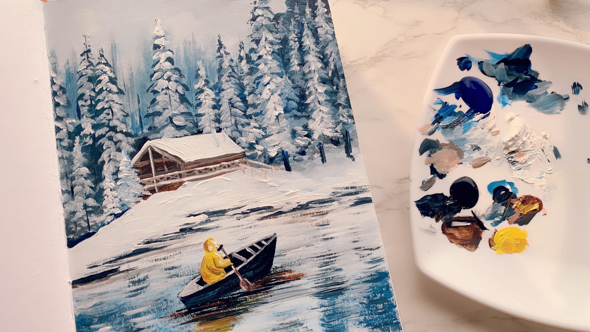
1. Introduction!: Welcome to this cozy winter
landscape painting class. In this class, we will
explore the beauty of snowy pine trees and create
a serene winter landscape. You will first learn
how to find inspiration online and then paint two
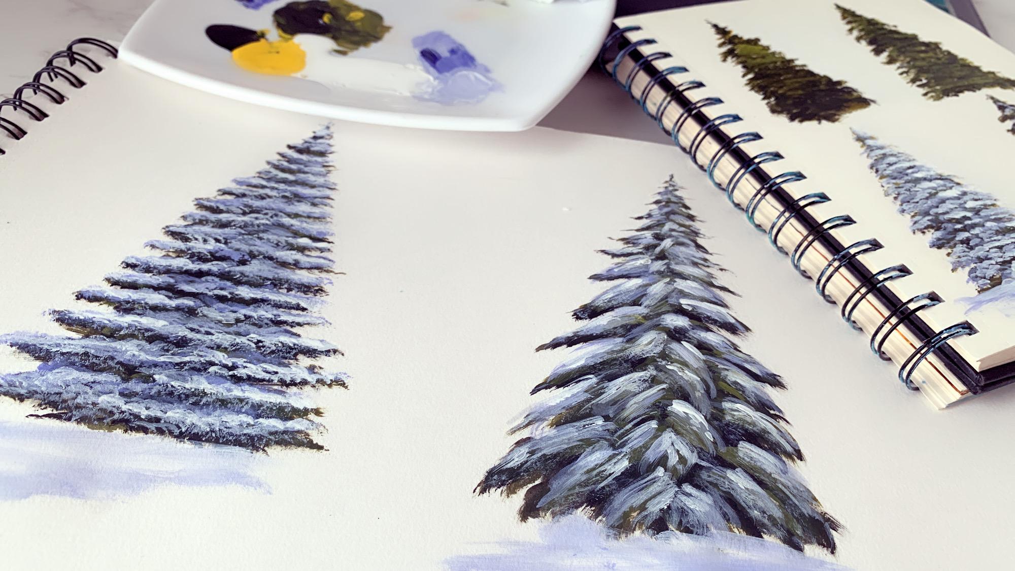
types of snowy pine trees, one with straight foliage
and one with droopy foliage. Once you have mastered those, we will put them into a
magical winter scene. You will learn to paint the snowy pine trees
in the background, a charming wooden cabin
with a snowy roof, a peaceful lake and
a little boatman in a yellow jacket rowing through
this cold serene world. The painting has a beautiful
monochromatic feel to it, blending shades of blue, white, and a warm brown. By the end of this class, you will have a stunning
winter landscape perfect for decorating your home or gifting to someone
special this season. So let's bring the beauty of
the winter season to life.
2. Finding inspiration: Guys, welcome to this class. In today's class, I'm going
to be teaching you how to create this beautiful
snow covered pine trees. If you just Google
snow pine tree, you will see lots of different
types of pine trees. When I was researching all the different
types of pine trees, I basically came across two different types
of pine trees. One is, this type. Where you see the leaves
are a little upward. You see the leaves are a
little upward and another one in which they
are a little droopy. If you see all the similar
ones related to these, they are pretty straight. At the straight
level like this one, you can see it's
pretty straight, and some of the leaves are moving a little bit
towards the upward direction. This is one kind of pine tree
that we're going to learn, um, and the other one is a little droopy,
check out this one. You see the leaves
are falling down. These are little droopy trees. Even this one, um,
even this one. These are the two basically
different types of pine trees that I came across and I'm going to be teaching
you both of them. Just look at few
of the pictures, few of the different
landscapes to get an idea of how the snow covered
pine trees looks like. It's so gorgeous to
just look at them. I can just keep staring
at them always. It's really pretty pictures. And once you learn creating these two
different types of trees, you will be able to create any landscape like
this that you like. All of these
landscapes that you're seeing pretty much have
the similar types of um, pine trees that you're
going to learn. I'm really excited for you
to learn this snow covered pine trees and to be able to create any of these
gorgeous landscapes. So yeah, let's go. The first
one that I'm going to teach is the straight or
little upward one. Let me choose a really
good picture that I like. Um, I think this is really nice. Los proper like a
Christmas tree. Um, even this is really nice. They are all nice. It's very difficult for me to choose one. But I think I'll go with
this one and or maybe let me see. I think I'll
go with this one. This is pretty good. Now
one of the thing that is if you see for all the background of
these pictures are bluish, but I'm going to show you
directly on my white paper, that's not going
to be a problem. But when you do it on top of a blue background like this one, the tree is going to
look more popped out, but white on the white may
not be that prominent, but it is good enough
for you to learn the techniques do
little bit of practice. I'm going to save this photo. And for the next
one, let me choose. Oh, this has too much of snow. Let me choose a little
different one maybe. This one, yeah, I think, these are all droopy ones, the second type that
I'm talking about. Let me save this one as well. Oh the droopy deep trees. I like this one as well. No, not really. Um, Let me save this one. It's a little small photograph so I'm not able to see
this very clearly. Let me see if I
can find one more. I don't want to select
anything like this because there are a
lot of trees together, so I want to pick one where
I can see it very clearly. I think this is the only
one that I can find This is really nice as well. Let me save this one too. Here, I got all the
pictures that I downloaded. Let's start with the first one. This is type one, which is the straight or going up,
and this is the type two. Let's start with that.
3. Snowy Pine Tree 1: Let's talk about all
the art supplies that you need for this class. I'm using my A three sketchbook. This is how it is. It's a 3140 GSM
artist sketchbook. This is where I
will give the temo. For the colors, I'm going to be using a very limited palette. If you remember from
the color theory class, I am going to create olive green by mixing chrome
yellow and black. Okay. I'm using ultramarine blue. This color I do not
have in fluid acrylics, so I'm using a little bit
of thick body acrylics. These two, um, um, fluid acrylics and finally,
I'm taking out white. These are the four
colors that I'm going to be needing for
this entire class. Now, if you want to use sap green or dark green
or any other green, if you have the olive green, directly, feel free to use that, but I'm just using both of these colors to create my blue. And the brush that I'm using. So here I have a
little bit of tips. I have always
created this kind of Christmas tree or pine
trees using flat brush, but I tried it with a flat brush and it
came out really well. So I keep the option
open for you to use either a flat brush or
a flat brush or you can try with both and see
which one you like more. So like I said, I've always created this kind of pie
trees with flat brush, literally for as long as I can remember, seven years or so. Because I never used
field bit brush much before this time, I tried with the fieldwo brush and it came out really well. This is my little protein, if you would want that filbert brush gives a
better Christmas tree. This is the one I'm using
size six, um, that's all. I have a cup of water here
and some tissue peppers. That's all. Let's dig in. So the first thing that
I'm going to do is, um, if you see it's not
very much visible, but if you see closely, you can see a touch
of green in the tree. First, what we're going to
do is we're going to create, um, the proper green tree, and then we're going to add
the snow cover on top of it. For creating the tree,
I'm mixing yellow and black and creating this
beautiful olive green. Now, for the first layer, I'm using a little
more of black. And here is my color. First thing, what I'm doing is, this is again another
protep that I have figured out after
teaching this kind of snow covered pine trees to my students in physical classes that people have a problem creating this conical shape if you are painting
for the first time. What you can do is take a pencil and just mark out the area. Or you can just do
this along with me. Um, create with the back of your brush and just mark out
the area that you need to. Then what I'm doing is just marking it out how
much I'm going to do. This is pretty much
my rough marking. Now comes creating it. For the chop part because
the tip is really narrow. Now if you feel, normally what I do is I hold
my feel boot brush like this and just go
and make a pointed tip. But if you feel this
is difficult for you, just pick up a small round
brush and just use it nicely and create
the chop like this. Now or maybe just a little bit more until you feel
you're comfortable enough. I feel, with the fill bit brush
is pretty much from here. Until here, I can use the
small brush to do the edges. If you notice I'm going down
pretty much in zig Zac way. I've come down to the space
where my filbert brush can go easily and now I'm going down in the zigzag
way like I just said. I am just using just
a little bit more black because more dark
it is in the background, the better depth
your tree gives. These are all going to
go in the background. The marking of the tree
is pretty much done. All right. Now, this
is the first step. You can call it the first step. Step two, we are going
to use the Felbert brush to go and add a little bit of textures on the
edges of the trees. For that, before doing that, what I'm going to do is just
take little tissue paper, and I feel I have a lot
of paint on my brush. I'm just wiping off
the excess paint. This is a little bit of
a dry brush technique. Taking a little bit of
paint on the tip and what I'm doing is going
with the edge. This is where I felt
the filbert brush came in more handy than
the flat brush. All I'm doing is little
dabbing like this. And if you've already done the acrylic
painting techniques, do post in the comment below. Which technique
do you think this is what I'm doing right now? There is a technique
name for it. Do post in the comment
and let me know. Let's see who can
guess it right. Now we are focusing a lot of details in the
edges of the tree. The edges of the tree is
what will be visible at the end these edges that
we're doing on both sides. Drybush you already know by now, drybush will give you create really nice
textures of the leaves. That is exactly what we
are trying to do here. Notice one thing, I am
keeping some gap in between. You see these gaps. There are these white gaps
that I'm keeping. Don't make them so close
that those gaps vanishes. When you're creating
for the first time, I built for myself, that was a problem
that was happening. But with practice, I understood that I am supposed
to leave these gaps, otherwise they will look. Just to give you an
idea of what I mean by not keeping the gap.
See look at this one. Do you see that they're
not too much of gaps. It feels more like a conical one rather than
the leaves going out. I mean, this looks good as
well. That's not the point. But if you do like this with little bit
of gap in between, that makes it look much
better from my experience. But again, I'm just telling you everything that
I have learned in the process of creating
these trees and then you can make your own
decision how you want to do. This is your step two, where we define the edges of the trees a
little bit nicely. Now let's do step three. In step three, what we're
going to do is just add a little bit more of
yellow to the same brush. I don't want too much light, but we just creating
a shade lighter than the dark green that we
had created with olive green. And we are going to continue the same process
that we did in step three and just go and add a little
bit of lighter shade of green on top of the dark
shades that we did. What's happening is basically and try to keep it,
say, let's say, for example, this is the
one edge of the leaf. You are going to add the
lighter color on the top of it. Same thing we will
do with the snow. We're going to add
it on top of it. With the same technique,
all we are going to do is just add some lighter shade. Keep dry brush. If you
have lots of paint, just make sure to
just dab it off on the tissue paper so
that you have less. See that become too less, I am going to pick
up a little bit now. Also, one more thing
to keep in mind, now that you know about
light and shadow, we talked about it
in the color theory. They have an idea of where
the light is falling from. Here I am assuming the light
is falling from this side. I'm going to keep more
of the lighter tones on the right side and on the
left side, just a little bit. Not too much as much I'm
doing on the right side. That way, your tree will
look very realistic. Again, you can say this is
part two of step three. I'm just going with one shade lighter than the previous shade, a few touch ups to show the
light really prominent. The more number of layers
you do with lighter shades, the better your tree
will look. Okay? Can you feel my tree is a
little tilted from this side? Do you see that there is
a little bit of problem? I can see it now. What I'm going to do is
I'm going to fix that. If you have a problem
where you face this problem where it is not proper conical, this
is how you fix it. This should be the line. I'm just increasing
a little bit on the left side and going higher. Making it pointed. Did
you see how I fix that? Obviously, you can do this only if you have the space to do it. Otherwise, it can be a little tricky if it goes
out of the canvas. That is why I think it's a
good idea to trace it out with a pencil or
something so that you know how much you can
go on both sides. This is pretty much done. This is our step three where
we added lighter sheet of green on top of that. See, sometimes what
happens is I go overboard and the down also I add a
little bit of lighting. If you do that, this
is color correction. You can just add a little bit of darker shade at the bottom
to compensate for that. Everything can be corrected. Nothing is a problem, if you just feel anything
I'm just showing you all possible stuff that can happen and the way
you can correct them. You saw how I added the black
over here to correct that. I'm pretty much liking
how it's turning out with little edges, the rough edges, the
leaf like textures. I really love this,
just adding a few more. Okay, I think my sketchbook
is a little tilted, so let me just straighten
it and yeah, that's it. Our step three is done in the state four and that
is the final state, we are going to add
the snow on top of it. Already you can see the three
layer of it is visible. Now, this one more protein that I'm going
to give you here. Now, if you're not adding snow cover on top
of the pine tree, you can just go
one more layer of this lighter shade and
you can just add a little bit more of the light to make it look like a finished one C. You can just add a little bit
more lighter shade to this. The more number of
lighter shades you add, better your tree looks. And Okay. So it's already looking like a very nice Christmas tree
at this point of time, but we are going to create
some snow on top of it now. Just going a little
bit with that down. All right. Now, before
moving on to the step four, I'm going to let it completely
dry because I don't want the blue to mix up
with the green. Anyway, it's going to dry in a couple of minutes and then I'm going to do the step four. Okay, so the green
as has completely dried and I have washed
my fielbot brush. I got my camera a little
down so that you can get a really close look at
how I'm adding the snow. Now for creating the snow, I'm using ultramarine blue, and all I'm going to do is mix a little bit of ultramarine
blue with the white. Again, just like what we
did in the green step, we first added a dark shade, then we went on a lighter shade. Same thing we're going to do
for the snow part as well. I am mixing blue and white. It's quite a bit, so
I'm just going to wipe off a little because all of these textures
works best when you use it as a
dry brush stroke. Let's start from the top. One protein here, I want you to understand this
really well is that you do not want to cover
all of your green stuff and you want to leave some gap in between while
you're adding the snow. Again, I am moving in
the igact direction. It might not be very
much visible to you, but just keep following
and you will understand. Just a little bit
more. It's too dry. It's so there's no
paint only on my brush, using the tip of
my Filbert brush and tapping it very
lightly on the tree. If you see sure what happened, I covered the green area, little bitty spine, but I'm just trying to
show you so that you understand what is that
I'm asking you not to do. We want to keep a little bit of green viewable in between. So I'm trying to go only on top of this extended leaf area. M. If you feel you have
too much of paint, keep dabbing it off
on the tissue paper, then only you will get
these beautiful textures. Can you see the edges of
the flavor brush and having really less amount of paint is creating such
beautiful textures. This is the first layer of S four of adding the snow. Now what we're going to do is increase the amount of white to this and continue with
the process once again. I had a lot of blue, so I'm just getting rid of
that and adding. Now you see the color is little lighter than
the previous one. So I tried this blue snow cover that we're doing right now
with the halo blue as well, let me tell you my observation was that with the thalo blue, the snow is not
looking very snowish. What I mean by that
is the snow color, the proper blue was
not coming because halo blue is like greenish blue, the snow is not very prominent. That is when I feel like ultramarine blue would be perfect color for
doing the nons. This is just another protein for you if you want to try out, you can do it by yourself. I haven't tried with cobalt
blue or Prussian blue. If you try that, do let me
know how your try came out. Or whatever color you're trying not necessarily that you
have to do only once. You can do the exact
same tree with multiple colors to find out
which one you like the most. I have always done it
with Prussian blue before and I like the
Prussian blue shade, but I felt ultramarine
is actually giving much better snow effect. That's why I am teaching you with
ultramarine blue right now. There's no right or
wrong, of course, the color that you like
the most works best for you, choose your blue. Very, very dry
brush I have. Okay. Almost done. This was the second layer of the S
four of the snow cover. I'm going to do one more layer on top of this and for that, I'm just getting into
all the blue from my brush and I'm going to do the final step with just white. This is where everything
starts looking gorgeous. Again, if you see all the previous layers that I had done, I am not going to
cover them up all. I'm just going very
slow on top of all the previous layers
and adding my white layer. You see the previous even
the very first layer, a little bit of that dark
green is also still visible. You don't want to
cover them all up. See, if you have lots of paint, it's going to make a blove make sure you don't have
a lot of paint. Again, this is what I was
talking about now that we are going with all white because
the background is all white, it's not going to
look that gray, even though it's looking good, but when you have
a dark background or little colored background, it's going to look even better. When you create a landscape, this is going to start looking really amazing popping
out with all the whites. Now what I'm doing is with a leftover paint in between wherever
there's lots of dark, I'm just going very slowly and just adding it's almost going to look like snowfall happening
in those dark areas, not covering them up completely, but just with a little
leftover paint on my brush, just going very
gently, very soft. And that's it. Our first
tree is done, I think. That's looking
absolutely three dish. You can see the
spherical shape of it. Now the last part that I'm
going to do is just add a little bit more of
white on the right side, just to make sure that it shows the right side is
more lit up than the left. All right. That's
all. Now we move on to the next type of tree and we're going
to create that one.
4. Snowy Pine Tree 2: So I hope you learned how to
create the Type one tree. Now we will work on
the Type two tree, and this is the photo
that I had downloaded, and this is what
I'm going to refer to while creating this painting. Okay? So let's start. The colors are pretty
much just the same. The brushes are same, everything is same, except the technique and
the way I create it. Okay. So here is my brush,
same color palette. Um, I am mixing yellow and black to
create the olive green. First layer, it will
be more of black. The tip, I will do it
with a small brush. Remember, this is
the droopy one, all the leaves are
falling down, right? From here, I think
my pilot brush will be able to do its job. Let's try. Again, just like the type one, I'm just making some of the
structure roughly first. More or less the
structure is done. Now let's start making
the proper shape. Remember, again, the same thing. You want the aged leaves that are going on this outside
to be a little at a gap. You want to leave this gap in between you don't want to overcrowd it
with all the trees. Now, I'm looking at the
shape if the shape is proper conical or
not because I have realized I do make
that mistakes at times where the shape goes
a little heavier. But yeah, I think the
structure is pretty much fine. That's it. This is the
first layer of the tree. Now maybe I should just take
it down a little bit more. Okay. So now, Step two, we are going to add a
little lighter layer of green If you notice the little difference between this tree and the first one
that we did is that here, we are not doing the daves
to create the edges, the textured edges here rather than doing this,
I am doing this. That's the only
difference I feel. Here also, you see,
I'm just brushing it over towards the
top of the leaves. This one, you see the one
that I did in the middle. This is one of the leaves that is coming out on this side, in the front of you. That is why are some of
them are in the middle. Okay. We are doing in
three directions. I'm not too happy with
how the top part looks, so I think I'm going to
increase it a little bit and keep it like this. Yeah. That's looking nice. Here, we mostly went
from left to right. Here we are going
on left and right and a few strokes
in the center also. That is the major
difference between the type one tree and
the type two tree. So if you look at the photo, I'm referring to this image, you see there are left and right and then there are
a few in the center also. This, this, all these
are in the center. We're not making exact how
you see in the picture, but more or less I'm showing you the
technique so that when you refer to any image while creating any
of the landscapes, you can definitely follow exactly how it is in the
picture that you see. Okay. This is pretty
much the second layer of the step two and if you want to do again another
layer on top of it, you can feel free to do so. I'm just adding a few ones. Most of it is not going to be visible because the snow is
going to come on top of it. But you see the depth of the tree starts to
show when we add these different shades
or shall we call tint. Because when you
add a lighter shade or maybe a little more white, it becomes like a tint, right? Only thing I'm touching is on the top of each of
these block of leaves. Similar thing like
I showed here. If you feel you made a mistake or you want to touch up
with little bit black, you can go just below it and just do all the touch
ups if you need to. You can always
correct any mistake. I think it's looking fantastic. The shapes and everything
is coming really well. As you can understand by now, the major difference between
the two types of trees are how you move your
hand and the brush. St, everything is
absolutely similar. Here we are moving
our brush like this and here we
were doing this. That's pretty much what
the difference is. This is done. Now I'm
going to wash off my silver brush and let it dry completely once it is 100% dry, I'm going to come and add
the snow on top of it. So the green has
completely dried and let's start adding all the snowflakes
on top of the tree now. Same colors. I'm
mixing blue and white. We're starting with a
dark shade of blue now. And maybe gently, I'm just
brushing on top of the leaf. I feel the most important
thing of creating this kind of pine tree is to
remember to add the stroke in the center
because that is what gives the shows the dimensions
of the tree really well. See, I'm not putting
too much pressure. I'm holding my brush absolutely loose and going very
gently on top of this. If I press, it will be
really a lot of blue. See through each of
my blue strokes, you can still see the
green from underneath. So to achieve that only, I am not putting a lot
of pressure, okay? This is my first layer. For the next layer, I'm adding
just a bit more of white and I'm going on top of it. Wiping off a lot of
paint in my brush. For the tip of it, I
am again switching to my small round brush and
going directly with white. There's a bit of water in it. No problem. Let's just add
a few white on top of it. Now, if you see the photograph, you see there are some of the
white sticks popping out. Even if I do this,
it's not going to be too much visible on
the white background, so I am not doing it, but if you have a blue
or a dark background, you can just increase a few of these white
ones like this. An easy way of
doing this is just adding a little touch up of black underneath it
so that it's visible. You see what I'm doing for all these ones that
are popping out, I'm just adding a little
touch up of blackish green underneath so that
the white is visible. Now I'm going to add
some more of white. All right. I feel
for this white. The last step, white where I'm going to add all the
white on top of this layer, rather than doing it
with a feel board brush, I'm doing it with a
small small round brush because I feel I would have more control and I'll be able to do all the minute
detailing really well. But make sure it's a dry brush and you don't have
too much of paint. Okay, see, that is too
much blob of paint, so I'm just wiping it out. Absolutely less paint so
that you were almost like, you know, dry brushing it. Okay. Now that most
of it is done, remember in the very last step, what we did in this one was we added a few
strokes in between where there was a lot of the
dark green color showing. Same thing I'm going to do
here also with the dry brush, I'm just going to touch up a
few lines like this so that the dark black or
green is not too much prominently visible and it has a little touch up
of white in it. But make sure you have really dry brush to be able to do this. There you go. It's done. If you want, you can add a few. Like a little land below it. That's it. Here comes your two different types of Christmas trees using which you can pretty much create any winter landscape. I
hope you practice this. You can try this out
with different colors. You can even with dark green, you can do it with any
other color that you have and see how it
looks differently. Here, the pictures
that we saw together, mostly it was blackish, but you can always try it with different greens to
see how it is looking. So not necessarily has to be always the olive green
color that I have done. Okay? So try out with some different colors,
these two techniques, and more you try, better your hand becomes and better you are
able to do the trees.
5. Step 1 - Background: Guys, welcome to this class. Here, I'm going to teach you a beautiful landscape of pine
trees covered with snow. If you have already practiced
all the snow pine trees, this landscape is going to be really, really easy for you. Today I'm going to use my Mnra journal for
creating the painting. This is where I did the
previous class as well. This is a A five size. And for this IF size, I have taken out
two filer brushes. One is number six, one is number two that I'm going to be
using for this class. And the colored palette
is very minimal. I have taken out three colors, white, black, and Prussian blue. These are the colors
that I'm going to use. These are the two brushes for the time being and
later I might take out a couple of round brushes
for doing the detailing, but that's all as of now. And let's begin. Before
doing the painting, I'm going to do a
very rough sketch out of the painting so that we
know where is what exactly. So let me grab a pencil. Yeah, I got my pencil. So let's just sketch
it out, okay? So this is where the land is this is where the house comes. Even if you do a mistake, it's fine because
it's going to get all covered with the colors. That's it. This is
where all trees come. Now before painting,
what I'm going to do is add a little bit of
masking tape on this side, just to make sure I
don't cover this side. Come on. That's good enough. Now
let's start painting. Actually, I have taken out
fluid acrylics, black, white, and fresh and blue,
but I feel for this painting, it would be nice to have thick body acrylics
white because, you know, with a
thick body acrylic, you can create really
beautiful textures of snow. For that, I'm taking
out a little bit of my thick body acrylics of camelin All right. Let's start. How do we
start? Where do we start? The first thing
I'm going to do is cover the entire
background first, and then I will
do anything else. For the background, I
am using a little bit of both the whites and touching just a tiny bit of prussian blue black
because it's windy, gosh, I took a lot of black. I'll just wipe off the entire paint and
pick up a lot of white. You see the color that I got. It's a mix of black
and prussian blue that is good enough. Just want to add a
little touch up of more white. Sorry, more blue. I'm adding mostly white because we want to keep
the background all white and covering it up. Now, keep in mind that we don't want to create a
solid background, so I want to keep some
textures into it. I want to give a little touch
up of more blue and white. You can see I'm going in every direction while
covering up the background. I don't want to go in one solid
motion and now it's done. You can also go on
top of it and add some little extra
in the background. With a plain brush, just
a little touch up of blue here and there,
that's good enough. We got a really,
really nice background covered before moving on to
doing all the other stuff, I want to add a layer of
snow here on our land. Okay. And I'm touching a little bit of
that's a lot of blue. I want to wipe it off
a little bit again. And let's go and add. You see, just the direction
is different here. I'm not doing much different. Same thing what we did
in the sky background, same thing I'm doing here, just in a horizontal direction. This becomes our land. Again, I'm going to come on
top of it and add quite a bit of white to make
the snow look more. But that is all as of now. Now I will continue this and go down and just cover this
portion up as well. And we will create the
complete water texture. You can see we are just doing complete background at this
point, let's continue going. First step or the first layer is just about
covering the paper. All the canvas,
whatever you're using. First thing is just covering
up the entire space. Now that it has been covered,
6. Step 2 - Lake: Now I'm going to go and add some textures on it in
the horizontal direction. The colors that I want
to do is a little bit of blue and black and see what I'm doing is just very roughly
brushing horizontally. A It's a mix of Prussian blue and
black is all I'm using. These are basically
all the reflections of the trees that we are
trying to do here. Same thing on the right. This is where the
boat will come later, but for the time
being, you're just adding some of the reflections. Also one thing I feel
like doing at this point is keep the Felbot brush and use a small round brush and I
will take the same colors, but use the small
round brush a little bit to create some
of these lines. I'm using a little bit of water as well
because with water, I can do the lines much better. So let all the lines that we
did with the pilver brush, it's giving really nice
textures in the background. Let that all be there.
On top of that, we are adding you
can consider this as a second layer of
reflection that we are doing with a small brush. Very dry strokes,
and in between, I'm adding some
strokes of white. But did you notice that
I did not wash my brush, so the white is not
absolutely pure white. It is a mix of blue,
black and white. I'm just wiping off
the brush because I want to have a little
bit more white here. This is where I'm
taking a little bit of thick body acrylic and adding
some nice textures here. Okay, that's pretty
much it. At the moment. If I feel like doing
some more lines later, we might do it, but I think this is good for covering the
entire background. All right. I'm just
washing my brush. One more thing that
I want to do is just mark out the house once again so that I know
how much to go for it. Yeah. In the next, we're going
to create the trees. But before doing the trees, what I want to do is just
take a little bit of black and outline the house. I'm using a little bit of
blue and black to outline it. And leave it at that. Maybe use a little bit
of white to mix it up and then later we're going to fine tune it while we
paint all the trees. That's all for now.
7. Step 3 - Trees Part 1: Now in the second step, I am going to add
all the trees first, and then we will
do anything else. This part is almost dried and let's create all the
trees that we learnt. First thing I'm doing is
mixing the blue and the black. And let's start here
from the right side. I'm going very
randomly over here, not trying to create
a proper tree. I'm going to do that
in a little while. But these are pretty much
the background trees. Creating the background
for the tree. Bringing it down all
the way till here. The edges are completely done. Now I will start creating the trees from here,
the proper trees. Now, I feel this pilot brush is a little big for this place, so I'm just keeping
it aside and using the small fill brrat
which is size two, yeah, this is perfect
for creating this size. I I size that I am
using paper right now, for that size, this
size brush is perfect. Continue doing as you can see
that I'm not really doing the trees in a exact way
that we have learned. I'm pretty much doing it
in a fairly random way. And let's go behind. For the distant ones, I just want to add little light strokes in the background. I kind of grayish black. These are really light colors because they are
in the background, almost blended up with
the background colour. We always start from background, and then we come
to the foreground. Okay, so the background
has been done. Now let's focus and create
some of the foreground trees. This is pretty much
like the type two tree, as you would say, and
to do a few small ones. Use the round brush to do the tips. Space is small here, so I'm
using the small round brush. Let's do a couple of
more here on this side. But one more next to it. This is why doing two
trees next to each other, this is where it helps you
so that in the landscape, you can do them
next to each other. Then couple of more. Okay. All our tree structures
have been done now. Fairly done, and now I'm going to go over it
without washing the brush with some more white
and try to create the final output of the trees. You see, most of the
trees I'm doing in the um um, type two structure. I'm not really doing it
in type one structure. So I'm mostly just dabbing
and creating the structure. Rather than I'm just stroking and creating the
structure rather than dabbing. Dabbing would be like this one. I'm not trying to do that. Okay. So very good structures
are being done. Now let's come in at some of the lighter
shades on top of this. Make sure that you're
not covering up the complete black that we
have done on the background. It has to show up a little bit. You don't want to
completely cover it up. I am adding a couple
of more in front here. H lending it all the way down to this white area. That's done. Now I'm going with another layer of white and adding very gently
on chop of this. For the right side because
the space is small, I'm doing it with a round brush. Okay. Let's bring it down.
I'm using just the tip of some of the trees to show there are
lots of trees here. We're not really creating
the entire tree, but just creating the top.
8. Step 3 - Trees Part 2: So you can see, but
just by creating a few layers of white
from dark to light, we are starting
to make the trees look really nice textured
and three dish formation, I prefer using the filbert
brush if I want to go faster. If you want to go slower, you can use the
small round brush. Okay. That's pretty much
done. Let's add a few more. I am using some of the
thick body acrylics. Was this done? And let's
add some more here. And finally this one. All right. So I think that's good enough. I'm just going to do some finishing touch ups
to the land over here. So this is still
where the land is, and now I'm adding
some of the whites here to make sure it just
eventually goes inside. The left side is
completely done. But the right side, I'm just going to
create a little bit of dark backgrounds
here in some places. What happens is when you have a dark background and you create the white
trees in front of it, it just looks more prominent. Now let's bring this down
a little bit on the land. Let's take more of white and
just a bit of blue maybe. There it goes, and is
completely done on this side. Maybe we want to add just
a bit more trees just to make sure it's looking
nice at the bottom section. Okay. Some of the trunks showing
through here and there. Not a lot of line, but just a little touch up which
makes it look really good. There you go. Our complete tree
section has been done. We might come back to it and add a little touch ups
here and there later. But for the time being,
most of it has been done. Did you notice that just by adding a little bit of trunks, it's starting to look so good. Just adding some random
lines here and there. That's it. I'm going to wash off
all three brushes and come back to
it a little later. Let it all dry up now
because after this, I'm going to paint the house. I'll just give it a
couple of minutes. Once it dries, I'll come
back and do this part.
9. Step 4 - Cabin: Now in the next step, I'm going to create
the house and the snow covered area over here and the connection of
the land and the water. The only color that
I need to take out for this is Bern Siena. And I'm going to mix it up with a little black to make
it dark at places. And for this place, I am going to use the
uh clean round brush. This is size zero
that I'm using. But it doesn't feel like zero. It's like I always say, it really depends
on brand to brand. What is the number of the brush. But this looks to me like a size one or two, to be honest. Okay, let's start doing it. First thing I'm doing is mixing a little bit of bon
sienna and black. And I'm using little water. I love this color
that I just created. First thing first, just creating the background of the house. Let me just go all the way straight and create this color. Got it. Can you see
how I am taking it in horizontal direction so that it looks like the planks of woods. Each stroke is like each plank. The entire as has been covered. Now what I'm going
to do is take little white and little
burn sienna mixed and I'm going to come on top of it and create some of
the lines like this. I'm going to take
some white as well, and let's just create Same thing on the side. All right. So the wooden house
color has been created. Now I'm going to wash it off and colored the
roof of the house. And for that, I am switching
to the small Silbert brush, washed it off completely, and I'm using this thick
creamy thick body acrylic to create the roof over here. Did you see how
pretty it is looking? Just to do the borders,
I am going to use the small brush and little
tiny touch of blue. And the same one, I'm going
to take it down on this side. All right. Before moving on further, what I'm going to do is
just add a few trees here in front of the house.
10. Step 5 - Snow Land: All right. Now let's
create the snow in front. This is done again with a thick creamy texture of the thick body acryl and
just by using this color, it's going to give you such
a nice effect of the snow. A Before moving down any further, what I'm going to
do is first thing is going to mark
the land ending. For that, I'm again switching
to my small round brush, and you can actually do this part with a
pencil if you like, I'm doing it directly
with the brush. I'm mixing black and blue and
let's take some more blue. H. That is how I defined my land. Now, I'm just going to go a
little bit here and there. That's it. I think my work with the
filbert brush is done, so I'm just going
to wash it off. Now just below it, what I'm going to do
is take a little bit of burnt sienna and white and I'm going to come here and just add a little
reflection in the water. Just below this black
area that I added. Done. Washing off my brush and taking some of the
whites and continuing even further down. Same thing. Now, I'm going to add
a few more strokes on the top to show the snow on the land. That's it. Let's finish up the house by creating a little
barrier in front of it. For that, I'm mixing
white and Burn sienna, adding a little water. And let's just create touching it up with a
little bit of white because it's snow falling over this land as well or
this barrier as well. And final touch up just a
little chimney on the top here. The house is completely done, and I feel now it is okay
for me to pick up the tip. The final thing remaining
is we will create the boot over it
in the next step. It
11. Step 6 - Boat: All right, so let's
hit the boat. Again, for the boat, you can
actually sketch it out with a pencil first or let me
do that very roughly. But thing is that
you won't be able to see it if I do
it with a pencil. So let me do it with a brush, but you can create it
with a pencil. Okay. Here comes the boat. And this is where the person is. The person would be
really easy to do with the technique that
I'm going to teach you, hold on for that. Just filling it up with black. And let's stick it tone. Here is the complete boat. I'm going to do the
reflection a little later, but it's just for you
to understand where the boat is and just
leaving it up till here so that you can copy
it how much the boat is a little later we're going
to do Let me do one thing. Let me just create
the complete boat and I am creating the
black completely. The entire boot has been done. Now to differentiate it
or to understand it, what is where what I'm doing is taking a
little bit of white and adding a white line all the way till here. Same thing goes on the back. The boat has been done. Now let us create
the man on the boat. For that, I'm using
a little bit of yellow and I'm going to mix
it up with burnt sienna, which I already
have on my plate. You can see that with
just five colors, we created this entire painting. Let's mix up some. This is the lemon yellow I had. If you have chrome yellow, you can totally
use that as well. Just mixing it up a little
bit with the burnt sienna. See this is how you
create the man. It might feel like, Oh my God, how I do that. So just watch this first. Done then all you
do is put a head. And we're going to add a hand That's it. You see our
man has been done. Now to make you
understand what is where, what we're going to do is take a little bit more of Bonsiana this time and just go over
it a little bit. There you go. Pretty much done. Just a little touch up of white. And the man is done. Now we're going to create the I don't know what is called the thing that this guy is holding. Let's create that. For that, I am using
the burn Siena and black and we take it all
the way from here to here. And add a little black to his hand here. Done. The man is done, and now
the final thing that is remaining is creating
some of the reflections. I'm continuing it with the
black that I had already. Maybe just wipe off
some of the water. I want really try strokes. So burnt sienna,
which is a reflection of the man on the water and
a little bit of yellow. Now, the first time
reflection that we did, if you want to add some more, this is the time we can just a little bit of reflections here and there,
the reflection lines. I like adding such broken lines. These are basically all the
reflections from the trees. There you go. Our complete painting
has been done. Now, there are some
final touch ups that I want to give
to this painting, to make it look
even more bright. The final touch ups that
I'm going to do is with a small fiilot brush or actually can do it with
a small round brush also. Add some final touch ups of
white onto the trees to make it look even more
white in some places and so that you know, it looks like really bright snow on them and it
looks really good. This you can do with a filbert
brush also if you prefer. But I feel with a
small round brush, I have more control over
doing it the way I want. Just a little touch
ups here and there.
 Debasree Dey, Acrylic Artist & Educator