Transcripts
1. Skincare Product Photography a Monochromatic look: Creating images that sell are attractive doesn't have
to be complicated. When we analyze how a
photograph is composed, we can learn a lot about
the process of designing an image and replicate that style with what
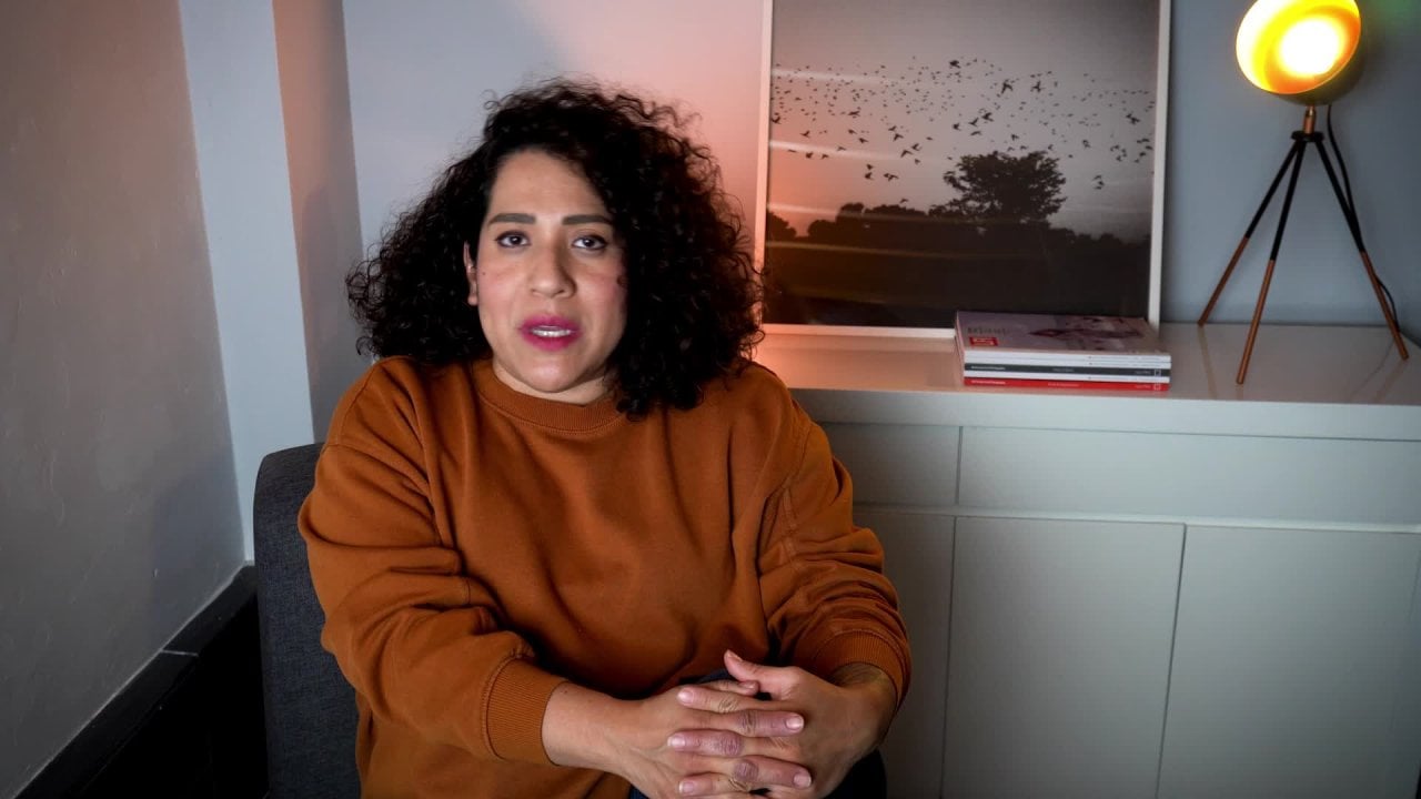
we want to achieve. Hello, I'm Cecilia Cruz and I'm a professional photographer
here in Mexico. I believe that everyone needs to know how to create a good image. It can be a photograph of
people, places, or objects. I'm going to tell you
in this class all about my process of how I
create product images. By using few elements and
leaning on the use of color, we can make our images
very interesting. To start your journey
into product photography, you can use natural light
or artificial light. I will be using
one's studio flash to illustrate my process, but you can use
continuous light as well. What you will learn in
this class at the end, is to adapt this composition to your own products
and your own style. From here on, you can create many images for your social
media with no effort. Use your smartphone or your professional camera
to take your images. We are also going to edit the final image for
a complete process. Join me here on Skillshare to learn my protipes and
to make them your own. To have a bright
photography future and start trusting your
instincts and your skills. Come to Skillshare and
let's get started.
2. First steps to take better photos: Creating images. That cell doesn't have to be
very complicated. You can do this type
of photoshoot with different variations
according to what you have available. We are going to dissect how I
created this image and give you ideas on how to make it different just by
changing a few things. First, let's talk about
lighting here in the studio, I use strap lights because I do product and
port photography. I only use continuous light. When I do video, I use flashes because that's
what I have available here. But if you only have
continuous light, go ahead and use them. You can also use
natural light if the place where you are
working is well lit. The only thing is that you only will be available to
work during the day. The setup that I have over
here is using one light, a soft box, a diffuser, to make the light even and soft. Our products are small, so we don't have the
need for a second flash, but if you want to, you can use an umbrella or another soft box. The light is close and a bit
above at a 45 degree angle. We are lighting the
products from all sides. We are also using white foam
board to bounce the light. It doesn't matter
if you are using a professional camera or a smartphone to
take your photos. As long as a light, it's okay, Your products look great.
That's what matters. When using natural light, you can replicate the set up by placing your table
by a window door, and bouncing the light
with white foam board. I use my straps with less
than half of the power. It depends on the power of your equipment and how
strong the flash fires. Do some testing before
you get the exposure. Right now, let's talk
about the composition.
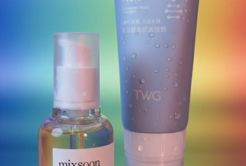
3. Working with color: the Monochromatic look: As you see, I'm working with the smallest skinker products. The bottle is quite pretty
in purple and silver. I want to use a
monochromatic look to enhance the product. In the background, I
have a roll of paper. You can buy color paper
sheets in any craft store. I am using three tons
of purple to go with the color of the
product on the table. I have a lighter purple and I place a box
wrapped in brighter, pink, purple as a base
for the products. The monochromatic look
is dynamic and you can spice it up with little
changes like flowers, leaves, other related
items of your product. If you are not sure about
what color what to use, you can consult a color
wheel to give you an idea of complementary
and analog colors to use. Always check your
packaging for the colors. They give you the first
hint on where to go.
4. Analyzing the composition: Now that it shows your
colors for the composition, let's talk about how to place your products within
the photo frame. For sure, you are going
to use your photos for social media horizontal
and vertical. Just remember to
leave enough space on both sides in case
you need to crop your image and take both horizontal and
vertical photos to use around your
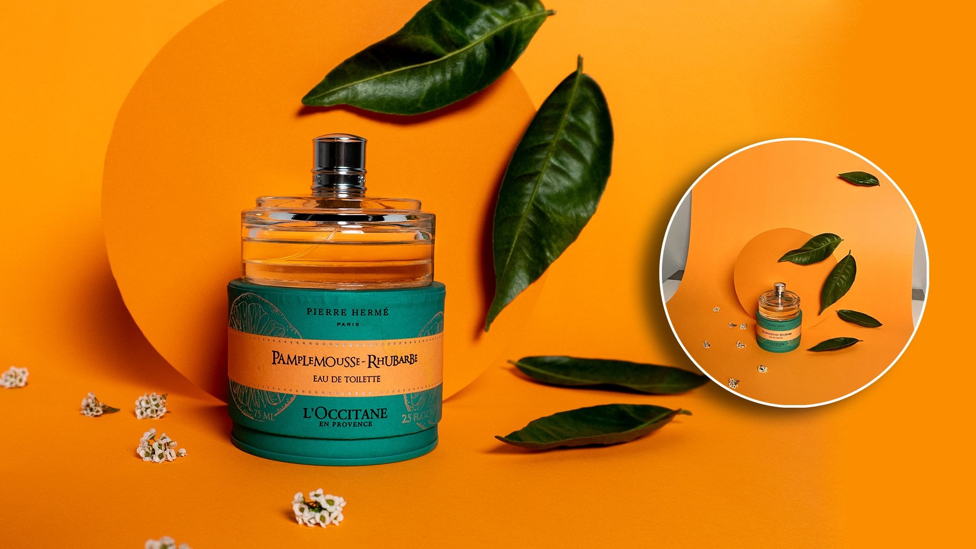
social network. Flowers are a great prop for your photos because they have
texture and bring softness, a visual interest to
the whole composition. I chose these tiny white flowers to create a surrounding frame. In the composition, I
place the flowers at several distances to create
a Dep field negative spaces. Take photos from
different angles and see what works
for your products. I'm using a low angle to make the bottles look bigger
and fill the frame. By stacking three bottles, I am creating a vertical line that draws attention
to the center. This works because the
bottles are round and short. Take advantage of the size and form of your product
and play with it. See if they look okay in
groups or stack like mine. If I wanted to use the same
set up with other product, it'll be easy since the center is where the attention
is in the frame. Move closer to show more
detail of your product or just let the flowers be a companion to your composition. Now that we have
the final image, let's go to the editing part.
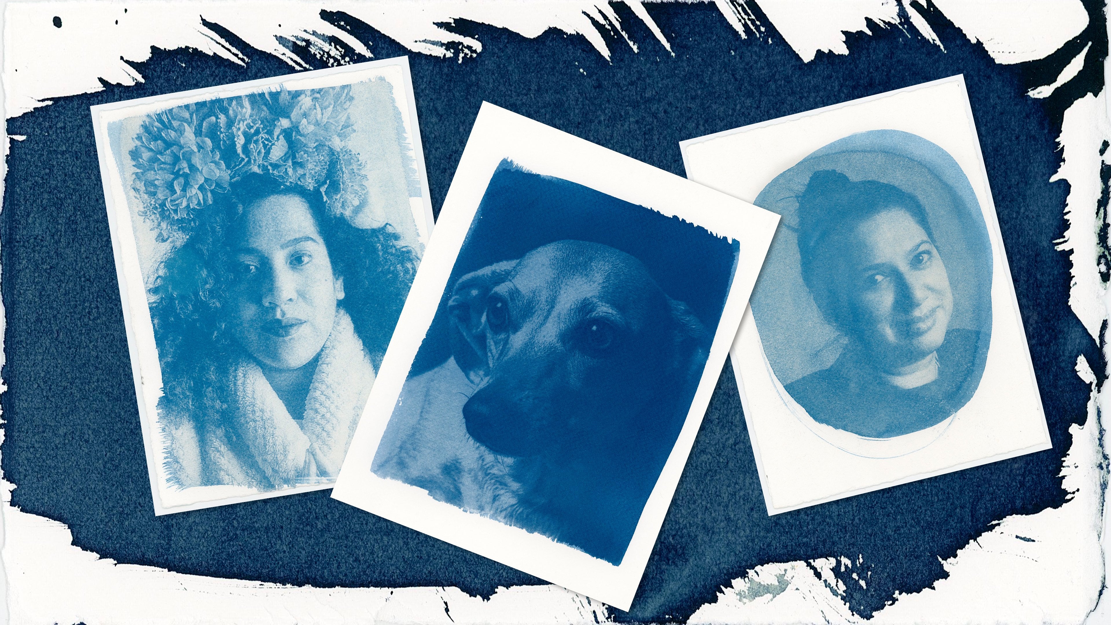
5. Editing the final image: Editing a photo is quite
a direct step if you took your pictures with
consistency and check for all the details
you have to edit list. My advice is to try
to have a great image from the beginning in your
camera or your smartphone. I use light room on my desktop computer
and online smartphone. Many times I only use the native editing
software from my phone. Choose what you know and
what you have available. Let's go to light room
and edit the final photo. Editing your image is quite a simple step
here in light room, I can change a lot of
properties from the image, but most softwares do
the same thing here. I'm just going to move
the contrast to create more balance between the light and the dark sides of the image. Since my image is
quite well exposed, I don't need to change
a lot of things. This is what I meant, that if you are consistent with your images and
how you take them, you don't have to spend a
lot of time editing them, moving the curves and
the exposure just to create a nicer balance between
the lights and the dark. You can do this with your phone. If you took your photos with your Smartphone,
it's the same thing. Maybe some names change, but basically you can do the same in all these
kinds of software. Also, I want to increase the
saturation of the colors because the purples
are really nice and I just want them to
pop a little bit more. I'm choosing each
purple and increasing the saturation just to create this different
balance of colors. You can also tone the
image if you want to and you can improve
the texture if you see that you image need that change here in light room. I can also create a mask and do some other exposure movements to make the central product pop. I'm going to create a mask here to increase the exposures, to bring more light to
the center of the image, to create a starker difference between the background
and the front. As you can see, now the
bottles really pop. But besides that, I
also want to see if there's something
else I can do to change the overall
appearance of the image. Here I'm trying with
different color, toning of the images, maybe see if it can be warmer or a B a bit
greener or cooler. You can do all these changes and see if they work with
your final image. If you make a
mistake, don't worry. You can always go back and do what you just did in the
transformation of your image. I'm just increasing
a little bit of the warmth in the image because I like it a
little bit more yellow. Just to check the
different colors, the greens and the purples. Now I want to change the crop
of the image because I'm going to use it for a
real in my Instagram. I'm going to use
a 16.9 cropping. This is very simple, just
adjust to your image. Cropping from the upper side, from the background in the image just to make my central product pop
a little bit more. I'm also going to create
a vignette because I think vignettes sometimes help to encase the
product and to bring a little more interest
to the center. With the vignetting,
what I'm doing is just creating a darker
frame around my product. Please share with us your final image to connect
and inspire others. I'll be glad to give you
feedback and see your results.
 Cecilia Cruz Sandoval, Photographer / Content Creator