Transcripts
1. Intro: Hello, my name is
T0 and welcome to this and mixed media art costs. I'm an artist and
graphic designer who enjoy sketching out on location are used digital tools as well as traditional twos. But I prefer to use
traditional tools to create art because
it's just more fun. In this course, I'm going to
talk about my inspiration. I'm gonna give you a quick
guide to the tools and supplies you can use to
create mixed media art. I will talk about the
characteristics of each tool, the pros and cons. And finally, we will
create this art project to get there using some
of the tools and supplies mentioned
in this course. And after you have
completed the cause, can I invite you to write a review for this
course so that you can help other students know whether this
course is any good. Alright, let's jump
into the first lesson. Let me talk about
my inspiration.
2. My source of inspiration: In this lesson, I'm
going to tell you where I get my inspiration. I collect many art books and a final lot of
inspiration from books. I also enjoy urban sketching, which is sketching outdoors
on location with my friends. I really like to
see how my friends create art and the tools
and supplies that a use. And I also use social media to discover artists and
discover more art. So this is how I find all these different
sources of inspiration. Let me show you some
of the books that I have. I really enjoy. I love sketchbooks because I find it very inspiring
and fascinating. Artists can create absolutely beautiful
and detailed artworks using the loose lines that
were created with pen and ink, pencil and quick
splashes of colors. And I have reviewed
countless sketch books over the years which you
can find on my blog. So let's talk about one of the earliest books
that got me really inspired to create art and illustrated life
by Danny Gregory. This book was published in
2008 and it's popular enough, be reprinted several times so you can still get
this book today. And artists and author
is Danny Gregory, who has authored and Illustrator many similar sketch
books as well. So I highly recommend
you check out the books from Danny Gregory. There is actually a sequel to this book called An
Illustrated journey, which focus and features
travel log sketchbooks. So let's take a look
and see what's inside. I find his book to be very
inspiring because it features the sketch books from
artists around the world. And all these artists, they have different styles. These are the sketches
from Danny Gregory. These are pen, ink and
watercolor sketches. These are just ink sketches
from my tires. Are Dawson. He creates a lot of cartoons
using his fountain pens. These are comics. There is also a lot
of mixed media art. So from this book, you can see the different types of tools and supplies used by other
artists to create your art. Styles are also very different. So you can try to mimic some of the styles you see
here and learn from as many artists as you can to develop your own style. There is also a lot to
read this book so you can find out where this artist
get their inspiration from. This. This book is quite thick, so it's really worth the money. It's just packed with
lots of inspiration. So beautiful sketches. I also collect many sketchbooks
from artists as well. This one is from in my Serrano. This is a view from
top to bottom. I like her mixed
media art sketches because they are
very expressive. The way she sketches, the way she uses
colors are dry and wet media is very fun,
very exciting. And where she
composes have page, the way she lays out a
page is also very dynamic. So it really brings
you into the scene. When you are looking
at his sketches. Sketches are so lively. And she likes to use
very bold colors, very striking colors. And you can really feel the
energy behind sketches. This is a very
lovely sketch book. Next, we have whole
arm euro from Sasaki in my Serrano As to
ascii art board from Spain. So they are Spanish artists. And so ascii likes to use mixed media tools as
well to create odd. So for this sketch
you can see we have black lines and red lines. So this is something
you can try as well. Drawing with just line odd
but mixing different colors. This is a pen ink and watercolor sketch with a
very limited color palette. We have grays, blue,
red, and yellow. Sketches are very loose as well. This is a more detailed sketch with watercolor and dry media. I can say this our pencil lines or maybe call it pencil lines. And there's ink as well. His sketches are
also very lively, very energetic, and
very expressive. I like that he has written notes and captions
talking about the people he has met in this museum and the stories behind
some of the extra bits. This is a very lovely
sketch book as well with very beautiful art. That stretches to
the h of the pitch. So it feels very
massive when you're looking at these sketches. And this book is dare
to sketch a guide to draw it on the goal
by Felix shine burger. This is actually an
instructional art book with a lot of tips on sketching, on using pen and ink and
watercolor and on journaling. And in this book are very
sketchy, beautiful artworks. So these are just some of the books that I flipped through very often to find inspiration, to get inspired again and again. This is a very
lovely book as well. I have many books relating to urban sketching because I really enjoy sketching out on location. So this book is the will of urban sketching,
publishing in 2022. Authors and author is
definitely power in his book, our sketches from Urban
Skechers from around the world. So again, you get
to see a lot of beautiful sketches
in different styles. The types of media
that they use, the stories behind a Sketchers, and also the artist's
profile for the artists. So if you'd like the
artworks that you see here, you can check out more
art from this artist's. This book is birth
thick and is just packed with inspiration,
art, and stories. So this is a book I can
recommend very easily as well. I have not finished
reading this book yet, even though I bought
this a few weeks ago, because I want to enjoy
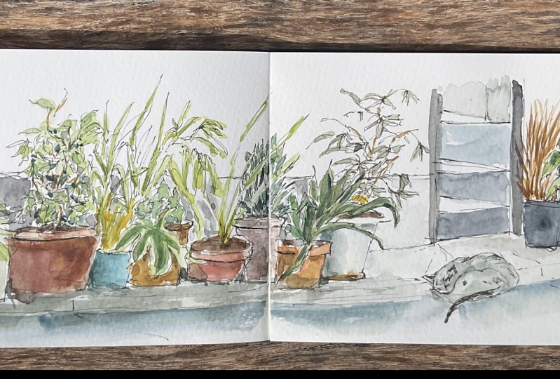
this book first slowly. And the cost that you are about to start on was actually inspired by a
sketch in this book. Let me show you which sketch. So it's this sketch
to inspire me to create this mixed
media art costs. There are so many different ways and styles to drawing plans. So creating mixed media art is really about experimenting, mixing and matching
different media to create a fine difference, Dallas, that may
or may not work. That's just part of the fun. The earliest sketch was
created with dry media. This sketch was created
with ink and markers. So the look and feel
is very different. This book is
actually a sequel to an earlier book called The
Art of urban sketching, which is a boom that you should also check out if you can, because it's a great book. I find inspiration not only from art books and social
media art pages, but also from
sketching on location. I like to explore
new neighborhoods. I enjoy sketching
outdoors with my friends. The more and more sites
you are exposed to, the more ideas you can get. It's easy to be inspired by the beautiful art works
of other artists. But sometimes you can
inspire yourself as well. Because sometimes you
don't really know the type of art you can create until
you have created that odd, I highly recommend you
archive your artist so that you can refer
to them in the future. Because it's very inspiring
and motivating to see all the artworks you
have created over the years. And you can get this
sense of achievement. You won't be able
to get if you kinda see the volume of wool
you have created. In the next lesson, we will look at the tools and supplies that you can use to
create a mixed media art.
3. Guide to mixed media art supplies: In this lesson, I want to give
you a quick intro to some of the tools and supplies we can use to create a mixed media art. Don't worry, you don't
have to buy everything because we are not
using everything. For this course. I have already separated the 2s and supplies into
different categories. And here at the top left we have dry media such
as color pencils, crayons, graphite pencils,
mechanical pencils. Here we have wet media
such as watercolor wash, which is the opaque
version of watercolor. And we have a watercolor brush. Here we have inks from pens, from markers, and here we have paper in the
form of sketchbooks. My general advice
when it comes to buying art supplies is to choose based on the effect that
you want to create. Because each medium, we will
have its own pros and cons. When you're buying art supplies, it would be great to go with supplies that mentioned
the word pigment. Pigments are physical particles
that make up the color. Generally speaking, pigments
are more light fast, which is to say the
colors will not that easily when exposed to light
for long periods of time. When you see a pen or
colored pencil and there is no information regarding
the pigment that is used. I highly recommend you do more research online to find out what's used to make
the color e.g. with this alcohol marker, the color that you see here
is made with diabetes inks, and these colors can fade when exposed to light for
long periods of time. So alcohol markers
such as this are not suitable for
creating display. Odd, you can use markers
in sketch books. It's fine because mocker art in sketchbooks are not exposed to light when the
schedule is closed. The supplies you see here
are all made with pigments, but they come in
different forms such as dry media, paint and inks. The reason there are
different forms is due to the binder that is used to
bind pigments to gather. And now let's take
a quick look at the pros and cons
for each medium. By way, if you want to learn
more about each medium, I highly recommend you check out my other course on
sketch booking with mixed media supplies
where I dedicate one video for each medium. So let's start with
colored pencils. Colored pencils are fun to use and are relatively affordable. The good brands that I
recommend are Karen, Dutch, Faber, Castile, and went. Box set of 12 pencils
is good for beginners. So color pencils are quite versatile way it
is our scribble, Mark Smith by my daughter. So they can be used for
drawing, for making marks, as well as for shading, for covering large areas. And you can mix colors
very easily as well just by adding more colors. Let me add more yellow here to mean Is leaves more interesting. This is the dry effect, the texture effect you can
create with colored pencils. Colored pencils work
great with watercolor and colored pencils can
be water-soluble on non-water soluble. If you are working
with watercolor, I recommend you get non water-soluble colored
pencils because e.g. if this drawing was drawn with water-soluble pencil and you apply watercolor on top of it, the lines would dissolve. So what we want to do
is to retain the line so we use colored pencils
that are not water soluble. Crayons for me, or just a thicker versions of
colored pencils. And because they are thicker, the lines that you
draw with them are going to be thicker as well. The advantage here is you can, again create dry or
texture effects. And because they are thicker, you can cover more areas
more quickly and easily. With this drawing, you
can see it's actually not possible to tell which areas were drawn with colored pencils and which were
drawn with crayon. So in this case, it doesn't make sense to buy colored pencils and
crayons to CAD. They're creating mixed media art is really about experimenting, mixing and matching to find
out which media will work the best sum media will work
better with other mediator. Between colored
pencils and crayons. If you can only buy one, I would recommend
getting colored pencils because you can draw details more easily
with colored pencils. Crayons just like
colored pencils, can also be water soluble. Now let's take a
look at watercolor. Watercolor is an incredibly
versatile medium. There is no limit to the number of colors you can
mix with watercolor. For beginners, I
recommend you get a box set of 12 colors. Don't get too many colors
because it can be quite overwhelming to learn color mixing when you have
too many colors, this is a half pen and this is a full pen and they
contain solid watercolor. I have added some water ready. That's why they look glossy. When you run out of
paint in the future, you can read pens and very
easily with watercolor tubes. The advantage of watercolor is they have limitless
color mixing potential. They are great for
covering large areas and they are incredibly expressive. So here e.g. if I want to paint the port, I can do so very easily. I can mix different colors easily to Creek
traditions such as this. So coloring the pot with color pencils or crayon is going to
take a longer time, but with watercolor, I
can do so very easily. And what a color is great for creating solid shapes like this. To mix the screen, I actually use yellow and blue. So I don't need that many colors when it comes to
using watercolor. Watercolor effects are not
something you can create with non-water base media. So these are really fun to use. They can be quite
challenging to use, but they are very fun to use. Watercolor works really
well with colored pencils. So earlier I use rate colored
pencils to draw the pot, use watercolor to paint
over the colored pencils, to paint the leaves. Now, I'm using colored
pencils to add more details. You can add details with
watercolor as well, but the effect will be
slightly different. One huge advantage of watercolor is watercolor is
mostly transparent, and this allows you to show
off line OD really well, e.g. this is a pen ink and
watercolor sketch drawn with waterproof black ink and paint with watercolor on
top of the black ink. And you can see the
line art is clearly shown through the water color. Earlier on, I mentioned gouache as an opaque version
of watercolor. So the advantage of using
gouache is you get the opacity, you get the covering
strength for this artwork, you can see the yellow on top
of the darker green behind. This darker green overlaps
the red leaves behind. This is possible with quash, but not possible with
transparent watercolor. If you have transparent
yellow is just going to blend with the
darker green behind. This were painted
with gouache as well. For this fish, I had
read on top of yellow. For this I had yellow
on top of red. Wash is great for blocking out the colors that are beneath. There are actually opaque
versions of watercolor, such as cadmium yellow
and cadmium red. Let's move on to colored inks. Colored inks can be
found in color ink pens, ink bottles and markers. I prefer to use colored ink pens because
they are more convenient. And this ink pens can come with different types
of pen tips, e.g. this one here is a felt tip
and this is a roller ball. Felt tips can wear out. And when you use felt-tip
pens on rough paper services, you can wear out really fast. Metal pen tips are more durable, and the pen tips can
come in different sizes. Depending on the tape you use, the ink flow may vary. This ink pen that I have here is called the one line painter. And to get the ink out, sometimes I have to press the
nib to get the ink to flow. I like the vibrant colors. The downside here is sometimes
it can create ink blot, so sometimes the ink
splatter onto the page. And depending on whether you are looking for effects like this, this can be welcome or this
can be a nasty surprise. As with other media, you can mix and match ink, colored pencils or
other media as well. This will work great
with watercolor too. Here are some examples of line drawn with the colored ink pens, and these are accidental blobs. I have them here as well. Regardless of the
tool you're using, always test your
tool first before you use them to make actual art. Because when you're drawing, you don't really want
a surprises like this unless you want
surprises like this. Markers can also use inks, and these markers use alcohol inks which
are quick drying, as mentioned earlier,
these are diabetes in so the colors may fade when
exposed to light long enough. Our paint markers, which are opaque or transparent mappers, this paint markers
use pigments so the colors are less
likely to fit. The main advantage
of using markers is they are extremely
convenient. The downside is color mixing
potential is quite limited. So if you need a sudden color, chances are you have
to buy that color. And if you want more colors, you have to buy more colors. And macros are not cheap. For me. I have a limited number
of paint markers. When you start to
add more colors, that's when you will
spend a lot of money. So just be aware of that. The paint markers that
I recommend are from unique postcard and Marlowe toe. This is the model TO one
for all acrylic paint, marker monitor, one for all
is refillable. This or not. You can buy the markers
with different tip sizes. The paint are made with pigments and they are all
pig waterproof when dry. I usually use markers
to add details on top of my art for drawing, I use a fountain pen
with waterproof ink. The brand of the pen is
actually not important. I like to use fountain
pens because the ink is refillable and because I apply watercolor
on top of the ink, I have to make sure
the ink is waterproof. When you are buying things
for use in fountain pens, make sure the ink portals
specifically mentioned, the ink is safe for
use in fountain pen. Listed on the site.
Here are some of the waterproof
drying inks that are safe for use in fountain pens. For paper supplies, I recommend you go with
watercolor paper, so you can either get
sketchbooks or watercolor pads. There are actually pay per created and marketed
for mixed media art. However, those paper may not be treated to handle watercolor. Using actual watercolor
paper may still be the safer choice if you want
the textures like this, and granulation like this, get cold press,
watercolor paper. If you're into drawing
details, creating line art, using colored
pencils, you may want to go with hot press, smooth, surface watercolor paper to
create basic mixed media art, I recommend you get a box of
watercolor with 12 colors, a box of color pencils with 12 colors of
watercolor, sketchbook, graphite pencil, and a
pen with waterproof ink, and this does not need
to be a fountain pen. In the next lesson, we'll draw.
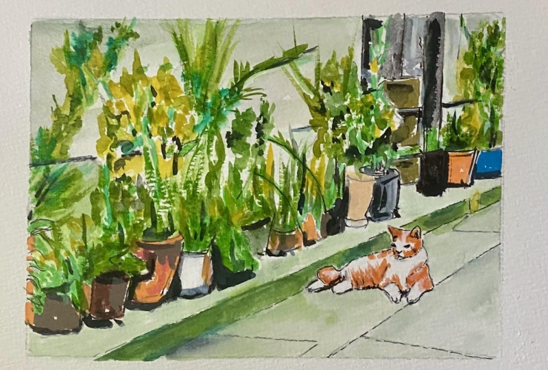
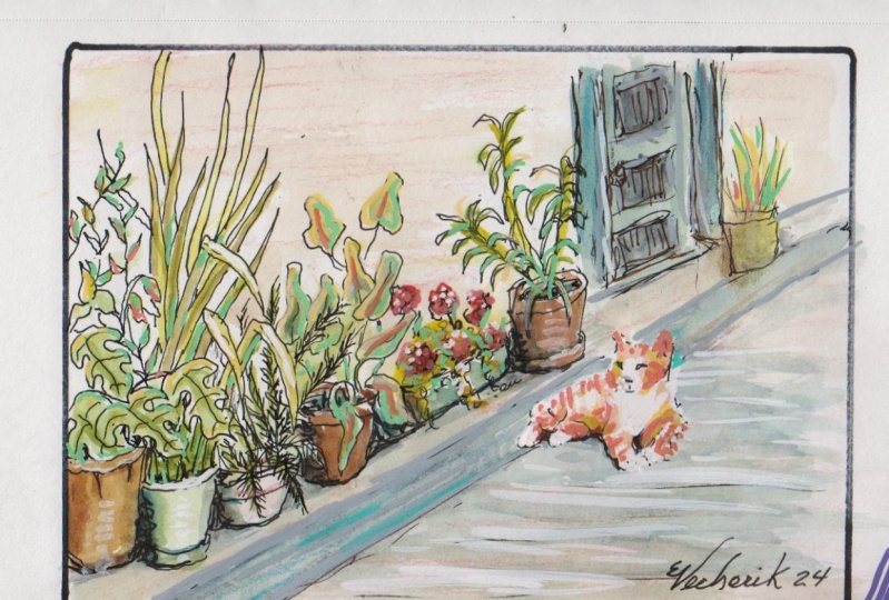
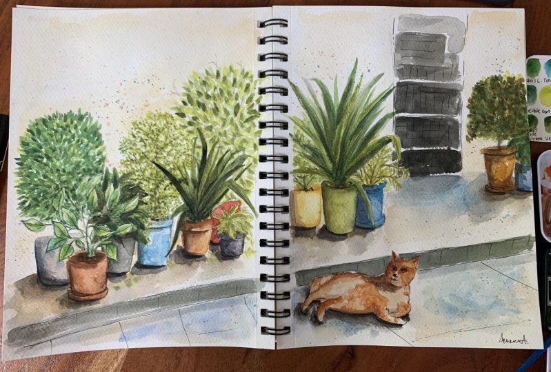
4. Main project (part 1/2): Welcome back. In this lesson, I'm going to show
you how I created this mixed media sketch using this reference photo that you can download from
the video description below, or from the link that I
have provided which links to the original
source of this photo. And here's a list of all
the tools and supplies I have used for this sketch. It's very fun to experiment with different styles
once in a while. So for this sketch, I'm going to lay down the
pencil lines for the curb. Maybe I'll draw this with later. Okay. So for the potted plants, I am going to draw them with a big soft colored ink
pens, watercolor, and ink. So let's start with one color. So for this, put a plan, I'm going to draw the
outline with pencil. This is a mechanical pencil. Some of the leaves
are overlapping. This product plans. So I'm going to leave
some whitespace here. I'm going to draw the rim here. I am not going to follow
exactly what I'm looking at. I'm not going to follow
exactly the reference photo. Sorry, I'm not going to follow the reference photo Exactly. Next, let's have a potted
plant on the side. So in the photo you will see
this protoplanets white. So I'm going to leave
a white space here. And I'm going to paint the
pot the pot plant here. I'm not sure what color
painting this is. This looks like Van ****
brown. I may be wrong. So let me get the shape right. I may want to add
some red to this to make the pot a bit warmer. The color be more
reddish so that it's not just this boring brown
color that you see. And I can see there
are some plants here, so maybe I will
paint them later. I'll wait for this to dry first. Does this look big enough? I think it looks alright. It looks big enough. Next, let's draw
some other plans. So maybe I can have this ink
pen for the white part here. So this is brown
and brown ink pen. Hopes my perspective
seems to be a bit off. And not just that, it seems like the ink from this ink pen ink pen
has soaked over. No, it did not. So Alice, this paper
is thick enough. You will probably want to
try drawing something like this with thick
watercolor paper, 300 years analytical paper. This is the white part. And I can switch to a different
color for are the ports. This is another part. Maybe I can switch
to read as well. Maybe I can switch to
red colored pencils. So there is a brown. Put the plunge here on. This case, I'm drawing with red. Maybe another one with this. I'm going to have this overlap, sorry, have this behind
this plot that is in front. I'm also going to leave some
whitespace for the leaves. Maybe I can draw the leaves, draw an outline of the leaf with colored pencil first. Yeah. We have a black pot, so maybe black ink instead
of black colored pencils. We have a black part here. This one is just behind. And again, there are
some overlapping leaves. Is actually not easy to just switch between the
ink and color pencil. It's quite tedious. That switch to another color. For the other potted
plant, those here. And it's put, the plan seems
to have a tray beneath. So I want to draw it that we have another potted plant here. So for this one
it's behind this. And for the trade
that's beneath, I want to draw that with ink just to switch
things around. Just to switch things around. And there is a door behind. So for a dorm, I can draw it with ink. Or there are actually
some steps behind. A stack is behind. So should I grow it with pencil or with ink? Maybe
I can draw with. But I want to draw some
transverse just to make sure that I will remember
to leave some space. Leave the white space
for the plants later on. So this is the doorway
to the staircase. This is entry to the stack. And we have some steps. The first one is like this, second one is like this. And like this. Okay. For the next
plant onyx plot, I'm going to paint. Again. I'm going to use this color. I think this is permanent brown. It looks like permanent brown, PBR 25 mixed with some
ultramarine Florida Bullock. It does not look dark
enough right now, so let me just add
more paint to it. While you're drawing
the product plan. Really spend the time to observe like make sure you
get the curves right. Okay, let's have
this at an angle. The other plant that a pot
that is B side is red. So maybe I can use this color ink pen or
this is non-written. This is actually wrong. Let me switch to another color. Orange. Oh, there is
actually a blue pot. And we all the colors
that you see here are mixed n my chest, I'm not following
their photo exactly. I'm going to draw
the plants with the long leaves behind with ink and plants in front with the yellow
leaves with watercolor. So that's my plan and let's see how it's going to turn out. So let me try and follow the
shapes as closely as I can, make sure I get the
overlapping shapes right. Maybe later I will
draw the plans. If ink pens. Oops, I think I made
a mistake there. This is very fun. The nice thing about
this exercise is it's not easy to draw this from memory or from your imagination. So when you're drawing this, you are really relying on
your observation skills. We have some potted plants
behind with small leaves. So far that I will paint maybe with watercolor instead
of growing debt with ink. What I wanted to do with
this sketch really is to play around with mixed media. So take your time to draw the way the plans
or the leaves turn. Those are really, that's a really good
practice for drawing. Because they will always turn in a way that you don't
expect them to turn. And when they turn, incident waves the leaves
to actually flip over. So you can see the underside of the leaves or the top
site of the leaves. Hey, so far I think so good. So far, so good. As difficult to see
the details here. So I'll just draw the details
that I can see later on. This area is probably going
to be just painted with one big shape of
very dark green. If I want to draw the cat, noise per helps to time to
block in the shape of the cat. The cat actually overlaps. The curb. Mice are very stylistic. Cat. Maybe I'll draw this with. Yeah, maybe I
shouldn't draw this with kink. Let's
see how it looks. I think that's the kill. The white legs, the front legs, the front feet, the triangular years. Eyes, nose, mouth. Looks kinda weird. Maybe we'll look at
watercolor is added next. I'm going to use a lot of water to paint the curb,
NO soda ground. The cat is on. So for this I'm going to use ultramarine and burnt sienna, like a lot of ultramarine
and burnt sienna. And maybe some yellow hansa yellow because the
curve seems to be, that seems to be some yellow. And I need to use a lot of pink. Okay, That's some test it out. Make sure not to
paint over the cat. I'm going to leave
the wall just white. I'm going to have
more green here. Now I'm going to paint
the leaves here. And this stage I have
to say that I am, I don't know what I'm doing, which is quite scary. So let's paint the
background here. So this is mixed with
phthalo, blue and yellow. If you want your leaves
to be more green, or just add more, sorry, more yellow, just
add more hansa yellow. I'm not painting within
the shapes exactly. I'm just having fun
painting, splashing, paint around for the leaves that are almost bright, white. I'm just going to leave
them as they are. Maybe paint them with a lighter
shade of green later on. My paper, as you can see, it starting to buckle because
there's too much water. This is quite fun. Let's have some
leaves here as well. So the leaves here, we're
not drawing with ink. Instead, I'm just playing with the shapes are painted
with watercolor. If you want to make
you all leaves darker, you can use more philo
blue or ultramarine. There are some
yellows stocks here. Those are difficult to paint. And because because my
camera is in front of me, I'm actually sitting
behind my camera. Okay, That's peanut
shapes for the leaves. And we have more blue
leaves behind here. Make sure the watercolor brush you're using has a sharp tip. So this will allow you to paint leaves with the sharp
tips more easily. See all these leaves
with the sharp tip. The details look
alright from afar. But if you actually
look closely, it's actually quite
difficult to differentiate different plants from each
other, from one another. I really want to capture the
sharp points of the leaves. I mean, add more yellow
to make this more. Hello. The steps are
actually much darker. So I have a dilemma now, should I pin this here we are much darker and then
paint the leaves will wash. Maybe I should,
maybe I shouldn't. So let me just stop right now. For this plan here, let me move to discipline
on the left side. This is what I have so far. Let me continue here. Okay. I'm really not sure
what I'm doing. But I know this part here
has to be black, right? Darker. So for that I'm going to use my phthalo blue with
some Hansa yellow, we have some red. So once you add red to
blue and yellow mix, it's going to be much darker. So now you can see two tones, our values, the mid green
and this darker green. So this darker
green will create, help you create more
contrast for the leaves. I mean, need to paint. This area are much higher
with the darker green. Have the leaves come out
at different angles. Have them, have the
leaves crisscross. Basically tried to
create interesting shapes with the leaves. Okay, um, let's see
what we have so far. I think it looks
alright, so far. You know what, maybe I
can draw some leaves with colored pencils as well.
5. Main project (part 2/2): So I'm going to have some
branches and yellow leaves or brown leaves or with
tone with colored pencils. This will help create this mixed media style will
help create interests. So we have textured
media or gains, those flat coloring, watercolor. And we have solid shapes
against line art. So this creates a variety. Yeah, I definitely need some brighter or darker leaves as well to create contrast. Oops, that's too much. They loo blue. And I can put in some green
behind a colored pencils here to create to make
it look more different. To give it a mix of watercolor
and colored pencil, wet and dry media. And maybe I can even use the
green ink marker ink pen, the green ink pen to
add a few leaves here. Okay, be some dots or texture. This is what we have so far. Mixed sound pin this
area here much darker. So I'm going to use
ultramarine with some Hansa yellow and some
red to make it darker. Let's see what happens
when a pin this, okay, it's dark. It's dark. So as mentioned
earlier, later on, I will be painting the leaves on top with gouache
or opaque paint, all with Posca marker. Depending on what colors I have. I'm also going to use this
color to paint the curve. Hopes I actually
painted over the cat. I know what, I'm just
gonna leave it as it is. Just leave it as mystic. Not be too stressed
out by the mystic. Next time you want to draw
the tweaks here with pencil. Pencil, and then use either
pencil or the ink pens. Let me try and use pencils. Pencils. And pencils are much cheaper compared
to independence. And also ink pens. The ink can run out quite
quickly, so colored pencils, or it's going to be
more affordable. Okay? This pen is not, sorry, this pencil is not
opaque enough to go over the leaves here. I'm going to mix things up
by using yellow as well. That was how many yellow. How? Sorry. He was brown for the branches. What are stocks here? When drawing the stocks? You will notice from the
reference photo the lines are very random, very expressive. So that's how nature is. It's very random. Okay? I may want
to use green here. Maybe here. Doesn't look that great. You can use this to
add some variety at this stage or
this part is dry. So now I may want to
paint the potted plants. So I'm going to
have a mix of white and grow and read potted plants. So this one here is
supposed to be brown. Let's try and mix them. Brown. Let's see what this color is. This I'm actually not
sure what this color is. Raw sienna, Queen go. Yeah. Maybe this some red
to it or burnt sienna. So this looks like this. Maybe more queen goal is added. Yeah, maybe I should've had more quinacridone gold
for the plant here. Let me just, sorry, this is actually a white pot. That I did not draw it here. So I decide now I
can actually pin, grow that with the orange pen. Next, maybe we have
another port here. This one is black part. What I'm trying to
do here is to have different shapes as well as different values
like white agains lack, sorry, lighter values
against darker values and lighter values
against meet values are, and just switch things around. Okay, next, let's have two. Let's make this rate instead. Let's make the pot reinstate
the one behind me. While these two parts will
be drawn with red sorry. Rate colored pencil
young correct. Hopes. Once I paint over the
colored pencil lines, the lines are lost time. Let me try and get a ship back. We have an orange part here. If you want your lines
to show through, just choose, make sure that
the pen you uses transparent. I'm actually just picking
random paint from my watercolor box
for the sketch. And some of those random
colors are actually, pay me the most that. Why is it called the soil? We need to make this soil dark. And maybe I can use
orange for the cat. So this is new
gamboge on the cat. Maybe I can add some raw sienna. Okay, I think this
looks alright. Let's try not to
mess up the, oops. Let's try not to
mess up the cat. It's okay to paint
the cat with just, you can wash so
that the cat with the vibrant colors
will stand out against a neutral background. And next, I'm going to
paint the opaque colors on top of the darker areas and
also on top of the stairs. And I have created color, our co-op break here. So it says that it's
crayon gouache. So I suppose this is
going to be opaque. I hope it's opaque. So I'm going to mix
the color here. This watercolor set is
actually used by my daughter. Okay, it's actually
not easy to dissolve. Now, why do I add green,
blue, and yellow? After using tube wash, I realized that it's
easier to use pen gosh, it's just more convenient. Okay, this is, this
looks fine here. But for the yellow, know, the yellow is an
art that will pick. The background
here is very dark, but the color is
not open enough, so you don't really
see the contrast. So why may actually have
to use the tube paint? So I switch over
to using to wash. So let's hope this is enough. Let's paint a few leaves here. Okay, This is opaque enough. Let's mix some greens. But it's not 100% opaque. Okay, this looks alright. This looks alright. What I want to do here really is to create the overlapping look. Because when you have
overlapping elements, you're going to have
foreground background. There are other paints
that are more pig. Or you can add more white, titanium white to
make the paint more. Pick. The mean, just paint over it is let me have yellow on
top of the darker green. Or if you want to make
the paint more opaque, you can paint over
it a few times. Just have fun painting. Painting is like solving
a jigsaw puzzle. You have to find ways to make
your painting look good. I'm going to use this opaque
paint to paint this area. Perhaps. There is actually a very
big piece of leaf here, which I'm not sure I'm
going to draw that. Let me just paint with the wash. Let me just
continue with phosphorus. I am not very good with
gouache here as well. Okay. So if you
don't see anything, it's because the paint
is not picking up. So let me maybe just switch
over to Posca marker and see if the paint markers
can make any difference. Okay. The paint markers work
well, but paint markers, I say you wouldn't get the gradation with pain markers that you can with watercolor. Because we've watercolor,
you can create traditions, but we've pinned mockery
is justice, single color. But Alice, it's opaque. So that's great. Okay, this actually looks good. Make sure the paint is
dry before you use this. Otherwise you are going to dirty or mocker me a
buck or two teeth. So this actually looks
kinda like colored pencils. Hopes my mockers dirty. You may also want to use staining colors for the
leaves behind so that the colors will stay in the page and we're not lived
when you use markers on top. If you use colors that
are non staining, when you paint over
with the opaque marker. You may actually move the paint beneath
even though the pain is already dry up
in the air for so that's one thing you
should take note a half. Okay. It looks alright. It
looks all right to me. Let's switch over to this green. This green does not look right. Let's switch over
to another green. This olive green color. Hopes too much ink spilled out. This green doesn't look
right to me as well. It's a very dirty olive green. So maybe let's switch
over to yellow. No, we don't have
the contrast there, so let's switch over
to color pencils. We need a darker colored pencil. Yeah, this looks alright. It's not the color
that one though. Let me see what
other colors I have. I think I'm out of colors. There is another green here. This looks like a sap green. My table is very
messy right now. This looks I'm not sure
how this looks right now. I'm just scribbling things on. I'm actually just
scribbling things. Yeah, doesn't look good. Let's switch over to
the white Posca marker. So the leaves here have
that white outline. Yeah, so I'm using
the Posca marker to draw those white home lines. And you can use
the Posca markers to add highlights as well. Maybe some highlights,
gains the story. Maybe some highlights and
kings the steps here. Okay. Next, let's paint the leaves
here with a yellow and blue. I can also use the
brush to add blinds. Okay, So this country
is almost done. I just need some more yellow
on top of this pod here. More yellow enhanced lines for some of the pot plants. Okay. Okay. So I guess this is the complete That's how some
texture on the curb, this grid on the curb to
create some perspective. Okay. I didn't
actually quite like how the leaves turn out. Mostly because my pen
is not opaque enough. Let's use wash. Hopes
too much paint. You know what? Maybe I
should just stop right here because I feel like I don't know what else
I should add to this. So let me just stop right here. I can make certain parts
a bit darker though, just to create extra contrast. So if you feel like the, everything is off meat
value would definitely add some black or darker
values to your sketch. This will help create
contrast very quickly. This is the complete
that sketch. I think it looks fine. I suddenly had a lot
of fun painting this. So let me just write
the date here. Alright, so I hope you
will try drawing plans yourself and try to mix and
match different styles. Lie. Have line art, again, solid colors have light values, again, mid-value, have meat
value against darker values. Have light against dark, half, dark against light. Just mix it around
and play and also play with the color
contrast as well. This is very fun.
6. Goodbye: We have come to the
end of the course. I hope you enjoyed the mixed
media art creation process. I hope you liked that
mixed media art sketch that you have created. So as mentioned many times, creating mixed media art is
all about experimenting, mixing and matching different
tools and supplies, discovery in different styles. Going forward, I hope you can continue to create
mixed media art. Experiment with different
tools and supplies, find your own style, develop your own style, and get inspired
by other artists. Right before you go, I hope you can write a
review for this cost to help other students
discover this. Cos, thanks for following along. I hope I can see you
in my other courses. Bye.
 Teoh Yi Chie, Sketcher, watercolour lover