Transcripts
1. Intro: Hello and welcome to this second course in this series, caught sketch booking with 20, that's me. So this is a series where we will feel a sketch book to get there from the first to the last page. In the earlier course, I've shown you how you can develop your drawing skills and creativity using a sketchbook. So in this course, we are going to have some fun with mixed media or such as color inks, watercolor, wash, refine what a soluble, gratified and colored pencils as the title of this course that jazz, you're going to need those tools and supplies in order to follow along. However, if you don't have the supplies that I'm using, I have also listed a tentative supplies that you can use so that you can still follow along with this lesson. So each lesson we'll have a brief introduction to the 20 and then we would just get right into drawing. So let's get started.
2. Coloured Ink Pens: In this lesson, we are going to draw with colored ink pens. But first, let me talk about the tools. Let me give you a quick introduction to color ink pens before we draw with them. My recommendation is not to spend so much money on color ink pens because you may or may not like to draw with them. For beginners, I recommend you get an affordable set of colored ink pens. And my recommendation would be to get the uni-ball pens. Uni-ball is a company that makes high-quality stationery products at affordable prices. And this particular pen that I have here is called uni-ball Vision needle, which features what approve and feet proof ink. So you want to use your pens with watercolor and makes sure the ink is waterproof or archival. And this particular pen comes with a needle point tip. This is another pen which is also made by uni-ball. This pen has a roller ballpoint tip which can sometimes produce lumps. And I like those accidental ink blocks. So just go with the brand uni-ball first to find out whether or not you like color ink pens. And even if you don't like to draw with them, this color ink pens can be quite useful. I don't actually draw a lot with colored ink pens, but I like to use those pens to add details. Here are, for example, I used a red pen to create the pattern on the awning. I also use the same pen to add details on site bought. And this was drawn with a rate marker. I could have used watercolor to draw all this as well, but it's more convenient to use pens. I also have white gel pens are used to create highlights over darker colors or over blacks. Now the inks are actually not 0 pigs. So if you have read over black, you are not going to see the rate. If you want opacity, if you want opaque inks, I'll make sure to get opaque markers. For example, this yellow dots here are withdrawn with opaque markers. Once you find out you enjoy working with these pens, you can then buy pens that can produce a thin lines or thick lines, depending on your needs, don't get carried away because you may be tempted to collect them all. And soon you realize you have a shelf with all of this pans that you may or may not use or need. And before you buy audits pens, make sure to check reviews on line because these pens have their own advantages and disadvantages, for example, and that the one graphic line painter is available in a huge variety of colors. That's the fun ditch. But the ink from this pans can splatter or hospital randomly. So it's difficult to use them because performance is inconsistent. This are multi liners or fine liners. They are also available with a huge variety of colors. This pens feature needle point hips as well, but the tape not met also, it can wear down quite quickly, especially if you are drawing on a rough paper surface such as watercolor paper. The pen tips wearing down is the main reason why I recommend you go with the uni-ball pens that I showed you earlier because they feature metal tips which are more durable. And other thing to take note is if you do need to replace your pen in the future. Finally, if you can actually buy replacements for that specific color, because some companies, they actually just sell pens in sets to replace a specific color. You actually have to buy the whole set, which doesn't make sense. So if you do need to do one to buy fine liners, you can consider a pig or spectrum law for opaque inks. I recommend you go with Posca markers or posca pens. These are also made by uni-ball. These are really worth the money. You can buy her a small set with a limited number of colors just to test them. They come with different tip sizes. So this is, are thicker pen for drawing thick lines and this one has a bullet tip for drawing thinner lines. Another option is to use depends with colored inks in bottles like this, but this is more inconvenient because you have to keep reloading the ink and this bottle opening is quite small. So it's not easy for you to put your pen into the bottle and after you draw, you have to clean your pants so it takes more effort to use ink portals like this. The advantage is these things are very waterproof and also with a dip pen like this, you can draw really fine lines. You can draw extremely thin lines and vary the thickness of the line depending on the pressure you apply. This is not possible with other pens, some other downsizing through it. Well, you have to replace them when it's land and it can make your hands dirty. These are for advanced illustrators and definitely not for beginners. This is a back-off stainless steel ball bearing, which is so separately, I would drop one or two ball bearings into the bottle to help me mixed ink more easily. I got the idea from pens like this because some of these pens do have ball bearings or something insight to help you mix the inks because some of the things are actually painted, which means the heavier pigments with settle at the bottom, so you do have to shake them before you drove them. Otherwise, the color of the ink will not appear intense. However, you go with the uni-ball pens, the colors that you can get out from this pens are always going to be intense. No shaking is required. So if you want to go with pens, I recommend affordable uni-ball pens. Any of you one thing allies consider the unique postcard. I recommend you go with stronger or bolder colors because the pastel colors in this appears washed out, relatively speaking, compared to the colors they can get in this set. All right, it's time to draw. We are going to draw kitchenware. So you can draw whatever you can find in your kitchen or you can go online and look for reference for those. The color scheme I'll be using would be the rainbow color scheme or the color scheme of the color wheel. So I will have yellow followed by orange, red, purple, blue, green. And then I'm going to repeat yellow. And just feel that page from left to right. If you don't have colored ink pens, you can use colored pencils and you don't have colored pencils, you can use black ink, but colored subjects with same color scheme that I'll be using. I'm going to draw the items small so that I can draw a lot of them. I think it would look good. And I'm going to group the items into our vertical column for each color. So let's start with yellow. So this is the derby and graphic line pin turned that I showed you earlier. I have a love hate relationship with this pen because it can spill ink randomly. The thing we've yellow is the contrast is actually not that rate against white paper. If you wanted to have yellow against some back ground, try to buy opaque yellow pen or mockers. So this is what I have so far, just some pens, ports, fork and spoon. And this is quite a fun exercise. I'm glad to be too stressed out because Ahmadiyyas subjects are not that difficult to draw. These are actually very simple subjects to draw. So just have fun and just draw whatever you can find in your kitchen. And if you run out of things to draw, you can always change the angle of all these items and draw them from different angles. And if you went out of angles, I'm just repeat the items again. So I'm done with the second color. Next, let's move on to read. And I think to note is to test your colors first on some scrap piece of paper. Before you draw with them in your sketch book. Or you can test em, you know, sketchbook, of course. Next we have new. And lastly we have read. So this is what I have so far. I'm going to continue. And is pattern of color on the right pitch? There are other patterns are you can try for example, you can have yellow in the center and then draw orange, red, purple, and then blue. Or you can draw a wave of colors. It's really up to you. I accidentally put a drop of ink there, which I have to clean up later. So this is the completed sketch. And while drawing this, I suddenly had the idea to draw the colors diagonally. So you may have other ideas that would just come up randomly. How your drawing and desktop fun thing about sketching, sketching endlessly or doodling. You can develop your creativity. Get ideas just out of the blue, just by simply drawing. So as I mentioned earlier, you can actually just draw all this with black ink and color them according to this color scheme. Yellow to orange to red to blue to green to yellow. Again. Other things you can try would be to draw a bunch of items small and then draw something big, but in a different color and then draws I'm small items again and then draws on thing, beaker, smaller. But tried to group the colors to get HDR rather than have for the colors are mixing around. It mean not look that great. If you have the colors like all over the place, it can look confusing and messy. Sometimes you want to know whether the result will look good until you try it on the page and see it for yourself. So for example, with this particular sketch with colored inks and watercolor, I don't think it looks that rate. There is no particular pattern to the color. So the colors are kind of random. The app, so it looks kind of messy. It looks all over the place, but I wouldn't know until I actually tried on the pitch. Or maybe it may look good. Happy accidents don't happen. Not all color combinations will work. So you may want to task color combinations on a scrap piece of paper or you can make a mistakes in your sketch books so that you can refer to those mistakes in the future to avoid making the same mistakes again.
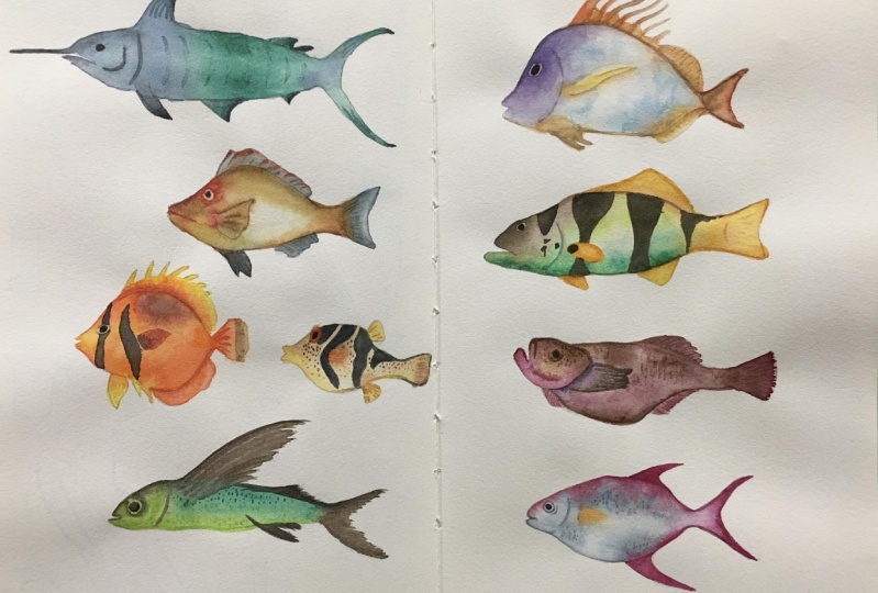
3. Watercolour: In this lesson, we are going to play around with watercolor. Watercolor is definitely my favorite medium when it comes to coloring, because it's such a versatile medium, you can use it to create detail illustrations or you can use it for quick and loose sketches. It's very convenient to bring what a collars around because you can have them in watercolor pen sets like this, which are compact and portable. Or you can use them at home, indoors in a studio. And they dry pretty quickly without leaving a massive oil. They are very easy to clean up its home. Those are just some of the many reasons why I love using watercolor. For this lesson, we are going to have some simple coloring exercises and to follow along, you will need what a colander if you don't have watercolor. And this is where I will tell you the things you should look out for before you buy watercolor. What a color is available in two forms. You can buy them in watercolor tubes like this, either individually or in set. Or you can buy them in a watercolor pen set like this. The advantages of having a pen set is the colors are already selected for you by the company so you can start painting straight away. The advantages of using watercolor tubes is they are more economic goal because all 12 like this, you can get 515 ML. And you can actually squeeze the paint into empty plastic pens to make your own watercolor pen set. And this can save you a lot more money in the long run, what a telecoms into grades, student grade, which is more affordable. However, the paint will have more feeler compared to pigment. Pigment is the actual color that you see. And for artists grade, it's more expensive, but you get more pigment. So you just need to use a bit of paint and you can achieve really intense colors. But for student grade paints, sometimes you have to use more paint and you can run off paint more quickly, and hence you have to buy replacement cubes. So in the long run, I will probably recommend you go with artist grade paint. You don't have to buy so many colors, you just need three primary colors, yellow, red, and blue. And you will be able to make a huge variety of colors. I want to be able to cover watercolor comprehensively in this lesson because watercolor is a subject that deserves a whole caused by a, so, by the way, I do happen to happen at a cause on what a color, more specifically what a color mixing. So if you want to learn more about watercolor mixing, do check out the other costs. Let me show you some pieces of wood that I have retrieved from my dollar. So you can use watercolors to test different color combinations. I highly recommend you write down the names for the colors so that you can remember the colors you use. For example, if you create column mixes like this without the names of the colors, after a while, you won't be able to remember her the colors that you actually use. And here, I wasn't able to remember the colors that are used to great artist mixes. You can create color swatches in your sketch book or in loose sheets of paper like this. I would recommend you use loose sheets of paper because he won't be limited by the number of pages in a sketchbook. With loose sheets like this, you can always add paper to test more colors and the number of colors that are out there her in the market. It's almost unlimited. Before we start painting, let me give you a quick introduction to watercolor mixing and color theory with the help of this color wheel. So to mix colors, we need primary colors. It can be yellow, red and blue, or yellow, magenta and blue. Primary colors are colors that you cannot mix, that you cannot create it. So for example, if you want to mix the yellow, you just can't because you need to be a yellow. However, if you want to mix orange, you can actually mix it with yellow and red. All right, here's the most important thing you need to know about color mixing. If you want to mix vibrant orange, you should use a primary color that is very close to that, orange on the color wheel. So for example, in this case, if you want to mix vibrant orange, you should use a rate that is warm, that is like hot. And you should use a yellow that is warm, yellow that really has some hint. Orange and then you will be able to mix up vibrant orange. Here's a variation of the color wheel with the actual names of the pigments. So yellow, red, and blue, those are just descriptive colors are when you look at what a colored tubes, they actually have names as well as the pigment that is used to create that color. For example, with this lemon yellow from Daniel Smith. And this is made with the pigment PY 175. If you look at lemon yellow from other brands, they could be meet with other pigments. When you buy watercolor, focus on the pigment coat or the pigment number rather than the name, because the name is actually just suggestion. Here's how you can use this color wheel to select colors to create a versatile color mixing palette. As mentioned earlier, to create a fire burned colors, you have to use primary colors that are close to each odd term. So for example, if you wanted to mix a vibrant orange, just choose a yellow or a warm yellow that is here and that is nearby. So the distance between the yellow and the red, it's like this. Whereas if you choose a yellow that is around here and a red guys here, you can see this distance is much bigger compared to this distance. So if you mix the yellow here and a red here, you're going to get a very muted orange if you want to mix vibrant green. Again, choose primary colors that are close to each other and choose a yellow somewhere here, and a blue that is close to the yellow. Do an add, choose a yellow here and blue here. You can see this distance. It's much bigger. Competitors, this distance here. Same thing with purples. Choose a ray that is close to the U versus this red here, which is so far away from this view here, avoid opaque colors such as cadmium colors will pick colors are not easy to mix with the colors you want. Transparency and use that pigment information provided to find out about their light fast quality of the paint. Go for light fast pain, which are paint that do not fade when exposed to light for long periods of time. I'll put a link to where you can find this color wheel in the video description or the class notes. This color wheel is made by Bruce man, evolved from hand print.com, right? It's time for the hands on exercise. Just flip to our new page. The subject we are going to draw is a fish. You can go online and do a search for fish and use any of the pictures you can find for reference. The focus of this lesson is on watercolor techniques instead of drawing. So we are just going to draw a caricature style fish or you can draw fish from your imagination as well. Try to draw off bij big. Don't worry about accuracy because I just going to practice our watercolor using pencils instead of ink because you can create a softer look with pencil. So when you use this, when you color with watercolor, watercolor, instead of the pen and ink line would stand out. You can design your own fish. Try to vary the size and also varied a design so that you can have a good variety of fish. When it comes to painting with watercolor, it's good to have two cups of water. One is for washing your brush, the other is well, washing your brush again to make it cleaner so that you didn't bring the dirty water onto your colors. These are squeezed and paint from the tube and they have harden with time. So before we can use them, we need to add some water. You can use your watercolor brush to drink some water onto the pens. For me, it's faster to just use this spray. The colors I'll be using our Hansa Yellow Medium. This is new gum, Bosch, and this is a warm yellow, one, red. This looks like a rose color and this looks like magenta. I cannot remember the names of this roughness. This is phthalo blue and this is French Ultramarine. What I'm gonna do first is to paint wet on dry. So I have my wet brush, I'm going to debit into this yellow and painted on dry paper and wet on dry when painting, try to leave the white areas white because once you paint over the white, you won't be able to make the white white again. So what a color is transparent and aligns. We'll show through. If you pick a color from the pen and painted directly onto the paper, the color is going to appear very vibrant and sometimes they can appear a bit unnatural because the color is just too vibrant. So what do you mean wanted to do is to add a tiny bit of this JSON color here is one orange, just to mix the color slightly, just to get that slight variation with the color. So when you add the second color, you can create this beautiful color gradation as the color spread and blend. You have to do this while the wash is still wet. This process is also called charging in a color. So just dab some other color here. Just pick up the other color with your brush and paint over the wet area and you will be received. Colors move and spread. How well the colors can spread, or how far they can spread will depend on the paper you use. That's move on to a data fish That's wash our brush once and twice and pick up some clean water. And now let's practice some wet on wet. So this time I'm going to pin this, we have new gamboge and at rit. So we need to have a lot more water on the brush, pick up the pen here and just paint over. Oops, I actually went over the pencil line there. So make sure that your wash Harriet's wet, it's sufficiently wet, but not too wet. And when the wash is still wet, we can charge in that color. So early on we are a church in the color for this. What colorist is, I have no idea what it looks like. I really have no idea what color this is. Anyway, while the wash is still wet, just charging another color. So you realize that when washes very wet, the colors can move more freely. If you have used too much water, you have to remove the excess water. To do that, just clean your brush and dry up brush and then use your dry brush to pick up the excess water. If you don't rebuild the excess water, it's going to create this very distracting back and run effect later on. Bec Khurana effect, yes, it is distracting cauliflower like effect. Next I wanted to pin at this, we've got a light rose color. So now I'm using more water compared to paint, and this will give you a very light color. And later on I will add more colors to create some pectin on this fish. But now just one other light wash. For the under painting. It may be good to start off with a lighter color and then add more pigment, more paint. When you find a color to light, rather than start off with more paint to dilute the color later on. This can waste the pin. Not sure if you notice the pattern here, but I'm actually painting according to the color wheel, yellow, orange, red, purple, blue, green. And next I want to use this magenta color to draw some pectin for fish can be any color. It doesn't really matter. Because what we are trying to do here is just to play with color. Next, I will have the little blue for this and ultramarine for this. Blue is a very strong colors. So try to use it with caution. Which is to say don't add too much paint. It's an incredibly strong and a staining color. Staining color means once you apply onto the pitch, you won't be able to scrub it up. So this wash is still wet. I want to add some ultramarine just to make this washed look more interesting rather than just having this flat wash here. Next we have our ultramarine. I'm also going to mix it with magenta. So remember earlier I said to mix vibrant colors, you should use colors that are close to each other on the color wheel. So ultramarine is quite close to magenta. So in this case, I can actually get a very beautiful purple. You will need a watercolor brush with a sharp point to paint. Details like this to paint shop. Beacuse. If your brush is blonde, will be quite difficult to paint details. Ultramarine is a granulating paint, which means you're going to see some texture on the paper. Additional texture on the paper to mix a vibrant green. Let's use Hansa yellow medium and they look, oops, I actually went over the eye again. I am not a very patient person, unfortunately, when it comes to a painting. Illustrations that require detail. So this is phthalo blue with yellow medium. You can have three colors. So we have yellow and then we have the mixed color, and then we can have more blue here for the third color. You realize the bij way vibrant colors look better compared to the washed out fish. We'll fix that later using the second technique, glazing. Glazing is also known as layering. So here we have a fish that is yellow to warm yellow. There are two ways to mix colors wise to mix them on the palette. By this, the other way is to mix them on the paper. And the third way is to use glazing or layering. So I'm going to use a very light wash of blue. The light blue and glaze over the yellow thing we'll do is transparent. So it should combine with the yellow beneath to produce a green. So that's paint over and see what happens. So there's wash seems to be, how should I say too concentrated? So I may need to dilute this even more. All right. Let me try again. This is more diluted. So you could have painted the fins by mixing the colors on the palette and then applying the green here. Or you can paint over the green light, sorry, create the green like this by using a glazing technique. So that's one way you can create a pattern on the fish. I've also used the blue to pin the eyes there. So this was painted with a light wash of rows earlier. And now I want to use the same rose color but in greater concentration now allows this still wet. I'm going to be at more pin here at the bottom to maybe blend the colors together and see what happens. I'm not sure if it is looks good. Perhaps it doesn't look that great. Now, next, let's paint some polka dot design on this. I'm not sure if this is going to look good. When the dots are near the ages, we will just paint half a dot. Theta dot is going over to the other side of the body. I just painted eyes red and it looks weird. Don't worry, we can fix this. We will just add a tiny bit of phthalo blue is one rate. Notice I added a blue to a rate, which in theory should give me a purple. But the thing is because this blue and the one rate is quite far apart on the color wheel. That's why we get this very muted. Purple. In this case, it's not even a purple, It's like black, right? So go ahead and finish up your are the fish of fishes with whatever designs you can think off when it comes to glazing. And Firstly, of pain that you use is actually quite important. You will probably want to go with a staining color. Because when you paint the second layer, you don't want the first layer of paint to be lifted. And in order for the first layer of paint not to be lifted, you have to use at least in color. So for example, if you had pinned and this wash wave outright marine and you paint a second layer, ultra marine me, get activated again. How staining the color is really depends on well, the pigment. Some colors or some paint will be more staining compared to others. Once you paint over it. And why do you want to be able to get the white back? So if you want to bring back the wide, you can use white paint or white quash. Notice this fish is not very obvious because white auto fish actually blends into the white of the paper. There are two ways to separate this fish from the paper. One is to paint the fish. The ADA is to paint the background. So in this case, I'm just going to print the fish with this very light wash of warm rate. So this is what I have. Some look good, some not that good. This looks a bit strange. This is also strange. This looks weird because stripes on fish are usually vertical and this is horizontal. So even if we don't know what's really wrong with this fish, somehow our mind tells us that it looks a bit weird. This fish was supposed to be ultra marine with a blend to magenta. I painted a Secondly of ultra marine. And somewhere along the process, I'm not sure what I wanted to do with this. So I painted ultramarine over the whole thing and it doesn't look good here. And another thing to note is you see the tail here, the till is not sharp because I did not tapered point of the tail properly. And because of this, the shape of this fish doesn't look that great. So what I wanna do here is maybe to make this tail shopper. So having a brush with a sharp tip definitely helps a lot. Still looks weird here because the tail is either supposed to be dabbled fin or just one big shape. So let me just pin does with one big shape just to fix this. One common mistake beginners make is the colors appear washed out or the design is not strong, or the contrast is not great. So don't be afraid to use strong vibrant colors or make your design look bolder. Because without contrast, the design is not going to look clear. It's not going to have clarity. So this looks really weird. Let me see if I can rescue this with white quash. Let me just draw some Pepin on the fish just to make this look more interesting. Because now it's just one flat. I think now it looks slightly better, definitely more interesting to just flat view. You can see that by not using pen and ink, we allow the colors to stand out even more.
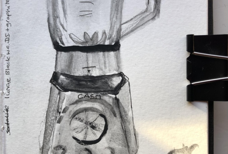
4. Watersoluble Graphite: In this lesson, we are going to learn how we can use what does sort of 0 graphite to create monotone sketches. This is a fantastic way to learn about contrast, light and shadows, and tonal values. A sketch like this without any colors, light and shadow contrast can look quite boring. The lines also have consistent thickness. There is no variation for the thickness of the lines. For a sketch like this, nothing stands out because there is no contrast. And all the people in this sketch, they are quite similar in size. So we don't have the contrast of size. We don't have the contrast of colors, we don't have the contrast of light and shadows, so nothing stands out for this particular sketch. Now when you add grays and blacks, you can create contrast very quickly. So this is also a sketch. We have a lot of people. However, when you have values and light greys, darker grays and blacks, you can see the scene is more lively as long as you can create some sort of contrast, even if your scene doesn't have an EQ colors, your sketch can still look good. Another example of a sketch with no colors, but still looks good. Here we have a dark gray and black, so we have wide dark gray and black. Three values here, depending on the medium you use, you can create interesting effects. So this sketch was painted with Sumi ink. With Sumi ink, you can create a lovely textures with your washes, and this can create more visual interest. For this lesson, we can use water soluble graphite or bottled ink. If you don't have water soluble graphite or ink, you can still follow along by using what a color and this other color combinations you can use to mix dark colors. So you can use a warm red, which can be or pyro, scarlet period of vermilion. Use a one rate makes it were fatal blue and you can get a very dark color. Or you can use the little green we've read. Or you can use French ultramarine. We've either burnt sienna or burnt umber. We've burnt umber, you can get a darker shade. Let's take a look at some water. So both graphite and ink products. What does Levo Graaf? I can come in many forms. You can come in blocks like this, or it can come in this pencil farm or a steak, or in a solid pen like this. Or you have to do is add water and you can paint with it. It works very similar to watercolor. This is graphite as a paste, so you can add water to paint with it as well. This is a solid graphite stick. You can draw with it or you can wet your brush and dab onto the stick to paint with your brush to create those lovely texture washes that you saw with the sketch earlier, you can either use lamp black, this is pigment PB, PK six, or you can use Sumi ink. And the Sumi ink from Winsor and Newton is actually called liquid India ink. Before we paint, Let's start by putting some water into the mixing wells on this plastic palette. So now I'm going to pick some water and put it into this empty well, maybe put some water here as well. So I'm going to make some very light wash of graphite and test it on the paper first, we'll start with a light wash. If you find out is too light, you can add more graphite or more watercolor paint if you happen to be using watercolor. So I'm going to keep one well with the light wash and one well, we have that are darker and wash. So now you can see it's Dr. Let's start out with something simple first to warm up. So I'm going to draw this chair. You can download the reference photo provided when it comes to a painting, monotone sketches, I recommend printing with liters. So what we are doing now is painting the first layer and anything that is not white should be painted with a wash of gray. If you take a look at the reference photo to licks for this chair is quite dark. We will make it darker later on by painting a second layer. I'm going to use this same graph whitewash to paint a site here. I'm going to live a very thin line of white there, or to highlight. And I'm going to use this same water again to pin the shadows here. And then I'm going to quickly wash my brush, make it clean to fit this wash into the white of the chair, or just make this wash really pale, very faint. So let me just quickly wash my brush and fill this. Make this software because he wanted to create that gradient from this shadow area here to this side here. If you find this gradation not that obvious, you can make this darker by dabbing some graphite onto the wash while it's still wet. If it's dry, then you won't be able to get the gradation anymore. Because when it's dry and graphite won't be able to move. When painting tonal values, we have to think this way. Is this value lighter or darker compared to the value that is just beside? If it's darker than paint, an additional layer. So if we take a look at the wood here versus the shadow side of the Kushan. We can see the wood is actually darker compared to the cushion, which tells me I need to paint an additional layer for the wood here. And even for the wood, we can see areas of shade versus highlight on this what is considered dark wood. But even for these dark when there are shades or areas which are Docker like this part here, which seems to be curved down slightly so it doesn't catch the light, so it's darker. And this part here is also darker. So what we're gonna do now is to add more graphite. And at the second layer, just by painting over, you can use the initial wash that you have the year and just paint over if it's not dark enough, just add a bit more graphite. So this is the shape of the leg here, and this is the back. So by painting an additional layer, this is going to be darker compared to the site cushion here at the top. I just realized that I need to paint the lake as well because this shade is very similar to this sheet here. So let's pin this as one continuous sheet here. So just by using two layers of graphite, we can make this chair look. I mentioned gnome. Next, we'll paint this synth. Let's analyze this scene first. So when we paint with tonal values, we need to think in terms of black and white. In this case, is one shade darker compared to the other sheet on the site. First thing we need to do is to find the highlights or the white. And it's very clearly this shape here which is lead by the sun that is white. We can see contrast for the window against a wide. So this will be painted with one graphite wash. We can see shadow on top of the window. So this will be the second wash. This shape here will be the second wash. How about this roof here? Is this darker or lighter compared to this shadow? It's actually not clear. It looks like it's light because the light is casting in this direction. But if we take a look at this line here, we see these white shape or line here. So this line here, compared to this shape beside, it's a difference of one value. And we can see contrasts between this and the roofs. So we're going to pin this with a difference of one value as well. So this is probably going to be as dark compared to this. Next we have this, which is in cast a shadow. So this cast shadow is the same as this cast shadow. So because this is the same value as it is, we can pin this whole shape here as just one value. And we can see there's this black bar here, so this is obviously darker compared to this or anything else. So we need to pin this with an additional layer or with black. So I've already drawn the catch here. Prepare for the painting. Make sure you have enough water because we don't want to run out of paint. We'll need a light wash first. That's pin this window. We will be painting in layers, so we need to wait for this to dry before we pinned. Additionally years. Next we can pin the roof here. Leave the white on top. We can pin this whole area here front. So this Here we'll be black, which we will paint it later on. So this is now dry and we can paint the second layer, which is this shadow shape here, which is cast onto the window. I have just switch over to a larger brush so that I can pin this large area more easily. So I'm going to pin this. Let me test watch first. So this is lighter because I added some water to the initial wash. So let's make this darker or at least as dark compared to this here. Okay, It is, I think looks great. So let's paint this shadow shape. I'm going to tell it to my sketchbooks or that of water, those down in this direction. Otherwise, the water may actually pu I'll collect in certain areas and when it dries that area, we'll create a bank run effect which will not look nice. So that's pinned on this. I'll make sure you keep this area white. There is this small triangle here, which is white, so that's next we can paint over the window. If at this stage you feel like the wash is not dark enough, you can quickly add some graphite just to create that additional contrast. So that's pin, this shadow shape all the way down here and go all the way to the right side. And we need to paint the pipe as well, which looks gray to me. So this is now dry and we can take a closer look. So the cost of shared dorm on the window, it doesn't look that of years to me. Perhaps I could have this slightly darker to create a stronger contrast. But we do get this strong contrasts from the shadow against a wide. So perhaps this really needs to be slightly darker. Since we have already painted this. If we are to make this darker, we can go in with another additional layer, but it could also mass up your initial wash. So in this case, I'm just going to leave it as it is. If you have some more space on your sketch book, maybe you can just focus on painting this particular area. Again, the last thing we need to do is to make this lack or much darker. So we need to add a lot more rough way here. The thing we have bra Phi is you will not get lag. You can get a very dark gray, but you born to be able to get it to look the lack. So this is pretty much the best I can do with concentrated graphite that's pinned. This last example. This time I'm using Sumi ink. So meaning has lovely textures. So let's ping the shadow shape first we see this are triangular shadow shape. We see some cast a shadow here. So let's try and get those shapes are right. And I'm going to start off with a light wash of Sumi ink. This is diluted Sumi ink. So just paint over all the areas which are supposed to be gray. Anything that is not what should be painted over with this light wash, this initial wash of gray. We see some shadows here on this side. It goes down like this. We see this cast shadow here. That goes down to the right side of the window here. We see this ship here, the shadow here, which is above the DAW. So I've drawn the outline. Now I'm just going to paint with thin the shape here. This part here is lit by light, but this part below is in shade. There is a diagonal line here. Oh, there is actually a tree in front, or sorry, a plant in front, but I do not draw that. I accidentally left it out. We have shadow on the Chrome. So just paint over anything that is not white. There is shadow here. Now this line, we will continue down here. And we see this shape here, a rectangular shape here that goes to the right side. And areas, this little pocket of light here. I got it right. Things. So, so concentrate on getting the shapes right. And this will come down at an angle and go down at an angle onto the grass. And we can pin this whole area here. In this rush. We see cast a shadow here as well coming down at an angle. So let's see where else we may have left out. I can see this shadow color here. We will draw the windows with black later on for the plans. I'm just going to leave it as it is with some pockets of white. We can see some trees here in the background. Maybe we will pin that later, or maybe we can pin that now. So by painting the trees, we create this contrast of the tree against a white building in front. So this way we can actually separate the building in front from the back ground. I see some tree trunks. They're actually accidentally painted over the tree trunk. So let me just move to a tree trunks slightly further down and leave our pockets of white for the sky. Just a tiny little pockets of white for the sky. And this shape here would be in light green. Later on we will pin this area here much darker as you can see in the reference photo. This area here is actually just black. Okay, So this is the initial wash and we shall now wait for this wash to dry before we paint the second layer. This is now almost dry so we can paint the second layer. So I can see the shed DO here is darker compared to tie shadow onto the left side. So I need to paint a secondly year, uh, here, as well as here for this shape and also for the grass here. You can see this site here as darker, compat today flaw here. So that's paint. So this is the second layer. And once we paint over the first layer, we can see this extra contrast. So this actually comes down at an angle. Don't paint over this site here. Dawn to paint this wall here because this is lighter compared to this. And we have this docker as well. Because this is darker because well, in a familiar with Docker competitive this here. So this is also darker because this is docker compatible with this shadow here on the app. Decide, which is why we need to add an additional layer to make it darker. By painting with layers, it's easier to make your shape. Tool runs Docker. This is easier compared to, I mean, painting in layers is easier compared to mixing or darker gray paint. Grass here on a grow. So it seems like this darker shade actually extends all the way up to this peeler or here. So that's pin that as well. So just go over the initial Washington earlier and make sure you keep the shadow our ships recognizable. I also want to make this darker. And for the plants here, I can just use this quick strokes to suggest that DTUs. If you take a close look at the photo, you'll realize that the floor here is actually one shade darker compared to this part here which is in front, which tells me I need to paint a light wash year. And this shadow shape here is darker compared to this wash, which tells me I need to paint a second layer here. Next, I want to add some shadows on tree trunks here. And finally, I'm going to use concentrated black ink to paint the trees here. So just try to follow the ships that you see from the photo. Remember to leave some pockets of white for the sky. I'm going to use the same black to paint the windows. Make sure this is Dr. first before you paint over, otherwise, the black we'll spread. I can see it's not dry yet, so I want to append a window under site first. You can also use the black two ships here. To create more texture. I need to pin the grass on the ground because there is contrasts between the grass and the front here. Next, let's paint this guy with this very light wash of diluted ink. We need to work fast. So once you paint the sky can immediately see the contrast of the sky against a white building. Oops. Paint here is not triad. The ink here is not dry yet, so we need to fix this. So let's try and rescue this sketch here. The boundary for the tree against the sky is now not very obvious here because of the mistake earlier. So I want to make the shape clearer. I've lost count at the number of the Eurostar use here, but there are definitely more layers here compared to here. The more layers you use, the more realistic your scene we'll look. But it's going to also take up more time to paint all those leaders. When it comes to painting monotone sketches, it's better and easier to work with layers to get a sense of appreciation why you should work with layers. Here's an exercise you can do. Draw the same subjects again and this time premix your grace, light gray, darker gray and very dark gray or black and paint using those three mixes without using layers. And then you can compare which workflow is better.
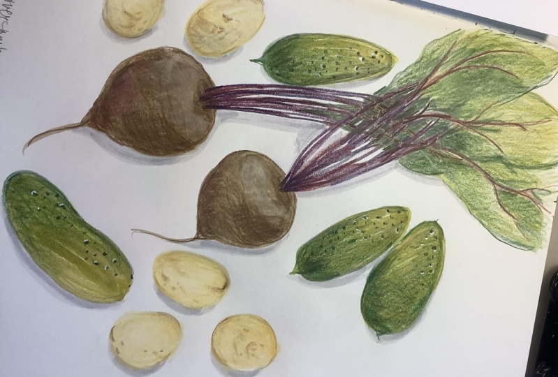
5. Coloured Pencils: In this lesson, we are going to mix and match different dry media together with watercolor to see what we can create. This is going to be a very fun lesson. Let's take a look at the supplies we'll be using for this lesson. We have color pencils, crayons, and watercolor crayons. All this wax pastels are optional, but you do need color pencils in order to create that texture look. Medium has its advantages and disadvantages. So for color pencils, you can use it to draw lines for calorie and you can create a textured look. You can mix different colors together to create an interesting look. So this is something you cannot do with watercolor. And when you use colored pencils and watercolor side-by-side, you get this very interesting contrast of textures. And here I've used graphite as well to draw the lines. Crayons can create textures and they are great for covering larger areas, but they are not as good compared to color pencils when it comes to creating details. Tape is quite blunt for colored pencils and crayons, there are also water-soluble versions. If you want to use your colored pencils to draw lines or to create the texture look, you may not want your pencils to be water-soluble. Colored pencils can also be available with multi colors. These pencils are sometimes called magic pencils. The call is multicolored, so you can create multiple colors while drawing or coloring at the same time. This is quite fun. These are some popular brands fall color pencils and crayons. You can find a lot of reviews for them online. For this lesson, we will be drawing colorful vegetables and fruits. Or this reference photos are available for download. I'll just be using some of them. You can use the rest of the photos for additional practice. Let's draw this first. So I've already picked up the colors that I'll be using. I'm going to start this purple colored pencil and try to draw the stock kinda pencils on watercolor paper can get quite violent easily because of their rough paper texture. So it might be good to in fast in electronic or electric sharpener to help you sharpen those pencils quickly. So here I'm using the color pencils to draw the lines. For the bottom here I will learn to draw with graphite pencil. Or you can choose to use a brown color or dark brown color to draw the bottom. And I always want to draw some put date dose here from this side. And it seems like there are some cucumbers as well. So that's rather cucumbers. That's switch to using a green color to draw the queue, converse, just mix and match different suppliers to see how he's going to turn out. Because sometimes you won't know how it's going to turn out until you prefer, I'll try different supplies for the leaves. I'm going to use the same green color as well. So I'm going to draw the shapes for the leaves. And later on I can color the leaves with what their color. I can see some of the veins for the leaves. Those are purple, so I may want to draw those VMs like this from the photo I can see texture on the cucumbers. So I will one to maybe create those textures using colored pencils. I can see a lot of tiny dots. So that's Frodo's tiny dots. And later we can pin this with yellow. I can also see some brown spots on the door. So I will want to create some texture on the potatoes as well. Alright, let's paint. So I'm going to start by painting the leaves first. We have this yellow wash and maybe mix it with some, the low blue to get the green. So if you have used non-water soluble colored pencils, the lines will remain intact. So that's just paint over the leaves. Some of the leaves we'll be painting with just our watercolor. For example, I can have a leaf here in the background that I did not draw with any pencil outline, I guess do you painted the leaf here? Next, we can use this same green to paint the cucumbers. So it looks like I don't have enough yellow here. Let me just add some yellow, blue and maybe more yellow here to make this more yellow. And we have the potatoes for the bottom. You can use burnt umber or burns Yana. Next, let's paint it us talk. You can see some highlights on the stock, so I will want to leave some white on this talk. I'm using magenta and some ultramarine, but mostly magenta. If your leaves are not drive, this can happen while you're painting, the colors would lend, so wait for your leaves to dry before you paint it. This doc, if you want those sharp ages, That's continue. This is definitely more blue here, so I need more magenta. I actually prefer to look earlier, the one we've just add lines and no water colors. So here I want to trike into, draw a different version just to compare the look. So here I have two variations. So for this, I did not colored stock with what a color. However, for the color mix here, I actually used Hansa yellow medium, and French ultramarine. So the green here is not as vibrant compared to this green here, which is brighter. And here I have yet another version, but this one was drawn with graphite pencil. Note that once you have painted over your lines with watercolor, it's very difficult to add lines on top of the watercolor after that. So you will want to create your line out first before you add watercolor. Right now it's difficult to see what this is because it's just one big shape of similar color. So I want to add some shadows and mix it in areas darker to create the extra contrast. So I can have this def, much darker. And maybe this one as well, just to make certain areas darker and just to separate the leaves. So by adding more colors and more contrast and also some shadow effects, we can make the sketch look more interesting, more dimensional. When it comes to painting, there will be hits and misses. So sometimes the sketch we'll come out and looking exactly as what you envisioned, but sometimes it doesn't come out that rate. So I need to blend this each year to make it softer. Let's see if we can add some brown dots to the potatoes here. Yeah, we are able to do so. And maybe some textures on the site. So I've gone ahead to create another version using pen and ink. With pen and ink, you can actually rely on the line art to provide clarity. So this drawing here will also work even without colors thanks to the line art. Now, I want to add some texture this time using crayons. And a leader, I see it. It's difficult to use colored pencils to add texture back onto the watercolor, but you can use crayons to do so. So these are some of the things that you will discover while you are playing around with your supplies. So for example, we have this cucumber here. I can use crayons to add the texture back. So I'm just jumping all over the place just to test different combination of median. Just to see what works and what doesn't work. When it comes to creating mixed media art, you have to learn through trial and error to find the look and style that you like when it comes to using dry medium. The medium is actually not fixed on the paper, which is to say that if you have your finger on the paper or use eraser. You have the pages together like this. The median may actually come off, may actually go on to the opposite page. So if you want to protect your art, consider using fixative to spray and protect you all art. Before you move on to the next page, there are many brands off executives out there. Just look for the one that is appropriate for the media you use. Next, let's draw this fruit bowl. So I'm going to use this darker green pencil to draw the leaves for this pie apple. So this is a very sketchy sketch and I'm going to use this orange color, or maybe crayon is orange or yellow crayon to draw pi f bulb. Or maybe actually use watercolor. Maybe I should use watercolor. Yeah. Anyway, that's fraud. The banana with graphite pencil. I don't want to draw the banana ours outline with yellow because yellow against white is not, we're not give you good contrast all I'm using graphite in state. So let's draw this. This is actually a lead holder because I don't want to sharpen my pencil. And we have this apple here drawn with this red colored pencil. And for the bowl, I want to draw it with this graphite pencil. So just mix and match whatever color combination are you have. You can think off just to try and see how it looks in. Another thing I wanted to do here is to draw the pectin on pi App Bot with, There's a graphite pencil first. Before I color it. That's painted the pineapple with this warm orange. Let's get the shape right. And for the banana, That's wash our brush and paint it wave of yellow. I notice there are some spots on the banana, so we'll add those spots later because I got into them earlier. I missed him earlier. For the app bot, we have green at the bottom, yellow green mix of blend into this are read at the top here. Make sure the shape is recognizable. Okay, at this point I realize are some thing because I'm looking so far. So this is not dry yet. So if you paint here at the boundary, it's the colors will blend into the pie apple. So I don't want the rate to blend into the pie apples. So I'm going to use is crayon here just to color the boundary, just to see what happened. And he looks good. I always want to color this part here just to blend yellow and their rate catheter, that it works a little early, but not as what I would prefer. That's at some texture to the pineapple. So in this case, I wasn't able to add a texture on top of the watercolor. Wet on wet, you can add texture on top of the watercolor will depend on several factors. For example, the median you are using, the surface of the paper and whether or not the wash is dry or still wet. So this is still wet. Maybe that's why I cannot add is dry media. So I'm going to draw, continue to draw, paint. This pineapple that's have some brown spots on the nana. So it seems like colored pencils work quite well. How about crayon? Let's try Creon, okay, This color is too light, we need something darker. Crayons work as well. This is orange and I'm going to paint bottom of the pineapple. I tried to paint over this orange part here, which was colored with that crayon. But in this case, watercolor doesn't work well on the wax pastel. It, the wax pastel actually repels water. So again, these are the things you can learn while you are practicing on different color or median combination. Next thing I want to try is to help create some texture for the bow here. This is with graphite. Just to see how this looks. It looks kinda weird. Let's give this bowl some thickness. That's straw and the fruit bowl. So this is the one with, to meet those. We have a bowl here at the bottom, and we have the green leaves less used or darker green leaves here. You may also want to shade the leaves. So he stayed all of the line art. Now we have a shape. And this looks, this looks interesting. This may actually look at, we have another one here that's painted tomatoes and make sure that the shape is recognized. The bot make sure it's round shape. And make sure to leave the highlights for the tomato because I got to see some highlights. It looks, I think that looks nice, it looks good. We have another tomato here. Again, make sure that the shape is recognizable. So I'm drawing the boundary first before coloring the shape with the. Now the thing is you have to draw pain faster so that hopes there should be some highlight there. I accidentally left out a highlight. If you want to draw the boundary and then color within, make sure you work fast because if the boundary is dry and you color, you're going to see the outline of the of the line-drawing that you'd draw a layer which is not going to look good. And it's happening right? And now Keirsey is line that I drew earlier. So this is what happens when it dries faster than you can paint. Next, I want to pin this. Again. You can see this line here which does not look good at all. So we have to work like all quite quickly. And this is the other tomato here. Make sure this shape is recognize a bowl. You can actually work on other sketches while waiting for one of your sketches to dry. So here I can see some unsightly outlines. Let's see if I can add some shadows to separate different tomatoes. This color is mixed with the same rate. But we've phthalo green Edit, slight tail green Edit. Don't add too much. Green because green is a very strong color, very powerful bold color. So I'm trying to add the shadows here to see even as coin to improve the drawing and it doesn't seem like it. Anyway, I'm going to use the little green and mix to paint the bull, the shadow side of the bowl. So I was wondering what would happen if I draw the rate outline first before I color. So this is how it looks, but helps it looks better. Next, let's draw this melon with grips. So I'm using three different green colors to draw the leaves. I'm switching between different colors just to create a variation for the leaves and for the stems and the ribs. Draw them liter. So let me use this brown color to draw the branches. And that's how it is branched. Turn like this. Sometimes when you draw a fast, all when you draw, you don't care. Your sketch me actually better. Sometimes we're too stressed out trying to make your sketch look accurate. May turn out to make your sketch look quite. Steve. You know what I mean? That's pinned this melon, we have this wash off new gum, Bosch, and we'll pin the green later on. K we have the greens. I will not color order leaves just to create some variation. So some of the leaves will, because of the sound, we will not be colored. I'm going to use this darker ground to make brunch darker. Let's see if we can add some highlights back to the tomato. What do you use this white crayon here. And it actually works. Not bad. So it seems like mine, Melanie is more yellow than orange, so I want to yeah. Okay. This is the correct color that I want. I wasn't wanted to make this more orange or have stronger contrast against a white because later on I will use the white to draw the seats. So this actually needs to be darker. That's used is green to cover the white. Let's see if we can add seats back with this white crayon and this is dry, but it looks like it doesn't work. So I may have to use white wash. So I'm going to use this thick. You have to use this thick, otherwise it's not going to be opaque enough. So try as many combination of mixed media as you possibly can and try to mix up your style. For example, sometimes use colored pencils to draw that line. Sometimes you can use graphite. Sometimes you can use colored pencils to color the shape. Sometimes you can use watercolor. Just mix and match and see what works for you when you make mistakes, you can refer to your mistakes in the future to avoid making the same mistakes again.
6. Opaque Media: Gouache and Markers: In this lesson, we are going to work with opaque media and these are what we are going to paint it together. These are simple exercises designed to let you see how gouache works and how wash differs from watercolor. Let's look at some opaque media we will be using for this lesson. We have opaque paint and paint markers. For the pains, we have opaque watercolor and this is wash. To use the paint, we can use the same watercolor tubes such as the palette and brush, and we will also need water. The mean difference between watercolor and gouache is washi is meant to be opaque, whereas for watercolor It's meant to be transparent. However, there are selected colors which are opaque when it comes to watercolor. And the transparency or opacity information may or may not be included on the tube. So if you want to buy opaque watercolor, you how to do some research on life first. Some common opaque watercolors are the cadmium colors like cadmium yellow, cadmium orange, or can win rate. I don't know of any opaque blues for what a color. So if you need an opaque blue, I recommend you go with wash. For beginners, I would actually recommend you go with a wash Set, which really includes the primary colors like red, yellow, and blue. And for this particular set, it also has green, black and white. White is actually very important for wash because if we need a lighter color, we can't just add water to wash. It's going to make the paint transparent. So we have to add white to make the color lighter. And we also have black to make the colors darker. This are to wash. It says that I recommend you can either get M Graham goulash or we can send Newton designers quash for opaque markers. I recommend a unique GAR, markers. These are available in many colors. The thing with markers is you cannot mix colors, so you have to get a marker for each color you want. Opaque markers are incredibly convenient. For example, with this sketch, I drew the lines here with the uniport karma occurs. I could have used wash, but with gouache, I would need to squeeze the paint out. I have to prepare the water and use my watercolor brush with markers. I can just uncapped them bunker and started drawing. This sketch was drawn and paint it with pen, ink and water color first. Then I use opaque markers to draw the street lights so that they can overlap the buildings behind this sidebar here was also drawn with or pick markers. And then I use ink again to draw the power lines on top of markers to create this overlapping effect will pick markers are great for adding little details like this because to do the same thing with opaque watercolor or gouache, it's going to be tedious. Each medium has its advantages and disadvantages. With watercolor, we have transparency, we've wash, we have opacity. And with these markers here we have opacity and convenience. Now these are not great for covering large areas. I guess you can buy a chisel tip to cover large areas very quickly, but you will run out of paint or ink very quickly. So for covering larger areas, go with paint. Some subjects are easier to paint with one color and some with gosh. If the subject has a lot of overlapping elements, personally, for me, I feel like it's easier to paint those subjects with wash. For example, with this photo we can see the leaves above the fruit. So if I'm going to pin this with watercolor, I need to leave this area white. First. Painted the orange, then paint the leaf. If you are using wash, you can actually use the same process. Leave this area white first all you can actually painted the whole orange and then paint the leaf on top of the orange. We have watercolor. You can use pencils or pens to create the line drawing first and apply watercolor on top of the line drawing. Wash. You cannot do that because cautious or pig, it's going to cover the lines that you draw, right? Time for some hands on exercise, let me just squeeze out some paint first, some squash on the Padlet that's analyzed this photo first, we are not going to be copying this exactly. We are just using this for inspiration. So we have a yellow green leaves in the background and we have the orange leaves on top. And then we have to darker green leaves on top of the orange to the US, So we have overlapping elements and this is great for painting with wash. And we can see some diagonal lines. We have one diagonal line here, one diagonal line here and here and here, they are all in different angles. And also when we take a look at the leaves, you can see this general shape here. So when we are painting, try not to go outside of this general shape. And also notice how the leaves taper. We have thin, becoming thick here and it becomes thin again here. Let's start by drawing the stock or the branch first. And to do that, I want to mix a green. I went to mix a dark green. I'm going to draw those diagonal lines first. So I have one diagonal line coming in this direction, and I have another diagonal line coming in this direction. And now we can draw the leaves. So for this color that you see here are added more yellow. Make sure the leave is tapered from a sharp point. You are becoming a thicker and to a sharp point. And this should actually come out at an angle. My angle is actually a bit of a should actually be like this. So let's try. I'm painting the leaves properly, starting from a sharp point, coming out at an angle. This is about 45 degrees compared to this line here. Sharp pointed at an angle, and then taper to a sharp point a again. So just continue to paint your leaves and make sure that the tapering at occur direct action shed their leaves are coming out at the correct angle and tapering at the correct direction. Oops, this is too big for this painting. I'm going to paint right up to the age of the page. So when you have your painting go out of the pitch like this, it's going to make your subject look beaker. It's important to wait for your first layer to dry completely before you paint the second layer, because quash will actually reactivate with water more easily compared to water color. So if still wet and you pin the second layer, you may actually move the colors from your first layer. If you don't want to move the colors from this firstly year, you can actually spray sound fixative, but that would mean you have to do more work because each time you paint a layer, you have to spray fixative paint again, spray paint again, spray. Next we are going to paint the orange leaves. So we'll need to mix an orange with yellow and red. The amount of water that you use is very important. Then in this case, we need to use more paint and water. If you use more water, the paint is going to look transparent. And when you are painting over the green leaves, those green leaves are going to show through. That's paint, the stock or the branch first. And that's happened at this angle, right this time, I wanted to make sure I paint in this answer correct angles. So I'm going to tap that this at 45 degrees. And notice this is almost opaque, but not a 100 percent opaque. If you need this to be even more pig, just add more white to it. The thing is wash. We'll never be a 100 percent opaque. If you want a 100 percent opacity, you can consider acrylic wash, but those accurate garage I want difficult to handle because when acrylic dries on your brush, you can make your brush quite steep. So you have to take care of your brush. Otherwise, you have to replace your brush very often, but with quash and what color? It's easier on the brush. So here you can see the red covers the green behind, almost colors the green behind. So just continue to paint over the green leaves that you have already painted. And remember to taper your strokes. If your brush is too dry at somewhat, just to make the shape of the leaf recognizable. And for this, I want to have to leave, go out of the page as well. Next, we'll paint the darker green leaves on top of this. So I'm going to place the brunch or the stock here closer to the center so that I can cover the rate as well. So this is going to be much darker. And this will go quite close to the h of the page because I want to crop off the leaf over there. So once again, let's paint the leaves at the top at the correct angle. If your leaves are not dark enough, you may have to add some black, but don't add too much black. Or you can choose to add red to your green just to make it darker. Depending on the green you have and also the rail you use, you may be able to get the green to look darker. I just realized I should have made the stem wash more yellow. Leaves that I pinned at first, this leaves here more yellow because right now, the contrast for this darker leaves against these leaves here, the contrast is not good. So I may want to fix this later on. Since this is what I have, I'm just going to work with this first. So that's this big leaf overlapping the red leaves. Make sure the leaves are dry first. Even though I painted the green on top of that, you can still see the leaves beneath showing through. So this is a case of mean not using enough paint. What the color becomes lighter when it's dry and guage becomes darker when it's dry, That's something to take note off. So the contrast from the leaves here and it's darker leaves, It's not that strong. So what I wanted to do is maybe introduce another layer of leaves on top of this just to see how it looks. It may turn out looking good. It may turn out to be a disaster. The process of making art is very fluid. Sometimes it may go as you plan, but sometimes it may not. Anyway, we are painting in a sketchbook. It's a place for you to have fun, is a place for you to try out things so we don't have to be too stressed out. So I'm going to paint this run inch here on top. And I'm going to paint it to the leaves. So now we have light over the darker colors. This is nice. Sometimes we want to have dark Harlow's over lighter colors. Sometimes we won lighter colors over darker colors. It is this play off, light and shadow, light and dark that makes your drawing. That makes your art look interesting. If you feel like your yellow is not big enough. Just add more paint or add more white. This is the covering strength of quash. It's not 100 percent opaque, as mentioned earlier. If you really want Opacity, go with accurate wash. So this is the limitation of wash. And also remember not to use too much water. Otherwise it's going to reactivate the paint from the earlier, from the layers beneath. I may have used too much water here, so the darker green leaves are showing through the yellow. This does not look nice because this shape here has not recognize the bowl. So I will have to paint over this yellow leaf again. Let me go over the leaf a second time. This is of course, double the work. So this looks so much better than num with the yellow almost completely covering all the other colors beneath. That's half-mile practice with quash. Remember the fish that we painted earlier with watercolor? Let's paint the same fish again this time with wash. So I'm just going to draw the shape of the fish like this. Just draw different ships for your fish. And this one would be read. Make sure that ages us all live. So once you have drawn your fish, make sure they are dry before you paint the patents, make sure you are using opaque paint. So this fish, we have read over the yellow. The fins are read. And for this we have yellow over raid, just mixture. The yellow is in. Use. A lot of pain. Use some white. If the yellow is not opaque enough. Light green for these two. I'll need to add more white. And for this my meals, I want to add the white, therefore the eyes. And that's more interesting designs. You can also use opaque markers to draw the designs if you want to. So this opaque marker does not look 100 percent opaque. So I have to wait for this to dry and paint over again. You can mix and match, wash with water color, with opaque markers. I had a lot of fun painting these two sketches. So this is how gouache works. This is how wash behaviors. You can use the reference photos that I have provided in the previous lessons to get more practice.
7. Final Project: It's the final project for this costs, we are going to draw and paint this coral reef seen with mixed media, pen, ink, watercolor, wash markers, and some colored pencils. Before we draw and paint, Let's do some research on coral reefs. So it can go online, go to Google, or go to Pinterest and do a search on cornrows are coral reefs. So these are some of the photos I found. And at a glance I can see the colors are really vibrant. So later we will be using our most vibrant colors to draw and paint this. So some of the designs are really interesting, such as this one here with this branching net work. So we'll try to replicate this later on. There are some fish and sea creatures as well. You can choose to include them or you can choose to leave them out. It's up to you. So here we have this blend of colors. And you can see within the colored shapes, there are pockets of colors. So maybe we can draw something like this later on with a huge wash of color and there's little using opaque paint. So while you are looking at all these reference photos are thinking of how you can replicate them. Later. You can get a lot of ideas just by looking at this. And this looks like a brain like design. This is not easy to draw because all these lines that you see, they don't actually overlap one in there. So while you're drawing, you have to keep that in mind. This is another branch like structure, but this is in yellow. And notice this is quite thick, whereas for this, it's thick. For the mean stem and becomes really thin. And here we have little dots of colors at the XD, we're coral plates, I call them plates. So these are actually not easy to draw because of the shape. So we can actually simplify this into or so-called later on. And notice some of these corals, you have this stem and at the edge of the stem that color is different. In this case, the colors different due to lighting. But some of these corals actually do have a different color at the age of the tip. The tools we'll be using for this exercise would be colored ink pens, watercolor, wash, Posca markers, and colored pencils. All right, Let's flip to a new page in our sketchbook. So far, the corals, we are going to attend it between ships of colors and line art drawn by pens. And we are going to have overlapping shapes. Okay, so let's start by drawing something on the pitch. So for this, I'm going to draw an outline with this pen, and I'm going to pin this with solid colors and add dots of colors on this reef. Next, I wanted to draw a smaller Caro's like this with a different color. So you can design a cornrows however you want. And that's pin, this, make this color solid because we'll be painting a lighter color on top of this later on. And you can blend your colors while your wash is still wet, you can blend it to any color you want. So I started with this orange and I have this column blend to read. Just use a solid color, a color that is very bold, very striking mix That's draw some designs on the smaller coral. Try to use analogous colors. So for example, if you use orange to draw the lines, you can use yellow, orange, or red to draw the design. Or you may want to switch to a complimentary color, maybe try blue, for example, if you have used orange. Next, I want to use this to draw more corals here. So you can have what a color in one area. The line illustration. In Azure. And you can draw the lines while you're waiting for the watercolor to dry. So you can work on different pages, sorry, different areas of your page while waiting for your colors to dry. With the earlier design, we went with parallel lines. So now I want to have this design which looks different compared to the earlier one. Minus that seem to come out from the center. And while you're painting, I tried to be careful. There's lies are not meant to overlap. So now we have some variation. We have a big shape versus small shape. We have a solid shape versus a ship that has white. So next I want to have a solid shape it Qin, this one, I will make it big. That's have concentric circles. And let's draw some lines. So I'm going to have the lines coming from maybe the center here. To make sure the lines are at the right angle. You can actually split your design like this and do half and half so that it can get the angles right. And just continue to fill in the line. Make it the lines close together, make them as close together as possible without touching one another. So this is going to take some time to draw. I'm also going to work on this inner circle here. Next, I'm going to use watercolor to draw additional lines. So these lines that are drawn with watercolor, thicker compared to the line is drawn with ink. And again, I want to make sure the lines don't touch each other. Almost done. This designs were drawn with lines. For the next design, I want to have a solid shape. I'm going to use this pill light blue pencil to draw this circular shape here to mock out the outline. The color is very light, so you won't be able to see it unless you are really looking for it. For this, I'm going to use the little green and phthalo blue. So I'm going to draw this shape, or actually serveral shapes. So I'm using the outline that I drew earlier with pencils to help me get this move. Circular design. So let me just create this shape. This irregular shape. Makes sure the shape is connected to the bought them because the ship has to come out from somewhere. Make sure there are white gaps. So I've just run this weird shape. Let me just use this. That's how this much thicker and the bottom. Be careful when you are painting near the, that are corals. I've added some phthalo blue to you that they look green. And this part here, I'm going to make it real the thin. So we have thick, thin. And now I want to thin here. This is what we have for this shape. So you can see this ship is recognizable as a circular shape. But within this shape you have irregular lines. This mix, this shape looking. Next, maybe we can have Psalm, see we coming out. I'm trying to visualize how it's going to look. You can draw whatever design that comes to your mind. And that really is the fun thing about this exercise. So I'm going to have overlapping C. We, sometimes I start drawing from the bottom and sometimes I started from the top just to have some shapes that are different from what we already have. So some of these lines are going to be thicker and some will be much thinner. Maybe some can be more blue, more yellow. Next, I want to draw some really small corals here with the branch structure. So I have a feel circles drawn with the same pencil earlier. You won't be able to see the lines. And those lines will help you get this shape. So just draw the branching structure to the H off this call so that you can see this very obvious circular shape. Taking your time. There's no rush. Just make sure the branches are coming out at the correct angle. So we have one there and let's draw the other one. By correct angle. I mean the lunch not come out perpendicular to the allele aligned. It should always come out at an angle like this, smith and go. So we have three smoke Horos here with circular shapes. Next, I want smoke Horos with a street, which I almost wanted to use a blue pen earlier, but I realize this is blue as well, so I've switched over to a green pen. So in this coral will also have a branching structure. But for this car roll, the design will look like this. It's like a cup. So instead of their circular shape, now we have this shape is design. At the anode, the line, somebody to have this little circle of color. This would probably look better if the lines were to go up to the h. So you can see here I have some lines that n here. There's these coral there I saw earlier with this web like design. So I'm going to try and draw that with colored pencils. So now we have a text chaired. Dear. So that's all this web like design. The thing is if you draw it like this, use the, the shapes are, they overlap so the design is actually not clear. It would be great if you can separate your design. But it really depends on the design you have. So if you have lines mixed with lines, it's continually look like this. The shape is not going to be clear. Okay. I think I shall just leave it as it is. So this is now drying. Let's paint some dots. I'm deciding between white or yellow. Let me just go with yellow. This is where you have to use a thicker paint. Otherwise the yellow is not going to show up well. Against the rate. Orange. If you have a light-colored then you should go with a darker color. If you have a strong color, then you should go with a lighter color so they can create contrast. So this young low against orange doesn't look that great, but helps actually have when wave wide. And we, I've just added some white to the yellow to make the paint more opaque. You have to use opaque paint here. If you use transparent, what a color? Yellow. Yellow is not going to show up at all because it's transparent. So just work slowly. On your coral. My dots are not perfectly circular. The other way you can do to create this dots is to use the Posca markers. It may be you may actually be Foster. I'm not sure if this looks nice. Let me try a lighter rate but with darker dots. Luckily, I still have some space here, so let me just draw some coral to fill this up. And this will be painted with a very light wash of orange or red. And when this is dry later on we are going to paint darker dots, solid red dots on this. I went to draw a branch like structure here as well. One of this things, but thicker lines and I'm going to use an orange. I'm going to use my pencil again to mock out the shape. And I'm going to have the branch structure on top of the blue, because the branch structure, we will have a lot of lines. If I have a lot of lines on top of a lot of lines, it's not going to look that good. So I'm going to have it on top of the blue. I'm going to draw a very light pencil marking here. Just a small one will do. And now I can use is opaque orange mixed with yellow and red to paint that structure. I don't want to cover the white, almost did. So this is not a 100 percent opaque. If you want to make it more Pitt, you may have to add white. If you add more white, the color will be more washed out. So you have to add more color. If you want a vibrant orange, you may have to buy a vibrant orange in the first place. Because sometimes when it comes to mixing colors, the colors you mix may not be as vibrant compared to a single pigment paint. This orange is not as right as I want it to be. It's not as vibrant as I want it to be. So maybe later I may want to paint another layer on top of this. That's work with what we have here. So if the paint is thicker, it looks more opaque. So maybe I can just make the paint thicker. This orange is not as vibrant as I expected, so I'm going to go in with a second layer with yellow. There should provide better contrast against the blue packet grow. And because this is correcting the mistake, and by painting over the lines, you have to be very careful. Okay. Thank you. It looks lightly with the yellow contrast. I'm not sure if that looks good, but I'm going to leave it as it is. Keep correcting this. It's probably going to look worse. Next I want to draw the dots on this light wash is, looks good because the contrast is good. We have for a fire, burnt, recognizable rate thoughts. A Qin's a light wash. I'm using Posca markers is very convenient. Imagine doing the same with a watercolor brush. So use the right tool for the right job. Let me add some yellow seaweed on top of the green. This is not completely opaque. I like this extra color and mix. This looks more interesting. Maybe I have one yellow that is behind, and some yellow. It'll be a birth. This will go behind his green here and go on top of this green here. So sometimes the yellow is behind, sometimes it's in front. I didn't really use colored pencils for this sketch. The only area where I used colored pencils is this area here. So maybe you can use colored pencils to draw the lines for the corals instead of using ink. I had a lot of fun painting this and coming up with the designs. This is a fantastic exercise for developing your creativity as well. To get more practice, you can switch up your media. So here I've used mostly watercolor. So instead of one color, maybe you can use ink with wash. Or I can use opaque markers with wash or opaque markers with watercolor. So just mix and match and see what type of outlook and effect you can create.
8. End: So thanks for joining this course. I hope you had fun. I hope you enjoy learning about the characteristics of each medium. So when it comes to creating mixed media art, it's really about experimentation because there are countless ways you can mix and match different tools and supplies. And you wouldn't know how well each tool and supply will walk together until you have tried it yourself and he wouldn't know whether or not you'd like to look at the effect until you have seen it foil self. And oftentimes there will be a lot of pleasant surprises. And also with this experimentation and exploration, you will also learn more about those twos and supplies. So before you go, do live this cause a review so they can help me and other students to find all red and on-disk causes any good. And do let me know which I a favorite lessons or which i, our favorite combination of tools and supplies that you use to create art. Thanks for watching. See you guys in the next costs where we will continue to fill a sketchbook.
 Teoh Yi Chie, Sketcher, watercolour lover