Transcripts
1. Intro: Hello, my name is T0 and I'm
an artist, graphic designer, and urban sketcher who enjoy
sketching on location. Welcome to this course on
sketching panel Rama's. Since this course is actually one of many courses
I have created in the urban sketching
series and its causes for intermediate artists who already know the basics of drawing. So if you are a beginner, I highly recommend you
check out the beginner causes first because
in this course, we're going to jump
straight into drawing. I'll talk about how
you can drop out your scene to make sure
everything fits on your page. How to compose the scene, how to think about perspective, how to draw what you
see, how to add details, and also how to paint the sketch that you
have just drawn. This is a very
hands-on course and reference photos are
provided to download those photos and practice
along with me because the best way to learn
drawing is to draw. And after you have
completed your sketches, to upload them so that
I can have a look and give you some critics
on how you can improve. Alright, let's jump
into the first lesson.
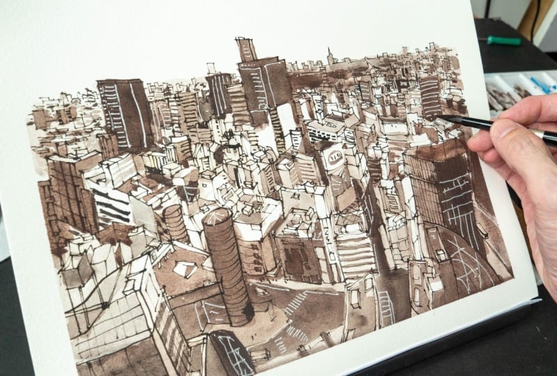
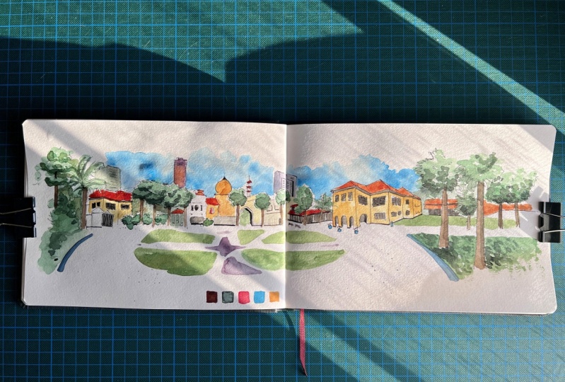
2. What's a panorama?: In this lesson, we are going to talk about
what makes us seem panoramic or what makes the
scene a panel Rama's sin. If you go with the meaning
from a dictionary, panorama means an unbroken view of the whole region
surrounding an observer. Or it can also mean a picture or photograph containing
a wide view. But how y is y? So let's take a
look at this sketch that I have here of
Singapore reverb. Is this considered a panel? Ram make sin. It sure. Looks like it. As long as
it looks white to you. It can be a panoramic
scene or a panorama. This scene is
actually much wider because I drew this on
an accordion sketchbook. The fun thing about using
an accordion sketchbook is you can draw
on and on and on. And when you reach
the end of the pitch, you will automatically
have panoramic scene. So this is how this
reversing holey ears. It can actually be wider, but I ran out of paper. But as you can see, this
schedule is already quite wide. And when you have a
panoramic scene like this, it can look very impressive, especially if you have drawn
it with lots of details. This cash was actually
drawn without much details because
if I were to draw all the details such as the windows from the shop
houses and tall buildings. This sketch is going to take
me way longer to complete. And when it comes to
sketching a panel remixing, it's going to take
more time to draw because there are
more things to draw, because you are
drawing widest thing. You have to add more details. Otherwise, your sketch,
me feel finished. This sketch is actually quite manageable
bone in the sense that height of the page
is actually quite short. If the page is taller, it would mean I have to draw more details and that
would take even more time. So if you want to buy an
accordion sketchbook, maybe start with one that
is on the smaller side, so that you can practice and get comfortable with drawing
such white scenes before you move on to drawing on larger or longer
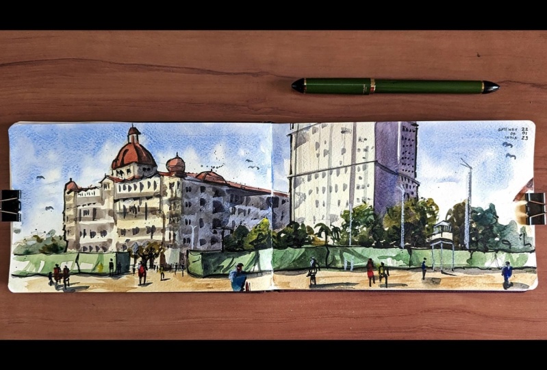
accordion sketch books. Here's another panoramic sketch. This one is of
Chinatown in Singapore. And this is a street scene
which is quite challenging to draw because there are so
many moving human figures. Because the height of
the page is taller, I have to draw more
details and this took me a very long time to draw
all the panoramic sketches. Take a very long time to draw. So let's take a
look at this in I wanted to capture the busy-ness of this particular street, as well as the stores that
are along the street. And I also wanted to
capture the tourists. You can draw a panel Rama on an A5 size sketchbook as well. So this is a scene
in Hanoi, Vietnam. And there is one
vanishing point here. So all the diagonal lines will
go to the vanishing point. This is considered a white seen, so it looks quite
enough for me to consider this as panoramic seen. This looks slightly
panel ramming to me. So this was drawn on location
in Hanoi and Vietnam. I remember I was standing beside a convenience store hiding under the shelter
from the drizzle. As were most sketches
drawn on location, you don't actually need
to know perspective. To draw. You have to rely
on your observation skills. But knowing perspective can help you draw more accurately. Draw faster. This is impulse
Cathedral in London. And I drew this really quickly because I didn't have time. Before you start on a panel. Make sure you have enough time because if you don't have time, you may not be able to complete the whole sketch and it
can look unfinished. Or you can draw a portion
of the sketch and come back again to draw the
same scene on another D. Or you can draw
something else and turn the panoramic sketch
into a collage. This is Trafalgar
Square in London. As you can see, I'm limited
by the size of the pitch. If this sketchbook is wider, I could have drawn
the right side of this building as well. Here's another sketch
along Singapore river, and this looks like
a panoramic scene. So I chose to end breach here instead of drawing
the whole bridge because. I can let the viewer CDs
part and the viewer will be able to know how to
bridge looks here as well, so you don't have to
draw the whole thing. Let's take a look at this sin, which is drawn at Marina basins. So this is a white seen. But again, I'm limited by
the width of the page. If this page is wider, I can actually continue
to draw on and on. This looks like a
panel remixing to me. This scene has two vanishing
points. There is one here. If you look at where the
diagonal lines are going, there is one here actually
it's outside of the pitch. And their reason, their
vanishing point somewhere here. So this scene has
two vanishing point. If you've seen has
two vanishing point, chances are it's going
to look panel roaming because moles scenes usually just have one vanishing point. This is a sketch inside a cafe. There is one version point
here and another one here. If you look at the diagonal
lines pointing this site. So there's one
here and one year. So this scene looks
panel ramming enough. Let's look at some examples
from other artists. So this book is the urban
sketching handbook, panoramas and vertical vistas, techniques for drawing
on-location from unexpected perspectives. So here we have two
panoramic sketches. This one was drawn by the pan. This is just a line art, but it's quite impressive. Titles to the amount of
DTUs capture in this scene. There are two vanishing
points in this scene, one here and one. This is a panel Rama's
sketch as well. And it's also a collage. So you can mix panoramas with collages to create
an illustration. This was also drawn
at Marina Bay sense, and this is the same thing
that I drew earlier, but I only drew this portion because my schedule
is the white. So you can see this art,
Here's material in Harris. He drew the whole thing. This is two times the width of the sketch that
I drew earlier. This was drawn in
black and white. It is possible to
draw panel Rama's seen this with an
AFI sketchbook. You just don't use
the full height. You draw on half of the pitch like this and you
have another sketch below. That's how you draw
panorama sketches on a schedule that
is not that white. This was drawn by a
rough sketch of men. This is Hong Kong CT. And as you can see, there are
so many details captured. This is almost black and white except for the blue
for the harbor. We have more line art. These two sketches are
by my Ru Guo does. These two sketches
are scaled down to fit inside this small book, so they look quite small here, but the original art is huge. It's 70 cm by 32 cm. And just for
comparison purposes, the height of this
book is 20 cm. So these sketches are 1.5
times the height of this book. So these are actually huge. And if you can look
at them in person, you can look at the original. It's really impressive. Before I end this lesson, I want to give you a quick
tip on how you can make your scene or your
sketch look panoramic. So when you're drawing
more location, usually there is just gonna be one vanishing point on your
pitch or in your scene. So e.g. here, I'm going to place the vanishing point here. And I'm just going to draw
a very simple building. And the other vanishing point, the one that's on the left side will be
outside of the pitch. So if you want to make
this look, panoramic, images, find some way to two vanishing points
in the scene. On the page. This is the same building
that I drew a few seconds, let go, but here I've drawn it smaller so that I can fit
two vanishing points. So this is the right
vanishing point and this is the one
on the left side. So by having two
vanishing points here, I can draw another
building here. And neither building here. And this line will
go down to this VP. And I can draw another
building here. Islamic go to the VP
and this line will go to another vanishing
point on the right side. So now I can add
some trees behind, maybe add more
buildings behind that are affected by the
vanishing point. So this is a very quick and
easy way to make your scene look panoramic to ensure that you're seeing
is a panorama. Just have two vanishing
points in your scene. One here and one here. And usually the vanishing
points will be quite close to the edge of the pitch Unless
you have a really wide page. Or if you're using an accordion sketchbook,
in which case, the vanishing points
may be somewhere within the lung pitch. But here I have the vanishing
points are here and here. So now this scene, after
adding the details will look like a panel, Rama scene. Panel Rasmussen has
to look white enough. And usually if there is just one vanishing
point in the scene, the scene usually
isn't wide enough. Right? In the next lesson, we will talk about planning and the thought process
before we draw.
3. Planning your sketch: In this lesson, we
will talk about planning and thought process v4, we draw panel Rama scene. The first thing is
to make sure you have allocated enough
time for the sketch, because panel Romer seen usually takes more
time to sketch. So make sure you have time
to complete your sketch. Otherwise you may have
to come back again to draw the scene some day. So time management is important. Growing a panel Rama CAN
usually involves growing more details compared to
typical street scene. So make sure you
have enough ink in your fountain pen
before you hit out. If you want to, you can bring additional backup
pens just in case. So I use a fountain pen before I sketch a
panel Rama scene, I will make sure to feel the
pen completely with ink. And for beginners, I recommend you start with black
and white sketches. Because if you want
to add colors, that's going to take
even more time. So make sure you
have enough ink. Point number three
is composition. So if your sketch
book looks like this, I recommend you plan your composition
with a pencil first. Planning your composition
first with pencil will allow you to identify mistakes. And if you make any
mistakes at this stage, you can erase the pencil lines. Sometimes you may not even
need to erase the pencil. Ink composition will
make it personalized, so challenging that fetus, less intimidating to draw. So spend some time to use
your pencil to just block out the general
composition of the scene. This will help you a lot. Drafting the
composition first with pencil will also make
a challenging sin, less intimidating to draw. If you find that during the composition
drafting stitch that your sketchbook is
not white enough. You don't actually have to
use the hello two pages. You can actually use
half of the sketchbook. So just use the top half of this sketch book first and
create your panoramas. Get. And you can use the bottom half of the
sketchbook for another scene. This will allow you to draw two scenes on these two pages. So we can use half
of the sketchbook, the top and bottom half of the sketchbook to
create a wider seen. The last tip is to find
the vanishing points. As mentioned in the
earlier lesson. If you can fit two
VPs in your scene, chances are that scene is
going to loop panoramic. So e.g. when you have
two VPs in your scene, you can draw the diagonal
lines to the vanishing points. And this will help you draw more accurately and faster as well. Do not that Eve, there are really tall
buildings in the scene. You are probably not
going to be able to fit those tall buildings in
and it's okay to crop out. Those are tall buildings. Alright? You don't have to
include everything. If you include the
tall buildings. If you want to include
the tall buildings, it would mean you will have to draw the shorter buildings, much smaller so they can
feed the tall buildings. And that's where planning your composition
will really help. You find that the buildings are too small to buildings
in the foreground too small. You have to draw them beaker. And the tall buildings
will have to be taller and they are likely
to go out of the page. And that's fine because
you want to make the buildings in the
foreground look bigger. If you draw the buildings
in the foreground to small data is going to
be a lot of empty space. So, yeah, we are planning
with pencils first. Before you ink and paint. For this really quick sketch, you can see the tall
buildings are cropped off. It is not possible
to draw everything. Anyway when you are drawing
or a typical sketch, you will also have to crop out the left and right
edges of your scene. Let's recap the five tips. Make sure you have
enough time to complete your panorama sketch. Make sure there's enough ink
in your pen for the sketch. Dropped out the composition with pencil first to make
sure you can fit your subject in the scene and your subject is not
too big or too small. If your sketchbook or your
paper is not that wide, you can use half of the sketchbook or half
of the paper to create a wider scene and find the vanishing points first
before you start sketching. You don't have to
know perspective to sketch a panorama sin, but knowing perspective
can help a lot. Learning perspective
can help you sketch faster and
more accurately. In the next lesson, we will
talk about the tools and supplies we will be
using in this course.
4. Tools and supplies: In this lesson, we will
look at the tools and supplies you can use to
create panoramas, sketches. For my sketches, I use
pen, ink and watercolor. So while the ink, it has to be waterproof
when dry so that I can apply watercolor
on top of the lines. For watercolor paper,
you can either use watercolor sketchbooks
or watercolor paper pad. And sometimes I may also
use Posca markers are opaque markers to add DTUs
on top of the sketch. There are actually a
sketch books designed for creating panoramas,
sketches or paintings. And these sketchbooks are
called a codon sketchbooks. So they have this
very long pitch. Sometimes they are
paste it together, sometimes it's just a
very long piece of paper. And if you want to
use watercolor, makes sure the paper
is watercolor paper. Sometimes you can draw on both sides for this sketch book to pivot qualities
and that great. So I'm only using
this single site. This will allow you to draw
a panorama seen very easily. And they come, this sketch
books come in different sizes. This is a small one which
I would recommend for beginners who are starting
out with panoramas, sketches. If you view like you
are up for a challenge. You can go with larger
accordion sketchbooks. Sketching in a
sketchbook like this will take a lot of time. So as mentioned earlier, do prepare time for creating and completing
your sketch for beginners, I would actually
recommend you go with normal A5 size
landscape sketchbook, because a sketch book will have many pages and this will
give you a lot of practice. Whereas for accordion,
sketchbook slide, this is just very long pitch. It is possible to draw sub role panel Rama's
sketches, e.g. with this sketch book, because the pitches so
long you can actually draw three separate or two
separate panorama sketches. But with typical
sketch book like this, you get more pitches
to practice. And A5 size sketchbook, when open UP is
actually what enough for Panorama sketch,
portrait format. Sketch books can be used to
sketches by my daughter. If you want to draw
a panorama sketch in a portrait format sketchbook, just use half the pitch and you can draw two scenes on a spread. You can also use
watercolor paper pads to create panel Rama
sketches of paintings. The format for this
watercolor paper pad is not ideal for
panel Rama's scenes. So again, you can use half of paper before you
sketch or painting. You may want to cut the paper, or you can just have two scenes on the
same piece of paper. There are actually watercolor
paper pests that are designed for panel Rama,
sketches and paintings. So if you don't want to
cut or if you just want to draw a single scene on a
single piece of paper, go for those people pass
that are ultra wide. In the next lesson, we will draw our first
panel rough sketch.
5. Project 1: Screen scene panorama: Welcome back. In this lesson, we are finally
going to draw some thing. And this is the reference photo we will be using which you can download if you want to follow along
with this lesson. So this photo was taken at the Mandalay Heritage
Center here in Singapore. And it's actually
a raw photo stitch together to form one sin the aspect ratio for
this photo looks like six units or seven
units by one unit. So this is definitely
a panel Rama sin. There is one vanishing point on the left side for this building. Another vanishing point
here on the right side. So the main subject
is this building. So this has to be
included in the sketch. When you draft out your
composition with pencils, you have to place this in the
sketch and everything else, the trees, the other
buildings will be in proportion to this
building here. If I'm drawing this on occasion, I will be seated while at
the same place where I took the photos so that
I can draw this host. Now this scene may be too
wide for certain sketchbooks, so you may have to crop off
the left or the right side. If a crop of this site, e.g. it may suggest that the trees
are going to go on and on, but there is actually
a building here. But that's the
compromise you have to make when it comes to
sketching, panel Romancing, or any sketch or
any scene because you want to be able to include everything you want to draw. Another option is to crop
off the right side here. Instead of drawing two trees, you can draw one tree. And this still looks alright. And if your schedule
is not that what you may choose to draw this, I would include this
tall building in the background just
as a reference for comparing the height of this versus the
main building here. But if you crop up this site, you won't be able to draw or see this circular design in front. So there are many
things to think about before you
start sketching. The main thing to
think about is, what do you want to
include in your sketch? It is possible to
sketch a panorama seen in an A5 size sketchbook. However, if the senior
want to draw as to why, such as the one we saw earlier, it's going to be quite
challenging to fit that onto the pages of the
A5 size schedule. Because when I open this up, the aspect ratio looks
like a three-to-one to me. And a scene we saw
earlier is six by one. So if you want to use
an A5 size sketchbook, you may have to draw with the top half
of the sketch book. So for this lesson, I will be using
watercolor paper pad. Instead. I have medium-size
one and a large one. This is A4 size around A4 size. This is A3 size. And I am going to divide the
paper into three pieces, three areas, so that I can
get is our trial y sin. If you feel like after
dividing the paper, the space, that area, it looks too small for you. You can go with a
larger piece of paper. Just do the same thing, divide this into
three equal portions. So for me, I think
I would probably go with this larger paper because after dividing
this into three portions, I can still get a good amount
of space to work with. So this is just
gonna be practice. Don't worry about wasting paper because if you have one
big sheet of paper, you get three smaller pieces of paper after cutting them up. For practice, the height
of this paper is 30 cm, so I have divided the paper
into 1,010.10 cm each. So let me just use this light blue pencil
to draw a line cross. We also want to paste this tip here to protect the
bottom half of the paper. If the tibia is too sticky, you can run it on your
quotes a few times so that it's not so
sticky so that when you tear this off later on, it will not tear off the paper. This is just an optional step. The aspect ratio for this area is actually
still not white enough. This looks like or by one to me. But this will do. If you want to fit everything you want
to draw in the scene, just draw them slightly smaller so that they
can fit onto the pitch. Alright, so that's dropped out the composition,
as mentioned earlier, the main subject is the
building on the right side, so we will need to fit
that in my drawing. You have to rely on your
observation skills. So I'm going to place this here. I may want to place it down. Further up. No, I'm going to place
it somewhere here. Alright. I think it's alright. Okay, So just dropped out the
shape of the main building. Paying attention to where
the vanishing point is 0, which is actually on
the very far left. Your perspective does not
have to be exactly accurate, but it has to look
convincing enough. Sometimes when drawing. It's really about having fun so you don't have to worry
too much about perspective, but makes sure that everything that he wanted to
draw can fit on the page. So here I have the site for another front-facing
more sidewalk here. And we have a tree here
and not a tree here. More trees in the background. Okay? We have the horizon line
which is somewhere here. You may want to draw
the horizon line. So after you have drawn
the main building, you can use that as a
measurement tool to draw or please other elements. So from what I can see, this building, the
width of this building. If I move it to the
left side by one unit, this is where the trees will be. There is another
group of trees here, which I'll just block out with this rectangular or
trapezium shape. And we have, we have the building here or
it looks like we will be able to feel this scene to this aspect ratio,
which is nice. If you're not confident with the perspective for
the building here, you can draw some lines to
mark out the perspective. So in this case, you have to draw this building in relation. The size should be in relation
to the main building. And from what I can see, it's actually quite short
because this building is the way which you
draw the perspective. Now one good thing about
being able to see your scene, your whole scene at a glance, as you can tell, the size, proportion, gauge the size
and proportion at a glance. If you're drawing
this scene with an accordion
sketchbook and you're drawing from the
left to the right because you are right
handed in one your ink, your hand to smudge, show smear the ink. If you draw from left to
right and you are not good at maintaining
the consistent sizing. So you may draw bigger and bigger and bigger
and bigger as you reach the right side and you will not have enough space to draw this building because this building is going
to be too big later on. So it's good to have some
pencils at the start, regardless of whether you are
drawing in a sketch book, on the paper pad or in an
accordion sketchbook, right? Next thing I want
to do is to draw that very tall building
in the background. And we can mark out
some trees here. You can use important
elements in the scene to to help you find out
where you are in the skin. So there's one tree here, another one here, one here. There is a mosque
in the background. It looks like there
is tall. Oh, okay. Seems like this area is
going to be much shorter. So let me just try and draw this area because
area big shot there. Yeah. So just use the penciling stage,
the composition stitch, or the planning
stage to identify problems that may
arise later on, because later when
you're drawing with ink and you make mistakes, you won't be able to
correct those mistakes. So here it seems that
I may have placed on Rhonda trees to talk in
relation to the main building. So later when I draw, I have to remember to draw
them shorter so that they can feed and so that all
the other elements can fit. Okay, So this, the composition looks
fine to me right now, so we can start drawing. There is good amount of empty space at the
top and bought them, which is nice because it makes the sketch
view more spacious. Or if you want to, you can draw to the h
of the pitch as well, to the h of the area as well.
6. Project 1: Inking: Now we will draw with ink
if you are not confident of the composition or if you're not convinced
them that you can fit everything on
to this area here. Draw the main subject
first, draw the mean, subtract, make sure that there is enough space for
the main subject. There is enough empty space
at the top and bottom so that this sketch does
not view that cramp. Draw them in subject first
and expand out from there. Because as I mentioned earlier, if you draw from
the left to right, if you're not good
at maintaining the consistency of your
proportion and size. The drawings later
on, me, sorry, at the end of the sketch here, the subjects may be bigger or smaller than you
expected, right? So let's draw and make sure you have enough ink in your pen because drawing a panel Rama
sketch uses up a lot of ink. I've just switched to
different fountain pen from the one that I was
using a few seconds ago. Because this one can
draw thicker lines, which are going to be easier
for my camera to capture, for you to see. So let's drop. Even draw toes slowly. Sometimes your lines
can look too rigid. So it really depends on how comfortable you are and how familiar you are with drawing. So for me I'm just
going to draw a bit faster because I like
the sketchy look. And don't worry about getting the proportion right or all. Just enjoy the drawing process. If you make any mistakes, those mistakes will just be learning part of the
learning process. So I made a mistake here. The roof should be should be at an angle
that is not this deep. Yep. So try to focus while
you're drawing. Sometimes it's difficult
for me to talk and at the same time, hey, let's draw this roof at
the correct angle this time. So if you make a mistake
on paper with ink, it's gonna be difficult
to correct that mistake. Need a line here. It's a bit off. Maybe I can you know what? I'm not sure if I should
correct this mistake. I shall just leave it
as it is right now. Let's continue. So this is the front and we
have to cite the building. We have a tree here at the
bottom of the tree will be below the bottom
of the building here. I may also want to add
some thickness to the, to the doorway there. So sometimes while drawing, I would just jump here and
there anywhere on the pitch. This is the leaves. And we have the buildings
in the background. I've also just refilled the ink converter in
my, my fountain pen. So now the pen has a lot of ink. So I'm confident that ink will not run out while
I'm sketching this. So this is the other tree
trunk which is in front. I'm not going to
draw to the bottom. I'm just going to leave it here. And we have trees overlapping. I could draw trees because
when you have a lot of trees, they can actually block
buildings, the subjects behind. So if the leaves
block the buildings, it means you don't have
to draw the buildings. You don't have to
draw as much details. And also having trees
in your sketch, having nature in
your sketch will make your sketch will
look more lively. Because these are organic shapes versus inorganic shapes that
are mostly straight lines. So with a sketch to make it more interesting,
you need variety. So you can get variety with straight lines versus
organic lines, loose lines, lines
without shapes. You can get contrasts, can add variation with contrast. Big versus small,
color versus Grace. Okay, there is a pathway here, so I may not want to
draw that with ink. I can actually pin that
watercolor later on. Okay, so I'm right-handed as
I'm drawing this area here, I'm trying my best
not to have my sorry, I have my hand touched at paper. And if I'm drawing
over to the left side, I will have to be
even more careful. I'm going to add some lines here to the right side of the tree to let me know that this is the shadow side because the light source is
coming from the left. And I'm going to
add some dots on the ground to help me to remind me that this is
actually a grass on the ground because
I would not be drawing the boundary
for the grass. But I will want to draw the
boundary for the green, which is going to
start here and n here. So if you look at the photo, the drain is curved, going to start below this
area here and n here. Nope, my lung is too steep. If you look at the
photo, you can see that it's more gentle
due to perspective. But this is alright. I'm just going to
leave it as it is. Let's move on to the left side. This area here looks
a bit weird to me. So I'm you want to just join
to suggest that this is some type of roof and I can
see this side of the roof. I will draw the
windows later on. The main thing here is I have already drawn main building, so all the details can
be drawn later on. And this is especially
important if you are drawing in an area where the weather changes very quickly. Or if you are drawing
in an area where cars can pop up in front of you, draw the main subject first. And if the weather changes or if you cannot
complete a scene, at least you can go back home and complete
your scene later on because you still have the
mean subtract on the paper. Now let's move on to the
left side of the sketch. I'm going to place the
drain here. Early on. I drew this too steep. So this time around, I want to really follow that pencil line
that I have here. Oops, my line wobbly. Okay, so let's do
a quick sketch. Sometimes you'll
sketch, can look up better on my server if
you draw faster inducer. When you are drawing
faster and do so, you are actually
are more focused on getting the proportions right rather than cutting the kills. All right? So the technique that
you use will, I mean, depending on what you
want to practice, you can use different
techniques to accomplish that. So if you want to practice a
composition and perspective, you can draw faster and looser. If you want to get more
practice with drawing details small, just draw slower. So we have the tree here. Okay, I want to draw
the trees here as well and makes sure
that these trees are in proportion to the size of
the building other side. So the height of
the tree is here. There are three trees here. And bottom of the tree will
align to this building here. It's going to be here slightly higher compared to the n to
the base of the building. So I can draw one tree trunk
here, another one here, the baseball, this
secondary is gonna be higher compared to this. We have an entry here. It's difficult to
see all the trees. Anyway, when drawing
the subjects here, makes sure they are aligned to the subject
on the right side. Okay? This trees actually
have sharp leaves. I'm just drawing them
with this type of leaves. And it's difficult to see
the boundary for each tree. Hey, next we can draw the gate. There is a gate here. Again, before we draw,
make sure to align, to get to the building
on the right side so that the perspective
is consistent. This audits elements are these buildings are
in the same world, following the same perspective. So I'm going to
draw the base here. There's a wide gate here
with a triangular top. I'm not being too, how should I say to a precise? Because as you can see, I'm drawing really quickly. We have some greenery here. And we have Building
here in the background. Okay, one, this is the H here. This is the perspective. If you know enough perspective, you can actually cheat
the rules of perspective. As in all we have to
do is to make sure that the perspective
looks convincing enough, even if it's not the
correct perspective. Okay, we have this more bushes in the background, greenery. Let me put some dots here
because there is grass. There is a very tall
building in the background. It's an office building. If you want to draw
that office building, you may draw it
with thinner lines. So I'm going to draw that tall office building in the background
were penalized. Objects that are in
the background should have fino lines and
smaller details. I can draw the parallel
lines as well. This, this is
considered killing. So you can actually
leave this to a last ditch of the sketch when
you add details so you don't have to draw all
these details right now. Next I want to draw the trees here between this group of
trees and main building. I can see that I may not have left enough space
for this area here. So I'm going to draw
the trees bit smaller. There is one tree here. The height of the tree, the tallest part of
the tree will be below the window here. Let me just draw
some windows here. So the height of this
tree in the middle between the H here and H here, is going to be, Let us. And bottom of the
tree will be taller, higher than this bottom
edge of the building. Clear. Select this. So remember, everything
that you draw, you have to be in relation, has to be in relation to other things that
you are drawing. At this stage, I
find that I may not have enough space for this
orange building behind. So I'm going to skip
one of the trees there. I'm just going to
draw the palm tree on the right side here. Yep. So during the drafting stage, I did not leave enough
pays for the trees here. Which is probably
why I'm able to fit this six by one scene into
this fall by one space. Or maybe this is a
five by one space. Anyway, the more you practice, the more you will learn
about all these things. K, Let's draw the building
in the background. Now, it's gonna be very helpful if you
can find a vanishing 0.4 for the buildings
before you draw them. So that when you draw
a certain lines, e.g. when you draw lines like this, this lines actually will go to a certain vanishing points. So if you know where
that vanishing point is, you will be able to draw
the angle of this line is very accurately even with, without knowing
what the angle is. Okay. It seems to be a, seems to be a smaller
tree here and there are some shops behind. There is one shop here. The height will be using the Windows here to determine the height
of this building. And hide is somewhere here. So let's draw the
square block here. And is trapezium shape here. There is a gray wall. This gray wall belongs
to the Heritage Center. And in the background
you can see the mosque. Let's draw the
shape of the mouth. The dome, makes sure
the shape is circular. So this is where you
will see the contrast. Another variation of variation. We have rectangular shapes
and we have circular shapes. So you get that contrast from
the difference in shapes. And we can draw this
office block in the background much higher
than the one on the left side. Okay? This building is to toy. You can actually let it
go out of the pitch. So if you have drawn
this building bigger, the main building bigger, everything else will
have to be drawn bigger. So it is possible that this
building can be too tall. Let's continue to draw
this on the mosque area. So by placing the trees
onto the pitch first, I can use them to
help me find out where there is a little
tower here, the background. And we have the moss on details. It is not easy to
see the details. Yeah, it's definitely not
easy to see the details from this photo because this photo
is actually quite small. But if you are
drawing on-location, you are probably going
to see more details. There is an archway here. There is an archway,
but there are also additional trees here. We're here. And we have to draw the main building of the
mosque, which we are, which is behind the
behind the trees here. I'm going to add more
dots to the trees to give this illusion
of texture and leaves. This is one trick I like to do. I was a one to add
the dots outside of the trees and here as well. This is also part of
the detailing stitch, which you can do later. Next, we can draw the hotel. This tall building behind
is actually a hotel. And I'm going to draw this here, makes sure that a hot
day or the height, the maximum height of
the hotel is aligned to the maximum height of
the building here, k. So it's gonna be here. The hotel he has
in the background. So you may want to draw it
with an alliance if you can. And for the windows, yeah. Well, the windows, I can use
dots to represent a Windows. Just make sure when
you draw the dots, they are aligned to perspective. Horizontally as
well as vertically. I think I have enough dots
to represent the windows. If you cannot
count, the windows, don't draw all the windows. Okay. Let's have some pillows for the building in the background. This is what we have so far. The sketch is not complete
yet because I have not drawn the windows
for this building. Here. There are a lot of, there are so many windows here. Make sure that windows
are in perspective. Michelle windows are following the perspective of the building. Again, it's difficult
for me to see the details from the photo
because it's so small. I would highly recommend you dropped out the composition
with pencil first, especially if you are
drawing this on location because you don't want
to face your paper. And the opportunity to draw this nicely on location
to try to minimize the possibility of
making mistakes by drafting out the
composition with pencils. First. This sin does not have
any people in it. So I may just want to see
people walking around. And if there are people in the scene
while you're drawing, you can mark out the height of the people first. Just mark out. And red F feed is so they can draw the
people in the scene later on and draw
stationary people first. Because the stationary,
they are not moving. They are going to
be easier to draw. A little heart here. Notice the ink lump there, or you probably cannot
see the ink blot anyway. Now I'm just adding details. The main shapes for all the subjects are already
drawn, are really drawn. Include it. So now I'm just drawing the, adding the details
on trees here. So this is actually
quite a quick sketch that I drew here. I actually expect that some mistakes actually expected this to turn out quite badly. But I'm glad to say
that it did not. So it looks alright. I'm going to leave the
pencil lines on the paper. Am I going to do that? Yep, I am going to do that. Because when I paint
over with watercolor, the pencil lines will probably not be that obvious right now. Depends on lines are
actually quite obvious. So at this stage, you can
take a look at the sketch, at a glance and see where
else you need to add details. You can also get
variety and contrast from areas that have more details versus areas
that have less details. So there are many ways to
create contrast and variety. Or early on, I mentioned shapes, circular shapes versus
rectangular shapes, straight lines versus
organic lines. Big objects versus
small objects, details versus
simplified shapes. So there are so many ways you
can use to create contrast. And on the left side, on should I add more dots
here to create texture? If you notice for trays, sometimes you can see through the trees because
the leaves don't cover this guy completely. Yeah. Okay. So I am going to
stop right here. If I have left out any details, I may still be able to add
them with ink later on. So this is just penciling,
inking, stitch. Next, we will paint this.
7. Project 1: Colouring: Welcome back. In this lesson we are going
to paint the panorama sketch, but before we do that, let me show you the watercolor
supplies that I am using. I highly recommend you use
a limited color palette, especially if you
are a beginner, e.g. if you have only one
yellow and one rate, there is only one way
you can mix orange. And that's why we have
these two colors. If you have two
yellows and two rates, there are four ways
to mix orange. So by limiting your colors, the pellets, sorry, the colors that you have
in your palette, you're going to make
color mixing so much easier and faster, as well as to which colors should you pick to include in
your limited color palette? That's really up to you. For me, I have a azo yellow, transparent pyrrole,
orange or some warm red. I can't actually remember
what this color is. Raw sienna or yellow ochre, phthalo blue, french ultramarine or cobalt
blue, and burnt sienna. Right here I have a
porcelain palette for mixing larger washes, because this palette is not
something I would bring out to sketch a big sketch. If I have to draw
something very big, I will bring a bigger
watercolor palette that has small space for mixing, so that I can mix a bigger, larger amount of mix
so that can paint it. If you have very small
mixing wells like this. After applying a few strokes, you will run out
of paint and you have to mix the
same color again. And it's very difficult to mix the same color that
you were using before. So if you are painting big, use a bigger what
color box. For me. I'm painting at home, so I'm just using
this together with my porcelain palette
as the mixing area. And these are
leftover paint from the previous mixing
painting session. I will be using two brushes, the big brush to
cover large areas and this small brush to
paint the details. And I have two cups of water, one for cleaning the brush
and one for clean water. Another thing to have
some tissue paper so that you can fix mistakes
as m when they happen, I'm going to paint
the sky first. It's a cloudy day, so we don't see a lot of blue. Now you may want to
wet the paper first if you want to have
the soft color blend. So let me just wet
the paper first. Don't go over the
buildings if you can. So after I've wet the paper, I can paint this guy. I'm using cobalt blue deep. If I want the colors to
be a bit more vibrant, I can add some little blue. It's a cloudy day so there are no strong cast shadows
on the ground. Now you have to be aware of
the watercolor paper you're using as NB aware of how people will react
with watercolor. So test your paper first
at home before you. Houston paper on
location outdoors because you don't want
any nasty prices, right? Next thing I want to
paint would be green because I see a lot
of green in the scene and I will be mixing green
with yellow and phthalo blue. You can use whichever yellow
and blue that you have. I usually like to use fail. Fail blue will let you paint, mix this very vibrant green and also a very
dark green sheet. You need to paint shadows
for the green later on. So let me just pin
this area here, the tree trunks and look
like they are black. So I'll make them
darker later on. And because they apply, I can
actually just paint over. So what I want to do is to leave some whitespace for the sky. Because as mentioned earlier, we can see through the
leaves to this guy. Now, the sketch has
already been drawn. So for the painting process, it's actually not going to be different compared
to painting. The usual, usual sketch. The main thing here
is to make sure that you have enough paint
that you haven't mixed. Enough paint because here I keep running out of paint
because this mixing well is just too small for me. But for this color, for this green, it's alright, because I can mix this
green very easily. If it's some other color that
is more challenging to mix. I will make sure that I have enough paint here
before I paint, so that I don't have to keep
mixing the same colors. As you paint the green here, makes sure that the green doesn't go below
the horizon line. Okay? Yeah. So just be careful when you're
appending the greens. And it would be helpful
to step back to look at the sketch as well
just to get an idea of the composition and balance. By balance, I mean, there is green on the left side, so maybe you have some green
on the right side as well. What is catches, okay? Because there is the
arteries on the right side. You will notice the trees on the right side, I
actually leaves. The colors of the
leaves are actually kinda dark like black. So I will make this
darker later on. I am not going to paint it
to the edge of the pitch. I'm going to leave some space for the H on the page. Here. I'm going to draw a
straight line across to mark out the walking pathway. I'm still using the big brush. If you want to paint big areas, use a big brush. You want to paint small areas. Or if you want to be more
careful, use smaller brushes. The warning pathway, okay. It's makes sure that this
line is straight enough. It's not easy. So
take your time. Hey, let's take a look. Okay. I notice here I actually painted on top of the walking
pathway, but it's okay. Maybe there's a bush
there are we don't know. Okay, is let's see
where else we need to paint the greens. This is the first layer. So later on, we can paint the second layer for
the darker leaves. Next I want to paint
the growing front. And this is where having
the tip below we'll help in case I mess things up. So I'm not going to I'm not going to paint it
to the age of the pitch. There are some designs here, but I am not going
to follow the design because design is actually
quite complicated. What I wanna do here is just to make sure that I
get the shape right. Yep. Just like this. And don't be afraid to use more paint to get to make
the colors more vibrant. I'm beginner mistake. Most people make is
not using enough pain. So the colors, they don't
look vibrant enough. We need a sharp
point here and here. So we need to create the
illusion that there is this circular pattern
in the middle. And the reason why
I did not draw any pattern with ink
earlier is because I reserve ink lines for
subjects that will affect the form K. I think that's pretty much it. There is some green here. And next up, I will switch to a smaller brush to pin
the other details. For the main building, it's going to be
this light yellow. You don't have to
mix the same yellow. Or in fact, I think
I'm just going to use yellow ocher or ross raw sienna. I can't remember the
exact color that I have. This yellow has been
contaminated with blue, so it looks like a
yellow, green to me. So I will want to use raw
sienna, yellow ocher. Raw sienna and yellow ocher is a nice color that you can
use straight from the pan. Just to pin this building and also this building
on the left side. You may, you can use
quinacridone gold as well. You want to. So I'm not following
the painting. Is that the same color as I see? This will be Raul. Sorry, raw sienna. And for the mosque
in the background, we will have this
raw sienna as well. Okay. So I think this part is done. Next. I will want to mix orange. No, I will not mix the orange. I will wait for this to dry before it makes
the orange because the orange roofs are too
close to the building. So if I accidentally painted the orange on top
of the building, the color may mixed together and it's not
going to look good. So I will paint the tall buildings in
the background first. And to do that, I'm going to mix french
ultramarine or cobalt blue deep with burnt sienna. Okay, so that's pin this. While the wash is still wet, you can charge in another
color to get some variation. K, That is one color. And this building here, I accidentally painted
this building over with the green, but it's okay. That's just paint over
the green to create that shape that looks like that looks like
the top beauty. And we have another
tall building here. K, the tree trunks. We can paint a tree trunks right now using the same color. So to tree trunks
are almost black. So we can paint the tree
trunks with this color, which is using cobalt
blue and burnt sienna. You can use ultramarine
and burnt sienna. Just make sure that the
tree trunks straight. We have four tree trunks here and there are some tree
trunks in the background. So you can also use this to suggest to us in the background, there are actually a lot of
trees in the background. Here as well. Here and here, here. And here. I will make the leaves
much darker later on. If you want to make the tree
trunks look more brown, you can add more burnt sienna. If you wanted to
make it look darker. You can add more ultramarine. Kay? I'm going to use this gray. Add more blue to pin
this wall here in front. And I'm going to
add more water to the blue to this wash. To paint
some of the pattern here. The design here. There is a circle, circular star in the center. I won't be able
to make this into a circular shape with
pointed edges, but I'll try. You can use pencils to help
you design this shape. But here I did not
use pencils earlier, so now I'm just painting what I think this
is going to look like. Okay. I can pin the windows later on. I can do that later on. So right now you can use
this gray wash to paint over all the areas that
are gray or dark? I'm going to leave
the ground white. Yep. I'm going to leave the
crown y so that I can get some highlights versus colors. For the buildings here. I can pin this gray as well. I'm going to have the dual of the moss, yellow, bright yellow. Okay, so the the
yellow buildings should be dry now and now
I can mix my warm orange, my vibrant orange with
yellow and a warm red. I prefer to use azo
yellow and a warm red, orange or yellow with a warm
red to paint the orange. Every 40 use warm
colors and cool colors. This color doesn't
look that five brands. So I may want to use this color that I have here
straight from the pan. I can't remember
what color that is. That's the problem with having
too many watercolor boxes. If you have too many
watercolor boxes use, you can't remember all the
colors that are in the boxes. So there are some rules
here in the background. So my pin the rooms, make sure they go
across the scene. So you know that the beauty is continue across the
scene behind the trees. K we have right here as well. We have a red roof here as well, and read the awning
here at them. You can add red, orange to different areas of the scene just to
highlight those areas. And after I paint this orange, I will paint the blacks, the shadows case
so far, so good. I left out this tree
here in the background, so let me just pin that. So as you paint, try to paint. I mean, if you are
using green to paint the leaves are plants, make sure you pin all the
leaves and the plans in the scene so that
you don't have to go back and paint those
areas later on. Okay. So I want to
paint the dome here. And I'm want to make sure
that my yellow is clean. I see my yellow here is actually contaminated with blue and red. Yellow is a color that's very
easy to be contaminated. It's very easy to
contaminate yellow. So try to keep yellow clean. And awesome artists, they have one yellow for
mixing and one yellow, just pure yellow
for pure yellow. Because yellow is so
easy to make the dirty. So let's try and pin this. I'm going to paint
this yellow maybe in a small area here first just
to see how it looks. Okay. It looks fine. Let's pin this. Okay. I I'm not sure if
it looks fine here. Too much paint, perhaps. Yep. I think I added too much paint. So delightful. It's
coming from the left, so I'm painting, making the
right side a bit darker. And maybe I can use
this yellow to add some details to
the malls as well. Okay. And this part here, it looks like it's being yellow. For the pin that you use. Make sure it's transparent if you want to show
off the line art. So this mixed does not look
transparent to me right now, but when it dries, it's going to dry lighter and the ink lines should be
able to show it through. Okay, next up, let's
paint the leaves, the darker leaves that
are under the shade. So earlier on I use azo
yellow and phthalo blue. Now I'm going to
use the same color, but at some rate to it. So that's at, is all
yellow and blue. And add some re-tweet. Test this mix in a small area first to see what
color you can get. This looks alright. It looks
alright, This looks darker. So the darker areas are going to blend with the tree trunk, which is also quite dark. If you add too much red, you will lose the green because rate will
neutralize the green. So I'm going to use
this darker color to draw the branches. Draw the design for the leaves. Try not to overwork your sketch. If you don't know
where else to paint, that's when you can stop.
8. Project 1: Adding details: And now I can paint
the black areas. There is a black line
beneath the roof. I'm just going to paint this
black line beneath the roof. I'm going to use the same
color to paint the windows. And we're just going to
paint, in this case, suggest that we use there
are too many windows here. So the main thing about
painting the windows here is to make sure that
the windows a line, I am not able to pinned the
rectangular shapes properly. Mostly because I'm not that patient to pin those
rectangular shapes. So I'm just using
vertical strokes to suggest the
windows and doorways. If you want to be more precise, you can draw out a paint out
their ships for the Windows. Rectangular shapes. What
I mean does here I'm just placing dabs of paint
too, such as Windows. This area under the
building is quite dark. And I'm going to pin
this area here. Oops. Yeah, I think it's alright. I wanted to pin this
rectangular area here. And as I pan the outer areas, I want to make sure that I
have some vertical lines. You can pin this whole
era black and draw the white lines later
with the white gel pen. And you know what,
maybe I should do that because it's
easier that way. Yeah. So just pin this whole
area black and later you can draw the vertical lines with white gel pen to
represent a peelers. The peers that are
holding up the building. There is a tree here, so maybe I can have this
little line that goes up. There are some
windows here as well. For the nostril, you can
see those for the shops. On the left side. There are some shops
at the bottom as well on the ground floor. So these are just some lines, dots paint it
suggests that window. There is this little heart here with the orange group
that I missed out. So I will have to go back
and paint that later on. That's continuing to
pin this area here. So I'm just going to pin
this whole area here. So you notice that this
whole era is just black now without any noticeable details. So it's very difficult
to tell various the tree trunk or the pillars. That's where we will use the white gel pen
later to help us. Okay, this is the black line
beneath the orange roof. You have to Windows. Sorry about the creaking
sound, squeaking sound. That's actually from the tablet stand and I'm using behind is watercolor paper pad. Okay. Painting details while
requires a lot of patients under on the first floor. So I'm mixing the details with cobalt blue
and burnt sienna. You can use ultramarine. Just use whatever colors that you can use to mix
this darker color. Okay, we have to Windows. This is going to take some time. So as mentioned earlier, when you're painting
something like this, when you're painting
a huge scene, make sure you have enough
time to complete your sketch. Here. Let's make this area black, the bottom of the
buildings black. And we can use the bike
job and later again too, such as the pillars behind. Now, even though
the tree trunks are supposed to be black, here, I've decided to
create this contrast by leaving them lighter
than the background behind. And the light source is
coming from the left side. I feel like this tree
triangles can be doctors deal. So let me just paint over the right side of the
tree trunk here too, such as some shadow. I'm going to use the
gray wash to paint the drain on the side. Here. Maybe I should paint this way. There is a difference
between painting this way. I'm painting this way may
cause if you're paying from here down to the bottom, you can press down harder. The stroke look thicker, but if you paint this way, you cannot press down harder
because this will make this part thickener
which you do not want. I see certain areas that I have left out or that
I did not paint. Hopes too much paint. This area is to white. So let me just paint
over this area here. I think this sketch
is pretty much done. I can actually add a thicker
line here at the bottom. I can add the black line at
the bottom with politer. Now I want to add some blue
to the pots here that front. And I missed out this area here, which is supposed to
be the raw sienna. K, is too bright. Too bright. Which is why I said it's best to paint with debt
color that you're using and cover everything that needs to be covered
with a color rather than going back later
to fix that area. Because it's gonna be
very challenging to mix the same color thing. This sketch is pretty much done. So now I want to
add more details with ink and my opaque markers. Markers. I'm using
a Posca markers, which are opaque markers. So I'm just using the Pascal markers to add
some white to certain areas. I should have left the white painted to show the
paper texture because now it looks more like paint on paper rather
than the paper texture. Here are some plants
here with red flowers. So I've already added some rid of the year
with democracy. I mean, add a bit more
red to make the flowers, to make them look more obvious. If you wanted to pin this with
watercolor, you can do so. Just make sure you use
opaque watercolors such as cadmium colors, or use a lot of paint
if you don't have opaque colors for
the pillars here, I'm going to use white gel
pen to draw the pillars. I can also use a white gel
pen and maybe too such as the window frame or
highlights on the window. And this area here is very dark. So we want to use
this white gel pen again to create peelers. Or maybe there is
some lighting in the rooms here so we can
add some horizontal lights. This building may
need more details. I'm going to use this
white gel pen to draw a white line across it to you. Make sure there's ink. I'm going to use
this white marker to add this white line
cross building. It's not that obvious here. Possibly because the color or the watercolor that I
use is not saturated. So I'm going to
leave it as it is. And next I want to use a fountain pen to
draw very thin lines at the top to give this
beauty in more detail. A little hopes. You can turn your fountain
pen on the other side, onto the other side
to draw the lines. And at the bottom is
I can actually see the black lines
darker at the bottom. Maybe. I'm not sure if I
should draw this in line across the beauty. I shall just leave it as it is. This sketch is almost done. I just wanted to add
some dots for the grass. I have lot thoughts
and bigger dots in front as smaller dots
and fewer dots behind. Kay? I actually wanted to splatter some watercolor
splatter marks onto the sketch. Just to create more texture. I have other paper area at the bottom which I want to
use to draw something else. So I will not splatter. I will not create
those button marks. Okay, so this sketch is done. Let's take a closer
look at the sketch. I feel I can add
a white line here just to give this
a bit more detail. I think it looks alright, now, let's move over to
the right side. I can add some more detail
here with my fountain pen. I'm going to turn this around
to draw the thinner lines. Do know that when you draw
lines above watercolor, the lines will still
become thicker. K. Okay, just add some
tiny details there. And also I want to add some
details to the surface of this building to
suggest perspective. And for this main building, I've decided to add the
black line costs now, it doesn't look like
there isn't much details. So I'm going to add
mixture to turn the phone ten the other
side and add the details. Just some surface lies
to suggest perspective. And I realized that a white Posca marker there I
was using earlier on, it's not I do not use debt to draw the
correct perspective. Right? So just some very
faint line too, such as some details.
9. A word on perspective: In this lesson, I want to
talk about perspective. So this cash was actually drawn with observation
techniques. I measure the width
of this building and use this wave to measure how much space I need to allocate for this era
here in the middle, and also for this building
on the left side. I also use alignment
techniques where I align the top of the trees
to the top of the roof and use alignment to
help me figure out how high or how tall to draw all these buildings
on the left side. If I draw the main
building bigger, everything else in
the scene we will have to be drawn bigger because you have to keep
the proportions similar. So getting the proportions right or accurate at
a star is important. You don't actually need to use perspective to draw
a scene like this, but having knowledge
of perspective can help you draw faster
and more accurately. And now I'm going to
draw the same scene, but I'm going to
focus on perspective. So the first thing
I will do is to find out where the
vanishing point is. And I'm going to place
the vanishing point of the main building
somewhere here. So when I draw the
front of the building, this line will be straight, but the diagonal lines, we'll
go to the vanishing point. So instead of drawing
the diagonal lines based on observation techniques, you can just draw
the diagonal lines to the vanishing point. And angles will be
accurate as long as you find a correct position
of the vanishing point. So I need to find a VP for
the right side as well, because the building will have two vanishing point if you look at the building from this angle. So the VP for the other site
here, it's somewhere here. Let me just place a
dot here so that I forget where VPs are. So now with this
variation point, I can draw this diagonal line. This line is off. I see the
angle of this line is up. You have to draw it to
the vanishing point. If you draw this line
based on observation, you may get the angle wrong. There is a chance
to get angle wrong. But if you have a
VP on the page, you can just draw that angle, that line to the VP
and join it like this. So this is the site of the building and this is
where the windows are. We have 123.4. Next we
can draw this warm, the diagonal line, the angle
line will go to the VP here. So let's draw that. Make sure you get the
ankle accurately. This line at the
bottom is difficult and challenging to
draw because it looks like it's almost
horizontal and we know the base of buildings
will be horizontal. So there is a tendency for our brain to tell us to draw
this as a horizontal line. But this is not a
horizontal line. This line will go
to the vanishing point on the lab test site. So you have to draw this
at this very slight angle. Alright. Next we can draw
the site of the war again to the VP here. Here. Come down and draw
this angle to the VP and we have a front here again
and the site wall again. Next weekend, draw the roof. I'm going to place this
point here and join it like this, please. This point here and
joint like this. And after you have
drawn the perspective of the form of this building, you can add the windows. The perspective of this
building is not accurate. The perspective for all
the windows will be off. So it's important to
get the perspective and the form of disputing accurate. Let me just draw a thicker
line to mark out the roof top. There is a shorter building
here behind the trees that is side-by-side to disputing they are
actually parallel. And because the
buildings are parallel, they will share the same perspective, the
vanishing point. So now I'm going to draw
this building here. This is the corner
of the building. And I'm going to
draw the angle line here to the vanishing
point here. And as the building
becomes taller, their lives would
become steeper. So if the beauty is this tall, this will be the
angle of the line, but this is a shot buildings, so the angles are quite
gentle like this. Next we will move on to the
building on the left side. The first I want to
play some trees. We have one, There's
another one here, about the same height. This one is short, and
this one is taller. Make sure you place the
bottom of the trees at the correct level. Here I've placed it too low. The horizon line is
actually somewhere here. The horizontal line is where all the vanishing points are. So I've drawn the trees
not very accurately here. Anyway, let's move
on to the left side. So this is where the
bunch of trees are. Here's a very important concept to understand about perspective. Every building we will have
their own vanishing points. And if the buildings
are side-by-side all parallel to one another, they will share the
same finishing point, which is to say that if the buildings are
not a side-by-side, oh, they are not parallel
with one another. They will have their
own vanishing points. And this is the case for this
beauty on the left side, which is not side-by-side to dis and it's not parallel
to it is building. This building will have its
own vanishing point and you need to find out where
the vanishing point is. So eventually pi is
actually somewhere here. Let me just put it here. The VP for this building
is somewhere around here. So these two vanishing points are not at the same location. So I'm going to draw this
building on the left side. You have to draw it to
its vanishing point. This, and there is a VP
on the left side as well. So as I draw some of the walls here which are
affected by this VP, the diagonal lines
have to go to the VP. And as we know, there are
some bushes in front as well. Yep. So that's the beauty
on the left side for all the buildings between
these two buildings, like the tall buildings and hotel to hotel in the
background and mask. You can just draw them with
observation techniques. Actually, on the
right side here, that r is this
building extension from this building which is parallel to this
main building. And they are sharing the
same measuring point. So I have to draw this extension here to the vanishing point as
well, which is here. And as we know, there
are some trees in front. You have a tree here. And we have another tree here. Once the line, once the building is below
the horizontal line, the line will tilt upwards. But if the building is
above the horizon line, the lines with two downwards, if you know perspective. All of these concepts
that I have just mentioned will just happen in the background while you are drawing so you don't really
have to think about it. But if you don't have
no perspective than you will have to rely on
your observation, growing techniques,
and you have to draw a bit more carefully. You will also have to
draw a bit more slowly. But if you know perspective, you can use that
to help you draw faster and more accurately. I can actually talk a bit more. Actually, I can talk a lot
more about perspective. But this course is
not on perspective. So if you want to learn about
and mobile perspective, do check out my other
course. Perspective drawing. Because there is a lot to learn when it comes
to perspective. If you know perspective, you can avoid certain mistakes before they actually happen.
10. Thumbnailing: In this lesson, we
are going to look at some photos of panoramas scenes, and I will create
thumbnails for them while I talk about my thought process. So this is the scene that we have already
drawn and painted. I hope you have tried
to draw and paint this scene because
it will really help you gain confidence. And we've already seen the mall. You draw, the more confident you will be and the better
your ad will look. This scene is not exactly panoramic because it's
not white enough, because there is only one perspective vanishing
point here. So if you want to make
yourself look more panoramic, definitely choose a
scene where you can at least see two vanishing points. This is the sketchbook that
I'm going to use to create my black and white
thumbnail sketches. As you can see, all
the scratches in this book are very
rough, very quick. They are just black and white. Creating quick tongue news for the scene you
want to draw is a really quick way to identify problematic areas and also to
test out your composition. So for this guy, I actually made some mistakes
with the proportion. Cars here should be slightly smaller and
also they should be slightly lower aligned to
this car on the left side. So this Tanya was drawn
under 1 min and it helped me identify the ears I need to
be careful of when drawing. More specifically, make sure I, make sure I can get
the proportion right. So if you make any mistakes
here, It's alright. You will not have
wasted too much time. So now I'm going
to draw this scene again and be a bit more careful. And now I want to
draw things a bit slower because I drew the
elements here too big. So now I'm going to make the car like maybe half the size and just be more
careful when drawing. I will still grow very fast, but I will be slightly
more careful when drawing. So this is the other
car that's parked here. This is the pillar here. We have the VP here, the diagonalize with go to
the vanishing point there. Thumbnail does not need to have too many or too much details. It's just to help you plan your composition and also help you check your perspective. So we have the other car here. This is not exactly a panel remixing due to my camera
lens, not white enough. If you're actually
drawing this on-location, it is possible to draw
this as a panorama, or you have to do is to keep
drawing to the left side. So the left side
has more buildings. So audience shop houses were
extend to the left side. So there is a lot of detail
to draw on the left side. Let me draw some windows here. And we have the
building there again. So using thumbnails
like this can help you cast your composition. This may not be a
panel Rama seen, but it can be. If you are drawing on
occasion for the next scene. It's not that exciting. I actually, this scene
is kinda boring. It's a street scene. The way I, the way. The reason why I say it
is seen as boring is because the shop houses, this double story shop
houses on the left side, they look quite monotonous. So there is no shapes
that break out. I mean, there is this building
here in the background, on this tall building here in the background that breaks out. This is the hotel and this is
another office block here. So these are shapes
that can break out of the big shape here in front, which is just this
very flat shape. This shape here is not. Very interesting. So when you're drawing, try to look for
interesting shapes, or more specifically,
variations of shapes. So if you are just
drawing this rule of double story shop houses
or it's kinda boring. Yep, so this is I mean, this is a panel remixing, but it's not going to
look very interesting. It could be interesting though, if you add like a
lot of details. And people and v goes to
make this look lively. One thing I like to do is to
use ink washes like this to quickly create the values. Just to give me a
clearer sense of how the scene will look with some very basic
light and shadows. We have this strong
appears cast shadows. Cast shadow here in front. Here. This is the Pentel brush pen. We feel with my own ink. In this case it's
diluted black ink. Black ink. Okay, so we can use Pentel color brush pens to create really quick
thumbnails like this. This can be drawn
under one or 2 min. This next scene is of a church, and this is definitely
a panel Rama's scene, because there is one vanishing
point on the right side. Even though we cannot see
the VP on the left side, we know all the diagonal
lines are affected by the vanishing point
on the left side. So that will give
you the illusion. Sorry about that noise
in the background. That will create the
illusion of perspective and create that
panel Rama. Seen. This scene is quite
challenging to draw, so it's good to create a
thumbnail first before you start sketching just
to get a sense of the proportion and perspective. We have some trees here
in the background, some P equals here. We have another tree here
which is kind of big. You don't need to
draw windows here. You can paint the windows
with the brush pen later. Okay, So my sketch here is not white enough cost this
space is not white enough. I should have drawn
everything smaller so that I can draw everything wider. So these are some of the
things you will begin to understand while you are
creating thumbnails, e.g. I. Ran out of space here. Why did I run out of space here? And how can I create
more space to draw this sketch? Okay? This is pretty much it. Maybe we can use the
brush to add details. So we can add the roof
here, the roof here, and we have the shadow here on this side because the light source is
coming from the right, the tree will be just black. So I'm not going to be
using this gray wash. I will use this to
paint the rules. This is to help me figure out the value structure of
this scene where the is, I'll try to, I'm trying
to find out whether there is enough contrast
with the light and shadow to make this the balance. Because our forest
sketch to look balanced, it should have good balance of black and white highlights
and the sheets. The values are good
balance of values. And we have this shadow, the cast shadow for the
tree on the right side. Next we will try an aerial sin. So this cityscape scene has a lot of periods,
countless buildings. So what we can do is we will draw the biggest
buildings first. And if we don't have space to
draw the smaller buildings, or if the smaller buildings
are too small for us to even see properly, we will just skip them. I'm going to draw the
bigger buildings bridges to use them to s elements that I can use
to place other elements. Make sure you position
the buildings accurately at the
correct locations. So in this case, observation skills
is very important. So for this building
that I'm drawing here, I have to align it to
this building here. This is still the thumbnailing
thumbnailing stage. So you don't have to
worry about messing up. It's perfectly
alright to mess up. If you really do mess up, you can just started another sketch below
this sketch book. Okay. We have, Yup, So we will continue to
draw all the building for this sketch because there are just so many hearings to draw. It is impossible to draw everything unless you
really have the time. Even for the thumbnailing stage, it's difficult to
draw every thing. Okay, so I'm just
going to test out the composition by placing
all these blocks here. Next, let's move
on to blocking out the mountain that's behind a
tall buildings, skyscrapers. So this wheel here, this is gray, which is
not the color I want. I want black. Okay. Let's leave some
space for some of the tiny little houses
and buildings that are within this area here. This should help you after
you see something like this, this should help you get a sense of whether
or not you should start a sketch like this. This sketch is definitely
very intimidating simply because of how much details you have to draw it in order to make this
sketch look good. Ben mine, I don't really need
to draw so many details, if so much details, if you are drawing on a
small sketchbook, e.g. if you are drawing
this panel Rama seen in this tiny
little area here, you really can't draw that. Many, are that much details. I can use this brush
pen to create window. And I can use the grids
later to create more values. So let me just use the pen here. I may have run out of space
on the right side here. This is where the hopper is, where CTE means the
harbor at and waterfront. Yeah. I think it looks alright. Now, at this stage, because there are
so many buildings, you will also want to figure out how are you going to
draw the windows. You can draw the windows
with little dots like this. You can draw them
with parallel lines, horizontal parallel lines
of vertical parallel lines. And when you draw
those parallel lines, make sure they are
affected by perspective. You can draw black
lines against. Black lines against
white buildings are white lines and gains
black buildings. If you have the white gel pen. This is very, very
challenging to draw. If you want to draw
a cityscape like this on a very small area, you have to be very good
with simplification. And the simplest
way to simplify is to draw the big elements first, followed by the
medium-sized elements, followed by the
smaller elements. And if you don't have space, just leave the
smaller elements out. The details for the
smaller elements. Next, we have a cafe interior. Yeah, So for interiors, just look for the VP first. And the VP will effect
all the tables. Interiors are actually
quite difficult to catch because the space
is very compressed, so it's difficult to figure out which elements are in the foreground and which elements are in the background. Unlike when you're drawing
cityscapes or buildings, It's very obvious
which buildings are in the foreground
and which buildings are in the background. We have chairs, we have
many overlapping chairs. I'm drawing chairs is
quite challenging for me. We have to draw here, there's a Christmas tree here, there's a door here
on the call frame. Yeah. So wow. There are some bottles here. Is coffee machine
here if I'm not wrong, more bottles here. So even when you
are inside a cafe, tried to pick a spot. I'll try to pick a
seat where you can see the overall steam. That would be great. Okay. I think this looks fine. Let me just quickly create some black and white washes
for the lights at the top, we have the menu here. We have some, we have
the black shale here, and this part here
will be black. But I will use white to
draw the glasses that cops. We have some black here as well. The black frame for the
doll, the Christmas tree. Black here for the frame. And we have black a black wall here with some words on it. Yeah. So this is just a really
quick Tom noon to give me an idea on how I
should approach in this scene. This is a subway seen. I actually drew this
thing on location. When I drew it, I
thought it looks quite interesting because
of the perspective. But after I drew this, I realized that
it's actually not, that, not that exciting. Because how should
I explain this? Because it's just
repeat the patterns. We have people,
the passengers on. On the other platform here. This scene would work best
if you draw it like this. If you frame this scene like
this, it's actually enough. But if you continue to draw, you actually just repeating
all the passengers here. And it's not very interesting. But if you make the passengers the highlight of this scene, and it can look interesting, but if it's just
the train station, you don't have to draw a
panoramas and you can just draw this small area here, which I think should be enough. So earlier I said
drawing or cityscape with lots of details
can be tiring. So you should start
your very busy, very detailed sketches
early in the day when you have the energy and draw sketches or buildings or seen that have less
detail when you are, when you have less energy. And this is an
example of building that I will say you can draw
towards the end of the day. Because for this building, or you can just
draw the big shape and draw the little details and a few in the little details. This scene is very manageable. I think if you look at a
scene and you're not sure where you have the time
to complete your drawing. That's a sign that
you may not have enough time to
complete your drawing. I may put some black here
just to create some values. There is shadow here. We have a door, here. We have some vehicles in front. Some doors here again, shadows here under the
shelter. We have some plans. Here are trees, windows, creating thumbnails before you start a complicated sketch, sketch that may take
you several hours to complete is something
I highly recommend. So creating thumbnails
like this is not going to use waste
you too much time. In fact, it can help you
save time by avoiding mistakes that you may make
later on when you are drawing. When you are losing
your energy while drawing a such
complicated scenes.
11. Project 2: Cityscape panorama: The second tutorial, we will
draw a cityscape scene. You can download
this reference photo from the Downloads section. So this scene is actually
more manageable compared to other photos that
I have provided. This is another photo that
you can use for practice. I say this is more
manageable because if you want to count
the buildings here, you can actually count them. But for this scene, it would be quite difficult to count
all the buildings here. If you can count the buildings, the scene is kinda
more manageable. So let's analyze this photo. The horizontal line is
here in the middle, and this is where
the vanishing points for all the buildings
will rely on. So every single
building that you see here will have the
vanishing point on the, on the horizontal line. If the buildings are
parallel to each other, if the buildings are
side-by-side each other, they will share the same
vanishing point, e.g. the vanishing point for the buildings on,
along the street. They will be here,
somewhere here. Because if you draw the
diagonal line down, you will see the VPs here. This building is side-by-side, disputing is just beside this building and it's
parallel to this building. This building will also share the same vanishing
point as this building. These buildings as well. So you can see all the VP
actually go to this point here. There is another
vanishing point here, because if you draw
the diagonal lines up, you're going to see here. So this panorama scene
has two vanishing, 0.1 here and one here. So when you find a VP first, it's going to be really helpful. Later when you are drawing
the diagonal lines, you can just draw to
the vanishing point. You don't really have to
measure the angle that much. All you have to
worry about is to get their propulsion right. Make sure that the buildings are spaced correctly at the
correct distance apart. And when we are
drawing, we need to pay attention to propulsion. How big is disputing relative to other buildings that you
may have already won. This building in the
background seems to be under construction because
there is a queen here. You can choose to
draw the crane, or you can choose
to live this out. It's really up to you. One tip that I have
for you when it comes to drawing
tall buildings is, if you cannot count the windows, don't draw all the windows. You can use vertical lines, or horizontal lines are little thoughts or
depth of the brush. To suggest windows. You don't have to draw windows to show that there are windows. For this tutorial, I'll
focus is on getting their perspective and
proportion to look, right? So line art is gonna be
important for painting. We will just be using what
does soluble graph fighting. If you don't have water
soluble graphite, you can use watercolor. You can use Payne's gray, or you can mix a gray or a dark color with ultramarine
and burnt sienna. For the windows, we
will draw them with black against the
white of the paper. We will use white gel
pen or white paint. The gains a wash, e.g. for the windows here
I will draw them with black horizontal lines against
the white of the paper. And what we do is here, it will be painting with water soluble graphite before I paint the windows with white. Alright, Get your pen and ink
ready for the next lesson.
12. Project 2: Inking: Welcome back. So this is the same
watercolor paper pad that I have used for the
first tutorial. So now I'm going to
remove the tape here and draw the second
sketch in this section. And hereby decide I have
my reference photo. And I can actually
reuse this tip here at the wall to protect
the both them. I'll be using a pencil to
draft out the composition. So I'm going to place the
horizontal line first. Next, I will place
the vanishing point somewhere here towards
the right side. Let me mark that out
with a little cross here and maybe here as well. That's the vanishing
point there. I may not need to use this. We'll see about that later. So that's done. Yeah, so this is the
penciling stitch. Next we will draw the
building here first. Brow reddish building
here in background. The most important
thing here is to make sure you can
fit the buildings. We've been the
height of this area. So once you are able to fit the buildings within this area
or the other buildings on the left side will be
able to feed onto pitch because buildings here on the left side are
actually shorter compared to the buildings here. But if you draw the
buildings here too tall, those buildings
on the left side, we have to be drawn
bigger as well, and they are likely to
run off space here. So it's very important
to make sure that the first thing that you
draw can fit on the page. And I usually draw
because element first, I'd like to feed the biggest
element first on the pitch. I apologize, I did
not record the audio for this part of the sketch
when I drew this earlier, anyway, I started by drawing
the horizontal lines first. And I drew the diagonal y is pointing to the
vanishing point here. So now we have the mean building here and we can
continue to draw. So as you draw, just take your time to draw
the buildings properly. Close up all the gaps. Draw the beak shapes
first if you can. There is no need to
draw the windows. The most important thing
here is to make sure the proportions for the
buildings are correct. So there is another
building here with the VP that goes with a diagonal line that
goes up to the VP. And this building seems to be as wide as the first
building here. So we'll draw that here. I notice my lines
are quite wobbly. That's because I'm not sitting directly in front of the paper. The camera is dominantly
in front of the paper. But I am not kinda
challenging to draw this with the
camera blocking mine. So there is a building here. So this building has
a horizontal line. Now, if you notice any
mistake that I make, That's great because you
are really observing. Because sometimes when I draw, I don't even recognize that
I have made any mistake. So this is a horizontal line
for this building here, this shot they're viewing here. And the diagonal line
will go to the VP. So if you don't
have the VP there, you will have to measure
the diagonal line. And it's going to be challenging to get those
angles right all the time. So once you have BB there, you can draw all
these little shapes. Are these little rectangles
pointing to the VP. Sketch like this will
take a long time to draw. And sometimes it may
not be possible to complete a sketch like
this in a single sitting. If you are drawing
this on location, you may have to come back
to draw on another day. But generally speaking, if I'm drawing something
like this on occasion, I will try to draw and
complete this in a single day. So I will make sure to allocate enough time to draw
something like this. I am using a lot of
artistic license to add elements to the
top of the building. So what I'm drawing
here may not be the same as what you see in
the reference photo, right? For the diagonal line here, just draw it to the
VP right there. And same thing for
all these areas here. There are so many windows. So I'm going to place some windows here
just to remind me, this is a wall
with many windows. And the tip here for joining Windows is if you cannot
count the windows, you don't have to draw the
exact number of windows. The important thing is to
make sure that windows are aligned horizontally
or vertically. Or if the windows
are in perspective, make sure they follow
the perspective. Lines. E.g. if the windows
are on the Saudis wall, that's affected by
this diagonal line. Makes sure you have
the windows on drawn with perspective in mind. For the other windows, you can just draw them later. What's important here is
to make sure you draw the big shapes accurately. Okay? I have to be very, very careful to draw this. And the more careful you are, more tiring it's going to be as you continue
to draw on and on. So for ink drawing, you actually have
to draw the lines. But if you are going
to paint this, if you want to pin
this without lines, you can try and do so. Try and paint this
scene without using any lines and see how
it works for you. Sometimes see it work for you. You may, you may find
out that you actually like that kind of style
painting with lines. Okay, I may have made some
mistakes here. Ready? Definitely, I've made
some mistakes here. Anyway. The thing is, even if
you make mistakes here, as long as the mistakes still follow the perspective
of the scene, those mistakes will
not look obvious. Unless the person who is looking at your sketch
has photographic memory, he or she will not be
able to spot the mistake. But of course, when
we are drawing, we want to draw a scene that represents what we actually see so as
much as possible, try to draw what you see. So this is the top
view in here for very obvious shapes like iconic landmarks,
iconic buildings. Make sure you draw them
accurately because those iconic landmarks
will be recognizable. This is the building at
the top and there is some construction
work going on here. We have a little thing here. Oh, I, I realized I did. This part should be curved, so I made a mistake here. We have a line here. Okay. I will draw the windows here later that's continued
on the right side. We have, let's draw this
big building first. We have a really big
building that seems to be one building away
from this building here. So we'll draw it here like this. And this will go to the right
side and go down like this. Okay. I yeah, I definitely messed up this area here because I lost
the concentration. Sometimes it's difficult
for me to know, draw and talk at the same time. But as mentioned, as long as they all mistakes still follow the perspective of the scene, that mistakes will
not be that obvious. Disputing one to yep. You may have you may be
able to see my mistakes. Okay. So draw the big ships and
follow by the big shifts, followed by the smaller shapes. If you don't have space to
draw the smaller shapes, just leave them out. That's how you simplify. We have this building here. Oh, I just realized
that this building on the right side is actually
taller than this part here. So unfortunately, I drew
this thing here too tall. Yep. So now I'm going to
let's see if I can fix that. Okay? I think it's still,
it's still alright. Sometimes I like to draw
the boundary first, the left boundary and
right boundary and fill in the details between
the two boundaries. Sometimes I like to draw
from left to right, sometimes it's right to left. Okay, We have some
buildings here. We have some buildings
here as well. For the buildings that are on the far left or far right side, those diagonal lines are going
to be almost horizontal. They are going to look
almost horizontal, especially if the buildings
are very close to the horizon line here. So e.g. disputing, if I draw
this diagonal line, this angle is going
to be very gentle. But for buildings or four
diagonal lines here, they are going to be steeper
and steeper and steeper. These are just some
things you will notice with more experience. And also this line
actually should curve up to the right side. Because the areas of
BP on the right side. This is something you cannot see with the
reference photo. But we've experienced,
you will know that you should be drawing
this line upwards. In this case, we're just
following the reference photo. So that's the thing
with drawing. The more you draw, the
more experience you have, the more insight you
will be able to get. Okay? So notice my lines are
becoming looser and looser just because I'm starting
to lose concentration. We have a road here. Seems to be many
cars on the road. Let me just oops, I just drew another
wrong line there. Let me just move somewhere else. Let's continue here. I would draw the roots later on. So that's just use some lines to draw the details
in the background. Draw the big ships first, followed by the small shapes. And if you run out of space, just leave out the
small shapes or small details as you are
drawing in this area, when you become too
focused in this area, do take some time to step
away from your sketch. Look at your overall sketch from a firearm to see whether
or not the perspective, the proportions
are looking right? So now I want to move
to the left side here. Draw from the left side. This is the road
that we'll go to, the vanishing point so I
can draw the lines here. I'm going to stop here
because there is a building here which I want to draw. The height of this building should align to
this building here. So everything that you draw, that you have already drawn, usually use that as a
measurement tool to draw measurement or
alignment tool to draw all the elements that
you are about to draw. This will make your
proportion look. This will help with making, getting a proportion accurate once in a while to
check your proportion. Okay, this part
here is difficult. I'm not sure what
I'm drawing here. The fun thing about
sketching is you don't have to be too precise. You can be precisely
if you want to, but you don't have
to be that precise. Here I want to draw
is building up here. I'm drawing this line
here so that I can use this line and this area
here as my boundary. And Dan, I can draw the elements between
these two boundary. We have another tall
building here which is aligned to disputing. So make sure it does not go
taller than disputing here. As you are drawing
the buildings or make sure it's clear which building is in front of which building. So when you have
the lines overlap, makes sure they are
overlapping properly. Make sure it's clear which line is overlapping,
which building. So this area here, I'm actually using
my artistic license to draw the buildings. It's not, it's not
going to match what you see in the photo. Because I lost
concentration here. There is a construction
crane there, but I will not draw that. So let's move on
to the left side. There is a, well, her such a big building
here are in the foreground. So let's draw that big
building in the foreground. We have this line that goes
to the VP on the left side. Okay, my proportion
is a bit off. This line will go to a VP on
the right side. Right VP. And this line as well. This line will go
to the left VP. So once you have the
left and right VP, drawing becomes so much easier. When it comes to
drawing diagonal lines. You may not even need
to think too much. And the lines we'll
just look accurate. Ropes my wobbly line, very difficult for me
to draw the camera seated in front of me instead of me sitting
in front of the paper. Okay. So just making our
way from left in this case, right to the lab. If you want to draw from
the left to the right, or I would probably recommend
starting in this area here. But you can, okay. You cannot cause that
Harappa you want. Wherever you feel comfortable. With my experience, you
will be able to know which are the better ear is
to start your skin. And as mentioned earlier, I like to start my sketch by
drawing the biggest lemons. First. K Ops, this line, as you can see, it's this
angle, it's, it's off. It doesn't go to the VP. So when I draw this
line instantly, I know that this line is off. So let's try and correct
that line like this. And we have this thing
at the top here. This will go to the right VP, this we'll go to
the left and VP. So as you continue to draw, you may get lost because there
are just too many details. What I like to do is to draw some prominent landmarks, e.g. like the tallest building
and use that to letting me know that this is where
the tallest building is, and this is where I should draw all the other shorter buildings. And when you are looking
for scenes to draw, it would be good to look
for interesting shapes. E.g. with this cityscape, you can see they
are tall buildings, shop buildings. So
that's interesting. If the scene only has
tall buildings and all the buildings are all the
same height, it's boring. So try to get some
variation with, oh, I just realized
I made a mistake. Here. Yap, another mistake. So let me just add
disputing how this building that I'm Brian right
now should be disputing. Gosh. Mind. We will just
continue to draw. Okay. You will not know what a mistake unless you have photographic
memory of this place. Okay, So most of the tall
buildings are already drawn. So now we can move on to the smaller buildings
in the background. And you can draw, just draw the bigger
buildings first houses, the homes, followed
by the smaller. How's this? And draw
them all the way up to the horizon line is shorter. Buildings will just go
up to the horizontal, but they will not go beyond
the horizontal line. There is actually a road here. You know what? I'm
just going to, I'm going to just keep the
root ascii playing the root. So I'm just going to have
the lines it up from this side because I kind of
messed up the left side. Even for me, even cheers of
experience with sketching. I still make mistakes at times. But you really have
to practice and hone your craft skills to the extent that even when
you are feeling very tired, you can still use
your drawing skills. So if you are really experience, you will be able to draw and use all those
drawing techniques. Are we even thinking about them? That's when you're, drawing techniques have already reached your subconscious? Subconscious. Yeah, something like that. Okay, so I think this
is pretty much done. I can actually use what they are soluble graphite to
add more details later. We have, it would be good to
add some cars on the street. There are some cars parked here, and some people maybe add
some dots to represent people on the street to meet
the street look more BC. This is how the
overall scene looks. And because I've only drawn
this single horizon line, I can actually just
erase the line, especially the little cross
that are used to mark out VP. Make sure the ink is
dry before you erase, or you may not even need to erase because the
pencil line is not quite. In the next lesson,
we will paint this with water-soluble
graphite.
13. Project 2: Colouring: Welcome back. In this lesson, we will paint the scene with
water-soluble graphite. If you do not have
water-soluble graphite, you can mix your gray or black with French
ultramarine of CNR, or you can use Payne's gray. All you can use
fountain pen inks. Just dilute your
fountain pen ink in a small area and have a light
wash and concentrated in. So what I wanna do now is to wet this graphite here
with some water. By the way, I actually have another class on painting
with water soluble graphite. So if you want to learn
more about painting with black and white media
checkout that cost. We also want to put
some water here. So this is for the pale light
wash, something like this. And this area here will be the darker wash for
something like this. I can, it's faster to, for me to just
produce motor odd. Painting with water
soluble graphite is great for beginners because you can learn to create values, light versus darker values, dark versus lighter values. So I've just added
some graphite to this big pool of water here. And I'm going to test
this by painting over buildings that are supposed to be supposed to have colors. So we have the first
wash our mixture. You have a lot of
water and paint over all the areas that are
not supposed to be white. So make sure you leave all
the white areas. White. E.g. or the top of the
buildings should be white. This is very important. Make sure to have some
white in your scene. Okay, so once you have painted the first
wash. You can see the sketch will sort of
come to life instantly. Because now there is
more information. Now you know which
buildings are colored, which buildings are white. And later when you add
the light and shadows, you will know where
the sun is coming from and how tall some
of the buildings are. You may notice in the photo, this area here on the horizontal line is
actually quite dark. So the thing we have
this graphite is you can paint layer upon layer
to make things darker. So this is just a first wash. You're going to use this
brush to draw or paint the roads and the river
that is here or the plans. When you don't have to
think about colors, or it's actually easier
to paint because what you are thinking of when painting with black and
white is just values. Is this supposed to be
darker compared to the e.g. is there is this building gonna be darker compared to the sky? If it is just pink one liter, this part of the
building supposed to be darker than this
part of the building. If it is just pin, second layer on
top here and just compare and contrast
and paint as many layers on top as possible by using this comparison method. Okay, so, um, the first
wash is still wet, but now I can add a second wash. A darker value to paint some
of their darker buildings, but not the buildings that
are black, of course. Oops, this is to black because
I use too much graphite. We want to control my
use of graphite here. And now when you add
the second layer, you can see the sketch wheels to the formula start to appear. The form will start to appear. And make sure when
you're painting, I'll be careful who try and
paint the ships properly. If it's a rectangle, make sure it's a rectangle
with sharp edges, not a rectangle
with rounded edges. I'm using this very big brush, which is kinda
difficult to control. So I will want to switch
over to a smaller brush now. So here for this
building, I actually, Chile accidentally
painted out of the line. Some of the mistakes that
you make can actually make your sketch look
more characteristic. Army sketch look more likely. Because I think we've
hand-drawn odd. Unless you are
really very careful, is quite easy to make mistakes. So now what we are trying
to do is to create a mix of Light and darker values. So for windows here, I'm going to paint them
with vertical lines. And vertical lines here. Make sure you're using a
brush with a sharp tip. So that's easier to pin
those vertical lines. This building in the
background, I'm going to leave it as it is. But for this building here, maybe I want this is where
I made the mistake earlier. This building there I'm
painting right now, should actually be disputing. Okay, Let's paint a darker here. And this building is
supposed to be darker here. If you paint first and lose your sketch
is going to paint. Looks fast and loose. But if you pinch slow
and steady and need, your sketch will look neater. Obviously. Which style you
prefer really comes down to what type of painter or
what type of look like. Sometimes I prefer
the Nita look, but I don't have the
patience to pink. That's the law. Okay. The gap here between
the two buildings should be darker because often
the lack of light. So this is what I have so far. I have painted the horizon
line here and much darker. Now I'm using two washes, the concentrated wash
and diluted wash. This building is
very reflective, so I will want to paint some
of the reflections here. So this is the second wash. And we will need to paint
the third wash liter, which is just gonna
be like solid black. But since we are using
water soluble graphite, we will not be able to
achieve solid black. So for that, I may want to use my fountain pen for solid black. We'll see about that later. So the downside of water-soluble
graphite is you will not get my black black. The upside is, since you
cannot get the black, black, the ink lines that you draw beneath
will always show through. So this is a great
way to, I mean, what a syllable
graphite is a great way to highlight your line OD. Okay, let's make this
building darker. If you paint this with water color or it's
going to take much longer because you have to
actually mix the colors. But for graphite, RBI
just adding water to gratify or adding
more graphite to water. For this area, which
is the horizontal. I will also want to
make this darker to make the horizon
more or less. And I'm going to
add concentrated graphite to certain areas to make certain buildings
look more obvious. But I will also want to retain the highlight for certain
buildings so that there is a contrast of black against
meet values against white. So when painting, I'm always, constantly thinking of contrast. Is there enough
light against dark? Is there enough
dark against light? Right, on this sketch, I believe it's almost done. One quick way to add texture
is to have your brush run against something that is solid
to create splatter marks. When you create your splatter, try to control your splatter. So e.g. I. Actually use, do you want to use the bottom area here to
draw something, Alice? So I want to, just in this area, try splattering in a
small area first just to see how the letter looks. And also be careful when
you're splatter in some of the water mass
will remain under, in this case the hook. So be careful not to have
the water drip off here. Unfortunately, I wasn't able to control my
splitter that well, so you can see some spatter
marks here, but it's alright. Now's the time to add
details like the windows. So I'm going to place the
window's horizontal Lee. Here. Windows that are too far away can be represented
as thoughts, vertical lines or
horizontal line. It's, the windows are too
big for the fountain pen. You may want to use
a marker. Here. I think it's due, alright? Make sure that washes dry
before you draw with ink. Otherwise, the ink
is going to blend. And for the windows here, make sure the windows are
aligned to perspective. Otherwise, the windows
are going to look green because they are not
following any perspective. You use rectangles. What is Windows? Windows, I'm not going
to fill them up. Let's draw some
windows here as well. For the windows here, I will draw them with
horizontal lines like this. And one trick to draw
horizontal lines is draw the line on the horizon first and this line
will be horizontal. Baseline is to ten. So you can Troy in the middle and make
sure these lines angle to the VP and just do
fight the lines like this. And this will help you draw
the angles accurately. For this building is darker. I will want to use my Posca
marker as one line here. Oops. I don't lie here, another line here
and a line here. So I can use these to
draw windows as well. That helps the bigger
windows in front. I love using Posca
markers because they are so convenient
and easy to use. And the ink is pigmentosa. It's archival, it's waterproof
when dry, and it's opaque. So you can use these to
cover over other colors. These are just great
for adding details. So here I want to add some weed indoors with
horizontal lines. And we can have some
little dots here for details on some dots
here for the Windows. Makes sure that windows
are aligned horizontally. Let's see, this thing here
is supposed to be black. Black. Some details as well. This is really convenient. And remember earlier I said water-soluble graphite
is not completely black. So this is how you can get
something to look more black. Okay, so let's just
add more details here, maybe here, and here. Here as well. This one here. I'm going to switch
back to using my pen for the thinner lines. And windows here
will be thoughts. Switch back to mocker skin. So try to have some variety. E.g. if you have vertical
lines here for this building, then maybe for the next
building have horizontal lines. And for the next building, you can have dots because we have already to use lines here. So it would actually
be better if this building with the dots
is actually disputing. So we have lines here, dots here, and lines here. Because right now you can
see the vertical lines and horizontal lines or they
don't stand out that much. When to use vertical lines and when to use horizontal
lines or as something that will come naturally to you
with more practice. Okay, I'm using a Posca marker to draw the windows
here as well. So far all we have our grades and black against white paper. So now I want to use
white against Greece and black to create variation. So I'm going to use
horizontal lines here. This white gel pen doesn't
seem to be working. I've just switched to
a new white gel pen. So that white gel pen
earlier was too thin. Pen tip was to finish, so it's difficult to get
it to show on paper. Okay, So we can use this to add some white to some details, maybe some windows here as well. This will work
better if the wash is very dark so that you can
actually see the contrast. If you are using white against these light
gray area here. Can barely see any details. I just realized for
the windows here, many of them are actually white. So I will just leave this acid, this because the wash is gray, so black looks good on gray. If I use white, the
contrast between white and gray is not
going to be that great. So instead I will use white
against this area here where the grid it looks
like it's darker. If you want to use
white or you have to plan in advance first Vygotsky, make sure that areas you want to paint over our dark enough. Let's have some
little dots here. Maybe some dots here,
some lines here. So why will work better if gray, white will work better on
darker grays and blacks. If I pin here, I can
barely see any details. This sketch is almost complete. I just need to look
around to see where else I can add more details. Let me add some
horizontal lines here and some very thin
vertical lines here. I probably need
more details here. So I will want to add
horizontal lines. If you are not sure whether
or not to add details, I will say you can
skip the details, but here in this area, it does look like there
is a lack of details, so I really do want to
add more details here. I can use ink to add
some vertical lines or horizontal lines here as
well to suggest details. So just continue to
add more details. And once you reached
a stage where you are not sure whether you
should add more details. Let's the stitch
where you can stop. Let's take a closer look
and see what we have. I love water-soluble graphite
because you can create such nice textured look
with just graphite. And they work really well with. So now I'm just
adding some details. You can see the white arm here. It's not that obvious
against this ray. So it will be great
if this is darker. If you use diluted ink, the loop will be
different as well. Depending on the ink you use, you may be able to
get some texture or you may not be
able to get textures. If you use watercolor
and Payne's gray, Payne's gray can
look quite flat. So to create variation
with Payne's gray, while the wash is still wet, you can charge in more colors to get gradations like this. At some details here, probably should have drawn
dots here, are lines here. Because there are
already dots here. So it would be better
to draw lines. Is K on Windows here. Makes sure to wash it
dry before you add dots. For elements that are
in the background, you may want to draw them
with much thinner lines. Okay, little dots here. Okay, thoughts here for windows. Alright, so for the right
side here you can see the note E to use just
suggestions of details. I think this sketch will look better with more blacks like solid black Posca marker. So I'm going to add some
blacks to make some of the details more obvious. So solid black will look great. This building. Maybe I can have it darker. Maybe I should make this whole
building darker like this. So just use black to create, to balance, basically
balance out the sketch. Because now I feel like
there is a lot of white. You can see the sky is why
there is a lot of grease, meat grease and light grays, but not a lot of black. Most of the times the ground
floor of the buildings are usually just black because the light cannot reach
the ground floor. Okay. This sketches
probably done that.
14. Sketching an indoor panorama: Welcome to the last lesson. In this lesson, I
want to show you how I sketch this interior sin. So this was actually
sketch on a tablet. And this tutorial is going
to be a time-lapse tutorial, which is to say that this
is not a follow along and draw with me
type of tutorial. The app that I use was Concepts, which features and
infinite canvas. So it's a great app for
drawing panel Rama's in. This scene was actually drawn on location inside an
Indian restaurant. I was having lunch with my wife and I happened to
have my tablet around, so I wanted to
sketch this scene. So there were some time
before the foot arrived and I took 1 h and 15 min
to sketch this, which is actually
considered a short amount of time
because if I were to use my watercolors
set is going to take much longer
because I have to wait for the watercolor to dry. Unfortunately, I do not have a photo of the interior
of the restaurants, so I'll just put my
completed sketch at the bottom-right corner while I talk about my drawing process, I started this sketch by drawing the long table that
is behind my wife. Usually for my sketches, I will try to draw
the biggest or the longest object or
element in the scene. And in this case it's actually
the long table behind. And I have my wife in
front of the table. So now you can get a sense of
foreground and background. And I'm adding some
details such as the bottles on the table behind. And drawing details is actually the most time-consuming
part of the sketch. The brush I'm using for this
sketch is the pencil brush. Concepts, by the way, is a freemium app, which is to say
it's free to use. However, certain tools are
locked behind a paywall. And I do have several courses
are drawing with concepts. So if you want to learn
more about this app, you can check out those causes
I have already created. So now I'm drawing the
foreground elements. I have the glasses, the bottles
overlapping the table, and also all these
elements are overlapping. The other elements
in the background. Now before I started a sketch, I already have in mind where
the vanishing point is. When I drew the diagonal
lines for the tables. Those diagonal lines, we're actually going to
the vanishing point. When it comes to
drawing interior, it's very important
to find out where the vanishing point
is because it's going to help you draw
more accurately. And it's also going to
help you draw much faster. Notice in the earlier lessons, I also find where the
vanishing points are. Same technique applies here
for drawing interiors. After drawing the big shapes
such as the big tables, I divided the big shifts into smaller shapes for the shelves. And within those smaller shapes, I draw the bottles. And notice that diagonal lines, they're all going
towards one direction. They're actually all going
to a single vanishing point, which is right in front of me. So the most important
thing about these sketches to find out where that
vanishing point is. There is another vanishing
point on the left side, which you will see later on. Now when you're drawing
from observation like this, you don't actually need
to know perspective. Just knowing where
the vanishing point is will help a lot. On the right side we
have some tables, are some tall tables and stews, and there are some customers
on the right side as well. For this sketch I drew
from the center and expand outwards because this app
features and infinite Canvas, I don't have to worry about
running out of space. And as I continue to draw on, the panorama perspective
will present itself. On the left side you can see the tables that
diagonalized for the tables are going to another vanishing
point on the far left. And here on the far
left you can see the diagonalize or
the sofa chairs that I'm currently sitting
on are also going to the same vanishing
point on the left. I did find out where this vanishing point
is before I draw. So again, it's so
helpful to know where the VPs are before you drawn so that I can
draw more accurately. One tip to making
your scene look more lively is to add
people in your scene. And this applies to
draw interior or exterior scenes where there
are people in the scene. It's just going to
look more lively naturally by having
people in your scene. It also gives you an idea
of how big the scene is. In this case, how big
the restaurant is. I saw some other
customers having their lunch and too many
bottles have drinks. And as I continue drawing
to the right side, you may notice the
diagonal lines are starting to converge and those lines are converging to another vanishing point
on the right side. So this actually has
three vanishing points. One directly in front of me, one on the far left and
one on the far right. When sketching this, I just
went straight to drawing. I didn't even compose the scene because with
this particular app, which has infinite Canvas, I just have to make sure I get the diagonal lines to
meet at the vanishing point. And the perspective
will just present itself as you continue to draw. Coloring with this app is a
bit different compared to other digital drawing
or painting apps because there is no
field bucket tool. So to color, I actually
have to draw all the shapes and order of drawing the
shapes is very important. So I have to draw the shapes
for the background first, followed by other
shifts in front, followed by other shapes
that are in front. So in this case, I drew
the background for libido, orange color for the shelves. And I add some
black or dark gray for the shadows on the shelf. And then I add labels on the bottles which
are above the shelves. So this coloring process
is actually quite tedious, so it's going to take some time. And that's the main
difference with concepts versus digital drawing apps. But I do like the look of this app because this is a
vector illustration app. And in this case I use
flat coloring with textured pencil brush and
combination of style. Looks alright to me. Speaking of style, don't
worry too much about Stan. Your style will
develop on its own. Your style will find you. It's not the other way round
where you find your style. Your style will find you. I won't worry too
much about style. My style has evolved
over the years. Sometimes I draw neat, sometimes I draw quite loose. But for digital
sketches like this, I tend to draw a bit neater. And maybe it's also
because I can undo my mistakes so I can
draw a neater that way. Now it's just coloring process and you can see
after adding colors, the sketch we'll come to life. Now one important thing to note is to make your
sketch look good. You all line art has to look good before you
actually add colors. If your line art doesn't
look good enough, adding colors is
not going to make your art look much better. Focus on getting your line art to look good before you color. Now, when it comes to
sketching such complicated, elaborate scenes,
it will be good to take a reference photo first. I did not do so, which is now why
I am not able to show you the reference
photo of the restaurant. But taking reference
photos right at the start, before I even start
sketching is a good habit to have because you can actually
just draw the line art. And if you run out
of time to color, you can use your reference photo as a reference to help
color the sketch at home. So here you can see
some employees working at kitchen. At the back. On the left side
of the restaurant, there are some
tables and chairs. If your sketch does not
have enough details, it can look unfinished. So it's good to
add more details. I tend to add more
details in the center. And as I sketched
towards the left side, the amount of details
will become more sparse. And it's alright because
when it comes to sketchy, most of the time
people were just focus on the area that's in front, which is a center. I do enjoy sketching
panel Rama's since digital Lee because I won't run out of Canvas and
then I can continue to draw as much as I can. And there is no restriction to how white does scene
can be aliased with this particular
app that I'm using. So you can actually
create very impressive panel Rama sketches
with this app. If you're using some
other app like procreate, photoshop, Clip Studio Paint. You actually have
to create a canvas first before you draw. But with this app, you
get an infinite canvas. Alright, let's take a look
at the completed sketch. Again. Notice the diagonal lines
are not completely straight. This perspective is actually
curvy linear perspective. So you can see the lines, they are actually curving to the VPs on the left and
also on the right side. But if you are going to zoom in, those curved lines will
actually look straight. But if you zoom out like this
to see the overall view, you can see the curve. You don't have to worry about
curvilinear perspective. As mentioned many
times in this lesson, all you have to do is draw your diagonal lines to
the vanishing point and all the perspective will
present itself on its own. Let's take a look at
another sketch which was cached inside a restaurant. This scene also has
three vanishing points. One in the center, one on the far left, and another one
on the far right. Now the perspective
looks a bit wonky. I wasn't able to get
the perspective to look accurate because this was quite a challenging
sketch to draw. I will sit up very close to the table and who
draw the left side? I have to turn my
head to the left. And to draw the right, I
have to turn my head to the right so I
wasn't able to get the perspective
of the left scene to match the right scene. So if you look at the employees, the waiters on the right side, those waiters are wearing black. You can see that they
look like they are at a lower plane compared to the restaurant manager which
is right in front of me. So in this case, those
waiters on the right side should actually be
drawn much higher year. So they are hearts can match the restaurant managers height. Don't worry about making
mistakes with your sketch. The more mistakes you make, the more you will learn. Even for me after sketching
for so many years, I still make mistakes like this. So that's just part of
the learning process. If you want to learn
more about perspective, I do have courses on
perspective drawing. You can check out, alright, for the homework of this lesson, go to your living room or
your kitchen and draw them. Find out where the
vanishing points are first, before you start your sketch. And do share your sketches
with me because I can give you some critique on how you
can improve your sketches.
15. Outro: We have come to the
end of the course, I hope you have found
is cause informative. And I hope you are now more familiar with sketching
panel Rama's, since if you have any questions, feel free to contact me
and do share with me your completed sketches so
that I can have a look. And if you have been
fully along with the lessons and if you have divided your paper
into three parts, this is where you can go
phew up the third part, the empty portion
and up-to-date, you can cut out your
sketches and paste them on your wall to have
your art inspire you. Thanks for following
along with this cost. Do check out my other
courses as well. N, Remember to live this
causal review to help other students find out this causes any good.
Thanks for watching. See you in the next course. Bye.
 Teoh Yi Chie, Sketcher, watercolour lover