Transcripts
1. Introduction: Welcome to sketching
textures with markers. My name is Orga. I'm
Industr Sketcher and your skill chef teacher. Today, in this class we
will delve into the world of textures and explore
how to bring food, glass, and metal to
life using markers. Drawing different textures often looks complicated and confusing. In this class, I will
give you a clear step by step algorithm to
make sure you can do it. We will break down the process in manageable steps together. We will walk through the
process of drawing textures from pencil sketch to
finish sketch reustrations. By the end of this class, you will have the skills
and confidence to create stunning sketches that capture the essence of these materials. The primary focus of the class will be on
providing you with clear and understandable
steps to draw realistic wood glass and
metal textures with markers. This class is suitable
for beginners and for everyone who want to improve
and refresh their skills. Now let's dive into the
process of drawing. Let's begin our artistic
adventure together.
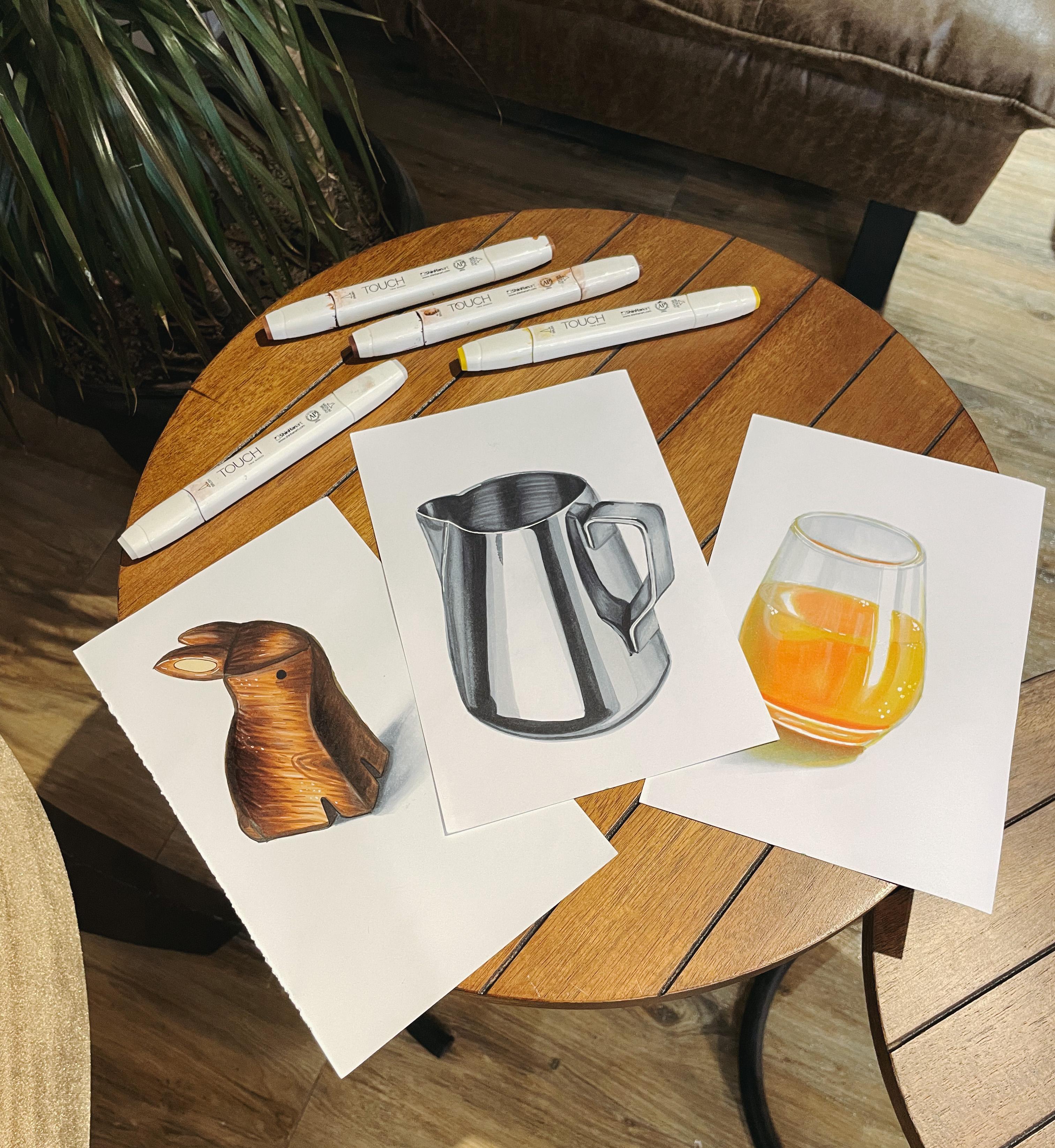
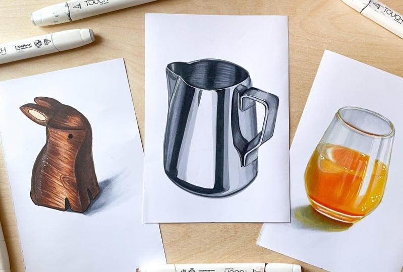
2. Class project: Now let's talk a bit about our class project. The project consists of
three sketches in total. I suggest you draw
a wooden figure, a glass of juice, and
a metal milk pitcher. You can choose all
three sketches for a full immersion in the
diverse range of textures. However, feel free to select
variations that inspire you. You can draw only one
texture you like. This project is all about personal growth and exploration. Before we get started, let's quickly go
over the materials you will need in attachments. You will find the color
paper that I used. You can pick up similar colors from what the ones
you already have. I use touch and ooh
markers In this class, you can use any markers or draw with whatever
materials you have on hand. As always, for markers, you will need a special
paper with a density of at least 120 gram/centimeter
or your favorite sketchbook. I also encourage you to
observe reference images you can find semi prepared for you in the projects and
resources section. It will help you to capture the details and characteristic
of each texture. I invite you to share your projects In the projects
and resources section, it will be a
wonderful opportunity to support and inspire one, each other together we can celebrate the progress
we made and provide valuable feedback and
encouragement. Let's get started.
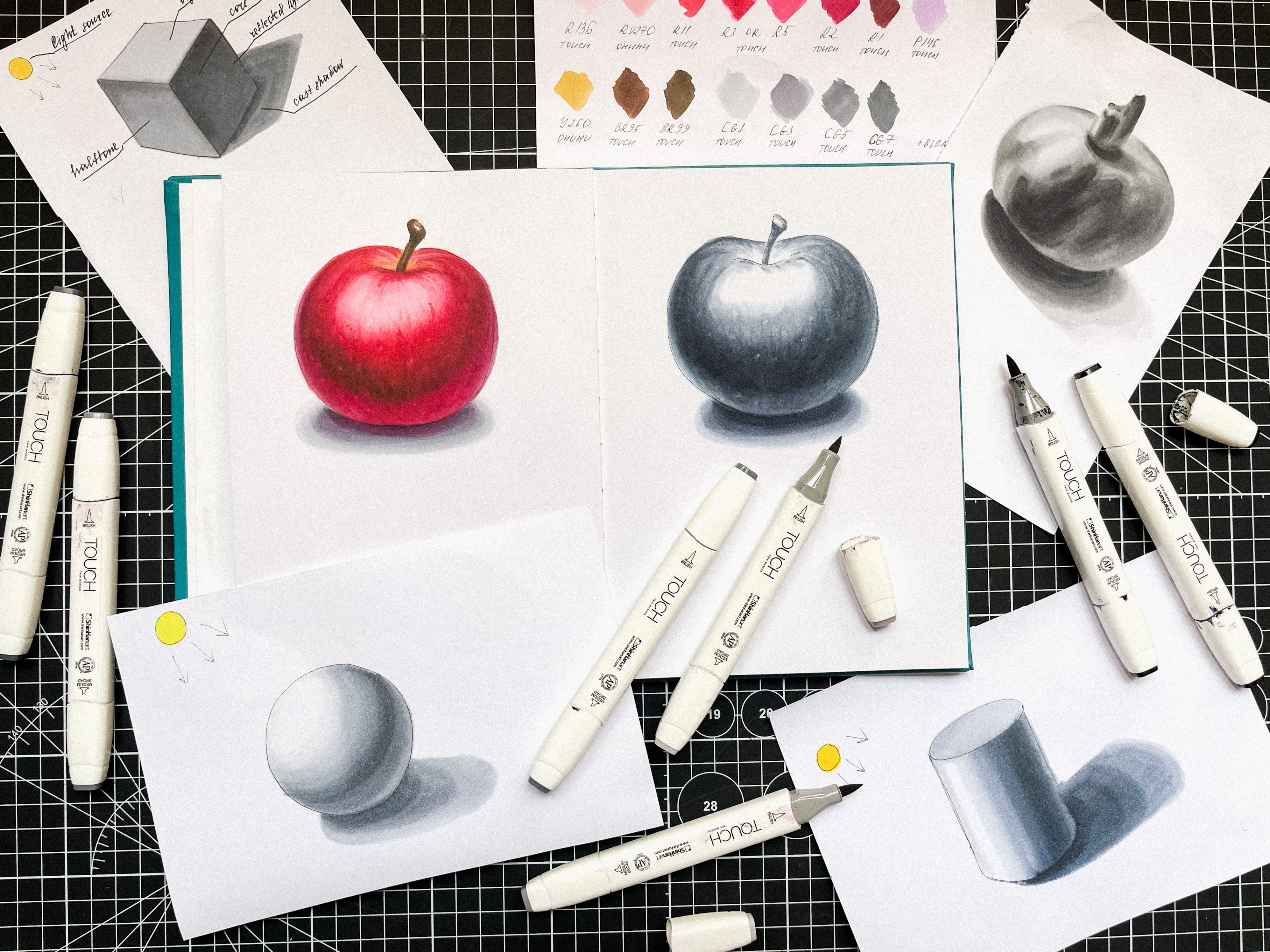
3. Textures Overview: First, let's take a look at the general aspects to consider when painting textures of wood, metal, and glass on any object. Apply the basic principles
of light shedding, but consider the material
from which it is made. That is, the basic rule is that any texture is applied according to the
shape of the object. If you want to learn
more about how light and shadow form
on different objects, check out my skill. Share class. Sketching Basics. Drawing Shapes with
light and shadow. Now let's talk a little bit about each texture separately. Let's start with wood. Wood is a textured
natural material. Usually wood is brown and its texture is
traditionally striped. Our main task here is to
show all these jagged edges, stripes, and drinks which are also often found
on wooden objects. Class here, it is important to understand
that when drawing glass, we will always have a lot
of glares and reflections. If the glass is transparent and the drink and it has some color, this color will always be
reflected in the cast shadow. Often glass is thickened at the edges and there
will be darker areas. We usually see the thickness
of the glass at the bottom. In faceted rectangular objects, you can see the thickness of the bottom and the thickness
of the walls very clearly. In thin glass objects, you often can see the
thickness of the walls, but you can see the
thickness at the bottom. Now to metal, if the
metal is glossy, it will too have many different light and
dark reflections. It will reflect
what is around it and this reflection will
always be distorted. Mud metal has less
pronounced glare, but it also reflects
the objects around it. Now it's time to try to
understand this in practice. See you in the next part.
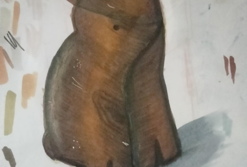
4. Practice: Wood: Welcome to the first part. We embark on a journey into
the world of wood texture. I suggest you to draw
a cute wooden rabbit. We will draw this
rabbit on the left because it has a more
pronounced wood texture. First, we need to understand how the rabbit is eliminated. The light here is on
the left and in front, the lightest part will
be the central part. This part on the right, will be in the shadow. Here is where the back will
be a zone of half tone. Pay attention to the
direction of the wood grain. Here the grains are at an angle. Let's start drawing.
To begin with, we outline the general position of our figure on the sheet. We don't have any
special composition, The rabbit will just be about
in the middle of the sheet. Maybe it will turn out a little bigger or
a little smaller. We will see now that the rabbit
is turned sideways to us. We draw it considering
the perspective. First, I'll just mark
these rectangles. The basic shape of the rabbit
here will be the head, here are the legs, here we will have the back
part of the body. We do this just for our convenience and
better understanding. We also form our
rabbit from a piece of wood and start with the snout and then to the body. Like sculpting this rabbit. I remind you that we are not
striving for perfection. We don't immerse in the
nuances of construction. Now we're just doing sketching, and our main goal is to learn
how to create textures. I'm putting quite a
bit of pressure on the pencil to get a
better view of the video. Let's add ears to our creature. And we will draw the eye at the end with the liner
or black marker. Now let's remove
the top layer of the pencil and outline our
rabbit with the liner. Like this. Now I remove all the remaining pencil and we can start working with color. We start by making a color
under layer with marker. I will take my B 113 and cover
the whole rabbit with it, except for the
shadow part where I will directly work
with darker shapes. Now I just fill the
rabbit with color. Here we can ignore the
direction of strokes. It is convenient to do
it with a broad tip. Now I take my B 103. You cannot sit
well on my marker, but it is A 103. And I'm going to fill in the entire shadow part
of the rabbit visit on the reference, there is
just a dark place here, but we are going to add an outline so it's
clear that there are pos and I'm going to fill those places with
air 103 as well. We begin to add these 103 in shadow places here
on top of the snout. And at once with B 113, I mix colors a little to get
a smoother transition here. I don't just fill with
color but work with such strokes because now we form a first layer
of wooden texture. Then I move on to the ears and let's add B Air
103 to the body. Here we put strokes in
the shape of the figure. We are already showing
the texture of wood. And now with 130 is the colors. A little until the marker is not dry. Again at B 103 and our bit already
become wooden. I take dark air 93 and even
more, deepen the shadows. But here you need
to be more careful not to over darken the
pattern, the light on the ears, you can mix
a little with B 103. We continue to deepen the
shadows with B air 93, cover completely the
shadow, part it. And then on the top
of the same marker, we show the texture with
strokes as a second layer. And let's set a little of the same B air 93
on the light part. I remind you that we apply the strokes in the
direction of wood grains. So we show that texture of
the wood on our sketch. And I mix the colors
with my air 113. And again I do it in the wood
cranes direction as well. And now I'm going to add
a little bit more of B air 103 before the
marker is completely dry. Again, with my air 93, I reinforce the
texture with strokes. In some places the strokes are of different lengths
and thicknesses. Vatican drinking with the Pope, a mountain peer
getting French toast, Tokyo, Sukipbepetat. Yeah, I got that,
Yeah, I got that. Somewhere we can directly draw the three rings for a
more illustrative look. Yeah, I'm not driving
here, not to close. I mean, lying up as of
moist them tats here, they're doing the most of
the original to come close. I got that. I got that. Now I take a more intense brown 92 and added in the shadow errors to show
the texture even better. Here are the strokes I applied carefully in the direction
of the jagged edges I got that day. I got that day. I got that day and now
blew a bat with B A 103 and keep going with B Air 92. It always will be darker. In the place of refraction
of the form here. Between the head and the body. Between the light and dark pot. Get your biscuits
in the kitchen. Masha Fauna, Mission
Bay. W the lid. It's viscous. Were about
to break the dishes. Got the pepper with the sodium we're
cooking with petroleum. Come step up to the podium
and cut up the slinoliumjt. Sit down is stupid. No sitting down an more time. And of course we pay additional attention
to the shadow part. Peaches off the stupid
work that throw back and watch them shoot scotty pip and all mix it up like cold. Shake your buffalo chicken
bran. Get your crates. Make it that you sang. Just oddity rule. He see your window? Just moodier. See your window. Now I take my darkest. B are 99. And deepen the contrast even more because
the markers get lighter. When they dry, we
will go lightly over the darkest area. See your way. Just sitting down a stair fit. Let me see your word. In the darkest places, you can even go twice. And now with my B 103, I'm going to mix it up a little bit and don't forget about the tail. Now we can paint the
lightest place on the ear. For this, I take E 130 form. This is such a light
whitish yellowish shade, paint here inside the ear
now with a black marker. Let's draw our eye then Maybe I will strengthen
this eye with a liner. Also, I add some black to the
shadowy places on the legs. Also, we see that the rabbit has a very slight cast shadow. Let's add it for this. We need several shades of
gray from light to dark. We start with G 0.5 and roll the basic
shape of the shadow, it closer to the figure itself. Strengthen the
shadow with G one. Even closer at G three and a little CG five at the bottom of the rabbit. And blend everything
with C G three. Now I take a dark gray G seven and go with it
quite near the post blend a little bit
with C G three. Also, we can take our C G 0.5 and blend the
shadow a little bit. But we can do the
same with a blender. It will make the border of our shadow while
the shadow is dry, we can add detail with a white
pencil and white gel pen. My white pencil is already so
tiny, but I really like it. On the reference, we
can see that there is a pretty pronounced
glare here on the back. I'm muting it a little
bit right with my finger. You can do it with a piece
of soft paper or a soft era, but I find it more comfortable and faster
to use my finger. I add a little more white
pencil in the light areas. Now with a white gel pen, I enhance the most
pronounced highlights and maybe add some dots to add a more illustrative
look to our sketch. Note that in the shadow areas, we don't add any white gel pen. It's quite dark there. It's important not to overdo it. And here I even wanted to
mute a pen with a pencil. Again, it's important
to stop in time. Sometimes I should
tell it to myself. Yes, let's go around
the eye with a liner. And go over the bottom of
the legs with a liner too. If you have good color pencils, you can additionally work
out the texture of wood. With a brown pencil, it will be more delicate, but again, it's
totally up to you. Our bit is ready,
we can move on.
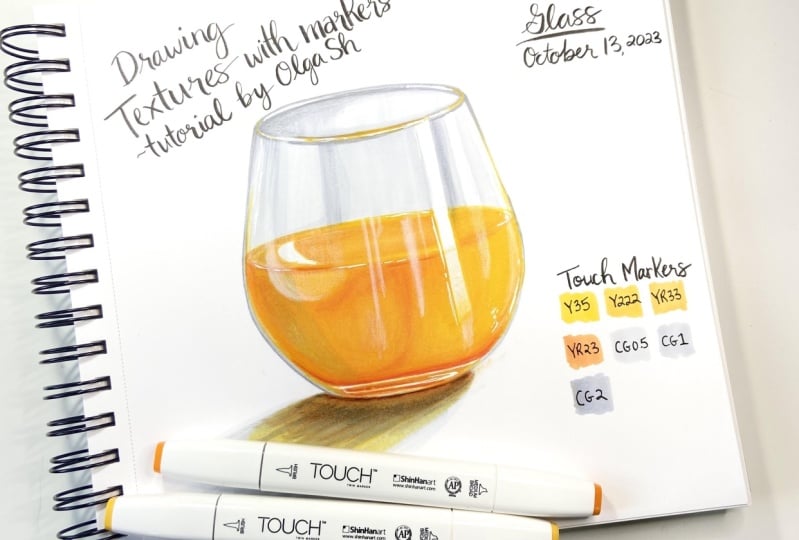
5. Practice: Glass: In this part, we will study
glass texture glass with its transparency and reflective properties offers a unique
challenge and opportunity. I suggest you to draw such a
nice glass of foreign juice. We start by understanding
the lightning. The light goes on the top right. The cache shadow is
on the bottom left. This area is in the light, there is a shadow and
reflect from the surface. This area is lighter. Let's start drawing. We start by outlining the
axis of our glass, like this. Then we mark the axis
for the top ellipse. Now we show the axis
for the bottom ellipse. The bottom ellipse
will be smaller. Let's also mark the
widest part of the glass. Now let's outline the top
ellipse looking for its shape. Okay, And now to
the bottom ellipse, connect the top and the bottom. To check for straightness, you can turn the sheet
over and you will immediately see if something
needs to be corrected. I correct here a little bit and here. Okay, now let's add sickness to the top
edge of the class. Here it is. And let's
draw this juice itself. Also, we show it with an ellipse ready. Since our glass is
made of scene glass, I suggest you not
to make an outline with a liner and work
directly with markers. Let' s now carefully remove
all unnecessary lines with a soft eraser and leave only a thin counter so
that we can see our glass. And let's start
working with color. I'll take my lightest gray C G 0.5 and carefully outline
the counter of the glass. It okay, here it is. Now let's show the
liquid level for this. I will take this yellow 35. And now it's important to
leave the glare unpainted. We leave this place
white because it will be difficult to show
this glare later. And also, let's leave
this glare unpainted. We can leave this rather
bright glare at the bottom, this one above it, and painted to perhaps they will have to be
emphasized additionally later, if the marker bleeds on them, because these glares
are quite thin, let's leave it that way for now. Take our G 0.5 and continue
to outline this glare. Also, we are going to show the second glare here,
right next to it. And we can paint
the place between the highlights with
G 0.5 right now, and also added here
on the left here. We have a big highlight too. We leave some place for it, but we will show it later
with a white pencil because it's not as pronounced as the
highlight on the right. I cover this part C G 0.5 and add it to the darker
places on the top edge. And I go a little bit more
around the edges of our glass. Now I cover almost the entire inside part
of our glass with the same C30 0.5 The marker will dry and it
will become much lighter. Emphasize the top one more time. And now I take my G one and edit right
here on the border of the glare along the
top edge of the glass. Right here on the border
of the glare too. A little bit darker here, right here on the inside part. As I said, now I'm
going to cover this big glare on the
left with G 0.5 later. We highlight it with a pencil. Right away, we can blend the transitions with
the same marker. Go one more time on the
sides of our glass. And now let's add C, G, two in the darkest places. I'm sorry you reached the number that has been disconnected or
it is no longer in service. Okay, now I take this
classic yellow and gently added along
the top edge of the glass because that's
where the juice is reflected. Then I take a
brighter yellow Y R 170 and add this bright
reflection in the center. Okay, now let's leave it that way for now and start
working on the juice. I take Y 35 to make a color under layer
and cover all the juice. Note that all strokes I put
on the shape of the glass so the first layer is ready. And now we take a
darker yellow Y 30 form and start adding it where
the juice is darker. In this way, we form
an area of half tone, and don't forget to
save the light zones. And now with our
lightest yellow, Y 35. We mix the shades together. Okay, here it is. Now I take an even darker tone, Y 170, and start to form the
darkest places of our Jews. And now mix it all with Y 34. We can even go over
this orange shaded self with Y 34 to mute this
bright shade a little bit. And I add a little bit of the
same color in the center of the top edge of the glass to soften the orange a
little bit there too. And I gently add quite a bit of the same shade along
the sides of the glass. Now I take my darkest shade, Y R 23, and show this bright stripe at
the bottom of the class. It, as you can see, this stripe is very noticeable. And also, let's add Y R 170
at the bottom of the class. Okay? And now with the darkest shade, Y R 23, we go underneath the very bottom
of the glass like this. Now with the lightest yellow, 35 blended a a little bit and with the same tone. Go again over the light areas. Now take Y 34.1 more time. Go with it on the
zone of half tone and strengthen this border in the liquid a little bit more. And before the marker is dry, let's add G one to this border to make it
even more noticeable with the same C one. Let's show this shadow in
the left part of the glass. Soften that transition
with C G 0.5 Now I want to add some
gray to the base of the glass, something like this. Also I go over the top
edge of the glass, again bringing all the shades together and one more time
on the control of our glass. One more time on the
top edge of our glass just to show its thickness
and make it more pronounced while the markers are dry. Let's show the cast shadow. I take my C G 0.5 and
slightly draw its shape before the marker dries. Let's gently add Y 34 to this shadow because it is reflection of our juice
in the cast shadow. Let's carefully
add our darkest Y, R 23 under the glass. Now blue it with y form. And on the top of it, again with strokes,
add our CG one. And now with a blender, we can blue a bit
borders of our shadow. And I want with my Y R 23 to emphasize at the
very bottom of the glass. Also, we can intensify this bright line on the
juice a little more. I think we can even enhance that reflection at the
top a little more too. Now I take my white pencil, or rather what's left of it, and start handing the highlights on the right side with it. As usual, I used the
pencil with my finger, it's more comfortable for me. And let's show this
big glare on the left also, let's show these
small glares here. And this glare on the left
side is more pronounced, so I think we should
emphasize it a bit more. Also, we go over the reflected light areas
on the sides of glass tomb. Now we strengthen the glare
on the surface of the juice. Here you need to
look carefully at the reference and notice
where the glares are. This is not always easy to
catch because class objects often have a lot of very
different small highlights. But we don't aim to 100%
repeat the reference. We need to show the texture
of the glass itself. That's all now with a white jail pen. Let's add the
brightest highlights. There are a lot of them on
the top edge of the class. Also let s show bright highlights on the
bottom of that glass. We also can add white pen along
the brightest glare here. And somewhere we can show these white bubbles
on the juice. And add some white dots to make our sketch
more illustrative. Now I see that I
want to emphasize the left edge of
the big even more. And we can still go over the
top edge of the glass with a pencil to also. I see that the upper counter
is a little bit floated, so I take my G one
and correct it with the same CG one. We can also go over
the shadow again because the marker has dried
and now it's much lighter. I think that at the
base of the shadow, we can even add a little
bit of C, G two now. Okay. I also want to correct a bit this bright line
at the top of the glass because the marker has dried and this line has become too
big on the reference. It is more delicate. If you already got it
seen, that's great. Well, I like it better now. I think we managed to capture
the texture of the glass. I remind you that
when drawing glass, you need to pay attention to a lot of glares and reflections. If the glass is transparent
and the drink has a color, and this color will always be reflected in the cast shadow. Usually the thickness of the glass is visible
on the sides. Here we have a very
thin glass and we see the thickness
mostly at the bottom. Let's move on to the metal.
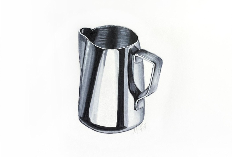
6. Practice: Metal: Welcome back. In
this section we are going to work with
metal drawing. Metal surfaces with
their reflective shine and intricate details can
be quite challenging, but we will try to deal
with it as a reference. I've chosen this
nice milk pitcher. Let's take a close
look at the reference. We see this big white glare and pronounced almost black
stripes on the sides. The part on the left
is more in shadow. The handle is all in the light. We have noticed
for ourselves the lightest and the darkest
places on the reference. And we can start drawing. We start by drawing
the center axis, then outline the base like this. Now mark the top part. It is a little narrower
than the bottom part. We will draw this tip later. Now we begin to form
the upper ellipse. That's how it is. Now we go to the lower Eps. It's even more open. Okay, now we connect the upper
end, the lower ellipses. To check our lines, we can turn the sheet over and correct something
if it's necessary. That's it. Now let's draw the
tip of the picture. It's torn away from us, so we draw it a little
in perspective. And let's move on to the handle. It may be a bit tricky because the handle doesn't
have a simple shape. So we're looking carefully
at the reference and roughly repeating
the shape of the handle. We're not doing any complicated
constructions here. Our main goal in this lesson is to deal with the
texture of the metal. I even perhaps lower
it down a bit. This is how we
roughly outline it. And now we can begin to sculpt it shaped
around the corners and correct something somewhere, something like this. Now we remove all
unnecessary pencil lines. Again, I want to
suggest you work only with markers without
outlining with liner. Maybe later we will let
it somewhere we will see. We go straight to the color I take on E and
outline our picture. Done now we can take C G 0.5 and pay the
entire handle it. Now with the same C G 0.5 we can outline the boundaries
of the big highlights. Here we'll have a bright dark. The location doesn't have to be precisely in the same
place as on the reference. It's important to show
the texture of the metal Now limit the large light glare that it expands to the bottom. The brightest glare we
have is the center. And we can fill the rest of
the right side with the G 0.5 Now let's take C, G one and mark the bright highlight
which is located in front of the darkest
place on the left. Now we bravely take C, G seven and begin to
form the dark highlight. Also, we show this dark stripe at the bottom of the picture. We look at the
reference and roughly repeat the shape of
this dark high light, and we move on to
the dark glare on the right and outline its shape. I make the highlights
smaller than on the reference because otherwise they won't fit on my sketch. But again, we don't have a goal to perfectly
repeat the reference. Now we take G five and we are going to use
it here on the left. Here on the very
edge of the picture between these two
parts on the reference is the slight part relative
to these two colors. We show it with C, G, three. My CG three has dried up. I'm going to switch
to another one and continue to blend the shades
for smoother transition. Adding a little bit of the same G three at the bottom part, I take G five and once again intensify the darker
areas for more contrast. And with CG three
paint on the tip. Now we C, G five, add shadow nuances on the tip. Mix a little bit
with my CG three. And once again enhance the shadow places
with CG five before the marker dress and with the same CG five, I showed the small
dark glare on the top. I showed it with the same
strokes as in the reference. Now I take CG nine and deepen the darkest places
even more because when the market is dry,
they become lighter. And I want to add more contrast. And now I blew this edge with C, G seven, just a little. Now I will let a
little of G five and then blend it all
together with G three. Then on the right side of there, we can also go with G
three, but very carefully. Okay, now we take G nine and intensify the dark glare
on the right side. It has such a clear border, so we don't blend anything here. We can go with the
same marker on the bottom part just to
give it more contrast. Now again, marker is dry
and I want to strengthen the left dark highlight
even more like this. Let's take G three and
show this highlight. I'm not blending anything here. Reached the number.
It's been disconnected, it is no longer in service. Please check the
number and try your. Now we need to show the
reflection from the handle. Let's outline a
shape with CG five. If you're afraid, you can
draw it first with a pencil. I show it straight
away with marker. Note that the reflection of the handle will have a
slightly distorted shape. Okay, we have outlined
it and now we C, G three pains this reflection. Now let's take G five
and start darkening it. Note that again, we apply
strokes to the shape. And with C, G seven, we deepen the shadow
areas even more. And with C G five, we carefully smooth transitions. So now with C, G three, we will go over the right
edge of our picture. And with the same marker, we go over the bottom edge here on the right side, we can add a little more
of the same G three. Now we take C G five and add it a little
bit on the right edge. And with CG one before the
market dries, we go 0. Cg five once again, and then add a bit
of CG three again. And now we take CG 0.5
and blend it altogether. And also, I want to add g one for an even
smoother transition, and with the same CG one. Let's work on the handle
and darken it a little bit and we can adjust the three a little so the handle
becomes more visible. Let's set the same CG three in some places on the handle itself to make it
more contrasty. There is quite a
transition here. And here this part is also darker. And now we G one. Soften all the
transitions a bit. Now let's take G five and very carefully
show it the counter of the handle here. At the top of the
handle there is quite pronounced
shadow. Let's show it. And I add a little G five here and right here
at the bottom. Now let's take G three and
slightly blend these places. We're still applying the strokes in the shape of the handle. Now we C, G one soften
transitions even more. Let's take our G seven and show these dark areas between the handle and its reflection. And I add a little bit of the same shade on
the handle itself. Here, here, here, here, and here again, darken the outline of the reflection
a little bit more. Darken a bit here in the
middle of the reflection, and blended all with C G five. Now I want to add a
little bit of contrast here on the handle with
the same C G five, but just a little bit, we don't want to overdo it with G three. Blurry little bit. Pre work strokes which we put on the shape this way we show
the texture even more. And at a bit of the same G three again here
on the right side. Now let's look at the
bottom of our picture. It has this pronounced
line at the bottom. We will draw it with C,
G five for convenience. The sheet over this line
starts from the side shadow. I draw with CG five. Only two to emphasize it
even more line please. Now from it, I show a line
that goes along the bottom. This line is quite seen.
Pay attention to it. And now we see three. We go over this line to
blew it it little bit. Well our picture is settled
on the surface now. I'd also like to blend G three a little bit on the shadow
part on the left. There are not so sharp
transition here. Now with C G five, I will once again emphasize
this dark place on the tip of the picture with
the same C G five. Mark the upper cotter
of our picture. It's time to work on the
inside part of the picture. Everything here is quite dark. I start to make an
under lay with my C G five on the inner
part of the tip, there is a small light place. We leave it unpainted for
now and cover the rest with CG five here. We also leave a
place for the glare. We will do it later
with C three. I apply strokes vertically, just to show the tabs. Okay. Now I take C, G three and paint
glares with it. Well, we have made a
color underlay and now we will darken the
inside part of the picture. I take my C, G seven
and start to dark. You can see this shadow
on the left very well. So let's show it then, a lighter area. Leave this part and further
deepen the shadow areas. Again, a light piece and
further all in the shadow emphasize the upper
contour a little bit. Now in the darkest places, we can add even C, G, nine to add more depths. And look on the handle, the markers have dried and
are noticeably lighter. So I will go into the darkest places
with the same CG nine. These are places where it
attaches to the picture. It here again, we deepen the shadows
on the inside part. Now I take C, G five
and blue transitions, and my CG three, I mix the shades in the lightest place before
the market dries completely. Take CG five again. And with the tip, we draw these horizontal
lines that we see here showing this texture. In fact, this has
the same ellipses. We just repeat the
shape of the picture. And we can even add these lines with CG seven on the left side. And with the same C G seven. I want to correct
the top contour because the marker has run
out a little bit here. I also want to
strengthen the CG seven, the line at the bottom
because when C G five dried, it became clear that
it wouldn't be an S this play closer to the tip, I emphasize now with
this dark shade. Let's add a little
bit more of C, G seven on the handle
for more contrast. So in general, our
picture is almost ready, but we will add a
bit more details with white pencil
and a white gel pen. Take the white pencil
and add it right here on the highlights on the
inside part of the picture. I'm going to dim it down
as usual with my finger, see if there is some depth now. Now, let's add a
little more light on the handle and here
on the left side. Right here, we can
light on the tap a little more because the
markers smudged here. Okay. I take a white gel
pen and go with it along the top counter to
show this bright highlight. Let's set a white
pen right here on the handle just to emphasize
this glare even more. We can also use
the pen to correct if the marker has run
out of the outline. And we can even
use the white pen here on the left to
enhance the glare. Now we can take a blender and
go over our biggest glare. Just to make it a
little more mat, the blender will dry and
become much lighter. Well, our metal
pitcher is ready. Now you know more about how
to show the texture of metal.
7. Final thoughts: Congratulations,
we've reached the end of our creative journey. I want to commend
every one of you for your dedication and
the progress you've made. Throughout this
class, we explored the captivating world of class
wood and metal textures. I hope you've gained
variable techniques to enhance your artwork and
bring these textures to life. Remember, practice
makes progress, keep sketching,
keep experimenting, and let your
creativity flourish. Art is a continuous
learning process, and I encourage you to seek further
inspiration and growth. Explore another texture drawing, or try different mediums
to expand your skills. I want to thank you for joining me on this
artistic journey. Thank you for sharing
your projects. If you enjoyed this class, I kindly ask you to leave a positive review and share
your experience with others. Your feedback helps me
as a teacher and helps other students to decide
what class to take together. Let's inspire and uplift
the creative community. I wish you continued its
success on your artistic past. Keep creating, keep learning,
and keep practicing. I see you in the next class.
 Olga Sh, Sketch Illustrator | Master Coach ICI