Transcripts
1. About This Class: For me, art is meditation. There is a certain
mindfulness in paintings and patterns that helps you disconnect with the
chaos around you. Especially in the recent times, when we were also
isolated and vulnerable, we resorted to art in some form, be it painting,
cooking or dancing. Somehow, art rescued us. I'm Anita, I'm an artist
and educator from India, and in this class we
will be discovering the mindfulness of art with
the magic of watercolors. Watercolor is a soothing median and yet quite unpredictable. It has a mind of its
own, and in this class, we explore some
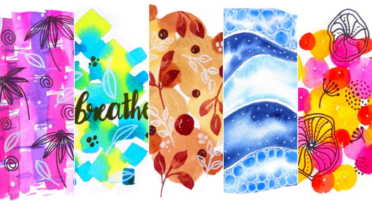
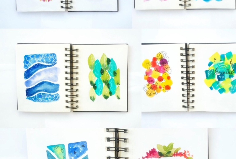
simple techniques and color mixing to create 10 beautiful backgrounds that you can use for
doodling and lettering. This is a big enough
[inaudible] class, and you can join in if
you feel connected to art and want to just start
a sketchbook practice, for meditation and relaxation. I have three other classes
in sketchbook explorations, where we try out some fun
patterns and doodles. Personally, I feel having
a sketchbook practice helps us immensely in
staying connected to art, while at the same time not worrying too much
about the outcome. As it's your sketchbook, so it need not be a
masterpiece on every page. Together, within these
10 beautiful backgrounds and try out some doodle and lettering fun while we're at it. So I hope you will join me
in this relaxing journey, so let's get started.
2. Materials Needed: [MUSIC] Getting started with
the materials of this class. Now, this is a sketchbook
therapy class, so we will need a
sketchbook, but that's it. You don't really need to
stick to a sketchbook, you can also go for something like pretty loose
watercolor papers. The one I'm using here
is a brushstroke, 300 GSM, 100 percent cotton
sketchbook. But that's it. You can go with even a lower
GSM because this is not a really watercolor
intensive class like you're not doing
for heavy washes, so you don't really
need 300 GSM. You can very well work
with 200 GSM as well. But just something that's 100
percent cotton preferably, because that helps
with the techniques. Lot of times we start off
with the wrong paper and then dislike watercolors because it doesn't work the
way we want it to. But 90 percent times it's just the paper so go for something that's a
100 percent cotton, a lower GSM works just fine. Now, coming to the colors, I'm using the Daniel Smith
artist crepe watercolors. Now here again, you
don't need to stress on any specific brand or
any specific shape. We're using some
very basic colors and we'll be creating
some nice mixes. I've also covered in a separate section
all the details about the colors that we use, why we use them,
the way we use it, how to create harmony, etc. We'll be covering it all, so you can use any brand of
watercolors that you have, preferably artist grade because the student grade
once they are chalky, so they may just come
off while you're trying to doodle on top of it. But that's about it. Go with any brand of
watercolors that you have and any shades as well you can mix and
match with your own. Then for the brushes, I'll be using two brushes, mainly around brush
and a square brush. We have a few patterns like
this one where I've just used the square brush to make those horizontal or
vertical lines or bars. Then maybe I've stuck
to one round brush. Go with any round brush or
clappers that you have and we'll play around with the sizes based on the size of
paper you're using. Next, we need masking tape, so I have two projects here wherein I've used
some masking tape. I find it really fun
playing around with the masking tape and with
watercolors around it. We'll explore this technique in a little bit detail
in the projects. But you can use any masking
tape that you have, either a normal masking tape or colorful washi tape.
Either one works. Last but not the least, we need some pens for doodling. I'm using these
unit ball markers and some fine liners as well. We're going to use these on
top of dried watercolors, like we'll be painting it out, we'll let it dry and then
we'll doodle on top of it. You don't really need
waterproof pens. You can go ahead with
any pen that you have, any ball pen or gel
pen works just fine. I've mainly used white, black, and in a couple of
places some metallic markers. White mainly because
the highlight looks really good on dark
colors like this, so I've used white a lot and in some places I've used
a few silver marker as well. That's about it. That's
all the materials you'll need for this class, so let's get started.
3. Basic Techniques: Now, let's get started with the very basics for
watercolors and doodling. So to start with the techniques for watercolors, now, again, this is not a very heavy
on technique class, but just so fun stuff that you can try out if you're
very new to the medium. Starting with wet on wet. So wet on wet is when
your paper is wet and you're adding
wet paint to it. This is where watercolor really comes to life
because you can see the way the
colors spread here. Without much of an
intuition from your side, it just does its own thing. It's beautiful to
watch these colors blend into each other. So you could have plain
water as the first layer, or you could have
something like paint. In this case, we
painted this green. You can add in another
color on top of it so that it blends
into each other. You can also add in the same
color with a darker value. By value, I mean how dark or
how light the pigment is. So if you add in a lot of
water and very little paint, it will become a
very lighter value. If there's a lot of
paint like this, it becomes a very dark value. So you can try mixing
the colors here and seeing how they interact with each
other in wet on wet. So we use wet on wet for
all our backgrounds, and anywhere you want
watercolor to blend, you will be using wet on wet. Wet on dry on the other
hand is for detailing. So it's usually paint on dry
paper or paint on dry layer. This is what you'll be using to add all your details, etc. But mainly, any background anywhere you want to
blend watercolors, you'll be using wet on wet. Mix some quick
tips for doodling. So if you're totally
new to doodling, if you've never actually picked up a pen and quite some time, you can start with
simple exercises to build up your muscle memory. Simple stuff like straight
lines or slanting lines, and some curves like
this would really help you get started with
the doodling part. It may not be a
perfect straight line or a perfect circle or curve for that matter but these are just some simple exercises
to get you started. So I usually start
with lines and then slowly we move on to curves and then to shapes like circles and squares
and triangles, etc. But all of these are just quick warm-up session so that we start building
the muscle memory. Once you are comfortable
we can try out some nice shapes
for the patterns. So, mostly, I have to
start to something very basic like these leaves or maybe multiple smaller
leaves like this, and some swirls. These are my favorites. So simple stuff like this. Nothing too complicated. But it's just about enjoying
the process, having fun. Once you have those backgrounds, if you want to add some
doodles or lettering to it, you can try these simple
things and get started. Now for few of the projects, we have shapes
that we're filling in with some simple
doodles like this. So this is another thing
that you can try out. You can make some
shapes like boxes or triangles and then try filling it up
with smaller shapes. Like in this case,
I drew a square and then I'm adding in smallest
circles to fill it up. So you can try
something like this, wherein you create a
bigger shape and then just try filling it up
with smaller doodles. You can also add to the patterns
by using these shapes in clusters like a bunch
of circles together or a bunch of triangles
together, work just fine. That is something that
we can also try out. Another doodle
pattern that I really enjoy making is flowers or flower-like structures like
simple shapes like these. Filling them up is
something super fun. I've used this in
one of the projects. So again, these are not
something hard and fast. You can go with any doodle. Simple shapes, all
swirls work just fine. I enjoy creating these
different patterns with some fun doodles, so I try to experiment
with that quite a bit. So that's one flower
doodle that you can do. There are a few others that I've tried out in the projects. Like this one where we build the center and
draw a coneflower. So again, these need
not be perfect. You can go with any flower
or leave or shapes. Just make sure that
you have a lot of fun while you're
trying to these out. But the easiest way to get
started is to practice these straight lines or triangles and curvy
lines like this, so that you can warm up a bit. Sp I'll quickly share what all we have done
in the projects. So it's mainly like
these simple flowers and dandelions and dots or leaves. Again, some simple circles, more flowers and
the swirls patterns on which I'll cover in a minute. I've used a lot of white to create these
highlights and dots, which adds a lot of
life to the patterns. But most of it as you can
see are simple doodles. So let's try out
that wave pattern. It's one of my favorites. I really enjoy doing this one. So I create an overall shape
of the wave like this, and then we fill it up with
lines that are going in sync with the overall shape of the wave and
converging at a point. Same for the side. We make sure that all
the lines converge at one place and that gives
the wave effect to it. One last thing, the
small, cute dandelights. So start with this shape
and then build up on it. But that's about it. I've stuck to very simple
doodles in this class. I hope you'll enjoy it. Even if you haven't tried
doodling in a while or at all, feel free to join in. Let's start simple and let's keep it that way and have
fun while we're at it. So let's get started
with the projects.
4. Color Mixing: In this section,
we're going to talk about some color mixes and which colors go well with
each other, which don't, etc. I painted this color wheel using the three primary colors, the red, yellow, and blue. Then I've mixed the secondary
and tertiary colors using these three colors. I've used permanent red, wild blue, and lemon yellow to start with
the color wheel. Then created all
these fun mixes. These three are the
primary colors, and then when you
mix two primaries, you get these secondary colors. Then mixing again these
secondary and primary colors, you get the tertiary colors. There are various variations
to the color wheel. Depending upon which
colors you're using, your color mix will look
entirely different. But there are some basic
principles that remain the same. One of them is that the colors that are next to each other, or analogous colors
are colors that will have a harmony or a
soothing effect on you. If you paint with colors that are closer to each other
on the color wheel, there's not much chance
that you'd go wrong. For our projects, we
have played around a bit with all these color schemes, but mainly with the
analogous colors so if you see these
two projects. For the left one, I've used
a yellow, pink, red combo. These are colors that you'll
see are close to each other on the color wheel so they are harmonious
with each other. Same for this blue green combo. These are colors that are soothing to your
eyes and there's not much of a chance that
you'd go wrong with these or create muddy
colors with these. Because these colors are
usually next to each other. Same with this combination. This one's the
pink-purple combination, which is again, colors that are close to each other
on the color wheel. This one's again the
blue-green combination. These are safe combos. You'll almost always
get them right. Now, on the other
hand, there are complementary colors or colors that are on the opposite side of each other on the color wheel. Now these are colors that
if mixed in the wrong way, end up creating muddy colors. It's not that you
cannot use them at all. These being complimentary, they create a very stark contrast. If used in the right way, they can definitely be
very appealing to the eye. But make sure that
you're using one in slightly more
quantity than the other. Also, you can always
layer up things. You can have an orange
background and once it's dry, you can use a purple or a violet and create
some details on it. That would indeed help in
creating the contrast. But you just have to make sure
that you don't mix them in the wrong amounts and end
up creating muddy colors. But that's about it about
the complimentary colors. Now going to the
next set of colors that we've used for
the Volvo palette. I've stuck mainly to
yellows, browns, and reds, muted colors that are calming
and soothing to the eye, and at the same time, they give such a beautiful vibe. Here, I've tried to
create a contrast with a darker red that
you can see here. But mostly we are sticking to some nice muted
tones in this one. For the next set of projects, we are using a single color or different shades
of the same color or different values
of the same sheet. Here we're playing mainly
with two set of colors, the blues and the greens. You can try out the
different greens and blues that you have in your palate and play
with more water, add more pigment, etc, to see how we come up
with this pattern. Then moving on to our
last set of projects, we are having some
masking tape on here. But the color scheme here again, is something that we are sticking to
throughout the projects, it's something safe,
it's something fun. Maybe the blue-greens
and in this last one, we have some flowers
and leaves, etc. That's all the projects that
we're going to try out. As you can see, we have stuck to some very basic color schemes in all of these so you need not have a very
extensive palette. We can start with
whatever you have and mix the colors and have
fun while we're at it. But we remember
the basic rules or basic techniques from the
color wheel and we're good.
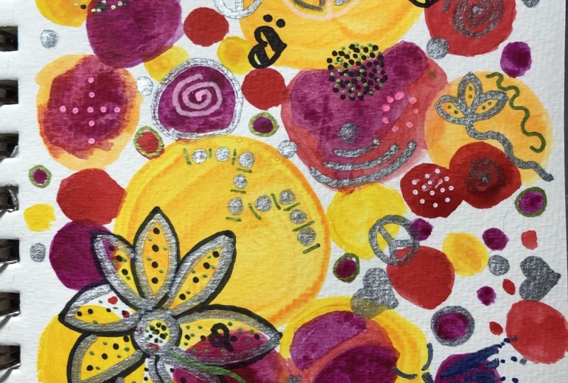
5. Project 1 : Watercolor Circles Background: So let's get started
with our first project, this one is going to be super simple as the other
projects are as well. So I'm going to be mixing
some nice warm colors. I'll start with
this warm yellow. Any yellow that is leaning towards orange or
red works just fine. So I'm going put
this yellow, pink, red combination
for this project, and we'll be painting
some fun circles in it. So for the other colors, I'm using Opera
Pink and a scarlet. So these are the three
main colors that I'll be using for
this background. So we'll get started
with the yellow and paint some circles. So you need not worry too much about how this turns out. Does it look like
a circle or not? It really doesn't matter. Just relax and enjoy the process and have fun while you're at it. So I'm using a
slightly lighter value of this yellow that I have. You can vary the
size of the circles, vary the values as well. By that I mean that you can simply add water like
this and lighten it up or you can pick a little bit more pigment and drop it in while
this is still wet. It's totally your call how you
want to add in the colors. So next, I'll start
with the pink. I'm not going to wait
for the circle to dry. I'll just start with
the pink right away. I'll start with a
lighter value and let it gently touch the
edges like this. So the circles are touching
each other and you can see that the bleeds
start happening. Now this may vary based on
the color you're using, the shade you using. So some of the
colors bleed a lot more and some of
them not so much. So depending upon the
shade you're using, you may notice a totally
different effect. But here, I'm just going with a lighter pink
to start with, and just dropping in these
darker values here and there. Then again, while
these are still wet, we'll start with
the darker pink. So I'm using a slightly darker
value of the same pink. Again, I'm letting the circles
blend into each other, not worrying too much about how the bleeds are
happening at this point. The idea here is that
you explore these colors let watercolor have it's way and have fun while you're at it. So I'm just going
to continue adding a few more pinks and slightly
darker values at that. Now, I feel that the yellow
got overpowered by pink. Maybe I'll just add a few
more circles of yellow. So let's think about it. When it's a sketchbook,
you really don't have to worry about the whole process, how it's turning out, etc. So I go with the flow. So I only started with
a few yellow circle. The composition isn't looking nice so I added a few more here. That's the fun about exploring
stuff in the sketchbook. So I'll add a few more. Then while these are still wet, we'll start with the red. Now starting with the red, I'll add these little
circles first. So the red again blends
really well into the yellow, but now the yellow circles
have almost dried, at least the first ones. I'm adding these smaller
dots, small circles here, and trying to make
sure that they are at a place where they can mingle with the
other circles so that the colors can bleed into
each other if needed. We're not trying to control in any way how the
colors bleed here, we're just letting
watercolor do its thing. I'll add in a little bit
of darker value onto the same circles and
a few more circles. I think I'll stop here. I think it looks
nice and vibrant. So we will let this
dry completely before we start with
the doodling part. So that's really
necessary because if you're using a pen that
is not waterproof, you'd ideally want
the background to be completely dry before you
start with the doodling. So let's wait for this to dry.
6. Project 1 : Watercolor Circles Doodle: Starting with the patterns for these beautiful backgrounds. Now, so for this one, I'm going with some
simple flowers, like the ones that we tried
out in the doodle section, and just adding in these lines that connect it with the center. I'm using a Sharpie here so
you can use any pen since we're doodling on dried
out watercolor background, it doesn't really matter the
kind of pen you're using. You can even use a simple ball
pen that works just fine. So I'm really sticking
to some black pencil and some white and silver gel
pens mainly for highlights and some leaves and
stuff pattern like that, but mostly I'm
sticking to the black for creating all the doodles. So I'm adding some dots
in between like this. Just having fun as we
go through the pattern. Next, we add some dots or
little circle patterns here. So overall, I'm trying
to keep it in sync with the background but again, you are free to experiment with different set of doodles
and patterns here. You can also use this
background for lettering. We will be trying that out
and you have the projects. But for now, for this one, I'm going with some super fun simple doodles so I'll
repeat another flower here. Notice that I'm not sticking
to the background itself so it's not like you have
to limit yourself to only the area there
where you have painted it. You can create a
mix-and-match like this. Now, it still feels a
little empty to me, so I'm going to add
in a few more fillers so I'll go ahead with those
little dandelions here. You can also fill this up
with small white dots or even black dots or simple
shapes like triangles. Just something to
fill up this area that is there between
your main elements. Notice that you can also experiment with the
direction of these fillers. So they all need not be
in the same direction, so some of them are
upside down like this. Next, we add some white
dots as highlights using a white gel pen or marker. So I'm just simply
dabbing it here with this Posca marker
and we're done. I really like how
it looks right now. It's not too full and yet it blends in with the background so we'll
start with the next one.
7. Project 2 : Watercolor Squares Background: Let's start with
our next project. In this one, we're going
to paint some square or diamond patterns using a
flat brush and the yellow, green, blue color scheme. For this, I'm starting
with this cool yellow, the lemon yellow, a light
green like this one. Add a turquoise blue. These are the three
colors that I'll primarily be using
for this project. I'll start with
this lemon yellow. We'll start with simple strokes like these with a flat brush. Just pressing it in and creating these four sides so that we
can have this diamond shape. We'll vary the values. We'll play a little bit with the same color,
but different values. We'll follow the same technique that we did for the circles. We'll start with one color
and while it's still wet, we'll keep adding
the other colors. For this one, I'm
using the same strokes and adding a few diamonds of
different sizes like this. Not really worried about the
placement at this point. We're just having fun,
and we'll see how this goes with the other colors
once we add them on top. Next I'll start with
the green, same stroke. Trying to add in one
or two edges that just touch the
other yellow ones. You can see that
as soon as I add them, it starts blending. We added a few more with
slightly darker values. Let it blend into each other. Since these are colors that are closer to each other
on the color wheel, we can see that
even when they mix, they are creating a
very harmonious blend. That's the reason I
chose this color scheme, yellow, green, and blue. [MUSIC] I'm adding a few
more random diamonds over here with the same stroke. Next, we will start with
the turquoise blue. For this I won't be
adding the same size. I'm simply using the
flat brush stroke to connect these
diamonds that we have made and not following any
specific angle or pattern, just trying to
place them in a way that it connects everything. Also you can see that this color tries to
bleed into the others. Be it green, be it yellow. You can see the way it spreads. It's creating this
beautiful effect, which is what
watercolor does when you let it be on its own. You can see that it's
spreading so beautifully, and creating this
gorgeous bleed pattern. I'm not too worried about how the composition
looks at this point. We'll just let the mix
happen on its own. Once it's dry, we'll work on the doodle or the
light green bar. But for now, I really like
how this color mix looks. Just adding a few more strokes, small ones with the flat brush. Now while it's still wet, I'll use the same
turquoise blue, but a much darker value. More pigment and less water. We'll do the same strokes, just simple flat brush
stroke like this. It will create those
squares or rectangles. We do the same thing since
the paint is still wet, we just add them
in these gaps so that it can again bleed into the other squares or
diamonds that we've created. Not really following
a certain pattern. You can see that I'm not trying to fill up the page or anything. We started with a few
shapes and we built up on the overall background
and we're having fun. Don't worry too much about how this is turning
out at this point. You can work on it later, adding doodles, adding
patterns on top of it. But for now, I would
highly recommend just enjoy the process, and letting
watercolor do its thing. We're done. See you
in the next one.
8. Project 2 : Watercolor Squares Doodles and Lettering: For this one, again, I'm going to stick with the black and white
combo for the pins. I'll start with some
simple leaves with white. Since these have some
patches of the darker blue, the white really shows up on it and it looks quite pretty. Next, we'll switch to
the black pen and we will add in some circles
and dots like this. Again, trying to fill up the spaces between
the leaves like this. I'll try lettering here now on this background, just so that we can
experiment with a few things. We already tried the patterns. This background looks
with lettering. A very important message here. Breath, and don't forget to have fun while you're
trying out these exercises. Because in the end, I believe these patterns and these backgrounds
really help us relax and they have mindfulness
associated with them, which I really enjoy. I hope you do that too and I hope that once you have
tried out these backgrounds, you will also try out a few
other doodles or lettering stuff on it so that you
can experiment with them. Just having a cute little art
at the end. But that's it. That's set of projects, and the doodling done
for both of them. Let's move on to the next one.
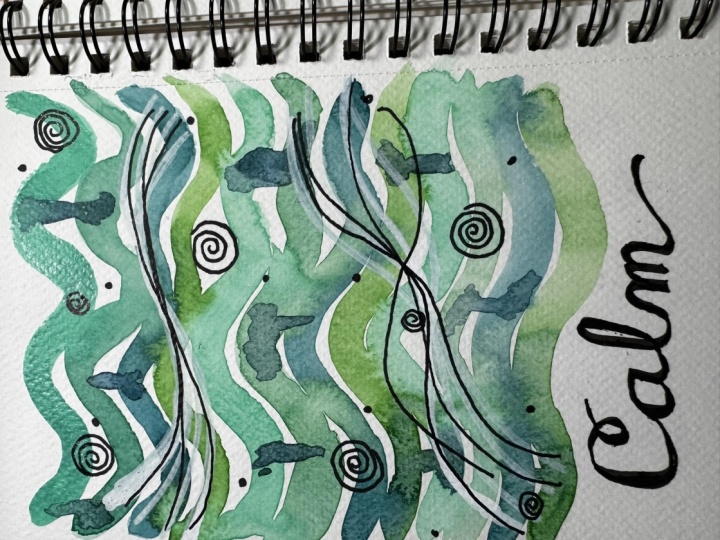
9. Project 3 : Watercolor Bars Background: On to our next background, and in this one we continue
with the flat brush, but with a different
color scheme. I'm going with the
pink-purple combination here. Starting with lighter
pink then adding in some darker values of the pink and then ending it
up with the purple. This is the opera
pink to start with. I'm just using a flat brush, and dragging it down like this. Again, don't worry if it's coming out to be a
straight line or not. Just use a pretty light hand and drag the brush with the
lighter color like this. I'm adding some
three or four bars up until the end of the page, and then I'm dropping in
some darker opera pink here so that it can just
bleed into the earlier layer, and then we add in
the darker pink here, which in my case is
[inaudible] rose. It's slightly darker than your opera pink but
it's a beautiful, beautiful pink and it looks super gorgeous
right next to opera. Again, I'm following
the same strokes, adding in darker value at one of the edges and playing
around with the values. Really not worried about
how they're mixing, but simply making these bars right up to the end of the page. Next, I continue with a purple. You can see that I'm letting
one of the sides touch the previous layer so that if the color is bleeding
into each other, it can do so at this point. I'm letting watercolor
do its thing and not really trying to control
how the blend works. I'm just adding the colors next to each other like
this and letting it blend on its own and we continue the same type of strokes
with the lighter pink again. I'm just adding it the
same way that we did. We started off with a lighter
pink, the opera pink, and you can see
that I'm not really keeping the same gap
between the bars either. Just using the simple
strokes and adding the bars right next
to each other. Next, we'll maybe try a
slightly darker color. I'm using this carbazole violet. If you're mixing your colors, you would want to
go with something that is on the side
of pink and blue. Because if you try mixing
a red and blue to create violets you'll notice that they are more on the
middle on each side. To get a proper
violet or a purple, you would rather
mix a nice pink, a darker pink, and
an ultramarine, or a nice blue that can
create those purples. Here I'm trying to
fill in the gaps, and I'm just adding in
these horizontal strokes, and it looks nice, so I'll add it
over here as well. That's more or less how my
process goes because most of the times you end up just
trying to fix something, and it looks nice so you try to adapt it to the rest
of the design as well. That's what I'm doing here. I'm continuing with
the darker pink now. I'm not sticking to
the same pattern of using the light pink, dark pink, and then purple. I'm just mixing and
matching it on the go based on how the colors are
behaving with each other. The purple had almost dried up the carbazole violet
that I had used. But you can see that as soon as I add the pink next to it, it is still trying
to spread into it, which is creating this
beautiful bloom effect. I continue with the lighter pink here, same straight strokes. I'm just trying to
fill in the gap here that I ended up adding. But these horizontal
strokes definitely giving a lot of extra character to this pattern or the background, so I plan to add a
little bit more of it. While it is still wet, I'm using a little bit more
darker carbazole violet here, and creating these
horizontal lines. Wherever you see
that the paint is still wet, it's
trying to spread. Otherwise, it's wet on dry, so it's not spreading much. But just adding this as an extra element through
this background. I guess we're done,
It's looking nice. Again, we let this dry
completely before we start with the doodling, or anything
on top of this background. We let this dry, and we
move on to the next one.
10. Project 3 : Watercolor Bars Doodles: Now let's start with the
patterns on this one. For this, I'll go with the simple cone flower that we had tried out in
the doodling section, starting with black pen here. [MUSIC] Now you can leave the petals as it is, or maybe you can fill it up. I'll try and add the lines onto these petals that are mimicking the overall
shape of the petal, and we add in a few
more of these flowers, starting with the
center here, and then adding in the petals. [MUSIC] Next I added some fillers to this, basically the swirls and leaves. Let's try out a few more leaves. I'm using a silver pen for this. You can also go ahead with
white or any other color that you like and that will show
up on these darker colors. Since the background itself is slightly darker here with
the pink and the purple, I went with the white
and silver like this and added a few dots. You'll need an opaque paint to show up on these darker colors. A few more here and there, mainly called the
highlight spot. I think we are
looking good here. It looks super pretty with the white dots and those leaves showing up
on the darker background. Let's get to the next
one in this set.
11. Project 4 : Watercolor Curves Background: [MUSIC] Onto our
next project and we continue with the flat brush, but a different color scheme. We stick to the blues
and greens in this one. I'm starting with a
sap green like this and this 3D motion
of the flat brush. I'm basically using
the flat stroke and creating this motion. We continue the same one
with a different color. I'm using this
turquoise blue next. Again, you can vary the values. You can start with a
lighter one and go in and add a darker
value in-between. I'm following the same pattern, just using the flat brush
to create this wave. Adding in a slightly darker
value here and let it touch at a few places so that if it wants to
blend, it can blend. Next we go in with
a darker blues. I'm using the indentron blue, but the exact same motion. I'll just start here
and create the waves. You can see that based
on the color and based on how wet the
previous layer is, the colors bleed into
each other a little bit. We continue with the
same thing again. I'll be using the sap green
mix to create the wave. Just adjusting the edges a
bit here, softening them. Then we go back to the turquoise and [MUSIC] then the dark blue again. It's super
fun to create these waves. You can see that the colors
go so well with each other. I'm just adjusting the edges
over here so that they are soft, and in sync
with the other waves. I guess I'll do one more round
of the green blue combo. I'll add another
wave of green here. Another layer of turquoise, I think I like to stop here
because it's the end of the papers and let it be I won't be adding another blue here, but we can always use that
blue to connect the waves. I'm going to use
that darker blue that we used, the
indentron blue. Just create some simple
connectors to these waves. I'm just using the flat
brush motion like this and adding these strokes so
that the connect activities, and you can see
that in most places the paper is still wet. It's creating this
beautiful blend and bleed, and that's it. We let this one dry. That's another background done. Let's move on to the next one.
12. Project 4 : Watercolor Curves Doodle: Let's get to the next
one in this set. Here we painted these lovely
waves with blues and greens. I'm going to use, again, silver. Silver or white really helps in showing up on these
darker backgrounds, so that's the reason
I'm going for a lighter color like this. We'll create the
wave doodle that we tried out in the doodle
section as with. I'm creating the outline
of the waves here. Then we'll fill them
up with the lines. I'm sticking to the
overall shape of the wave, and then making sure
that all the lines converge at this
point at the center. Same for the top one as well, we add in the lines inside, which are mimicking
the overall shape of the wave and then
converging at the center. Next we added some
swirls with black. I'm just going to go around
creating these fun swirls. Now, this will show up better if it is on a lighter background. You can see that the light
green and the light blue is where it shows up nicely. But even otherwise,
since this is black, you can always add it over
the darker blue as well. Next, we go ahead and add
those dots with white. Again, these are mainly helpful in giving
some highlight. Especially where you see
all those darker colors, the white dots really pop up, and they work great
as a filler as well. We add in a bunch
here and there. Done. That's another
set of patterns done. I really love how
these look in the end, along with the background
and the cute patterns. I hope you are going
to try this out. I'll see you in
the next section.
13. Project 5 : Bohemian Rainbows Background: For the next set of projects, we're going to use a
very bold palette. I'm using a yellow
ocher to start with, and then we will be using a mix of browns and reds as well. The next color that I'll have
on my palette is going to be a dark maroonish red. You can use any dark
red that you have and add in a hint of blue to create
a beautiful maroon color. The next color I'm
going to use is a burnt sienna and we're
good to get started. We again start with one color and slowly build upon
it with the others. I'm starting with the
red here at the center. I'm going to use this flat brush and create this
rainbow-like pattern. How I'm going about this is you start with a flat brush slowly, and midway through just turn your brush a
little bit so that it ends up with the same edge or at the
same stroke at the end. Once again, we can
try this out here. You start slowly with the brush and midway through here I'm just rotating the brush a
little bit so that it ends up with the
same flat edge. We're going to try
this out for a few more of these rainbow patterns. [MUSIC] Again, I'm placing
them randomly here. I may fill up the page or we
may just do a part of it. But let's go ahead and add in the other colors as
well and see how it goes. Here I've used the slightly
lighter value of the maroon, and next I'm going with the burnt sienna and
the same motion. We start with the flat stroke
and then midway through, you just rotate the brush so that it ends up with that
last stroke like this [MUSIC] We continue adding
the next color to all the previous mini
rainbows that we created. I'm doing this slowly and
mindfully enjoying the process. You don't really
have to rush this, you don't really
have to worry about the colors or how
they mix in this one. We are leaving that lucky bit of white between the two layers. They're not really mixing. We may now go ahead and add a few more layers and that will eventually end up
mixing. But that's fine. Like this one, the third
layer to the rainbow, you can see that once I added
that it's going to mix with the other layers of the other
rainbows, but that's fine. I'm not too worried about if the previously
hasn't dried or not, I'm just working my way through the rainbows
like this [MUSIC] Next, I've mixed
up a darker maroon here and we start with
another set of rainbows. I'm starting with the
darkest color here, the darker maroon for
the inner rainbow part. Then we'll slowly build up
on it with the other colors, just like we did for
the first round. [MUSIC] Now, using the
next set of maroon red to create the next layer of this rainbow and
we repeat it for the others that we did
the first layer for. [MUSIC] For the last layer
of this rainbow, I'm going in with an
alizarin crimson, which is like a
dark reddish pink and I'm adding back to
the last layer here. You can see that it is adding such a beautiful contrast to the earlier set of
rainbows that we created, and most of it has dried, so they're not really
blending into each other. But even if they did, it's fine. Like I can see a bit of the yellow and red
mixing at the base, but I'm enjoying the
process and I'm having fun while creating these
meditative patterns, so it's all good. Here I see there are a few more spaces left which
I would like to cover. I'm adding in another layer
of rainbows like this, starting with a dark
color at the base and then slowly adding in
other colors on top of it. We add in a few more of
these mini rainbows [MUSIC] You can stop at any
point if you feel like your composition
looks good, or you can fill up the
whole page as well. This is your sketchbook, so make sure that you're
enjoying every bit of it. I'm just adding in a few more because I feel that
part of it looks empty. I'm just trying to
balance it out [MUSIC] Down here, I'm starting with the darker maroon is
shred and then adding in the other colors on top
of it and we are done. We let this dry now.
14. Project 5 : Bohemian Pattern Background: [MUSIC] For our next background, we continue with the same
bow wow color palette, and I'll start with
the yellow ocher. We'll create some small
patches like this. You can make it any
shape you want, I'm just going with
a random shape here. We added these patches of
lighter color to start with, and then I'm adding a
slightly darker value of the same color here
while it's still wet. We're letting it
blend wet-on-wet, and then we added a slightly darker brown
right next to it. Again, letting it blend. I'm not waiting for the
colors to dry at this point, I'm just adding in the
colors one-by-one. If they bleed into each other, we let them do that. I started with the yellow, added the brown and adding
the next layer of brown now. I'm sticking to this
yellow, brown, red palette. [MUSIC] For the next bit, I use the same dark brown
but a much darker value, and we create these
small circles right onto the background
that we've created. Not too worried about
the bleed again. I'm just adding them in here and there and letting
them blend in. [MUSIC] Adding a few more circles, and after this,
you'll let this dry, and we will add in a few more
details on the background. That's the last circle for now, and we let this dry. Once your paper is dry, we start with some
leaf patterns. For this, I'm using a
slightly darker red, and using the simple
motion to paint leaves. We start with a thin stroke, and then press the brush
a little bit so that we can create that leafy
shape out of it. Thin stroke and press. I'm just creating
these simple leaves with the darker color. I'm varying the
angles of the leaves. Some of them are pointing down, some of them are sideways, but the motion remains the same. We start with a thin stroke, and then just press the body of the brush to create
that leaf pattern. [MUSIC] Adding a few more
with the same stroke. [MUSIC] Next we add in a few, very shapes, mainly circled with a little bit
of highlight space left. I'm adding in these circles and leaving a little bit
of space like this. That's not painted. These are wet-on-dry, unlike the previous
set of circles that we had painted which would be done wet-on-wet because
the other layers that was surrounding
it was still wet, so you could see those soft
edges on those circles. But since these are being
painted wet-on-dry, they're already well-defined
and have a very clear edge. After this, we'll add in a few more smaller
dots, [MUSIC] and we're done. Once again, we let this dry before moving on to adding the doodling part.
15. Project 5&6 : Bohemian Doodles: Coming to the doodling part
for these projects now, both projects in the
boho style that we have done they've quite a lot of design going on in
the background. It's not really a muted
background anymore. You can see that there's a
lot of drama already in here, so I don't want to
crowd it with doodling. But if you feel that you have scope to doodle on top of it, feel free to try it out. I'm just adding these little
dots to the outer layer of the rainbow-style design that
we made on the dark red. You can see that on
the darker colors, the white really pops out. That's what I'm trying
to do here just simply adding these dots. [MUSIC] That looks super cute to me. I'll maybe add in the dots
to the central ones as well; the ones that are
slightly darker here. The same way, just
tapping the pen, and creating those little
highlights on those. Now, for the ones
that are lighter, having the white dots won't
really show up on them, so I'm going with
black for those, specifically the
yellow outer layer of the remaining rainbows. [MUSIC] You can see once we add the black, it merges with the other dots that are there in the white. It's looking quite nice. I like how this looks. I don't really want to add any more doodles or
crowd it any further, so I'll leave it at that
and we'll move over to our next pattern in
the same boho style. Now here again, we did quite a lot in the
background itself. All the berry stuff
that we drew and the leaves are quite adding
to the overall pattern. I'm just going to add a
few more details onto it, like these white leaves. Here again, I'm playing with the direction of the
leaves as well as how they are mingling with
the other elements here, like the smaller dots and the
watercolor leaves as well. [MUSIC] Now, since we have some nice
dark patches here, I'll try and add some circles the way we did with black
earlier in one of the projects. So I'm adding them
with white here on specific areas like where we have those darker
patches [MUSIC] and we're done. This
was the simplest doodling part that we did
for any of the projects. But I really like how
it looks in the end. I hope you enjoyed it too. see you in the next section.
16. Project7: Waves in Blue Background1: [MUSIC] In the
next two projects, we are going to try a
bit more of wet-on-wet. We'll be sticking to one
color or one color family, and we try out
different values or different shades of
the same color here. I'm trying out a
wave pattern here. I'm just wetting the paper
and creating the wave. Just clean water. Now, I'll add another
wave over here. Now, if your paper
is drying too fast, I recommend going one
by one but in my case, I'll just try out to
see if it stays wet. If it does, then you can go
ahead with more next time. Once you wet your paper, once you've created this
pattern with just water, I'll start with the blues. I'm using the ultramarine
blue to start with. I'm just dropping it in
and letting it spread. You can see that because
we wet the paper, there's already water on the paper and it's helping
with the blending. There's not much we
have to do here. We just dropping
the color and let watercolor do its
thing as always. Now here if you want, you can use your brush to give the paint a little bit of
direction and let it blend but in most cases I'm just adding the paint
at the edges and letting it just blend towards the center using the water that's already
there on the paper. Here again, you'll see that few colors just
spread like crazy, while a few others are a
little bit more reserved. The next color I'm using is another blue indanthrone blue. You can see that this one
gives a beautiful bleed. Even on water, you can see
how beautifully it spreads. That's the fun part to
explore in this one, because when you're
mixing two colors, you'll see that a different
color gets formed, but when it's just water, you can simply see
the bleeds that happened within that color and how the value changes with
the way the water mixes. I'm taking a little
bit of care to not mix those two
but then again, this is a sketchbook
therapy exercise, so don't worry too
much about that. If it mixes, it can mix because we're
using the same color, it will still look good. I'm creating another
wave pattern here. Next I use cerulean blue, again, dropping it at the edges
and letting it spread. Cerulean is another color
that spreads like crazy. In case of Daniel Smith
it is granulating, so it creates this
beautiful effect when added with water. Again, you can adjust the
edges a little bit if you feel that it's
not blending well, and even give it a little bit
more direction if you want but I'm leaving it at that and I'm going ahead
with the next way. I'll again use the
blue on this one, and then end it
with ultramarine. Creating the leaf pattern
with just water here. Since my paper stayed
wet long enough, I'm just going ahead
and I'm going to add another wave pattern right
below this. The last one. Let's start adding some colors. I'll start again
with the indanthrone blue and see it
spread like crazy. I really love how the
bleeds work on this one. Just dragging it in towards the center a little bit so that it can blend in with
the water that's there, creating the galaxy
effect as well, so I can add in a little bit more darker value
at the edges here. For the last one, I'll go back to ultramarine. Again, let the watercolor
spread like this. The more water that's
there on the paper, you'll be able to better
see these bleeds. Of course, it depends on the
color that you're using. Some of the colors
may not bleed as much but in most cases, ultramarine would give you a similar effect
with most strands. That's it. That's
another background done and we let this dry now.
17. Project7: Waves in Blue Doodle: Let's get some patterns done on these
beautiful backgrounds. Now for these, the
blue one here, most of the colors are darker. I'm going with a white pen for all the doodling
so that it shows up. You can go with any of the pen that will show up on
a darker background. Gel pens or the Sakura gelly
rolls work absolutely fine. Any gel pen or any opaque
pen works just fine. For the top layer I'm going
in with these circle bubbles. That again something
that we tried out in the doodle section so just adding these circles and then filling up the gap
between the bigger circles. I really enjoyed this exercise because I find it
really therapeutic, adding in some small patterns like these and
filling up the space. For the next wave, I'm going to simply add in dots. Since it's already pretty dark, it looks really nice with these dots just popping up
on the dark background. I'll repeat the same for the
next darker blue like this. I'll leave the middle
one as is because it is a lighter blue so
adding white on it won't really make
sense and to wrap it up, I'll add in those circles
again in the last wave. I'm mainly going in with those bigger circles and then
filling up the area between two circles and it's
super fun and relaxing. You can also try out any of the other patterns
that we tried out, or just simple shapes
like dots or circles. Whatever makes you happy
just make sure that you're having fun, and that's it. That's a fun set of patterns done with the blue. Now, let's move
over to the green.
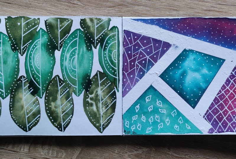
18. Project 8 : Leaves in Green Background: Next in this set is another background
that we're going to use only one color for. Again, we'll start
with plain water, create the shape and
then add in the color. In this case, I'm painting
some leaves like this. I'm adding the shape
of the leaf with just clean water and
creating this pattern. Again, depending upon how
soon your paper is drying, you can take a call on
how many leaves or how many patches you want
to do in one go. In my case, the paper is
being wet for longer so I'm creating a bunch
of leaves like this, and then I'll paint
them together. While the paper is still wet, I'll start with my first green. Again, just dropping it in
and spreading it like this. For the waves, we use the blue so this one's being all leaves. I thought of using different shades of
green for this one, but we follow the
similar pattern. We let the colors blend on their own
with water like this, and a lot of the colors will just bleed or spread
like this with water. If they don't, you can
always use a clean brush to blend them in or give
them a little direction. For all these three leaves, I'm using sap green
to start with. Next, we go with
the phthalo green. I'm again doing
the similar thing, adding in the color while
the paper is still wet. Now, I'll add in another
set of leaves after this with just clean water. I'm just trying to make sure that I'm not touching
the edges here. But if they do, that's
completely fine as well. Once again, going ahead with sap green to start with. We continue in the same manner, adding in the colors. You can see that just because I had added the water leaves
very close to this one, the sap green is spreading
on to the other patterns. You can see it's just
bleeding into the water. We continue with
the phthalo green. Now that we have
a mix-up already, I'm just letting
it bleed as well. Not too worried about
leaving that little space. One last round of leaves after this and we should be good. Continuing with
the same sap green once again for this last layer. I'm trying to add in
these little connectors so that the colors can mix. Now while this is still wet, I'm adding a darker green, the same leaf pattern
but with a dark green. This is similar to
what we did with the leaves that we created with the plaid brush and how we added in the darker blue at the end. In the same fashion, we are adding in the
darker green here, letting it blend in with
the other layers that are still wet. That's it. We let this dry before moving on to the doodling or the
lettering part.
19. Project 8 : Leaves in Green Doodle: [MUSIC] Now, let's move
over to the green. Again, for the green as well, since we have some really
dark patches here, I'm going to stick
with my white gel pen. We'll try to have a
uniform pattern here. For the leaves that are
similar in color or shade, we can stick to the
same set of pattern. I'm just adding these lines
and dots on one side. We can repeat the same
for the other leaves that are of the same color
and for this top one, I'm going to change the
pattern a little bit here. Now, we repeat the same
set for the other leaves. The ones that are
similar in color, I'm adding the similar
patterns to them. If you notice, we are
creating a mix of straight lines and curls over here so on the
lighter greens, we've just done some
simple straight lines and on the slightly
darker green, I'm sticking to these curves. It's fun to experiment with different shapes and
different type of patterns in the same background as well, and it can give you a very
beautiful mix of patterns. [MUSIC] I'm continuing the same with the last
set of leaves. [MUSIC] Now, I feel like this looks empty on the
other side of the leaf, so I'm just adding these dots at the edges for all the leaves. These darker green ones, they will have dots
on the right side. But it makes it look complete, now the leaf.
[MUSIC] We are done with yet another
beautiful project. I hope you enjoyed this
one, and I'll see you in the next one where we experiment
with some masking tape.
20. Project 9 : Masking Tape Geometric Background: For the next set of projects we will have some masking tape fun. I'm using a very thin one here. This is from Mt. I'm going to just create some simple patterns here using the masking tape and then
we paint in between them. Now, you need not stick
to the exact same design. You can have fun while exploring different shapes that you can make with these masking tapes. But I think most
satisfying part about this whole design is when you actually get to
remove the masking tape. Now, a few quick tips about
using the masking tape. If you're using it on
a painted layer, now, in this case I'm
starting out with a blank paper but if you're
using it on a painted layer, makes sure that the
paint is completely dry before you start with
the masking tape part. Also press the tape gently so that it's stuck properly
to the paper and there are no gaps in between because that can
lead to the paint seeping through the
tape and then it may not give you the neat white edges that
you're looking for. But then again, I think this is an experimental class so you can definitely do some
experiments with the tape. Now, here I'm not really following any specific pattern, I'm just creating
these triangles and shapes out of
the masking tape. Then we just go ahead
and paint them. No specific pattern as
such, just have fun. You can also use the bigger
tapes or the carpenter tapes that you get from hardware
stores. That's also fine. Just something that
won't let the water seep through the paper tapes or washi tapes that we
use for journaling. Drum may not really
be helpful because those are likely to let
the water seep through. You need something
that would create the separate sections
and hold them. Then when you remove it you
get those neat white edges. I'm starting with
the watercolors. I'm going for galaxy theme here. I'm starting with this
yellow green color. Depending on how
soon your paper is drying you can work on
multiple sections like this. But if your paper is
drying super fast I suggest going into it
section by section. Here I'm coloring
multiple sections with the lighter yellow green. [MUSIC] Next I'll add
in this cerulean blue. I love how this spreads
with that yellow green. It's just the wet on
wet doing its magic. We add same way to the other sections that
we've painted wet on wet. [MUSIC] Next, we start
with the other sections. For this I'm starting
with this cerulean again. Since these sections
are separated by masking tape you
really don't have to worry for the previous section to dry before you
get to the next one. [MUSIC] I'm using
a very light value to start with and then we add
in a slightly darker value. Next we add in a darker blue so I'm using
the Indian thrown blue here and letting it blend in with the previous
layer while it's still wet. Most of this is being worked on wet on wet, as you can see. We're letting the colors
blend into each other. For the last set of shapes I'm starting with Othello
turquoise here or you can start with another lighter blue or maybe a pink
galaxy called blazewell. Here, I'm sticking mostly
to the blues and greens. [MUSIC] Now, while it's still
wet I'll add in a darker value of the
same Othello turquoise. It's the same color but with much less water
and more pigment. [MUSIC] Finally, I
added the indigo, which is the darkest
blue I have in here. I again work wet on wet and just drop it in
and let it blend. After this we let the paint dry completely and then we go about removing
the masking tape. [MUSIC] My paper is dry and now we come to
the most exciting part, which is removing
the masking tape. I really love how the clean
edges come up after this. Just one thing to note is that your paper has to be completely dry before
you proceed with this. Also, in case of some
handmade paper there's a chance that when you
take off the masking tape, a little bit of paper comes up. To avoid this, what you can do is to heat up the tape with a hair dryer so that by the time you are
trying to remove it the glue has loosened up. But this is the fun part and I hope you enjoy
this as much as I do. After this, we go about
the doodling part on this one so see you
in the next section.
21. Project 10 : Masking Tape Floral Background: Moving over to our next
project with the masking tape. In this one, we try to create some simple flowers
and lettering space. I'm using a slightly bigger
masking tape this time and just creating
these small sections and we'll leave the
space in between them to work on the flowers or any code that you
want to write on this. I'm basically masking
this particular area and I'll be painting around it. Let's see how it goes. Now, I'll start
painting some flowers. The idea here is to continue painting as the
tape doesn't exist. You just paint all the flowers or leaves or whatever you want. You can paint on top
of the tape as well as long as you're using
a good masking tape, you shouldn't have a
problem with that. We are just painting
these flowers. The one I'm using is waterproof so you can see that
there's no paint that sticks around on the tape. I'm starting with a nice pink and we'll add in a few
more colors on the go. Add again, a hint
of orange here. Again not waiting for
the flower to dry, I'm just adding the
colors in like this. That's a bunch of flowers. Now, I'll quickly add
some leaves for this. I'm using a sap green
and a yellow-green mix. Here again, you don't have to
follow any certain pattern. I'm just filling
up the gaps here with some leaves and fellows. I really love how colorful and vibrant this
looks right now. We'll add in a few more details. Smaller leaves like this
with a darker green color. Adding in a few more details with some darker color. These could be leaves. You could also add in
some simple berries or something that
fills up this area that is left behind between
the flowers and leaves. I let this dry and then we'll
add in a few more details before we go about
removing the masking tape. All right, now my
first layer is dry, so I'll add in some
more details with a smaller brush and
some darker colors. Just for fun for adding a
bit of life to the flowers. We do the same with
the leaves as well, using a darker green color, we add in a few
more leaves on top and same for the leaves will
use a darker green color to paint some details. Then we'll let this
dry completely. Once your paper is
completely dry, we can take the masking tape off and I'd clubbed it with
some nice white edges here. Remember the quick
tips for masking tape. If you are having trouble, you can always use a hair
dryer to loosen up the glue and maybe peel it at an angle so that it doesn't
rip the paper off. That's it. That's another background
done and we'll add some fun lettering to
it in the next section.
22. Project 9 & 10 : Doodles: Moving on to the last
bit of our project here. We already have
our work cut out. We have the set shapes here. It's just about filling them
up with simple doodles. I'm not going to do a
lot of doodling here, just simple dots of
leaves and patterns. Not filling it up completely
because I really like how this looks with
those neat white edges, so adding some
simple leaves here. I'm sticking to the same
patterns for the same colors. Like the blocks where we
have the yellow-green combo, I'm sticking to the
same pattern on them. You can always
experiment with this. You can always mix and match, but just trying to keep a
little bit of uniformity here. Now, for the darker blue ones, I'll go with a
white pen instead, because it needs to be opaque to show up on these
darker backgrounds. I'm using the Posca gel pen and just adding these dots here. It looks like a night sky with stars in it and I
really like that. For the last two sets
of remaining blocks, I think I'll go back to black and add in some basic shapes, so maybe triangles like this. Adding some highlight
with the white gel pen, some dots like this. I really like how
it looks right now, especially the darker
sky with the stars, it's looking super pretty. We're done with this one. Here in my case, I stuck to the specific
blocks that we had created by separating them with masking tape and just
doodling inside it. You can always doodle
around them or on the white spaces as well. Now, in the second part, where we painted
around the tape, these flowers and leaves, I'll try and do some
lettering again. Some simple message
like this one, because it's extremely
important in these times to live, laugh, and love. I'm adding in those thicker
downstrokes with the pen. I had this quote in mind, so that's why I took those
three specific tapes. You can always go in for
a bigger message as well, and you can add in multiple
words in each block. But you can see how, when, since we had kept
that space covered, and we painted the
flowers around them, it now looks like
you painted them around these beautiful letters. Using my white pen to add
some quick highlights. We're done with
all our projects. I hope you enjoyed this, I'll see you in
the next section.
23. Thank you and beyond!: Thank you for joining me on this beautiful relaxing journey of Sketchbook Explorations. I hope this inspires you to
start a sketchbook practice, or if you're already at it, I hope it helps you maintain it. I would love to see all the beautiful projects you create. If you do try out the projects, please do upload them in the project section
of this class. If you are on social media, you can find me as
that crazy doodler on Pinterest, Instagram,
and Facebook. As always, if you
have a feedback, positive or negative, about this class,
please feel free to share the review or reach
out to me personally. Your feedback
really helps me get better at what I do and
create better classes. I hope to see you soon
with another class. Until then, keep creating
and keep inspiring.
 Vinita, That Crazy Doodler