Transcripts
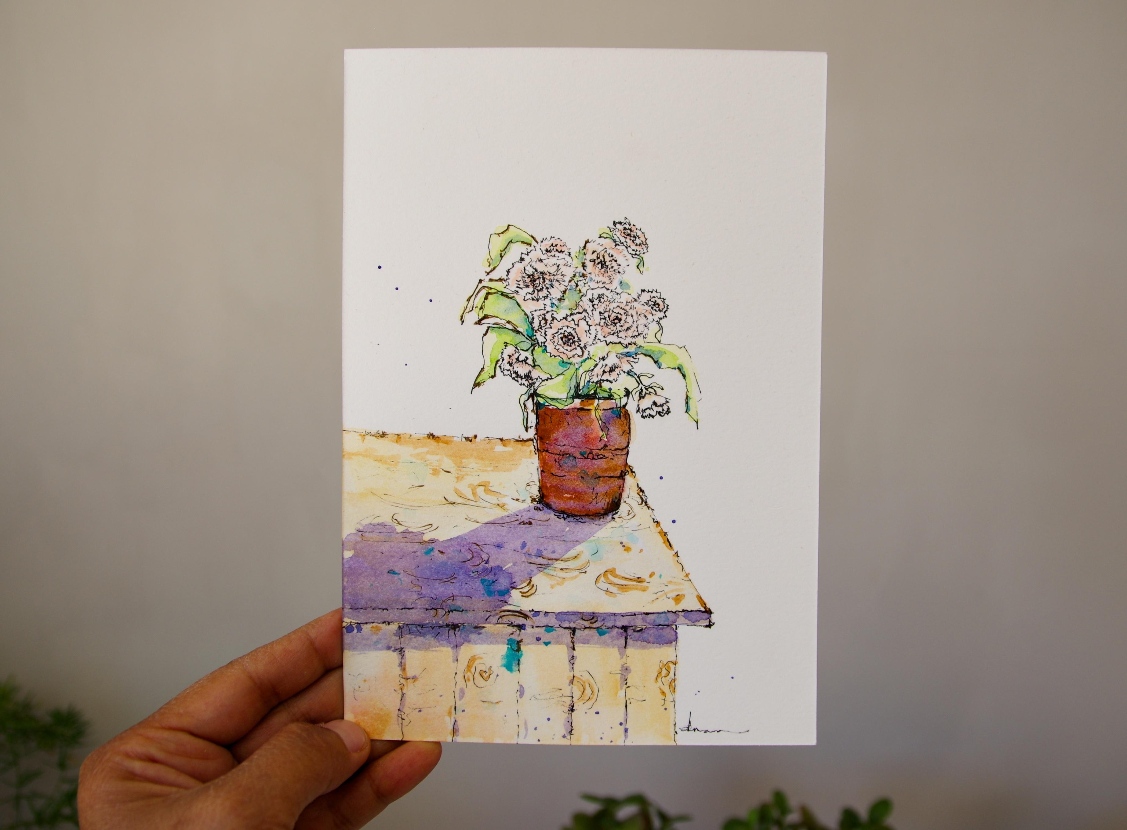
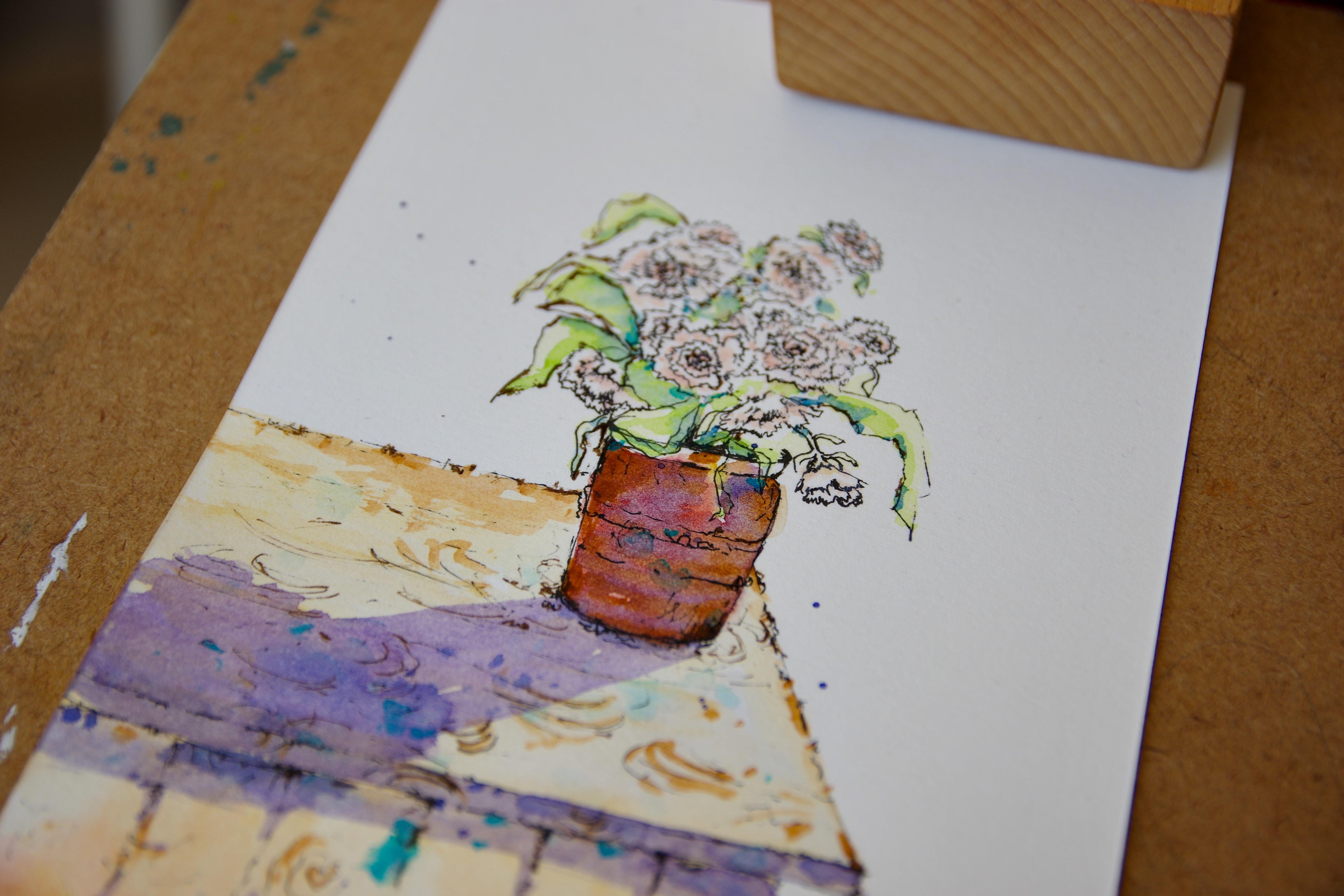
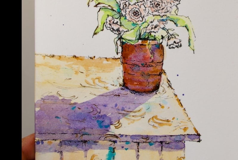
1. Class Introduction: His Jonah Here, artist An
Ill Strater welcome to this beginner friendly
painting class using the beautiful ink
and wash technique. In this class, we'll be sketching and
painting a carnation, a simple yet elegant
flower that's perfect for learning how to
work with ink and watercolor. You'll learn how to sketch
confidently with ink, create expressive
shadow add loose stress free watercolor washes that bring your art to life. This class is all about
enjoying the process. No pressure, just
playful creativity. It's perfect for beginners, but artists of any
level are welcome. By the end, you'll have a stronger understanding of
ink and wash. Fair warning, this technique is very
addictive and once you try it, you might not want to stop. You can follow along with my reference photo or use
your own if you'd like. Grab your pen, your
brush, and let's dive in. You'll be amazed at
what you can create.
2. Materials: Everyone is donna here. These are the materials
that we are going to use for this ink and wash
watercolor carnation. We're using cotton, eight times 5 " of paper, and for pen, this is an ink pen and I
recommend that you use the waterproof ink pen and try it before using it on
your final project. You don't have to buy
expensive materials, just have materials
that are worth it. Next, we have the
watercolor palette, and this is Paul Robins that I'm using and this is
a professional one. But if you don't have, just
use whatever you have. So watercolor paints,
this one is really vibrant and it's very
absorbent, so it's really nice. Next, these are the colors. We have yellow org, bright red, indigo
purple, borne sienna, van **** brown, ivory black, lemon yellow, sap
green, tortoise. But whatever colors you have Try to experiment it if you have cool
and warm colors. Of course, you have
your tissue paper, your glass of water
or baketa water, and of course, lots of fashion and patience
and determination, and I can't wait to finish
this painting with you. Everything will be
available to download, so please download
it before we start.
3. Sketch and Composition: Thank you so much for
joining me in this class. I'm so happy to have you here, and I'm very excited to paint this ink and watercolor
painting of carnation. And this is pot. So let's begin. By now, you have downloaded
your photo, the reference, and that you can
also use some of the other reference that I'm going to give you in this class. You are able to download
that in all our FDA files. I'll be using this
paper and this ink pen. Now I am trying to make sure we are going to start
at the very middle, so the mouth of the jar. I decided to to use a jar instead will be at the
middle of the painting. I am starting with points and
it's going to guide me to have the correct angle and
lines and shape that I want. We are going to use the
final painting as a guide, and I feel like it's better
to use that gender reference. But of course, you can download the reference photo with you. Now I am doing my sketch really, really slow and I'm not really in a hurry.
We're not in a hurry. We just want to enjoy the
sketching pot and I'm making lines is more like an
arc but really slight arc. Now, I am going to to drag the lines down so that we can
have the shape of the jar. Now that I have, I'm not
sure if this is a jar. I think this is more like a pot. We're going to make
a pot instead of the jar and I've
changed my composition obviously and feel free to use to use the
reference as it is, and to cap it as it is. So now we have the bottom of the pot and I'm going
to drag my lines down. I'm going to use another point, the points again to guide
me through the lines. I'm dragging it really slow. As you can see, I am
using an ink pen, but feel free to make under
sketches using the pencil. Then later on when you're
done with your sketch, you can erase them very lightly. This paper is 20% cotton. This is Paul Robins, watercolor paper, and this is the first time that I'm using
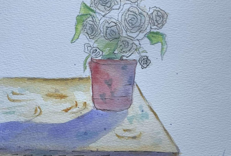
it and it's really nice. I am making now the petals of the carnation and the
reference is bigger. So I am actually
doing smaller petals, smaller flowers of carnations. I'm very careful and I
started in the middle. So we have the jug shape circle, but it has little spiky petals. Carnations, they are spiky
petals and it is perfect for ink pen because we can do it really
well with the ink pen, especially with the
pointed tips like this. There are two ways to
make your carnation. One is to start in the
middle and then another one is to start from
the shape itself, from the outside and then
you go to the middle slowly. I'm making really jag and
pointed edges of the petal. And I'm doing it really slowly. If you notice this
reference that we have, it has you don't really know where is the
middle of the flower. I'm just making small
sections inside the flower and as long as
you're doing it slowly, you can have that spiky
petals that you want. Here on the left, I'm going to add a
smaller flower here. So one of the tip another tip
that I can give you is to really observe your reference before starting the painting. It doesn't have to be perfect. Sketches, lines and shapes, but at least it has
the correct, you know, it has the correct lines. So using this ink
and wash technique, so I would say that you spend at least 80% of this painting in general
really on the sketches. We are focused more on the sketches rather
than the washes. Most of the paintings that
you see with this technique, you have really light
watercolor washes, and I think it makes sense because it's going to show
the lines that you have. I'm going to add another flower. I've changed the
composition and we are trying to balance the
painting at the same time. We don't want it to
be a big bouquet of circle of flowers
in a round shape. I want it to have
that even and more artistic position of my flowers. So here, as you can see, I've started outside and then the middle
and we're going to go farther and farther
inside the flowers. It really depends on
how you want to do it. So if you want to determine already the
size of your flower, you start at outside. But if you want to do it
gradually and you want to add, maybe you will change
your mind and you make it smaller or bigger, then you start in the middle. I think this is a very
stress free practice and it's really fun
to use ink technique. This pen that I have actually
is not 100% waterproof, but it's because it is really, really fine line that it doesn't bleed even
if you add the washes. This is really a cheap pen
that I bought in Asia. Now I am trying to
add more petals or flowers in my painting and feel free to experiment with your composition
with this one. So far, I like it and obviously I still
need to add more flowers. Take a moment to look at
your sketch and plan ahead, I think is very crucial
and it's very important, especially with the ink and wash and if you are starting
directly with the ink because obviously you won't
be able to correct them or erase them easily once you
already started the lines. So plan ahead and
it will give you the confidence for any execution that you want and it will
show onto your painting. So this one, the position of this flower is
kind of falling. Of course, we're going to
add the shadows later. But I'm still going to add darker lines to tell me later that this is part
where there is a shadow. That's it. Well done, for this first part, I congratulate you and we are going to go to the
next part of the sketch, and this is going to be really
exciting. I'll see you.
4. Flowers and Leaves: Pot of dcation ink and
watercolor wash sketch, and we are very
excited for this pot. Also this is the part of
the sketch and the painting that I am going to give more tips on how to get
better at sketching. Let's begin and I can't wait to finish this
painting with you. So now I am adding flowers on the top
part of the painting. We are sketching
section by section. You still have your
reference with you and you have your guide with you while
you're doing this with me. And now I'm starting outside, so we have the shape of the carnation and then
we're going to move slowly and little by little
to sketch inside with the jag or pointed
tips of the petals. The first step that
I'm going to give you is to master
your basic shapes. It starts with simple
shapes like circles, squares, rectangles,
triangles, cylinders. Almost everything you can draw can be broken down into shapes. For example, with this one, we have a round shape
for your carnation, practice drawing them in
different angles and positions, and this will help
you understand from the form and the
structure of your painting. Keep on practicing the shapes. So now I am adding the middle parts of
the carnation and I'm really doing it very slowly with the jug edges of the carnation. Carnation has got to be one
of my favorite flowers, and I don't know about you. Probably you also like carnation and flowers they
always make us feel happy and it has a mysterious flower in
it that makes us happy. So this painting of yours, you can make a lot of things. You can give it as a gift, or you can also display
it in your living room, or you can make it as a card or a thank you card
or whatever you like. And even a bookmark. Go. So in between these flowers, there are some leaves. I'm leaving some distance right
in the middle right here, and this one, I'm going to
put some leaves in here. So plan your composition. I have so many classes here
in this platform and I am guiding you and introducing
you to composition, which I think I
strongly recommend that you practice because it is the most important
part of a painting. So if your composition fails, then everything else will
fail on your painting. Another thing is that
learn your proportions. Proportions refer to
the relative size pots in relation to each other. Here we are adding flowers like big and small
and the biggest. We don't just add flowers
randomly with the same sizes. It's one of the goal not to make a big round or a giant
circle on your painting, but you have to vary the sizes, you have to vary the lines. So far, I like this sketch, and I'm pretty sure
you love yours. And if you don't give up
to start all over again. Maybe it will also help you
encourage that I've done this sketch quite a lot before
finalizing my final sketch. And when I'm not
very happy with it, I always do it again and I think it's
just really a matter of how eager you want to learn and your dedication
and your passion. On this spot, I'm adding a flower that is
just a falling one, so it's going to
change our composition a little bit and we'll balance the overall
impact of our flowers. On top of this, I'm going
to add a medium size of flour to balance the
upper part of my sketch. So I would also find
time to move my sketch. And look if it looks
balanced because if you are to focus on your sketch
and your eyes is 100% on it, sometimes you don't see the
balance or the composition. So you have to
move away a little bit and just look at it. Another thing that I had to really study well when I'm doing my sketches and I started really on this one is to
understand the perspective. Perspective creates the
illusion object and learn the basic principles of
1.2 0.3 point perspective, and this will help you
draw objects and scenes in a way that mimics how we
can see them in real life. I'm looking at my sketch again, and does it feel right? Yes, it feels right
for me right now. And so we're going to
continue with our sketch. And I'm going to add I'm
starting to add the leaves and so the stock on my flowers. But we are going to work on the texture of the
pat right here. I really hope that you are
enjoying this sketch and, you know, enjoy your sketch as much as you enjoy your painting. Mm hmm. Mm hmm. So we are almost finished in the second part
of this sketch, and we still have some pots
that we need to finish, and you will see that
it's getting really, really interesting once we will start adding colors and making
this sketch, turn into. I'll see you in the next
part of this sketch process.
5. Details and Tips: Okay we want to carnation sketch Potter and we are so excited to finish
this sketch with you. We are almost there, so let's go and start sketching again. Right now, you already have your reference photo with you to guide you through
the sketching pot. This one, I have added some darker ink onto
the mouth the pot. This is indicating the
shadows on my sketch. In this pot, I am going to give you tips on how
to get better with ink and wash and drawing and
also we are going to add the table and also the
other small details that will definitely
change your sketch. So far, I like my sketch, and I hope that you like yours, and if not, then go ahead and sketch it all over
again just as I did. Perseverance, titans, we definitely need that in
everything that we do, right? So I'm looking at the sketch and now it's time for
us to add the table. I change my table and it's up to you what kind of perspective or structure of the
table you want to have. And also, I will try to
balance the table on how big or small it is depending
on the size of the spot. So in order for me to have the right perspective
and balance on it, I have to imagine how
it looks like for real, this table with a pat on it. So I'm using the point
to guide me through, and I'm holding my inkin in a very slanting position as
if I am holding a pencil. I am actually using an
easel, as you can see that, but it's going to be easier
for you if you are probably sitting at the table and you would put your
arms onto the table, maybe that's easier for
you to make these lines. As you can notice with the
ink and wash technique, you don't need to
have straight lines. The more crook it is, the better as long as it has this correct structure and
perspective for the eyes. I'm using the point again
to guide me through, and as you can see, I'm
not making straight lines. First tip for this class, for this pot, start
with pencil first. As I've said before, that if you are more
comfortable with a pencil, go and start with a pencil
and then the ink pen. The second tip would be
use different line weights as we have been doing
throughout our sketching pot. Varying the line thickness adds depth and interest to your work. If you have the same line
weights of your ink, it will look boring and dull. As you can see, this is
the table made of wood. We're adding some lines in there and not sure what
exactly is called, but we're adding some
lines in there to make it look a little bit realistic, although we are not
up to that realistic so some people might
use ruler to do this, but I recommend that
you don't just put rest your arm on the paper and try to practice it on
another piece of paper. And I think the
more you practice lines as I've said at the
beginning and shapes, the more you get better
with this technique. It's finished for the spots. Let's go to the next
part of the sketch, and I would like to say
that congratulations in going this far and you are
doing very, very well. I'll see you. So
6. First Wash: Welcome one to the painting
part of this class is the carnation painting
number one and it's going to be the most
exciting part of this class. Let's go and start it right now. I have with me, of course, my reference to get me along and I am using
brush number two, and this is a normal brush and I am mixing my watercolor paint, this is a yellow orb with
lots of butter in it, and we are trying to make a light orange or pinkish
color of our petals. As you can see in the
reference is white. But if you look closer
onto the flowers, it has some really light
colors of pinkish and orange. We are going to use those
colors to pop up our flowers. I recommend that you use a paint brush that has pointed
deep because it will be easier to work if you have
the same reference as me and you have sketch
your flower not as big. If you have the same
size flowers like I did, then we have to use
the smaller brush. This one is brush zero and that's the
smallest brush that I have right now and I felt that that brush was a bit
too big for my flowers. I added a lot of
white on my orange, I'm going to lift
some of the colors, some of the pigment
onto my flowers. If you are starting
out this ink and wash, you can see that
it's better to use a light pigment of your
watercolors because it's going to be the lines that is probably more important than your washes in this
process and it's going to be very quick while
we're doing this. You can also see that I
am leaving some white onto the flowers and those
will serve as the light. The light of the painting
is coming from the back and we want some shadows and some lights
onto the flowers. I'm leaving some white. I'm just really dabbing
the watercolor paints, very quickly because the sketch that we have is quite small. I really hope that
you are enjoying this part of the painting
and one of the first tip that I could give you as
well in this process is that when you are trapping
your watercolor paint, just leave it as it is and
don't overdo your brushes. Also, it's very important where
the light is coming from. So decide at the beginning where you want your
lights to come from. Observing your reference or the place that you're going
to paint is very important. I left it to dry
for a few minutes, then I moved to my leaves. I am using the lemon green, but you can experiment with your own greens
like maybe sub green, but keep it light as possible. We don't want to
cover our lines. What I like about
ink and wash is that it takes away
the pressure that everything will be perfect and it's just really artistic and every student will definitely have their own version
of this painting. I'm really excited
for you to share us your own version of this or another reference
that you use, and I'm pretty sure
it's going to be great. Please post and share
your paintings with us. I'm sure it's going
to inspire us. While the first
was was still wet, I'm really quick to add
another color and it has more pigment and I think this is the combination of sub
green and lemon yellow. We are adding darker shades
another total value to indicate the shadows on our
lips and as you can see, it's going to make the flour pop up because of the contrast. So so far, I like the
result of what I'm doing. I was able to keep it light
and that was a challenge. And now I am adding another green and this
is a darker version, and probably the darkest
version of my green, and this is sub green and I've added some shades
of blue as well. I've added aquamarine
blue on this one, and I'm really doing it very, very quickly so
that we will have that loose effect on our leaves. Do it while your
leaves is still wet. Said girl Also, I forgot to say that if you want your carnation to
have different color, then you can definitely change the color
of your carnation. You can have it red,
you can have it yellow, you can have it pink,
whatever color that you like, as long as you feel confident in doing so and it's going to
show onto your painting. I really hope that
you are enjoying this process and that you
are not very stressed. If you are a beginner,
I have a lots of classes in this platform
that you can start with. They are beginner friendly. Looking at this
painting, so far, I like the results and I like the loose effect on my libs. We're going to continue
and we're going to finish this painting and we will
be working on the pot. So I'm drapping
bright red yellows. I'm going to mix
all these colors directly onto the paper. I'm just dragging
down all the colors. This is the first
wash for our pot. Thank you so much for
joining me in this class, and I can't wait to finish
this painting with you. I'll see you in the next
part of this painting and I hope that you will love your own version
of your painting. I'm just dropping
more and more colors actually before we
add more washes. So that's it. I'll see
you on the next part of the painting and just keep on following until we move
to the next video. Here I've added the purple and we're going to use the purple
to add the shadows later.
7. Shadows and Layering: B. Welcome back to this painting the
carnation ink and wash. And now we will be
working on the table. And this is yellow org
and I am using brush six, and this is a normal brush. I am just dragging some of the colors and I'm
just letting it, work on the paper. I am adding the purples, of course, feel free to add
any color that you want. And this one, you can mix the warm and the oh on the table. And once we are done
with the table, we're going to be
working with a shadow, and this is a very
interesting part because the table is going to make the difference with the overall composition
of our painting. This is a bold stroke, and this is yellow orc. I'm also adding
some cadum yellow, and I want this table to
be a little bit medium dark so that it will have a nice contrast on the dark
part of the carnation flower. That's it, and I like this color because it's warm and on this part,
I'm just cleaning. I'm making the edges even
so that it looks nicer. Now I've dried the paper, and then we can add the shadow. The sun, the light is
coming from the back, so the shadow is at the front, and of course, added this. It's because in our reference,
we don't have this, but I really want to
add shadow on this one, especially with the
table and the flower. It's going to be a
really nice combination. This is purple and
we are working on a very, very dry paper. So we don't want to
overdo this part and we are just doing really quick
and confident brush stroke. So as you can see, we
have some flowers. So I'm adding this part
because we have some flowers, of course, so I'm
adding this part so that it will look realistic. That's why from time to time, I recommend that you work plain air and you observe
the objects as it is so that you will have a better guess or idea
on the actual painting, especially with the
shadow and the light. I drop some blues while
this part of the shadow is still wet and it's going to give us a really nice
texture at the end. It's really important that you mix your watercolor
pigment very well before trapping
it onto the paper so that you can achieve the
color that you really like. We are adding shadow
on the table. I've got lots of videos and
classes in this platform. That's going to teach
you about shadows and composition and about light. So please visit them because I am sure that you're going
to learn something from them. I really hope that
you are enjoying this class and that
you are not very stressed and it's time to light up a little bit
and just enjoy the process. Here I am adding
some tonal value and darker to the value
onto the shadow so that it will have a
little bit of interest. And here I am splashing, but I have to be very careful that they are not
really that big. I changed my brush and
this is a smaller brush. I think that's a smaller
brush that I have. This is a very cheap brush
and I'm just dragging some colors and I'm adding more warmer total
value onto the table. The shadow is the cool tint
because it's purple and blue, and then you have the yellows. Those are warmer like the reds and I'm
just mixing the two. Mmm. You might think that this is
already finished. Not yet. We are going there
and we keep doing and adding more and more details until we feel that
it's complete. This one, this color
it's ocean blue, and I feel like I
really need to add another color the third
color that will make this painting pop up
and have more interest. Feel free to experiment
on this part. I am very excited to
see your own version of this painting and what you've done on your own version. So please share it with us, and we're super excited
to see your own painting. I am dropping this
ocean blue everywhere, and I'm just making it unified. I am unifying the
painting so that it will look like whole in general. So far, I like the
results and we can see that the shadow
is really bright. The brighter you
want your shadow, you want to be adding light, transparent
watercolor paint. Now we're going back to
our ink pen just to add some details and some lines and contrast onto the painting. I feel like here in the
middle of all these flowers, I need some dark ink pen, so we're going to
work on that and we're going to add more
lines and contrast. You will see that your flowers and the pot will
definitely puff up and will play it
through which is the main point of view
or the main focal point. So what I'm going to
do here is just to add really quick lines onto almost everything,
even the table. This part of the painting
is probably the best part because you know that
you are already done and you've done the
most difficult part which is the sketching. You just enjoy this process, but don't get carried away
and add too much detail. We still want to keep it light and simple as
much as possible. Mm. So I'm just adding some highlights
and I'm still following the first
line that we did, and I'm not trying
to overdo this part. I just want my carnation flowers to be a little present in
the painting because they were a little bit fade
and we couldn't see them very well when you look at the painting
at the first time. I will be doing more and
more ink and Wash classes. So please continue to
visit the channel, the platform so that
will be you can see more of the ink
and Wash technique and learn more about it. There you go. I like the
contrast that we have. Those dark lines of blacks
are really cute to look at. I'll see you at the next
part of the painting. Of course, job well done.
8. The Project: Cora, we finished this painting. Thank you so much for
painting with me. It was a pleasure and now we
are going to add a promise. This will be the last details, and I recommend that
you continue doing this because it will change
everything on your painting. We're adding the final
details using the ink pen. I really hope that she enjoyed the process
painting with me, and I have more classes
about ink and wash. It's just something that you cannot stop painting,
as I've said. Once you start with
this technique, you'll fall in love
with it and you will continue and doing it
on your future artwork. One thing I could give you
as an advice is at the end, make sure that everything is
completely dry before adding these last details and you
just enjoy this process, but do not get carried
away and overdo this process because it
can change your painting, please share your
painting with us. You will definitely have constructive criticism
from me or your peers. I think it's really nice if
you share your own version of this because I am sure that with the ink and watch
watercolor technique, everybody, every student, every artist will have
different version of this, and then feel free to
add your signature. Post your painting for constructive criticism
and of course, the most important of all
is to inspire the others. So far, I like the result of my painting and I hope
you like yours as well. I feel like I still
need more highlights like darker ink pen lines. I'm adding this one. It's just a normal ink pen
and this is not waterproof, but because the watercolor paper has already dried,
so I can do it. If you feel like you need more highlights,
feel free to do so. But if you are already
happy at this stage, then feel free to stop as well. To have that really very short summary of
what we've done. The first thing is you
choose, of course, your watercolor reference,
your painting reference, and then we started making
sketches using the ink pen, and then we applied, the watercolor paint
from light to dark, and then we added some lines along the way
until the final process. Do this process when you are
starting another project. A In the discussion, you could also
communicate with me. You can write down when
you post your project, you can write down any
request that you want me to faint for you and we
can learn together, feel free to write it there and I could
definitely see that and I will be very happy to paint or sketch
your dream project. And of course, if
you have any ideas, it is very, very welcome. I think it's one way for
me to grow as an artist and for us to grow together
as artists in this platform. So I'm very happy with this
result, and I'm sure you are. So thank you so much for
joining me in this class, and I hope to see you
in my other classes. And of course, job well done. You did very well, and I congratulate you for your own
version of this painting.
 Dawna Mae, Author-Illustrator