Transcripts
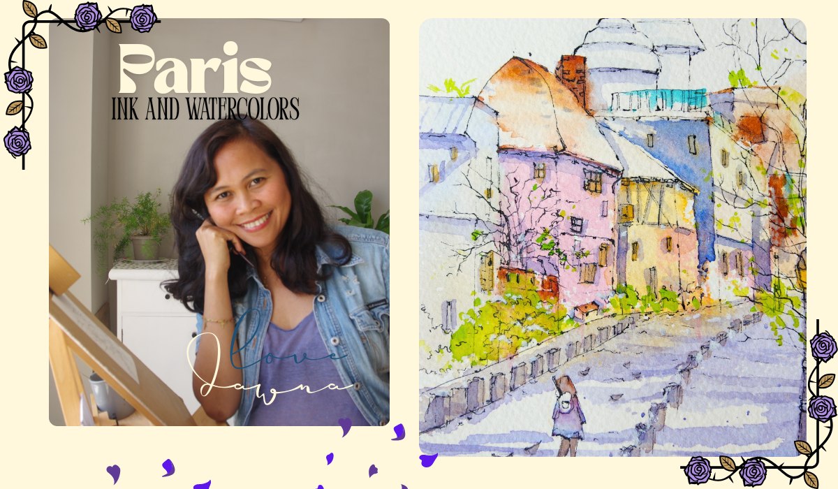
1. Introduction: Virgo and Donna, I'm a Filipino French artist and illustrator and in this class, I'm excited to
take you to one of my favorite place is Paris, and I spent many years here and this place greatly
inspired me as an artist. In this class, we'll explore urban sketching using
just ink and watercolors. You can paint Paris on your own. Favorite place is up to you. This class is suitable
for all scale levels. I know it can be challenging, but I'll walk you
through every step with clear and easy to
follow instructions. You'll learn how to simplify conflict scenes lines and shadows and create
better compositions. By the end, you'll feel
inspired and confident to use this technique and fun approach to painting in your own work. As a sub taught artist, I know all the struggles,
being a startup, and in this class, I'll be sharing
my journey of how I learned and became
a watercolor artist. Through patience and practice, I believe that you can
achieve your goals too. Whether you're looking for
a challenge or just want to enjoy a step by step process
this class is for you. I'm excited to guide
you and help you enjoy the process of creating
beautiful arts. So let's go and paint together.
2. Composition: Bongo Talmands Donna and welcome to this ink and
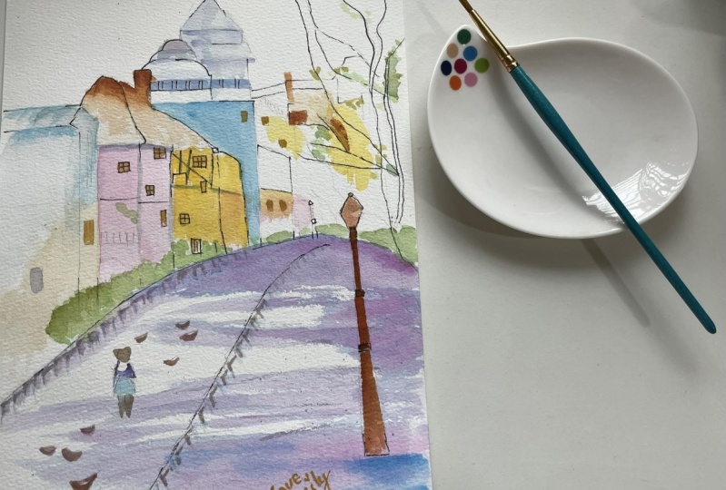
watercolor painting of Paris. We are on the sketch pot one and I have with me the arches rough surface of eight times 5 " and my ink pen, of course. By this time, you have your reference photo
with you as well. We always start with a plan, and this is we consider as
well the size of the paper. We start with your reference. We have the focal point. This is the major
part of the painting. We have the pink building as the major part of
this reference. I am using the dot to
connect my lines because it makes it easier for
me to make lines, although I'm not trying
to make straight lines, but then it's always nice to have good perspective
and correct lines. We are sketching section
by section and we will break it down into small
pieces so that it's easier for us to sketch and
also it's stress free. As you can see, I am using lines with different
vibrations of shades. I'm varying the line weights. Ticker lines can be
used for emphasis, such as outlines while Tinner
lines work for details. I'm working on details on the
focal point of this sketch. As you remember in
some of my videos, we have three
important subjects. You have with you your major, your minor and your jumper. The major here is
the thing building and the major is
the focal point. Then around that are the minors. A smaller subjects or
buildings and the jumper is the one that's going to
connect everything to have this balance painting. So we have the
first focal point, and then we have the second
building on the left, and I'm going to start
sketching this as well. If you want to know why I've
chosen Paris this time, that's because I was once a Parisian and I know
this Paris by hot. And actually, I've lived right
at the foot of this hill, and I am very familiar with
the stairs going uphill, to the Sacrca Basilica Church, and from there, you have a
nice panoramic view of Paris. So choose the place that you really like to draw
and makes you excited, and I think it's going
to make a difference on your final output. So I'm going to the right, and this is the
third building which is also part of the minors. And I am actually
as well adjusting the height of the paper and
the size of my subjects. So the lower pot, which is the foreground, I'm also trying to
calculate that so that you will have a space
that's not too crowded. Normally, the focal point
is the one that has more congested feeling and the background and
the foreground, they are more in they
have more spacey feel. So in ink works in inks
technique like this, usually you sketch at least
80% of the reference, but it also depends on
the style of the artist. Go ahead and experiment
on your own. You don't have to sketch
exactly what I am doing. Now, I'm still working
on the minors, so we're going to the
right side and this spot, as you always work
in three shapes, you have the big, the
small and the smallest. Here I'm trying to
make it not too high. Not too high because
we will still have the Sacrec basilica church roof. This will be the second
highest point on this sketch. We don't sketch everything
with the same shapes, no repetition with the
same shapes and lines. So my pen is not
really working well, but I took it on my advantage because I want to
vary the lines of my sketches and also
I'm adding space in between because if I
want to add more details, tiny details like the
roofs, like the chimneys, or anything because
this is Paris, and it's always congested. There's always this little
little cute something on the roof or on
the architecture. I'm saving these small
spaces for that. I think this technique
is really working well, especially for the beginner, especially if you want to adjust something because the moment you make really thick inclines, you won't be able to adjust that at the end
of your painting. Now I am trying to adjust and calculate the shape and
the size of my roof. I always start with a
point and this point is, of course, going to guide me on the correct shape
of the object. You're asking me, is
these points going to matters going to change how my output is going
to look at the end. It always depends
on your preference. For me, point my points
is part of the painting. Here I'm adding some chimneys, some tiny roubs and I'm
trying to make, you know, the painting look
more like Paris. I
3. Sketch: Here I'm adding some chimneys, some tiny roubes
and I'm trying to make the painting
look more like Paris. Of course, you can see that
I've changed some shapes and compositions and that's okay because I think if you know the place or
the reference very well, it's going to guide you on
how it actually looks like. And that's why if
you've chosen to sketch this reference or if
choosing to sketch something, then at least get familiarized with the reference and try to look at it for a few minutes. Don't just start haphazardly
and this always goes back to the main points that you
should plan your sketches way ahead before you touch your
paper with your inkpen. So I've adjusted the size of my basilica church
because my focal point, the roof, they have
bigger roof, so roof. I decided to make the roof of the basilica a slighter
smaller than it really is. If you feel like you need to sketch with your pen
prior to this ink pen, we'll go ahead and always
do what you think that is you should do and always try
to listen to your instinct. Don't just follow
your teacher in art, but you have your own
experiments and your own, outside of the box thinking. So I won't be able to show
the tip of this basilica, and I'm just going to
show some part of it, but I still need to
adjust the size. I'll give you the
first tip on how to improve your skills
in sketching. Number one would be to master
the basic line control. So practice straight, curve circular lines with smooth
when confidence strokes. For me, this confident it
always goes back to how often do you practice and how serious you are
really in your craft. Also, as you can see, I am sitting and I'm not
actually using a table. I'm using an easel. It's because it's
for technical reason because of the light. I am able to adjust
the light easier. This is the reference,
and this is how I am actually positioning
while I paint and sketch. So we have the section
by section sketches. You have the focal point and then to the
left to the right, I've started adding
the buildings which are the minors on this painting. Here in this spot, this is less important because I
will be covering this with the trees with the branches and twigs
of the tall trees. But I'm still going
to sketch them lightly as possible so that we will have the vision of overall
picture of this scenery. I love this part
of Paris because every afternoon after work around 5:00 in the
afternoon five to six, this is a very lively and a very touristic spot if you've been here and the place is just, you know, very much alive with the music and it's just a
busy busy tourist spot. I am going to work
on the foreground. That's why I was doing my
best to leave space on the foreground so that we have enough space to sketch our road. These roads and
sidewalks is very important because it's going to lead us to the focal point. I will try not to make a
very, very straight lines. As I mentioned this before, the thicker lines
can be used for emphasis while thinner
has work for details. Also for me, when
you vary your lines, you have the light and the dark and then you
have some points, it's going to add drama
and contrast onto the painting because these lines of course black and
your paper is white, so it's definitely going to add those interesting contrast. Burying pressure on your pen or brush can make the
artwork look more dynamic. Another tip that I
could give you is draw lines without undoing
them repeatedly. So once you make those lines, commit to the stroke. It's going to show that you were not confident
in that stroke and eventually it will show your confident overall
on your painting. Be confident, plan ahead. If you need to do
some ghosting on your line before the drawing with your pencil, then go ahead. Whatever makes you feel
confident on doing that line, do it. There's no rule. So now I'm adding the pools, the lamppost and this one, I'm pretty sure I can remember this very well because I've been observing this in
any area of Paris. Another tip that I
could give you is that learn from
reference and master. Study the line art from experienced artists,
comics and animation. Me, I will find myself
spending hours looking at some of my favorite artists in
Instagram or in Pinterest. Those are my two favorite places to look at and be inspired with the work of other artists and it always always give me
an idea on my work. So here I am adding
the lamppost and I've made a faraway one and the one that is very
close to the foreground. It is a course bigger. One of the things I actually
do is to experiment by mimicking different
styles to develop my own. Before I've done this painting. I mean, this final sketch, I've actually done quite
probably three or four before I decided to finalize it. I actually do a lot of free sketching before
the final sketch. So if you think that I've
done it all at once, then you're not alone
because I've done it so many times before
this final sketch.
4. Trees: So here, I'm going to add the trees as we can
see in the reference, and I'll try to
copy it as it is. When you're doing this
tree branches and twigs, try to to make lines
with varying weights, you have light and
dark, thick and thin. The more you go up, the
more it gets thinner. This part is very
enjoyable part and I like this because once you
add actually the trees, they are the jewels
of your painting. The whole appearance and feel of your painting
change instantly. I like adding trees, flowers, bushes onto the trees, sometime, I mean,
onto the sketch, sometimes I would
also add right at the beginning of
my sketch right at the section that I
am working because it gives me that
instant confident that, this painting is
going to be great. Okay. So using the right tool, especially if you're a beginner, is really important
because it's gonna make a whole difference on your
experience as an artist. But right now since I'm also starting with a line and wash, I'm just enjoying the
inexpensive materials. But then the paper, I would definitely
suggest that you use at least 20% cotton
watercolor paper. We are almost done with this
sketch on the part one and the next part will be we will be adding more and more
details onto the buildings. Before we move on
to the next step, I'm just going to add more twigs and branches
onto this sketch. So I'll see you on the
next part of this sketch, and I'd like to tell you that this sketch of Paris
is quite challenging, but I'm very positive
that you will have a great result and just
trust yourself. So let's go. Oh
5. Small Details: Hello, everyone.
Welcome to this ink and watercolor painting Paris. Hello is Jonah, and we are super excited to get
to the final result of the sketch because I
know that you will have your own composition
and everybody is different. We are very excited
to have that to see the own version that
you've done and I'm just going to
let you know that no matter what's the result of
your sketch or your painting, don't give up and
just keep on doing it and have a confident
on yourself, add onto the process, and everything
will be just fine. Now, I am going to add
the small details on the painting from the left and we're going upward to the hill. We're going uphill to the
Secrecal church and it's the same time that we are going to add details
from left to the right. For me, this is the most
exciting part of the painting. Well, second to the
painting part itself because we've done the most
crucial part of the sketch, which is adding the
three major subjects. You have the focal point, the minors, and the jumpers. Now we're just enjoying
adding the little details or the jewels on your painting to make our sketch
look like complete. Uh We are still working on the focal
points of the painting, and here you will
finally see how important it is to vary the
total values of the ink, the lightness and
the darkness of your lines so that there will be less overlaps on our
sketches and lines. I also think that
this is different. It really depends on every artist on what's
your preference, feel free to experiment
on your own. This is the first example. I'm going to add
bushes on these parts. This is to balance the
painting because on the right, we've added the trees. They are huge and crowded. I need something to balance
it on the left side. Here we are trying to do some bushes and here there's
some little overlaps, but still it's not that visible, especially if we
are going to cover this with watercolor paints. This is why I'm doing
some little trick to vary the lines of my ink so that
there will be less overlaps. So I hope that you that you are enjoying this part
of the process. You don't give up when
you feel like nothing is doing right because
I've done a lot, a lot of sketches
before, you know, getting into the final
sketch that I'm doing now. So it's just a
matter of patience, of determination, and,
of course, effort. Here I'm adding the
tree on the left, and I've actually made this bigger than it should
be in the reference. It is, of course, to
balance the painting. So when we are adding the darker lines or
the darker lines, we are bringing the attention of the viewers onto that line. And since this is still
part of the focal point, it's still a little
important or still a little crucial that we make
the lines a bit more visible. Dark lines in ink and wash is like adding contrast
onto the painting. As you can notice where
I'm doing these lines, I am varying the thickness and the lightness of the lines. That's depending on when
I press my ink pens. It will have dark lines
and bigger lines. And when I press it lightly, of course, it will
have lighter lines. It also depends on how
you hold your pen. I am holding my pen
like a pencil I'm holding slightly when I'm doing and holding it a
little bit in the middle, then you will have
a thinner line. Straight pen with
very strong pressure, you're going to
have a very thick and maybe straight lines. We are almost finished
for the sketching part of this painting and
now we are going to move to the last
part of the sketch. But
6. Final Sketch: Part five of this Paris
ink and watercolor, and I'm super excited to finish this with you and
you've done it. We're almost finished and you've finished the most crucial
part of this sketch, and now we are
just enjoying this adding the details of
the Paris cityscape. I'm adding more twigs
and branches on the left side because I
want to balance my sketch. Now we are going to add more
details on the focal points. We're going to add windows. And. As you can see, I've changed a lot of the compositions and
details onto the painting. If you have followed
this reference, then I will be very, very excited to see your own version, as I've said before and if you have decided to use
your own reference using all the techniques
and the advice and the practice that we had since the beginning
of this sketch, then I would be very, very excited as well
to see that and see how you made your
ink and wash sketches. Below, I added the small trash because we can see that
everywhere in Paris. I feel like I need to add a little bit more
to balance my painting. Okay, so we're almost there, so we're going to work on this house on this house or
probably it's a building. And this is unique. This building is unique because it's not very often
that we see this in Paris. We usually see
this building with wooden lines outside
in Strasbourg, is another place in Paris
that I really love. And I don't really
understand why they're putting these lines outside
these wooden lines outside, but I think it's for
aesthetic purposes, but it's very cute. It makes you feel
like you are in the fairy tale story when
you see this building. So this part of the
sketch will take a little bit a little a little
pot on our focal point. So we're still going to
work on this building. Oh Okay, so we're almost done on the left side and focal
point of this sketch. And on this part, we're
still going to work on there on the upper
part of the building. So we're going uphill to the sacre core and it's the same feeling
when I sketch this. We're going up, we're going
up and then we're going to go back down at the end of
our sketching process. So this part, although
it's far away, usually, if you are using the
impressionist style of painting, well, I don't usually
sketch this part. I just leave it and I
just make it really, really blurry because
it's like a distance. But then this is the
difference when you are using the ink technique. We're still going
to add the details. I'm going to add
some windows here, some lines and cables to make this part still look busy
but not overcrowded. That looks good to me. We're going to
continue to sketch on on the right side
of our painting. On this spot, we are
going to add the woman, which we have in the reference. When I sketch this woman, I will try to copy how
she exactly look like. She's carrying a bag and probably she's carrying
something inside the bag, maybe she's a painter
because that's very common if you are in
this spot of Paris, this is a perfect
spot for the painters to just enjoy this
beautiful view and panoramic view of Paris. Probably she's a
painter like us. So as you can see, we are
very close to our foreground. So this woman is kind of
a bit bigger and we make it bigger so that it will give the balance
on our painting. Remember that the
perspective and, you know, the far and the near
part of your painting. So your subject sizes, of course, is going to change. So this is only you will only have this idea
on how to do that, if you have sketch before, if you have been drawing before, it's really in the
matter of practice. Of course, observations from other artists from
reading books, from watching videos
such as this. So I'm going to add some pigeons because that's
everywhere in Paris. Everywhere I would go, I would also I would always
see pigeons there. I'm going to add some pigeons, and I'm just going to make
these roads a little bit busy. Those are fat pigeons, they've eaten too much bread from the tourists, I would say. Okay, so there you go. These parts, I'm quite
happy with that. So we're going to move on to the next parts of
this sketching. I would like to tell you that, feel free to share your
paintings because we are going to be inspired with your beautiful paintings
and just be proud of it. Now we'll finish
the focal point and then all the major
parts the major parts, the minor parts rather and
the jumpers are already done. Let's move on to the next
part of this painting, which is the most exciting
part and we are going to use. I bought a new
watercolor paint set. This is professional
watercolor from Paul Robins, and this is going to be
the first time that I'm going to use it today
in this painting. I'm also very excited to use
this because I've always used the same brand for the whole years that
I've been painting. So I'm also going to share you my review about
this painting set. It's all good things
and we're done, and let's move on to the painting part of this
tutorial. I'll see you.
7. First Wash: O is Donna again and welcome to the painting
part of this class, the cityscape, Paris,
watercolor ink, and wash, and I am using my new
palette painting sets professional watercolor
prom Paul Robins and I'm going to be sharing to you the reviews that I will
have after using this one. I am making my paint, and this is pink and I am mixing Chinese
whites and some red. This is cadmium red, and bright red, I think. I'm still not familiar
with the names of this set because
that's the first time I use it and I was
using Windsor and Notan for many years.
This is exciting. By the way, well done
for continuing painting with me and for that very challenging
sketch, so well done. So now we are painting the focal point and I'm
doing quick brush stroke. My brush is loaded with pigment and I'm doing quick
brushstroke so that I will have the
white on the paper left, and this is wet
on dry technique. I am looking at some pots of
the sketch that I'm going to paint pink so that I
don't need to do it over again and it will save
some of my paints. I actually have loads of classes with wet on dry and quick
brush strokes and wet on wet, feel free to visit my
classes in this platform. These whites on your
paper the sparkles. They are usually passable very easily when
your paper is rough. If you're using the normal
watercolor paper surface and just make sure that you make the strokes really quickly if you want to have that white. If you have lots of pigment and less water on your brush and you make this really
quick brush stroke, then you will still
have the white paper, even if your paper is
not rough surface. Now, I've added the paint
on the left building, and this is cobalt
blue with loads of water and I've added
the yellow k as well. I'm trying to
balance the warm and the cool color of my
watercolor paints. As you can see that we are
doing the brush strokes really quickly and I am leaving some white because
this is very important. In the end, those will serve
as the light on your paper. So far, I like this paint, and it's really bright color. It's highly heavily pigmented, so the colors really pop up. Also because we have
cotton watercolor paper, it's actually very
absorbent and you can see that the watercolor is
really working very well, it's very transparent
and very bright. So we are actually working on wet and dry paper. And as you can see, I'm doing really quick brush
strokes and I am mixing on my palette some of the colors that I
want very, very well. As you can see, I'm
always checking on my paint on my sched where are the watercolor paints
that I'm still going to apply on the paper
so that I don't need to mix the color
all over again. It's going to save me time and also it's going to make my
painting more coherent. Now I'm adding more water onto the palate and I am
mixing for the shadow, and I'm trying to
make a purple here, so I mix magenta and
Kuback blue to have my purple and feel free
to experiment your own. So I'm really
mixing very well to have that light
shadow that I want. And sometimes if you're not sure how it will
be on your paper, you can have another extra
paper just to practice the color before you drop
them onto your paper. So we are always done in the first part of this
painting process, and it's really exciting. So far, I really love the color that I'm
adding onto the paper. And there is less stress now because we've done the
sketching process. So I'm still walking on wet
and dry and I'm really, really quick to add the shadow. This is still brush number two, a mop brush. We're doing shadow. It's very important that you do it really quickly
and you plan ahead and you don't overdo
this part so that it will look fresh and natural. Thank you. I'll see you in
the next painting process.
8. Shadows and Small Objects: So this is purple, and this is a mix of
magenta and cobalt blue. Feel free to experiment
your own purple color. And now I'm just doing
it really light. This is wet on dry technique, and I'm trying to make it really like one quick brush stroke, and we don't try to do it all over again because
it won't be fresh. There you go. It's
only one go and I'm adding while this
pot is still wet, I'm going to drop
a little bit of cobalt blue just to make
this part a bit interesting. This is the foreground
of the painting. So I want it to pop
up just a little bit, but not to overshadow
the focal point. So we have really nice texture
going on in here and ops. So if you want, you
can cover your paper on that pot on the upper part if you're going to do deplhes. So we have different
texture as I've set because of the rough
surface of this paper. This is what I like
about watercolor. It's because it's very free
and transparent and you can really see the watercolor
pigment moving on its own. So the edges of your paper, we are going to balance it and make it a little
bit more neat. There you go. We see the shadow and it is
really, really light. And now that we've
done the foreground, we're going to move a
bit higher and we're going to work onto the buildings and it
starts with the roof. So this is yellow or
but very light color, and we are working on wet
and dry watercolor paper. So here again,
just a little tip. I'm really looking at the
pots and my painting, my sketch section by
section where I'm going to drop the yellow orc again so I don't need to mix the
color all over again. So we are trying to save the watercolor paints and
at the same time, the time, and I think it's
really important to plan ahead and sometimes some little accident
will happen, but if you plan ahead, then they are minimized. So here I'm dropping my orange. And what tip I could give you is that if you feel like you're
not sure about the color, as I've said before, before you drop that on your
paper, just, you know, have a practice on a scratch paper and
try the color first. As a roll of the
tumb in watercolors, we are starting light to dark, and this is what we're trying to do because if
you're going to add your dark colors at the beginning of your
painting process, that would be not easy to add lighter at the
middle and at the end. Save your dark color at the
end of your painting process. You know, it's like a cake. We're trying to make the
layers later little by little, and at the end, we add the best. This is orange and
I think this is a combination of yellows or my yellows like
yellow orch feel free to experience with your own
watercolor paint brand. It doesn't have to be
exactly as what I'm using. Now I'm mixing my greens and some part of
this is still wet, but it doesn't
matter, and we are going to make the trees
a bit more loose. So this is permanent nickel
green and green yellow. You have yellow greens
and I'm just wrapping it on wet on dry paper and
some part are still wet. So this style of ink
and wash is blues, but I'm going to make more
tutorials on how to make more controlled and unloose
cityscapes and landscape. So please wait for it. Now I am dropping the
greens onto the trees, and this is still
wet on dry paper. In this pot, it's
completely dry, so we have more
control on the shapes and the sizes of
paints, our leaves. So what I'm trying to do here is like you see in the reference, it's not we don't
have much leaves, but if you look closer, there are some leaves
because this is like springtime
and I want to add more leaves onto the trees just to add more color and
life onto the painting. But of course, feel free to change your
composition as needed. And I'm just, you know,
making some small splashes. I'm applying the watercolor
paints little by little, so I have more control on
the shapes and the size. I'm also going to add
more greens in here. I hope that you are enjoying
this process and we are going to move to the
next part of this painting. I'll see you in
the next painting. Well done, and keep
up the good work.
9. Second Wash: Three of the ink and
watercolor Paris cityscape, and we are getting
there to the last spot. And here, I'm using
brush number two, that's a normal brush, and I'm adding purples
onto the post. So I'm actually just making
everything going to pop up. In this part of the
painting process. Now we've done the shadows
and those light colors, and now we're going to go a
bit darker in this process. So I'm dropping colors onto the windows and
the small details, the little jewels
of this painting. I hope that you are enjoying this part of the painting
process because this is really fun when we're adding the little details at
the end of the painting. I decided to add yellow k onto the windows and
the post and just make it around 5:00
in the afternoon. Now I am using my
smallest brush. This is zero and feel free to use any brush that makes
you feel comfortable. The smaller the detail is, the smaller the brush. Now, I am going to add Tarkartel
values onto the yellow. This is still yellow c, but I'm adding it
with more pigment. Here, I am mixing my
watercolor paints very well onto the palette and
we are mixing purples. Actually, like I said, this is a new palette and it's the first time
I'm going to use it today. I keep on mixing my
colors even though I already have the color
that I have on my palette. That's because I'm used
to mixing my own colors. I am adding shadows onto
the buildings and I am using a small brush and this part of the paper
has completely dried. When you are adding
shadow, most of the time, you make sure that your
paper has completely dried. You also have to
unify your painting. Even with the shadow, you have
to choose the right tint. Here I'm using purple as a shadow in the general
of this painting. I'm going to use the
same onto the building. Notice why I am where I
am adding the shadow. I actually add it in
between the buildings so that at the same time the shadow will give shape and
contrast to the building. Here as you can see, it's not exactly the
same in the reference, and I'm adjusting the shadow, and this is more for
the composition sake. Feel free to adjust your
shadows if necessary. I think this goes with experience and being
familiar with the scene. On these parts, I'm going to add to apply the biggest shadow, which is very close to our focal point so
that the building next to that will pop up and also it will give a
very nice contrast. Remember, when you
are making shadow, you have also to make sure
that you don't repeat the strokes over and
over again so we don't overkill the shadow and we
make it as simple as possible. Quick confident strokes
for the shadows. I've dropped some blues here to add more contrast
onto the buildings. So notice, as I've said, when we add shadows, it should be dryer paper. But on that blue, the paper has become wet because we added
the purple before the blue. So actually, I added that shadow the other layer
of shadow to make it darker and it doesn't
matter on this case, even if the paper is still wet. The purpose of that
is to actually have this unique and natural flow of granulation of your
texture onto the paper. In some painting, the shadow, they usually add right at the beginning of
the painting process. But in my case, in this special painting, I decided to add the shadow in the middle
of our painting process. So it really depends on you. But as you can see, it
makes everything pop up. Here a shadow plays
a vital role for all our subjects to pop
up onto the painting. Mm. So now I'm going to add darker shadows. So, I'm just going to add
more darker tint onto the purple like blues or a
little bit of ivory black. But always remember to make your shadow as
light as possible. If you're going to
add those tints, make sure that you have
more water on your palette. I think as a rule in general, your shadow should have lots
of water on it so that it will become lighter the moment
you apply onto your paper. If you are not sure of how
light or dark your shadow is, so you can practice that
on another piece of paper. Now, as you can see that the lamp post was very important for the
composition sake. And now you will probably have more idea that composition is really important
on your painting, and I would say that it is even important than your technique. I have more and more
videos about composition, feel free to visit
them in this platform. As you can see, I've added
my second wash of shadows and I'm just adding specific shadows of
the specific object, but I'm trying not to
overdo these pots. One quick confidence stroke for this another
layer of the shadow. I really hope that you are
feeling satisfied with your own version of this
painting or another reference. At this moment, if you are unsure of how it's going
to look like in the end, I encourage you to continue
painting and grow up that confidence in you and tell yourself that
it's going to be okay. And even if it doesn't end
up the way you wanted it to, it's just a paper, you can always go back and
paint all over again. So here I'm adding trap
of colors onto our birds. This is a mixture of purples and some
blues and bon sienna, Vandek brown rather, and
I'm just keeping it light, not to overshadow the focal
point of this painting, which is the building
in the middle. So here I'm dropping
darker shadows, but I'm just making attention
that it won't be overwork. We're almost finished this part and you will see that
maybe you're thinking, this painting is
already finished. No, it's not yet, we're going to do a little bit more
and then we can say it's finally done and you
will see that you will be surprised and you will love
the painting at the end. I'll see you in the
next painting process. Thank you. You've come so far, congratulations, and let's go.
10. Highlights and Final Details: Part for the ink and watercolor Paris
watercolor painting, and we are almost there, and here I'm going to just
lift some color because I want this to be more
like yellow greens. I'm not happy on this spot. I'm just lifting some color with my watercolor brush and
water and tissue paper. And if you don't feel like
doing this, your decision, but I feel like I want to add more brighter
color on this one. So I hope that you are enjoying this painting pot and
we're almost there, almost finished, and we're very excited to see your own project. So don't be shy to show your own projects because
it's going to help you if you receive um
constructive criticism is going to help you get
better over your art. As you will inspire others. I believe that
each and every one of us has something to share. Please share and post your project so that
we can see that. Here I'm adding
purple shadows onto the Sacricar basilica church and normally it's really white, but we need something
to make it pop up. I'm going to add
shadows on this one. So always remember,
as I've said before, that make sure
that your paper is completely dry before
you add your shadows. I really want to add that
congratulation for going this far because this painting and sketch is
really challenging, but I bet you learn a lot
from this because this is exactly how I do when I'm
doing this kind of painting, the ink and watercolor. So far, many people like it, because I've sold quite
a lot of this stem. I really think it's very unstressful way to
use watercolor and ink. As you can see, I went back to my ink pen and I'm just
adding the last details. I'm doing some highlights onto the focal point especially
so that they will pop up. As you can see, I'm just adding
really light details and I'm adding more darker
details onto the focal point. I have more classes
in the platform with the ink and watercolor
wash painting and impressionist style as well, and I will be
explaining to you and showing you how to get better
with your composition. Feel free to visit them, and I'm sure you're going
to enjoy them as well. This is the last pot, adding the last details, and I'm quite happy with this. For the review for
this watercolor paint, the Paul and Robins
Professional paint set, I really loved it because it is a really transparent and very
vibrant watercolor pigment and you just need a little of water and then everything
is just going to show. I also notice that
it's really popping up all the colors even
if I don't put a lot. It's really good quality
watercolor paint. And yes, I would recommend
that you use this one. Here on the roof, I drawing some bricks
and make it look like a real roof and
chimney rudder in Paris. So far, I really
like the painting. If there's something
that I need to change, I would change if
I had a choice, that would be this orange on the farther part on the
right side of the painting, I would make it lighter as possible because it's
kind of a bit um, taking RI from the focal point. But anyway, I'm
just going to add more darker lines onto
the focal point just as this so that this orange on the right side will
not take the center. So these pots, I really enjoy it because it means it's the
last part of the painting. So when I grab that ink pen, that means that it's
almost the end and we are Now, I am just checking where I should add more
highlights, and so far, I think I'm happy with it
and I do want to add more and exaggerate
because you want to keep it simple and really light. And I really recommend that you use a cotton watercolor paper. I think that's at least
you can invest because the watercolor paper is really important to achieve the
result that you want. So in my next class, I will be doing more ink and
wash watercolor painting. Please stay tuned and this style is really fun
and it's really enjoyable, please wait for it. As you can see the details, I'm adding more lines
onto the plants and onto the bushes and we are adding more details on the
focal points, of course, so master your composition and practice daily as possible
and never give up. And just always try to learn
something new every day. If you're doing this for
your hobby and, you know, just to unstress from your work, then go and find
some books that, that's really very easy
and very basic and then you get a little bit higher with the
level as you go along. Start with the simple
ones and the basic ones. The next part of this painting
is I'm going to show you what are the small
little details that will make the difference at
the end of the painting. We're still not finished.
We're still going to do the final touch your
projects, and that's it. Let's keep adding
more highlights and then we'll move on
to the last part. Yes, that's the last part
of this very long ink and wash watercolor
painting and so far, you are doing really well and I congratulate you
for going this far. I'm sure your next project
is going to be more easy because this project has challenged you
and definitely, or I hope improve your skills. Of course, I really wish
that you enjoy this. I'm going to add more twigs
and branches onto the trees, and I think it's
better like that. I'm going to add now that
it's completely done. And we're going to move to the next part,
so I'll see you.
11. Project: Congratulations, everybody. Felisa sun, thank you for finishing this ink and watercolor painting with me in Paris Cityscape, and that was quite a painting. And now I'm just going to add the white acrylic
onto the painting. I'm just going to
add more whites to add more lights
onto the painting. Feel free to skip this
process if you feel like you've left quite enough
white onto your paper. Now overdone and you want to learn more about
ink and wash and, of course, the
impressionist style, please feel free to
visit all my videos, all my classes
into the platform, and I'm pretty sure
you're going to learn a lot about watercolors. Feel free as well to post. I really encourage you to post your paintings, please
share it with us. We are so excited to see the final results of your
painting because I'm sure each and every one
of you will have a different and unique
version on your own. So please post and share
that to us in the platform. We're done. This time
we're really done and congratulations and I hope to see you in my next
painting class. This is Jonah, and I'll see
you in the next lesson.
 Dawna Mae, Author-Illustrator