Transcripts
1. Welcome to the Class: Look at the moon in the sky, not as a meal celestial body, but as a gateway to an
infinite universe of possibilities and discoveries
waiting to be explored. Just like the galaxies
that surrounded. Hello everyone. I'm my sheet a barrier, a chartered accountant
and an artist, as well as a creative
business entrepreneur. To know more about me, you can follow me on
Instagram under the handle, creating from the heart. Welcome to our new
class on creating a stunning galaxy painting with 3D mountains using paper craft. In this class, we will explore the fascinating world
of paper crafting and discover how to use
this technique to create a unique and
captivating galaxy painting. We will first dive into the
galaxy painting itself, discussing how to create a stunning background using
bold, vibrant colors. I'm cosmic effects. Do not be overwhelmed. If you are an absolute
beginner with gouache or paper crafting. Through this class,
I will first be guiding you through the
basics about gouache. The properties, the blending, the layering with gouache. And then moving further, we will discuss the basic
blending techniques you would require for painting
this beautiful galaxy with the 3D effect. Before we dive into
the techniques, I will even discuss with you the color tones that
we will be using specifically for this class
so that you can prepare your alternative color tones by following the color mixes
that we will be discussing. I would move on to
the basic blending and layering techniques
to understand more in-depth about wash.
Apart from that, I will discuss all the materials
you would need through this easy class for creating in the beautiful 3D
galaxy mountains. In this class, we
will also learn how to create 3D mountains using paper craft and adding
that extra layer of dimension and visual
interests to our painting. This will require some
cutting and gluing skills, but don't worry,
I will guide you through the process
step-by-step. By the end of this class, you will have created a
beautiful galaxy painting with 3D mountains using paper craft that you can proudly
display on your wall. So grab your scissors
and let's get started. So without further ado, I will see you guys in to the
next lesson of this class.
2. Materials you'll Need: So before we dive into
the class project, Let's have a look at the materials that
you would be needing. First of all, you
would be needing a set of quash paints
are watercolors. I'm going to be
using in these quash colors from the
brand flash pains. This is a set of 25
beans in a jar forms. You're not going to be
using in all the colors. I'm majorly we going to
using in the shades of blue, white, and a little tint
of the black color. Now in case if you are someone who's not used to
working with gouache, then you can use watercolors
to create the galaxy. Next, I'm going to be using
in these round brush from the brand Princeton
Heritage Series size two and size ten. Size ten for adding the background and
size two for details, you would be needing
a jar of clean water. Do not worry, this
is a messy water. After doing the painting. Next for painting, you would be needing a piece of
paper for which I'm going to be using in this hundred 300 GSM
or 25% cotton paper. Because since we are
working with gouache and I guess this paper
will be good enough for me to add in the details. If you want, you can
go ahead and using 100% cotton paper if you're
working with watercolors, apart from that, you will be needing additional
paper for adding in the 3D mountain and
creating in the craft work. I'm going to be using in this round shape cutoff for cutting the edges
of the painting. Once we are done,
adding in the galaxy. Apart from that, you would be needing some fine liners for creating in that line
art mountain range. I will be using 0.10
point 3.0, 0.5 pens. You can use any fine liners so as to add in these
liner details to the mountain range
that we will be adding as a 3D effect to our galaxy. You will be needing
in some pair of scissors and some
regular stationary such as pencil erasers and some
cutters to cut in these chips. And given the crafting
details for this class. Now forgiving in the 3D details, you would be needing this
double-sided form T, which will give in
that 3D effect to your mountain as well
as the moonscape. So make sure you have
this tape with you. Otherwise, it will be
very difficult to get into 3D effect to
your mountain range, into the galaxy painting. I'm going to be adding in a
quota as well to the galaxy for which I'll be using in the
code sheet from our store. You can shop for
this on our website, or you can just write down your own code and paste it here. So these are all the
materials that you would be needing for this pretty
simple class project. I will see you guys
into the next lesson where we discussed
the colors in depth.
3. Color Palette: Before we dive into
the techniques, Let's have a look at
the colors that we will be using for
this class project. We are going to be
using in the shades of blue for creating in the galaxy. So the first color
that I will be using is the sky blue color. It's a pretty
peaceful blue color. Now in case if you do
not have this color, you can simply make
senior civilian blue with a lot of fight Koch and
you'll get a sky blue color. So this is the Palo that
I will be beginning in the center space for creating
in the lightest tone. Then I will move on to
another tone of blue, which is the marine blue. Now, again, this is just
a kind of a blend of the ultramarine blue with a little of civilian
and white quash, giving it another
basal tone of blue. So this is the second blue tone that I will be using closer to the sky blue color to give it the second darker color
of the blue tone. After that, I'm going to be using in the
Prussian blue color. Now again, you can go ahead
with any dark blue color. So basically you have to use in four to five different
tonal values of the blue color to create the galaxy from the
lightest in the center towards moving darker
side onto the edges. I'm going to be
beginning in with the sky blue color
in the center, moving to a little
of the marine blue, then the Prussian blue. And then lastly, I'm
going to be adding in black to my Prussian blue
to get an indigo color. In case if you want you
directly have an indigo color. You can directly go ahead using the indigo color instead of mixing in the plaque along
with the Prussian blue color. Lastly, you would be
needing in the black color, and then you would
be needing in the white to create
little lighter spots. So this time I'm going
to be playing around with gouache in a little
watery consistency to create a texture into the galaxy will be
using this mic's off the crucial in blue
and the black color to the edges here you can
see are indigo tone, as I told you, you can either mix the colors
together or directly using an indigo color as per availability in
your color palette. And lastly, you will be
needing in the white to create that texture in
the center of the galaxy. So I've just washed out
the white color as well. So these are the five
colors that we are going to be using in a
pretty simple one. Now say in case if you want
to create a green galaxy, you can go ahead with four to five different
tonal variations of green and then use Vi
to create textures. And the stars like these, as we have created,
do not worry. In the next lesson, I will be discussing with you all
the techniques in detail. Now in case if you want, you can even use a little of the violet and the pinks along with the blue color to give it a little more depth
to your galaxy. And given little
textures in the center, you can add in a little bit of the violet and the
pink along with white to create textures as we have created just
with the white tones. But to keep it simple and
easy to follow along, I'm just going to be using
in the tones of blue for creating in the galaxy that
texture and the effect. But in case if you want, you can go ahead using
these different colors, even the yellow color
for that matter, to give him little texture
in the center space of the galaxy and create
little highlight points. So these are all the
colors that you would be needing to five colors,
the light blue, medium blue, or dark blue, and indigo color and a little of the white to
create the texture. So grab all these colors. And I will see you guys into the next lesson where we first discussed the
basic techniques, of course and the
basic technique for creating in this galaxy. And then we will
move on step-by-step each lesson into creating in this beautiful galaxy
for this class project.
4. Consistency of Gouache: Now, before we move on to the techniques for
this specific class, let's discuss some very basic
techniques about gouache. I'm going to be using in this pistol violet color to first make you understand
the consistency, of course, the blending, the right consistency
of water to be added, the smooth movement of gouache. So first let's directly pick up the color from the
bottle and try to just spread it across and see how the consistency works. You can see it's too thick. You are getting in or little
or blobs of the colors around and it's becoming quite difficult to
spread across evenly. Now, I'm going to
pick up a little of the color out onto this palette. I'm just going to add in a little extra water and
let's see how this reacts. So you can see a little
of the paper underneath becomes visible when you
add an excess water. In the first layer, you
can see the excess color around which was not
blending in easily. And in the second one, you can see the color has become a little
translucent because the fish the underneath what paper is visible
under the paint. Now, let's go ahead, blend in the perfect
consistency and see how smoothly it
will spread across. I've just used in the previous layer of
that we used in and two, that I've added in
a little more of the paint and I'm
blending it all well, making it into a
smooth consistency. And now I'm going to begin
spreading it out smoothly. You can see the paint
begins to spread smoothly. There is no excess paint
leaving onto the edges, plus the paper is not visible
underneath the paint. This is the right consistency in which you're supposed
to use in the course so as to maintain the opaque
effect of the colors and so as to get in the
perfect look off the panes. Now, let's understand
where you need to use which kind of consistency. The thickest consistency you can use while adding in the details. And you know, but that is also to take and it may
be very difficult. This second layer is too
thin and it's translucent. And the third layer is the
perfect one for blending. So this layer you can
use for detailing, as we discussed, but it will
still be difficult to blend. The second layer you can use for color blocking bile or
you're just walking in with the color blocking
method and you just want to block out the colors where
which colors need to go in. So you can use this
transparent layer and this perfectly ordering
is perfect for blending. So every kind of the
consistency that we have discussed has
some pros and cons. The first one is
difficult to blend. The second one is translucent and transparent
layer that comes in. And the third one is easy because it gives you the perfect consistency
for blending. The second layer,
as we discussed, you can use for color blocking just lightly or to mark out your colors where which needs
to go in the first layer, the third layer that we
discussed as a perfect blending, the perfect consistency and the top layer you can use in for some detailing if needed. So this is about the
consistency of gouache. Now in the next lesson
we will discuss specific techniques related to the class project that we
are going to be painting. So I will see you guys
into the next lesson.
5. Basic Technique for Creating the Texture in Galaxy: So now let's go ahead and understand the
techniques that we will be using for creating in
the galaxy has discussed, we'll first ping
beginning in with a light tone of
blue in the center. And we'd be playing along with a little liquid
consistency of the cause and treat it
like a semi watercolor, then begin adding
in the details. So for painting the
background of the galaxy, I'm going to be
using in this size ten round brush from the
brand, for instance. It is from their
heritage series. Since I'm using an
almost five or six inch by six inch paper
painting in the galaxy. That is the reason
I'm going ahead with such a bigger size brush so that I can cover
the space together. So to begin with, in the center, we're first going
to be beginning in with this lighter tone. So you can see I'm
playing along with a little liquidy consistency or little of the underneath
paper is visible. Let me give you a closer view. Now you can see a little of the white sheet
underneath visible. Let me swatch this color directly first and
show you as well. So you can see the opaque
consistency of the color is so thick and so dark that the underneath paper
is not visible. The reason that we are
going to go ahead with a little liquid
consistency is if you can see we are going to
create in the texture. We want the colors to flow
into each other to get these natural textures
with the flow of colors. For that, the colors
have to be in a little liquidy
consistency only then they will flow and float into each other and create
that texture effect. If the color will be too thick, it will not flow. It will be very difficult to
blend and get those texture. This is how I'm just
going to quickly blend in and get it into a lighter
tone consistency. We are going to be using in a very light tone in the center
of this light blue color. Next, we'll move on to
the next tone of blue, which is going to
be the marine blue. Now, as I told you, these are just to paste
or tones of blue, so you can simply mixing white along with the ultramarine blue, cobalt blue, and
getting lighter tones of blue in the face
of color theory. Now closer to it, I'm going
to add in this next color, again in a little
liquidy consistency. Now at this point you will
see that the blending is not happening in naturally plus
the color is not moving in. So I'm going to quickly
pick up a damp brush, just move it at the meeting point of both
the colors are using the same lighter
color as we used in the between and run
again in the center. And just given a little
liquidy consistency, then in this way you will see that the colors
will begin to flow into each other because of the little extra
watery consistency, you can see how the colors
are now beginning to float. So we are using gouache in a kind of a watercolor
consistency, but not exactly what
a color that is. We're not using it in
too liquidy consistency. We want the opaque
look as well as we want the flow and texture
like watercolors. We're going to use this
technique to create in all of these textures that you can
see in the center spaces. Then moving towards the edges, we're going to keep moving
onto the darker color. Using this liquidy consistency, we will keep rotating a paper
in direction so as to get those blends and texture between the pains happening in smoothly. So same way on the
edge like this, we are going to go ahead
with the darker tone, then use the black
color to create an indigo color mix of the
Prussian blue and the black. And same way again,
you can see at the meeting point
of the lighter tone and the Prussian blue color, I'm just adding in little
watery consistency, damp brush so that the color begins to
flow into each other. And the texture begins
to happen because of the liquid and flowing
consistency of the paint. You can even drop
a little of water like this so that the
colors begin to flow. Now, we'll gently keep
rotating a board. You can see how the
colors begin to flow and begin to
create in that texture, that ROI effect into the galaxy giving in that very
natural texture effect. After all of these will dry out, it will have that opaque loop. But for getting in
those blends and the texture we are using it
in a liquidy consistency. Again, just giving
you a closer view of all the textures that we
are going to be creating in using in the floating
consistency of the paint and keeping rotating our boats
in different directions. So this was the
basic technique to know about the blending
for the galaxy. Now in the next lesson, we'll begin painting
our galaxy first.
6. Painting the Galaxy: So let's begin
painting our galaxies. So I have this paper cut. All the D is approximately
six inch by seven inch. The paper size that
I have selected. I'm going to go ahead and just given a little
taping at the top because I'm going to
be cutting the rest of the edges later on once
we paid in the galaxy. If you want, you can take all four sides perfectly
and then paint the galaxy. I'm just taping it at
the top and bottom so that it does not
move from the surface. And I will relate to cut all the edges and give
each round shape. So let's begin with the
colors that we have discussed to begin
painting in the galaxy. From this set, I'm just
picking up the tones of blue. And as we discussed, you can use the tones
of violet, pink, yellow to give him little
dip in the center space of the galaxy and
creating little texture. But I'm going to be keeping it simple with different
tonal values of blue. Beginning in with
the sky blue color, we are going to play along
with the liquid consistency, of course this time, yet to try and maintain
an opaque layer. So you do not have
to take the pain's a completely to a
watercolor consistency, but you do not even have to
keep them to take enough. So beginning in with
the size ten brush, I've just dipped it in
water and I'm going to begin in with the paint
in the center space. I'm just going to directly
begin adding in the color and begin adding on little water step-by-step as we
move on to the next color. Also, you will see, I'm going
ahead a little diagonally, a little tilted color
tonal variation to create a little spiral
look into the galaxy. Also remember, this
galaxy may look very hard at certain
parts while adding in. It may look as if it's
not going to turn out pretty or beautiful,
but believe me, when you reach the end of it, it will turn out very pretty than more than you expect it to. So I've just added
in the next color. You can see how roughly
I'm adding in the colors. I'm just going to
go ahead and add in all the layer first
layer of colors first, and then go on adding water, getting the paints a little flowy and blend into each other. So first began in
with the sky blue, then the marine blue. Now moving ahead with a little bit of the
cobalt blue color, ultramarine deep color, sorry. And after this, I'll move on to the Prussian blue and then adding a little bit of the
black at this point also, you can see how loosely
I'm adding in the paint, how bad at this point the entire composition is
looking even the color layout, you can see how roughly
I'm going ahead with, because I'm just going ahead and adding in the first
layer of colors. Now from the center, I'm beginning in with
the same layer of colors again so as to get
the blends happening in. At this point also you will see the pins are not flowing
well into each other. I'm just darkening the color after this now you can
see I'm beginning to drop in the water so as to get the
colors flowy and getting in the texture that the colors flow and float into each other. On the edges you can
see I've gone ahead with very rough edges
because as I told you, I'll be cutting this into
an entire perfect shape, giving in the round edges
to all the four corners. Now I'm just going
to go ahead and play along with a
little water on to these paints and keep getting them flowing
into each other. I'm even going to add in a little bit of the black
color to the edges to get in a little Indigo kind of a tint onto the
edges specifically. At this point also you can
see how the paints are added, how they are looking, such a rough look, such a rough pattern that is created does not
look like a galaxy at all. Again, just moving ahead
with the colors on the inside from the darker
towards the lighter tones. Again, at this point also
the blending looks ****. But to not funny, we are going to go ahead
blend all of these. Begin creating the texture. To create that
background effect, you need to keep moving, working on layers from
darker to lighter, lighter to darker tones
and keep adding in water because we also need to
maintain consistency. That is the reason I'm going
ahead with so many layers of the Payne's plus to get that flow and the texture
effect into the galaxy, I'm using a little water
to create the texture. So again, I've moved on
into circular motions. I have kept an oval shape from the center space
as you can see, and a little tilted as well. Now I'm just going
to pick up little of the white paint as well
and drop it in between. And then I'm going
to go ahead and drop in a lot of water at certain spots and make the
colors flow into each other. I've gone ahead diagonally and added in little of
the white tint. Again, this at the point
looks so VR and looks as if just terrible mistake of color layer that
has dropped in, but do not worry, we'll blend all of these,
get everything right. Now. I'm just
picking up water on my brush and I'm
dropping water at different spots and making
the colors flow and float into each other and begin
creating in the texture. You can see how I'm
just dropping in the water and the white paints
is beginning to flow in. Now I'm going to keep rotating my board in different angles. I'm not going to keep my boat
in one specific direction, tilted for a long time because all the colors my flow
towards that side, we want an equal
flow of colors and all angles as well as
texture is being created. You can see how using the water, I'm making the color move
into the darker tones, creating indoors
or you don't win kind of details forming in
with the flow of color. Now on the edge, I'm again
going to go ahead with that little darker
tone because I feel the color is a little
light on the edges. So going ahead with darker
tones again and again, I will just drop in a
little water and make the darker tones as well flow
into the lighter colors. I'm just going to pick
up very little tint of this violet color and
drop it in between the Prussian blue
color onto the edges to give little lighter
effect on the edges as well. Now this violet column and not clearly be visible
because I just, I'm using this to give
him little lighter effect on in-between the Prussian
blue color as well. Now again, in-between
the white also, I've added little of the
blue because I do not want a complete white
patch in the center. I want a mix of little white, little blue, little
white, little blue. So I have again added little
of the lighter blue in the center space over
the white as well. I'm giving him that
lighter effect. I know you may be
feeling what kind of a galaxy is this
turning out into, but still just
another two to 3 min. And you'll see the
texture is being formed. Again, picked up little white
added into the center of the blue color because
I had covered up almost all of the white
with the blue tone. Again. Now I will keep tilting
my board in directions, but I'm first adding
a layer of photon to the edges because my edges
are turning a little dry. So just running a
layer of water again so that everything
dries equally. Otherwise, if the edges would
be dry and the center would be where you may get in a
lot of dry patches as well, which I do not want. Now I'm just plotting
a little bit of the water you can see just
splattered the water. Now you will see the colors
forming in the texture. Because this platter, the water it is making the paints
flow into each other. The darker colors moving
over the lighter tones, the lighter tones moving
towards the darker color, creating in those
vain like textures. And you will see those
fine lines forming and moving into the darker
and the lighter tones. I've made sure my
entire painting is wet. You can see I've made my
edges also wet by running a **** brush onto the areas
that we're trying out. Now, wherever you feel that the colors are
still not flowing, you can just pick up water
onto your brush and drop them. I'm just going to go ahead with a little off the white
splatters as well, because I want to give it a little wider effects onto
the darker spaces as well. Suggest using in
the finite quotient and little liquidy consistency. I'm just going to splatter
in a little off it into the galaxy while
this is still wet. So some of these may begin acting in as the
del star spaces. And some of these, you know, automatically bloom and create little lighter patches
into the galaxy, giving a little more depth. Now before we let this to dry, I'm just going to move it a little more in all directions so that I get those darker colors moving into the center space, creating in that vein
effect and the texture. I'm just dropping
in water using in my brush so as to
make the colors move, you can see how the
colors smoothly flow. After this, we'll
wait for this to dry. You can see these darker tones moving towards the center space, creating in that vein effect. It will give a beautiful view, beautiful natural
texture to your Galaxy. I'm just dropping in
little darker and very randomly in the center
to make that color flow. Getting those vain effect, you can see just a little
tinge of color, more of water. And the wind effect that is
moving into the lighter tone, creating in that natural
texture to the galaxy that glow with the
lighter tones. So that is it. We are
ready with the galaxy now, I'll let this dry settle down. I'm quite satisfied with these light last wins
that have turned in. So we'll wait for this to dry and move on to the next lesson.
7. Crafting the Mountain: So now, by the time we let our galaxy dry
around separately, we're going to go
ahead and draw out the mountain range that
we'll be adding in. Make sure that you let your
Galaxy dry out nationally so that those beans come out as the perfect
texture effect, giving him the natural look. Now I'm going ahead with a very rough pencil sketch
for the mountain range first. And then I'm going
to shift on today technical pens to give him the line art to the
mountain range. I'm going ahead with a very
random mountain range, but different
heights in-betweens. You can go ahead with any shape of the
mountain of your choice. You can even go ahead with two to three layers
of the mountain, creating in more 3D effects
to your mountain range. But to keep it simple, I'm going ahead with
one mountain range and I have picked up all
the three technical pens. Now, I'm first going to go
ahead with the 0.5 nib. I'm begin the outline first and then for
the inside line art, we will use the final ones. Now, this is just
the first outline that I'm giving in after this, I'm going to begin
darkening this up, giving, making it a
little more broad. In case if you have
bigger size spending, this is 0.80, 0.9, or one, or one MM completely. Then you can go
ahead and use that directly to given
this bold effect. Now first, I'm just
giving it a little more inside lines to the
mountain ranges as well, using the 0.5 nib. After this, I'm going
to take in all of these lines that I'm
adding right now. So at this point you can see
I've added a lot of small, small sections into
the mountain ranges. When we go ahead with the
detailing of line art, we'll make sure to make all of these
sections stand out with different kinds of
line art in each of them keeping some of the
spaces blank as well. So right now we're
just marking out the outline creating
in sections. Now I'm going to go ahead and
begin broadening this app. So as I told you, if
you have a vitamin pen, you can directly use
that or a Marco, Whichever can give you
a bowl detail quickly. But I'm going ahead
with the 0.5 nib pen and just thickening
up all of these lines that we have added so far for the line
art we are going to be using in verifying Stokes
and not these thick strokes. Also using this 0.5 nib pen, giving in this rough
kind of thick texture, gives in a little
more natural effect to the mountain range, to the liner that
we are adding in. That is the reason I
prefer using in the 0.5 nib pen rather than
directly using a thicker pen, because this gives them a little more texture for
the mountain as well. It may take a little time
getting in these take edges, but it's very important so as to get the depth into the
mountain range as well. Because if all the
lines would be fine, then there would
be no distinction. And the liner would look a very basic one
so as to give him the depth into the
mountain range as well and showing
little or you know, that differentiation
in the thicker areas, the smaller areas that we are
going to add in the liner. It's important to go
with these thick lines. Also in the galaxy as we have those fine lines to give him
the texture these lines are acting in as detection
the mountain range with those tick and fine
lines later on with the liner that we'll be adding in those
fine lines as well. So I'm almost through giving
in these darker edges. I know it is time-consuming, but believe me at the end, the 3D effect that this mountain range
lie not will give him, will be voted to go
ahead and slowly do not give up and not rush
with the details. Make sure to have so many
sections so as to have in those liner because
we're not going to be adding in line not
to each of these. Some of these will
be living in so as to give him that depth to
the mountain range as well. So it's important to have multiple sections
so that you can show a variation of all the liner as well
as the empty spaces. So I'll just quickly
finish adding up these into the last spaces here. And then in the next lesson
we'll move on to the depth of the lineup in-between these
lines that we've created, we are ready with
the base layer. In the next lesson, let's
begin adding in the lineup.
8. Adding Details to the Mountain: Now that we are ready with the outline for the
mountain change, Let's quickly begin adding in the details of the line art for that I'm going to be
using in 0.1 and 0.3 pen. So I'm first going
to beginning with the leftmost side here and begin adding in very simple
lines closer to each other. I'm using the 0.1 nip pen and adding in very
fine lines close to each other to create that effect onto the mountain range
with the line art. Now, in between, if you want, you can go ahead and
tilting the lines as well. I'm going ahead with
one pattern your, then onto the next part, we'll go ahead with a different
movement for the lines. I'm done adding in the
details onto this first part. Now I leave the biggest space in between and move on to
the third gap here. Now this side you
can see I'm moving diagonally towards
the other side and adding in similar kind of line strokes very
closer to each other. To create these beautiful line are details onto
the mountain range. Make sure that you
add these lines, get closer to each other
so that it gives you that effect and does not
look like an empty space. Again, I've left one space in-between and moving
to the next cab. This time I'm moving other way diagonally from the top left to the bottom right and adding in very fine lines
close to each other. Again, you can see every movement of the
line in every patch. We are going ahead with
a different movement, giving in that detail
to the line art. Now I'm going to go
ahead quickly add in the other details onto the wrist part of the
mountain ranges as well. So now you can see we've
given in the texture towards the shadow parts
of the mountain chains. So basically these areas, I wanted to keep
them darker to show the shadow effect
falling onto the parts. And the lighter parts are
going to be the lighter mountain ranges onto the
lighter parts as well. We'll give him very
simple dot lines at places Given little texture
to those mountains as well. So that is why I had
asked you to create a mountain range with
a lot of patchwork so that you can show in
these shadow details like adding in these liner
to actin as the texture. Now into the rest of these spaces which we
have left in white, I'm going to go ahead and add in very simple dotted
kind of work here. And it's going to be very
light and not too dark enough. So I'm going to
use in the 0.3 nib pen for this because it's
going to be very limited. So you can see how loosely I'm pulling out these
dotted lines here, make sure you do
not go overboard. These light spaces. I want to show these as the lighter mountain range
and wherein the you, the glowing effect of
the galaxy is falling in the rest of the mountain
spaces where we've added the complete line art. It's going to be the
shadow space basically, through the help of
the liner details we are trying to depict in that. Now randomly at certain spaces. I'm just going ahead with some overdue lines to give it a little more texture
to the line art. We are ready with
the mountain range. Now quickly onto
this left corner, your eye will quickly mark
out the moon as well because I have this space here so I
can use this paper itself. I'm just going to add in a very small crescent
kind of ammonia. So you can go ahead
with the full moon, half-moon or crescent moon. It's absolutely your choice in any shape or size
that you wish to. So it's the same V as I went ahead with the
mountain range, I'm just darkening the
edges for the moon as well. And into the moon. I'm not
going to add in the liner. I'm going to keep
it simple white. But in case if you want, you can go ahead and create
a little texture using in the stippling art
into the moon to create some texture effect
onto the moon as well. Now, while cutting these out, we're going to keep a very
fine white margin as well. See approximately of
two MM that will keep him roughly keeping in
a white border so that these black outline
stand out much better off with the details
that we've added in. Now using a very
smallest size scissor, I'm beginning to cut this out in the shape that
we've mapped out. You can see I'm keeping a
very fine white border, crossed a mountain range
even across the moon. I'm going to keep that
small white lines. Also you can see I'm
putting the mountain in the shape that we've
added, the black outlines. So a little crooked
lines that I'm trying to cut in here so as to maintain the aesthetics of the
mountains as well. I'll quickly go ahead
and chop this off and then even cut the moon
in a similar pattern. So I'm almost through
the cutting of the mountain range at the top, at the bottom as well, you can see there is extra
white line which is there, which I'm going to
cut it off as well, because I do not want that
extra white-space to be there. So I will quickly cut this off your as well using an a because is that because it's just
a small straight line that asked to cut in your. Now in the same we're
keeping that white margin. I'm quickly cutting off
the moon as well here. Now, if the mountain
range will be bigger, while I stick onto the galaxy, I will chop off the edges as well so as to fit into the size. Now, I will quickly cut the moon and then
in the next lesson, we will move on to adding in the star details
into the galaxy. Before we add in
these 3D mountains and the coats onto
our final painting. So you can see a pretty moon
is also ready here as well. Make sure to keep those
white margins so that they stand out with the black
details that we've created. Now we'll move on to
the next lesson wherein alphas adding the
details to the Galaxy. And then we will add
in the 3D detail.
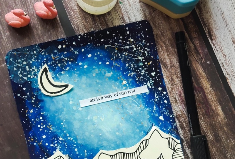
9. Adding Details to the Galaxy: Now let's begin adding
in the details into the galaxy so you can see the texture after it
is all dried out. The water that we use to move
the colors into each other. Now, I'm just going to pick up a little of the
white quash out here separately to begin adding
in the stars into a galaxy. So first I will
begin splattering a little of the stars
using the white gouache. Now at this step, make sure you do not
add a lot of water to your white gouache
because we need an opaque look to the stars. So make sure you pick
up the gouache in a little thicker
consistency so that it's easier to splatter as
well as after splashing, it stays in the opaque look. I'm using a smaller size
brush for splattering so that I do not have a lot of them
all together at one place. You can see I'm moving my
brush in all directions quickly so that I do not have all the stars picked
up at one place. Now let's begin creating
in some glowing spaces. I'm just going to
go ahead and add in smaller dots of the
white color first. And then I'm going to
blend all of these into the background to create
the glowing spaces for the glowing stars in case if you've been following me on
Skillshare for quite awhile, you would be knowing this
technique for creating in the background glowing
spaces for stars, moons into your galaxy or night sky and other
lights and so on. So I'm quickly adding in some bigger white
dots as you can see, I'm now using a damp brush. I will begin blending these into the background and create
a dull white small circle, two, which we will add in the shining star effect
once they dry out. So now you can see just
using a damp brush, I'm learning these
white spots into the background,
toning them down. And one Steven dry, we will add the glowing star into the center of the spaces. So I'm quickly done adding, creating in the background
for the glowing star spaces, you can see them as the
dull white patches. Now when you begin adding
in the glowing star, you just have to add a very bold small white
dots into the center of this space so that the
background space is still visible and act as
the growing space. So now using the white quash, I'm going to begin adding
in the glowing spaces. So just into the center of these you can see I'm dropping
in these white dots. You can see how
quickly the background double-spaced begins to act
as the glue behind the stars. That is how you can use this technique even for
adding in the moon, some fireflies into
your forest painting and stars into your
galaxies and night skies. Now along with the
glowing stars, I'm just going ahead with
some shining star details. I'm just using the
tip of the brush and the white gouache to
add in these details. I'm not going to be
adding in a lot of these, just a little of this. I'm absolutely in love with the texture of the
galaxy that has come in. The wind texture you can see off the darker colors moving
towards the center space. And I want that to be
the highlight into the painting along with the craft work that
we're doing good. So I'm just adding in some smallest stars of
the shining details here. Now, I'm going to quickly go ahead and add
in a few more of the glowing stars
wherever I feel the space is looking
a little empty. So that is, I always
tell you that do not add a lot of any kind
of detail altogether. Goes step-by-step. So first I added a
few of the stars, then added in some
glowing stars, then went ahead with
some shining stars. And now I feel I need a few
more of the thicker star. So I just went ahead with
some thicker gold stars. You can see those white
dots that we've added in. We are ready with the
painting of the galaxy. So now I'm just
going to remove in this masking tape and
I'm going to first cut the galaxy on all
the four edges so that we can begin pasting
our 3D mountain effect. Make sure that everything is dry before you begin
the cutting thing. I'm quickly going
to just go ahead and giving a rough pencil mark, or I am directly going
to use enough cutter to cut these pieces now makes
sure everything is dry, otherwise it will
get lifted onto the scale or the series
of whichever method you would be using in making sure that I cut them into
straight perfect lines. I'm going to quickly
go ahead and cut in from all the four edges. That extra whitespaces. If you're not confident
about cutting these directly
without any markings, and I would recommend
you to first have a rough pencil mark
so that you do not cut excess of the painting, otherwise it mid-tone too small. So I'm making sure
that I have a unit of account about where and
how I'm going ahead with. Now I will quickly cut out this last side and then
I will go ahead using the round corner punch
and punch all of the four corners and
give them a curved edge. Then in the next lesson, we will move on to
the final details of pasting everything creating
in that 3D effect. Just another five
to 6 min to create the beautiful outcome
that we're looking for and have been working on to. I hope you guys have enjoyed painting your own galaxies and I hope you guys would have experimented with
different colors as well. So now I'm going to
first go ahead just adding a few more
stars which have just caught or because of my
hand touching on to them. I'm quickly going to add
those glowing stars again. And then in the
next lesson we will add on the final details
into this painting. Before that, I will
wait for all of the stars to dry completely now.
10. Creating the Magic: So now my galaxy is
completely dried, even the edges are
completely dried. So using the round cutter, I'm using the round ten MM side and I'm cutting out
all the four edges. You can see how
quickly it gives him. Those are very smooth and neat. Go finish to the painting. If you want, you can cut
them manually as well. But since I have a
cutter, I'm using that. Now the mountain range is
looking a little bigger compared to the size of the
galaxy that I have in hand. So I'm going to paste this
and then cut the extra edges. So for pasting, as we discussed, make sure to use in this form double-sided tape
so that it gives a little elevated
look and creates in that 3D effect to
your mountain range. So I've just pasted it and I'm going to go
ahead and cut it into small pieces and paste
on the top as well. Make sure that you paste the
masking tape, I'm sorry, the double-sided tape in
such a way that it is not visible outside the white
paper once you've pasted. That is a reason I'm cutting
them into small pieces and adding them into the
shape of the mountain. They're now on the edges. As I told you, I'm going to
be cutting off the excess. So I've kept very minimal
glue on the edges for now, if needed, we'll
add it later on. Now it's onto you how
you want to place it. You want to cut
all of Texas from one side or cut equally
from both the sides. So I'm going to place it
in the center and give little drop-offs from both
the sides after pasting this. Now make sure when you add this, you do not press it a lot. Otherwise the form
may settle out completely and we not give that 3D effect and it
mid-tone too thin. Now on the edges, as I told you, I'm just cutting them into the shape of the
paper very carefully. Make sure that you're not cut in excess or cut the
galaxy as well. Now using the same form tape, I'm going to add in a small
piece of the form onto the moon as well to give the
moon as well elevated look. Now, make sure again, this is all to smallest size so that this white tape does not be visible after you
paste the moon, you need to go and very
carefully now as we discussed, you can go ahead with
a different size of the moon if you want. You can go ahead
with a full moon, half-moon or crescent
moon like this. Or even adding a little of the stippling details
onto the Moon. I've pasted the moon as well. Now, let's go ahead
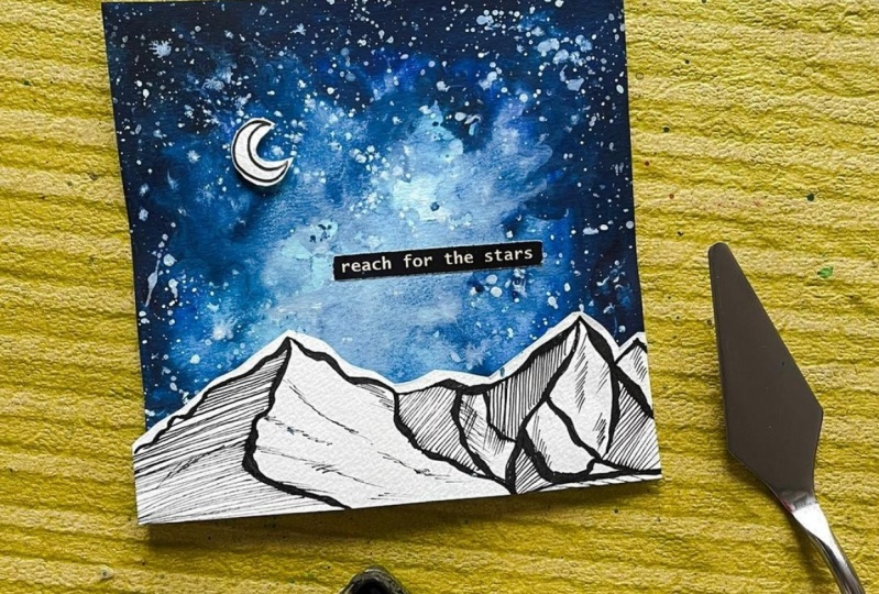
and add in a code to this before we are ready
to see our final painting. So far, the code
I'm going to use in this off-white color
sticker sheet because it will pop out quite well on to the blue color
galaxy that we have. And plus it will go well with the color combination of the mountain range that
we've gone ahead with. I'm going to paste it
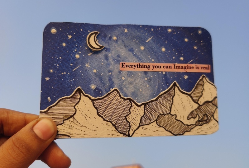
completely out here. And the code reads as
everything you can imagine is really absolutely Just like the galaxies that we
feel that never exist, but they do exist. Ngo. So everything that
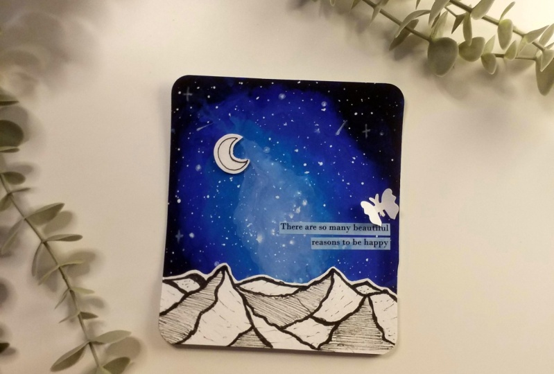
you imagine you need you want is possible. And Israel. Now in case if you want, you can go ahead and add in little more 3D elements
to the galaxy as well. So say e.g. you can
cut out butterflies. So I have this bunch of
a butterfly as well, which will give me
a small butterfly. I'm just using a white sheet and just going to punch
it out like this. And in the back of it, I will have a very small
butterflies silhouette of the white color. So in this way, if you want, you can go ahead with black
butterfly silicates are white silicates or any other
color for that matter. And just fold it into
half and add it into your galaxy and create a little 3D effect with
other elements as well. This is just for sample
that I'm showing you. I'm not going to
be adding these. That is the reason I'm just keeping it to your and
showing it to you. You want you can add into two-three bunch
of these as well. So now yours, a closer look at our 3D galaxy mountain painting. I hope you guys have enjoyed
painting this beautiful one, a pretty simple one, Justin, like half an hour with all the craft and the creativity that
we've gone ahead with. As well as a little
off the line art. I'm just going to add in
little more detail of the line art here and given
little more detail here. Because since we cut the edges, I feel that this white gap
is looking a little extra. So just adding in little
more detail quickly here. So here's a closer view. In the next lesson, I will give you a
further detail view of the painting
that we've created.
11. Thank you for Joining: Thank you so much
for joining me into this class and painting
along with me. I hope you guys have
enjoyed creating in this beautiful 3D galaxy with
a lineup mountain range. I hope to see all
of your creations into the project
section of this class. And also if you
liked this class, make sure to drop
a review so that it can reach maximum students. And I will see you guys soon into my next Skillshare class. Till then keep creating and thank you so
much for joining in.
 Umashree Taparia, Artist, Art Instructor, Entrepreneur