Transcripts
1. Hi: Hi, I'm Carlo Kassar. I'm an editorial and
narrative illustrator, and I thought that my
walls were a bit empty, so I thought I can make
my own mini galleries. So let's do it together. In this class, we're creating
a tiny butterfly gallery. You'll color
butterflies, each with a different shape or style
using a limited color palette. We will draw patterns
or motifs in our butterfly wings
using the anitrtol. Then we'll arrange our
final illustrations into a mini series that you can print and hang or use as a wallpaper for your
phone or laptop, as well. This class is perfect
for beginners or anyone who wants a low pressure
creative outlet or project. A very neat of prints
for your home, too. So, let's get started.
2. Templates: Are tons of different types
of butterflies out there. Each wear their own unique
shapes, patterns and colors. But today, we're
keeping it simple. I've prepared five different
butterfly templates for you. You can find them in
the resources section. These are PNG files, so they don't have a background. The idea is to personalize each one of them and build your
own butterfly gallery. So feel free to stylize, exaggerate or simplify
them as much as you want. Go to resources, save the files, then create a canvas in
the size you prefer. I will be using letter size. Tap the Ringe icon. Go to Ed, select, insert a photo, and choose the template
you want to import. Now let's go play with color.
3. Color Palette: Now for the fun twist, for our entire
butterfly gallery, we will use one limited palette. If you would like to learn more about limited color palettes, I have a class in which I
go deeply into the subject. But for now, we will work
with only five colors, and we have two options to
select those five colors. We have a game or
a playful option. Go to Coolers. You can find
the link in resources. Now, click on Create a palette
or start the generator. Let's click on the first color, and this little
menu should appear. Click on the name and
find the color you want. And then click on
this little Log icon. Hit your spacebar.
From then onwards, the colors will be at random, so you have to stick to the
ones you get just for fun. You can keep that palette
if you really like it. I'll tell you how to export it and to Procreate in a minute. But if you only want to
keep the second color and see what other random color will be added to your palette, then click on that colors lock icon and hit the
space bar again. Once again, if you like that
palette, you get to keep it. But if not, lock the following
color and proceed again. We're going to
repeat the process until we get our
random five colors. If you're worried
that the palette that you got really clashes
with your decor, don't worry. We'll
fix that in the end. But for now, I want to
focus on these colors and challenge ourselves to use them and create
something with them. Even when we might not be too happy with them
at the moment, to export the palette, go to Export and select ASE. Send it to your iPad via AirDrop or even email
it to yourself. Usually you can find
files that have been sent to your iPad
in the recent folder. Tap on it, send to
Procreate, and there you go. If you cannot find the
palette for some reason, scroll all the way down to the bottom, it should be there. And just to make sure that
it doesn't go anywhere, I would recommend
setting it as default. If you don't want to
randomly select the palette, I've created five color palettes you can download in
the class resources. The limited color palette
is a constraint that help us make the series of
illustrations feel cohesive, and it's always super fun to use the limited colors the
best way possible.
4. Brushes and Set Up: Okay, it's time to
draw our butterflies. But before we begin, let's
talk about brushes real quick. Feel free to use your
favorite brushes, but I'm going to use this three. This is where you can find them, and these are default brushes. So you will have them
in Procreate for sure. Since we have five colors
and five butterflies, let's choose one color to be the dominant color
for each butterfly. Before we die in, here are a few quick setup tips. First, to activate drawing
assist for symmetry, just tap the wrench icon, Canvas, turn on drawing guide, then tap edit drawing
guide and choose symmetry. Make sure drawing
assist is turned on in your layer, and that's it. Another thing we will be using for this class is
clipping masks. This let you add color or detail only within the shape
of the layer below. Super helpful for shading or decorating without going
outside the lines. And lastly, every element we work on will
have its own layer, one for the main body color, one for color additions, one for details, and so on. Keeping things
organized this way makes editing easier and
keeps your artwork clean. You can also find a JP guide to the layer order in resources. Now we're ready to start.
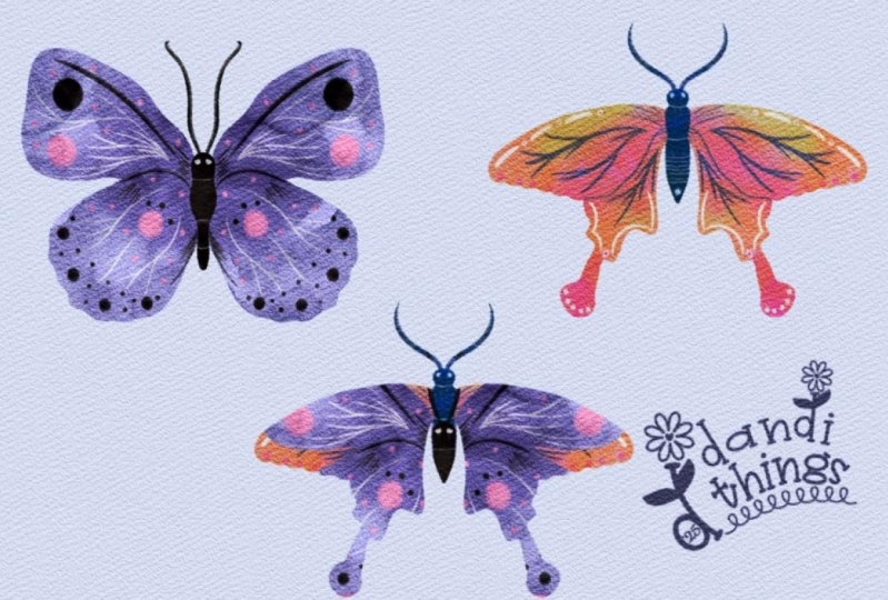
5. Eunica Amelia: Let's begin. Create
a new layer and make sure drawing
assist is turned on, and we're going to
use the Nicole brush. I recommend is lowering the opacity of the
template layer. It helps to see your
work more clearly. One of the things I really love about this brush is
how imperfect it is. I love how it leaves behind
little bits of white. It's great for
coloring because it gives everything a
soft textured look. Now let's create
another new layer. Again, make sure drawing
assist is enabled and also make sure to
select clipping mask. I want to add a few
small color details, so I'm switching to
the airbrush brush and selecting a pink shade. I'm going to add a
bit of color here in the center and
around the wings. This will give the butterfly
some nice dimension. Next, we're switching to our
third brush, which is chalk. We're going to use the
chock brush as an eraser. So tap on the eraser and
select chalk there as well. Now go back to the main layer, the one where you
added color and start gently erasing
small details. For this butterfly, I'm
mainly using circles. Now, create a new layer. Again, I recommend lowering the opacity of the template so you can see where
you're doing better. Now, let's roll the
thorax of the butterfly. I'm going to use a dark color to create context,
and I'll color it in. We'll also use the eraser to create the eyes on
the same layer. Now I'm adding details using the same dark color I
used for the thorax. I'm going to go
over certain parts of the wings and add
a few little lines. These lines don't serve
a specific function. They just add some visual
interest to the butterfly. You don't have to draw them. It's totally optional. Now I'm going back to drawing circles. Again, they don't
have to be perfect. Try mixing up the sizes to create a more
interesting pattern. For example, I'm adding
a really tiny one here, just a tiny little circle. Now I'm drawing the wing
veins of the butterfly. I think that's what
they're called. Just a few lines that branch out and they connect
with smaller lines. One tip. All these lines should stem from
one single point. I'll do the same thing in
the lower part of the wing, just a few Y shaped lines. This gives me a sense
of how much space I have left to keep
adding little circles. Now I can return the opacity of both layers back to normal. I'm also going to trace over any places that I feel need
a bit more definition. The butterfly we're drawing
is called Enka Amelia. The name come from Greek, possibly meaning
in good victory. A charming nod to their
thoughtful and resilient nature, despite their
delicate appearance. Once you're happy
with your drawing, you can deactivate
the template layer, swipe to select all of
your butterfly layers, group them, and rename
the group to number one.
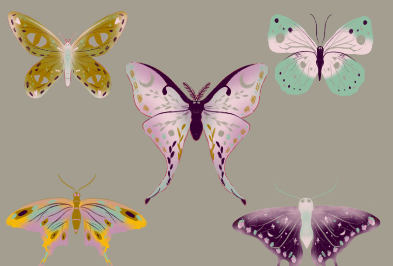
6. Two Tailed Pasha: Time for butterfly, too. For this butterfly,
I'm going to use the same procreate file or
canvas as the first one, but feel free to create a
separate file if you prefer. First, I'm going to turn off the visibility of the first
butterfly group named one, just so it doesn't
get in the way. Then I'll add the
new template on top, lower its opacity and
create a new layer. Make sure drawing
assist is turned on. Now, I'm grabbing the
same brushes before, Nicole, and I'll start
coloring in the wings. Once again, I'm not going to
be too precious about it. I'm letting the brushes
imperfections show through. Those little gaps give
it a printed look, I think, and I really like that. Let's create a new layer. Make sure drawing assist is on again, and
I'll keep going. Lower the opacity so you can
see the template clearly, and let's color in the thorax
and the antenna and then use the check brush set on the eraser to draw the
butterfly's little eyes. Next, we'll create
another new layer, turn on drawing assist and
set it as a clipping mask. Now I'm going to use the airbrush brush to
add some soft details. Just a touch of color at the
top and bottom of the wings. Now let's create a new layer. And again, drawing
assist should be on. With the chop brush
set as your eraser, we're going to start drawing the finer details on the wings. Those little lines I mentioned
in the last butterfly. If you make a
mistake, don't worry. Since we're using the
eraser for these, you can switch back to the brush and simply color back over it. We're using the brush to fix things instead of the
eraser at this time. This butterfly, I'm going
to reverse the order a bit. First, I'll draw the wing veins, so I have a better sense of how much space I have
left for extra details. Draw slightly curved lines
that fan out in a why shape. Don't up too many, so you'll
still have room to decorate. Now you can return the
opacity to normal. Let's select one of our two lighter colors
to begin adding details. For this butterfly,
instead of circles, I'm going for oval shapes. I'm making sure they vary in size to keep the
pattern dynamic. Then I'll use a blue tone to add a few small
dots here and there. But if it's too dark, feel free to go with
a lighter version, which is what I'll do now. I'll create a new layer, turn on drawing assist, set it as a clipping mask, and use the airbrush again. This time, adding some soft pink near the bottom and maybe
a touch at the top. Just like that, it already feels lighter and more balanced. Let's go back to
the detailed layer and start drawing
some special shapes. For this butterfly, I want a
mystical or celestial theme. So instead of simple shapes, I'm drawing a little start, which is a cross with
some curved lines meeting at the cross and still sprinkling in a few circles to balance
out the sharp shapes. I'm even drawing a tiny moon. This is going to be a
nighttime theme butterfly. To fill in the empty spots, I'm adding sparkles and some fine gray lines plus one longer line that goes
down the wing, like so. As I did before,
I'll go over areas where the butterfly needs
a bit more definition. This time, I'm making
some of the shapes a bit larger and I'm adding
a few touches of pink. I feel like the butterfly
had too much blue and gray, and this softens it up. More sparkles here,
where there's room. And this butterfly is called
the two tailed pasha. A fun fact about this one. It has a taste for
fermented juice and over ripe fruit,
especially fix. They even get a little tipsy
from snacking on them. And I think I'm pretty
happy with this one. And here is our
second butterfly. I quite like how it turned out. Don't forget to group your layers if you're
working in the same file.
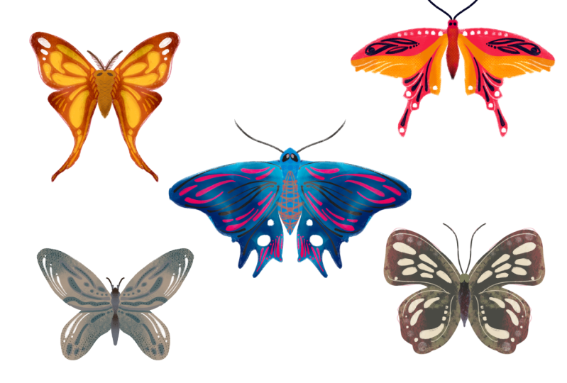
7. Sword Tail: Time for butterfly number
three. Let's dive in. First, lower the opacity
of the template layer, then create a new layer and make sure drawing assist is on. As we've done before,
we're going to color in the wings using our main
color and the Nkuollbush. But remember, feel free
to use any brush you love or even use this
brush differently. The whole point of this exercise
is to explore and play. Now let's create another layer, turn on drawing assist and
also set it to clipping mask. I want to add a few strokes
with the airbrush brush. They don't need to be precise. Just a few soft blue
accents like this. Next, I'll add one
more layer again with drawing assist on and
set as a clipping mask. I'm still using the
airbrush, but this time, I want to add a
second color strip just to make things
more dynamic. Create a new layer and
start drawing some details. I'm going to use gray for that. Now I'm heading back to the layer where
the main color is, and I'm going to erase
a few circular bits, maybe one here, and maybe I'll try a teardrop
shape in this area. I'm not going to fill
them in just yet. I'm testing to see
what looks good. Actually, I don't love how
it's looking erased like that, so I'm going to leave them as little unfiled tear drop shapes and just add a few
small dots instead. Let's see if we can add
a larger shape now. I might skip the blue
for us and go with gray since that's the accent
color we have been using. Make sure you're working on your details layer,
and let's go. Maybe I'll draw some more of those shapes right
around here and here. I'm liking how
symmetrics looking. Now I'm going to draw an
oval inside another oval. It's a nice layered detail. Let's draw the wing veins now. I just really like how
they at structure. Now it's time for the thorax. I'm going to use gray, and instead of using the
eraser for details this time, I'll use pink to
draw them directly. So instead, I'll add a few more small shapes to
bring in that pink pop. A hard shape here, maybe another one here. A cute little pin
shape over here and a tiny one down here just to add a bit
more visual interest. Yeah, I quite like this one. This butterfly is called
the sword tailed butterfly. And those little
tails on the wings, they're not just for decoration. They're actually decoys. Predators often
mistake them for legs. So if a predator attacks, the butterfly might
escape just with a tiny nibble taken out of the tail rather than
becoming lunch. Now let's go ahead and select
all the layers, group them, and rename them group three, to keep things organized,
and that's it. That's butterfly number three.
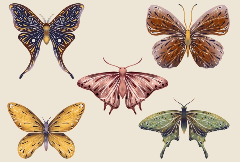
8. African Moon Moth: Butterfly number four. Let's go. By now, you probably know
the drill, but don't worry. I'll still walk you
through the steps. We're starting by
coloring in the wings. I'm still using the
Nico all brush. I'm keeping the same brushes
for each butterfly in this series to keep
everything feel cohesive. But of course, you can
still switch it up. Use different brushes, play
with different textures, or remix the color order. Now, let's create a new layer, make sure drawing assist is on and color in the rest
of the butterfly. I'm using a color here that
really pops against the pink. Once it's done, it's time for the antenna, which
is such a bombard. You can play with
brush size here, go thicker for something bold or thinner for
something delicate. I think a thinner line works
really well on this one. I'm using the chalk brush
again for that organic feel. If you want to create little
white areas or fine details, feel free to use the eraser too. Now, time for the details. I'm lowering the opacity of the main color layer so I can see the template
more clearly, and I'll start tracing those little detail
lines on the wings. But for this
butterfly, I want to draw something a
little different. Instead of the shapes
we have used before, I'm going to draw leaves a little line with a small
leaf shape branching out. It doesn't have to be perfect. I'm also scribbling
a bit here and there to experiment
with form and texture. Think of it as doodling
with intention. To add depth, I'll draw more leaves, but
in a different color. It adds more dimension
and contrast. Now let's go back to
the main color layer and erase a few sections
to add variation. Oh, and I'm drawing
a moon on this one. Why? Because it's an
African moon moth, and their tails can confuse bats by messing
with ecolocation, helping them survive
nighttime predators, which I think is really cool. Next, I'm sketching out the
wing veins, but only a few. I don't want the
illustration to feel too heavy or crowded.
And here's an idea. I'm placing more leaves here where the wing veins
would normally go. It's a nice subtle way to guide the eye without overwhelming
the composition. Now for the finishing touches, I'm adding a few more
small blue details since we've used blue in
the other butterflies, and I want to tie
it all together. A few pops here and there
make a big difference. Let's also create a new layer, turn draw insist on, set it to clipping mask and
go in with the airbrush to softly blend in some pink or blue where
it needs balance. This really helps pull the whole illustration
together, and done. Final step, group all the
layers and name the group four, so we stay organized.
9. Queen Alexandria: And for this one, I want to include my
cats in the pattern. By this point, you're
basically a butterfly wizard. So let's dive in.
First things first. Lower the opacity
of your template, create a new layer, and
turn on drawing a ist. Yes, I keep repeating this
because I always forget. Halfway through coloring,
so let's avoid that fate. Go ahead and coloring the wings, and while we're doing that, let me tell you
that this butterfly is called Queen
Alexandria's butterfly, which is the largest
butterfly in the world. Females can have a wingspan
of 28 centimeters or 11 ", and they only live
in a tiny part of Papua New guinea's rainforest.
That's it. Nowhere else. When I think of my cats, I think of their beautiful eyes, so I'm using them as the
main design element here. I'm going to erase into
the main color layer to draw a set of eyes at the top and another
at the bottom. One set for each cat. Don't worry about perfect
shapes, suggest the forms. On our new layer with
drawing assist on, I'm drawing ovals for the eyes using the check brush and
filling them in with gray. Now for the whiskers, three at the top,
three at the bottom. Symmetry is key. Now, let's go over to
the details layer. Um drawing little pink hearts
at the top and bottom, equal love for both cats. Then tiny fishes,
ovals with two wines. That's an instant fish. Use the eraser to
add a small eye dot. Tiny blue sparkles
because to me, my cats are pure magic. Try to keep the top and
bottom elements balanced, mirrored magic, if you will. Now let's create a new layer, turn on drawing assist, set it to clipping mask, and softly airbrush
in some pink. Play with the pacity We just want a little
blush of color. Next up, the thorax. New layer, drawing assist on. I'm coloring it in pink, which goes nicely
with our gray base. Blue's gray as an accent, but pink is doing the
heavy lifting here. To add texture, I'm using the eraser again on the thorax layer for
a little details. Think for or fussy highlights. We're going to add more
details, bubbles for the fish. Dark lines that equal scratch marks because my cats love to do that to
my sofa unplanned, but honestly, it's
just accurate. Filling in any empty
space with more sparkles, just to keep things
feeling lively and full. Now, zoom out for a minute. I like doing this
to check balance. Sometimes you catch
things that feel off only when you see
the full picture. Biking clothes, new layer, drawing assist on, and
let's add those wing veins. I'm keeping them subtle and placing them where things
feel a little bare. No heavy handed lines here. We want elegance. Since we don't have
a lighter color, I'm using the eraser again
to create small circles like tiny kibble pieces because my cats never
finished their food ever. I Group your layers and name it five. One last touch,
create a new layer, set it to clipping mask, drawing assist on, and let's add a whisper of blue
airbrush in a few places. Just a soft glow of
color and the wings subtle and balanced.
And that's it. Do a little celebratory stretch.
10. Curate: Now that you have your
five butterflies, it's time to create
your gallery. You can simply print them at their current size,
or if you prefer, you can create a single
print inspired by those beautiful
scientific illustrations from the late 1800s. And remember, you don't have
to print your butterflies. You can also turn them into a wallpaper for your
laptop or phone. Just create a new Canvas with
your devices screen size. If you're not sure what that is, you can easily find
templates on Google. Just select the background, tap on this icon, select everything, then swipe down with three fingers,
and then copy all. Paste everything into
your new canvas. Remember that we
erased bits instead of painting them with white or
any other lighter color. The reason I like doing this
is because if you decide to print your butterfly on
colored paper like yellowish, pinkish, or anything else, the erased parts will show the color of the paper
instead of plain white. Eyeball the size you
would like them to be. Just a quick reminder. If you shrink them and then try to make
them bigger again, they might look
blurry or pixelated. So it's best to start big
and size down if needed. If you're not completely
happy with the color palette you choose and want to adjust a few colors, here's
a quick trick. Create a new layer above the
area you want to change. Tap on the layer and
select clipping mask. Then pick the new
color you want, drop it into the
canvas and Va. You can also tweak small details
using clipping masks. Just create a new layer
above the one you want to adjust and
turn on clipping mask. This time, instead
of color dropping, use a brush to paint directly over the areas you
want to change. And if you're working
on symmetrical details, don't forget to turn on drawing assist.
It'll save you time.
11. Bye!: Thank you so much for
joining me in this class. I hope that you found it fun, but more importantly, useful. I would love to see
your illustrations, so please upload them
to the projigai. And if possible, it would be amazing to see your occurrence
hanging in your home. So feel free to share that, too. It would be incredible to see. Also, please consider leaking
a review for this class. I read every single one, and I truly love hearing
what you enjoy most. I always keep your feedback in mind when planning
future classes. Here are some links
to my socials. If you like staying in touch. Thanks again and
see you soon. Bye.
 Karla Alcazar, Illustrator and Teller of Tiny Stories