Transcripts
1. Welcome!: Have you ever picked
a color palette that, in theory, should work? But once illustration
is finished, it feels a bit dull or not as impactful as you
expected. Hi, I'm Karla. And even though I
really love color, and I've been illustrating
for a while now, I keep coming back
to the same method whenever something feels off. Not because the
colors are wrong, but because something
underneath them is. In this class, we're going
to talk about value. What is it, why it
matters so much, and why it's surprisingly
easy to overlook. Value tends to get ignored
because color is louder. More emotional, more fun, and it feels like the
obvious thing to focus on. But when value isn't working, even the best color
palettes can fall flat. And that's usually the
moment when we start random toing colors instead of actually solving the problem. This class is about
avoiding that. I'll show you a simple,
repeatable way to evaluate your colors by
temporarily removing them. You can see what's really
happening in your illustration. You'll learn why some good
palettes fail in practice, how to spot value issues early, and how to fix them without
changing everything. This class is for
illustrators who feel stuck when their
colors look flat, Procreate users who want a clearer and more
intentional workflow, and also artists who love color but sometimes feel
overwhelmed by it. It's also for anyone who
wants their illustrations to read clearly before worrying
about pretty palettes. Follow along using Procreate or any digital program you like, along with the color palettes I've included in the resources. And if you work traditionally,
you're welcome too. Just grab some colored
pencils, crayons and paper. For the class project, you'll create a value
driven illustration using a surprise
grayscale palette, and then apply color only
after your values are working. By the end of this
class, you'll have a finished piece, and
more importantly, a method you can come back to anytime your color work
feels flat or confusing. If you're looking for stronger
illustrations and fewer, why doesn't this work moments, you are in
the right place. Welcome, and I hope
you enjoy the class. Mass.
2. What's Value And Why It Matters: Color can be one of those things that seem really overwhelming. So let's cut to the chase. When we think of
working with color, sometimes we might overfocus on palettes if the colors
look good together, if a combination of colors
is analog or complimentary, or if they are warm
colors or cold colors. And although these are
important concepts, I think that a lot of the times
value can get overlooked. Yeah, but why does
this matter, really? Well, it matters because value is what makes
a color palette pop. But there could be a
little problem with value. The thing is that
value is often hidden, and if we don't pay
attention to it, our color palettes
can look quite flat. So in short, color palettes fail not because you're bad at color or because the
palette is wrong. Most color problems are actually value
problems in disguise. I'll explain this in a minute, but firstly from now on, I want you to keep the
word value in mind. This will be the key concept we will develop
throughout the class. If you want to full on
color theory class, you can check out this one. But for now, let's
exclusively talk about what value is and why it's important to create
palettes at work. Okay, so what's value? Value, it's just how
light or dark a color is, ranging from white, which will be the highest value to black, which is lowest
value. That's it. Let's not forget that there
are medium values as well, and they're equally
as important. I'll show you some examples. This image shows how value
works across different colors, and as we have said before, value simply means how light
or how dark a color is. In short, value will describe how much light
a color reflects. High value colors reflect
more light and appear lighter while low value colors reflect less light
and appear darker. Now, every color has a unique value of
lightness and darkness. That's called
intrinsic color value. Let's look at this example. Yellows sit at the top because
they naturally reflect a lot of so they have a
high intrinsic color value. But if you pay attention here, you'll see that oranges reflect a little bit
less light than yellows. Blues, violets and bluish
greens reflect less light, which gives them a
low intrinsic value. Red and greens tend to fall
somewhere in the middle. This matters because
even when colors are equally saturated or
are equally intense, they don't usually start on equal footing when
it comes to value. Now, if we take that same
information about color and high and low values
and place it onto a color wheel, something
interesting happens. Let's delve into
that in a minute. But before that, perhaps
you have noticed a similarity between the two images that
I just showed you. And that is, if we're talking about how light or
dark a color is, we could also translate
them into white or black. Or in other words, we can translate colors
into gray scales. Let's look at this image again. When we organize colors
on a color wheel, we start to notice
something interesting. Colors that sit close to each other often have
very similar value. If we focus on the
gray scale version, you can see that many
neighboring colors collapse into nearly
the same shade of gray, even though they feel
different in full color. When it comes to value, they're doing almost the same job. This image can show us that
value is about proximity. When a palette relies heavily on colors or close
together on the wheel, it's easy for shapes to blend, for edges to soften, and for the illustration
to feel a bit flat, not because the colors are bad, but because their
values are too close. Now, if you're familiar with the different types of color
palettes that they are, you can see why a complimentary color palette works quite well. That is because their values
are opposite to one another. Now, something important. A color at a high
value can look very different from that same
color at a low value. In this image, even
though we're looking at variations of the
same color family, the lighter and darker versions don't just feel
lighter or darker. They are almost different
colors altogether. The difference comes from hue, which is a very
important concept, which is basically the
name of the color itself, and as value changes, hue can appear to shift. But for now, we're not
going to focus on that. That's a different
topic, and we're just going to try and focus on value, not on the color
itself. The hue itself. Now imagine that we have an illustration with
a color palette that, in theory, should work. Okay, let's look
at the sky here, and this is a palette I chose. In theory, it looks okay, but there's something
off, I think. If we translate that
into gray scale, we can see that the cat and the rock underneath kind
of blend into each other. The background and the
foreground are basic Now, if we change the gray
into a darker color, you can see that the image kind of collapses and it looks really flat because it's really hard to distinguish
what's the background? What's the foreground.
And the little details are a little bit
difficult to catch. The real issue here is none
of the colors aren't working. The issue here is that colors are sitting too close in value, and they are competing
for your attention. In other words, there's not enough contrast or definition
between the colors. If everything has a similar
lightness or darkness, the shapes blend and
contrast collapses. Now, if we were to lower
the opacity of the cat, we would have a lighter
gray in theory, and you can see
that instantly the illustration pops and
feels more alive, and you can distinguish details a little bit more clearly. Now, let's translate that back into color to see
what it looks like. Remember, your eye reads
value before it reads color. So how can we fix
value problems? There's basically two ways. One, you could change the value of the colors or are too
close to each other, like I just did in
the previous example. And two, you could change the placement of your colors
in your illustration. In this case, I swap the color of the rug for
the color of the hat, which is a little bit darker and it creates more contrast. Personally, I tend
to do a mix of both depending on the desired
outcome for the illustration. And the next lesson, I'll
show you the method I used to diagnose where the problem is and decide which option
could work best. I'll show you exactly how I
uses workflow in Procreate, but we'll also talk
about a method that you can use if you use
analog materials.
3. The Method: W So we talked about value
and how every color has its own and how the
proximity between them can make an illustration
feel flat or unclear. When colors are too
close in value, even a beautiful palette can
seem a bit in a final piece. So what if we could
just actually see the values very clearly and see where the problem
is instead of feeling stuck and guess
and all that stuff? There's two ways in
which we can do this. The first one is painting
in gray scale first. Now, this doesn't have
to be a finished piece. A little rough
thumbnail will do. And two, you can use a 50%
gray saturation layer. Can do this in Procreate or any other digital
program you use. Now, for your thumbnails, you can use analog media or you can use digital
media as well. You just need a
very loose sketch of the piece you want to color. And if you decide to do
this with analog media, you will need pencils
or markers that have a different shade of
gray or a different value. If you do this digitally, I would suggest you to
have some swatches of high and medium and low
values in your palettes. But if there are already specific colors that
you want to use, you have to keep their
intrinsic value in mind. I am going to leave
these images in resources just in case that
you need them for reference. The thumbnails can
be very, very loose. It's just for us to
have an idea of what colors would look like
together in terms of value. And I would definitely
recommend doing two or three or even
more thumbnails just to make sure that you're happy with the final
color placement. This exercise is
not about making a finished black and
white illustration. It's about using gray
scales to find clarity, hierarchy, focal points, which is the point of most
interest in an image. I think this is
important because when I work in gray scale, I'm deciding what matters first before color distracts me. This method lets me diagnose a problem before
I try to fix it. As you practice, you'll start becoming more conscious
about the colors in the wild and you'll think of light mid and dark
values instinctively, which will help you in the long run to decide the
colors that you'll use. Okay, but what happens
if you already have an illustration
that you love or just finished and you feel
that the colors are a bit off and would
like to fix them? Then I use a diagnostic layer. Pick one of your illustrations
and create a layer on top. Now, I recommend you to duplicate your artwork
to have it as a backup, since we'll be experimenting
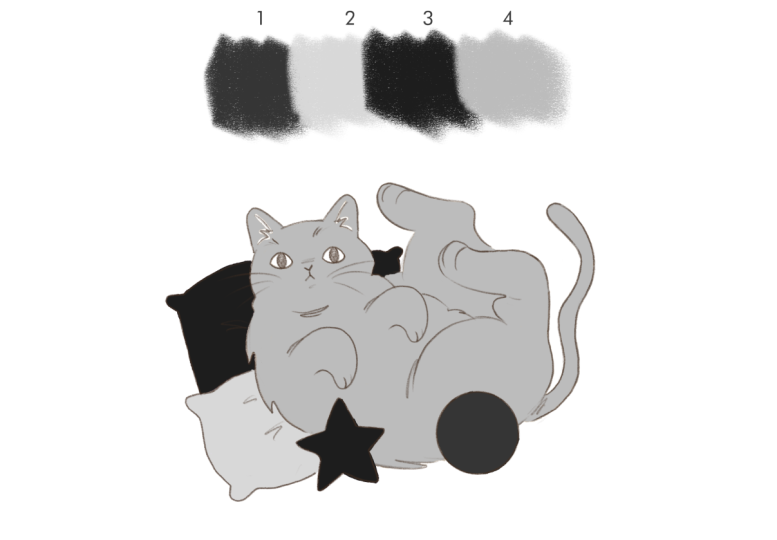
a bit with it. Okay, now go to colors
and select disk. Go to the far left and pick a gray that you like
roughly here in the middle. Now, go to value because we're going to
change some numbers. Saturation down to zero, and brightness should be at 50%. This shade of gray will help us diagnose things more easily. I would also recommend to keep that swatch and
save it in your palette. Now, create a new layer at
the very top of your artwork. Using that gray we created, we're going to drag and drop
it to create a color fill. Now go to that layer
blending modes and select saturation.
And that's it. Now you can see your
values very clearly. Even though the layer
is set to saturation, what this is doing
is temporarily removing color information. It should be called value, in my opinion, since what
I'm seeing here is value. That is how light or dark
my colors really are, but that's just my opinion. Now, what do you see? Are some colors too
close to each other? That is, are two light
colors next to each other or maybe two dark colors
sitting next to each other? I always recommend
working one layer per color or one
color per layer. That way, I can
easily change them if there's something
I'm not too happy with. But if you already
have worked with different colors
in one same layer, create a new layer on
top of those colors, set it to clipping mask, and then you can change
colors one by one. Now you'll have to
paint very carefully, but it's a solution. Now, in my case, since I already have my
colors in separate layers, I'm going to change them
just by dragging and dropping colors on their
corresponding layers. When I do this, the
problem becomes obvious. So I'm not stuck anymore. And what's more importantly, I think I'm not emotionally
attached to a color. I'm just responding
to what I see, because if it doesn't
work in gray scale, it won't magically
work in color. Now, this method isn't about
fixing one illustration. It's a way to think
about color problem. Removes emotional
decision making, especially when
you really, really want to use a specific color. This method also help us
with blocking shapes, so things are more
distinguishable. It helps us separating the
foreground and the background, which will help us to make sure that the illustration
reads far away. And the next lesson,
we'll take this method and apply it step by step
to our class project.
4. Class Project!: I thought of this
project because I really want us to
make decisions based on value only and to avoid thinking of color,
at least initially, because sometimes color is linked to preferences,
and for now, we're going to focus
entirely on value first and only introduce color once the illustration
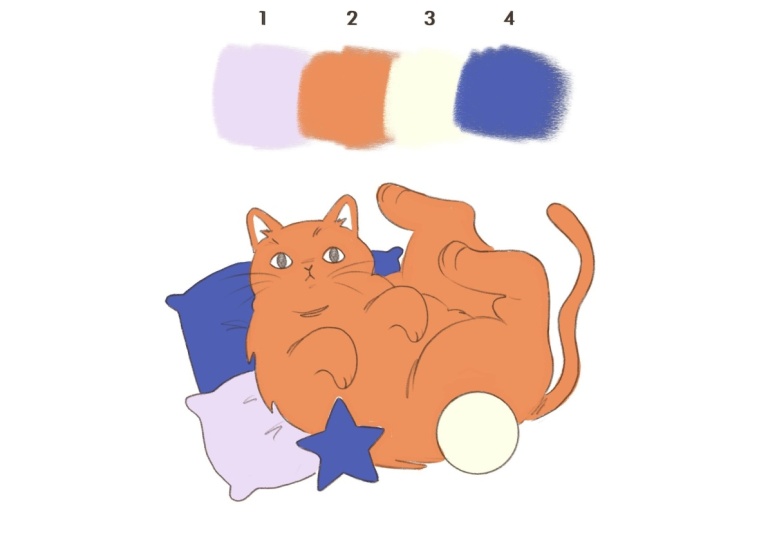
is already finished. Okay, so step one to
work on this project, you'll need appropriate file, which will be located
in resources. You'll find three files names or price one, two, and three. Pick the one you feel more
draw to and download it. I'll picture price
three. Step two. When you open the project file, you see a color palette
group at the top. At first, this group
will look empty. Don't worry, that's intentional. The colored palette is hidden, so you're not influenced
by it just yet. You'll also see a
gray scale version of the same palette
here at the top. Each color has a
corresponding number. You'll see that this color
palette has one high, two medium, and one
low value colors. You can also see that there is a sample illustration that
you can use to color, or you can also draw your own illustration
or import your own. If you do this, I recommend
drawing something simple. Step three. Let's start coloring using the
gray scale palette. In this file, you
can see that there is layer one, two,
three, and four. Each one of those corresponds to one of the colors
are also numbered. I know that it can
be a little bit annoying to color in
a separate layer, but I promise that
it'll be worth it when we have to color
the illustration. Now let's start coloring the illustration using
the gray palette. The goal here isn't to
make something pretty yet. The goal is clarity,
contrast, and separation. Okay, I'm going to start with the darkest
color number four, and I'm going to start coloring something from the
background with it. And as I said before, it's
okay if it's done loosely. It doesn't have to be perfect. Okay, I'm going to go ahead
and choose color two. Don't forget to change to
layer two to start coloring, and I personally will start coloring the cat with
that particular color. I think that choosing medium
values for the main subject creates a really nice contrast without being too overwhelming, so I'm going to use it
for the cat right here. And I'm also going to
erase these little bits. I personally don't
think they need to be all color number two. Oh, wait. I forgot this little bit right here.
It's number four. Okay, let's go ahead
with color number three, and let's go to the
layer number three. I'm going to use this high
value color for the ball right here because I think it creates a nice frame for
our main subject. Now, let's use color number one, and I'm choosing the pillow
that's underneath the cat. I think will create
a nice contrast with the other pillow. And finally, let's go back to color and layer number four, and I'm going to color the
little star with that color. And I particularly think
that it's a nice touch to sandwich the cab in between
those low value colors. I think that creates
a nice contrast. This whole class project and the whole method really
is about exploration. So we're going to swap some colors just to see
if they look better, if there's some changes
that perhaps work best. I'm going to just
drop the colors onto the different
layers, but highly, highly recommend to keep a mental track of
which layers and which colors you're
dropping into each layer in case that you actually
like the final result, it is highly important
that each layer corresponds to
each of the shades of gray that we have because
it's going to be really, really important when we
reveal the color palette. And now I would like to
add a few little details. If you want to use that color to paint onto your illustration and that layer is on top of the other colors and
it's going to be visible, then that's
perfectly fine. If not, I will suggest you to create a new layer and place
it on top of everything, but just name it details in the name of the color
that you will be using. For example, I'm creating
details four right here because if I were to paint
in the layer number four, those little details are
not going to be visible because that will be painted underneath the color
that's on top. So in this way, I make sure
that it is actually visible. I think that using color one
on top of color number two, creates a nice
contrast that is not as abrupt as if I were to
use color number three, for example, it just makes everything feel
really cohesive, as well, without making it feel too contrasting or overwhelming. And so far, this is
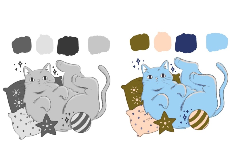
what my cat looks like. Step four, before we
move on to color, take a moment to look at your illustration in gray
scale and ask yourself. Does the focal point stands out? Are important areas
separated clearly? Are any values too
close together? This may sound a bit harsh, but if something feels flat
here, color won't fix it. And that's why we're doing
this first. Step five. Once your illustration is
working in gray scale, it's time to reveal the color palette and this
is the fun part for me. So go to the layers
and go to color. But to reveal the color palette, you just need to click on that, and that is your color palette. Now, all we have to do is create a new layer on top of
each color and create a clipping mask and drag and drop the colors onto the
corresponding layer. The reason why we are creating a clipping mask and not
dropping the colors onto the layer underneath is because I would like us to
keep the grayscale version, and I think this is a safe
way and quick way to do that. Why it was really
important for me to keep the layers
and the colors in the right layers and
also the details one because it's just
going to make things really easy for us. And this is the final result. What do you think? Do
you think it works? Do you think it
doesn't work? And why? Remember that the whole point of this class project was not
to create something pretty, but to translate colors
into grayscales aka value. Now let's not judge
the illustration based on the colors
and how they look. But again, let's
just think value. Take a moment to compare your grayscale version of your illustration to the one
with color and ask yourself, did any areas lose contrast? Are they colors that feel surprising based on their value? Step six. I'd your project. Please include your gray
scale illustration, your final color illustration. And this is completely optional, but it would be nice. So if you could add a short note about what surprised you, there's no right or
wrong outcome here. The learning is insane.
5. Thanks!: Thank you so much for
joining me in this class. We learned that
when color doesn't work is often not
a color problem, but a value problem. We saw how every
color has a value, how value proximity
affects contrast, and how removing color can help us see what's
really going on. Then we applied that knowledge
directly in class project, starting in gray scale, making intentional
value decisions, and only then revealing
and applying color. This project works because
it removes aesthetic as. It forces value first
thinking, and it creates moment. Personally,
I think that this project mirrors professional
problem solving, especially if you want to work in a editorial and you only have a few seconds to
catch someone's attention, and usually color is
the way to do it. And this is a method you can
take into any illustration, especially when you feel stuck or unsure why something
isn't working. Please upload your project
to the project gallery. It's always super inspiring and interesting seeing your results and hearing your thoughts. Also, please leave a review and let me know what
you enjoyed the most. This really helps me to keep producing classes
that are helpful. And if you want to
keep building on this, make sure to check
out my other classes, especially my color theory class where we go deeper
into these ideas. And thank you so much
for taking the class, and I can wait to
see your projects. Thanks. And see you soon. Bye.
 Karla Alcazar, Illustrator and Teller of Tiny Stories