Transcripts
1. Introduction: We spend so much of our lives trying to figure everything out. We keep wondering and
asking, will this work? Is this a right choice? Am I
actually getting anywhere? But life rarely gives
us the whole picture. Most of the time,
we can only take the next step without knowing
where it will lead exactly. Hi, I'm Neha Modi. I'm an artist and a
Skillshare top teacher, and I've spent years
exploring how simple lines, shapes, and reputation
can come together. Create something
meaningful and intricate. And somewhere along the way, I realized that creativity isn't always about knowing
what you're doing. Sometimes it's about being
curious, making a decision, seeing what happens, and then to keep moving
forward from there. To create, you have to
surrender to the process and trust yourself enough to
take the next small step. And that's the foundation
of this class. We'll start with simple geometric
shapes and learn how to build an abstract
composition using scale, repetition, balance,
movement, and negative space. We'll explore how
color can change the mod and visual weight
of a composition and the different ways
geometric forms can be arranged to create a sense
of story and movement. And then we'll slow
everything down and build the artwork through repetitive mark-making to create texture, rhythm, and a unique
visual language. The intent of this class is not just to
create an artwork, but to experience the
transformation that happens when a very simple
idea is given the time, attention, and space to grow. So whether you are an
artist or a beginner, join me to discover
how simple lines, shapes, and color
can come together to create an intentional narrative.
See you in the class.
2. Class Project & Material : Welcome to the class. I'm
so glad that you're here. Now, before we begin, let's
talk a little bit about what you'll be creating and how you can approach
your project. Now, in this class,
you will create your own abstract geometric
artwork using shapes, color, and repetitive
mark-making. You can follow along with me
and recreate what I'm doing or use the techniques to create something that feel
completely your own. You can experiment
with the shapes, the way you arrange them, the color palette, and
even the negative space. The goal isn't to
create a perfect copy, but to understand the
principles behind the process and create something that feels
personal to you. And once you're done, please do share your artwork in
the project gallery. Along with your
project, I would also love to know a little
bit about your process. Did you discover something
while making it? Did the artwork evolve in
a way you didn't expect? Now, let's talk about materials. I'll be working on a 300
GSM a five hot press paper because it's smooth
surface allows the fine liner to move
easily across the page, but you don't need to
use the same paper. Any smooth surface
paper works well. I'll be using
colored fine liners from a mix of different brands. You'll also need a
pencil and eraser for your initial
composition and a ruler if you'd like to create
cleaner geometric lines. And finally, you
will need something which is just as important
as the material. Time and a little patience. Please don't rush
through this artwork, take breaks whenever you want. Put your phones away
for a little while, sit somewhere comfortable,
let your shoulders relax and give yourself the
permission to slow down. Because as we'll
discover in this class, drawing isn't always about knowing where the
line is going to go. Sometimes it's about being
willing to follow it. So gather your materials and don't worry about making
the perfect mark.
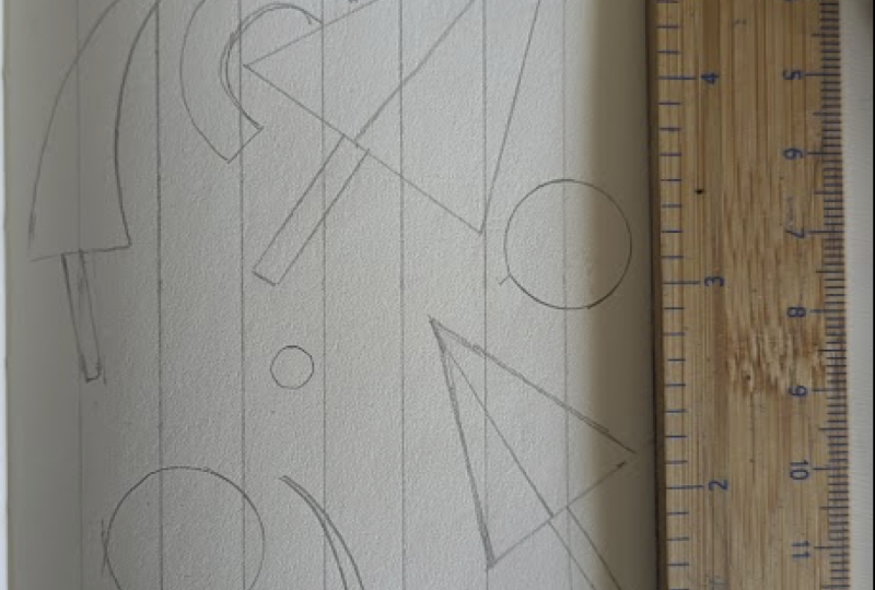
3. Building Blocks: Shapes & Composition: The first step in creating a geometric abstract artwork is building the shape library. Think of this as
your visual library, a collection of simple shapes
that you can later combine, change, and arrange to
create your own artwork. Start with a few basic
geometric shapes, draw them freehand and consider them as
your starting point. The next step is to
play with their size. When you change scale,
it creates variety. Later, when you plan
your composition, by playing with the
scale of a shape, you can decide the elements that you want to give
more importance to. Stretch a circle into an oval, make a square taller or wider, stretch a triangle
in one direction. You can take one basic
shape and create many variations by playing
with their proportions. The next thing to do is change
the direction of shapes, rotate them, tilt them,
turn them upside down. Once you've played
with the basic shapes, start bringing different
shapes together. Let some of your shapes touch. They can meet edge to edge, point to point, or simply
brush against each other. This creates a
relationship between the shapes without needing
to add any detail. You can also let
some shapes overlap. Overlapping can create depth, connection, and more interesting
visual relationships. And finally, let some shapes
continue beyond the edge. Cropping creates
movement, and it makes the composition feel as though it continues
outside the frame. Once you have played
enough with all the shapes and all the variations,
put them all together, and you will have
your shape library of visual vocabulary
that you can return to whenever you
begin a new artwork. Now, once your shape
library is ready, the next step is to ask yourself, what do
you want to say? You might want to
represent a place, an object, a memory, an emotion or a
particular theme, or you might simply
want to explore shapes without representing
anything specific. There are no rules about
what your idea needs to be. It's just that you need
to spend a few minutes in deciding what you
want to communicate. Once you know what
you want to express, you can return to the
shape library and ask yourself what shapes can
help me communicate my idea. And once you start associating different shapes with the idea that you want to communicate, simple geometry starts
becoming a visual language. Now here are a few
examples of how you can translate an idea into a
geometric composition. Here I'm using organic shapes, vertical forms, and layered
planters to suggest a garden. For a desert landscape,
broad landforms, a cactus, and a simple sun are enough to
establish the setting. And here, layered waves and a strong vertical lighthouse immediately suggest
an ocean landscape. Here, the large cup
and coffee pot becomes a male element while the surrounding shape suggest the table and the
space around them. And here the geometric butterfly becomes a symbol
of transformation, and by using symmetry scale, and angular shapes, we can
suggest change and movement. And sometimes you
don't even need to represent anything literary. Changes in scale, direction, and movement can simply
suggest an idea. Now, my starting idea for the main artwork was the
phoenix rising from fire. So instead of trying to draw a detailed Phoenix immediately, I broke down the idea
into simpler elements, the body, wings, head, tail, flames, and the
surrounding landscape. I started very small using
little boxes in my sketchbook. At this stage, I don't think
about small marks at all. I only play with the shapes
and keep asking myself, where should my focal point be? How should the shapes move
through the composition I make several versions rather than trying to get it
right the first time, I move shapes around,
change their size, rotate them, overlap them, and sometimes remove
them completely. This is really just another way of using the shape library, except now I'm trying to
communicate a specific idea. Eventually one layout
begins to feel right, and that's the one
I take forward and develop on my final paper. And even then I don't read the thumbnail as a set of rules. It's simply a
starting point that gives me enough
structure to begin with. So now you can try
the same process. First, build your shape library, then choose an idea
you want to explore, then make few thumbnail
compositions. And once you have a clear
idea of what you want to do, make the artwork
on the exact size of paper you want your
final composition to be in.
4. Color, Mood & Meaning: At this stage, I have
finalized my composition and drawn it as per
AFI size paper. It's a working version
that helps me see exactly where everything will go before I begin on the final paper. I use the stage to work out my main color palette and decide where those colors will
sit in the composition. Now I want the Phoenix
and the fire to feel like the source of
energy in the composition, so I will use warm colors
like red, orange and yellow. These colors will
also help reinforce the idea of heat, movement,
and transformation. I'm going to keep the
surrounding areas cooler using blue and darker early tones so that the warm colors have
something to stand against. I don't need to color the
entire artwork at this point. I'm simply marking in the
main colors so that when I start filling in the artwork
with the small lines, I know where things go exactly. So now before we move
to the next step, let's take a little time to understand how we can
use color intentionally. I like to think of color as another language
in your artwork. It can tell us how to
feel, where to look, and sometimes even how to
move through a composition. It can become part of the way
you communicate your idea. So as you choose your colors, start thinking about what
you want them to do. A color can remind one person of energy and another
person of comfort. It can feel completely different depending on the context
and the colors around it. So use color theory
as a starting point, but also pay attention to your own association and the idea that you
want to communicate. Now, when it comes
to choosing colors, there really isn't
a magic number. You can create a
beautiful composition with just two or three colors, or you can even use a
larger palette to give more variety and create a richer and more
expansive feeling. But if you are someone who finds color choices
overwhelming, I would actually encourage
you to start small. A limited color palette can make the decision making much easier, and it can help your artwork
feel more intentional. One simple way to
begin thinking about color relationships
is through warm, cool and neutral colors. Warm colors can bring
energy and warm. Cool colors can create a quieter or more
specious feeling, and neutral colors can give
the eye somewhere to rest. So instead of thinking that every color needs to
have equal importance, give your color different roles. Can have one dominant color that carries most of
the visual weight, supporting colors that
can create balance, and a smaller accent color that can add energy or
draw attention. Now, color becomes
really interesting when we think about where
we want to place it. Strong color against
a quiet background can immediately become
a focal point, whereas, when you repeat
the same color in different parts of the artwork, it creates a visual
connection and helps the composition
feel cohesive. Color can also guide the
viewer through the artwork. You can move from a quieter
color to a stronger one, create a pause with a neutral, and then introduce
contrast again. So even though the shape
themselves aren't moving, your color choices can
create a sense of journey. Before planning
your color palette, one of the questions that
you can ask yourself, what does this part
of my artwork need? Maybe it needs energy,
maybe it needs space, maybe it needs
warmth or balance. This simple shift
can turn color from simply filling shapes into a
way of telling your story. Now, before you start filling all the little
shapes with color, I really recommend making
a quick color map. This is something I
find incredibly useful because when they are working on one small section at a time, it's very easy to lose sight
of the whole composition. A color map lets
you step back and see the larger picture
before you commit. Try two or three quick versions, change the dominant
color, switch the accent or make the
palette warmer or cooler. Do remember you're not looking
for the right version. You're simply testing what
feels right for your artwork. And finally, once you understand
some of the basic ideas, make the palette your own. Think about the colors you
naturally gravitate towards. Think about places you've
been, things you remember, colors you associate with a particular feeling or
a time in your life. You might choose a color because of what
color theory says about it or simply because you love seeing it
next to another color. There doesn't have to
be one correct answer. Use these ideas as a framework, experiment a little, and
then trust your own eye. That's when your artwork
starts becoming truly yours.
5. From Idea to Artwork : Now that I have planned
my composition, I'll start working
on the final piece. I'm starting by dividing the
paper into smaller sections. These sections are
half centimeter each. I'm making smaller
sections because I want the final pattern to have
a fine detailed look. But if you prefer to have a more open pattern or you're
working on a larger sheet, you can make these
divisions a little bigger. There isn't one
right size to use. It depends on the kind of
final look you want to create. I'm going to start
with the Phoenix, which is the main element
of my composition. I want it to be the focal
point of the artwork, so I'm giving it enough space to stand out from the
surrounding shapes. I'm not trying to draw
a realistic bird here. Instead, I'm
simplifying the form and building it with
geometric shapes. I want to give it an
origami inspired look, so I'm building the entire form using triangles and
sharp angular shapes. Now rather than drawing
each part separately, I'm letting the
shapes connect and overlap to form the bird. I'm also paying attention to
the direction of the shapes. The pointed forms help
create a sense of movement and make the phoenix
feel as though it's rising. Now, when you draw
your own composition, think about how you can simplify your subject in a similar way. You don't need to draw something exactly as it appears
in real life. Start by looking at it
through its basic forms. Think about which
shapes you can use, how they might overlap, and how the direction can help
express your idea. Sometimes a few
simple shapes can communicate much more than
a complicated drawing. And for me, this is what makes this kind of abstract
drawing really interesting. You're not simply
drawing an object, you're exploring how
far you can simplify its form while still retaining its character
and movement. Once I'm happy with the
main shape of the Phoenix, I start building
the fire around it. For the fire, I'm using triangles of different
sizes and proportions. Some are long and narrow while others are
short and wider. I let the shapes
overlap and point it in different directions
so that the fire feels like it's moving
rather than sitting still. I'm also connecting
the fire with the Phoenix to indicate that they're part of
the same movement. Once the main elements
are in place, I start looking at
the rest of the page. I look for areas where another shape might help
balance your composition, and I also look for places where I can leave
some space open. You know, it's easy to feel that every empty area
needs to be filled, especially when you're working
with an abstract pattern. But I don't want the entire page to compete for attention. I want the Phoenix to remain the main focus with the
fire supporting it. That's why I'm going to draw some large geometric shapes in the background using
a mix of rectangles, strangles, and
other simple forms. This helps connect the
different parts of the composition without making everything feel
equally important. As you work on your
own composition, keep stepping back and
look at the whole page. A shape might look
interesting on its own, but what matters is how it works with
everything around it. You don't have to
fill every space. Sometimes leaving something out is what makes the
composition stronger. And if you're following
this particular design, don't feel that you
have to reproduce every shape exactly
as I have drawn it. You can change the
proportions of the Phoenix, make the fire larger, introduce more
triangles or even let the fire spread across the page. You can also replace some of the background elements
with your own shapes. The idea is to use this as a starting point and find a version that feels
like your own. Now that the base is ready, I'm going to start
filling in the sections. I'm beginning with a
corner as it is easier to maintain the line direction when you start with one corner. I'm starting with brown as it is one of those
background shapes. Now, the pattern starts
with something very simple, a short slanted line, and then I keep drawing
one line after the other. I'm trying to keep
the angle and spacing fairly consistent as I continue
repeating the movement. I want the lines to be
evenly next to each other, so I'm trying to maintain a consistent distance
between them. Now, they don't have to
be exactly the same, but keeping the spacing similar helps a pattern
looks balanced. I'm also keeping an eye on the edges of the
shape and making sure that each line stays within the boundaries of that
particular section. Once the first set
of lines are done, I start connecting the first
section lines with the next one by making
diagonally opposite lines. I'm starting from the end of
one line and drawing towards the neighboring line to create a small V
shaped connection. I'll continue doing this
one line at a time and make sure that each new line follows a similar
angle and direction. As I continue these lines, you can see how the
individual marks are gradually coming together to
form a herring bone pattern. After finishing the first
section, I move to the next. The aim is to maintain the
same back and forth movement. So I begin by drawing the
slanted lines and then gradually build them into
the same connected pattern. Before starting a new section, I always take a
moment to look at the previous section and decide which directions the
line should follow. This helps me maintain
the rhythm of the pattern without making any mistake with the direction. So if you are unsure about which direction the
next line should go, try following the movement
with your finger or pen just above the paper before
actually drawing it. When I draw this pattern, I try not to get too caught up in how the finished
artwork will look. It's very easy to keep
thinking ahead, you know, about the next
section, the colors or how much work is still left. But when I do that, I tend to lose sight of what
I'm actually doing. So I bring my attention
back to the drawing. I look at the line
in front of me, make the next mark, and
continue doing that. If my mind wanders, I simply return to the pattern. I don't get frustrated with
myself or losing focus. I just begin again
with the next line, and that's what being
mindful really is. I'm not trying to force
myself to stop thinking. I'm simply giving my attention something small and
tangible to return to. As I continue filling
in the sections, you can see how the
simple slanted lines are not just adding color, but have also started
creating texture. If I had colored each shape
with a solid flat color, the artwork would have
looked quite different. But by using these
repeated marks, I have introduced a
layer of detail that gives these shapes a much
more intricate surface. When the lines are
closer together, the pattern appears
darker and more compact. When they are spaced
slightly apart, the individual marks
become more visible. So when you are filling in, you can play with
the spacing too. You can make some
sections dense by drawing the lines very
close to each other, while in others, you
can leave some gap. It might bring a
very different look to the pattern and
can be worth a try. After all, there are no rules when it comes to
creative practice. You can experiment, explore your own trial and error
and see what works best. The process and the artwork
should make you happy. The colors you choose should narrate what you
want to express. So go with your
instincts and don't worry about mistakes
or making it bad. As you draw, you'll notice that some areas are easier
to fill than others. The spaces where
different shapes intersect or where the
shapes become narrow, you need to pay a
little more attention to how the lines move
through that section. Please remember that
you don't have to get through every section
at the same pace. Now, if you're new to
repetitive mark-making, you might notice
that after a while, you start feeling
a little restless. You're making the same
mark again and again, and perhaps part of you starts wondering how
much longer it is going to take or whether you could be doing
something else instead. And that's quite natural. We're so used to moving quickly from one thing to another that staying with one
simple action for a while can feel
unfamiliar at first, but give it a little
time and you will see how it starts
to feel calming. There's a certain
rhythm that develops. You make one mark, then another, and gradually your hand
begins to find its own pace. You don't have to keep
deciding what to do next because the basic
movement is already familiar. That gives you a
little more room to pay attention to the details, the direction of the line, the distance between the marks, the way the pattern
is developing. And most importantly,
it is this reputation and familiarity that takes
you into a meditative zone. And at the same time, if
you do feel impatient, then don't force
yourself to continue. You can take a short break and
return when you are ready. The idea isn't to make yourself sit through something
that you aren't enjoying. It is to give yourself the
opportunity to experience what happens when you slow down and stay with one thing
for a little longer. And as you do that,
you may begin to see a shift in the way
you look at progress. When we look at
the whole artwork, especially when it
is still unfinished, it can feel as though
there's so much left to do. But if you bring your focus back on the section
you're working on, you can see the progress
happening right there. These are small changes,
but they are real changes. And when you keep
returning to the work, these small changes
begin to accumulate. Eventually, the sections start connecting with one another, and something that
once existed only as an outline begins to
take its own character. So as you work on your piece, try not to measure your progress only by looking at how
much page you've finished. Notice the sections
you've completed, the rhythm you are
beginning to find, the way you've become
comfortable with repetition, and the feeling that you are experiencing while
doing the artwork. Now I'm moving on to the fire, and I'm going to follow the same color scheme as that
of the Phoenix. I will use one yellow, two different reds,
and one orange. I'll distribute
these warm colors across the triangular
sections of the fire. The yellow adds
brightness while the reds and orange create contrast
between the shapes. Now, I'm not following
a strict rule about which color
has to go where. I'm looking at the
neighboring shapes and deciding how the colors
can work together. For example, if two
triangles meet, I might use different shades to make the boundaries
more visible. If you have more warm
colors in a similar range, you can use those to create
additional variation. You can introduce a deeper red, a lighter orange, or
another shade of yellow. If you want, you can create a completely different
interpretation using blues, purples or greens. I mean, you don't need to use the traditional fire colors. Though the one thing
I would consider is keeping the Phoenix and the fire within the related color scheme. Since they belong to
the same visual story, using connected colors can
help strengthening your idea. As you work, you'll probably notice small differences
in your marks. One line might be
longer than the other, other spacing might
change slightly. Sometimes a segment won't meet the previous one exactly
how you intended. When that happens, I
don't try to correct every difference
because even though a repeat pattern needs
some consistency, it doesn't need to be
mechanically perfect. What matters is
the overall rhythm of the marks and how
they work together. So try to pay attention without being too critical of
every line you make. You don't have to
discard the pattern just because some lines don't turn
out the way you expected. Sometimes the best thing
to do is simply continue. Once I worked through
the main elements, I begin filling in the
remaining background sections. I'm using blue to
create contrast with the warmer colors
of the Phoenix and fire. The blue helps the yellow
stand out and gives the composition a cooler
area to balance the warmth. I'm also using different
shades of brown in some of the other sections to introduce further variation. As I continued working
on this piece, I made a few changes
to the background. Initially, I had planned to leave some white space and had also included some additional
background divisions. But as the colored
sections developed, I felt that the composition was becoming a little too busy. I wanted the Phoenix and the fire to remain
the main focus, and some of the extra divisions were drawing attention
away from them. So I decided to remove a few of those background
sections and let the blue occupy
more of the space. This created a more
continuous background and helped the brighter
shapes stand out. I think it's important
to remember that your initial plan
doesn't have to remain unchanged
throughout the process. Sometimes you only
understand what a composition need once
you start filling it in. A section that seem necessary in the rough drawing might
feel a distraction later. You might realize
that an area needs more breathing room or that simplifying something will
make the main subject clearer. So when you do your artwork, feel free to make those changes. You don't have to
keep something simply because it was part of
your original plan, and you don't need
to keep adding details just because
there's space available. Every now and then, step back and look at the
whole composition. Notice what draws
your attention, whether the main
subject stands out, and whether any areas feel
unnecessarily crowded. Sometimes, adding something
helps and at other times, removing something makes
the artwork stronger. I'm going to continue
working through the remaining sections
using the same process. And once all the
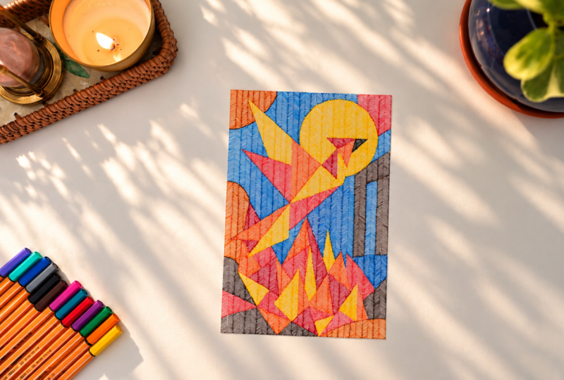
sections are filled, this is how it looks. What began as a simple drawing of shapes has
gradually become into something much more
intricate through repetition of one basic mark. I really like how the Phoenix
stands out against the blue and how the warm colors carry through into
the fire beneath it. Now, here are some
other examples. In this one, I have used
pen and the path as the main element and rest of the shapes to signify
obstacles and resilence. I use the play of light
and dark colors to showcase that resilence isn't just about the difficult parts. It's also about moments
of light, change, and possibility that
exist alongside. I also left quite a bit of
negative space here so that the path becomes much more visible and there
is breathing space. This one, instead of
focusing on a hero element, I just wanted to play
with limitation. So I used limited color
palette and also limited shapes to create a composition that feels continuous and dense. In this pattern, I
wanted to create a simple abstract
interpretation of a city without drawing it
way too realistically. So go ahead and create
your own version. It can be as direct or
as abstract as you want. The goal is to simplify it into basic shapes and slow down
with one mark at a time.
6. Closing Thoughts : Thank you so much for
spending this time with me. We often imagine progress as
something big and obvious, but most of the times
it is much quieter. It is showing up, doing a little coming back tomorrow,
and doing a little more. Most of the times,
just like these marks, it may not look like
much in isolation until you step back and realize
how far they have taken you. So be patient with your
process and do remember that your small efforts
will start showing up not just on the drawing
board, but in life. I'd love to see what
you've created, so do share your work
in the project gallery. If you enjoyed this class, then do explore my other Skillshare classes
where we continue to explore mindful drawing patterns and creative practices
in different ways. And don't forget to follow
me here on Skillshare so that you can stay updated
on my upcoming classes. You can also stay connected
with me on Instagram, and if you'd like to
explore more of my work, you can visit my website
where you'll find my artwork, prints, workshops, and
other creative offerings. Thank you once
again for creating with me until next time, keep drawing, keep exploring and keep trusting
the small stems.
 Neha Modi, Mindful Artist & Educator