Transcripts
1. Introduction: Shadows and highlights,
also known as values, are key to making figures, fabrics and pretty much
anything look realistic. In this series of lessons, we'll break down value, what it is and how to use it
so that you can draw figures confidently with dynamic
lighting effects on your instructor Fe Lu, figurative artists and
founder of wind Canvas. I've been studying and drawing
figures for over 20 years, learning from master artists and practicing from live models. I'm passionate about
teaching because I love helping my students
achieve their goals, like getting into the art
school of their dreams. And I believe figure
drawing is one of the fundamental milestones
and learning art. Because when you're able to confidently draw a
figure out of your head, you can draw
practically anything. In the next set of lessons, you'll be introduced to
the value scale and how it can be used to transform
flat shapes into 3D forms. And you'll be guided
through the different types of shadows, cast shadows, core shadows form shadows, highlights, and reflected light. You'll learn how to
construct figures with simple shapes and add realistic highlights on both
white paper and tone paper, as well as tips on shading
fabric step-by-step. If you're new to figure drawing or have trouble
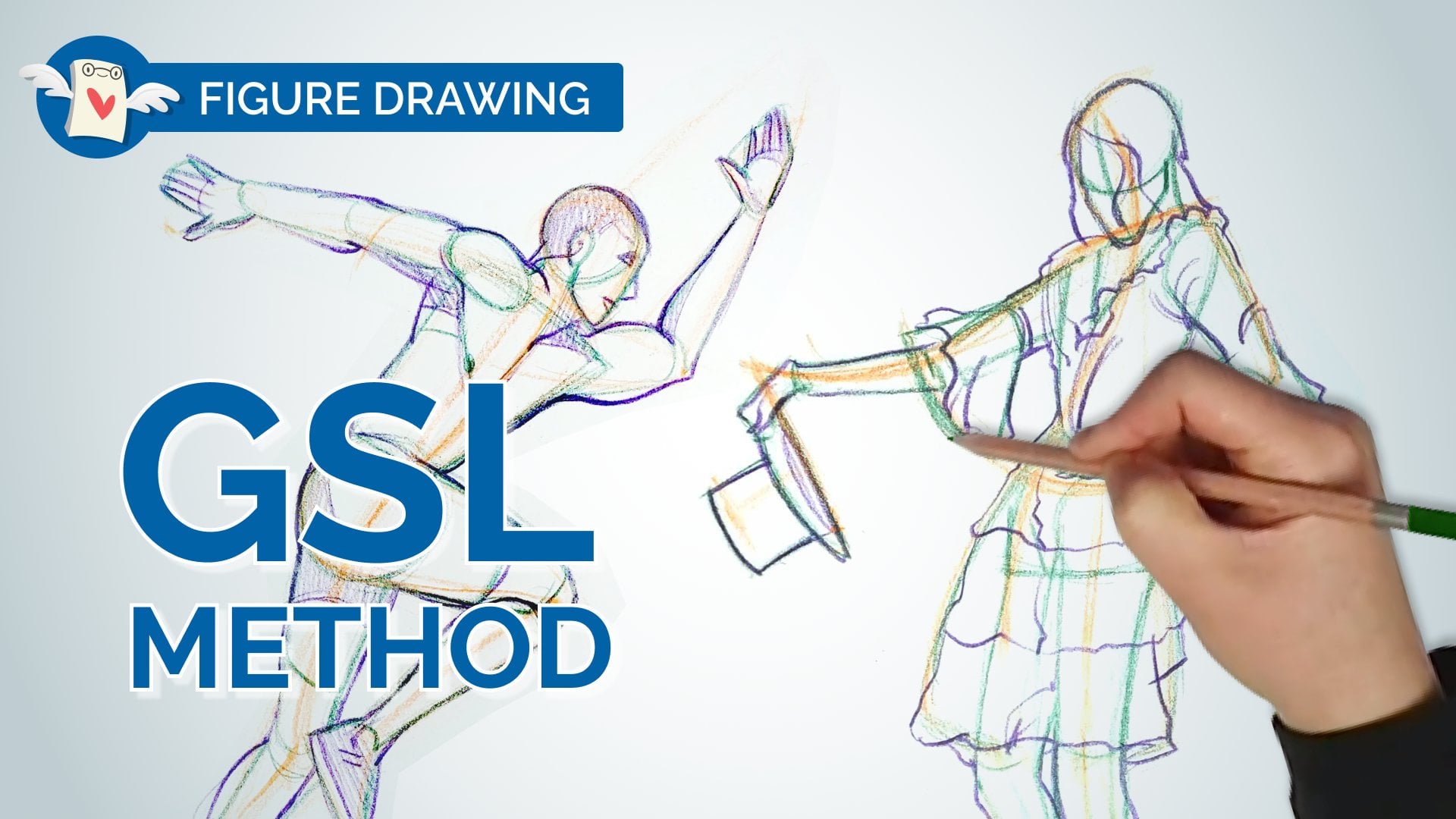
with proportions, I recommend starting with our beginner friendly lessons on human proportions
and the GSL method. Otherwise, get ready to level up your figure drawing skills
with lighting and shading. Make sure to share your
artwork with the community. See you in class.
2. The Different Types of Shadows: The last thing you
might want to take note of our types of
shadows form shadows, core shadows cast shadows. Three types of shadows with three different
types of properties. I started learning about them
when I was drawing fabric. Because fabric, you have
to be very specific about your form shadows and your core shadows and
your cast shadows. Because if you just think of them as just one
type of shadow, then your drawings don't look very realistic form shadows are shadows that are on the form. So for example, my
little mannequin guy. Examples of form
shadows right here. I'll kind of a long his body
here all along the arm. Now if you look for cast shadows that
there's a cast shadow that's being cast
by his arm right here. See that cast shadow. See how it has a
really sharp edge compared to the form shadows. That's a form shadow.
That's a cast shadow. A core shadow is the darkest
part of a form shadow. Look at, let's look
at his arm over here. See how it's like
light on one side, dark on the other side. But like right in the middle, the shadow gets extra dark. It's important to know all of these different
types of shadows. Because when you are shading, you need to think about them. Like, what's the form shadow? How do I shade the form shadow? Where do I put the core shadow? How is a cast shadow
different than a form shadow? So if you guys don't
know your shadows, get to know them because
it's going to make a huge difference with your
art and with your shading. Reflected light will only appear if the object
is on a surface. If this ball was in outer space, imagine it's like a planet. If it was a planet, there would be no
reflected light because the planet has nothing that's
reflecting light on it. But if you had one planet
and then another planet, close it, then maybe you
would get reflected light. Usually on figures there is a little bit of reflected
light like for example, if I was wearing a neon shirt, a 100% there would be
neon reflected on my face just because of the proximity
of the color on me. It also applies to colors. That's one of my figure
drawings from a long time ago. I think it's like a five-minute
drawing of this man. Had a lot of fun drawing him
because he has this belly. I simplified the belly
into like a sphere. Then the ribcage of
a rectangular prism, and then the chest plate. I simplified it into like
almost like a shelf. And you can see I'm putting
in some of the core shadows here by just
emphasizing that break. I've put in some cores, I put in some of
these form shadows. I didn't put any cast
shadows in this figure. There might've been a
cast shadow down here, down on his arm there. But I did emphasize like the lines that were
in the shadow. So for example, all
along the bottom here, there's a bit of a cast shadow there when you're
drawing figures and you only have five
minutes to draw something, you want to emphasize
the parts that are closest to you and the parts
that have the most contrast. For example, his
foot this foot was a lot closer to
me than his knee. I made sure that I
use line to emphasize the parts that are closer to me so that I can
feel more depth. You can achieve depth with
line art and not just shading.
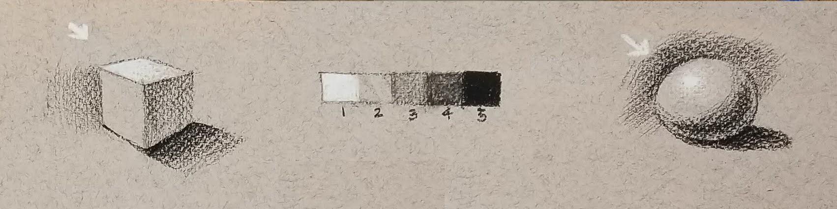
3. Shading Exercise: Values and Forms: We're gonna be drawing a
gray scale on this paper. And we'll need a point of
reference for middle gray. For now, we're gonna
figure out where the value of our
tone paper lies. How we're going to
figure that out is take your white and your
black drawing tool. The first thing I'm gonna
do is I'm going to draw a little value scale at the top. That value scale is going to
be a five step value scale. I always use an odd
number when I'm making a value scale because
if you use even numbers, it's harder to find middle gray. Some people will use
a six-step grayscale, but then they have like two values that share
the middle gray. So I find that a five-step value is way more than enough
for this type of drawing. Actually, the less steps, the easier it is for you
to organize your values. I'm drawing a
rectangle and very, very lightly like
super, super lightly. I'm going to draw like five
sections here at the bottom. And I'm going to turn
one of those sections into my darkest value. I'm using my black
going in and coloring in that full section
using black. Make sure that there's no
little holes that show through. Okay, Make sure
it's nice and dark. Next thing is you're
going to draw your white on the other side. So these are the ends
of our grayscale. We're gonna be using this
value scale throughout our drawing to keep our
shading in check. Value skills are so important. It's absolutely almost
the most important thing when it comes to tonal drawing is to identify your values. Now if you look at your white
and you look at your black, figure out where
your middle gray is. So if you squint at the paper, squint with me like this, you squint at your paper. Tell me which colors
stands out more. Now, look at your paper. If you're using Cardboard. Does the White stand out more or does the
Black stand out more? If you're using
cardboard and you feel like they both
stand out equally, then that means that your cardboard color
is your middle gray. What we're trying to do is we're trying to find middle gray. If you're using
tone paper like me, like this kind of
paper is pretty tan. According to my like, crazy color wheel
thing that I did. This is middle gray. If I compare middle
gray to this gray, you'll see that I
need to go darker. The next thing we're
gonna do is we're gonna find our middle gray. We're going to draw it in
the middle square here. So I need to go just a
tiny, tiny bit darker. Now if I look at
this value scale, the contrast between the white and the middle
gray should be the same as the contrast between the middle
gray and the black, which means that they
should stand out equally. This is a little
bit tricky to do. You're gonna have to do
a lot of squinting and a lot of kind of like standing back and evaluating the values. I can see that my paper is sort of in-between middle
gray and white, which means anytime
I'm using this value, I'm just going to leave
it the value of my paper. So the benefits of drawing on toned paper is really like you don't have to
draw this value. You can just use the paper. And luckily, we all love
to draw highlights, so we can draw our highlights. But our base color here
is already done for us, so it actually saves
us a lot of time. Now, I'm going to leave
this as my middle gray. Then I'm going to draw
my steps in-between. This is a delicate process. Now when I draw the
step in between this, this and this, I can kind of see my middle grays a
little dark, right? It's a little bit dark. So I'm gonna take
a kneaded eraser and I'm just gonna kinda tap it. Lighten it ever so slightly. I might need to lighten
it a little bit more. Then underneath my value scale, I'm going to number it, okay, so I'm going to make
white number one, my paper number two. Then the black is gonna
be number 512345. Again, you want to avoid putting lines in between
your value scale because the lines are going to create almost like
artificial contrasts. Like you can't really
compare the two values. So you really want to, but your values right up
against each other and then see the contrast
between each square. So this is a little bit
hard to do, little tricky. We're just going
to draw some tiny, tiny forms to practice applying these values
to those forms. So the first thing I'm
gonna do is I'm just going to draw a box
in perspective. Then I'm going to leave
one side of the cube, the color of the paper. I'm going to use
these other values to show light on this cube. So using your white pencil, what you can do is you
can draw a light source. So I'm just going to
draw a little arrow. If your light
sources at the top, then obviously the top is
going to be super light. I'm almost like drawing a little radiant little fade here. I'm gonna erase this line
underneath the white. Then I'm going to
apply a darker value. So I'm going to leave this one. This is two, this is
going to be three, and then the bottom
is going to be 45 or not the bottom
but the shadow. If the light's coming this way, it's very likely that I'm going to get like a
shadow that looks like this. Here I'm gonna put down my value five because cast shadows
are generally pretty dark. Then I'm just going
to fade it out. My shadows here are values 45. Then the side of the
cube that's receiving less light is going
to be value three. Here on the cube, I'm
going vertically. Then in the shadow I'm
going horizontally. This is because if I went horizontally on the cube
and then on the shadow, it gets a little bit confusing
like my lines are saying, okay, this is one thing
that I'm drawing. So as soon as I move from
one object to the shadow, I might consider changing the direction of
my shading to also communicate that
There's my cube. Now one thing I notice
about this cube is that there's not a lot of
contrast in this corner. And I really want this corner
to like pop out at me. What am I gonna do? I'm gonna use something
called artificial contrast. So if I want this
corner to stand out, I'm going to make this
corner slightly darker. I'm going to fade it out. Now you can see it's
starting to pop. The other thing I'm noticing
right now is this side, because this side of my cube and my background is the same color, the cube is starting to
fade into the background. What I'm gonna do
is I'm going to use artificial contrast
and I'm going to make the background darker. And I'm going to extend this cast shadow a little bit to emphasize the
weight of the object. There's plenty of ways you
can make something stand out. And one of the best things
you could do is artificially boost that contrast using the knowledge that you know
and your value scales. Now I'm going to draw a sphere. Spheres are a little
bit trickier to draw just because there's no definite value per facet. So again, if I know my
light sources there, I'm going to start
with my highlight. My highlight is going
to be value one. And it's also going
to be circular because the object is circular. So, and start with my value one, and I'm just going to kind
of fade it out a little bit and I'm going in
circular strokes. I'm going to fade my value
one into my value two. And then the next
thing I'm gonna do is I'm going to
draw my value five. So you notice that I always do my lightest point
and my darkest 0.1, just like we did
in the grayscale, there's no way to figure out
what your middle gray is if you don't know where your lightest point and
your darkest point is, essentially your lightest
point is you're stealing your darkest place is
your floor, right? And then you can find
the room in-between. Just start at the ends and work your way
through to the middle. Once you have the highlight in your gonna put the
shadow in the shadow, I'm going to make into
roughly the size of a circle. But it's gonna be more oval, like I'm going to shade it in. I'm going to
emphasize the bottom. I'm going to make the
bottom like really, really dark and kind
of fade it out. The next, I'm going to
draw in my core shadow. My core shadow is the darkest
part of my form shadow and core shadows are generally
as dark as cast shadows are. It's almost like a little like a little curve or like a
little Smiley face there. Then I'm gonna put in my
value for the bottom. Remember reflected
light will never be lighter than your mid tone. Because your reflected
light is still light being reflected
inside the shadow. So don't lose sight of that. The other thing to
remember is don't shade your white all
the way to your black. Leave some of the paper, the middle to help you
join those two values. Lot of the time I'll
see people like over highlight and overshadow and
then before you know it, the tone, like why
use toned paper? The whole point of
using tone paper is to kind of let that paper do
some of the work for you. Make sure you leave some of that tone paper in-between
your white and your dark. Don't color it all in. And now I'm gonna
do the same thing. I'm going to add some
artificial contrast to the top of the
ball because I want the top of the ball to pop
out a little bit more. But the background is
so light that it's not really giving me the
contrasts that I want. What I'm gonna do is
I'm just going to make the outside of the ball darker. If I make the
outside of the ball darker all the way
around the ball, then my dark part is
going to disappear. I only want to put contrast in the areas where it's
sort of opposite values. So dark against light
and light against dark. I don't want to shade the
background fully Either. If you use forms like spheres,
boxes, and cylinders, it's going to help you draw
the body because the body is just made up of boxes, spheres and cylinders,
and maybe wedges, but wedges are kinda like boxes. So just practice shading
some of these simple forms.
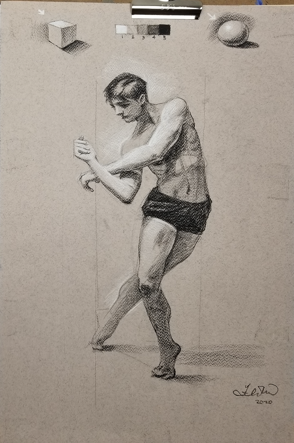
4. How to Draw a Dynamic Pose: If you want to do
your gesture in just regular pencil,
that's totally fine. It just means that you
have to erase it before you add on your values. Normally, if I was
drawing this on my own, I would do the gesture in white. Because I can erase white more easily than
I can erase black. But because I'm doing
this through webcam, I'm going to use
black just since. So it's a little bit easier
for you guys to see. But my recommendation
would be for you to draw, draw your gesture in
white or with pencil. That line is this line here. So if I draw a line here, I know that his foot his foot, I want his foot to the bed
there and his other foot. If I want my foot to be
here and my head to be like roughly here against this line. Now I can draw my gesture, so I'm going to go
from here to here. Then from there,
I'm going to draw another vertical
line from the top to the bottom so that I can
measure my negative space. I can see where I
initially placed the foot is right up
against this line. And so my foot needs to
move over just a tiny bit. The next thing I'm gonna
do is I'm gonna find the angle of the arm
and where it kind of goes on the hips in it
kinda goes from here to about here. On my mind. Just like a rough estimate
of where it goes. Don't worry if your drawing
is a little bit off. As long as we're expressing the pose in the
way that we want, then that's really
all that matters. This would be the top
of his hips here. Then I'm going to draw the
line of his shoulders. So if you can't see it, the top of his shoulder is
there and it goes to here. So look at that angle
of his shoulders. It's like really,
really severe angle. So I'm gonna try
to kind of capture that angle and sort of make sure that I've
translated that angle well. Then I'm going to find
the angle of his ribcage. So remember the angle of
his ribcage goes like this. Okay. And then I'm
going to just pencil in the box of his ribcage. My gesture line does not
go through the middle. It's kind of off
to the side here, so don't treat that as the middle if you've done
the same thing as me. And you notice that I've
still drawn the room cages a box even though
his shoulders are tilted. Remember the shoulders tilt independently from the ribcage? Sort of draw his belly button. Then I'm going to draw the
opposing gesture here. Leg two, foot, sort of
where I want the foot. Please don't press too hard. Okay, at this stage, just go very gently, very gently so that you
can erase your lines and you're not committing
to anything too too early. You're just sort
of testing it out. I noticed that the calf
goes right through the leg. So if I turn this
into a ribcage shape, I feel like I need to make his ribcage bigger Because
right now he's got female proportions because I made his hips a
little bit too big. So I might want to
make his ribcage just a little bit
bigger in general. So keeping my proportions
in mind, again, male rib cages are
much bigger than females and hips are much smaller in comparison
to female hips. Then I'm going to
place his head so I marked where I
want the head to go. So I'm going to draw
my oval and shield. Careful not to make
his head too big. You make his head too big. He's gonna look like
kind of childish. Plus the hair is going to
make his head even bigger. So prior to keep in mind that a male ribcage has the
volume of two heads, whatever size your ribcage is. Compare your ribcage and hip proportion to
what you know, right? So your ribcage should be
about two times the size of your hips and your head should be about
the size of your hips. About the volume of your hips. I'm going to connect the
neck to the ribcage. I am going to do a bit
more measuring and use the negative space
on this elbow here. I'm going to have
a look at where that elbow is in what kind of negative space that creates. And I'm gonna try and draw
the negative shape here. I think I drew
that a little far. That's kinda my
negative shape in here. Remember that the
forearm here should be the same length
as the upper arm. Here it looks like it's a
little bit foreshortened. So like this section of the arm, and this section of
the arm is the same. But if I do something like this, then this section of
the arm is shorter than this section of the arm
because it's foreshortened. Here. It would be the same here it's foreshortened on him. It's a little bit foreshortened. Really what that
means is instead of drawing your cylinder this way, you're drawing your
cylinder more like this. It's the same type of cylinder just in a
slightly different angle. Okay. So I can kinda see that
his arm goes quite low and his hand goes to the
middle of his face here. I want to make sure that I leave enough room for his hand. Then I'm going to put
the other arm in. But first I see a little
triangle shape in here. This tiny little triangle shape. That's also my negative space. I'm going to put that in. I'm
going to locate the elbow. So his elbow is
approximately here. The ribcage just kind of like
right next to this circle. Then I'm going to connect the top of the arm to his elbow. Forearm goes out like this. So his arms are quite long. For the hands, don't
worry so much, just draw them as a shape. Now that I have the entire
body sort of laid out, I'm going to have a
good hard look at it. Step away from your
drawing or hold it away from you and
squint really hard and have a look at the reference picture
and at your drawing. When I have a look, I can
kinda see that the thigh, the reason why my figure looks very female is because I have a very round thigh here and
my thighs supposed to be a little bit more vertical,
little less round. That's one thing that I
can fix in my drawing. Now would be a good
time to add in some of those bumps that you
may want to call out. So for example, I can
add on his calves now. So I can kind of
look at where that bump sits along that calf. And then I'm going to add it to my cylinder and do the same
thing on the other side. Again, make sure you're not
using really hard binds. The other thing I would
say is makes sure that your pencils are sharp. Once you have your line
drawing pretty much figured out and
everything looks decent, you're pretty happy with it. You can then start to
putting your values.
5. Realistic Shading Techniques on Toned Paper : First thing we're gonna do is we're going to draw
our value five. We're going to draw everything in here, that's value five. So if you squint at
the piece here and have a look at all of the
parts that are value five. So obviously his shorts
or a value five, right under his arm
here you can see a beautiful immutable
core shadow on his arm. Look at that. Look
at that core shadow. Yes, it does exist. The core shadow and
the reflected light is right here on his arm. We're going to make sure
that we draw that in. Also, the dark values
are on his hair, in his eye socket, underneath his arm here, and underneath his arm here. I'm going to start with
his shorts because I know that that's value five. I'm going to go in and
start to color that in. Again, I made a short,
a little bit wide. So here's my opportunity to make it a little less wide
and a little bit more boxy. I'm just going to shade this in. I realized that there are some parts of his
shorts that our value for, like the folds. I might start at my value for and then leave the parts that I want value for. So I'm gonna draw in
some of these folds. You don't have to go to
too detailed with this. We're only really
using five values. So what we're really
doing is we're simplifying all of the
values in this drawing. Once I've done my shorts. Now I can go in and
maybe I'm going to roughly draw out the
shadow under his arm. Now the shadow under his
arm is a cast shadow. You can see that under his
arm It's like really sharp. And then as it gets out
here, it's much blurrier. Now is where you can
add those bumps. Okay guys, I know you
love these bumps. So now we're going
to add the bumps to the side of his body. We're going to add the additional
muscle to his ribcage. This is where you get to draw
those really nice lines. Then underneath his
arm here I'm going to give them a bit of
a tricep muscle. My bump here, straight
down to the elbow. So once you have
your form's drawn, it's much easier to figure
out where those bumps go. I don't know about
you guys, but I don't see lines all around his body. I see a line on this
side of his body. Like a line around the
bottom of his legs, but I actually don't see
much line in his arms here. What I don't want you to
do is I don't want you to outline his arms
like super dark. We're gonna try to do it
with artificial contrast. Again, only be very selective about where
you put your lines. What I'd like to do
is I like to just sketch out the shape
of the shadow. Sketching out the shape
of the shadow helps me color it in faster. Again, the shadow
is probably value for with parts value five, with some parts value five, but mostly value for. As it reaches that
really sharp line under the arm
becomes value five. And then as it moves
outwards from the body, it becomes value for. Now I'm going to jump to
the next part that's dark and that's kind of this
ring around his arm. If you look at the shadow, the shadow tells you
a lot about the form. This shadow is wrapping
around his arm. So it's telling you
that his arm is round. This shadow is a cast shadow that's cast by this
arm here, right? So it's like if I
have my arm and my arm is on top
of my other arm, there's a shadow and that
shadow is usually round. So you can see the roundness of the shadow that informs you
of the form of his arm. I can also see
that the bottom of his arm is also nice
and dark, right? So let's do that part. Shaded in. The method I'm
showing you guys is really the fastest way to shade. To start with your
lights and your darks. Start with value one
and then value five. Then work your way
to the other values. Here you can be a little bit more descriptive
with your lines. Have a look at his face, like what value is most
of his face in right now? If you squint and look at it, I would say it's probably
like a value three to four. And then his hair
is a value five. So if I want to know
how to do value three, I have to do value 5
first to set the context. When you're shading the hair, it makes sense to shade in
the direction of hair growth. I'm going to shade
the hair so that it's kind of like fading up. Once I have in the
value of the hair, I'm gonna move down to draw
this part of the neck. Now I started with my darks because my paper is
closer to my light. If you're working on our
super dark tone paper or even black paper, it doesn't make sense
to start with black, you would start with white. So you always want
to think about those decisions
because they're gonna save you a lot of
time in the end. The next thing I'm
gonna do is figure out the shape of these bumps. So if you can see the
bumps on the arms, kind of where it
attaches to the ribcage. You can see that
the ribcage here, you can feel the roundness
of it a little bit. So go ahead and round
that box a little bit. Make this part
nice and straight. Then on this side
of the body you can see a little
bit of compression. I'm going to draw in
that compression. I'm going to make sure that
I find my center line. You can draw in
his belly button. Then if you squint at his torso. About what value, that is, that's value one and
that's value five, I would say the torso is in your three to four range
in your mid tones. Definitely start to color
in your torso here. And I know that this
part of the torso is much lighter
like right in here. So maybe isolate that part, then make everything else
a little bit darker. For now, I'm just going to
lay in a very light tone. Whatever your value three is. If your value three is
the value of the paper, then just leave it. If your value three needs
a little bit of a tone, then you can go in
and add that tone. Then if you want, you
can go in and work your way to your value for I
might put in his abs here. You can see it didn't take too, too long because I started
with my value three. The next thing I'm gonna do is I realized that the
leg that's going behind it is about the
same value as the torso. That's kind of like
my value three. So over here it's like
value 12343 kind of thing. So if I'm going to
draw the leg behind, I'm going to make sure that
I figure out where the knee is so that I don't
interrupt the other leg. And then I'm going
to go in and give it a nice middle gray value. Again, if your paper
is middle gray, then what you can
do is you can take your white colored pencil
and you can isolate this gray by adding
artificial contrast like this to lift that
color out of your paper. Make sure not to go too, too dark here, if
you have to compare, go back to your value scale and figure out before
you start any section, figure out, okay, what is
the value of this section? And make an effort to kind of match the value in
your gray scale. Here I can see right, or the legs start to
intersect a little bit. It gets much darker. I want to make sure
very subtly that my shorts overlap the
legs a little bit. Go ahead and really emphasize
the bumps in his muscles. Now I'm going to move down here. And if I look at the
bottom of his leg, I would say that this
leg is like a value for there's my value for it's pretty dark compared to the background and it
groups with value five. I'm going to go in
and shade his leg. I'm gonna put a bit of an accent right underneath his foot to really show that his
foot's on the ground. Then you see there's a
nice pattern like a nice form shadow going up on his leg. There's a little bit
of a shadow here indicating that there's
some muscle here. So what we can do is start to put that in like at
first very lightly, right? Until you know, it's
in the right spot. Then I'm going to start to shade the side of this cylinder. Then kind of connect it to
the bottom of his leg here. Then you can also
put in his knee. His knees seems to be a little
bit darker than the rest. For these shadows, what
you're really trying to do is just match the shape
as best as you can. Then also match the value
as best as you can. The best way to double-check your values
is just a splint. When I'm at this stage now I'm just going to have
a look and see if there's any other darks
that I want to put in. Now I think I'm going to
move on to my light colors. To put my light colors on, I have to make sure that he I
erase all of my dark lines. I'm going to take a break from
my konnte, from my black. I'm going to start putting
in some of those highlights. One thing I want to warn
you guys about putting in highlights is as soon as
it's like highlight time, we get a little bit crazy. And when we try to
highlight way too much, be very strategic with where you're putting
your highlights. If we squint at this picture, a, pretend that the
background is a little bit darker because I
want more contrast. Like even though
we're trying to copy this picture and we can
take a little bit of creative license to change things up to the
way we want them. So if I want to put artificial contrast in the
background, I'm gonna do that. I'm, I'm not going to
shy away from that. Remember, you can always adjust the lighting or the value
so that it works for you. The first thing I'm
gonna do is I'm going to draw the top of this arm because the top of this
arm is very white. I'm going to start
with his shoulder. I'm going to start
to color this in, make sure that you're using the paper to help
you transition. Okay? Don't just go all the
way to the black. Make sure you're
letting that paper do some of the work for you. You can see as I start
bringing this arm out, it's kinda adding more
dimension to my piece. I don't want to over
highlight because if I look at the arm and
I look at the leg, what's getting more light? If the light's
coming from above? Obviously, things that are
closer to the lighter gonna be brighter and things that are further away from the
lighter gonna be darker. Naturally, there's
going to be a gradient. Focus your highlights on the top and gradually let it
settle down to the bottom. I'm actually going to highlight
the background because I want more contrast
on the values. For now the hand over all the hand value
is your value one. I would say like value
one, value three. Okay, so even if you're drawing the fingers like don't
go super, super dark. Just stick to this value range. Because if you start outlining the fingers are getting super, super dark, then you're not
really using your values, you're just using line. I might put a little bit of a highlight on his upper thigh, just like a little bit. Then I'm just gonna
kinda let it fade. If I want to hit this
shoulder to stick out because right now
I don't see this.
6. How to Render Clothing and Fabric: The first thing we're
going to sketch out the figure, obviously, there's a gesture, There's lots of shapes that we can
kind of break it down, which she's standing still. But if you look at her hood, her hood is protruding
out a little bit, so her gesture is a
little bit of a curve. It's not straight up and down. It's better to put a
slight curve in it. It shows more action anyway. And then with that I'm going to start breaking up the ratio. So let's look at the
size of her hood. Mine just going to mark
the top of where I think her hood would be
in her hood shape up at the top here is similar to her torso size-wise because her hood is actually bigger
than her head. Her hood is a bit there. I'm actually going to
add that distance, the same distance down here. Maybe a little bit more. I would say it's very
similar in size. This to this. You can take your fingers
and measure as well. This part is really
her belt area. The first thing we want to do
is capture our proportions. Assume from here
all the way down to the bottom is going
to be her robe. And I'm going to measure how many hoods I can fit
from her waist down. I'm going to say three
and a little bit. I'm going to take
this distance, 123. A little bit for good measure. You'll notice that it's
not seven because I'm not using her head as
a unit of measurement. Her head is too
hard to see here, so I'm going to use her hood. Now. Look at any other
shapes that look like the same size as her hood. I can see her sleeves
like her sleeves. The image there are about
the same size as her hood. So keep that in
mind because that's going to help you with
your proportions. Let's start by actually
drawing her hood. So let's sketch out
the shape of her hood. I'm going to use
angles here because I want to avoid using
really curved lines because the angles are
going to help guide me more so than using
organic shapes. Normally I don't go
into this much detail. But for today because we're
focusing on clothing folds, I'm sketching it if buying it, but also sketching
it the way I see it, but focus more on shapes
rather than outlines. Now that we have the
hood figured out, Let's use the hood and figure out how wide her shoulders are. Going to draw the slant
of her shoulders. You can see her hood is
kind of covering that. From there. I can see that the
size of her hood is roughly half of the size of her torso,
including her sleeve. I'm going to do something a
little unconventional here because it really helps
me with proportions. I'm gonna sketch aware of
her sleeve as just a shape. If something is jumping out at you as a shape and it's super obvious dry because it's only going to help you
with your proportions. Here I just drew a tilted
square and now I'm gonna connect the sleeve to
that tilted square. If you want to jot
down the hand. Don't worry about all the
fingers and all that. You can just kind of draw
the hand as a shape. If you want to put the negative
shape in there, you can. It's like less of
a hand and more of a claw at this point, just to keep things
simple, check it out. This shape and this area here
are about the same size. This and this. So we're going to
sketch out this shape. Makes sure that this has,
is at a bit of a slant. Next I'm probably going to
draw the other sleeves. So I'm going to draw
this line here because it breaks up this
shape into a triangle. I see another triangle here. We're going to try
and draw as much as we can with just shapes. Next shape I see is this fear. Notice how big the sphere
is compared to the head. It's roughly the size of
the ball of the head. He wanted to draw a sketch out
the ball of the head here. Sketch it out really lightly. Checkout this long shape. It's like long oval shape
underneath that ball. How big length wise is this
shape compared to the ball? So if I marked down one ball
length, it's too short. So it's probably about 1.5. That looks about right. Now. I'm going to draw
in that long shape. Now I'm going to in
this sleeve here. And maybe a little bit of
the shape of that hand. If you want to sketch out
the reflection on the ball, you can do that as well. Now, check out the
negative shapes. So the negative shape being
this triangle in here. See if you can see
that triangle. Lot of the times
we forget to check our negative shapes and
that becomes a problem. So I'm gonna use that
negative shape to help me. Then I'm gonna draw this
robe on both sides instance. I'm going to mark where
on the sleeve that Rome starts and the tilt, that robe. Kind of how it's tilted. Then for the bottom,
I'm just going to, for simplicity's sake, just
kind of draw a curved line. And then we're going to
decide on the folds after. But right now I'm just sticking
to very simple shapes. I'm actually going to make her robe a little
longer because I feel like my proportions are
a little bit short here. I know on her It's
a little bit short, but I want to change it so that you can't really see the feet. But she's got this long robe. I'm even going to add
a tail to this robe, Given a little bit
more of a story. Because I think
it's actually more mysterious not to see the feet. So you can make some creative
decisions like this. Like when you're
drawing something and you're like, You know what? I think it's better
without the feet. Then get rid of it. Once you have your basic shapes, you can start to draw
in some of the folds. Again. You don't have to draw
everything that you see. Just draw the things that
make the most impact. So for example, if we look
at the top of her arm here, you start to see some
of these lines up here. When you're drawing these lines, try to use variety
in your lines, like try not to use repetition. When you're drawing
like folds on clothing, you want to avoid repetition. You want to make the folds
a little bit more organic. So let's say you have
a big fold here. Maybe, maybe there's
a little one, a couple of little ones. Maybe you're in line isn't
super even throughout, maybe you're using broken lines. More variety in your folds. Hey, so when I say
use line variety, it could be okay, maybe this line is
a little thicker than this line is thinner
and then here it disappears, and here it's a
little bit thicker. That's what's really
going to make your drawings feel good. Is this kind of organic
type of line work. Like the folds here that you see this person didn't iron their
costume before wearing it. Like, is that really
important to your piece? Should you include it? Maybe not. I don't really. That those folds add anything
except the fact that she didn't iron her outfit is
irrelevant to my story. No, I'm going to leave it out. Now. I'm going to draw the oval in her
sleeve and make sure that this oval is similar
in size to her other slave. Gets a little bit
complicated in her sleeves. So just try to keep it
as simple as you can. If you want to add some
folds in the hood, just make sure that this
top part is overlapping. There's lots of
overlaps in the hood. Anytime you see these
overlapping lines, make sure you include them. There's some bunches
of stuff here. I can go in later and
fix those things. But right now I'm just drawing
myself some guidelines. Then when you're drawing
robes or dresses or anything that has these pleats
and full folds in them. You don't have to necessarily
draw them all the way down. You can just draw the tops
and then the bottoms. And your eye should be
able to connect them. For the most part
like this one here, this fold goes all the
way to the bottom. But then the ones
that surround it kind of go halfway down and
then they start to disappear. When you're looking
at the shading, try not to over-complicate it. Like just squint with me for a second here when you squint, if you see that
this is all dark, look at your darks. They come screaming out you. And in terms of shapes, this is all dark. This is all dark down
here is all dark. And try to break it
down into three values. When you're shading, again, you don't need the entire
spectrum of values. You want to simplify
it into three values. If you're doing
this on tone paper, just leave the paper tone
as your value to that. You can do your highlights
with white colored pencil. They wanted to just
draw her hand. Just so I have a
finished drawing here. Notice how her
fingers are a little bit tilted up like
they're pointing up. And notice the negative shapes. We're going to think in
terms of our values. The shapes that are
really dark that I see right now are the
ball, the hand, this part of the sleeve, this part of the sleeve here. And then there's a gentle fade from the top to the bottom. If you don't want to
smear your piece and take a piece of scrap paper and
put it just below your hands. Do this so that I don't
smudge everything. We're going to get in
all of our value threes. So really what we're trying to do is we're just
really trying to capture the value of some of these shapes using the
inside of your pencil. I'm not exactly
following the form yet. I can do that later. All I want to do is get down a very even
application of color. But I'm holding my pencil
at a 45 degree angle. I have the ball. If you want a darker, you can kind of go on top of it, but I'm using a to b. So if I want to get any darker, I can go to a four or a six B, but I'm just going to leave
it like that for now. Okay. And I'm going
to work my way over, squint with me here. If you squint, you can kinda see this shape is also a
value three, right? So let's get that in. Just focus on the shape. Don't worry so much about all of the different variations. Don't worry about all
the different grays. Just think to yourself, what is a value three. Where should I be darkening
fabric to show those values? Here? I'm trying to be very
idiomatic about it. You can see I'm just
using shapes and I'm only really worrying
about value three. There are some areas like right here where it goes
from like a value through to allow you to if
you come across those areas, you can just kind of gently
fade it. Your value two. Now, I'm going to do
the hooded parts. So obviously the
hood casts a shadow, but I see a very obvious
triangle shape up here. And that trying in shape, it's all in dark. Don't worry about the face. Just squint and shade
that entire sheep. So it's really important here to not lose yourself
in the details. I mean, if you have all
the time in the world, then you can really approach
this anyway you like. But if you have limited time, the best thing to do is to just focus on one value at a time, on a three-step value scale. So nothing too complicated. If you want to do the hand, you'll see that it's really
just a triangle here. That's dark if I'm tilting my pencil even
more so I'm using the edge of it so I'm avoiding
shading like this. Whereas I'm kind of
tilting my pencil. Tilt shaved this way over here. It has a little bit
of a white lip. Simon, to leave that there. And look at all these
folds on the bottom. I'm going to choose a few of
them and just darken them. I'm going to save the
robe for later because there's a really nice gradient here and I want to
do it all at once. I'm going to move on. And I kind of drew with my lines these gentle folds in the
clothing in the sleeve here. Now I'm going to put in that reflected light and go
ahead and shade this. All done. Okay, right now I'm
just adding a gradient. On the bottom of
this hooded figure. You can see that I
put in a gentle fade. They're going to try
to even it out even more so that there's
no uneven spots. In contrast over here, this line here see how
super sharp that line. I want to be able
to really dark. I'm going to fade in this
way from right to left. All right. What I'm doing down here
is I'm trying to separate these pieces of cloth to
maximize the contrast. Anytime the bump goes in, I'm going to shade it darker. Anytime bump comes out, I'm gonna leave it lighter. Or darker out lighter
and darker out lighter. You want to work
from big to small. Don't get lost in
details because if you try to do
the details first, what happens is you
don't want to draw over the details and soon
you just kinda lose sight. The bigger picture. I put in all of my values 3s. Now what I'm gonna do is go into my value 2s and add
some more detail. The reason why I
start with my value three is because if I
started with my value to, it's kinda hard for me
to judge my values when I don't really have the
floor and the ceiling. The floor being your
value three and the ceiling being
your value one. This is also a part
where you get to do something that's a little bit different than the
reference picture. So maybe you change that
ball into something else. Like maybe you want
to draw some smoke on it or do something
to make it your own. That's really what's going
to set your portfolios apart from everybody else's, is if you give it a
new interpretation. The other thing I can start
to do is start to put in some artificial contrast. But really what that
means is to put in a background that's
very strategic. So I'm putting in this
background because my robes are white and I want
them to look even wider. So I'm gonna put them against, that's dark. In this case. You can see as soon as I
put in the background, you'll start to see the E
Rome's pop out a little bit, but I don't want to
make the ball go away. I don't want that
ball to disappear. So I'm going to be very careful around that
ball because I still want that ball to
pop. Some maybe. Now maybe I take my HB pencil and I draw a really sharp
dark line around that ball. Maybe I go in really
dark here and just kinda put in a core shadow. Let's say I want to add
some smoke to this. I'm gonna make this ball
kinda look like it's got some magical smoke
coming from it. I'm using my eraser and I'm just gonna put
in flame there. You might not see it right now, but starting to
put in some flame. Again, like if you don't really
know how to draw flames, you can pull up a reference. For now, I'm just using my
artificial contrast to give the feeling of glowing
flame me here. Starting it to feel magical. If I want that flame to glow, I've got a darker
along the edges. So this is where
artificial contrast really helps you
with your piece. It darker and just giving
it some atmosphere. And you don't have to color
in the whole background. You guys can just kind of
faded out a little bit and just add your contrast
very strategically. The method that I'm showing you with the three
value breakdown is really the most efficient
way to shape thing. And so I would invite
you to try this on your own with a piece
that you choose. Because this is an exercise. This is just for
us to try it out.
 Winged Canvas, Classes for Art Nerds