Transcripts
1. Self-Publish with Canva & Amazon KDP: What if your art lived beyond the screen of your iPad
or of your computer? What if you could
turn into a book that you can gift or
use for your portfolio? That's exactly what we're
going to do in this course, giving new life to the artwork
that you already created. I will show you how to
take your repeat patterns, perhaps repeat patterns that
you created previously, and how to turn them into beautiful journal
covers and into beautiful notebooks that you can publish using a free Canva
account and Amazon KDP. It's one of the easiest, most actionable and most rewarding ways to breathe
new life into your artwork. Here's what I will walk
you through step by step. How to recycle your
pattern artwork and prep it for print. How to design a
custom journal cover using a free Canva account, how to create a line
style notebook interior, how to choose the
right book dimensions and file specs for Amazon KDP, which is Amazon's self
publishing platform, how to set up your listing
in Amazon KDP step by step, and how to go through
the publishing process so your journal is available
to buy for yourself, for gifts, or even to sell it
in your shop or portfolio. You don't need any prior publishing experience
to take this course. Quite on the contrary, all
you need is your creativity, perhaps a repeat pattern
that you created before, and a free Canva account. That's it. Let's turn your art into something
real, useful and empowering. I hope to see you in class.
2. About Video Quality: Before we dive into our course, just a very quick disclaimer
about the video quality. So all my videos are
filmed in four K, and that's how I plow
them into Skillshare. But Skillshare is a
streaming platform, and if anything looks blurry or pixelated at first as you're
watching this course, then you don't have
to worry because Skillshare is a
streaming platform, and it really just
needs a moment. To fully load, especially depending on
your Internet connection. Just because something isn't
sharp doesn't mean that the quality of the videos
that I upload is low, quite on the contrary,
I pour a lot of care into producing these classes with the highest
quality possible. So please don't be too quick to leave a lower review based
on the video sharpness. Most of the time it just needs a little bit of your
patience to load properly, and to look, it's best. So thank you for
your understanding, and let's start watching.
3. Why Self-Publish?: Hello, dear students. Before we dive into
our actual tutorial, I wanted to share something personal and really
meaningful to me, namely a story of why I
chose self publishing, why I chose to self publish, and how it completely change the way I think
about my portfolio, the way I think about my career, and they're important
about my creative freedom. So I was invited to be one of the speakers during
an artist event called The Profitable Artist, and I thought that it would
be a great opportunity to promote to consider
self publishing. It's a wonderful exercise. And I pre recorded
a mini lecture, which I will include as part of this course,
and at some point, I think I will also
publish it for free on my YouTube
channel because this mini lecture contains a few important points that I think every creative
should hear. So I share my personal story
behind why I chose to self publish and why I believe it's an incredible opportunity
for every artist. This will also serve as an introductory video
to our tutorial, and I hope that it will give you enough inspiration to continue
with our course project. Happy watching. You don't need to wait for a
publisher or a client to give you permission to
share your art with the world. As a matter of fact,
you can hire yourself. Self publishing has
changed the way I see my art and I see myself. And today, I wanted to
show you why I believe that every artist should consider self publishing
in order to grow. Case you don't know me, hi. My name is Veronica. I'm a children's
book illustrator, surface pattern
designer, and teacher. I've taught everything from the basics of vector
illustration, digital illustration
in Procreate. A surface pattern design all the way to creating
your own coloring pages. And self publishing
is currently one of my most favorite topics. And the reason for that is
that it's very empowering. I came across this idea to self publish my own
coloring books for my little daughter
over on Amazon out of sheer frustration because at the beginning of this year, I was experiencing a bit
of a dry spell at work. And this gave me a lot of anxiety not only
about my income, but also about my self worth as an artist
because in my head, I was thinking, if I'm
not getting hired, then what kind of
an artist am I? So I wanted to introduce
you to self publishing as a great way to tackle
not only your anxieties, but also practically speaking
to tackle your dry spells. It's a great way to kick start also your career
as an illustrator, and it's one of the best
exercises that you can do for your own portfolio because at the end of
the day in a very, very fast way, you end up
with a physical product. For example, I self
published coloring books. And within one or
two weeks you can be holding this physical
product in your own hands. Whereas if you were to go the traditional path
with a publisher, first of all, you would have
to land this job either by representing yourself
or through an agency. And on top of that, the
publishing industry is notoriously slow. So you could be
holding your project in your own hands maybe in
half a year or even a year, which is really a lot of time. Let's also turn my own example of my own personal journey into self publishing into some actionable steps
that you can take. Tip number one,
start with something that you already have
in your portfolio. Last year, I drew a lot of
monsters for my portfolio. It was a lot of fun and drawing them actually helped me to
land some publishing projects. For example, a publisher hired me to illustrate a board book. I hope you can see
that. I'm illustrating an affinity designer on my iPad. So I was hired even for illustrating two board books for babies and for
toddlers with monsters. But unfortunately,
to my frustration, this publisher went bankrupt and this project
need to be canceled, which led again to a lot
of frustration on my side. So I decided to create some more efficiency
in my workflow. I had a bunch of monsters
that I drew for my portfolio, and I decided to recycle them. This is one of the
best tips that I can give you so that you
save up some time, but also so that you prevent lots of beautiful artwork that
you create getting stuck, for example, on your iPad, if you're creating
on the iPad or anywhere in your storage. Oftentimes, it is just simply a shame to be putting
your heart, your energy, and your time into your illustrations and not
do anything with them. And so this is how I created my very first coloring book
called Friendly Monsters. This is actually a
coloring book that is really used by my daughter. Those are all the
monsters that I drew literally February last year. Uh, yeah. Super sweet. My daughter was really
occupied coloring those. And they were simply
on my iPad and because I'm used to drawing
everything with vectors. Wh, it was so easy to
adjust everything and to turn it into a coloring book. So right now this coloring book and another coloring book are available on all
Amazon marketplaces. I self published my coloring
books through Amazon KDP. These are coloring
books for kids, which I made in particular
for my daughter who is four, which leads me to
tip number two, let your own influences inspire your project choice B
self publishing project is by default, a personal project
because you're not waiting for any
client or a publisher. You basically you have the
idea and you hire yourself. I recommend that for your
very first project idea, you take something that is
really close to your heart. Even if this project
will not sell, for example, those
coloring books, I think in the first
months of Amazon, I sold maybe two, and it was mainly
through my friends. But I wasn't disappointed
at all because for me, what mattered was that I had
those coloring books for my daughter and also as
gifts for our friends. It was just close to my heart. It wasn't all about profit. It was more about having something physical
for my portfolio, something physical
for my own daughter. And also proving to
yourself that I am worth. I am worthy. As an artist. I can create. I don't
need to wait for anybody. This is how I also created my second coloring book
called Cute Easter. Cute chickens. So this one actually I
created from scratch. But I knew that it's
very important to have some Easter themes in my illustration portfolio
because seasonal illustrations, such as, you know, Easter
Christmas, they're really, really, really important,
and they they sell. So I created this coloring book. I was really motivated and
I had nothing else to do, meaning, I was experiencing
this dry spell at work. I created this coloring book right before Easter in April, and from creating
this coloring book to publishing it to actually proofing it and ordering
it over on Amazon, I think it was something
like two weeks. So you kind of still need
to do it ahead of time. But it was super awesome
because they came on time, I think on Monday before Easter, so I still had a few days, and I was able to give them, of course, to give
it to my daughter, but also to gift it to the kids and the family
and in our friends circle. Another example of a
project that comes from the heart that
I can give you from my personal experience
is that right now we have May as I'm
recording this video, and I'm really a
lot into gardening. Like, I garden a
lot on my balcony. And I noticed out
of the need that I need to take some
notes about my garden, the seeds, what I planted. Sometimes I forget if a plant
needs what kind of soil, how much watering, is going to be okay on
my southern balcony. And I already started to take some notes and create drafts
of a gardening journal. So this will definitely
be a project that comes from the heart that, you know, I will have the satisfaction
of having created it as an artist without searching
for a publisher that might, first of all, they have
to agree to your project. And second of all, you
are giving away some of your creative freedom
because publishers usually have very strong opinions
about how things should look. So if you have a vision
for your baby project, they will likely want changes,
adjustments, alterations. And in the end, you will have
to compromise because it will be a teamwork between
you and the publisher. Whereas, if you are
self publishing, then your baby project
can look as you want. You have a full
creative freedom. That's why, again,
big recommendation, choose a topic for your self publishing project that really comes
from the heart. And on top of that, if it will not sell at
least initially, then you will have something for yourself or for your close ones. Let me give you now
tip number three. Start with a simple project. So initially, I will not lie. There will be a little
bit of a learning curve, and some people who are used to using
computers and iPads, they will be a
little bit faster, but there's also a lot of people who are not so fit
when it comes to technology and they need
a little bit more time or they feel overwhelmed
when they want to get started with
a new project. That's why to lower
this barrier for entry, namely your anxiety and
wanting to give up because there's too many technicalities
that you have to learn. I recommend that you start
with something, first of all, from the heart and second
of all, something simple. So if you really don't
know what to start with, you could consider the so
called low content product. This is the easiest
as it can get. Imagine journal. Imagine a sketchbook, a planner, a logbook, a to do list, or a habit tracker. These are typical low
content products. It means they have very
minimal or even no content. It could be, for example, a repeat pattern that
maybe you created while taking one of my courses that you just slap on the cover, and then insight could be
completely blank or it could be bullet journal style with
dots or it could be lined and it could be just a
notebook for taking notes, but it will be your unique
product because it's with your pattern on the cover of this notebook or
of this journal. This is as simple as it can get. You can create it probably in a few minutes using
any software. I'll talk about it in a
second of your choice or just using the free
Canva account. And boom, boom,
boom, theoretically, you could be done in half an hour and have
your first project, um yeah, waiting a
little bit to get approved over on
Amazon and then sell it on all Amazon marketplaces. With low content products, you can add your
own illustrations, not just patterns, but full
illustrations as covers. You can also use some decorative elements that you created before using any software of your choice as decorations
that will be inside. So it could be
still, for example, a plain notebook, but
every now and then, it might have a
botanical element or some cute linework
style illustration that will give this
personal touch. You can also create
themed guided journals or like I said, just
simple sketchbooks. And low content products
are by default, of course, much faster to create, and they can give
you the motivation boost that you might
need at the beginning. I highly recommend that you stay tuned because I will be releasing new courses
on this topic. And it's going to be
either on Skillshare, where I'm a top
teacher or better yet. You can stay tuned on
my SPSC block letter. It's like a blog platform where you can also
get all the updates, resources, knowledge articles
directly to your email, or you can check it out in the Substack app
because they also have a very nice It takes a little bit of time to
release a new course, but it's definitely
coming this year, so I hope I will see
you there as well. Now, the last tip to give you
some extra encouragement. The software you're
using doesn't matter, so don't get hung
up on the software. You can create your self publishing projects
in any software. Maybe you prefer Procreate. Perhaps you're an Adobe person and you also prefer
to work on desktop. I personally love using
Affinity Designer. If you know me, if you've
been following me, then all my feeds
my Facebook groups. They're full of affinity
designer recommendations. I'm not sponsored by them. I love creating on my iPads because I can
take it anywhere with me. And this choice for me, the iPad and using
Affinity Designer was the perfect choice
for me personally. I also have the entire
affinity suite, so I learned how to quickly and efficiently
use Affinity Publisher, together with Affinity Designer, but it was just a
personal choice. You can also set up,
which I would highly recommend a free Canva account. I don't have the pro version. I used to have it,
but then I realized I can bridge the gap
with what I need by my knowledge of graphic design and
digital illustration in affinity designer. I just have the free account
and even though I was creating everything in affinity
designer for the iPad, I was still putting everything together in my Canva account. It's very accessible
and very intuitive. There will be also a
course about it how to put together a quick low
content products using the free Canva account. So also, if you're
using affinity, I do have to mention that because I know affinity
much better than Adobe, for example, even
though I was using both and I'm able to compare. I think that in particular, using vector design has a lot of advantages
because, for instance, the monsters that I turned
into a coloring book, they were already vectors. And with vectors as opposed
to pixel art or raster art, you are able to
change the size of your artwork pretty
much indefinitely. I was able just to take
the vector shapes that I created literally
nearly two years ago and turn it into something new, taking into account
the dimensions of the coloring
book that I needed. Vectors give you this technically
speaking, this freedom. Literally last week, I got
a licensing inquiry and I licensed one of my illustrations
to a puzzle company, and I was so relieved
that I work with vectors because if it was raster and I didn't have the
dimensions that they needed, then I would basically have to redraw it and I would
be wasting time. So one big advantage is that affinity designer is
great for vector art, and another advantage is
another favorite topic of mine are using vector assets. I have two courses about
creating vector assets which are pre saved design
elements that you save up in infinity
into a library, and then you can just re use it to create new illustrations
or repeat patterns. Maybe you've taken some of my botanical assets courses or any courses about
pattern design. Botanical elements are the
most versatile elements that you can create
as opposed to other themes because
they're like, in their nature, the ultimate
decorative elements, botanical art. So perhaps if you've
taken my courses before, you really have a bunch of cool botanical
assets in your library, and you can basically
just recycle them. The way they work is
that you just have a library of assets
that you created before and you just drag and
drop them onto the canvas, the document, the project that you're working
on and you can them all over again without
spending more time at work. Let's wrap it up.
Tip number one, start with something you
already have in your portfolio. Tip number two, let your own influences
inspire your project. Tip number three, start
simple and tip number four, don't hang up on the software. You truly don't need permission
to publish your own work. What amazing times
we live in that we have such opportunities
to simply create something with any
software of our choice and then sit at our
computer, login. Upload it and publish your own work before it
wasn't even possible at all. So with this regard, it's
very empowering and it can be a great tool for your portfolio and building your
confidence as an artist, and it's such a
fulfilling way to share your art with the world
or with your loved ones. If you would need some
help for example, turning your illustrations into beautiful printable
coloring pages or coloring pages that can be put together into a
coloring book project. I have a course that
guides you through every step of the process with my favorite software
affinity designer, and if you have no other
personal projects in mind, then I would recommend
that you start with a simple coloring book and get into the world of
self publishing. Thank you so much for watching. I hope that you
really feel inspired, and hopefully, I'm going to see you in class.
Happy creating.
4. Low- & No-Content Products: In this lesson, we are diving
into something that is absolutely perfect
if you're just getting started with
self publishing, namely an introduction to low content and no
content products. It's the best way to start because there is a bit
of a learning curve. For our project, we will be
using a free Canva account, and then we will be setting up an Amazon KDP account together. So if you haven't self
published before, it might feel a little
bit intimidating. That's why one of the biggest
recommendations that I can give is to start small. So now let's talk
about low content and no content products,
what they actually are. You might have heard
this term before, especially in the
self publishing and passive income space, but what does it actually mean? Low content products are things like, for
example, journals, workbooks, prompt books,
planners or logbooks. No content products
are even simpler. For example, we can
have lined notebooks, just like for our project, dot grid sketchbooks or
blank composition books. In this course, we'll be
creating a very simple, pretty much no content journal with lined interior and with our own repeat
pattern on the cover. So this will count as no
content. Why start here? There are three big reasons. Number one, we have a
low barrier to entry. You don't need to write a
story or you don't need to hire an editor to
write the story for you. You can simply use
your existing artwork, your existing design skills or even templates to create a
finished and sellable product, and it will be very, very fast. Number two, portfolio power, just like with my self
publishing story, even a simple journal
or workbook or a coloring book can show potential clients or
collaborators what you can do, especially if you treat it as a real design project and you really put your
personality into it. You can even order a real
physical example of your work, just like in my case, I ordered my own coloring books, and then you can prepare real life photos, for
example, with you, holding your journal
or your coloring book, and then you can include those photos on your website,
on your social media. So this is a great option for beginner artists who
aren't published yet. It will, for example, give you much more variety in your
portfolio because instead of just flat mockups or just flat illustrations that you would like to showcase
to potential clients, you will have actual physical
products that you can show. And that leads me to
point number three. It builds confidence. It's easier to take
creative risks and finishing something
when the scope is smaller. And when you finish
something once, it's much easier to
finish something again, and next maybe to tackle
a bigger project. Perhaps a coloring book, maybe you want to
take my next course about creating coloring pages, put it into a coloring
book project, or you can even self publish your own
picture book for kids. So start small and then
get more ambitious with time once you learn
how the system works. Your project is to create
your on line journal using a free Canva account and one
of your own repeat patterns. If you've created
a pattern with me earlier in one of my
pattern design courses, that's perfect, you
will get to see it in action on a real
syllable product. You can of course recycle any repeat pattern
that you have. It doesn't have to
be created with me in affinity designer. It could be a pattern
that you create, maybe in Procreate or
in Adobe Illustrator, as long as you are the author. This is a hands on beginner
friendly way to walk through the full process of designing a professional looking cover. Laying out your interior pages and preparing everything
for Amazon KDP, Amazon's self
publishing platform. By the end of this tutorial, you will have a real
product ready to publish or add to
your portfolio. It's simple, it's achievable, and it's a great first step into the world of
self publishing. I hope that you're convinced
in the next lesson, I will give you a short
introduction into Amazon KDP, what it is and how it works
and how to get started.
5. Getting Started: Amazon KDP: This lesson, we're going
to talk about Amazon KDP, which stands for Kindle
direct publishing. Now, there is a word Kindle in the name Kindle
Direct publishing, which might imply that this
platform is just for eBooks because that's what
you would associate with the Kindle reader. But it is not only
limitted to eBooks. I self publish my
own coloring books and a few journals
through Amazon KDP. It's a platform
where you can self publish and sell
physical products, physical books, which
include journals, notebooks, workbooks. You can create
your own planners. For example,
currently, I'm working on my gardening planner. You can, for example, tacular
coloring book project or even self publish
your own picture book. I believe that Amazon KDP, it's not the perfect platform, but I think that it's a really great
platform to start with. So you can basically treat
it as your guinea pig. You can be your own author. You can hire yourself and
you can test things out. And because this
platform is for free, you're not really
losing anything. So what is Amazon KDP? KDP is Amazon's own
self publishing tool. It lets you upload
your book files. So we have a manuscript that we need to upload both for the
cover and the interior, and then you can sell
printed copies on demand. That means you don't have
to be printing in bulk. You don't have to invest
in any inventory. There's no shipping
task for you, so you don't have to deal
with any shipping problems, and there's no
upfront cost for you. Every time someone orders your journal or your
book over on Amazon, Amazon will print
one copy of it. And by the way, every time you access your publications
through Amazon GDP, you will get all the information
about how much it costs, so how much actually Amazon is paying to produce your
book or your journal or your coloring book and then you will earn a
royalty on each sale. So it's a very simple, pretty
straightforward system. Why start with KDP? There are a few reasons I would recommend starting off with KDP, which I already mentioned
one that it can be your guinea pig so that you
can build your confidence. Reason number one is
that it's accessible. You only need a basic cover
file and the interior file. You can do everything at your own convenience in your
kitchen or in your studio. Need a computer, and of course, you need an email address
to start your KDP account. But you don't need to
invest in hundreds of printed physical copies
of your product, that's already a big plus, and you don't need to learn complex publishing tools and also you don't need a client, you can hire yourself. Number two, it's free to use. There are no setup fees. You only pay a share
from each sale, so it's a system of royalties. You will get a royalty
for every product sold. But you don't need to
pay for your listing. For example, this
year I closed, again, my Etsy shop because
I got annoyed that I wasn't selling my
coloring pages, but they introduced that you have to pay for your
listing on a regular basis. So it's not enough to
pay one small fee. When you start the listing, they actually get back to you. I think every month or
every second month, or maybe even once a quarter,
I don't remember anymore, but they bother you
that you have to keep paying even though it's a small amount to keep
your listing online. I like that Amazon KDP can be my free guinea
pig, basically. You can publish
anything you want, and then you can even
forget about it. You can let it run
and no one will ever bother you about
any listing fees. I think it's a huge plus. Number three, it's connected to the biggest marketplace
in the world. So your journal or your coloring book will be listed on every Amazon possible. By default, I choose to set up my publication
for amazon.com, which is targeted for
the American market, but you can also create unique listings for any
other Amazon marketplace. For example, I am
based in Germany and I created my coloring books
also in the German version. Even though it's still a pretty
low content publication, there's no text inside, but at least I adjusted
the title to be in German, and I created all the
descriptions in German because I think that Germany is still a big market and I
know the language. So it was just a
few more minutes of my work for the work
that was already done. So one coloring book
was already created, and I was able to
very quickly create multiple language
versions to adapt it to a given
Amazon marketplace. And because it's all
connected globally, I am able even to send over my own publications to friends who live in Spain or in France, or in the UK, especially
in the UK, it's a problem. Sometimes when I want
to send over gifts, you have to go through customs
and fill out weird forms. If you have your
own publication, a journal or a coloring book
that you would like to give, you just log into the
given Amazon marketplace. And you can give in their address and send it over them through
Amazon directly, so I think it's
really convenient. So the fact that there are
multiple marketplaces. So we have amazon.com, amazon.de, one for the UK, for France, Japan,
whatnot, Canada, you will see that when you go to the tab where you have
to adjust your pricing. You have to adjust pricing for each of
those marketplaces. It can give you
relative visibility. That's something that I
would still like to mention. What does relative visibility mean in my personal opinion? It means, okay, you have
some exposure because Amazon is the biggest search engine for books and for
publications in the world. But at the same time,
you're not alone, so it's not just your
coloring book out there or your journal,
and in particular, low content and no content
products are so accessible that imagine that this
course is, for example, taken by let's say 100 students and each of you
publishes something, there will be 100
listings that might look similar and will be
competing with each other. There's still a
matter of competition and big saturation
in the market. That's why sales could be low and it all depends
also on how you promote your publication and whether you optimize
it well for SEO, which we will be also talking about it in one of
the videos to come. You still have to
optimize it for visibility, include
relevant keywords, like for any other
selling platform, be it red bubble shop or a spoon flower
shop for patterns. The same rules apply, you still have to optimize it and maybe not have
the expectations that everything will run well from the very
beginning and you will, uh create or generate a big
income from the very start. You still need to have
a little bit of flow, upload on a regular basis. So just like for any
other, for example, POD, shop, the same optimization
recommendations apply. Still, despite all
that, my last reason, reason number four,
is that being on Amazon KDP is empowering. Because there's something
very magical about holding a printed copy of your own
work, something that you made. I truly believe, and this is probably one of
the main reasons why I considered this topic for my next course outside of
Affinity Designer courses. It can really, really
boost your confidence. It can be your guinea pig. You can see how your work actually looks on a
physical product. And you will get a real
product in the end. You can order more
author copies. You get some discount when
you order it from Amazon, from your bookshelf, so to say, you still have to
pay a shipping cost, the prime discounts
do not apply, but it will still be cheaper
because I think effectively also you will only be paying the shipping cost
and the printing cost. Since you have to pay
for the shipping cost, it's worse to order a few more copies
than just one or two. But again, you will probably remember another
reason that I gave in my mini lecture or another recommendation
that I gave that it's really a good idea to choose something a
project that comes from the heart because then you avoid disappointment and regardless of sales or the lack of
sales that you have, you will still have a product that you can give
to your friends, you can give it to your family, or in particular, if you
have a child like me, you can create
something for them. And then having
this physical copy without the disappointment
of not getting projects from real clients
or real publishers. It can be bridged
and it can really give you a lot of confidence. On top of that, I already
said that it's a good idea to consider recycling some of the work that you already
have on your iPad, and it's empowering
with disregard that your artwork doesn't get
stuck on your device storage. So it doesn't get stuck on your iPad or on your
desktop computer. You can see it on a real product and it can again boost
your self esteem. So I think that was enough
for the introduction. To Amazon KDP, let's have a look into the Amazon KDP
interface together. All right, so let's
jump together to Amazon KDP interface. All you got to do is to choose
browser of your choice. I am using Google Chrome, but you can use any
browser and then go to your search engine and
type in Amazon KDP. Now, in case you didn't
have an account yet, I would recommend that you
actually go through this link, create a KDP account. Let's click on it
together and see the two options that
you can choose from. Namely, you can create
a KDP account if you already have an Amazon account, which was the case for me. But you don't
necessarily have to have an Amazon account
where you're buying things, books, for example, and you can still create an
Amazon KDP account. For those two scenarios, choose the one that applies to you and then you can go directly to the link that will prompt
you to start an account. It will be normally by
default, the link here, kdp.amazon.com that you have to click through and then depending whether you
have your Amazon account, you will either use your
existing password that is connected to your Amazon account or you will have to
create a new one. In which case, this is
scenario number two. You will need to
enter your name. You need to have an email
address that will connect to your new account and you will need to give it a new password. Then very important, before you even start
with your project, with your journal
project, in this case, you will need to still input some important information
right at the start, namely, you will need to
decide on your author name, which I would recommend that you still choose your real
name, in my case, Veronica Salak that will show up next to
your publication, and in this way, probably clients also
or publishers will be able to find you
in an easier way, and you will also need to input
your payment information. So right from the
start, you have to input your bank account. To which you will be getting your royalties after you've made some sales and you also have to input your tax information. Also, to find out more about all those three points that I just said,
author information, getting paid, and
tax information, you just have to select
those extra tabs over here. For tax information,
for example, there's information that there
will be a differentiation between US citizens
versus non US citizens. You will need to input your tax identification
number for example, I am based in Germany
and in Germany, we have the so called
personal tax number, Stenuma and this is
what I needed to input. This information will let Amazon know which country you are coming from and also if
they need to withhold, meaning keep a portion of your tax because they have different agreements
with different countries. With Germany, for instance, they are not
withholding any tax, so the percentage of
withholding is 0%. But with some countries,
there might be a percentage that they
will be still withholding. Tax information getting paid, payment information
in your bank account, and deciding on your
author name information is something that you have
to do from the very start. Okay, so of course we
will be diving much deeper into the
homepage of Amazon KDP, but I wanted to show you in general what you can expect
when you start your account. By default, you will land
in your bookshelf area. So this is your bookshelf, and this is where all
your publications are nested, so to say. I have a journal that I recently published and I
have my coloring books here. And if you go to those
uh three dots over here, you will find out that each
of those publications has some extra things that
you can do with it. For example, you can still edit your publication,
for example, edit print boook details, edit pricing, even after
the publication is live. You also have exactly
this information whether the publication is live, you see the live button
here when it was submitted, the pricing and so on, all the information is over here and this big Create button, the yellow Create
button is where you start a new title
or a new series. On top of that, you will
have the tab with reports. This is my dashboard where you don't see a lot because
it's only this month. We have the beginning of June as I'm recording this tutorial and I haven't made
any sales yet. There's also a community tab, which is basically like a forum where you can, for example, read a little bit more
about marketing and promotion strategy,
ask questions. And there's also
the marketing tab. So the bookshelf and marketing
is where I am the most. You can run ads, Amazon ads by choosing a marketplace here and
then going to Amazon ads. This is also where you can
set up your author profile. For example, I can click
here on Manage Author Page, and it will lead me to this Amazon Author central where I can work on the profile. This is the homepage. This view looks a little bit squished, but those books don't look
like that in reality. For some reason, it looks a
little bit strange in here. So when we go to profile, this is where you can set
up your branded photo and write all your biographies
in English, French, German, Spanish, or
just in English, if you wish, and
this is where you can also set up your
author page URL. So I have amazon.com slash
AuthorAS Veronica Salak. Uh, when I click on it,
this is exactly yeah my author page that is
connected to all my books. For example, let's go to my
cute Easter coloring book. Here we have my author, URL, Veronica Sala author. So this is also
something that you set up when you start a new
account, like I said. Along with payment and taxes, you have to decide on your
name or your pen name, and I do recommend that you
go with your real name. So whenever a potential client, a publisher wants
to research you, they can also go
through this link, and they can see if you
were published before, but they will not know if the work that is
connected to your name is associated with a traditional
publisher or if it's self published unless they
click on your work. And the information,
whether it was published independently is under
product details. You see here under publisher, it says independently published. It means that it
was self published. So going back to our bookshelf, this is where you
get all the updates about the KDP environment. Lately, there were some
changes to royalty payments. And this is all that you
have to know for now. As we will be developing
our journal project, we will go back to
this KDB interface, and we will be creating the publication that is part of your project together
step by step. So again, a reminder setting
up an account is very easy. You either use your existing
Amazon account or you create a new one for which you need to input your name and
your email address, and then you're ready to go. So I would highly recommend
that you go now and set up your account so that
you have it ready. And in the next video,
I will give you a short introduction to
the Canva interface.
6. Free Canva for Self-Publishing: Let's take a quick tour of
the free version of Canva. There's also a pro account, but I don't really think
that it's necessary, so we will be using
for the purpose of completing our project
free Canva account. And I will explain how it fits
into our creative process, even if you're already using Affinity Designer or any other design and
illustration software. First of all, why Canva? I love using affinity
designer and it's my GT tool for most of my
illustration and layout work. But for this type of project, something like a
lined journal or a simple printable and
even my coloring books, Canva is often faster, it's very intuitive, easier,
very beginner friendly. And it's especially good for quickly combining
text with images. You can also profit from
using free templates that are available as
part of the free account, and it also has very
good export features. We will be needing
a PDF for print. This is what Canva
allows us to do. We will also get the
right file type. And on top of that,
you see here, for example, my
personal Canva account. It's very easy to
duplicate our projects. For example, you can see here now everything that I
have in my Canva account. I have some animations
that I'm using for my videos as part of my branding and also for my YouTube channel. So, for example, this
animation was simply just where is it
here? Make a copy. It was duplicated so
that I make similar uh, animations without having to start my project from scratch. With this regard,
Canva offers me a lot of efficiency in my work and it helps
me to save time. Most importantly,
you don't have to pay for your Canva account. I used to have a pro
account over here, you see the banner area unlock all the Canva create launches with another
30 day Canva pro trial. Of course, you can try it out, and then you will be
able to use some of the pro features which are marked with a little crown icon. But once your trial is over and you're
not using it anymore, it will get watermarked. So I used some of the elements in my project and then they
got the watermark anyway. So I do not recommend
doing that. Now, maybe you know,
maybe you don't know, but Canva merged
together with Serif, the maker of affinity, affinity designer, Affinity
Photo and affinity publisher. And if you've been
taking my courses, you know that I'm a
huge fan of affinity. Right now, Canva
and affinity are still as if separate products, but there might be some
sort of an integration between the two products
anyway in the future. So it's good to try out Canva because if you're
an affinity user like me, maybe there will be
some integrations between the two solutions. So think of Canva as your
publishing layout tool, and Affinity can still stay
your Illustration Powerhouse. Or of course, you can use any other illustration
software such as Procreate or Adobe. So in this project, you might create your repeat
pattern, for example, in affinity, and then you can export it as a high
quality PNG or JPP. I will also by the
way, show you how I am preparing my repeat
pattern so that it fits, for example, here, in this
project, I can show you. I used one of my
all their patterns, which is uploaded
here to uploads, I will show you
exactly how I do that, and then we will be able to
recycle our existing work to create our journal cover
design directly in Canva. This workflow using Canva,
gives you custom look, but you can still
retain the quality of professional
illustration because the pattern will be created
in another software. So everything will be
paired with the speed and ease of using Canva because you will see as we
do the project together, it has a very handy drag
and drop interface. So with that regard,
I think it's really, really intuitive and it's
basically the best of both worlds if you're
using Affinity and Canva together or any other
illustration software. So now we can take a
quick look at Canva. In case you don't
have a Canva account, the same like with Amazon KDP, you can just either search
for it in your browser and there might be again
a sub link that prompts you to
register or to login, or you can go directly
to type in the lcva.com, and this will lead you here. Maybe let's open a
new Incognito tab. So v com, how it will look possibly on your computer,
accept all Cookies. You can either log in or
you can just sign up. And what I recommend
is if you have a Google account just to
continue with Google, and then you just select the email that
you're usually using and you input your
regular password that is connected with
your Google account. But you can, of course,
also continue with Facebook or just input
manually your email. So this is both for login
and for the sign up. The options are also available and choose whatever
is convenient to you. For me, I always
like to log in with my Google account,
and that's that. It's very fast. And once you will create
your free account, most likely you will not
have all the designs here, like you see in my interface because I've been using Canva for many years now, so a lot of projects
accumulated here. By the way, you see
here on the left that I'm in the home page area or
in the home area of Canva. And this is what we call
the Canva homepage. This homepage nest here, the possibility to
look for templates. For example, you
can s start typing YouTube and even see the suggestions that
show up, for example, choose to create a
YouTube banner if you have a YouTube account or
you can start typing in Instagram and have some ready made Instagram
post templates, including a blank,
custom Canvas, which is completely blank
and free for you to use. So over here, you can
search for templates. Let's go back to our home. And there's also a few
icons where one of my favorite ones that I use all the time is this
custom size icon. Or you can hit here
on the left side, this plus Create button, and it will also give you
the opportunity to use any ready made templates
or here to select a custom size where you can
just input the width and the height of your canvas of your document and also
choose here units, for example, change it to
inches or 2 centimeters. I'm going to click this X
to get out of this view. If you're using Canva
for a little bit longer, you can also start organizing your things into projects
and into folders. For instance, over here, I have a folder which is nesting all the pages of my acute
Easter coloring book, so we can also sort them. Templates will be
basically what we also access from the home page over here from this Canva browser. You can also go
directly to templates. And if you have a pro account, you can also access
here this brand area. Having a pro account gives you access to the so called brand
kit where you can input, I think, your logo,
your branded colors, any graphics, and Canva
solution will also give you some automations that will basically spit out for you
like a custom story template, Facebook post as you see here, Instagram post ready
for you to use. AI I usually stay away
from any AI solution, so I haven't really
explored that. I believe that if I
have my knowledge about using affinity designer
without any help of AI, I will stick to that. I'm
a little bit against. I use AI for my business
to brainstorm ideas, but I don't use it for design, so I cannot even give you more information about using AI because I'm not
using it myself. So from this homepage, as we work on our project, we will be choosing this
custom size here to create our Canvas and then just again to click on the
same journal cover. Then we will head to
the document interface, which we will be also
discovering together in much more detail as we carry out with our
project together, there's a design section here of the document
view and Canva. There are elements
that you can add. For example, here,
you can go to shapes, see all and input some
ready made shapes. For example, this the
spine of my notebook is a simple square shape turned into a rectangle where
we also change the color. You can input text in Canva, and what is really
handy, for example, this notebook area is a text. We can choose among really, I don't know, tens or hundreds of different fonts in Canva, and you can also use
them commercially, so you will not be infringing anyone's copyright or
intellectual property if you're using Canva fonts. Brand is if you
had a pro account, you might be directly drag
and dropping your logo, using your branded
color palette, branded fonts, and
so on and so on, but we're not going
to be using that. Uploads is where you input, for example, this
pattern was put here. I can also click
on it and input it again, but I'm
going to delete it. So in uploads, this
is what you input from your desktop Storge, for example, or from your iPad, what you would like to
feed onto your design, now, tools, I'm not using
that much projects. I don't access it really
from here and also apps. There are some apps
that you can connect, but I don't really
use it too much. I use the most the
elements section, text. And uploads, and I
think this is it. So going back to the homepage. Okay, so this is the first
look to the Canva interface. It's all quite intuitive
once you get the hang of it. If you already know Canva, then it will be even
easier and faster for you to get started with our
self publishing project. And I chose it because
it's very intuitive. Of course, you can use
other publication software to create your no content
or low content product. You can even create
everything from scratch in Affinity Designer, affinity publisher, in
Illustrator, in in design. But Canva is so easy to use, and everything is in the cloud, so you can also access
it from any device, wherever you are,
everything will be synced. I think it's really efficient and it speeds up my workflow. That's why I chose to teach
about using the free Canva account for our self
publishing project. This was just a short
introduction to Canva enough to get
you familiar with the interface and understand why we're using it
for this project. Don't worry at all if it feels a little bit new and
a little bit different. As we work on our journal
project together, we will dive deeper into
the tools step by step, and you will see how
simple and fun it can be to bring your designs
to life with Canva. So if you're ready to start
creating, let's move on.
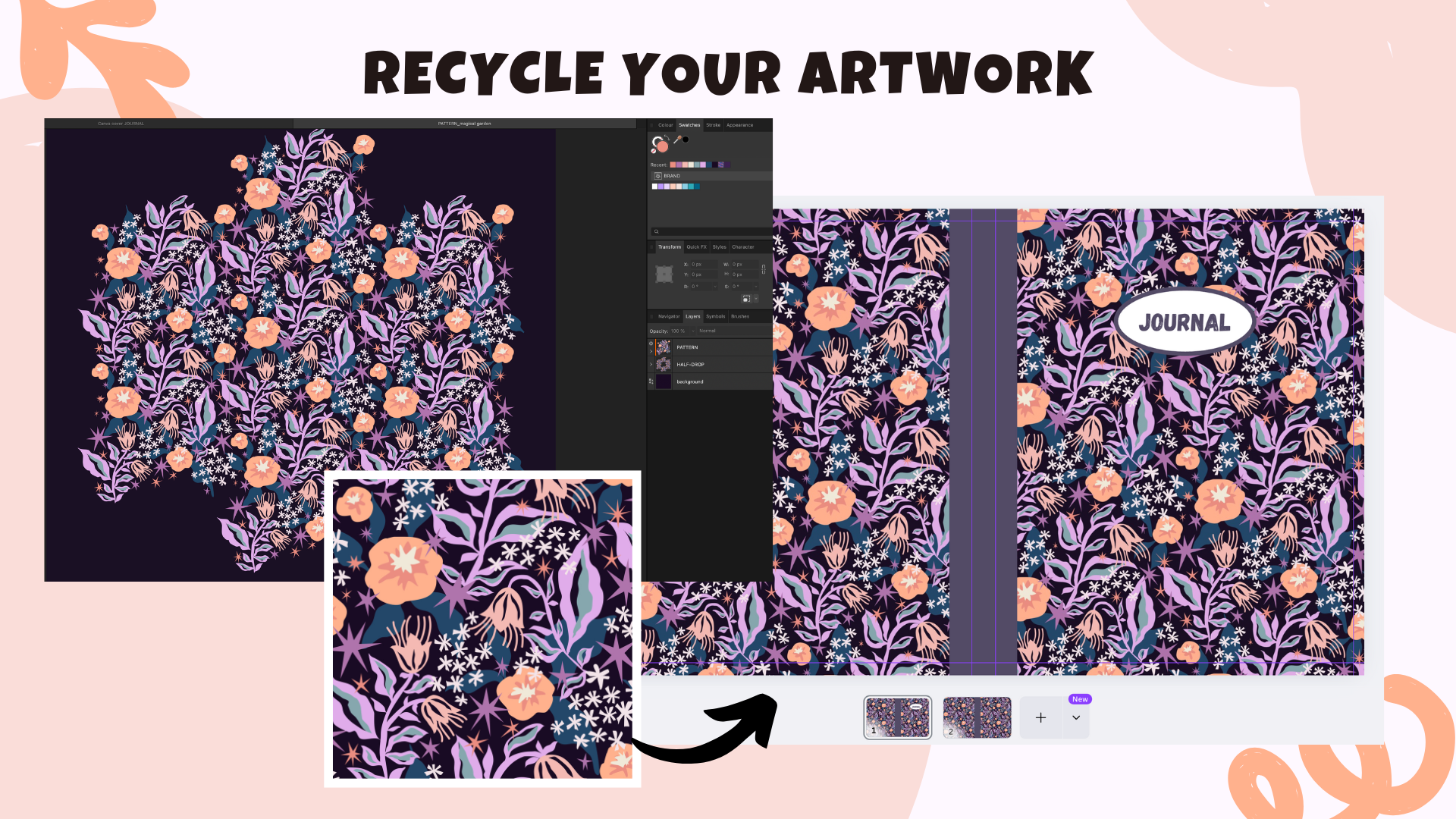
7. Repurpose, Recycle & Plan: In this lesson, we
are going to take the first creative step
in your journal project, namely by recycling and repurposing ever repeat
pattern you already made, and we will be
planning our cover and our interior layout
for our journal. So here's my recommendation. Recycle a pattern
you already made. Instead of starting
from scratch, I invite you to repurpose
your existing artwork, which probably
normally gets stuck on your iPad or whatever software you're using to
create your artwork. So this will save you some time, and it will also give you
some joy that you will give a new life to your artwork. Here's an example
perhaps from mine. So let's go to my website. So let's go to my portfolio. I have one pattern that is
really dear to my heart, and I think I created
it. Oh, my goodness. I think it was 2022 for a social media event
called June and Bloom, and I made since then
many color variations. It's botanical, it's feminine, but it's also magical. The dark background makes it a little bit mystical or witchy. I really, really love it. So I will be repurposing
a pattern that I created three years ago. And it's again,
following the advice to choose a project and probably
also to choose an artwork, a repeat pattern in this
case that is close to your heart because then
whatever the sales, whatever the numerical
values at the end, this will still be
close to your heart, so you will have satisfaction
from this project anyway. I absolutely love this pattern and I would love to see it on my journal cover.
So this is set. I will just have to
dig out my files from my iPad somewhere,
find this pattern. I backup all my files, so everything is either on
my iPad or on my storage. I have an external
Toshiba drive. It's likely on
both, both the iPad and my external storage, so everything is
backed up for sure. Reusing your patterns like that is a really
great move because, first of all, of course, it saves you time because
the work is already done. It gives new life and value to your existing designs and
it also helps to build a consistent visual brand across your products
because you might actually also have
some signature artwork that you may want to put
on physical products, and then later
when you order it, you can also take promotional
photos and again, use it for your portfolio
or for your website. So in case you don't
have a pattern yet, I would highly recommend
that you pause this course and you go
create a repeat pattern. So you can either create
something completely from scratch before you
proceed with this course, or perhaps you would
like to take one of my affinity designer courses. I teach about pattern design. There's also more information on my website and you can also find my courses on Skillshare. I teach about pattern design. Do I teach about pattern design. For Affinity Designer. So there's another sub page that I have here, Affinity
Designer courses. I have this free playlist on my YouTube channel to dive
into Affinity Designer. And actually, as
a matter of fact, let's go to my YouTube. So this is if you're watching this video
outside of Skillshare. If you go to my YouTube
channel, perhaps videos. Ah, I uploaded this video one month ago affinity designer
pattern in 15 minutes. It's a pretty quick class. So if you want something
a little bit more slower, deeper, more explanations, then I would recommend
taking one of my courses, either a Skillshare or gum Road. But if you're quick to learn
or if you want to save time, you can try out this video, which is completely for free. On my YouTube channel,
and actually, I have a few other
pattern design courses. Exactly. There's a whole
playlist on my YouTube channel, Affinity Designer for
pattern designers. Sometimes it's
without a voiceover, and there's also some videos with an explanation,
and I also made. So if you go to the official Affinity Designer,
YouTube channel, there was or start typing
in creative sessions, Veronica Salak
then you will come across this video here creating VctoryPitPatterns in Affinity Designer
with Veronica Sarak. Two years ago, I
looked different. And this is another step by step tutorial that you can
take completely for free. Or you can head to
Skillshare and take one of my classes in surface
pattern design. But in essence, you can work in any software
of your choice. You can create your
repeat pattern in Procreate in Adobe Illustrator. Just make sure that the
artwork you're using is 100% your own and that you
hold full rights to it. I will show you how
exactly I prepare my pattern tile for
our cover after we cover the lesson about figuring out the overall dimensions for our journal for
the template that will be necessary for the
upload for our Amazon KDP account because we need to run some calculations which I'm going to show you in a second. Next, you need to plan
your journal interior. So maybe I will go back also to my Canva and show
you, for example, my bullet journal page for my previous journal
uploaded to Amazon KDP. You need to ask
yourself, do you want a lined page,
journal for writing? Maybe you want a bullet or
dotted page for sketching. Nodes a little bit
more flexibility. You can also mix and match or you can even just
have a blank page. Maybe it will be a sketchbook or like a planning planning kind of I think there's a name for that something with composition,
a composition. Workbook. Yeah. So you need to make
up your mind about that. You can keep it
also super simple. You can just repeat one page
example throughout the book. For my previous journal, I made something a little
bit more ambitious because there's this you'll see there's this decorative element at the bottom of the page. It's always in one
of the corners. Over here in Canva, we can go to the grid view. So when you open your notebook, let me maybe grab
another notebook which I printed out through
my red bubble shop. It's also one of my
very first patterns that I made an
affinity designer. There's actually
some notes here, but never mind notes
about pattern design. So when you open your notebook, there's just the cover, and there's the first
page of your notebook, which will have a
decorative element in the lower right corner. Then I'm going to select
those two pages will be interior pages that you see when you
open your notebook. Those are the two
pages that you open. And I chose my
decorative element to be just on the outer edges. But you can, of course,
create exactly the same page. It doesn't have to be mirrored. So this decorative
element is mirred. You can also make
up your mind about adding any decorative elements. They can be just in one
corner of your page, or it can be mirred, and this is something
that you can consider and plan now
for your project. Okay, so before we move on, I actually have a short
checklist for you. Ask yourself, do you have
a repeat pattern ready? Did you decide on the interior? Did you set up your free Canva account and did you set
up your KDP account? If this is all checked, then in the next lesson, we will actually start building your interior and the
cover template in Canva.
8. Journal Dimensions & KDP Cover Calculator: In this lesson,
we will decide on the dimensions and the
specifications for your journal, and a very important
step will be to generate a template
that we will be able to use in our free Canva
account to make sure that we have the right dimensions
for our working files. So this is a key
part of the process because knowing the
exact dimension that Amazon KDP specifically will require will affect the overall look and
feel of the journal, but it will also influence
how the cover file will be built and how it
will print on Amazon KDP. So let's walk through the most popular options and prepare your layout
files accordingly. First, step number one, we have to choose
your notebook size. KDP offers actually
many trim sizes, but for journals, these are
the most commonly used sizes. So we can have six by 9
". It's quite portable. It can fit in any bag. Actually, I found
even information that it's a best seller size. If you're not sure
and by the way, inches were more
convenient to me than choosing millimeters
because instead of centimeters, you can only choose
inches and millimeters. I stick with inches. This is, for
example, six by 9 ". To compare in Europe, it's very common to refer
to those din sizes. This is a five. If you compare, six by nine
is a little bit taller. So let me actually put this A five notebook
that I have behind, and you will see this is
not the exact A five size. It's the same width, but it's a little bit taller. So this will be six by nine. I find it very handy because
in particular inches, I don't know how to
imagine them properly. So I like to cut the dimensions out
whenever I'm also getting a book project from my client to imagine the scale for
my illustrations, I like to cut it out on just
an ordinary notebook paper. And then another very
popular notebook or journal size is 6.5 by 9.25 ". This is what we'll be using. It feels like a slightly
bigger notebook. It's a little bit wider. So it has pretty
much similar height, but it's going to be wider. I hope that by the end
of filming this course, I will be able to order my own journal so that you
can also see it in real time. I hope to take some nice
photos for your reference. Those are the dimensions that we'll be using that I will be recommending to take for
our journal project. It's a little bit wider, but it still feels
like a relatively small notebook or journal. And then there's also in case
you want something bigger, depends on the purpose
of your project. If you have something in mind. Then another popular
size is 8.5 by 11 ". It's really great
for sketchbooks, composition planners
and also for workbooks. So it's up to you,
and I will show you in a second how to calculate your overall dimensions that you will have to input into
your free Canva account. So that everything prints
correctly in Amazon KDP. So for this project, we'll
be using 7.5 by 920 5 ". We just have to make sure
to stay consistent with both the interior pages
and the cover template. Next, step number two, decide on pay page count. Page count matters for printing, because depending how many pages we want in your notebook, it will affect the
width of the spine. And therefore, when you open
when you open your journal, it will affect the overall
dimensions because it will include both
the front cover, the back cover, and
the spine together. And of course, logically, the more pages you
have in your journal, you see in my example, this spine area is
also marked with this decorative orange
element in the middle. This will affect the dimensions that you have to input for Amazon KDP that's
super, super important. And then for a low
content journal, I suggest to start
with 100-120 pages. Personally, I will go for 110. You can do exactly
the same project like me with the same
dimensions to keep things easy. 110 pages is light
enough and it makes it still quite affordable regarding
Amazon printing costs. And we will keep everything probably in black and white
because color costs more, and there's no need for
color for a simple journal. Step number three, get
your cover template. So before we start
designing the cover, we need to know the
overall dimensions, and we need to download a
precise KDP cover template from Amazon's cover calculator
to get to the calculator. I will also include
this link somewhere in the class description
or in the resources. You can just go to
your browser and type in Amazon KDP
cover calculator. And then when we
click on this link, you will see the als ktpt amazon.com slash cover
Hyphen calcular. You can also go to this link directly or find it
in the resources. And this is where we will
generate our template. Let's do this together now and fill out this form
to get the template. We first have to after
the planning stage, knowing what you want, input the important information here. Binding type, we will go for a simple paperback Interior
type will be black and white. Paper type, I would
go with white paper, simple, reading direction, left to right, pretty standard. Measurement units. We will stick with inches. And the interior
trim size, remember, we will go for Oh, now I have to
focus. Where is it. So this was one of the
recommendations that I gave six by nine, but we will go with 7.5 and 9.25 because it's
a little bit wider. You can also input a
custom trim size here, but I will go with a standard that I can choose
from this drop down menu, and I will input 110
pages for my page count. And now we select
calculate dimensions. And this will be our template. You don't really
have to focus on this too much right now. We just go to download
our template. And then we can open
it in our downloads, and there will be a zip folder which you have to click
to open a folder. And then when we click
on it, there is a PDF. There's a text file, the
text file we don't need, so I'm just going
to get rid of it. And PDF, I also get rid
of it to keep it clean, and this will be our template. So I just keep the PNG file. Let's open it together. We will use this PNG guide Okay, let me adjust it a
little bit here. So this is going to
be our template, which will be our guide
insight Canva when we design the front of our journal and the
back of our journal. And here we also have the
spine area, as you see. It looks like a colorful
layout with some boxes, lines and labels,
and it might feel a little bit technical at
first, but don't worry. I will walk you
through it. This is a visual guide for how to design your cover so that it fits Amazon's exact
printing requirements. It's super important.
Here where exactly the dimensions that we opted
in for 7.5 inch by 9.25. But these are the actual
overall dimensions which include the front, the spine, and the
back cover together. You also see here there's
a bar code area here. This matters, for example, it mattered when I was designing the covers for my
coloring pages. There will be like a
default barcode that will be generated by
the Amazon system. So if you have a cover design, which also includes
some information, it's no it's for normal
content products, so to say. So this doesn't apply to
low or no content products. It only applies to normal maybe coloring books
or picture books. You'll have to be mindful
that you don't put any important information
in this area over here. So the white area
is the safe area, and this pinkish reddish
area is the danger area, and nothing important should be in this danger area
because it might get cut out. So front areas over here, back areas over here. We have a narrow spine area which takes into
account our 110 pages, and we have our margins and
bleed zones marked in color. White area is where your important design
and text should go, so we will be also Ah,
you don't have to. You can just design it
with repeat pattern. So if you want to keep it
confidential, so to say, just a simple
journal with no text and no box, then
you can do that, or I don't know, for the purpose of
this exercise also to learn canvas or in case you
like this type of design, we'll be also adding in
a colored spine area for our journal and a little kind of notebook sticker or frame. But you can also
skip that together. But this will be
important to know that this front is going
to be on this side. And then knowing
those exact here, journal dimensions,
we will be able to start our cover and
design in Canva. So this is what we're going
to do in our next video.
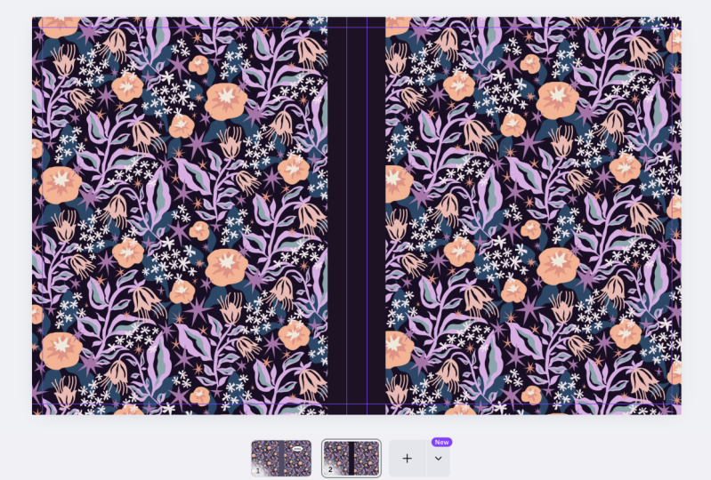
9. Setting Up The Cover Template in Canva: We are finally bringing your journal cover
to life using Canva. So we go ahead and log into
our free Canva account. I'm going to close
that for a moment. So if you haven't been
using Canva before, then this is likely empty. Don't worry. We will populate
it soon with new documents. And now step number one, we need to create a
custom Canva design. The easiest way to do this from our homepage is to simply
select custom size, and then we make
sure that we have inches and you need to go
back to your document, and in case you
haven't opened it yet, you have to go to the PNG
templates that we just generated and look for those overall dimensions
that we need to input. So we have 154, 98 or the wist 15 498. And I like to triple
check everything. 15, four, 98, 15, four, nine because it's so
weird 498 height, we have a 9.59 0.5. It even remembers this dimension because I used it before. So this is really handy when you do it correctly the
first time the system will remember the
previous dimension so that you can really
double check that everything is correct with those weird point
numerical values. Okay, create new design, and we have a new document. Over here, we can also give
it a new name, maybe magical. Journal cover because this pattern that I chose
for my project, to me, it's a
little bit magical. So magical, maybe magical
garden journal cover. So I'm just going to name it. When I go back to my homepage
and I refresh the homepage, it should actually show up. But there's nothing inside
it, so it looks blank, but it's already called
Magical Garden Journal Cover. And we also see the dimensions
are correct in here. Okay. We go back to
the document and we open the folder where we have our template and we just
drag it onto the document. Then every time you drag and drop some new
elements, for example, this template or your pattern, you will be able to
access it under uploads. I already had it
before. It's over here. In case I have a duplicate, you can also go
to the three dots and move it to trash
so that you don't have any copies or
unnecessary copies that will kind of populate
your space here. So this template is here in
case you want to reuse it, and now I'm just
going to drag it. So it should snap automatically. It kind of works like magnetic snapping in
affinity designer. So I start from the upper left corner
and just need to drag it to the other
cornet and it snaps again. You're going to
feel it, so to say. And now this template is also part of our
document and should fit perfectly because we used exactly the dimensions that
we were supposed to use. Okay, in case you're afraid
that you're going to move it unnecessarily,
as it is selected, you also have some sort of contextual menu here and there's a pad log
or lock symbol, and you can lock it
in place for now. So now our new
design is created, and we have the template
inside of our documents. So we also locked it. This template will now act as our guide while we
build our cover. And now I would like to set up guides instead of needing
to deal with this template. So one way would
be but for that, we have to unlock it to unlock all the other
editing options. One way that we could
go about is here this transparency checker board is a symbol for the
transparency option. If you click on it, you can reduce the transparency
of this template, and you can proceed in this way. But I like to lock it and
I like to set up guides. So in order to
activate the guides, we need to go here
in Canva to file. And then I think it was settings and show rulers and guides. Now those rulers showed up. And here I kind of hovered on this ruler and this
arrow showed up. And then I just press and drag this guide to match it perfectly with the left
side of the pinkish area. Over here, where you
see 77% in my case, you can also zoom in
to see things better. I'm just going to drag
one more ruler now here. So I want to trace
the bleed area in the spine area here
in the middle and one more to the outside
here to the right side. So now, if I were to reduce the transparency
so that you can see better. You will see that we have this purple guide here to the left and we can
still keep moving it. I'm going to fix it
in a minute or do Command Z to go back because now that the
transparency is lower, I'm not able to see properly if it's
really fitting there. So we also need to
know the spin area. So we need those two lines
in the middle, one, two, and one line to the right, and now we need another
line here and here. So the top and the
bottom of our journal. So I'm going to bring back
full transparent full opacity, actually, full opacity of my guide. And you
can do the same. You see this big fat
black arrows showing up. Just press and
drag your guide to the top and one
more to the bottom. Zoom in if you have to, doesn't have to
be super perfect. Now I can simply delete this template,
and I have my guides. So by using those guides, I only wanted to denote the
areas that will be safe. So when you go back
to see our template, I wanted those white areas. That's why I use the guides that will show me
those pinkish areas. Let's make it smaller
so that you can see. So here will be my spine. This might be cut
out, this might be cut out, and this
might be cut out. And I prefer to work with my guides like that
instead of having this template which
might interfere with my building
blocks for my journal. Okay, so now we
use our template. We have the right dimensions. We have the guides, and we are
ready to design our cover.
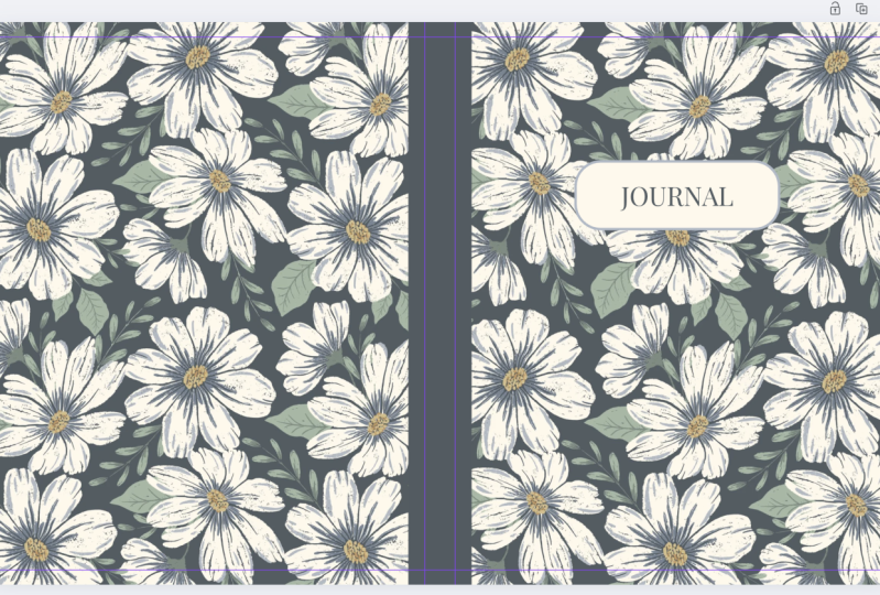
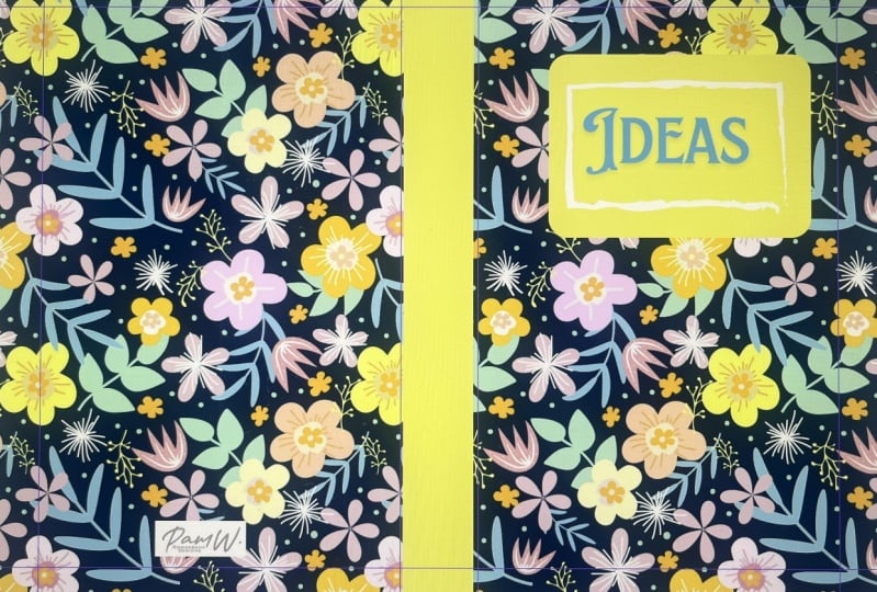
10. Designing Your Journal Cover: Welcome back. So now
we are ready to start designing our cover with the repeat pattern of
our choice, basically. So this is an example of a journal cover that
I designed before. This will be option
number one that you basically do this
exercise with me. We repurpose your
beautiful repeat pattern. We also create an extra
element for the middle, so the spine of our notebook. And we create also
the corative element here that just says
notebook or journal, diary, or any other
thing that you want on this
notebook, basically. But you can also go
for option number two, which is just the repeat pattern and decorative colorful spine. So if this was this journal, we would have the
repeat pattern, and then instead of the spiral, binding, we would have
a block of color. And then, of course,
the back would also include your
repeat pattern. Exactly. Or option number two is as simple as it can get is
just your repeat pattern. So imagine that there's
a repeat pattern in the front on the spine
and in the back. This is as little as you
have to do for this project, and I'm sure it
will be beautiful. And some people actually
prefer not to have any title here that says diary or
reflections, you know. Memoirs or something like that. So if you want to keep
it a little bit more confidential because
you might be using such a notebook
somewhere on the go or in the cafe and you don't
need a fancy title, then of course, you
don't have to do that. So this is just to
give you a little bit of inspiration of
what is possible. And now, let me show you. So I created my
original pattern tile in Affinity Designer, and this time, I am on Desktop, and I actually really
enjoy recording my screen. So maybe I will create more desktop version
courses to come. I really, really, really, really love to
create on my iPad. So I also have a variation
of this pattern on the iPad, and it was originally created
on the iPad because this is my number one device
for creating. I love Apple Pencil, and I'm using a lot of the pencil tool to
create my vector shapes. Everything is vector based, and it's still pretty much just like just
like drawing on paper. If I do it on the iPad, that's why this
is what I prefer. And there's a few things that I have to mention
for you to prepare your repeat pattern
so that we do not run into any white lines or
any technical problems. So I have this folder here with my paperback
template from Amazon. This is my original
pattern tile. So I wanted to draw
your attention to the repeat type that you will be using for the cover
of your journal. For example, this pattern
that I created ages ago, I used a half drop repeat, and I have to admit I really stopped using half
drop, and instead, I opted in, like, most of the time for
the diamond repeat because it's like a half drop, but it's already in
a standard repeat. Standard repeat means that there will be no offset
tile in the middle, but everything is
just kind of stuck like in a checkerboard to
the left to the right, top and bottom, and it's much easier to create repetitions
without any mistakes. But at the same time, the diamond repeat template
that I use for affinity, it gives this feeling
of a half drop while having a standard repeat. So if there's still a little
bit too technical for you, I highly recommend that you
have a look at the courses. Especially about
the diamond repeat. So this was created
a long time ago, and it's in a half drop. It's my original pattern tile. I have it here just in case, but I also turned
this original pattern tile into a standard
repeat pattern tile. And this is like the
minimum that you can do to quickly create
your journal. Let me show you that in action. So I'm going to
go back to Canva. This is the document that
we created together. And I'm going to go again to my folder where I have my
standard repeat pattern tile, and this tile is already a repetition of
this original pattern tile, and it includes hope you can see that it
includes more details. So we will be able to stretch
it out on the cover of our journal and
have more details both in the front and in
the back of our journal. So this is like the minimum option number
one that you can do. You can just drag and drop it. Onto your document, it will
also start uploading into the upload section and
we already have it here, and you will remember that those purple guides
that we have here, it's important that
the repeat pattern is really stretched
out to the edges. It can also stretch out outside of the canvas and
all we got to do. I'm going to zoom out a little
bit is to stretch it out. And this is as much as we can do with this pattern tile because I cannot go any further or I cannot go smaller
because I will cut it out. And you might be tempted here to just if it's
a standard repeat, to just copy paste, make a copy, and start building your pattern directly here kind of manually, but I really, really
don't recommend doing that because see,
most of the time, there is no precision of, like, a good illustration software to prevent Uh I think every
pattern designer is disgusted when they see those
white those white lines. So I would really not recommend to build or to expand your pattern from your
pattern tile manually. So you either have
enough detail on your pattern tile to
really stretch it out, to have it a little bit
zoomed in and just to kind of make the best out of
this pattern tile as it is. And this will be, for
example, your cover. You can also zoom
in a little bit. If you go here on
this scale to 100, this should be 100 will
mean that this will be the original size when it's actually when you're actually
holding it in your hand. So you can kind of eye it and see if this is what you like. And personally, I would
like to have more detail. That's why from
this pattern tile, I will create a variation, which is a little
bit wider, bigger, and it contains more detail
and more wiggle room for me. And now this step,
I will continue with this step in affinity
designer for desktop. But I would really
like to underline, not that you get
intimidated that I'm using affinity and maybe you don't
have affinity designer. You can do that in any software. You basically repeat the
steps that I'm doing, but for your software, you can even do
that in Procreate. Hopefully, there won't
be any layers limit. Procreate was about to get
rid of the layers limit. I'm not sure if this
is already there. You can proceed in Adobe Illustrator or Photoshop in any software of your choice. And also, if you would
rather use the iPad version, you can do the same
in the iPad version. It's just more convenient
for me to continue recording my desktop for
the sake of this tutorial. That's why I decided this time to show everything in
the desktop version. So in affinity designer or any other software
of your choice, we have to create
a new document. Here I go to File and New in case it is cut out because
I'm screen recording, you have to be an
affinity designer, and then up above there's the option to
create a new document. We have to make sure
that we have inches, and then going back
to our template, we have to take so see those are our overall dimensions that we also have in our
free Canva account. We have to take very
rough similar dimensions. So it doesn't have to be 15.498 and so on, it can be rounded. So I'm going to
take 16 and 10 ". For example, just to and
because I was doing it before, it's already here, but you
just type in 16 and ten, you keep 300 DPI, and I would create an artboard
because you can recycle this one document for multiple repeat pattern
cover projects, so to say. So then I hit Create and
in the layers panel, I will rename it
to magical garden, something like dark
because maybe I would like to create
a color variation. So this will be my
darker color variation. And then maybe let's
zoom out a little bit. And from the tools bar, in case you don't
have those views, you have to go to Window. And for example, initially,
I didn't have my layers. So from the window section, you have to select that you have layers. Tools should be there. And then from the tools, I choose the rectangle
tool and I just drag out a rectangle somewhere also on the outside of the
original canvas so that, again, I avoid white lines
from the Swatches panel. Even though it's just cosmetic, I go to the stroke and I make sure there's no
stroke, only fill. And now I go to the to
to the gradient tool, which is over here to the left. It's selected and from type over here in the
upper left corner, I choose bitmap, and this will only work
with standard repeat. Again, if you have a half
drop repeat pattern, this will not work.
There will be mistakes. But this one is in a standard or a full drop repeat. I open. Now I can make a variation
that has more details. I can also rotate it. But I think let's
see. Let's see. So I want enough detail that
will be good for my journal. And the good thing
is, you can always come back to this design, and you can make changes or you can also create
a new artboard, that will be next to this
artboard and you can make a color variation which you first have to edit
in your software. And then again, you come back. You create a new artboard and imagine that you have
ten different designs, you can kind of
nest everything in one document for your
reference for the future. That's why I opted in for this document to create
artboards this time because this is not building
a repeat pattern from scratch with the automated
patterns method, for example. Oki dookie, I think
this looks good. Tutu to so now we can export it, and we will be able to
use this more detail. So if I go back, see if this
doesn't have as much detail. That's why I'm creating a new
variation that already has roughly the dimensions
of the journal cover, and now I go to file and Export. We can export it
as JPEC and just make sure that we save it in the right folder so that
we can find it well. So pattern or I can input whatever naming
conventions you have cover one, magical garden and Bath. Okay, so this is saved. We can create here a new
page by hitting plus, and it will retain
the dimensions, the overall dimensions
of this document, plus the guides that we
set, they will stay. And now we go to our folder, and this is the new cover
design that we just created. We drop it into our document. You see it's also
uploading here so that we will have it forever
in our Canva account, even if we log into it
from another device, and now we have
more wiggle room. So I just wanted to show
you the difference. This is where we
kind of pre created a bigger repeat pattern with
the dimensions of the cover, and this is where
we work just with the original pattern tile
without cutting it to the right dimensions and just um kind of trying to do our best with the
original pattern tile, which is usually in a square. So by default, you are cutting
a lot of the details out. And in this way, we're able to have
more wiggle room. So I am in particular, focusing on the right side because this will be the
front of my journal. So the back for me, even though it looks
all very similar, but for example,
those bigger orange, peachy flowers
that are cut here. This is where my
guide is helping me. I want to prevent kind of weird cuts, for
example, like this. So I'm also zooming out. I have an IMAC with Command minus or zooming
in with Command plus, but you can also zoom in and zoom out by using
the slider here. This is what I always
recommend when we're creating repeat
patterns together. Zoom in, zoom out before you commit to the
size that you want. Okay, take a little bit of time. I really want those flowers
to be nicely visible. So I think I think this is it. This will be the
cover of my journal. And this is one of the
options that I gave you. You can just use
your repeat pattern. You don't have to do any extras. If this is your version, then you go to share.
You click Download. You select PDF for
printing, PDF print. I usually like to
flatten this PDF. And because I have
multiple pages because I was experimenting with
different variations, you click on it and
you can either select current page or you can manually choose the
variation that you need. Then you hit done. Because we only have the free
Canva version, we are not able to select
CMYK for printing, but this is not that important or not as
important as you think. This will be still okay with
the free Canva version. And then we have again,
okay PDF for print, the right page, and
we hit Download, and it will download
our covering design. It will take a
little bit of time. But let's also create the
variations, for example, with the now with the spine, if you would like to have
a bit of a colored spine. So back to my document. This one, I don't
like it that much, so three dots, and I would
like to delete page. So I just want to kick it out. This one. I think I will keep it, I will
not duplicate it. Now, if you would like to
create decorative spine, we can also temporarily go to the transparency
of this pattern and reduce the transparency so that we can see our
guide in a better way. Okay? Zoom out. Now, from elements
here to the left, we go to shapes and usually the most commonly used
shapes are right there. We have, for example,
the square that we need, but in case you want to
explore more shapes, you go to see all, and
then you have lines, you have a variety of shapes that you can use
for your design. What we need is the square and it doesn't matter what color the square has right now. I am first focusing
on its position. So for my design, I think I would like the spine to have
the color, but also, I would like this
color to be visible, also, both in the back and
in the front a little bit. I think it looks nice. But you can also just focus
on the spine. So if you want to be
on the safe side, you can snap your
shape into the guides. And you will see that they get a little bit highlighted
with a pink line. That means everything
is snapped into place. Okay. This also snapped. And now going back to
the original pattern, we can bring back
the transparency. So this is option number one, but you can also choose option
number two with the spine. I'm going to drag it out again so that I don't move the guides. You can make it a
little bit wider. And this type of snapping
will also show you a line that goes exactly through the
middle of our design. So the guides that we set up, they have this purple color, and the guides that show, for example, where something is right in the middle
of the document, they will have this hot pink. So this is my middle. And
then back to transparency, I have to then, of course, pre select my pattern, and then I can go back and bring back the opacity so that
it's not transparent. And if you prefer this
version, you can keep it. And now I would like to make some adjustments
because, for example, I don't like how the
orange of this flower. So this was again, the color is usually chosen by default. It will probably be pre selected from the
pattern that you upload, but you can still
change the color. I don't like how it floods the same color into
the same color here. So making sure that I
only select my spine, we see a few editing
options here, and we already can
recognize this is the color that is used for
the spine of the notebook. You click on the
color and you have more options to choose
from. I like to. So sometimes the
colors are sampled from the photo colors
you can choose. For example, this one, or
this one or this gray. Or I also like to use
the document colors, this plus with the rainbow
when you click on it, you can see the slider
where you can also change anything on the slider. Or you can go to the
pick a color version. You just click on it and
you have this color picker, and you can select any
color from your pattern. For example, I like
this petrol green. Oh, I think this will look good. Okay, Diselect again, make sure that you've got
everything diselected. You can also go
to file settings. Show rulers and guides to temporarily deselect it so
that you can see your design. Uh huh. And you can
also make variations. So I go to three
dots, duplicate page. We can select again
the spine and maybe choose a black color
instead and see how it looks. And I deselect by clicking somewhere outside of
my document here. Oh, I think I like this. But you see you can
make a few variations, and you can either keep them or again three dots and you
just delete the page. So I think this would be
my option number two. And again, if you're happy
with it, you just click Share. Download, just repeat the steps. PDF print. I like to
select flattened PDF. And because we don't
have any extra pages, we don't have to pre
select any page number. We go directly to download. Yeah. I also make
sure that I put all my cover designs
in the right folder. This will be cover number
two, but with spine. So you see, they have to be
in PDF format. All right. This could be your
option number two. And now let's also
create together option number three with this decorative
element that says notebook or diary or any
other text that you wish. So you probably guessed
what we got to do. We got to go again to shapes, and just by clicking on it, we create another
rectangle shape. We go to color, and we change
it to white, for example. We either try to eye its position or we can
also bring back here, we can also bring back
from the settings, the rulers and try
to use guides again. There's another trick
that you can do. We go back to elements. We create another, what's
it called? Another square. And now it will also
snap to the color of our spine and we can adjust it on one side how we want it. For example, this could
be this could be the W, and we make a copy, and we put it on
the other side from the guide. So we don't put it. I just wanted to demonstrate
that we don't put this exact copy to the edge because when
Amazon is printing out, this would be cut out anyway. So to position our journal
text exactly in the middle, we have to focus on the area where the color of
the spine finishes. So here, and the area
that will not be cut out, which is this guide that we have to the right side,
if it makes sense. And now I just adjust the width of my what's
it called of my frame? And we can kick it out on our keyboards, just
hitting delete, and I will note that I will have it
exactly in the middle. So now we just need some
text. It can be heading. It doesn't have to
be any text style. It can be heading or subheading
or just paragraph text. And I go right away to the colorful A over here
in the contextual menu, and I make sure that instead of white, it will
be, for example, in black, so that when I put
it into this white frame, it will not disappear. So I select somewhere else
to be able to move it, and I place it in the middle. And again, we will have
those guiding lines that will show us
the exact middle. And now keeping
this text selected, you can go here to the fonts. The default font was Canva sons. Oh, and now this
is the fun part. Canva has so many beautiful,
beautiful, beautiful fonts. So your task right now is to go through all the
fonts, and, of course, mm mm mm to write what you need to
write first so that you see the font for your text
for your exact title. So Capslog I'm going to
write here, for example, journal, and you can
manipulate this text further. With those circles, you
can make it smaller here. Or when you have
everything selected, you can also go directly here to the font size and just
input your number. That's that. I hope I
pronounce it correctly. This ga gadin font
is also very cute because you will see that it
has a little bit of texture. So if you want to you
can also make it bigger. And if you don't like
this type of shape, you can also go to elements. Then you can go to
graphics, see all. And from the graphics,
you can type in frame or decorative frame, and you can look for some
frames that will be for free. The ones that are with
the crown symbol, they will not be available if you don't have
the Pro account. And maybe you'll
find something here that will be more
appropriate for your design. Re frame solid. So if I just don't
want the outline, but the solid, you can
also type in solid. For example, this is a
nice oval that by the way, it also has a bit of a
gray from my pattern. So maybe you would like to
recycle this shape here. Once it is selected, you have also options
to edit it further. For example, we can
change this gray color to white and this white color
which is on the outside to the gray or the purple or the black from my pattern or
even this orange. I think this looked nice. Then this is just an example. Then you can kick
out the other frame. In case this shape is
in the wrong order, you can go to
position and you can either move it forward
or move it backward, or you can do it here from
the layers panel. You see? If you drag it to top,
it will be on top. If you drag it below,
will be down below. Again, I'm clicking on the font because I want to
change the color. You see this colorful
text color option here, and I will change the color to the color that also is included
in the frame. I'm going to zoom in and make
it a little bit smaller. So now I know this text is in the middle following
my previous guides. So the only change I'm going
to do is to resize my frame. I'm also going to experiment with the color of
the spine again, choosing this purply gray
to see how I like it. Okay. So this is
another suggestion of a cover design with a colorful
spine and with a text. If you're happy with it,
you just click Share. Download. And because I also marked here safe
download settings, it should also remember
my previous settings, PDF print flat and PDF. There's no other pages, so there's nothing else
to choose from. Download. And then I'm going to make sure that
it's in the right folder. Okay, dokey, so let's make
it a little bit bigger. We have right now three
different covers that we can choose from either just
your repeat pattern. A repeat pattern together with a colorful spine for the
notebook or for the journal, and also a cover that
comes together with some sort of a title,
some sort of a text. The choice is yours here. Your task is to prepare your repeat pattern and
to design your cover and export it as a PDF file that will be necessary for
the upload for Amazon KDP. Now we will explore
a simple design for the interior of our journal.
11. Setting Up The Interior in Canva: In this lesson, we are going to design the interior
pages of your journal, again, using the
free Canva account. This part is quite important because this is the main
part of the journal, apart from the cover that
makes it maybe more sellable, and what the user will be using
at the end of the day is, of course, the inside
of your journal. So my suggestion, especially for your first project is to
keep it simple and either go with a simple blank page or just like me to create
a lined page journal. So this is an example from a
project that I did before. We will be learning how
to do that together. I created a simple
lined page with a dotted line and the curative here, the curative element. This is only for inspiration. You don't need to add in any extra decorations
in your journal, and you can also just
completely ignore the bleed and the margin aspect and go with a
completely blank page. It's really up to you. For
the sake of this exercise, I would recommend that we
create this line page together. So I have to take
into account if I would like to have
bleed or no bleed. That means that we
will decide whether our lines will be extending all the way to
the edges of our page. And I went to search on the
Internet for some examples. I think EtS is a pretty
good platform to see what people are doing there and what people are selling. So I found two example listings which are completely random. I'm not recommending
also to make any purchases via any EtS shop. There are people who are also selling different KDP
templates on t's here. But I just found a few examples
for you for inspiration. This is a blank
lined journal page, exactly what I will be doing for my project
where the lines go all the way to the left
side and to the right side, to both of the side
edges of the page. This is an example of a
page where we include some free bleed on the edges. The sides have a bit of this white area to the
left to the right, and of course, to the
top and to the bottom. To know exactly what dimensions
you need for those pages, you have to go to Amazon
KDPs help center, set trim size,
Bleed and margins. I will also make sure
to link this help page somewhere in the course
description or content, but you can just go ahead to your browser and
type in something like KDP Bleed trim. I think this will
be enough exactly. In the very first
search result will be exactly the landing page that we need trim size,
bleed and margins. So when we click on it, we will get some more information, which you can also read
in peace and quiet about bleed,
understanding what it is. It's basically this extra area around the edges of
your page that will get trimmed off during the
manufacturing process. So during printing, and bleed
ensures that your design goes all the way to
the edges of the page without leaving any
unexpected white borders. That's why it's
really important to set things up properly, and Amazon KDP has
a nice article about understanding bleed
with some examples. So we need to scroll
all the way down to examples of page size
with and without bleed. Like I said, I will
be doing this type of interior page with
bleed. Like this one. So we have to
orientate ourselves on this right side of the
table page size with bleed. The original size,
we can find it here. So the size for our project
is this one, 7.59 0.25. This is without bleed. To two, two, to do.
And this is W bleed. 7625 and 9.5. So now we can go to our
free Canva account. And we can go to custom size and we can create
those dimensions. So I was using those
dimensions before. That's why under RSN, you will see the recent
dimensions that you used before. You can just go ahead
and click on that. But most likely you haven't
used those dimensions before. So what you got to do is make
sure that you have inches. If you just open
your Canva account, it will switch to
pixels by default, and then you input 7.6 to five and the
height will be 9.5. Then you create new design. I also like to rename my Canva designs right away.
You can do that over here. No interior pages lined,
something like that. Whatever will be good for
your own documentation. So now we have our blank page. And another thing
that I would like to take into account
are the margins. Also in case you change your mind about adding in
any decorative elements. So for margins, we have to
go back to this help page. There's, again, even a YouTube video that you can watch in your own free time to
understand margins better. Margins will be the area of your design that will
protect it says here, protect your content
from running off the page and being cut off during the
manufacturing process. For our project, I will
be doing 110 pages. So we have a look
at the page count, and then we have to find
outside margins with bleed. 22, two, and it's exactly
the same everywhere. 0.375. So now we go back
to our interior pages. We make sure that
we have our rulers. Under file settings show rulers and guides,
they have to be on. Now we just drag, so we have this fat arrow that shows up when we have above our ruler, then we create our first guide. You see on the top, we can roughly see the measurements that
we need in purple. I try to get as close as I
can to something like 0.38, 0.37, if I can. But even the 038, I am on the safer side if I choose a little bit
more than too little. So I have one line, and then I go to elements, and I go to shapes. And from shapes, I just select
a simple simple square, and I place it in my
upper left corner. Let me zoom in so that
you can see better. So if I just want to drag one of the corners of the square to retain to
retain the shape of a square, I have to select
shift on my keyboard, and then the shape
will be retained. And then I just Exactly. I needed to focus here. So we need to kind of
drag this square shape to the corner and it will snap into this one guide over
here that we created. And now very gently, not to select the guide again, I click on the square. Control C, Control
V to create a copy, and I place it in
the other corner. Then again, Control V to create another copy.
Let me zoom out. So we're creating
copies that we'll be placing in the corners.
Three are enough. So this is enough to
create guides that will kind of show us where the margins are on all
the edges left and right, and also top and bottom. So now we will drag another vertical line
to the right edge. And if it snaps, then the color of the guideline will change
from purple to pink. And then we gently release it and now we have to do
the same with the top. This big fat arrow shows
up, drag and drop. The pink line shows
that everything snaps to the shape of the
squares that we created. Then when we release, the
pink changes to purple. Then one more guide
to the bottom, change to pink, release, now very gently so that you do not select
the guides again, just delete it either
on your keyboard or through this
delete trash icon. We are deleting those
orientation squares. Okay. And now we also
have our margin guides. For example, if
you would like to add in any decorative elements, but also to make sure that our
lines will be not cut out, especially on top
and at the bottom. Okay, so the document is ready. It has the right
dimensions for bleed, and we have our margin guides. Now, still from the elements
and from the shape section, there are three types of lines
that we can choose from. So it's enough just to click on them and maybe also to drag them to the edges so that
we can see them bigger. There's like this it's
not really dotted, like a lined line with lines. And there's the dotted line. So I'm just showing you
what you can choose from. And now, all of them
are very thick. So if we select all of them, we can edit them
at the same time. And this contextual
menu will pop up here. And here we can go to the stroke style and work
on the stroke weight. So this is very big. I just wanted to show you
how to manipulate it. You can also go manually
to this little box. And change it to one. And
another thing that I would do, I would go to transparency, and I would reduce
the opacity of those lines to
something like 35, 40. So now, if we click somewhere to the
outside and we zoom in, these are the lines
that we can work with. Just for a second, I
would also like to select only this dotted
line to show you something. Let's go back to
the stroke style. Let's make it a
little bit bigger. This dotted line is
built from squares, but we can also change
it to rounded endpoints. So now we have circles, and we can go back to one, so that it's not so thick. Now, your task is to choose what line you prefer the most, a simple line or
maybe a dotted line. I think I will delete
those two guys and leave a dotted line. I just have to double
check if I maybe like the w because it's very
subtle. How about I go back. And make it a little bit bigger. You can also keep the size of your view at 100% because this will be kind of like
the 100% of your page. Nah, two is too thick. So yeah, I'm going
to stay with one. And now what you want to do, you want to have
this line selected, and then you want to copy it
and you want to paste it in 24 times so that we
have together 25 lines. So we have one line, and
now we need copy paste, two, three, four, five, six, seven, eight, nine, ten, 11, 12, 13, 14, 15, 16, 17, 18, 19, 20, 21, 22, 23, 24, 25. I don't know how
about you, but I prefer for the sake
of this course, I'm counting in English, but if I was doing it on my own, I would count it in my own
language which is Polish. In should pinch and so on. Okay, so now we have 25. We can select them all
and we can also group. And now we can
continue to drag them so that they can fit our
page. That looks nice. By the way, to fix the fact that they're not
centered evenly, we can first ungroup them. Then we can go to position, and then we can go to
align elements center, and then we can
group them again. I like to group them
again so that nothing goes somewhere else
where it shouldn't be. Okay, now we can again
make them bigger, extend them and pay attention
to our margins here. So I like to leave a little
bit more room at the top, and I still orientate myself looking at the margin
guides that I created. So I make it a little
bit smaller here. I give it a little bit more air breathing space at the top. So if I deselect it
will look like this, I leave a little bit of
space to my top margin and a little bit less space
next to the bottom margin. Yeah, and this is it, so we're as good as done. But I also wanted to show you how I created this
decorative element. So back to our document. And by the way, as a group, you can still edit it. For example, you can
go to transparency and pla exactly you
can make it like, even less transparent, a
little bit more subtle because now that everything is in place, you can
see things better. So I like lines that are
a little bit more subtle, but you can, of course, leave
it also as black lines. Okay, now when we go to
elements, we exit shapes. We can go to graphics over
here and click at C all. And here we can type in anything
we want for our journal. So we can type in
something like flowers, outline and see what they have. And the elements that have
this little crown symbol, it says that you can
use it only with the pro subscription to Canva. But there's a lot
of little flowers, for example, it
decorative elements that are not part of
the subscription. For example, this
little flower here. Some of them, by the way,
they don't have to fill. So depending if it bothers you, you can, for example,
leave this flower, go to the color, add new color, take the pick a color tool and select the gray from
the gray of your lines. Okay. And then you can
position it in the corner, making sure that it's
within the margins. So the guides that
we have set up. So that's one example. You can also choose flowers. You can choose
something with a fill, not just with the lines, flowers, black and white. And it's about experimenting
a little bit browsing. So this one also
doesn't have fill. I can still see
the lines through. You can keep selecting
Oh, this is so cute. They are free of
use, by the way. You're not infringing any
copyright if you use them. And I just invite
you to play with it. Oh, this is so
beautiful and feminine. I just invite you
to play with it and maybe choose some decorative
elements only if you want. This is completely optional. So my cover is a
little bit witchy. So Wichi icon is something that I can
spontaneously look for. I could add in a snake if
I had the Pro account, or if you, you know, have the knowledge
of software such as affinity or there'll
be Illustrator, you can create your own
decorative elements. And procreate. So a lot of that because this is very
specialized, like Wichi icon. It's probably also very trendy. A lot of it is P and
I cannot use it. And those are
colored and I don't want to have anything in color, and I don't want to
waste time switching everything to gray
scale as I wanted. But as you can see, it's very easy to just
look for the elements that can maybe also match the
theme of your journal cover. Maybe I will type in something like mindfulness.
See what comes up. Black and white. Or something like Zen Yoga. Here's a mandala, for example, that you can use or a
silhouette of a Yoga lady. Ah, that would be nice. And I can just do it in gray or in light
gray if I want to. So this is one example
or something like this. You can even make
different types of pages. It doesn't have to
be the same page. Yoga gardening. Let's see what they have here. I'm going to remove that or nature or from my uploads, I can basically go to anything
that I created previously. For example, this is one
of my old illustrations. I can also turn it to gray scale by changing those
colors over here, and I can use it for
my journal design. Okay, but to keep
everything simple, this is already
our interior page. The other thing that we
got to do is to create basically an interior pages manuscript for our
Amazon KDP account. And to do that, we can go
here to this grid view. And either from the three dots that you can see in
the corner here, we can click Duplicate
page O on the keyboard, we can just Control C, Control V over and over
to make ten duplicates, and then we can select. They will be marked in
purple, those ten duplicates, copy on the keyboard control C, and keep pasting them. And so we have 20, 30, 40, 50, 60, 70, 80, 90, 100, 110. Let's scroll down to
see if this is correct. They are all numbered. So you
will not have any mistakes. And we have 110 pages. And then our manuscript for Amazon KDP interior
pages is ready. We just got to go to share. Click on Download PDF for print. I like to still select this
option to flatten PDF. So everything is correct. We see here pages 1 to 110, and then we click
Download and we make sure we save it in the folder with all our journal documents
because this will be very handy once we start creating our publication
in the Amazon KDP account. So it's downloading. It will take a moment because it's quite a few
pages that it has to turn into a PDF
friendly document. And now it says it's complete, so I will just make
sure that it's in the right folder
here in my storage. Alright, guys. So
this is what we have. We have different variations
of our journal cover, either with the title
without the title or just with the repeat
pattern on the cover. And we have simple
interior pages with simple lines that
are ready to be uploaded into our
Amazon KDP account. I really recommend to
keep this project simple, especially when you're
getting started, you can start and learn everything by doing
your first journal, and then you can get
a little bit more adventurous and do variations, different cover designs, and also different
types of interior. For example, you can
create bullet journals or gardening planners. Then you can go into
more detail, basically. Okay, we are ready to start our very first Amazon
KDP publication project.
12. Publish on Amazon KDP: All right guys, now
we are ready to start our first Amazon KDP
publishing project. We have our folder here with all the PDF documents that
we will need for the upload. This is by the way, the cover that I decided to do because I already
printed out one journal. I hope it will come
on time so that I can show you a real
physical copy. I already have one journal
that says journal, but I would like to
have a simple notebook that doesn't have any
title on the cover. This will be my cover design. This is our PDF file that we saved up from our
free Canva account. Dam. This is our PDF
interior pages document. That's what we're going to need. It will be handy if you have it somewhere in a
folder ready to use. Next, we go to our
Amazon KDP account, which you hopefully
already set up and we go to the
homepage basically, which is our bookshelf. Next, we create the
big fat yellow button, create and we will be creating
our publication together. For our journal project, we want to create paperback, so we choose Create paperback. Next, which is the
primary language that the book is written in. I would suggest that we
just stick to English because it's a no
content publication. I will also suggest that you focus on as your primary
market for starters, you focus on amazon.com, which is targeted for
the American customers. Now, we need to think
of a good book title. And subtitle, and I already saved up some
cheat sheets here in my Google Drive document where I have the dimensions
that I'm testing out for Amazon KDP just in case I forget I write down here
all the specifications. You can also write it down in a physical notebook
if you want to or any other a kind of information storage of your
choice, for example, notion. I also have a remark
that I'm using the bleed variation
for my journal, and for this project, I was creating a bullet journal. So this will be a
title for my journal, and this will be a
subtitle for my journal. Once I create a project, I copy paste everything down
into a cheat sheet document. It could also be
in the Notes app if you're an apple user. So these were my notes, and this is my actual journal that I self published before. First, we need the title, which will be this it
clearly says what it is. In my case, my previous
project was bullet journal, and then I give it a
title just for reference. So it's bullet journal, and then I called it Tan
Bergia because this is the flower that I use
for the repeat pattern. And then after your main title, the system will
generate this column. And include your subtitle. This is how it will be
structured by default. Now this is how it looks
again in Amazon KDP. Your book title should
clearly state what it is. For example, notebook or journal. I had here bullet journal title. So I can, for example, write Notebook
journal and give it a title magical garden. It's going to be also
for my own reference, but maybe also someone will be looking for
something magical or something garden related in
the Amazon search engine. Now I'm just eyeing it and I need to make a
decision if I'm going to leave it as it is and do a little bit of
keyword stuffing, which is including
relevant keywords as much as you can,
Notebook Journal, Magical garden because
those are actually synonyms which can be
included in the subtitle. I will just leave
Notebook. Magical garden. This is what I would recommend. The first part of your title
will be stating what it is. Is it a bullet journal?
Is it a diary? Is it a notebook,
sketchbook, planner? And then you can
give it a hoopla, and then you can
give it a title. Then in your subtitle, which will be after the column, you can add in any other
relevant keywords. This is really important to include relevant
keywords which will help your published item to be
as searchable as possible. I will also copy what
I had here previously. One more time, this
will be the subtitle. Where we can put
in extra keywords. I'm going to change
dotted to line. Because I used notebook here, I can switch notebook
to line journal. I'm including another synonym to increase the searchability. 110 pages, it's good to
include in the subtitle any obvious facts about
your publication. I will also change
polka dot because I had a bullet journal before
into dotted line. So we've got line and we have line as two
separate keywords. Botanical floral motives,
I'm going to leave that because as you remember, my journal cover
will be botanical. Maybe someone will
be searching for that in the Amazon
search engine. I leave diary for
mindfulness and relaxation. You can also put
in something like planner, and I think that's it. We've got Notebook
magical garden, lined journal, 110 pages, dotted line botanical,
floral motifs, a diary for mindfulness
and relaxation, planner. Good. This section is relevant
if you have a series. For example, I have a series
for my coloring books. If you have a series
of journals which have maybe botanical themed covers, you can create a series, and then your listing will have suggestions
from this series. So I can, for example,
maybe go back to the browser and look for my profile and go to one
of my coloring books, for example, cute Easter. Exactly. So this series that
I had for my coloring books, I named it sweet coloring pages. So this coloring
book in particular, just to give you an example, has an extra link
that the client, the customer can click through. It has the information as part of the sweet
coloring pages. There are two books
in this series. You can click on it,
and you will see Aha. There's not only this
one coloring book, but there's also another
coloring book in the series. And as I will be
expanding this series, I can add in extra
items into the series, and that will just
give your customer more opportunities
to buy from you. And I think exactly. Also here, there will be
information that is labeled in this series so that the customer can consider
buying more from this series. I only have one journal, but I can imagine
to expand it maybe get rid of this notebook so this notebook title so that
it matches this cover, and maybe I can make
a collection of bold botanical covers with similar interior pages that
will be part of a series, something like
magical, botanical, notebooks, something like that. Then I will create
my series here and I will make sure that
this publication is added to the series, which you can also post edit after this
publication is published. So this will not be great. But the title, by the
way, will be great. So choosing your
book title is very important because you
cannot change it anymore. You can change other things. You can even change
the manuscript itself. If you see any mistakes
or if you'd like to make some tweaks,
you can still do that. But the title will
be set in stone. You really have to
make up your mind. That's why I like starting
a brainstorming sheet. This one is in
Google Drive again. So that I can really make up my mind about what
I want to publish. Serious is optional, and
you can edit it later on. Edition number, I don't
input any edition number and author should be it already remembers my name,
Veronica Salak. This will be also
what will be shown up here and it will link
to your author page. So you either have a pen name or ideally
you use your real name. Contributors, this is only if you're working
on a publication together with a friend or another artist,
illustrator, writer. Sometimes you are
the illustrator, you make illustrations, and someone else writes the book and is the
author of the text. Here, you can add a contributor. Now, description
is something that even had GBT can help you with, but if you're using any
AI tools to kind of cheat your way a
little bit to write a nice description,
I've done that. I asked HAGPT for suggestions, and I also analyzed
competition to make the best description
for my needs. I would just like to give you some words of warning that AI generated promotional text
tends to be very rigid. It still needs to be checked. Be careful, especially
if you're not a native speaker of English. You can use it as a starting
point. That's what I did. I was like, Oh, I wonder
what it will give me. But then I still needed
to make a lot of adjustments because English
is not my first language, I use this way just to see that everything looks like
in proper English, so to say, but I still went in and I needed to
edit my description. The best advice
that I can give you is again to focus
on the keywords. Let's go back to my cheat sheet. This is where I have
my description. Have it basically
somewhere written down so that next time
you can just copy paste it if you're having more
publications and you can just input different
information. For example, this
description was meant for my botanical bullet journal with a bullet journal
style of interior pages, and now I will have to
adjust everything to fit this aligned journal style. But in any case, without
even overthinking it, I can just copy and
paste it in here, and then I can keep
editing it here. You can make your text
bolt or just plain. I like to make it bold
just in some places. I'm going to copy the notebook name
Notebook Magical Garden. Posted in here. I would recommend that
you just say, Okay, this is notebook,
this is the title, B and I write By Veronica
salac because I still want to spread my own brand awareness
and not just a notebook, but it's a notebook
by me because I think notebooks in
particular for sales, they're such a no brainer item. And usually in shops,
let's be honest, they're much cheaper than
what you can get in Amazon. Amazon is now
incentivizing people to pump up their prices
because there's a lot of AI generated content, and it's very cheap and taking into account the
raising production costs, manufacturing costs and
printing costs and so on. It's becoming less and less
profitable for Amazon to be promoting very low
income products. But notebooks shouldn't
be that expensive. They shouldn't have
the same price as a picture book or as a textbook. So since it is still quite expensive to buy my journal here, like this
one, for example, is priced for amazon.com
at nearly $8, I guess it will be cheaper
somewhere in the shops. I include things like
buy Veronica sale because I'm hoping that maybe if someone does buy my journal, they will be guided by some
sort of a brand loyalty. Maybe they like me
as an illustrator. I also have my own
favorite illustrators, and I would pay a little
bit extra just to get notebooks with their unique
a cover design, for example. So if you would like
to build your brand, I would say include your name. And then the obvious
facts, 110 pages. Dot. So what did we have Dot? Lined paper back. Let's go back to
my lined journal. Maybe I take this
because it will also include the keyword journal, 110 pages, lined journal, paperback the description
is something that you can still edit even when your
journal is published. Just the book title. The book
title with the subtitle, you will not be able to
change it later on. Oki doke. And then I want a so this is basically the
mission behind my notebooks. I am writing what my intentions
are for this product. So it's something
personal that you have to decide on when you're designing your
product description, including keywords, but also really speaking
from the heart, why did you create this product? Why should they pay those extra dollars
to get your journal? So I'm writing Bing
common creativity and beauty into your
writing with this elegant, botanical themed line journal. See if you're copying the description from
another project, you have to stay really focused. Design with a feminine touch. This paperback journal. So I have journal here, so I'm going to write here this paperback notebook
to include synonyms. Features delicate flow. Okay, instead of delicate, I'll put in magical. Magical floral modes
throughout offering gentle inspiration as you organize your days,
dreams, and to do. Then insight you will
find and I like to put the number of pages in bold because you'll see it
will stand out better. This is exactly the
same description that I copy pasted
from my document. Then let's go back 110 pages of lined paper at
of lined paper. Once you create one description, again copy paste it and you can recycle it as many
times as you want. Maybe you create a new notebook that has exactly the same specs. Also lines inside
and you just change the name from magical garden to peaceful gardening or something like that,
depending on your theme. But since I haven't done
aligned interior before, I need to just double
check that everything is adjusted properly
perfect for writing, sketching, habit
tracking or layouts. This is still true
a lightweight, flexible paperback format for easy portability. I'm
just checking here. I made also the measurements involved, including
the brackets. So people also want to see the measurements right
away and sometimes they get sometimes they get lost or you just want to
reinforce the measurements. They're also here in
their dimensions. See, I published this
one very recently. Right now, we have
mid of June and this journal was
published end of May. A charming magical a little bit witchy
design with moody. I'm really improvising
right now. Harming magical, a
little bit witchy design with moody flowers that makes every page feel
like a breath of fresh air. Shall we leave it like that? A charming magical, a
little bit witchy design with moody flowers. I think I'm just going
to cut it because it's getting a little
bit too poetic. This line maybe let's
write a notebook. This notebook is
your cozy companion for a more intentional
null and creative life, designed by artist
surface pattern designer Veronica Sala in
case you need help, you can go and ask
some AI solutions to get started with
your description. I would say in the first line, repeat what the
product is about. Repeat that it's a notebook
or a journal or a diary. I would say, give it a name because if you're
planning to publish more, then everything
will be notebook, notebook by your name. In this way, you can create
a series that will have a title and it will be also
easier for you to sort, so to say, and then
repeat any specs. There could be
measurements here, what is inside, that there are lines inside and
it's a paperback. Then the second paragraph, I suggest that includes important keywords
still, such as line, journal, paperback,
notebook, even to do, organize, feminine, but it's still a little bit more
descriptive, even poetic. And then bullet points
are always your friend. If you go back to
my listing here, bullet points make
it a little bit more the overview is much
better and it's cleaner. Then maybe just closing lines, which still include
important keywords such as lined notebook, and you can still
repeat your name. This is what I would recommend. Another option for you is to go to Amazon and to look at competition and to see
what they are writing. But you don't have to be super complex here
in your description. It's really important just to include the most
important specs. The measurements, what it is, journal diary,
sketchbook planner, bullet journal, and so on. It's good to mention the
dimensions, and that's it. Okay. Let's finish
this first page together before we move on. I own the copyright and I hold necessarily public
publishing rights. This is about publishing rights. We don't have any sexually
explicit images or title. I would skip the reading age, especially for no
content product, and then primary marketplace, I leave it at amazon.com. Now, categories are
categories that are important information for the Amazon KDP
ecosystem, so to say. You will choose those categories by clicking on the number
choose categories. By default, we start with books. And you need to do a little bit of search and find in
here and go through the categories to see which ones will reflect your product best. So this is the type of research that you got to do
at the beginning, and this is what I have done, and I can share with
you to give you advice what I'm
actually choosing. So those are the categories
that I basically copy pasted from the journal
that I published previously, and you can still change it. You can go in and
make adjustments. If you see that competition is using different
types of categories, you can go ahead to your
publication and you can post edit it even
after publishing. But a good starting point is to use my cheat sheet basically. So category number one, books, self help journal writing. Books, and then self
help is over here. And from here we choose journal writing,
and it's already here. You don't have to
do anything else. Then plus another category, I go to my cheat sheet, books, crafts, Hobbies
Home and general. Crafts, Hobbies Home are here, general, and it's already saved, and then you can add up
to three categories. I would say, use it to
the max this one is a little bit of a wild card because I wanted something that hints that it's a
botanical theme. So depending on what
cover you have chosen, maybe you have something
with food and cooking, then you would
need to go through all those categories and choose something
more appropriate. But for the botanical theme, I wanted to maybe risk it
a little bit and choose a completely different
category type. It's still books,
science and math, biological sciences,
plants and flowers. So let's go and find
science and math, and if it's not performing, you can change it at any point. So, or even check what is
under agricultural sciences. Chemistry, horticulture. Biological sciences. And then there's even biochemistry or
general biotechnology. So I had biological
sciences and plans. There's a subcategory of a subcategory and then I
choose general and that's it, and then you hit
safe categories. There is no right or wrong, and this is only to show to communicate with
the Amazon KDP system. It's the language of Amazon KDP. It will give some
extra information to the algorithm
that is supposed to show the best product for the customer depending
on their search intent. So what they put into
the search engine. I guess this is the best that we can do to try to go through this list and choose the
best category in our case, for the cover that we are presenting because
let's be honest. Let's be honest, there's
nothing really inside. It's a no content product. One more thing that
we have to type in here or select is that it's a low content book like journals,
notebooks, and planners. There's even a
little explanation here about what low content is. I'm selecting low content
book and now keywords, you can look at competition or you can just type in
the obvious keywords. For example, line journal. So I am choosing the keywords that clearly state what this
product is about. Line notebook. There might be more competition
for those keywords, but I'm actually also
a search specialist, and I know that those type of bread and butter keywords
are usually the best anyway. Then apart from very
obvious keywords that just state the basic
nature of your product, then you can expand and go with a little bit
more fancy words. But go with those bread and butter keywords first anyway.
So cheat cheat again. I had bullet journal
here, lined journal, lined notebook,
botanical planner. Yeah, I'm going to use that too. Botanical planner. Botanical notebook. Mm hm. You can also change your keywords
after publication. You can still go back
and make changes. Feminine journal, feminine
notebook, feminine journal. I would like to keep
those feminine notebook. And is it a sketchbook?
Is it a planner? We already had a planner. Maybe something like
a lined planner. You can also include keywords that speak about the audience. For example, when I was choosing keywords for my coloring books, I wrote a coloring
book for children, coloring book for preschoolers. So you can also type
in a longer keyword, something like a lined or
instead of line planner. A lined notebook for women, but no one types that in. For kids, yeah, they want to specify that something
is for kids. But when I'm looking for
something for myself, do I write you have to ask yourself what you're
typing into the search engine. Line notebook for women. I mean, notebooks are
not gender specific. Witchy Witchy notebook. Maybe Witchy notebook. I mean, it's not it's not super witchy. Mm. To me, it's just kind
of, you know, moody. Botanical floral.
I'll go with that. These are examples of
short tail keywords. Short tail keywords are very basic bread and butter
keywords that usually include just one or two words as
part of the keywords. Then long tail keywords
would be longer. They would have at least three, four, five plus words that
constitute that keyword. For example, lined journal, for women or a feminine
journal with lines. This is more of a long tail
keywords, long tail keywords. They have less competition
and they're more specific. Short tail keywords such as
those, shorter keywords. They have more traffic, but there's also more competition. So your visibility might be
a little bit compromised, but I still like to go with
those very basic bread and butter keywords,
especially for the start. Publication date and
release date are the same. And that's it. Then we will hit
Save and continue. So on this very first page, we need to input our paperback
details, language, title. Remember that the title
cannot be changed, author, description, categories,
primary marketplace, keywords, and so on. And now we will save and
continue to edit our listing. Remember that it's always a good idea to create a
cheat sheet that will help you to publish any
new publications after this first one in no time.
13. Editing Your Listing & Pricing: Now we can continue to
page two of our listing. So we hit Save and continue
and we will be moving to a section where we had to edit the paperback content
for our publication. So we choose publish
without an ISBN number. Or identificator. It's a special ID
that is assigned so that we are able to search and identify books in an easier way. Every new publication
will need to have a new ISBN number, but we will get one assigned
from the Amazon KDP system, so we just publish without. Then for print options, you can also check
how these will look. We just opt in for simplicity, black and white interior
with white paper, trim size, we skip this default and we go to select a different
size and we search for our original dimensions that we used in our Canva account, 7.5 and 920 5 ". Then for bleed settings, we opted in for a bleed. And for the paperback
cover finish, for a coloring book, I would suggest
to choose glossy. It's also a little
bit more expensive, so you will get a little bit
less profit on every sale. For a simple notebook
journal diary, I would always go with
the mat cover finish. Now the fun part, we will be
uploading our manuscript. This is where the manuscript, which is the inside the
interior pages will go, under the book cover section, we will be uploading uh, our book cover design. Let's first upload
the manuscript, so our interior
pages. We hit upload. You need to find the folder
with your design and I have it here journal
interior pages lined. And I click Open,
and it will take a few seconds to upload the
manuscript into the system, also depending on the
volume of your publication, and it will also take a little
bit of time to process. But before this gets
processed fully, we can move to the
book cover design, and we select upload a
cover you already have. So you can also launch
a cover generator. I never used it before, but since we are
illustrators and designers, we have our own
beautiful covers. So we choose the second option and we go to upload
your cover file, and I wanted this one here. So our PDFs are ready
waiting just to be uploaded. And then the system is
again taking a few seconds. To upload our cover. And in a second, we
will be even able to test it out, which
is really important. So we will get the
very first look of our publication here directly before hitting the
published button. So our cover does not
include any barcode. If it did, then we
have to tick this, but it will it was not included. Just as a reminder if we
go back to this template, remember, there
will be a barcode. Is location and sizes over here. We could identify
it on our template. So Amazon will
generate this barcode for us because we didn't pre design it. So we leave this out. Now, this is quite new because
AI didn't exist before. AI generated content. Did you use AI tools
in creating text, images, translations in your
book, and, of course, no. It's a no content book, and we created our covers by using our own
repeat patterns. Oki doke. Now we can check our design and select
launch previewer. So depending again on the complexity and the
volume of our publication, this will take a
little bit of time. The system is basically
generating a preview for us, and in case there will be
any issues, for example, I had some very
small issues with the design of the covers
of my coloring books. And before I publish something
with printing mistakes, I was able to check my
cover and also the inside of my publication within this book preview
here in Amazon KDP. And also, after we hit
the published button, you can still edit
your publication. So just like I said in
the previous lesson, we cannot change the title in the subtitle. This
is set in stone. But we can change
the entire cover even or everything
that is inside. We can switch to a
different interior. It's just that the title and the subtitle
is set in stone. So that means that they will
not be able to be adjusted. So if your title says it's a
lined notebook or journal, then it has to stay this way. This is the preview. This is what the cover
would look like. I decided not to
have any title here, so it's just a plain
repeat pattern. This system inserted
this barcode here, but there's nothing important happening in the
back of my cover, and then you can
continue to flip to see what it will
look like inside. And you can also switch here
to this thumbnail view. And in this way, you will see exactly what will
be printed out. So the cover, it's
a separate file will be printed
separately, looking good. And then the very first page is like half a page, so to say, because when you
open any journal, you have part of the cover, and then there's just
like the single page that you that you see over there
in the upper lift corner. And then the other
views will present the journal as it looks
when you fully open it. Then what you want to
still double check is probably the number of pages. So it's 110. And over here, there will be information regarding
the quality checks. So if there were any mistakes, there will be a warning here, but there's no issues. It also says here,
no issues selected. Everything looks good,
so you can just hit a proof, and we're nearly done. So we still have to set
the prices in a second, but the paperback
content is all good. Okay, no AI. We checked the previewer, and this is our summary, black and white
interior, white paper. There's bleed, mate,
paper back cover, trim size, page count, and this will be the
estimated printing cost on amazon.com. So for this journal, the
entire printing cost will be a little
bit less than $3, and these will be
the printing costs over on other Amazon
marketplaces. For example, I'm based
in Germany in Germany, it will cost Amazon, the German Amazon two euros $0.51 just to cover
the printing costs. So we save and continue, and this will guide us to the very last page that we have to cover, namely the pricing. So we want to sell our
journal in all territories, but our primary marketplace
will be amazon.com. And now, it's a little
bit in progress now. It's taking a little bit of
time to process everything, but we can carry on and
we can input some prices. It gives us here
the information. We start with our
primary marketplace, which is amazon.com. It says that the minimum
should be $5.74, and the maximum for our
journal can be $250. But let's maybe put it at $6 first so that
we get an estimation. So the printing will be $2.87. And now because it's
still a low paid product, the royalty rate is only 50%. If we price our listing, this is something new that
was introduced in June 2025. If we price our listing
at least $9.99, then we will get 60% royalties. This is Amazon basically
fighting with a bunch of very cheap AI generated products that flooded a lot
of marketplaces. So if we change that to 999, our listing price, then we would have a higher royalty rate. And if someone bought this
journal for basically $10, our royalty share, what we would earn would be this $3.12. But if I wanted to price
it at something like 699, this is the royalty I would be earning and it's very little. So in a way, those content
or low content products, they're very good for
personal projects to print out something
for yourself, but to make big sales, I don't think it will
be that sustainable in the long run unless someone is willing to
pay a higher price for your simple notebook for, I don't know, maybe
some branding reasons, maybe a famous illustrator
whose covers would sell. But for average
beginner artists, this is quite unrealistic, but you can still
give it a try and either keep the price
a little bit lower. And then you have to go into volume to make some good sales. I'm going to try to price it I think like my
previous journal at 799. I like those 99
59 price endings, and I'm just checking if this is what I would
be happy with. Maybe something
like 69 will give me a royalty of nearly $1. And I think I'm going
to leave it at this. So going to pounds, I want to test what
659 would give me, and it's looking good. Maybe I can go a
little bit lower. For some markets, it would also include VAT for the customer. I'm going to leave it at
this and then and then here, I think I had 749 before. So it would be nice to
have at least one euro or $1 royalty with the sale. Let's see, 739. That looks good. I'm going to just copy this, copy this for the
French, Amazon, and you see how
everything gets updated. Spanish, the same. I just want to be aiming
at for simple notebooks at maybe $1, one euro royalties. The Italian marketplace,
the Dutch marketplace. Poland is a lost cause. Everything, this is
way too expensive, I think, for an average
Polish citizen. So whatever is there, I just change the ending to 99, and I completely ignore
the Polish market because Amazon is not that
popular in Poland anyway. And because I don't really
have an understanding of all the other markets like the Swedish one, the Japanese one, I just make sure to change any ending that I can
to 99 because I think personally my primary
markets will be Germany the UK and the
United States, Canada. Maybe Australia. Let's see. Yeah, I don't mind
that it's just $0.61. I kind of ignore the
Australian market because I'm not expecting big sales
over there. And this is it. So take a little bit of time to have a think how you would
like to price your notebook. Will you stick with
a lower price and a 50% royalty share? Or will you go above, and you can, of course,
price your journals, planners notebooks
at at least 999 so that you get at least
a 60% royalty share. Have a look at this column here that says royalty
that will give you an estimation of what you
will get when you make a sale in that's that. So terms and conditions, it really takes a lot of time. So also when you go back
to the manuscript or to the listing and you change anything in your description, it takes, again, at
least two days for them, whoever is making that. I don't know if it's
a computer or if it's an actual physical person who is checking all
those listings. It takes a lot of time.
So pay attention to that. I also after the publishing, if you go back and you
want to change something, even if it's just a small comma, or a dot or a different
word or a keyword, it will again take at
least two working days so that it's all accepted again and live and
ready to be purchased. I don't request a book proof because if you order approve, they will get a watermark
that it's approved. I would rather later on when
this publication is live, purchase the author copy, which is basically
a printing cost of my publication plus
the delivery cost. I don't request any
proof and d d d do. I just hit publish here
paperback and then the system is saving everything for me and I will have my second
journal. No live yet. It will take. Today is Tuesday, Wednesday, Thursday, maybe
Thursday, maybe Friday, it will be live, but
it already gives me a bit of a preview
how it will look. A simple notebook, note title. See, I created This
is our main title, notebook, and then
I have my title. Then there's the column, which is auto generated
by Amazon KDP. Then this is our
subtitle. This is us. This is the author. This
is the pay the price. And then it's just a
disclaimer that your book will be checked against KDP
guidelines, blah, blah, blah. I will go through a review, and it also encourages
you to publish your book as a kindle book. But for journals, I would rather skip that or for
notebooks, and that's it. Now, if your
bookshelf was empty, now you have it
populated and you can go in to your Canva account. You can even create a copy, go to the three dots, make a copy of your design. Over here, you can rename it. Instead of this test, I will
put in a different title, and then you can play around. I'm going to kick that out too because I don't want any title. Then you can create more
variations of this design. If I were, for
example, to go to, I have a whole
bunch of materials here because I've been using Canva to create my online
courses for a very long time. For example, I can
choose a position. I can choose this repeat
pattern. I'm not editing it. I might actually change it if I really consider it as
a new cover design. But just to show you
how simple it is, you can just take something
that you already have. Of course, I would
probably go to Affinity designer and I would still trim and edit it
as I actually wanted, and you can play around with
other repeat patterns that you basically just
have at your hand here in your computer storage
or maybe already in Canva. For example, this one, this we can kick it
out, and this one. Oh, so nice. And on the middle, I go in and I select a color. That is maybe a color taken
from the Oh, that's so nice. I really feel like
uploading one more design. Oh, it looks super easy. So now, especially if you had this little cheat eet over here, boom, boom, boom, copy paste, copy paste, copy paste, you just change the title. Graphic garden. I don't know. This was like a design that I had for the
fall fall garden, fall, something with the fall or autumn. I would have
to give it a thing. But this is how easy it is. It looks kind of similar
to this pattern that I created also for
the fall season. And all you got to do
is recycle the content, both for the Canva account
and for the KDP account. You can recycle it as
many times as you want. So you have taken this course. I did take some time
because I tried to be quite descriptive
when I give advice. And I explain how I do things to make
them more efficient. But this is something that you needed to do only one time. And now everything is ready. Like, look, even this template has all the guides
that you need. So you have to do it one time, maybe for different
dimensions for next time. But if this is your
favorite dimension, you can just copy paste, copy paste, copy paste and
create a whole series. And next time you're creating a new publish Shing listing, you can create a
series out of it. For example, a series of
botanical themed journals. And this is it. We created our first or maybe not so
first listing, it's in review, and now it's going to take at least two working days to get approved and to get checked
by the Amazon team.
14. Final Thoughts: Thank you so much for
joining me in this class. I really hope that
you're feeling inspired and feeling empowered, especially if you're in a bit of a creative rut or you're
maybe a little bit unhappy with how the career is going or you're
experiencing a dry spell, or maybe you just feel
empowered because you found a way to unstuck your art from just staying forever on your iPad or on your
desktop storage. I think it's a wonderful way to breathe this new life
into your artwork. So before you go, I have
a few ways for you to, first of all, to stay connected and also to keep
the momentum going. You can, for example, follow
me here on Skillshare, so you don't miss any
of my future updates. I've got more self
publishing classes coming soon. I really
like this topic. It really keeps me
going these days. So I will definitely be including some deep
dives, for example, into Affinity Designer and also affinity publisher
for self publishing, and we might even tackle some other more ambitious
self publishing projects. If you enjoy the
course, it would mean so much if you
could leave a review. It really helps other
students discover this class and supports
my work as a teacher. I also write a creative
newsletter on Substack. I call it a block letter
because it's a mixture of a blog with longer articles and getting the updates
to your mailbox. With this regard, it's like
a classical newsletter. And on this platform, I share behind the scenes
some creative tips, artists resources, and early previews of upcoming
projects and classes. You will find the link in
the class description, somewhere in the resources, and I hope to see you there. If you'd like to
connect on Facebook, I have two Facebook groups, one for General Illustration
in Affinity and Fresco, and one specifically
for pattern design. It's a safe space where you can support other artists
by commenting, giving feedback, but also you can get their help yourself. And I think it's nice
that it goes a little bit beyond Skillshare because
you can post their videos, screencasts, or any other
images of your projects. And you can ask any
questions you want there. If I don't get on time to
give you some answers, then most probably a
member of the group will reply even faster than me and give you some
tips and advice. If you want to keep learning, don't forget to check
out my other courses, especially if you're into
Illustration surface design or exploring the power of
affinity designer tools. Thanks for being here,
and I can't wait to see what you create.
Happy creating.
 Weronika Salach, Art with MAGIC