Transcripts
1. Welcome: What's up, guys,
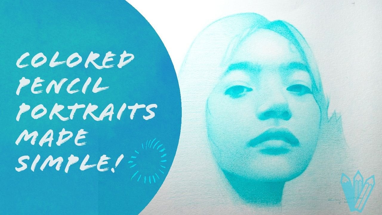
My name is booby. I'm a freelance artist
and illustrator. And in this lesson
we're going to be learning how to
draw this portrait. I've chosen this painting
by John Singer Sargent as our reference because of
its ability to translate what he saw in the visual
world into something beyond ordinary toward the drawing just
for the fun of it. Or you have aspirations to make portrait commissions
and original arts. There's something in
this class for everyone. I'll be sharing with you my process for drawing
a portrait and pencil dive in into
the subtle nuances of every stage and revealing not just the actions or the thought process
accompany my decisions. The skills you acquire
in this class include the ability to simplify
complex facial features, render values realistically, capture a likeness efficiently, and integrate all of this
into a finished drawing. This lesson is geared
towards the beginner and intermediate artist with the
intention that the skills you acquire here will prepare
you to take advantage of the opportunities an excellent portrait drawing affords you. That's all for now.
Let's get drawing
2. Materials: Alright, so in this class
we're gonna be using these materials in
order of importance. We have our graphite pencils,
erasers, paper, sharpness, divider and blending
stump the pencils I've been using it from
Staedtler and fabric Estelle, both a good brands with
solid pencils that hold a good taper
and shopping Well, for the races, I
used three kinds, primarily, a kneaded eraser, a pencil eraser, and
a regular verb erisa, the rubber eraser we're
all familiar with, great for erasing large
patches of value. The kneaded eraser
is a bit more of a versatile tool because
of its manageability. And the pencil erisa
affords us a high degree of precision in our
erasing ability. Next to my paper, I'm
using the Strathmore or 500 series vestal
vellum paper pad. I like this surface one
because it's not wise to because it possesses a
reasonable amount of tooth. And three, Because
he stands up well, to repeat the duration is
without getting damaged. I've also used stone hand, you're drawing pads and Fabriano artistic or hot
press watercolor paper. And I loved those as well. So pick whatever works
for you to sharpen. My pencil is I use
a sharpening block. This one is from neutron. And then exactly what I've got to sharpen charcoal
with the sandpaper. It's a similar technique here. You use the exact
or knives to strip off the word from the pencil and the sharpening block to sculpt the graphite into
your desired shape. Alternatively, you
can always buy sharp. Now, if you manage to
find a reliable one, the divider is a particularly
important instrument for how we'll be
approaching this portrait. So I suggest getting
a good one that's ideally not made of
metal and sufficiently large to get the
job done it I see ideally not made of metal
because metal dividers have a tendency
to leave holes in your paper which are
impossible to get rid of it. Or on last but not least,
is the blending stump. As is evidenced by the name, we had a planning tool great for smoothing out passages of
value in a more direct way, applying value to only, I only use this sparingly
my drawing practice, but it certainly has a
place in the process. So if it's within your means, I suggest getting one
that's going to wrap up this material is video.
I'll see you next one.
3. Conceptual sphere: What's up, guys? In this video, we're going to be
drawing a sphere. And the purpose of this
exercise is to teach you how to query there visually
compelling lights effect. In other words, how do we
create the illusion of three dimensionality
on a flat surface? I believe a sphere as the
perfect foil for this exercise, largely because it
contains a lot of the kinds of edges we
find in the portraits without the added complexity of very specific shapes
and proportions, a central idea to
what we're doing here is the separation
of light and shadow. In order for us to create a realistic joins going forward, we must understand that these two families are
distinct and separate. Trust me, you want
to remember this, there's no quicker paths with 2D portraits on a 2D surface. Darks to lights and
lights at it too dark. With that said, I
always say more of your time to grab your pencils
and let's get drawing. To begin, I'll start by defining the height
of the sphere. This height is arbitrary. Make it as tall or
short as you wish. From there I proceed to use my divider to
determine the center. Mark, that center with the cross and the longest
horizontal plane, make a couple of marks
to define the width. Because this is a spirit. We want the width and
the height to be the same in order to
maintain symmetry. Thus, be sure to verify that fact that your
divider, when in doubt. Once I have all four
points established, connect them with C curves and try to get the best
approximation. The perfect spirit that I can certainly wouldn't
be perfect at the start. But if our markers
are placed correctly, that should get us
somewhere in the ballpark. Once I have the shape in place, I'll knock down the
whites of the paper with a few layers of graphite
from my forage pencil. From there I proceed to build up the form its successive
layers of graphite. For my B pencil, I'm drawing
this way from memory, but even in the
references on screen, you will notice that
the shadow shape in a sphere is generally in
the form of a semicircle. Let that pattern guide you and the patient as you
build up your tone. Dark values and
graphites and like say, oil paints, are not
easily achieved. So avoid the temptation
to push harder with the pencil to get
quicker results. In this moment, I'm creating the core shadow by making
it darker than the value surrounding it is darker than the rest of the form shadow
because it's the part of the shadow or receiving
any reflected or indirect light from
the surrounding regions. Beyond that, we want
to make sure we soften that core shadow into the rest of the form and preserve the area
of reflected light. We want to avoid making
it too dark or too light. If you squint your eyes, the entire shadow
shape should coalesce. Now's a good time to jump
into the light shape. Starting at the Terminator, I'll begin to create my darkest
band of halftone values, keeping my eyes
always on the shadow to make sure I don't encroach into that level of darkness. I like to build my
life values and segments taken on one band of value at a time and connecting them with intermediate
values afterwards. Doing it this way, it gives
me complete control over how dark or light each part
of the light shape is. With some of the
half-tones in place. I'll expand my value range to include parts of the center
lights of the sphere, which are lighter than the halftone
previously considered. For the highlights, I'll leave the parts of the
paper on blemished. Let the white of the
paper shine through. Make sure your values and the light shape go around
the sphere completely. The movement of value
from half-tones, the center light is subtle. Tones change very slowly
near the lightest lights and dark and more dramatically as they approach the terminator. This principle is known as
Lambeth and mission law, and it's the reason
why the values are on the center lights tend
to be compressed. This juncture presents
an opportunity to cross check your work and make sure that your
dog half-tones are not too light or too dark. The reflected light
is not too bright. And that's your light and shadow families are still separate. You can say yes to goes,
You're on the right track. Going forward, most
of our actions will consist of building up the
saturation of our values. More layers, making
them more even, softening transitions, and
making sure you can see a clear gradation in tone
from shadow sensor lights. I've always found the more
frequently a screen my eyes, the quicker errors in
value jump out to me. Doing that alongside getting some distance from
the drawing will give you a different perspective that is almost
always beneficial. In addition, ask yourself
whenever you make a mark, if it has contributed positively or negatively to the image
you're trying to create. This is especially valuable when you are
approaching the end, when unsure as to
what to do next. With that said, we have come to the close of this exercise. And I hope you've
been able to glean some insights into
how we can create the illusion of form on a 2D
surface through a sphere. You assignments in
this moment is to draw your own sphere and put into practice the lessons
you've learned. Analyze your work
from mistakes and iterates until you are
happy with the results. That's all for now. I'll
see you next one. Bye bye.
4. The Art of the Gradient: I feel that one of the
most salient aspects of realistic portrait drawing is the ability for
its soft edges and unified value shapes. To do this, you must be able
to transition from light to dark values and vice versa
with minimal visual noise. Thus, this exercise
is designed to cultivate your ability
to Layer values, spotting consistencies
and tone and softly transition from one
value to the other part. It is our worst enemy. So it's sharp pencils and
our kneaded eraser on hand, you can have pushed this task, the tools necessary to succeed. Ideally, this exercise
should take anywhere 1-1, 0.9 h, depending on the size of the shape
and how quickly dropped. So take your time, squint
your eyes and visualize how these actions will bring you the results that you
desire later on, That's all for this intro. Let's get drawing.
First things first, using my ruler and a pencil, I'm going to draw an
equilateral triangle. This will serve as the
boundary for the marks will make hereafter be approaching this exercise by drawing
distinct bands of value and connecting
them together with the right intermediate values. Always begin with the pencils and progressively move
to darker and softer. Lead. This triangle, our
values with gradients from dark to light
in this direction. I'll be living my values primarily through
cross hatching, making sure to be
consistent with my application in each layer. That is to say, avoid
zigzagging with your pencil. You don't introduce
more noise to your drawing them is
absolutely necessary. With each successive layer, the values in this
current role at getting darker and closer to
where we want them to be. However, we're still going
to have some streakiness. Dark spots and areas where the white of the paper
still showing through the dark spots you can remove
with the kneaded eraser and the white spots you
can fill in with a sharp pencil possessing
a harder lead, like an HB or an H. Making our way to the second row are drawing
process remains the same. The only difference being
this rule will be lighter in addition to using
lighter pencils to get a lighter average value, you can also reduce
the pressure of your application to
derive similar effects. I repeat once again, controlled pressure,
many, many layers. And then I for spotting aberrant values will get you the kind of even told you after. Once I'm happy with
the consistency of my values on this new role, I started merging the two rows by shading and they
valued my pencil. That's somewhere in between those two values on
the value scale. Exactly. The pencil
to facilitate this transition will vary based on your
individual drawings. What's important is
that you experiment until you find the right one. Pressure matters. The white pencil with too
little or too much pressure can lead to swap our results. If you're still having
trouble getting it to look unified, I suggest scribbling on top of crosshatching because
they were allied to get into little nooks and crannies of the
paper a bit better. I said begin on this third row. I'm depending largely on my HP and H pencils to do the work of
building the values. As you get lighter, the
layering of value should become easier as it requires less time to reach
full value saturation. Not to mention, we don't have to sharpen our pencils as often. I truly hope that as you watch the movements of my pencil, but you can observe
a specific pattern to transition between
values smoothly, layer them until they are even and diligently bridged
the gap between each discrete step back from your easel or
squint your eyes, you should not be
able to tell where one starts and the other end. If you can. Those
transitions are too abrupt and in need
of more refinements. Periodically I go back
to areas are considered finished with a very
light pencil like a to H. Or for each, I tried to unify those regions with the
new lighter value. This process really eliminates those white spots and gives a crisp look to the
entire picture. Now, let's us rules of value. We need very little graphites. Your lights hand is necessary
to avoid going too dark. Err on the side of caution, begin lighter than you think, and pay attention to
what pencil you use to merge those rules
with the ones beneath. We are now approaching the
conclusion of this exercise. Scan your eyes throughout the triangle for areas
of need of improvement. Transitions that are
not social enough, values that are uneven, edges that are too harsh. If you're happy with
the outcome. Well done. I'm sure to you this you have the better grasp of
the patients and attention to detail that is required to make truly
stunning portraits. Nothing great is achieved
quickly on your journey to better portraits is
now fully underway. Thank you for watching. I'll
see you in the next one.
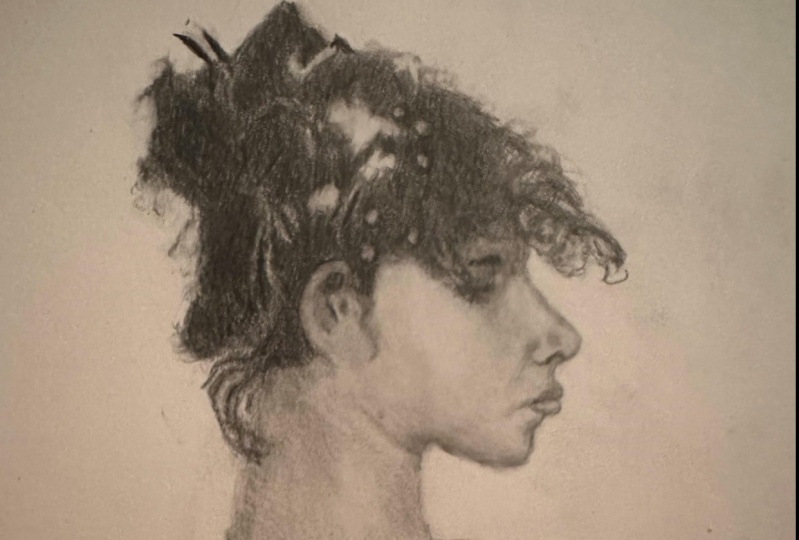
5. Features nose: Alright, so in this video
we're gonna be talking about and drawing the
features of the face. In particular, the most
important ones which are the eyes, nose, and mouth. Most important to the likeness. That is, I thought it
necessary to isolate these features because they are the focal
points of the face, they also central to
getting good likeness. Now the facial features
are not exist in a vacuum. They have to sit correctly in the overall structure of the head for them
to resonate butts, having sort of a trial run in drawing them and getting
a proportion of rides and visualizing what they should look like you had will make it much easier when you
are constructing the head to draw them
as they should be. Now my attention here
is not to create a highly rendered nose are highly rendered mouth
or highly rendered. I that would take too much time and ultimately wouldn't do very much
for us in the end. What is most
important is that we have familiarizing
ourselves with the shapes and the
general movement of value across those
forums. Protein. Before you start drawing
the features by yourself, it's a good idea to
print out the image, crop out the parts of the face you actually
want to work on. Increase the scale
and then draw it on a one-to-one basis as far
as the size of things. That way it's just
easy for you to make judgments on hides, the widths, the breath, breath, this is two-dimensional, but the
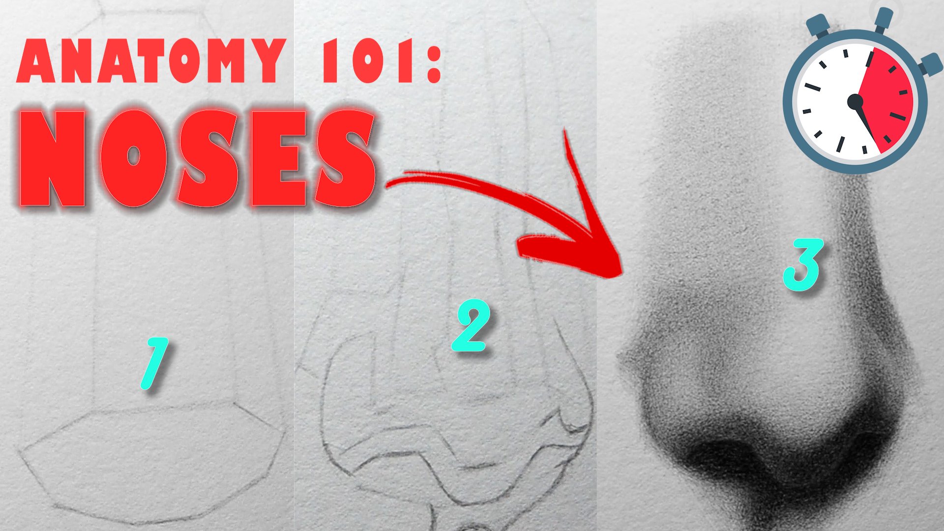
heights and the width. So I'm gonna begin
by drawing the nose. And the first thing I like to do is create a straight
line blocking. What that means in simple
terms is I wanted to get a general sense of the
proportions of the nose using only straight lines
and ignoring a lot of the small or a minor angle breaks
that I see along the way. If you look closely,
you'll notice as I make my straight lines and try to capture the general expression
of the subjects. I have these little
lines across the forum. And those are
basically markers of Angular Burke's
and Engelberg bean when there is a rapid or a sharp change in the
direction of the form. And these small lines
serve as markers, as guide points that I can use to verify the
accuracy of my shapes. And made sure that I'm not deviating from what
I see my reference. I'd also like to point
out that at this stage, it's not really
going to look like what you've seen
in your reference. It's a rough sketch and it's only compose
a straight line. So you can only look so much
like what you're drawing. Also, given that
this is a sketch and not elaborate drawing, you're probably not going to be perfectly accurate either. So just take a step back
mentally and try to enjoy the process and realize that
you are having fun here. Are you trying to
learn as much as you can about the nose of, in this case was enough era. And hopefully some
of those lessons can help you later on when you're doing something
more than fine. Right now I'm going back in and redefining the contours
and the wing of the nose, you my best to improve
upon those shapes, infusing them with C
curves and S-curves. When working on small
areas like this, I tried to utilize negative shapes as well as positive shapes
as much as I can. Negative shapes
between the spaces in-between movie,
actually fun to draw. I'm happy with the
shapes that I see. I'll begin to add value, starting my two H pencil,
moving to each B. And finally the pencil, the value engine, this
painting is fairly compressed. So I'm going to as
much as I can unify the values that I see,
minimize the variation. After that, I'm going to
include some dark accents around the nostril
decrease of the wing, of the nose and the contours
on the right-hand side. You'll notice that in this
painting most of the edges are soft spot in certain key areas like I have indicated on screen, we have some medium
and hard edges that introduces a certain level of variety that makes this
painting worth looking at. With all that done, all that is left is to add value
to the maxilla, the nose side plane, clarity to be lighter than everything we have
on the paper so far. So I'm gonna make sure
to indicate that. In addition, we want to soften the edges between the maxilla, the bridge of the nose
from Ball and the wings. Do this two indicates
that the form is turning and the
degree of softness is going to suggest how quickly
the nose transitions for those key
anatomical landmarks at the side of the nose that have are
absolutely drawn up the nose onto the next one.
6. Features mouth1: I have to say the mouth is
a more complicated shape. So you might want to slow
down a little bit more, trying to think it'd
be more abstractly, maybe turn your paper upside down and that's
going to help you. But ultimately the
same principles apply. Take advantage of
those palm lines, the patient with the
measurements that back off and keep your eye focused on the whole as well
as the specific. And constantly
remind yourself that the purpose of this exercise, again and understanding, it's all about adjusting,
improvising, and getting yourself to replace that you're happy
with even more so than spinosum utilizing
those little markers to guide me as I move through the structure of mouth
and make sure that I'm not going off track in
terms of my proportions. And if I do, I'm
able to catch it. I can't say it enough. The
ankle breaks are your guide. So whenever you
notice a sharp change in direction, make
sure you note it, and use that as the
reference points for all the marks you going
to make going forward. At the start, I will
begin by working my way down the contours and the
right hand side of the mouth. Keeping my shapes simple, stick into straight lines and relying on the angle
breaks the judge my alignments for the shapes with the lip to look accurate, we have to judge not
only the length of the lines with your angles. It's difficult to measure
angles with one's hand. So these horizontal and
vertical plumb lines, well, let's us incorrect angles
and proportions in general. Crucial at this stage to
just get something on paper with the understanding
that you will have to modify it later on. That is not to say
you should rush, but only to understand
that a piece of paper with only two lines on it lacks enough information to make meaningful comparisons. Right now I am ready to better specify the true
nature of the shapes. If you've done your job
correctly in the previous stage, this part shouldn't be too
difficult given the fact that there exists already a framework for you to build on. However, be aware
of complacency, It is possible the
straight line blocking had some structural errors
and we cannot be afraid to correct
them at any points. This part of the
drawing and tells a more careful consideration for every variation in the shapes that we see in our reference. There are no shortcuts
to draw and better as we must practice using the
tools at our disposal, plumb lines, negative shapes, squinting your eyes,
using the divider, stepping back to see the whole. All this will act as fail-safe. So when our initial
judgments are incorrect, no, no, no, no, no,
no, no, no, no, no, no, no, no, no, no,
no, no, no, no, no. Moving on to the values, when I squint my eyes, I see two major value shapes. Some highlights on the
lights up the two. No doubt there are some
intermediate values merging the both of them. But at first, I want
you to focus on just to get them even unified and
possessing the correct shape. Beginning the top lip and making my way down
the bottom lip, I keep a steady hand applying consistent strokes
with my pencil and eraser and excess graphite to my pencil eraser to better
define the value shapes. There is a dark accent between the two lips to make
sure to indicate that it's at this point where we have sufficient information
about the mountain, the page that we can expand our value range
ever so slightly. Tell me a few layers of value in the area
surrounding the lip and we have a complete
sketch, the mouth. That's it for this one.
See you soon. Bye-bye.
7. Features eyes1: With the nose or
mouth completed, all that remains is the eye. Unlike the two visual
features prior, the eyes, a bit more of a
challenging task to complete. Reason beam, as
Sergeant painted, it's edges are very soft. The sheep's a morphous and everything blends in
with what's around it. In some sense is a good thing
because it's indicative of the Mastering which the
painting of the ad was handled, but it presents a
difficult task for us as we try to draw it. First things first,
we have to get an outline of our
subject on paper. I'm going to start
with the eyebrows, make my way through
the eye sockets and finally, the eye shape. The eyebrow is basically a modified rectangle
with a triangular base. And the eye itself a triangle, the convex space and the downward tilts in
typical fashion. We're keeping our lives streets, paying attention to
key angle breaks. That's sporadically check now proportions, we plumb lines. Sometimes you'll see me drawing lines that aren't
in the painting. I do this to help me visualize the relationship between
two points more easily, especially if there's
an odd angle. Now I'm wiping down
the initial lane with my kneaded eraser. You want to be
careful to not over erase else your
efforts be wasted. Conversely, if you don't
remove enough graphite, your initial sketch will get
in the way of the new lines. While drawing the, I don't
get carried away with drawing eyelashes or individual hairs in the eyebrows for that matter, sergeants in this painting only suggests the appearance
of those things. Accurate value shapes
with soft edges will be sufficient to provide
the illusion of hair. Later on, I will use my
pencil eraser to carve out some indications of eyelashes to complete the look
that we have to, at this juncture,
I've decided it's time to introduce
value to the sketch. The outline isn't where
I want it to be yet. But I realized I need some tone to help me see what's
actually wrong. If you join up, you inevitably reaching the sticking points. And once you must remember is if it looks wrong, it is wrong. And if you can see that,
you can change it. Looking back now, the tilt of the eye and the awkwardness
of the shapes in this area. Or the corporates simultaneously working on both shape and value, I see that the eyebrows
are only slightly darker than the average
value of the eyes. So for the purposes
of this sketch, I'll group those
values together. The rest of the eye
socket, however, would be about
three value steps. Two to three values
That's really lighter than the
eyes and eyebrows. As I work my way through
the shape of the eye, I'm relying both additive
and subtractive join, meaning that I'm using the tone, the values that I
put down on paper to help me find the actual
shape of the eye. But I'm also utilizing
my eraser to remove the excess graphite
and helped me create that illusion of eyelashes. Haven't gotten this
far. The shapes are starting to improve. My attention has
shifted the smoothing out the value
transitions between all the elements
of the eye shape really are not quote-unquote sharp edges in this eye shape. So what we're dealing
with our levels of soft all the way to Los edges. By the way, if I haven't
mentioned it already, degraded between two
disparate values by creating an intermediate
value between them. This will cause the two
disparate values to match optically and
transition smoothly. With that said, we are
officially done with these sketches and I
trust this trial run. However many times
you need to repeat these exercises
will leave you with a lot more confidence to tackle the joints to come.
That's all for now. See you in the
next one. Bye bye.
8. The Outline Pt.1: Alright, we can officially
began this massive study known as our first on the
agenda is the outline. Now there are numerous ways
we're putting the stage. Everything ranging
from side size, comparative measurements to more tonal approach, arbitrary, comparatively relied
mostly on my eyes and proportional dividers to get
my measurements correctly. At the end of the
outline, I'll be transfer my drawing onto a
different sheet of paper after making some
corrections to Photoshop overlays before adding
value to the drawing. But that said, the materials
you need for this stage are your pencil, paper, divider, eraser, and basically everything you need for the rest
of the drawing. Just a few tidbits of advice,
don't work too small. Use a light pencil. Make sure you have a
well-organized to do space with lots of
writing a paper. Beyond that, you're good to
go and we can get started. To begin, I have
it printed picture my reference right
next to my paper. I start from the top
left hand corner. And utilizing straight lines, break down the
complex shapes that I see into simple ones. This approach
requires you to draw a line from one
angle to the next, put down a marker and shrink those together
as best as you can. Kind of connect the
dots type approach. At an early stage such as this, you want these lines to
be as broad as possible. So ignore much of the detail. You see my hair, I'm focused
on just the essential. Whenever I draw a
line across shock, It's an ant with my divider and compare it to what I see
my reference besides, in addition to length,
angles matter. And ever so often I
hold up my pencil vertically and horizontally and check to see
them are angled, bricks are lined up correctly. It's very easy for error, so accumulates work in this way. So you have to be
extremely meticulous about every mark you make
even more so than me. I suggest you start
with product, particularly around
the facial features. Wait to get the general
proportions before specifying the lips are most shows the
exact shape of the nose. Lean on your negative
shapes wherever possible to corroborate
the marching making a given area and avoid
the temptation to get detailed too quickly in
this outline process, more than likely at
some point you will discover something isn't
looking right on the head. Don't panic. Just slowly trace your way down to every
section you've worked on. Look at heights, widths, angles, and wherever
something looks out of place. For me, this happened
a few times. One instance, the nickel's too narrow, then it was too wide. Another time, the entire
left-hand portion of the hair was too far from the right
side, and so on and so forth. In the words of Richard Schmidt, confidence does not come
from doing things perfectly. Window you can fix things. Hello. At this juncture, I'm
fairly happy with the outside contours
and I'm ready to define the shapes
on the inside of the form. The same rules apply. Straight lines, draw markers
and every key angle break. Only now we can
more easily utilize negative shapes because we
have a framework to work out. If you look closely for that'd
be the eyebrows or hair. I'm always looking for
visual shorthands. The incidence of inaccuracy or the speed of the joint,
it's pretty high. And so I don't want
to over-commit to my lines by spending 15 min drawing a specific
IC whenever possible, try to combine the
shapes that you see. I suggest things that can be better define the tone later on. See e.g. the hair. Now I'm just adding some details slash placeholders with
embodying the hair. So I remember where
they are once I start adding value
to that region. After that, I'm scanning
my eyes to the drawing, looking for areas that caught my attention in need of fixing. Once those corrections I made, I can finalize this stage of
the drawing and move on to the next assignments in this moment is to create
your very own outline, replicating the steps
you've observed in this video and bringing you're drawn to a similar
level of completion. Don't worry about it
being perfectly accurate, like I alluded to earlier, there are going
to be some errors necessarily because we're working within
certain constraints. As you progress through
the different stages, you will inevitably improve
upon the marks with meat and finally arrive
at a good drawing. Don't allow grids to
be the enemy of good. Repetition every day is
the only path to mastery. That's all for this one season.
9. The Outline Pt.2: With the shoe lobe is behind us. We cannot commence with a more complete depiction
of our subject. In this stage, we introduce
more complex contours, infusing our drawing
with C and S-curve in addition to the streets already present, it's
now more than ever. We must pay close
attention to each and every shape and their
relationship with one another. Take your time to crosscheck your measurements and utilize the tools at your disposal to increase your
sense of accuracy. The end goal here is to get
our drawing close enough in this linear design to this
painting by sergeants. Such that when we begin
application of value can focus more on that in a bit less
than finding out proportions. That said, grab your pencils
and let's get drawing. Firstly, I'm going to
start by reaching down my pencil marks
from the previous stage with a new Larissa. I want to remove just
enough graphite for the lines to be
barely visible so that the marks
that comes to have some guidance but are
not completely obscure. Next, working my way down the right-hand side of the face, I'll attempt to
imitate the countries that I see in my reference, do my best to be
as exact as I can. The shape that I see. I spent a lot of
my time looking at my subject and then
back in my drawing, trying to spot errors
wherever I can. As a result of my earlier work, it shouldn't be too difficult
specifying these lines. The majority of the work is getting things in
the right places. And beyond that, we just
building upon a foundation. However, proportions
are not accurate. This stage will prove to be more difficult and bring those
errors into greater focus. And that's you
don't be dismayed. Go back to the drawing board and try to identify
where you went. In areas like the hair, that is sometimes enough to
suggest the appearance of things rather than trying to
imitate the hair exactly. This is in part because
hair is amorphous, always changing the
shape and appearance. And also because it
helps us to think more abstractly as opposed to trying to draw individual hair strands which has an error we all make when we first start drawing. Like in the previous stage,
I'd like to start with the outside contours
before going inside. Just because I find it's easier
to get the sheets within to look rights when they had a good surrounding, so to speak. Once you move to the
inside contours, I'll start to elaborate on
the shorthands we created. Anymore information to
the shapes are still leaving aspects that will be
better expressed in value. Parts of the hair, eyelashes
on certain halftone shapes. As you work your way
through this drawing, you might be wondering,
why do a master study. There are many reasons,
not the least of which is artists like sergeants were able to translate
what they saw in the visual world to something
beyond the ordinary. And the words of William Blake, to see the world in a grain of sand and heaven
in a wild flower. This particular painting, the distinct sense
of form again, in a portrait that
is evenly lit with no strong shadows is a
hard task to accomplish. The distinct value groups
of the hair, face, and background we
see when we squint our eyes gives this simple
composition is striking the rising edges from the sharpness of the
profile to the softness of the skin and hair excites the eyes and stimulate
our imagination. If you're struggling
to sushi correctly, it might help to think about it that if familiar subjects, maybe you shouldn't
L-shaped than the nose or trapezius and the hair or
whatever the case may be. Giving those shapes and
name it change the way you see them and help you
draw them more effective. Before I wrap up this
video, I just want to say, don't be fooled by the speed of these time-lapse is this is an incredibly
deliberate and often slow process to be patient. And anytime we're
efforts towards better drawing will be rewarded. In the next lesson, we'll
transition from lines of tone and begin to sculpt this portrait from
the inside out. That's all for this one season.
10. Values Block-In: The blocking is
unimportant but often overlooked aspect of
portrait drawing, its role as ancillary
Bob, without it, we run the risk of misjudging our values are settling for
poorly-designed shapes. This stage allows us to create a foundation of more
organized values and better linear design support the more subtle
mark-making to come. Our focus here will
be on grouping our values appropriately, eliminating some of
the white of the paper and improving upon the lines
from the previous stage. View this as a trial run, an opportunity to further analyze the values
in this painting. Line quality before we start rendering with that
said, let's get drawing. Before commencing
with this blocking and made some modifications to my initial outline using a projected overload
the painting to aid in those corrections. After that are transferred on to a different sheet of paper. And here we are. I begin this blocking
with the hair. My goal here is to create
one relatively dark, evenly or value over
the entire surface. Keeping the variation
in values minimal and leaving the embodying the hair
as the white of the paper. This process will require several layers with
a sharp pencil and match patients try to be consistent in your
method of application. That is to say if
you're scribbling, do that when entire layer before switching as opposed
to scribbling, some cross hatching, hatching,
and so on and so forth. Remember that even
though our focus is on value application, there is always room to
improve the shapes in our drawing and enhance
our proportions. In addition, besides
consistency and layering, maximize the usefulness if
you need eraser by pulling our dark spots where you see them before they
accumulate significantly. Happy with the hair. For now, I'm going to
migrate to the eye sockets. First I'll create one average value for the eyebrow and I, equivalent to that of the hair, fine-tune the shape of the eye
and eventually work on the valid inside the eye sockets which alighted on the eyebrow. And I individually next are developed the darkest
values in the nodes, which are by the nostrils
on wing of the nose. I like to be ordered in
our shooting my values. So for that reason, I'm only going to indicate the values in each facial feature that are the darkest to maintain
that workflow On the lips, the boundary between the upper and
lower lip will be the darkest value with the upper and lower limbs
themselves in mid tone. In this blocking,
we dealing with approximations of what
we see now reference, minimizing the number of
variables is key here. So if two values
are close together, we make them one and save ourselves from the
endless complexity. When I screen my eyes, the shadow shape in the air around the left-hand
side of the neck and lower jaw jump out to me as the darker sediments
left in this picture. So before adding our
next set of values, I plug those in with value
similar to what I have in the eye socket and connect them with the
surrounding regions. There's not time for us to add some more half-tones disjoint. I start with the nose. I connect the half-tones
there with those around the forehead before
sliding down to the next, creating a base for
the values there. Foremost on my mind is keeping the virus that I'm
creating now Latin on the values from
earlier to ensure this portrait looks at least
somewhat two-dimensional, there has to be a hurricane
values for objects look real, which is why we started
with the tacos group of values before moving
on to the midtones. Beyond the nose and neck, in between the iron
nose and around the chin will be the next
set of midtone similar in value will be
having the nose and forehead connect those
value shifts in a sort of a chin strap all the way to the ear region and blend
those terms together. In effect, there are three main valley groups in this portrait, as you can see on screen. Within those groups
are slight variations that make the picture
more lifelike. However, and this
is blocking were more concerned with
the larger forms and unifying the
immediate value groups to create a cohesive blocking. The white of the
paper represents most of the lightest
value group, given us ample room to go darker when we begin
our modelling. That's all for now.
See you next one.
11. Rendering the form Pt.1: Like with the previous chapters, I'm starting in the hair with
my dark and softer lead. I worked my way
through this L-shaped, building up the values until they are as dark
as I can get them. I'll be ignoring the
ornaments in the headfirst, but I'll get back to
them once the actual mass of the hair,
it's best to define. You'd like if you're
doing a lot more sharpening at this point, because it darker pencils
get blondes faster. If you're anything
like me, you're going to be bored
out of your mind. But hang in there, resist the temptation to push down harder
with the pencil. And in time, this
section will be over. If you look closely
at your reference, if you notice that the values in these regions are
lighter than the surrounding and the
edges noticeably softer. Make sure to highlight
those differences, as well as introducing variety
in the shapes of the hair. You don't have to
replicate exactly the pattern of the
hair presents, but you do have to draw them
as clumps and clusters with soft edges composed
primarily of C and S-curves. I find that when drawing here, confidence strokes create
a more natural appearance like connecting multiple lines
together to the same end. Went to go ahead and
connect the hair. But this shadow
shape in the neck, simply because they are close in value or right next
to each other. There'll be other parts of
this joint where you have a shadow shape and the skin
close in value to the hair. Don't be afraid to
connect them and soft edges and be wary of exaggerating the differences
in the values when in doubt, step back to get a
more accurate sense of how the values relates. This year of the hair.
It's interesting, primarily because of sergeants decision to purposely
lights in the hair significantly so that it flows better with the
overall shape of the face. If you close your eyes slightly, that lock of hair almost
melt into the skin. I don't know for
sure, but almost certainly there was
darker in that region. But yet the final outcome
is one that is remarkable. With that said, it should be
a discernible difference in darkness between a lock of hair and the hair on
the rest of the head. My strategy as I approach these locks of hair in
the front of the head. So build up the
value. First two, I wanted soften the edges
around the locks with a lighter pencil and then
go in with my eraser and pencil to create some
variety in the shapes. This variety can include
extra hair strands, highlights, and negative space. The extra insurance, by the way, it should be thicker than
the width of a line. We don't want to be
drawing cartoons here. Finally, I'm ready to dive
into the embodying the hair. I waited till this moment
because those elements are complicated, much
like highlights. And I really part of the form. I've taken some liberty
with the shapes here, but I tried to match
the values as close as I can to what I
see in the reference. There is some variation. Some partakes uni lights, others are much closer to
the local value of the hair. I've observed that
the darker ornaments have much softer edges
and the lighter ones, a difference which must
be replicated in our drawing if you had to remain
true to the painting. Very easy when working on
areas like this to convince yourself of its unimportance and tried to draw more quickly. However, if excellence
is what you seek, must overcome your desire
for immediate gratification and draw these
ornaments like they are the most important
part of this picture. Experiment as much as you can with the subtle
details and the hair. Take advantage of your different
erasers to push and pull shapes and don't settle once you get the look
that you're after. Personally, I'm using
the reference as a guide or beyond
a certain point. I'm just trying to
create interesting looking at tractions. Beginning of the face
and darken the values in the shadow shape of the ear
to reflect its true value, which is similar to the
hair right next to it. I'll also darken the
half-tones around the neck to further elaborate on the
shape we started earlier. In the next video,
we'll be working mostly on the face and elevating the
shadows and dark is halftones to their
full saturation. That's all for now. See you soon
12. Rendering the form Pt.2: Here I'm just evening now, the shadow shape around the jaw. I returned to it later, but before then my focus would be on the darkest
values in the face. Those values can be found
around the eye sockets, ear, and neck, primarily. Beginning in the eyebrows. My workflow is as follows. We define the contours
of the eyebrow shape, elaborate on its values, and then connect it to
the surrounding regions of the hair and eye sockets. The local value of the eyebrows about the same as the
hair on the head. In addition, grid is lighter, ever so slightly moving
from right to left. Don't be shy about indicating some flyaway hair strands here and there, just don't
get carried away. And doing so processes exactly the same
for the eye shape. We draw the contours
with an eye for making it more dynamic and
truer to the reference. The eye can be simplified as a triangle with a
slight downward tilts. So don't be intimidated by
seemingly amorphous nature. The eye is about as dark as the eyebrows with a
similar movement in value, going from darker to
lighter, from right to left. Once I have those two key
features established, I'll develop the values
in the eye sockets such that the contrast in that area is as it is in my reference. Moving outward from
the eye socket into the glabella and
bridge of the nose. We see a similar value
with the eye sockets. So it's better to connect
them and minimize any variety we see when
we start to deeply. And the nose, we have some clearly defined
halftone shapes. Our job will be to replicate
them in our drawing. Keeping a light hand
and building up those soft but
specific value shapes to the match what we
see in the painting. Keeping in mind that
the value here will be considerably lighter than
anything in this upper region. So while designing the shape, keep your eye on the values of everything else
in the picture. In between the eye and nose
is displaying a value that is darker than the half-tones on the cheek and
typing of the nose, lighter than the dark is
halftones on the nose. Devalue sheet that
can easily get lost. So I'm going to
develop its values now and define its shape. But then that value will
be subtle variations, e.g. very nice. The I is a bit darker than
everything else beyond that. And returning to the
cycling of the nose, which right now is to
light relative to water. And it's using my tuition
for each pencils, I'm going to darken
that side plane connected with soft edges, the value shapes surrounding it. The mouth, our
approach for us by establishing the divide between
the upper and lower lip, which is a relatively
dark band of value. From there, I'll create an
average value for both lips, with the upper lip being
darker and lower lip lighter and possessing some
highlights in the bottom lip, the right-hand portion
is darker than the left. And the highlights,
although apparently brights when you start them, actually pretty dim when you compare them to see the
ornaments in the hair. When viewed as a
whole, the mouth has a darker local value
than the nose, but he lives a local value
than the eye region. In other words, the mouth
is in-between the two on the value scale when
taken in its totality. The quiz around the mouth
is very important to indicates as it gives
characteristically drawn, but also highlights
an important part of the formula, the face. Often you make it too thin. So make sure there's
some breadth to the halftone shape and that you connect it to the
values below it. Later on. Leaving the
features for a moment, we have free to elaborate in the larger forms of the face. From the ear all the
way down to the chin. We have this passage
of tone that's about the same value and gives
structure to the face. I'm going to start
building that area up with an even application of graphites and laid
the foundation for the modelling to come. In the next video, we'll
pick right back up from here an inch closer to
the finished drawing. That's all for now.
I've seen next one
13. Rendering the form Pt.3: Slowly but surely we're beginning to give life
to this portraits. This halftone shape
around the side of the face is an important one. For that reason, I've delineated boundaries with the goal of emphasizing the specificity of its shape and the importance
of keeping its edges soft, we must create several
layers of value for that halftone shape to
appear even on unified, and also make the effort
to integrate it correctly. Ear, hair and the
rest of the face. This joint will be in a
state of flux to the end. So certain things that
appeared correct. We now prove otherwise in
light of new information, this lock of hair
that we drew earlier, at some point started to
blending too much with the skin. What's the area surrounding
it was dark and response, I've gone back
over it repeatedly to darken it with correct value. This halftone shape
around the chin is very similar to the one we
just finished working on. The value is pretty much
the same, and as such, both should flow into
one another seamlessly. Of course, there was some
variation in this region. If you look closely,
you'll see that as the form of the facial
rolls towards the edges, the values get darker. This change in values subtle because the forms yet
turned very slowly. An attitude of
continuous improvement and a healthy level
of dissatisfaction. Keep you returning two
areas you've previously drawn to analyze them
with fresh eyes. There's the ability
to spot errors are part of the picture
that I incongruous, that leads to great
results in the end, for me stepping back and view in the picture from a
different perspective, almost always calls my
attention to something amiss. Progressing onto the lightest planes on the side of the face, I noticed that it's
very similar to the values on the side
plane of the nose. And it's slightly darker towards the bottom of the
shape than the top. I'll limit myself to enforce and switch pencil here so I avoid going too dark and ensure that I have absolute control
of my values. Once you achieve a value that relates properly, we
put surrounding it, go back in and create the necessary
intermediate values to connect the three main
value shapes together, the kneaded eraser plays a major role in my
drawing practice in large part because
it compensates for the natural graininess graphite, which can be inimical to
getting machine-like finished. I'm after. If you prefer, more rugged look
to your drawings, may find it less useful
or not useful at all. Returning back to the
muzzle form of the mouth, I'm going to give a little
more breadth to it. If I darken the values around the upper lip, as
well as the crease, half-lives right above are about the same value as everything
over in this direction. We just have to make
sure the darker slightly as they feed
into the philtrum. At this point, you probably
realize there's actually not much variation and the
values in this painting, that's part of what
makes it so unique. The trouble one runs into as a beginner is exaggerating
the differences that you see. Instead of making them as
subtle as they actually are. So resist the temptation to make things super dark
and then super light, the darkest and
lightest elements. And this joined by quite
a bit higher in the hair. Everything else is
a sea of midtone. How many Muskegon? The neck can be very easily
visualized as a cylinder with a value is moving from light to dark outward from the center. In this particular neck, we have the shadow to the left, the dog halftones on the side, the mid tones in the center, and this light band of
halftone value at the top, the shapes are already there. The key will be getting
the values rights, creating the appropriate edges, and connecting it all together. While all of the
editor, in fact soft, there are levels of softness. The edges here are sharper
than the edges there, but softer than those over here. So managing those relationships visually will be the key to
accurate representation. In the next video, we'll
finish up the neck and apply some finishing touches to the rest of the portraits. That's all for now. Bye bye.
14. Finishing touches: Like I alluded to
in the last lesson, over the next 5 min or so, my efforts would be
directed towards developing the cylindrical form of
the neck and integrating your shadow shapes with its
large shapes relative to the focal points of the face the next further away from
the light source. So its values on the whole, you on the darker side
of the half-tones, we have already established the lightest places
in the neck we can find along its center. And from there moving outwards, the values get
progressively lighter. And the top left-hand corner, we have the shadow shape, which is effectively
the same value as the other shadow
shapes in the face. And then seamlessly with
the dark half-tones towards the bottom and the
hair at the top. Closer to the face, we
have this light strip, a value which is a part of the net catching
a bit more lights, I have a visual on
screen to give you a better sense of
what this value should be relative to the other allied planes
in this portrait, whenever we start a particular
section of the reference, the local contrast in
that area increases in our eyes relative to
the entire portraits. Meaning you will have a tendency to exaggerate
the differences between values if we fail to compare them to other areas
of our drawing. Right here, as I start to
work on this halftone shape, I can see clearly that
along this boundary, the values get
considerably lighter. To make life easier, I
will not attempt to render this entire section
of ones or create the value that I seek
in this area before moving on and connecting
it to anything else. In my mind, this is a
jigsaw puzzle wherein I am attempting to fit together different soft but
specific shapes. The values and the neck
are very compressed. So even as I make my way to the lightest part
of the neck and cognizant that it can only be so light in comparison
to what's around it. I will take my time and later
my values carefully and to the level of contrast I see is commensurate with
Watson the painting. Also, because the neck is a slow turning cylindrical form, express in our drawing, they fled radiation from, from light to dark as we
move towards the edges, each phase of the form must be accounted for by unified value. And the only way we get this, if I learn values
correctly and removing areas of coincidental value
with our kneaded eraser, too much incidental value on either side of
your friendships lead to difficulty in perceiving the difference between
the two values. In other words,
everything starts to look the same and
the Drawing Flats. Most of what I'm doing now
is filling in white spots in the tone to increase the
clarity of the values, as well as adjust
certain transitions. I looked too abrupt or too soft. I do this to ensure
that the indication of my value planes is consistent
with the expected fall of lights will be advertising more or less consistent
value gradients as we've traveled further
away from the light source, the value of the
plane should diminish and lightness accordingly. At this juncture, we are free to focus on the details
of the painting. I'm bringing forward
the smaller forms such as I'm currently
describing the chin. In addition, keep your
eye out for areas of flatness or the
transition between light and shadow is
missing a dark halftone were an edge between
half-tones is too sharp, or where the proportions
look inaccurate. Towards the end, we want to remove the effect of graininess. Why unseen baggage transitions
and clarify on edges. Making it this far then
accomplishments and of itself, irrespective of how you
feel about your drawing. Now, she'd be honest in your reflection of the
good, bad, and ugly. What do you like
about your portraits, or would you improve it? How can you carry these lessons into your future projects? Remember to appreciate
the little victories. Understand that the
road to the top is a winding one. Successful. No one comes easily. I appreciate you all for
coming along for this ride. And I sincerely hope
that you leave here with better skills and the confidence to meet your dreams. A reality. That's all for now.
15. Class project : I hope by now you have all that you need and
are ready to bust out those pencils and begin
making some portraits. We are officially at
the end of the class. The last thing, the agenda is perhaps the most
important thing. And that is putting all
this theory into practice. But before you begin
your portrait, I want you to practice
your values and your ship design through the preliminary exercises
and the earlier lessons, those simple exercises
will train your eyes and hand to see an act as one, giving you the confidence
you need later on when drawing the
final portrait, feel free to download the
image of the painting we'll be working on
in the resources tab and maybe convert it to
black and white to help you see the values more
clearly, outline the steps. First, create a straight line
blocking of the portraits, capturing only the
essential forums and ignoring surface detail. Next, infused the
earlier blocking with C and S curves to better describe the contours and differentiate the hair
from skin from there. Add value to the picture, limiting yourself to only
the major value groups. And finally, bring
the portraits of full focus by expressing the full range of
values that you see, accounting for the variety of edges we have in the reference. If you've made it this far, I appreciate you being here and I hope you are able to take something out of this class
to apply your own artwork. I look forward to
seeing the amazing work you create for your
class projects. But until then, adios
 Terence Zulu, Fine Artist & Teacher