Transcripts
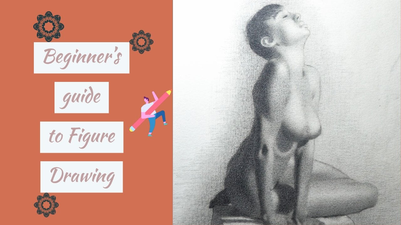
1. Introduction: Hey guys, it's moving here. In this class you're
gonna be drawing the human figure and graphites. I'm going to share with
you my favorite techniques and a deep dive
with the process. So this one, we're gonna be
working with a photograph, the singular dominant
light source, and wearing the
picture from start to finish on like my previous
class on figure drawing. The focus of this one is going to be on the modelling of form. That is to say how you can shoot the figure to make it appear
more three-dimensional. This class is for all levels, but he'd been a prior experience
drawing will make on a stunning some of the
terms that I use in lessons a lot easier. It will be approaching this
drawing in three stages. First, the block in my
little separate light and shadow IT rendering stage, but we'll be describing
the large and medium forms may detail stage that will comprise mostly
of the fine-tuning of edges and describing
smaller forums, as well as the tactile
qualities or figure. At the end of this,
you'll be ready to take on your class project. Will you be able to
assess what you've assimilated or put your
new-found theory into practice. I had a lot of fun making
this and I hope you enjoy it. There's a lot to you all. See you soon.
2. Block In: Alright, so we are
officially at the start of the block in this class, our focus is going to be on creating the illusion of form. And I'm making our drawings
look three-dimensional. So for that reason,
I'm going to skip the outer life stage and just
trace the drawing on paper. If you're curious about how I normally get my
drawings on paper, you can check out my last
class and figure drawing. And then there I show
you my process on how I free-hand a
figure drawing. To start. First on the agenda, we want to divide the values. We've seen our reference into two families, light and shadow. The shadow we will find
in the areas receiving no direct lights signaled to us by virtue of
their darkness. In this photo, the
form shadow is located around the
crease of the back, the left arm glutes
and lower leg with a cast shadow extending leftwards away from the body. Based on the location
of these shadow shapes, we're going to assume
that the light source is located in the top
left-hand corner and our values are going
to move from light to dark. These directions. The hair on our model,
why not in shadow per se, will be grouped as a shadow
value of its darkness. And for the sake of simplicity, what I'm thinking about in
this moment is creating an even shadow value
with minimal variation. I want to make sure
that I'm improving upon the contours of
the drawing as I go, keeping my focus on the border
aspects of the picture. If you're struggling to
get your tone to be even, I suggest varying up the
angle of your pencil, a plant layers first with a lighter pencil
than a darker one, keeping a light hand and taking our dark spots between needed
to Risa as you see fit. Moving into the left shoulder
before adding value, I go in with my
pencil and better define the shapes I
see my reference. I want to ensure that I
have a good balance of C curves, S-curve, and streets. I find this beneficial
because the values only makes sense within the boundaries you
create for them. So Justin, we
outlined beforehand, reduces the
likelihood of errors. Later on. You might have
noticed that the values in the hair darker than the shadow on the left shoulder
and you'd be right. My block, and I prefer
to downplay variation like this and keep the
body's more similar. It allows me to stay
more organized mentally. But if you want to
highlight that difference, you're free to do so. In the shadow are on the glutes. We can clearly see core shadow, reflected light and
occlusion shadow. Once again, we want to keep
our shadow values unified. So I'm going to minimize
all that into one tone, the same value as
everything else. It's very easy to
be tempted to show a whole bunch of
variation in this region. The more you stare,
the more you see. However, in order for our lives
to really shine later on, our shadows need to
be somewhat muted. Ergo, at this stage, our focus should be on
smooth gradations in value, even tone, a
well-designed shapes. If you squint your eyes and your shadow values merge optically, you know you're on
the right track. Hands and feet are
generally pretty tricky to draw and
shade because you only takes a few mistakes
before they start to resemble something
out of a hurry. My advice is less is more
vis-a-vis the amount of detail, whether that'd be in
its contours are, and how you modeled the form. No, no, no, no, no,
no, no, no, no, no. No, no, no, no, no,
no, no, no, no, no. As I make my way
down the lower leg, I'm utilizing both the
negative and positive shapes I see to properly determined the boundaries of
my shadow shapes. I'm understanding that
it won't be perfect, but do my best to get
it to a good place. At this juncture,
we have a simple two to unblocking the white of the paper seven
as the lights and the values we just created
seven as the shadows. In the next video, we'll
be building upon this for some halftones and gradually bringing this picture to life. Thanks for watching.
See you soon.
3. Modeling the form Pt.1: With the blocking behind us, we will now introduce halftones to give form to the lights. I always like to start
with the darkest tones because they are closest and
value should the shadows. This is important because
a cardinal rule of realism is that our darkest
half-tones have to be lighter than a lighter
shadow values in order for the light and shadow families to mean separates. Before I get into all that, I'm going to lightly indicate some value for this
tool beside the model. My thought process
here is simply, I don't want that area
to be stark white. So our pi a few
layers of graphite to my H pencil before moving
on to the lower leg. Lower leg you can think of as a more complex cylinder
with a shadow on the left, the lights on the
right-hand side. The form of the leg
is slow turning. The consequence being that
our values are going to be compressed with very
little variation. So just focusing
first on creating an average value of the light
shape of the lower leg. Once that's completed, welcome to transition
along the bed bug line, filling in the
intermediate value that will merge the shadow
with the lights. Beyond this, you can
begin to walk carefully, inspect the edges
you see me reference and modify yours to match e.g. the shadow edge
and this region is sharper than the shadow
edge further down. And the shadow edge here
is known as soft as the transition state
in this region of the torso or the like. Somebody I find
useful in creating smooth tone is going
back into region like the one we're
working on with a lighter pencil than
you would otherwise use. A for-each or two each eye filling in those
nagging white spots. It's a bit tedious to do, but it goes a long way in creating that plate-like finish. Going back to the transition
between light and shadow. If you use say to the pencil
primarily for the shadow, then each V4 your lights, it's easier to
transition that to one. You use an intermediate
pencil I could be, prevents you from going
too dark or too light. In addition to choosing
the optimal pencil, controlling your
pressure is key. Try not to push too
hard with your pencil. That way if you make a mistake, it uses the paper is still in good enough condition for
you to rework the area. On the right leg, we
have values that are similar to the ones
we just observed. There are two main value
shifts in this region with smaller forms embedded within them, creating more variation. To start, I will focus on
the major forms and try to capture the correct shape
would be appropriate edges, which in this case, I'm
mostly soft. Wow, good. And my values on the right leg, I'm occasionally glancing over
the left leg to make sure that I'm creating here similar
to what is over there. Besides that, as you
probably already know, if you dry pencils, you
can shortcut the process, so resist the temptation to draw faster, whatever that means, by zigzagging all over the place or pushing harder to
get quick results. Getting values where you
want them is just going to require many layers
and a ton of patients. So now that we have an approximation of the
values we're seeing, our model of attention
to detail must increase. Squinting your eyes
will enable you to determine if there's
too much contrast, but truly to contrast
in this region relative to your
reference while doing so, we also alerted to address them, it'd be too hard such as whether the two
major value shapes. The glutes heavy lights
or local value than the legs degrees orientation in relation to the light source. However, there are parts
of it that are closer to a drug SAP zones around the
shadow on the left side, e.g. in the plane connecting
the right, Let's roots. We add some darker half-tones
that only slightly lighter than the values
and the lower leg visualizations
needs to be solved. So pay close attention
to how the values in the lower leg connects
to the rise in each. Periodically I'll revisit areas that I've worked on before. If I detect an imbalance, if you've got a certain
error cannot be improved upon the additional contexts. In this slide, cheaper
on the left arm we have some var doc is happening
in the picture. Very subtle movements in the values and edges
in this small area. The b's value of this
region should be dotted and all the half-tones we have
so far, but only by little. The edges are fairly
subtle around, slightly sharper towards
the right border with the shadow than the left. More often than not,
people tend to make an error like this lighter
than it really is. So when in doubt, go darker. In the middle backup, identify this band of dark halftone
along the spinal column. It's about as dark as
the lower leg or just slightly lighter as it
tapers worth bottom. This value shape will
serve as an anchor for all devices come in this
region that is quite possibly the darkest value
shape and thus establishes and upper limits for my values
in a drawer switches this, we're going to have very
few truly hard edges on the inside of the form. So make it a habit
to double-check where your value shapes needs, particularly along
the bed bug line, and make sure that transitions
are not too harsh. At this point, I'm going
to start rendering the values are on the trapezius, the simplified form, It's basically one big balance sheet. We're going across
the traps into the neck and ending
around the red deltoid. You can think about it as one
continuous value shape with soft edges and the local value equivalents what we have here, it becomes simpler to draw. In the next video, we'll finish
up this area and begin to introduce some lights I have to give like what we have here.
4. Modeling the form Pt.2: In this video, we're
going to continue developing our half-tones, moving systematically
from our darkest values to our lightest at the end of which will result in a more complete expression
of our subjects. Currently, I'm modeling the
values across the upper back, attempting to get it
smooth and connecting it to the existing value
shapes surrounding it. The average value of this
region is interrupted by a light plane on the neck
here around the ear. And this depressed
group possessing a darker value, right? I'm happy with I have
round the upper back, so I'm going to move on
to what I perceive as some triangular halftone shapes similar in value to the
error we just worked on. Procedure is as follows. I lightly sketch out the shape
of that band of halftone. So I focused on joined first. Once I'm happy with that, I begin to darken
the value to match what I see on the model with the joint in place and
the value accurate, I start to alter the edges, how soft or hard I make an
edge with dependent on what I see on a bit of understanding of that
part of the anatomy. Cross comparison is the
best way I've found to determine where
on that spectrum. I just need to be. Looking at the screen.
I've identified some of the hardest
edges in our picture, the softest and a
few in between. Having an anchor such
as this will prove invaluable and determine
what edges to have where. In addition, we
must remember that every part of the
picture has an edge. We can't afford to
have good ideas in one area and then on
the opposite side failed to address what we see in lighter parts of the
forums such as this. It will save us and
sticks on for age to age and need to be
pencils prevents us from accidentally getting
too dark and completely eliminating the impression
of three-dimensionality. Don't know. The models right
arm, we once again encounter familiar
cylindrical form. Presently we have the shadow
values already established. So the logical next step is to render out our
dark is halftones. To elaborate on the lights. This is the shape greeted by
this band of dark halftone. Before getting into the
medium and small forms most first creates its local
value, or average value. That value is going to be
a little bit lighter than the balance sheet we have
in this region of the back. Once that shaded, I can then
begin to darkness values towards the edges of the form rows away
from the center line. If you look closely, you
also see that there is a lighter plane around
the olecranon or elbow, which you can
indicate by putting awesome graphics in
that region by Reesa, some other things
I'd like you to pay attention to the
shadow edge we have here and making sure it's a soft as you've
seen the picture, not to mention
adjusting the contours, the actual shape of the arm, you feel like it looks wonky. The rest of the upper
arm is lighter than the region we just finished
my thought process here is to first grade that
basal value with the lighter pencil start by running the dark is
halftone shapes, which are by the fingers
and this area of the hand. After that, they can begin connecting those dark
and half-moon shapes, the rest of the hand with
the intermediate values. Along the way, I'm
continuing to make microns is more
specific insurance. What I see my reference, this era of the hand is
when I returned to where my putting
enough finishing touches just to make it
look a bit more realistic. Returning to the back, we have this band of halftone value, define the rest of
the red deltoid. It's lighter than the
values adjacent to it. That is the values
we've shaded in, but darker than the
rest of the deltoid, as well as the region containing
the terrorists major, infraspinatus, teres minor,
and a bit of the Isthmus. The values and the rest of
the arm because cities, one of the lightest
planes in the picture, the very pronounced highlights. And I'm watching the way
of contrast in the form. Its average value significantly lighter than the
vantage surrounding it. Like all the cylindrical
forums to this point, the vantage get darker as you migrate away
from the center, only slightly, but
when you go to parts of the figure as light as this, but changes in value or subtle. There's a law known as
Lambert emission law. I spoke about this, my
fears class on this topic, but I think it's worth
pointing out again. It stays that value
change very slowly near the lightest lights
and darken more dramatically as they
approach the terminator. They tap into being
where light and shadow, aka the bed bug line. So keep this in mind, careful of making the license
halftones to dark. Once I've created a sense of
roundness and the shoulder, it's time to define
the highlights. You can do this a
multitude of ways. The pencil eraser via crosshatching with the kneaded eraser
like I'm doing here. Well, by just leaving
a part of the paper whites and highlights, although it's somewhat
superficial elements, requires equal treatment as
the rest of the drawing. By that I mean, pay attention to where the edges might
be softer or harder, the actual shape
of the highlights and its location in space. In this moment, I'm
just going back to the church era as I
previously worked on, adjusting the value slightly, picking out dark spots and altering shapes that
need some work. As I returned to
the middle back, the same procedure
will be followed as I render the
other value shapes, software specific should be your mantra as you work
through this section, make your shape specific. Let the edges to be soft. Also, be wary of
getting tunnel vision and losing track of the
relationship between things. The halftone values
we have here are considerably lighter
while we have lower down the ribcage and document what we have in
this region of law arm. That's it. Good. Okay. On the left side of the back,
we already have in place our shadow values are
dark is half-tones. So all that remains of
the lighter values, including the highlights by the scapula and the spinal column. I'll start by applying
a few layers of graphite on my porch pencil. It's not down the whites of the paper and fill in the tooth. From there I'll
introduce my two h to get the value two
full saturation. Beyond that point, I
can begin to soften the transition between the
value shapes are owning it. If you look closely, you see the edges on the
right-hand side. I'm what sharper edges towards the left, especially
further down. This is because the form
of the bacterium is more abruptly from this
region into that, It's not from that
region into this. I know I say it a lot, but now's a great time
to squint your eyes. Take a step back and glands back-and-forth between your
reference and your drawing. Ask yourself, what is
calling my attention? What's popping out
as in congruence, what looks out of place, focusing on those areas and modify them to fit
your reference. Hi. As usual, I see the high
life last carbon out that shape with
my kneaded eraser before pulling out my pencil, emerging its edges with
the surrounding values. The highlights is
the brightest in the middle and gets
slightly darker towards the extremities and the edges on the left side and slightly sharper than the edges
towards the right. Took me awhile and
there was a lot of pushing and pulling to
get this highlights. It'll just writes. So don't be afraid to spend
some time here. So you feel like
it looks natural? No, no, no, no, no,
no, no, no, no. No, no, no, no, no, no,
no, no, no, no, no. We're the left side
of the back finished. We're left with the lightest
plane is in the picture. I'll cover the entire area
with some tone before diving into the left glute and increasing its
sense of roundness. The glutes are kind
of egg-shaped form. So if you can imagine
drawing and shading a sphere could do in a
very similar thing here. We already have our shadow
and the dark is half-tones in the form of this triangular
groove and these halftones. So all we need to do is connect those values to the
rest of the back. Nice, smooth and unified way. The right glutes the two shapes you're trying to measure these, we want that
transition to be soft, so we have to layer carefully. We also need to be specific. So if you look
closely, we can tell the difference between the two. While I'm doing this, I must
preserve the lightness in this region for that sense of light to really
shine through. As I rendered the
form of the glutes, I made sure to indicate some darker half-tones around
the border of the torso. Let's increase the
sense of turning. Three-dimensionality. I'll leave this area phenomena returned to the
back or somewhere I liked his paintings needs to be darkened and edges
needs to be softened. Foremost in my
mind is connecting the value shapes together, keeping those changes
in value shuttle and creating even tone. At this stage, I'm going
to be jumping on war, trying to correct
errors as soon as I see them, wherever they may be. We're far enough in
the drawing that I think it's a good time to add more information into the
shadows in the entire drawing. I stopped by darkening the part of the shadow around the glutes, receiving the least
amount of lights, as well as the form
shadow around it to keep the level of
contrast the same. Whenever we introduce
a darker values, which is this occlusion shadow, everything around us is going to now appear lighter than it was prior to be a good
thing or a bad thing, in this case, the latter. So much now adjust the values around the rest of the shadow. What's enjoy the same
balance we had previously. Once I'm done with the glutes are moving through
the shutter on the left arm and indicate
the darker region here. It's a common mistake to
go overboard and make these variations
to pronounce, you, squint your eyes and the
values and coalesce, it's probably too much
contrast at this juncture, most of the information
I picture will contain has already
been established. Over the next couple of
minutes on document has slightly to match on
newly defined shadows of the body or on the light
shape of left arm and better define the half-tones
and the right arm and leg. That's going to be
it for this lesson. In the next video, we'll be treating solve
the smaller forms and the figure and better
define our shadow shapes. Thanks for watching.
See you soon.
5. Modeling the form Pt.3: Picking up where we left off, I'm making some minor
adjustments to the figure, filling in white
spots, documents, and values, and
modify some shapes. Not much is going to appear
to be happening on screen, but these final touches
are very important in getting our drawing to
look the best that it can. Begin on the table.
I'm going to start reading the values on
the left-hand side, which is entirely in shadow. There are two main value shapes, one much darker than the other. However, all the values here must be darker than
anything else we have in the lights on the rest of the figure on the right
side of the table. The table is covered with a
piece of cloth with drapes around it obscuring most of the faster that
is on the table. For that reason, the edges
we have here mostly soft, the exceptions of
these two regions which are quite a bit
sharper than the rest. As you build your
values in the table, make sure to cross
reference them with the surrounding forms
in the legs and hand. The relationship of these
parts is essential for that table to sit back
in space as it should. Much of what I'm doing
now consists of me scanning my eyes and
looking for things that jumped out to me as uncomfortable
to look at in there usually lies and
opportunity to change something to potentially
enhance the drawing. There is no perfect sequence
of procedure for doing this. All I can really say is you
should be spending more time looking at your reference and less on your drawing.
At this point. We're turning back to the table. I'm trying to get
those values even and connect the edges with
doors of the fingers. I tried to be systematic
in my approach. By that, I mean,
I'm not trying to draw the entire table at once. I take it as section
on your time, get each one writes
and then ask myself what difference exists
between what I just finished on what
I'm about to start. In this case, I'm moving from a darker parts of the
shadow to light, so one less defined edges. The right side of the table
stands in complete opposites. Left side, it's in full light. Values be much lighter. A cloth on this side does have some creases which you
can consider shadows. But I prefer to keep
those values of dude for near like this. I'd like to first get
obese value that's equivalent to the
lightest value there. Because the lightest value in this case is the
white of the paper. I'll be going with the
second lightest value. Next, I establish
my shadow shapes, paying close attention
to the edges and contrast you for
modelling the half-tones. On the left-hand side, there's
always a temptation to rush through ancillary parts
of the picture such as this, which you find in grit figure
drawing an arts in general, attention to detail in every aspect is what
leads to great results. On that note, it's clear to
me that the main light shape on this table is the brightest
aspect of the picture. So I'll leave that
as the white of the paper since we can't
go any farther than that. I just noticed on
the right leg around the hamstrings that there's
this light band of value. This is a perfect example
of a smaller forum and something that's
been addressed at a later stage of the drawing. I'm going to focus
first and getting the shape right before working on the values of finally tweaking the
surrounding edges. Right? Currently I'm sketching
the cast shadow, which for those of
you who don't know, is the shadow being cast by the figure exactly what it sounds like in this
particular picture, it's lighter than most
of the form shadow. But of course, as
we learned earlier, still darker than all about
half-tones because we have to keep the shadow and
light families separate. In the past, I used to outline the cast shadow and
then fill it in. But I found that this
always lead to hard edges. So now I just sketching an approximation of
the correct shape, build up the values, and then use my elasto,
my eraser to carbon to that tone to get the
shape that I'm after. It's important to realize that the cast shadow merges into
the rest of the background, soft edges, and those edges get progressively harder the
closer you get to the figure. Or in other words, they
get progressively softer, the further away you
get from the figure, horizontal and vertical stroke. That's typically how I
like to layer my value. I find that when there is consistency in your application, you get less noise and the
tone and have to do less erasing with the kneaded
eraser to get to a good place. Also, use of the brush and tissue paper can
accelerate the process, getting the soft
smoky effect we want in our cast shadow adjacent
to the cashier that we have, this irregular light shape doesn't appear to be
part of the shadow. So if you had to stay
true to our reference, we must preserve its lightness. Personally, I'm going
to make it darker than I see in the
photo because I think it disrupts the center of turning in the
larger forms a bit. Everything in this
region is pretty dark and I would like
to keep it that way. And as much as this is
an academic exercise, it is also arts. And as such, you must allow room for individual expression. The triangular
shape here we have some of that cast
shadow coming through. The major difference between
it and the rest is that the shadow here as the
lighter local value. Unlike most of the picture, the edit surrounding this
value shapes are fairly hard to make sure to
preserve that quality as you render that area. Good day. So much of what is required
to make good figure drawing standing orders from
our physical dexterity, but our ability to see directly, ask the right questions and
pinpoint the differences between our subject and
our slowing things down, stepping back to
see the whole and remembering that our issues
can only be that I'm drawing edge of
value is extremely helpful in this drawing
because we traced it. Very few of our issues will
be from the drawing aspect. So most of the time, if you are tracing,
the problem is going to be one value or edge. Having said that, it is possible to trace the drawing
and still have it look incorrect
proportionately, but it's less likely. Part of the rationale
for beginning destroyed by tracing is, I hope you understand
that you can attack these elements in isolation. As a beginner, it can
sometimes be too difficult to juggle all those
three elements at once. So creating a joint practice, are you focused on shading and rendering like we're doing here, are just the linear aspects, like in the joints
you see on screen. Can make learning a lot easier than when you feel
better equipped. You can attack all
aspects at once. Returning to the
goods, something about the shadow
seems wrong to me. It's for next couple of minutes. I'll be trying to
change some shapes, document licensed and values, until it starts to look right. This part of the drawing I
found particularly tricky. And at the end I think the core shadow values with too dark and the occlusion shadow
extended beyond its borders. Sometimes if you want
to try your hardest, certain things will still
escape your vision. So from Mirrlees, that's something to work
on your future drawings? No, no, no, no, no, no,
no, no, no, no, no. No, no, no, no, no, no,
no, no, no, no, no. As you get to the
end of this video, I would like to suggest
that you make it a part of your process to conduct
an after action reports. It's a military term,
but in this context it means coming back to
your drawing a data. It's finished with
fresh eyes and picking apart what you like
and don't like about it. From there, you can
now chart a course of action. It's getting better. That course might include doing master copies, finding a mentor, doing more preliminary
sketches are giving yourself more time to finish
your particular drawing. All in all, this is a
marathon, not a sprint, so we must enjoy the
journey upwards, despite its many bottles, I want to say big thank you
to all of you for watching. You guys are amazing
for moving all the way. And I trust that this
lesson will be a boon for you in your
drawing practice. Much love, Bye bye.
6. Class Project: Alright, we're finally
at the class projects. And despite this a
signature of this video, it's probably the most
important one for you. Having watched all
that you have, very few of the concepts
will remain with you if you don't actively
put them into practice. So the class project
is pretty simple. I want you to make
a figure drawing from a photograph or from life, lit with a single dominant
light source with graphite pencils on a
white sheet of paper, the specific lighting
is important because it creates a clear separation
between light and shadow. And that makes the
task of rendering form easier as you just white paper because
you don't have to create the lightest
value in the picture, which necessitates a
slightly different approach, shading the figure. As you work on your project, you may find it best
to work on each stage immediately after the
accompanying video lesson. That way the contents
is fresh in your mind and its application made easier. My guess is if you're
watching a class like this, you are probably
passionate about arts. I just want to encourage
you to enjoy the process. The disappointments,
the failures, and the eventual
woman's are trying. Expectation really keeps
pace with ability. And so even for the best of us, success is always
somewhere in the distance. If you do create
a class project, I'd really appreciate
if you shared it. Now just so I can
be of value to you and provide some inputs so everyone else can be inspired
to try by your effort. You are the reason
that I do this and I just want to say a big
thank you to you all. And until the next one. Bye bye.
 Terence Zulu, Fine Artist & Teacher