Transcripts
1. Intro to Rose Gold Enhanced Monogram on Marble: Hi guys and welcome. My name is Dolores nascar. I'm coming to you from sunny and beautiful Manitoba, Canada. In this class today
we're going to be producing a beautiful monogram, is golden foil trimmed and it's going to be set on a
nice marble background. It's really pretty and it's
something I came across on Pinterest the other day
and thought to myself, This would be a good way to
teach some more basic skills. I know you've probably done a lot of these things
in my other classes, but I find that when they're
applied differently, you'll learn something new. I'm providing 25 different
assets in his class. So it's a win-win
for both of us. I would love to hear your
ideas for other classes too. I'm always trying to
come up with new ones. And it's really helpful
when you guys have some ideas and you
pass them on to me. You can do that in the
discussion section or you can always email me at the loris 1960 at me.com. I welcome any
questions or comments. You can use that e-mail address anytime you're
more than welcome. If you're interested
in my classes, you'd like to hear more
or get all my posts, make sure you hit that
follow button up there. That's the best way
to stay informed. I also have a signup
list on my website. You can check that out too, because that's where I sell and give away all kinds
of other resources. So be sure you head down there at the lower assert dot ca. We're going to start this class with a little bit
of inspiration. We'll take a look
at some examples that I found on Pinterest. And just with a
general Google search. Once we do that, we're going to start laying out our document in the
very first lesson. You're ready to get into it. All right, I'll see you there.
2. Lesson 1 Overview and Document Set Up: Welcome to Lesson one. In this lesson we're
gonna be looking at a few examples and
then we're gonna get right into setting up our
document. Let's get started. Sometimes I have to
go and really look for inspiration for classes. And this is one
project that I've thought of before and
just never revisited. I was thinking that be fine to create some kind of monogram. I did some research, looked at a whole bunch of
ideas. In the back of my mind. I kept thinking, okay, how can we do this in Procreate? Because there's a
lot of things that I could easily do in Photoshop, but haven't really experimented
with much in Procreate. So this project, I think is going to be a fun
one because all of the skills that
we're gonna be using are things that I've
taught you in the past. We've touched on here and there, but I've never kind of
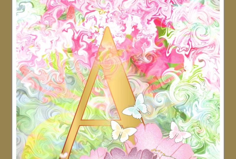
consolidated all into one class. And I looked at a ton
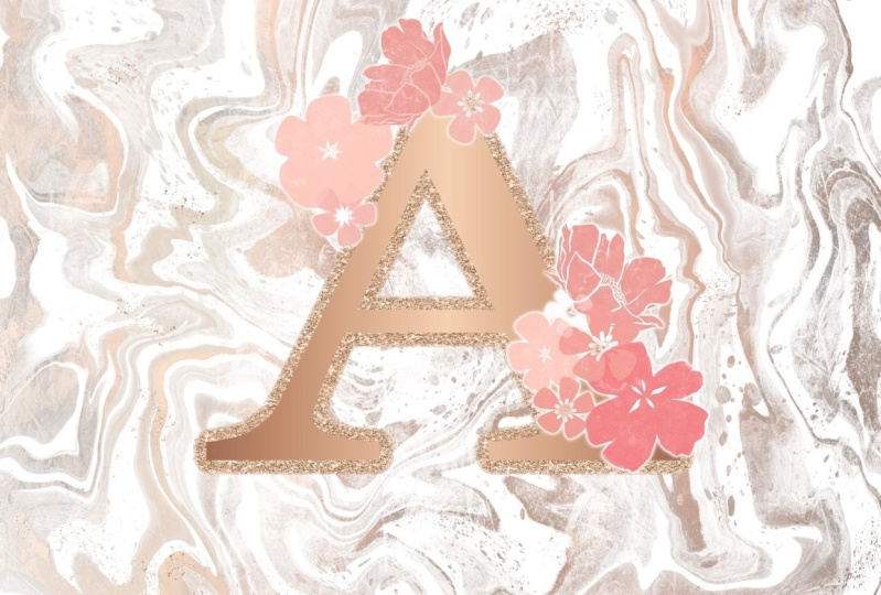
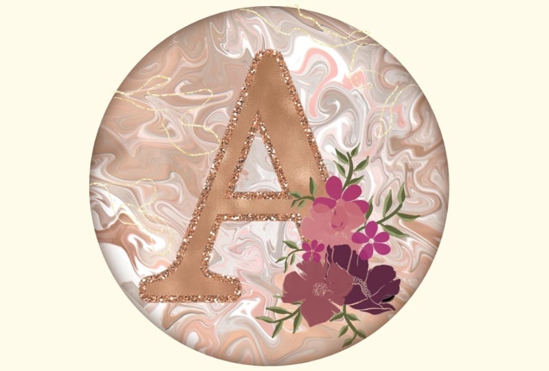
of different reference. This is one of the
ones that really stood out to me and I don't
know about you, but I really love this particular color
scheme is kind of a rose, gold, or pink width goals. So this was me looking on
Pinterest and then I went to a general Google search. It came up with some
different ideas. So that's, I think
one of the things that we could experiment
with working on. I don't have any rose gold
textures available to me, but I've got a bunch of goals, so I think we can
work with what I've got and create this
rose gold color. There are a lot of things
that are really eye-catching. And I think that this is
one of the things that could be a moneymaker for you if you're into print
on demand or you're creating assets for
Creative Market. I've noticed a lot of
them on Creative Market. Take a look through some
of these and you'll find that monograms are
definitely popular here. So this kind of
thing that you could consider creating and selling. I really loved these. I think these are so studying. I'm not gonna be quite as
elaborate as what you see here. But this is the direction that I'm thinking
of going with it. That one is really,
really gorgeous. So I just wanted to give you
a quick sort of overview and talk to you a
little bit about how I am inspired at times, It's different when
you're looking for ideas for classes
obviously then if you're looking for
something that let's say a customer wants and you're
trying to get ideas. I just wanted to point that out. Show you a few examples. I'm gonna be showing you a
bunch of different steps. We're going to be
creating some marble, then we're going to be
creating the monogram itself. I want incorporate gold, foil, maybe something
like this rose gold. We're gonna do
some of the things that we've done
in other classes, but they're kind of all
in different classes. In this class I think
we can combine, come up with some really
nice looks that you're likely able to alter. Or you could use it as a
stepping stone or jumping off block just to get started
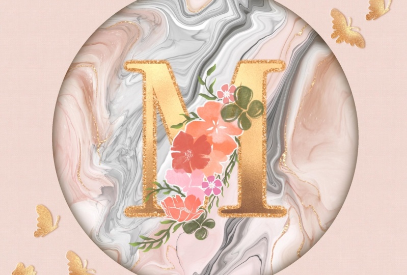
on this project yourself. I thought I'd also show you the construction of the layers that I've created here to end up with this
finished product. So really the basis
of it is the marble. We'll do that first, then the application of
a Clipping Mask, and that's on a
duplicate of the layer. So we get some kind
of metallic gold, metallic rose gold
added to our marble. Then we do the
lettering and create kind of outline on
it which is glitter. And then the letter itself
with the brushed gold. Then I thought it'd
be kinda cool to enclose all that into
a circular shape. It looks simple. I guess. We add a course,
some flowers here. I'm going to give you some
of these flowers here. These are a set that I've created and I don't even think
I have this set for sale, but I do have a bunch of these
flowers that I will give you and painting some
of these leaves here, we can add a little bit of color and texture to the leaves. I did a quick version of
it here just to practice. And now we're really
ready to get started. So I will meet you
in lesson two, where we're going to get
going on that marble.
3. Lesson 2 Creating the Marble Background: Hi guys, welcome to lesson two. Lesson two here we're gonna be creating the marble background. I'm gonna be showing you the
use of the Liquify tool. And we're going to go through
all the steps to produce a beautiful backdrop
for our monogram. Get started. We will refer back to this document I'm sure
a couple of times, but I want to start fresh soap. I'm going to go into my gallery, would add a document up here
with a plus sign and go to my 12 by each at 300
pixels per inch. And the first thing I want
to do is create that marble. So I'm gonna go in with some of those watercolor brushes that I gave you in recent classes. And I'm gonna go with a mid-tone gray and I'm gonna make
my brush nice and big. There's really no way
you can do this wrong. You're scribbling on
some different tones of black and white. That's literally all
you're doing here. So you could try
with a couple of different brushes and
different thicknesses. Never gonna look like
this. So don't worry. What we're gonna do
here is we're going to end up verbalizing this. So we'll be using the liquefy. I think I'll try a little
bit of rows in there. And so I've got some really
opaque brushes and I've got some kind of
in-between tones here, and I think this is adequate
for creating our marble. I've left this middle
area a bit blank. We may end up feeling that
when we're doing the marbling, anyhow it now I've
got that ready to go. I'm gonna go into my adjustments here and
go down to liquefy. I've got my Porsche
set at about 60, 6528% percent distortion,
momentum 70%. Not that it matters, but if
you have momentum set here, you can do things like this. While that's fun. I don't
use it that off and I'm gonna do a combination
of whirling and pushing. So let's twirl a little bit here and there
with the twirl, I've got that a set of the
same basic size of 60% or so. You can go and just twirl
a few of those around. And then let's take the push. And what we're gonna do
here is we're going to really start
creating our marble. This one's going to look
a bit different than the one that I did create. One thing I added
on the other one that I really liked
though was the spatter. So I'm going to add a
little bit of spatter here before I do too much more. Let's go back to
the Liquify here. What I'm doing is
just kinda moving it around until I get a
marble that I like. A lot of times, you just go for it and
at some point you feel satisfied and that's
where you end up kind of leaving this
inside middle bit, a little bit lighter and with a little bit less
detail that can be behind the letter anyhow. And I just want it a
bit lighter there. I did notice that in
fact all my other one, I had to do a little bit
of erasing in the middle to really make it look
the way I wanted it to. But once you feel
satisfied with it, you're going to just stop. So I'm gonna say that I am most dissatisfied
with this here. Purposely left some
nice dark areas here. And you'll see why
in a few minutes. You can reduce the size
of your push to if you want to just go in and
do small sections. So I find that that
can make it look quite interesting as well. People back a little bit bigger. And the alloca, I think that'll be perfect for what we're doing. Now what I do here is I
duplicate this layer. I want to keep one that
is basically untouched, but the other one I
want to use to add some metallic to this
in a couple of minutes. But what I want to do first is I'm gonna hide that
underneath layer. And then on this
layer here I want to actually lose some
of the details. So we're gonna go
into curves here. I'm brightening it a lot, trying to get rid of 70
or 80% of the details. So we're left with
just these areas here. These are the areas
that are going to end up being our metallic. So in comparison to this, you can see that that's
going to just be on some areas of the
marble, Not everywhere. And in fact, I'm gonna go
in and erase a little bit. I've got, I'm going to
take a soft airbrush, soft brush and get
it nice and large. And I'm even going
to further reduce, especially in the middle here, further reducing the amount of what will end up being
gold in our final layout. So now we can turn on that
layer again because I think we need that
layer there in order to feel like we've got
some control over where our goal will be and we may be doing some additional erasing. Here we're going to import file. I've got a bunch
of metallics here. Some of these are purchased
so I can't give them to you, but some of these
I've made myself, I'm going to try the next
one, this flat gold. First of all, I'm going
to set this to free form. This one I liked
because it's got lots of areas of light and dark. Let's just fill up
the whole screen even though really at the edges, we don't really need it if
we're gonna do that vignettes. But what we want to do here
is set it as a clipping mask. See how much of the gold
has applied to that layer. That's a lot we might want
to take some of that away. I would just continue go back to that layer there and
continue with erasing. So you might want
to erase out so that you've got a
little bit more of your initial marble layers showing this is probably
going to end up quite a bit different
than my original, just because I want to kind of experiment as I'm doing this. I do quite like that, but I want to change this gold
to be a little bit rosier. So go to the gold layer itself, go to hue and saturation. And you're gonna pull just
a little bit to the left and not too much because
that's a bit too much. It rose gold tends to be
a little bit desaturated, so you have to add a little
bit of brightness to it. And probably be adjusting this to certain
extent once we get our other elements in here because we want all the
goals to work together. So I'm going to leave
it at about 4644. Maybe. I liked that
some of these areas are like better than others like
this is quite nice here. Maybe that big blob there
isn't going to work. And one of the things
we can do here, we can actually select
both of these layers, which is something I did
not know for a long time. And I'm gonna go
to liquefy again, reduce the size of my push. You can see here that I am actually affecting
both of the layers. So that's pretty cool. And I, you know how
sometimes you just have that light bulb moment
and you're like, Oh, I wish I had known
that before because there's so many times
I've gone to do this and I eliminated layer and duplicate another one
just to get what I want. And this is just so
much easier when you realize that
you can do this. So I think that works
for me for now. What we'll do is mess
around with this further as we progress through the class because it's gonna
be adjustments, I think. But for now we're just
going to leave it at that. I'm going to actually select
all three and group them. If you'd like,
labeling your groups, go into the Rename
and call it marble. I know that I rarely
name my layers. I don't know why. I'm just a
little bit lazy in that way, but I know it's very
helpful if you do. I find that my habits in Procreate or a
little bit different than they are in Photoshop. In Photoshop, I would always
label just meticulously, but I haven't been quite
as energetic in Procreate. But nonetheless, we've
got the first part of our project done. And I will meet you in the next lesson
where we're going to start working
on our lettering. See you there.
4. Lesson 3 Setting Up the Lettering: Hi guys, welcome
to lesson three. Lots of three here
we're gonna be doing the setup
for our lettering. I've got a few tricks
up my sleeves, so let's get into it. Next task here is to
add the lettering. So we're gonna go to
the Actions menu. I'm gonna go to Add Text. Now, fair if that
happens to you where you accidentally
dropped the text before you have a chance
to do the editing, just go into the
Layers palette and click edit text and then
you're back to a square one. So I'm going to select it
by double-clicking on it. And I will go to i keyboard. I'll do the letter a again. And I want to get a better
and nicer looking font. And I think that a serif
style will be more appealing. There's several of them
built right in here. Georgia is one of them. The one I used on the
other one was Bodoni. But only 72. That one's quite nice. Baskerville can work. Depending on what
fonts you do have. Unthinking, I'm going to
settle with the Bodoni again. And here you can resize it. You will be able to move
it around and resize it later if necessary.
Got it fairly nice. Enlarge. Just kinda
center it if you want to be sure you're
a 100% centered but you're snapping
and magnetics on. And then when you see
those two gold lines, you know that you've
got it centered. You were to take a little bit
on this particular project isn't going to be a problem
because we're gonna be adding other elements
and things that may actually have us moving it
slightly one way or the other. So the first thing I
want to do here is to think I'm gonna go
a little bit bigger. So I'm going to put
it edit text again. For a little bit larger, you can shift the
baseline like this for positioning next year. I think that might be too big because I do want to put
that in the circle after. What I would like to
do here now is to create what will end
up being our outline. So I've showed you
quite a few times how to create an outline
around something. I'm going to duplicate it here. And then the layer
that's underneath, I'm going to end up
putting a blur on it, but I want you to be able
to see what I'm doing here. So I need to make that
letter bold already. We can either grab
that same goal that we used here or we
can get another one. So lets just grab a
different one here. I'm going to grab
this in bold here. This one's got a brushed
finish, which is nice. I'm gonna rotate it.
And I'm going to use my free form transformation
tool just so that we can get, I want to get some light
and dark going on here. And I have, so now I'm going to make that
into a clipping mask. And now our letter
is really pretty in its brushed gold
kind of a look. We can go in here and again, adjust ever so slightly to the left to get a
rosier kind of a color. And you can see that other black peaky through a little bit
on the edges there. I'm going to make it
a little bit more obvious by applying
the Gaussian blur. And we're just going to blur it probably six or seven.
I'm gonna go with seven. And then I'm gonna duplicate
this numerous times. Now I've showed you two
or three different ways of getting a harder line. This is another method that
I have sometimes used. I'm going to make a bunch
of duplicates here. I find that seven or
eight works well. I'm going to pinch all
of them together here. Then what I'm gonna
do is select it. So I'm going to go into the
layer, select, then fill. And you can see as
I'm doing that, it's getting wider, which is good because
we're going to put glitter on there and I want
that to really show. So select Fill and then I'm gonna select
it one last time here. And then I'm going to
go too hard airbrush. And I'm just going to brush
that a little bit too. And that also works to harden
that edge up a little bit. Now that we've got that, we want to put glitter on it. So again, we go back to insert a file and we're going to go to, I'll take my extra
large glitter. It's going to fit the space anyways and then
I can reduce it, rotate it if I might. A quicker way of rotating
is to just hit that 45-degree a couple of times. And I'm going to turn that
snapping and stuff off. Free forums that
I can enlarge it. And then here we're going
to apply the clipping mask. And now we've got a really
pretty gold edge there. I'm thinking that
maybe I'm going a little bit too
orangey with this, but I guess we can make
those adjustments later. I'm going to go
in and do it now. Yes. Sometimes I just like
doing things as I go along. So I think I went a
little bit too far. So I'm gonna go a little
bit like 52% here. And I'm going to
desaturate it a bit. I'm going to brighten it a
little bit. So who knows? I might end up changing
the lettering anyways, like the color of
the overlay here. But I'm taking you
through all this stuff sort of step-by-step as I
did it in the first place. There's always that
possibility of changing things in
the end if we want. Alright, so we've got
the background done, we've got the lettering,
somewhat done. I think in the next
lesson what we'll do is start adding some of the flowers and things that really kinda spruce it up
and bring it up a level. I will meet you in that lesson where we're gonna get
started with that.
5. Lesson 4 Adding the Flowers: Hi guys, welcome to lesson four. Less than four here we really try to pretty obvious lettering. I'm gonna be adding a bunch of watercolor flowers
and I'm going to explain all of the
techniques that I use. Let's get started. Before I start on actually placing
the flowers here, I want to neutralize my
background a little bit or just make it a
little bit more subtle. I'm going to go and just see if I can do it with
opacity and yeah, that's gonna be a lot better. I think my letter will
then stand out a lot more. So I'm reducing
the opacity on it and I like how that looks
a little bit better. One of the things
that you can do as well when it comes to
something like this. Once we've got our
vignettes and we've got our flowers and
everything on there. We can take it and move the entire marble
around until we find a position that we like. For now, I'm leaving it
at this, but just saying, the other thing we can do
is we could go in and add some additional
air brush texture in and around this
at some point. And in that way, what we
would do is just take a texture that we have
and spray it in here. And then we could add a little bit of detail
or a little bit of color in areas that it looked like they're
missing colors. So that's a step that we
can take in a minute. Right now though I want to
start working on the flowers. So I think I'm going to take all of this lettering
here and I'm going to group it and rename this
group to put lettering on it so that we recognize it and can move around our
document a little bit easier. I see that I've got a
little bit of glitter missing on that
lower corner there. I'm gonna move or enlarge
that just a teeny bit. The scale of the
glitter is quite large. So that's something to keep in mind that if you
didn't like that, you could take the glitter, Let's duplicate
it, merge it down, and then we could take that
and reduce it as well. So that might be kind
of a finer glitter. So that's something
to think about. Make sure your reapply
it as a clipping mask. And I do like that a
little bit better. So I'm going to leave it and let's start adding the flowers so we can do a new layer here. And the flowers that I've set
aside here are these here. I started with just kind of
placing a big one and then I worked my other flowers and petals and
things around there. I'm sure I'm not
going to be able to duplicate exactly what I had. Now the palette that
I was using was this one that I had used
in a previous class. I wanted to use these deep, an orangey kind of colors here. So they're kind of pinkish. Like Rosie, Rosie read,
that makes sense. And these flowers,
you can stamp them on there quite transparent because of the way that they were made, but that's okay because we can duplicate them and
build them up. Now that wasn't the one that I had used as my main flowers. So I'm going to pinch
those together. I'm still going to
keep it and use it. And I'm going to make
this as a smaller one. And I think I'm going to go
a little bit rosy or so. I'm gonna go and saturated. And then just kind of make it rosier and then grab this one. I want to make sure to give you whatever I've used in
class here so that you can work on this yourself and achieve the results
that I'm showing you. But there are some
absolutely gorgeous sets of watercolor flowers
available that you can buy. I bought some in the
past and they can be really worth it when you're
doing something like this, just to have them available. So I think I missed one of
the flowers that I had, but let's put this one in, again, a new layer that will allow me to do things like this. And also to move
them around as I'm trying to position them in mind how you have the order here, because that can also make a difference with how
it looks overall. I'm gonna go back
to that brush set though and maybe
grab a couple more. I'm not sure exactly which
ones I'm gonna be giving you, but you'll have a
few to choose from. So I think this was the
one that I had used. I have two versions of that. I've got one that has no
texture at all or very little, just a little bit of
fading on the edges. And then I have one that
has a lot of texture on it. So that's in the grain here. And when you get this, you can play around with it. If you wanted to have a little bit more watercolor texture, you might want to put that
at a lower percentage. So I'm gonna take that one right now before I
forget and put it into this Class Resources
folder or brushed step, and I'm going to slightly
change my color here. Add a new layer, will
stamp not one in. I'm gonna go even a
little bit darker and maybe even a
tiny bit rows here. So I'm moving the hue slider here over a little
bit just to get a little bit more of a rosy red. So that's kind of
working on getting some nice variety here. And this is also completely your own personal taste
as you are putting this together and you're
probably going to do it completely
differently than I am. I would like to add another one, maybe this one here, and we're going to go a
lot smaller and new layer. Maybe I'll go this time. That one's got a little
bit of texture to it to show up better right there. I'm going to duplicate this
one here and try it down here because it's got some
transparency in it there. But I'm trying to kind
of create a little bit of shape that's dropping
down from that corner. I'm going to add some leaves to really enhance that as well. Now I've got other,
I've got tons of flower brushes because I am addicted to creating
these brush sets. I've got 14 to them now, but I'm gonna go into this
set here because I've got some cute ones that
would work quite nicely as fillers as well. So I was thinking this one
here because that one can go real small and still
look really good. So let's add a new layer. And I'm going to
maybe put two or three of those in as
you're doing this, it's a pain in the butt
to go and do new layers, but you won't ever regret it. And I can tell you that right
now because it's really something that you might want to change a lot along the way. So the more that they are on separate layers is the easier
they are to work with. Experiment to once you've
got them laid out like this, flip them and see
how that looks. I like it the way it is,
so I'm gonna leave it, but we've got a really good
grouping of flowers here. And I think in the next
lesson what we'll do is start adding some of
the stems and leaves. And I've got some
special brushes that I've added to the SAT. Will be working with
these two brushes here in the next lesson. Alright. I will see you there.
6. Lesson 5 Setting Up the Vine and Leaf Embellishments: Hi guys, welcome to lesson five. In lesson five here we're gonna be talking
a little bit more about adding golden
foil accents. We're gonna be doing that
with the brushes and with some of the assets
that I've provided. Let's get started. So it's really starting
to come together. And I think that now if we start adding the
leaves and such, It's going to really add to the overall detail here and
the overall pretty nice. Let's just say I'm going
to go to that layer here, add a layer, I'm going
to drag it underneath. I'd like to keep
it in that group because it's gonna be
part of the florals. I'm also going to do
something different here. I'm going to take all of these. I'm going to, I'm going to
group them within the group. I have a second
group, that group, I'm going to duplicate
the bottom one. I'm going to flatten that one we're just
going to use to create a mask afterwards
that will mask out if we have anything that
shows through the flowers. So I'm just going to
hide that for now, but I'm gonna go back to
that stems layer there. And let's start adding some sort of lines going through there. I'm gonna pick this
green here. I like that. It's kind of a
dulled down green. And this one is an opaque brush. It's up to you what
you want to use. You could also into
a watercolor brush. I'll actually put some
of these in there. These are the ones that were
in one of my other classes. I usually duplicate and
then take those duplicates and drag them in there so
the sets remain complete. So you could take
watercolor brush. This is the one that we were
using there and you can see it's got some variability. It's got a little bit
of light and dark and some texture and a kind of a rough edge to make it
look like watercolor. And yeah, let's just
kinda go for it. I'm going to make it thinner. So this is gonna be about
the thickness of my stem. And I'm going to start up here. I'm going to add
some leaves there. I want some definitely want some leaves peeking out in here. I want to fill that
area a little bit and I want some to
kind of come down and out of that grouping and
then maybe a few over here. Now how did I switch
out of that green? So the one thing is with this, you can see through
these flowers because they're watercolors, so they tend to be a little
bit transparent looking. So I wanted to have that
mask of air that I can use afterwards to block out some of that
that's going on there. But now we can start
doing our leaves. And I showed you in another
class how to do leaves and we can stay with
that brush if we want. So the trick with this one is to start really light and then
press harder to get the leaf. So depending on the
kind of leaf you want, you might want a
short and fat leaf, you might want a long
and skinny leaf. And it's all about
that pressure. So really light pressure to get the point and then heavy
pressure to make it thick. And then you end up with
a leaf shaped like that. So I'm gonna go smaller
and we'll think about the thickness of
the fattest part of the leaf because that's what
you want that to be set at. And then I'm just going to
start drawing in my leaves. So light pressure heavy
pressure, light pressure heavy. So in cases like that, It's stuck it right to the vine, but you might want
to have a little bit of extra stem there so you can start and then end with a really light pressure to
get that automatic stem. And don't worry that
it's going in behind the flowers and
that you can see it because we're gonna deal
with that in a minute. I mean, I've done my
stems a little bit heavy, but I think I'm gonna
leave them for now though here I'd do something like this. Now that it's thick there, I'm gonna have to kinda
work with it that way. You kind of start to
get the feel of it after you used a little bit. So this is something
you could do and practice a little bit before you start actually doing the leaves. You could have a separate
document for a separate layer. And I'm just going through and just kind of filling it out here nicely and add a bit
of greenery in here. And don't hesitate to
do things like this where you're curling
the leaf around the stem because
I think that can also be a way to make
it look more realistic. You don't want all the leaves to go in the same direction, but you also want to
keep it looking pretty. So you're, you're the one
who's gonna be judging that what in your mind
makes these leaves pretty. I like the sort of
winding nature of them. I love vines. I have always just adored winds, have had wines on my old house. I had binds everywhere. I had a beautiful gazebo. What The fact that
was covered in vines, my daughter now has that. My husband hates spines. Why? I don't know, but he's just got to hate on for these vines that
are so gorgeous. I'm gonna sneak a few in. Hopefully he doesn't notice. Okay, so now what I'm
gonna do here is I'm going to use that mask
of that I created. And there's a couple of
different ways you could do it. You could either take that
one and select it and then fill it with a solid color. So I could be just
filling it with white. That covers those other leaves. Because that was a little bit transparent in this flower here. It didn't cover that. Well, I think I
will do it again. I'll duplicate a couple of times and pinch these
three together, select it, and then go back
here and fill it again. And so that's done a
nice job of filling and it's kinda cool
because it's given a little tiny bit of
a white edge there. So that's something I
mean, if you hate it, take it off but I don't mind it, so I'm gonna leave it there. I think we've done a
beautiful job here already of creating
that interests. The good thing about
it too is that it's all in one layer here. Let's label this. For once. I'm actually labeling myself, so I want to be consistent. Call it flowers, not flyers, because it's in its own folder. We can then move
it independently. And that's kinda nice. So I think the other thing
I wanted to maybe do is light and some of
those leaves or asked a little bit of extra
color to the leaves. So let's go to that layer. Let's add a clipping mask. I'm going to grab this was
the green that I was using, so I'm gonna go just
a little bit lighter and let's zoom in
a little bit here. I thought that brush
really big right now. So I can go in and kinda overall ad or I can
just make it smaller. And let's say split a leaf so that its half-life
and half dark. So you can see that works
really nicely for that. And we can also do that and go a little bit darker
in some areas. So let's say in an
area like this, we could brush a little
bit of shadow in there. I'm gonna go real bright, reduce the transparency
a little bit, and then have some nice
highlights on there. So we're, well on our way here. We don't have too
much left to do here. So in the next lesson, we'll take a look at
anything else we can do to enhance are
pretty monogram. Alright, so I will see
you in the next lesson.
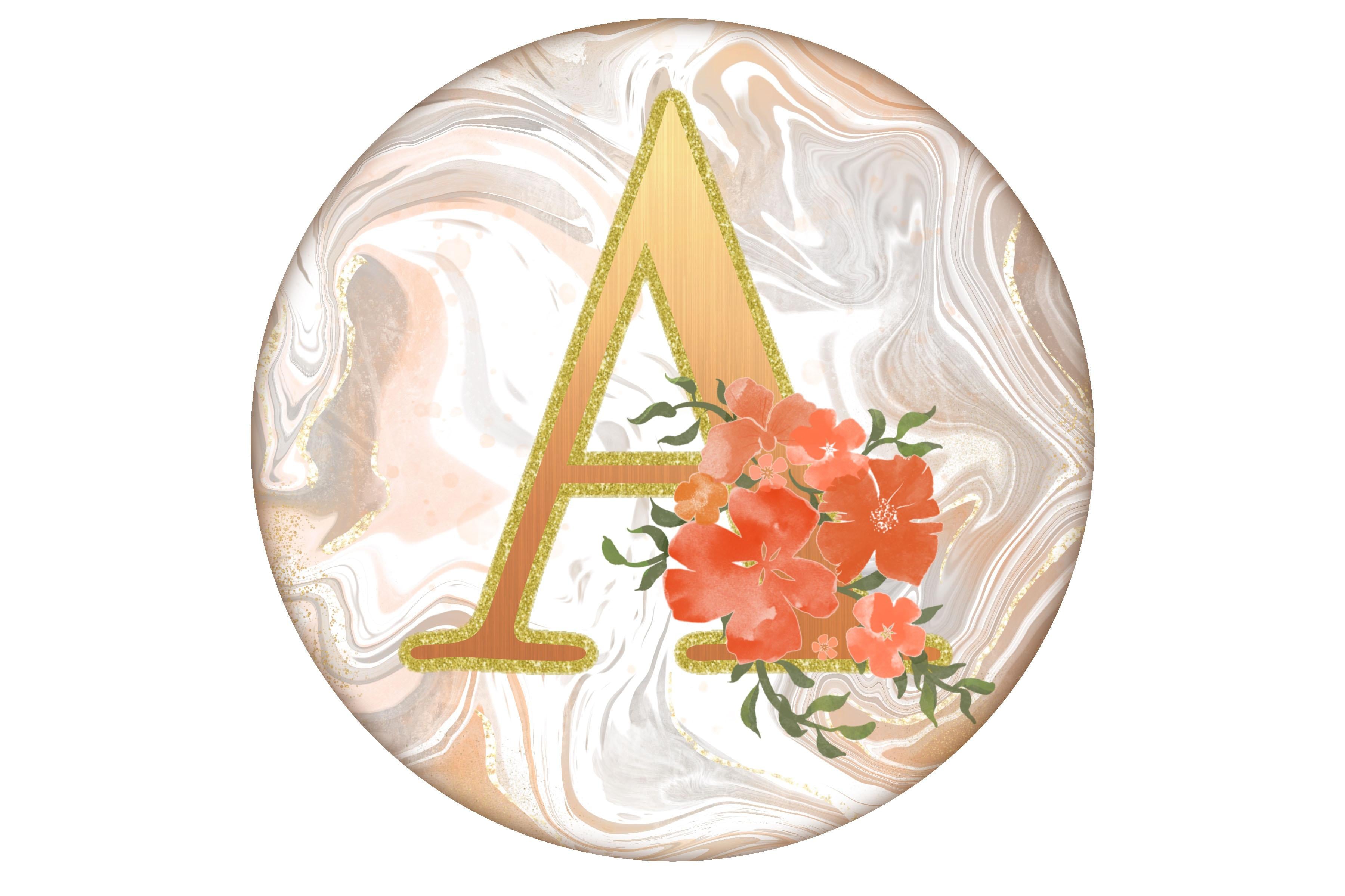
7. Lesson 6 Finalizing Background with Foil Details: Hi guys, welcome to lesson six. Less than six here we're gonna be finalizing the background. Let's get into it. I think at this
point we can create the vignettes that I did in the other example
that I showed you. I want to create a circle here. So you could do that in a
couple of different ways. One of them is to use your circular or
elliptical selection tool. I'm actually gonna
do it with a brush. So I've got my Posca paint
markers selected there. That's just a monoline brush. Draw yourself a circle, make sure it overlaps. Once the shape is created, you can go to Edit Shape and make sure that it's
a perfect circle. And then put on your
snapping and magnetics. And you'll be able
to center that on your layout if that's important
for what you're doing. We've got that circle. What we're going to use it
for is simply selecting, so we're not going to end
up needing to keep it, but I'm going to use
it for selection. So I'm gonna use an automatic
selection to do that. And I'm actually selecting
this outside area here. I'm going to add a layer
and then that layer, I'm going to fill it with white. And this is somebody
you could fill this in whatever color that you want. You know, what kind
of liked that line. I don't know if
I'll use it or not, so I'm going to turn
it off for now. There's something
to be said about that really crisp white
border or vignettes. I find that that really makes whatever you've
created stand out. So let's go back to
our lettering and our flowers and work
on the positioning. I knew that this was probably
going to be necessary. I'm going to enlarge
it a little bit. And I'm sure that's a
little bit off center, but it's balanced just because of the flowers
that are there. So that creates a
really pretty layout. I'm actually really
happy with this one. And I want to just do a
couple of things here to make this even more interesting. Let's duplicate this folder, the one that's underneath,
and select it. We're gonna choose block here, or we can do a very dark kind of a brownish color and then go back to the layer
here and fill it. You can see here on the layers palette that
it's the darker brown. Then we're gonna take and
use the Gaussian Blur, Gaussian Blur and create
a drop shadow there. And I love that, that gives it so much depth
than just so crisp and clean. I think that that's something that you could definitely
consider doing. I mean, there's nothing
wrong with the square one, but there's something
about this. If I was doing monograms are creating stickers
or something, I think this would be
a beautiful finish, so I like that marble. Now I was thinking
at first that I wouldn't be doing
some changes on it. I do want to show you I might undo what I've done
and go back to this, but I want to show you some of the things
that you can do here. It a little bit
more interesting. So I'm going to select
the layer and then I'm gonna go in and grab
one of my textures. Let me duplicate this one and put it in your
set right now. I don't know where
that went ended up. You've got to make sure
that your brush set opens up and then drop it in. I'm gonna grab that
one and I'm going to add just a little bit
of that in there. I think that's added a
little bit of interest. It's probably really hard
for you to see it there, but I think that's
really pretty. And I want to also Brianne or air brush in
a little bit of texture. So I'm gonna go into
my texture set here and you can decide on what
kind of a texture you like. I'm gonna duplicate
randomly this brush here, and this is a brushed texture. I'm gonna put that
in your set here. That's the one I'm going to use, but you can also go in and just simply go into
the green here, Edit, Import, go into
your source library and you could change it to any number of backgrounds
or textures here. This one actually might be nice, so let's go to that one. With this one, you
could just brush in some white in areas that
you might want to lighten. So in this case, I'm actually going to
use it as an eraser. I'm gonna grab the eraser tool here and then go into the SAT and grab that brush I just created and make it a
little bit smaller. And I could use it
too, do some erasing, and I could do that on
both of the layers just to lighten up and add textures. So I'm not sure if
you can see that, but see what it's doing in here. And it's just a way
to make those darker, bold areas kind of stand out. So let's giving some
white in that area. I think it's lovely. I don't think I'm
going to actually change it anymore than that. But one of the things
I do want to do is add a little bit of gold foil. I'm going to go into
my blink brushes here. I'm going to duplicate this. Let me grab this one, this one, and this one
actually duplicate first. So this is the one
I'll give you. I'm going to grab
all three of those, throw them into your sit here. And now you've got
what you need to do, a nice kind of a foil accent. The color you're going to
want is kind of a gold, muddy, kind of a gold color. You can go a little bit more
to the pink side there. But what I do with this is I usually take it and just draw, I'm going to add a layer. And I just draw along a darker area there
just to give some foil. So can you see that how
it's adding just a, It's sort of a foil, really glittery gold line there. And this one is
pressure sensitive. So when you want
to ease up on it, you just let go of your pressure and it'll
go nice and thin. And you can go through and just add a little bit of
that here and there. You can go bigger if
it's not big enough, you can go into the properties here and just increase
a little bit here. And we've added some really
pretty and subtle foil there. The other two are also oily. So if you want to
paint on some glitter, you can do that with
the startups brush and then the spray paint is just a really fine mist of
gold that you can apply. I don't put too much of that. It tend to be a little bit
reserved when adding that, but overall, it's added some
beautiful detail in there. That's what I do
for the background. And I think that we've produced a really pretty monogram here. I hope you like it
and I hope that your ideas are a
little bit different and yet come out as
beautifully as this. So I think that's pretty
much it and I'm gonna meet you in the last lesson. I'm gonna show you
this on a mock-up. And yeah, we'll do a wrap-up
and cloth over his class. I'll see you there.
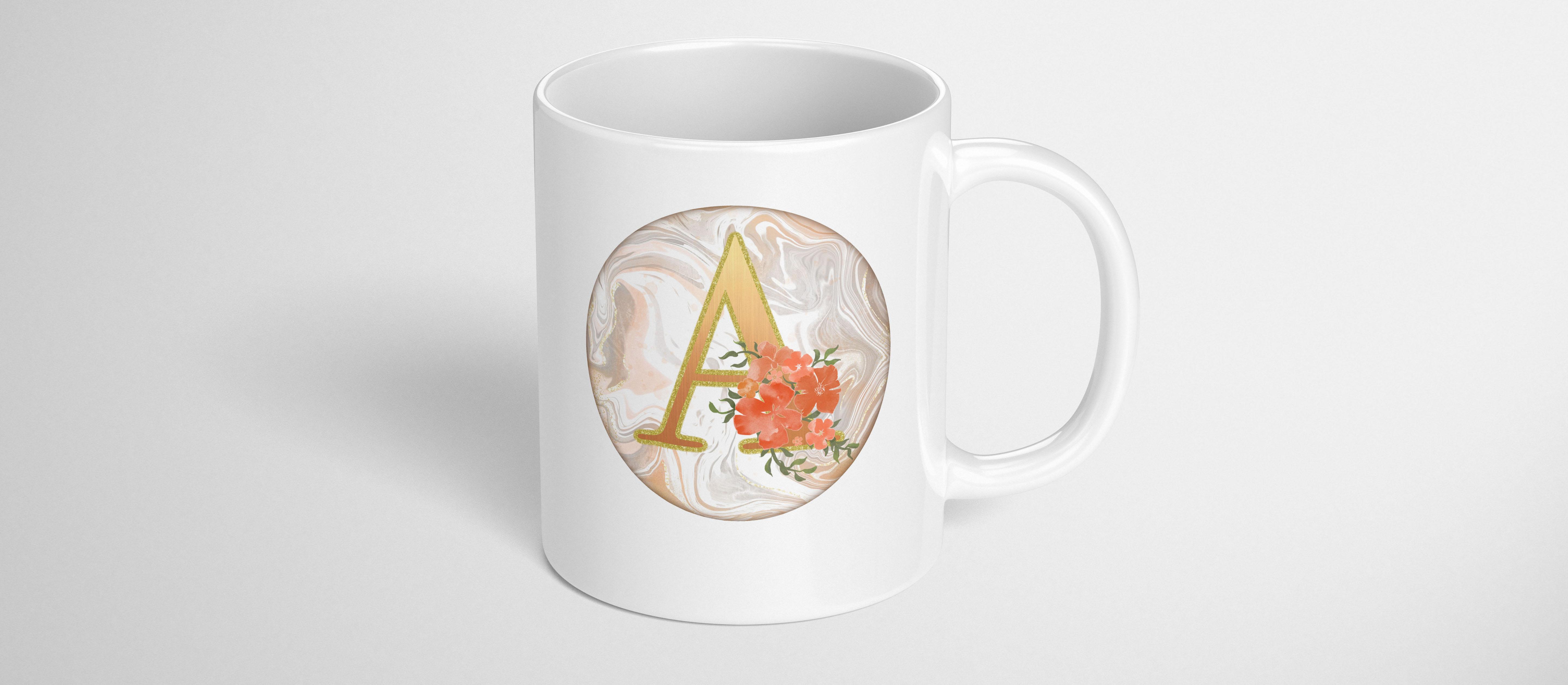
8. Lesson 7 Closing Thoughts and Mock Ups: I promised you a
quick class today, and that's exactly what I've
delivered in this lesson. We're gonna just do
the final wrap up. I'm gonna be showing
you some mockups. Thanks so much guys for hanging out and finishing this
project with me today. I hope you're happy
with the results. I'm sure they're
gonna be really, really pretty and
I can't wait to see your examples posted here. Please share because I love seeing how everybody interprets my assignments and pulls off
a really gorgeous design. It really makes my day. Now if you're new
and you haven't been in my classes before, make sure you hit that
follow button up there that where you're
gonna be informed of anything that I post. And of course, you'll be the first to hear about my classes. I tried to post once a week. So make sure that
you're following. Also a reminder for you to go to my website and I named
my mailing list. That's where I send out any free products or any fun new things that
I've got going on. I promise there
won't be too much. I also want to remind you
about my two Pinterest sites, the lowest art dealers and aspirin and teacher
Dolores and aspirin. You'll find plenty of resources there for projects such as this. I especially love
the art inspirations for it that I have there. Definitely go and check it out. The other board that
might be relevant for you today is the
lettering board. So check it out. And I
think this one called type, type design or
something like that. So take a look at that as well. I hope to see you soon
in my other classes. It's always a pleasure
to be in class with you. I love the projects that
we create together. Please don't hesitate
to post here. It's a great way to get
feedback on your projects. I guess I have nothing
else they add today, so I'll be saying bye for
now to keep the class short. You soon.
 Delores Naskrent, Creative Explorer