Transcripts
1. Intro to Create a Travel Postcard in Procreate: Hi guys and welcome. My name is Dolores masker. I'm coming to you from
sunny Florida this week. The project I'm bringing you was really inspired by this state. I have been buying
postcards to send, to buy a little grandchildren
and my older relatives. One of the postcards I ended up buying was my inspiration
for this class. It's a really cool
lettering project that I think you're
going to enjoy. What I did is I created a
travel postcard in procreate. From start to finish. We're gonna go through
that process together. In this class,
you've got to really learn how to use clipping masks. And I'm gonna show you a variety
of techniques that helps me produce something like
this quickly and easily. By the other class, you'll have a really cool travel postcard. And if you don't want to
do a travel postcard, you can do lettering that
says absolutely anything. A single word is best. But when we get
into the project, you're going to see what kind of parameters you can work with. I hope you'll join
me in my class here and learn a bunch of different techniques
and all kinds of different methods
that you may or may not have used before. Now if you haven't
done so already, make sure you hit that
follow button up there. That way you'll be informed if my classes as they're
released them, as well as anything else that I sent out and I don't
send out too much. I also want to invite you
to check out my website. The Laura start dot ca on it. I have a bunch of
artists resources and even some freebies. So check it out, it
yourself added to that mailing list and get
some of those free products. Are you ready to get started? All right, let's get into it.
2. Setting Up the Document 1: Hi guys, welcome to lesson one. We're gonna start with
the basic steps here. I'm gonna show you how to
import a font and any of the other basic setup
that we need to do to get started
on this project. All right, so today's
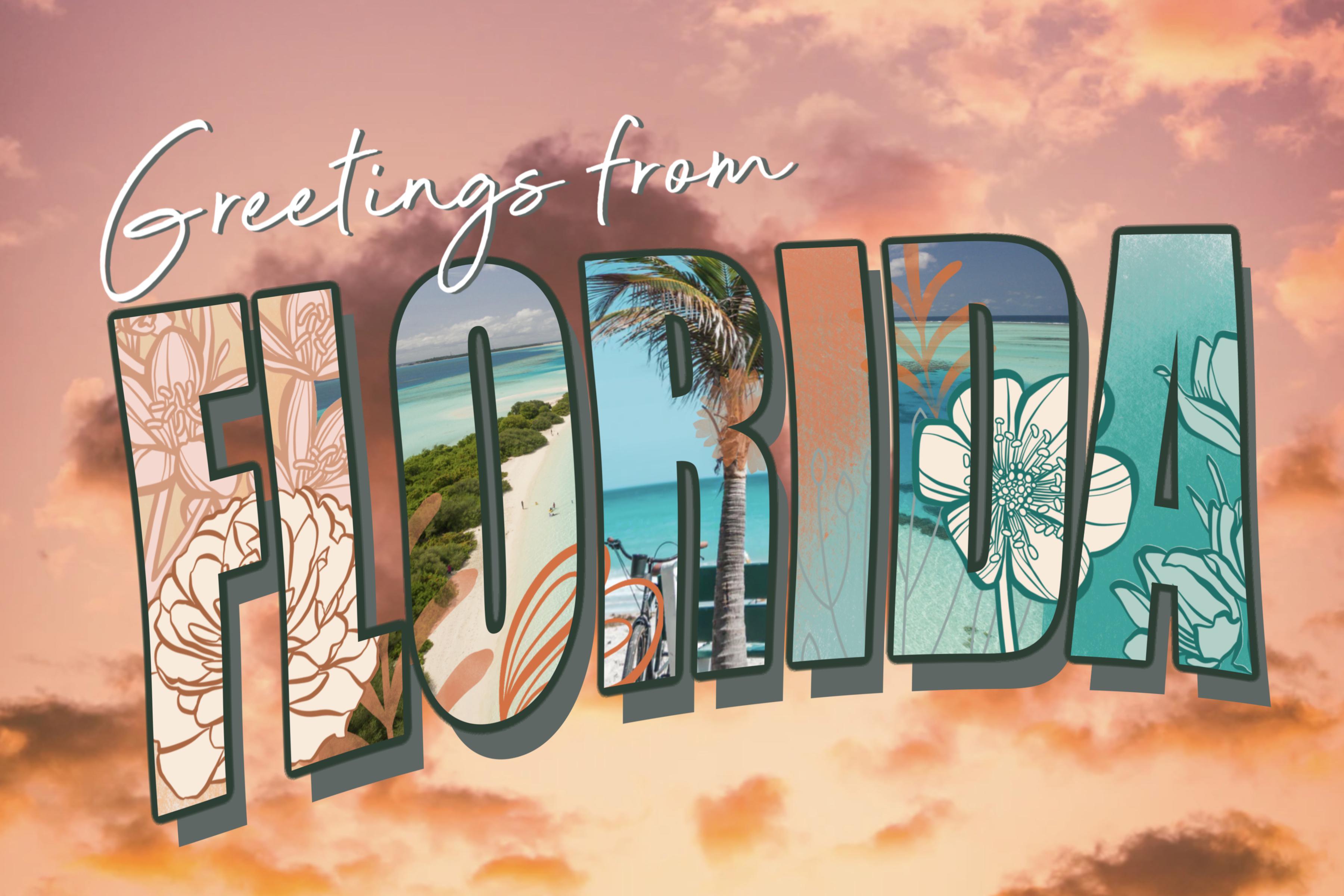
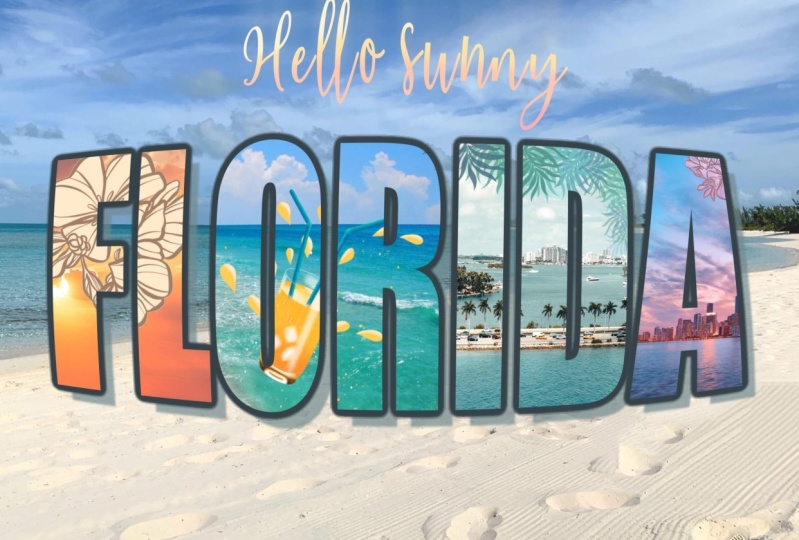
project is going to be to produce this lovely
travel postcard. And I got the idea from
this postcard here. I've been mailing out postcards every other
day for my family, for my grandchildren, and of course some of
my older relatives. So snail mail is still a thing. So I wanted to
create this postcard because I thought when
I looked at this one, How many skills there
are involved and how we could transfer those
into knowledge for you. So here's the example of
the one that I did create, and I'm gonna go through it
step-by-step so that you can learn all the skills that are necessary to
put this together. It's not super hard,
but what it does is it teaches you
about clipping masks, teaches you how to
create this kind of thick outline
on the laddering, a drop shadow and importing photos or whatever else you want to include
in your artwork. And just the whole
topography interface. I'm going to show you all
the different things that go together to make this
particular postcard we're going to
start from scratch. I'm going to get out
of this document here. And what I've created is a document that's 12
inches by eight inches, and it's 300 pixels per inch. That's probably
doubled the size it needs to be for the
actual postcard. If you were to be
making these up, for example, if you're a
maker and you do craft shows, I used to do
postcards like this, or my city or whatever
city I was going to be in for the particular
show I was in, or I would create
them for occasions. So I still have a huge
pile of them at home, lots of Christmas
ones, for example. Learning these skills is
pretty helpful for you, especially if you are into POD. That's print on-demand. And if you're doing
creating, like I said, for craft shows
are like alright, so first step that I
did when I decided to do this postcard was
to import some texts. Are some import, some
nice tight in order to import a really nice font
that would work for you. Of course, you could buy a font. You can see I was just
opening here and important, this picture is one of the
ones that I could use. One of the places
I go is that font. If you download usable fonts, these are sometimes restricted. As far as license. You can buy extended licenses
from a lot of these makers. But I'm just going to show you step-by-step how to do it as far as your licensing
and that sort of thing. Make sure you check. And you'll see here that most
of these say right in here, free for personal use. So be mindful of that. If you're going to use a font in a product that you're
going to be selling, then you're best off to get something that has
an extended license. A lot of the makers, you can see the name here. You can go to their
specific websites if you find something that
you just can't live without, you really want to have for
yourself then go through the process of buying
the extended license. I'm just gonna show you real
quick just so that you know how to actually do the process
of downloading the font. So let's just randomly
pick this one here. And it asks me if I do want
to download it and yes, I do. So I'm downloading here on
my iPad and you can see that if you go into that little circle with
the downwards arrow, there's the Ralphie coast hit this magnifying glass and it'll take you to
where it's stored, which is right here. Then we can unzip it. Did unzip it. Now I've just
done it twice, three times. And once you have the font, Let's just de-select and how
only the one version of it. Then we can go into
Procreate again, go into the Type tool. So we're gonna go
to Insert Text. Once you click on the text, double-click on the text, you can get this
particular interface. So let's go into that
by clicking on it. And right here you can see
that you can import a font. So let's import, I'm
going to locate it. Shouldn't look real
quick where that was, but it's usually in the it
downloads folder or the iPad. So that was the
downloads folder, the general downloads folder. What I want to do is click on that little icon in the
upper left-hand corner. And I want to go to
the other downloads. So you see here we've
got downloads that'll be four on my iPad and this
is on my iCloud Drive. You can see it right here. On my iPad is the one I want. Here's the font here. I just have to click on
it and it imports it, so it should be here on my list. This is one of the
things I've noticed is that when you first import it, sometimes the name
doesn't show up after you've closed procreate
and opened it up again, it will be there, but
there's the text I imported. I just wanted to show you
that process real quick with texts are not
going to use this one, so I'm just going to delete it. But that's how I went
through the process of installing my fonts. Now, I do want to insert
the word Florida us. So I'm going to add text again and double-click
on this so that it opens up this little interface. Click on it. Once
it opens up here, I'm gonna go to a really
thick and bold font. You may have something built in this one I have
I'm not sure if I imported it or if it
was built-in impact. I thought it was
actually perfect for what I'm doing today. I'm gonna move this into the image area so you
can see it better. So I'm, because I went
out of it and I'm back in it again in order to I can't just double-click
on it to open it up. In order to edited, I need to go into here to the layers palette
and click edit text. Now I can highlight it
and do whatever I want. So I'm gonna go to
my keyboard and I'm going to type in
the word Florida. Now in my case, I want
this to be all uppercase. So I'm gonna go back
into this interface here again and hit this, which puts everything
into uppercase. So as you can see here, it's not quite fitting and whatnot, we're gonna deal with
that real quick. And that's just by going onto my free form
Transformation Tool. And I think this is
basically what I had to start with when I
did the other version. I can kinda decided on a
color scheme that I liked. And I'm going to show you one
other really cool ways to import a color scheme that I don't think I've
covered in any other class. So I'm gonna do that at the
beginning of the next lesson. And then we're gonna
go through and start working on each of our different
techniques that we're using to add some interest
to this lettering. All right, I'll see you
in the next lesson.
3. Drop Shadow and Lettering Outline: Guys, welcome to lesson two. I'm gonna show you
a fine way to do some really cool decorative
colors on our lettering. And I'm going to
show you how to do a drop shadow and no line. That's gets started. Started with this
lesson, I want to show you how to import a color scheme from Safari. I like doing it this way and I don't think I've
showed it to you before. This is when you're just
trying to come up with an overall color scheme or
whatever you're producing. I like to grab my
safari interface here. I swiped up gently from
the bottom center here, I'm going to grab
that icon for Safari, and I'm going to it over to
the left-hand side here. So now I've got that set page when we were
looking at for fonts, but now I've got this and
this open at the same time. So you can actually make
it smaller if you want. And you can do your searching and anything that you
normally do in Safari, you can do it when it's in
this reduced sort of a format. I'm gonna do color scheme and maybe I'll add
the word beach, maybe Florida and type, go, go. I'm going to hit
just images here. So that's all I get
here are images. And you can scroll
through here and decide on a color scheme
that might work for you. It doesn't have to be an actual color scheme
like you see here. It can just be a photo. But if you do find
one that you like, open up your color
palettes here, and basically all you
have to do is grab the image rule over here
and drag it in over here. And you've created
your color scheme. I'm going to grab a couple
here because I'm not sure which way I'm going to go. This one might be actually
quite interesting, different than what I thought it was going to turn out as. But obviously it's
picked up a lot of the grass and the trees. This might be an
interesting way to do it too with a color palette. So we've got a few things
here to choose from, and I just wanted to
show you that process. Now, I've got my colors, I've got my lettering. And I want to show you a couple of really fun
things that you can do with clipping masks to add some interest to this lettering, I'm going to grab
one of my brushes. This one is in my pastel brushes and it's
this rough pastel wedge. And I like it because
it's nice and wide. It has texture and it's
really good for blending. Let's go with which color
scheme shall we use? Now? This one might be
fun, so this is what I'm gonna do is click on it. I can rename it here, so I'm gonna call
this one beach. And now that's my default. I'm going to clear
whatever colors I was using previously. So I've got these colors
that I want to work with. One of the things I like is
keeping the disc open as well so that I can make
variations on the colors, either brightening
them or darkening them right here on the wheel. So I'm going to make this a bit smaller so you can
see what I'm doing. And I'm going to start with a nice light yellow color and create a new layer
right above the lettering. And then I'm just going
to start coloring to create almost like what
you'd consider a rainbow. What I did with
my other one is I basically worked my way
around the ring here. So you can choose
to do that or you can work with the colors that you've actually imported here. So maybe this time
I'll try it that way and you can see that
it's very easy to blend. I just put a lot less
pressure on it when I get to the overlapping part, I'm starting out light and then putting more pressure
on to show the color. I'll include this
brush so that you can experiment with it with
something like this. I could continue to go with different colors or
I could also just move this around so that I'm making slight changes
to the color. But you can see I'm
working my way over from a neutral color
to a brighter color. And I think I'm going
to start working in some of my blues here. And I quite like how
this blends just because of that texture. It looks so realistic like really as if I've
just taken a sheet of nicely textured
pastel paper and I am creating this blend
really organically. I think I'm gonna go
a little bit more. Deep. Know, I've done it at an angle
here, going right across. You could start from the
top and work your way down, make it kind of like a sunset. But what I really
like about this is how effective it
is on the lettering. Once we're done, what I just
did there is I went back and I sampled the color
by tapping on it. I've got mindset
to be a one tap. You might have the one where
you hold down your mouse or your finger and select
the color that way. Do my next trick, which is to
create a clipping mask with this so that it is applied
only to the lettering. So to do that, you go back into
your Layers Palette, click on the layer, and
then click clipping mask. And there you go. You've already created
a beautiful backdrop in your lettering to be a backdrop for whatever else
you're going to do with it. If you want to go
back to my sample, I'll show you that real quick. I basically went
from a nice light yellow to oranges
and then into pinks. And I created that beautiful
effect on my lettering. Now this one's going
to be a lot more subtle as far as the colors. And I kinda like this as well. This really does remind
me more of the beach. And then we can just
offset the duplicates. So let's grab it
and move it down. Now, with this color scheme, this light shadow does
look pretty good. We can change that up. No problem. If we wanted to, we can
just go to that layer and hit edit text and then
we can select it. So I just did a triple tap
there that selects it. And I can actually bypass this interface now and just
go right into the colors. And you can see that I am changing the color
of that drop shadow. Now that blue is a little
bit of a pain in the butt to have there because it's hard to really see the
effect of your lettering. But Let's try maybe just one of these colors that we had
in our color scheme. And I kind of like that,
that's a dark gray. It's very desaturated,
kind of a teal color. So if it was the pure color, That's what it would look like. It's really horrible, but if
you bring it over to here, you've got that nice dark
shadow and that's nice. If you wanted to make it deeper, you can just bring it
around the circle here. But I kinda like
this sort of dull, kind of a teal color
for the drop shadow. I think I'm going
to leave it at that for the drop shadow, and that looks great. Now the other thing
I want to do though, is I want to have a bit of
an outline on the lettering. So that can be done in
pretty much the same way. We're going to duplicate
the lettering. So we're going to leave that top one to be colored version. This one is going to
be above the shadow, but it'll show up
around this one. So select the middle one. Now, this one I want
to edit as well. I'm going to hit Edit
Text, triple-click on it. And this one I'm going to
make quite a dark shadow. So I'm gonna go
back to that doll, kind of a teal
color, darker teal. And I'm going to actually
even darken it more. So I'm going to
bring it over here a bit and that's going to end up being the color of our
shadow or other outlines. So if I move it around, you can see it there. But basically I want it right in position exactly where it was. So basically it's completely
lined up to that first word. Then what we're gonna do here, something really unusual and I know I've done this
in another class. Don't ask me which one, but what we're gonna do
is create an outline by first doing a Gaussian blur. So we're going to
blur that lettering. So as you can see, I don't know, I'll
bring it up quite big. So you can see, see as
I'm applying the blur, it's expanding a little bit. For this kind of an outline, I usually land at about 5% here. These next steps
seem a bit weird, but they work. So let's do it. We're going to go
into Layers palette. We're going to hit Select, and then we're
going to go back to the Layers palette and hit Fill. And then we're gonna
do that several times. So select bill, select Fill. And you see as I'm doing it, not only is it expanding beyond the edges of the
lettering a little bit more, but it's also hardening. So I'm gonna do this
a few more times. You see how it was getting
kind of a hard edge there now, I think I did that
about six times. I didn't know. I didn't keep count
but around that. And you can see that's
actually a good thickness. I'm going to now take it and harden it even more by
going into my airbrush. This is a category that's
right here on your iPad. I don't need to give
you this brush. This is just the
regular airbrush. By Procreate, grab
the hard brush. You still got that
color selected. And now just go in, make sure you hit Select
and then now just go in and paint it with that hard brush two or three
times and you'll see what that does is it just sharpens up that border a little bit. So unfortunately
in Procreate here, we can't just choose to
create this sort of a shadow. We have to work around
the limitations, but I have found that creating a border like this
works just great. And now we're done our
lettering basically, and we're ready to start adding some of the other details. At this point, if you wanted to, you could deselect or
just choose this layer. And if you wanted to, you could just go into hue and
saturation and brightness. And also experimental little bit with making it darker
or making it lighter. Even this deep green looks
actually quite nice. So maybe I'll just leave
it with that deep green. And that's another thing
that you could do with your pastel kind of an overlays. You could go to that layer, go to hue saturation
and adjustment, and make slight
changes if you wanted, just to make it a little bit
different than what you had. I actually kinda like
that when you swing it a little bit more to under 50, 50% is where it comes
up and it's normal. And I'm gonna do
maybe at about 49 and then I think I can just
leave this at 50 or 51. So we've done our lettering, we've done our outline,
we've done our drop shadow. So now we're ready
to do the fun part, which is adding some of that graphic kind of
stuff in the foreground. All right, so we'll do
that in the next lesson.
4. Adding Decorative Details: Hi guys, welcome to lesson
three, less than three here. And we're going to be adding
some decorative details. You can do this with all kinds of different graphics
that you may have. You can do it with brushes. We're probably going to focus on mainly adding the details with brushes because that's
the heaviest thing I have right now. Yeah, we're gonna
just go through this step-by-step so
you can figure out the best way to add interested in detail
to your lettering. Let's get started. For this lesson. What I want to do is show you a couple of
different ways to add detail or interest
to your lettering. So I say a couple
of different ways. Basically, I'm gonna show you a bunch of
different techniques that you can use with any
sort of motifs that you have. I'm gonna start by using some of the flowers that I've
created in the past. So lets just grab a
couple of flowers here. I'm going to add
a new layer here, and I'm going to choose maybe a deeper kind of rust
color at least for this side. So I'm just going to stamp
a flower in position. I can go through and do a
whole bunch of different ones. Maybe on this side I'll grab a little bit more of a teal color. I will add a second one. There was one here. Maybe go a little
bit bigger and I can do this on a separate
layer and combine them later and putting them on a second layer allows me
to then move them around. And don't worry that
it's cut off on this side because
we're going to have it clipped right to the
lettering that we have there. I've got a couple
of things here. I think this one here maybe
I'll move down a bit. So I'm just selecting it
with my freehand selection. Tap on that little dot and
you can move that on its own. I'm going to add a
little bit of extra. You can do this on a
separate layer two. So that's like I said, you can move it around. There's something like that. This one I actually want behind. I'm holding down on layer and bringing it down below
the one that was there. Now you can see here,
my secret is out. This has created
a clipping mask. And you can see that that's clipping rights
to the lettering. What I wanted to do though, is I'm going to select
all of these layers here. Actually, I think I can combine them. I'm
going to do that. I'm going to I'm not because of that little overlap
that's happening here. I'm gonna do this one
separate because I wanted to cover that
other one there. So I'm picking my automatic
selection and I'm dragging, and you can see if
I drag too far. So if I go to a 100, it fills in everything
on the page. I wanted to just select this
outside part of the flowers, so I'm down to about 95 there. I'm going to invert
the selection and I'm going to create
a layer below that, below the flowers
that I had there. And then on that layer, I'm going to fill it
with a lighter color. So I'm just going to grab, but lots of nice
light colors in here. I'm gonna grab that one and go back to the layer
and hit Fill Layer. And you can see
where it does here. It feels the flower with
a solid background. So this one was separate. I'm going to grab it and do
the same thing with this one. I think I need to
add those sections that are actually part of
what part of the background. I'm sure there's more in
here, but this is fine. We're going to hit Invert. Can see here I've miss that, but it's okay because
it'll be, it'll be hidden. And for that one, I'm going to also
add another layer, makes sure that it's below
the layer that I want. This layer here. And let's fill that with a
slightly different, maybe this color here. So go back to the layer
itself, fill layer. You see what I
forgot to do here? I've got the whole
background selected. What I really wanted to do
was to invert the selection. So let's go back
and have to be sure that I'm on the layer,
that I'm selecting. The layer automatic
selection tap to get all of the additional
bits in there that you need. If you accidentally
select the flower, a double-tap will
bring you back. Don't need to worry
about what's back here. But now what I forgot
to do before was to hit Invert because I want
just the flowers to be selected on this
layer will fill it and I'm going to fill it
with maybe this color here. So go back to the
layer, hit fill layer. And of course we have to
change the order here so that those are kind
of in the background. I'm not sure I like that color. That's a little bit too gray,
so I'm going to go into hue saturation and
brightness, saturate it. I think I like that
a little bit better. And then what I can do here is combine those two and
combine these two. Now I don't have to do that. That makes it easier if I
want to move them around, for example, these other
ones, I'm just gonna leave. So you can see that as
I apply clipping mask, I could do them separately
and it still works. And then now you can
see I've got all of my graphics here within the lettering, which
is what I want. I wanted the
lettering to clip it. Now this one I didn't colorize. Let's do that. We can still do it
even if it's clipped. So I'm doing that selection. Let's check and see
if there's anything I need to select Other than that. And select Inverse and
add a layer underneath. And let's fill
that with a color. Again, I'm not loving that one. It's a little bit too dark, so I can go in with hue and saturation and brighten it up, saturated a little bit, brighten it and that's a little bit more like what I wanted. That's one method to add
interest to your lettering. And at this point really you can create any clipping mask. And if you're on
a layer that has a clipping mask and one
above it as a clipping mask, if you add a new layer, it automatically makes it
into a clipping mask as well. So now we can go
in and just start adding other graphics or motifs. Could be brushes, could be
things that you import. I've got this below all
of the other lettering, so let's just start adding
a few little details. So in this case I've got
kind of a leafy branch. We could try ferns. You want to try to put in motifs that makes sense to whatever your
subject matter is. That kind of works. I like that. I'm going to keep it kind
of desaturated because my whole color scheme is
a little bit desaturated. But now you can see
how much fun you can have just going in
and adding some of these additional little motifs to make it more
interesting to the viewer. And it also adds sort of suggestion of what you would see when you are
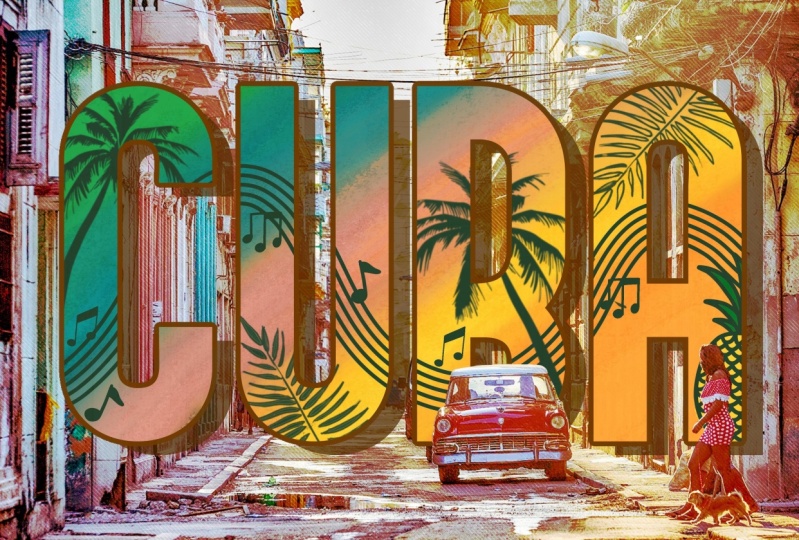
here in Florida. I went into Pinterest and did a search for travel postcards. You can see here that was my last search, travel postcards. This is another great way of looking and seeing what there is the weight of these
lettered postcards. So this one really the same idea and I do like that this
is curved lettering, so maybe we'll try that in
one of the lessons coming up. But checkout what you can
find as far as inspiration. And you know, I do really like
the limited color scheme. I'm going to make sure
that we keep working in that color scheme
that we chose because this is one kind
of look with full-color. But then when you scroll
down and you'll see some of these that are limited
color schemes. They're actually really
pleasing to the eye. So it's really up to
you, your design. The skills are gonna be what dictate the type of
design that you like. But that is very pretty so. In the upcoming lessons, what we'll do is we'll
keep experimenting with adding clipping mask and
clipping masks details. And I think next
what we'll do is import a photograph
that we could use. All right, I'll see you
in the next lesson.
5. Importing and Adjusting Photos: Hi guys, welcome to lesson for this lesson is
gonna be all about importing photos at adjusting them to fit onto the lettering. You're gonna learn
how to create a mask. A bunch of other little tips
and tricks along the way. Let's get started. One
of my favorite places to find great photographs is
this site called Unsplash. These are free for personal use. One of the things that
you would need to do is download the photo. If this is especially something
that you're going to be doing for commercial purposes, then I would suggest that
you check with the maker. So that would be
this person here. You can download it for free, but some of them still
have limited use licenses. So definitely check that out. And of course give
credit if you're not actually using
it for selling. Maybe mentioned
the person's name in your post or whatever, just to give that
person a little bit of extra mileage on this
kind of photograph. And it's only fair that
person did the work, got the picture,
has posted it here. And that is a tremendous help to those of us who
need that kind of work and actually don't go out and do the
photographs ourselves. I could go out to the beach today and take a bunch
of these pictures. But in this case, I'm
going to be showing you just some easy ways to
work on your design. If you're going to be using
it simply for design, simply for classes,
we're just using this. We're not going
to be selling it. One of the ways that's
quicker than downloading now. So if you wanted to download, you can just click
on the picture. You can hit the
download button here, save it to your iPad
into your files. But one of the ways that I
do it when I'm just doing quick designs like this as
I'll click on the photo, open it up, so I have
the full screen. Then I'll just grab
and hit my side button here and the closest
volume button together. And that gives me a
screen capture here. And then I'm going to next
select the area that I want. These won't be the
highest equality, but there'll be suitable
for what we're doing today, which is just fulfilling the requirements
of the assignment. So I'm gonna hit Done and then I'm gonna
hit Save to photos. And then these photos
are going to be available for me when
I'm in Procreate, you can decide whether
you want to add photos to your lettering or whether
you simply want it for your background in order
to get the picture, just hit Insert a photo
that's going to go to your photos that
you've just saved. Let's grab that one that
we just did because I was in my list of
clipping masks here. It created the clipping
mask for the lettering. If it didn't come in there, if you had it that
say here and you went and you imported the photo, it would come in and
you would see it on the entire background. So that's just follow through, make this our background. I could drag that
down and that would be the background
for my postcard. This is the one that
I'm basing it on. So that could be your
background photo or you could definitely drag it up anywhere in here and it's gonna
clip to your lettering. This is just a really fun way to have learned how to
use Clipping Mask and creating
something absolutely gorgeous and look how
quickly we did it. So you could decide
whether or not you want that picture to be
on all of the lettering, so the same picture all the way through or whether
you want it to have a different picture
for each of the letters. If you wanted to do that, what you'd want to do is mask
out some of the pictures. So I would take that
picture and you can easily just cut off the
sections that you don't want. But if you want to preserve the picture just in case you might want to change your mind. Click on the layer
that you want to mask and then hit Mask.
This is your mask. Now anything that is
in white is going to show anything that's in
block is going to hide. What I would do here
is grab my black, which is where I'm at here. And you can use a brush, you can use a selection. Actually, in this case, I think it's selection,
we worked better. So let's be sure that we're on the mask layer, so
that's highlighted. And let's the
Rectangular Marquee, and let's just have
it on the letter O. So what we're gonna do is draw a marquee around all of
these other letters. And then we're going
to go to Fill layer. So you can see that filled that rectangle width block that has blocked the picture
in all of the lettering. But the, OH, so the good thing about that
is if you change your mind, you can also erase
parts of the Mass. Let's say I wanted also to
show up in my letter a. What I wanted to do
is paint in white wherever I want that
photograph to show up, I'm going to use my
Posca paint marker, which is basically a monoline. I'm going to bring
it up to full size. And you can see here
that as I paint white over that block
that was there, I am revealing more of the photo so we can leave
those two in there. We could grab another photo. So let's insert, grab
something with a tree. And we could do the
same thing here where we've got palm tree, that's the only letter I want. So I'm going to add a mask. And I'm going to use
my rectangular marquee here to select these letters. This letter changes to block and fill the
layer with black. And now you see those other
letters are now protected. And so the picture
that we just put in is showing up only
in that one picture. You could go through and
do that with all of them. Now the next thing I want to do, I was a little bit
inspired by what we saw on Pinterest
there a minute ago. So I'm going to take
all of this stuff here, everything except
for the background. And I'm going to group it. Then in the next lesson, what I want to do is what we saw here with this lettering. I wanted to do some
experiments with the shape. So we're going to do
some really fun stuff in the next lesson
where we're going to change the shape
of a lettering. I will see you there.
6. Warping and Finalizing Lettering: Hi guys, welcome to lesson five. And less than five
here I want to make some adjustments to the
shape of the lettering. I'm going to show you a
couple of different methods. The first one being
the warp tool, and the second one
being Liquify. Let's get started. For this lesson. What I want to do is do some
of this kind of warping, this happening with
the lettering, just to make it a little
bit more interesting. Before we do the
thick lettering here, I think I'm going
to add that line of lettering so that we can warp everything
at the same time. Remember, we went in
here and we created a group of everything that
was part of the lettering. I am going to insert text right above
everything else here. So I'm going to add text. Now if this kind of
bugs you, that it's way up here and
you can't see it. Then before you start enlarge your image and
move it up a little bit, or wherever you know your
lettering is going to land at texts so that
you can see it here. That's one of the reasons
I do it this way. Double-click on it or
triple-click on it. Get your keyboard. You can type in greetings
from or whatever you want to put down there as
your little catch phrase, I'm going to triple-click
on it and go back into the main type
interface here. And let's grab that
lettering that we imported, which is the one that
has no name up here yet. Here we can make adjustments as far as the
lettering, the size. You can extend the box that holds lettering so that
it's all in one line. Again, we can change the color just by double-clicking on the
lettering or triple-click. And if for some
reason you lose it, you're back here
and you're like, Oh, I can't triple-click. Then just go back into
the layer itself, which I'm actually going
to drag into this group. I don't want it to
be a clipping mask. If you have dropped it and
you want to go back to it, remember you can go
here to Edit Text and you're right back
where you were before. So I'm gonna select this all. I'm actually thinking I'm
going to switch the font because that one's just
a little bit too light. See what this one looks like. I like this one is a
little bit bolder for one thing and it's also
a little bit less busy. I'm not going to
add all of this. Like this person. Put a little bit too
much detail in here. In my opinion, we could do a
drop shadow really quickly, just duplicate it,
go to that layer, edit the text, change the color. Let's go to that deep
teal and we can move it. And to move it just
ever so slightly, you can just tap on one side. I'm not going to blur this one. I think that this one is fine for the look that
we're after here. And everything is in this group, which is great
because I can then take it and I'm
going to reduce it a little bit and centered a little bit better top to bottom. And now let's apply that work. In fact that we've got it all in one layer is great because now whatever we do is going
to apply it everywhere. So if you wanted to do just a straight distortion
like lettering, getting bigger on one side
is smaller on the other. You can use just
this regular distort here that keeps everything
still in straight lines. But what I want to do is
more like what we saw here in Pinterest
with kind of a curve. And then you can also see that it's slanted it a little bit. So let's do that. I'm going to select
the whole thing again, and in this case I'm
gonna go to work. Now, warp gives me the ability to create curves
which I really liked. You can grab it
anywhere and pull, pulling in a little
bit on that corner so that we get that
slant that I liked in that just like kind of mess around with it until
you like what you see. I mean, basically
you are the judge, the judge and jury, you decide it's your design. So use your artistic judgment to distort the laddering
the way you like. Now if you need it
and advanced mesh, you wanted a little
bit more control, go to that setting there. And this will also give you these little handles which
you can use to make changes. So this one, these allow you to, within these different
columns or quadrants. Quadrants, I don't
even know what that word would be
for nine sections. You can manipulate is
with a lot of control. So you can decide whether or not you might want a bit of
a curve happening there. And I like that, that's kind of neat to, to apply that little bit
of an extra curve. So that's one of the
ways that you can affect your lettering to make it a little bit
more interesting. Now another way that you
could have done this was to go into the liquefy. And this might just be a way of adding a little bit
more distortion. And you can see with the liquefy that I'm able to just
kind of push sections. Let's say I just
wanted to push that or pull it out a
little bit sharper. I can go a little bit smaller
and I could put more of a curve on the lettering
all the way across. If I go across like that, you can see I've added
a curve everywhere. So between the two, between the distortion
that you can grab in the move dialog box here
or with the liquefy, you have a couple of different
ways that you can add a little bit of interest
and a little bit of movement to your lettering. So yeah, Greetings from Florida. That's my finished postcard. I hope you like it. It was a short class,
but there's a lot of valuable information
that you can use in all kinds of
different designs. So definitely don't limit it to something like a
travel postcard. You can use it for
any sort of a layout. And I think we've done
a pretty good job of basically mimicking the
style of this postcard in our own way with a little bit of our own creativity
inserted in here. So I hope you've enjoyed
that and I'll meet you in the last lesson where we're going to do a
little bit of a wrap up. I'll see you there.
7. Lesson 6 Wrap Up and Conclusion: Hi guys, Welcome to the wrap-up. The rap appears wanted
to quickly show you how this postcard
looked on a mock-up. I really appreciate that
you're hung out for the whole class and I hope you have a really nice
product to show for it. Please post your projects. I love seeing them. I tried to comment
within a day or two. I hope that you got
all the information that you needed and I
didn't go too fast. Remember that you can
re-watch the classes. There's no limit
to the amount of times you can watch the class. And you can also adjust
the speed in your browser. If you haven't done so already. Don't forget about hitting
that follow button up there. That way you'll be
informed if anything I do and if I have any mailings, I will send them to you. You should also join my
website mailing list, because on that mailing
list I sent out other sort of prompts for you, like when I have a
new product that I've put into my
artists resources. So check that out as well. The artist Resources page has a bunch of discounted assets, and I also have some
free products there. That page is getting
more and more robust. So check it out. If you wanted to check me
out on any of my stores, I have one on society six under my own name and under the
umbrella of out of the blue. I also have a site
at Sawzall.com, which is probably
my biggest ones. So check that out. And yeah, in Canada at art of where I just want to remind you about my
two Pinterest boards, loris art to Laura's now sprint and teach a
Dolores Nas grit. So check those two out. If you have time, definitely leave me a comment
in the discussion section, which is where I can
reply to you or leave me a review or review
I can't reply to. So if there's something that is a concern or if you have a question or something
that didn't work, please ask me in the discussion
section rather than leaving it in the reviews. That way I have a chance
to actually address it. I really appreciate when
you do leave reviews. That's the way
other students are enticed into joining my classes. I don't think I have
anything else to add. I hope to see you again soon. Bye bye.
 Delores Naskrent, Creative Explorer