Transcripts
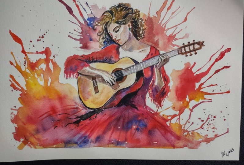
1. Welcome To The Class!: Hello everyone. My name is Will Elliston and in this
class we're going to explore the exciting possibilities of painting portraits in
watercolor With portraiture, we seek to capture the essence of a person's character
and emotions. With watercolor, we have
the opportunity to infuse our portraits with a sense of spontaneity and vibrant color, creating pieces that
are not only visually appealing but also
emotionally resonant. It's more than just
capturing a likeness. It's about conveying the soul
and spirit of the subject. And what better subject
could we have to express these things
than Flamenco, which is a complete
celebration of passion, energy, and emotional depth. I've been a professional
artist for many years, exploring lots of
different subjects, from wild life and portraits to city scapes and
countryside scenes. I've always been entranced by the possibilities
of water color, but when I started,
I had no idea where to begin or
how to improve. I didn't know what
supplies I needed, how to create the
effects I wanted, or which colors to mix. Now I've taken part in many
worldwide exhibitions, been featured in magazines, and been lucky enough
to win awards from well respected
organizations such as the International
Watercolor Society, the Masters of
Watercolor Alliance, Windsor and Newton, and the SAA. Watercolor can be overwhelming
for those starting out. Which is why my goal is
to help you feel relaxed and enjoy this medium in
a step by step manner. Today, I'll be
guiding you through a complete painting
demonstrating a variety of techniques and explaining how I use all
my supplies and materials. Whether you're just starting out or already have
some experience, you'll be able to follow along at your own
pace and improve your watercolor skills if this class is too chal***ging
or too easy for you. I have a variety of classes available at different
skill levels. I'd like to start off with a
free, expressive approach, with no fear of
making mistakes as we create exciting textures
for the underlayer. As the painting progresses, we'll add more details to bring it to life and
make it stand out. I strive to simplify
complex subjects into easier shapes that
encourage playfulness. Throughout this class, I'll be sharing p***ty of
tips and tricks. I'll show you how to turn
mistakes into opportunities, taking the stress out of
painting in order to have fun. I'll also provide you with
my watercolor mixing charts, which are an invaluable tool when it comes to choosing
and mixing colors. If you have any questions, you can post them in
the discussion thread. Down below, I'll be sure to read and respond to
ever think you post. Don't forget to follow
me on Skillshare by clicking the follow
button at the top. This means you'll be the
first to know when I launch a new class
or post giveaways. You can also follow me on Instagram at Will Elliston
to see my latest works. Let's learn how to b***d
technique with emotion, precision with spontaneity,
and vibrancy with subtlety. Are you ready? Let's go.
2. Your Project: First of all, thank you so
much for choosing this class. I'm very happy that you're
here joining me today. This might seem like a
complicated painting to do, but I invite you to
watch me paint this. And you'll see how I
break everything down into small steps from the
beginning to the end. If you use my
template to trace it out into the different sections, it's just like
painting with numbers or coloring in, but
with water color. I'll show you how
these small steps, which are quite simple
to do by themselves, come together to create a
very impactful painting. In the resource section, I've added a high
resolution image of my finished painting
to help guide you. You're welcome to
follow my painting exactly or experiment with your own composition
as we're going to be focusing on the painting
aspect of watercolor. I've provided templates
you can use to help transfer or trace the
sketch before you paint. It's fine to trace when using it as a guide for
learning how to paint. It's important to
have the underdrawing correct so that you can relax and have fun learning the
watercolor medium itself. Whichever direction
you take this class, it would be great
to see your results and the paintings you
create through it. I love giving my
students feedback. Please take a photo
afterwards and share it in the Student Project Gallery under the Project
and Resource tab. I'm always intrigued to
see how many students have different approaches and how
they progress with each. I'd love to hear
about your process and what you learned
along the way, or if you had any difficulties. I strongly recommend
that you take a look at each other's work in the
student project gallery. It's so inspiring to see
each other's work and extremely comforting to get the support of your
fellow students, so don't forget to like and
comment on each other's work.
3. Materials & Supplies: Before we start the painting, let's go over the materials
and supplies I use. Having the right materials can greatly impact the
outcome of your artwork. I'll go over all the supplies I use for this class and beyond. They're very useful to have at your disposal and we'll make it easier for you
to follow along. Let's start with the
paints themselves. Like most of the materials
we'll be using today, it's a lot to do
with preference. I have 12 stable colors in my palette that I
fill up from tubes. They are cadmium
yellow yellow ochre, burnt sienna, cadmium
red, alizarin crimson, ultramarine blue, cobalt blue, serian blue, lavender,
purple, di, black. At the end of the painting, I often use white gas
for tiny highlights. I don't use any
particular brand. These colors you can
get from any brand. Although I personally
use Daniel Smith, Windsor, and Newton
Halbe paints. Let's move on to brushes. The brush I use the most is
a synthetic round brush, like this Escoda Perl brush
or this Van Gogh brush. They're very versatile because
not only can you use them for detailed work
with their fine tip, but as they can hold
a lot of water, they are good for
washes as well. They're also quite affordable, so I have quite a few
in different sizes. Next are the mop brushes. Mop brushes are good for
broad brush strokes, filling in large areas and creating smooth
transitions or washes. They also have a nice tip that can be used for smaller details, but for really small details, highlights, or anything
that needs more precision. I use a synthetic
size zero brush. All brands have them and
they're super cheap. Another useful brush to have is a Chinese calligraphy brush. They tend to have long bristles
and a very pointy tip. They're perfect for
adding texture or creating dynamic lines
in your paintings. You can even fan them
out like this to achieve fur or feather
textures as well. And that's it for
brushes onto paper. The better quality
of your paper, the easier it will be to paint cheap paper crinkles easily
and is very unforgiving, Not allowing you to
rework mistakes, it's harder to create
appealing effects and apply useful techniques
like rubbing away pigment. Good quality paper, however, such as cotton based paper, not only allows you to rework
mistakes multiple times, but because the pigment
reacts much better on it, the chances of
mistakes are a lot lower and you'll be more likely to create
better paintings. I use arches paper because that's what's available
in my local art shop. A water spray is
absolutely essential. By using this, it
gives you more time to paint the areas you
want before it dries. It also allows you to
reactivate the paint. You want to add a smooth
line or remove some paint. I also have an old rag or T shirt which I used
to clean my brush. Cleaning off the paint
before dipping it in the water will make the
water last a lot longer. It's always useful to
have a tissue at hand whilst painting to
lift off excess paint. Also, you never know when an unwanted splash or drip might occur that needs
wiping away quickly. I also have a water dropper
to keep the paints wet. When you paint, it's
important to have them a similar consistency to what
they're like in the tubes. This way it's easier to
pick up sufficient pigment. A hair dryer is useful
to have for speeding up the drying time and controlling the
dampness of the paper. Lastly, masking tape. And this of course, is just to hold the paper down still onto the surface to stop it sliding
around whilst painting. Also, if you plan on
painting to the edge, it'll allow you to create a
very crisp, clean border. That's everything you
need to paint along. I encourage you to experiment and find out
what works best for you. Now let's get ready to
start the painting.
4. Starting The Painting: I've drawn this off
camera because it took a long time to get
right rubbing out and making corrections by doing it myself properly and making
a template for you to use. I've saved you a
lot of time when it comes to transferring
or tracing it out. I've tried to draw it in a way that blocks out all
the simple shapes. It's more like
painting with numbers because there's not
many gradients. As long as you get the tones right inside the
different sections, it should be a good result. It's quite a nice effect
as a whole image. It looks quite complicated, but up close you can see it's just different sections
that you need to paint in. That's what I'm going
to show you today and hopefully you give
this painting a go. I'm going to start off with the background
elements and under layer with some light tones. To begin with, starting
off quite abstract, I'm going to use a
medium size brush. This is a size eight
synthetic round brush. I'm going to wet some area here, so there's a nice smooth
edge on some areas just before I start mixing
the colors so that it really absorbs
into the paper. And we're going to explore
lots of different reds here. I've got cadmium red here, which will be the main red. And then we've got a lizard
crimson on the other side, which is a bit of a
cooler pinker red. We can't even add a bit of yellow onto the other
side to make a orange red. Those are going to
be my base reds, but they're very potent, so you don't need much
for the underlayer. And already adding some
liquors in there movie, incorporating some
yellow, yellow, orange in there. Yellow, red, it's dropping loads of water in there, making it exciting. Because this is just
the underlayer. So we don't need to stress
too much about this, just creating nice,
interesting shapes. I've got a straw here that
I might experiment with, and let's hold it close
and blow, blow outwards. So it creates some lines
that can be directed inward, that adds some movement. I'll go all around
this composition, aiming those lines inward. And I was inspired with
that technique by a student actually on, on a
different class. So it works both ways. I can get inspired by, my students now get some purple just in influencing
different colors into there. A similar thing on
the other side, bit more water but to straw, try not to go over that line. Then again, taking
that straw bit of an experiment with this
straw because I've never actually used it before. I just like the way it looks. I just assumed that
that's how it would work. Going to do some of the
under lay on the hair, which is what colors
are my using? I'm using the spurned sienna. A lizard and crimson and
that's a bit too vibrant. I think. I'm just going to tone it down with
a tiny bit of black there. Just a tiny little bit. It's a very potent color. So you only need a little bit. Then I'm going to go
up and just test it. Do a little stroke and judge whether it's too
light or too dark. That's too dark. I'm going to add anymore, I'm going to add more
water to my brush and then bring it out a bit. As you see as I spread it out, the whole thing goes
lighter and you can just stop whenever it's the
right tone for your liking. Let's mix some purple
tone in there. I'm staying quite light at this stage because
I don't want to go over the lines because
those lines are important. When I come back
to paint later on, I was going to use a tissue
just to make dab those bits there a bit too dark around the bottom of the
hair like that, mixing that hair
color with the red. I'm going to do a bit of
under layer on this ear, saving that earring,
a little hole there. I'm going to save
for an earring. It's just that ear that I want doing an under
layer in that color. We'll come over the
rest of it a lot darker a bit later on, but that's okay at this stage.
5. Mixing Skin Tones: I am going to mix
a light skin tone. Of course, skin tones have so many different
colors in them. But a light orange is
good for an under layer, which is what I've
just mixed there. Just filling that
in, it's very light. You can still see
the pencil lines very clearly underneath there to the top. It's quite vivid. And then I'll make the bottom
of it slightly darker, but there's not much of
a under layer on there. Just adding up subtle bit of light tone just so that
it's not pure white. Really, really. The face is made up of different shadows in
different shapes and it will come together quite smoothly even though it does
look quite complicated. Hopefully I'll show you that it's not actually
that complicated. When it comes down
to it later on, there's going to be a shadow there that we'll
paint over later. We don't need to
worry about that. But the skin that's
not in the shadow, I will have to paint now. You can use the color
shots that I've included to really perfect
your skin tones, to see what colors you mix. But it's the red color. I use the burnt sienna
and yellow ochre. And those are all the colors
you need for any skin tone. This is slightly pinkish
skin tone I'm doing now, but still very light. And that's all we have to
do there because we'll be overlapping the edges with a red dress and the
shadow on the top. I think we can use that same
tone while we've mixed it. To do the under la, on this arm, it's a pinky orange color even though the hands look
complex like the face. If you actually look into the
shapes, it's quite simple. There's just four
sausage like shapes. I've done a line across there where it's
going to be shadow. If you see how I break it
down into simple steps, it doesn't have to be as
complicated as the mind makes. It makes a bit of purple for a shadow
there. Oh, burn. We can move over
to the other arm too, so it's not that clean. It's just filling in the
shapes painting in numbers. Without the numbers though. But I'm here to tell you where those numbers are
and what colors to mix. Yeah, Skin tone is open to different interpretations
and different colors. It doesn't need to
be exactly the same. It can always be changed around. Don't try and stress getting exactly the
same color as me. You paint past the
lines if you want. In some places, as
long as you can see where we're going
to paint darker later, you can go over those lines. You can paint a bit more orange. Start on this side, actually, because I'm going to
paint on this side. And my hand will touch, I'll start this side and
then paint that side.
6. Expressive Under-Layer: Get some vibrant
yellow in there, mix in some red. Now, I'm going to
be very bold here. I should have maybe
picked a bigger brush, but it's okay, we
can deal with that. It's not the end of
the world just having fun adding powerful colors,
strong, powerful pigments. Randomly dotting this
thick pigment down there. And then using the water to manipulate it and then just
leaving it to do its magic. Really letting go, It can
be difficult to let go, but this is good practice to do that, be a bit more water. Now, kicking that
straw back again, bring that pigment back. Tilting it a bit, get a
completely wet that edge. Because I want there
to be a soft edge. I want it to b***d out, so it means completely
wetting that. Let's introduce a different
red, that Alizarin Crimson. Here you go. Putting the yellow back here. Now you say just getting
it to reach that edge. So we're just going
to b***d out. Might even add a touch of blue. And the whole idea of
this is that it'll b***d out and it
won't even look like blue by the time it's
finished b***ding. Just a complimentary color, that will add a bit of interest, Suck some of that piquant
up there, and add it here. We'll have it b***d
down at that. We'll come back over some more of this later to
make it extra vivid. Just a line under that. A few spatters of water paint, a bit of the edge
of the dress here. Girls rotated around. Yeah, I like Eliz
and Crimson here. Then get that again. I quite like having this orange around the outside 'cause we're gonna have it
very red in the middle. Taking that straw again of a really wet brush, adding a few drops of
a lizard in crimson, slicing that area there a bit because I think it
was slightly too dark. And it would conflict with
that when we painted it.
7. The Guitar Under-Layer: And then one more thing with the under layer is the guitar. And I'm going to bring those yellow elements
into there too. Being very careful at
this top section here not to paint over arm. There's lots of areas you can be free and experiment
with water color, but there's also areas like this where you have to be very
careful with your edges as a bit of brown as it is a guitar and a lot of
guitars are brown. I feel like I want to
be a bit more playful. Add a bit more texture. To add more texture, you
just wait until some areas are dry and then jab
it with more pigment. This area down here is
fine for you to go over the line because we'll be going over the top with other
areas to make it darker. Make a bit more brown, I think. Not going over this edge either. Maybe I had a little dab of red. Make sure you replace your
water every now and again. If you're using
your water to clean your brush and it becomes dirty, then even if you clean your
brush with that water, your brush will still have
that dirty water on it. Okay. I think the under layer for this guitar is okay too. Now, this purple. I'm going to add a few drops. I want to do something
a bit are exciting. We have these reds here. Now, I'm going to use
the hair, dry it, to dry it down completely. I'm just going to correct
these tones, some of them. I want to make this
guitar a bit more dynamic by having it light on one
side and dark on the other. Now, if you're following along, of course you can do this
exactly like I am doing it. But if you're
watching this first, then you'll see in the
reference image that I've provided of my final painting that I've already done this. When you paint
through it yourself, you can just paint
it this way in the first place without having
to correct it like I am. It's nice having a hard
bristle brush like this just to agitate the pigment and
bring it up like that. That's the good thing
about cotton based paper. It's really sturdy and tough, so you can really
mess around with it with a hard bristle
brush without any of the paper peeling.
8. Painting The Face: Okay, now I'm going to go
in and paint the face, and I'll do that with
my small brush number one, pearl Skoda. Any small brush can work. Here's another example
of a small brush list, a very common stick with
my skin tone colors, which is a burnt sienna here. Maybe mix some red into it. And just looking at
the different shapes, I'm going to paint
the hair dark so I can paint over the
line on that side. And always have a
tissue at hand just to dab away if it's necessary. Now going back to this brown, maybe I'll add a bit of a
black to make it less vibrant. It is a shadow after all. Fill out that area there. Just painting that section out. I've drawn out mapped out
the different sections, so it should be okay to
follow along like that. Then just depending on how detailed you do want to
make, it is up to you. Other colors in the shadow might make it a bit bluer out there. It's more to do with the tones. As long as the
tones are correct, then you've got a
lot more freedom with the color you can use, get real details
with the eye lashes. It looks like quite
abstract shapes, but when it all comes together at the end,
it'll make sense. Of course, the bigger the paper, the easier it is because you got more space
to look around. But if a dark ridge where
the eyebrow goes up there, now the, the shadow
of the nose here. It takes a bit of finesse
and concentration, but as long as you
fill in those gaps, it should turn out okay. Good practice of brush control, which just takes time to practice and this is one of the times
that you can practice. There's no easy shortcut
with brush control. Just practice and
practice, but it's fun. You can take your time, have a cup of coffee or tea. Listen to music,
listen to audio book. If you want to
practice on faces, you can just maybe trace over the face by itself and
put it on a big scale, just focus on the
face if you want to practice on that rather
than the whole body, whatever you want to
practice and learn from, whatever is most helpful
for your progress. Now, if there's anything that's difficult on the
faces this bit here where this shadow has got quite a few different
gradients on it. So I'm just going
to fill it in with this orange, yellow tone. And then I think mix
in some purple into there 'cause purple is a
complimentary of yellow. Just create Amie effect. Take this purple and
start on top here. There's some nice
dark tones in there, so I wanted to get
some solid black. Just to give me an idea
of the total range, the full total range here, going back into the
eye with black too.
9. Painting Hair: Okay, and that's the
face basically done. I'll come back to it and
refine some of the edges once we get further along with the other
parts of the painting. Because I'm more concerned
about the hair than the face. I find trying to create a nice organic look for the hair is more difficult
than the details of the face. Now negatively painting
the shape of the face. So my plan of action is to find the main
swirls of the hair or curls and just paint
them in to begin with. And then we can get a bit more abstract after
we've done that. But at the same time
I'm trying to make it look like bundles of hair. I don't want it to look like Medusa and have
them look like snakes. I don't actually paint
portraits that often. This might be the first portrait that I've done in
a couple of years. But the same principles
for painting portraits. Landscapes watercolors,
as long as you understand the
nature of watercolor and how you break down subjects into a
paintable process, anything can be worked out
and expressed in watercolor. Okay? Because you're
always looking for the main elements and then how to compose
those elements together. So you've got color, you're going to work
out tone and texture. And as long as you work out
the right balance of those, the contrasting factors of them, the whole composition of them, then you can paint it. You can paint any subject. But you can't necessarily paint every single subject in
different conditions. The references have to
meet the right conditions. This is quite a nice reference because the lighting
is very harsh. And it means that
the shapes can be broken down and
painted quite simply. Even though it's a
very complex subject. We're breaking it down
into a simple way. Yeah, because it is complex, it might take a bit more time, but just because it's taking more time doesn't necessarily mean it's
more complicated. I personally find it's
harder to paint in a expressive way and have it end up pleasing then spending a
lot of time painting details. I'm going to move
to my bigger brush, slightly bigger brush, and
add some more color in there. My burnt sienna and a
bit of a lizard and crimson just to make
it nice and a vibrant. Keep on switching between my larger brush
and smaller brush. Adding some thick pigment there
just to let it bleed out. Maybe some blue down here because that
will go nicely with the red red of the dress. We'll paint later.
Yeah, there'll be a nice contrast between the blue right here and
then the red of the dress. It's adding a few
wispy textures, maybe some red in there too. Similar thing on the other side, I like these little touches of blue whisky brush strokes. I'm just going to dry it off
just to see where we're at. So now that it's dry, I'm going to make the hair
a bit more dynamic by adding water on a brush in the direction of the hair
and then rubbing away. Doing this just a few times, let's just add to the feeling of the swirls
and curls of the hair then you can, going back now,
there's a bit more defined, you can go in with the black, You create even more swirls. Maybe just one more here. I like that single hair
coming down there. It makes it look, makes it look more
refined than it actually is having a single hair
like that coming down.
10. Painting The Neck: Of course, painting
in the ear lobe, just a little shape
like that goes a long way now to paint
the shadow on the neck. It's a kind of brown
but with some warmth. So I'm just going to
go straight into it. Maybe add that purple
blue right here. I'm working quite quickly
here, but at the same time, I have to make sure that the values are right, sir. Quite dark at the moment, especially at the top. So I'm just going to draw
some of that liquid out. We bring it down here, b***ds a bit into
that neck cheek. I mix some of that purple with a
bit of blue in there. I like to vary the colors a bit, and I want it to be a bit
darker on that side anyway, because it's right
underneath the chin. Daddy, I'm trying not to tamper tamper
with it too much. I want it to have it magic. I think I'm just going
to leave it like that now that I've done that. I think there needs to
be a bit darker there, the collar bone that is and
have that b***ded out a bit. Okay. Now we can a bit to dry. While I'm thinking about it, there's no harm in just
painting that earring. I'm going to use a bit of green, just a pop of color in the
11. Painting The Sleeves: Now we're going to start
painting the skirt, starting the shoulders up there. Let me clean this section of my palette because I want
to get a very vibrant red now and I don't want
it to be infected by any dirt or muddy color. Let's use Cabman Red. And starting at the top here, it's filling it in,
adding more water. A lot more water. It's a very, very powerful
pigment in this one. It even stains my palette
after I watched it E. Then it's going
straight up to that blue, bringing it down, then we can incorporate some
other reds in there. Maybe some yellow, first of all, painting to
the edge, to the lines. You can see I'm rotating
my hand all the time depending on where I want to get the
point of the brush. Sorry, if that's not on
camera, cause of the angle, very powerful pigment. Then we can add Alizarin crimson in some
places to do it down. Alizarin crimson isn't
a very vibrant red. By adding drops of
darkness in there. It, the vibrant
parts really pop. And maybe with a clean brush, a clean but wet brush, dabbing few drops
of thick pigment, yellow pigment in there. It's making exciting text. You can see the
contrast between that blue and red really pops now. But a yellow in that
corner right there, pigments so powerful you
don't need much of it. In fact, the thinner you use it, the more vibrant it gets. Because it uses the white
of the paper to really No, me like influencing
different colors. So yeah, like the yellow pop some yellow in there somewhere. Maybe a bit stronger
because they just get lost. The red pigment is so powerful, other pigments get lost in it. Then going back to the purple, it's a few dabs
there in the shadow. Add maybe a bit of Ab
of purple up there too. Instead of using
black for the shadow, try using this purple. The purple goes very nice with the yellow because
that's a complementary color. You go red as the base color
and then the yellow and the purple interacting
with each other. On top of that ching, a kind of text
today, edge there. Now I'm going to merge
it a bit up here. Just as it's drying, I can have a few drops
of pure liquid. Again, to me, texture, I can do the same thing
on the other side, not going over that guitar line. That's what makes it
quite interesting is having lots of abstract
things going on. But where it matters,
having nice clean edges grow at Alizarin Crimson. And doing a nice thick blob at the top of the corner there. I think I want a nice vibrant blob of
orange up there of a red. Sorry, I'm going to paint this section of the
guitar. This shadow up here. Painting the shadows here. I'm actually going to
paint a bit of a shadow on this guitar very carefully. There. Here, it's a little bit
there. Bringing it out. Yeah, I think that's
a bit better. And use that black,
and that really boosts the vibrant nature
of the red by having that contrast really make it pop and soften the edge
a bit if you need to.
12. Moving Down The Painting: I think I'm going to do
more shadows on the arm. I'm going to mix
this color up here. To do that, just
a grayish color, maybe I will add a bit
of pinkness to it. I'm going to use that
same shadow to paint the bottom half
of these fingers, which are basically all
going across like that. And then after that stride, we'll go in with the black lines to add more definition
to the fingers. But I think that's okay
for the time paint. Start painting the
shadows underneath the arm here and the
edge of the guitar, make it a bit more purple. Like I said, as long as you
have the drawing correct, if you are able to
use the template to really map out which
sections you have to paint, then this doesn't have
to be so difficult. Of course, for a beginner
it'll be very chal***ging. But it's still useful to watch
as a beginner just to see all the different techniques and the basic idea of how
to use the medium. Even if you don't try painting
it at a beginner level, it's still useful to
see how to do it. Now I'm going to paint the
inside of these fingers, bringing the shadows down from the fingers onto the guitar, drawing out liquid
if it's too intense, which it was for me just then. We're going to use
this burnt sienna to paint the circle
of this guitar using that same color. Going to paint this
section of the guitar. I'm not sure the name might
change to a smaller brush, actually, just to make sure
I get nice, clean corners. It's not quite dry,
so I'm going to leave that for the time being. I can start working on the hand up here. Again, it doesn't
have to be so detail. It just just enough details
that it isn't obvious, isn't eye catching, which I understand is
easier said and done. I'm just painting the
outside of the arm now. Some dry in there to
reactivate later. We can do that. Oh, let's see, I can get down a bit further painting a slightly vibrant
underlay here.
13. Guitar Details: Can paint that bit again. Now a few lines there painting the hole
inside the guitar. Basically, it is black, but not completely that much black. Then wetting the area and letting the black
merge down into it. Now I'm going to
fill the fret board, this area here, with a kind
of browny, bluish purple. I'm just going to keep on
making my colors ambiguous. Some areas will be bluer, some areas will be browner, some areas will be purple. Making sure I don't
go over those lines. Painting the brown bit. The bit, whether it's painting
the bit that gets tuned. Like an elaborate
painting with numbers incorporating some of
that blue into there. And I'm going to mix
a black or dark. Actually, I'm going to
change to a smaller brush. Use this to get really dark pigment instead of because it's too
wet on my palette. So I use this just
to dry it out a bit, to make it the
consistency a bit thicker paint red underneath here. It's like an underlayer. Yes, I get to put
mice purple here. I feel like we need to contrast that yellow
with some purple. Then before it dries,
mix it to red, put some yellow in there. And I'm kind of
merging the two areas.
14. Painting The Dress: I can use my water
spray to wet that edge. Edge again, mixing up the sharp tones with
the light tones. 0. Really powerful purpose. Now, not being afraid to be in really heavy
pigment, Even blue, just lying on different textures for where I imagine her knees
are underneath the dress. A few dark touches, I like a few maps of blue there. Maybe move it to purple
when we come out there. It's similar thing over here, y you 0. Adding some interesting
tones into there.
15. Finishing The Painting: Well, a shadow. I think adding a few blobs. I don't trust myself with
splatters at this stage. So just adding them in myself. Now, you finishing touch
of some highlights. So can use straight
from the tube some guash, some white lines. I'm not painting the whole line, just filling in a few gaps and allowing the eye to
fill in the rest. A using the edge of the tube just to make a
chisel shape out of the brush, we need to add a bit more water. It's a bit too thick. 0. Oh, the verse colons emphasizing some of them. What other highlights can we do? E 0. It's a bit too much
of a highlight there. Let's throw it off a bit. That had a bit of a swirl the earring. That's a bit too much as well. Carrying on the highlights just on the hair is
making the hair pot. And that's pretty much it.
I'll take the tape off, disconnect for it
for a few days, and come back to it
with a fresh eye to see if I've missed anything.
16. Final Thoughts: Welcome back and congratulations
on completing the class. I hope you had fun watching. And if you haven't already
given this painting and go now is the time to put what you've
learned into action. Throughout this class, we've explored the fusion of
colors and emotions, the delicate balance between
technique and expression. And the art of capturing feeling through
brushstrokes and pigments. The Flamenco guitarist
with her fiery spirit and dynamic pose has served as both a chal***ge
and an inspiration, pushing us to capture
the energy and vibrancy of what this
art form is all about. From the choice of vibrant reds to the details on
the face and guitar. I'm excited to see what
paintings you come up with and the personal touches that each of you infuse in your artwork. Your unique styles and
interpretations always inspire me, and I hope to see how this project can help reflect
your artistic voices. Remember, watercolor painting is not just about technical skills, but also about expressing your creativity and
personal style. I encourage you to continue
exploring, experimenting, and pushing your
boundaries to create your own unique
watercolor masterpieces. As we come to the
end of this class, I hope you feel
more confident and comfortable with your
watercolor painting abilities. Practice is key when it comes
to improving your skills. So keep on painting
and experimenting. I want to express my gratitude for each and every one of you. Your passion for
watercolor painting is so inspiring and I'm honored
to be your teacher. If you would like feedback on your painting, I'd
love to give it. So please share your painting in the Student Projects
Gallery down below. And I'll be sure to
respond if you prefer, You can share it on Instagram, tagging me at Will Elliston
as I would love to see it. Skillshare also loves
seeing my student's work, so tag them as well at Skillshare after putting
so much effort into it, why not share your creation? If you have any questions
or comments about today's class or want any specific advice
related to watercolor, please reach out to me in
the discussion section. You can also let me
know about any subject, wild life or scene you'd
like me to do a class on. If you found this class useful, I'd really appreciate
getting your feedback on it. Reading your reviews
fills my heart with joy and helps me create the best
experience for my students. Lastly, please click
the follow button up top so you can follow
me on Skillshare. This means that you'll be
the first to know when I launch a new class
or post giveaways. Keep painting, keep
experimenting, and keep connecting
with the world around you through your art
until we meet again. Stay inspired and
keep those brushes dancing and those colors
singing bye for now.
 Will Elliston, Award-Winning Watercolour Artist