Transcripts
1. Introduction: Chances are you walk past them many times at the store. They look so much like crayons, they can easily go unnoticed and yet, did you know oil pastels are an amazing and easy to use art tool to unwind while creating beautiful paintings? In this class, I'm going to show you how you can use oil pastels' simple techniques to relieve anxiety while creating amazing art. Hi, my name is Francoise, I'm a multi-passionate artist. I mostly work with watercolors in a realistic style and I also juggle running my art practice on my own with motherhood, so even though I feel incredibly lucky to live a creative life, I'm no stranger to stress and anxiety, trying to balance a never-ending to-do list with personal aspirations and self-care in a world where pressure is everywhere. I created this class because I used to think oil pastels weren't for me. I got to try them out and the experience blew me away to the point I use them on a regular basis now, when I need to let go and just have fun. I'm going to show you how to use them to their full potential because, after all, they're the only medium where carefree scribbles will easily turn into a rich, smooth, and satisfying piece of art. First, we'll talk about the few supplies you'll need to get started. Then, I'll show you the only two techniques you will ever need to have fun and create beautiful paintings all at once. We will apply these to an easy and very beautiful seascape painting I'll help you create from start to finish and, before you go, I'll give you tips on how you can store your oil pastel art with a bonus lesson. It doesn't matter at all whether you're completely new to art or a seasoned artist because this class is 100 percent beginner friendly and because it's such a fun and relaxing way to create, is for everyone who's looking for something fresh to slow down and enjoy the moment. Now, let's dive into the world of oil pastels and experience all the goodness they have to offer.
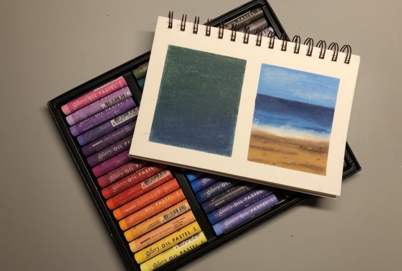
2. Class Project: Your project is a colorful, beautiful, and simple landscape. It's a perfect one to practice basic techniques and experience the soothing benefits of oil pastels. Because whether you have a lot of anxiety or you're a perfectionist, or maybe you're an artist with an art block, oil pastels are so approachable and fun to use. They have the ability to pump you up to create more, and that will turn into a virtuous circle of feeling calmer and developing creativity all at once. The next lesson is a warm-up exercise that's going to help you practice to achieve just that. I highly recommend that you complete it first before jumping into the project itself. You're welcome to reach out anytime and share a photo of your project with me and other students to the project and resources section of the class. In your project, I'll be looking at how you implemented the techniques we'll talk about in the class, and most importantly, I'd like you to let me know with a few words how the experience of oil pastels made you feel. We're ready to start, so meet me in the next lesson for a peek at the supplies we'll need.
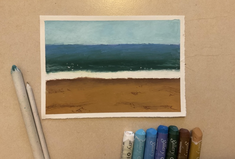
3. Class Supplies: Let's take a look at the supplies you'll need for the class. A box of oil pastels with at least 12 colors to have room to play. They are around 24 in these two sets here. But you can get started with less colors than that. You can even pick different colors than the ones I'll use if it suits you better. The brand does not matter much. I know the Pentel oil pastels are easily found in stores like Walmart for instance. You can find more choice online or at your local art store. The ones I'll be using today are Art Philosophy Oil Pastels. Make sure you see they mention oil pastel on the box as crayons and soft pastels can look very similar, but they're very different in texture and they wouldn't work well with the techniques I'll be showing you today. Oil pastels are a lot creamier than crayons and they feel rich, easy to mix, and just perfect to create our project with all the fun I'd like you to experience today. Besides the oil pastels, everything else we need is going to be pretty basic and reusable with plenty other art mediums and crafts. For paper, one that says mixed media, a multitechnique like mine will do. The paper should be smooth and thick. Mine here is 250 GSM. We'll apply some pressure so it's important to work with something that's much thicker than plain copy paper. The only part that shows at the end of our painting will be the edges of the sheet. cell a white or cream colored paper will work best, but any other shades are okay since oil pastels are opaque. I cut out a four-by-four square for the exercise. You can plan on something a bit larger if you like, just be aware the larger it is, the more oil pastels you'll be using, so I personally prefer to work on smaller projects with this medium because I love it so much, I use it a lot. We'll need a few paper towels, we'll use them to smudge large oil pastel covered areas. A common belief between artists is all pastels are messy. In my opinion, they're not bad at all compared to charcoal sticks or liquid inks, for instance. There are no volatile pigments there. No ways to spill, but since they're a bit oily, it's always safer to lay them on the paper towel as you use them to keep the table stain-free. If you have young kids, it's a good idea to keep them out of reach. I'd like to take advantage of this class to show you how to use blending stumps. I'll use these to smudge small areas more precisely than we would with paper towels. They can be used with a lot of other art mediums too, but if you don't have them, Q-tips are a good alternative. I found a piece of cardboard to protect the table from accidental scribbles just in case we get carried away. Anything firm and larger than this sheet we'll be working on will do. Finally, I recommend some plain masking tape or a washi tape if you're into scrapbooking. It will work great too. We're going to use this to maintain our sheet from limp place as we paint and also create neat edges around our painting. We're ready to start, so let's meet in the next lesson for a gentle and highly satisfying warm-up exercise.
4. Warm-Up Exercise : Let's Play !: In this lesson, we're going to warm up for a painting. If this is your first oil pastel experience, relax and try to focus on the sensations you feel, working with this medium. I'm using this small four-by-four sheet, and I'm going to tape it down to my cardboard piece. Here you can choose how wide you want your edges to be. I like mine quite narrow. There are many benefits using masking tape here, since we'll be able to use oil pastels freely, knowing this sheet won't move. There's also no need to worry about the edges being irregular, if you prefer a neat finish for your finished piece of art. I like that. This also helps make oil pastels way less messy. Now, pick any two colors of your choice. We're not looking and making anything harmonious or perfect. We're just experimenting. I'm going to go with purple and pink. I'm going to cover the top half of this sheet with purple, and the bottom half with pink. Breathe, relax, and let's scribble. You can do it vertically, horizontally, go in circles. The beauty of oil pastels is it does not matter the least how you apply it for a background like this. Can you feel how creamy the pigment is, almost like lipstick. We're just going to stop around the middle. Other than that, there are no limits here. To be able to smudge this easily, we need to cover almost all of the paper. I insist a bit in the corners. It's okay to see a bit of the paper showing through still. Now let's grab the other color, and we're basically doing the same thing on the bottom half of the sheet. With oil pastels, if you want to create backgrounds, paint landscapes like I do, it's a good idea to overlap colors to get a smooth-looking gradient of colors. Can you see how we get a new color by doing this? Oil pastels mix very well. Also why we don't need a huge selection of colors to create beautiful art. We're ready to smudge this, top and bottom. It's my favorite part. We're going to need the paper towel. Wrap it around your finger like so, and get ready for the magic of blending oil pastels. I'm going in circular motions. When you have enough oil pastels down, it's easy to smudge. Fuel the creaminess, and see this turn into something smooth and velvety. I love the sensation, and I find it very satisfying to watch and feel. If it feels like it's dry underneath, like it doesn't glide enough, add more oil pastels. You can do that anytime you need it in the painting. You can see here, it's easy to spoil a color with another. I'm just going to wipe it out here, since there's not that much, and it's almost gone. Then I'm going to add a bit more purple, because I need more there towards the top. To avoid spoiling a color too much, I use a clean piece of paper towel for each color I blend, and where the two colors meet, I'll be careful to keep the smudging where I want the gradient. For the bottom part, I would use the paper towel here, it's faster. But I want to show you how to use the blending stump. Because using the paper towel requires some pressure, and if you find it too hard on your hands, you might prefer using a blending stump. I do the same thing, circular motions. The advantage is I can also get into the nooks and crannies better. It does take a bit longer, so that's why I normally keep this method for small areas. I am improving the gradient here bit here. You won't need much more pigment at this point, since the surface one take a lot when it's already been covered. A little bit will do. Adjustments are possible. We can even add another color to alter our purple or pink. But if we add too much of it, you will know, because it will become slippery, and hard to smudge. You can take advantage of this exercise to try it out if you like, add more pigment, smudge, it should be okay still, then add more, and notice how full the surface feels done. I'm happy with my mini background so I'm removing the tape. I'm seeing it's tearing the paper in places. I've had this happen before. I do have an easy and effective fixed to that that I will show you next. So meet me in the first part of our project, for a quick look at the colors we'll work with.
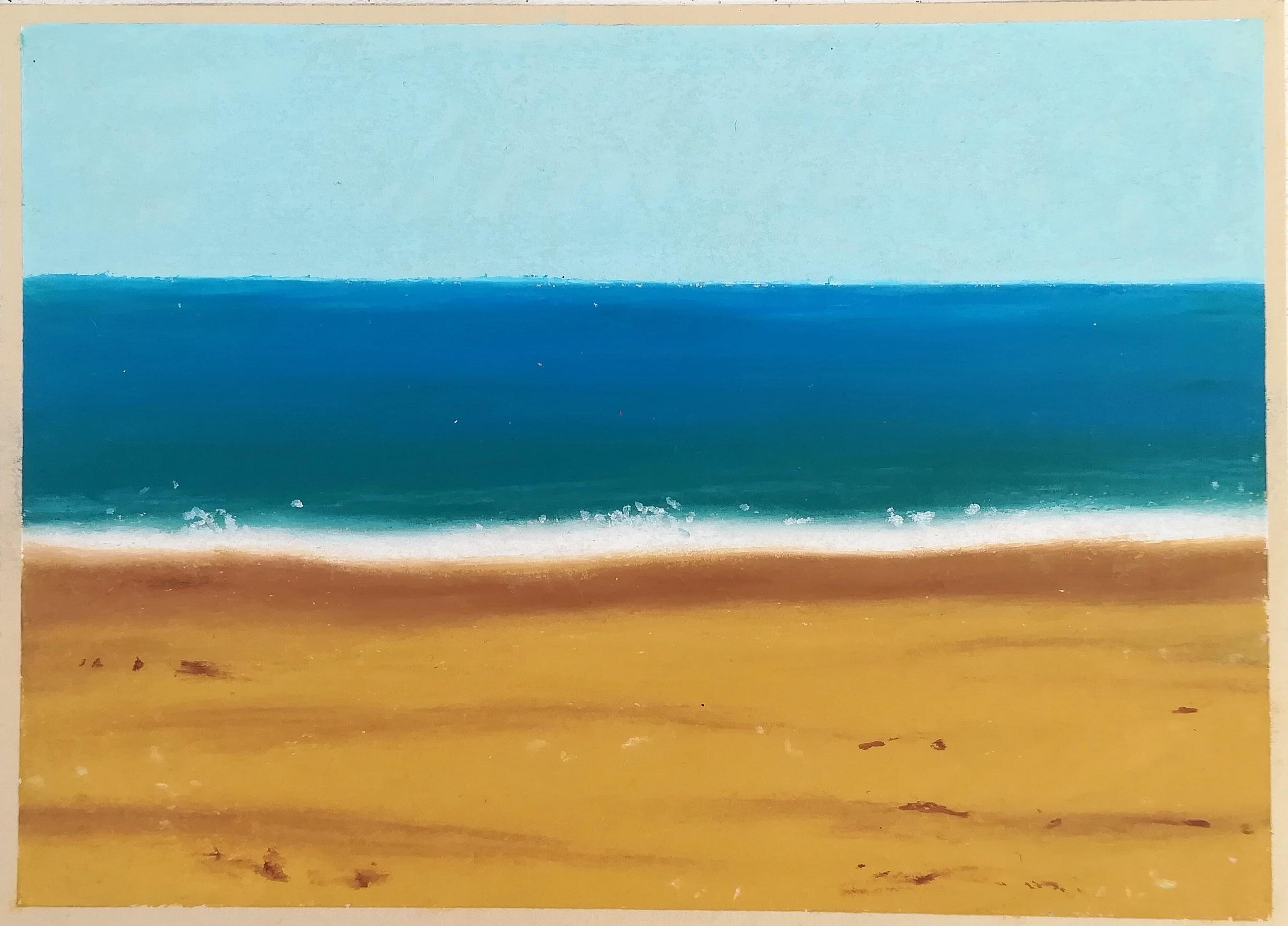
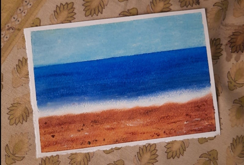
5. Class Project Part 1 : Color Selection: I have taped my five by seven sheet on the cardboard and to avoid the tape from ripping parts of the paper off when we remove it later, what you can do is make it stick to your shirt or jeans like so to wear the glue off a bit. It's a simple thing to do and it's really effective. For our colors now for the entire project we're painting from top to bottom here. So we'll need in the following order, a few shades of blues. A light one for the sky, a darker one for the sea, a turquoise or green shade for the sea as well. White for the foam and also to make other colors lighter if we need to. Then two shades of brown for the sand, a light and a dark one. Keep in mind that if you don't have several shades of blues or browns as needed for the painting, don't be afraid to mix white to any of your base colors to make them lighter and the same goes for making colors darker. Add any dark color like a gray or a black. You may also substitute browns with oranges or blues with greens. Feel free to experiment here. We're ready to paint our beautiful seascape. Let's start with the sky in the next lesson.
6. Class Project Part 2 : Sky Painting: In this lesson, we're going to paint the sky. I'm going to add some tape here close to the upper part. Don't forget to rub it onto fabric first to make it a bit less strong. Since this is a landscape, we're creating this clear separation between sky and sea, unlike what we did in our exercise. It's a technique you can use when you want to get a straight and clean line. For the sky, you can use just blue or add white too to make it a lighter shade of blue, as oil pastels will mix very well. We'll smudge them later and they will turn into their own shade then. Now you can let go and make scribbles as you like them. Add more white if you prefer a very light sky, more blue if you like it this way, it's completely up to you. Remember, we are doing this until just a little bit of the paper's left. We can also add more if there wasn't enough, so don't overthink this stuff. I'm insisting a bit in the corners because I know those are where I often need to add oil pastel. Let's take a tissue to smudge this. Remember you can use a blending stump if it feels easier on your hands. I used to do a lot of colored pencil work and blending them made it a bit painful after a while. The advantage with oil pastels is pretty fast to blend. There's something else I appreciate about this medium. I'm making circular motions to blend those colors well. I'm adding a bit more white. You see it's easy to do. For something like that, you can keep on scribbling in a careful way. It looks good already. I'm making my version a bit more opaque with more oil pastels. If you like, you can keep adding a bit more and stop when you're satisfied as long as the paper will take more color. We're done. Next we're going to paint the sea and the sand without any more tape. We'll blend the area that separates them like we did in the exercise. Let's remove the tape carefully. A good tip is to keep the tape as horizontal as possible, close to the sheet when you remove it, to minimize the risk of tearing the paper. Look at the straight line. Let's meet in the next lesson to paint the sea.
7. Class Project Part 3 : Sea Painting: Welcome back. We're ready to paint the sea. Another cool thing about oil pastels is you can sketch with them too. Here I'm drawing a line where I want the blues to end. This way, I know where to apply them. I'm starting with a darker shade of blue than the one I used in the sky. This part there that marks the separation with the sky is the only one in the whole painting that requires attention, because we'll need to use the side of your pastel stick like this to get close to the sky without spoiling it. We'll fill out later the oil pastel free spots with our blending stump. No worries if you can't get too close just yet. Later, I'll add a blue-green shade at the bottom of the sea. If you have green, it's fine. For now, I'll let you watch the process with some music. We're ready to blend this. I'll go straight with the blending stump since we want to preserve this neat horizon line there. If it's difficult dragging oil pastels with the liners, just add a bit more and pick up that excess to cover the gaps. It's okay to get some of that blue-green shade onto the rest of the sea while smudging both. It will actually look more natural of a gradient if it doesn't look like the two colors are separate. Remember that you can always add more color once the sea looks smooth and then some more. I find my sea a bit dark, so I'm going to layer some of this light blue I used before for the sky, and it should make this area a bit lighter. It's all smooth now. The circular motions helped blend my colors pretty well, and to finish the looks for the sea, I'm going to use horizontal motions this time just because the ripples on the sea look horizontal. I think this way it will look more accurate. Let's paint film and ripples to finish the sea.
8. Class Project Part 4 : Adding Foam: Let's paint foam and ripples to finish the sea. You need to stick a white oil pastel, and it needs to be clean. Make sure to wipe any stains off if it's dirty like mine. I always use white in my paintings, so I need to clean it up every time. Let's make a thick line for foam right there. We're going to try and avoid touching the sea since the blues there will spoil our stick again and we'll have to clean it up if that happens. If it does though, it really is no big deal. You can fix small stain to your paper towel. I'm going to use a blending stump. You can see now how useful they are to blend areas in more precision. All that blending stumps are dirty. I wouldn't mind at all to blend other colors, but why does the exceptions? Maybe when blending stump, just so bending white is a great idea. Just like we did before for the top of the sea, I'm blending this precisely enough that my white stays white. We still want to see a gradient between the sea and the foam to make the foam look like it's part of the sea. Please blend the two and it's done. Let's add some fun details there. You can customize it as you wish. I'm choosing to add a little bit of white there to create a highlighted ripple effect. You can imagine those areas in the body of water that are hit by the sun. I could very well add darker ripples too with one of my blue shades, it's up to you. I'm going to smooth those lines out slightly and well there is our sea. I'll see you in the next lesson to paint the sands.
9. Class Project Part 5 : Sand Painting: We're getting closer and closer to finishing this beautiful painting. Let's take our darker shade of brown. We're going to start where the film ends. We want to be a bit careful not to spoil the white area once more but after that we're all good. I'm going to add the lighter shade as well. I overlap a little bit of white on top. They wanted to be a bit of a lighter shade of brown. Let's smudge this. I'm going to start from the bottom. You can do the opposite. Make sure to use your Q-tip or blending stem for that top part, it will be easier to build up a nice gradient between white and brown. Let's meet next for final details.
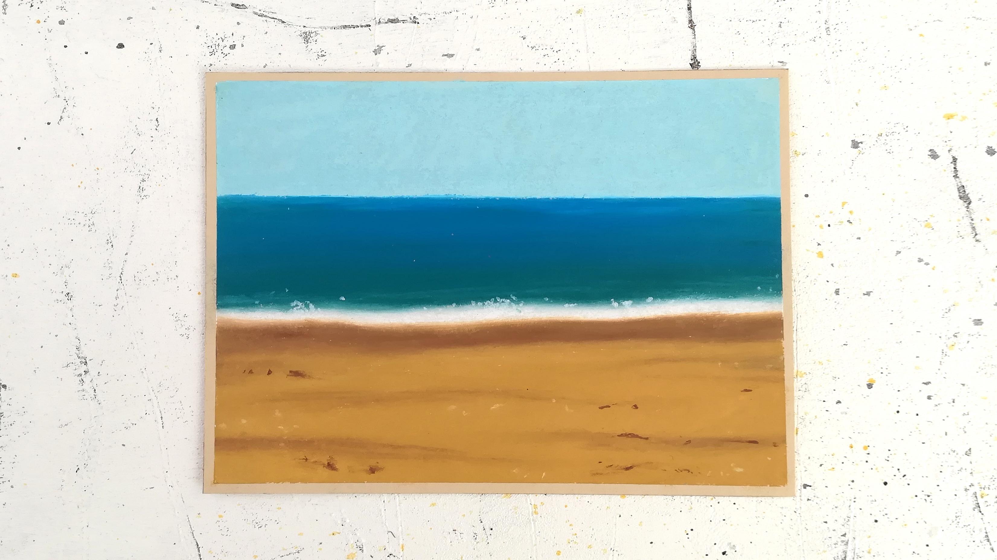
10. Class Project Part 6 : Final Details: We're now ready for a few final and subtle details that will make our painting look more realistic. With a dark brown, let's add texture to the sand. Since sand is a lot of the painting, it's nice to add a little bit of detail there to make it look more interesting than just a plain color. You can add a few lines, dots. Feel free to be creative here and follow your intuition. I find a few details are great. Something a lot of creators including myself tend to do or have done is to go overboard with too many details. Add some step back and add more if you think you need more. Now a great tip of seascapes like this one, smash that white pastel stick onto the blue areas that represent our sea. You will get intense white dots that could just shine. Make sure your stick is clean first as always with white. I'm going to do the same for the sand. I might needs more details and smashing oil pastels and paper does leave more intense chunks of color than just coloring with them. It's a great technique to use for final details. Can you tell how much nicer the painting looks all of a sudden with just this tiny addition? What's magical about creating art it's always worth it to push through any artwork till the end, whether it's oil pastel or anything else. Because that's when the magic truly happens. I'm going to add white as well for a little bit of highlights in the sand. We're done now. Let's remove the masking tape. Remember to do this very carefully. Know that your painting will look even more stunning once the tape is off. The before and after is amazing. Look at this, it looks so smooth and peaceful. We're going to meet next for bonus lesson, and I'll show you how to store your paintings. Also please upload your version of this to the projects and resources section of the class to share with me and other students. I would also love to know how you found this oil pastels experience. See you next.
11. Bonus Lesson : Store Oil Pastel Paintings: In this bonus lesson, let's see how to store oil pastel paintings so they don't spoil your other arts or even each other. Although, when they're as smooth as we've made them, they're not that messy. This is what I do. I have this file holder here and I place my paintings in there along with a sheet of transfer paper in between each and every one of them. You can also use copy paper. Why not? Any thin paper like that to avoid any in wanting smudging. I hope this tip is helpful. Let's meet one last time for final thoughts.
12. Final Thoughts: Congratulations for diving into oil pastels. I cannot wait to find out how this experience has been. So please, before you go, share your project in a few words to describe your experience to the project gallery. I'll be happy to give you feedback and help you out if you need more guidance. Feel free to leave a review about the class. If you'd like to see more oil pastel painting classes from me and take your practice further, do let me know and follow me here on Skillshare to make sure and get notified each time I upload. I'm active on Instagram and YouTube with a lot of inspiration and behind the scenes, you can find me there as well and use the hashtag create with Francoise to connect. Thank you so much for taking this class with me today and see you in the next one.
 Francoise Blayac, Professional Artist