Transcripts
1. Introduction: Is possible to make some really deep and detailed drawings with graphite pencil. I think sometimes the process
can seem overwhelming. I want to show you
today that if you follow a series of key steps, it maybe not as difficult
as you might imagine. My name is Joan Chambers, and I've been making online
art tutorials since 2020. I've helped tens of thousands of people improve their drawing. But today, I want to focus specifically on
drawing with graphite. And how simple it can be to create some really
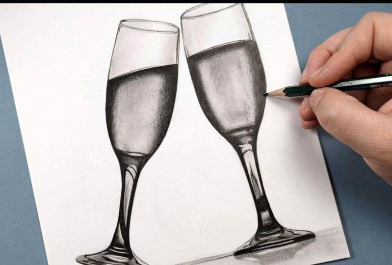
rich, elegant drawings. I want to show you today how to create these two wine glasses. I'll start off by
showing you all of the materials you'll need
to complete this course, and then we can start
working through the process I always
use for every drawing, focusing on building up all of the richness in a series of
layers. Let's get started.
2. Class Project - Drawing the Wine Glasses: Class projects, we'll be
drawing these two wine glasses. Now, I've picked these
for a couple of reasons. They're nice and simple,
but I think they create a really effective
finished drawing. Now, I have included in
the description details of all of the materials
I'll be using for this, and I will be going
through that in a bit more detail in a second. I'll also be covering how to
create the sketch outlines, but if you don't want
to create your own, I have included copies of
mine in the class resources. When you've completed
your drawing, please do upload it to
the class projects. I would love to see
what you've done. Let's talk about the
materials that you'll need.
3. Materials You'll Need to Draw the Wine Glasses: Let's talk about the materials you'll need to
complete this course. And first up, the most
important thing you'll need is a set of
graphite pencils. Now note that you will
need more than one. In order to create
all of the richness that we need in the
graphite pencils, what I'd like to do is generally
draw with three pencils, a hard pencil, a medium
pencil, and a soft pencil. With soft pencils, the graphite goes down
looking much much darker, whereas with a
particularly hard pencil, it looks much lighter, and we can use this to
build up that richness. General rule, I
like to work with an HB pencil as the
hardest pencil, then a three B as the mid tone, and maybe a five or a six B pencil for
the darkest pencil. Next up, what you'll
need is some paper, but you want the
right kind of paper. Because we're going
to build up all of these different pencils
on top of each other, building up layers, we need some paper that's going to be
able to take those layers. So I always like to
work on bristol board, a smooth kind of bristol board. This is quite a thick paper, and this I find is perfect for building up all the layers we're
going to need. It is one of the most
important things to make sure that you do get
that right kind of paper. D, you'll need some way
of sharpening the pencil. So I just use a standard
pencil sharpener. As long as it makes a
really nice sharp point on your graphite pencils,
that will be fine. Now, let's talk about
something that actually you will very likely
have around the house. We need something that we can
use to blend the pencils. I just use a bit of tissue. Just a couple of squares,
I can use it to wrap around my finger and
blend that pencil. Step, I will need
a type of eraser. I like to use a putty eraser. This is a moldable eraser, so I can mold it into
different shapes to lift the graphite in a
slightly more precise way. This next item, I would say, is an optional item. This is a black colored pencil. Specifically, I'm using a
black polychromos pencil. When we get to adding in the final darkest
parts of this drawing, we could use something
like a six B to add in all of those
final details and those darkest values. I do find with the
softer graphite pencils, they tend to be
very, very shiny, which makes them
not look as dark. They is absolutely fine, and you can, of course, do that. But I like adding in those darkest values with
a black polychromos, because it is much more matt. As I say, you could use
this step where I'm using the black
poly chromo pencil and just use the six B. Final material that we will need is some way of looking
at the reference photo. I find the easiest way to create realistic drawings is to
work from a reference photo. Now, I like putting the
reference photo onto my iPad. I particularly like that I can zoom in and see all
of the details. But you don't need to
work from an iPad, you could print out
the reference photo. So you will need a set
of graphite pencils, the right kind of paper, a pencil sharpener, some tissue, a putty eraser, a black
polychromos pencil, if you would like, and some way of looking at
the reference photo. So let's start working through the process of drawing
these wine glasses.
4. Sketching the Outlines: First thing that I
always need to do is create some sketch outlines. I don't want to just go
straight into shading. I want to make sure
that I get all of my proportions looking correct. The way that I
like doing this is using something called
the grid method. This is where you draw a grid on your drawing paper and you put a grid on your reference photo, and you just draw what's
in each individual square. This will make it so much easier to get those
proportions right. Once I've drawn out
each individual square, I then use an eraser to
erase the grid lines, and I'm left with a sketch. If you want to go
through this with me in a lot more detail, have a look at my beginners
guide to graphite pencils. I'll include a link in
the course description. Probably one of the
most important things that you need to take away with the sketch though
is that you want the lines to be really
nice and light. You want to get to the
point that you can barely see the
sketch at the end. You can see when looking at
the beginning of the drawing, here, how light these
sketch lines are, you can barely see them, because we don't
want to end up with a really thick outline around our wine
glasses in this case. You don't want to
create your own sketch, you can use my sketch, which I have included
in the class resources. I've also included
a reference photo with a grid in those
class resources. Now, let's keep working through the process of drawing
these glasses.
5. Studying the Reference Photo: Before I start adding
in any of the shading, what I want to do
is take a minute to have a really good look
at the reference photo. I don't like just jumping in straight away to the drawing. I want to take a
minute to look at all of the key
shapes and details that are within the
reference photo that I'm going to want to bear in
mind whilst I'm drawing. Let's take a minute to
have a look at it now, and I'll show you what I'm
particularly noticing. Now, first things first, I'm particularly looking at the background of the picture. There's a lot of it looks like buildings
in the background. I'm not going to
want to draw that. On my drawing, I want to have a plain white background,
which is fine. On the most part, I can just
leave these buildings out. It's really just
these bits here, as well as the sun or moon here. When I'm drawing
this top section, the C three sections, I want to not draw these. But I will draw the buildings
in these sections because it wouldn't necessarily
think you would know it is buildings. It, on the most
part, the reference looks reasonably simple. The wine section, it's darker around the edge and then
much lighter in the middle. There's a little darker patch
up here and a darker patch coming across here and a darker patch here
and down the bottom. On the most part, it
looks reasonably simple. Then on the stem of the glass. I think it's really
just a case of drawing the patches, the shapes. So for example, it's very
dark going down here and across here and very dark down this right
hand side as well. Then there's this
stripe in the middle. Much lighter stripe with these
kind of curved sections. And then some of
these dark sections carry on all the way down here. It looks reasonably
simple still. It's just a case of drawing
the shapes we can see. I just want to really
focus on getting all of these shapes marked
out in the right place.
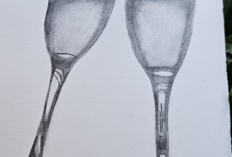
6. Building up the Base Layers: As usual, I want to start this off by using the
hardest pencils. I want to use them
to both put down some base layers as well as getting
everything mapped out. I'm starting off here
with the two H pencil. This is the hardest pencil that I'm going to use in the drawing. What I want to do is
be putting this pencil in all of the very light areas. I'm not going to worry about some of the darker areas, particularly where
I mentioned around the edge of the wine. I only want to put this in
the absolute lightest places. So, for example, on this
first wine glass on the left, I'm particularly
wanting to put down some shading in
this section here, as well as this strip down here and a few of the areas
down the bottom. And it's exactly the
same on the other one. This area here, this area here, maybe a little bit around here and these few strips
down here as well. There isn't a huge
amount to this. My main focus is to
try and get this down as lightly and as
smoothly as possible. Now there are a few
things that I can do to help me do this. First off, you'll
notice that I'm holding the pencil very
close to the end. I'm not holding it really
closely to the tip. What this does is it stops me from being able to press
too hard with the pencil. I want to be pressing
very, very lightly. I don't need to get a lot of the graphite down at this
point. I just want to this very faint covering. If I hold it really
close to the tip, then I can still achieve
the same effect. It just needs more
pencil control. It's going to be harder. The other thing I'm
doing is working in little circle motions
or aval motions. And this again helps me
to get the pencil down in as smooth and consistent
way as possible. Now, it doesn't matter too
much if it's not absolutely perfect because I can blend
this in a little while. I do want to help
myself to try and get it as smooth as possible. Before I move on to
the other wine glass, I do want to get a
little bit of shading on the table that these
glasses are sat on as well. Again, you'll notice I'm working in these
circular motions. I'm holding the pencil, but
still very close to the end. I just want to be putting something underneath
that left hand glass. Let's do exactly the same
to the right hand glass. Again, you can see a bit
better here that I'm working in these kind
of oval motions. I once again want to
cover that same area, so this very light
patch in the middle. As you can see,
it's not perfect, but a reasonably smooth and even coverage over
the whole section. I can work my way down these lighter patches on
the stem of the glass. Also add a little bit of shading on these strips
towards the bottom, and then I can once
again be adding some very light shading on the
table around the bottom. Before I move on to
the next pencil, I realized that I've missed this little patch around here, so let's just fill
that in as well. Then I'm reasonably happy that I've put some sort of pencil down on all of the
absolute lightest areas. I'm going to move on now to
the next hardest pencil. This is the HB pencil. I want to use this
as a way to mark everything out to
get my bearings. So I can start off by going
down the side of the glass. I want to be very precise with where I'm
putting this pencil, and that is made far easier
by having a sharp pencil. I'm able to control where
it's going much better. I do recommend frequently
sharpening your pencils, particularly around
the top of the glass, where there needs to be
some pretty thin lines. It's going to be hard to do that if you've got a blunt pencil. Beyond that, I'm
pretty much working in the same way as I did
for the two HH pencil. I'm once again using
circular motions, and I'm once again holding
the pencil further back. You can see I'm still
holding it about halfway down the
barrel of the pencil. I can carefully map out
the edge of the glass, and then once I've done that, I can then shade from this line, both around the
top of the glass, and I want to be
doing exactly the same around the
edge of the glass. Where the wine or champagne is. I'm noticing that
around the edge, it's not all got the
same amount of shading. There's a similar amount of shading around the edge
here and around the top, but on this right hand side, there's a much
thicker dark section. So I'm going to need
to add a lot more of the HB pencil around this side than I do around
the top or around the left. And it exactly the same
on the other glass. Less obvious, I would say, but I would say that this side is slightly thicker
than this side. I'm also noticing that
around the bottom. The dark shading
around the edge gets a lot thinner around
here and around here, is much thicker towards the top. So that's what I'm trying to achieve whilst
shading in this area. I also want to make
sure that where I shade where this darker area
and the lighter area meet, that it's not too sharp a line. Now, I don't need to strive to make this absolutely perfect. I am going to blend this. But do you want to try my best. F here, I just want to mark in around the top of
the glass as well. Now, I'm noticing that
around the top of the glass is kind of two lines. So is obviously, the
whole oval shape. And then around the
top, there's two lines, and around the bottom,
there's two lines. And on both of these, the top line is a thicker, more consistent line
than the bottom. The bottom line generally is
quite dark around the edge, gets light towards the middle,
and then is dark again. And the same down here,
dark around the edge, then lighter towards the
middle, and then dark again. So that's what I'm trying to do when marking in
this top section. I've marked that in I
want to continue to work my way down the
stem of the glass. I want to get some sort of
pencil in the whole way down. Let's block in these very
dark sections either side. Once again, doing
that in exactly the same way as I have before, so very lightly using
these circular motions. I am going back a
little bit over some of the edges higher up just to
make it a little bit darker, but I'm not pressing hard still. I can continue working my
way around the bottom. So really following those
shapes that I can see. I'm not worrying that I'm
not going to get this area as dark with this pencil as
it is on the reference photo. It's not about trying to
do that at this point. I'm really just wanting to get my bearings with all
of these shapes. So get everything
marked in. It's just going to make my life way easier when I come onto
using a softer pencil. 'Cause I'm going to be more confident about what
needs to go where. So things get a little
bit more complicated, I would say as we make our
way around the bottom. So let's have a look at
what's actually here. Can't stress enough
that is still just a case of drawing shapes. There's a very thin
light shape here, a slightly thicker
shape here with a very subtle line
going down the middle. I'm not going to worry
about that line right now. There's then a light patch
here and a light patch here. And then the darker areas, there's a line coming
along here and round. There's a line coming
along here and round. There's this dark patch. This comes along here, and then along the bottom, there's this very
thick dark patch here going all the way along
the bottom of the glass, and this line goes all
the way along here. Can't stress that it
doesn't need to be perfect. It doesn't need to be exactly
the same as the reference, but am trying to get it
as close as possible. The closer I can get this
section to the reference photo, the more realistic it's
going to end up looking. Although it seems very
random with reflections, if you get them too far
straying from the reference, they just look a
little bit weird. Before I move on to
the other glass, I also want to just mark in, there's a bit of a
shadow underneath, particularly a dark shadow here, and then there's also a
thin line going along here. Let's get that marked in. Then you can see quite quickly, we've ended up with something that does look
like a wine glass. It's not got enough contrast, and it generally needs
a lot more shading. But it does look
roughly right and we've certainly made a good template
that we can build off of. Now, before I move on, I'm
just going to add there's a few darker lines around the edge around here that I just want to mark in.
And once I've done that. I'm also going to add
some light shading. Just on either side, you can see this is
very, very light. What I want to do here
because I'm not drawing any of the background with
all of those buildings. I want to just help the glasses look a
little bit more round. And generally speaking, if
you add some darker shading, it pushes an object
back on a drawing. If you add lighter shading, it brings it forward. So if I can use circular
motions to just lightly push these
edges back a bit, I think that's just going
to help the glasses look a bit more realistic. Just add in these little curve
shapes before I move on, and then I want
to do exactly the same to the other glass of wine. So we can go over this
a little bit faster and once again going
around the edges. And once I've mapped
in the edges. I can then think about
adding that shading. Again, using those
circular motions, holding the pencil further back, and just pressing
very, very lightly. Once I've shaded in the
very dark wine section, and then wants to
think about marking in these lines around the top. Once again, there's kind of
double lines around the top. It's exactly the same as
on this left hand glass. It's a thick and more
consistent line around the top. And then the second line the underneath line is darker
in either outside edge, and then it gets lighter
towards the middle. So again, around the bottom, darker around
either outside edge and lighter towards the middle. So I can once again
mark that in. And whilst I'm here, I'll add
that same light shading to try and make the top section look a little bit more rounded. I can work my way
down the glass. So once again, looking at all of the shapes that
make up the stem. For example, there's this
kind of lighter patch here. So it's dark along this top
section, lighter strip, and then it's quite
dark along here, and then there's a lighter
patch here as well. Is then pretty dark around
all the edges around here? And there's this dark kind
of arch going over here. And these dark sections extend all the way
down to around here. I want to avoid this
light patch and avoid this light rectangle. Can shade all of this in. I do also want to add in some of the reflections of some of the buildings that you can
see on that lighter patch. So these buildings here, you wouldn't necessarily
know that they're buildings. I just want to draw some strips going upwards in a
kind of similar way. It doesn't need to be
perfectly the same as this. What I'm actually
drawing is much smaller than how far I can zoom in
on the reference photo, so I don't need to get as
huge as amount of detail in. But I do want to get
something in there. And then I can draw my attention
to this bottom section. You'll notice here that there is a dark line that's kind of just coming underneath
this bottom light patch. There's also two kind of squiggles coming
down on either side. And then this bottom
section is really very dark with this lighter strip going through the middle. So a very dark section
all around here. I'm going to want
to mark that in. Drawing that in. The
last thing to do with this pencil is very lightly
draw in the reflection. And I'm pressing so
lightly to do this. I don't want it to be
looking very hard. And then once I'm
happy with this, I can think about blending
all of these areas together. Now, to blend this, I
want to use a tissue. And what I'm going
to do is just wrap the tissue around my
finger like this. And then I can very gently rub the tissue
against the paper. Want to be doing this
with circular motions in a similar way to what
I do with my drawing, and I can't stress enough that I'm not pressing hard here. I want to be very
gently starting off on these lightest areas. You'll notice that I'm
particularly focusing on the central wine section
on both glasses, and just very lightly, as I say, using these circular
motions to blend this. I want to keep it
light, I just want to make it as smooth as I can. Once I blended these
absolute lightest areas, I can then think about blending
the rest of the drawing. Main area that I want
to be particularly careful of is where the wine is meeting the
blank empty glass section. So I don't want to
really smudge that line. I can help this by starting
off blending the top section, the lighter section, and then blend the underneath section. I also want to be very
aware that if I'm getting a build up of graphite
on my tissue, I should rewrap the tissue
around to different parts, just that I can
always be working with a clean section of tissue. You find when you're working
with two H and HB pencils, it doesn't really build up
too much at this point. It's when we're using
three Bs or five Bs, a softer pencil, that
I'm going to want to continually rewrap the
tissue around my finger. So I can just keep working
my way down the glass. I'm not going to
worry too much if I smudged the edge
of around the stem. As you can see on this
left hand wine glass, I have smudged around the stem. It's kind of bled a bit onto the white
background section. But that's okay. I'm
not worried about that. I can always fix that a little
bit later with an eraser. So once this has
all been blended, it should look
something like this.
7. Building up the Contrast: Chapter, I want
to begin building up some of the contrast
on these wine glasses. So let's focus on using the three B pencil
in this chapter. This is not my softest pencil, but it is a lot softer
than the HB pencil. And what I'm doing
here is pretty similar to what I was doing in the last chapter
with the HB pencil. I want to once again go over all of the slightly
darker areas. So I can once again focus
on starting off going around the edge
of the wine area. Now again, it's exactly the
same as the last chapter. I want to focus on having a nice sharp pencil so I can really control where
this is going. So I want to frequently
be sharpening my pencil. You'll find that it will
need sharpening more often a softer pencil like
this than a harder pencil, it just wears down faster. Notice that although I'm not
holding it right by the tip, I'm also not holding
it really far back. I gradually I'm starting to work my way close
to the pencil because I need to be a bit more precise here on where
I'm putting the pencil. I still want to be
pressing lightly. But where I'm marking the
very top of the wine section, for example, I really want
to be accurate on where I'm putting that now and have
that pencil control. But it is very important that I am still pressing lightly. If I want to be
making an area look a little bit darker
with this pencil, I want to go over it more times rather than pressing But I still want to be
working through this in these circular or val motions, because I do still want this
to be as smooth as possible. Now, in addition to going
around the edge and adding that darker area in. I also just want to add
a little bit of shading to a few of these areas
where I mentioned, it is a tiny bit darker like this section up the
top up here to the left. It's not dark, but it is a little bit darker than
the rest of the wine. Particularly looking
at this patch here. Then work down all of
this right hand side. Again, I just want to make
sure that where possible, the transition from
the dark edge into the lighter wine is as
soft as I can make it. I am going to blend this again, so I don't need to
worry too much, but it is going to
make the finished drawing look better if I can try and make it
reasonably smooth. From here, I want to work
my way down the stem. Now you might
notice that I'm not adding any of those lines
around the top of the glass, around the C three section. Because I'm going to blend this pencil a little
bit later on in this chapter and
because this pencil is a softer pencil than
the previous ones. If I add all of the lines
around the top of the glass, I think it's just going to
end up looking really smudgy. I want to save adding
any final details up there until I'm moving onto a pencil that I'm not
going to need to blend. So that'll be in
the next chapter. I can pretty much
work my way down. Go through exactly the same
process as I did before, so blocking in some of
these darker sections. And I'm just really
looking at each area. Again, noticing where
is a bit darker, where is a bit lighter? I can't stress enough. It's
exactly the same process. It's just that this
is a softer pencil which is looking darker. So it looks like it's
making more drastic marks. But I'm really just doing the same thing as there was before. This is all made
ten times easier because I marked everything
out with the HB pencil, as well as the two H pencil. And so I've kind of got a
template that I can work on because I took my time
marking out those last areas. It means that this section
is much, much easier. Although, as I say, it's not as dark as what I'm doing here, I can at least see what
needs to go where. So I want to work my way around
the bottom of the glass. There's very dark strip
along the bottom. Before I move on to
the other glass, I also just want to add back
in this shadow along here. It's the same shadow, again, that they marked in in
the previous chapter. But some of these shadows, I think just need to be
a little bit darker. So I can go over these
with the softer pencil, and it just helps to let them stand out
a little bit more. Do the same on the
right hand glass. So going around the edge
of the wine once again, using those circular motions to try and make this look smooth. This section is looking a little bit lighter
when I'm doing that. That's just the way that
the light is reflecting. Is in actuality as dark on this right hand glasses is
on the left hand glass. I work my way around
the edge of the wine. I just want to add
in any extra shading that I can see
towards the middle. So particularly looking at this darker section here as well as along the
bottom along here. Then once again, I want to work my way down the
stem of the glass. So filling in all of
these darker shapes, blocking in the darker shapes. Then I can focus on this section around the bottom of the glass, again, filling in these
same shapes, which, as I say, is again far easier because we've got a really good, although
light template. It just kind of gives us
something to work off of. Then I can again add in any shadows that need to
be a little bit darker. Particularly,
there's a line going between the two glasses
in the middle here, as well as the shadow
or the reflection, I guess, underneath this
glass on the right hand side. So this point, I'm pretty happy with my slightly darker layer. I once again want to think
about blending this. Go to blend this again using a piece of tissue wrapped
around my finger. Just like in the
previous chapter, I want to really
be keeping an eye on if the tissues getting
quite a bit of graphite on it, I want to get a
new clean section. I don't want to risk just
smudging the whole thing. But I'm not too worried
about making some of the lighter areas too dark because I can always lighten
them up in a second. I'm not worried about how smudgy it looks around
the edge of the glass. You can see it's looking
quite messy. But that's okay. That doesn't matter.
So let's do the same on this glass on the
right hand side. And then by the time it's
blended, it looks like this. So what I want to do from
here is take my putty eraser, and we're going to
tidy everything up. So I'm starting off by
going very carefully around the edge of the glasses and getting rid of all
of those smudges. So where the wine glasses were smudged where I blended
it with the tissue, and it's all smudged
onto the white section. I can just generally
go around with this erasor and tidy that up. Kind of like to mold it into
a little bit of a point, and then that just gives
me a bit more accuracy on where I'm using this. I'm happy, I've
gone around all of the outside of the glasses
and it's looking much tidier. I then want to focus on
if there's any areas on the actual drawing that need tidying up or need
lightening up maybe. Probably, in my opinion, the most obvious area
to start with is the light patches on the
stem of the glasses. They started off
looking very light. They're looking a little
bit too dark now. So I can just very gently use the pat eraser
over these sections, blending it and molding it into a sort of more flat section. I can just very lightly
brush it against the edge. And you can see
that that's lifting a reasonable amount of graphite. It's just getting that section back to as light as it
is in the reference. I can then re mold the putty eraser and move
on to the next section. I also want to
brighten up some of these strips around the
bottom of the glass. They look pretty light
in the reference voto, and they're not looking as light in my drawing at the moment. I also just want to lighten up this area along here as well. It's lighter towards the
top. I can also tidy up. There's a few areas
around the bottom that I think could just stand to
be a bit lighter again. That's pretty much all I'm
doing with the eraser. Now, I can press very, very lightly and just remove a very small amount of graphite. I don't want to go
overboard here. I don't want to undo
everything that I've done. Now, on the champagne
or the wine section, I just want to lighten it up a little bit,
but not too much. So I'm dabbing the eraser here, and you can see that that's just lifting a little bit
of the graphite, but nowhere near as much as
on the stem of the grass. It's just lightening
it up a tiny bit. I'm particularly focusing on lightening this central section. I don't really want to do
anything around the edge. Do the same on the
other glass of wine. Again, starting off by
dabbing the eraser on the middle section and just lightly brightening
this area up. All over, only on
the lightest areas I can see on the reference. I pointed out a second ago, some of the darker
areas on the reference. I want to now be lightening
those opposite areas. Once I've gone over
this top section, I once again want
to lighten some of the areas going down
the stem of the glass. So particularly
this section again and some of the lighter
patches towards the bottom. Now I'm able to use the
eraser at this point because I'm not planning on doing
any other blending now. I wouldn't do this if
I intended on putting another layer of pencil
down and blending it with a tissue because it would mean that I'd have
to do this twice. I can do it at this point
because I'm only going to use one more pencil from here and it's not going to be one
that I'm going to blend. It's going to be
the final section where we add in the detail. Just going to add a few last
little touches to the top. Then I'm happy with the amount of raising
that I've done here. That is it for this chapter.
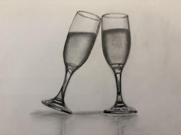
8. Adding in the Final Details: Right. Let's add in all
of the final details. Now, to do this, I want to use the darkest pencil that I'll
be using on this drawing. So either the softest
or the darkest. Now, it's completely up
to you what you use. I'm using a black
polychromos color pencil, and I'm using that to add in these absolute darkest areas. If you don't have one,
then you could use a five B pencil or
maybe a six B pencil. I just personally prefer using the black polychromos
because it comes through mat, so it makes the darks look
really nice and dark. Now, I'm starting off with this pencil going
around the top again. I mentioned, I didn't go
over any of these lines with the last pencil with the three B pencil because I didn't want to risk
smudging anything. But because I've now done all of the blending
I'm going to do, I do want to go
back over and make these lines around
the top much crisper, so I can go back over this with the black polychromos here. I'm just really focusing on what I can actually see
around the top here. As I mentioned before, it's
got these double lines, and the top line is darker
than the bottom line. I'm also noticing around the edge that there is also some double
lines around here. So down this side here, you can see quite a thick line, and then there's
the thinner line right at the very
edge of the glass. There's also this line here. And along the top here, there's this little
section in the corner. So that's the kind of
thing that I'm looking at that I'm then
wanting to add in. Most important thing to do here, and I can't stress this enough is to make sure that you
have a really sharp pencil. It is probably the most
important at this point because there's so many of these smaller fine
details to add in, and you really want to make sure that you can control
where the pencils going, which is only really possible
with a sharp pencil. I've done that top
section. I want to go back over the edges of the glass here really make these areas look a lot darker
and pop a lot more. So once again, working in
these circular motions, I still want to be trying to get this as smooth as possible. And I'm noticing that the darker areas around the edge
are really dark, pretty much jet black on
the very edge of the glass, and then a little bit
lighter further in. So that's what I'm
trying to do here. Although I'm still pressing lightly working in
these circular motions, I can go over an area more times if I want to build up
more of this black. As I say, this will
work exactly the same if you're using a five
B or a six B pencil. You might just need to sharpen it a little bit more often than I have to sharpen this
polychromos pencil. Because I generally find that the softer graphite pencils
just wear down a lot faster. So I can work around the
edge of the wine section. Once again, it's
really exactly the same as what we've been
doing up until now. I will add an extra
line along the top here though you'll notice that there
is a kind of double line. Here? You can see it along here, so I want to be adding
in that second line. And then I can move on down the side and add a
bit more shading. So these are the kind
of extra details that I'm needing to
add at this point. They're reasonably
minor, I would say, they're not huge differences, huge things that need adding. You just really
want to be looking at the reference photo and looking for any of those
odd little extras. There's going to be a
reasonable amount of shading to add on the
stem of the glass here because so much of it just looks like blocked
in black to me. All of these sections down the side are pretty
much just black. I just want to avoid that
area towards the middle, which is, although still reasonably dark, it's
quite a lot lighter. I can block in these areas, and it's really just making what I've already got
here look darker. I'm not making any
major changes. I can also work my way around
the bottom of the glass. Again, just going over those
really, really dark areas. So much of the work
is already done at this point through
building up the layers of the slightly harder pencils and from adding the light
back in of the erase, there's really not
a huge amount that needs to be done on
this final chapter. We're just finally increasing the contrast a little bit more and adding in
any extra details. The details like, for example, where I said, I can
see a very subtle line running through the
middle of here. That's again, the thing that I'm wanting to be adding
in this chapter. Pretty much the first
glass finished. Let's do exactly the same to
the glass on the other side, really looking for any
of those extra details. So I can start off by going
around the top of the glass. I'm noticing that there is again a kind of double line along here with the more left hand
line quite a bit thicker. This side, I'm noticing that there's a reasonably
prominent line up here, then it gets very light
towards the middle, and then it gets darker again. And beyond that is the same
that I pointed out earlier. The line along the top here is a more prominent
line than underneath. This, again, is quite
dark around the edge, gets lighter and then darker again and the same
around the bottom. Prominent line
around the top and then darker gets lighter
and darker again. And that's what I'm
doing where I'm going back over these lines that
I did with the HB pencil, making those same
areas more prominent. Then work my way onto
the wine section. Again, you'll notice that at
the top of the wine section, I've put a double line
along here as well. I can't see it on
the reference photo, so I do want to include that. Then I'm just going
to work my way down the glass of wine. All the champagne,
maybe it's champagne. It's this part that
I do really like because I do think that
it all comes together. It just really pops. You always like doing the
final detail section. All of the work that we
put in on building up all of the layers just
suddenly comes together. Again, on the stem of the
wine on the right hand side. A lot of it is just blocking in and going back over what
we've already done. I do want to take a minute
to add a little bit of extra fine details on the
reflection of the buildings. On this section here, they're generally darker
towards the top you'll notice, and I can just add
some very light flicking motions with my pencil. But I'm not needing to add a
huge amount of detail here. As I've mentioned before, I
can zoom in a lot more on my reference photo than
I can on my drawing. The drawing isn't
a huge drawing. There's only so much detail
that I can actually add. If you added loads of detail, but you couldn't see it at kind of a normal viewing angle, then I think it would
just be wasting time. As I work around the
bottom, I'm once again, noticing that the odd strip here has kind of double lines. So this section here, you'll notice that
there's that dark line that's going through the middle. On the most part, I would say
that that's the main detail that we haven't added in
that I wanted to add in. Once I work my way
the whole way down, the last thing I want
to do is just tweak the reflection and the
shadow a tiny bit more. So just going very lightly
back over what's already here. I'm not needing to
press hard here. This is a reasonably
light section. I just want to help
the shadow to pop a little bit more. And
then that is it.
9. Summary: Right, and that is the
end of this course. I hope it shows you
that maybe it's not as difficult as
you might expect to build up the graphite to make some really nice
and rich drawings. So I always want to start out by drawing out my
sketch outlines, making sure that I get
the proportions, right. I can then take a minute
to have a look at all of the key details in
the reference photo, anything that I want
to be bearing in mind whilst completing
the drawing. Then I can start working my way through the different
graphite pencils. I always want to start
with the hardest pencil, and I can use this to
map out the key shapes. Once I'm happy with
those key shapes, I can then blend it all
with the piece of tissue, and I can move on
to the next pencil. I want to gradually work my way through the pencils
getting softer. I can then use the eraser to add in all of the lighter areas, really brighten everything up before adding in
the final details, which in this case, I did
with the polychromos pencil, but you could do with
the six B pencil. Hope you found this
course helpful, if you have, please
do leave a review. Do upload your drawings
into the class projects. I would love to see
what you've done. Happy drawing, guys, and I'll
see you in the next course.
 Gemma Chambers, Pencil Artist