Transcripts
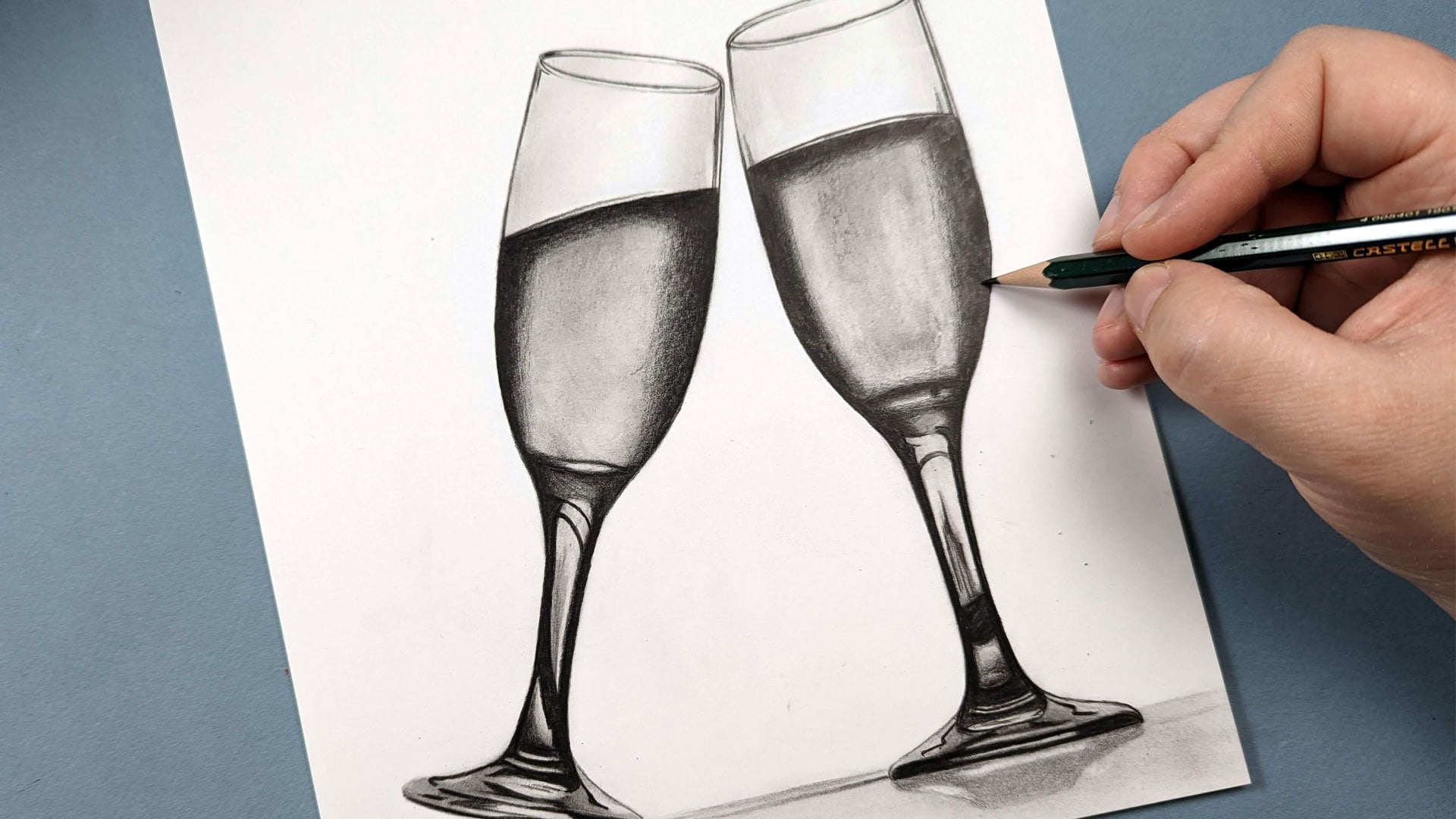
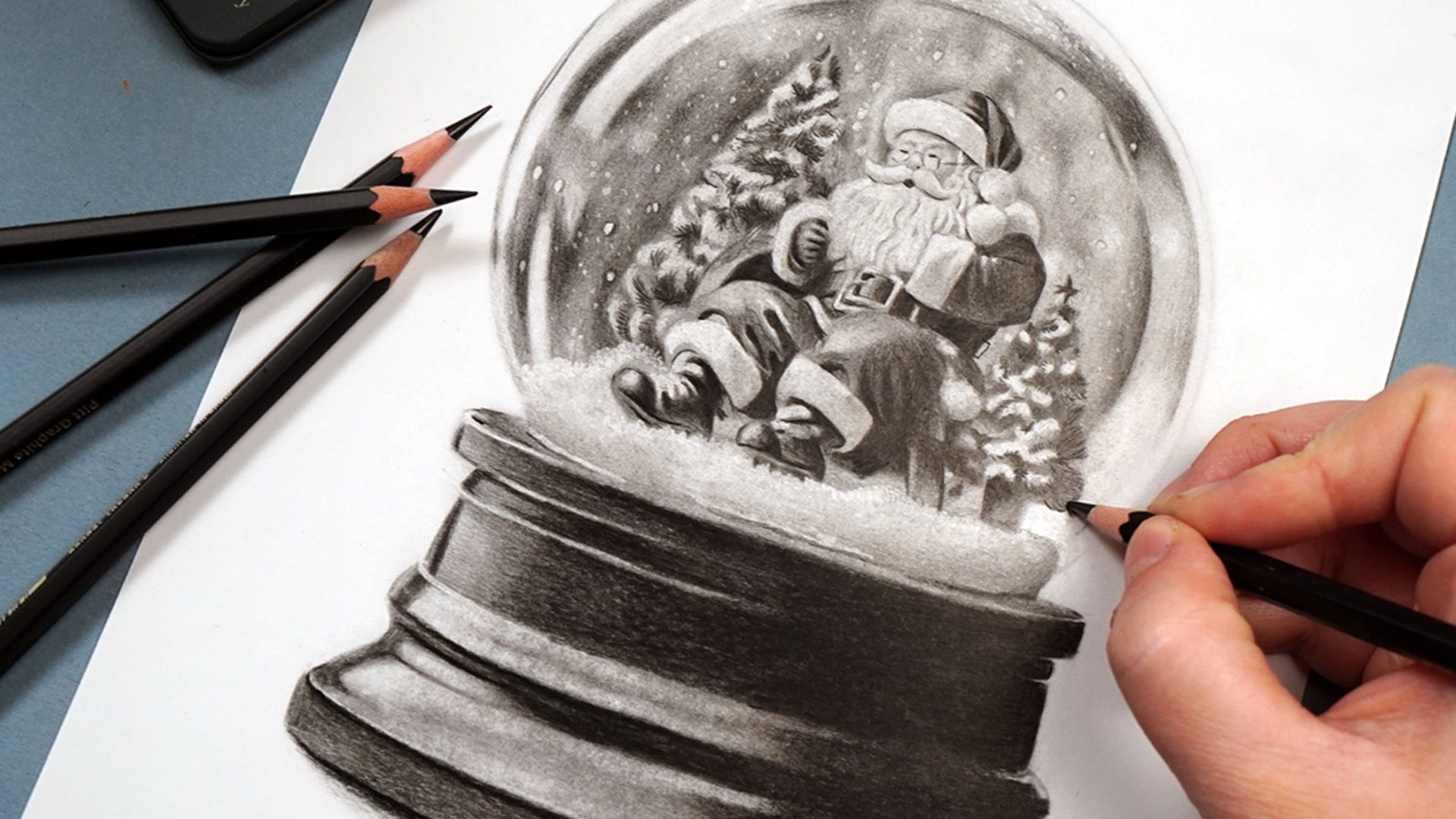
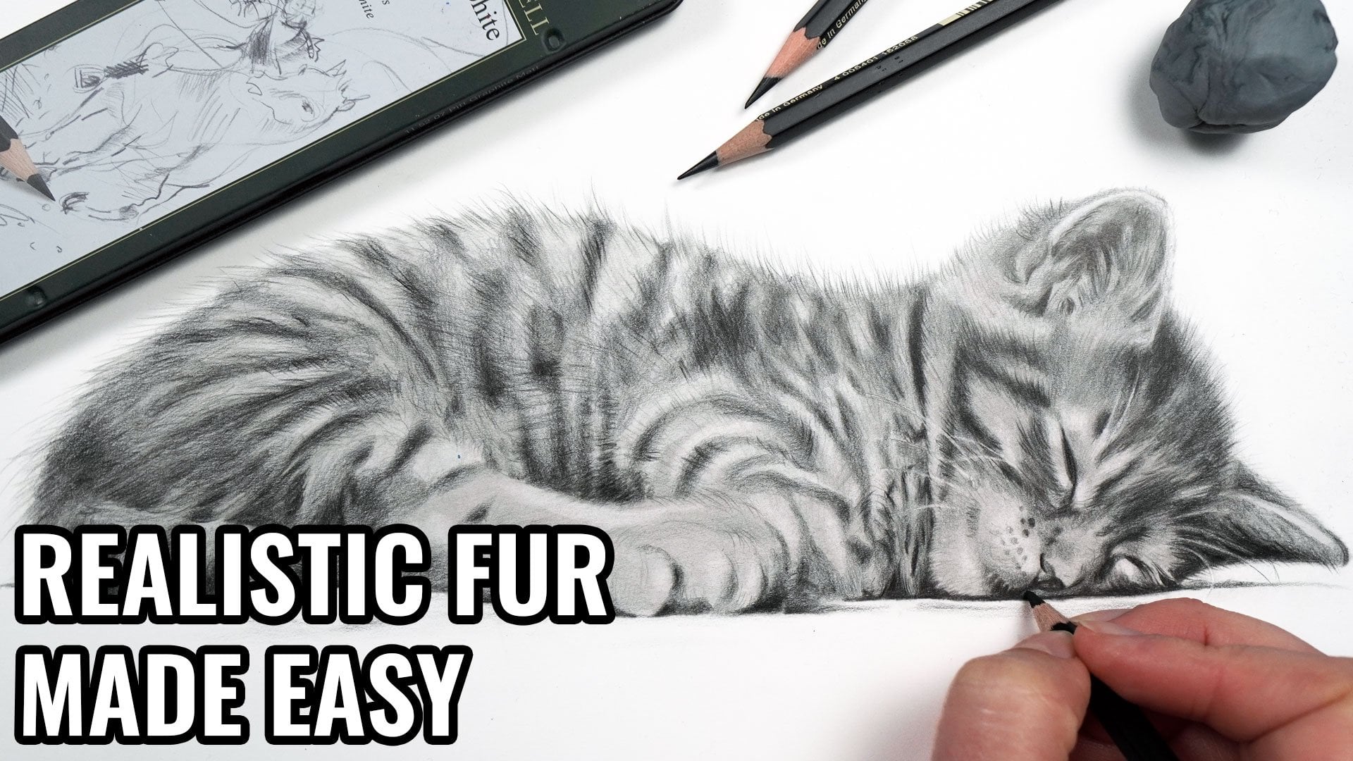
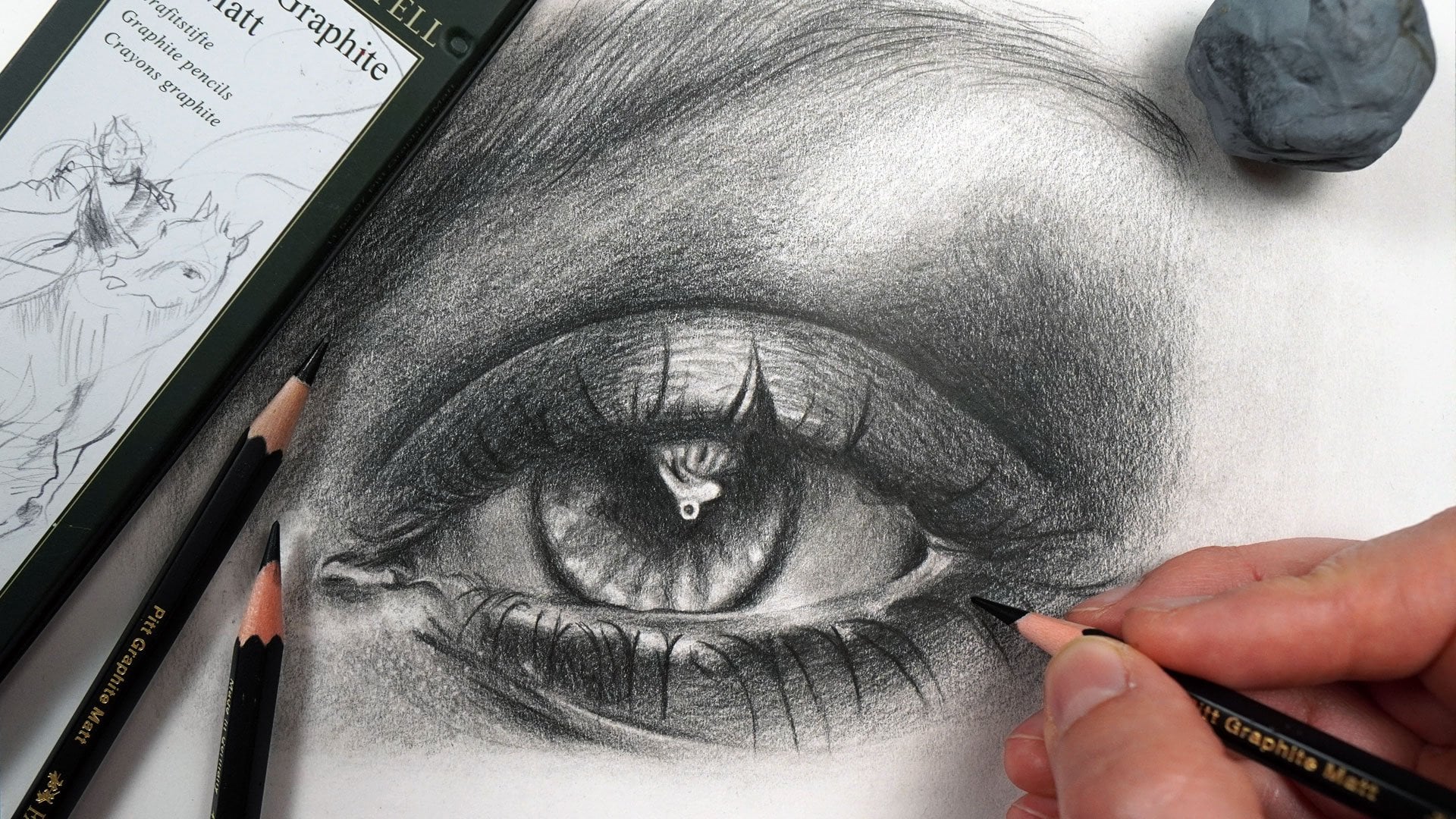
1. Introduction: Is possible to create some
really deep and rich drawings with graphite pencils. But I find a lot of people
aren't sure where to start. I want to show you
that actually, if you follow a
specific process, it is possible to create some
really beautiful drawings, and it's not as hard
as you might think. My name is Jemma Chambers, and I've been making online
art tutorials since 2020. I've helped tens of thousands of people improve
their drawings. But today, I want
to really focus on my main graphite
drawing technique. I want to show you how I
layer the graphite pencils to create this really rich look that you see in my drawings. I'll show you all of the
materials that you'll need, and then we can work
our way through the process that I alas e. And you'll see that
it's maybe not as hard as you might expect.
Let's get started.
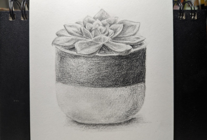
2. Class Project - Drawing a Succulent Plant: Last project, we'll be
drawing this succulent. Now, I've picked this
for a number of reasons. Not only do I think
it's quite sweet, but it's got some
really good contrast. It's got some
amazing dark values, some really nice light values, and a lot of mid tones, and it's got some
really good detail. So it's going to be a great
drawing to practice on, particularly if
you're a beginner. Now, we will go through in a second all of the materials
that you'll need, but I will also include them
in the project section. Also go through
the whole process, including how to
create the sketch. But if you don't want to
create your own sketch, I have added mine into
the class resources. Finally, when you've
completed your drawing, please do upload it to
the class projects. I would love to see
what you've done. Let's have a look at the
materials you'll need.
3. Materials You'll Need to Complete This Drawing: Think about the materials you'll need to complete this course. And the most important
material you'll need is a set of
graphite pencils. Now note that you
will need a set, you won't be able
to create this look with just one pencil. I'm working with
a set of pencils that has a variety of
different hardnesses. The harder pencils are going to look much lighter on the paper, and the softer pencils are
going to be much darker. And we're going to work with
three different pencils, hard and medium and as. I'm working with mat
graphite pencils. These are very similar
to standard graphite, but they aren't as shiny. You don't have to use
Mt graphite like I am, and I will include details of the equivalent normal graphite that you can use for every
mat pencil I'm using. The next most important
thing that you'll need is the right kind of paper. So you don't want to draw on
sketch paper, for example. It won't be possible to build
up enough of the graphite. I'm working on a very nice and smooth bristol board paper. This is a particularly
thick paper which is going to help me build
up all of these layers. Next up, you will need some way of sharpening
your pencils. So I just use a standard
pencil sharpener. Anything that creates a really nice and sharp point
is what you need here. It doesn't need to
be anything fancy. Next up, I need something
to blend these layers. This is probably something
you'll have around the house. It is a piece of tissue, and you'll see how
we're going to use. From here, we'll need a few ways to add some light
into our drawing, and I'm going to be using two
different types of eraser. I'm using a putty erasor
and an electric eraser. So a putty eraser is
a moldable eraser. I find it really
good if I want to be quite soft when
lifting the graphite. I don't want to be creating
really harsh lines, but I maybe want to make an
area a little bit lighter. I also have an electric eraser. This is so good for adding
in all of the fine details. And you'll see a bit later
how we're going to use that. But I so highly recommend
getting an electric eraser. It's going to make your
life so much easier. Final thing you'll need is some way of looking at
the reference photo. Because I'm focusing on
drawing realistically, I always like to work
from a reference photo. I find that the easiest way to create a really
realistic drawing. Now, I'm looking at my
reference photo on my iPad. I particularly like that I can zoom in to see all
of the fine details. You don't need to look at
it on an iPad, though, you could, for example, print
out the reference photo. You will need a set
of graphite pencils, the right kind of paper, a pencil sharpener, tissue, a putty eraser, and an
electric eraser, and an iPad. So let's start working
through the process of building up and
layering up these pencils.
4. Sketching the Outlines: Now that we've gone through
all of the materials, the first thing I want to do is create my sketch outlines. It is so important that we get everything in the
right proportion. So what I always like to do is use something called
the grid method. This is where you draw a grid on your drawing paper and you put a grid on your
reference photo, and you just draw what's
in each individual square. Stops you from
making assumptions about the overall shapes, and you're just looking at
each individual section. You're not really
focusing on drawing a plant, for example. Once I've gone through and drawn each of the individual squares, I then use a putty eraser
to remove the grid lines. Now, the most
important thing here is to create a
really light sketch. Want it to be so light
that I can barely see it. You can see here
how light this is. Now, if you don't want to
create your own sketch, do remember that I have included mine in the
class resources. And if you want to go through the sketching process
in a lot more detail, check out my beginners guide to graphite pencils where I do go through it really thoroughly. So now we've got our
sketch all mapped out. Let's start working through
the rest of the process.
5. Studying the Reference Photo: The final step that I
like to do before I start shading is to take a really good look at
the reference photo. Rather than just diving in, I want to take a minute to look at the reference
and really look at the most important details and shapes that I can see here. Looking at really all of the intricacies of what
is particularly light, particularly dark,
anything that I think will help with the drawing.
Let's take a minute to look at the main elements, and you'll see a little
bit better what I mean. So first off, the thing I'm probably noticing
the most is the pot. Now, this pot is split into a dark section and
a light section. But they are not all
consistently the same color. First off on the
bottom of the pot, this pot, I assume
is white down here. But it's firstly,
not actually white. In some areas,
it's a light gray. In some areas, it's
really a very dark gray. But because these shadows it creates the
illusion that this is And as I just mentioned, it's also not the same
color throughout. So it is much lighter
in both sections, both along here and along here where the light is hitting
in a line down here. And then it's much darker on the right hand side where there is this more
prominent shadow. So when I'm drawing both the
top and the bottom section, I want this to be so
nice and smooth and have really nice and smooth radians going from the darker
side to the lighter side, and then it's kind of mid tone with a light strip
down the side here. Looking at the
succulent at the top. Again, it hasn't really got a huge amount of
texture at all here, but there are some very
good light and dark areas. Generally speaking, the
underside is darker on quite a lot of these leaves
and generally speaking, the top of the
leaves are lighter. It's worth mentioning
that on these top sides, just because they're lighter doesn't mean that there's
no shading on them. This is firstly on
the lighter areas, still, I would
say, a light gray. And then there's these
odd shapes which are more of a mid tone
gray, a light mid tone. And then there are
some darker mid tones. There's quite a good range
in this top section. So we're going to want to build that up and make sure
that we blend this and smooth it out
after we've drawn with each pencil so that
both sections, both the leaves and the pot can be made as
smooth as possible. That's the number one aim. So those are the
main things that I'm noticing initially,
let's start drawing.
6. Building up the Hardest Pencil: Want to draw this plant in the same way that I would
usually go about it. I want to generally start with the lighter or the
harder pencils and gradually work my way towards the darker
and softer pencils. So I'm starting here with the hardest pencil I'm going
to use in this drawing. This is the four B pencil. This is a four B, but
I'm using Mt graphite. If you're using normal graphite, I would recommend
using maybe an HB. All I want to do here is begin marking out
the key shapes. I just want to get something
down on the paper. I'm starting with the
plant at the top, and we're going to work
generally from the left to the right and from
the top to the bottom. Let's take a look at what
I'm seeing to begin with, and then I'll explain a bit how I'm putting the pencil down. Starting on this leaf here, and there isn't a huge
amount to this leaf. There's a very dark line
all along this edge here. It then fades a little
bit into the leaf. Then there's a light strip
here and down the edge, and then there's a light, midtone triangle shape here
that's extending down. Then the leaf
behind, for example, this is all pretty
consistently one, very light color, except
for down the edge here, where it's much, much darker. Then on this leaf here, it's very light around the edge and then it's got this darker
section in the middle, but it goes very pointy
into the corner, and then it comes down
and zig zag down here. A I'm doing is drawing
in those shapes, looking at one leaf at a time. Now, the most important
thing that I'm doing here is pressing really nice and
lightly with the pencil. Because we're building
up this pencil little bit by little bit, we want to press lightly, and then we will be
able to blend it, smooth it all out, and we
can build up the next color. Now, as always, there are a few ways that I'm
going about this. First off, I want
to be making sure I've got a really nice
and sharp pencil. I find that it's going
to go down a lot more evenly with less pressure
if it's nice and sharp. Generally speaking, I
do also like to try and hold the pencil further
back than you might expect. That said, right now, I am holding it reasonably
close to the tip because I do need to be very accurate about where it's going. But generally speaking
for larger areas that you'll see
in a second where I don't need to be as precise, I do hold it further
back and that stops me from being
able to press too hard. Right now, I just need to be careful to really control
my pressure here. Also want to make
sure the pencil I put down here is
really nice and smooth. Because as I mentioned when we looked at the
reference photo, there's not really any texture. I do want to get this
as smooth as possible. The best way to do this is
to work in circular motion. So I like to sketch out the outline of the shape I'm
working on and then work very lightly in these circle or oval motions to just try and get the pencil down as
smooth as possible. And you can see me
doing that here. Let's take a minute to look at this leaf and I'll show
you what I'm seeing here. I'm looking at this leaf, and there's this
darkish shape here. There's almost a line going up here and up here around here, and then there's
this shape on here. And then on this leaf back here is dark
down the side here and has these kind of horseshoe like midtone
areas here and here. That is literally
all I need to do for this first pencil
is just try and get my bearings and get
everything marked in, just working really, really, systematically, one
leaf at a time. Now, I will show you some of the other
leaves so you can see a bit better what
I am looking at. But there's not more
to it than this, certainly not right now. We just want to be
following these shapes. Now, something that
has made this a lot easier is that when I
made my sketch outlines, I did take a good
amount of time to get all of these leaves marked in as
accurately as I could. It does make it a lot easier. I'm really able to match each leaf with the leaf
on the reference photo. And I think that is one of the keys to making
my life easier here. And now it's just a case
of going over that sketch, going over the outlines like
you saw me do a second ago, and then I can shade in following the tone I
can see from there. Let's have another look
at the reference photo. Notice that towards the middle, the leaves generally are
getting a bit darker. This leaf along here
is very, very dark, but it is lighter
towards the point, and this leaf is almost as
dark here as it is here, I would say, so I can
follow the shapes of these zigzags of these leaves
in here and then shade up, leaving a little gap
around the edge, and then carry on shading in these little dark spots
in these kind of diamond So I make my way down
from the center. I'm not going to worry too much about any sort of details. So, for example, on this leave. It's got this line
going up the middle and it's darker on this side,
lighter on this side. I can add that in
in a little while. Why don't need to worry about is adding a huge amount of detail, particularly at this point. So it's worth bearing in mind that towards the end
of this chapter, we're going to be blending
all of this together. So a lot of the detail that
I'm adding will get lost. So I don't want to invest
too much time and energy into trying to make it perfect if it's not really going to be
visible by the end. That blending that we will do towards the end of
this chapter is the key to making this look
really nice and smooth. Because although I am trying to make this as smooth as possible, it's not going to be possible to make it perfectly smooth. So that's where we can blend
this, and that'll help. So towards the bottom here, it does get really quite dark. It's very dark along
the edge of this leaf, along the edge of this leaf. There's a slight line
around here showing the separation between here
and here, and it's very, very dark going into here, and it's very dark here
and all around here. More like a mid tone in
here and around here, but very dark here, and I want to add a
darkness under here. Those are the main shapes and tones that we're wanting
to build up on the leaves. And you can see that
quite quickly, really, we have built up the
succulent itself. From here, I'm going to
want to focus on marking in the key shapes of the gravel and generally getting
the pot marked in. Looking at the gravel,
I assume it's gravel. I don't need to draw
this out perfectly, but I do want to get some of
the key shapes marked in. So I can mark around the edge of each of these gravel shapes, trying to get it reasonably
close to the reference, but it doesn't matter too much. More importantly would
be to get this curve here looking right and
getting this area shaded in, and putting a slight line
around the edge and going around here so that we have this light patch on the corner. Here you can see a little bit of the stones, but
not a huge amount. I just want to mark
out the main shapes. And I want to be careful
around the corner. Here that I am marking
in this lighter area. It's kind of in two
different strips. There's the top strip and
then the bottom strip. So you can see me marking out around those shapes
of the gravel. I can use the sketch
on the edge of the pot line and where the leaves are as
a little bit of a guide. As I say, it doesn't
need to be perfect because it's a really very
small area of the drawing. I do want to try and get it as accurate as I can
to the reference. Here on the other side,
I'm just going to mark in where those light strips are. Then from here, I want to start focusing on marking in
the shape of the pot. The most important thing
because the pot is a man made item is I do want to try and get as straight line
down the edge as I can. So I'm just really carefully following the lines
of my sketch. I am confident that
the sketch is right. Once I've gone up the edge,
I can then draw around where the black top section is meeting the bottom
white section. Draw over this line, here, that it is much clearer. From here, I want to get down
some really smooth shading. So I can start off by
going against that line on the edge so that I don't want to risk
going over that line. And then I want to be kind
of working in sections, but also in circular motions. So first off, notice that
I'm not holding the pencil right close to the
tip because we are trying to press really
nice and lightly. I am holding it a
bit further back. I'm just going to
work in these kind of circular kind of val motions, and you can see
that's putting down the pencil reasonably smoothly. As I say, it's not
perfect, but that's okay. When we blend this in a second,
it will look much better, and it will certainly
look better as we build more of the pencil on this So once I get about
halfway across, I can just go against the
edge on the other side, make sure that that's
looking nice and tidy and then start
shading up from here. And then once I'm happy with
the section towards the top. I want to do exactly the
same thing on the bottom. I want to start off
by going lightly over my sketch
line for the edge. And then I want to be adding more shading on the
right than on the left. As I said when we were looking at the
reference vote here, you'll notice that it is much darker here and lighter here. So I want to be adding most of my shading all around
here and going down here a little bit darker along this bottom section
rather than up here. On the black section at the top, there was also that light strip towards the left hand side. We're not going to worry
about that at this point. Simply because this isn't a
particularly dark pencil. When we move onto the
much darker pencils, that's when we can
start adding in those light strips
in the top section. And once again, working really
nice and lightly working in circular motions on this
bottom section as well. Again, I'm trying to make
this as smooth as possible, but as I say, I don't
expect it to be perfect. Once I'm happy down the bottom, I don't want to forget
about the shadow. So the shadow isn't the
same the whole way along. It's thinner in the middle. There's more shadow here and
there's more shadow here. So I want to be adding
a nice crisp line from about here around the
bottom to about here, and then shading more here and more here and less
towards the middle. As I say, it doesn't
need to be perfect. I just want to get something
marked in here that we can build upon as we move
on in the next section. Now quite quickly,
I think we have something that does
look like a succulent. It's not got a lot
of depth to it, and it is quite scratchy,
but that's okay. It is something that we
will be able to build upon. So what I want to think
about now is blending this. And I don't use any fancy
tools when I blend. I just use a piece of tissue. So what I want to do is this tissue around my finger, just wrap it around
and then work in circular motions to
smooth all of this out. So I'm starting off towards the middle and then blending over the
plant section as well. If I find that my tissue
gets a bit too dirty, I can just put it
rewrap it around my finger in a different
area and then carry on. And I want to end up with something that looks
really nice and soft. I don't really want to see
too much of the pencil mark. Want to give myself something
that I can build upon. So you can see me lightly going over this
area at the bottom. I would say that
the lighter areas are so important because it shows so much if it
is looking scratchy. You can see how quickly you
end up with a really nice, smooth, kind of a template. I think of it as a template
that we can build on. So by the end of
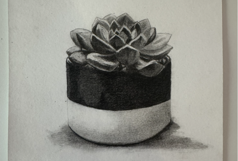
this first chapter, you should have a succulent in a pot that looks
something like this. As I say, it hasn't got a
huge amount of depth to it, but certainly we've begun
to get our bearings and we have a good basis
to build upon. But that is it for
this first chapter.
7. Building up a Softer Pencil: Let's now do exactly
the same thing as we did in the previous layer, but we're going to refine
things a little bit more and move on to a
slightly softer pencil. This is the eight B pencil. If you're using normal graphite, maybe something like a
three B would be good. I really just want to
go over everything again in exactly the same
way as we did before. I'm maybe building up a bit more of the
shading on some of the darker areas and
just lightly going over any of the more subtle shapes. Where we blended it before, the shapes that I marked in
have got a little bit lost. So this is a good opportunity to refine them a
little bit further. Now, in terms of how I'm
building up this color, it is exactly the
same way as before. I am holding the pencil closer to the tip
than I was before, because I do need to be very accurate about where
this pencil is going. I want to make
sure that I'm able to mark out all of the zigzags, for example, in this section. I need to hold the pencil closer to the tip in order to have the kind of control over the pencil where I can
mark out those shapes Working reasonably
systematically, again, I'm working along the top vest, and then I'm generally working, so from top to bottom
and from left to right. The main reason I like doing
this is where possible, I like to try not
to smudge this. That said, obviously,
we will be blending it, so it will get a bit smudged, but that's more of a
controlled smudge. That's all that we really want to be doing
for this section. It is just a case of further
building up the shapes, and further building up so
that it looks a bit richer. Now, don't worry about any areas that are really
light in the reference. So some of these areas, particularly along the top
of the leaves are very, very light, like along here, for example, and around here. Don't worry that they're looking a little bit kind of midtone. Obviously where we've blended, it smudged all of the pencil
onto the whole drawing. What we'll do in probably the next chapter is add
those light areas back in. So although it looks
a little bit too kind of muted at the
moment, we will brighten But right now we just
want to be focusing on adding in the darker
and the more midtone. The good thing about the
last chapter, particularly, not only were we first off marking in and
getting our bearings, but we are able to put some sort of pencil down on
the whole drawing, so we don't really need to worry about the lightest areas. So once I've gone over the
whole of the succulent itself, I can then start working my way down and begin
working on the pot. So looking at the
soil, for example, that needs to be a lot darker
than it is at the moment, so I can just go over this. It's much easier now because I've already got
the shapes marked in. I'm just going to go over around these light patches here. Now, there is one
thing that I'm going to be doing differently
on the pot. You'll notice down
this left hand side, there's a lighter strip. There's a line for
the edge of the pot, and then there is
a lighter strip, and then it goes to dark, that it's reasonably dark
here and then there's a lighter patch here and
then dark all around here. What I'm going to do is
draw a line down the edge, a nice and crisp
line along here, and then I'm going to
leave a gap and draw another line to add
in that light band. And then I'm just going to
shade the rest of the pot. Can do this in exactly
the same way as before. There is still the lighter area, sort of a third of the
way from the left. But I'm not going to worry
about that right now. I can think about
shading this in with the darkest color and
avoiding the lighter hatch. But I want it to be darker
than that very edge strip. So I once again want to
mark around the edge. Fill in around these
little gravel sections, and then I can shade in
just building up the color. Now, again, don't worry
that it's looking a little bit scratchy. It's
not looking perfect. We are going to be
blending this in a second, which will smooth
the whole thing out. So this is all looking
much better already. We're gradually getting more s. The last area that I want to focus on
is adding a little bit more shading to the light
section down the bottom. So building up more color in this bottom
right hand corner, making sure that I'm using
these circular motions, really focusing on getting
this as smooth as possible, and gradually fading this pencil into the lighter area
towards the left. I'm also going to put
a really crisp line where the shadow is meeting the bottom
of the pot because the shadow down here isn't
looking dark enough right now, and then I can keep shading
along the bottom here. To add shading around
the bottom of the pots, and I want to add shading for the shadow going from
that crisp line down. As I say, although I am trying to make this as
smooth as possible, it is looking a little bit
scratchy, but that is okay. So once I'm happy with all of the shading
down the bottom here, I'm happy with the whole slightly darker,
slightly softer pencil. I want to blend this again. So I once again, I'm
going to use a tissue. I've wrapped it
around my finger, and I'm focusing
a little more on the top section on just
going over the darker areas. I don't need to blend
the whole thing now. I just want to focus on
where I put this pencil. I am going to blend a
lot more in the middle. First off, I have moved the tissue so that I'm
using a clean part, and I'm just going to gently use circular motions
down the bottom, and then I can start focusing
on the middle section. It's not as important that
I have a clean piece of tissue for the middle
because it is just so dark. But down the bottom, I do want it to be as smooth as possible. And you can see how
nice and smooth that bottom white section
is looking now. So we're gradually getting
there with building up this color and building
up all of the shading. By the end of this chapter, you should have a
slightly clearer, but still pretty fuzzy
drawing of the pot.
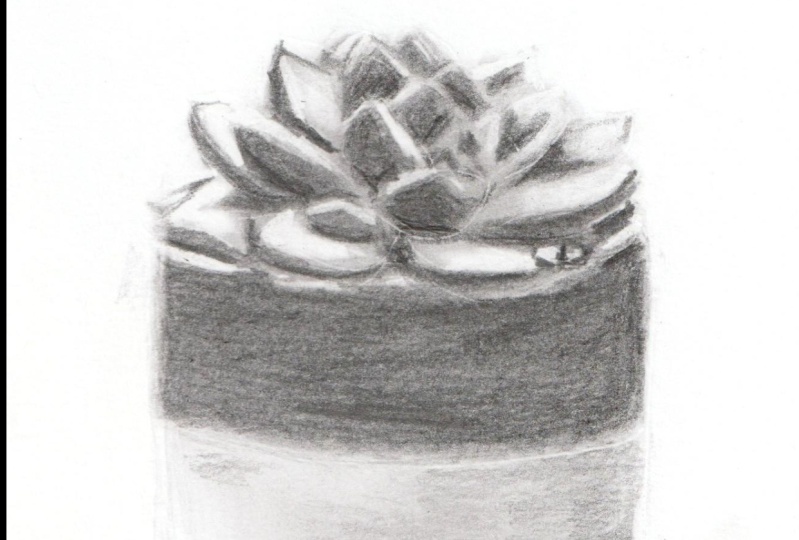
8. Adding in the Darkest and Lightest Values: This chapter, let's focus on getting these darkest
values marked in, and then we're also going to
add the light areas back in. So let's start off
with the darkest or the softest pencil we'll
be using in this drawing. So this is the 12 B pencil
in the mat pencils. If you're using normal pencils, maybe something like a five
or six B would be good. I only want to go around
the darkest areas. So there's not a huge amount of areas where I
need to put this. Really just the select areas. And I think it really stands out because these
are the darkest. So, for example, this
little corner here. All along the top around here, a lot of the central
spots in here, here, here, as well
as around here. And then all around the edges of the leaves around the bottom, all of these really
dark patches. Now, it is very, very similar to what we were doing before. I just want to gradually work
my way from the top down, filling in these patches. In terms of how I'm doing this, I once again want
to be trying to get down the pencil in as
smooth a way as possible, so I want to be working
in circular motions. And I also want to have a
really nice and firm point, which is going to help me
build up the contrast here. Now, you may notice it
doesn't necessarily look as dark as
you might expect. And to be honest,
I think that is because the areas around these very dark patches aren't as light as they are in
the reference photos. So in a second, we'll be adding those light
areas back in, and it will make
these darker areas look much, much darker. Just working my
way through here, building up this contrast. The area that I really
am going to need to add a lot of shading with this pencil will be
on the pot itself. On the most part, I just
want to be adding this in the same places as before and just gently working
my way through. I'm not spending a huge
amount of time on this. So far, I have spent about 5
minutes up until this point. So it's really not
extremely time consuming, and I would say that I am
really taking my time. Once I'm happy with the leaves, and I'm happy with the kind
of gravel the soil section. Let's start working our way over the dark section
of the pot here. Now, once again, you want to be having a really sharp pencil. I'm not pressing
really hard here. I will need to press hard a little bit later on,
but at this point, I just want to build out more of the shading and just build
this up a little bit more. I'm doing is
building up a lot of the shading to the left
of that lighter patch, and then let's put a
line down here so I can see where this lighter
patch is going to end. Now, by the lighter patch, I mean this little subtle
shine is not super obvious, but there is a
lighter area here. It's darker here, lighter
here, lighter here. Darker around this
right hand side. So I can put a
line roughly where that light glare
is going to end. And then I can basically block in this whole
right hand area. And it's a bit easier for me to see where the
pencil needs to go. So working in circular
motions with a sharp pencil, just gradually building this up, it does look a little bit
scratchy, but that's okay. And then once I've
shaded all the way up to that quite solid line. I can then just start
to fade out and build up a bit more of the pencil on this
gap, but not as much. I just find that the easiest
way to build this up. Actually, I'm going
to put pencil over the whole area because I don't
want it to be too light. But as I say, I'm just
building up less in this pat. Let's keep working our way down, and I want to be thinking about the darkest areas
towards the bottom. There isn't a huge amount
I need to do here. Specifically, I want to
do around this edge here. Just build up a bit
more of the pencil, so the shadow is a bit
more obvious around here, and then I want to do
a really solid line for the shadow along the bottom. So where the shadow
is meeting the pot, I can add a really
solid line and then just shade down
from that point. At this point, I'm
reasonably happy with all of these darkest
values on the pot. What I think it now
needs is a final blend. With a tissue, once
again, just very, very lightly, I don't want
to make a big smudgy mess. So very lightly on the leaves and very lightly around
the bottom here. You can see how
cautious I'm being. I have got a little
bit of a smudge down in this left hand corner, but we can tidy that up in
a second with an eraser. I am going to use
circular motions on the pot just because
this is all very dark. It doesn't matter so
much if I smudge it. But I don't need to do too much. So now at this point,
I want to start adding in the lightest areas. So I'm going to start off
with my putty eraser, and I want to use this
to work all the way around the edge and just
tidy up any smudges. So you can see where
I've been blending, a lot of that blended pencil has just sort of seeped
out over the edge, but I want to have
really nice crisp edges. So I'm just going to work around here around all of the
leaves as best I can. And I can always be a
bit more accurate in a second with the
electric eraser. Do frequently remold my eraser so that I have a clean area. So do bear that in mind. I can also just tidy up where this smudge
was a bit untidy, so just very gently
taking some of that off, and that looks much better. But it's really only around the edge for now that
I'm going to be using this putty eraser for pretty much everything else I want to be using the
electric erasor. It's so much more accurate. So let's take a minute
to have a look at the reference photo and look
for these lightest areas. So there are some areas
that really stand out like this little corner section
in the same round here. But when you look at the leaves, a lot of them need some
of the pencil lifting, particularly around
the edge of each leaf. So this is really nice and light around
all of these edges. They've all got this
sort of halo effect, which is just where the light is catching from this side I guess. Also a little bit of
light in areas like here, for example, that adding that in is going to
make a huge difference. So let's work our way around. So adding in these odd, very obvious patches of
light around the pot. And then I'm going
to start working my way around the leaves. Now, I want to go about this in the same way that
I would usually. So I do want to end up with a really nice and
bright white area anywhere where I'm
lifting this pencil. I do find that after a little
while of using the eraser, it stopped lifting
the pencil as well. You'll notice that
reasonably frequently, I take the eraser away again. And all I do is use
a craft knife to cut off a tiny sliver
just the very tip, and that gives me
a new clean point, and it comes back much brighter. So you'll notice me
doing that in a second, but I'm literally
for now working my way around the tops
of all of these leaves. I can also tidy up around
the edges if I need to, just if the putty eraser
wasn't quite accurate. You see here it's starting
to not lift as well, so I've taken the eraser away. Off camera, I've just
cut the tip off, and then I can come back and
it will be much brighter. So you can see what a big
difference that makes. It's much brighter. So do you highly recommend doing this? I'm just working
my way around in. Now, don't worry that
it looks maybe a little bit too bright in
terms of the contrast, or a little bit too it's
not completely accurate. Maybe some of the light lines aren't as thin as they are on the reference photo
because we can tweak everything in
the final chapter. Add any of those
final last tweaks, just to tidy this up. So you can see on this
leaf here, for example, maybe it looks a
little bit kind of harsh on the white
line, but that's okay. So as I work my way down
through the leaves, there becomes a few more
areas that I need to add in, not just the edges
of the leaves. There's quite a bright
patch here, for example. Around the edge here
and around here, it's pretty bright, as
well as around here. So it's not necessarily just those edges that we
want to be building up. We're going to add a
few little tweaks in the gravel. I think it's gravel. And then once I'm
happy, I can have another look over the whole
of the drawing and see if there's any other
areas where I think maybe just a little bit of
the graphite needs lifting. But it's really final tweak. Just now before I move
on, go around the edge, just tidying up the
shapes of the leaves. As I say, the putt eraser
isn't hugely accurate at this, and it'll be better
if I can tidy up these quite angular shapes
with the electric eraser. I'm just going around the
edge, tidying this up. So then by the end
of this chapter, you should have a pretty
accurate and detailed plant. And what is particularly lacking now is those final details as well as the very black black that we need to add
in for the pot. But we can add in that
in the next chapter.
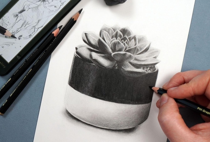
9. Adding in the Final Details: Spinal chapter, let's add in
the absolute darkest values, as well as any final details. So anything that just
needs tidying up. And for all of this chapter, just like the last chapter, I want to focus on adding
in the darkest pencil, the 12 B pencil. So again, if you're
using standard graphite, you want to be using the
five B or the six B. And I'm just going
to work my way around one leaf at a time, adding in some tweaks. There's not a huge amount that I need to do
for the leaves. On the most part, I'm
pretty happy with. Can see, here I am just
going around this corner. So pretty much all of
the darkest areas, and I am now pressing
much, much firmer. Because I want to get these
darkest values really dark, I do find I have to
press a bit firmer with the pencil or it doesn't
go to its full darkness. And I'm pretty much
just going around all of the leaves in exactly
the same way as we did in the previous chapter at the beginning there when
we use the 12 B pencil. Going round and firmly adding in some of this pencil
in the darkest areas. But I can also, in some
of the lighter areas, maybe add some very light
pencil for the odd tweaks. Now, an example of a small tweak that I want
to be adding in would be things like where this leaf
is crossing over this leaf. There's a very small line here, just separating the edge of this leaf from the
edge of this leaf. Want to very lightly
add those lines in add that separation
because when I drew in the edges of the
leaves or when I added in the edges of the leaves with the electric eraser, you can't add that sort of detail really with
the electric eraser. So I want to be doing it at
this point with the pencil. But really, I am just looking
at each individual leaf. I want to get to the point
that I think that leaf looks pretty much exactly the same as the reference photo. For where we needed to add in
more of the lighter colors, for example, or we
needed to add in a series of layers to
build up the detail. We don't need to do
that anymore because this is the final section. I very much need to add
in those final details. I'm once again working in
the same way that I usually would from the top down and generally from the left
towards the right. Now, the main reason that
I like to do this is not only does it help me
to work systematically, I find that much easier. But hopefully it will cut
down on any smudging. So there will be
a certain amount of smudging that's
going to happen here. Particularly. I mean, you
could stop it by leaning on something like tracing paper.
I don't tend to do that. I just I do try and be careful, but we probably
will need to tidy up the drawing and the edges
one more time at the end. Not a huge amount to talk
through on this section. It really is the same as
what we've already done, filling in all of those
lights and darks, and as I say, pressing
a lot firmer. I will mention that it
generally doesn't look as dark in the footage here as
what it is in real life, just because of a bit of
a glare from the lights. But this right hand side is as dark as the left hand side,
despite what it might look. So work my way down
all of the leaves. The main area that I
want to be focusing on, and the main thing
that I think is really going to help this
drawing come together is making the dark patch of the pot look as dark as it is
in the reference photo. Let's add a light line down the edge just to give it a
little bit more structure. There is quite a dark
line along here. I want to also put a line down the other side of this
lighter patch all along here, and I want to build up
a lot of this color. You can see how much firmer I'm pressing here in comparison
to what I was doing before. Much, much firmer pressure. But I am still working
in circular motions. I do want this to
be as smooth as possible because that is one
of the main things about Do you need to be
careful as I get towards that light patch that I talked about in the
previous chapter? Because I don't want to make that as dark as the rest
of the pot needs to be. I do want to have that
nice, subtle light patch. You can see, I'm
just shading up to the edge of where
that light patch is, and then I am fading out, and then I'll fade back on
the other side of this spot. Actuality, I do need to
add a reasonable amount more shading on this light patch because it's not hugely light. So you can see I've added
some extra shading, and then I want it to be much darker from about this point. And I want it to be super dark for the rest of the right
hand side of the pot. I can just keep building
this up until I think that that light
patch looks about right. Honestly, it does need
to be pretty dark. And from here, I want
that solid color to carry on the whole
rest of the way. So back to pressing firmly, but still working
in circular motions so that hopefully I end up
with a really solid color. Now, it does look a
little bit scratchy, even though I am trying to make it really smooth and consistent. Think the best
thing to do here is go back over it with a really
nice and sharp pencil, really build that up
a little bit more. It's still not looking
quite smooth enough, but we can maybe give it a final little subtle
blend in a second. Let's go over the darkest
area at the bottom here. Once again, creating
a really sharp line where the shadows
meeting the pot and then shading down
from that point by pressing much firmer
around the edge now. I'm really just
wanting to focus on how scratchy this
area here looks. I'm just going to
take my time to build up a bit more
of the pencil. Try to make this look a little
bit more of a solid block. Then I'm just going to use
my passe eraser to tidy up down this edge one more time where it has smudged
a little bit. Just because there's
so much graphite here, you can see that that's
nicely tidying this up. And that's it. Now, you could, if you want to add
a little bit more, just keep building up that
dark section a bit more. I think it probably could
still be a little bit darker. But the final thing I'm
wanting to do here is just focus on tidying
up around the edges. I think having a really
clean edge and outline to the drawing is one
of the main things that's really going
to help it to pop. But that is it for
this tutorial.
10. Summary: Right, that is the
end of this class. I hope you've enjoyed it,
and you found it helpful. So what I always like to do is start off by creating
my sketch outlines, making them really nice and light so you can
barely see them. From here, I take
a minute to have a look at my reference photo. Really look for the key things I want to be noticing when
creating this drawing. I can then start working my way through the
different pencils. So starting off with
the hardest pencil, filling in all of
the key shapes. Once I'm happy I've got
everything marked in, I can then blend
it with a tissue. Here, I can move on to my
medium pencil, once again, fill in all of the key shapes and blend it before moving onto my softest and darkest pencil and giving it one final blend. I can then use my
putty eraser and my electric eraser
to add in all of the light areas back
in that have ended up getting smudged through
using the tissue. I can finally go back to that darkest pencil and add
in all of the final details. Now, I hope that you found
this course helpful. Please do review it if you have, and don't forget to upload your drawings into
the class projects. Happy drawing, guys, and I'll
see you in the next one.
 Gemma Chambers, Pencil Artist