Transcripts
1. Introduction: I love creating
seasonal drawings. They can be so much fun. And with Christmas
rapidly approaching, what can be more fun than
drawing a little Santa? Now, drawing something really detailed can seem overwhelming, particularly getting everything into the right proportions. But I want to show
you that if you follow a series of steps, it's maybe not as hard
as you might expect. My name's Gemma Chambers, and I've been making online
art tutorial since 2020. I've helped tens of thousands of people improve their art. But today I want to
get Christmassy. I want to draw this really fun little Santa
in a snow globe. I will show you why I
picked this specific Santa and talk you through all of the materials you'll need
to complete this drawing. We can then talk through how
to create the sketch and start working
through the process of building up the picture. And I think you'll
find it's not as tricky as you might expect.
Let's start drawing.
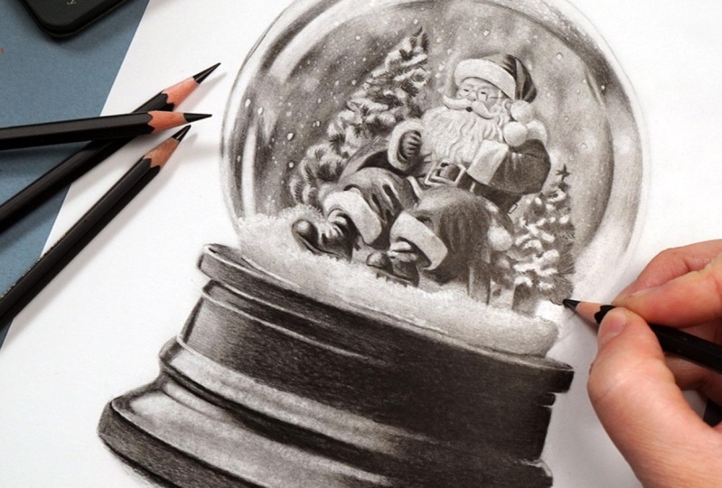
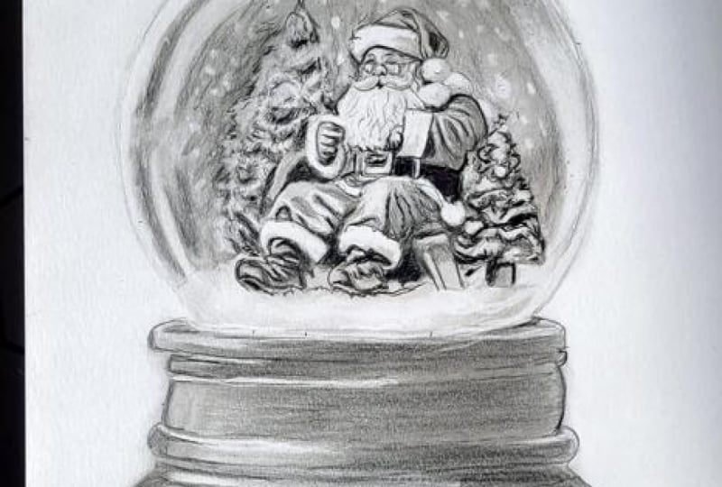
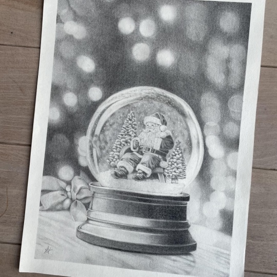
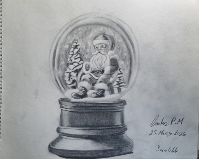
2. Class Project - Drawing a Santa Snow Globe: The class project, we will be drawing this Santa
in a snow globe. I've picked this
for a few reasons. Now, because we're drawing
this with graph white pencils, the absolute most
important thing we need to bear in
mind is contrast. When we turn the reference photo into a black and white photo, we need to have
really good dark, really good lights, and
really good midtones. We don't, it's just
going to end up as a really washed out drawing. I also want to have
a reference photo with a really good
amount of detail. If it's just simple shapes, it's never going to
look as impressive. Now, I will talk you through everything you need to
know to create this, including how to
make this sketch. But if you want to use my sketch that is available in
the class resources. Finally, when you have
finished your drawing, please do remember to upload
it into the class projects. I would love to see
what you've done. Let's talk about the materials you'll need to
create this drawing.
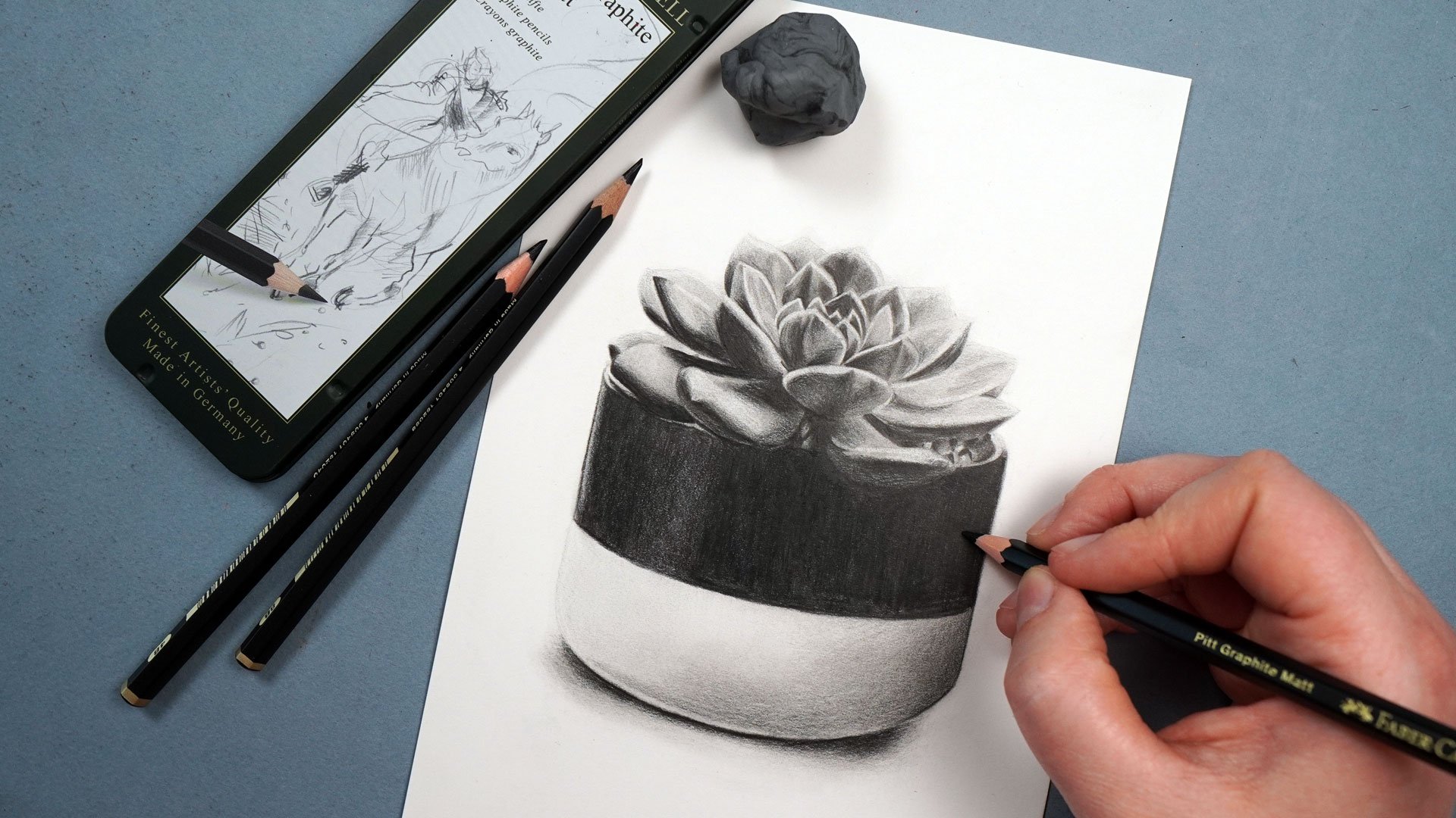
3. Materials You'll Need for Drawing with Graphite Pencils: Let's talk about the materials you'll need to draw this sana. And the most obvious
thing you'll need is a set of
graphite pencils. Now note you will need
more than one pencil. Graphite pencils come in a variety of
different hardnesses. Harder pencils tend to look lighter when you put
them down on the paper. Softer pencils look darker. I generally like to work
with three pencils. Usually, an HB pencil, a three B pencil, and a six B pencil. Find that they're a
really good range of light medium and dark. Now, in actuality,
on this drawing, I'm going to be using
Mt graphite pencils. They are less shiny graphite. So I'll be using the equivalent
pencils in this set. That would be the
four B, eight B, and 12 B. I will always
show you which pencil I'm using in the top
left of the screen in both normal graphite and MT. It's completely up to you
which you would like to use. Next up, you will
need some paper, but specifically the
right kind of paper. Now, because we're
going to be building up a lot of layers
of the graphite, we need paper that is going to be able
to take those layers. Generally speaking,
I like drawing on a really smooth
bristol board paper. It's almost like a thick card, and I find this works brilliantly for
building up graphite. These techniques won't
work anywhere near as well on something like printer
paper or sketch paper. Next up, you will need
a pencil sharpener. It doesn't need to
be anything fancy, just something that's
going to create a really nice and sharp
point on your pencils. And then the next thing
you'll need is some tissue. Now, I like to blend
out the graphite, and literally all
I need to do this is a piece of tissue,
nothing fancy. Next up, you'll need a few
different types of eraser. I use a putty eraser
and an electric eraser. So putty erasers are really good for just lifting a little
bit of the graphite. You can mold it into
different shapes and just lift a small soft amount. I also have an electric eraser. This is amazing for
any fine details. If we want to lift a
lot of the pencil, really brighten up an area, but be very precise about
where we're doing this. This is perfect. Next up, you'll need a ruler if you're
creating your own sketch. The final thing you'll need is some way of looking at
the reference photo. So for every drawing
that I create, I always work from a reference. I find that this is
the most accurate way to create realistic drawings. Now, it's completely up to
you what you use to do this. I like working on my iPad. I particularly like
that I can zoom in to see all of the details, but you could always print
out the reference photo. So you will need a set
of graphite pencils, the right kind of paper, a pencil sharpener, some
tissue, a putty eraser, and an electric eraser, and some way of looking
at the reference photo. So let's take a minute to
think about the sketch.
4. Sketching the Outlines: Before we start building up all of the shading
in the graphite, I want to take a minute
to map out this sketch. I want to get a really
detailed sketch so I have my bearings, and the whole drawing is going to be much more in proportion. Now, to create my sketches, I like to use something
called the grid method. This is where you put a grid on your drawing paper and
on your reference photo, and you just draw what's
in each individual square. Rather than trying to
draw Santa as a whole, you're kind of
just looking at it as a series of shapes instead, trying to get the lines
to cross the squares at the right points and
just looking at whether they're straight lines
or curved lines rather than trying to
draw a full Santa, which would be much harder. Once I've drawn out
everything in each square, I can then use an eraser
to erase those grid lines. Now, you'll notice that my
sketch here is really hard. That's because I want you to be able to see it on the camera. In actuality, I would do
this extremely lightly. That will not only mean that the grid lines will
erase much easier. We want to have an
extremely light sketch at the end of this so
that it doesn't show through at the end once
we've built up the graphite. Now, as I said earlier, if you don't want to create
your own sketch, you can always use my sketch, which is in the class resources. Now that we've got our sketch, let's take a minute to have a look at the reference photo.
5. Studying the Reference Photo: Before I start any drawing, I always like to take a minute to have a
look at the reference. Rather than just jumping in, I want to look at
the key shapes and tones that I can see
within the reference. So let's do that now and you can see a bit better
what I'm looking at. So the main intricate
part of the drawing, the main area that we're
really going to need to put a lot of attention
on is going to be Santa. Actual snow globe is
reasonably simple. So first off, you'll notice that the light is coming from
the left hand side. You can particularly see that here with this little
patch of light. All of the shadow
is on this side. And because of the
circular glass, you can see that there are
some quite large patches of light curving around. So there's this big
patch of light here, this smaller patch
of light here, and then a little shine going around the edge
around here as well. Is some light on
this side as well. And then, generally, it's
darker in the middle. But note in the middle,
it's not all one tone. So for example,
this patch here is quite a bit darker
than this patch here. Now, whilst we're looking
at this background area, I'm noticing that there
are a lot of white dots. Now, that I assume is from where the snow globe
has been shaken, although it might just be
lights from the background. That said, I'm not
going to worry about these whilst
drawing the snow globe, I'm going to put
these in at the end. I think that's going to be
the easiest thing to do here. Let's look at Santa now. Now, I'm looking at him
pretty closely here. In actuality, he's going to
be quite small on the paper. So although when drawing him, I like to look at him
in a very detailed way, we're not actually going to be able to draw in every detail. We won't be able to draw
in precisely his eyebrows, for example, because it's just going to be
too small to do. We'll include on this sketch as much detail on him as possible to make this
a little bit easier. But essentially, what
I'm noticing about him is particularly on his clothes, how many dark patches there are from the
folds, for example. So on his hat, there's this
really prominent triangle. There's these really
prominent folds up here. And then even on the
white section of his hat, it's obviously not as
prominent as above, but there's some quite
dark for a white area. Shadows here, for example, shadow here and along the
bottom, particularly. Those are the sort of things
I'm going to want draw in. Also noticing that his beard
has a kind of wave to it. So I just want to add in all
of these little wavy lines. Again, I will mark them in on the sketch to make it
a little bit easier. But he's got some
really good darks on him and some
really good lights. So hopefully he will
come out really nicely. Now, looking at the tree, it's essentially
both of them are essentially sorted
into sections. There's some light
sections where the snow has landed on the tree, some kind of mid tone sections and then some really
dark sections. And I can probably go about that to start with just drawing in the patches and then adding a little bit
of texture later on. I don't need to do
too much because when viewed from kind
of a normal distance, I don't know how much of this you're
actually going to see. And then finally,
looking at the bottom, there's not a huge amount
that needs to happen here. There's obviously
a lot of shading, and there's this light patch, there's various lines
so a light line here, a light line, here,
a light line here that's what's giving
this section the shape. But there's not any
texture to think about. We want to make it
as smooth as we can. And there's not a huge
amount of mid tone, either. Generally speaking, it's either
very dark or very light. There is a little bit of a sort of shadow
going through here, I guess, and there's a
little bit of mid tone here, but really not a huge amount. Those are the main
things that I'm looking at within the reference photo. Before we start the drawing, let's take a quick minute to think about the main process
we're going to be using.
6. The Process: Before we start drawing,
let's take a moment to think about the main process
we'll be using. Now, for all of my
graphite drawings, I always follow
the same process. So let's briefly cover
that process now and then we can put it into
practice in a second. What we essentially
need to do is build up the graphite
in a series of layers. It's going to create
much richer color if we build the different pencils
over the top of each other. So I always want to
start out by mapping out the key shapes with the hardest and therefore
lightest pencil. So with an HB
pencil, for example. Map in all of the
shapes and then I can use the tissue
to blend the pencil. I can then do exactly
the same thing, map in all of the shapes with
the next darkest pencil. So generally the three B pencil. And then once again, blend it with the tissue before doing the same thing again
with the darkest pencil, the six B pencil. Once I've given
that a final blend, what I then want to do is add
all of the light back in. So I can use a combination
of the putty eraser and the electric eraser to brighten
up any areas that need. Then once I've added in all of those light areas and
tidied everything up, I can then add
final details with, again, the softest pencil. So generally the 60. That's a really quick summary of the process
that I always use. Let's work through that process.
7. Building up the Hardest Pencil: So let's start out by
marking everything in, and I'm going to be drawing this whole chapter
using the fob pencil. So this is the fob pencil
in the map pencils. If you're using normal graphite, I would use something
like an HB. But I just want to be
using the hardest pencils, so the pencil that will
come through the lightest. And generally speaking, what
I'm doing here is I'm going to start on the left and work
my way towards the right. Starting off by putting some pencil down around
these light patches. So in a second,
we'll have a look at the reference photo and I will show you what I'm seeing here. But I want you to know how I'm going about putting
this pencil down. So it's the same way as usual. I want to be putting
this down as smoothly and as
lightly as possible. So first, you'll notice that I'm holding the pencil
quite far back, and what this does is it stops me from being able
to press too hard. It helps me create a really
nice light layer of pencil. Also generally working in some little oval motions to try and get this down
as smooth as possible. I don't want to be
pressing really hard and scribbling
back and forth. That's going to make a really
scratchy base layer here. Actuality, I am going to
blend this in a little while. So although I'm trying to make
it as smooth as possible, it's not absolutely perfect, but that's okay because it will, as I say, get blended
a bit later on. So let's take a minute to
have a look at the reference here and we'll see
what I'm drawing. So I'm particularly looking at this background area
all around here. I'm noticing that
although I am wanting to get this down as
smoothly as possible, it's not all one tone. So, for example,
it's darker here, it's darker here,
it's darker here. Darker here, and then generally also all along the side
of this Christmas tree. So I can build up those darker
patches a little bit more. And in order to build up
those darker patches, what I want to be
doing is going over the area more times rather
than pressing harder. So you can see here, I'm just going over this patch
a little bit more. I'm still pressing lightly. I'm still holding the
pencil further back, but going over it
more times has built up more of that pencil and
made it a little bit darker. It's also worth
remembering that you can always add more to it
later if you need to. Goal here, as I say, is to just put something down on the paper. I'm not necessarily trying to get it all absolutely perfect. I can certainly
tweak it as we go. I just want to have something that I can begin
building off of. And because this is
the hardest pencil, so it's really nice and light, if I make a mistake,
that's okay. I'll be able to go over it with a darker pencil in
a little while. Just go to keep
working my way around here and building up
some of that base. I'm only going to go to about
halfway on the snow globe. I don't want to go all the
way over to the right because it'll just end up
smudging it with my hand. It's gonna be easiest if
I do halfway and then start mapping out the
Christmas tree and also Santa. And then once I've
done all of that, then I can fill in the right
hand side of the snow globe. Let's have a minute to look at the top of the snow
globe as well. So up here, there is a lot
of, I guess, is it snow? I think it's the snowy
stuff inside the globe. But there is a slightly
darker section here, along here and along here. So I just want to
roughly mark that in. And I'm also putting a very
light line around the edge, mostly because I'm going to
leave this on white paper, but the background is black, so I just want to add
a really defined edge. I think it's going to look
much tidier if I do that. So I filled in this
whole top section. I put something
down here as well. You can see I am
being very light because it's really
not very dark up here. I then want to start thinking about marking in
the Christmas tree. Now, as I mentioned when we were looking at the reference photo, the tree is kind of split into
a few different sections. There's some lighter sections, some darker sections, and
some midtone sections. Sometimes it's easier if you're looking at the Christmas tree if you kind of
squint a little bit, makes it a bit easier to see
where all of these patches. All I basically want to
do here is work around those light patches
and just mark in where the dark
patches are going to go. So I'm just trying to get
my bearings of the tree. I'm not worrying about the
texture that's on the tree. I'm not worrying too much
about the mid tone, either. I really want to
mostly work around the light areas and
map in the dark areas, and then I can tweak
things a little bit later. So you can see I'm working in some quite kind of
loose circular motions. It doesn't need to be
perfectly smooth here. I'm focusing much
more on looking at the shapes of the tree
and trying to mark that. Actually, as I do this, I'm realizing that
I need to add a lot more shading down
the left hand side of the tree because actually it is looking pretty light, a
little bit too light. Now, this is made a lot
easier because I have marked in where these patches roughly need to go
from this sketch. I'm just working my way from the top of the tree to
the bottom of the tree. As I said before, I
will be blending this. So if it's looking
a little bit rough, if it's not looking quite right, that doesn't matter because we'll be smoothing it
all out and then going back over it with a softer
pencil, so a darker pencil. I can't stress enough
but right now, I just want to be mapping out the key shapes of
the whole drawing, and then we can go from there. So once I've got
the tree marked in, I can then think about
moving on to Santa, and heat is going to be the
most time consuming part. Just add a little
bit more shading on this left hand side
before we do that. Sometimes, the more you add, the more you realize is missing. And I don't think these are looking dark enough right now. And then with Santa,
I'm very much going to start at the top
and work my way. So I think it'll be easiest
if for each section, I show you what I'm seeing, and hopefully it'll make it a bit clearer how
to draw it yourself. Really, all we're doing is marking in the
darks and lights. Don't think of it as
drawing a person. Don't think of it as
drawing a center. We're only drawing shapes here. So on his hat, it's
very much kind of split into two
different sections on what is the red area. Ing at this area on the left, there's this curvy
shape up the very top. There's then a dark line
coming through here, a dark line coming through here. And it's generally shaded quite dark on this
right hand side, whereas it's more like a
midtone on the left hand side. Note how the background
is darker than this area. Then on this area here, there's this dark triangular
shape sort of in the center. And then it's very dark
towards the edge of the hat. It's also a little
bit dark up here, but then this area is a
similar shade to this area. Also looking at this
white fluffy area. This has a little dark spot, not too dark, but not
as light as up here. So a little bit of
extra dark shading here and all along the
edge of the hat. That is essentially
what I'm drawing here. You can see that on
that fair section, I've drawn in those
three strips, I guess, the larger
one at the top, and then the two
smaller ones below. And here I'm just drawing
in that triangular shape. You'll also notice that
I've added a little bit of extra shading around
the edge of the hat, just to hopefully make the
hat stand out a bit better. And then let's add some darker shading along here
and along the top, and then I'll add a very light shading on the rest of the hat. Now you'll notice that I've
also drawn in the bauble. Again, I wanted to add
some light shading on the bottom right
because that's where the main shadow is
on that bubble. Now that I've got something
down for the hat, I can move on to Santa's face, which is probably the
trickiest part of the drawing, partly because it's so small. Now, for his face,
I'm not going to be able to add a huge
amount of detail, obviously, certainly not
this level of detail. What I want to do
to start with is draw around his mustache. So particularly underneath, it's a little bit darker under here. I want to draw in the
darkness of his mouth. I also want to make sure
that I'm going over my sketch where I've got
all of these wiggly lines. I just want to really
focus on hopefully getting his face in
the right place. As I say, this is very tricky
because it's so small. To add some extra shading
around the bottom of his nose, you'll see that this
is particularly dark, draw in some little
dots for his nostrils. And then I want to add a little bit of
shadow going up here, a little bit for
his eyebrow here, a little bit for this eyebrow. And generally, this
right hand side of his face is darker. And then seeing that his eyes
are just above his glasses, and then I want to as
best I can, but as I say, it is very small, draw in
the shape of his glasses. Now, all of this is made a lot easier if you
have a sharp pencil. So do make sure that you
are sharpening regularly. It will make a huge difference. And my main advice is
to take your time. You don't need to rush this. If you do make any
little mistakes, then it will be blended shortly, so it will kind of smooth out. It won't show as
much. I would say, just try your best to try and get it as accurate as possible. Do bear in mind that
I am very zoomed in. You can see from the
sides of my hand. And actually, when from a
normal viewing distance, it's not going to be as clear. See if his face is
a tiny bit out. I don't know that it's
going to show too much. As long as I've drawn in
his face as best I can, I'm just going to map in
his glasses, as well. As I say, they don't
need to be perfect. It looks a little bit rough and ready at this point,
but that's okay. We'll tweak it as we go. And also, it's really not going to be that
obvious by the end. Going to map in the edge of the fluffy bit
from his sleeve. And then I can start going
over all of the sort of curvy, wavy lines of his bid. And as I say, I'm just generally working from the top down, generally the top and
more towards the left, towards the bottom
and the right. So I'm going to talk you
through a few bigger sections on the reference photo. So I want to be looking
at his hand here, the seat, his belt, and this arm as well. Now, this hand, I want
to particularly be marking in the dark shadows
in between his fingers. Want to be drawing
in a dark line, adding some extra
shading in between here. I'm noticing that his thumb
is quite a lot darker, whereas this has a
lot of light to it, so I need to add a lot
of extra shading here. It's also generally darker at the bottom and darker
around this left hand side. There's then this
light I don't know. It looks like a
bracelet or something. It's probably just
the way it's made, but there's this
light strip here, and then there's also
some dark shadow of his arm going
into his sleeve. In fact, all around here, it's very, very dark, coming all the way around
to this arm of the chair. And then for the
arm of the chair, I'm just going to add
some light shading. So looking at this arm, this is much easier
because you can't really see a hand. I
don't know what this is. But we'll just draw it
as a series of shapes. So just drawing, it's kind
of like a semicircle, I guess, a mid tone semicircle. I'm looking particularly at
the folds of his sleeve. There's a dark strip going
along here, a dark strip here. There's this dark
strip going along here and then also up here. All of these lines are
what's giving his arm shape. On the most part,
I'm noticing that this area is just
particularly dark. I'm going to want to add a lot of really smooth shading on this area as well as
marking in these lines. On this white fluffy section, it's got a little bit more
shadow at the bottom. There's a light patch running
all along this left side, and it's generally lighter at the top, and then
it's darker here. Then looking at his belt, it's pretty dark all
the way along here, but then there's
this light strip, so I don't want to work
around that if I can. And then on the area of belt that's in the
buckle, it's darker. On this side, it goes to about halfway through the
buckle, particularly dark. Then there's a light strip with a few dark patches at
the very left hand side, and then this is a midtone. Really, that's all
there is to it. Using a sharp pencil and
working very lightly. I literally just want to map
out these lights and darks. You can see that what I'm doing isn't perfect, and that's fine. It's just a case of for now getting things
roughly marked out, and then we can build
upon it as we work our way through the
softer pencils. So we'll go over everything with this particularly light
pencil, this harder pencil. And then I can go back over
just the darker areas with a softer pencil to
really define things. And it's a good opportunity to fix any areas that
aren't quite right. Let's look at the
legs now. It's going to be very similar. But I really want to look at all the lights and
darks in this section. I think it's important
to remember that we're really just drawing
a series of shapes, and I think what I'm doing here does that make that a
little bit clearer. You can see that I'm drawing in the shapes and then
just shading it in. And that's literally all
I'm doing for each area. So on the legs, there's this
kind of zig zag here and then a big circular or
curvy section up the top. Also a darker patch here,
like a darker strip, and a curvy, little semi circle, just a dark line around here. And then, generally, the
knee is very, very light, and then all around here
is a kind of midtone. There's a little
light strip here and a little light strip here
that I want to avoid. And there's a little light
strip here, as well. On this leg, this
leg is generally, I would say, a
little bit darker. You can see these darker
strips going along here, along here, down here,
down here, down here. And there's another one of
those little semicircle, dark semicircles. And then, generally speaking, all around here is pretty dark, except for this area
that's quite light. Looking at the boots, again, we just want to be focusing on looking at this as
a series of shapes. So there's this
kind of dark curve around here, going around here, then back out, a light
strip going along here, along here, at the
end of the toe here. And generally a lot of dark
shading all around here, all along here, all up here. Same on this boot, particularly light patch here,
here, here and here, and at the end here,
and then a lot of the rest of the
boot is very dark. Now, before we move on to
the tree on the other side, just take note that on the snow, it's not as light as
you might imagine, particularly here in
these shadowed areas, the shadow created by Santa, it is really quite dark, and we are going to want to
build up a lot of it. Same in this area here. I would say that
this is all quite a time consuming process, but I would say that
this first chapter is the longest out
of all of them, because after this,
we're going to be more focusing on just adding in the mid tones and
the darker tones. It's not going to
take as long and everything's already been
marked out so thoroughly. Hopefully, it will be
much, much easier. Move on to marking this tree on the right hand side very much the same as I did on
the left hand side, really focusing on marking
in those darker areas. And you'll see, once
again, I'm doing these in these circular motions, but I'm not being
as sort of soft, I would say, so they do look quite tight cows,
but that's okay. I'll all blend out. So I
want to draw the tree, and I also want to draw the pot. And then I can think about
shading in the background, the snow globe area on
this right hand side. Similar to the left, it's not as light as
you might imagine. There's this very dark line going actually all the
way around into here, and the extra shading is on
the left hand side here, and then it kind of switches to the right hand side
here and the top. So it wants to be building up
a lot of extra shadow here, kind of going in a line along here and then
this little section, and all along here. I also want to be drawing
in this little line. It's obviously much
softer than this line. But do you want to
add a little bit of shading along here to make this light section visible and then shade in this section, you can see that the
line goes along here. And then I also want to add
a very faint line around the outside again just to create the shape
of the snow globe. Don't forget that you
want to be working very lightly working in
circular motions. You still want to be making
this as smooth as possible. When I get down to the bottom, I'm just going to shade
in this area of snow. In fact, I'm going to draw a
line all along the bottom, just to define where
the snow globe is meeting the base
of the snow globe. I would say that that
is the hardest part of the whole drawing done. But we do still need to draw in the bottom section as well. So let's just take a minute
to look at what's here. And certainly in comparison
to the top section, this is all reasonably simple. So there's this little
dark patch here. I just want to be looking at and following the
shapes around here. There's this light line
going through here, and it's generally quite
light towards the middle. And then it's all in some
pretty sort of clear strips. So there's a dark strip
going along here. There's a light strip mostly
on this left hand side, a dark strip going all
the way through here. Don't forget this
little light patch here going round and here. There's also a light
line going through here, stopping about midway. Note that it's lighter. There's a light strip coming
all the way down here. So it's a little
bit lighter here, but a lot of shading needs building up on the
right hand side. There's a light
strip here, there's a strip going around
here and so on. And also notice that
there is a sort of mid tone strip
going along here, making that look a little
bit more shapely, I guess. And then around halfway, that's where it gets
really dark on this area. Let's draw that in, once again, trying to make it as
smooth as possible, really looking at
all the shapes here. As I say, I did mark this out very thoroughly
on my sketch. I really tried to get it marked out as accurately as possible. So if you're using my sketch, hopefully, this isn't too bad. And you'll note that I am trying to make this as
smooth as possible, but it does still look
a little bit patchy. I think when you first
put pencil down, it does you could be so careful and it will always
look a little bit patchy. But when you put the
next layer on top, after blending, it looks
much, much better. And it generally goes down
in a much less scratchy way. My advice is to try your
best to make it as smooth as possible by doing all the things I've
mentioned a few times, particularly having
a sharp pencil. It's so important. But beyond that, we'll
smooth it out when we blend. So once I've drawn in the
whole of the snow globe and added this very light
shadow at the bottom, what I now want to do is
blend it all together. And this is going to
smooth everything out, make everything
look a lot softer, and it will give us a
really nice kind of base that we can then build some of the darker pencils on. So all I'm doing is
taking a piece of tissue and wrapping it
around my finger like what I want to do is work
in circular motions. So just very lightly,
I'm not pressing hard, just lightly brushing my finger against the paper in
these circular motions, and you can see bit by bit
it's smoothing everything out. And what we'll end
up with, as I said, is just a really nice soft
picture of a snow globe. It doesn't have any
hugely dark areas or hugely light areas, to be honest, because this is going to blend it all together. But what we do have is I
kind of think of it as a underdrawing. Something that
we can then work off of. Everything gets a lot easier, in my opinion, from here. Don't worry if you
slightly go over the edge, if it smudges onto
the white paper, we can tidy that up a bit later. What you're aiming
for is at the end of this chapter to have
everything marked out and have a snow globe
that looks quite blurry but nice and
soft like this.
8. Building up a Softer Pencil: I want to move on to
my next softer pencil. I'm going to be
using the eight B, but if you're using
usual graphite, I would use something like
maybe a three B. I want to be doing very similar to what
we were doing a second ago. Going back over everything, focusing a bit more on
the darker areas now, that said, if I need to, I will still likely go
over a lighter area. Just want to be making
everything a lot richer. So right now, it's
all very washed out. We can't really see a huge
amount of any kind of detail. And there's just not
a lot of contrast. I want to really start building up that contrast now and start making the darker areas a bit
more noticeable, I guess. So as I say, I'm
going about this in exactly the same way as before. I still want to be pressing
really nice and lightly. So you'll notice
again, I'm holding the pencil about halfway down, still pressing nice and soft. I'm still working in
these circular motions to try and make it as
smooth as possible. Now, once again, we will be blending this
in a little while. So if it isn't absolutely
perfectly smooth, that is okay. And as I go around here, where necessary, I am trying to add a little bit more detail. So, for example, on the
background of the snow globe. So you'll notice that
it's a little bit patchier than what I've
drawn in at the moment. It's not completely
smooth in the back. Particularly where
I'm shading in now, as well as down the left
hand edge of the tree, it's not all perfectly smooth. Now, I don't need
to try and get this exactly the same as
the reference photo, but I do want to try
where possible to get the lights and darks in
pretty much the same place. But as I say, it doesn't
need to be perfect. As I particularly
do want to avoid is the light strips on the left hand side here.
I want to keep them. They're not white, but I want to keep them kind of
closer to white. Although I haven't put any
pencil down on them when I blend that pencil does get
blended into the white areas. So that kind of gives
them a very light amount of shading without me
needing to add that in. Now I'm generally happy with the background on
this left hand side. I'm working across in exactly the same way
as I did before, so starting on the left, working my way
towards the right, and also generally starting at the top and working my way down. So at this point, I want to be looking at the
Christmas tree again. And this is all made much, much easier because I've
already marked in where a lot of the sort of lighter and darker
patches are going to be. So I want to be
going over a lot of the dark patches and really defining the shapes
a little bit more. You can see that it's
starting to look a little bit like a kind of
blurry out focus tree, which is how I want
it to look and just gradually building
all of these shapes. I do very much recommend looking at this like
a series of shapes rather than trying to draw a tree and just let the shapes gradually
build up the tree. So once I've drawn out
all of those dark spots, I then also want to be looking
at the tree and adding in any extra shading if there's any areas that need to
be more of a mid tone. So I'm particularly looking generally at down
the right hand side, but I can add in extra shading anywhere where is
more of a mid tone. Now, you'll see that
the lighter areas kind of look a little
bit lost. That's okay. We can add them back in. But for now, I
just want to get a little bit more
definition on that tree. Carry on working our way around, and I'm going to move
through this a little bit faster because it is so similar to what we did
in the last chapter. So I can add a few kind of spotty areas above Santa's head. Then I can start marking in the hat in the same way
that we did before. There's still all
of those darker patches that I marked in before, and then I can start
moving onto Santa's head. Very, very lightly
going over his face, as well as some
parts of his beard, just because it's so faint where we blended the last pencil. I want to make it a little
bit more prominent. But I honestly don't need to be adding a huge amount in here. I just want to be very lightly marking over what I did before. And that's pretty much the theme for the whole of this chapter. Can see that here
I'm very lightly going over the white sleeve. There's some very
light shading here, which I do just want to build up a little bit more
because I don't think it's quite
prominent enough. And then I can start going back over his arms and his legs. Once again, marking in, you can see all of those
very dark shapes that I marked in before from all of the creases on his
arms and legs. I'm really just going back
over those same parts, just giving some extra shading. You can see how much darker
this is making everything. Really my goal here is to just define everything
a little bit more. So you can see me going over the shapes of those
folds on his leg and then adding a little
bit of light shading because the red is
such a dark color. And I can do exactly the
same to the other leg. All of a sudden, Santa is
looking much, much better. He's obviously the main
part of the snow globe. I'm happy with Santa, I can then move on to the Christmas
tree on the right hand side. Once again, throughout
all of this, I'm doing the same
as I did before just with a softer and
therefore darker pencil. So it's go back over the shapes of the Christmas tree, again, made far easier because I've already marked this out
with the previous pencil. And then I can just tidy up around the right hand
side around here. So really looking
at if there are any patches around here that need to be made a
little bit darker. And there's not a huge amount. Down here is actually
probably where most of the shading right
now needs to be added. And from here, I
can start working my way down on the
snow globe section. So once again, this is much, much darker than the
rest of the snow globe. But it is made far
easier because they've already marked this
out so thoroughly. So once I've gone over this whole bottom section once again in exactly the same
way as I did before, again, what I want to do is
think about blending this. You'll notice, particularly
around the top, around the edge of Santa on the snow globe and on
this bottom section, all looking a little
bit scratchy, and it certainly will benefit
from being smoothed out. Now before we do
that, once again, I want to remind you that
it is going to be much easier to put this
pencil down if you have a really nice
and sharp pencil. I do find it makes a
massive difference. If you don't, it ends
up just looking a little bit kind of
clumpy, I find. It just doesn't look
as smooth or as neat. And once again, you want
to be pressing light. Let's once again take that
same piece of tissue and I'm going to wrap
it around my finger again and blend this. So I want to be blending it in the same way as I did before. So once again in these
circular motions, which I always think
is a bit easier when you're drawing
something circular. And I maybe don't want to
blend quite as much as I did last time because I don't want
it to look really smudgy. But I do want to end up with something that is
nice and smooth. So at the end of this chapter, you should have quite
clear snow globe that doesn't have still a
huge amount of contrast, but it is better than it
was in the last chapter. Just mostly made
up of mid tones. It doesn't have a huge
amount of lights or docs, but we can fix that
in the next chapter.
9. Add in the Final Details: Let's move on now to
the darkest pencil or the softest pencil that
I'll be using in this drawing. This is the 12 B pencil. This is for the Mac graphite. If I was using usual graphite, I would use either
a five or six B. And what I want to be
doing is just going over the darkest areas
throughout the snow globe. Now, I'm not going to spend a huge amount of time on this. I think I spent about
20 minutes on it. In this chapter, we want to not only add these darkest areas in, but also add the lightest parts back in and add any
finishing touch. I'm going over these very
dark patches once again. I've mentioned them a few times. So I think, generally speaking, there's four patches around
these patches of light. There's one here, one here, one here and one here. And again, I also want to really define down this left
hand side of the tree. And you'll see I'm
going about this in exactly the same way
as I have before. Pressing still nice and lightly. We will be pressing a
little bit firmer later on, but right now I want to be focusing on a nice
light pressure, still trying to get this
as smooth as possible, and I'm still holding the
pencil quite far back. And you can see
I'm just building up that color a little bit more. Now, as usual, I want
to be starting on the left here and working
my way over to the right. So let's add a little bit
more shading around the top, add a bit of extra
detail around here. This is partly what helps create the curved look
of the snow globe. And then I can go over the tree, those absolute darkest
parts of the tree again. So not all of it
like I have been. So for example, you'll notice
that here is quite dark, here, here, here, here, here. But I've previously been
drawing in all of these areas, but this is more like a midton. So I don't need to be going over this area with this so
much darker pencil. I really want to be focusing on the really dark areas like
here and here and here. Now, right now, I'm
still not worrying about putting the
texture on the tree. I'm going to do that
right at the very end. I'm really right now still
focusing on trying to get those lights and darks in here correctly,
particularly the dark. As I have done before, I
can now start on Santa, work my way at the top, and gradually work down. I'm once again going over the same areas that I have
done twice before now. So going over that
triangle on the hat, going around the edge here, which is particularly dark. And actually, the edge
around here is quite dark, as well, around the
bottom of the hat. I don't want to be going
over the white section of the hat because we're getting into way too dark of a pencil. I am putting very light shading on some areas of his face. Now, it's important to
note at this point that he's looking a little
bit kind of mid tone. He hasn't got a huge amount like his beard is not looking
particularly white. His hat isn't looking particularly
white around the edge, but we can add to that, so don't worry about that. So except for under
his mustache, I'm not doing any other areas. So let's move on now
to around his hand. So this is where I'm
really wanting to go over these darkest areas,
really define everything. I think it's just going
to make life a lot easier and really help build up
that color as we go here. Just be blocking in any of
these really dark areas. Now, as I say, I wouldn't
say I'm spending a huge amount of
time doing this. I am wanting to block
in these main areas. But I would say it's a
reasonably quick process because I've already
built up so much of this. So it's pretty clear
what needs to go where. So once I built up these
very dark areas on his boots and also on the
chair he's sitting on here, to be doing the
same on this tree as I did on the previous tree. So just filling in
those darkest areas. So mostly on this
right hand side, but particularly this,
here, here, here, not so much just the hole way
down this right hand side, because there's a lot
of mid tone in I also want to be going over
this pot at the bottom, because that is
particularly dark. And then after tweaking a few of the areas on the
right hand side, like around here, and
all down this side, there's these two
kind of curves. I then want to think about
really filling in and making the bottom section of
the snow globe a lot darker. So I'm just going to go
over these same areas again in exactly the same
way as I did before. I just think right now it's
looking way too light, and it needs to be made a
lot richer, a lot darker. Worth remembering
that although I am building up a lot of
extra shading on here, I will be going over this one more time before
finishing the drawing. So I do want to get
a reasonable amount of the pencil down
in this bottom area, but I will be adding
even more a bit later. So once I've gone over
this whole bottom section, before I move on to adding
in those lightest areas, I want to give it a very, very, very light blend. So I'm once again using
a clean bit of tissue, it's still the same
tissue, though. And I'm just giving it
the lightest blends. It's still very light circular motions,
not pressing hard. I just want to smooth
out what's here, but I don't want to make
it a big smudgy mess. It's very lightly
going over and you can see it slightly
smoothing it out, but I don't need to
do a lot at all. And then this is always
my favorite part of any drawing is adding
the light areas back in. So I'm going to be
using a putty eraser for this and an electric eraser. So let's start off
with the putty eraser. And I'm just beginning here by tidying up around the edges. So where I blended, some of the pencil got
smudged around the drawing. You can see that it's
just tidying it up. We're getting a really nice
light, crisp background. So you can just nice and
carefully go around the edge. It tends to be two things that I would use a
putty eraser for. I don't tend to use it for
any particularly fine detail. I like to use it
as I'm doing here, tidy up around the edges, but also to just maybe
slightly lift some graphite. If I want to make an area
a little bit lighter, but I don't need to be
too precise about it. That's when I would
use a putty eraser. I can mold the
eraser into a point, as you can see I'm doing here. And that's just going to help me control a little bit
better where it's going. And what I want to
do is be looking at any area that
needs brightening up. So, for example, this shine on the left at the bottom
is particularly bright, and it wasn't looking as bright from where I
blended all the pencil. Also want to be just lifting a little bit of the
pencil down the bottom here. There's the odd spot
on the background. It's most obvious
around here there's these light patches
where I think it's actually something behind here that's showing
through light behind. But I want to add
these light dots and the putty erasor is
great for doing this. Also, around here, for example, you'll see that this
is a light patch and it's not looking as
light on my drawing, there's various other
really light areas. All I do is just gently dab my patty eraser
against the paper. So you can see I'm
just pressing on and it's just lifting a little
bit of that graphite. More so I'm going to slightly lighten this light
patch at the top, not as much as the one at the bottom and really
focusing around the edges. And then I'm going to just dab my patty eraser on
a few other areas. Again, just to lift so that this background looks
a bit more patchy. The background is quite patchy. Although I have drawn
a lot of that in, I think it's been lost to a certain extent
where I have blended. So you can see me
adding those light dots in on the right hand side. I do periodically
re mold my eraser, so I as you can see here, just sort of squish it
into a different shape, so I'm using a different
part of the eraser. And then once I'm happy
that I've gone around the outside and I've added in a lot of these lighter spots, I can start thinking about
going over Santa, for example. I want to be slightly
lightening some patches of the white on his hat or
his general white areas. I don't want to do
over the whole of it. Notice that it's lighter
towards the middle at the top, and then much darker, particularly around here,
but also closer to his face. So I want to lift some of the graphite towards the top so that this becomes
bright white. But I don't want to do
that here, for example. Same for the bubbles
along the top. I want to be lifting
some of the graphite, but I want to leave it
as it is at the bottom, and generally, it's the
same for all of these. And then there's
a few other areas that could just do
with brightening up. For example, all down this side around
the top along here. I'm not going to
worry about his beard because I'm going to do that
with the electric eraser. I will lift some
of the graphite, particularly just
above the boot, so towards the left
hand side here. Let's once again do that with the eraser by kind of dabbing or gently brushing the eraser just lightly against the paper. So I find that with
the putty eraser, you can lift a little
bit of graphite, but not a huge amount. So generally lighten an area, and it tends to create quite
a kind of soft effect. Whereas the electric eraser, I can be a lot more
accurate with. So you'll see in a second what we're
going to use that for. It also tends to make
areas in my experience, a much brighter white, but it does create
kind of harsh lines. It's not as soft as
the putty eraser. I'm happy that I've just lifted and brightened up some
of these white areas. I do now want to move on
to the electric eraser. And the main thing I'll be using the electric eraser
for is these dots. All of the dots
of the snow globe need to be created from
the electric eraser. It's the easiest way to do it, as well as any other
particularly detailed areas. So all I'm doing
is gently pressing the eraser where I want
to add one of these dots. And you can see it makes
a really good shape. It makes a really good dot
that looks like a snowflake. There's a couple of things
really that I'm doing here. Firstly, I am looking
at the reference photo to see where these dots are
on the reference photo. I find that that is much, much easier because they all
need to be pretty random. I say a lot. I think it's hard to be
naturally that random. So I can kind of use the dots on the reference photo as a little bit of a guide
on where these should go. Also added in the big dots, I can think about adding in some medium and some small dots. I'm literally just barely touching the paper with
the electric eraser. I can also use the
electric eraser to add a little bit
of detail where the snow at the bottom
of the snow globe is meeting the top section. So again, gently dotting and lightly pressing the
eraser against the paper. Let's add in all of
these tiny dots. I do find that after using the eraser for a
certain period of time, it stops making as
nice and crisp dots. So I do periodically cut a very small sliver off the end of the eraser so
I have a fresh piece. I just find that gives a
slightly better finish. Just working my way
around the top up here, there are a lot of dots. So I'm really adding
a lot up here. Nothing fancy, just spotting
it against the paper. And then I can start
to add some of the light back in onto the tree. Now, I do want to be
quite precise about this. That's why I'm using
the electric eraser, and I'm just looking
at the tree, seeing where the
particularly light spots are and going over just those. So, for example, here
along here along here, here, here, here, down here. There's actually
not a huge amount. As I've said before,
it's mostly mid tone. There's some dark patches, and there are some
light patches, but not a huge amount. Just lightly go over
those light patches, add those back in. Don't worry that it looks
a little bit kind of harsh because we will add more pencil over
the top of this. And then I can start
working my way along Santa. So actually, I am going to go over just around the edge of his hat here because I think it's not looking
quite crisp enough. Then I want to start going over a few patches on his face, but really focus on his beard. So as I've said
before, his beard looks it's not very exciting. It's very mid tone, and I want to lighten it up. So I can start off by going over the top of his moustache. It's darker at the bottom, but lighter at the top. Remembering to go around
that curl at the end. You can see how much more
defined that looks already. And then I'm going to start
to go over some of his curls. So I'll go over
these few bore balls just around the top again
just to tidy those up. You'll see, I'm just going
where the waves are. So I kind of already marked the dark patches around
the light patches, but this is just really
helping his beard look white again
and helping it pop. So let's go all down the middle. I am looking at the
reference photo and really trying to follow the wiggly
shapes that are here. I'm noticing that
generally speaking, it's lighter towards the bottom. So it's kind of less
detail towards the bottom. And it's also lighter
towards the left hand side. Let's go around
the light patches on the fluffy parts
of his wrist. I've gone a little bit on the
lighter areas of his belt, and I'm also just
going to go over the lighter areas on his legs. So I'm particularly
looking at how light it is here on the belt and along the top and this little line down the side, as well as here. And then it's a very light patch here and here and on the top
of the knee as well as here. Can start going over the fluffy white
section here as well. You can see what huge difference
all of this is making. I think it's turning him
from a reasonably kind of bland looking drawing to really giving him
some great contrast. So let's go over the light
patches on the boots. So just go over these
odd patches here. And then I can focus on
the lightest areas on this tree on the right
hand side, as well. They're generally
speaking, going down the left hand
side of the tree. I'll finish off on
this top section by adding these dots in on
the right hand side. This is exactly the same
as we did on the left. You can see that
that is turning it into looking like a snow globe. So let's just go over these
really light patches, the odd shines of light
around the bottom here. So there's just the odd line
that's particularly bright, and adding this in is
really going to help. At this point, I'm
generally happy with all of the light
that's gone back in. What I want to be thinking
about now is really getting the darks as
dark as they should be. They're not quite dark
enough at this point. So I'm going back to the 12 B
pencil, the softest pencil. I'm going to once again
focus on the tree. Now I'm going about this now
in a slightly different way. I do want to be adding
in the final details. So with a really sharp pencil, I'm adding some
really small flicks to build up some of the texture. I'm only doing this on the
absolute darkest parts, and I am really looking at
the reference to look at the direction of the
spines, the needles. Now, it's not hugely clear
on the reference photo. But generally speaking,
when there's a dark patch, I want to be making flicks
going out from the center, from the edge of
that dark patch. So I'm here and work my way out, you see that bit by
bit that is building up just some really
subtle texture. I don't think it's the main
focal point of the drawing, so I don't want to go
overboard with it, but I do want to
just add a few of these flicks to give
the idea of texture. And then once I've gone
over the whole of the tree, I'm going to focus on going over just the absolute
darkest areas of Santa. So going over this very dark
patch here, for example, and all around his hand, as well as once again these
really dark areas on his hat. I can then work down over
the very dark areas, like all of those lines on his arm before moving on to the darkest
patches of his belt. Really just tidying
everything up and trying to make it as
dark as it should be. I think the key to drawing with graphite is to make sure that
the contrast is correct. You can see comparing his legs, how much darker and better the left leg looks in
comparison to the right. Now I've gone back over all
of those darkest spots. So I'm going to do the
same with the left leg. I'm applying, I would say, quite a firm pressure now. I'm pressing not full force,
but reasonably firmly. I'm not pressing
lightly anymore. Just going over the same areas that I have been up until now. So on the tree on the
left hand side, here, I once again want to be going over this with those
little flicking motions. So just again, looking
at the reference photo, trying where possible to work out which direction
the flicks need to go. And then at this
point, I'm genuinely happy with Santa at the top. I want to really
quie firmly be going over this area at the bottom. I am looking for any sort
of intricate odd lines. So, for example, there's a very dark line going along here, and then it kind of turns out to be as dark
as everything else. There's a dark line
going along here, also one going along
here and along here. And I want to be adding
all of these in. As say there's one along here. I'm just going over all of
those lines really applying some firm pressure to try and
get it as dark as possible. And then once I've
gone over this whole area at the bottom, the last thing I want to
focus on is just getting the shadow marked in
a little bit darker, and I want it to
kind of fade out. It's hard to see because
of the camera angle, but it just fades
out at the bottom. Now, the absolute last thing
I'm going to do is very, very lightly go around some of these spots some of the
larger snowflakes up here. I'm just very lightly going
around them just so they pop a little bit better.
And then that is it.
10. Summary: Alright, and that is
the end of the drawing. Now, I hope you've enjoyed it, and you have a very happy
looking little sander. So the key to creating
this drawing is to build it up in a
series of light layers, starting with the
hardest graphite pencil, filling in all the shapes
and then blending it. Then the middle pencil, once again, filling in all
those shapes, blending it, and then the softest pencil and one final blend before adding in all of the
lightest areas that we've lost with the
erasers and then adding those final details back
with that softest pencil. I hope that you've
enjoyed this course. If you have, please
do leave a review. And don't forget to upload your drawings into
the class projects. I would love to see
what you've done. Happy drawing, guys,
and Merry Christmas. I'll see you in the next course.
 Gemma Chambers, Pencil Artist