Transcripts
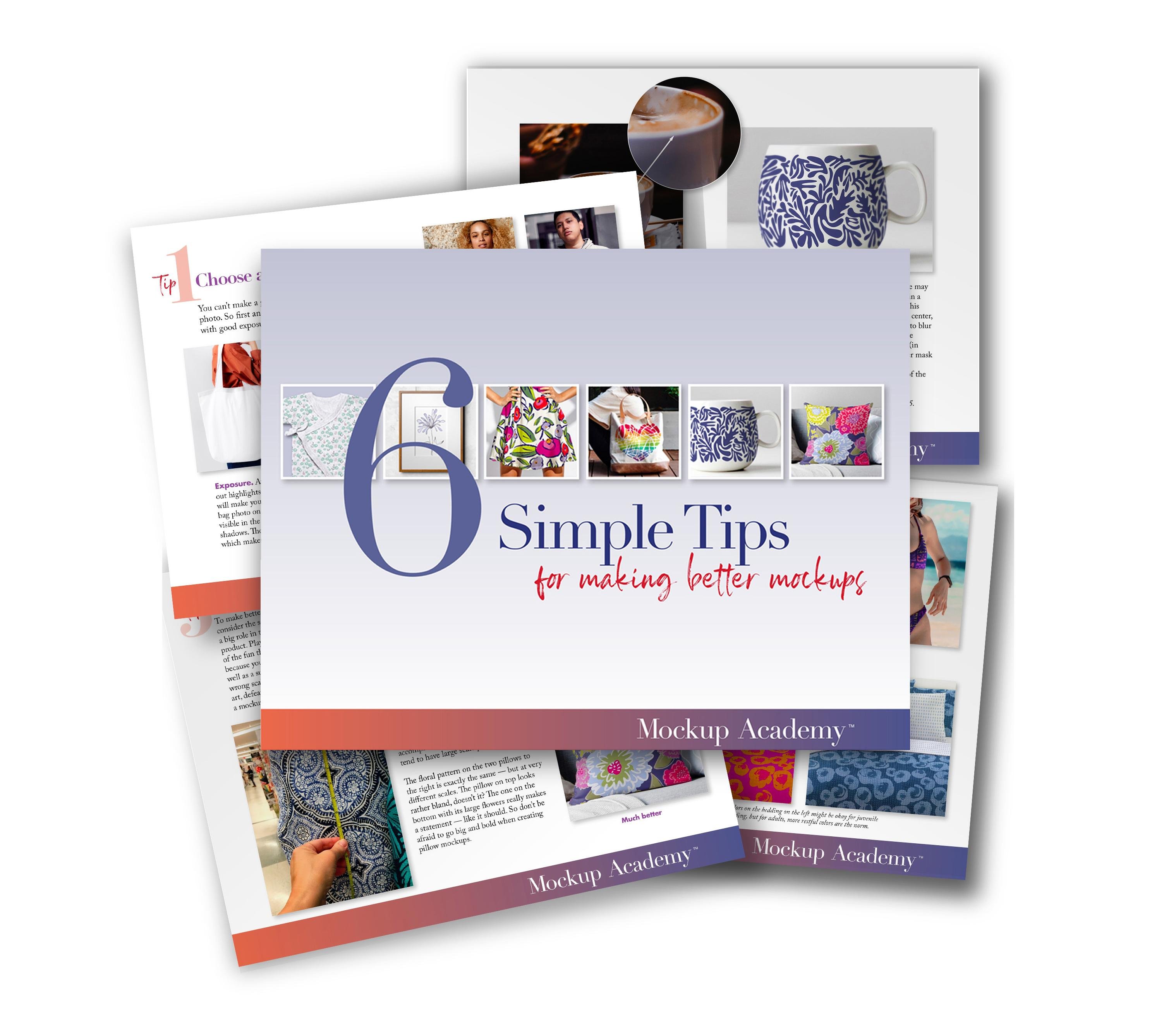
1. Introduction: Hi, I'm Chris Rough. Welcome to class Two of Mock Up Academy. In this class, you're gonna learn everything you need to know to make mock ups of products with curved surfaces. We'll start with this straight on view of a mug. And then because mugs air such a popular item to mock up, I'm gonna show you a couple different techniques you can use for mugs. Then I'm going to show you some tricks for creating depth on the interior surface of a bowl , and then we'll switch to the outside of bulls. I've got a couple different views and lots of tricks and tips and techniques throughout the whole class. The techniques that you learn in this class are not just limited to mugs or bulls. You can also use them for lamps or things like soap dispensers, ribbon reels, pens and a whole lot more A little background about me. I'm a surface in pattern designer, and I've been doing it for five or six years, and I've worked with dozens of manufacturers, creating products for many different categories for home and stationery and pets and gifts . And let's more to I created this course because when I started making mock ups, I would have loved to have something like it, something that's specifically made for putting art and patterns onto a variety of different products. If you're just starting your art business, you've probably been told how important mock ups are for showing your clients how your art will look on their products. I've certainly found that to be true, and I used them all the time. I create look books and sell sheets, and I also use mock ups as a design tool. When I'm working on new art, I can quickly test out which art will look best on which products and also play with scale and different color ways very quickly and easily. A few technical details about the class Everything I demonstrate will be in photo shop, and I'm using Ah Photoshopped CC 2018. I work on a Mac so all of the keyboard shortcuts will be based on that, and I'm assuming that you have a working knowledge of photo shop. That way I can keep the classes moving along quickly. The basic concept lesson at the beginning of the class is identical to the basic concept lesson in class one. So if you've already watched Class one, you need to watch this one again, unless you'd like to review. But if you haven't watched Class one, even if you've made markets before, I do recommend you look at this basic lesson concept because I'll be showing how I lay out all of my files, and you'll need that for all of the lessons moving forward. I'll go over your project at the end of the class, and at the end there will also be a section called Help. It's not working. That's a section where I answer some frequently asked questions and also do. Hopefully a little trouble shooting to make your learning curve go a little bit more smoothly. So I hope you enjoy learning how to make mock ups. It's a fun journey, and it's so cool toe. Watch your art come to life
2. Basic Mockup Concept: in this first lesson, I want to go through the basic concept of how you make a mock up. First, I want to do it with some diagrams, and then we'll jump right into photo shop. So to start, all you need is your photo and your layers palette. Now, when you open the layers palette, you'll see there's already one layer in there, and that's your bag. Photo will start by setting this layer on multiply, and the reason for that is we're gonna be adding layers underneath the bag photo. And so if we said it to multiply, then we'll be able to see the layers that are underneath it. Next, we'll create a folder, and that's where we're gonna put all her art and that will go right underneath the bag photo. Next, we select the area on our bag where we want the art to go, and we're gonna turn that into a layer mask. Now, if you're not familiar with a layer mask, I like to think of it as a window. So that selection we made on the bag is now this white square on the layer mask, and that's the window where the art is going to show through the rest of it. The black area is all blocked out now when we add art into the folder, it will only show through that window. Now you'll notice that I put the layer mask on the folder and not on the layer that has the art. The reason for that is now when we add additional layers of art, it's already massed and ready to go. In addition, if the layer mask is on the folder, then we're free to add additional layer masks onto the art layers. And we'll do that in some of the later lessons. Okay, so that's the very, very basics. Now let's go to photo shop and do the same thing. So here's our gift bag photo again, and over here we have our layers palette. Now your photo might have a padlock on it like this one, so just go ahead and click on that to get rid of it. Now we'll take that layer and change it from normal to multiply, and now we're ready to make the art folder, and to do that, just click down here and change the name and then drag it down below the bag photo. Now we're ready to make the selection on the bag where we want the art to go. And to do that, I'll go use the quick selection tool and make sure that the photo layer is selected and then go up here and select subject. Now that did a pretty good job, but it did give us the handles and we don't want that is part of our selection. So we'll go to the Polygon Tool and used the option key to get a minus on our icon. And then we'll just subtract that from the selection and missed a little bit along this side. So let's zoom in and using the shift key. We can add that area here and down here, and I also see that we missed a little corner down here. So let's add that in using the shift key, and then we want to take out the shadow at the bottom. So for that will use the option key and just go along that edge and subtract. So now we have our selection, and we just need to turn that into a layer mask and we want the layer mask could be on the artwork folder, so make sure you choose the artwork folder layer and now use this icon which says, add layer mask. And there it is. We have our layer mask. Now, everything that we put in this folder will only show through that white area. So let's go get some art. I'm gonna go to Illustrator, which is where my art is, and I'm gonna copy here, and you can also copy from Photoshopped. Or you can drag your art into the photo shop player. However, you usually get art into photo shop will work just fine in this situation. So go back to photo shop and paste as a smart object. And now just click and drag that art layer into the art folder. And there it is. It's all masked and ready to go. Now. Everything that we put in this folder will be massed in exactly the same way. So that's the very basics for how to make a mock up. And now you're ready to move on to the rest of class to working on curved surfaces
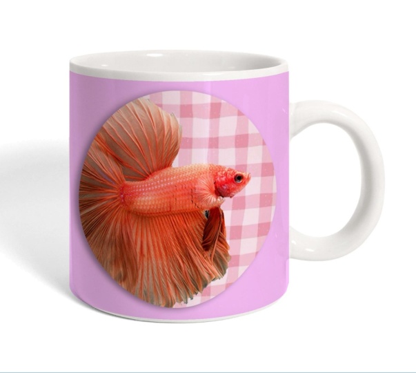
3. Mock Up a Mug - Part 1: in this first lesson, I'm gonna show you a super simple technique to make it look like art is wrapping around this mug. But before we get to that, let me walk through the steps for setting up the layers. Once again, if you have a padlock here, just click on it so that it goes away. And one thing I'm gonna add to this set up is I always make a duplicate copy of the photo, because sometimes I'm gonna want to manipulate this image. And so I always like to keep a copy in the file that I can go back to that that is unaltered. So to do that, I'm just gonna take this smug photo and drag it down here to the layer icon, and then I'm just gonna re lock it and hide it. So now it's just kind of in safe keeping, and then this layer will set to multiply so that we can see all of the layers that we're gonna put underneath it. Now we'll make our art folder and just click down here on the little folder icon and rename it and drag it down beneath the mug photo. And then one other little step. I recommend that you, right click on it and give it a color. This lesson is very simple lessons. So it's not a big deal right now. But later on in this class, we're gonna have sometimes two, maybe even three art folders. So giving them each a unique color will help us keep things simple. And now we'll make a layer mask will select the area that the art is gonna go for this. I'm going to use the quick selection tool, which is right here. But first, go over and and make sure your mug photo layer is selected. And now just go up here to select subject. Now, we're just gonna delete the handle because we don't want that part of our selection. And we have a little bit of clean up to do along some of these edges. So I'm gonna use the polygon lasso tool. And if I hold down the option key are icon gets a minus sign so we can subtract this area and then I'm just also going to use it down here, pull down the option key when you start and same over here and will take out this little bit down here. Okay? Think at the top. We need to clean this up a little bit right here. I want to add this soul area, sir, This time, if you use the shift key, you'll get a plus sign on the icon. And we can use that to add that little bit and same over here. Okay, so that's a selection that we're gonna make into the layer mask. So go to your art folder and click on the layer Mask icon. Now, we'll add our art, and I'm going to go into illustrator for that. So copy this command, See, and go back to photo shop and command V and I always paste it as it's smart object. That way we can size the art upper down without any loss of resolution. So now I'm gonna make this bigger and click return and drag it into the art folder. Now our art is masked, and I'm just gonna move it over here. I kind of want this area to be in front. And this now looks like a respectable mock up. And a lot of people would just stop right here, But it happened. Have a photo of an actual mug. This art was used on a mug a few years ago. And if you look at the way the art wraps around this image, you can see that this image looks pretty straightforward. But as we go around the corner, the art gets more and more so distorted and same over here. So we want to do that with our art. And the easiest way to do that is really to just compress the sides. But before we can do that, we need to rest. Arise are art. So go over here and right Click and go down to Rast. Arise layer. Now, as in the rial photo, we don't need to really do anything for this central area. So all we want to do is bring in the sides a little bit. Now remember, we have more art underneath here and on this side, too. We just can't see it because of the layer mask. So let's set up some guides. We need to have our rulers on for that. So if yours aren't go up here to view and make sure that rulers is selected now, just drag a guide in from the left and same thing over here and now we're ready to compress in those sides. So to do that, grab your rectangle tool and go from this line out, and we need to have some art to compress in. So that's why I'm grabbing out here. So now we'll go to edit free transform. And now we have handles that we can move, weaken, move them in and out And you can see if we just compress the whole thing in It doesn't look very realistic. So what we're gonna do instead is just push in a little bit. Now we'll hit return and will de select it. And now we're gonna make a new rectangle but not go all the way to this line. We're gonna come out a little way. So we're gonna grab a little bit less of the mug still with a lot of allowance over here, and we're gonna do that transform again. Now there is a keyboard shortcut that we really are gonna want to use because we're gonna do this multiple times, So use command t t for transform, and now we can push it in again. So now we're gonna go in a little bit more and hit return and de select. Now we'll take a little bit less command t and move in a little bit more. Turn de select. So each time we're just taking a little bit less of the mug command T and moving a little bit more and you can start to see it looking a little bit more three dimensional. So what happens is that we're not touching this area at all. And this area, we only distorted a little bit. And as we move around the edge, it gets more and more to started, so you can see how distorted this one is. Okay, Now, we could do the same thing on the other side. So start by compressing the whole section in command t and moving it in return de select. And now take a little bit less command t and move it in and just keep doing that. Now you can see that our mock up looks much more three dimensional, just like this one does. So that's a really simple technique to start out working with curves. I actually use that technique quite a bit. You can use that on like lampshades or cookie tins or popcorn tins. Anything that has that cylindrical shape. This technique works great, and it might look like a lot of little fussy steps. But it really does go quickly. And I just want to show you a second demonstration so you can see how that works on an all over pattern, as opposed to this spot art from the previous one. So there you go. That literally took me a minute or two to do that Now. One other thing I would change on this with an all over pattern is when you're printing on a mug you can't print all the way to the top edge or the bottom edge, so you might want to adjust your layer mask a little bit. And to do that, go over to your layer mask and just hold down the command key and click on the layer mask so you can't see it very well. But it's it's really loaded. The selection here and now just go back and select that layer mask again. Make sure that selected and you know it selected because it'll have this little box around it, and now you can just grab a handle and pull it down a little bit and up from the bottom. And now when we hit return and de select, we haven't actually changed the art. We've Onley changed the layer mask, so now you can see that it's still floating in there. So next up is some more mugs and more techniques for dealing with curved surfaces.
4. Mock Up a Mug - Part 2: coffee mugs are probably one of the most common mock ups. You can find them all over the Internet. Some are good. Some are not so good. But I've got a couple different methods that I like to use with a mug that are a little different from some of them that I've seen on tutorials. So I'd like to share those with you. So let's get started. I have my file set up my usual way with the duplicate. Copy the mug photo and we'll set that to multiply. And the artwork folder is already so Let's make her selection Look over toe quick selection tool and select subject. And then we'll take away some of the parts we don't want, which will use the polygon tool. And with the option key, l subtract the handle and I'll clean up this bottom edge down here for this. I think I'm actually gonna use the magnetic lasso tool so that we can get this curve better . So I'll just come in here and kind of slowly, the slower you go, the more points that it will add. So I'll get a better selection now on the top. Obviously, we can't print on the inside of the mug, so we don't want that part of our selection. And I don't think the magnetic lasso tool is gonna give us a very clean edge here. So we're gonna use a circle tool instead. So make sure your rulers are showing and then bring a guide in from the top. And rather than put it, run the actual room, we're gonna move it down a little bit, because when you're printing on a mug, you can't print all the way to the edge. So we're just gonna give ourselves a little margin from the top for the side. We're gonna bring one in, and for this purpose, it doesn't quite work to go right to the edge. We want to bring it out a little bit here, and that's where we're going to start our circle. So get the circle tool and we want to subtract this area. So use your option key and draw your and draw your circle until your circle matches the ark of the top of the mug. Now we'll make that are layer mask. Now, one thing I said that we can't print right up to the top we can't print right up to the bottom either. So I want to just alter the layer mask now. And to do that, go to your layer mask. Hold on the command key. You'll get this little square and click on the layer mask. Now that has reloaded our selection and use command T which is our transform tool. And I'm just gonna push this up a little bit so that now we have a little margin on the bottom to now when I click return in de select, you can't see it cause it's a minor change. But we've actually changed the layer mask now that will get some art. And so we'll go to illustrator And this is the art I want to use, so I'll copy it. Go back to photo shop and paste it. Look return and then drag that into the artwork folder. I think I'm just size it up just a little bit. And now that we've resized it, we can rest. Arise it now. The difference between this mug in the last one was we can actually see the curve of the previous one with just a photograph straight on flat. There was no curve here. So we want to bend our artwork to fit that make a selection around the mug, leaving an allowance on the sides. And now we're gonna goto our warp tool. So that's edit transform. Where now, if you're not familiar with the warp tool, it has individual points that we can move in any different direction and we can move inside the art. We can do all kinds of stuff to make this distorted. So let's undo that. I'm gonna go back into the warp tool, and I'm going to use this shortcut, which is command t for transform right click, and you'll find the warp tool listed there. So the presets air up here right now, it's on customs so we could move any points. But they're a bunch of stuff in here, and the best one for our situation is arch. So click on that and you can see it arches in the wrong direction. So that's determined by this number here. So we want this to be a negative number so that it will arch the other way. So if we put minus 50 in there now, it's arching the direction we want. But It's really too big and arch Well, let's try half that minus 25. That's still a little bit too much, Ben. So let's try more like 18. That looks like it matches our arc. So now click OK and d select. And now we can use exactly the same technique we used on the previous flat mug so we can put some guides in here we want. We want to compress the areas to the right and left of this. So do exactly what we did before. Grab some on the left up to that guideline command t and push in and do the same thing. Now, the only difference here is that I'm I'm going to do more iterations of this so that it looks more gently wrapped around the corner. Okay, so that's the one side. You can see how much more three dimensional this side looks compared to over here. It's very flat. So now we would just do the same thing on the other side, Manti, and then push it in a little bit. Return in de select and before you de select could just mark where you're going to start the next one. So I'll de select. But I have my cursor right where I want to start. The next one command T push in return. And before I d select a move this a little bit, and there we go. So get rid of the guides. So that's another option for making a bug mock up. All right, So I'm gonna turn that off and bring in a new piece of art from Illustrator Copy and Paste . And now that I've sized it, Aiken Rast, arise it. And now we'll make our selection around it. Now we use command t right click for warp. And now, rather than use that arches command, we're just gonna move things around sort of freehand. So I usually start with the corners, come up here and make this one go up a little too. Straighten that out. And now we want to make these straight lines. We want to make those curve to so they match the curve of the mug so you can pull those up . Now, let's look at this without the guides sold a command age, and this looks pretty good. Although the center here looks distorted and we don't want that. Remember, we want that area to be not to started in more distortion on the sides. So I'm just gonna push towards the sides until they look more distorted. But our center does not look distorted, so I'm happy with that. So we'll turn the but guides back on and hit Return and de Select. Now that option worked great because our pattern was very organic. So if we made any distortion to the art, we can't really see it because every because there's no straight lines or anything, if you have pattern that's more geometric like this one. You're gonna need to be a lot more careful because the lines need to be straightened. The circles need to be the right shape on everything needs to line up just right. So I have another variation that's a little bit more methodical. So I've already sized this how I wanted and placed it, and I've placed it purposely, very symmetrically. So this goes down the center and these little flowers both on this bottom edge and on the top. So we'll go ahead and make her selection the same way and use command, T and work. And now, this time, before we do anything, We're going to set a bunch of guides. So we're gonna put a guide on each grid line and then on the side will put one on this grid line and this one and we won't put one here because we're gonna be pushing that in, so we'll put one right next to the mug like that. So start with the corner again, and we're gonna lift this up about there. So now pay attention to this distance from the grid line to this point, we're gonna do that same distance over here. So from point to grid line, it's the same as over here. So we'll do that with that same distance on all the corners. And I'm gonna take this handle and put it on this grid line. So again, between this point and the grid line is about the same distance as from this point to the grid line, we'll do the same for this one and the same over here. And what that's doing is now we have created this curve that matches this curve up here. Now you can see we have the same problem on this mug that we did on the previous, one that the center, it looks compressed and we want the edges toe look compressed. So there's one little trick that I've found and that has to do with this curve up here. See how this curve up here really looks like a segment of a circle. Whereas the mug is a segment of an oval Here, let me show you what I mean. So this is the shape of the arch at the top of our warp grid. So this looks like segment of a circle, but the mug is an oval, so we want our arch toe look more like the section of an oval. And what's the difference? Well, it's a little bit flatter here than it is on the corners. That kind of rounds the corner in this little hook, whereas this is all the same all the way around. So how do we get that shape here with a little hook on the end? The secret is this handle right here, take this handle and bring it down and do the same thing on the other side. Now you can see it's it's a little bit more Kirby there and a little bit flatter here. That's what we want. And now we're gonna use that. It's very close to our grid line. So we're gonna use that and straighten up this line. I hope that makes sense. So bring that grid line in and this grid line in and the same down here now with the warp tool. When you move any part, the rest kind of moves to so it. So it's kind of difficult to use Sometimes I had these on the line, but now they've moved, so ends up being a matter of tweaking it back and forth before you tweet this here, I'm gonna bring these over to our guideline, and you see, I've pulled this one off. So what I'm really gonna do is pull this past where we want it and then go over on the other side and pull it back announced closer. So we'll just keep doing that. We'll pull a little bit farther than want and push that one back and do the same over here . I hope you can see that. So pull this back to the green guideline and this actually need to go this way a little bit . Okay, so everything still looks straight, and it's looking pretty good. One thing Remember this grid line here? This line was supposed to be down there, so we touched that grid line and same here and at the bottom needs to go there. So let's hide our guides. That looks good and it's compressed in on the sides. Now there's just one thing I notice and that is See how in this little flower, its arrows, they're touching the bottom edge. Well, over here it should, too. So we should really bring this up a little so that now this flower is right along the edge to those little arrows will do that in both sides. So there you go. That's another option for warping art around the mug. Now I know that's a lot of work, and if you have a whole bunch of different designs like this that you need to do, it would be awful to have to do that for each one of them. Now there is a way to work around that, and it's called It's Smart Object. And if you set up a smart object every time you add art to the file, it will automatically warp just the way we did here. Now, I'm not gonna go into that in this class, But the next class will be about smart objects, so make sure to check that out, too. Okay. I think that's enough with mugs. Now, let's go work on some bowls.
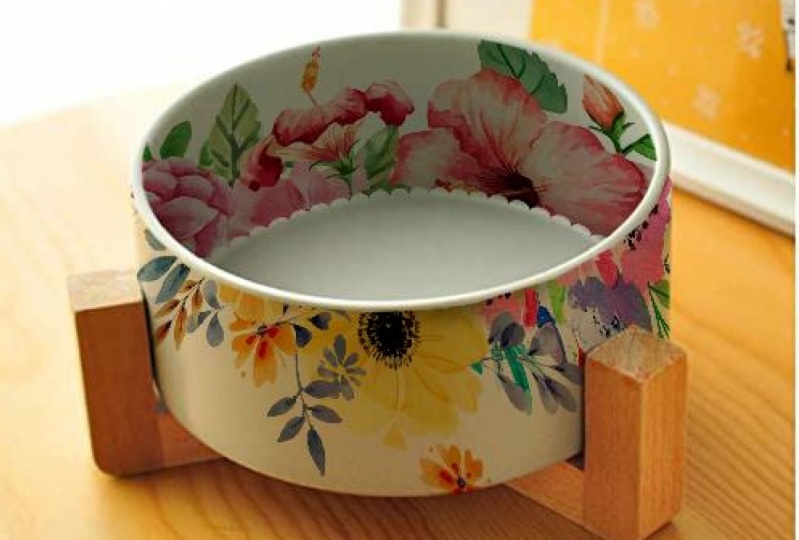
5. Creating Depth in a Bowl: If you've ever tried to mock up the inside curve of a bowl, you know that it could be kind of tricky. The challenge is that if you just lay your art on the image, it will probably look more like a plate than a bowl. So this is really kind of a fun lesson, because I've got some simple tricks to help you create that illusion of depth so that your plate becomes a bowl. So we'll get started. I've got my layers ready. This is set to multiply, and I've got my art folder ready. So we're ready to make a selection on the bowl and this one, it seems like a no brainer to just use the circle tool. So I'm gonna set up a couple guides, one from the top to the edge of the rim and from the left to the edge of the rim. I can use that to make my circle and drinking down till we have the inside of the bull. And before I make this into a layer mask, I want to find out the center point for this circle. So to do that, I'm just gonna go over and click on the bowl photo and then click command t to get this. These little points. So now I'm just going to use that to line up some guides on the center of the bull, and then we'll click return, and we'll go ahead. Make that a layer mask. All right, Now we're ready for art, and I'm gonna go into illustrator and I'm going to copy it. Go back to photo shop and paste it as a smart object and then line it up on the center of that bull and enlarge it. Click OK and drag it into the art folder. Now that we've sized the art, we can go ahead and rest. Arise it. And now we're gonna use the warp tool. So we'll click on our art layer, use command T and find the warp tool. Now for this, we're gonna use a preset. We're gonna go up here where it says custom and choose fisheye. Now, just like on the mug, you can change the amount of bend on this, But for this instance, I think 50 is fine, so I'm just gonna leave it now. One thing about the warp tool is it always wants to work things within a square. And what that has done to our image is kind of flattened out these areas. So, like, here, you can see these dots on the floral, but here you don't. And if this was a perfect circle on the outside, we should be able to see those dots. So to counter act that we're gonna go back now up to custom. And we're just gonna push in these little corners until we start to see those dots again. And that helps. Although we still have some space here. So we're gonna now pull these little handles out to kind of make that a little bit more curved. So click return and de Select. So that's looking a lot more three dimensional. But it would also help if our bowl photo had more contrast if I turn this off and see their shadow here. But it's not all that dark. And there's also a highlight down here. And those shadows and highlights really define the depth and the shape of this bowl. So if we increase the both the shadow and the highlight, it'll look more three dimensional. To do that, I'm gonna add two more duplicates of this bowl and one of them I'm gonna make a layer mask for the shadows and the other I'm gonna make a layer mask for the highlights. And then when we combine that altogether will get a much more contrast image. To do that, go to your bull photo layer and with the option key down, just click and drag. You'll get two little arrows, and unfortunately, those don't show up from the screen cast. But once you get the arrows, let go and you'll have a second copy. And now I'm just gonna do that again. And then all their rename, this one highlight and this one shadow and then we'll just leave this one as whole photo. Let's turn everything off except the highlight layer. And now we're gonna go to select color range and in here at the top, words a select choose highlights. Now, I don't know what the preset is for the range. This might look completely black on yours or might look completely white, but we what we want to do is move the slider until the only thing that's really white is those highlights. So the biggest highlight is right down here and that corresponds to this highlight here and then the fuzziness that'll be how soft the edges are. So you can see it's making our highlight brighter and brighter. There click. OK, and now that looks pretty strange, But it'll all make sense in a minute. But we want to do now is make that a layer mask on here and said this to normal. Not still looks weird, but trust me. So turn that off and now we're gonna do a similar thing to the shadow, so go back to color range, and this time, choose shadows. Move the range around until you have just the shadows. Now, the first thing to come up looks like an eclipse is the drop shadow. That's this area down here. So keep going because we also want to get this area which corresponds to over here. So again, this is like our layer mask. The white area is where it's gonna show through. So here we want the fuzziness. Here's without any fuzziness and you can see it's a pretty hard edge. So we wanna make it a little bit softer edge for this and click. OK, so make the a layer mask and this one we're gonna leave on multiply so you can turn that off and we'll go back to where we started. But you can see now if we add this shadow layer, it looks much more three dimensional. Now, if we put the highlight layer on, you can see we have this highlight here now, Right now that looks like too much. It doesn't look riel, so we'll just go up to that highlight layer and will reduce the opacity. Now, one other thing I want to do with this image is add a colored rim. So to do that, I'm gonna make enough a separate layer. I'm gonna turn the guides back on and remake her circle, go up to edit stroke, and we'll choose a width here. I'm just going to make a guess at 30. And here I want the color to be blue. And I don't want to pick a blue over here really wanted to match here. So I'm just gonna go over to the image and I'll get this dropper and click there, and that's now here will click. OK, and now that color also shows up here, so click OK, and now we have our stroke weaken de Select that, and I'm gonna make it a little larger to fit our bull and to get a little bit more of a hand painted. Look, I'm gonna duplicate that layer, and I'm actually gonna move it in a little bit so that we get a little bit wider Rim click , OK, and then I'm gonna decrease capacity on both of those layers. And now you'll see that it kind of looks a little irregular. Like somebody had hand painted there and kind of gone over some of it. And then I'm just gonna drag those two layers down below that bull photo. So now our photo layers are multiplied onto those rings. So I hope that gives you some idea of how to use warp and shadows and highlights to help make something, have more depth
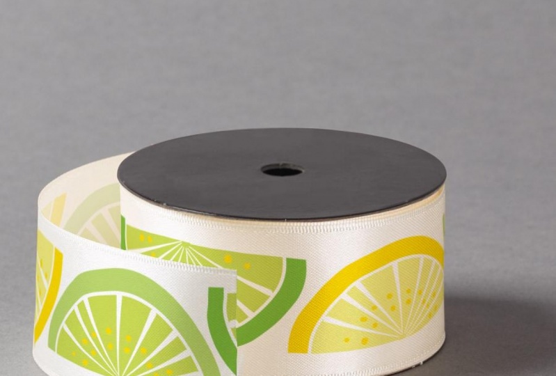
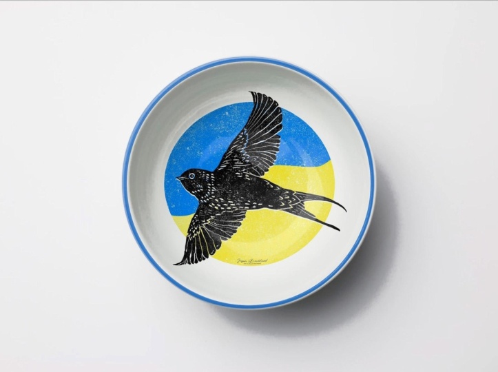
6. Mocking Up Bowls: So this lesson is packed with lots of great information we're gonna be mocking up on the outside of a bowl will first start with kind of a straightforward version and then another angle version. And in the process, I'm gonna show you how to use the pen. Tool is a selection tool, which is something I haven't done before, and also some tricks on how to deal with the photograph that's a little bit more challenging to work with. So let's get started. And whenever you start with a new photo, it's sort of a little puzzle to figure out how are you going to select the area that you want for your art on this one? It's not a very good candidate for a quick, select tool, because it's got kind of a soft edge here and kind of a questionable edge over here. I think it's just sort of Ah, a very bright highlight that's been kind of blown out, so the magnetic lasso tool won't work very well either. So this is a case that I'm gonna use the pen tool. I don't use it very often, but this is a perfect example of when to use it. I'm also gonna do another little trick, and that is I'm gonna take the right side of this bowl and copy it and flip it over so that it will give me this shape right here. So I'm gonna go to my bowl photo layer. I mean, hit copy, and then paste. It's added a new layer and here it ISS. So I'm gonna flip it by going to edit, transform, flip horizontal. And now I'm going to turn it on, multiply so that I can take this and line it up carefully on the other side. Now, I have a better indication of where to make that curve on this side. So go back to the bull photo and the pen tool is right up here, and it works very much like the pen tool in illustrator. So just click a point and start dragging. You'll get these little handles, and now we'll go around the edge and make curves. When you get to a point like this where you want to make a sharp corner, hold on the option key, click on the point again and just continue and then just go back to the beginning and then click to close it. And now we can just go back and I just our curves using the command key Click on this one, and I'm just gonna pull this down, and then I'm gonna move things around a little bit. And once you're happy with your selection, you can go up here two paths and you'll see that path we just made double click on it to save it. And now, right click on it and shoes make selection. And now it just looks like every other path that we've created. So go back to layers and make that a layer mask. Now, that extra layer we made, we could just delete that because we only had that to make her selection. Now I'm gonna go into Illustrator and choose my art. I'm gonna go with this one here. So copy command. See? Go back to photo shop and command V and paste it as a smart object and I'm gonna size it up . Click OK, drag it into the artwork folder and rest. Arise it. So we're gonna use the warp tool again. But this time, when you make your selection, go right up to the area that you want the art. So in other words, usually I have you add some allowance on the side. This time we're not gonna do that. We're gonna do just what we need. Then make sure your art layers selected command T and right click for warp. Now, when we worked on the coffee mug, it was pretty straightforward because we had a lot of straight up and down lines on this one. Because we have this angle here to work with. Things can go arrived pretty quickly. Things can get very distorted. So I'm going to show you some very detailed steps so that we can try to make this controlled as much as possible. First, start with this point and it's not really a point. It's a handle and push that almost all the way to the corner and do the same thing on the other side. Next, take this point and bring it towards the center and you can see what that's done is starting to make this diagonal line and now take this corner and kind of pull it so that we're starting to get the curve of the bowl and do the same thing on the other side. Next, bring in this corner. So we're going a little bit up and a lot in and do the same thing on the other side. And now take this corner and bring it up and out. Do that on both sides. And now, if you imagine art on a bowl, it's gonna be the biggest of the top. It's going to start to get smaller and more compressed as we go towards the bottom of the bowl. To do that, we're gonna bring this lying down and then bring this line down and now you can see that's distortion starting to happen. I want to come in just a little bit more on the side. And then let's look at it with the guides turned off, I think want to bring this just up a little bit, and once you're happy with it, you can hit return and d select. Now we'll do the same thing on a more angled bowl. So here's the new bowl, and I'm just gonna go ahead and make a duplicate of it. You can see this has quite a yellow cast, so we're gonna take out some of that color go up to image adjustments and goto hue saturation. Now we'll take the slider for saturation and move it down till it's more white and we're gonna lighten it up. Just a tad click, OK, and now we're ready to make our selection. This is another one where there's not really strong edges, so we'll use the pen tool again. We'll start in this corner and click and pull and just make our way around the bowl and then go back and adjust using the command key. And once you're happy with your selection, you can goto path. You'll see our path year double click to save it and then right click make selection. Okay, and now we have a selection, just like we always do. Now we can make our selection into a layer mask, so click here and now we're ready for art, and I'm gonna use the same art we used on the previous bull. So copy and paste here and then size it up. Click OK, drag it into the art folder and rast arise it, move it into place and now we'll do the same thing with the war. So make your selection and this time with no allowance, just the area that you want to cover with the art command T for transform right click to find the warp and will do the same thing again. So we start with ease. We move them all the way to the corners. We move this one end to the center and then we start moving this corner to start the shape of our bowl curve. Bring this one in, bring this one up. And now here's where it gets a little bit different. Now we have a substantial curve here, which we didn't on the previous one. So we want all of our lines here to kind of follow that curve. I'm gonna start by bringing this one down, but then also bring it up on the sides. Pulis learn a little bit to fix that curve there. And now this curve needs to come up at the end a little bit. So we'll pull that up and then pull down in the center. Then we'll look at it without the guides and do some little minor adjustments if we need it . And once you're happy with it, you can return and de select on a bull like this. Oftentimes you won't have an all over pattern. But you'll have some kind of a border that goes around the bowl. I'm gonna demonstrate with this lemon lime art. Drag it into the art folder and rest. Arise it. Now we're just gonna turn off our fruits and vegetables art and drag this one into place. So now we're ready to work this And because we're not covering the whole bowl, we're just doing this one strip. We're gonna go back to the part about leaving some allowance on each side. That's gonna help us get this to bend around the corner. So command t more and much like we did on the coffee mug. This time, we're going to go back to moving the corners and moving this one up and pull this curve down, and then we're gonna pull these corners in so that we start to get this angled line, but pull it down again. So it's a lot of back and forth to kind of get it placed and size the way you want it. So I'm pretty happy with this now. These curves all are very similar to the curves on the Bowl, and this line here helps to define the rounded shape towards the center. And our fruit gets kind of distorted along edges, as it would. So I think that looks pretty good now, as I mentioned before, that's quite a lot of work for just one piece of artwork. But in the next class will go over smart objects, so that will help you speed up the workflow. And now we're gonna add some art to this saucer and also to the inside of the bowl. So for the saucer, we're gonna create another art folder. So click on your folder, Icon. We're gonna call this one saucer and give it a different color and drag it down below. Here, we're gonna rename this one bull art just so that there isn't confusion. So to select the saucer will set up some guides to make a circle. So we'll bring it in here and one down to the bottom, and we'll use those guides to make a circle. Now we have our circle, and we need to subtract the inside of the bull and the front of the bull. So we use the lasso tool and with the option key down so that we're subtracting will just draw around the inside of the bowl now, because we've already made a mask of the bowl area weaken. Simply subtract that from this current selection. So go to the layer mask, right, click on it and pick, subtract mask from selection. So when I do that, it's now gotten rid of all of that bowl and we've got a little bit of scraps here. Symbol, Subtract those. But now our saucer art will Onley show up in this area so we'll bake that the layer mask. So for the saucer, I just want to add one of these fruits. So I'll copy. Go back to photo shop and paste it and I'm gonna make it quite big Click, OK? And Rast, arise it Now, this time before I put it in the art folder, I'm actually gonna drag it up here and now we're gonna take that art and come in T and we're gonna distort that so that it matches the shape of the saucers. All right, now I know I've got the right angle, so I'll click OK and drag it into the saucer folder and I'm actually gonna may be offset it a little bit and make it a little smaller in the maybe at a 2nd 1 We could also take this fruit and we could add it on the inside of the bowl. So create a new folder and this one I'm gonna call inside bowl and then we'll need a layer mask for that one, and I'm gonna turn my guides on. Will do a circle starting right here and on the side. Well, with circle, make that are layer mask and will give a different color for this one. And we're gonna drag copy of our fruit. So use your option key, drag it into this one, and then I'll move it into here will make it smaller. So it sits on the floor of this bowl and then you can see I accidentally put that folder above our bowl so we'll just drag it up where it belongs. And that completes our summary lemon lime bowl set. So we covered a lot of ground in this lesson. I hope you have some better tools now for mocking of bowls and also how to use the pen tool . Next is the Q and A section called Help. It's not working
7. Help! It's Not Working! (FAQs): Now it's time for the section I call help. It's not working, and I want to cover some of the little things that contribute up when you're first starting out. First up, I put the art in the R word folder, but I can't see it if this happens to you, is probably for one of two very simple reasons. First off, you may have for gotten on your original photo layer to just turn it off, or it's possible you just forgot to change your gift bag photo to multiply. Help The marching ants make it so hard to see my art when I'm trying to warp it. So here's a situation you may come across. If you're working from a pattern that you made an illustrator, you make your selection that you want a warp when you start to move it. All the little marching ants surround your art, and it's really hard to see what you're doing. As you start moving things in, it gets really hard to see your lines, and then there will be other times when that doesn't happen. So what's the difference between this art and the floral art? The reason that it doesn't here is because the background of the pattern is transparent, so the marching ants are outlining every little single element. So if your art has a white background than the marching, ants will only appear around the outside of the whole thing. So what quick work around to that is? Make a new layer. Select the whole thing. Go over here and choose white. Click. OK, and now edit Phil and we'll use the foreground color. Click OK, and now drag that layer below your art. And now select the art layer and the white layer and go up to layer Merge layers. So now we just have one layer again. And now when you go to warp it now, the marching ants have gone away and you can see they're just around the outside because now our pattern has a white background help. It won't let me use the distort tool or warp tools on my art. So this is a situation where if you go toe, edit, transform and these tools are all great out. Probably What's happening is you forgot to rast arise your art layer, so if you look over here, you can see it still has the smart object icon on it, so just right, click it go down to Rast, Arise layer. And now, when you go back to edit transform, those will now be available. I put the layer mask on the wrong layer. Do I have to redo it? The answer is no. If you put the layer mask on the wrong layer like I did in this example, you could just simply click on the layer mask itself and drag it onto the artwork layer. Where can I find photos to USA's mock ups? I'm gonna go more into this in later classes. But the quick answer is there are lots of places online where you can find mock ups, just Google product mock ups, and you'll find a lot of them. Some of them are free, and my feeling is kind of that you get what you pay for. I often use shutter stock. In fact, most of the images for this course will be from shutter stock, and they're really quite reasonably priced. You can get a one month membership, I think, for $49 for that month you can download 10 images, so that makes him $4.90 apiece. If you'd like to use the images there in this class or any of my classes, you can follow the link and the resource is, and that will take you directly to a page showing all of the images that I'll be using in the course. So I hope those tips were helpful, and next we'll go over the details for your project.
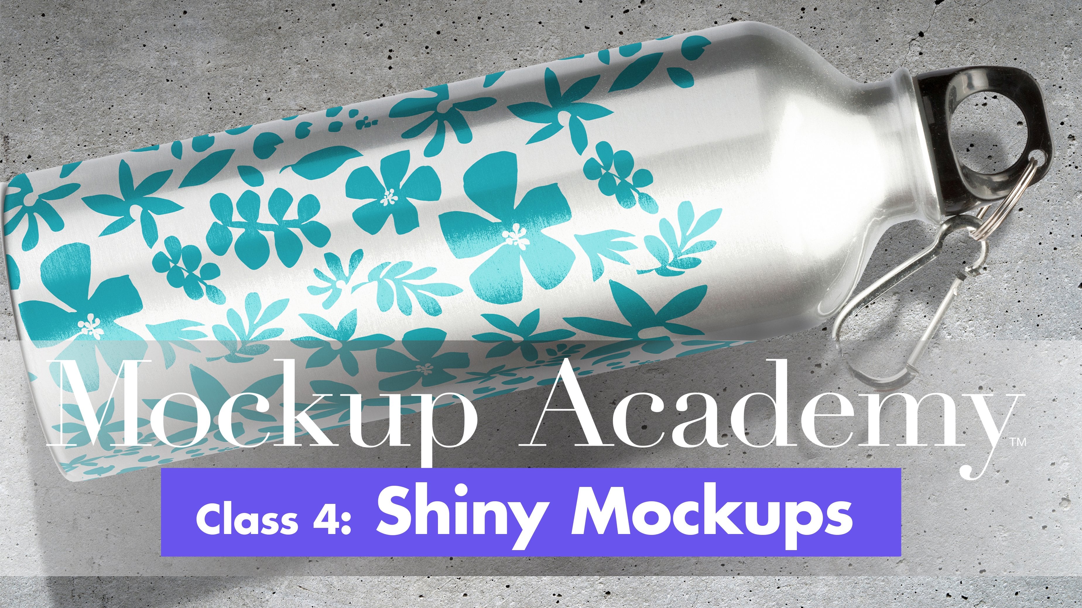
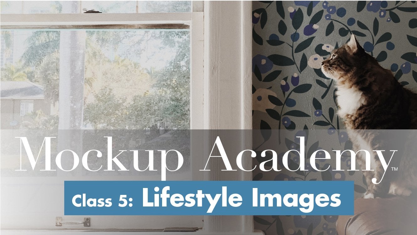
8. Your Project and Future Class Previews: Now it's your turn to make a curved mock up. This mug photo is included in the class. Resource is so once you download it, you can set up your layers, create a layer mask and add your own art and start warping it. Try out all the techniques that Aaron the lessons so you can find out which one works best for you and which applies best to your art. And if you'd rather work on one of the bull photos those air available at shutter stock and I'll put a link to those in the class project section when you finish, I hope you'll post it to the class page. And if you have any questions about the process, you can post them in the community section, and I'll do my best to answer them. I hope youll also review the class that really helps others to know what to expect from the class and helps me know what's working and what's not. As I work on future classes and speaking of which, the next class will be about smart objects, and that's a process where you can do your transformation of the art non destructively, and then you can swap it out for new art, and the transformations will be applied automatically if you plan to use your mock ups more than once. This is a tremendous time saver. Class four will focus on working with shiny surfaces, and transparent objects will go into greater depth on creating highlights and shadows and creating the illusion that artists wrapping around a transparent object Class five is a really fun one. It's working with lifestyle images. That's when your mock up is part of a scene, like a rug on the floor or framed art on the wall. And you really need your mock up to look like it's within that environment. I've got some great tricks for those situations that will make things look super realistic . So I hope you'll join me for those classes, too. And if you follow me, you'll be the first to know when they're published. In the meantime, thanks for watching this class and have fun making mock ups
 Kris Ruff, Surface Pattern Designer & Coach