Transcripts
1. Introduction: Hi. Welcome to mock up Academy. I'm Chris Rough, and this is class for all about working with shiny and transparent surfaces. In this class, you'll learn techniques about adding highlights and shadows to your shiny objects to make your mock ups look more realistic. So after the basic concept lesson, I'll introduce you to the techniques on this plate, and then we'll move on to this metal water bottle on this one. I'm gonna use art that has a solid, dark colored background, because that can often be challenging when you're making mock ups, so I'll show you how to handle that. And then there's a lesson to show you that those techniques work on other objects to, even if they're not shiny. When you're working with strong, solid colored art, then finally will look at ways that you could make your art look like it's wrapping around this transparent glass tumbler. Each of my classes starts out with the same basic concept lesson, and if you've taken any of my classes before, you've probably already watched that one. So go ahead and skip that one and move right on to Lesson three. But if you're new to mock up academy. I do recommend you watch that lesson even if you've made mock ups before, because I'll explain how I set up my layers on all my mock up files. So by watching that lesson will all be on the same page as we move through the rest of the class. So let me share a little bit about my background. I'm a surface pattern designer, and I've been doing that for more than five years. I love what I do, and I've worked with probably a couple dozen manufacturers creating products for home decor and stationery and pet products and gifts and lots more to. I created this course because it took me a long time to learn how to make mock ups. And I would have loved to have found a class like this when I first started out something that's geared specifically towards putting art and patterns onto a variety of different products. A couple technical details about the class. Everything I show will be in photo shop, and I work on a Mac. And so the shortcuts that I give will be based on that. I'm using Adobe CC 2018 and I'm assuming that you have a basic working knowledge of Photoshopped. That way I can keep the classes moving along quickly, so I think that's it. And now let's go ahead and get started.
2. Making Mockups - The Basic Concept: in this first lesson, I want to go through the basic concept of how you make a mock up. First, I want to do it with some diagrams, and then we'll jump right into photo shop. So to start, all you need is your photo and your layers palette. Now, when you open the layers palette, you'll see there's already one layer in there, and that's your bag. Photo will start by setting this layer on multiply, and the reason for that is we're gonna be adding layers underneath the bag photo. And so if we said it to multiply, then we'll be able to see the layers that are underneath it. Next, we'll create a folder, and that's where we're gonna put all her art and that will go right underneath the bag photo. Next, we select the area on our bag where we want the art to go, and we're gonna turn that into a layer mask. Now, if you're not familiar with a layer mask, I like to think of it as a window. So that selection we made on the bag is now this white square on the layer mask, and that's the window where the art is going to show through the rest of it. The black area is all blocked out now when we add art into the folder, it will only show through that window. Now you'll notice that I put the layer mask on the folder and not on the layer that has the art. The reason for that is now when we add additional layers of art, it's already massed and ready to go. In addition, if the layer mask is on the folder, then we're free to add additional layer masks onto the art layers. And we'll do that in some of the later lessons. Okay, so that's the very, very basics. Now let's go to photo shop and do the same thing. So here's our gift bag photo again, and over here we have our layers palette. Now your photo might have a padlock on it like this one, so just go ahead and click on that to get rid of it. Now we'll take that layer and change it from normal to multiply, and now we're ready to make the art folder, and to do that, just click down here and change the name and then drag it down below the bag photo. Now we're ready to make the selection on the bag where we want the art to go. And to do that, I'll go use the quick selection tool and make sure that the photo layer is selected and then go up here and select subject. Now that did a pretty good job, but it did give us the handles and we don't want that is part of our selection. So we'll go to the Polygon Tool and used the option key to get a minus on our icon. And then we'll just subtract that from the selection and missed a little bit along this side. So let's zoom in and using the shift key. We can add that area here and down here, and I also see that we missed a little corner down here. So let's add that in using the shift key, and then we want to take out the shadow at the bottom. So for that will use the option key and just go along that edge and subtract. So now we have our selection, and we just need to turn that into a layer mask and we want the layer mask could be on the artwork folder, so make sure you choose the artwork folder layer and now use this icon which says, add layer mask. And there it is. We have our layer mask. Now, everything that we put in this folder will only show through that white area. So let's go get some art. I'm gonna go to Illustrator, which is where my art is, and I'm gonna copy here, and you can also copy from Photoshopped. Or you can drag your art into the photo shop player. However, you usually get art into photo shop will work just fine in this situation. So go back to photo shop and paste as a smart object. And now just click and drag that art layer into the art folder. And there it is. It's all masked and ready to go. Now. Everything that we put in this folder will be massed in exactly the same way. So that's it. Now you know the basics for making a mock up and you're ready for the next lessons
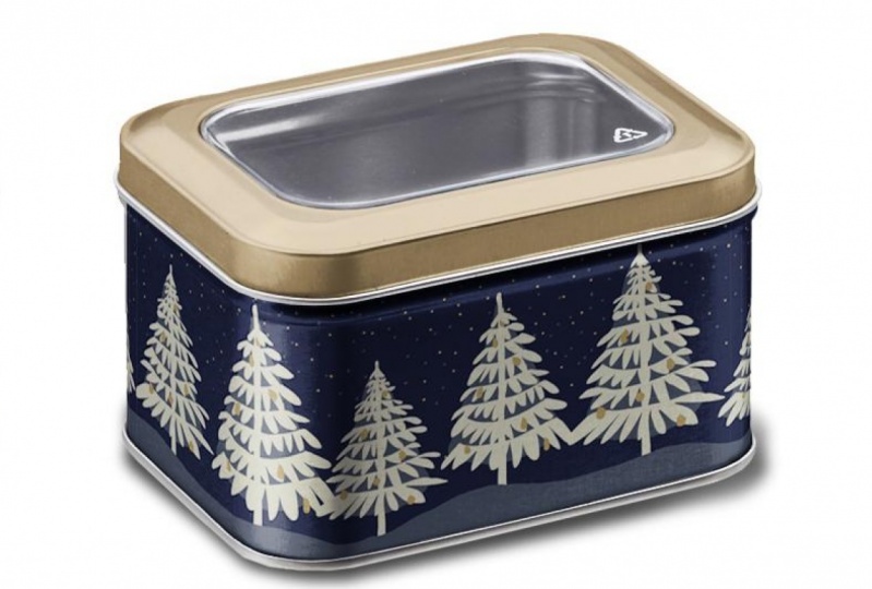
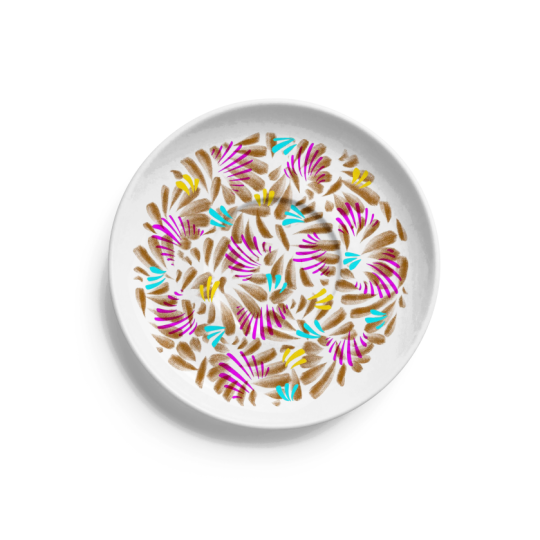
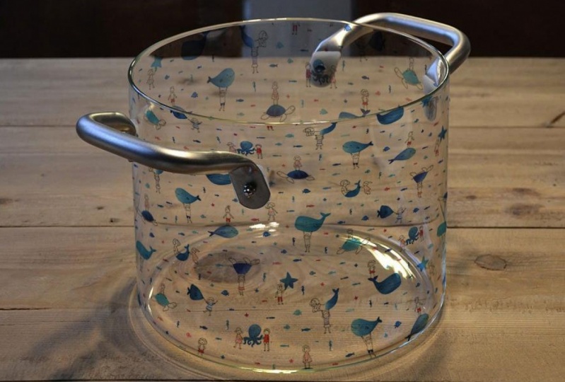
3. Creating a Shiny Plate Mockup: Before we start on this plate, let's look at some sample photos of shiny products. When we look at thes, it's clear that these air shiny And why is that? Well, mostly it's about the highlights. So if we look at this plate appear, look at how strong that highlight is. It blocks out nearly all of the blue background and obscures the horse. Here we have another highlight here. It's not quite as strong, but we still get the idea that it's shiny. This water bottle also has a really strong highlight through here a little bit less here, but you can see how it really lightens and washes out the color of the pattern. And then we also have a very strong shadow along the front. On this popcorn tin, you can see an area right here that's almost purely white, and then we have a little bit softer highlight that runs down the front of the can, so that gives us a really good idea what we need to do with our mock up. All we really need to do is make sure that we have a really bold highlight on it to give the illusion that the surface is shiny. So what we're gonna do is we're gonna take our original photo, and it really helps if we start with a photo that has strong contrast in it, like this one will add the art as usual. And then we're gonna isolate the highlights and add that on top of the art so that it will lighten the art just like it did on the sample photos. And then finally, we're gonna add an extra shadow layer that will just help make things more contrast e and enhance the effect. So when we add that all up will end up with a very believable looking shiny mock up. Okay, let's go back to our plate. And hopefully you've watched the basic concept lessons. So you know how to set up the layers. I'm gonna go through that quickly here again. So if your photo has a lock on it, go ahead and just click on it. Now, if you've watched any of my other classes, you know that I always make a duplicate of this layer. So let's go ahead and do that. Drag that down here, and I'm just gonna re lock this one and hide it. And I do that because if I want to make any alterations to this image, I have a back up one that I can go back to. So now on this one, let's set it to multiply, and then we'll make our art folders. So click on the folder icon and rename it and dragged that layer below the plate photo. Now we'll make our selection for our layer mask. We want to make it around this whole plate. So Dragsholm guides from your ruler make sure your rulers are turned on and put it right at the edge of the plate on the side and on the top where those two guys intersect. We're gonna use our circle tool, and we're going to start a circle right at that intersection and bring it down till you get to the other edge of the plate. Will turn that into a layer mask, making sure that our art folder is selected and shoes Theo add layer, mask, icon. And now we're ready for art. I'm gonna go into Illustrator and select my art and drag it back into photo shop. Click OK, and then dragged that art into the art folder. Okay, Now all we have left to do is to add that highlight layer and add a shadow layer. For that, I'm gonna create a separate folder. So click down here and we're gonna call this lighting. And I'm also gonna add a color to its by right clicking on it so that it will be easier to identify what's in that folder. So we're gonna make a copy of our plate photo, so click and drag it onto the add layer and put that into the lighting folder. Now it's also read and do that again. So this layer is gonna become our highlight and this layer will become our shadow. Let's work on the highlight first, so turn off everything else. Now you can see the highlights on this plate. The biggest one is here, and then there's a little bit more subtle one right here and actually kind of a secondary one through here. So the easiest way to select those is make sure that your highlight layer is selected and now go up to select color range now at the top here, where it says select, choose highlights and for now, turned the fuzziness off and move this one all the way to the right. Now we can use this area to preview our selection, but let's instead turn on black matte. So now we can see what's happening on the full screen. Now move this marker until we get most of those highlight areas. Now, we'll change the fuzziness a little bit, and the fuzziness tells us how soft or how hard our edges air gonna be. So I'm gonna move this up. So now we've got a little bit of that secondary highlight coming through and a little bit softer edges around these highlights. So I think that's gonna work pretty well. Now, when you do this, it's kind of trial and error. Sometimes you want a little less highlight or some more. It really just depends on your image. And you can just play with that, try it a couple times and see which one makes the best effect. So click. OK, Now we have a selection that is those highlights. And make that a layer mask on your highlight layer. So click on that and go over and add a layer mask. Now turn that one off and do the same thing for shadows. Turn on that layer, go up to select color range and this time choose shadows and let's turn the fuzziness all the way down again. And I just want to make this book all black so that we can just kind of slowly see those areas pop up. OK, so first is the drop shadow. So keep going, because what we're really after is this shadow area here. Let's move it a little bit over. That's probably good enough. And then add some fuzziness here. A swell. I think that's gonna be pretty good. So click OK and then make a layer mask on that one, too. Okay, let's turn everything off. And now let's turn them on to see the final result. So we've got our plate photo, we turn the art on, we add the highlight layer. Now, you see, when I clicked on that highlight layer, nothing happened. That's because we have this one set on multiply, and so the white is not going to show up it all. So change this to normal, and now you can see those highlights are added over the top of the art and then turn this shadow layer on. So we got some more shadowing here, which is good, but it also changed the color of her background. So in order for those lighting layers, toe Onley affect the plate and not the background, we're gonna make a copy of this layer mask and put it on our lighting photo. To do that, hold down the option key and then click and drag that layer mask and drop it right onto the lighting folder. Now our background is back to where it started. Now, this highlight is a little bit too strong on this image. So the last thing we're going to do is just go to that highlight layer and change the opacity. Lower the capacities so that we can see some of the art come back through that highlight. So there it is. Now you know how to make your shiny surfaces look more shiny by just adding that extra highlight layer and the extra shadow layer. We took it from this to this. So now let's do the same thing in the next lesson on the water bottle
4. Working with Dark Colored Art: and this us, and we're gonna mock up this water bottle in much the same way as we did in the previous lesson. But this time I'm gonna use this dark colored art. If you've ever tried to make a mock up with something that's dark colored, you know, it can be a real challenge because the darkness tends to black out all of the details of the photo. So I'm gonna show you how this technique of layering highlights and shadows works really well with dark colors, too. So first, let's get our documents set up. I've got the duplicate photo. I've got the water bottle photo that's set to multiply. My artwork folder is ready, and now I just need to make the selection where we want the art to go. So let's give the quick selection tool a try and make sure that your water bottle layer is selected. Go up here to select subject and now we just need to do a little bit of cleanup. I'm gonna use the magnetic lasso tool to take away this drop shadow. We want to subtract it so we use the option key, click and then just slowly drag along the bottom and then go up to the top and we need to take out the cap and this clip Oring so well again will use the option key, Dr. Gregg it along the neck. And that worked well with just this one little exception and will go and use Thebe Polygon tool again with the minus. Get rid of that little piece. And I think we want to add just a little bit here. Looks like it missed a little bit over here too. So we'll add that using the shift key, and we'll look over the whole thing. Looks like we need to fix a little bit down here with the option key. Okay, that looks good. So we'll make that are layer mask. And now we're ready for that art. So I'm gonna copy from Illustrator, Go back to photo shop and paste and always paste as a smart object. Then I'm gonna enlarge it, click OK and drag it into the art folder. Now we're ready to set up that lighting folder, so make a new folder and it put it right in this folder. We don't want that. So bring it up here above this time it needs to go above the water bottle photo, Call it lighting, give it a different color. And now make a copy of the water bottle photo, Put it into the lighting folder so that it turns orange and do that a second time. You can call this one highlight, and this one will be our shadow. And now you remember from last time that we want this one to be set on normal, not on multiply. Okay, so we'll start with that one first. So turn everything else off and then, as we did before, go to select color range. Choose highlights. Move everything to the edges. Make sure that the selection preview is on black mat and then just start slowly moving this slider down. So we're going to get that full highlight on the front, and then we'll use the fuzziness to make our edges softer and get some of that additional stripe of highlight over here. Click OK and turn that into a layer mask. Turn that often will do the same thing for the shadows, so go to select color range. This time, choose shadows, turn off the fuzziness and make everything dark Now we'll start moving it until we get some of the shadows on the bottle itself. So there it is. And turn up the fuzziness. Click OK, and turn that into a layer mask on the shadow layer. All right, now we'll turn everything back on. And at this point in the previous lesson, we clicked on her highlight and dropped down the opacity. And that works here, too. But it seems like it kind of dulls the colors. So what I've found when you're working on a metallic surface like this, I actually like to use soft light as the filter instead of normal. So click on that, and it's not as strong a filter. So put the opacity back to 100 and that gives us more highlight. The shadow. Maybe a little bit strong here, So let's turn that down a little bit. Now, remember those sample photos and how strong the highlights were on the metal surfaces were kind of missing that here, And that's mostly because of our dark colored art. So in this case, I'm actually gonna add another layer of highlights, so duplicate the photo again, drag it up into the lighting folder we'll call this one top highlight because it's gonna sit on top of our existing highlight layer will turn everything off again. Go select color range. Choose highlights. This time I'm gonna take a much smaller amount of highlight, so I just want to get that stripe of highlight down here. I am going to make it a little bit fuzzy, but I don't want to get any of this highlight here. I just want that stripe down front. Click OK, and make that a layer mask and this one. Let's try this soft light again and turn everything back on, and that's still pretty subtle. So let's go and do this one on normal and then just bring the opacity down. So here it is, before that highlight and after. So I think that really helps make this look more metallic. So then there's one last thing to do, and that is make our art look like it's wrapping around this curved surface. The easiest way to do that is Rast. Arise this and then use the technique that I showed you in in class to working with curved surfaces where we're just going to compress the sides and So we want these flowers to start being compressed kind of along the shoulder here. So make a rectangle that goes right up to the edge of that shoulder. And then we're gonna use the keyboard shortcut for transform, which is command t and then move this little handle in. So we start to compress the art click return, and we're gonna now take another rectangle that starts about right here. So de select and make that new rectangle command t move it in. Click OK d Select and make another Do that again and then one last time with this little sliver here. So what that did was compressed the art along the side so that it looks like it's wrapping around the bottle, so we'll do that quickly on the other side. And if you want more details about that process, you can go to make up academy class, too. So there's the final result. And so this lesson showed that by adding this additional top highlight, you can really make this dark colored artpop
5. Bonus Lesson!: so this is kind of little bonus lesson. I realize that this object is not shiny or metallic or transparent. And in fact, I just pulled this mock up right from Class One of Markup Academy. And what I want to show you with it is that the technique of adding highlight layers also works for things that are not shiny and especially if you're working with dark colors. So let's say that I wanted to have this art, but I wanted to have it on a black background so I might add a new layer called background , and I'll put it in the artwork folder, but below the art. So I go over here, make sure that this is set on black and then just fill that layer with the foreground color . And now I have my black napkin, but you can see that it doesn't look very realistic anymore. So first, let's lighten up the black a little bit because in reality you wouldn't have a napkin that's quite this intensely black. So just go over here and lighten it up just a little bit, and then we're gonna do that same highlight trick, So make a new folder. Call it lighting, right. Click and give it a different color. And make a copy of the napkin photo and drag it into lighting Boulder. And this will be our our highlight. And then turn everything else off. Okay, So same technique Here. Go to color range. Pick highlights. Turn off the fuzziness, make it black, and then slowly move this until you see the highlights come up on the image. That's pretty good. We've got kind of a solid one here and over here and then kind of It looks like the lightest flowing across the surface, which is really nice. I don't really need much fuzziness on this one. I don't think, um so click. OK, turn that into a layer mask and then turn everything back on. We don't want that one. We'll put this back up here. That's our duplicate. So turn this on and this and then make sure that the highlight layer is set to normal and now just turn down the opacity. So there you go. There's are black napkin and another nice thing here. By doing that, we brought out some of the texture of the fabric, which is really nice So now that looks much more realistic. So we took it from this to this. So I hope you see now how useful that highlight technique is. Even when you're working with fabrics, something that's not shiny at all, it really adds some great dimension. So next up, let's work with a transparent glass.
6. Mockup Up Transparent Objects: in this lesson, We're gonna mock up this water glass. But before I demonstrate it, let me just kind of explain the steps that we're going to do. So, Step one, we're just gonna add the art like we usually do. And step two, we're gonna warp that art so that it looks like it's going around the front of the glass. Step three will turn off that front, art, and we'll add a duplicate of the art that we're gonna use to go around the back side of the glass in Step four will warp that art so that it looks like it's going around the back of the glass and then in step five will flip that art horizontally because on a real glass, as the art goes around the back side, we're actually gonna see the back side of the art, so flipping it horizontally will make it look more realistic. Step six will just turn on that front art again and make sure the front and back line up correctly. And then in step seven, we're just gonna lower the a pass ity of the back side art. Okay, now, let's go do that in photo shop. All right, here's our glass again. And I've already started the set up. Over here, I have the duplicate photo locked and hidden. I have the glass photo set to multiply, and I have art folders made. And this time we're gonna have to art folders one for the art that goes around the front and the other one for the art that goes around the back. And I've given each of them a different color so that it'll help us keep track of what's what. Now we'll make the selection for our layer mask and so click on your glass photo and we'll just use the quick selection tool again and click on select subject. And this is a case where rarely is your art going to go up to the top edge or down to the very bottom because of the nature of a glass. So really, all we care about is making sure that we have the sides in this layer mask, so this will work fine. And I'm just gonna clean up this bottom edge a little bit. We're gonna use the option key and subtract the stuff that's actually not on the glass. Okay, that's what we'll use for our layer mask. So click on one of the art folders and choose add layer mask. And then we're gonna use that same layer mask for the other folder, too. So just use your option key and click on that layer and drag it down to the other folder. And when you do that, make sure you're not dragging on the layer itself, but actually right on the layer mask. And now we're ready for some arts. So I'm gonna go into Illustrator and I'm gonna use this floral here and I'll click and drag it into photo shop in Size it. And once I have the size that I want, I can rest. Arise it by right, clicking on it and choosing Rast Arise Layer. Now we want to put a copy of this art in the front folder and the same in the back folders . So go ahead and make a copy of this and drag one of them into each art folder. For now, we'll turn off the back and then will warp the front art so we'll choose the area of the art, leaving some margin on the right and left and then we'll use the keyboard shortcut to the warp tool, which is command t for transform and then right, click and go down to warp. Then go ahead and warp it and then click OK and d select. Now we'll do the same thing with the back art. So turn off the front art, turn on the back art and will do the same thing. But this time, instead of following this curve, will make our art warp so that it's this shape. So click on the proper layer and go do the same thing. Manti, right. Click for warp and then start moving the outside first and then the inside. Then click return de select and then go up and choose the move tool and then go to edit, transform, flip horizontal, and then make sure we move it into position correctly, click OK and de select. Now we turn on the front art and lower the a pass ity of the back and moving just things as needed. And as they look at this, I kind of wish there was a few more flowers down here. Something actually used my clone tool and choose this orange flower and make a little bit smaller version of over here and maybe do the same with this one. And this feels like a whole here. I wish there was another leaf here, so I'm just gonna take this one and duplicate it down here. And I also don't like how high these are in the back. So I'm just going to go to the back artwork and choose my eraser tool and and just get rid of those. Okay, so there is the final result. So by flipping that back art horizontally Now we've got this art. We've got the purple flowers and then red flowers. And then if we think about going back around the other side, we have the purple flowers again and the red ones over here. So that really gives the sense that this art is moving around the back side of the glass and by lowering the a pass ity of the backside, it makes it easier to read the art on the front, but still gives us the sense that this is art that's going to wrap around the whole glass and then by lower in the opacity, it helps us be able to read the art better, but still gives a really good visualization of what this art would look like on a transparent glass. So that's the last of the lessons for this class, and next we'll talk about your project.
7. Your Project and Wrap Up: you're Simon has two parts. The 1st 1 is super simple. It's toe. Look at shiny and transparent objects all around you. Study how the light affects thumb and take note of the highlights and shadows. Do they have strong edges or soft ones? And how does the light affect the color or the pattern on the object? You could even create a reference file for yourself with photos torn from catalogs and magazines, or even created a Pinterest board devoted to the topic. The second part of the assignment is to create your own mock ups, choose a good photo with strong highlights and shadows, and then try out the techniques from the lessons. If you'd like to use any of the photos from the class, you confined those in the mock up academy collection on shutter stock dot com. I've assembled an ever growing collection of photos that are perfect for mock ups on that website, and you'll find a link to those in the project section of the class the way they're set up . If you sign up for one month, you can download any time images for $49 which I think is pretty reasonable and there's no obligation to continue your membership after that. Once you've finished your mock up, I encourage you to post it or post a couple of them to the project section of the class page. When you're working on mock ups, sometimes it's hard to be objective about like how much capacity you should use on the highlights or what things look realistic or not. So it's great to be able to post those to the class page. You can get feedback from someone who has fresh eyes and can take a look and instantly tell whether it looks realistic or not. So I encourage you to do that. Also, if you could review the class that helps me out a lot, it helps other people know what the class is going to be like and helps me to know what's working and what's not working so I could make adjustments for future classes. The next markup academy class will be about mocking up lifestyle images. That's any photos where the product is photographed in a room setting or outdoors. Think framed art on the wall or a rug on the floor, or an outdoor shot of a beach bag to make those kinds of mock ups realistic. You'll want your product to reflect the color and intensity of the lighting in the photo, and I've got some great tips for how to do that. If you'd like to know when that class goes live, you can follow me on skill share. Or also you could follow me on Instagram at Chris Rough Design and in the meantime, have fun making mock ups.
 Kris Ruff, Surface Pattern Designer & Coach