Transcripts
1. Intro to Course: Hello everyone and welcome to this course. Now in this course, I will teach you the R programming language from beginning to a place where we can become experts and constantly solve our data problems. Now, R is the language of data, so it's vital for data science and analysis. However, however, for this course, you don't need to be an expert. You can be a complete beginner, just interested in learning about data science. Or an x-bar, looking to make your day-to-day analysis easier by learning are. Now r is becoming really popular these days for a multitude of reasons. Mainly because people have become more interested in pursuing data science. With the current growth of big data and machine learning in almost all industries, the demand for data keeps going and therefore the demand for analyst keeps on increasing. And this opens up lot of opportunities to be able to work in different sectors and different areas. And with the current climate, people have a desire to be able to work remotely and work freelance to have a bit more flexibility in how they were converted back. So with data science and analysis, this is definitely something that you can pursue. Now, why is are important are, is one of the main languages of data science. Another main language is Python. But Python is a very generic language that can be used for many different things. And it's really the language of programmers. Borrowed. R is the language of data scientists and statisticians. So one of the main reasons why R is great is because it's free and open-source. And this means that our large communities working on and that's very supportive communities that can help you if you have any questions or any problems with any analysis. And they also continuously work on making packages. Packages are something that you can install and they are for very specific data problems. It makes solving them a lot easier. I will go three packages and future videos have to install these and how to use these. Now something the ADH does really well is data visualization. And that's something that no other programming language comes even close to. And data visualization is really important for data science, especially because we deal with graphs and charts and data. So this is something that is really good and are now if you are interested in data science or R, and you think that this could be useful to you then definitely have a look at this course and I hope you enjoy it. Thank you.
2. Lesson 1 : Installing R & Rstudio: Hello everyone and welcome to this video. This will be a brief introduction into our downloading R and RStudio and bound up with the basics of how our functions and it looks like. Okay, so to download our, we just go to the r-project dot org. We come over here to download R and the Pentagon, our country that we're in, we click on the relevant link and it will take us to have an E2. Or we could just go to Cloud, which will automatically redirect us to the server depending on our country. So you click over here and then we collect on downloading are the one that's for our computers or whether we're using a Windows or a Mac and redownload the lacO download, anything else? Okay, so once that we have downloaded R, it's important to have a good IDE or platform to run out of it. And in my opinion, RStudio is really good. So we just come here to ask you do.com products, RStudio. And there are two versions of RStudio. There is the open source or free version, and does the prior version which comes with a price. And to be honest, there is really no need for the prior version unless it's a big institution or company that season game. For individuals regardless of what they're using it for the free one should be more than enough for their needs. So you just click over here. And once again, we click on the free version. And we downloaded depending on our computer, whether we're using a Windows or Mac or any of the relevant ones. And we connect. Okay, Once we have F industry yet, this is what it looks like. It might seem a bit complicated and fiddly, but it's very easy and simple to use. It has four quadrants. And the first one, this is where we would input our code, your right, what we want. And the code, it would be outputted here. So depending on what we call then we will see over here at the bottom. Now, this third quadrant, which environment is empty, shows this is where it will list any functions or objects that we have created. Now this was may seem a bit foreign now functions and objects. But once we start using Got, it will become second nature. Start using these words. It's very easy. And two years under mountain 10 stand. Okay, So the fourth quadrant looks probably very familiar with the titles of file and this different folders that we have. So that is basically what it is. This first tab, we have our files than plots. So any plots that we create here on the first quadrant, we can view it on here. Now packages. The hair, I've briefly spoke about it. It's why we installed packages to help us with our coach and manager easier. And of course then you can use the help and the viewer. Now, we will go into all of this in much detail, but this is just a basic overview of what RStudio looks like. So it's not so scary when you first open it. And of course, these quadrants, we can move them around depending on how you like it, what we use more, what we look out more. And it's really very user-friendly and density is as we will find out in future videos. Okay, so thank you for watching this video. I hope that's been useful and I will see you in the next one.
3. Lesson 2: Data & projects: Hello everyone and welcome back to this course. So if we'd had a brief introduction into how to install R and RStudio and a brief look at the different quadrants and on what they do. So for this lesson, we'll be focusing on how to import data creating projects and some small manipulation of data. Okay? So to import data and use it, the best thing to do would be to create a project. Now, with creating a project in shows too heavy, teach the day to we add a new movie, all stays in one place. So to start a project, we go over here, create a project. We give it a name. Project 1. Not very imaginative, but it does the job. Create Project now, okay, let's just wait for this to load. Okay? So let me just fix this again. Okay? So it has created this project one here in our folder. Now it hasn't just created this in RStudio has also created this on our computer. So if I go to my files, you will see this project there. Okay, So this is my laptop photo, and it has already created this automatically for me in my hard drive. I didn't have to come here and creators. So if I make a project in Ostia, automatically create two on for me in my own folders. So if I come here to project one, get in here, and this is the upper folder for the project. Now I can paste whatever I want and now I've already copied data that I do want. And I've pasted the hair is Hey, I would like to rename this to make it easier to deal with. Just Theta one. Let us make it simpler to deal with. Okay? So data one or this is the file that I have created. Now I choose to do CSV because it's a lot more easy to deal with. It's very efficient. Now, you can also do this with Excel sheets or anything else. And I will show you that in future videos. But for now, I'll just do the CSV. And just to clarify, you can download or change your Excel spreadsheet into a CSV file. That can also be done. Okay, so now that we're back in, now we can see that the data we had pasted into our folder has already shown up here. However, this is not exactly imported into RStudio, is just showing up because it's on that folder. Now we can import it either by clicking it from here or coming to import it from, Hey, I think the best way to do it is to start writing code and importing it via code. So one way to do would be read CSV. So it shows up itself automatically. Go there, you write the title of what you want to import. In this case it's data one, theta one dot CSV. And we do Control Enter and heritage. This is my data that I had and now it's reading it for me. So this is all the names. The age in years, gender, height in meters. So as you can see, it's all shown up. However, this is not very useful because we just read the data. The best way to utilize this data is to turn into an object. So I can give the, some other title. I can call it anything, but I'll go again with data one to make it easy to feel with this arrow sign. And let me just read this. Okay. So as you can see, it's shown up here. Now, as I said, whenever we create an object, oh, or, you know, any functions, it will show up in our environment. So there's our environment and what we did now is recreated an object. This is the title of the object data one, and we have assigned it something, and this something is this file. We've assigned this file into data one. Now to view the data, you can easily just click down here and you'll be able to see all of it. Nine observations for variables. So it's four columns and nine rows, as we can tell here. Okay, so this has easily been created. That is how you import data. It's very easy and very simple. And that's how we made an object. So it's very easy to use and simple. Now, we will go ahead and do some further manipulation of this data. So the manipulations or the faster we are going to use if they're going to be pretty simple. Just the basics of it. So for example, we can do that. Okay? So new right, had data one way it does. It gives us the first six observations that we have and all the data from there. Now as you can to head, of course we have tail and then we do data. One. Yeah, and of course Control Enter. Now, it's very important that we are really clear about our titled, because right now they are not identifying data one with the lowercase t, lowercase d because we have originally with a bigger case, then this is the only way they would recognize it. So if I change the entire capital T and I try running list. So as you remember, running is controlled. Placenta will give us the buzzer six. Okay, so that was very simply looking at the heads and tails of our data. Well, we can also do is look up the data in itself. So if VJ, VJ Day 21, and we click Control Enter, we automatically get this here. This data to us, our data's presented in a very nice table here and we can easily visible. Now, we're going to come back to this. And you can switch back whenever we want. It's a lot more neater than say this, because this is really just trying to store as efficiently as possible nine observations and four variables. Okay? So we can come back here. Okay, so now that we have done this, let's try and extract data from here. So for example, we want to first write the object that we want to address. So that would be data one and what we want to get out of them. So for example, I want to view. So the first number you will always input would be the RI. So what role do I want to address? I want the third row and I want to see which column, Let's say the first column. And I do Control Enter. Now, Zach, That will give me the information. Zach, though, rest of it is Charlie query, David, Emily, Molly, and what type of book? Really what we did is just the third row, if we go back here, that we're fast. Zach. So that's correct. Now, if we want a specific rather than house a specific date and we can have a whole row. So we can do that by pulling down, for example, we want the second row, but we want, we can leave this blank. So you can leave the column blank. And then it will give us the whole row. As it does here. Started be Emily 26 female 175, Emily 26, female 175. And the same way we can do that for theta one. We can do, leave this blank. The fourth column D, we have a fourth column alone. Just check. Yeah. So you can do Control Shift Enter and it will give us all the data from the fourth column. So if just to compare, here it is. And you've got, and those are just simple manipulations of how to extract specific data from our whatever. Okay, So there is a Muslim data rather than just writing it like this specific line demand level and you're talking to somebody can do is we do data one. So that's our object that we're trying to address, the dollar sign. And then inhale, we can pick the specific variable that we want the information from. For example, I want the agenda. And if I click Control Enter, it will give me all the different it'll give me that particular variable. Oh, yeah, that particular column. So female-female, if I can just click here and compare it to DNA, and we just go to the gender. Females, three males to females, three males and female, male, female. It gives it a whole column. Now we can do that for all of the other variables as well. So dollar sign and then choose any and it should give you that information that regard. So this was a very simple way of extracting data. I hope this video has been useful. So just to recap, we have had an AKA important data creating a project, creating an object. So how we got to over here, and then extracting data using different methods, isn't the head tail then extracting specific data and then a specific variable. So I hope this has been useful and I look forward to seeing you in my next video. Thank you.
4. Lesson 3: Packages: Hello everyone and welcome to this course. So today we will continue learning about are, and we've already had a brief introduction into what R is, how to install R and RStudio, and how to import data, create a project, and some small manipulations of data. Today we will be focusing on packages. I have already briefly mentioned it. We will go into a bit more depth this time. So packages are small bundles of code or pre-programmed functions. We can, we can install them and use them to so very specific problems, very specific statistical problems, and to manipulate data in a way that we want. So easy once we go through them and understand them more clearly. Okay, so fast we want to install a package, store packages, very simple code that we write. Let's install packages. And we do open brackets, speech marks, and then you write the name of the package that we want to install. Now, I want tidyverse. And because of the verticals, install installed, I don't need to install it. So once you haven't stored into RStudio, you don't need to install it again. But every time that we want to use it, we need to write the library tidyverse control shift or require tidyverse. And of course I missed out the speech marks. Okay. So it will show up here. Wants to be unfortunate that we don't have to use both just once and wants to churn up payments. It's already an effect. Okay? So the reason why I want to install tidyverse is because it's not just one package. Tidyverse is a very powerful collection of packages. It uses many different packages, such as de playa, GG plot two, very good for data visualization, but you will get through this as we go further into our course. So once you have installed tide of us, we have access to a number of packages. So today we'll be mostly focusing on packages that relate to data manipulation. So the specific functions we're going to be focusing on is, for example, selecting specific variables out of the whole dataset. Filtering specific data that we want out of a large data set. Arranging data, for example, in a specific order, mutating it and summarizing. So to do this manipulation, we need to have access to data. And if you've watched my previous lesson, we've already made an object. We've turned our data into an object which we can view over here. So this is our data which we will be using today and we will manipulating this data. Okay, so now that we've had a brief introduction, we will start by using our data and selecting very, select a very specific variables out of it. So to start, we write down data one which is our object, and it's this data that we're dealing with. And what we use is called a pipe operator. So Control Shift plus M and relates these three signs together. And what this dot is sort of takes out data to a path and makes it go through sort of like a filtration system for what we want to do with them. So what we will be doing is, for example, you are selecting few variables such as IEEE only one, the name and height. So now that I've done control and, and we've got specifically just the name and the height Out of all of this data. We've just got the names and the height. Very easy to use. Of course we can add more variables such as are you also want age? And to that we've got now name heightened age. So it's very easy to use. We've just narrowed it down the data into what we specifically want. So that's just selecting. What we can also do is filter the data. So to filter the data, It's the same process. We get to data one. And again we use the pipe operator. Now we write filter and we do age 24. So if I go through this, it gives me the information for anyone that is aged under 24. So it's felt in my data to look for exactly what I'm looking for. So if I change this to any one day is eight. If I change it to anything that is aged more than 20 for greater than 24, all give me the rest of the data. Now if we look over here, that's sort of what we have now because we were doing it more or less than we did not get David in either of them because it wasn't equal to was just because David's already 24 and we didn't get him as a one of our datasets. So it's very important to be careful of these things. So this is called filtering our data. And of course we can add more to this. For example, we can do and and, and height. So let's try this. So it's anyone aged over 24 and width height over 1.7. So it's given us all the datasets for them. We can use this in combination so you could do select it and we only want the name, age and height. And then we can refill term for the specific data so we don't get something like Janda. If we don't want the agenda out of it, we don't want the names. We could do that and let me take the name out of this. Now we only want the height and the age of people, but we also want to filter. For example, exactly why I've done before just to show how to combine different functions. So I can age and I can do 24 again, height. Again, I can do 1.71.7. And let's do that. Now that gives me the same data, but we've just removed the name from it. We, so we just wanted the heightened ages to see how many data, for example, we've got. So that's how we combine different functions as well. So who would had a look at selecting data and filtering here? Now what we can also do is arrange it. So for example, if I look at this exact same function that we've done, we can arrange this. And to arrange. And we can do such as arranger by height. So it has arranged for us going from smallest to largest side. The same way we can do that, for example, the iterator from high TBA arrange it from age. And that because from 2006 to Titan II, of course, this is only the data that we have already filtered for age over 24 and height over 1.7. Okay? So we've already gone over selecting, filtering and arranging. Now we will go over mutating data. Again, we use the pipe operator, so our data will go through a pipe operator. And for example, we want to mutate it by, let's say we want to change the height and we want to times that by a 100. So because the height is in meters, if I times by a 100 percent image, so depends on what you want to look out. For example, it's really easy if you want to change the units of something like heroin or change the units of height from meters to centimeters. And here it is. It's the same data, but we've got another, we've got another line, Another, sorry, we've got another variable, which is the meters times 100. As you can see that the title has changed here because they've changed the title to height, meters times 100. So would it give us the centimeters and it gives us everyone's height in centimeters. Which makes it very easy for working with data for you only want in a specific unit. Now, this is something we can, you know, this is a very small example, but we can use it for more complex functions. And to get more familiar with it, you have to, you know, a bit more experienced lookup, bit more online stuff like a different sort of websites to see what other sort of mutations that we can do. Because really this is a subject that we just have to keep learning about. We can't learn all the functions of by heart, but we always have to research them. Okay? So the last function that I want to focus on is summarizing data one pipe operator. Summarize. Okay? So what this does is it gives me one specific variable. For example, the median height is sort of summarizes the whole variable, all the variables or the whole variable of height. And it gives it to me as, you know, one median, the median I can do max. So it gives me the highest height there is, and that's 1.82. And if we compare this with our data, we do this manually. Why cannot the median? It should be the same thing. So this is, I've summarize, as I've mentioned, these are some very small and very basic examples of, of manipulating data. Understand more complex functions or more complex codes that we can use using tidyverse or other functions. We would have to look into doing more research and looking up depending on what we need in our data and what we're manipulating. Because there's tons of packages out there that we can use for our data to help make a, make it easier and manageable for us. Okay, So now the question arises, where do we get the packages from and where do we find what we need? The easiest way to do this is by going into the website of our itself. Okay, so now I'm back on the website before which Ben, hey, buffoonery or downloading. If we go over here, go back to the automatic one. You can see here there's an option for packages. And once we click here, this will show us a table of available packages sorted by date of publication or by name. And then hey, we can, for example, look for exactly what we want. So it's a bit of a such thing, but this is how we will find what we want and then we can download it depending on what we need, the specific package we want for our data, for the sort of manipulation that we want. Okay, So I hope this has been useful. It was a brief introduction into installing packages and some specific manipulation using the tidyverse package or de playa, which was the specific package in tidyverse that we were using. And really this again, we're just exploring and learning and having fun using this. So I hope you have learned something and I will see you in my next lesson. Thank you.
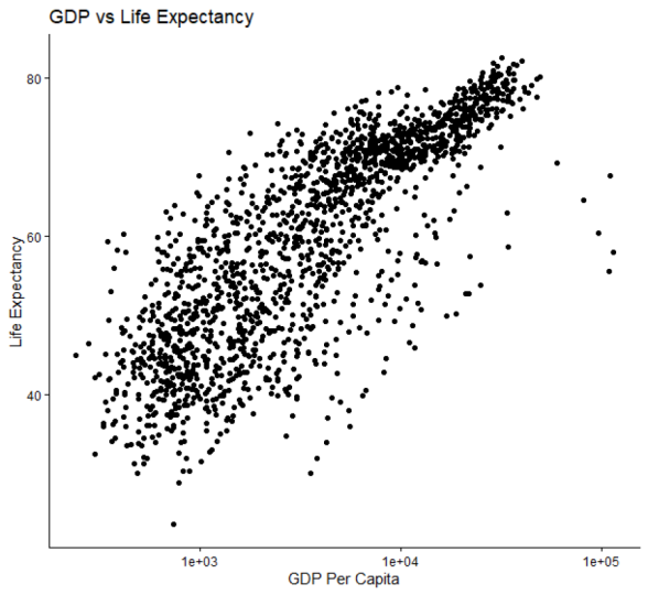
5. Lesson 4: Scatter Plots : Hello everyone and welcome back to this course. So we will continue looking at packages. We've already had the luck installing tidyverse and using tide of us to manipulate data. Today they'll be like an app is anti diversed for data visualization. Now we can use that to visualize data in many different ways, from histograms to boxplots to line graphs. But specifically today we'll be looking at scatter plots. So I'll have guidelines for how you can create a scatter plot and make changes to it using data that we have. And in future videos we'll be focusing on different types of data visualization to create a scatter plot with fast and have access to data. So I'll blackness is attaching iris naught. This is data that exists with tidyverse. So if you use this, we can easily attach this and view it. Okay, that's fine. Now I can do view IRS. That's very careful to be all caps lock because very small difference and make a very big change in the code. Now this is just data that exists and we are going to be as invest today to create a scatter plot of okay, so as I said before in one of the beginning and the first lesson, I believe, what we have now is just data, but we need to turn this into an object that we can use. Because just having day-to-day of wood, it is really difficult to manipulate. So I will make a title IRS now, this is the object that I want and make an RI. And then I want to assign something to the subject. So I will assign iris to this. Now, most people want to change it this name, this object named something different by life to keep it as it is, but it makes it easier to use and understand. Okay, so we've created this object of a 150 observations of five variables. So we're going to be using this object with this data to make our scatterplot. And it's very simple. We would do GG plot. Now we're using GG plot because this is a specific package within tidyverse that is used for data visualization. So the data that we want, iris and V, right? As for statics, and then we open up brackets and as you can see here shows us x and y fast. So what we want as our x-axis and what we want to have us all y-axis, we put it in, in the same order. So I want my pattern length to be my x and my petal width to be my y-axis. So I'll just type that in the same order within my brackets. Petal length, yes. And then petal width. Okay. Control, Enter on a plot shows up here. Now if you can see there are no points in a geometric points for the data, they have just plotted it as x and y. To include that, what we can do is we will add geom point. And let's run this. And here we are. It's given us the geometric points for the data as well. Okay, So this is really the basics of creating a scatter plot. We blend GG plots, the package that you want to use. We plan, I rest the data that we want, then a statics, AES, our x and y. And then to say that we want the data plots as well. And we can change this a bit as well. For example, we can add that we wanted the size of each plot to be, say, five, and then run this much larger. 3, I think is better. Okay? So we can make small adjustments as we like. Okay? Now, for this specific data, that line does not work because it's not something that is connected. It's a different petals or different flowers that we're using and it does not make sense to use align hip. Now this is, we will add a line if you wanted to create a line graph, but this is a scatter plot so we don't necessarily need it. So I'm just happy with leaving it like this. Let me just clean my console. And it shows up with other lines. Like I know, we can make this a bit more complex, for example, by adding in a color that is not determined just by a random color. So if I are then color equals species. And run this. Okay, So in our data we had three different types of species. Now what they've done is this separated the different species into different colors by just adding the simple kind of color equals species. So it's a very good way of analyzing our data and making it easier to read. So before it was just different points and different scatter plots everywhere. So this way we can see specific data we want to address, not listen, we've done this. We can further manipulated by making changes to the size of the different points instead of making the size just three, say 50. Miss this. I can come here and I can say the size is to be determined by, for example, what do we want? Hey, the Locard data was specific, we want is sepal length for example. I want that to be determined, that to determine the size of the specific plots. So I can do that. There it is. And let me run this test. So it also has another key that it's created. So the different length it is, the different size of the plot as we can see. So this is a very good way of bringing in different variables of data within one scatterplot. We can change the color, the size of the dot, and how, how you present the data. Now, this is good and easy to read, but there is another way we can present the data of the different species, for example, or we can separate the however you want. Let me just show you that. So if I just go here and I add a plus, I can do asset. Now it will shop itself or you can just type it in. Right now. What do I want it to be broken into? For example, I specifically wanted to deal with species. Okay, let's just run this. Okay, so as we can see this data, this is no longer just separated by the different colors of the species or the sepal length and the size of the dot is created its own scatterplot for each different species. Okay, So I hope this has been useful. We've gone over how to create a scatterplot, have to change the size of the specific data and assign it to something as we have done the sepal length, assign the color to something specific, create different scatter plots in the same chart. So it has been a brief by a thorough enough introduction into scatter plots. And this will give you the confidence to do a bit more exploring good data visualization. It's a very exciting area to be in. And with our data visualization and different graphs are presented, uh, so well. So I think this definitely one of the best points of our I guess I hope you guys have learned something and I will see you in my next lesson. Thank you.
6. Lesson 5 : Bar Charts: Hello everyone and welcome back to this course. We will continue learning about data visualization. And the previous video we learned about scatterplots. And this video will focus on bar charts or bar graphs. So the first thing we need to know is that there are two different types of bar charts. Now if I just write that down here, geom bar, it comes up header. There are two types of bar charts. Now, for a brief explanation for the differences in the bar, geom bar, the height of the bar is proportional to the cases in that group. Whereas in G on Call, this is where we choose what value should represent the height. So in geom called, we give them two values, one x and y, and dingy and Bob, we give them one value. And depending on the number of those values, That's how high the boss will be in Gm bar. This will be much better explained as I go along when I show you examples of both. Okay? So just to explain geom, geom bar or geom called they are both bar charts. And to create these, once again, we'll be using the package tidyverse, which we used for creating scatter plots as well. And most specifically the GG plot. So if I just write that here, j plus GG plot and then the date that we want. Now we have already discussed it before that iris data comes with then tidyverse, and we have already created a as an object in the previous lesson. So we'll just be referring to that I'm using here. So iris and a stat x. Then we open up this and we inhale we put in that one variable because we are going to be zinc geom bar, we only can paint one variable. For example, I specifically want to look at the species. So how many different types of species that are in the stage? Now if I look at this data, as you can see, there are different types of species in here. So I want to have a look at how many of these different types of species we have. As you put a, hey, the way it is already, the code would not know what sort of function to perform unless we actually do plus g, m underscore bar. And of course, open and close parentheses. And heavy guy. Okay, So this is not a great example because the different species of all 50, 50, 50. So it doesn't actually show the difference between them because there is no difference which if it gets the data, as you can see, there's a 150, So 50 of each species. But this is still a good way to show you the difference between the different ways we can represent data in a bar chart. Now some small manipulations that we can do, for example, is we can add underscore flip. And of course I went plus parentheses. Okay? So it is, we've just flipped it, so we've changed the axis of how it was before. Now this is very useful if you have a lot of data and you don't want all of this writing too bunched up at the x-axis. So if you put this, the writings on the y-axis, you can have many different types of many different bar charts. May different bars for the bar chart. I guess another manipulation that we can't do is we can change the title of the different axes. We can do that by denke plus labs. And then our x, which will be whatever we put in here, comma, and then y, which will be whatever you put in the speech marks, comma, then title. Okay? Now for our x-axis, one thing to note is that even though this may look like our x-axis, this is still the y-axis. We've just flipped it. The axis itself has not changed. So if we want to change this, this is still the y-axis and we might want to name this, for example, number our x instead of species, our name it for example, SP. And with regards to title, not sure, so maybe just none. And let's just run this. Okay. Here's his species number and no title because we haven't given at one. Okay, so this was a brief introduction into geom bar, which is one type of bar chart. The other type of watcher we're going to have a look at is a geom call. Okay, so one thing we have to know Fujian is that we need to give it two variables, and x and the y. So to do that, we have to manipulate our data will be going back to one of the lessons we had in the beginning about manipulating data and put those into action. So for example, I want to use the Iris data. And I want to control Shift M, take it through the filter. And then for example, when a clip by clip on the school by species. So all the data that we have will be grouped by species. And once again, we can take it through the pipe and we can for example, and we can summarize, for example. Now, I want in here to make a new variable, for example, PM and equal to the median of petal length. Okay? So now that we have created this old running and this is what we get for the different species were gang them medium length, so we only get one number for each. It will make the willing the bar charts a lot easier for us. This is why I'm making is so small data and of course will be the second revision of how to manipulate data, which we had learnt in our earlier lessons. Now, this data by itself is not as useful, so we have to turn this into an object to make it more easy to deal with. So SB for species and PL 4 petal length. So we can do that and let's run this. And here we are. We've created another object with three observations of two variables. Okay, so now that we have this data, we can plot this in a bar chart. So let's do GG plot open brackets. Now the data that you want to use, which would be SP, PL, because this is the data that we have here. And AES. Now, as I said previously, with using a G on call and strip Gm bar with Jiang call, what we will be doing is we're giving them t variables. So in here we have to put two different variables and you already have two variables. So that would be species, yes, and pl. Okay? As you can see, nothing has shown up because we have not given them a function to work with. So always remember to put a G on call if B18 call or geom bar if you want to, Gm bar. Okay? So now we've got the median petal lengths for all three different types of species as we have here. Now one thing tonight is that we've got geom called HIPAA. If we did change this to G on bar, it will not work. You will get an error message because it will say here, it can only have an x over y. We can't have biased if we have Gm bar, which is why you would be using G on call. So yeah, once again, this has shown up. Now, we can again use the same manipulations here as well. So flips around once again to make it easy if there was lots of different data variables, the various different types of species that would just make it easier to see written rather than all at all of the account up here. Okay. But I don't necessarily want, so I'll move this away. And once again, we can use labs to give it a title. For example, I want x to be high. It's not very practical. But just as an example, don't forget the speech marks. And then title would be x. Now this is definitely not what the graph is showing. This just to show that we can change the variable, the titles of these different x, y, and the title of the whole bar chart. Because this is not very practical. So let's just remove this we've made appoint and showing that this can change. And we can very easily change that. And we will once again take its own PR and species title. Okay, So this was bar charts and bar graphs, I hope has been useful. We've discussed the two different types. How to plot them, how to make changes to them, how to change the title. If you want to learn more about this, is it's just a matter of playing around with it to be honest. So it's a great place to start from. And I hope you've learned something. I will see you in my next lesson. Thank you.
7. Lesson 6: More Data Visualisation: Hello everyone and welcome back to this course. So this will be our last lesson on data visualization. We've already had a look at data visualization in regards to scatter plots and bar charts. Today we'll have a brief look at the other types of data visualizations such as histogram, boxplots and line graphs. Okay, so we will start as we usually do. Gg plot brackets, our data, IRS, abs brackets, and the data, the specific variable we want them to address. So for this faster than we're going to be making a histogram. And the histogram we can only put in one variable that the histogram should present to us. So in here, I would petal length. And as I said, we have to express the function that we need. So it would be GO underscore histogram. And that's run this. Okay, So this is our histogram. Now of course, those who are familiar with histogram, if you want to change the bandwidth, eat candy that we can. As a inhere already says that it's gone with the default. Then hey, we will go with for wanna change. It would have to go inside the brackets. Ben. Then width, and I will go with one that's run this. Okay, and heritage. So of course we can change this however we like to whatever is suitable for our data and presents it in the most efficient and effective way. So 2s clearly not good. We can even go with 0.5. Okay, so thank you everyone. Thank you for listening. We can play around with this to change it to whatever is best for our data. So this is how we would make a histogram. Another type of data though and a focus on is creating boxplots. So GG plot, IRS a VS. And with boxplots we have to pay in two different variables. So for example, I want the species and then the sepal length for example. And of course I should give it a function to create a boxplot, geom underscore boxplot. Okay, So Harris says this is showing the boxplot for the different types of species. A boxplot is for the different sepal length. So this would be our inter-quartile range, Q12 and 3, and our highest and lowest values for each different species. And they've also done an anomaly here for us. Okay, So this is a very easy way to draw a boxplot. The more we get experienced in and start using it, the more you can make changes, but that will concert experience and time and how much of the research into it. Okay, So the third tap on a briefly touch on is a line graph. So GG plot, IRS, as for example, I want to do petal length and petal width. Okay? Now we put in the function, and in this case I want G M underscore line. And let's run this. Okay, so it showed us this line. Cough. Now of course this isn't ideal because in a line graph, we would expect to have one data. It would be one data for every x and y-axis. And as we look our data, this isn't the best data to use to draw a line graph. But we got the idea of how to join on what to change. Now, it's, as we can tell, it's the same principles. Geom boxplot, geom histogram, geom line. And there are many more functions which we can come across on land. So I have, this has been useful and I hope it's more than just told you of how to use these different aspects given you the confidence to learn about yourself. Because I think that's the most important thing with learning about programming. And learning are especially because there are packages being developed all the time. So if there's something specific you are looking for, you would have to go digging and finding the package that you need. It's really important that we master the skill of looking and researching and finding what we want. Okay, So thank you, everyone. Thank you for listening.
 Storay Amiri