Transcripts
1. Introduction: Are you overthinking
on your lines, getting stuck on the details, taking forever to
finish a sketch? If the answer to any
of these is yes, then let me introduce you
to the wonderful world of water-based markers.
Hi, my name is Imran. I'm a graphic designer
and illustrator, and this is my new class, quick sketching with
water-based markers. With water-based markers, you can create quick sketches with beautiful expressive elements
in minutes, not in hours. This class is aimed
at all levels from beginners seasoned
professionals, and its focus is all
about sketching quickly, completing quick artwork
using water-based markers. I'll show you how to get started quickly with these wonderful
water-based markers. Even if you've never
used them before. We'll start by going through what water-based
markers are all about. We'll then move on to
the class supplies, and then we'll move quickly to the exercises that
you can follow along and really get
warmed up in this medium. We're going to look at some
simple application methods, layering methods, hatching lines and layers
and combining them together. And then we're going to be doing a quick little mini sketch that you can follow
step by step, that will take you under
5 minutes to complete. We'll also touch on the
subject of blending, but not spend too
much time on this. And then we're going
to jump straight into full sketch
where I'm going to be providing you with
a reference image that you can use to follow along with me on a step by step system to
create a wonderful, expressive work of art
using water-based markers. And that's what this
class is all about. Quick sketching, no
stressing, sketching freely, capturing subjects
that you love, and most importantly, finishing those sketches
in a short amount of time. Excited to start the journey. What you're waiting for, grab
yourself a nice warm drink, get yourself a
nice little treat, get your water-based
markers ready and let it get
started in the class.
2. Class Project: Okidoke, welcome back. Let's now quickly
run through what your class project is all
about so that you can put it into perspective before you start
watching the lessons of the class and it
will get you really excited for what you're
going to be doing. Let's quickly run through the
exercises and your tasks. OkidokiF your class project, you only need to do four things and they shouldn't take
you too long to do. Keep it nice, quick and easy. That's the whole
point of this class. Number one, complete all
of the four exercises that we go through in the class from lessons five
to Lesson eight. Number two, complete
the blending exercise, but this is an optional exercise where you will come
to know when I explain the ins and outs of blending and that
is Lesson nine, and then number three, complete the full sketch from the reference
picture that I provide. This is covered in Lessons ten to Lessons 13, step by step. And ensure that you try your
best to complete it within that 15 to 20 or even
30 minute time limit because we don't want to spend too much time making
perfectionism, our aim. We just want to go ahead
and do quick sketching with these beautiful
water-based markers, and you should have a nice idea once you've completed
all these lessons. Then the final stage is take lovely pictures of
all of your work upload them to the
project gallery so that all our lovely community of students can see your
beautiful artwork and then ensure that you leave a lovely review on
the class so that other new students
can find the class and learn from your
experience, and that's it. Four things that
you need to do in order to complete
your class project. Okdoke now you know what your class project is all about
and you're super excited. Let's quickly run through
some of the pros and cons of water-based markers so you can put it into perspective. Let's move on to that one next.
3. Water-Based Markers: Okay, welcome back.
Let's now quickly run through what water-based
markers are all about, and I'll explain to you why they're such a fantastic
medium to use. Let's get started with that. Number one, speed
and efficiency. Water-based markers allow you to apply color and line quickly, making them ideal for fast, quick sketching and capturing ideas without focusing
on the fine details. Number two, loose and
expressive sketching. They naturally encourage
a more relaxed, expressive drawing
style, helping you focus on movement and form
rather than precision. Number three, blending. These markers can be blended
while the ink is still wet, allowing you to create
simple transitions between colors and
suggest light and shadow. However, in this class, we're focusing on doing quick
sketches so we don't want to get bogged down with spending too much
time on blending. Number four, quick
and easy to use. They require no setup or
additional materials, making them
convenient to use and allowing you to spend
more time sketching. Number five, dual
tips for versatility. Many water-based markers
feature dual tips, typically a fine tip, and then maybe a
broader brush tip or a chisel tip allowing you to create both detailed lines and larger areas of color
with a single tool. Number six, they come in at a range of different
price points. Water-based markers
are available at a wide range of price points
so that you can choose affordable options or invest in higher quality sets depending on your needs and
on your budget. Finally, number seven, more flexible across
different surfaces. Water-based markers
tend to bleed through paper a lot less than
alcohol based markers, making them more
flexible to use on a wider variety of surfaces and paper types without
damaging your work. Ok. Now you're excited all about the world of
water-based markers. Let's now move on to
what you need for this class and there's
only a few items. Let's move on to the
class supplies next.
4. Class Supplies: Hello and welcome back.
Let's now make a start with the class supplies and really get ourselves
all warmed up, ready for the adventure
of water-based markers. I've got myself my coffee ready, so make sure you grab
yourself a nice drink, get cozy, and let's get started. Okay, so on the screen here, I've got a few samples
of different markers, and these ones, yes, of course, are water based. We've got to remember
that for this class, we are specifically looking
at water-based markers, ensure that when you go ahead
and start the exercises, you do select the
water-based markers that you have
because sometimes it can get a little bit muddled up with markers and
alcohol markers, and I don't want
you to accidentally grab hold of a marker like this one that you can see
a pro marker or a Sharpie. These are alcohol based markers. Again, I've done a
complete separate class of sketching with
alcohol based markers. So these we need to make
sure don't get mixed up. To our materials. Let's put the alcohol
markers away on the side. Ok. On the left here, I've got my favorite cheap
brand of water-based markers, which is available everywhere. This is the wonderful
crayola super tips. These, again, you can
get these from anywhere. Supermarkets, local stores, a lot of people store
these and stock them. If you have these at hand, if it's a pack that
you've already got, then you can use
this for the class. I just wanted to show you some other examples
that you may or may not have heard of in this world
of water-based markers. On the left, we've
got the crayola and then next one is a funky
little marker here, whether you've seen this or not because this one is from Ikea. So that's wonderful,
lovely store, Ikea, depending on where you are in the country or in the world, you may or may not have heard about this
particular brand. This one is called Mall or Mala. I'm not sure how
that's pronounced, but I've actually
only recently come across these because I got
these summer kids to do a little bit of coloring and I actually didn't even realize
that these were so good. So these are fantastic bullet
shaped thick tip markers, and they are water based. So if you have any of
these lying around, or if you happen to
be shopping around in Ikea on the weekend or whenever,
then do check these out. They are really cheap. You
get a huge pack of these and they hardly cost anything compared to some of the
more expensive ones. That one is my second option,
mal water-based markers. Then moving on to the
ones on the right, these ones are
where we come into a little bit more of
the expensive category. The one that I've got
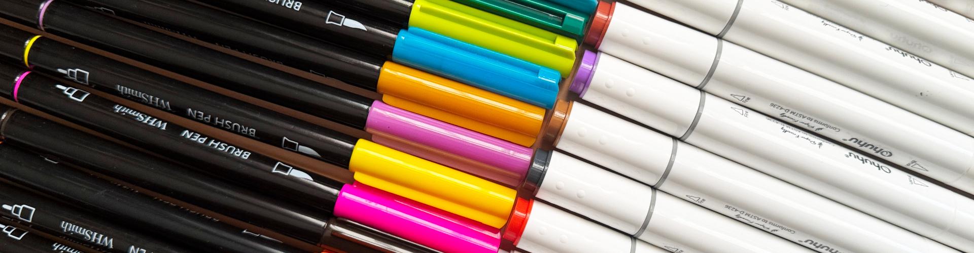
here, this one is a brush pen by local
store WH Smith in the UK. Now you can get more
expensive versions of these from a brand called
Tombo and I do use them, but I tend to use them more
on the gray shades of color. As with the color versions, I usually have maybe a jar
of these lying around. And again, these
are water based, so we've got a nice brush tip, which is fantastic to
do sketching with, and we've got the bullet tip, again, great for using detail. That was the example
of the brush pen from our local stationery
store in the UK WH Smith. Then finally, this
one is probably my favorite marker so far up to now because
of the quality of it. This one is called
the O huhu marker, and it's specifically
a watercolor marker that is paper friendly. Now, this brand O huhu I
didn't really know much about it till probably last
year over the last 12 months. And they produce a lot of alcohol markers and various
types of beautiful pens, and I never really
kind of delved into it until I realized that they do water-based markers as well. So naturally, I just
couldn't resist. And I got myself a nice
box of these markers. Can't really remember
how many there were, maybe 48 or 50 with a
decent color range. And my God, these
were fantastic. They dual which I love. They've got the beautiful
bullet nib on one side, just like the WH Smith ones, and then this part is just great because
it's the brush tip. I really like how
this brush tip works, the application of these
markers with the ink, the water based
is just so juicy. I absolutely love it. So if you do have these great, if you don't have these,
no problem at all. I just wanted to show you
some examples that you can get in the world of
water-based markers. So that's pretty much it. Just make sure that
you get your markers ready and that they have
enough ink in them to complete the exercises in the class because
there's nothing like having a dry marker
because you get all excited, ready to do the class,
and then you find out half of your
markers are dry. So do test them out.
Do a little swatch of your markers before you
get ready for the class. Let's now move on to
the paper service. Ok doke, welcome back. Let's now look at the surface that I'm going to be using
for this class and some of the recommended ones
that I suggest that you use in the exercises
part of this class. On the screen over here, I've got my go to favorite
lovely pad by Rodeo. This is the vellum pad that I use all the time
for sketching. You would have seen me use this in a lot of my other classes, and this is just
a fantastic paper because it's cheap,
it's so flexible. You can do quick doodles on it. And it's great for taking ink. It doesn't have too much
bleed through, and again, using markers is all about avoiding that bleed through
going onto the other pages, which is why we're not
using alcohol markers. We're concentrating
on our sketches and not having to
worry about all that bleed through thing that goes on and ruins our
books and sketchbook. So this is a great example of a paper that you can use for the exercises
part of the class. Again, if you don't have this, that's absolutely no problem. Just grab yourself
some printer paper. See if you can get
some printer paper that's a little bit thicker. I tend to use quite
thick printer paper for a lot of my design work
and graphic design work. I go all the way up to 120 GSM. In the UK, we can get two or three different
grades of paper. My favorite one is
the navigator range. But again, if you
can't get that or if it's not the paper that you
use, don't worry about it. Don't want you to stress
about the materials. I just want you to quickly get started because that's what
this class is all about, getting started and building this medium into your
daily habit so that we can eventually move it onto your everyday pages and
sketchbook journaling. I'll just quickly show
you a demonstration of this paper with the
markers that I've got. I've got my Creola over here, do a nice light swatch. You can see that's
gorgeous, isn't it? Nice and juicy, that
Creola fantastic pen. Just use Creola for this class if you
haven't got any others. And then this one, this is
that mal or Mela from Ikea. So you can see
that's really nice. The application is fantastic
on that one, as well. I really do like these. I was quite impressed with them when my daughter was using them, and actually have gone
ahead and nicked a few of pens without
her knowing otherwise, she's going to end up
throwing a tantrum. So don't tell her. I will put them
back in her case, her lovely little pencil case that she keeps all
that markers in. So that was the mal. And then we've got our standard
brush pen by WH Smith. And again, I love that lovely brush pen
because with the brush pen, the application part is so easy. Just look at how it
glides with the nib, the kind of bullet
nib, at the end. This is great for
thin line work, detail work, which
we're going to come onto in the later
lessons of the class. Then finally, my all time
favorite so far is the Ohh. So with the hoo hoo. Let's just quickly show you
the wonderful brush pen tip. Look at that. That's
just beautiful. It's so juicy. It dries really quickly,
and I just love it. I love the feel of
feels really premium, and they're actually not that expensive compared to
the alcohol markers. So for example, we've
got the pro marker here, which is the alcohol
marker here. These are probably double
the price of these. So again, you're limited with where you can use
these because you're going to have to use them
either on a sheet of paper that has a decent
bit of protection or kind of marker layer on it to
be able to avoid that bleed through or specific sketchbooks that are suitable for markers. Again, I went
through all of this in the alcohol marker class. So if you want to
check that out, absolutely, go
ahead and do that. But with the
water-based markers, you are just so
much more flexible. You don't have to think too much about where you're
going to use them. You can just use them
in your sketchbooks, on paper, on little notepads. You can literally
use them anywhere. Fantastic little medium. So, oh, that's the brush pen. Let's open up the side. So the bullet tip there, again, really nice bullet tip. You can see the bullet
tip thickness is a lot thicker than the
one from the WH Smith. I would say this one
is probably a 0.3 or a 0.4 in comparison to how linewidth
measurements are on pens. That one's probably
a 0.1 or a 0.2. But again, great
for line work and detail work that we can
use at our advantage. So that was just a quick
little demonstration of the pens that I've
got on this rodeo paper. Again, if we turn
this on the back, you can see there's only a
little bit of shadowing, but there's no bleed through, so we don't get no
horrible splogy marks going on to the next page, and that's where the advantage is of these markers and
using a paper like this. So grab hold of your paper for the exercises
part of this class, whichever paper it may be, test out your markers before to ensure there's enough
juice in them, enough lovely inky juice in
them and put them to the side and we can now move on to the first exercise
of the class.
5. Exercise 1: Application Methods: Oki Doke welcome back. It's time now to start our lovely exercises
for the class. Let's bring our attention back
onto the screen now again. Okay, so on my screen here, I've got my lovely rodeo paper ready to go for the exercises. I've got my lovely
Creola markers here, the super fine tip that
we just saw before. I'm going to use these
super tip creols to demonstrate all of the exercises in the class and
at the same time, I'm also going to use my Ohh
markers because that way, I can show you how a
dual tip marker with the brush pen works and what type of
results it can produce. But remember, if you don't have either of these or you
only have one of them, then just go ahead
and use the one that you have to follow
along in the exercises. There's no advantage or disadvantage of having a
certain type of marker. Just go with what you've got. Don't stress about the
material or the supplies. All you want to do
is concentrate on these beautiful
exercises to start creating these wonderful
quick sketches of your beautiful
work. Let's start now. I'm going to start off with
the lovely crayola over here. I'm just going to
move these out of the way so they don't
bump everywhere. I've got a similar
color range for both of the markers
with the creols. You don't actually
have a specific color name labeled on them. They're just like a green, blue, and we could probably
call this a plum color. I've got the similar ones
for my O huh but again, with these ones,
these are numbered. So if you have the
same ones as me, if you have these markers, I'll just quickly read off what these numbers are
on the screen here. I've got 72 blue. Then I've got a 77 lilac and then I've got
a 54 deep green. Let's just move all of the
markers out of the way for now and let's just grab
hold of our crayola. I'm going to start
off with the green, what we're going to do
now is we're going to look at the application methods. What I want you to do is
on your sheet of paper, whichever size paper you have, just draw on the
left hand side in maybe one quarter of the
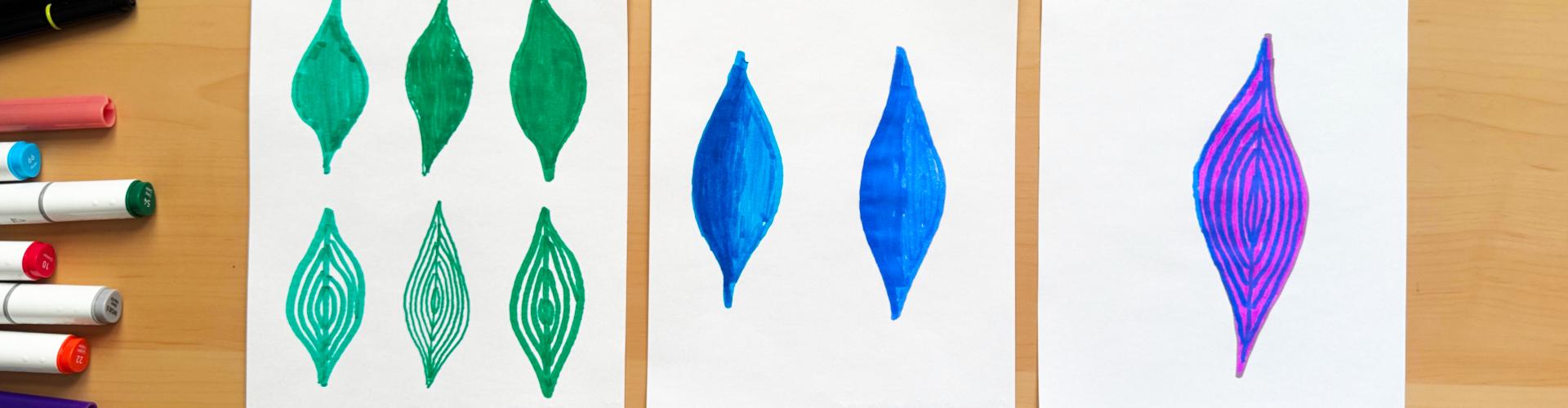
kind of shape of your paper, a nice little leafy
shape like this. I'm only doing
these leafy shapes purely because
they're easy to do, and they're just visually
good at looking and comparing and contrasting the different
application methods. Do a nice swervy leafy
shape design like that. It doesn't have to
be the same as me. It can be any kind of shape, a shape that you can
actually fill in. That's what this
first method is. It's the filling method. But what I'm going to do is I'm going to go ahead
and I'm going to also do another one of these
leafy leafs over here. I'm going to do
something similar, just like I did on
the one on top. Don't worry if yours looks
different from the one on top. Just do the best that you can, draw them out like so. Then what I'm going
to do is I'm going to close my green marker, and then I'm going to go
and open my Oho hou marker. I've got the Oho
hou one over here, and then I'm going to use the bullet for this
one with the green, bullet tip over here
and you can see the thickness has already been determined with
the bullet tip. It's so much more
thin compared to the crayola and I'm just going to do
another one like this, another leafy design like this. These are just outline purposes. Then what I'm going to do is I'm going to go ahead and use my brush tip to do
exactly the same. Again, with the brush tip, you have that huge
advantage of going from thin to thick to
vary your line weight, but that's not what
we're doing here. We're just creating beautiful shapes, whether they're wonky, wobbly, it makes no difference like the ones that
I've just done now. Just something similar
on the page with three different shapes if you have three different markers, and in my case, I've
got two markers with two different tip sizes. We've laid out the foundation
of our application method. Let's now start
with the first row. With the first row,
I'm going to go ahead and get my creola marker, and all I'm going to
do is fill it in. That's what this method is it's called the
fill in method, the method that we all know, it's basically just coloring
in your shape, like that. I'm just using up and
down motions like this, going to fill in those
gaps, give it a little tab. Good way to work with these. Use the edge over here
you can see over here, we've got the tip that curves and creates
this pointy part. Try not to use the pointy
part to do the filling in. Try using this side
part like this. If you find it easier holding it like that, do it like that. But you can see how quickly
did we fill that in. It only took a few seconds. So that was the fill in application method
using the creola. Let's move on to
the hoo hoo marker. Now, with the bullet
tip, it's going to take a bit longer
to fill this in, so you've got to be a little bit more patient and
just take your time. But again, sometimes it's just that kind of process
that's relaxing, isn't it? Going up and down,
filling it in. Giving you that kind
of satisfaction, it creates a really nice
noise as well, isn't it? I'll be quiet for a
second so you can hear it. Look at that. Gorgeous noise. Beautiful,
beautiful sound. That's a bit of ASMR sound. So just like that,
filling it in, and you can see the comparison
of this one and this, you can see that you've got
a slight texture going on over here because
the tip is so thin. And we've basically done
exactly the same thing, just dabbing away at those
gaps, fantastic stuff. So I've done that.
Now for the next one, I'm going to use the
brush tip of my Oho hoo. And then all I'm going
to do is fill that in. Again, that's a huge
advantage of the brush tip. It's so easy to use
to fill in shapes, fill in areas of this
water based ink, and it just requires
no effort at all. Again, the application method that we've just demonstrated here with our two markers
is fill application. Now I know that was super
easy and you're thinking, Oh, I know how to color
in. No problem at all. Just practice because what
happens is if you haven't used a medium or a
specific tool for a while, you get out of the flow
of the application of it. This is just a good exercise to get that application going and just to see the
results that you can produce in the time
that you have. Fairly quickly, we went ahead and filled all three of them in. That's the first part of the
application method done. Now we're going to move
on to the second part, which you might find a
bit more interesting. Let's grab hold of our creola and I'm going to work on that
same one that I did here. This one, what I'm calling
instead of the film method, this one is called
the hatching method. We're going to do hatching lines in this one. Just like this. What we're going
to do is going to start off by just drawing a straight line
from top to bottom, this gives an idea
of the lines and the curvatures that
we need to follow. Then I'm just going
to start following the curvature by leaving a
gap starting from the bottom, going all the way
to the top like this and it looks like a really nice
pattern that, doesn't it? It looks like it's the
inside of an onion, but we're not drawing
an onion, we're drawing a leaf. It's a leaf. Let's continue with the
design and just like that, going along the curves of that outer drawing
that we just did, and that's looking
pretty nice, isn't it? That's your second
application method, how to fill in the gaps of your object and create
a bit of interest, a bit of variety. Sometimes while
you're doing this, you might see that I've got
a bit of a bigger gap up easy fix on that is just draw in another line
to complete it. What we don't want to do is we don't want to
fill everything in. We want to see these kind of contour lines and this
pattern emerging. That was with the
creola looks fantastic. I'm going to repeat the same
now with that bullet tip, and with the bullet tip, we'll notice straightaway that we've got a nice
thin line, again, this is fantastic for
this type of effect, this kind of application, filling with texture lines, hatching lines like this, just to create this
beautiful pattern. The thinner the tip the more lines you're going
to be able to fit in, you can see, I can fit
so many more lines in. It gives it such a unique
look and sometimes it just adds that another dimension to
your beautiful artwork. So instead of just having a
boring old fill over there, you can have something more
interesting, isn't it? So there we go, just done
it with the bullet tip. Let's move on to the brush tip. Again, easy way to do it is
just split it in half first, and then just follow the curvy lines that make
the shape from the edge, bring it in with your second, if you have space with
the third, again, the brush tip is going to be the thickest tip so that
you're going to get minimum lines in your
filling in section. Again, I've got a
thicker line there. I can just go ahead and
drop in another line there. Looks fantastic.
Let's close our pen. Always remember to
close the pens. Otherwise, you're going to
get that horrible dry tip, and then it's not going to
work and you're not going to be happy. Try
this out yourself. Try it out with the
colors that you have in your water-based
markers if you've got two or three different types of markers, see what
results you get. Do it on a couple of pages. You don't just have to
stop on one page or fit everything on whatever
size sheet you have, go ahead and do it on there. And what I'm going to show
you is I'm going to show you the harder you press, the more of that solution, that inky water solution
is going to go through, and you're going to get
a lot of shadowing. So that's one tip. Try not to
press too hard or overwork. Kind of area that you're
trying to fill in. Otherwise, eventually, what will happen is it's just
going to tear through, and then you're not going
to be a happy bunny, then, Are you so. Just keep it nice and light. Don't overwork it. Keep to kind of single layers and layers is what we're going
to really talk about next. But just give it
to go and see what the markers can produce
as a result for you. That's exercise one done, application method,
two different types. Let's now move on
to exercise two.
6. Exercise 2: Layering Methods: Yoke, welcome back. Now we're going to be
moving on to Exercise two, and we're going to focus
now on layering techniques. Let's have a look at
our screen again. I've got my rodeo
paper ready to go, and I'm going to use
my blue colors for my creola and my Ohh marker. Let's start off with the creola. What we're going to do is we're just going to go ahead and do similar shapes
like we did before, those leafy shapes, and I'm just going to do a bigger shape here. With the creol just like this. A nice leafy shape like that. Then what I'm going to do is I'm going to go
ahead and actually work on the crala one first and then we'll work
on the O hou one. With the crala, what I'm going to do is
I'm going to go ahead and I'm going to just lightly
with a very light touch, just fill in the space
that's on the inside. Remember, from exercise one, this is just a fill in method where we're basically
just coloring in. But what you might
notice is that I'm not going up and down to fill in. I'm just using the
same direction and I'm just filling in
the gaps now just to layer that color on
and I'm not going to press too hard because
with water-based markers, the more ink that you use, the more juicier that they are. They will start to crumble the paper if we go ahead
and work them too hard. We want to keep it really nice
and light, just like that. So we'll see the
bottom of the page. You can see it's just
lightly shadowed over there, and that's exactly what I want. What I'm going to
do is I'm going to wait for that to dry now, and while we wait
for that to dry, we can actually go ahead
and just do the Ohohu one. What I'm going to do
with the Oho one is, I'm not going to
use the bullet tip. I'm just going to use the
brush tip for this one because it's a lot quick
at getting the ink down. Like this, I'm just
going to go ahead and draw something
similar on this side. See how a gorgeous color that
isn't it that blue color? Then with that tip again, just going to go ahead very gently and lightly
just going to draw in these filling lines just to come and fill up this
shape in one direction. I'm not going over the ink that I've
already gone down in, but I can go up in the other direction like this
where we've got the white, then move it forward so that we can fill it in a little
bit more quickly, like so so just like that, then wherever we
have the white gaps, just use a tip of that
brush just to fill it in. Not going to work it too much, just want to get a
nice baseline color, and you can see how quickly we can achieve that, isn't it? I mean, this is a bigger
shape than we had before, before we had smaller shapes. This is a bigger
shape, and we've got a pretty decent
filling over there, so I'm going to close
the Ohohu one for now. Let that dry. Let's
just have a quick look. You can see with the o huh, with the brush tip, it
releases a lot more ink. It's way more juicy
in its application. Do bear that in mind. The creola itself, it
actually releases it at probably just the right amount where if you do
overwork it a bit, you can get away with it. But if we had overworked it
with the actual Ohou marker, like so, then it would have
gone through quite a lot. But just bear that in mind. But again, for these exercises, I'm just using this rodeo paper, and I want you to use anything that you have that's
similar like this, some thicker weight
paper would do fine or even sketchbook
paper that's cheap. I don't want you to use
expensive materials for these practices because you can keep your
more expensive paper for your class project. This is just to get
you warmed up in the application and usage
of these wonderful markers. This is now dry to the touch and I think the Yohuhs probably
going to be dry as well. Let's now start talking
about the layering method. With layering
method, we're going to use the same color to layer. We're not going to look too
much into different colors. We might talk about that later on we come to doing
our full sketch. But what I want
you to just do is concentrate on the same
color that you have. On the left hand
side of your shape, I just want you to create
lines that are going down and just very
gently overlap it, but don't work it
on the same line. Bring it down. And then go up, but take nudge it in a little bit so that it
covers the base layer. Just like that, you can see
covering the base layer, we're nudging it in so that we're slightly moving
to the center of it, just like that and
that's about it. You can see it's a very subtle because with
water-based markers, the layering isn't going
to be as dramatic or as heavy as it is with
the alcohol markers. So what we have to bear in mind is that we've got to
be very subtle in this increase of tonal values and increase of
darks and lights. So we do need to just
work very gently and slowly with I'm going
to let that dry now, and let's move on to the Ohh. You can see even
on the screen that now it's slightly
darkened that area. Again, that's just
with the same color. So with the brush marker over here, I'm going
to do the same. You can see with the
brush marker because it releases way more ink, it creates more of
this layered effect. You can see I've
just added that line on there and it's dit it on. So I'm going to hold
my marker like this now so that it uses
the edge of the brush. And just like that, I'm just going to drop
in some light lines, not pressing down hard at all, let the brush do all the work, and I'm just going to
let it go to the middle. Just like that. Keeping
it nice and rough, we don't need to be super neat. But you can see just with
a few little strokes with that brush marker, we've created this wonderful
texture so quickly, and even with the creole, it's created a
really nice kind of second layer on top
of that base layer. So what I'm going to do now is just making sure that
it's not too wet. It feels a bit damp to me, making sure that we don't bleed through because once
it does bleed through, and it will eventually bleed through with the
layers that you put on. On the first sketching
application, these markers won't
bleed through, but the more you keep
adding layers on, the more chances you are
going to get to that bleed through unless you
use watercolor paper, we'll move on to that when we come to doing
our full sketch. Let's now maybe
risk this and add a third layer on top of her very gently just
back and forward. You can see it's adding it on. I'm not pressing
hard at all on this. Very, very gently with this, you can see it
started darkening. I think we should leave it
at there before we have some leaky leaky bleed
throughs going on. With the brush marker now, let's just go ahead and use
the brush marker to add maybe just a little bit more
darkness, another layer. Remember, it's the same color. We're just adding more
of it onto this edge. And look at that.
Beautiful, that, isn't it? That was the layering application
method in exercise two. I want you to try this out with all of the
colors that you have. Just draw smaller shapes,
draw different shapes, add the base color on, and this is using the fill method that we
did in exercise one. What we can do now
is we can move on to the next
application method of layering and what
we're going to do is concentrate on this
what we did before. So the lovely texture work
that we did with the hatching. We're going to do some
layering with that. So let's quickly move
on to that one next.
7. Exercise 3: Hatching Layers: Odoki welcome back. Let's now move on
to exercise three, where we're going to
look at layering again, but we're going to look at
it from a different angle, and we're going to introduce our lovely cross hatching to bit. Let's get back onto the screen, and you can see, I've
got my third color, that lovely purplish plum color with my Ohh and my creola. So what I want you to do now
is with your lovely pen, I want you to go ahead and just draw a beautiful leaf again. We're going to stick
to these leaves because they're
just easy to draw. It's not about overthinking
things and thinking, Oh, what shall I draw
for these exercises? Just draw this shape. Give it a nice little fill
just like we did before, nice and easy, and
we're going to let that dry just like we
did for exercise too. Then what I'm going to do is
close this and do the same with my ohh using the
brush marker tip, just like that.
Quick little shape. It doesn't have to be accurate, it doesn't have
to be super neat. It just needs to be
done, doesn't it? Get these exercises
done so that we can get to the exciting stuff. So just like that,
I'm just randomly just filling it in
backward and forward, not really worrying too much
about how I fill it in, as long as the color
gets there and as long as I don't overwork it. So that's that done. Let's now just wait until
this dries off and make sure that we're ready
to do that next method. I think I might just
grow, grab myself a nice little tea
while that dries. I'll see you when I'm
back. That was a nice one. And I do enjoy having
me ginger tea and this nice cute little fancy
mug that my wife got me. Fantastic stuff. All done. Fantastic little
shot of ginger that. Ginger tea, that is, not
anything suspicious, so let's put that to the side. And what were we talking about? We were talking about some beautiful
layering applications. Oh, hello and welcome back. I was just enjoying that nice
little cup of ginger tea. That's what it was ginger tea. And I've nicely replenished myself with a bit of energy
and a bit of ginger extract, and I'm ready to go, and I think these are nicely dried
out on the table, so let's get back to. Okidoke now, so everything
is nice and dry. Let's grab hold of our crayola marker now and concentrate on the one
on the left over here. Let's go ahead now and
add our second layer. Now, remember before we
just added the layering in on the left hand side
using that fill method, what we're going to do now
is we're going to go ahead and draw a line in in
the middle like so, go up and down a
couple of times. And what we're doing is
actually going in and drawing in that same technique that
we did in exercise one, where we're just drawing in those lines to
follow the contours and effectively creating a
hatching within our shapes. You can see that it started creating this beautiful
line and we've just basically joined up those two methods of
hatching application. And layering and
it's just fantastic. What I'm doing is
I'm going backward and forward very gently. Don't want to press too
hard and you can see I've created this wonderful,
beautiful pattern. I'm going to do the same again, just like we did before
in the other exercise. Now, sometimes with the
pens that you're using, you might not be able to pull
this effect off because of the ink intensity that
your particular pen has. Don't worry about it
if this doesn't work. Because we're using the same color and
sometimes it can be difficult when you're using the same color to produce
an effect like this. But again, we're
going to move on to more interesting secondary
and tertiary colors when we combine them together. Don't want to give
too much away, but for later on, let's just have a look at what we can achieve
with what we have. With the Yo hoh, I'm
going to stick to the lovely brush
marker over here because it's just easier in the application
and you can see, with the Ohh, it
just works so much more dramatically
compared to the creola. So let's just do that now, nice little lines, hardly
pressing anything, I'm letting that marker work. That's why I love these markers so much because you
can just produce this wonderful layered
textured effect so easily all with one color. That's so difficult to do. Other mediums
because you have to wait for the other
mediums to dry, and then you don't know
how the medium is going to react when you apply
it with watercolor. It can take absolute
ages and you can spend time creating beautiful artwork
and enjoying the process. But we want to do quick
sketches in this class. We want to focus on the time
that we have in between our everyday pages and our more technical
drawings. But look at that. That was done within
literally just a few minutes. Gorgeous texture
of that, isn't it? Now imagine using this in your sketchbook for
your everyday pages. When you've done that
subject selection and you've created these beautiful
outlines with pencil, you can go in with a
water-based markers and start doing the
detailed work in layers. But again, we'll
move on to that. Later on, let's now look at the results
that we've achieved. So with our beautiful
purple color, you can see let's have a look at the kind
of bleed through. And again, it's
shadow as expected, it's not gone through because we've not been pressing hard. If you do this on
watercolor paper or some decent quality
thick cartridge paper, then you're going to
get even better results because you're going to
hardly have any shadowing going through due to the protective layer that
exists on those type of papers. That was the exercise for the layering method with some texture work
and cross hatching. Give this a go,
try this out with all your colors and then do something even
a bit more funky, which I might just
quickly mention now. If I just get rid of this,
I'll move this to the side. Why don't we go ahead
and quickly do that? Now, let's maybe
use our Oho hoo. So I know you're
excited and you just can't wait for me to show
you this other technique. It's not really
another technique. It's just an addition, isn't it? So let's just maybe do
another leafy leaf over here. I'm just going to
quickly go ahead, use that same beautiful
purplish color, quickly, backward forward movement,
move into the spaces, the white space,
not overworking. Get it all filled in. And then we can
actually test out something else because that's what I'm a bit more excited for. So let's quickly do that. As that's done, let's
wait for that to dry. Ok. I think this
is nice and dry. So let's work with
another color. I know you already guessed it. I'm going to work
with another color, and I have that blue and tie, so I think the blue is going to work really nice with this. Let's grab hold of my Oh
ho marker, the blue one. I'm going to stick
to the brush tip because that's just
what I like to use. So with the Ooh hoo marker now, let's just move this a
little bit to the center. I'm just going to go
ahead and draw in my line and you can see the
application is so easy. You don't get no feathering, you don't get no
horrible jazzy branches coming out of anywhere. You've just got this
beautiful clean line, ensure that when you
do this technique specifically with another color on top with the texture work, the hatching line it has
a layering technique. Make sure that that layer
that you filled in with the solid fill that's
completely dried, otherwise, then the inks just start
merging and they start becoming all funky and produce this
broccoli cauliflower look. Unless that's what you
really like and want to do, then go ahead and do that and make it a bit more abstracte. Why not? Test it out,
see how it goes. Don't worry about these
lines being straight or I need to follow every
single angle perfectly. Keep it loose like this. Just let it flow. If it comes out of the shape, don't worry about
it, don't stress, let it come out, let it relax, let it live, and everything's
going to be great. That's the lovely fill with
the blue and look at that. That looks gorgeous, doesn't it? Just imagine doing loads of these beautiful funky
little leaves in your everyday pages when you do your subject and
your beautiful art I really enjoy doing that. That's another thing to note. It's so much fun
because you're not constrained or you're not restricted by any
rules or regulations. Remember, art is not about rules and regulations,
it's about expression. I think these markers, water-based markers are one
of the best tools that you can use for free
enjoyment and expression. Try this out, try this final
exercise of layering out, using the same color,
using different colors, even maybe use a third color or a fourth color and see
what results you get. Try doing some cross hatching. This is what we're going
to move on to next just to produce some
detail and texture work. Have a break now, go through the exercises, enjoy yourself, and then go maybe grab yourself a healthy snack and have a nice little
coffee on the side. I think that's what I'm
going to do and then I'll see you on the next exercise.
8. Exercise 4: Mini Sketch: Oki Doke welcome back. Now it's time for
the final exercise before we do our full sketch, and this is going
to be a fun one because what we're going
to do is we're going to do a mini sketch
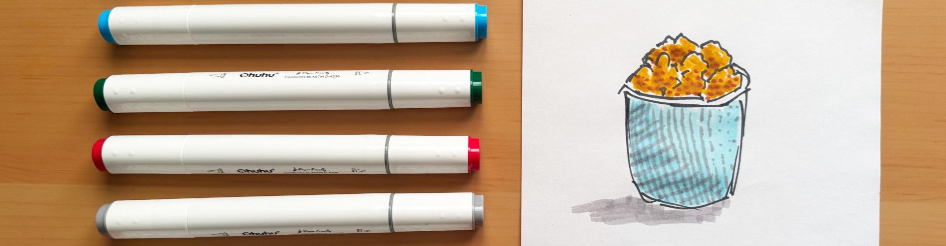
of this beautiful, lovely little cup that I've got. I use this as an espresso cup. But what I've done today is
I've gone ahead and filled it up with some walnuts so I
can snack while I draw. So this is what we're going to concentrate this final exercise on so we do a complete
little drawing before we do our full sketch. So I'm going to provide you
with a picture of this, but I'm going to
do this right now live while I'm looking
at this on my desk. I'm just going to place this
on my desk like this over here and I've got my
lovely markers setup. I've got a whole range of colors from the pack that I had. You don't need to worry about
what colors you've got. Just use any colors to
produce this sketch if you have similar colors as this reference that
we've got over here. So we've got light browns, yellowish browns
for the walnuts. You've got this kind
of speckled look on the ceramic part of the cup and I lip that's a little bit mahogany brown on the edge,
and that's all you need. You just need two or
three different colors. If you only have one color, just do the sketch in
one color, follow along. The important part
is to take part and follow along regardless
of what colors you have, you just need to give it a go so that you can
get some practice. I'm going to actually place my walnuts reference over there, I'm going to move my markers on this side and we can
start doing the sketch. What I'm going to do first
is I'm going to go ahead and just like we did
in exercise one, we just did a quick
outline with our marker, I'm going to go
ahead and do that. I think I'll do that in
maybe a darkish color. I've got this gray hair
just for reference. This one's called BG nine. It's called blue gray nine. For this, what I want to do is I want to use the bullet tip. Get that bullet tip out. Again, we're not here producing beautiful reference images and perfect artwork or
anything like that. We're just doing rough sketches. This is what I want you to do. Start off doing rough sketches
and then when you get used to the medium and you become really
quick at sketching, then go ahead and do
beautiful artwork that you want to put in the wall or
take to an art gallery. But that's not what
this class is about, it's about getting
started quickly. Talk and let's start sketching. I'm going to just draw shape, the outline shape of this. You can see I'm
doing it very rough. I'm not bothered
about straight lines. I'm just going in as I feel
necessary just to come up with that sketchy look you can see it's
so nice, isn't it? It's this beautiful sketchy
look and it's just this jar, then maybe if we place
a jar on this side, it's a bit easier to see. Then maybe we just go ahead and draw the walnuts, as well. So the walnuts have
got all these funny, funky little shapes like this. I'm not bothered about
replicating them perfectly. I'm just doing
these fuzzy lines. That's all you need
to do. Just throw something in there with
a few fuzzy lines, and we're ready to go. And just like that,
we've just gone ahead and done a
quick little sketch. That just took about
10 seconds, didn't it? Just do your quick little
sketch to start off, and then let's go in
with some color now. I think I'm going to use maybe a lightish bluish shade
for my first layer. What I'm going to do
is I'm going to use the brush tip now. I've
got this color here. This is actually called 185
CST or whatever that is. I'll just call it 185. It's a beautiful blue shade. I'm just going to go ahead
and drop in this blue color. I know the color of my cup isn't this color, but
it doesn't matter. Just use a reference image
like I am, use the same one. I've got it attached
in the class. I just download it
and pop it up on your phone or on your screen somewhere
and just give it a go, just copy it and create that outline and just do
a first layer of a fill. I've done that first layer of the fill there with this blue. Now I'm just going to
fill in those walnuts, and let's see what color we are. We've got this funky
little color here. This one's called 31 Auburn, let's get the brush pen out. And yeah, that's decent. I mean, it's not
the same color as the walnuts, but who cares? We're not bothered about that. We just want to enjoy ourselves. So just like this,
I'm using the brush, the side of the brush
tip over there, and I'm just lightly
layering down that color. You can see already
we've started producing a quick,
beautiful little sketch. Not even done any
other techniques yet. We've just done the
fill technique, quick little outline and fill, and that's how easy it is. So I'm going to keep that
color on this side now. Ok, now, I'm going to
wait for this to dry. I think that's fairly dry, what I'm going to
do is I'm going to use that same color now, that blue to do that
layering technique. I need that brush tip side, and I'm going to start adding
in some dark over here. Basically just going in with that second layer so you can see it's already adding it in just like this into this side
because what I can see, not sure if you can
see it on the screen, but I can see a bit of
dark going in on that side of this little mug,
just like that. And then that's about enough
on the bottom left and then again with the brush tip. I keep opening the
wrong side, don't I? Need to look at the labels. So with the brush tip again, I'm going to start going in onto the kind of left hand
side of these shapes. And you can see it started
creating this beautiful form and difference in value all just using the same
color. Just look at that. We're just adding
in a little bit of color into the
bottom left hand side, just to give it that bit of depth how quick
and easy was that? Imagine doing that
in watercolor. You would have had to
wait for it to dry. You would have had to create
your solution darker, go in with a little bit
of brush and a bit of wet and it'd be
all over the place and it takes ages doing that. This is where the advantage of water-based markers comes in. I'm going to let
that set as it is, and now we can do that next application
method where we start doing those funky lines
with some cross hatching. I might go ahead and do
this with another color. I think I might just
do it with a gray. Should we test it
out with this gray yet? Let's do it with this gray. This one's called a cool gray and it's cool gray number four. With this, I'm going to
stick to the brush tip, what I'm going to do is I'm
going to follow the lines of the shape like this in the
darker area like that. You can see add these
lines in what this does is it creates so much
visual interest, it creates texture. Again, it's just a
great little way to practice with these markers, practice with any
markers that you have, do it with the crayolas, do it with whichever ones
you're comfortable with, and you can see what I'm
doing here and I'm just breaking up my
line very lightly. As we're coming toward
the lighter area, I've got more of a broken line and that just adds to that. Perfect. What I'm going to do is I'm going to
take it further now and I'm going to add a bit of a cross hatch going
the other way, maybe starting it from here, just like that very gently,
following it through. Don't worry when you do this, if you press too hard and it messes up, no problem at all. You can always start again. It's not the end of the world. Art is about relaxing. Not about the end result, it's about enjoying the process. You can see just like that, I've done a few little
Crissy cross hatches there, and then maybe if we just
add a bit of shadow, I can see a bit of shadow
on my reference there, just like that,
dropping a couple of lines just for a bit
of shadow there. It just gives it a bit
more interest, doesn't it? Just like that,
let's close this up. What I might do is
let's see if we've got a darker color for the walnuts. I think this color
might be good. This one is called it's
called sallow 21 sallow. I don't know what
that means, but let's just get the
brush tip out. And what I'm going to
do is I'm going to start adding a bit more
texture to this now. I'm going to add texture
to the actual walnuts and just add in these
little dots now. So these are effectively just stipples with
a darker shade of that similar color just on the base of them
just to give it a bit more texture and some visual interest.
So look at that. Look how easy this
is. So easy to do. We just sketched from
a kind of reference. You can do sketches Imagination,
I do that all the time. But just like that, just a few little
dots here and there, and I think we'll
call that done. We don't want to spend
ages perfecting this. This is what I'm talking
about. Quick little sketches that you can do with
just a few colors. I mean, I didn't even
need all these colors. I could have just
done it with the gray and just filled it
in with the texture. But if you have the
colors, why not use them? Don't be afraid of color, use the colors, use colors
that don't even work together. Just try it out, make
it funky, make it work. Enjoy that process.
There we have it. We've done our lovely sketch by following all of those exercises
that we did previously. We just added in an outline. Then we moved into filling it in with that application method, a quick full fill, using that application method, using our water-based markers. Then we went in and
started creating a layering effect with
cross hatching and also with the same
color to produce darker tones on the left hand side
where the shadows were, and then we added in
some final touches with some stipples
using different colors. Added in a little
shadow squiggle at the bottom, and that's it. We created a quick sketch within literally a few minutes
and your job is done. Let's now move on to
looking at maybe creating a more detailed
page and spending maybe about 15 minutes on
it or 20 minutes on it. That's what this
class is all about, building you up to a
level where you're comfortable enough
with these markers to come up with a nice
little sketch that will take you only
15 to 20 minutes to complete and then
this will become your class so let's
have a break now, maybe go out for a walk, have a piece of fruit, maybe even have a
naughty little cake. I think I'll do that and I'll
see you when I'm back and we're going to be rearing to go and start our full sketch. I'll see you when that's done.
9. Exercise 5: Blending: Welcome back. Let's now start our full sketch
because we've done all the exercises and learned all those small little
methods and techniques, and then we can use
them all to create a beautiful sketch in around about 15 to 20
minutes because remember, that's what this class
is all about doing quick sketches with
watercolor markers in a quick little single session where you don't need
to stress about anything using a reference or just coming up with
something from imagination. Either way, that's what the focus of this
class is all about. Before we actually start, there is a burning
question in your mind. I can sense it straightaway that I've not covered
the techniques of blending yet and
there's a reason for that because as
I mentioned before, this class is all
about quick sketches. I don't want you to
start getting bogged down with blending
techniques and coming up with all these
beautiful various layers of gradient from one
color to another. This can be achieved
with watercolor markers. But specifically for this
class of doing quick sketches, I don't want you to focus
too much on that side. You can use blending for
your everyday pages when you want to spend a couple of hours creating beautiful
blends of color. In those illustrations
that you do for your everyday pages or for
your sketchbook journaling. Just for this class,
particularly, I'll quickly show you
how to do blending with the Creola marker and with
one of the brush pen markers, again, who wants
so that you have an idea that you can actually go ahead
and blend with them. I covered blending with my alcohol markers class
in a lot of depth. Those techniques can be used
with watercolor markers, but again, what we
don't want to do. We don't want to get too carried away or get lost in
blending too much. Otherwise, it's just
going to take so long for you to complete one full sketch, and you're going to end
up doing an hour's worth of sketching and doodling, which is fine for your everyday pages or
for your artwork. But for this class
and specifically for your class project, let's stick to the quick methods and quick techniques
that we can use to do some quick little doodle
style sketches just to get it all out on so on
the screen here now, I've got some sheets of paper, and I've got my two markers, which I'm going to do a quick demonstration
of blending on. I've got my creol
lovely super fine tips that you've seen me
demonstrate before. I've got a nice yellow
shade and orange shade. We'll do a little quick blend
of that color into another. Then again, I've
got my Ohh markers. The numbers on these ones
are 33 light orange, and then I've got
23 reddish orange. The reason I'm showing you
both of these markers is so that you can have
an idea of how it works with the brush style tip and how it works with the
cheaper creol markers. Can do blending in
various colors and shapes and sizes,
let's quickly start. The paper that I'm
using is going to be the paper that I use
for my full sketch. This is important because
blending can take up a lot of ink and it can wear down the paper because these
are water-based markers, they tend to crumble the
paper as you keep blending. You do have to ensure that you use a suitable paper for this. I wouldn't do blending on the thin paper that I used
in the exercises before by rodeo because
that'll just start bleeding into the other sheet. That's one of the
main reasons I wanted not to concentrate on
the blending process. However, I'm going to do it on this lovely hot pressed
watercolor sheet that I've got. This is my go to watercolor
sheets that I usually use for sketching with
watercolor markers. Great for absorption. You won't get bleed
through on these because of the lovely
coating that they have. Again, hot press usually works nice and
smooth with markers. You can use coal
press, of course, if you want a bit
more of a texture in the strokes that you use, but this is just a
personal preference. I've got some sheets cut up
over here in A five size. I'm going to do the
blending on this sheet because I'm going
to use this same paper for my full sketch. Let's just move
them onto the side and let's probably start
off with the creola. I'll move these onto this side
and then keep these here. We're going to start off
with the light color. Again, with blending,
I would always advise you to start off
with a light color, and I'm just going to go
through the simple steps. With my yellow marker, what I'm going to do is
I'm going to start on the left hand side over here and I'm just going to drop
in a nice little swatch, you can see this marker
isn't very juicy, it doesn't want to
release too much it probably wasn't a good color
to use, but I'll continue. I'll continue for the class. You can see, it's not
releasing much ink, so we have to work
fairly fast with it. And then I'm going
to quickly swap to that orange, that darker orange. And what I'm going to do
is I'm going to start on this side, and
just like this, I'm going to bring
it in, overlap it onto that area of that lighter
yellow, and then go back. As so. And then
I'm going to bring that yellow back
in from this side, just from halfway point and
bring it into that orange. I'm using circular motions
to get these blending out. And if you watched my
class on alcohol markers, you'll know that there's a
colorless marker as well, and you do actually
get colorless markers in these water based ones. But again, I don't
want to go into too much details of
you delving into this blending exercise too
much because it just takes so much time doing
this and perfecting it that I don't think
it's necessary, but you can use this technique for your
everyday pages when you come on to doing but just for this class and
your class project, let's probably just stick to our standard lovely
little techniques. You can see we've got a
nice decent blend going on over there and that's
it with the creola, I would just go
ahead and do that, lay the first color down, lighter color from
left to right, then do the darker color
from right to left, let them overlap, use
the circular motions, and then if you've got a bit more ink compared to what I've got, then do it again, do another layer of the yellow then with a very light
touch with the darker, just bring it in,
but use that yellow to blend over in layers. So that was with the creola. Let's now move on to our
fantastic o huh markers. I'm going to use the brush tip. I've got the nice brush tip
of the Huh marker here. You can see these ones
is just so super juicy, with the brush tips, it's a lot easier to do the blending which you'll
be able to see here. I'm just laying down
a decent amount of color there and then
I'm going to go ahead with the orange
and you can see the orange is nice
and vibrant and dark. Then I'm going with
those circular motions, just stop at this point again, similar with the creola
in the middle and then we're just
going to go ahead with that yellow
original yellow, start again from
the left and then keep using those circular
motions to blend it in. You can see we've got this
beautiful blend going now, I don't know if you
notice on the camera, as I was doing the blend, I was pressing quite hard because I was doing
it quite fast. What happens is the
paper starts coming off. You can see these
little bits and bobs of paper fumbling off. I'm not sure if
you can see that, this little fumble bit
comes off off the paper, and that's the danger that you fall into with the blending. If you go in too hard or
spend too much time on it, it will eventually start taking off that first layer of paper, and that's what we
don't want to get into. We don't want to get into
those complexities of blending and the paper
messing so I would highly recommend that you don't go
ahead and do blending for your class project or for this full sketch
that I'm about to do. If it's something that
you're going to follow, leave the blending for
your everyday pages so that you can spend time on it and build the
layers of blending, if that's what you want to do. So that's it for
the blending part. Let's now pack
everything away and get our clean sheets of
paper now on the table, and let's get our
reference image ready so we can start
the full sketch.
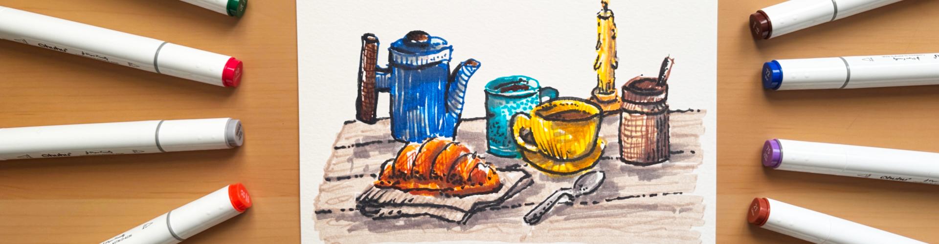
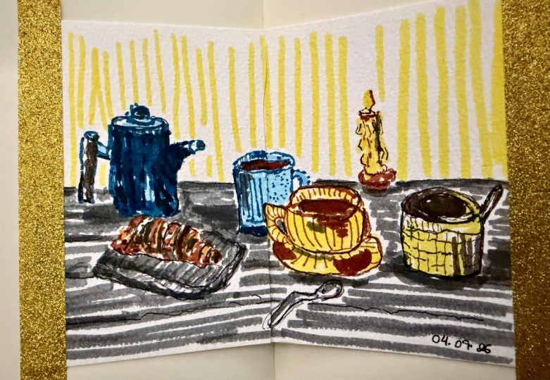
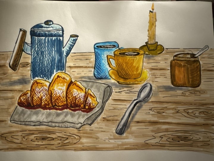
10. Full Sketch: Ok, welcome back.
Let's now start our full sketch from
our reference image. Now, I've provided
this reference image in the resource pack,
do download that, open it up on your
mobile phone or on your screen or tablet or iPad, so that you have it
in front of you. You can even go
ahead and print it out if that's easier
for reference. I've actually got
it on my iPad mini right here, so you can see, I've got this
beautiful gorgeous, lovely reference image that I'm going to do a
quick sketch of. Now, I'm going to put the reference image on the
screen just so that you know what I'm talking
about while I'm drawing it so that you have a
bit of perspective. But the first thing to do when you have any image of reference or whenever you're drawing from something that you
want to match with, then the first step to do
is to select your colors. I've gone ahead and
selected my colors. I'll just bring them
onto the screen here. I've got a nice range of colors from that pack
of O huh markers. So yes, I'm going to be using my O huh markers
to do this skep. Let's now make a start. And let's move the
markers out of the way. Now the thing with
markers is that they're going to have a nice
fixed color on them. So before you go ahead and
start sketching the elements, just have another
piece of paper. Again, the same paper
that you're sketching on, it can just be a small
sheet and have that on the side just to test out
the marker color first because sometimes you might
think a specific color has a certain finish and it actually doesn't turn
out to be like that. So to avoid being disappointed, just test out the marker before
you go ahead and use it. But remember, this image here, this is a beautiful image. It has so many different colors. It has dark blue, brown, oranges, earthy type,
warm brown colors. It's got this beautiful
mustard color here. It's got a turquoise
color on this element, on that mug, and
then some lovely ceramic neutral
tones over there. Need to have every single
one of these colors. If you only got one
marker with you, just use that
marker to sketch it out and do all those method of techniques of layering and adding in those cross hatching because that's what
it's all about. But if you have the
colors, then why not? Try matching with the
colors that you have. If you have a different type of blue so this mug over here, then just use that blue. If you have a completely different blue for
the teapot there, then just go ahead and
use that, make it funky, make it cool and
remember we are not doing a real life study
all we're doing is using these elements
that are scattered on this table just as a
reference so we have something to sketch
so we don't have to overthink it and get
it done quickly. Let's make a start. Now,
I'm going to go ahead and probably sketch the
crossant first. That beautiful crossan I've got my sheet here, I've got
a little mark on there. I don't want to do it on a mark. I want to do it
on a clean sheet, so I'm just going to
switch that over. For that cross on,
I think I'm going to use a couple of oranges and maybe some mustardy colors
and maybe just a dark color. I'm thinking these colors
might work for me. Again, just pick the colors that you want and test them out. I'm just going to do a
quick little test of these. That's a nice color, fantastic. That's the base orange color. And then over here, we've got a darker orange,
more brighter. Then over here, I've got
a nice darker shade. Yeah, I think these are
going to be perfect. I'm just going to move
that to the side, and I'm going to keep them in that order so I know
where to start. So let's do the initial outline first and you can do the outline in one
color if you want. If you have a gray marker,
I've got a gray marker here. If you want to do
the whole outline in one color and then go
ahead and start filling in with that layer
fill like we did in the exercises with
another color and then maybe build your
values on top with some cross hatching
with a darker tone, you can go ahead and do that. I'm going to actually go
ahead and use the color of that particular item instead of doing the
darker outline first. Then what I might do is
once it's all put together, I might go ahead and do the outline with
that gray on top, but it's entirely up to you. Let's make a start. Let's now just add in a nice outline
and with the outline, I'm going to use the bullet tip. Let's get that bullet tip out. So again, you don't have
to make this perfect. It doesn't even have
to match your image. All it is is just laying down these curvy shapes
of what you can see. Again, we all see
things differently. There's no right and wrong. Just get it down as
quickly as you can and keep a little bit of perspective on it if
you can, if you can. It all goes wonky and funny,
don't worry about it. Now you can see, I've
just dropped that down as a base outline and
that's all I want. Then what I'm going to do is
I'm going to go ahead and use the brush tip now
to just go and add in some fill lines
like this onto these contours and funny
shapes of this lovely cross. Now I'm not really even
looking at the image. I've just got it on my
iPad in front of me. I'm just guessing where I
want these lines to be. Again, we are not producing beautiful photorealism,
anything like that. We're just using the
reference to give us a bit of a guide to start
sketching something, not worrying about the result, just enjoying that process, and getting that
quick sketch done, swiftly and easily
without any stress. At it for that color. Let's now move on to adding
a bit of orange. Let's get this orange. With the brush, I
think I might add in some orange marks here and then a few orange marks down
here might leave some of the areas white
where we have a bit of highlight from the sun
coming in from the window. Again, you don't need
to draw every element. For this sketch. You just
need to do a basic outline, a few dibble dabs of
color for the fill, and that's all we've
done, Dibble dabs of the fill from
that fill method. The Darkaton that I've
got now here is this one, and I think with this one, let's use maybe go back
to the brush pen. I'm just going to drop in
some dark here just like this into those white
spaces on the edge. I just gives it a bit
more depth, doesn't it? Now, again, don't worry about too much overthinking
things. Just get it down. If it doesn't look right,
just keep continuing. Don't worry about it.
Complete the sketch, and then you can move
on to the next one. I don't want you to stress. All I'm doing is
adding a couple of dots at the end for
some texture work, and I think that's
looking great. Now, what I'm going to
do is I might add in some hatching lines using
that same color now, that dark color to just
put that to the side. I've got it all over me hands. That's another with markers, be careful when you're
opening and closing them because you do have to close them otherwise
they're going to dry out. You do tend to get them
all over your hands. Maybe it's a good idea to have some tissue around
otherwise you're going to sploge all this ink all over your beautiful
illustrations. What I'm going to do now
is I'm just going to very gently drop in a couple
of hatching lines like this just to add a bit more visual interest
on this little illustration, this doodle illustration
that we've done onto that back part and then maybe just a couple going
across like this. Just to give it a
bit more depth. You can see so quickly
I was able to just replicate that similar
shape of that cross on and that first
element is done. So we can now move on
to the next element. Now, this cross on is actually
lying on a folded cloth. So I think I'll do that
folded cloth first. Let's find a decent color that we can for that folded cloth. Let's maybe look at
a brownie shade. It's actually more
gray, isn't it? So we need a warm gray. I
think this one might work. Not sure what the
color looks like, so let's just test it out. That's looking perfect. So that was just by luck, actually. I've just
got these markers. I've not even tested
them out before I started using them,
but there you go. Sometimes you get
lucky, don't you? So for this one, I'm not going
to do the outline first. I'm going to use
kind of the brush and I'm just going to
start going in and just creating this kind of shape that I can see of
that cloth, just like that. Filling in that area, just a light sketch, and I think that's looking
good and then just bringing it in that overlap
that we can see. And then I'm just
going to fill it in. You drop in a couple
of these strokes. Then again, just like that. Then what I might do is I might
let that dry and then use the bullet nib to go over like we did in the technique
class where you can see, you can go ahead and outline it. But because it's
still a bit wet, I need that to completely dry and then this will give
it a subtle outline. I'm going to keep this color
on the side here so I know I don't lose it in my excitement and we're going
to leave that part as it
11. Teapot: Let's move on to
maybe the teacup. For the teacup, it's this
beautiful blue color. So let's have a look at this. I think this is a
nice one. Yeah, I think I'm going to
go with that one. So just like this, very rough. Sometimes you just
have to improvise if you go off a little
bit and it's fine. I mean, this little hot here, it doesn't need to be
perfect, bring it in. And that kind of lid that
goes on top, nice and loose. Don't worry about
making it perfect, that little handle on
top and that's about it. There we go. There's
the outline of that and maybe the
handle that's over here. I know that handle is brown, but I'm not really too
bothered about that. I'm just going to stick
to the blue outline. Want to worry about details
or anything like that. It's just about getting
that first layer down. So that was the blue. I think I might use a
lighter shade first. So let's use this
nice blue here. I'm not bothered what the
color turns out like. I just want to use a slightly
different blue shade so that we have a
bit of a variation. So you can see over here
where the kind of light is hitting this kind of
shape down there, I'm just going to add in
the blue, the light blue, and then just over
here, a bit more there, and then probably just a bit on the edge over here and
maybe on the hot there. I think that's looking good. What I'm going to do with
this now is I'm going to go back with the blue and maybe just add in some nice
darker hues over here. I'm not going to be
bothered about blending. All I'm doing is just using that upward motion
to fill it up. And overlap it over
that light blue wherever I can or wherever
I feel like just like this, what we've done is
we've just created a really nice
effect, haven't we? So quickly, maybe
just color this in. Don't want too much
detail to come out. I think that's looking great. What I'm going to
do now is let's get the bullet point and
let's now start adding some nice hatching on this
just like that up and down. Cross hatching. Nice
lines going up and down, and we've got a interesting
fill now, haven't we? I'm just following the
contour of that shape. Beautiful stuff. Then again, on this kind of lip
part over here, a little bit towards the light, and then maybe a little bit down here where
this is attached. And because this is brown, I'm going to go ahead
and maybe use a brown. Or should we just go
ahead and do it as blue? Should we be adventurous? No, I don't want to be
adventurous right now. Let's just go ahead and find
a brown to cover that up. I think this is a
nice brown, isn't it? Let's just test this out. We don't want it
to be too light. That's a little bit
like that brown. I think I need a
darker shade of brown. So maybe Oh, that one's
good. Let's do this one. But actually, I think that original one might be
good as a base layer. Let's just drop in
this as a base layer, and we've got this kind
of glow on the edge, and we're going to
leave that white. That's dropped in. Maybe the top there is a bit brown as well. So we just drop that there
and maybe a bit over there on the chute I think that's
looking pretty good. With the dark one now, let's use the bullet tip. To start adding in some lovely
texture lines like this, broken lines just to represent
that kind of wood look. You can see it's so
easy to do this. You don't need to
worry. You just get that color down,
get that shape there. It doesn't even have to look
like the reference image, just about doing quick doodles, not thinking just
getting it down. So just like that,
maybe a little bit of a cross hatch over
there and that's it. What I'm going to do now
is I'm going to go in and finish this off because
this is nice and dry now. So remember, with
that gray that I had, I went in and now you can
see I can easily bring out some detail without having to use any liners or outliners. It's just so easy using that same color technique where we have the base
layer down first, and then we use the
same color just to go over it to add some detail. Again, what I might
do is just drop in some subtle hatching
lines like this. I think that's going
to look great. Again, just on the edge over here so that it looks
like it's folded nicely and then just here a
little bit of dark to represent some shadow and maybe a little bit of dark here. For where that shadow is. We can add in shadows right at the end with just a base gray. But I think that's okay. So you can see, so quickly
we were able to do this. But again, I'm talking
my way through this so that it's going to probably look like it's
taking a long time, but in reality, it isn't. What I'm going to do now is I'm going to go ahead
and I'm going to use this same style that I did
with both of these elements, and I'm going to finish
off this drawing and let's speed it up
so that you can see exactly what I'm doing and
I'll talk while I'm doing it in the background and
we can get this done. Let's move on to that one now.
12. Remaining Items: Ki doke. Now what I'm doing
is I'm just working on that lovely yellowish mug that we've got over there,
selected that color, doing the outline,
exactly the same process, doing the fill in application in the areas where I see most of the kind of
saturated color. Then I'm going in
with another yellow, but that one didn't work
out to be too good. Then I decided to use
this beautiful kind of yellowish brown shade
to really bring out a darker tone to just add a bit more interest in the values and to
differentiate that base layer. Then with that same color, I'm just going in with those hatching lines to
add a bit of texture, and then I'm just
adding in some of that lovely color for that tea or coffee
or wherever it is. And then I decided
to just go ahead and start doing the
same thing again for that bluish turquoise mug and the same process using a
darker blue for the outline, and then I decided
to do a lighter one on the inside
and then just use the layering overlap method and some stippling for the
texture on that mug. And then I moved
on to the spoon, just using one of the gray
colors that I had and then adding in a little bit of a darker shade just to
bring out some contrast. Then I just moved to that sugar pot thing that
we've got on the side. Adding it and draw it
exactly the way it was. I made it a little bit thin because I was running out
of space on the side, but the process, again,
is exactly the same. Outline. Do some lines and
textures of application and then just go in with
some cross hatching and fill in the darker
areas with a bullet tip. Just to add in some
texture and details. And then finally, I moved on to the candle using
that same method again that I've been
using all the way through this class outline, fill it up, add a couple of
texture lines on it, add in a little darkness on the right hand side to bring
out some more details, and then just finishing it off with filling it in
where that holder is. Yoke, welcome back.
You can see now that I've done a nice little
composition of that sketch, that on my iPad, the one that you can
see on the reference, and you can see it's done
so quickly in this loose, sketchy style using
those methods of layering the coloring, do the outline,
layer the coloring, do some cross hatching, just fill in the form
of what you see. The next step, what I'm going
to do is I'm just going to go ahead and add
in some shadows, just give it a little pop. Then maybe just adding
a light color on the background to represent the table and
that's probably it. I might not even
fill the whole thing in and you don't need to. This is just a nice practice, full sketch so that
you have a nice scene to look at and use as a
reference for yourself. Every time you remember
in your everyday pages or just generally
when you want to use markers, how did I use them? This will give you a nice
reminder that this is the quick technique of
using watercolor markers. And it looks great, doesn't it? It's so loose, not a
worry in the world. Don't care whether
things look right, don't care, whether things
are laid out properly. It's just about getting it
done and enjoying the process. I love the process.
While I was doing this, I had a nice track on
it in the background. So I highly recommend do this, sit down for 15, 20 minutes in a
nice quiet place, put your headphones on,
go outside and do this, just look at your scenery, where you are and just
do a quick little doodle of your scenery with
a couple of colors. No more than 15
to 20 minutes for each session to complete
a sketch like this and it's such a fun and relaxing way of enjoying your time
with traditional art. I'm just going to add in
some background color now and then just going to go in and add in some shadows and then once we've done this, then I'll probably do
a nice dark outline of the whole thing just
to bring it all together. Do. So what I decided to do now was to start working
on that wooden table. So I just used a side
of the brush tip with this beautiful kind of light tone brownish
shade that I had. It was actually a
warm gray color, not a cool gray color. It was a warm gray color. And I just used the strokes in those kind of motions
to create that texture. And then with that same color, I just went ahead and added in a little bit more detail on those planks and
then just added in some of that wood
grain effect just to give it a bit of perspective and to make it that it's actually a table that all these
lovely items are on. So again, just testing out some colours now
for the shadows, and I decided to
go for this kind of darkish cool gray color. And I also added shadows on
the actual items themselves, so not just on the drop shadow
that goes on the table, but also to just darken areas, especially here where
we've got the cloth, just to bring it out
a bit more because I did find that it was kind
of blending into the table. And again, just adding in
dark I think it's necessary just to give the
illustration a bit more of a pop, adding
more contrast, and just playing it by looking at it to see whether
it makes sense or not, just to pick out those details
and ensure that we have a nice complete image that looks decent enough to continue. There we go. I've added in the background table and added
in a couple of details by just layering that same color over the lovely wooden
boards of that table. Then I've just added
in with a gray, some shadow areas just to
give it a bit of a pop, doesn't need to be accurate, just layering on top, not going in too much, just doing it really quickly. Let's now let this completely
dry out because it's still a little bit moist and
let's maybe go for a break. Then what I might
do is I might go ahead and use a darker, really dark gray marker
just to pick out some of these details and
then we're finished. Let's have a break, go
for a nice little treat, go for a walk, and I'll
see you when I'm back.
13. Outline: Oh, this plant is, uh, getting a bit old,
this, isn't it? Oh, I think I need to renovate, maybe get myself a new plant. I think when I go
out market shopping, I think I'm gonna get
myself a new plant. I do like this plant, though. Okay, what were
we doing? We were doing some outlining work. Oh, Kiddok welcome back was just contemplating on my decor and how long I've
had these plants, it's been absolutely ages. But they're not like watercolor markers that are
going to run out. We don't need to replace them. We can just give them a bit
of a freshen up, can't we? Right. Okidok. This is the final part now
of the full sketch. And as I said before, if we
have a look on the screen, we're just going
to go ahead and do a light little outline
with a darker color, and I've got this nice
dark gray color here. This one is called BG
nine, blue gray nine. I'm just going to
use the bullet to go ahead and just do
some light outline. I'm not going to
outline everything. It's just to give
it a bit of a pop. Again, you don't
need to do this. You can even do this
with a fountain pen or a fine liner if you want. I tend to do that when I do my everyday pages or my
sketchbook journaling. I get the water
marker down first, and then I go in with my
fountain pen for the outlines. Let's just quickly do this now. Let's start with
maybe the teapot. I think I might just
darken this area here just like so
with this gray. Just to give it a bit
more depth and like that, I'm just going to tilt the page so that it's easier
for me to do. Just remember tilt the page
to make it more comfortable, make the angles more
comfortable for yourself. There's no rules that you've got to keep the page straight. Do it as it works best for you. Just here, I'm just going
to add in some dark over here outlines
on the shoot area, and then maybe some
at the bottom, and maybe some on
the edge over here. I don't really like
that blue outline. And maybe on the edge of the top part of the handle here just to make
it more prominent, and that handle on the lid. I think that's looking great. Let's move on to
the cross ont now. Just with the cross ont here, I just want to build
some definition in between these kind of crossant curvy layers
of pastry just like that. Not going to overdo
it. Add maybe just a thick line
at the bottom here, and I think that's
enough for that. Maybe a couple of
stipple dots just at the bottom to give it
a bit more texture. Again, this is optional. You don't have to do
this if you don't want, but I tend to like to do this because it's just my
style of sketching. Let's do that cloth because
I think that cloth is get muddied away in the
background of that table. Let's just make it pop out. We just outline the edges of that cloth and the
curvature shape of it. What this will do, it
will establish that we actually have the
cross on on something. Otherwise, it just
looks like it's blending into the tables. Again, at the end, you can do some refinement
work like this, maybe adding a couple
of extra hatching lines just to give it a
little bit of a pop. I think that should be enough. Don't want to spend
too much time on it because you
know what I'm like, that I love to keep adding
details and going on, but we don't want to spend
two, 3 hours on this. We just wanted to
keep it within that 15 to maybe maximum
30 minute time. With the spoon here, I
think this will give this a nice outline just like this so that we
know we have a spoon. Just like that and
leave the shadow underneath and maybe just add
in a couple of dots there, a couple of dots on the inside. Then we've got our gorgeous
turquoise mug here, nice thick outline on
the edge over here as well on that rim and on the
inside maybe a few dots, neaton up the handle. And I think that's about it. For that one, maybe
just add a couple of stipples just to give a bit
more contrast and texture. Then we can move on
to the yellow mug. I think the yellow mug
needs a decent amount of outline because it does look a bit muddy with all the colors, but I don't want to lose that texture and
interest because I do love how those colors
all kind of come together. Just adding that little
outline will really give it that pop and it
will complete that image, and I think that's about it, just a couple of dots
there and maybe outline the tea or the coffee or whatever it is on the
inside, just like that. A couple of dots there, and then maybe just a few kind of hatching lines
from the bottom, maybe on the inner part of this, and I think that's looking good. I think I want to
actually go ahead and do a nice thick line
on the outside just to close it off so that
you can see it and then it has its own nice
form. Fantastic that. Okay. Let's move
on to the candle. Let's do a bit of
that candle holder, which is getting a bit buried
away in that orange shade, just like that to
bring out some detail. Then maybe on this side with those candle drips that
are coming on the edge, maybe do the same
on the other side, maybe darken it on the top. And we've got that little
thing that sticks out, the wick, I think you
call it, the wiki wick, just the wick there, a
couple of dots on the flame, and then just like that, it's just brought it out, hasn't it so nice and easily. The final one, we've got this cool jar over here of sugar. Well, it most likely sugar. I don't really know what it
is. It could be anything. It could be sugar, it could be some kind of candy
in there, anything, whatever your imagination
wants it to be, outlining this because
I do like the kind of design on this kind of pot, and then we've got that spoon. Maybe with this spoon, just add a couple of stipples
on it to fill it up. And then just on the edge there, and then on this darker end, maybe just add in some
of these lines to make it pop out so
that it looks decent. Again, we don't care whether
this is a perfect image. This is just a light sketch
doodle of this reference. So I think with the wood, let's maybe just add in a couple of these dotted
lines where we've got the separation of the
panels just to make them pop so that you know that
it's sitting on a table, a beautiful wooden table. Imagine having this right
now after this sketch. Just enjoying a nice cup of
coffee with a beautifully, freshly baked croissant with a bit of sugar or even cinnamon. That could be cinnamon
sugar, couldn't it? Look at my imagination,
where I'm going? I'm getting really hungry now. I cinnamon kind of dusting
on top of the croissant and maybe a nice ginger
tea there and a nice perfectly balanced
coffee over there, and we are ready to go, have the treat, and
so that's it, then, that was the full sketch using all the methods
that we went through in the exercises of sketching quickly with watercolor markers. So I hope you've
given this a go. If you've followed
it along, follow and do it in your own style, do it in the same style, and sequence like I've done
it entirely up to you. Don't spend too much time on it. Spend at least 15 minutes on it, go all the way up to maybe
30 if it takes you there. But after half an hour, just leave it as it is. It in steps. Don't worry about
the whole image as itself. It might be a bit
intimidating because there's so many elements here and
if you miss an element out, don't worry about it
because just focus on the practice and on the application and
just enjoy the process. Let's now maybe have a look at some other illustrations
and sketches that I've done in my everyday pages using these markers and techniques where I've spent a
little bit more time on. Let's move on to that one next.
14. Inspiration: Do. Welcome back. Let's
now run through some of the examples that
I've done using these techniques for
my everyday pages, for my sketchbook journaling, and just for general artwork and sketching whenever
I get the time, this will give you a
little bit of an idea how to take these beautiful
markers further on and really build them into your sketchbook habit and your general practice
of traditional mediums. So let's move on
to that one now. Let's start off
now by looking at some little sketches that
I do on a daily basis, sometimes whenever I get
5 minutes here and there. These again, are
just really rough, made up sketches,
using the markers, just laying down that
first layer and then adding a bit of detail with
hatching and stippling. You can see it's just
so much fun to do. You can produce these
wonderful abstract designs and patterns just when
you have 5 minutes. This is a great idea
when you want to use these markers and you've only
got a little bit of time. There's example. I've got a load of
these examples, but I'm just going to
show you a few of them now so you have a
bit of an idea. Again, this one, a
little bit more details with this kind of made
up plant at the back. This one I actually was doing some observational work on I think this was
what I was eating. I was having some type of a cauliflower
casserole type thing. So I decided to just draw the cauliflower pieces
just out in the open and then add a little plant while I was
waiting for my dinner. So that was that one very loose only took about
three or 4 minutes, maximum, didn't think
about anything. And this one over here, this was just a nice
little simple design. Again, using a lot of the techniques that
we did in the class, the laydown of that first layer
of color, the first fill, and then just going over
with some hatching lines, using the same color here and using a different
color on top, just to build that texture and visual interest and not have
to think about anything. And then finally over here, I've got this kind of, like, a design just with hatching lines and a
bit of cross hatching. This is just a great way of
kind of exploring kind of different methods of laying down the color and just producing
more of a funky look. So try that out if you
get a chance to do this. And that's it for the kind of small pieces of art that
I do using these markers. They're so versatile. This type of card
that I've done them on is just standard normal card. It's not even watercolor paper, and you can see it at the back. None of it's bled through. I've just done the
basic layers and the basic texture work
that we did in the class. Okay, let me now show you
some work that I've done with these markers when I've spent a little bit
more time on them. So not doing quick sketches and quick doodles like this on the little cards or like we did for your full sketch
over here where we only spent about 20 to 30
minutes maximum on it. This is now taking
these markers further in your sketchbook journaling
and in your everyday pages. This is one of my mini
sketchbook journaling, the Echa one, which
I'm sure you've seen before in the
previous classes. I'll just go to the
page where I've done this beautiful
little markers sketch. I know what you're
thinking. Oh, that's quite vibrant and
quite a lot of detail. But I didn't really spend
this much time on it. I'll just show you
how the process that I worked on worked with
this particular sketch. The initial laydown
was of the color, just like we did in the class. So I just filled in shapes that I sketched out with
pencil initially, and then I just went
ahead and added more layers on with
different colors. And then I just did that
same process of adding in those hatching lines over here to build out these details. Again, I quite a bit of
time on this, probably. I think I probably spent maybe about 30 solid minutes on it, maybe even 40 minutes, but I kind of had the
time to do this and do my kind of sketchbook
journaling at the same time, and it turned out really nice. I added the shadows in
with the gray just like we did over here on our
lovely full sketch. But you can see that if you have a bit more time
with these markers, you can really produce
wonderful results. And this sketchbook is the
Echa watercolor sketchbook. This I think this one is the hot pressed. It's not
the cold pressed. So the markers worked
really nice on it. I did use my O huh markers. So again, even with these
sketches over here, the small ones, all of these are done with the O huh marker. I tend to stick to O
huh because I just love how they work on
different surfaces, and you can get
such a wide variety of line weights and
applications with them. So that was just an
example so that you can really start using these in
your sketchbook journaling. And I've got another example in my sketchbook
journaling over here. So if I move that one
out of the over here, I've got actually this is my coffee shop
sketchbook journal. So I'll just quickly move to the art work that I did
the markers in over here. So this is actually a
recent one that I did of a coffee shop that I had a
nice little bit of lunch in. So I decided to go ahead
and just use my markers. I kept them in my pencil case, so I had a nice little
pencil case with me, which I also drew, and I
just kept some incliners. And on this one, what
I've done is I've gone ahead and put
the marker lay down. Uh, first, done the
little sketches, and then right at the end, I've done the outline with a fountain pen. And
it was so much fun. It was at the coffee shop, easily transportable
this medium. Don't have to worry
about having water with you or any mixing
mediums, nothing like that. Quick laydown of
color, and that's it. So pencil sketch, laydown of
the first layer of color, building some
different colors and textures with those markers, and finishing it off with
just outlining with ink. So that's it for
the inspiration. I hope it gives you an idea of different variations or how
you can use this wonderful, wonderful medium of
watercolor markers. Okay, ok now you're super inspired and motivated to
complete your class project. So just jump onto
those exercises, get your supplies ready, your markers ready,
and your paper ready. And you can go ahead full flow doing these quick
and easy exercises, only spend a little
bit of time on it, and hopefully it will motivate
you to take it further. So let's just wrap up the class
with some final thoughts, and I'll let you jump onto
this adventure yourself.
15. Final Thoughts: Oki doke, welcome back. Let's wrap up the class
with some final thoughts. I hope you really enjoyed
the class as much as I did. You know, I always
enjoy working with art and materials and mediums and I hope you really took on to these quick little exercises
that we did in the class. They were nice, short,
easy to follow, something that you can
do within just one sitting where you
don't have to worry about too much or have
too many material. What's going on in your head. You can just get on with it, get your lovely markers ready, get your paper ready, and just work your way
through those exercises. You don't have to split your day and do different
parts at different time, go through it in one session, the exercises and that mini sketch that we
did and that lovely, full sketch using the
reference picture. So I hope you really enjoyed the process and I hope
you've gone ahead and uploaded your class project to the class project gallery do remember to leave
a review on the class when you're done because this will help other students find the class and learn from
your fantastic experience. Do follow me on social media, on Instagram because I'm constantly posting all
the work that I'm doing, the adventures that I'm doing, and even maybe you might get some sneak peeks into what
I'm doing for the next class. So do keep an eye on that. Remember, Art is
all about relaxing. You don't need to
stress or worry. Thank you so much for taking part and building
this community. And thank you so much for
your support in helping me produce classes like this because without you
and your support, I can't produce any
of these classes, and I can't spend this
quality time with you. So carry on with your
wonderful sketching habit. Use those traditional mediums. Always relax, don't stress. Don't worry if the marks
aren't working the way you want them to
work. Just keep going. Try it again the next day, add another interesting doodle in your book the day after. Just keep the momentum
going forward. So stay focused,
stay in the zone. Don't stress and don't
worry about anything. Remember, we can't
control everything, but what we can control is art, and we can control what we
draw and sketch and write. So focus on the things that
you can control in life and use art as a medium to
help you with your well being, relaxing, and just taking
every day as it comes. Take care of yourself,
stay healthy, enjoy your art,
keep up the habit, and I'll see you on
the next one. Peace.
 Imran Mughal, Graphic Designer & Illustrator