Transcripts
1. Introduction : Have you ever felt that
learning art fundamentals could help you to create better
and more meaningful art, but you just don't
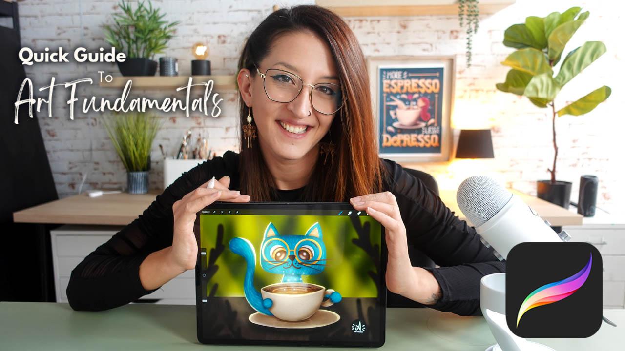
know where to start. Hi. My name is Alexandra
AKAD art water. And in this class, I'm here to make art
fundamentals simple, fun, and accessible
all within procreate. Whether you are a
complete beginner or an experienced artist looking
to refresh your foundation, this class will give you the essential skills to
make your ideas come alive. I have a background in animation and illustration and years of experience of teaching
art fundamentals to students of all levels. Throughout my
career, I have seen the incredible
transformation these basics can bring to an artist's work, whether you are drawing
traditionally or digitally. There are incredible
success stories of my students publishing
their own children's book, and I learned illustration
in my classes. So I can say with confidence. You are at the right place. So why is mastering the
fundamentals so important? Because they are the building
blocks of all visual art. In this class, we are going to cover the core elements of art, line, shape, form, space, color, texture, and value. And I added two bonus elements that I think are
worth to talk about. And that's light and details by understanding and
applying these elements. You will get the confidence
to create on your own and create more
mindfully and intentionally. It will help you to really show up as an artist on your journey. And that sounds like. This class is organized into
ten structured lessons, each lesson representing
one core element. Every lesson we start with some theory where we are going to talk about
the core element. Then we will going to move
into practice and practice it. Then we will have a
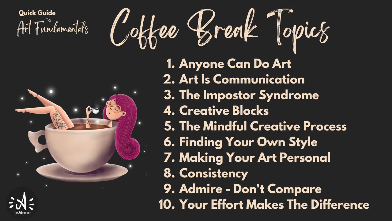
short coffee break where I'm going to talk about some topics that every artist is facing like
imposter syndrome, creative blocks,
finding your own style, then we'll dive back into building one complex
illustration. Throughout the whole
class, step by step, walking through and
applying each element into it and arrive
into a final piece. Class is designed for anyone
new to art fundamentals, especially if you want to
learn, we then Procreate. So what you need
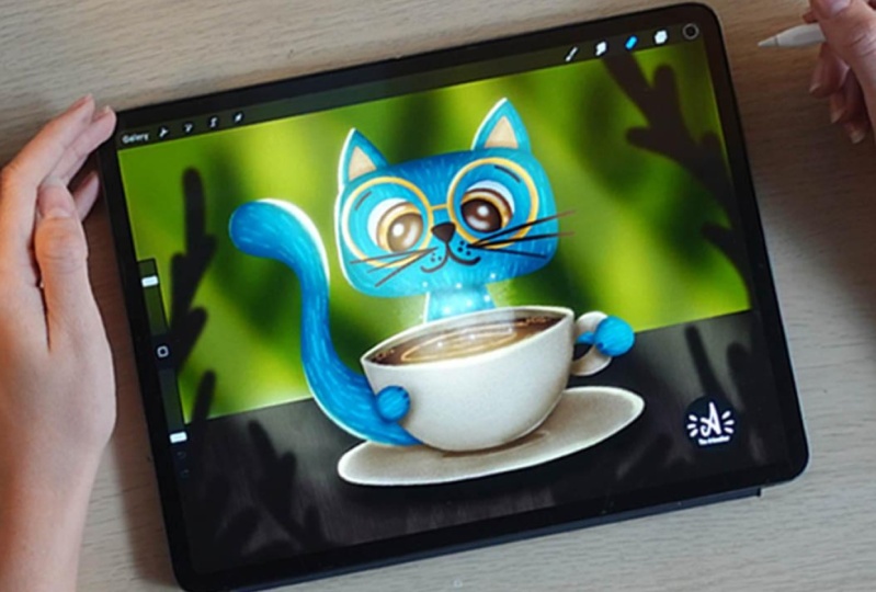
for this class is your iPad with Procreate
installed on it. By the end of this class,
you will have a complete, complex illustration
and a skill set that will give you
a strong foundation for your artistic path. Okay, so are you ready to dive into art
fundamentals with me? Let's just get started.
See you in class.
2. About The Class : Welcome to the class. I'm
so glad that you are here. In this video, I'm going to talk about the
class structure, the class project, and
the class resources. The class, as I
already mentioned, has ten structured lessons. Each are about 20
or 30 minutes long. So take them in your own pace. But watch one lesson at a time. It can be every day or every
two days or every week, but don't overwhelm yourself. Give time for the
knowledge to sink in. It will all make sense
at the end, I promise. So even if we are going just one section within
the illustration, just keep it that way
and try to understand the theory behind it and the thoughts that I'm
going to share with you. So each lesson will start with a theory where I'm going to
talk about a core element. Then we are going to have a little practice session
about the element. In some lessons,
it will be already connected to building
the illustration. So do the practice. Then we will have the coffee
break where I'm going to talk to you about some
topics that every artist, regardless of their
skill level are facing. For example, creative blocks, imposter syndrome,
finding your own style. I will share my views
on these topics, okay? And I would really love you to reflect on
these topics as well. So use the discussion
board below to express your opinions and ideas about these
topics as well. Let's just have a discussion. It might be really beneficial
for a lot of people. Then after these coffee breaks, we will have practice
sessions again, in which we are step by step building a
complex illustration. So we are going to take
one step at a time within that lesson and have one
illustration at the end. So we are going to
progress really slowly, but I want to ask you
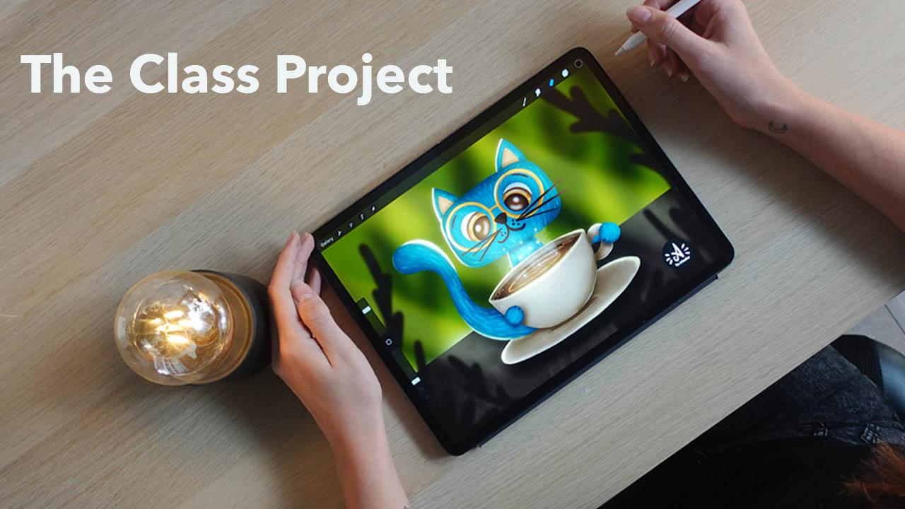
to trust the process. So the topic of the
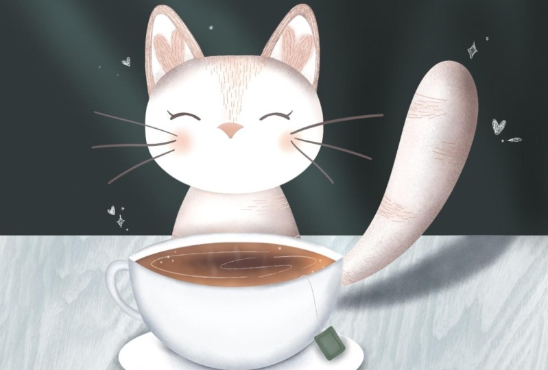
class project is free. I will be illustrating a
cat with a cup of coffee, and I recommend very
beginners to follow me my ideas and my
steps that I'm taking. You can use even my sketch that will be provided
in the resources so that you feel more
comfortable with applying the knowledge
from the class. But more courageous and more
advanced students can just, grasp the ideas of the lesson and create their
own illustration, whatever that be. Okay? Now, regarding the
class project, I already told you
that we are going to create a complex
illustration, but I would really want to have a little experiment
in this class. So now I want to grab
a piece of paper or your iPad and create a little
illustration of whatever, let it be the cat
with the cup of coffee with your skill
set that you have now. If you don't want to do this, just grab a recent drawing of yours and upload it into
the project gallery, and then take the class and when you are finished
with the class project, with all the knowledge that
you've got from this class, upload that into
the class project. And we will just have
a before and after. And we will have a gallery
of a before and after, and I would be really
happy to see that how you progress from the current state of your skill set and
after taking the class. It will be really good for
you as well to see how mindfully can you apply the knowledge from a
class to your artwork. This will be so much fun. And also, I would
really love you to share some words in
your class project. So describe your
experiences. Who are you? Where are you from? What
is your background? So if you now start to create a class project and applaud
that initial artwork, just share some words about
your and your art journey. I would be really
happy to read that. And when you are
finished with the class, applaud the final piece and share your experiences
what you had during the class so that it is really an expression of yours about the class in
your class project. Regarding the class resources, you will find a brush set, a color palette, my sketch, my original file, for reference. You will also get a worksheet summarizing the theory so
that you can read it through, and there will be a worksheet with journaling prompts
and questions that will help you to process the topics that we will have in
the coffee breaks. You can use that for
your own to reflect on your ideas about these
topics in your journal, intimately at home,
just for yourself, or you can again share some of your thoughts in the
discussion board below. All right. I think that's all. So the first step is for you
to download the resources, grab your iPad, open Procreate, and see you in the first lesson.
3. Lesson 1.: Elements Of Art: Yes. Welcome to
the first lesson. In this lesson, we are
going to talk about the core elements of
art, but in general. So this lesson will be a little bit different
than the other ones, as we are going to take
all the elements of art and talk about them
generally in little so that you get the
general idea of them and understand what we are going to go through together
during the class. And in every lesson
that comes up next, we will get a core element of art and dive deep
into that, right. But today, we are going to
talk about them generally. And we are also going
to draw together. So I really want to
warm a little bit up. Now, we are going to
warm up our hands, and I will show you
a little bit of a warm up exercise that
you can really, like, do with your hands to
warm up the muscles and bring back the
muscle memory. And I really recommend you to do this little warm up exercise every time you sit down to draw and not
just within this class. But every time you
just want to create. It is really good to do a little bit of exercise
for your hands. It will bring you to
the present moment. It will wake up
your muscle memory, and it can be a really
cool ritual that will just set you into
the mindset of Alright, now I'm sitting
down and actually, I'm going to create. So let's just get started. Okay, so put your hands
together like this. We are going to start with
waking up our wrists. So create circles into
one side ten times. And to the other one, as well. And be gentle. Okay, so we have our wrist. And now let's turn it
inside out five times. Give it a nice stretch. Okay. Now, let's work
with the fingers. Close your palm and open
again, like ten times. Make sure to stretch your
fingers as much as you can. And now do the sprinkle
act as if you would sprinkle water with your hands. This will release any tension
that you have in it. Okay. Cool. I think I'm warmed up. And now I think we are
ready to start drawing. The seven core elements
of art are line, shape, form, space,
texture, color, and value. I added two bonus elements I think are worth to talk about, and that's light and detail. Now, throughout
the next lessons, we are going to go through
each of them in detail. But now let's just see generally what each
element represents. We are also going to draw a little to get to
know the elements, so prepare your Apple
pencil as well. So let's start with line. Line is the most
basic element of art. It's a mark made by
a tool, for example, a pencil or brush that
moves across a surface. Lines can be straight,
curved, thick, thin, zig zag or dotted, and they guide the viewer's
eye through a composition. Now, lines can define shapes. For example, if I close
a line like this, I will get a shape,
for example, a circle. We can also create textures by lines or even convey emotion. For example, boiled sharp lines can make a piece
feel more aggressive while soft flowing
lines can make it feel peaceful and calm. Now, I invite you to go to gallery create a new
screen sized canvas, and we are going to
just draw several lines to get used to these
elements, right? So I will choose
black as my color and the sketching pencil from the brush side that
comes with the class. Creating art is self
development process. I will talk about this a bit more in the coffee breaks
that we are going to have. But basically, what
I want from you now is to observe yourself. How are you doing things? How are you holding the pencil? Okay? So you learned a way how to hold a pencil or
brush in elementary school. Now I want you to
be mindful of that. How are you doing that? And at first, we are going
to draw straight lines. So I'm drawing straight lines. And play with pressure
sensitivity as well. And as you can see, I am
fixing my wrist on the screen. If I would be
drawing on a paper, I would fix it on the desk. And I am drawing, like, from my arm if I want
to get a straight line. So I'm not drawing
from my wrist. That's that's the movement I make when I want
to do curved lines. So now it is your time,
spend a few minutes. You can just stop the video
right here and just draw some straight lines and see
how you are doing that. And then move to
curved lines, okay? And then zigzag lines. As you can see, I'm
kind of positioning my head differently when I'm drawing these
straight lines. This is very intuitive. I really just want to
raise the awareness within you how you are doing
things. Okay, cool. When you are done, with
drawing several lines, I missed the dotted line
because that's a line as well. And you can do a line like this. So when you are done with this, I'll just move back
and talk about shape. Shapes are flat enclosed
areas created by lines. They are two dimensional, meaning they have height
and width, but no depth. Shapes can be geometric
like circles or squares or organic like the irregular
shapes found in nature. Now, shapes help to define objects and spaces
within a composition. They can simplify complex images and convey symbolic meanings. For example, with
shape language, we are using shape language
a lot in character design. We are going to talk
about that a bit later. But let's just now go back
do this little canvas, and I will just turn off
the layer of these lines and create a new
one for the shapes. So let's just draw a circle. Again, be mindful of what are you doing and why are
you doing it like that. So are you starting to draw a circle from the top or
the bottom or the side? Is it distorted? Can you draw a perfect circle right away? I can't, but I will show you a technique how
to get it right later. And now let's draw a square. Again, see where you
are drawing the lines. Why are you drawing
it like that? Where is your hand? Oh, let's
draw a triangle, as well. And then let's draw
an organic shape. Okay, cool. Now, let's go
back and talk about form. Form refers to a three
dimensional object with volume, something that has
height, width and depth. It is essentially a shape
with added dimension. So we created shapes with lines, and when we add shading,
we create forms. Forms can make a drawing or
painting feel more realistic. Shading and lighting and
perspective techniques are often used to create
the illusion of form. Now, let's go back to these shapes that
we have just drawn. I'm sure that you learned
shading in elementary school, and I don't want anything
special from you just randomly shade these
objects like our shapes, you don't really need to
be precise or anything. This is just to bring out
what you already know. So be mindful of what you are doing and how
you are doing it. If you are tilting
an Apple pencil, you will g a shading tool, but you can shade
with lines as well. So you don't really
need to smudge things, but just place
some shadows onto, for example, the
circle at first. Um, Like this, and I will
add some drop shadow. Now, this is a first
trick to add space, the illusion of space to your art if you add
the drop shadow. Now, there is a square. I'll just make it a
cube really quickly. And how I shade it, I will just put a shadow to one side to the top and again, add a bit of a drop shadow. Oops. Also with the triangle. You are going to learn how to shade these things later, okay? But now just be mindful of
how you do stuff, right? And also, the organic shape, I will just add some
shading here and there. For example, here as well,
pretty randomly, okay? And I want you to remember these drawings that you are
creating now and we are going to compare
them to the end of this course where
you have progressed, and you will be amazed, right? So now we have several
shapes like randomly shaded. And this will be a really good reference where you started this class, okay? So cool. Alright, let's
move on to space. Space refers to the area around between or
within objects. So it can be a positive space. So actually, the area that
is filled by an object or a negative space and so
the empty areas around it. Space is crucial for creating a sense of depth
and perspective. You can manipulate space
to make a composition feel open and expensive or
crammed and intimate. So for example, just take
a look at these few lines, you immediately see that there
is a road going somewhere, and there are just one, two, three, four lines, actually, one vertical, two diagonal and
one disrupted line. So you can do so
much with so little. You just need to know
how to do these things. Ok? So let's just go back. To this initial thing. I'll create another layer, and now we are going
to play a little bit with the placement of objects. I will just draw two circles. And I want you to tell
me which one is further. Yes, this one. So, things
that are closer to us on to the surface
will be bigger, okay? And further away things
will be just simply smaller and placed above
the horizon line that we actually
don't even have it, but we already fill that
space within, right? What if I just place it here. Now, these are two
differently sized objects next to each other, right? So this is perspective, and this is the illusion
of space that we are also going to learn
in one of the lessons. Alright. Now I think we
should take a coffee break. We already gone through
four core elements of art, and let's just have a
minute of artists talk. Welcome to the 1
minute coffee break, and it is not going to
be actually 1 minute. It will be sometimes
a little bit longer. But in these little parts, I just want to talk to you about some topics that
we are all facing. And today's topic is
that anyone can do. Art. I'm sure that you
said yourself or you heard someone to say
that I can't draw. I don't have talent. I can only draw a Stickman. And my problem with this is that drawing and
painting and doing visual arts is just a skill
as other skills, okay? So it can be learned. There's nothing
supernatural that you have to have within you. To be able to draw or paint. And actually, you
have that within yourself because it is
the creation force. Just think about kids. They
love to draw and paint. It is totally natural
for them, right? They are expressing
themselves through art. And you have that
naturally within yourself. And our soul craves creation, and it always finds a way out. Some people are doing pottery or writing programming codes. Okay? So creativity
is a natural part of our, being or existence. So you don't need
anything special. You can't just learn it. It is sometimes easier
for some people who are gifted and requires more
effort from other people. But if you crave it, you can totally go for it, okay? So my point in this part is that you don't need anyone's
permission to do art. You only need your permission. Allow yourself to do art. And I know that
there is some level of elitism within visual arts, but I want you to think
about it like this. You don't need to be
an athlete or go for the Olympic games to
enjoy running, right? Within your art journey, you don't necessarily have
to have the goal to end up in Lure or have big exhibitions. You can just do it for
fun because you can. Okay? Okay, so I want
you to give yourself now permission, and
let's continue. Alright, so now that you
know that you can do it, let's move on to the next
core element texture. Now, for a long time, I didn't even understand
what texture is, but let me just tell
you, texture refers to the way a surface feels
or appears to feel. It can be an actual texture, how something
physically feels like rough or smooth or
implied texture, how something looks like it feels in a drawing or painting. Texture adds interest and depth. You can make something
feel more tactile, even in a two
dimensional drawing. Now, procreate comes with lots of textures in
traditional media. Usually, the material that we are painting on, for example, watercolor paper or canvas already adds texture
to the piece. In digital, we don't have that. This is why we really need to add
texture to the artworks. But basically, we can
create textures with lines. I will create another layer
and just let me show you. So if I draw lots of
short lines like this. Let's imagine this is
a cat or some kind of an animal or just I
don't know, something. This might imply that
this is fur, right? So we can create this feel of textures with
simple lines as well. Or, for example, the way I'm drawing wood is that
I'm creating a shape, and I'm drawing in with
lines, some things like this. Random lines. And it will feel like wood. So there are so many things. Actually, while you
are going to work on your artworks and progress
in your artistic journey, you will discover your own ways of creating different
feels to your artworks. Alright. So that's texture, and let's now move on to color. So color is the
element of art that's produced when light
reflects off an object. It has three properties, Hue, it is the name of
the color value, it is the lightness or
darkness and saturation. It is brightness or dullness. Color can evoke emotions, create a focal point, or establish a mood
or atmosphere. The color wheel helps artists
understand relationships between colors like complimentary
or analogous colors, and we are not going to now
create an color palette. But let me just show you what
you have within Procreate. So if you go to the classic view of the color wheel
or the colors, you will see three toggles here. And these three
toggles represent the three properties of color. So the first one is hue. So hue is red, orange, yellow, green,
blue, purple, pink. And then let me
choose the color. Yeah, can you see
that this dropped? So this is the saturation, this horizonal axis, how dull or how
saturated a color is. So this axis. And the
last one is value, and this is the vertical axis, how dark and how
light a color is. When you choose any color on the color wheel and
if it is paint, even if it is paint
like real paint, it will have these properties. It will have a hue, it
will have a saturation, and it will have value. Now we already
arrived to the value, and this is the last
core element of art. So value is the lightness
or darkness of a color. It helps artists to
create contrast, depth, and sense of form. By playing with value, you can make certain parts
of your composition pop, create a focal point or
guide the viewer's eye, and it is very important to have your values right
within an artwork because your eye reads this
information from artworks. Okay? And an artwork will be pleasant for an eye
if it is readable. So if an eye can read the image, and if it blends together, you will not recognize things
on the drawing, right. So if you have contrasts in your artwork, so
different values, the image will be
readable for everyone, and it will be remembered
by the viewer, okay? As you can see, I've
chosen three colors here, and these are the exact
values of this color. Okay, so let's move to the two bonus elements
included here, and the first one is light. And I'm not thinking
about light. In this case, like when
it is with shading, you know that you have
an object and you add shadow and reflections
and light, et cetera, and you
render the object. I mean now the
environmental light. So it can be a light source. It can be the sun like a
window, a natural light, or it can be artificial light or a magical light that illuminates the object
and creates atmosphere. Lighting art refers
to how lighting is used to enhance the
illusion of depth and form. It plays a key role in
defining how objects are perceived and can dramatically change a composition's mood. By understanding how
light interacts with objects you can better
represent realism, mood and atmosphere
in your work. Also, for example, little reflections can
bring life to ice. Key light can create
this magical mood. But we are going to talk
about all that later. And now let's talk about detail. Now, this is this
wooden picture that I already showed you. Detail refers to the amount of information or intricacy
present in a drawing. More detail can bring
an image to life, while less detail can leave room for interpretation
and abstraction. Deciding where to add or
subtract detail helps to guide the viewer's eye and can bring focus to certain
areas of your piece. Now, the level of detail defines actually your illustration
or artistic style and voice, how much effort you are putting into something
or into things in general. The level of detail
could be improved here with more shading,
more precise shading. It could be adding
more textures, wooden textures or smaller
details, et cetera, which would bring me
closer to realism, but do I want realism? I want you to know
that this is wood. And this level of detail will greatly influence what kind of voice you have as an artist. And you don't need to be
a realistic artist, okay? So I just want to point out that that less detail is
not a bad thing. Okay. So these are
the elements of art. I hope that I brought some Huika moments
to you right now. These are going to be our
tools during this class, and then in the future, as well to create
beautiful art pieces. By practicing and
mastering these elements, you'll gain a deeper
understanding of how to create balanced, dynamic and engaging artworks. And as you move forward
in this course, keep these elements in mind with each exercise you complete. And again, we are going to go through each of the
elements individually, talk about them in
more depth and build up an illustration by
going through all of them. So I'm so excited about this. See you in the first lesson where we are going
to talk about line.
4. Lesson 2.: Line : Hello, and welcome
to today's lesson. In the last lesson, we
explored all elements of art, and now we are
going to dive deep into the first element line. Ine is one of the most
fundamental elements of art. It is created when a point
moves across a surface, leaving a visible path. Lines are used in
every form of art from drawing and painting to
sculpture and architecture, and they can be
simple or complex. While often thought of
as two dimensional, lines can also suggest free dimensional forms or
motion within a composition. Now, let's talk about
the types of lines. So there are straight lines. These can be vertical,
horizonal or diagonal. Vertical lines often imply
strength and stability, while horizontal lines can
suggest rest or tranquility. Diagonal lines,
however, introduce a sense of movement or tension. Then there are curved lines. Soft and flowing curved
lines are often used to create a sense of grace,
fluidity, or rhythm. They can be organic reflecting
forms found in nature. Then there are zigzag lines. These sharp jagged
lines introduce energy, chaos, or excitement to a piece. They often feel dynamic
and unpredictable. Then there are broken
lines and dotted lines. Lines may imply a form
without fully drawing it, allowing the viewer to
complete the shape mentally. This adds a sense of openness
or mystery to composition, and there are implied lines. Sometimes a line isn't
physically drawn, but our eyes follow a path created by elements
like color shifts, shapes or the
alignment of objects. For example, here, just
take a look at these waves. They follow these curved lines which adds dynamism
to the piece. But they are not exactly
concretely down. Okay? And also, of course, we use lines for sketching
and clean line work. In Procreate, we
have several tools that help us to draw lines. So let me just turn this off
and show you these tools. So the first tool is
the quick shape tool. When you are holding
down a line, it will straighten the line. Can you see that? If I'm drawing a line like this and hold down, it again, straightens it. If I draw something like
this, it will straighten it. Let me see if I do this. It does something weird. But you can experiment how your lines are affected
with this quick shape tool. It is really nice when you
are drawing straight lines. I really love to use that. Then the second tool
is the Canvas guide. If you go to the
Ringe button and hit Canvas and turn on drawing
guide and edit drawing guide, I just make it a different
color so that you can see it. Yeah, you can see it. So if you turn this on, this will help you to
create compositions and draw different lines
so you will know that, for example, you
want this and this, for example, if you want a
diagonal line like this, so it will really help you. You can edit this drawing guide. There are several types of
guides you can call out, okay? You can have isometric. These are these ones. So this really helps
when you want to draw something in space. And then there is perspective, which really helps
you with one point and two point perspective.
We will get there. And we also have
the symmetric tool, which means that when
you have that turned on, what you draw on one side, it will, like, mirror
it to the other. This is really great
if you want to draw, like really neat line work
for different purposes. And the third tool is
stabilization within a brush. So if you go to any brush in the brush library
and choose it, you will have a setting
of stabilization here. You can add streamline,
which means, let me just clean this that
if you don't have streamline, the brush will pick up every movement that you
make with your hand. But if you add stabilization, like, for example, this much. Then it will smoothen
out your lines. And it is really helpful if you are not really steady
with your hand. You don't have this with
traditional media, right? So, um, if you're
drawing with a pencil, you need to mainly fix your hand to be able
to draw study lines. But fortunately, in
digital, we can do that. So yeah, so this is streamline
and also stabilization. There are motion
filtering as well. So as you can see how
it affects lines, if you add it to Max, it will completely disregard
your lines, curves. And yeah, it's expression. So you can play around
with this and actually find the settings
that work for you, okay, because everyone's hand and muscle muscles
work differently. We are differently
used to things. Take some time to play
with these settings and create brushes or adjust brushes within Procreate
to adjust your needs. On your tools. All right. So let's
just do some exercises. We already drawn some lines
and basic geometric shapes, and let's just start sketching. Let me introduce
you to sketching. Let's go to gallery create
a new screen size canvas, or you can go back
to this one and just turn off the layer
and create a new one, choose black and choose the sketching pencil
in the brush set. Also, if you go to the
sketching brushes, you will find so many amazing brushes that
come with procrete. For example, the 60 pencil
is my favorite or go with the brush that I just mentioned,
the sketching pencil. When you are sketching, you need to use your
observational skills, mainly if you are doing
actually observational drawing. You have a reference, either it is an image or a real object, you need to look at the object and copy those lines somehow. Or if you are drawing
something from yourself, you actually have a mental image of what you want to draw, right? So sketching is very deeply connected to
observational skills, and we are going
to practice that. So what I want from
you now is to draw a square you can now try out the quick shape
function of Procreate. Draw a square. I'm
going to duplicate it. And put this next to my square. I have snapping turned on here. This means that I will have these guidelines where
to put my objects. As you can see, this is not a perfect square and it
doesn't really matter because we need to observe and nothing
is ever perfect, right? I want you to draw some lines and shapes
into the first square, and you can do it as I do or you can just
do it on your own. I will just draw one here, I will draw circle here. I will draw a triangle
here and another line. And your job now is to copy
this exact thing here, okay? So when you are observing, you need to think of proportions like approximately
where this line starts. It starts approximately here. And where it ends, it
approximately ends here. Now, just observe also yourself. What are you paying
attention to? Take a look at how
I'm drawing lines. I will draw lots of short
lines to get the forms right. So I want to have this
curve similar to this one, and I am constantly looking
here and back here and back. How is it going like this? This is going to be
very messy first, but I can create another layer over and then create
a crelene linework. Now, our goal is to draw the exact same shapes
and lines here. Okay. Approximately the same. Okay. Now, again, with
this circle, look at it. Shape. It is not
a perfect circle, I'm looking at the circle
drawing those short lines, place it here, and then I
will continue with this line. Again, I will find the place where it starts
and where it ends. And again, looking at it and
with lots of short lines, I trying to find
the perfect curve. Okay, it doesn't
need to be perfect, but a similar curve, okay? I'll just erase from it because it is
getting a bit messy. Okay, I don't like that. Um, so this is what sketching is about
observing images. And you can do this exercise. Many times, it will develop
your observational skills. This is why in art schools, they tell you to do
observational drawing. Okay, it is not that perfect, but let's say that is okay. Maybe? No, I don't
like it this part. So I will go from this side now and try to catch that curve. I'm erasing from it. Okay, way better. Every time you think you are
not able to draw something, do some observational
practice like this one. It will be really handy and it will just train your eye
and muscles and hind to actually pay attention and follow what your eye sees so that your hand
follows what your eye sees. Okay, this is not I need
to get this shape right. And like this. Okay. That's pretty cool. Not 100% perfect, but I
think you got the idea. You need to pay attention,
look, measure approximately. It is always good to just randomly put things
where you see they are there and
then adjust them. So you are always free
to erase, to start over. Don't think that you
cannot make mistakes. You can. Always. We always
learn from mistakes, right? So now we had our
little exercise. Now, let's just have a
little coffee break. I think it was a
lot of information. Hey, in today's coffee break, we are going to talk about
that art is communication. I believe that everything around us is the reflection
of our inner world. So if we are thinking
about our art, the way we hold the pencil, the choices we make during
the creation process, the effort we put
into an art piece all represents our current state of being and communicates it. Carl Young, the Swiss
psychiatrist and psychoanalysts, made significant
contributions to understanding the
subconscious mind. And how art can serve
a bridge to it. By expressing
ourselves through art, we are communicating our
thoughts or feelings, and again, our current
state of being, even on a subconscious level. And then if we think
about it like that, the whole creation process
becomes a self development, self exploration, and
self reflection journey. But what does this
mean? This means that you cannot do
anything wrong, okay? There's not a right
way to do art. It is your way of
doing art, okay? This is your expression. It is your current
state of being. Even when you are following an art tutorial and doing
something step by step, you are holding the pencil. You are doing your own choices. You are a being in that moment when you
are doing that, okay? And during every
creation process, if you become a little bit more mindful of why you
are doing something, where you are making
some choices, and remember that this is
my current state of being. I'm communicating myself onto the piece of canvas or screen. You are exploring yourself. And you will get better
in your art when you start to know yourself better in the creation process. So can you see the correlation? This is your journey, your act of art and your expression. So there's absolutely
no sense in comparing your state of
being to someone else's. And this is so powerful. It gives you the power.
You are the creator. This is your journey.
So on your art journey. Okay, so this was fun, right? Now, let's do another exercise
with lines and shapes, and I will just again
turn of this layer and the other one and
create a new one. Let's make our
imagination run wild now. I want you to draw six blobs. Meaning, I will just do this random organic
blob with lines. One, two, three, four, five, six. And our first task will be to lower the opacity of this layer so that you can still
see the blombs, create another layer
over and choose a color. Let me have some light blue, and we are going to look for basic geometric shapes in them. Look for circles,
triangles, and squares. Now, this will help you, again, with your observational
skills and to see structures
within organic forms. This will help you
with drawing every time because drawing these
basic geometric shapes is just easy, right? And they can be starting points, just as we did with the
previous exercise to have some references
where to draw something. What shape should it kind
of follow, et cetera. It will really help you with
complex drawings later. So I will start
with the first one. I can see a circle here. Again, you don't need
to have perfect shapes. But let me just show
you what I just did. So I draw an ellipse and
this menu popped up here. I will click on this one, and you can just
change it to a circle. Let will just place
it here. Okay. I can see another circle here
and another circle here. They can cross,
okay, these shapes. Um this is more like
a square for me than a circle or not square,
but rectangle, yeah. So this is a structure
composition. Okay. In the second one, mm, I can see a triangle here. I can see another circle here. Here is another triangle. Here is another circle. Here is another circle, and here is another
circle. Okay. Next one. This is a big circle, but I can see a big
rectangle here. This can be a triangle
approximately. And this is again a rectangle, let's say, a little
square. Next one. I can see a circle. I can see kind of
a triangle here. Another circle, another circle, and let's connect
it with a square. Next one. Here is a circle. Here is a triangle. I would say this is
a triangle, as well. Kind of like this. Circle.
This is a rectangle, and this is a circle and let's
say this is a rectangle. I have some basic geometric
shape structures. What is going to be fun is to lower the
opacity of this layer, but keep them like
you can see them, create another layer on top. I will choose now black and
let's see something in it. I will just show you something. In here. I did this
exercise on my own. So here are the
blobs I've drawn. Here are the structures. And when I wanted to see a
cat in them, I've seen a cat. Okay? And when I want to see a frog in them,
I can see a frog. So it is really up to you what
you are looking for, okay? That comes from within. And let's just get
back to our blobs now. And let's just see a cat, okay? So in this class, we are going to
illustrate a cat, let's just see a cat. We don't necessarily need to
create an illustration from these drawings that we
are going to create. So don't put pressure
on yourself. Just let your imagination run. So in this first one,
how can I see a cat? Let's just think
about what a cat has. So he has a head which
is kind of an a circle, then ears, a body and a tail. So let's just look for these. I think here is a face. I can also add little notions that what I'm actually doing, I can totally add years. Okay? I can see his body here. Okay. What are these? Let's say. Hens? Is hens. Paws like this. Raise from the strong
cat. It looks like that. Okay. Like this. It will make it a smaller so
that it's not that bulky. And yeah, maybe he's
carrying something. Ball. I don't know. I don't add the legs, but I can just work
with that if I want, but let's just continue now. I can see a head here. I will again add the eyes
so that we know what we do. As you can see here
is a triangle. We can use this triangle
as a negative space. Okay? So I can add years here. And if they don't look good, you can just adjust
you are the creator. I can see his little
body like this. And maybe he has
his tail like this, asleep. And what is this? I don't actually
need to add that. That can be a negative space
as well as we already said. Space can be negative, so keep that in mind. Next one, where do
I see a cat head? Here is a circle.
That can be the head. I will add the
ears and the face. I need to add the body. He can have the hands
like this the paws. Here is his body like this
and maybe this is the tail. He is just lying like this. Okay. Next, here is the face. Where is the head? Guess
see the body here again. And the tail as well. And maybe the pow polls here. Oh, slipping like this, so cute. Maybe he has his ball
that he played with here. Okay, this is going
to be simple. Oops. These are just
ears. This is a portrait. And this is, again, for me, obvious already. So here is the face. Here is the body. I will
now add legs as well, and here is the tail. Okay. And if I want to look for another
topic, for example, a frog or a dog or a bird, I can see and find those things within
these constructions. This is a really
good practice for creativity and to just
start your imagination. So when you have
this procrastination and impostor syndrome
and stuff like that, and you are just having
this creative block in front of a canvas and
don't know what to draw. Just start with this.
This is so good. This just starts your imagination
and creativity flowing and takes away the pressure
because most of the time the pressure is what stops
you from doing great things. So, this was the
exercise for today. In the next lesson, we will
explore shapes and jump into the deep water and actually start an
illustration of a cat. So see you in the next lesson. M
5. Lesson 3.: Shape : All right, so welcome
to today's lesson. In the last one, we
explored what lines are, and today we are going to
dive deep into shapes. Now, shapes are enclosed two dimensional areas
created by lines, edges or color boundaries. A shape is defined by
its height and width, but unlike forms,
it lacks depth. Artists use shapes to
establish structure, define objects and create
patterns within a composition. Now, there are several
types of shapes. The first one is
geometric shapes, right? I'm sure you know this. These are precise mathematical
shapes like circles, squares, triangles,
rectangles, and polygons. They are often
symmetrical and rigid, evoking a sense of
order and stability. Geometric shapes are
commonly found in man made objects and
architectural designs. When illustrating,
you don't need to be mathematically completely precise with geometric
shapes, okay? That would be necessary in technical drawing or
architectural design, you know, where you really
need to be like a surgeon. But in illustration,
you are totally free. So don't stress over
geometric shapes, okay? So I'm going to
just draw a circle, and then you can see
that we already talked about if I hold down the shape, this menu pops out
for me and procreate. So I click here and I hit
circle and IG circle. What I use manually when I
am doing traditional media. I just grab, I don't know, a mug and draw around it. Like, you don't need
some extra tools, to be precise, you
can use a ruler even, but we can also create a square like this and also if you draw a square like
this and hold down, this menu pops out polyline and you can create a rectangle
or a square from it. So yeah, we have
squares, polygons. That means that there are
several sides to that shape, and we have also triangles. We are going to work with these three shapes in
the next exercise. So if you want to
take a minute to just revisit how you are drawing these shapes, you
can just do so. Also, we have organic shapes. These are three form, asymmetrical and often
found in nature. They tend to have more
flowing irregular edges, such as the shape of
a leaf or a cloud. Let me just draw
shape of a leaf. This is organic and a cloud. Organic shapes are more
unpredictable and can bring a sense of life and
movement to your artwork. Now, what is the role
of shapes in art? Shapes are often the
easiest ways to break down a complex image
into simpler parts. As we did in the last lesson, there are these complex shapes. They can be totally random. But, for example, you want to
draw a building or a scene. Or an animal, you need to break down its complex form into basic geometric shapes, and it will be so much
easier to draw the subject. Artists often start with
basic shapes when sketching a subject before refining it
into more detailed forms. The interplay of shapes
can also create harmony, contrast or balance
in a composition. Abstract art often relies
heavily on the use of shapes to convey ideas or emotions without the need for realistic
representation. When it comes to shapes, it is really important to
mention shape language. As we are talking
about illustration, character design is
an essential part of creating like illustrations, the main characters
of our stories that we try to tell with
our illustrations, because illustrations
are about stories. Shape language and character
design refers to the use of specific shapes to convey a character's
personality, emotions, and traits by manipulating
the basic shapes, circles, squares and triangles, artists can visually communicate ideas about the
character's nature in a way that viewers
instinctively understand. So each shape carries
its own set of associations and emotional cues that resonate with the viewer, allowing the designer to subtly influence how a
character is perceived. So for example, let's
talk about circles. Circles are soft, friendly
and approachable. Circles and curved lines
and rounded shapes are often associated with softness, safety,
and friendliness. They have no sharp edges, making them feel warm, inviting and non threatening. So it can symbolize a
character who is friendly. Harmless and naive. Squares, however, are stable, strong and reliable. Squares and rectangular
shapes suggestbility, strength, and groundedness. These shapes feel
solid and dependable due today's straight lines
and structured nature. They often evoke feelings of power, durability
and trustworthiness. Characters like warriors and protectors are
often designed with square bodies and features to emphasize their
reliability and resilience. And also authority figures like leaders, deaths,
and superheroes. Let's talk about triangles. Triangles are dynamic,
aggressive and dangerous. So triangles and angular shapes so that have these edges
convey a sense of energy, sharpness, predictability, and these pointed edges suggest danger,
aggression, and tension. Triangles can make
characters feel dangerous. So for example,
villainous characters and antagonists in stories often incorporate
sharp angular shapes to signal their danger and male. In short, this is
what I wanted to tell you about shape language. So taking this all
in consideration, we are going to start the
illustration of our cat. Okay? So the theme of this class is going to
be to illustrate a cat. So what I want from
you now is to go to gallery and go back to your cat. This is the time when
you need to decide what kind of a cat you will have as a character
in your illustration. Will he be like a nice
cat or a villain cat? You know, we already worked with shapes in the
previous lesson. I will turn these all off
and create another layer, choose my black, and choose
this catching pencil. So I want you to think
now about this character. And actually the body
parts a cat has, and you actually don't need to draw all the body
parts of a cat, and we don't really
need to overdo it as this is like a beginner class and art
fundamentals, okay? So I don't want
anything hard from you. So I want you to think
about the body parts. So let's just have
three of them, okay? So we will have the head. You will have the body, and we will have the tail. So these three will have
the focus and the ears and the legs will be just
a side thing, okay? So think about the head shape, the body shape, and the tail, and I want you to spend a
little time on combining basic geometric shapes to see how would that
combination look like. So for example, I can
have a circular head, but what came up to my
mind is that I want to have a bit more rectangular
shape as a head for the cat. To convey this emotion
of stability, let's say. It is also good to create a mind map about your
character design, but I don't want to go into
character design that deeply. Let's just focus on
art fundamentals. So draw some ice. I'll just note
them very quickly. Use a nose. And let's add the ears. They're not that in focus, so I am not creating
ears like this, but a bit more rounded. Can you see that even
though it has, like, an edge at the top, this is going to be rounded. So I want to convey the emotion that this cat is nice, okay? I want to keep this
roundness in the body shape. So kind of he will have this kind of body and a tail. Really nice. I want you, by the end of this practice to have this kind of a
rough sketch of a cat. Just think about the head
shape again, okay? The body That can have a triangular
base shape that can have a tail and
somehow have the ears. You can just note the eyes, the face, and stuff like that. Okay? So take your time. You can just draw
similarly as I am or just come up with
your own solution. All right. After you
have this sketch, see you in the 1
minute coffee break and let's talk about
some creative stuff. They will find out. They
will know that the way I'm drawing a tree was inspired
by my kindergarten friend, and she did it this way. And now I am an imposer
because I'm copying her still after 30
years. Sounds familiar. Welcome to the
Imposter Syndrome. The Imposter syndrome relates
to actually you owning your art journey and connects to the line between
inspiration and copying. And drawing this line
lies in confidence. It is totally okay to integrate things you like to your work. Like colors, color
combinations, line work usage, compositions, different topics, things you like in others' work. You can get inspired
by your environment and also nature and
integrate things from there, like textures or, again, colors. All artists do this. This is called
getting Inspiration. The other edge is copying, okay? Copying is not okay if you
are not referencing it. You can learn so much from
copying someone else's work. This is what sometimes people do like copying
great masters, the work of great masters, right? Vangg or something. You can learn technique, you can learn or see how
different colors look together, how to mix those
paints, et cetera. They're doing that at school. But they are like referencing. I copied this work to learn. And that's totally okay. Doing this and then calling
that your work is not okay. But why would you
do that? If you are confident in your journey,
you will not do that. So we came to a very
important point here. You need your confidence. Confidence lets us embrace
others' work while transforming it to something that reflects our unique vision. The Imposter syndrome also comes from the feeling
that we are not competent enough we don't
know what we are doing. We are not good enough. We are comparing our
journey to others. You can basically overcome the
impostor syndrome by being accountable and confident in
your way of doing things. You need to trust that
your unique ison, your scraps you are
getting from the world, and let it be nature or someone else's work or something you come
up with yourself. The whole combination is still you and you
are still doing it. That's you who liked those things and put
them together, okay? So you are not an imposor. You will not be voted out. All right, so now that
you know that you are the creator and
not an impostor, let's continue with our sketch. Okay? I will lower
the opacity of this sketch and create another
layer below the sketch. I will just spend some time
refining the sketch and I will actually add props. So let's just talk about
character design a bit more. So if you want to add a personality to the
character you are creating, adding accessories to the sketch or the drawing will
help you a lot. So I want this cat
to drink coffee. Okay? And I want this
cat to be like a smart, reliable dead cat,
I will just return back for a second
here to this drawing. And I will add a coffee mug, a giant coffee mug here. And add these paws or
heads of the cat to it. I will just in a second, refine this catch and I
don't need to overdo it. Here will be a coffee mug. I'm in my new layer. And what I'm going to do is
to follow this base sketch as a guide and basically draw
a clean line art over it. So it is refining the sketch. It is making sure I have
everything in place. As you can see,
I'm using lots of short lines to get the shape. And I don't like this part, so I can refine as I go and do adjustments to the
sketch like this. I have the giant
eyes and maybe try to add some reflections to
it or make it a bit funny. So the cat will look at
the coffee mug and have a bit of clumsiness or funky feeling. I will need to adjust
those eyes in a second, but I will add whiskers, as well. Like this. Mmm. Something's not
okay with the eyes. I will spend a bit of a time refining the Okay. Looks nice. I will add the ears. A little bit, it
looks like a rabbit. I will create smaller ears. Like this. Okay. Cool. And let's move to the body. Now what came to my
mind is proportions. So I think that the body
is too big for the mug. I want to create contrast. I will add the mug right here. This is going to be
the mug of the coffee. We can have something
written on the coffee, like good morning or
something like that. Oops. All right. And I will make the body small. And a bit triangular
maybe like this. Let me see how that works. I will add de paws like this. Let me turn off. This one. Okay. I'm not sure. I will try to round
this shape a bit more. I want a giant coffee mug, so I will select
this coffee mug. And free finger
swipe, cut and paste, and I will make it
big. Like this big. And go to the layer of
the body and select the body and make it small. Smaller. Like this. I can erase from it. A bit. Like this. I go to the coffee
mug and adjust it erase the paw, paw, one other paw. Like this. You can hold it. I'll erase
a bit from this, um, steam. This is a bit annoying. And I will adjust
the ice as well. So I will put these two on the same layer so
that I can adjust the ice. W. I will actually add
some glasses on top. So one circle, another circle, make it bigger and connect Walla I have a nice little cat holding a giant cup of coffee, maybe. And what about the legs? I will I can adjust and
add some pause here. You can add some pose like as if he was sitting.
That would be nice. So, for example, like this, Or you can just leave
them out as it is. Or you can make the coffee mug even bigger and just
hide the cat behind it. If you are not sure, um, how to proceed. And I can even I don't know. Erase the tail and just
paste another one. Like this behind the coffee mug, and it can be a giant
plate that they are sitting on for example. Okay. Looks nice. Alright. So you just experienced my flow state where I'm just randomly
coming up with ideas. Let me just do a little recap on what you need to do by
the end of this lesson. So come up with the
free shapes for the free main body
parts of the cat. So the head, the
body and the tail, create a composition of
these geometric shapes, create a cat from it. Random rough sketch of a cat. Then add some character design. Props into it. So
some axe accessories or something that
the cat is doing. So it can be a book. It can be a coffee mug. It can be whatever. Because
when we are illustrating, we are illustrating stories, something is happening on
those illustrations, right? So it is worse to add some things because
that will tell the story. So think about
something and add it. And if you This is a really good trick if you don't know
how to finish a cat. So if you don't know how
to add the legs below, cover it with an object. So now I have this coffee mug. I've covered the lower
body of the cat, but you can still see that it is somehow that body shaped there. And, yeah, this is going
to be so much fun. You can spend time on
refining the sketch. I'm somehow not really
satisfied with these ice, but I will work on them later or I can work
on them later, right? I'm not an imposter. This is my artwork.
I'm the creator. You are the creator. So you can you are a director
of the creative process. So get your courage, finish up a sketch and proceed to the next lesson when
you are somehow ready. If you don't feel the the creative energies and you just cannot
come up with a sketch. You will just grab
the sketch from the resources and continue to the next lesson and work
with me through the class. And after you are done with the fold process and you
know that you can do it, you can just rewatch the whole and then come up
with your own stuff. This is so cool.
Alright, so see you in the next lesson where we are
going to talk about form.
6. Lesson 4.: Form: Welcome. In this lesson, we are going to talk about form. Now, form refers to a shape
that has three dimensions, height width and depth. Forms exist in the real
world and have volume, as opposed to flat two
dimensional shapes. In two dimensional art form is often implied through
techniques like shading, perspective, and highlights, which give the
illusion of depth. There are several types of forms just like we had with shapes. So for example, there
are geometric forms. These are three
dimensional equivalents of geometric shapes. So for example, we had circles. They are spheres as a form. We had a Square, it is a cube when it
comes to its form. Then there are organic
forms like organic shapes, organic forms are more
natural and irregular. For example, the human
body, trees, animals, and other natural objects, all have organic forms that are often asymmetrical or fluid. We are going to actually explore shading when we are
talking about forms. And I want to differentiate
between two types of surfaces when it
comes to shading, and that is shading round objects and shading
objects with edges. Okay? There is a difference
with the approach of shading. So let me just choose a color I would choose this pink from this
little shading. As you can see,
here is this mug, and it is around objects. Can you tell me
how is it shaded? Well, it is a smooth gradation. This means that this shadow is smoothly going from
one color to another. And this creates the illusion that the object that
is there is rounded. Okay? It is rounded. It is not flat. It is rounded. So this shadow, like, dissolves as the object
come closer to you. We are going to do
this in a second. When it comes to
objects with edges, for example, this is
kind of a gradation, but can you see it here? So this is a flat surface
with shadow in it, and the object or
the surface next to it is on a completely
different level. Of lightness. So it is not smoothly going from this dark part to
this lighter part, but there is a cut. I like to call it like
it is levels of shading. So when we are shading a sphere, it will have smooth gradation. And when we are shading
an object with edges, there we have levels of shading. Yeah. So I will do this
on this worksheet. I have a new layer. I choose this pink. You can do this with
me to try this out, okay? I have a new layer. I will choose the clean
shaper and create a sphere. I will draw circle, fill it with color. I have some pixels
left out at this side. I will erase here. This circle doesn't need
to be perfect, okay? All right. Now I will Ifa lock this shape and choose a
darker version of this color. I will choose the shader
brush, and basically, I will decide that the light
is coming from this side, you need to think about
the light source, where is it coming from
where it hits the object. And on the opposite side, you will have the shadow. I'm going to just add
shading to the sphere. This is smooth gradation. It is going smoothly from this lighter color to this
darker one at the side. As you can see, I left
out a little bit here. This is because of the
reflection of the surface that I will just talk to you
about a bit later. I will choose a bit darker color and darken it at
this part even more. I will grab a lighter color. To create a bit of a
highlight at the top. And voila, we have a
three dimensional object. So I started out as a
circle with a line, filled with color,
it was a shape, and when I add shadows, it becomes a form. The reason why they tell you in arts course to learn to shade geometrical shapes
is because so that you know how light works
on different surfaces. So as we are in a
beginner course, I would love you to
now just remember that when shading round objects, it smoothly goes
from light to dark. And when you have edges, there's levels of
darkness alightenss. What is also very important, I will create a layer
below our drop shadows. I love drop shadows
because they really add the feeling of space. And we are going to talk about
space a little bit later. But now let's just
choose this black, and I will just add a bit of a drop shadow below this sphere, and it immediately looks like that it is on something.
Just check it out. It is like kind of
floating in the air, and I just place it back and
boom it is on a surface. So this is what you can do. Let me just quickly
create a cube. Okay. So I will choose
the clean shaper, quickly create ops, square. We'll close the
shape, fill it in. And actually, I will create another layer to create
the sides of it. I really don't want to go
into three dimensional art. Adding shadows to two
dimensional shapes will render kind of your image, and it is just enough, you know. All right. Um, Oops. Not a perfect one, but I don't want to waste
time on this. I will choose a darker color, Alpha lock this and hoops, use the shader and darken this part very much and just
a little bit of this top. And as you can
see, at this edge, if I leave it this
smooth shadow, it looks like as
if it was rounded. But if I create a
very harsh edge. You can see that it
got sharper, right? So this is the trick of shading rounded surfaces or edges. Okay? So I be some shading to the front as well so that it is
a bit textured. We look better. But I am cool. So this is what you
need to remember. And now let's go to practice and talk a little
bit about our cat. Okay, so in the first
part of this lesson, we are going to just
fill in the shapes, okay, on different layers. Filling in shapes
on different layers will help you with the
shading part, okay? So, choose a color for your cat. For some reason, I
thought that this cat would be like indigo blue. It is just in my hat, so we are going to talk
about color a bit later, and we can adjust
colors later as well. So now, don't really focus on the color that you are
actually choosing, but make sure that you
are choosing a color, and I will show you how
to work with color. Okay? So I will choose
a bit like this. And let's start
creating a palette. So I will just go to palette, create a new palette, and add that color there. The way I start
illustrating every piece is that I lower the
opacity of this sketch, create another layer below it. And choose the clean shape
or brush from the brush set and actually start
just fill the shapes. So what I'm going to do is to divide this sketch
into the shapes that I actually created
before and just fill them in. I will speed this process up. Take your time to fill
in the shapes, okay? So I will start with the head. Okay. Then let's add the neck. Or, actually, you can add kind of the base
shape of this body. Maybe it will help. All right. Let's add the ears. I will add detail. And layer on top and choose
another color for a mug, I will choose the light beach and actually turn
the background color down to a darker gray so that I can see what I'm
drawing here, okay? And another layer below it all. Okay, and also decide what you are going
to have in this cup. I will have coffee, so I will choose
dark brown and just fill the cup in on
a separate layer. I will also add
the hands on top. Like this. And yeah, I have all
my shapes filled in. Now let's see what
layers I have. I have a layer for the plate. I have a layer for
the tail, the body, where I just continue this hand here so that it doesn't
have a floating head, you know, somehow
connected to the body. The ears, the head, the coffee, the mug, and yeah, these hands. So yeah, let's just go for that 1 minute coffee break and then shade the whole thing. Today, let's talk
about creative blocks. A creative block most
of the time comes from over Rem when you focus on the end result and
all the satisfaction that you will feel after you will be finished
with that project, with that painting, with
that book, whatever. But you have a massive
work in front of you, and who wants to do that? Key to overcoming creative
blocks is finding the joy in the process in the hard
work you need to do and not put the end
result on a pedestal. So you need to find
joy in the process, in the flow, in the
messing up and learning. And basically, any project, if you break it down
into small baby steps and you focus on completing
it step by step, you will have more
regular feeling of success and not just
like high at the end, like suffering through
the whole process and then having a
high at the end. But you will have small wins
throughout the process, and it will motivate
you and make you keep going and put
less pressure on you, so you will not have
the creative block. You will just know
what you want to do and what is the next
step you have to do. Also, be kind to yourself. Allow yourself not to do
productive things all the time. You can rest. You can
take a step back. And don't hurt yourself. Or not being good enough
or productive enough, but take rest and
stepping back as a part of the process
where you just will get new energies and new perspectives and a fresh eye on the things that
you are doing. Sometimes just sitting down
and playing meaninglessly. Is what will give you that push to continue and get you back into that
creative state of being. Staring at the blend
canvas will not help you. So maybe you can just start doodling or not do
anything at all. Just go by your day and then return back when you
don't feel that pressure, again, that you now need to do something very
beautiful immediately. It's just unrealistic, right? Let's keep things real. We
are human. We are messing up. We are having bad days and we cannot create and be productive and be
perfect all the time. And here is a powerful reminder. You are the creator. So you decide when you
create when you have rest, when you are taking up time, what are your goals and how you are going
to achieve them? You are the creative director
of this whole thing. So be in charge of your own things that you
are doing, you can do it. All right, so let's
give our cat a form. We always need to keep in mind the basic geometric shapes that are the base of
our drawing, okay? I mostly have
rounded shapes here. So I will mostly shade with
that smooth gradation, and I will just
start with the head. For the shading, I will alpha log actually all the layers. And I will use the strategy of shading with a darker
version of the same color. We are going to talk about
the colors in other lesson. So now we'll just focus on
getting our shading right. Okay? So I have my base color. I will go to the classic and choose a darker
version of it, and I have a shader brush. The best brush for shading in a Procreate is a brush
that has grains. If you want to create
that smooth shadow. You can also create
edgy shadows. It really depends on the level of detail that you want
to put into the artwork. So if you have a different
style of shading, just go on and do it, but I recommend you to try
my way as well as well. So this is kind of a rectangle, but with rounded
shapes or edges. Oh, yeah. Choose the
shape of the head. And what I'm going to
do is to basically just go around the
edges of this shape. Like this. So it will darken
it and it will immediately add this sense of
space to this shape. Can you see that? Because
as it was with the sphere, the shape actually was darker at the edges and then got
lighter when it was like, you know, in the space. So I will try to do
that and focus on going smoothly from the edges to the inner part of the face, I will choose an even
darker color for the edges. This will add even more
contrast to the shape. And as you can see, I am not shading like directly
on that part, but outside of the shape. And as I can see, the shape
is not really perfect, so I will just get back from it. And if you overdo the shading, let me fix that first. And if you overdo the shading, just grab the inner color and just go back a bit
and smoothen it. And you can choose an
even lighter color to the middle to add that highlight
part so that it is actually lighter in the middle. Can you see that? So if I do
this with all the shapes, it will have this
sense of rendering. This is the simplest
way to shading, and I love to use that. So when you go to this menu, you will have the history of
the colors that you used. So if you choose this palette
that we have created, I can just place
my colors there. Place this very dark as well. So let's just do this
to all of the shapes. I will continue to the ears. I have my shader, and I will just make
it a bit smaller and add some shading to the edges and even at
the bottom, like this. I know we haven't added
the details of the face. We will do that a bit later. But now let's focus
on the shading, okay? And also, I will grab the slight blue and add a
little bit to the middle. And let's do the exact same
thing to the body as well. Oops, the darker version, yeah. So below the head, there will be a shadow, right? Kind of a drop shadow. Okay. Well, I will add
the bit back here. Cool. And now let's
go to the tail. If you need, you can make
the brush even bigger. And I will add a bit of lighter. Oops here at the top
of the little tail. And here as well. Cool. Let's see the hens. I will do the exact same thing. Shade around that shape. Also, this shape, and choose the lighter version and
add a bit of light on top. Totally cool. Now,
let's see the mug. I will hold down and
find a color that is darker. For
example, this one. Let's see how that works. Um, it is around the shape, so I will now focus
mostly on the bottom of the shape and I will add some darkness to the
inside of the mug. I will make it smaller
and add more shadow to the handle as this
part is bit outside. I will choose a lighter
color to get outside, maybe even lighter to this middle part maybe to
the top of the mug up here. Can you see that to
the mouth of the mug, if I can call it like that, maybe to the top here as well. I will choose an
even darker color and I will just go inside. Let's not fear shading, okay? I will just add some shadows. Below this hand, you know that
when it's holding the mug, it is casting shadow. So I will add those
shadows there. I will make the brush
a bit bigger and I'll add a little bit of
shading to the bottom. Also add a bit of a
shading around this bow. And I will make this inner part even more
darker than the outside. And I will go here
and add these edges. So you can see that
how it continues. I hope you understand
what I mean. So, like this, I will add this
little shadow to the edge. So it creates this effect of, you know, how the cups
are at the mouth. I'll darken this part a bit
and maybe choose a very white and add back to the
side of the mug also here, maybe even whiter to this part. To light on it. I love
to play with this. Okay, I think it
looks pretty cool. I will add on top
a bit of a white, maybe a little reflection
here and there. I add a bit of
reflection down here. Cool. Let's add some shading
to the coffee at first. I will choose a light brown and just add a bit of
a shading to the middle. Like this, looks super cool. Now let's go to the plate
and do the exact same thing. I have this dark hair. I will add this
dark below it all. And I'm kind of missing
something here. What's that? Yeah,
I'm missing pixels. Oh, okay. This is a
great opportunity to learn how to fix
something like that. So I will create a
layer layer below it. Choose a clean shaper, wrap the color that is there
and just fill in like this. And I will just merge
these two layers. And well I have a filled layer. So I can continue what I
was doing with my shader. So yeah, this is the plate. I will add this smooth
shading to the middle. And it is for some
reason not alpha locked, so I will alpha lock
it and do it again. So I am kind of trying to create a smooth gradation
from the middle. I've choose even darker color from the middle to the edges. And here will the
little magic happen. I will just erase from this shape a bit because
I don't like it. Very much. Oops. Okay, cool. Okay. And I will choose this very light color and the
shader and make it small. And I will just add
this edge here. Oops, even smaller. You know what plates
have inner circle. Okay, a bit of lightness
around this shape. We make it even bigger
and lighten a little bit. Around and make it even smaller and choose
that almost white. And at the edges of this shape
just add that lightness. All right, so let me just do a little recap on
what we have done. So we basically filled in
the shape shapes that we have in our composition to different layers,
alpha locked them, then chose the shader brush and the darker version
of the color and shaded around the shapes
with a smooth gradation. Now, we didn't set any light direction
and stuff like that. This is the easiest way
to bring something to life to space if you
just add shadows to it. Um, in this plate, we actually practice
the flat shading. So this area is flat. There is a light, and this
area is flat as well, so there's no smooth
gradation as much. So as you can see, this
is also a bit organic, and I have done a mug
like this several times, so it comes more
naturally for me. But again, to know how
to shade something, you need to grab your observational
skindles and actually grab a cup of coffee and just observe how the light
works on it, okay? So this is basically in short, a well, I wanted to
tell you about forms, and now let's move on to the next one where we are
going to talk about space and the illusion
of space and place our little cat to
more dimensions. So see you in the next lesson.
7. Lesson 5.: Space : All right. Hello.
In this lesson, we are going to
talk about space. Space refers to the area around between and
within objects. It can be positive space, the area occupied by an
object or negative space, the empty area
surrounding the object. Space is used to create a sense
of depth and dimension in two dimensional Otwks and plays a crucial role
in composition. Now, when we are talking
about the types of space, I would love to differentiate
between the foreground, the middle ground,
and the background. These are the three planes in a composition that help
create a sense of depth. So the foreground is the
area closest to the viewer. The middle ground is the area between the foreground
and the background, and the background is the area
farthest from the viewer. In two dimensional art, artists use several
techniques to create the illusion of space. So there is perspective. And I would say also shading
or adding drop shadows. When it comes to perspective, we have several types
of perspectives. There is linear perspective, one point perspective,
two point perspective, three point
perspective, et cetera. We are not going to
actually talk about the perspectives in this sense, but let me just tell you what
linear perspective is about and explain what the one and two point
perspectives are about. Okay, so just at first, take a look at this image. You can immediately see who is in the front from these
three characters, who is in the back, et cetera, and it is completely
about the placement. And the rule that
we need to follow here is that things
that are closer to us are bigger than things
that are further away. Okay? And also, they are drawn lower. So for example,
this giant unicorn, the unicorn mama is drawn closer to the
edge of the canvas. And it creates the illusion that it is like in
the foreground. And this little guy back here, or even this doughnut is drawn higher and further away from the edge of the
foreground, okay? Melo closer to the background. And this creates the
illusion that it is behind or kind of you know, this kind of a space
you can imagine there, that they are on the ground. Now with playing
with displacement, you can create this illusion, right? That we already did. So if I'm creating a big
circle and a smaller one, you will immediately see
that this is behind. Okay? So how far you can draw things. And this is where this
foreground and background thing comes to its importance. We usually have a horizon line. The horizon line let
me just draw it here. The horizon line is
the line between the sky and the land. We usually have horizon lines. It is just how it is. There is the sky and the land, and this is the background, and this is going to
be the foreground. The closer you draw something
to the horizon line, you will immediately see
that it is further away. Everything that is
closer to us is bigger when we are
talking about size, but it also affects the colors. Everything that is closer
to us are bigger, sharper, more saturated the
colors are warmer, and things that are
further away in the background get smaller, paler, brighter and
in cooler colors. Now, we can create
this illusion. If we put something
here, this is a road. You already seen this little thumbnail image
in the beginning. This is a road getting
somewhere to the space. Now, this point where it reaches this horizon line is going
to be one point perspective. If I draw a building,
for example, here, and I want to make it
three dimensional, these lines will always be in the direction to
the vanishing point. This is called the
vanishing point. I will just erase this here. And while I have a cube. Okay? We can have two
point perspective as well when we have
two vanishing points on the horizon line, and we can have even
free vanishing points. But that's more geometry, and I don't want to bring that into this illustration class. I just want you to
understand that. There is the horizon line. We have a vanishing
point on there, and everything that
is free dimensional will connect to that
vanishing point. No, I will go back. What we are going to apply
here is this first one, the linear perspective that
I call linear perspective, is that things that
are closer to us are bigger than things
that are further away. So this is what we are
going to basically apply. In the first practice, I already told you
about the drop shadow. So this is how we
can create space. And also shading
already added space to this little illustration. So in the first practice part, we are going to at first, add the drop shadows and then add the details
that we left out, right? So for creating a drop shadow, create a layer below the plate, choose black and go to the drop shadow brush that I already have included
in this brush set. Now you have the
black and make it big and I will place a drop
shadow below this object. It is following the shape
of this object kind, right? And I'm layering it. So the closer I am
to this object, the drop shadow
will become darker. I can layer it like this. And as the cat has
his tail here, I will just draw a
little bit of a tail shaped little thing at this. And if you want to make
these shadow smoother, go to adjustments, gash and blur and blur them
a bit together. And now you have a
nice drop shadow. And it immediately created the illusion that
there is space, okay? So the cat with the cup is already somewhere.
It can be a desk. It can be, I don't know, a floor, whatever, it can be
inside, it can be outside. We will decide that a bit later. But now let's focus on adding more details
into the artwork. And also, we are
going to talk about inclusion shadows
in the second part. But right, let's just start. So I will create another
layer on top and choose white and the clean shaper and just feeling the
shapes of the eyes. Okay, cool. Now I will create another layer on top and
make it a clipping mask. And I will choose the
color for the eyes. And I thought that
this orange brown would look good for the eyes. So I will just fill that in. Now, what you need to know about clipping mask is
that it will clip basically this layer to the
shape that is below it. So as we've drawn
these circles, um, anything that I'm drawing
on a new layer will be clipped to the
shape of the eyes. And it is so good
because then I can move this shape around as I wish and erase from it
without affecting the base shape of the eyes. Okay? I will adjust
it a little bit here. Okay. Lo so cute, right? Now, let's create another
layer and make it again a clipping mask and now draw
the inner circle, okay? And I'm not going to
go with black hair, but a very, very dark brown. Let's see. That's almost black. So maybe this one? Yeah, cool. If you need to adjust, just select one eye, for example, and
just move it around. Okay. How does it look like? For me, something's off, but maybe I need
to put it lower. Like that. Maybe the
eye behind as well. Oh, like this. Okay, cool. I need to adjust here. Like this and super cool. Let's shade these too. So I will alpha also
eye, the back eye. Let's start there
with the white. I will choose a darker
silver or gray color. Choose the shader. And again, just shade
around that shape a bit. I'll make it smaller, get maybe a little
bit even darker so that the white
is not 100% white. I will add a little bit
of that there as well. Now I will play with
these two colors. I will choose this
dark brown and go to the golden eye part. Again, with the shader, I will make it even smaller. I will add a bit of a shadow
at the edge of the eye. This will create the effect
of that glowing eye. This is a bit more
about coloring now, and I will go back
to this golden and choose an even lighter
part or lighter color, maybe even yellowish, more
yellowish, like that. And around this inner eye, I will just add a bit of a glow. Looks cool. Now I'm going to
this dark brown and choose this golden color
and add a bit on top or into the middle
to lighten the ice. Super cool. Now I'm going to create another layer and
make sure that it is not a clipping mask and I
will create the glasses. I will choose this
very bold yellow, choose the clean shaper, and I will create the glasses. I will hold down. Make sure that it
is a circle Cool. I will make this
one a bit smaller. I will adjust its size. I will make sure
that it is a uniform and be smaller Cool. I will connect the two
and just go around and make sure that it
is a complete circle. It Okay. Now I'm going to off lock it. Juice this darker.
Joe the shader, and just go inside.
Make it small. In the inside of these glasses. I will add a bit of
texture that we are actually going to explore
in the next lesson. But yeah, we'll add shading as well and a
little bit of texture. Okay. And now let's
add the nose. I will create another layer. The nose will be very
dark brown as well. So I will choose
the clean shaper. Add a little bit of nose here. Okay. Oops. I will add
these little mouth. So dots here. Whiskers. Actually, I can add them. They can be whatever
color. Really cool. And I will add these
things to the ear. So I will create another layer, and there will be just this very yellowish
beach, light color. These more yellowish I will
change its color, so I will go to adjustment
to saturation brightness. And I think I will
make it even brighter and change the color to this. I will alpha lock it, choose a darker
version of the color. Maybe it is brown, the
shading and just again, shade around these shapes
a little bit and make it darker at the bottom so that it has a bit of a
shadow from the hat. And by this, I already added
a little bit of texture. And let's go to the coffee, and I will create another
layer for the coffee. Choose a really bright
brown and sketching pencil. It is really good
for adding details. And I will just
add a spiral into the middle and
draw some bubbles. Like here and there,
little bubbles. Like this. Really cool. All right. So now let's
just check out for a 1 minute coffee
break and then we are going to continue
with inclusions. Hey, today we are going to talk about the mindful
creative process. I know our Dulu tells us
that pro artists just sit down in front of the canvas and create masterpieces
right away. But that's not how it works. You know that. The
creative process looks different for everyone. If you become mindful of yours, you will really so
much suffering. For example, for me,
doing nothing for two weeks and then
doing everything in three days is how I
can work effectively. I already stopped
beating myself up for not doing anything
like for two weeks because I know that
everything is finding its place in my mind
so that I can then sit down and put them
together in three days. And those two weeks count as
well. This is how I work. Accepting this as my rhythm lifted so much
unnecessary pressure. The mindful creative
process means that you know thyself,
how you function. What do you want to achieve and then approach it with curiosity. That's the word that's very important. You
need to be curious. And when you know your rhythm, you can more easily
break down any process into smaller steps and
align it with your rhythm, with your creative process. For example, creating
an illustration has its own stages from
getting inspiration, creating a sketch,
character design, linework, coloring,
shading, et cetera. And also being mindful of the phases of the project or the thing that
you are going to do, and then aligning that with
your process will give you so much peace and we'll help you to
work more smoothly. So don't be the Lulu. Be mindful Lulu. All right, so let's continue and talk about inclusion shadows that will help you to get more
space within the artwork. And for this, we
are going to use, again, the drop shadow
brush and black. Now, what are inclusions? Inclusions are little
shadows that you get when two things touch. So for example, when
the Cat is touching the cup or where there
is where the glasses, you know, or below some shapes that are casting
small drop shadows, if I can call it like that. So what I'm going
to do is to create another layer and add
these inclusions. And this will bring more space into your art
and more dimensions. For example, here, the
ear touches the head. So I will make this action a bit smaller and just
add some shadows, just a little line. Okay, I will put this layer
on top of everything. So it makes sense. I will also add a little bit of shadow here at this
part of the ear. Don't worry about the
layers or levels. We are going to gosh and
blur this layer as well. So this is a pro tip that adding these little shadows
will really help you increase the space
feeling of your otwork. Can you see that it
already creates as if it was casting shadows, more dimension to your artwork. I will do a little bit
of drop shadow around the eyeball so that it is
kind of more cartoony. To this upper part of
the eye, not all around, but only there
because this upper eyelid as if would
cast this shadow. Okay. Then I will add
some below the nose. I will add some below the
glasses, below the glasses. We'll make it a bit
bigger and like hoops and try to add these here. We'll add below the
nose a little bit more, maybe below this mouth parts. I'm missing these dots. I will just go back and
find that layer and add these dots here with
the texture shaper. Oops. And I will also add these eyebrows
if I am here right now. Cool. So I'll go back and
continue with the glasses. So I will add a shape or a little shadow below
the glasses like this. Maybe below these
whiskers as well. Okay. Below the
head, definitely. We need a little shadow there. I will add this also here where the cup
is in front of the body. Cool. Now, I will add
a little bit of shadow here so that this is
more defined shape. As you can see, we don't
really have linework here in the soundwek and
these inclusions really help us to add more. I will add a bit
of a shading here. Okay. Then below the
pores here as well. Then next to this handle. Cool. I will make it a
bit bigger and I will add below the cup or mug. Okay. Then here where it is in front of the tail
and maybe also here. As you can see it enhances
contrast in the artwork. Don't worry about it not being neat because
right now I'm going to adjustments Gashenblur
I will just gashenblur the whole layer
and it will be so gentle. You will not even really see that something
is painted there, but it will create
a shadow and that will that will just simply bring more contrast and
space to your work. Alright, so as we are
exploring space today, we already added some more
contrast, painted details, but our focus should be more on the environment
that the cat is in. Now, this step should
come a bit earlier. When you are coming
up with a character and you already think about what is happening in
your illustration. Now we are going to just
roughly sketch a background. We are not going to go in
anything too difficult. So I will just create
a layer below it all. Choose a sketching pencil, and I will basically just
set a horizon line, okay? So I want to
introduce you also to the concept of the
rule of thirds. And rule of third
is about dividing canvas with any dimensions
into three even parts. I have one part
here, one part here. One here and one here. I divided the canvas into three vamps both
horizontally and vertically. Now the rule of 30
is mainly about placement of objects
where these lines cross, those are focal points, more interesting
points in an artwork. If I place this cat
somewhere here, he will be just
more interesting. I will just put every layer into a group so
that I can move the cat. Yeah, I'm grouping. All right. So now I can move
around the cat. If I make the cat smaller
and just place him here, it will be more
interesting and I can build the environment
around him. If I put him down
here, as you can see, the focus shifted, he
will be down here. Maybe I can imagine a desk here, and then there will
be a background. If I make him bigger and
place him to this side, following this third Okay. This will be, again, more interesting
than in the center. So if you place the cat around, you can immediately, think of environments that
would fit that composition. So I want you to think where
would you put the cat, and I think I will make him
be here maybe making bigger. So maybe like filling
up this third. So I have this third free. Now I can just add
something there. You can also think about where you are going to
put this illustration, for example, to Instagram. Then you will need a
square sized canvas for composition and
create thirds there. I don't want to
overcomplicate it. I want you now to just group this cat and place him all around the
canvas and think of, like, environments that
just come up for you. It is also okay if you just
leave him at the center. This is what I'm
going to do so that I don't confuse you that much. And I will turn this
lower third thing off. I will create another layer, and your task now is to
just set a hornza line, and I will use the
lower third for that. If I would put the
horizon line up here, the angle of the
composition changes. I hope you can see that. All right, so we are
in the lower third. Just set a horizon line
in the lower third. Okay? So the kind of
the perfect third, you don't need to
be precise again. Illustration not
about precision. All right, so let's
just do a little recap on what we have done
in this lesson. So I introduced you to space
that space is positive, space is this little cat here, and the negative space is
everything outside of him. Then that we have a foreground, a middle ground
and a background, and that we should
have a horizon line that divides the sky or the wall or something the
background from the foreground. Now, we have the rule of thirds, which is dividing a canvas
to three even parts both horizonally and
vertically and using these lines as guidelines
for creating compositions. Um I also introduce you to
inclusions that are really little drop shadows within
an illustration that brings more depth and
contrast into your artwork. And now, in the next lesson, we are going to talk about
textures and add textures and then kind of build the environment also
for this little kitty. I hope you enjoyed, so see you in the next lesson.
8. Lesson 6.: Texture: All right, so welcome
to today's lesson. We already explored
line shape, form, and space, and today's
topic is texture. Now, texture refers to
the way things feel or look as if they
might feel if touched. In visual art, texture is perceived surface quality
of a work of art. It can be tectile so it is an actual texture or
implied simulated texture. But both play an
important role in how a viewer interacts with and
experiences an artwork. Texture can evoke a sense of
realism, convey emotions, and enhance the viewer's emotional and physical
response to a piece. Now, when it comes
to actual texture, it is a physical texture you can feel when you touch
a surface, okay? This type of texture
is usually three dimensional and most is
often found in sculptures, mixed media works,
physical objects like paintings with thick imposto
or collage elements. Now, this actual texture in
digital art is impossible, right, because we
have a completely flat surface on a screen. However, this is when the
implied texture comes in. It is a visual texture that creates the illusion of the texture created
by the artist. It looks like it has texture, but when touched, the surface remains flat and smooth, right? This type of texture relies on visual
techniques like shading, brushwork, patterning to trick the eye into seeing
a textured surface. You can get this with
realistic renderings. So in highly
realistic paintings, not drawings, artists
often imitate textures, such as wood grain, fur or clothes by skillfully using shading highlights and details. So more you go into details when you are actually
painting a surface, you get more realistic results. Now, in illustration, it is
usually not that realistic. So there are techniques, how you can create textures, just like the one that I
shown you with wood, okay? So if you add detail, and now we'll just combine
these two topics a little bit. As I already mentioned,
the level of detail will actually
influence your style. So how deep you go into detail. So you might paint wood
with really realistic, wood texture wooden brush that you can actually create and procreate or just use this level of detail
to create textures. So this is actually
a wooden texture. But as you can see, this blob that I created here
contains grain, and this is actually, I think, created from watercolor
paper texture. So yeah, back to having
actually an actual texture, when you are painting on a
canvas paper watercolor paper, it already has texture. And this is what we are
missing in digital art, and this is why it is
pretty important to add texture into our artwork. So in digital illustration, texture is often simulated using brushes or
patterns to mimic the look of real materials
such as stone, fabric or skin. And what I found is that when
we are actually shading, in digital, we are already
creating some textures. So if we go back to our cat, this shading looks a bit flat, but it already has some texture. Can you see that
these grains around the face in the shadows
already added some texture. Already here, can you
see that this brush this sketching pencil
already has a texture in it, so it already added some
texture to the artwork. Now, what we are
going to do is to add the fur feeling to the cat. As I already mentioned also, you can create
texture with lines. So when you are drawing
lots of small lines, so let me just go back here. So you can create
lots of small lines, which will actually
create kind of a pattern, and this is what will create
this illusion of fur for us. And as you can see in this cat, you can see these
small lines really created this nice fur effect. It looks really, really cool. And as you can see, I
already played with colors here to add
some variation, create more depth and contrast and interest
in the artwork. So what we are going to
do now is to go back to our cat and I will open up this group and I
will actually create a new layer above the body, and I will choose a darker color and choose
this caching pencil. I will go into this cat. I will make the
brush a bit smaller. I will try to add these
little lines to imitate fur. Okay. Okay. I changed
the direction. Kind of following the
shape of the body. We will add D. Nails as well and some more
details a bit later. But what I want to show you
is that blending modes also help us to create
different effects. So if you want to go to the blending mode menu,
we have this layer here. You click this in, and
this is the normal. Let's just take a look on what changes when we go
through the blending modes. So with multiply, you get
kind of see through effect. So for example, the shading
will not be that affected. So the lines will kind of
continue the S for effect. So this is the multiply. There's a darker color burn, linear burn, darker color. I like this one. This
is the normal lighten. You can't even see that screen. This looks also great,
the lighter color. Color dodge, add overlay, soft light, hard
light, linear light. There's so many, and
this difference looks great as well. This is fun. So it blends into
the main shape. This luminosity
looks great as well. I'm not sure which
I'm going to choose. It is on you, so
you can go through it all and choose the one
that you like the most. For some reason, I love this ad. So it is like a lighter color or color dodge screen.
Maybe screen. Now if I draw on this layer, it will automatically put this
to that. Can you see that? It is already a bit darker
where it is shaded. Looks really great. That's for texture now. We already have texture in here. There are several
texture brushes that come with procreate. For example, the materials, you can see so many
different textures here, rough skin, noise brush. I will choose the noise brush actually and go to
the coffee mug. Choose a darker brown.
Let's see what it does. Adds a bit of noise. I think it looks good, but I would love to make it
a little bit lighter. Oops. Yeah, I'll fog this coffee mug. So I will just go
through the hole and add a bit of this noise, go to the plate, as well. Yeah, it's already paloged and just add a bit of noise there. And while we have some textures, maybe I will add one
to the ears, as well. Alright, let's just
have a little bit of coffee ourselves in the
1 minute coffee break. Okay. Today's topic is so good. We are going to talk about
finding your own style. Your style is you.
So, who are you? When we are talking about
finding your own style, we are actually talking
about your choices, your likes, and what
you are drawn to. A style doesn't just
magically appear, okay? And finding your own art style, is not exactly a
destination but a journey. It's the journey of discovering you in your art.
Think of it this way. An art style is a recipe. Every technique influence, choice your curtsyt of
pink or the ingredients. Over time, you start picking those ingredients
that work for you, whether it's a bold color
palette or a loose linework, eventually you will notice patterns that keep
reappearing in your work, and that will be your style. And I will tell you
something funny. It is usually other people that are noticing these
patterns in our work. Oh, I instantly knew
that you created this. Have you heard this sentence
already? I bet you did. In the beginning,
it might just look like some decisions
on the basics, like what color palette
I'm going to use, like, consistently in my artworks, or if you are using
linework or not, how detailed your artworks
are or how rendered are they? It all comes down to effort,
focus, and dedication. For example, I love to
keep my designs simple, but render them a lot. And this also adds to my style that I'm doing it like this because I'm enjoying
the rendering part more. Maybe you like to create very, very detailed linework
and don't care about shading at all.
And that's also you. That's your style, and you're doing things you
like within the process. And that is your style, okay? So this is what gives
a sense of our work. So again, be mindful of
your likes, dislikes, and take ownership of your way of doing
things. You've got this. Okay. In the second part, I really want to show
you how to create a texture brush for
yourself in Procreate. What I will need
from you is to take your iPad and take a
photo of a texture. And what I'm going to
do is that I'm going to actually take a
photo of this space. Okay? Mm. I just open my camera. It is not really clean, but let's see what
we can do with it. Alright, let's go
back to gallery and create a square
sized canvas. Square sized because
the base image for any procrete brush, whether with it's a source, shaped source or a grain source, has to be square sized, and now import that photo. Okay. I will make it this big. What you need to know about
percurate brushes is that the source images should
be black and white. So let's just go to hue saturation brightness
and put down the saturation. And I want to play
with a contrast here, so I will go to curves and bring the blacks more black
and the whites more white. Okay. Now, we have a
tool called clone. So if you go to
adjustments and hit Clone, circle will appear here, and this will mean that
where you are painting, it will clone the space that
this is within the circle. I will just grab a brush and
let it be the clean shaper. And I will very carefully go through
This line to remove it. This is a new trick
that you can learn now. So I'm placing this circle to the space that
I want to clone. This is very useful. And it will help me. To get rid of this line. It can be seen a bit, but it's not that bad. Okay. And yeah, I will
clean this circle, as well. Okay, cool. So now I have a texture like
this, what to do with it. I need to copy this. I will
free finger swipe and copy. Go to my brush sets, create a new brush
with that plus sign. Go to grain. And here you can edit
the grain source, hit edit, import and paste. And now let's create an
auto repeat pattern. So if you hit auto repeat, it will repeat, create a
repeat pattern from it. I will just add maybe a
grain scale like this. Let's see. Now, this is weird. Does masking get a bit? And yeah, border overlap
should be there. Mask hardness. This is
actually pretty cool. It creates this texture within. I will heat done. And let's see texturized. Here you have two settings,
moving and texturized. If you set it to moving,
when you are drawing, the texture moves
along with your brush, but if you hit texturize, it will be a fixed texture
behind your drawing. I will hit done. I will turn this off and let's
try this brush now. We'll make it big,
create another layer. And, wow. Can you see that? It looks pretty nice. It is not that perfect, but I think looks really cool. It would work for a tree. Oh, okay. All right, so now
you have your own brush. You can do this with
whatever texture, you really just need to
put it in the grain sauce, make it black and white, okay, clean it up and put
it as texturized. Creating procreate
brushes is quite complex, but this can be your entering this amazing topic of procreate. So I hit done, you will find this brush in the
breast set as well. I will just name this
brush. Tree texture. But I will name it. And sign, create a new R point. If you change any settings, you can just get back to it if you click on this RST button. All right, so I hope that you enjoyed creating this branch. Let's go back to our little cat and let's discuss colors in
the next lesson. H.
9. Lesson 7.: Color: All right, so in this lesson, we are going to explore color. Color is one of the most powerful elements
in art and design, capable of influencing emotions, creating mood,
drawing attention, and conveying information. Artists use color
to add vibrancy, depth, and meaning
to their work. It can be used symbolically,
aesthetically, or even to create visual
harmony and balance. Now, I don't really want to go too deep into color theory. I just want to mention
some basics and then see how we can work
in practice with color. There are several properties of color that we already talked about that's hue,
value and saturation. And when you go to
this color tool here, I hope you remember there's these three tagles so
hue is this first one, that is the name of the
color, so red, orange, yellow, green, blue,
pink, purple, red. Okay? The second one is saturation, how dull or how
intense a color is. And then we have value, how dark and how
light a color is. So if you choose any color, it will have these
properties, right? There are several ways
we can look at colors. So this is the one
that I love too, but here is the disc, as well. If I draw a line kind of here, here you can see the cool colors and here are the warm colors. Now, the warm colors include
reds, oranges and yellows, and they are associated
with warm energy, passion, and tend to advance or feel closer in a composition. And cool colors include
blues, greens and purples. They are often associated
with colness, tranquility, and they tend to recede or feel more distant
in a composition. So when we talked about space, um we can create the illusion of space
with colors as well. So if we use warm colors, we should use them in the
objects that are closer to us and the things that are
further away in a distance, they become cool and less saturated and more
like pale colors. Okay? So we can create a sense of space in an
illustration with that. We are going to use that in our illustration to
use it in practice. And what else with colors? Now, there are color harmonies. So we have the tool of
color harmony here. If you choose any color, it will show the colors
based on the color harmony. So if you click on
this word here, it will open up this menu, so you will see
complimentary colors, split complimentary, analogous
triadic and tetradic. And these are basically Um, these tanss on a
color wheel that will bring you like harmonies if you use these
colors together. However, I prefer
intuitive color choices because as we already
talked about it, our subconscious
is also connected, um do the odds that
we are creating and sometimes things from us can
come out through colors, and we can also convey emotion. So if I purposefully want to create some very fiery piece, I will use rats and then see in that moment
what colors fit that. Okay? So these rules are usually
just for guidance, okay? So we don't need to necessarily follow everything like 100%. When you will progress
in your art journey, you will experiment out color combinations that
work well together. So, for example, I
love this orange, I love this turquoise
blue and indigo blue, and those are
colors usually that I'm using in my
illustration style. Now, if you choose the
blue that you like, the orange that you like, the red that you like, with the green and
the yellows as well. You choose those colors and then reuse these colors in your
artworks continuously. You will create consistency
within your work, and it will as well define
your illustration style. So it is really worth
to just go through all the colors that are there and choose the
variation of the color. That you like, and
then work with that. So that will be your
signature color palette. That is how it is
called, actually. So another thing
I wanted to show you is when it comes to shading, I usually I usually recommend beginners
to shade with the darker version of the
same hue, same color. But if you want to create more interesting
shadings, more lifelike, et cetera, I recommend to
push the slider a bit, for example, to this purple. So the color next to that main
color on the color wheel. Here you can see this was the original color
and I pushed it towards purple and
shade with that. Of course, the darker version. So that we have darker value. So color shaded with this one, can you see how more
vibrant this is. So like I did these
shadows now with this one, but if I would have
chosen this shader, this shading would be like, so cool with the purple. And so what I suggest if
you are a very beginning, just choos a darker version of the same color, it
is totally fine. It will create great contrast and make your values
look pretty good. But you can choose a
color next to it on the color wheel
and it will create more interest in an artwork. Alright, so in this
first practice part, we are going to create
color thumbnails. Thumbnailing is really good to try out several versions of your artwork in
different settings or compositions or colors. There are also composition
thumbnails that are really good when you are
creating an environment. But we are going
very simple now, and let's just try out what
color thumbnailing is. So what I'm going to
do now so that we have that cat in this group, right, slide it and duplicate. Now, I'm going to
flatten this group, I will hit this group
and hit flatten. Now, what I've got if I turn off this group is a flat
image of my cat. I don't want to interrupt
the layers within the group because we are going to paint into it a
bit later with color. But now I want to
duplicate this little cat. I will turn off the main cat. Okay. I have one cat, kitty cat. I will duplicate the
horizon line as well. We'll place it below this cat. Here, I will merge
these two actually. I will put this turn this up, and I will create four of these
cats and make them small. So there is one cat two three and four. Remember that this
thumbnailing is bass down when it is only
sketches, okay? So in the sketching phase
when you don't have actually painted this little guy, it is best to word with
the colors like that, but we can still use it in
any part of the process. So it is really good
to try this out. I will create another
layer below these cats, and I want you to
find two colors, one for the foreground
and one for the background that
will fit the cat. And we are just randomly going to throw
color there, right? So we have this blue. What would look good. Mm hmm hmm. Let me think. Maybe I will try a light yellow. I will choose my clean
shape or make it big, and just fill it
in the background. And for the foreground, I will maybe choose purple. Mm, I'm not sure. Let's see. On this exact
same layer, you can do it. I will choose this
light pink for the background and maybe a
dark brown for the foreground. Okay. I'm not sure still. I'm not sure if this
will be a desk. It could be grass. Let's just try some greens here. I will choose a green here
for the grass and let choose a light bes for the
background as if it was, you know, in the garden. And let's try to
make it a soil with this dark gray and maybe I will add the
green to the background. Maybe different green.
Maybe this green. I love this green. Wow.
This looks cool. Okay. I think from these four, I will go with this one. So it will be an outside. This will be the
ground and there will be grass around or some plants. I think it really
complements the cat. But yeah, as you can
see, with colors, we can immediately create
some kind of an environment. So your job now is to create these little color
thumbnails and find the two colors that you are
going to work with later. So now let's go to the
1 minute coffee break and then continue
building the environment. Hey, today we are
going to talk about creating your own resources
and making your art personal. I can do this. Really? Then
why aren't you doing it? Have you heard
this conversation? I'm sure you did. Let's be real. Everything has been already
said, painted, or drawn. Okay? So how do you stand out? How do you create
something new or original? The truth is, you don't need to reinvent anything.
Why would you? But you can make
things personal, creating your own resources. And if we are talking
about digital art, creating your own
procreate brushes or using your own textures or
even in traditional, using your own paint mixes will make your art
distinctively yours. Also, when you give your
artworks a story, a meaning, they start to represent
your journey, one that's entirely
unrepeatable. Your way of doing things is
yours, and that's powerful. I also want to say that
when I'm saying that many times that your way of doing
things is good enough, and on your journey, I don't mean that everything is perfect
how you are doing it. Okay? So you must stay curious and find ways of getting
better in your skills. So it doesn't, um diminish the necessity for you to practice and work on
your skills, okay? Owning your art journey
also means that you are responsible for the
development of your skills. So don't forget that, as well. I just wanted to say it.
Before anyone gets me wrong. Right now that we have
our colors chosen, let's put them into
our color palette. I will just hold it
down, pick the color, and place it here, I will turn off these
color thumbnails. I will turn back on my original and what I'm going to do is to create
a layer below it all. And fill those colors in. I will choose the clean shaper, lower the opacity of this horizon line and I will
just fill those colors in. This doesn't necessarily
have to be perfect. I will just look fine like this. I will create another layer, choose the green,
and fill that in. I will place this on top, right. And as I want to have the feeling that
the cat is outside, I will just add some plant shaped silhouettes
to the background. With this blue, blue, green. And I will go to adjustments Gausmblur and I will
Gauss and blurry. And it is already as if it was, like, outside with some
grass in the background. And yeah, this is going
to be the background. And in the foreground, let's just apply a
bit of a texture, and let's just use the texture brush
that we just created. And this is going to be kind of wooed as if he was
on a desk outside. Yeah. What I think, I will adjust the shape of
this because if it is a desk, it should be, like, really
straight straight line, right? All right, so I think
this looks pretty good. We are going to add some more
things in the next videos. We are going to talk
about value and then add some extra
light and details. So see you in the next
one where we are going to talk about values and get
it right a little bit more. So see you in the next lesson.
10. Lesson 8.: Value: Welcome to today's
lesson in which we are going to discover
and explore values. Now, what are values? Value in art refers to the lightness or
darkness of a color, as we already talked
about it, right? So how light or how
dark a color is. It plays a crucial role
in creating depth, contrast, form, and
mood in a composition. Without value, we wouldn't be able to distinguish
between light and shadow or define the three dimensional
appearance of object. Value is especially important in black and white or monochromatic
works where artists can rely on a range of grays
to convey their subject. Now, take a look on
this illustration. You can see that it is readable
in gray scale as well. One important thing
you need to remember is that your eye and the eye of your viewers
see in gray scale. Okay? So you see colors, but it is the information
that your eye picks up. What is a lighter or
more in contrast, it will be more in focus
for your attention. And when things blend
into each other, it is not that interesting. So this is where you
need to make sure that your artwork is always
readable in gray scale. Value is often represented
on a gray scale, which ranges from pure white to pure black with a variety
of gray tones in between. Scale provides a visual
representation of the range of lightness and darkness that can be
used in an artwork. You artwork don't
necessarily need to use pure white
and pure black. If you define a range
between on the scale, you know, this is going to be my darkest dark and this is going to be my
lightest light. This is the value range
within an artwork. Okay, so you define
the high key. Hi ke is the lightest color, and the low key is the darkest
color in your artwork. So this value range, again, if we are talking about finding
your illustration style, we'll again, speak about
your ways of doing things. How dark can you go? How light can you go? How big of a contrast you
create in your artworks. That is also an element of your style that you
need to think about. So you create steps, it adds atmosphere
and mood, et cetera. Let me just show you how you can check the values
in your artwork. So I will go back
here to our cat. And let me show you a trick. So if you got the layers and
you create a layer on top, select the middle range
gray and fill that in. It will be fully gray, right. But if I go to this button, so change the blending mode
of this gray layer to color, this is the one behind, you will see our Otwek
in black and white and see how the contrast and
values work in your outwork. Now, I love how this turned out. Can you see that the cat is
darker than the background, and the cup is lighter
than the foreground. So it is pretty balanced
with the values. What I don't like is
here, for example, this tail kind of
blends into the dusk. Now, we can adjust that. I already wanted to
add shadow to this, um desk because it
is kind of flat. If I add a little bit
of shading to the back, it will create more
contrast here as well, and also add to that space
that we already talked about. So I will turn this off. And what we are going
to do in this lesson is basically make sure that
we have our values right. So I will go to
this bottom part, choose the color
that we have here. I will actually
create a layer on top and create a
clipping mask for that. And as I want to
keep the texture, I will not go in with the
shader brush because I will lose the texture that I
already have painted there. So what I can do is to go there with the
drop shadow brush. So I would rather choose
black, make it big, and I will try to create a smooth
gradation with this layer. Oops. This will be much maybe a pretty dark part
there, and smooth gradation. Can you see that? It is darker
there and lighter there. I will just gash and blur
this layer so that it is really like a
darkening Tik Nika, can you see that how
great that looks? Oh, my God. If you want to
adjust the darkness of it, just go to this end, I mean, to this menu, and you can just lower the opacity
of this darkness. But I love how this turned out. And now if I go back to the
values and turn that back on, can you see that there is a bigger contrast between
the tail and the desk, and it immediately made it
pop and created more space. So it is darker back and the
lighter in the foreground. This kind of brings the focus
into the foreground. Okay? So the background is
not that in focus. When we talked about space, we told that things
that are closer to us are darker in value, right? And things in the
further away are paler. And that's also true. So what I want is to add
some elements to the front. I love to use some
floral elements. Oh, that will kind of create this vignette kind
of to this artwork, and it will enhance this
lightness or darkness. Alright, so let's
just have a break now and have the 1
minute coffee break. Today we are going to
talk about consistency. We all struggle
with it, for sure. So this is going to be very wise, what I'm
going to tell you. So if you want to be
consistent in your art, you need to be
consistent in your art. I believe that we are what we do in those tiny everyday
moments, mainly. Our little habits shape
how our days unfold. So if you want to be
consistent with your art, you need to develop small
habits that are art related. Do a little self
reflection and look for patterns of behavior that
you can connect art to. For example, are you
on your phone a lot? Put a sketchbook where
you are doing that. So while you are on the
phone, you just doodle. Okay? You will have so many ideas
if you're doing that a lot. Or are you having
long coffee breaks? Then connect droving while
drinking your coffee to it. Are you doom scrolling? But you know what to do.
Consistency also lies in seeing the big picture
while focusing on the details. So again, if you have a
project and you break it down into small
little baby steps and you overcome creative blocks because you are focusing
on the next step, and you are not an imposter because you are owning
your process, right? It will also help you to be consistent because you know that you can take
that next step. And what I think is very important is to
celebrate your wins, not just at the end of any
project that you are doing, but when you are
completing a baby step. So this is the time we need
to spoil ourselves and give ourselves gifts and
things that make us happy. So if you have a
win, celebrate it. Go for that trip or buy that dress or just treat yourself with something
that makes you happy. It is very important to rewire our brain that if we do
something, we will be rewarded. It is a rewarding
system, basically. This regular feeling of success
and celebration will also make you more confident
and actually proud. Be proud of yourself. We get so much self respect when we actually do the things
that we promise ourselves. That we are going to do. So keep going. You've got this. All right. And now
that we are back, we are going to add something to the foreground to enhance
even more the space that we have in your artwork and also to add a bit of an
atmosphere to the work. So what I'm going to do is to create a layer on
top of everything. Choose a darker color than this one and the textured shaper. I will just choose some
floral elements to the front. I will go and go and blur it. It is in a front closer to us. All right, so now I
have a little bit of atmosphere in the artwork. It added even more space. What I think, let's
just check the values. What I think is that I could make maybe the background a bit lighter or the
cat a bit darker, just to have a bit
more contrast here. But, we will see these
values. How do they work? In the next lesson because
we are going to add light, and that will change everything for us regarding the mood. So I think that's all for today. See you in the next
lesson where we are going to add
that magical light.
11. Lesson 9.: Light : Welcome to today's lesson. We are going to
explore light today. Light is an essential
element in art as it affects how
we perceive form, color, texture, and space. Artists use light to define
shapes, create depth, and establish mood or
atmosphere in their work. Whether you're working with
natural or artificial light, understanding its role
and behavior is crucial to creating lifelike
visually compelling art. Now, to effectively
use lighting art, it is important
to understand how light interacts with objects. Here are the key principles. So there is direct light. Direct light is a
light source that shines straight onto an object without any obstruction
casting well defined shadows. Examples include sunlight on a clear day or a
spotlight in a studio. There is diffused light, which occurs when
the light source is softened, either by clouds, fog or through
reflective surfaces like walls or diffusers, shadows become softer and the contrast between light
and dark is less pronounced. And then there is
reflected light. Reflected light is the light
that bounces off the surface and illuminates areas that
would otherwise be in shadow. For example, light bouncing
off a white wall might cast a soft glow onto the
shadow side of the object. So for example, in this image, we have a direct light in this glowing
object that it has, it is illuminating around
the object itself. Then we have kind of this
ray of light that is lighting these
parts of the frog. It is actually called key light, and then we have
reflective light as well, for example, at these
surfaces down here. Now, if we go back to our cat. We already have some
white here, right? I would say this diffuse light. So this is why we can
actually see anything. So we can see the cat, we can see the cup, we can see
the background, et cetera. What I want to add is more
of this direct light. So as if there was a ray of light like
lightening the cat, and I will create a new
layer on top kind of behind these front
floral elements, I will choose yellow and the drop shadow
brush that we have. Now, this drop shadow
brush is transparent, it is set to
transparency. It is big. It is really good for shading, and it will add so
cool ray of white. Okay? So I will cast
a little light here. Now, I think this is too yellow, so I will go and choose
more white color, and let's try it like that. Okay. This is too much. I will add this
light onto the cup. Maybe I will add a ray of light. Maybe I will smaller like here. And let's add the third
ray of light like here. I can again caution blur
these rays of light. You are not really seeing them, but I'm going to go to the blending mode of this layer
and just go through that. Screen at will make it more, um strong maybe stronger. Let's put it on to add. Now, I want to darken everything that is not
this rays of light, okay? Let me just do that. I will create another layer. I will fill that with black. I will lower its opacity. Okay? So I'm darkening. I will cut off this rays
of light from this. Or place it on top. Let's see. If I
select these rays of light and choose this layer, free finger swipe and cut, it created even more contrast. I want to adjust
these rays of light a bit place them a bit like this, and it immediately
created kind of this atmospheric mood and this little coffee
is like illuminated. Alright. So we have
added the rays of light. Now let's move and have that 1 minute coffee break and get back to add
even more light. Today's topic is
pretty important. We are going to talk
about jealousy. And I just named
this coffee break as admire. Don't compare. How to overcome jealousy? I think it is natural to
compare yourself to others, to wish that their
success would be yours or that you would have
their talent or dedication. So the first step is
acknowledging that you have these feelings
and that it is okay. It is natural. And don't blame yourself for
having these feelings. You are not your feelings. You are what you do about them, and you will not level up or feel better if you dim
the light of others. And what I love to do is to invite admiration to the party. You can use this
as an opportunity to observe what they
are doing well. What is the key to their
success and what is something they do that you can implement
to your own journey. This is the possibility
for you to learn. Admiring other people's work will help you admire
yours as well. Don't approach things from lack. But from love. And if we start to admire
each other, everyone, we will have a thriving
artist community, whether in art or other
dimensions in life. If someone else is successful, it doesn't mean that you
cannot be successful as well. You have a place, and we are really happy
that you are here. So we talked about reflections and what
brings things alive. And I think I would love to add more light
into this artwork, mainly to the eyes. So I usually add light to
the eyes at the beginning, but I wanted to keep this part till the end when
we are discussing light. So I will choose the inner eye choose white and choose the
shade or branch, and I will just oops make it smaller and add this
reflection to the eye. It will just bring that
alive. Can you see that? I don't I don't like
that, like that. Like this. So cool. Okay. And then I will go to this outer eye and add
a bit of light there as well and make it a bit
smaller where I am. Yeah. Oops. So cute. It brought it so
much alive, right? I want to add some
key light, as well. Um, so this is where
we are going to use our main cat shape
that we have here. Okay? So these are
the smaller ones, and we have one big. If you don't have it, you can just again
duplicate this group and flatten it because we need the silhouette of the cat, okay? I will choose a slight yellow, and I will basically select this silhouette and
create a new layer. So now I'm painting
on a new layer. And basically adding some light on the side of the cat, okay? So I can add a little bit of light onto the glasses
as well here as well. To the side here as well. Maybe on to the tail. Look at this. Is
illuminated, right? I will add some to the ear. Main beef to the mug here. It is illuminated. Okay. D. Play here. It will add just simply
more contrast and more fun. Okay. What I'm going to do with this light layer is that I'm going to
adjustments and hit bloom. Now bloom will lighten this
part that I just painted. I can increase its size. At first, I need to add
the intensity of it. Can you see that? So if I slide my pen on the
screen, let me just zoom in. It will illuminate what
I've just painted over. Okay? There is a transition. You can set things like this. You can add the size or make
it like this very contrast or you can dilute this light
a bit. I will do that. You can change the burn, how much it is lighting up. Can you see that? This
is lighting up so much with this burn. I love it. If somewhere you
think it is too much, you can just go back
with an eraser. I would choose a shade
eraser and just get back from that light. And I love how it turned out. It is so beautiful. I think we should check
the values again. So we see if it is right. And I love how it turned out, but I think the background
should be a bit darker. So I will turn off now
the value check layer, go to this greenery
in the background, go to adjustments and hue saturation brightness and just bring that brightness down. And, wow. This is so cool. Can you see that
these rays of light are totally illuminating
the cat and the coffee, and it looks super cool. Okay, let's check
the values now. To them, I think it
looks super amazing. And can you see that
you didn't really need anything special
to get this result. We were working with
geometric shapes, applying solid colors, just lines as texture, and there were some concepts
that if you understand and you apply to your
work, you will be fine. Alright. I'm so happy that you are here and that
you came this far. I'll see you now in the last lesson where we are going to add
some extra details.
12. Lesson 10.: Detail: All right, so welcome
to the last lesson. In this lesson, we are
going to talk about detail. Detail refers to the intricate
and refined elements within an artwork,
including textures, fine lines, patterns, and
small features that bring a sense of realism and
complexity to a composition. Details often elevate a
piece from basic structure to something more polished,
complete, and captivating. They help to guide
the viewer's eye, evoke emotion, adapt to the narrative or aesthetic
experience of the work. So as I already told you, the level of detail you have in your artwork at first,
defines your style. So, how detailed how
detailed your work is, how much you go into
detail in your artworks. For example, I include this
even reckless in this one. So this level of
detail, that is, I would say, is not
exhausting for you. For me, with ADHD, and I'm a very, um,
impatient person. I don't really like to go
into too much realism, okay? I like to keep it on a level. And it is totally up to you
how you are nailing details, how much you go into details, how much you pay attention to
the shapes of the shadows, the shapes of the light, the
details in the texture and the little magical
details that can make your art, like,
really whimsical. So this is, again, up to you how you
enjoy it, okay? You don't need to force yourself to go into too much detail. There is really
great art, so much, really great art without
lots of details, okay? So when we go back
to this artwork, now I don't really want to
go into that much detail, but we can add
elements that will add some kind of magic
to the artwork. Um, and the first is steam. Okay? So let's add steam
to this cup of coffee. So I will create a
layer above everything. Choose white. And we have in the organic brush set that comes with procreate,
the cotton brush. And I w to use this brush for
steam and stuff like that. So what I'm going
to do is to add a little steam to the coffee. And it is already a hot coffee. So these small little changes
can add to your artwork. What I also love to do, and I will do this on a
separate layer again, is the luminous brush and brush set and
the light pen there. And I'll just slow to add little magical dots
here and there. That will bring, like,
a little bit of magic, really, to the artwork. So feel free to add that hoops into your work and make it really,
really magical. Like, it can Enhance
stuff like that. Okay. This looks super cute. Can you see so sweet? Alright, so let's now move on to the 1 minute coffee break and then finish up our illustration. Today, we are going
to talk about that your effort makes a difference. Do you know what turns the floating ideas to finish
the Atwexs spoiler alert. It is not talent. It is not even
dedication or ambition. It is effort. Every action you actually take is what brings
your ideas to life. Effort is showing up on the days when your
inspiration took a day off. It's moving forward
in tiny steps, but doing at least something, even if it is just finishing one little task or even taking care of yourself so that you can show up the
next day more fully. Look at it this way. In your artwork, the more effort you put into each detail, like shading, sketching
or refining lines, the more polished and
intentional it becomes. And, trust me, it shows
it makes a difference. Your effort reflects
in every brush stroke, every careful line, and
every color choice. And here's the power move this isn't about any external factor. It's just you and the
energy that you are bringing into your twick and how freeing this
thought is, isn't it? And this is so powerful. You are not a victim of
your external factors. You can do anything. It is in your power. You just
need to put in the effort. And I think that so freeing and even just
changing your mindset a bit and thinking about these things and
reflecting on them. Will bring you
closer to success, and I measure success in how good I feel about
the things that I'm doing. And I think that's the
biggest achievement that you can do in life, like, enjoy truly what you
are doing and bringing your a game into it and you knowing that you are
doing what you can. It's amazing. So take your
power back. You can do it. Make the effort to create your
dream because at the end, it's your effort that
makes the difference. And now that we are back and we are almost finished
with our illustration, it is time to refine
some things that might not look good for us. And here I want to
take the chance to make you think about how you are presenting
yourself as an artist. So first of all, I think you should add your
signature to the artwork. So usually, if you create just a new
layer, choose a color. It can be also a
signature color that you are using for signing
your artwork. It can also be a brush that you are usually using to
sign your artwork, maybe a sketching pencil. You can just add your signature
or if you have a logo. So I will now just
import my logo. Okay, so here is my logo. I will put it into this corner
and it will sign my work. So it is really good if you
create a logo for yourself. You can even create a
little stem brush from your signature and logo that you can then reuse in every
artwork you create. Alright, so but back to details, I miss some things
from this artwork, and I want to just some shape. So, for example, I'm absolutely not okay with the
shape of the plate, and I miss the pole. I need the nails of the cat. So what I'm going
to do is to add first go to the
shape of the plate, and, yeah, just erase from it. I make sure that my shape my
eraser is the clean shaper, and I will adjust its shape. I also want to adjust the
shape of the eyes but you can make shapes proper when you
are actually creating them, but I want you to show that, sometimes it is just
you can't see them. And when you are
having a fresh eye, you can always, like, adjust things and just
don't worry about it. Like you are the creator, right? You are the director
of this illustration, so feel free to do
whatever you want. There's really no control. Here. This is a great place
to experience your power. Okay, I need to adjust
this light here. Here. And I will add this. I will create a new layer below this sliding thing so that
it is not affecting yet. And I will choose a
darker blue color, and actually the
texture is shaper, and I will just add
some Does it look good? No. Not that dark, but lighter. A bit darker. Smaller. Like this. Okay. Looks cute to me. What else? I really just delight here as
well, just a bit. So what I want to
talk about here in the details is that it is really good if you think about
where you want to post and, like,
design accordingly. So if you want to
post on Instagram, there is the square sized
canvas, so you can, like, cut off this part and then just adjust the logo so that
is seen in that diamenson. If you want to post,
like, for example, into a real you might want to, like, cut it like this. And again, adjust the logo. The good thing is that you have everything on
separate layers. So if you want to just
grab this cat and make it smaller so that it fits
better into a composition, you can do that as well. So this is what we have in digital illustration
as a um P thing. Whatever you decide,
whatever level of detail you decide
in your artwork, that will be you
and it is enough, and it is good enough
and it is super amazing. You just need to be confident and enjoy what you're doing, because that will be felt
in your artwork. Alright? So I hope you enjoyed this little tutorial
of creating this cat. I'm so excited to see
what you create in your illustrations
and see you in the final video where we are
going to wrap it all up.
13. Final Thoughts : Yes. Congratulations.
You did it. I'm so proud of you for sticking till the
end of the class. I'm sure that your final
illustration is gorgeous. So don't hesitate to upload
it into the project gallery. If you started your
class project in the beginning of the class
with the initial drawing, now this is the time that you update your class project
with your final artwork. I'm so curious about your class project,
so make them coming. Also, if you are sharing your
artwork on social media, make sure to tag me. Let's just do a little recap on what we have
learned in this class. In this class, you have learned about the core elements of art and how they apply in
every visual art piece. You have learned
to warm up before every art session to be
mindful and intentional. And you also learned
about and reflected on the most common
struggles of every artist. You also built up an incredible
illustration step by step in which you applied everything you
learned in this class. It was so much fun, right? And I hope that the
class really gave you a strong foundation
that you can now build on and more mindfully dive deeper into some topics that we have covered
in this class. So, for example, now you
know each core element, and there are so many
different topics in each of these topics, subtopics, if that makes sense. So you might now, um, know that you can learn so much or so many things within linework or within
shading or within space. And I wish you so much
creative flow on this journey. Make sure to follow
me on social media and here on Skill Share
to stay up to date. And please leave a
review for the class. Also with some words. It is so important to me to
know what you think about it. It was a pleasure
to have you here. See you in my other
classes as well. I have lots of classes on the core elements on these deeper topics that
I just talked about. So I hope to see you there and that you are going to continue deepen your
knowledge with me. So I wish you all the
best and hey creating.
 The Artmother, Professional Art Teacher and Artist