Transcripts
1. Introduction: [MUSIC] Getting started with digital illustration might
be confusing not just for very beginners but
also to those who are using traditional media already. Digital simply
works differently. It is not necessarily harder, it just has logic that you
just need to understand. When you get it, you
will be just ready to use it automatically just as when you are playing on a
musical instrument or you're driving your car, it is a tool. You will be ready to use it for your purposes to create
beautiful art for example. Hi, I'm Alexandra or the Artmother as you
can find me online. I'm a professional art
teacher and illustrator. I have taught art in person
for eight years and since 2018 I'm teaching art
online full-time. Since then I have more than
50k students worldwide and I have created more
than 35 art courses in all different
kinds of topics. I can tell you with confidence that I can guide you
through this process. I have build this class to
demystify the digital media. I have chosen Procreate
because it is the most user-friendly
digital art app out there which means that literally anyone can learn how
to create digital art. Before Procreate it was a
very unique thing to do. But if you just take a
look on social media it is full of Procreate
illustrations because all different artists and using Procreate as their tool
to create their art. In this class we're
going to create one full illustration
together with animation. Don't worry, the whole
process is divided into five comprehensive
stages that build upon each other so when
you finish one stage, you and your skills will be ready to continue
to the next stage. This is how we are
going to build up your skills in using Procreate, so the technical things and I'm spicing up this class
with art theory as well. You will learn about
those things too. Let's just take a very
short look on these stages. In the first stage we are
going to create some leaves, you will learn the basic
tools of Procreate, how to create shapes,
lines, and textures. In the second stage we
are going to create a very simple and
easy character, you will learn how
to shade it and a little bit of character design. Then the third stage we are
going to put it all together. We're going to
create this jar and import different
elements together. In the fourth stage we
are going to create these wonderful
landscapes that you can see all of our social media, so these mountains with this
beautiful sky in a jar. [LAUGHTER] In the fifth
stage we are going to add a very easy animation around your illustration so that we add a little
[NOISE] magical spark. [LAUGHTER] By the
end of this class you will be confident
in using Procreate, you'll have a finished
illustration with animation that you
can be proud of and you will have the skills and knowledge to continue your
digital illustration journey. This class is perfect
for beginners who are just opening Procreate
for the first time. For those beginners who are
already using Procreate but might get carried away by the illustration
process itself, it is also for anyone
who just wants to create something beautiful or is interested in this type of illustration or
just to those who want to use this time for
artistic [LAUGHTER] self-care. Now, what you need is your
iPad to Procreate on it, your Apple pencil and if you're already lets
just get into it.
2. About The Class: [MUSIC] Welcome to the class. I'm so happy to have you here. In this video, I would
just love to talk to you a little bit about how
the class will look like. In this class, your class
project will be to create a digital illustration with a simple animation in Procreate. First of all, as I
already told you, we will have five stages. Within each stage, we will have different videos where we are going
to progress in a very little steps so that we really build up your skills. When you finish a stage, you are ready to
complete the next one. Your illustration will need to include botanical elements, a simple character, jar, a landscape background, and a short animation of two free
simple decorative elements. It is recommended to
follow the video guidance, but you have artistic freedom
in the brushes you use, in the colors you choose, and in the shapes, textures, and
details you create. For the resources, I already have in the
resources below the video, my finished piece that you
can use for reference. I didn't create brushes and worksheets for this class
because I wanted to teach you how to rely on
yourself and that you don't wait for some
outside source that will magically help you. This is your journey
and you can do it. I am convinced that Procreate comes with everything you need in order to create
artworks like this. You can use that Q&A section
below to ask me anything. You can contact me
on my social media. I'm here to help you. If you don't have Procreate
chat on your iPad, go to the app store and
download Procreate. You will have to pay for it, not a big fee and it
is not a subscription. You pay this amount
of money and you will have Procreate for
your lifetime. Keeping in mind that you
are a very beginner. All these stages done
altogether might be pretty overwhelming and I want you to keep your
feeling of success. There are five stages
and do one at a time. It can be one every
day or one every week, don't make it too long. The point is that step
away from it a little bit, mainly if you're really
a very beginner and go back to it in a reasonable
amount of time. Regarding the class project, you can find about them
throughout the video. To add your class project, I will be very happy if you will build up your
project and at everything you knew that
you have created during these stages and then post
the final fees at the end. I also allow when you
describe your experience and your ideas and here link your moments and what
you like about it. Make sure to include some
birds in your class projects. I'm super excited
to have you here. See you in the
first stage [MUSIC]
3. Stage 1. - Botanical Elements - Setting It All Up: [MUSIC] Welcome to
the first project. In this first stage, I'm going to teach you the
basic functions of Procreate, the interface, and the
most important things like how to create shapes,
textures, and details. We'll just get started. [MUSIC] Let's open Procreate. When you open Procreate, you end up in the gallery. This is the place where you have all your artworks or canvases
that you have ever created. You can create stacks, so you can create groups of these canvases so that you can
organize your work better. Now you have a menu up
here and you can select. When you hit "Select"
it opens up a button so you can select an artwork and decide what to do with it. You can preview, share,
duplicate, delete. To delete this menu, you can hit this ax
that will turn to a plus sign and we're
going to use it. You can import a
photo, our files, and you can create a photo but now we'll just
create a new canvas, so hit this plus sign. You can create different
sizes that you have here. You can save your own sizes, you can create custom and you can choose from
these possibilities. For now, let's just choose the screen
size canvas so we are going to play with the other
options a little bit later. We create a screen-size canvas. In the next video, I'm going to explain the interface
really shortly. [MUSIC].
4. Basic Tools: [MUSIC] We're going to talk about the basic
tools that we have. I'm not going to go into too much detail because you don't need to know
everything right now, only the things that
we are going to use and how we are
going to use it or even in the process
that we are going to go through I'm going to
explain everything. But let's just go through it. Here you have the gallery bird, and if you hit that, you go back to gallery. Then you have the actions
orange button here. You have different
menus here you can set things regarding
the whole canvas. You can share, save at a drawing guides
and things like that. It is not regarding within your artwork but setting
the canvas itself. Then when you go to adjustments, you adjust things within your
artwork, within the layers. You have different
tools in adjustments, like hue saturation, brightness, blurring, and different
modifications for the pixels that you select. Then you have the
selection tool menu box pops up here where you can select areas of your
artwork in different ways. Then you have the Move tool
and that's all for this part. In this part you have the actual tools that
you are working with. You have the brushes. If you open the brush library, you have the brush sets here. Within each brush set you
have different brushes. When you hit a brush, you enter the brush
studio where you can set different things with
the brushes and you can create new brushes as well. This is what is good
about Procreate, that you can create new
brush sets as well. If you go up here like this, you have the plus sign here. As you can see, you can create
simply a new brush. If you swipe a brush, you can share it, you can duplicate
it and reset it. If you change a setting, you can revert it to
its original settings. Then you have the
Smudge tool here. You know what smudge is. What you can do
with your fingers like you have a finger there. Literally. You can
set a brush so you can't just smudge in with
the shape of your finger, but you can smudge in with different brushes
and that is awesome. As well, you can use different brushes for
an eraser as well. I'm going to show you a trick. If you double-tap on
the Apple Pencil, it switches the tool. Can you see that? This jumping. It is very handy when you are creating anything
you can just switch, go back and forth from
painting and erasing, and you can create
better shapes with that. Then the most
important tools here, the layers renew canvas comes with an empty layer
and the background color. You can turn off the background and you can
create new layers up here. Again, when you swipe a layer, you have different options, so you can lock a layer, duplicate or clear or delete. When you hit that here you
have a different menu as well, so you can rename and we have different tools
here as well that I'm going to show you later. Then we have the color menu. There are different
ways to choose colors. Here is a disc. Down here you can choose a disc. You can choose different colors. We have the hues in
the outer circle, in the inner circle, we
have the saturation. Then we have the
classic where we can choose again different hues. You can set it here
and you can set the brightness of the
color and smudge. We have to clean on horizon, you can go within this. You have a history. Here this is a very useful tool. You can just find a color
and when you use it, it pops up here in
the history and you have a color palette down here. When you go to harmony, we can choose from
color harmonies. Here we can set the
values and you can enter an exact color number here that is very
useful for designers. In the palettes, you can
create new palettes. You can create a new palette
that you create on your own. You can create from a
camera so you can take a picture and it imports
a color palette. It does it from a file
and photo as well. We are not going to
use this option, but you have it right here. Then we have some
other things here. We have this menu
here where you can set the brush size
and the opacity. You can customize this
whole interface for yourself if you're left-handed or right-handed, et cetera. It is very user-friendly. You can do things as you wish, but I'm going to work
with it this way. What I wanted to show you
in this little short video, as well as the gestures
that we are going to use. Swiping with two fingers, you can make the canvas
smaller or bigger than you can do and reduce it. I'm just going to paint here something with a tap
with two fingers. I go back and tap
with three fingers. I go redo, like I
redo the things. I can swipe three fingers for a quick menu that
you can set as well. Here you have a copy
paste menu actually. Yeah, I've already shown you the double-tap on
the Apple Pencil. I guess this is very quickly just enough for you to know where we
can find anything. I'm going to comment on everything during
the whole process. Don't worry, if
you're very beginner, you will be ready
to follow me along. See you in the next
video where we are going to start to draw. [MUSIC].
5. Lines and Shapes: [MUSIC] All right, so
let's get started. In this video, we
are going to talk about lines and shapes. Well, lines and shapes are the basis of any illustration. You're drawing lines, and then you close them, you have a shape. When you have a
shape you can build up absolutely everything
[LAUGHTER] in an illustration. This is what we are going
to practice in this video, you are going to create shapes, and I will just show
you how to do that. Let's just choose a brush. For this practice, you
will need a solid brush. To create a base for
our illustrations, you always need a solid
brush that creates shapes that are not transparent because you can build textures, and shading, and details
over solid shapes. There are several brushes
in the Procreate. In this class we're going to use only brushes that
come with Procreate, but keep in mind they
might disappear, and that the brushes I'm
using might disappear with an update because they're updating this brush
sets as well. What you need to
remember that it has to be a solid brush. You can basically see
that when you see it, for example, this one that it is a bit transparent
at the edges. I'm at the inking and I'm
going to use the syrup brush. It is a good brush because it has a little bit of streamline. Let me just tell you
very quickly what it is, it makes your lines
nicer, and smoother. If you have streamline
set within the brush, we are not going to go into
brush settings too much, I will just show you this one. It would in the stabilizations
you have streamline. It is said right here, it will make your
lines smoother, so it will not recognize every little move
your hand makes, so you will not make
this shaky lines. If you're a wary beginner who is afraid that you just cannot create nine shapes with
this inking brushes, most of them have
this streamline, some have more, and it can be also annoying, but for example, this syrup
is quite nice with that. We're not going to
use the smudge tool, we are going to have
our use an eraser, and it is good to set your eraser the same
brush that you have for painting because to have a nice shape sometimes you'll have just
to use the eraser, and you have the double-tap. There is a way to set it, so if you hold down the eraser, it will erase with
current brush, it will set the brush to the one that you have set as
the painting brush. Then you have the layers. You don't need to
create a new layer yet, we are at this default layer. As for the color, I love to use the
classic color palette to choose my colors, but you are free to
use any of them. What is an important thing
now to use a darker color because we are going
to then build up layers over it in a second. Choose a hue, I will use this little bit
turquoise color here, and make it this dark, and this is going to be the
color that I'm going to use. Now, let's just try out
what we are going to do, and then I will let you to do the practice for this class. We are going to draw plants. Let's just draw a shape
that is a leaf shape. I have drawn a line, and it created a shape, but we need to fill it. How? We can, like normally painted with
paint. Just fill it. You can make the
brush a bit bigger, and you can fill it. As you can see, this is
not really good because I can go out from
this main shape. How can I adjust it? I go to the eraser, and I can make this shape smoother with
the eraser, for example. It is a very nice way to make
your shapes look better. You can curve from the shape, and if you curve too much, you can just go back
to the painting, and make it smaller, for example, and do
that thing like this. This is one way. Another way
is to color drop. How to? Quick here, up
here to the color, and take it here, release, and there
you have your shape. Now, it can leave
out some pixels, so you can just fill it inside. You have to just take
care of the threshold, so take a look when
I'm color dropping, and holding down a
ColorDrop Threshold just appears up here, and it can be
bigger and smaller. If it is in 100%, it will fill the whole layer. For example, this is my
thing I want to tell you, if you choose a very
textured brush, for example, my free illustration brush
is a very textured one, if I create a shape with it, and color drop with
a low threshold, these little pixels can
be seen as left out. What you can do here is to at least fill this line around. It is good for big areas, but we are not using
the brush now, we are using the Syrup. Here it is, and I will tell you now what you need
to do in this practice. To start with, we
are going to use this floral decorative elements
in our final art piece, so we'll just start
learning with them. One thing that is
good about them, that they are flat, and they have very
easy, and nice shapes. What I used to tell
my students is, you cannot be more
creative than nature. There are so many differently shaped leaves out
there in the world, you cannot count even
if you go for a walk. Once I was on a walk, and I just collected
on one street, 30 differently shaped leaves. [LAUGHTER] Your task is now to find five differently
shaped leaves. I don't want you now to rely on digital references or photos, one reason is because as artist, I think you are on a journey
of becoming an artist, an artist is observing his
environment that is where you can get a lot of
inspiration in the future. Find five differently
shaped leaves on the street in your home, in your house plants, or you can go online, and browse for them. You don't need to be 100 percent specific how these
leaves are looking, we are creating
now illustration, and we have endless
possibilities, you are not limited, so this is why you can just
work from your imagination. I mean, from your brain, from your observations, and not having literally
these leaves placed here, copying etc, but
just look at it, and draw it like that. Now, I'm going to speed this up. I will paint five different
leaf shaped plants. Don't forget to use the eraser
to get your shapes well, and give it time.
Don't rush through it. Oh, and one more thing, pressure sensitivity,
I forgot to tell you. This Syrup brush is very
pressure-sensitive, this means that when you are drawing with the Apple pencil, and you push it harder, it will get very
thick, and very light. It is very similar
to normal brushes, when you push a brush, it will just make
it a thick line. When you are drawing
these shapes, keep in mind to use this pressure sensitivity
in your drawings. See you at the final part of this video [MUSIC]. Okay, so here are my five
different plant shapes. They are not perfect. They don't have to be perfect. See you in the next
video where we're going to have a
little fun with them.
6. Textures and Details: [MUSIC] In this video, we are going to add
textures and details. You will have shapes and we're going to
leave them as they are. We are going to work in layers so that you
understand what layers are. You need to understand
how these pixels work. If you go to the layers now, you can see on the layer in
this small image right here, and you can only see this color. You cannot see the background, but I can just turn
off the background. Now you have these
individual pixel clusters. If I can say that, and you can use these and
move these around it, it's not like you paint it on a paper so that you
have to cut them out. They live individually
as a sticker. You can just peel it off and put it here and there so
you can move around, you have the selection
tool for them. We are not going to
use that for now. I will turn the
background back on. But keep in mind that you have these individual shapes in one layer and as if
they were like cut out. Now we are going to
work over these layers. If I create a new layer, I can work on a different
layer and just, I didn't know, paint
something randomly up here and just ruin my [LAUGHTER]
beautiful image. I can turn it on and
off within the layer. I have this checkbox here so
I can turn it on and off. I will turn it off and
I will even delete it. If I want to add a differently color
the something over it, let's just choose that. Let's just choose the same
hue and keep it the same hue, just make it lighter. I will choose a
texture brush now. Now I'm going to choose a
brush that has an opacity. Using textures in digital
is very important because it gives this
natural feel for auto x. Because when we are painting on paper or we're
painting on Canvas, it has its texture. It gives this little grainy
feel to the aspects, but when we are in digital, you don't have that, like you have very edgy
and straight difference between the background
and the color. I think textures,
we'll add feel and the mood to our illustrations and you can use textures
for shading as well. I will show you that
later in the class. Now, I will just
delete this layer, slide it and delete. I will create a new
completely free layer. Do you have a lighter color now? You'll have a new layer and I just choose a transparent brush. I will just go to the textures. Choose maybe like toggle, we just try. It looks great. As you can see on this
layer when I'm painting, I will make it a bit bigger. I'm painting over it. It doesn't really look good. Now I want to add
textures to these shapes. There are two ways to do so. I can also lock the layer or I can
create a new layer over and create a clipping mask and I will just show
you the difference. Now I met this layer at the
top and I will just take this textured brush making with less snow pack so it will
be more transparent. I will just add a texture
over these things here. If I go to the layers
and hit this layer of this a random painting
and hit clipping mask. It will clip it, it feel cut out the
shapes from this texture. Can you see that? What is good with this is that I can move this layer around, I can move this texture around. I can modify this layer. I hit the n letter here, I can lower its opacity. I can choose different
blending modes that will somehow
enhance the hole. For example, I love this
color dodge, it looks great. I will move this around
a bit, move tool. I'm moving it around. When you had the move tool,
you can make it smaller, make it bigger, etc so
I can move it around. If I just use Alpha Lock, I will turn off this layer now. I will go back to the
layer of the shapes. Now I'm painting directly
into the shapes, but I need to Alpha lock them. When I go to the Layer, click and hit Alpha lock. It will lock the leg air. If you take a look at it, it will have a
checked background. When you have a
checked background, it means that these
shapes are locked so you cannot paint outside them. You are going to
use this future a lot and there is
a shortcut to it, if you take your two fingers
and just slide it like this, like this layer, like this. It will Alpha Lock
and on Alpha Lock, Alpha lock, on Alpha lock. I will Alpha lock
this layer now, I will just go through these shapes and just
add a texture to them. Can you see the texture? Looks pretty nice. What is a disadvantage
now is that now I have the original
shapes colored. It can be a disadvantage. You might not want to modify
this textures over it, but you might want as well. You will need to
decide whether you want to have a clipping
mask or not or just directly do it into the into the main
shapes with Alpha lock. Now I will leave it with
this Alpha locks thing. I will remove the clipping mask and keep it within
the Alpha lock. There is a third way that we are going to add
our details with. I will choose an
evil, lighter color. Now I will go for
a detail brush. Let's go to a sketching
and choose the 6B pencil. I love the 6B pencil
because it really works as if it was a colored
pencil, for example. Now, as I have this layer
with this shape here, I can hit Select. Now I selected the shapes that
I have within this layer. I can't just simply
create a new layer over it and a selection remains. I don't know if you can see it, but it is with these lines outside the areas
that I have selected. Now I can draw
within these shapes, but to a new layer. I'm painting to this shape, but to a new layer. Now I'm going to
add some details, but I've just changed the
color photo a little bit lesser, why brands? Let me see. What I'm going to
do now is to add details to these leaves, and you can do
[MUSIC] so as well. Now I hit the
selection tool here, and as you can see, I have these details on
a separate layer. I've had turned his back on. Let's just do a little recap
on what we have learned, how you can paint within
these solid shapes. The first one was to
create clipping mask, where you can paint on
a completely new layer and clip that to the
shapes that you have here. Second way is to Alpha lock the shapes that are on the layer and paint
directly into the shapes. The third one is to select the shapes you have on a
layer and create one over. Then the select. I hope that it
makes sense to you. You don't need to use all three. I use them in different
situations during illustration. You can choose whichever felt the most
comfortable for you. The most important thing is
to get results that you like. Congratulations on finishing
your first project, I hope that it wasn't
too demanding to you. I think this is very easy
for beginners and you had a chance to try
out most of the tools and to understand how these
pixels and layers work. I'm so excited to move on
to the next project where we are going to create
a character already. Don't be afraid,
I'm here for you. I'm explaining everything
and you can do it. See you in the next part.
7. Stage 2. - The Character - The Sketch: [MUSIC] Welcome to
the second stage. I'm so excited
that you are here. We are going to
create character, but don't worry, it is
going to be very easy. We're going to use a sketch, so we will have a sketching phase and then
just paint it and use the knowledge that
you've got from the first stage in here. Are you excited? Let's do this. Welcome to the second
project, the character. We are going to leave
this first project right here and just
hide gallery to go back to gallery and create
a new screen sized canvas, and this is when I'm
going to show you how to stack the canvas is. Again, go back to gallery, select these two canvases and hit "Stack" and hit the "X"
and then you go inside, you will find the two
new canvases here. I will go inside and we just
talk about character design. What is character design? Every illustration
needs protagonist. What is this illustration about? It's telling the story you need, like participants of that story. These characters are usually either human characters or inanimate objects having faces, for example, or
some human traits, or the third one is animals with human traits and that
is called anthropomorphism. We are not going to go
and do human characters, that would be a little
bit too much I guess, but we are going to
choose an object with a face or an animal away
to human accessory. Let me just show you
what we are going to do. At first in this part, we are going to talk
about this sketch, so we are going to
work with a sketch. I would love you now to choose the sketching 6-bit pencil and choose black and we are
at these default layer. What I love about this
sketching pencil is that, you can create nice
lines with it and when the Apple
pencil is stilted, you can really shade with it. We are not going to
shade right now I just wanted to show you this. Let me just draw this
to you, so character. We have humans, human
characters, we have objects. With human traits so let's
say would face or with eyes. Creating objects with eyes
is a very nice way to create fun illustrations and then there is anthropomorphism, where you give human traits
to objects or animals. We have a human, for example. I will just draw a
human character. We're not going to
work on this one, but for example we are
having objects with eyes. I can think of objects include everything
that is inanimate, so mushrooms, strawberry, fruits, vegetables, etc. I will just draw
here a strawberry. I have a strawberry with a face. This is a character, and I can have fox, for example, or a dog. Let me see what it will be, a dog, yes, with a scarf. This is a character or
let's say he has glasses. [LAUGHTER] In this part
we're going to think about a character that will be in or automatic and we are
going to illustrate it. Now, I don't want you to go
into too much detail with these things and don't go
into too complicated things, we are going to work
with simple shapes. If you are a very beginner, I suggest to go with
the objects with eyes. The objects have very
basic geometric shapes. For example, fruits
or vegetables. Or you can choose
your favorite book, or objects like a mug. They're simple shapes and
you can just put a face on it and you have a
character. That's one way. Another way is to choose a bit more
complicated character. This is for those who are not the very beginners and
are using, for example, Procreate for a bit of, a little bit more time
and they're more used to the interface and how
to digital media works. They can choose, for example, a unicorn or a dog or a fox, but give it a human accessory, for example, glasses, scarf, or sweater, or I don't know,
headphones, etc. I love to put headphones
on my characters. I will just show you a new dashboard that
I forgot to show you, it is the free fingers swipe
and it clears the layer. I have just used
that and now what your task is to choose
free characters. If you have time or mood, you can do three from the easy objects with faces on this strawberries
and carrots, for example. If you are more advanced, you can do free
from these animals. Let's just have a little
sketching session. I'm going to speed this up and see you down
after the video. Drawing tip, use more
short lines for sketching, it will help you to be in the loose style and to
maintain the shapes. You don't need to go and be really precise at this
part. [MUSIC] I have created free things;
a strawberry, a book and is this a flower
or maybe is sun made of face. As you can see I have
created very simple phases, like two dots and a
little small mouth. I have created it here as well, and also closed eyes. I have created a
unicorn with a scarf, a jellyfish with glasses, and a fish with a necklace. [LAUGHTER] I think I
will choose the unicorn, my daughter's favorite thing is a unicorn or are unicorns, so I'm going to use that. Keep it simple. You can follow me along with this
little unicorn as well. Do your own version. What you need now
is a simple sketch. You can refine it if you wish. The way I used to
refine my sketches is that I create a
new layer over it. The layer I have
created a sketch on, I will lower its
opacity and I work on the new layer and make that
sketch like refine it. I will just refine it in
a speedup process so that I can have something to
work with on the new layer. [MUSIC] I will turn off the sketch behind it. I have them refined sketch, and now I can hit the move tool and place
it to the middle. I can make it bigger or smaller. I will keep it
here in this size, approximately in the
middle and now see you in the next video where
we are going to choose our colors for our illustration. [MUSIC]
8. The Colors: [MUSIC] In this video, we are going to talk
about the colors. I already told you what
options you have within the color menu but we haven't created the
new color palette. Let us go back to the palette. Just hit the plus button
and create the new palette. Make sure that it
is ticked here, so it is a default one now. I will go back to classic
and I will just tell you the way I used
to choose my colors. Basically, what colors
this unicorn will have, it is going to be white
so I will choose white, I will choose a little
bit of gray for shading, this is going to be the
base of my illustration. Then for the hair, I will love to use magenta
and when I choose a color, I choose a middle range for it. Choose a lighter version for the light and the darker
version for shading. This is the easiest way. There are so many
different ways to choose colors but this is a very basic one that
I'm going to use. Then I will need
color for the scarf. Let's choose this blue for it. I will maybe choose
a little darker one. This is going to be
my color palette. Now, you have several options
for using a color palette. What I love to do is to create a new layer and with the brush
I'm going to paint with, I'm going to paint with the syrup brush again for
laying down the main shapes. I just paint a color palette for myself from which I can pick up colors
so this is one way. Or you have now the option to
drag down and put it here. Choose the color
palette option here, then you have the colors. Now you can move around
the color palette menu. I don't like to use that. I sometimes use this one but nowadays I just really
just click on it because then I can really manipulate the colors if I need
different ones. I'll see you in the
next video where we're going to start painting. [MUSIC].
9. Painting: [MUSIC] Let's get into
this exciting part. Again, what I'm going to do is to lower the opacity of
the sketching layer. I go to the sketching layer, hit this "N" button
and lower its opacity. The reason is that I'm going
to paint these shapes below it and I want to see how these
shapes really look like. If I have this drawing over it, I will not see the edges
and it is important to have the edges clear. I have it. Sometimes I set it to multiply, so that I can see three. This is important when you have a sketch that is not a PNG. I will explain a
little bit later. But when you have an image which is a solid one layer
with a white background, it is JPEG and in
PNG you only have these pixels without
the background that I have explained to you
in the first project. Now, you don't really need to set the multiply but if you have a sketch where you have this white background
and set to multiply, it will remove the
background from the sketch. I will create a new layer
but below the sketch. Now, I'm going to show you that if you hold down a layer, you can move it around. I will place this layer
below the sketch. As you can see, we can
set the background color, so we can turn on and
off the background. As you can see, we have in the color palette
this white color, and we have to set the
background color for white. Now, let's just take a
second to talk about values. Values are the
intensities of color. If you want to have
something in focus, it will be brighter
than the surroundings. Just imagine that this
unicorn is going to be white, so everything else has to be a bit darker so that
you can see it. Or if it would be this pink, also you should have everything around a
little bit darker. In order to see
your colors well, it is a pro tip to set the
background color to darker. I will set the background color. I will click this
background layer, and it will open up a menu with this color options
as if it would be here, but it isn't the layers, as you can see here it is blue, so this is active. I can set it to any color, but I will just set it
to a middle range of gray here so I can see
the colors pretty well. Now, we have prepared everything for the painting
of the characters. We have the colors, you don't necessarily
have to have them here, like you have the
color palette here. We have the sketch
with lower opacity and we've set the background
color to right. I have a layer below the sketch. I have selected the
inking syrup brush. Now, I will show you
the color picker tool. It is when I place my finger onto the screen
and hold it down, I activate the
color picker and I can pick all different colors. Now, I'm just going to pick the white or if you don't
have it like here, you can just select
a white color. I will just block in the
main shape of the unicorn. [MUSIC] As you can see, you don't necessarily have
to follow the sketch, but it is good sometimes, but absolutely not necessary. For example, with this legs, I want to keep this
drawing really simple and don't go into
too much of a detail. What I'm going to include in this layer as well is the ears, I forgot them, sorry. [MUSIC] Like this. The hair will be on a
separate layer and I will just erase this here like this. A scarf is going to be
also on a separate layer. I will include this
things down here, so I will need a brown color. I will go to red and choose
a darker version of it, a little bit orange and
that is going to be my brown for the legs. I'll just add them here. Now that I have
blocked this shapes, I will create a new layer
over this for the hair. I will choose this
middle color and the syrup and just draw in
the shape for the hair. [MUSIC] I will create a new layer below the hair and choose a yellow for this horn. I will go here and find this orange ocher yellow
color for this horn. To this layer, I can actually
add different details. I will just choose black
and draw the eyes. I'm going to make it
big, that's too much. I want to draw the eyes, the nose, a little bit of mouth, and I will choose
this light pink for the ears like this. I forget the tail. I will go back to the
layer of the hair. I will pick up this color
and just draw this one. I will add the scarf. On a totally new layer I will choose this blue and
I will add the scarf. I can put it below the hair like this and I will alpha lock this
layer with my two fingers, choose this darker but
maybe an even darker blue. Maybe I'll alpha
lock it again and add a little bit of these stripes with
this color as well. Nice. Now, we have all
the colors blocked in. Let's move on to the next
video and talk about shading. [MUSIC]
10. Shading: [MUSIC] In this video, we are going to explore
different types of shadings. There are three types of shadings I would love
to talk to you about. The first one is when you give
a dimension to the shape, then there is the inclusion
where things touch, and when there is a drop shadow. We are going to
create it all three. Now, I'm going to turn
off the sketching layer and I will need a
brush for shading. Again, as we have done
with the texture, we will need a brush that is textured or has transparency, so it's less opaque and maybe
it has little grains in it. Let just take a look
on these brushes. You can shade with
any brush actually, you can choose the airbrush. It will create a
really soft shadow. You can go to the textures. You can use these
textures for shading, you have spray paints, you have, I don't
know, charcoals. That would be nice. Or you can use the sketching
pencil as well for shading. What I'm going to use now is the spray paints and
use this medium nozzle. I love it as you can see it
has pressure sensitivity, and it has transparency. Let's just take a
look what it does. Now I will alpha lock
every layer that I have here and then
I'm going to work on. Let's choose the layer of
the body now and try it out. I will make this
brush a little bit bigger and lasso pack, so I will lower the opacity
and choose this gray. I will just go off through, and I'll make it a
little bit bigger. I will just go through this little belly to add a
little bit of shading to it. As you can see you already have a little bit of dimension. You don't need to go into
shading theory right now. The main thing is you have shadows on the opposite side where the light is coming from. We have a light from the
sky and we are going to have a night scene where the moon is shining
from the top, and you can just
add a little bit of shading down here and you absolutely don't
need to overdo this. You can go here to the hair and choose this darker version
of the same color. As you can see, I'm shading with the darker
version of the same color. There are different
theories and ways to shade, this is the easiest one. What I'm going to
do is to again, I will make it a
little bit smaller and add this little shading, make it bigger here to the hair, and to the tail as well. We have a little bit
of a shadow here, and let's do that on
this horn as well. I will pick up the color
and make it a bit darker. Make this brush a
little bit smaller, and just add a bit
of a shading here. You can always add back, if you overdo something
then go back to the original color and
just shade back with it, it will create a nice
texture as well. There is another
way you can shade, and I'm just going to
use that for inclusions. I'm going to create a new layer, choose black, and
go to the painting, and choose the round brush here. If you do so, you can see you can create a transparent layer over things. Now I'm going to make
it small and just add little bit of shadings
below things that touch. I will lower the opacity
and make it even smaller. I will just add little bit of
shadows where things touch. For example, here. You don't need to
overdo this as well. It looks pretty nice. If I want to shade
into this shape, I will go to the
shape and select it, and go back to the layer of the shadows because we are
doing it on a new layer. Now it will not go outside
of this main shape. Can you see that? Pretty nice. Now I unselect it. Now I go here to the legs. I can do it again. I can select the layer of
the body, with select. I just simply don't go outside. I hope you'll get the idea. I don't go outside
of these shapes. I can just add these little shadows here
and there where I need it. This is with a transparent
layer of black. Now let's talk about
the drop shadows. I will create a new
layer below it all. I will make this brush a bit bigger and just make
a circle below it. I can go to adjustments, and there is the Gaussian blur. Here is Gaussian blur. It is zero percent, and if I just drag my
Apple pencil here, I increase this threshold. As you can see, I'm
blurring this shape here. I will go, for example, seven percent, and I have a drop shadow
below my character. See you in the next
video where we are going to add some fun details. [MUSIC]
11. Details: [MUSIC] Wow, it looks great. I will turn off this
color palette here and create a new layer over
the whole character. As you can see if
I want to create a layer over something, I go to the layer and when I hit it creates a
layer right above it. So now details. Now I have this light
pink that I have chosen, I will choose the
sketching 6B pencil and I will just draw details like I have
done with the floral. I will just add hair to
the hair like these lines. It looks pretty nice. If you want to do
something to the body, you can choose a
little light gray. I have added these details
right to the hair, but it doesn't
really matter now. You can add little
bit of lines to the character to have it
like hair, for example fur. With these little
lines you can create so many wonderful textures. I can do something to the horn. Let's say I choose a really light yellow and just
add some lines to it. I will go back to the
tail and add hair to it. I will turn off the
background for example, so that you can really see that and now we
have a character. So what do you say? I think it is pretty amazing. Your second project is done, let's move on to the
third project, the jar. [MUSIC]
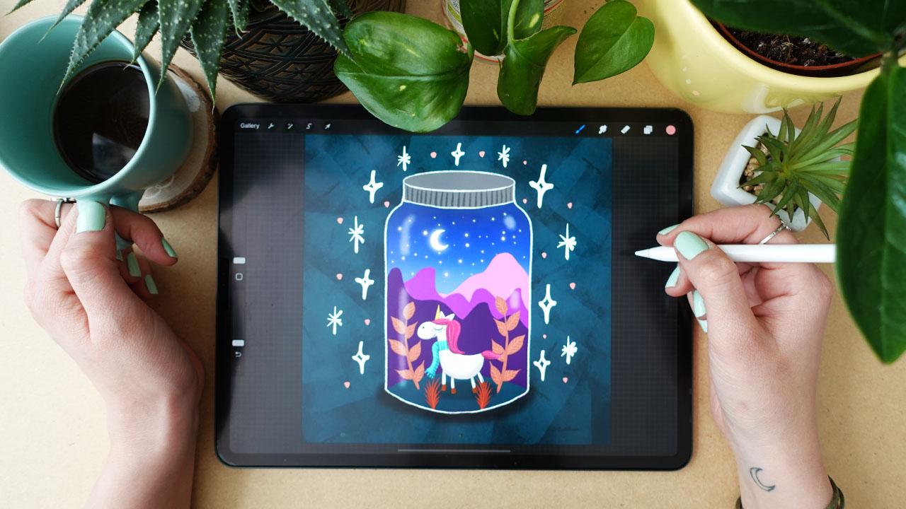
12. Stage 3. - The Jar - Setting It Up: [MUSIC] Are you ready? We're going to create something really cool at this stage, we are going to paint
with some built in tools, appropriate acute jar,
add the glass of fact, put these elements together and have already almost
finished illustration. This is when it all
comes together, let's just take a look at it. Welcome to the third project, let me just let you know that
I'm really proud of you, that you are doing
this and that you are coming with me
on this journey, so let just come click the gallery and let us
create a new canvas, so hit a plus sign and now
we are going to choose a square sized canvas because I think we are illustrating
for Instagram, [LAUGHTER] so it is very
useful to use this one. In this video, we are
going to set it up, we are going to use some
built in tools that come with procreate and are extremely
amazing, for example, we have a built
in drawing guide, symmetry tool, pretty amazing that we have
these things in digital. At first we are going
to set up the Canvas, this is going to be
your final artwork, we are going to then improve the decorative elements and the character into it and not, but now we are going to
paint the jar at first. We are going to set the
background color to a darker, so I will go to
the layers and set the background color
to a darker room. No, I will go and choose the 6B pencil and choose
white for my drawing. We are going to
create a glass jar, this is the reason we have this setting that we
have a dark color, we will change the
hue at the end, but it will basically have
this darkness and now go to the orange button
and hit Drawing Guide, but you can edit
this drawing guide. Then you'll have
some guides like to degreed isometric
perspective and symmetric and click the
Symmetry down here. Now, you will have one line here through the whole canvas. You can change the opacity of this lines and you can see it. You can change the
thickness of this line, you can change the color
of this line up here. Like this, it can be any color, can you see that? I will change it to white
so that I can see it better like this and now you
have the options here. If you click the options, you can choose to wet cool
symmetry to Horizonal, to quadrants and to radial. Radial is good for creating
mandalas for example, you can change the
middle button here, but what do we need
now in options? Choose the vertical one, we'll need a vertical
one and now hit Done. Then you will see
this vertical line here that will not be
seen in your artwork, when you go to the
layers now you can see a word below the layer, it is called assisted, this means that is drawing
guide applies to this layer. So when now, I'm drawing in
vertical symmetry. When I select the layer
and I see these options, I can see that drawing
assist is ticked here. On a ticket, this assisted
bird disappears from here and now I can draw without
this symmetry. I can draw with a symmetry
and then if I turn it off, I can draw without
that symmetry. Now I will turn on the
Drawing Assist and let me just introduce you the
quick shape function as well, so you have a quick
shape function, which means that if you draw
a shape and hold it down, it will make it smoother, I will just turn it
off for a second. If I want to draw an ellipse, I hold it down and it creates
a perfect ellipse for me and if I want to
make a straight line, I just make a line, hold it down and it
will make it straight. If I want to make a circle, I draw a circle, hold it down, I can edit the shape and
choose circle up here, if I want to make half circle I hold down or half [inaudible]
it creates it like this. You can create perfect shapes by holding down the
shape you are drawing, this is helping you a lot. I have the assist it
already ticked in, so make sure that the
layer we are drawing on is in Drawing Assist and I will try to draw
the top of the door, to make this shape is
going to be a little bit harder because it
is not like this. If you draw an ellipse, it will be like this. So try to start at this line, make a half circle and
hold down and you can just push it up and down
to make an ellipse. I want this not to be perfect, we have a symmetry, but I want this
hand-drawn feeling to it, so what I'm going to do
is to draw up for it, I will not adjust this
and draw aside for it. The reason that we are
using this symmetry tool is that it is good if we
have these two sides like running along, if you are the person like me, I can never do the same shape or same
angles in the both side, so this really nice thing. Wonderful, I will hit the Move button and move
it a little bit up here, even more I get this, I'll try to keep
it in the middle. I have my jar and now I will turn off the
Drawing Assist and go to the range button
and turn the drawing guide off and now I have my jar. In the next video, we are going to create
the glass effect, and I will show you
the different ways to select areas in your artwork.
13. The Glass Effect : [MUSIC] In this video, we are going to create
a glass effect. We will need to have
a transparent layer, inside this jar so that we can really see that it is a glass and there are
reflections over it. I'm going to also
show you how you can select things in Procreate. Now the first thing is to make
sure to have approximately close to these lines so that
you really have shapes, not just unended lines. I will make sure that where these lines touch,
they are closed. This ensures that I can
really select around it. I have the selection
tool up here, and I have the menu
bar down here. I can select in different ways, and I have the
automatic selection. I have the freehand selection, so the automatic is that if I click on a surface,
it's selected. Again, have a threshold. If I have it at 100%, it will select the whole area. If I go below it, it selects the
area I clicked on. You can increase this
threshold to have more pixels selected at the edges of these textured
brushes, for example. It is really good that you
can edit this thresholds. You can remove, invert, copy, paste, feather, save and load, color fill, clear
this selection. We are not going to
use these things now. What I wanted to show you
is the invert selection. Is a really cool thing that you can invert the selections. Then you can free
handily select, you draw around it
and it's selected. Then you can use rectangle
and ellipse selections. But now we have the
automatic selection. Now this is the part
that is selected, and if I click now on a brush, it will be not blue, but you will see if you
see it from closer, that there are these lines to the areas that are not selected and it is empty where
it is selected. When I'm painting now, I'm only painting to this
part of the drawing. We have done actually
the same thing with the shapes of these plants, but now we don't
have shapes painted. We have outlines. It is a different thing. This is why I added
this jar into this class project so
that you understand how the selection stings and different ways of
illustrating work. Now we have this area selected. I have white selected, and I will go back to the brush that I have
chosen for shading. For me, it was the spray
paint and the medium nozzle. I will make it big. I will create a new
layer and make it big, and really lightly
I will just go over this whole selected shape. I can make it or lower the
opacity of this layer. What will this make is, it will instantly add this grainy texture to
the whole jar inside. I will make this even
smaller and just add a little reflection
in the shape that you are in the angle that you have here as if it
was following it. Line here, and maybe
two dots here. This is enough reflection. If you want to learn how to add reflections to
different materials, I really suggest
you to just take objects and just observe
their reflections. If you can see now, here, we have differently
shaped highlights here. The more objects you
observed and better you will be in
drawing reflections. In the next video, we are going to put
it all together. [MUSIC]
14. Putting It All Together: [MUSIC] What is left from this project free is
to put everything together. I will now deselect
this inner space. What I'm going to do is to paint a ground and
paint the top of the jar so I will create
a new layer below it all. I will select dark blue color, gets the syrup and just
paint a ground here. [MUSIC] With darker gray, I will
just paint this top. [MUSIC] Maybe
choose a dark color and the sketching and a 6B
pencil and just add these. Now, hit "Gallery" and go to the character and
what we are going to do is that we are going to make one full finished image from this one without
the background. I have my sketches
turned off I will select the layers as they are. To select more layers, slide the layers like this. Now hit "Group" up here. Now you'll have placed
these layers into a group. What I'm going to do is
a very practical thing to do in the future
when you're going to illustrate so I'm going
to slide this group and duplicate and I'm going to hit the top group
and hit flatten. Now I will turn off this group, turn off the background color, and as you can see, I have a full finished illustration
without a separate layer. Now I'm going to use this for my illustration as
this is finished. But if I would want to
change anything within this, I have the original
layered illustration here. The reason why I'm duplicating
this group and I'm flattening these
layers together in a different group
is so that I have the original one and
there are several ways to place one element from one
canvas to another one. I'm going to show you
several versions and now the version is that I hold
down to layer more width, keep it, hold down. With my other finger,
I'm hitting gallery. I hit the jar as you can see there is a
plus sign that appeared here and I release and it
imports into the arctic. Now, as you can see this move
tool up here is turned on. Now I can make it smaller
and make it bigger. Now, what do you need
to remember with the move tool is
that if you make the selections more and turn off the move tool and move
it again and make it big. You lose from the
quality of the image. Another thing is that if you
place it outside to canvas and turn off the move tool and then you want
to move it again. Your little baby
will be cut off. You can see the
edges of the canvas cuts off these selections. You can always go back. Another thing to remember, is that you can go back and undo things if you don't go to the gallery every time to leave a file or canvas and go
back to the gallery, you will not be
able to do undoes. You only have the undoes from the time you spend
in the canvas. Every time you leave the canvas. The procreate program forgets the steps you have
done within it. Keep in mind not to
leave the canvas if you want to undo things, make sure to undo them first. Now I'm going to make
this little baby a bit smaller and place it to
the middle of my jar. Yes, I have it below this class effects so make sure that you have this character. Above the ground, would it
below this glass effect. I will maybe place
a lipid-like here. I will go back to gallery and go to my little florals
that I have created. I will choose this one as this
is what I liked the most, and I am just going
to simply merge these layers and now
I'm going to show you the way of merging the layers. You can click on
the top layer and you have the merge down. This will merge these
layers, really flatten them. Now you have them
all on one layer, I can turn off the
background color. Now you cannot move
the detail layer, etc, that we had here. Another thing to do
this is when you have two separate layers is
to pinch them together. Pinch, little pinch if
you have more layers, you can pinch all of
them together and they will just come together This is just a
little fun gesture you can use if you
don't want to merge, merge, merge and
select the layers so I will just
create free layers, pinch them together, and I'll
have one layer from them. I will turn off the
background color so that it doesn't confuse us. Now select the selection
tool and now we're going to freehand around them so I love this one that
I have created, so I will just simply
cut around it. You finish a selection
by clicking on this dot. Now, I will use my free
fingers to slide or swipe, and now I have the
copy-paste menu here. Now I can cut copy, copy, or duplicate, cut and paste and paste, etc. I will hit on copy
live to the gallery, go to my jar. Free fingers swipe and
I will hit here paste. Now I have my little floral
here that I'm going to place. For example, here like this. I will place it behind the little character
now I can duplicate it. I can swipe the
layer and duplicate. Now as you can see,
I have two of these. I hit the move tool and the
move tool menu is here. You can flip horizon,
flip vertical, rotate, distort warp so there are several things
you can do with it. You can just now flip horizontal and to place
another one here. You can just fill it
with wonderful florals. I don't want to
overdo this as well. Maybe I will make this a
bit smaller and I will go back to here
and I will select, now this one, I love it. Free finger, copy. This is the second one you can paste things if you are
not pasting full layers, I am going to just place
this may be in front. Your task now is, I hope that it is clear, fill this button with this
florals that you have created. I will select again this
duplication flip horizontal. Don't overdo it. You can obviously add some more by your hand if you wish,
some decorative elements. I think this is wonderful. At first, let me
congratulate you that you have come to this stage. It is amazing. It is already a very big thing that you have done these
things as a beginner. Now let's move to
the fourth project, where we are going to create a landscape behind this all to make it even
more exciting. See you in the next project. [MUSIC]
15. Stage 4. - The Landscape - The Background: [MUSIC] I am really
proud of you again. Now you have an almost
finished art tech. Let just add these
beautiful landscapes that you see all over
Instagram and social media. Pinterest is very
easy to landscapes. Also staring night, sky [LAUGHTER] it
will be really fun, so let's just get
into it [MUSIC]. This is going to be so exciting. Creating this background is going to have three main stages. You're going to
create a background with a background colors. We are going to create
mountains and sky. The background colors
are going to be actually the colors of
the sky at the back, I thought we should
not do a daytime because I would
love to add stars at the end as an effect. You can have a sunset where
you can, for example, place the moon already or we can have just a night
sky that is really the stage of the
sunset where it is already getting dark blue. But it's still a bit brighter, but you have already
the stars on the sky. What I'm going to do
now is select the jar, outline, hit Selection,
hit Automatic, and select D. It's inside area, then go to colors and
choose Free colors, go to the blues and choose a color that
is going to be light. Let's say this light. I will choose the
syrup brush and create a new layer and make this
layer below with all. Make the brush big
and at color here. Now, make it darker and
make it color darker here. I will maybe call
back a little bit to paint it right here. The darker here and the
most dark to the top. Now you've already
been introduced to the Gaussian blur and Gaussian blur like
blurred it around. We have different
blurring options. Now I'm going to go to Adjustments and I
have motion blur. Motion blur does that. It blurs the colors together in the angle
that you are drawing in. I'm going to do it like this. You see, I move my apple
pencil in this way. If I would make it this way, it will blur it horizonally. But I went to
blurred vertically. This is how you
create degradation and this is the
background for it. In the next video we are
going to add some mountains. [MUSIC]
16. The Mountains: [MUSIC] So we are going
to add some mountains. I will again select
the inside of the jar, so I will hit "Selection"
in Automatic. I will go down to this blurred background layer and create a new layer over. I have the Syrup
brush and I will choose a color for
the mountains. Don't worry, we will have a part where we are
going to adjust the colors the way that
they really look good. What you need to know about these mountains and
why I am including them in this illustration is to learn a little
bit about Perspective. Now you already have a
little ground and you have this little
character in the middle. As you can see, you placed
these florals here and there, behind and in front of. There are several rules
within Perspective. For example, things that
are closer are a little bigger than things further away. Within the colors,
things that are closer are more saturated, warmer, and darker than
things further away. This is an easy
landscape thing that you can see in different tutorials. This is a very
trending thing to draw these mountains that are getting paler and brighter
at the background. This is because of the rule of perspective that it getting
paler at the background. Let just create a
middle range color for the middle mountain. I have a new layer above. I'm just going to paint in
mountain really random shape. I will need to close it, in both size for color drop. This is going to be very easy. This is the mountain. I will choose a darker version and create a new layer above it and create a mountain
that is closer. I need to close these
two and color drop here. I will need a very light layer behind these two and
with a light pink. I will need to close
it in both sides. Like this. I don't
like its shape. I will make them a
little bit smaller. I will select these three
like this and hit "Move". If I move these three
layers like this, I will have them go out
from the shape of the jar. I have a uniform here. If I click the Freeform
in the Move tool, I can freely change their shape. For example, like this. But now I just want this
top part to go a bit lower, so I hit this dot up here
and make it a bit lower. Wonderful. I will
edit them separately a little bit because I will make this darker one a bit bigger, this middle one a bit smaller, and this light one maybe
a bit bigger like this. I will show you a trick. I have some pixels here
that I don't really want and I don't know
what layer they are on, so what I'm going to
do is to hold down this little rectangle here and move my finger about these
pixels that I want to find and it is in this
layer, on this one. It shows me. I can erase from it. I will choose this color here
and fill in this ground. Now let's move on
to the next video, where we are going to paint the sky and try out
some luminance brushes. [MUSIC]
17. The Sky: [MUSIC] We are almost finished. In this video we are going
to paint on the sky. Go to the layer of
these blurred colors, create a new layer. Now let's explore the luminance
brushes procreate offers. So here is the luminance
brush set and there is some extremely
amazing brushes. What I love the most
is still light pen, let me show you what it does. When I create a dot, it makes it like a little star. You can change the
color, obviously. I will choose some
yellow or orange color. The light of this
star will be orangey, but I want it to
be more lighter, maybe, like this. What I'm going to do is
to go through the sky and just add some little stars. I want to add a moon as well. I will just choose a simple
white color for it and the syrup brush that I
have for the solid brush, I'll create a new layer
for it and just draw it. [MUSIC] I will show you another trick
to make something glow. I will duplicate this moon, go to the one that is lower. Go to the adjustments and Gaussian blur and
Gaussian blur it. Now you have a glowing moon. Excellent. I call it finished
like the illustration part. In the next video we are going to do a little adjustments. See you there. [MUSIC]
18. Adjustments: One of the most
important things in illustration is that
it is readable, and it is readable
in grayscale too, so there is a value check
layer I will just create so that I can see the whole
illustration in grayscale, and I can decide whether some parts of the
illustration are seen enough, and then I can make adjustments
in the hues as well. What I'm going to do
is to go to the top, create a new layer, select gray and fill the whole layer with
gray, with color draw. Go back to the Layers and change the blending mode to Color. Now I can see that things are blending to each other
just a little bit. I will turn off this value
check layer and I will change the hues a little bit. I don't like actually
the mountains too much. Let's just start
with the ground. I think the ground
is too bright. I would love to make it darker, so I will go to Adjustments, Hue, Saturation, Brightness, and I can
set the brightness. I will make it simply
darker like this. Then I will go to the mountains, and I think that these mountains
are not the best hues. I will change different hue. I will just go through in
the hues and change them. I love it little bit more in this purple color
and make it a bit darker, maybe or lighter, darker. I will go to the middle
ground and do the same. Adjustments, Hue,
Saturation, Brightness, and I will change it to a
little bit too more of violet, and maybe make it a bit darker. Go to this one, hit this back and, again, change the brightness. I will make it a bit brighter. Make a hue I love that
it is a little bit this orangey. Let it be like that. I will sketch this middle
one a little bit lighter. I set it a little
lighter like this. As for these two, I will put them to one layer, so I pinch these two. These ones go to hue
saturation brightness. I will make them a bit
brighter with the hue. I loved this orange. Let's keep them like that. These top ones, I
will pinch them together as well. Now let's see. They look pretty
good with this red. I love the way they
are right now. Maybe I will go back to this little unicorn and place it a little
bit differently. Also I will just play a
little bit around here. I don't want to
over-complicate this. I think it looks pretty nice. You can add textures over these mountain
shapes if you wish. There are so many
things you can do, but I don't want to work too much in this, unnecessarily. Let's move on to
the final project where we are going to
do a little animation. Don't think about
anything complicated. We are just going to add
some moving elements around and to finalize
the auto exam. See you in the final project. [MUSIC]
19. Stage 5. - Animation - Finalizing: [MUSIC] Now your illustration
is actually finished. Now you have these
decorative elements, your character, you have
the jar, the background, and what is left is to make it a little bit more
lively and to learn another built-in
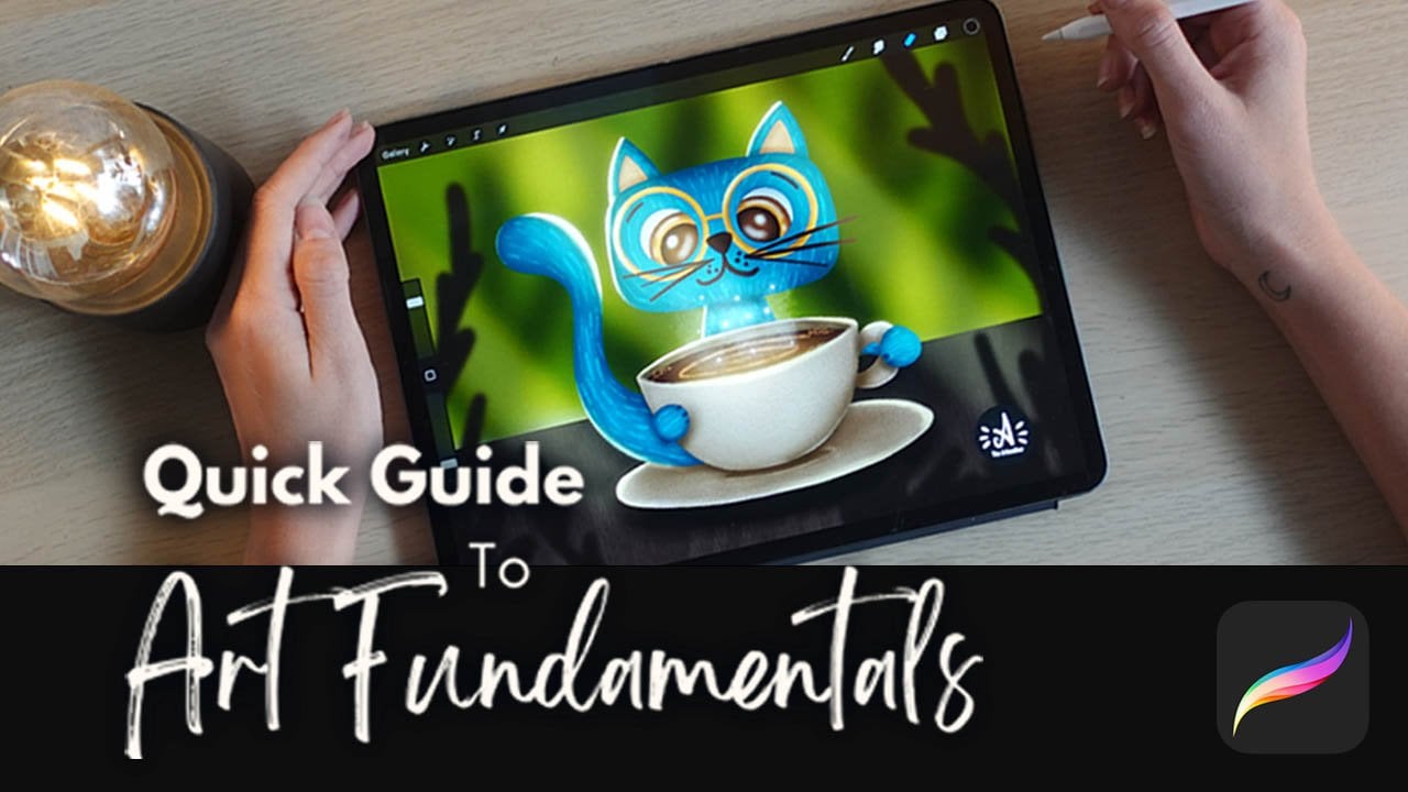
tool of Procreate that is just incredible
and that is animation. Don't worry, it
will be really easy so see you in the last stage. [MUSIC] I'm extremely proud of you that you have finished
the class until now, you already done a
lot of hard work. This animation is just
the cherry on the top. At first, we are going
to just finalize the image and then move on to animating some little parts and then we are
going to save and export and we're
going to be done for this class and
you will be a hero. One thing is that we
have only this jar. We will need something
around and I will change the background color of
it all it to be lighter, so can we really see this whole? I also don't like
that it is dark gray, so we can just choose
a different color and I like this indigo blue, but you can totally
work around it and just go around and see
what colors fits your jar. I loved this one. You can also add texture. What I would love to add is
the drop shadow below it. To create the drop shadow, I will choose the round
brush, the black. I will create a
new layer below it all and with the round brush just draw a drop shadow here. If you want it to
be a bit darker, make some more layers and
now hit "Adjustments". Just Gaussian blur. We
have a drop shadow here. Now, I love to decorate my illustrations with
decorative elements, if that makes sense. I love to choose different shapes and to
just place them around it. What I have in mind
is that I will create a layer above everything, choose white and the Syrup. I have some shapes that I
love to draw for example; these stars with this shape. I love to draw stars like this. What I want from you now is to choose two decorative elements, let it be stars. Or I didn't know, dots or hearts or other
nice elements and just paint them around
the jar like this. I will choose another color. I love this paint, but I will make it
a bit more orangey, maybe lighter like this. I will just add dots. What I forgot is
to add texture to the background so
that we can just jump into the animation,
the next video. I will just create a new
layer below the drop shadow. Go and find the texture
brush that I used. It was the rectangle, if I remember, well. Let it be a texture brush. Choose a lighter version of
the color of the background. You can pick up
the color and just go find a lighter version of it. Now we're going to bring out
the texture of the brush so we are not going to
go through background, but make sure to make the
brush big and just hit it. This way creates
really nice texture. If you think it is too much, you can always just lower the
opacity of this background. You have a nice textured
background for the illustration. Make sure you have a texture
over the background, you have the drop
shadow below the jar, and that you have the decorative
elements around the jar. Make sure to have at least two, so dots, hearts, rectangles, triangles, little
simple drawings, I have these two types of stars. What I will just do is to maybe make darker this background. Sorry, this is a little
bit more textured. See you in the next
video where we are going to animate these
little elements. [MUSIC]
20. Animation: [MUSIC] We are arriving
to the final stage. [LAUGHTER] I hope you feel well. There is a built-in tool in Procreate called
animation assists. It is a big hit. It was a big hit
a few years back when they introduced it. It gives us so many
opportunities in leveraging core skills in the
program and our artworks to make something
really cool with them. If you hit the Wrench button, you have animation assists
here and you just turn it on. Now what happened? In animation assist, every layer is a stage
in the animation. What I'm going to do here
within this hole is to select the layers of the illustration
without the elements. I have it all and group them. This group is one
stage of an animation. What are frames,
these are frames. If you take a look at
it in this bottom, you have now frames. You have the illustration, and you have the elements. The two layers that I have
here turned on our two frames. If you think about animations, think about down that
every frame is one second. You have to paint the movement
in these little frames. There is something changing throughout these little
frames or seconds, etc. There is the starting
frame per second. There you can set how many
of these little images or frames or layers appear
within one second. Now what we are going
to do is to go down here and where you
have it, click on it. This is the main
illustration here and hit Background. Turn it on. This means that the illustration with a texture in the
background will be fixed. I will turn off the elements. This is the background. This is what we are illustrating
over or animating over. The elements that
we have here in a different layer are
going to be turned on and are going to
be the first frame, if that makes sense. I hope you understand
what I'm saying. Here's the Value Check layer. As you can see, the layers
that are not turned on are not appearing down
here in the animation assist. I will just delete
this value check layer so that it
doesn't confuse you, so I deleted it. Now we have one layer. This is the illustration, and we have another
layer with the elements. Now I'm going to
create another layer. As you can see now that
I created another layer, this layer below got
a little bit muted. This means that you can use this muted layer as a guideline. What I'm going to do is the most simple animation
formed that exists is that, I have created at least
two different elements. I'm not even going to change their way as they are moving
around the illustration. They are just going to blink. If you go to my
Skillshare profile, I have very easy
animations here. As you can see, I
have this eye here, for example, that is blinking. I have two images played, blinking, open
eyes, closed eyes, open eyes, closed eyes. Then I have this learn
to draw animation where these little flowers are just
falling in one direction. There's 1, 2, 3, 4, 5, 1, 2, 3, 4, 5, maybe five different
images as you can see, and the background is fixed. When you go here
blinking, paint water, paint water, paint water, there's little moving
bubbles, coffee. There are these steam is moving on free stages of the steam. It's absolutely not a
complicated way to animate. This is what we are
going to do here. These are going to blink
one element to the other. I have this new layer. I will choose my whites
and my inking syrup. I'm going to change them. Where I have one
way of the star, I will draw over
the another one. I hope you understand
what I mean. [MUSIC] What about the dots? I will go back to the color of the dots and just
paint over them. You don't need to paint them to the same place
they have been in because if you add it a little bit of a movement that
will be interesting. Now, I will hit Play here. Play. As you can see, it is blinking, but a little
bit quickly, I will pause. Here down, you have
settings, click Settings. Now you have Loop. It is good that it is Loop set. There are different
playing modes like Pink-Pong and One Shot. Frames per second are set to 15. This means that
within one second, there are 15 images played or layers
played. That's a lot. We only have two, so we need to lower it, we lower it to for example 4. This means that it is going
to blink more slowly. Can you see that? Settings. If we make it like 2, it will be even more slow
and this is what we want. We want two frames per
second. It is enough. It is just a really nice touch to the artwork and you
don't even need to do more. For a beginner, this
is an extreme thing if you can understand
what's happening here. Let's just do a little recap
on what happened here. I hope I was clear
when explaining, you can fix your illustration as the background if you
make a group of them. You will have the whole
layered illustration in a group right here. To make it a background, click on the Frame and turn
on the background option. Then to have something
to illustrate, you have your elements,
at least two, I have three like adult and the two ways of
illustrating star, I have it on a one layer. Then I have another layer where I exchange
their positions. Where I had the first type, I painted the second one
where I had the second one, I painted the first one, and where I had these dots, I had a little bit of
movement if I make it closer these are the two layers
and as if it was moving, if I would make a third
layer, for example, and I would place another dot
here in the illustration, it would appear as
if it was moving, but we are not doing that. We're not doing a
blinking illustration so I played again and I
think it's wonderful. Now you have the animation and in order to have it longer, because now we have
two images per second, so how long this animation
would be, one second. We should export at least
a three second animation. That means that I'm
just simply going to duplicate these layers. Duplicate and place
it to the top. I'm going to do this several times in order to have
a longer animation. Make sure that you have the variation of
these two layers. Layer 20, 18, 20, 18, 20, 18. When I played it is the same, but it will be a three
second animation. See you in the next video, where I'm going to
show you how to save and export your artwork. [MUSIC]
21. The Class Project: [MUSIC] In this video, I'm just going to
show you how to upload your art work
into class projects. To create your class project, click here, ''Create Project.'' Now the first thing
you need to do is to export your artwork. I will go here back to Procreate and hit
the Range button. Then in the actions
I have to share and I have several
possibilities, I can share image
and share layers. Within share layers, I'm actually creating
this video files. An animated GIF. This is what we will need. Animated PNG, which is good when you don't want to
have a background. Animated MP4, which
is a video file, and what do we will need
is the animated GIF. Let's just click on it. You will have some
settings here. What is the most important
is the frames per second. We already started to two
so that we really have this blinking effects so you
will have a preview here. You have a max resolution, and you can click
to ''Web Ready.'' It will make it
smaller so it will really make it
ready for sharing. This is what we will need. Now, you can hit ''Export.'' It was exporting and choose, I will just save image. It will save it to
my camera roll. Now, I also want you to export this artwork as a JPEG
or as a static image so go to ''Layers'' and turn these animation as these layers
apart from the first one. As I said, for this one to have it really as a decorative
surface around. Go again to ''Share''
and also you can go to ''Canvas'' and turn
animation assets off. Go back to ''Share'' and
you have five formats here. For example, Procreate. Procreate means that you
saved the procreate file itself and if you open it in a different procreate or iPad, you will have the same
exact things inside. PSD is for Photoshop. If you want to work on your artwork in
Photoshop, you can do so. You will have the
layers there as well. You can save it
as a PDF or JPEG. PNG is again, when you don't
want to have a background, and a TIFF is a printing format. Go to ''JPEG'' now. Again, simply just
save image and you will have it on
your camera roll. Now you'll go back
to skill share and add your project a title, I will call it the magical jar. Into the project description, you can add an image,
photo library, and I will just choose the last one and I
have it in my project. You can include
some birds in it. I really want you to express your experiences
at eureka moments so just write some words. You can again go to
''Image'' and at the GIF so that we can see
the JPEG and GIF as well, and as you can see it really
nicely imported here. We can see it blinking. An easy trick to create a cover image for
your class project is to go to ''Gallery,'' select your artwork,
and duplicate it. When you duplicate it, you can do with one
find anything you want and you will not
miss any information. So I will keep the origin of artwork in one and I
will pay with the other. What you will need to
do here is to go into the layers and I will actually turn the animation
assist on and click this and turn it off
as a background. It is not a background. I will turn animation
assist off. Now I can hold down this background texture and
place it outside this group. I can see that it is
outside this group, that it is a little bit to
the side as you can see here. I hold down and swipe it a bit so that it
goes out from this group. This is important because I don't want to move
this background. I only want to move
the jar and the stars. What I need to do
now is to select this group and select these
stars that are turned on, and hit the ''Move'' button. I will just simply make it smaller and make
it to the middle, and I will just simply save
it as a JPEG and save image. Now when I go to
the class project, I can click ''Upload
image'' ''Photo Library'' and choose
this when it is smaller. It will just fit this image. I've been just submit
and I will have it fit into this differently
sized image, so then you can hit ''Publish.'' If you have any questions, go to the Discussions Tab
below and ask a question. [APPLAUSE] Again
congratulations, I am so proud of
you as you finish this whole class
and I think that you can be super
proud of yourself. Let's just do a
little recap on what we have learned in
this class [MUSIC]
22. Final Thoughts : [MUSIC] In this class, we have gone through
so much together. Naming everything we have
learned would be a long list. Let's name the key
takeaways of each stage. In the first stage,
we have learned that shapes are the basis of all illustrations and
that the best way to get inspired is
to observe nature. In the second stage, we learned that
putting a face on the shape will create
a cute character, and then by adding
human traits to them, we can make them truly unique. In the third stage, we learned that by
really simple steps, we can create a nice scene
and that we can put together an illustration from
separately created elements. In the fourth stage, we learned some basic
perspective rules, some cool techniques to
create a background, and that we can
always adjust colors in our illustrations
if they don't fit. In the fifth stage, we learned
that adding texture and simple decorative elements
can complete our artworks, and that adding simple animation will make it really stand out. That was a lot,
but I think it was really fun and it was so cool
to have you in this class. Make sure to leave a review to the class so that I know
what you think about it. Follow me on social media, Instagram and Facebook
where you can find me as The Artmother. Make sure to tag me as [inaudible] when you are sharing your artworks
on social media, I usually reshare them. Make sure to follow me
here on Skillshare as well so that we can
get in contact. I'm so happy that you
have chosen me to be your instructor and that you have been with
me in this class. I hope to see you in
my other classes, and I wish you all the best on your digital
illustration journey. Happy creating. [MUSIC]
 The Artmother, Professional Art Teacher and Artist