Transcripts
1. Checkered Patterns in Affinity Designer: Hello, students. It's
been quite a while since our last automated
pattern templates, affinity designer course. Today we are diving into
checkered patterns, checkered patterns with two
and five variable elements. It's going to be a lot of fun. On top of that, we're putting a big focus on global colors, which makes tweaking
your design super easy and keeps everything
looking very polished. In case you don't know me,
my name is Veronica Zala. I'm a freelance illustrator
and surface pattern designer currently based in Germany. And so far, I have released seven affinity related
online courses. In this class, we
will be creating two checkers repeat patterns
with a Christmas motive, a must in every
pattern portfolio. This course is super practice oriented with very
little theory. We will dive straight into it, create our automated pattern
templates from scratch, and then design two
checkered patterns with Vctor design tools, such as the rectangle tool, the pencil tool,
and the Pen tool. We will also refresh
our knowledge about vector assets and
the assets library, and we will get very
comfortable with utilizing global colors and document color palettes
and affinity designer. Let's jump in and start
creating together.
2. Getting Started: Or Hello, affinity
fans. Welcome to class. This course has
really a minimum of theory and a maximum
of practice. To get started, all
that you will need is your Affinity Designer software
and your drawing pencil. I'm recording this
course in December 2024, two weeks before Christmas, and my affinity designer
version is 2.5 0.6. As always, I will be
showing my demonstration in affinity Version
two on my iPad. However, I am pretty confident that you can follow along
regardless of your version. For example, you might want to work on your desktop version. Your task is to create at least one checkered
Victor pattern and affinity designer. You can use any
version of affinity. You can also select
your own theme. It doesn't have to be
a Christmas theme. And then our big
objective is also to get confident with setting up and using global
colors and affinity. A check riot pattern consists of a grid of alternating squares. It can be in two or more
contrasting colors, and it's typically arranged in a regular repeating sequence
in rows and the columns. It can resemble a chessboard
or a racing flag. We will be creating
a check riot pattern with many different colors, and we will also fill out the squares with
Christmas motives. Now, back to the course
prerequisites and your level, some prior beginner experience
with affinity designer or any other digital
drawing software will always be very handy. But all my courses are
very beginner friendly, and I am sure that you will
be able to follow along. You can create a pattern with two variable elements or with five variable elements or both. So if you're feeling a
little bit less confident, then start with the
easier pattern. And as you're gaining more
skill and confidence, move ahead to the pattern
with five variable elements. Case you get stuck or
you run out of time, I will be giving away my two checkered
pattern templates for Affinity Designer
Version two, as well as my winter color
palettes that you can save into your storage
as vector assets. You can import them in
your assets studio, and you can use them for any
projects also in the future. Here a friendly disclaimer, you can draw my vector
pattern from A to Z. You can exactly copy me for
the sake of this exercise, but please use it only as
an exercise reference. Since this is my
intellectual property, you are not allowed to sell the exact copy of
my pattern, please. If you're taking this
class on Skillshare, please upload a screenshot of your pattern or patterns
into the project gallery, and you can also simply screenshot your entire
affinity interface, maybe show us your
vector assets or the color palettes that you
saved into your libraries, and feel free to
share with us any of your work in progress
screenshots as well, because we really always
love to see those. If you're active on social
media, you can, for example, share your final
work on Instagram, using the hashtag
magical vectors. And if you're in our
Facebook affinity group, you can also post
your final project and ask for critique there. This is especially a good option for those of you who are taking this course from my own
website or from Gambro, and there is no
community forum there. So you can also
seek some feedback, for instance, on
Instagram or on Facebook. I hope this will be helpful. Thank you so much for taking
my course. Enjoy watching.
3. Templates, Colors, Inspiration: I wanted to introduce
the two exercises that we will be doing together
in Affinity Designer. We will be creating
two checkered patterns with a varied
number of elements. As a warmup exercise, we will create a pattern
with two varied elements. And then as our final project, I would like to
encourage you to make a more complicated pattern
with five elements. So let's have a look
at the first one. I also wanted to
underline that you can create any theme you want so I'm recording this
class in December 2024, and it's going to be
Christmas in about two weeks. That's why I chose
this Christmas theme, but feel free to also create patterns with some other theme
or with multiple themes. I will be making available,
those color palettes. I think they're
really fitting for Christmas or for
winter in general, but you are more than welcome to create something of your own and to use your own color palettes. So this will be
exercise number one. There will be two
varied elements that will be repeating
in a standard repeat. I also have prepared
color palettes for you. I like to save up my favorite
color palettes in this way. It's actually an inspiration
from the book that I recommended in another
course of mine, elevator patterns,
where I talk about how I choose colors
for my patterns. And in this book, I
like how the author is saving up patterns in this
way, using geometric forms. Let me maybe catch
the contrast better. So I also I also got part two of the
palette perfect book, and this is where you
see that the author is saving up her favorite
color palettes using those geometric forms. And I really like this technique a lot because you can
see the colors together and you can see how they fit together if
the contrast is good. Just as a reminder how to check the contrast in
affinity designer, you go here to the
navigator studio and next to the main
view mode vector, you have those three
overlapping circles. And when you click on it, you can see everything
in gray scale, and this can help you. This can help you
to see the contrast of your patterns or your
illustrations better. So there will be color
palettes that you can choose. And if you go to the color
studio, and swatches. You can also save up your
favorite colors as watches. You just have to go
to the Hamburger menu at application palette, which will appear across all
documents in your device. We will be also practicing
using global colors, and for that, we will do
that exercise together. You need to add a document,
specific color palette, and then we will be
able to work with global colors, global colors. Basically, if you
choose, for example, this one red, and it is
set as a global color, you will be able to
access to kind of enter the settings of
this color and tweak it, and then everything that
has that global color in your artwork will also
undergo any changes. For example, if
you want to switch it and make it completely blue, and it's a global color. You can do that
and everything in your artwork will change
to that blue color. But we will see that
in action together. This will be the first exercise. We'll be practicing global
colors and also setting up this simple checkot pattern
standard repeat grid, and we will be again refreshing how to save them as a template. And then after this
warm up exercise, we will move to something
a little bit more complex. I will be also making
available this color palette. It has a few more colors. But you see very beautifully here using those geometric
forms actually help us again to see if everything looks nice and harmonious
and if again, the contrast is good if you have some brighter colors and darker
colors for good contrast. And for this pattern, this is an extension
of what I was already teaching in my
newest master class. We were really learning
a lot about using the rectangle tool and
those different shapes. I wanted on purpose to create
a pattern that is a little bit more geometric and as you can probably
already see here, I utilized a lot of triangles,
rectangles, of course, stars and circles, and you will see that it
was really a lot of fun creating this pattern. I'm also showing you that you can have different
color variations, and again, you can choose also another theme if
you would like to. As always, if you've taken
my previous courses, I love working on the iPad. So I will be showing
all the shortcuts and gestures for the iPad
that will speed up your work. But feel free to experiment with creating such
patterns on your desktop. The principles that I'm
teaching on my courses also apply to the desktop version
of Affinity Designer. And also another
small difference between this second exercise and the first exercise
is that over here, we will be also working
with vector assets. I will be refreshing our
knowledge about vector assets. You can access your assets, the pre safe
documents over here. We have already seen the color
palettes that I was using. I have a lot of categories
where, for example, lately, I'm building this
huge library with animals that I'm utilizing
for my illustrations, and I also have a separate
category which you're also more than welcome to
create for holidays. So for example,
for this pattern, I use this pre created
Santa's hat and this present. So we will be also
creating some assets from scratch and saving them up
in our library together. Those are the two exercises
that we'll be doing together. Now you can join me in our
next lesson where we'll be creating this simple
checkered pattern with two variable elements.
4. Pattern TEMPLATE: 2 Variables: Let's now build our first grid. So to build our
template from scratch, we have to go to New Document. And I already have a few
documents that are pixel based. If you're not seeing
the same view, you just got to make
sure that under document units,
you select pixels. And then here you can
change your dimensions. And I like working with 4,000 pixels square because I think it's a good size
also for POD shops. So you can make sure that
you change this to 4,000. 300 DPI, we are not
using any artboards, so this has to stay
on the left in gray, no artboards and color
profile or color format RGB. We're not using any
margins or bleed, and then we hit Okay, and
we have our document. And we start by going
to the rectangle tool, rectangle, and we create
a perfect square. You also see the dimensions
of your shape over here. One finger on the screen, it
snaps into a perfect square. Move tool, we can position
it perfectly in the corner. It's important that our
magnetic snapping is on. And as you snap
it into the grid, you see that those
guiding lines are confirming that
everything is in place. You can also go to the
transform studio to make sure that the square is
perfectly square, and if it's not, you can
also change its dimensions. So, for example, just
choose the width, 2000, and now we have a square
that is perfectly one quarter of this original
canvas square, so to say. And by default, when
you create a new shape, so I just went to
the color studio, you will have not only
fill, but also stroke. So I select the stroke, and I just flip it up. To see things better,
I go to swatches and I select a color on the film, that will be contrasting
because I want to see the two squares that will
be building my pattern. Okay, now we don't have to go to the rectangle
tool anymore. We have to make sure that
we're on the move tool, two fingers on the screen,
and we make a copy, or you can go here to the three dots menu and you can hit Duplicate to make a copy. And right away, I go
to my color studio and I select a color that is different so that I
can see things better. And now everything is in place. We have our two elements. The green one and the pink one, and now we have to turn
them into our symbols. Symbols will be
basically a placeholder so that those two squares, there are two unique
elements and we will be populating them with
our decorative elements that will be building
our pattern. But first, we have to
turn them into a symbol. Here you can find
your symbol studio, Hamburger menu, three
horizontal lines. Add symbol from selection. And now you can see it's
really worth keeping it at contrasting colors because you can see better that
everything was added properly. We have one symbol that is in pink and one symbol
that is in green. There are two separate symbols. For example, if I were to change the color of those
symbols to be just this dark green and I go
back to the color studio, you see there are two elements. So just because it's one color, it doesn't mean that
it's the same thing. Those two squares, there's
still two separate symbols. Okay, so now we have
our symbols ready. You could also play it very easy and you can just
create four elements. We will be creating more. Let me go back to my
original pattern. We will be creating
one, two, three, four squares in a row because
as I'm building my pattern, I would like to
see things better. So instead of just focusing
our canvas on one, two, three, four
elements in total, we will have a grid
of four by four, 16 squares in total,
but two symbols. And this is what we're
going to do here as well. So I have those two
symbols selected. Two fingers on the screen. I make another copy, and I position them right
next to each other. Keeping the selection,
I'm dragging them down so that I have the
order that I want. And now I'm selecting
all the layers. A handy shortcut to select all the layers very fast
is to select one layer, two finger tap on
the last layer, and everything is selected. And now from the move tool, I can keep adjusting my shape, but to keep the proportions
perfect, again, two fingers on the screen, let me zoom in so
you can see better. And I'm making sure
that everything is snapped to the other corner
of my canvas as well. Now, to keep everything
neat and tidy, I will group the first row, and then two fingers
on the screen, I'm creating a copy. And I'm positioning it
below my first row. And what we got to do is we
got to take, for example, this last pink or
this first green and position it
at the beginning. Really making sure that
everything is aligned. See, sometimes you
make a small mistake and things are not
aligned properly. So seeing those snapping
lines or guiding lines, it's really worth to take a few more moments to make sure that everything
is aligned perfectly. So now we have row number two, making sure, again, suck that everything
snaps beautifully. And then selecting
row number one, row number two, two fingers on the screen or three dots
menu hitting duplicate. To make another copy that
we position over here, and now we see the
guiding lines in red and blue showing that everything
snapped perfectly. But if you still
got to make sure, then just take your time. Zoom in if you have to and
see if there aren't any extra pixels there that might ruin your
pattern a little bit. Keeping the selection,
I drag everything down so that at the end, we have row number one, row number two, row number
three, row number four. But it is all built
from those two symbols. So now I would like to drag out just the two symbols from my upper left corner
because it's enough to be working on those two guys and the pattern will build
itself in the rest of the squares because
this green guy is basically the same
as this green guy. So we just need to
focus on one element and everything else will
kind of build itself. So this is the essence of
automated patterns in infinity. Select my elements more easily. I find that it's easier just to select the
node tool because it selects what I'm trying to find on the
Canvas right away. It's especially useful to select from the note tool if you have lots and lots and lots
of elements on your Canvas. And now I'm just
taking this symbol and I'm dragging it outside. So you have to make sure
you're not dragging out just the rectangle
that you created, but the entire folder. And again, as a refresher, a symbol has this orange
line on the side, and it's also called symbol at first before you rename it. Okay, from the node tool, we search for pink. Making sure that you drag out the entire symbol,
we drag it out. So now we have just those two
exactly those two squares. Since I have them selected
here on the layers panel, you see also my selection here. There's a small outline. And now I want to group it, and I will name those group basically something
like my repeat. And the rest of my squares, I would also like to group
them so that they stay out and I call them
something like pattern. You don't even have
to call it anything. And then I go to my colors. And we can choose this
color palette here. And now our template is ready. The fact that I chose here green and pink and
doesn't really matter. It could be also different
gray scale square, so it really doesn't matter. And now, if you would
like to have this saved as a template with or
without this color palette, you can also kick it out before
you create your template. Maybe I'll kick it out.
So if you just want this, your simple checkered
pattern template, saved as a template. This is what stays, and then you go to
the Hamburger menu, three horizontal
lines, and you have to export it as template. Here you can also rename it. So something like Checker maybe something
like checker two. The two will imply
this template will have two elements in
the pattern, safe. And now I have a separate
template folder. I save up everything
on my iPad and my iPad storage and
once a quarter, or sometimes every month,
sometimes once a quarter, I also export everything to my desktop computer so
that I have my backups. So I have this templates folder, and this is where you
can save your template. And all the templates will have this extension dot AF template. So if I were now to go to the original guys and
maybe change this green to red and
this pink to white, I already manipulated this
pattern within this document. And if I go back to my affinity interface
outside of the document, I can still reuse that template, and it will stay at this
original state it was saved out. So we go to templates. Then you have to
find the folder or the place where it could be also dropbox if you're using Dropbox. So I have it here
in this folder. You have to find this
checkot two template. And see it opened
this template at the state that I saved it
at, if it makes sense. So as I was creating
this template, I was using this
green and this pink. What I'm trying to show here is once you start working
on your template, for example, here I
changed the color of the squares to red and to white. This will not overrt
the original template. So if I wanted to export
it again as template, it would export and remember the thing that I created at the beginning,
if it makes sense. But when you start
working on it, adding in the documents, changing colors, this will not change your
original template. So now we have our
template ready. We can also add in
our color palette, and in the next lesson, we can start creating our
first checkered pattern.
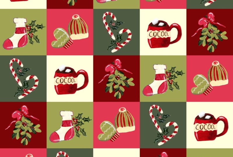
5. Checkered Pattern DEMO: 2 Variables: Our template is ready, our color palette
is waiting for us. In this lesson, we
will be creating this simple check root pattern
with a Christmas theme. Remember that in case you're not creating this
pattern in December, you don't need it, feel free to create something
in your own motive. It could be summery, it could
be autumyO Christmas Eve. If you need it, for
example, for your POD shop, the reason why I'm also
releasing this class with a Christmas theme is that Christmas is very,
very sellable, and you should
actually be creating Christmas patterns already in the first half of the year so
that you can market them to potential clients so that they can buy them and license them. And have them ready for December
for the Christmas time. So even though this class
seems very seasonal and only tied to December,
it's actually not true. You can create Christmas patterns at any
time of the year, and you should because
they're probably one of the most important
themes that you should have in your surface
pattern design portfolio. So having said that, we
have our color palette. The first thing that
I'm going to do is to change the colors
of the squares, and we will be creating
our Christmas assets with a combination of using the pencil tool and
the rectangle tool. So let me start by going
to our Layers panel, and I will drag this pattern example below and also this color
palette below. And I will make sure
that I am working in those two squares here
in the upper lift corner. It doesn't have to be
the upper lift corner. It can be anything as long
as you know where it is. And then the rest of the squares, we're
just leaving them out. So I would first like to change
the color of the square. So I'm using the eyedropper
here to this pink. And then obviously the other
square to this dark green. And you see here beautifully
how those symbols, excuse me, how those
symbols are working, we changed just
those two squares, and because everything
is tied to a symbol, everything was adjusted
across the entire canvas. So now you can just draw
something freestyle, or you can switch to
the pixel persona. And you can create a
pixel layer and you can first sketch what you would
like to have in your square. So I'm going to
the brush studio, and my favorite is the
Metacrylic 02 brush, which you can also find in the
Acrylics folder over here, and you can change it to
whatever color you want. If you want to see better
than just select the black. Here you can change its width. So how big it's
going to be test it out and everything will be in this pixel layer
and you can also drag it inside of your symbol. So now, whatever you're
drawing will be also here. Let's go back, draw again this
pixel layer to our symbol. And now we can draw like a Christmas hat more or
less as a placeholder, and this will help us to create a nice
vector acid later on. So you can sketch, but you don't have to. And then I'm going to
the second symbol, the green one plus pixel layer. And now I can draw here. Here, everything, as you
can see is happening simultaneously as long as you're drawing on
this original square which is in the
upper left corner. If I do it here, it will
show up somewhere else. You have to make sure
that you're working in those squares that you positioned in your
upper left corner. I'm going to sketch a
gift box with a ribbon. And this will be my sketch. I will get rid of it later on. You can of course work
without a sketch. So we will start by drawing
this Christmas hat. I will switch of this example so that we don't get distracted. We go to the pencil
tool, and first, I like to do like a test blob, so I start drawing a shape. Then I go to the color studio. I select the fill that I need. So for the fluffy parts of
the hat, I need the white. And oftentimes when
you just start in the document to use the pencil
tool, it gets a stroke. It gets a stroke.
So you flip it up, get rid of stroke, and
you just keep fill. And you can also make sure that here in this
contextual menu, you have fill on
and also auto close on so that our vector
shape gets closed. So now I'm getting rid
of this test shape, making sure that I'm in the right square,
which is the pink one. I start to draw the
fluffy part of the hat. And as you start drawing, you see this red circle will
indicate that at some point, the shape will close itself. So we draw the the
lower part of the hat. You can also move
to the move tool and you can make it smaller. You can adjust it
or you can go to the node tool and you can
adjust the individual nodes. If something is a
little bit too wonky, you can still fix it from
the node tool, for example. Now, I like to group
everything in color, the fluffy white part will
be just one group and then I go underneath and I make
from the pencil tool. I make another test and I
select the red that I need. I delete it, and then I go back and I draw the
rest of my shape, switching off or kicking out
completely my sketch layer. Yeah, I go to the
node so you can also select the node that you don't want.
You can remove it. Actually, everyone knows
that the fewer the nodes, the easier it is to
edit your shape. And I'm just slightly
adjusting the shape of the hat from the node tool. Okay, that looks quite okay, so I'm working again in the upper left corner
in the original square. Okay, that looks like
a nice Santas hat. And now I select the red part and the
white part, I group it. So here's the group icon, swipe to the left,
rename layer Santas hat. And now, since
everything is selected, I can still consider to
go to the assets studio. I have two very
comprehensive courses about Vctor assets and asset Studio. And if you have something
like a holidays category, you can put this new hat. So this one actually had
a around shape on top, but I like this heat as well, so you might as well add it as a vector asset hamburger menu, at asset from selection. And now our new hat is in
our vector assets library, and we can also use it for
any other future projects. So this is a little bit
different from my original hat, but I want to make something
slightly different. Now we can kick out
the sketch layer. This symbol is done. And I'm moving to the other
symbol to create my present. So I'm going to
the rectangle to, create a rectangle, change
the color to white. And now I'm going to
create ribbons very fast. So I am drawing
another rectangle. Change the color to pink. It also remembers the
previous colors that I used. So you can either eye
drop the colors from this vector acid here or you can change the colors
from this watches panel. So I go to the MVT, and then I position everything more or
less in the middle. If I want it to be
perfectly in the middle, I'm selecting the two elements, and I go to the alignment tool
and I select align center, but everything seems to be okay. Then I create a copy with
one finger on my screen. First, I drag this handle, one finger on the screen. I will be able to rotate
it by exactly 15 degrees. So I rotate it to 90 degrees. And I position everything
in the middle. I see those guidelines show me this is exactly
the middle, so I'm happy. Now for the ribbons, you can either just go to the pencil tool and
just draw something. That looks okay. But you can
also go to the pen tool, and if you want to keep things a little bit
more geometric, you can keep drawing
with the pencil tool, making sure that the fill tool over here is switched
so that we can also see the color and maybe create a ribbon that is a little
bit more geometric. Actually like that a lot more. Okay. So now those three
elements are sharing one color. That's why I'm going
to group them. Pad. So I also have to group
the present or the gift. And now since everything
is in the symbol, you see this is where it's really good that we had
more than just those two because now we have we
see more of the pattern, and we can tell if it
looks good or not. So I want this all at an angle, like so, and now my pattern
is basically complete. And if I want to, I can still
choose this gift asset, go to my library, maybe positioning it back at zero degrees so that
it's sitting straight. Add acid from selection
to add it to my library. Okay. And now this is done. So our pattern is
basically done. And in the next video,
I would like to show you how I would work with this pattern using global colors for easier color changes.
6. Global Colors Explained: In this video, I would
like to show you a really handy trick to be more efficient in your
design work and to save some time when you're tweaking
colors for your patterns. So we created this checkered
Christmas themed pattern using normal colors,
if I may say so. But it is time that we
start also getting used to using global colors because in particular for
pattern design work, this can be really,
really handy. The ones like a small
disadvantage of using global colors is that they
will be tied to a document. So if I had this
Christmas color palette saved up here and I wanted to
use it for another project, and it was previously set to
global colors color palette. It would be only tied
to this one document. I wouldn't be able to when I'm browsing through
my color palettes, I wouldn't be able to access it because this is an
application color palette. And you can even see it here, there's a little
category name on a slightly darker background that shows all the
application color palettes. Application color palettes
and affinity designer, they will be accessible
from any other new document or old document that I created. A workaround for this is to save your color palettes
as vector assets, just as you have seen before, then you have access to your assets studio in
any document, right? But with global colors, they're super Hindi, they will be only tied to
this one document. You save and you create
your all color palettes or swatches in accessing
the Hamburger menu, three horizontal lines. And here you have two options. You can either create or add
a new application pallet. This is what we have
done previously, and those application
palettes will be accessible throughout
the entire application. In this case, my iPad in any
new document that I create, or we can add a
document palette. This is what we will do. Let's name it Christmas. Global. So just for our
reference so that we know. And then we hit ok. And now from the note to it
will be easier for me. I would like to add
in all the colors, all the fill colors that I previously set for this
pattern as global colors. So now I have this dark green
selected hamburger menu, and now that we created. So step number one is to
add document palette. If a document palette
wasn't created previously, this option add global
color will be grayed out. It will not be accessible. But now we can just hit
and add global color. I do not rename it because
I want to be able later on maybe to tweak change this green color
to something else. So if I named it
Christmas green, it would make no sense
if I change it later on. So I just keep the standard
name Global Color one. And when working
with global colors, this is the only place where
in the settings you can also access to change them to overprint and to spot colors, which are relevant
for client work when you're preparing your artworks for specific print specific
print specifications, like requirements
from the client. But we don't need that. It's
just a personal project, and we just hit
Add global color. We need to select it by
long pressing it, edit. And from the eyedropper, we need to select that green. And now we have this
green global color. We have a new category
in our drop down menu. So there was just
application before. Now we also have a
document color palette. It's called Christmas
Global so that we know. And if we go back to this
original Christmas palette, you see that it's just
squares of color, whereas global colors have this little triangle in
the lower right corner. So now let's add this
pink, add global color. Long press, we have to use this eyedropper from this menu, pink, and we have
another global color. Another global color,
long press edit. And what else do
we need? This red. And now the white. This is a bit of an off white. You see my CMYK sliders here
that it's not perfect white. Otherwise, it would
be all at 0%. So now we have our
three global colors. So step number one was to
create a new document palette, and then we needed to create
our global colors and use the eyedropper to select the colors that we want to
be part of this palette. But this is not the
end of the task because this is like a
pre created pattern. For the next pattern,
we will be probably doing this from scratch. We need to apply those global colors
again to this pattern. If it's like a pre
created pattern that was using application
color palettes. But this one is super easy because it's just a few colors. So we just need to
kind of hit it again, pink for every element. So those two will
be this off white. This will be pink, and this will be red. And of course, this is something that I'm showing you afterwards. But if you know that
you want to work with global colors from
the very beginning, then you have to first
create them from the very beginning and then
start building the pattern. This is what we will be doing for our next pattern, of course. But this is super easy. We only had four colors here. Just have to make sure that we reapply those global colors now. Okay, so now what happens
with the global colors? Let's say I want
less of this pink. I'm also long pressing the pink. You can rename it, but we discussed that it doesn't
make sense because we want to be able to change basically those
colors to something else. You can also delete it
or you can edit it. Over here, you also
have different options. You can use CMYK sliders, you can use RGB sliders
or you can again use the eyedropper to select
a color from something else. Let's say we would like to change this pink
into something different. But you already see what I mean that the color has
been applied across our pattern and now it's much
easier for me to adjust it. You can change it, for example, to something more blue
or something more green. Let's maybe change the pink
to something more blue, and then this dark green
also into another color. So we long press it, edit, and now we can start
experimenting with it. I also want to see what I
can do with this red color. Maybe this can be a
little bit more bluish. Maybe more of a magenta color. So now this palette,
I can kick it out, or I can build a completely
new color palette and also save it in
my asset studio. Okay, so this was a
short demonstration of how global colors work. This is still the same
document color palette called Christmas Global, but the colors were edited. It's a really handy
efficiency trick that is, in particular, useful for
surface patting design. I don't use it that much for general illustration
or for Kitlet art. But for patterns where we often work with
limited color palette, I think it's really,
really super, super handy and it's
worth knowing about. All right, so those were
the videos about creating a simple checkered pattern
with two varying elements, also learning or refreshing
how to use global colors. And now we will move to our second exercise where we
take it to the next level, we will build a more
complex pattern, and we will be
using global colors from the very beginning.
7. Pattern TEMPLATE: 5 Variables: Alright, so now we move
to our second exercise, which is a little bit more
intermediate or even advanced. We will be creating a template this time not with
two variables, but with five, one, two, three, four, five. So let's go back
to our interface, and we will be also creating
this grid from scratch. Uh at first, I thought
maybe I could recycle the grid that we created at the beginning
with two variables. But the thing with
those templates is that you really got to make sure that there
are no mistakes. So I would rather
create it from scratch. That's why we select
again a new document. So the settings
here are remembered from the last time,
4,000 pixels square, 300 DPI, no artboards and RGB
color format, we hit Okay. And now part of the
process will be repeating the previous steps from
the rectangle tool. One finger on the screen, we create our first square. We go to the color
studio, and again, we have to flip up to get rid of the stroke and
just to leave fill. Next we can move to our swatches and we can select any color. Right now, it doesn't matter that it's an application
color palette. We will be setting up
global colors later on. Right now, we just focus
on creating our template. So this will be
our first square. I'm going to align it with my upper left corner.
Create a copy. Change its color
to the next one, and I will also drag
it because I want my left upper lift most
square to always be on top. Now, another copy. Changing my color. It doesn't matter what
colors you're selecting. It just has to be
something else so that you can see things better if
everything is aligned properly. So I'm putting it
in the same order, like here, starting
from my upper left. And our last color will be pink. So now we have the light green, middle green, red, the
darkest green and pink. If I want to keep
again the proportions, I have to keep one
finger on the screen. And you see this green
line that showed up, it means that everything
is aligned properly. Now we have our five squares, which will be the five
elements of our pattern. And now you guessed it, we have to turn them into
individual symbols before we continue building
the rest of our grid. So we go to the symbol studio. Hamburger menu at
symbol from selection. Again, because we assigned
different colors, it doesn't matter which colors. We can see things
better that yes, indeed, everything is correct. We have five individual symbols. So now we can also group it, making sure that we're on the MVTol and we will be building the remaining rows of
our pattern template. There will be five rows because we also
have five elements. So two fingers on my
screen, I make a copy. And I make sure that row
number one is always on top, and then I'm dragging the
second row to be below. Then I'm shifting
everything by one square. You see here that this
light green will be at a diagonal with the
next row, so to say. And then the element that
is at the back has to be selected and it has to
be shifted to the front. And again, making sure
that everything snaps. You can always zoom in, take this extra time
to make sure there are no extra pixels that
were created by mistake. So now we are creating
our next row, making a copy and shifting
everything by one square. This will be row number
three, one, two, three. And this green,
like, whatever is sticking out has to
go to the front. So now you see we have all
those colors at a diagonal. Okay, row number four. Shifting everything to
the right by one square. Making sure that this
is row number four, drag it at the bottom, and the very last element, which in this case, is
red comes to the front. And here as well.
And the last row. Okay, shifting everything
by one square. And moving that
green to the front. And since it's
also our last row, we can also drag
it to the bottom. So this is one way to
build this pattern with five different variables to have all those
variables at a diagonal. And then in this case, we would group those last rows, and we would kind of group
them so that they stay away. I made them invisible.
So we group them away, and then we would be
only working with those symbols that you
can see in the first row. So this is option number one, having everything at a diagonal. Let me also show
you how I created my original pattern
with five variables. So let's open this file here. So you can also walk the
extra mile, so to say, and you can try to spread out the elements of your pattern
in a more uneven way. So the templates the templates, the grid that I created a few
seconds ago that I showed you had all the
elements at a diagonal. But, for example,
if you have a look at this tree over here, you will see that it doesn't show up in this
pattern at a diagonal. It's actually spread out
in a more uneven way. And yeah, this is something
that I would really recommend either to do it at a diagonal or to
do this variation, variation number
two, to go back to your squares and to spread them out in a more
unpredictable way. So I'm going to
speed up this video, and I will kind of spread out all those colors
in a more random way. The only thing that you
got to remember about from your side is that when
you're spreading them out, Make sure that again,
you zoom in, zoom out, you have this
magnetic snapping on, and you make sure
that everything is really, really aligned. So there's always this risk that you will make
small mistakes, but you will create this
template only one time. And then when we are done, as you remember, you will be able to export
it as a template, and you can reuse it as
many times as you want, and making sure that this very first template is mistake free. Will be basically a guarantee
of your success later on because you just
have to make sure that everything is without mistakes
this very first time. Okay, so now let me spread out all those different colors
in a more random way. See you in a few seconds. Okay, that was just a
short demonstration of how I would go
about my template. From the move tool,
that's very important. I would just select a color. For example, I would try to
not look at any other color. If I would like to
manipulate the pink, I focus just looking
at this one pink, and I see, for example, here, that those two
pinks are more at a diagonal and those two pinks
are also at a diagonal. So maybe I would
like to split that. And then from the MVTol I would select this one
pink and move it around, and if it covers another color, I would go to the Layers panel to fix that other
color that was hidden. It's good not to
use white because when you start moving
around your elements, the original color of
your canvas is white. So if you see white, it means there is
nothing in there. You have basically just
uncovered your naked canvas. So you have to be
mindful of that that this is also covered up. And the reason why
I make sure I'm moving from the move tool and not the node tool is because we want to keep moving
the entire folder. So just a small reminder, this rectangle that is
nested within our symbol, that's not the symbol itself. So sometimes when
you're moving from the node tool,
let's, for example, use the node tool and select
this green you will see that this green shape was
selected, which is true. We selected this
green rectangle. But what we want to move
is not the rectangle, but the entire symbol from the top folder level, so to say. That's why we have to keep using the move tool as we
are moving around. And then when you're more or
less happy with reshuffling, you can close up your groups
to see everything better, make sure that you deselect. And you see that we are still
working with the first row. So this is where we
will be building our pattern and the
rest of the canvas. So the rest of the pattern
will kind of build itself. And the remaining part is
just the remaining part. It will be like the
scrambled up checkered part of the pattern, so to say. So you can also swipe
to the left here and rename this group that this will be the repeat
that you will be building. And the rest of your
squares are your pattern. So if it helps you to stay a little bit more organized and not to lose track
what's what and where, then you can also swipe to the left and rename your groups. If you're happy
with your scheme, again, it really doesn't matter what colors
that you're using. The colors were just meant
to help you to distinguish. Okay, I'm doing
everything correctly. I created five separate symbols which I will build
my pattern from. You can choose any
colors that you want. If you're happy with
what you created, you can go to the
Hamburger menu, expert it as a template. Even before re name
it, you can hit save, and to keep the same
naming conventions, you can go to the
original folder where you are creating
your template. You can click on
the other template to recycle the
naming conventions. And here you can
reuse that name, get rid of the two number
and substitute it with five. This way, you can very fast, create different
checkered patterns, variations, for example, with two variables, with
five variables or even more, maybe 12 or maybe ten. And you can create
as many variations as you like or as you need. So this is like
general guidelines for creating checkered
pattern teplans for automated patterns
for affinity designer. Now we are ready to move
on to exercise number two, where we create a checkered
pattern with five variables.
8. Checkered Pattern DEMO: 5 Variables: Okay. Welcome to
our final exercise. It's a little bit more
intermediate or even advanced. But in the previous lessons, we learned everything that we got to know to be successful, and on top of that, we will be practicing using
global colors. And in the end, we will
create a Christmas themed, slightly geometric pattern that we can add to our surface
pattern design portfolio. Remember what I told you
about Christmas patterns. They seem to be very seasonal and tied only to
the winter months, but you should
actually or you could, you should be creating Christmas themed
patterns throughout the year because they're
very sellable and producers, they're looking for new fresh Christmas patterns all the time. Our template is ready and our color palette is
also waiting for us. Now we have to set
all the colors that we have as global colors. We go to the color
studio swatches. Because it's a
completely new document, you remember
previously we created Christmas global
colors color palette, and this is not visible here. This is what I meant by that global color palettes
or global color palettes. They will not be accessible
across all your documents. They will be document specific. We have to create a
new palette here. We do that by going
to the Hamburger menu and we have to add first
a document palette. Now we can give it pretty much the same name Christmas Global, for example, something so that, you know, you have
this mental note Ah. This is my Christmas, global colors, color palette. And now we have to
add all the colors that we have in this color
palette here as global colors. So back to my swatches, Hamburger menu,
add global color. Long press it, edit. And from this eyedropper tool, we will add our first color, which is this pink,
and it also has this small triangle that tells
us this is a global color. Okay. Another global
color, long press, edit. Let's take this light green. Another global color,
long press it. Let's choose this red. Another one. I think this
is an off white color. Right now I have RGB sliders, but I can also, for
example, change to CMYK. You see it as a little bit off whitey. How many do we have? Six. We still need the greens, another global color Edit choosing the middle green
and our last global color, long press edit and
our darkest green. Now our global colors are set. And we can even remove that
so that we're not tempted to sample colors from
this swatch over here. And now what we got to do, remember this is something
that we are not touching. We're working on
our first row only. Okay, so now
everything is all set, and I would like to replicate this pattern that you see on the left with
Christmas trees. I left this darkest
green color as an extra, but I think I will stick to
my original idea and I will limit my color
palette It's always a good idea to limit
your color palette. It looks very good with
those geometric designs. So in order to
replicate this pattern, I will also replicate the background colors from
this original pattern. So this one has a
white background. This one has a pink background, the lightest green, red,
and the middle green. For now, I'm going to leave
out the darkest green color, but I set it up just in case as a global color in case I
want to change my mind. So from the Move tool, I am selecting my
upper leftmost corner, and I assign it this
off white color. Next in row, we have pink. Then we have light green, red, and middle green. So this is the photo
of the pattern that I imported here as my reference. We can first build our elements outside somewhere here
on our workspace. And then later on, we
can put those elements inside of our symbols
to build our pattern. So this Christmas tree
is very abstract. It's only built from triangles. So I'm selecting a triangle. And I am building one part
of my Christmas tree, making sure that this
middle green is assigned. And now I'm selecting
a rectangle, and I'm selecting this off white and I position it in
the middle of my triangle, so I create a clipping mask. And because it's
perfectly centered, half of my triangle is white, and the other half is green. And then I'm selecting
the entire group two fingers on the screen, and I create a copy. And I have my first
Christmas tree. You will also see that
the other half of my original white square
has this other green color. So first, I'm going to go
to this off white color, and I will place this
new Christmas tree either inside of the
symbol or even to be even more sure inside of
this white rectangle to make sure that things
are not sticking out to other rectangles. And now because everything
is super geometric, I am just you see it
snaps into place. I'm just positioning this
abstract Christmas tree inside and I make sure that
it all snaps into the square. And I need another rectangle that will be this middle green. I position everything behind my abstract Christmas
tree and from the move to I place it on
the other half of my square. And you see that everything snaps into the
borders of my square. And, of course, we assign
global colors to everything. You can also see
the entire pattern without the things that you positioned outside of your canvas by choosing
this preview mode here. So you can switch it off whatever you have
outside of your canvas, or you can switch back
on the elements that you have outside of the canvas
if you want to see better. So now we build our first
abstract Christmas tree, and we see that the pattern
is indeed populated across. Okay, now we will be building
this Christmas tree. It will also be from triangles. So I built my first triangle. I assigned it this white color. And now from the move tool, I'm creating copies to
build the rest of my tree. So the triangles that
are more at the bottom, they're a little bit more white. If you want to make sure that everything is aligned properly, you're selecting all the
triangles and you go to the alignment tool and
you can select align center. Okay. Make sure to group it to really double
check or triple check. You can also assign
that global color on the entire group level. And then in order to check
if everything looks good, you can place this
new Christmas tree within the other square. So here I can see, for example, that this needs
to be adjusted so that this Christmas tree is
a little bit more shapely. Okay. That looks good. Zoom in Zoom out to see if you like it. And now I will be also using
from the rectangle tool, the star shape and the ellipse shape to create
my Christmas ornaments. So I will just go back to this
original original symbol, and I will start with the star. By default, it remembers
the previous color. I have to assign it
to global color. So here's my star. If you have taken
my master class in Affinity Designer
Adobe Fresco, we were talking a lot, a lot, a lot about the rectangle tool. So we also talked about the properties of the rectangle
tool that you will be able to manipulate the
shape that you selected. By going back to
the rectangle tool, you will gain access again to some properties of the shape. For example, here,
you can adjust the shape of the star and
create completely new shape. So you can experiment to create a star that you like the most. And I will also make this
a little bit thinner. So that the star looks better on top so that this white line shouldn't kind of flow together with the red
line of the star. Okay, now it looks good. And now back to the
rectangle tool, we create a few round ornaments, if you want the perfect square
one finger on the screen, making sure that
everything is in place. To. They can also vary in
size if you one to one, two, three, spreading them out. And I'm also grouping
everything together. So because I was creating my
template in a random way, I didn't know what I
will be building inside. And for example, I see here
that those two symbols, they don't work well
together because the white from this element is overlapping with the
white that is above. So it is okay. It's
something that we just got to fix by going to
this one, two, three, fourth row, and we have to shift either this element
or this element so that there are
no color overlaps. So let's maybe shift
this symbol here. So I will go kind of manually
to this group to make sure that I'm not creating
any mistakes here, and I will position it instead of the red one
and I go to the red one, and I have to place
it back here. Now I have to also shift this red color because
there's an overlap. So making sure the entire
symbol is selected, let's maybe shift it
here or maybe there. And then the pink symbol with the Christmas tree
can move here. We will also have a
small conflict here, but let's see what we will
build inside of this square. We can keep reshuffling. But right now, we keep building. Okay, now we can create
this Christmas tree. It's also very abstract. I will create it again
outside of my pattern. Somewhere in my interface. I'm creating the first triangle. They're all the same size. Oh, okay, let's make a copy,
stack everything together. Let's group it, assign our
red global color right away. We can also merge
everything together. We have everything selected. We can stay on the group level. We go to Boolean operations. We also talked about it a lot, a lot a lot in my master class. And we select AD and everything has merged
into one shape. Then we go back to
the rectangle tool. We create an extra rectangle, assigned the pink color, and we create a clipping mask. We put everything inside
and we make sure that our shape divides this
new shape exactly in the middle. Okay. Now we can go to
our pattern tile, and we can position this new
Christmas tree inside of the light green symbol. Okay. All right.
That looks good. And for this shape, I also used this geometric star, which is, I think it's
called a square star. So we go to the rectangle tool, and here we have a square star. So we create our first star. If you want it to
have a perfect shape, one finger on the screen, we assign it white. And this star has six sides, one, two, three,
four, five, six. So instead of you can see that in the contextual
menu instead of five, we have to change it to six, and I can also adjust
its shape a little bit. Okay. So this looks like
a snowflake in the end. Okay? So we're creating a few
snowflakes to imitate snow, two fingers on the
screen to create a copy, if you want to retain the shape, one finger on the screen. You can also rotate it a little bit for
some more variety. So that they don't
look the same. Okay, so that looks quite good. And then we group
everything together, and we make sure that
the global color of white is assigned. Now for the red symbol, we will be creating
another very, very basic geometric
Christmas tree, triangle, still clicking, making sure that the
global color is assigned. Then we need the trunk
of the Christmas tree, which will be pink,
assigning my global color. This is stacked
perfectly in the middle. I can see everything well
because snapping is on. But in case you have any doubts, for example, this is
a little bit off. You can select the two elements, alignment tool and align center. Okay. That looks good. I'm going to group it and place everything in my red square. I position everything in
the middle and I can still tweak the shape of this triangle so that
everything looks nice. See, this tree has also shown
up in all the other grids, and then I'm going
to the ellipse tool from the rectangle tool, I assign it my off white color, and I create a few circles
that will also imitate snow. To retain the perfect
shape of the circle, one finger on the screen can also make a few of them
a little bit bigger, a few of them a
little bit smaller. Okay, I think that
starts to look good. And of course, we
group everything. We double check that our
global color is assigned. Okay, because we still
have some color overlaps, in order to be 100% sure that there's no overlaps
with the last tile, we will just finish our
last Christmas tree. Okay? This one is also fun. Everything is very minimalist. It will look very good both on fabric as well as on packaging. So we're building our last
Christmas tree. Similar shape. Okay. I will not merge everything together
because I still want to retain some editability. So I'm just going to group it. And with a simple rectangle, I'm also adding in a simple
trunk of the Christmas tree. And because it's the same color, I will put it into
the same group. Then we create our star shape, and we change points 5-6. Okay. Actually,
here we had more. So if you ever want
to change, like, keep working on the shape, go back to the rectangle tool, and you always have
the contextual menu. So maybe six will look good. And we position the star on
top of our Christmas tree. And because it's the same color, I keep everything in one group, and before I build the
rest for this tile, the Christmas ornaments
and snow texture, I will place it into
the right tile. So the middle green tile here in I position everything in
the middle. That looks good. Now I go back to
the rectangle tool and I will create
a few ornaments. For example, this
one will be pink. Before I move to other colors, I work with this pink. I group everything, back
to the ellipse tool, another circle, and let's
maybe select our red. Two fingers on my iPad screen, I keep creating copies. Okay. That looks good. And then I sort everything
by color into one group. And my third ornament color
will be this light green. Back to the move tool,
creating few more copies, and now I basically have to spread everything
more evenly. Okay. And before I forget, I'm also grouping the
light green color. Now for the snow texture, I can also group it into
a single Christmas tree. For the snow texture, we will be using vector brushes. Also in the previous master
class that I released, we were talking a lot
about vector brushes. So first, we got to move to the vector brush tool
here on the left, and making sure that we
stay on this vector brush, we can select on the stroke
side our designated color, which is this off white and then here by clicking on this
brush icon on the right, we will be able to
access our brushes. I have a few brushes
that I bought, but there's a lot of
brushes that are for free. So I think under patterns, I have my airbrush brush. Yeah, this is it. So
there's airbrush dens, airbrush medium, airbrush light. We can start with the
light, for example. And here on the left, you will be able to
just also the size. It's a bit of a trial and error. So I'm staying within my group. And I start drawing. So I need this
brush to be bigger. You see this circle, it shows me more or less the
size of the brush. So I need a little
bit more spread. That looks very good. I like it. I just drag it behind
my Christmas tree. You can also pause, go back to the
vector brush tool, make it even bigger and run another experiment
with the pigest brush so that the snow is
not too not too dense. Okay. That also
looks interesting. I made three strokes, so I have to group them. And now I can see
which one I like more. So this one is a little bit more like with
smaller snowflakes. I think I like this one more, so I'm going to
kick out that one. And now because it's a
vector brush tool texture, it will behave just
like vector shapes. So I can, for example, move
back to the move tool. And on the stroke
side, I can change, for example, this dark green that I haven't used
previously, I can use it. But since I wanted
to imitate snow, I will stick with the white. I just wanted to
mention maybe like a refresher information for
you that vector brushes, they help you to create really interesting
decorative effects that will look like raster art, but they will preserve
their vector property. So they will be scalable. If I go back here
to the MV tool, and select the strokes
that I created, you will see that this
is all vector property. It's a vector line that
I can keep manipulating. I'm a big fan of vector brushes. I also have a blog post on this topic encouraging people to use Vctor
brushes more. So see, it's all very editable. It would not be possible
with pure raster texture. Let's deselect by hitting this X symbol or by tapping somewhere
outside of my canvas. So now I will be
going row by row, and I will be checking whether there are
no color overlaps. For example, this I
don't like because this green is merging with the green from this
other element. I will take a few moments to
fix any color overlaps now. Alright, we are nearly done. It seems that there
are no color overlaps and everything looks okay. We can still test it
with a bitmap fill. So we go to the three
horizontal lines, hamburger menu, and we have
to export our pattern tile. We keep the original
4,000 pixels square, and we need to save
it, for example, into our storage.
So we hit Share. And then we save
image, for example, to our iPads camera roll. Safe. And then somewhere
outside of our pattern, so I'm going to close all the
groups that I don't need. I go to the rectangle tool for
the last time and I create just a random bigger,
of course, rectangle. Then we go to the gradient tool, which you can find here,
we select gradient. And from the contextual menu, we have to move to the very
end to select a bitmap, and this will immediately prompt us to get the option to
select our pattern time, for example, from
files if we saved it into our files
or from photos. Okay, so here's our Christmas
pattern. Let's selected. Whoa. And now let's
use the handles here to see if everything
looks okay. But it looks okay. There are no other
color overlaps. Oh, no, there are, see? So this is something
that we also got to move. We need to fix this. Okay. Let's locate it. Ah, okay, I see it. See, The Christmas
trees are stacked here. Ideally, there should be no repetitions when going
from left to right, and also from top to bottom. So there is one repetition here. This green Christmas
tree is also repeated in this last
column at the bottom. So we need to fix
this. Okay, this we can make invisible
for now.'s one, two, and let's fix that.
From the move tool. Okay, now it looks good. We can export it. Safe image. We can go back to
our test swatch, go back to gradients. Again, bitmap and place from photos the
corrected pattern tile. Okay? This is the corrected one. Okay, so this is
the corrected one. Now it looks like we don't have any overlaps. It looks okay. And there you have
it. We created two checkered pattern templates with two variables and
with five variables, we fix the one with five
variables so that now you can use it indefinitely without
any overlapping mistakes, and we created two Christmas themed repeat patterns
in a checkered design.
9. Global Colors Demo: We've got one last exercise to solidify our knowledge
of global colors. So for this more
intermediate pattern, we were using global colors and a document color palette
from the very beginning. So now, any color changes or colored tweaks will
be very, very easy. Just as a reminder, there are two color palette types
affinity designer, application color palettes
and document color palettes. So when we were creating
this simpler pattern, we started with an
application color palette. Uh, application color palettes, they will be available
across all the projects. We created a color palette for a Christmas team and save it as an application
color palette. That means that every time
I create a new document, this color palette will
be available and you will be able to see it right
away in your interface. It will be available in all
the documents old or new. And application color palettes
are saved within the app. So if you're also switching between the iPad version and the desktop
version, for instance, you have to make
sure that you export your application color
palettes and you import them, for example, to your
desktop version. Now, for this more
intermediate pattern, we used document color
palette in affinity. A document color palette will be nesting
our global colors, and it will be applied to
this one document only, so it will be restricted to
one file it is created in. But the big advantage of using document
color palettes with global colors is that they will offer you adjustable
color schemes, and color changes will be
very easy and very fast. By the way, don't forget
also to save your patterns. You can do that by accessing
the Hamburger menu, save as. And then I normally have the following naming
conventions that I start with the word pattern. And then you can just name
your pattern, maybe Christmas, geometric, trees, and
then you hit safe. And I like to save my
work to my iPad storage, which I then backup
at regular intervals. I send them over to
my desktop computer. So I have a dedicated
folder for every year. This is 2024 for Patterns
folder. I hit safe. We also have all our progress saved and we have a new name. When we enter this document, this was our testing tile. We can switch it off and
the original pattern. Now when we go to swatches, this is the application color
palette that we created previously when we were doing
the two variables pattern. And then when you hit on the name of your
swatches category, you have the whole list
of all the swatches or color palettes that you
saved, and right on top, we have our document, global colors Christmas color
palette over here. So we can select
that. There's also this tiny triangle in
the lower right corner. That's how you will recognize, uh huh, everything is okay. It's a global color. As I mentioned
before, I love using global colors for pattern
design specifically because I tend to work with
a minimal color palette anyway of maximum
six or eight colors, I think is a complete max. Rather minimal color
palette with fewer colors. So it's very easily manageable
with color palettes and another application example
of using global colors if you have your brand
colors that you use, for example, for your branding, maybe business cards for your website,
social media posts, you can create your branding, global color palette,
which then you can also reuse for various
projects within your software. And I did say that your global colors in the
document color palette will be tied to one document, but there are two
ways to go around it. You can also, for example, export those color palettes. So you go to Hamburger
Menu and then you have to click on Export palette. And then I have a
folder for exports, which I'm going to
use, and you hit safe. So if we were, for example, now to go back to let's say this pattern didn't
have any global colors, and we wanted to use the
global color palette with our Christmas colors, we go to Swatches, Hamburger menu, and
then we need to import that palette and
we have to choose that it's again
document palette. So it will be again tied
to this one document. But it's a workaround to take a global color palette
from another document into a new document
or a new project. So as document palette, and it also has an
extension dot AF palette. That's how you will recognize
the Swatches files. And now in this document, we have, of course, the full list of our previous
application color palettes and this new Christmas
Global color palette. So this is one way
to go about it. Remember that you can export and import your document
color palettes. And then this leads me to our actual exercise
for this lesson is to create the different
color variations for this more intermediate
elaborate pattern. Color changes on the simpler pattern would
be much easier because it's basically just four
colors, so it's super fast. But if you have a
few more colors and the pattern is a
little bit more detailed, then it's a really good idea
to be using global colors. So instead of just exporting and importing
my global colors, you can swipe to the left and
you can create a duplicate. You can create a copy
of this pattern. And then when you enter it, you will have copied
everything that kind of belongs and was tied to
this document previously. Which also includes our
Christmas global color palette. And now you can work on it, and it's a bit of a paradox. So in a way, those colors are supposed to be tied
to this one document. And we created a copy, but this copy is
still a new document, so to say, that
inherited by copying, this global color palette. What I'm trying to
say here is that now, if we will overwrite it. So when we start tweaking, changing the colors
on this pattern, this will not overwrite the original
documents, so to say. So it's just inherited, but we can keep working on it. We can keep editing it,
and it will not affect the original document where we created this Christmas global color palette
in the first place. Okay, so let's work on some color changes
so that you can see how global colors can
speed up your work. I also made available a few
assets with color palettes, which you can download
from the class resources. And I wanted to create two extra color variations
for this pattern, one with a bit more purply, colder tones, and one with a bit more
brownish rusty tones. So you have under resources this whole
category available. Remember that when you're
working with assets, you have to first save them
to your device storage, and then you can go
to your asset studio, Hamburger menu, and you
can import a category. So this is what
you would do with the resources that I made
available for this course. So those are the first two
color palettes that we are using for our
patterns for this course. And I will insert those two other color palettes that I would like to test out. And we will just start
with this first one. I'm going to make
this one invisible and we will work with this one. It's a slightly
different color palette. It's still very similar. I still have my own
preferences that lean towards exactly those
types of purples, but it's still different enough. So let's see how I
would go about it. I have my new color palette. You can also screenshot your previous pattern,
previous art, or even a color palette
from Pinterest, and then you can just
place it here from this hamburger menu and
use it as your reference. I would go to the color studio, and I would probably start
with my darkest color, which is this
middle green color. It's located over here. You long press it, click Edit, and you're using this
eyedropper tool from the sub menu to sample
this new green color. So that already
looks interesting. Now, I want to
kick out this red, so long press it, edit. And I would like to choose
this purple instead. I think the green
stays the same, but this pink is a
little bit too yellowy, so I also long press it, it, and I sample
this cooler purple. See everything
changed very nicely. And the white that you see in the middle is also a
little bit off whitey, a little bit warmer. So all the green and
purple tones are cooler, but the changes that were made on this white is that
it's a little bit warmer. This difference is very,
very, very subtle. This is our second
color variation and took me literally
just a few seconds. I go back to my interface, Save As, instead of,
let's do it again. Instead of copy, I will
write something like cooler. The same name, but cooler, I am saving up this color
variation separately. Okay, I swipe again to
left. I create a copy. It inherited everything else
that we've been working on. But this time, I would
like to work with this more rusty, brownish
color palette. It still has some cool
tones and warmer tones. I think this whole color
swatch idea is brilliant. You can see things very
nicely if they fit together. So Color Studio swatches and this new global palette that was previously created in
the second color variation. It was also copied. So what we do? What
will we do? Let's take? I'm going to kick out, delete this darkest green because
we're not using it. Then I will long press this
darkest green and sample this rusty orange
or reddish brown that already looks super nice. Now let's take this purple, edit and maybe
choose this color. You can keep staying within
this menu and you can keep sampling to see what schemes you like best. I
like this one a lot. I think this green is the same, but just to make sure I will edit it as well and
sample this green color. And I think this
should stay the same. Yeah, I think I'm pretty much done with
my color variation. This is a little bit
more rustic, so to say. Going back, savas And I
will tweak the name here. Rustic. Save. All right. So very, very fast, in a matter of
literally minutes, we created different
color variations of this more
intermediate pattern, and the global colors have done pretty much all
the work for us. So you just have
to have an idea, choose a color palette. Remember that you don't have to have a predefined color palette. You can also when you're
adjusting the colors, you can edit them from
the sliders here. So you can choose, for
example, CMYK sliders, or I also like to use the RGB sliders and you can
tweak your colors over here, or even go directly to the color wheel and
experiment with your colors. Okay, when you finish
working on your documents, remember also to save
them every now and then to make sure you're
not losing your progress. Remember to download all the class
resources, for example, the winter color palettes
that I'm making available, test them out and get more comfortable using
those global colors in your pattern design work.
10. Final Thoughts: Yeah, another automated
patterns course is behind us. We had the diamond repeat. We had the half drop, and now it was time for
a checkered pattern. I really hope that you enjoyed creating those fun
repeats with me, and I'm really
curious what you will share either on the social media or in the project gallery. It really doesn't matter if you stick to the Christmas theme or you choose something else that will suit
your portfolio better. Just remember that,
in particular, Christmas patterns
are very marketable, and you should always have fresh and new Christmas patterns in your surface pattern
design portfolio. If you're taking this
class on Skillshare, you can share your work
in the project gallery, or if you're taking this course on Gumroad or on my website, you can share your final project through
the social media, for example, in Instagram under the hashtag Magical vectors. Also, don't forget to download your class resources,
the templates, and the color palettes,
and I would very much appreciate it if you
could leave a class review. Most of you know
that we also have a dedicated Facebook group for pattern designers who work
in Affinity Designer. You can definitely publish your projects there and
ask for a critique. Remember that you can
learn with me both on skill share and through
my gam root courses. See you in my next
class. Thank you.
 Weronika Salach, Art with MAGIC