Transcripts
1. Prototyping in Figma - What you need to know: Welcome back. Prototyping Figma simply means making the
design interactive. It's like the project was already coded and
we get to use it. So let's jump in and we'll chat more about
this in a minute. So here are two
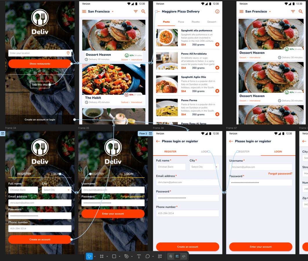
mobile app screens. We can register or login. Fantastic. Let's switch to prototype mode by clicking here. Not a lot has changed,
but that's fine. Now, let's select login from
the screen on the left. As you go above it, you're
going to see this plus symbol. Click and hold and drag a
connection to the other screen. Immediately, we're going
to get this pop up, and this allows us to fine
tune the interaction. In short, we want the following. When we click on Login, so that's the trigger,
we want to navigate. That's the action, and the
destination is already set because we drag that arrow to that specific screen.
So we're all good. And in terms of animation, smart animate is just fine. The rest really doesn't matter. Okay, let's do this again, but on the other screen. So click on Register and
find that plus symbol. Now, drag a connection
to the initial screen. Notice how there is a blue
border. That's great. Same settings as before, totally fine. And
yeah, congratulations. We have our first prototype. So feel free to
close this window. Okay. And to test it, we're going to use
this play button here. Now, bigger prototypes may
take a second to load, but this one is quite fast. And we can click and we
can see it in action. It's like the app has been
coded like it's live. Have a look at the cursor, where there's an
action available, we're going to get the hand
icon instead of the arrow. This is prototyping
in a nutshell, and there are only a handful of other features that you
actually need to know, and I'm going to guide
you through them. But here's the essential point. Prototyping is not
a design thing. It's not about making it
sleek and interactive, so it looks better on social
media to get more likes. No, close the tab and let's
go back to our project. Now, click on A arrow to open up the animation settings,
so you know what I mean. So what if we change it from
Smart animate to move in? Now we get a few
more options here. Say it moves in from the
right side. Let's try it out. Now, of course, this
is interesting, a cool effect, but the other tab is still
left on Smart animate. So let's go back. If this time around, we
switch it to say slide in. So that's something else. So
that may look even cooler. And then maybe let's change
the duration to say 600. And one final switch, let's change the curve
to something else. Let's change it to
ease in and out. Fantastic. Now let's hit
Play and test things out. Now, I'm rushing through it, but I hope you're beginning
to spot a problem. Yes, this looks interesting. It feels nice. But maybe
we can make it even nicer. Maybe this needs
to be set at 4:50, maybe a different
type of curve, right? And that's actually the biggest
problem with prototyping. It sucks you in. It
takes up so much time. It's super time consuming
like nothing else. And the issue is, it feels like you're
making progress, right? Like you're working
on something noble. You're polishing the app. You're making it
feel special, right? But as the founder of an app design studio company that I ran for over five years, I can tell you this, no
hesitation, no doubts. Everything that
you're going to do, everything that we did here is not going to be coded,
like we designed it. So that 450 or 600 milliseconds,
that's not the case. Move in, slide in,
that's not the case. Smart animate and so on. Now I'm going to
explain why that's the case in more detail
in the next lesson. But for now, please
download the project. You have it attached and link
these two screens together, like I showed you a minute ago. The reason why we're
using app design screens versus a regular website
is due to their size. They're smaller, so there's
less panning around. We don't have to move around
inside the big project. Imagine 20 desktop screens. That's a lot of
zooming and panning, so that's why I chose
mobile Lapa screens. But yeah, go for it, try it out, see how you do, and then please make sure
you continue watching the next lesson because it's
quite important. Have fun.
2. Prototyping is essential but has one major flaw: Welcome back.
Prototyping is exciting. You saw how many choices
we have with our settings, and that's just the
tip of the iceberg. Now, imagine how intricate, how polished we can make our designs look
like and feel like. And that's surely going to
do well on social media. It's going to get a lot
of likes, comments, and a lot of work requests, right? Me projects, right? Uh, no, actually,
no, not really. Keep in mind, I was the CEO
of my app design company, so I could just tell
my coders to match my prototyping one to one.
But here's the thing. I didn't. And why
is that the case? Because coding is super expensive. Think
about it this way. Say, 1 hour of coding, IOS coding is say 100 bucks, a random number, okay? 100 bucks an hour. Now, the developer
says that making this registration form work from
a functionality standpoint, takes around 15 hours,
just a random number. So that's $1,500, okay? 500 bucks. This is pure functionality,
no animations, right? You then ask about
the animations, and he says it's anywhere
10-30 hours extra. So that's anywhere
$1000-3 thousand extra. He doesn't know for
sure because it's a lot of fine tuning, a
lot of back and forth. It could take longer, but definitely not shorter. Now, do you say yes? Do you accept that huge cost? And keep in mind
that other parts of the project that need coding. So your best bet is to
make the app functional, and then if you have time, you go back and you
add a few animations here and there after
the app is launched. So what does that
mean for prototyping? It has to be basic. It's there to help the client and to help the coder
understand the flow. Have a quick look
here. Let's assume this is the first time you're
seeing this project, okay? Now, do you know all
the potential ways to start using this app? Let me break it down real fast. So you can type in your
location here, your address. That's number one.
Or you can click on this icon here to automatically
pinpoint your address. So that's a separate screen, so that's potential
action number two. You could simply skip
this step and simply see all the restaurants that
are listed inside the app, and that's potential
action number three, okay, three different flows. And finally, you can
register what login, and that's action number four. You cannot assume
that a client or various coders are going to pick up on all of
these four choices. So instead of assuming that, instead of making them think, you're going to
show them all the potential avenues showing is fantastic because
it doesn't leave any room for imagination, right? So this means that
prototypes are awesome for showcasing
how a website, an app, anything in between
is supposed to work. And here's why. Prototypes are an essential tool when
looking for coders. Okay? So a client typically
hires a designer, then with a complete prototype, he starts getting
quotes from developers. The prototype is there
so the development team can precisely
understand the project so they know
everything about it. Through the FIGma link, they can see the UI,
the actual design, but they can also see the many flows inside the
app, how you can register, how you can pay for an order, how you can add or remove
products from the card, so on and so forth. Now, for example, notice there's no social media login inside this screen.
That's quite important. All these tiny details change
the scope of the project. Say we did add something like log in with Facebook
or Google or whatever. So that may take two more
days of development, and that may add, say, 1,500 bucks of extra cost. So this is why prototypes
are absolutely essential. When the client is
looking for coders, having an interactive
prototype and full design they're invaluable. That's how you get precise
quotes and estimates because, again, the coding company
can see the entire thing. That's how they can be precise. But back to our work, nobody cares about
fancy animations. 400 milliseconds, 600
slide in, move in. No, they care about seeing all the options
inside the app. So that's how you should
approach prototyping. So it's not a design
tool to get more likes. No, from a functionality
standpoint, you want to showcase
the app's features. I'm insisting a lot because
you're going to see a lot of fancy animations
on dribble and Be hands, and you may think that's what
clients are looking for, but that's not the case. And you don't have to trust me. Simply go and look up these projects that you
see on social media. Have they been
implemented that way? Go and download those apps. Can you see all of those fancy, complex animations that you
see on Be hands or dribble? Inside any app or website,
it doesn't matter. Nine times out of ten, the actual project is
super stripped down. No animations or
very little ones. And that's because it costs
so much time and money. Very few companies can actually afford it.
And here's the thing. Take out your phone, look at the biggest
companies out there. Look at their apps, Netflix,
Uber, Amazon, whatever. Why don't they have all of
these fancy animations? Because it's a distraction. So very few companies actually benefit from
these types of things. So in this chapter, I'm going to show you how to prototype, but I'm not going
to waste your time. 99% of your clients are going to want a
functional prototype, not a super polished
one when you spend half a day for
a few transitions. That's not the point. We're
going to make sure that actual clients are
going to benefit from your work. So
let's get into it.
3. Use prototyping to find mistakes and flaws: Welcome back. Prototyping is a great way to find mistakes, things that you forgot or
maybe the client forgot. Now, one type of flaw is this. Say the user skips putting in his address and he simply wants to see the restaurants
that are inside the app. Okay, on one level, that
makes sense, right? He wants to browse around. Let's not put any barriers so the user can explore the app, and then maybe he's going to
be more likely to sign up. It makes sense, right? But what if this app runs
inside a huge country like the United States
what good does it do to show restaurants that are
thousands of miles away? So this is something the
client has to consider, and your prototype will
highlight that potential flaw. It's not your job
to change the way the app behaves or
have it sought out. But if you can showcase
potential problems, you're going to be
much appreciated. Now back to these screens, we made a very simple prototype. We can move between tabs. But what happens when
you go over this button? Nothing happens, and
that's not ideal. So in prototype mode, let's click on the button, and on the right
side, we can see this part here
called interactions. Click on the plus symbol. This is going to show
us multiple options, but I'm looking for
while hovering. So let's assume that
this is a website, not an app where
you typically don't have a hover state inside
the mobile phone, right? But while hovering,
we want the button to change to and we have a state. Right now, it's set
to active, okay? It's orange, so it makes sense. The button is available, and you can press it, okay? But let's change the state to hover and but here's the thing. We only have another one that's called disabled.
That's not good. So we're missing
the hover state, and that's not acceptable. That's a mistake on our part. This is exactly how you're supposed to
leverage prototypes. This is how you're going to find mistakes by using
prototype mode. We just found out that we're missing a state,
the hover state. So let's switch back
to design mode. Our assets are right here, so there's no need
to look for them. And here are the two buttons, but we need the third one. So click on this plus symbol, and we're going to
make a variant. You're going to see the name is already highlighted right here. And instead of state three or anything at random,
let's write hover. And, of course, we do got
to change the design, but we're going to
keep it simple. We're going to unlink
the action color, and we're going to
choose a darker shade of orange, something like this. Okay, good stuff. Now, go
back to prototyping mode, and now we can resume. So select the button, and under interactions, we
want the following. While hovering, change to hover. As for the animation,
I typically go for Smart animate in most cases. Great. Now let's try it out. And, of course, it's going to
work without any problems. This is fantastic.
So this is how you double check your projects
before you hand them off. This is not the end of
the world, this mistake. But if you add up
five of these, ten, 20 of these mistakes, then the developer, he's
going to get upset. He's going to tell the client the client is not only happy, so he's going to message you maybe in a few weeks,
maybe in a few months. You are then probably busy
with a different project. So as you can imagine,
everyone is upset. So please don't work that way. If you prototype,
you can quickly identify these mistakes and fix them in a few minutes flat. But what about the fields? Well, first, there is a
way to actually be able to type something inside them
inside a prototype, right? But does that actually help? No, not at all. That's why
we're not going to do it. Instead, we are going to
think about these states. So this is the hint state. My name is not
actually filled out. This is just an example, a hint, a way in which we
tell the user what's supposed to be typed in
and in what fashion. This is very helpful in the phone number
field, for example, where in my specific country, you could potentially write it out in a few different ways. So this is how you can write
out a number in my country. So that may be a bit confusing, but by adding a hint, it's a helper text,
right? It's fantastic. Now, in this situation, is it clear that this
text is just a hint, a helper text that's going to go away when you
actually click on it? No, not really. It's too dark. This is why we should
actually change it to something that's
a bit more washed out. You could even make it italic. What matters is this has
to be seen as a hint. It has to be clearly a hint. You could even write EG or hint, and then the actual
name or whatever. This is how you talk to
the developer through your prototyping, through
your design work. Now we need another state where the text is
actually filled out, where the user actually
typed something in, right? And then in this case, it has to be very
different from the hint. I'm talking darker, bolder, so there's no
confusion about it. Now, I'm going quite fast
through the motions, but I hope you understand
the reasoning. That's the point
of this lecture. You design something,
you think it's okay. But then when you dive deeper into it through a prototype, you understand that
it's not good enough. So you have to come back and you got to make
all of these changes. Designers who have
actually shipped products know all of
these situations, and they handle them
from the start. But if you don't have
that experience, not a problem, use
prototyping mode. Then go to all the
fields, all the screens, and see if you forgot
something because these fine details you may not
get them from the start. But when you set
everything up in this fashion, here's the thing. Developers are
going to love you, and there's a higher chance
that you will get more work on this client or a
great review or both. So in conclusion, my advice, don't waste your time
making the fields editable, right, by typing something in inside the prototype.
That doesn't help. But do make sure
that you include separate states for the buttons, for the fields for most
of your elements, okay? You got to make sure that
everything is crystal clear. If you want to take it
to 100%, this prototype, you could potentially make a state where the
field is disabled, where the button is disabled, maybe the field is
disabled as well. Maybe something else
needs to happen before this particular
field becomes available. So that's how you can take
it to the next level. Now, how you prototype these states, be
it through clicks, be it through hover states, what animation you put in, that stuff really
doesn't matter. More than that, you don't
have to do this for every single field in
a 100 screen project. Instead, you do
exactly as I did here. You work on the
master component. So on the left side is
the original field. There, I have a default
state where the hint shows up and another state
that we made together, where the user has
typed something in and the text
becomes bold and dark. Good stuff. Now, once
you have these states, go into prototype
mode and connect one to three and three to one right here from
the left side, from the original
master components. Okay basically now when
you click on them, you'll be able to
flip between states. By working on the
original fields, all the copies on
the right side, all of them are going
to follow suit. So if the project
has 500 fields, they will still act like this. You don't have to manually link them. Does that make sense? So again, by creating
an interaction on the original component and by using copies throughout
the project, with all set with once, and it's going to work
for the entire thing. And just in case you're curious, what's up with this other state? This is an option I
made just in case the background is white and
the label needs to be black. You can ignore it.
It's not important. So that's how you
actually prepare a project for coding,
for development. Okay, now, go ahead and fix
these problems on your own. And when you're ready,
please continue. Thank you so much.
4. Overlays in your prototypes (pop ups): Welcome back. Pop ups are
a great way to convey meaning to show a lot of
information in just one screen. This is useful for everyone, the client, the developer, but of course, the
end user as well. The end user simply means
the client's client. So the actual people that are going to use the app or website. So here's how this works. I realized that we didn't
have a pop up screen, which is sometimes
called the model. So here's the thing. I
quickly made one, right? So after you make an account, I want the user to
automatically be logged in. So in prototype mode, we're going to drag an arrow from this button to this frame. The difference is that on click, we won't use Navigate two. No, instead, we're going
to use open overlay. Now for the animation, let's use move in, though it really doesn't matter. Now, for now, let's test
it out just like that. So hit Play prototype, and let's see it in action. Now, I want you to notice the red background doesn't actually cover the
initial screen, and that's because the pop up is actually quite shorter than
all the other screens. The frame itself is smaller.
So let's see what's up. I like to use Control
W to close off my prototypes and quickly
get back to the project. To adjust any type of
connection, simply click here, and you're going to
get the same settings as before. Now,
here's the thing. This time around, let's
add a background, something like blue or
any other striking color. Now let's hit Play, and you're going to see that this does work, but
here's the thing. It only works at the
top and at the bottom. The red background
still remains. Now, the conclusion is this
for pop ups for modals, don't add a thill. So let's switch back to
design mode and we can either hide it or
remove it altogether. Okay, great. Now, one tip. If we hit the play
button right here, the prototype is going
to show us the model, not the initial screen. Why? Because that's selected. Notice the blue border. So as you can see,
when I hit lay, this is not actually useful. So always remember
deselect, then hit lay. Okay, let's see our
blue background. And yes, it works just fine. Now, the position of the pop up is irrelevant in
most situations, but I do want to show
you one UX track. Now, in the settings pop up, we can change the position from center to just about
anything else. Now, the list is quite big. You can quickly go through them, and you're going to see
it's quite straightforward. Nothing too fancy, but
it may help at times. Now, the actual trick, the UX trick is this. Change the position to manual. Now you're going to get
an overlay on the screen, and you can reposition it
to a very precise location. Now in this situation, I want the continue
button to be very near the original Creighton Account
button. And why is that? Because the user already
has his finger or cursor in that region because with keeping his focus in
that particular spot, the app flows nicely. In complicated terms, this
reduces cognitive load. You don't hesitate. You know
that if you see orange, you can click it and that most actions are available
at the bottom of the screen. And if you stay consistent throughout the app with
all of these things, everyone will be much happier. Now, the users may not realize it why the app feels smooth, but this is one of the
big reasons for it. Okay, feel free to test it out, and we're going
to be good to go. The next thing I
want to chat about is clothes when
clicking outside. Now, in certain cases,
this works wonders. You want people to be able to quickly navigate through
your prototype, right? So don't force them to click on tiny icons or buttons because
that feels tiresome. Right? Now, I know this for a
fact when hiring people, designers would make
prototypes that could not move forward unless I
checked a small box. Now, that fraction is not ideal, especially when you got to see lots and lots
of screens, right? So please don't block
your prototypes. Don't force the user
to do certain things. Now, going back here, enabling this feature doesn't
make sense in this case. You create an account and then you have a success message. If you simply close it by clicking somewhere at
random in the back, you're going to go back
to the register screen. So that would be a loop. So that's not good. In
this case, don't use it. In other situations, later
down in other lessons, go for it because it makes for the faster browsing
experience. So let's recap. So when you make
pop ups, modals, you can keep the frame
size quite small, but don't add a fill.
Don't add a background. You can keep the model centered, but you can also manually position it for a
faster experience. And talking about speed, typically use the option
to close when clicking outside so people can quickly navigate
through your project. But do that only in situations
where it makes sense. Here, that's not the case.
Okay, let's continue.
5. Timers in prototypes: Welcome back. I like to teach
the classics in terms of prototyping techniques that are actually useful in just
about any setting, but they don't require
a lot of skills. Timers are one of those things. So we just created an account, right, and we get this pop up. Now, the question is, do
we 100% need to click on this button to be able to continue and no.
The answer is no. Fewer clicks means happier
clients, happier customers. We got to show a
success message to inform the user to let him know that something
has happened, sure, but we don't want
to cause friction. We want the user to place an
order as fast as possible. Fewer clicks, happier clients. So we got to do this. We link the Continue button to
the next screen like so. The basics, nothing
too complicated. Now from the
interaction section, we're going to add another one. This time we'll use delay. So the first one is on click, then this other one
is delay because, yes, you can stack them. You can have multiple ones.
And it goes like this. After a time of, say,
2000 milliseconds, which is 2 seconds, we'll navigate to frame
X, this one here. So let's go ahead
and try it out. So with making an account, and then we hit the button
and we now see the pop up. If we are in a rush, we can click on the button or we can simply wait 2 seconds. So this is awesome. This is a great experience. If you want a faster one, you could drop it to
1,500 milliseconds. But here's the thing. Don't
flash stuff and take it away. I would be cautious about that. Some people may start
to read the text, and if you hide it by
showing a new screen, that may annoy some people. This is the tricky balancing
game between, you know, speed versus giving users complete control and basically
slowing everything down. Typically, when you slow down things, the revenue decreases. Now, what I suggest is
you have an awesome UI. If the design is on point, if the typography is great, you're going to do much better. For example, short
and sweet text, so copywriting, that's on point. You have logged in, and then a green checkmark,
that works wonders. So the idea is to guide
the user unconsciously. He sees a green check mark, he knows that he's fine. He sees logged in,
we're good to go. Now, the secondary text actually doesn't even
matter at that point. Okay, now it's time
for an exercise. I want you to recreate
the following effect. This is a countdown after
you've made an account. Start a brand new project
and see how you can manage. You don't have
anything attached. You have to make
it from scratch. Start with a 720 by 12 80 frame, but to be honest, it
really doesn't matter. Do your best to remake
something like this. It doesn't have to be
perfect, so no pressure. Just have fun with it.
And when you're done, share the prototype
link like so. Click here, and now you're
looking for this option. If you can't manage, no worries, you can record the video with your phone and
post that instead. What methods is you experiment with this delay feature
with this timer. This is the only exercise
where we're just going to have some fun with durations,
curves, and whatnot. But, yeah, the rest of the time, we're going to focus
on functionality and stuff that's
actually useful. This is just for fun, for the enjoying ourselves. Okay, let's go for it.
6. Scrolling in prototypes: Welcome back. Let's talk about scrolling in our prototypes. This is for UX purposes, but clients typically
appreciate these details. Say we're in this screen, and we want to scroll down
and see more entries. So go to prototype mode, and right here, we
have scroll behavior. Change this from no
scrolling to vertical, and that obviously makes sense. Hit the play icon
and have a look. Now, functionally,
this makes sense. But here's a UX. Having the top menu visible at all times really helps users. So we can do this. Select the Verizon bar
and have a look here. Rather than scroll with parent, change it to fixed. Then do the same thing for the action bar where you can
actually select the city. So set this to fixed as well. Okay, awesome. Now,
let's try it out. They do indeed keep
their position, so the user can always
use the search feature, the filter system,
open the navigation, and so on this is useful stuff. But to be fair, the Verizon bar doesn't really hold. So let's
change it back. So rather than it being fixed, let's change it back
to scroll with parent. Okay, now, let's see
how this looks like. And the thing is, yes, it's no longer fixed, but now we do have this ugly gap right here
above San Francisco. But that's where the other
choice really helps us out. So close the prototype, select the action bar, and change it to sticky, which kind of sounds
similar to fixed, but if you continue reading, it says, stop at top edge. Now let's have a look at it. And yeah, this is what we're looking for. This is perfect. So pause right now
and try it out. Okay, when you're ready, let's switch to a
website, Desktop mode. Again, first, we select the big frame and we set
the scroll to vertical. Then let's select the logo
and change it to fixed. Okay, fun stuff, the
logo bar, of course. Then do the same for
the main menu frame. This is the most basic approach, but try it out and
make sure you get it. And, of course, with having
the same issues as before, having the logo shown at all times with the
social media icons, that doesn't actually make
a whole lot of sense. It's not that useful, you know, so we're pushing valuable
content down, that's no good. So let's switch
back so it scrolls. And for the main menu, make it stop at the edge. And overall, yeah, this is
a far better experience. This is UX stuff,
user experience. Now, let's switch to the
horizontal scrolling, which is going to help
us understand something. So start with one random frame, something like this, pure white, portrait, nothing fancy, okay? Now, let's add a
random rectangle like so hot key R. You could
use anything else. It really doesn't
make a difference. I'm keeping things as
simple as possible. Now let's use Shift A. Okay, change it to hug from the resizing area
on the right side. And because we're here,
let's change the flow. We're looking for this one here. Okay, horizontal. Great stuff. Now, let's select the
rectangle itself. Okay, so the rectangle and hit Control D a bunch of times
so we have enough copies. Make enough so they go outside
of the frame, like so. Now, this would
be a perfect case for a horizontal scroll, right? So let's switch
to prototype mode and then select the
auto-layout frame. This one here. So
not the big one, but this one that contains
the rectangles, okay? And from here, change the
overflow to horizontal. And you might expect that
this is a done deal, right? But no, if we hit lay, what you'll see is that it
doesn't work. And why is that? Well, this icon tells
us the situation. It says the content needs to
be bigger than the frame. So this means the following. Switch back to design mode. That's essential.
You can't skip it. And now resize the frame
to something like this. So about the screen's width. Now you can hit Play and voila. It works just fine. So to recap, the content can
go outside of the frame, but the frame itself has
to sit inside the screen. This is the key. This border tells us the right
way to go about it. Okay, let's go back to the desktop website
and try it again. So let's grab the
first three items, this entire row, and
now use Shift A. We'll do it nice and slow. Next, select one card and
make a bunch of copies. So this would require scrolling. Good work. Good stuff. Now, select the
auto-layout frame, and in prototype mode, change the overflow
to horizontal. If you hit play right now, it won't work. Go
ahead and try it out. It's not happening,
right? No good. Now switch back to design mode and resize the frame like so. Okay? So it's inside
the actual screen. Pause as often as you need
to so you can work along. Okay, now you can hit
Play. And there you go. This is solid progress. That's how you go
about scrolling. This obviously applies for
vertical scrolling, as well. Now, for your exercise,
I want you to do this. I want you to use
this screen and make a horizontal scroll for the
addresses that are available. So add three or four so a bit more and add a scroll,
a horizontal one. If you can't manage, use my rectangle approach. So a brand new screen and
then retrace my steps. Then come back to
my addresses screen and try it out again.
Here's the thing. In this situation,
you may have to change a few things
for every card. You may change the width. You may change the
resizing method. You can change a lot of stuff. So I'm going to leave
that up to you. The idea is that you
have complete freedom. When you're done, please do the same thing for
vertical scrolling. So again, imagine you have five or six maybe
seven addresses in total vertically, and
you got to scroll. Just remember what
I taught you about the horizontal thing because it applies vertically as well. Have fun and do both of them. Horizontal and
vertical. Thank you.
7. Prototype smarter with this method: Welcome back. Prototypes are useful and bigger projects with the flows may be
quite complicated, but bigger projects
may be a pain to prototype due to the
sheer number of screens. Luckily, we can work
in a smarter way. When linking screens,
we know that we select one item and we drag out a
connection like so, right? For register and log
in, that's pretty easy. They're right next
to each other, and it makes sense, right? But how do we manage
the back arrow? Where should we link it to? The thing is, it can be
quite complicated because you could potentially arrive in a screen from
multiple locations. So how do you know where
to send the user back? But here's the thing.
Luckily, there's a built in feature in Figma. So you select the
instance like so, not the arrow, but the instance. And then you add an interaction on click Go Back.
And that's that. Figma knows where you came
from and you'll all set, automatically
nothing else to do. Now, another quick tip. Inside the big prototype, you can always
restart it by hitting R. That's going to take you
to the beginning of the flow. But how do you set
the starting point? How do you set the starting
point of the flow? So you select the frame. In my case, it's this one here, and then prototype mode. In this panel,
you're going to see flow starting point.
And that's that. Now when you play a prototype, but you've gone too far down and you're not sure what's up, simply hit R, and you're going to be taken back
to the original screen. Plus, you can always set up flows for different situations. New customer versus a returning customer,
just as an example. But let's focus on the
back arrow once again. We have lots of
back arrows here. Do we manually apply the same action in every
single screen one by one, or do we copy paste? No, you can actually focus on the main component
here to the side. Set this one with that
behavior, and that's the thing. We are ready to rock and roll. So you apply that interaction
on the master of component, and all these guys
are clones of copies. Because of that, they're
going to follow suit. So again, because this
design was made with instances with clones of
this original component, that means they will
work as expected. So you can define
certain actions through these resources. For example, let's add a
link to the logo. Okay? So select it and
set the following. On click open a link. I'm going to put my website, but obviously, it
doesn't matter. This is useful in case we
want to show the client or the developer a specific page
that's maybe already live. Maybe it's an admin panel or maybe a certain subdomain
that's hidden from the public. And yeah, it works just
like that. One last thing. Let's make the side menu work. So this should help
all stakeholders. First of all,
identify that frame. Okay, seems like
it's this one here. Note the width is the same
as the other screens. That's not ideal. So let's quickly fix that. So I'll drop the width from 720 to say 640 or something
along those lines. The logo may move, but that's an easy fix. I want to show that
this is a side menu, not a completely
different screen. So it's important that we
see something underneath it. Right. This is the frame that
we have to keep in mind. Now, let's go back to
the original component. If you've been
following my courses, you know that I recommend
that you have all of your assets in a separate
frame like so, so to the side. Okay, add the connection, but there's no need to drag a line because we know the name. We know the name of that frame. So we're going to do this. Open overlay, and now this is the frame that
we're looking for. Position, let's go top left, and we do want both of
these boxes checked. As for the animation,
Yeah, move in. This is where it
makes total sense. And we'll set this direction. Okay, awesome.
Let's test it out. Remember, when you want to start you prototype from
a specific screen, just select the frame, and you're going
to be good to go. Okay, yeah, this is awesome. Maybe the With is
a bit too much. Maybe 580 or something nada ware would work a bit better,
but this is fine. It gets the point across. But, yeah, we're good to go. Go ahead and try it out.
Then please continue.
8. Making an interactive dropdown: Welcome back. Let's make an interactive drop down by using all that
we've learned so far. But keep in mind with
going back to the basics, we're focusing on
functionality on helping the client and the
coder figure stuff out, not to make the design
100% totally interactive. Now, here's the scoop. So when you click
on San Francisco, you get a list of CDs that are available inside
the app, okay? So let's start with
the following. Type two, hot keyT and write something out like city
name. Let's keep it simple. Change the text to black
or something like that, and then add all the
layout with Shift A, the classics going
quite fast here. For the settings, Nonito say
semi bold, 28, whatever. And as for the padding, let's go with 60 and then ten. I'm rushing to it because I want you to focus on the
actual prototype, not on the design side. But of course, it's
best that you stick to the style that we've already
set up inside the app, you know, so follow the
same design language. A simple black border may also work well for
this dropdown. Again, I'm zooming throught. Okay, now let's make it into a component like so. Good stuff. And to make it
slightly more useful, we're going to
include a hover state and then a selected state. Okay? Now, the best
way to do that, nice and fast is
through variance. So add the first one by clicking here and call it hover
or something similar. Okay? Great stuff. And then add another one, so we have three in total. This time, call it selected or down state or
whatever you want. Now for some very
fast designing, the Hover state should have a slightly different
background color. I'm going to choose
anything at random, but you should stick to
the style in the project. And for the selected state, again, here something
quick, nice and fast. Let's go with orange with
maybe a pure white text. Okay? If you want to learn
how to design figma, of course, I have other
chapters about that. This is all about prototyping. Okay, great. Now, let's
make the actual drop down. So drag out a copy Alt and drag. That's Option drag on a Mac. And let's add an
auto layout Shift A, but we'll have to remove
all of the padding. So it's zero and then zero. But here's the
thing for the gap, that's going to be zero as well. So three zeros in total. By the way, in the flow section, make sure you have this one selected we're
going for vertical. Okay. Now, let's
select the instance. This one here, okay? Pause as often as you need to. Use Control D a bunch of times. So we have four or
five options in total. Now, you may see a nice helpful
message here from Figma. The program wants to help
us make the app feel real. So it's offering us the choice to automatically get
some city names, which is quite cool,
so let's use it. Okay, so far, no prototyping. This was just design stuff
that you may already know. But now let's switch
to prototype mode. So drag a line from the first
button to the second one. These are quite close
together, but that's fine. For the trigger, go with while hovering and then
change to hover. As for the animation, smart
animate is just fine. And that's done. Now, from the second button, drag a line to the third one. Nothing complicated on
click, change to selected. And finally, link the third
one with the first one, and you're going to
see that the options are already set up correctly. This is awesome stuff. So let's test it out,
but completely isolated. So select this frame here. So it's the frame that contains
all of these instances. Now hit the Play button. So let's have a look. Okay, so the hover state works just fine. Okay? What about clicking? Yeah, this is also solid. Congrats. We've completed
the first step. Now, go back to the
project, San Francisco. To be fair, the Hamburger menu should be separated
from this item, but we'll focus on the city
name and drop down arrow. So we'll link these two
with the menu like so. And for the settings, we want the trigger
to be on click, though hover can also
work just as well. And for the action,
we want open overlay. This is where that feature
makes total sense. Close when clicking outside. This is awesome, useful here. No background, but we do
want a custom position. So click and change
it to manual. Now, sometimes you may
not see the preview, but hit escape or
close the window, then click on the connection, and you should be
able to see it. Okay, place the drop down somewhere underneath
the city name, write line if possible.
Good stuff, yeah. Okay, we're ready
to rock and roll. So click on this specific
screen on this one here, and let's play the prototype. Yeah. Okay, I'm
very happy with it. So back to what I started
this lesson with. Should we also make a state a situation where San Francisco changes to something else, New York or based on
what the user selects? And then should we change
the restaurant listing for every single choice in this dropdown to make
it 100% interactive? So this is where
designers go crazy and they spend loads of
hours for no good reason. Remember, we've made
this drop down, so the development team can see the hover state, the down state. They can see that
there's no input field, there's no text field where the user could type
something in and so on. Basically, this thing helps
them scope out the project. And, of course, maybe
the client has a look, and he clarifies things, right? Maybe this is just
the recent list of cites that the user
actually previously used. Maybe this is only where the
app is actually working. But if it's 100 cities, does this drop down make
sense? Of course not? So as you can see, all of these details are outside
of our pay grade. That's not our job, right? We don't make these decisions. But through this prototype, we can raise a flag. We can give the
stakeholders an opportunity to discuss and decide the
direction of the app. Then we can come back and
implement those instructions. As it stands, we
actually don't know, so we did our best. If the business is planning
on being live in 100 cities, a drop down would
not make sense. Most likely, it needs to
be a field at the top, where the user can
type something in, plus maybe a list
of recent cities or maybe an alphabetically
sorted list or because, for example, maybe it's
limited to one single city. So again, it doesn't make
sense to show a drop down, maybe just show the current
address of the user. So this is why working on these types of projects requires
a lot of communication. But all those efforts and meetings absolutely
require a prototype. If you don't have this
to look at to use, you're not really sure if
you're on the same page. Okay, now it's your turn. Go ahead and make this drop
down. Have fun with it.
9. Final exercise - Make a complete prototype: Welcome back. You now
know how to create an interactive prototype for one specific reason to help the client and
his coding team. You're not prototyping
for likes. You're not making absolutely
every single item clickable. No, that would be
a waste of time. Now, instead, you're
prototyping to find mistakes, both screens that you've missed, but also logical
or flow mistakes that the client
needs to clarify. Now, are there many other
things that I could show you? For example, how to change
the state of a checkbox, how to use variables, how to make the prototype
feel even more interactive. Sure, of course, but I want to prepare you for real
world projects, and these are the skills
that you're going to use 90% of the
time, what I taught so with that being said,
this is your homework. You have this file attached, please import it. Then
start prototyping. Whenever you find a mistake
or a screen that's missing, link that item to an overlay
that says, This is missing. You're going to
have to design that yourself, that overlay. Now, where would that apply? For example, forgot password, we don't have a screen for that. Now, why is that important? Maybe it will ask
us for an email, but maybe it's going to ask us for the user name and an email. Maybe email and phone. You have no idea how the client is going to
approach his security. So this could be
a vulnerability. So it's actually
quite important. But because it's not here, we have to showcase
that mistake. So link it to a new frame
that you're going to design, set it to overlay, and set it so it closes
when you click outside. At the end of this exercise, you should have a
great prototype, and you can share the link on the platform so you
can get feedback. Ideally, you can
also look at what other students did and
see their mistakes. It's not about making
anyone feel bad. It's about understanding
how the client and his coders are going
to scrutinize your work, how they'll check everything, and they'll pinpoint mistakes. In my career as a teacher, that's something I've
heard 1 million times. Ah, Chris, I just
forgot about it. Sure, but as a designer, you got to be thorough. Not making the prototype 100%
realistic is totally fine. Not knowing that you're missing essential screens,
that's not fine. So go for it, get started
and have fun with it. I hope you're going to use these prototyping
skills in all of your projects so you can improve your prototypes
and get more work. Now, remember, you got
to have fun with it. If you need help with
anything, just ask. I'm here to help. This is Chris Barron signing out
for the moment. Enjoy.
 Chris Barin, Certified Photoshop Expert