Transcripts
1. Welcome to the course!: Hey there, I'm Chris. And in this course I'm going to teach you
everything that you need to know about
designing gaps in Figma. Figma is a free design program and I'm going to teach
you everything you need to know about it from scratch without any previous experience
or previous knowledge. So what I'm gonna do is I'm
going to show you how to design beautiful
Android and iOS apps. Number two, I'm going to show
you how the prototype them, which means we're going
to make them interactive. They're going to look like
they've already been coded. And three, the principles that make any app design look great. Now, these three parts
are absolutely huge, but I'm going to
break them down into easy to understand concepts. You can immediately use, which you need is Figma
and any desktop or laptop. That's it. Nothing else. Let me tell you a
few things about me. I'm an Adobe
certified instructor. So that means that
I'm a great teacher, but a diploma is nothing without practical experience,
without practical skills. To that end, I was
the founder of a very successful AB
design company 2013-2018. I had a team of about 25 people. Design of this Coders Desk does product managers,
all equally awesome. And we managed to get over
200 million downloads across our portfolio. So this means that I have
practical experience and everything that you're about
to hear down to earth. It's techniques and principles that you can immediately use. We don't focus on
boarding theory only on things that you can apply in your own projects
and make money. And trust me, AB design
projects pay very well. From my experience,
an app designer earns at least three times as
much as a web designer. And that's because
companies that need apps typically have
a very large budget. The absolute minimum
$20,000 per project. Now that there's a
lot more to say. But in short, this is a
very lucrative field. And you don't need
to know how to code. That's the great thing about it. You can bank it out and then
move on to the next project. Now, kids, what I want from you, I want you to be
committed, right? I want you to work
along with me, thought to me, ask questions, do the exercises,
and engage with the community of students
who are just like you. Please don't doubt yourself. Be forgiving when you mess up because you are
going to mess up. It is going to be tough
at times, but keep going. Try your best and don't give up those few times where you're
going to get knocked down. If you keep going, you'll eventually get there. I have a saying,
work hard, work, smart, work long enough, and results are going to follow. That's my only promised to you. And with that,
let's get started. I hope you can stick
around with me until the end and we can build
something awesome. For now, open up Google, search for Figma,
make a free account, totally free and download it. I'm not going to cover these
steps because it's like signing up for Gmail is
very straightforward. We've just put in your e-mail, your password, and that's it. So download Figma,
installed it and that's it. I'm gonna see you
in the next lesson. Thank you so much.
2. Design your first app screen: Welcome back. Let's get started.
Open up Figma. You should have it installed. But if you don't please
pause the video, go to Google search or Figma, and then install it
on your computer. When you're ready,
launched the desktop app. Just like that, we're not
going to work in our browser, even though it works
in other browser, we're going to stick
with the program. Okay, this is how it looks like. And we're going to look
for the import file. This is what we're looking for. You have this project
attached to the course. Now, here's the thing. Our job is to design this
green for one of my apps. And we can take inspiration
from this screenshot. This is actually a real project. So even though it
may seem simple, is gonna teach you a lot. Please watch this video twice. Once just to understand
what's going on. And then the second time around, you can work along with me by pausing as often as you need to. Repeat. Please don't try to work along on your
first viewing. This applies for
the entire course. Okay, let's get the word. This is called the frame
and everything inside the frame makes up a
screen, one single screen. Right now, we only
have one thing, the apps logo, keyboard atlas. The first thing that we're gonna do is we're going
to send the red, please click on it to select it. Or the second thing
that you can do is you can click and drag out a box and everything inside that box is
going to be selected. Now again, now we can
use this command to align it in the center of
the screen, just like that. Awesome stuff. Next, I need something that's going to act
like a background. So let's grab this tool, the ellipse tool,
the hotkey is 0. 0 for the lips doesn't make a whole lot of
sense, but it's fine. It's the circle icon from the top left
side of the screen. Usually you're going to
see the rectangle tool, but you can hit 0 and you're
gonna get it directly. Or you can do is you can use this arrow here to
show all the tools. We need to zoom out a bit. So let's do this. Hold the control key, that's the Command
key on the Mac, and then use your mouse scroll. This is how you zoom
in or zoom out. Please take a moment to get
familiar with that concept. So again, hold Control
and then scroll. By the way, when you zoom in, Figma is going to focus
you on your mouse. So if you move it
to the right side, that's where you're
going to zoom in. Basically is going to
follow your mouse, move it to the left. Same thing. Now with the Ellipse
Tool selected, let's draw out a shape that
looks something like this. Now again, now notice the logo went away and that's
because we're hiding, get the fixate, go to the
Layers panel on the left side, and you're going
to find the layer that's called an ellipse. One. Click and drag it
underneath the logo. If you're the lips is too large, mom might place it
behind your screen. The fixed that simply move it back and forth over the frame. If you can't manage, just make a smaller ellipse. Okay, back to atlas. Change the color from gray to just about anything
else for that, we're going to have to click
on this box next to Phil, will get this pop up and you can choose just
about any color. I'm looking for something
bright, saturated, a very modern color, maybe a purple of some sorts, something maybe like this. Now again, I'm happy with it. Now again, we're going
to have to center it. So let's use the exact
same command here. If you keep your mouse over it, you're going to see it says
Align Horizontal center. Awesome. Okay, Now let's hold
Control and zoom in a bit more so we can better
see what we're working on. The black logo doesn't
really work all that well. So let's switch
to the move tool. The hotkey is V, but you can click here, move V. Again, it doesn't really
make all that much sense, but make sure you select that. Okay, Now, grab the
logo by clicking on it, and then let's make it white. Believe it or not, this is
good progress. For some. It may be difficult for some
it may seem super simple, but let's keep going. Next. I wanted to add some
type of graphic, but let's raise up the
logo, just the bed. While on the move tool, click on it to select
it and then drag it up as long as you don't let
go of your mouse click, you're gonna see
that fake mom is going to help you
keep it centered. That's what this
red line shows you. Figma is really helping us out. Okay, now I want to
add the screenshot, but first, let's add a rectangle that will
help us out quite a lot. Does the rectangle tool, and you can hit R. Where are? Finally stands for rectangle. Click and drag one out. No certain size in mind, just something that's fairly
wide and fairly short. Okay, we can always
adjust that if needed. As always, please center
at the exact same command. That's an important step in just about any design project. Then inside your
resources folder, you're going to have a few
designs to choose from. These are all made by my team. By the way, we're
going to place one of them inside of this rectangle. So here's how this
is going to go. Click here next to the rectangle tool so we
can see all the tools. We are looking for a place image and as even the shortcut. Control Shift K. This will open up a browser
window and you can find that folder that has all
of these screenshots. Okay, awesome. I'm going to choose
one at random. Once the image is loaded, you're going to see a mini
version next to the cursor. This means it's ready to be
placed inside the project. So what we're gonna do is
we're going to go over the rectangle and
just click on it. And that's job, well done. One thing I don't like these square edges with the
rectangle is still selected. You're going to see
this field here. So this is where we're going
to change it 0-30 pixels. That's gonna give us
a much better luck. And I'm very happy with that. Now, to make the image
stand out a bit more, Let's click on this
plus next to fx. This is gonna give us
a nice drop shadow. To adjust the shadows, look, Let's go over this icon where you're going to see it
says effects settings. So I'm going to use
high values so you can really see it
through the recording. It's 15 for the y
field and 15 for blur. That's 15. We're going to talk
about everything in detail a bit later on. For now, please just follow my steps and the
top part is done. Now let's add our first button. Get the type tool hotkey t. The first message is going
to be choose keyboard less. Choose keyboard. Now when you
finished writing it, just hit the Escape key
to finish things off. Then let's change the
font from the right side. So this font doesn't
look all that great. So we're going to change at seed this area here
that's called text. Let's change the font to
something very basic. Let's say Arial Bold 24.
Take your time with it. You don't have to rush. As I said, pause the video as often as you need to
when you're ready, center it on the
Canvas, just like that. The important step as this one, move your mouse above it and right-click get from this list. Choose add, auto-layout. It's somewhere near the center. If you can't manage, just use this hot key, shift a. So this does the same thing. It doesn't seem like
anything happened, but now we have
this area here on the right side
that's called fell. Hit the plus icon. And again, nothing
seems to have changed. But notice we do have
white right here. We love white and most
AB design projects, but now we have to change
it to something else. So let's click here to
get the color picker. Now we can select
just about any color, but let's use the previous one. And then we go, It's
now verbal as well. Escape to close it off. Now, black and purple
doesn't really work. But notice this area
called selection colors. So this helps us change
that black to pure white. Just hit the black square and you know what to
do, make it white. Remember to use the Escape
key to close the window. And this is catching shape. The button is a bit too small, so let's make some changes. From this top right side. Let's switch the coordinate
radius two for the, that's this field right here. Then one down and find these
two fields within 80.20, and that's all there is to it. Now, 80 means we're
going to have 80 pixels on either
side of this text. And that's the buttons edges
basically horizontally. And this part is
for the other side. Now, cent of the
button once again, and we've just about them. Make a copy of it. Use control the now, again, it looks like
nothing has happened. But when you go with
it, with your mouse, click and drag, you're going
to see that we made a copy. So Control D or Command D, D as in duplicate. Awesome stuff. Let's change up the texts
and then we can move on. Doubleclick wants to
go inside the button. Now double-click again
to edit this message. Change it to activate
the keyboard. So activate the keyboard. After you're done, move to
the next video where I'm going to explain why we
work the way we did. For now. This is your first app
design screen congrats, and I'm gonna see you
in a second. Thank you.
3. The most important thing about designing apps: Welcome back. Let's see if we can improve
the design just a little bit. Maybe change the
size of the buttons, maybe add a few more details like add the website
at the bottom. Now wildlife work
in the background. It's the same thing as we did in the previous video,
the same techniques. Let me tell you a few things
about designing apps. Now, in my five plus
years in this field, I found simplicity is key. What you see here
is not difficult to do from a
technical standpoint. It's not crazy advanced. As you saw, we are
using a few shapes. We centered the few things, we chose some very
basic effects, like a drop shadow. This is actual lab designing. This is a real project and most are exactly like
what you see here. Times 100 right? Now, simple is not
a bad word here. Simple is essential in any AB design because
of their very nature, mobile apps, the
best ones at least have only one or two
basic functionalities. E.g. the classic Uber calls
you a car, and that's it. The interface doesn't have lots of decorations
or the buttons. You won't see any creativity. You won't see a lot of things that make it stand
out incredibly. So that's not the point. The app needs to feel
intuitive, right? The idea is to make the
app look in such a way where a four-year-old with a
tablet can manage the user. So again, this is a real
screen from a real app. It's not complicated, it's
not fancy, is not impressive. It won't get you a ton of
likes on social media, but this is what companies need. Clean, modern, precise designs that help
the user achieve his goals. Photo, but that's giving
you a car for this green, It's about making sure that the user activates the keyboard. The thing is, if you look at design galleries like dribble
or the hands or whatever, you're going to find
beautiful, incredible designs. But most of them are fake. Those are made for designers and the mate for
likes and comments. The truth is, this is
actually what companies need. Now, don't think that
this is easy to do. There's a difference
between easy and simple. Easy as when you pick up
a bottle of water, e.g. simple is when you know that if you want to get
big arms in the gym, you're going to have to use heavier and heavier dumbbells. Or if you want a six pack
that you have to diet. The process is simple
to understand. Add more weight as time
goes by, eat less, right? But the actual lifting of
those heavy dumbbells, that's far from easy. So that's the difference
between easy and cymbal. Another way to look
at it is like you're watching an experienced
chef when they cook, they do it with grace. It seems so simple, so easy. But behind all that, there's a lot of
complexity involved. There's a ton of experience. So it's the same thing
here in AB design. Getting to this
point where you can make a few elements look lovely. It's quite hard, but that's what you're going to
learn in this course. I'm going to take
you through all the design principles that are going to help you create
modern, beautiful apps. I'm going to teach
you about contrast, symmetry, spacing, hierarchy,
and much, much more. You don't see them, but those are the principles
of any successful app. One final thing, why
don't most companies have gorgeous apps like the ones you see on Behance and durable, because they're
incredibly expensive. Basic EPS, very
simple ones require a budget of at least,
at least $10,000. And that sounded
very, very low-end. Most apps need the budget
of at least $50,000. But let's put it another way. Say that 1 h of
building an app in total costs 200 bucks, $200. Would you spend more time on making sure the app
works correctly? Or the choosing colors, effects, fancy
animations and the law. So as you can imagine, most companies want the
app to work correctly. Functionality first, right? Design is always a low priority. So that's why you won't see any of these incredible animations, incredible transitions
and affects all Bois from the cost
an arm and the leg. The cost way too much and
then not worth the money. So what's the conclusion? Well, you need to learn
how to design like this. Simple, modern
effective, which you see on Design Galleries is very similar to what you
see on Instagram. It's mostly fake. People don't really
look like that. And relapse don't look
like that either. Simplicity requires
a lot of knowledge, practice, and in short, a ton of experience. I'm going to help you
with all of that. Stay with the course and
you are going to learn everything that you need
to know about this field. Now specifically
about this design, I chose to make the first button stand out by adding
a drop shadow. I made the second button gray to show that there's not
ready to be clicked. It's also not as wide. Now, this is the
principle of hierarchy. You feel it in your gut that you have to
click on this button, the purple one, and
not on this other one. Finally, I added
the text layer at the bottom to balance
the design out. Now, after you go
through this course, you'll even be able
to do a lot more of this stuff with a
ton of confidence. But now let's keep going.
4. Two fundamental skills to have in Figma: Let's create a brand new
file to control land, whatever method you prefer. And let's get to work. Initially, I know that
everything seems so empty. Any project starts with a frame. That's the first thing
you need to remember. A frame is like an art
board or a canvas, but there's just a bit
different than Figma is a place where you
add all your texts, images, basically your content That's all inside the frame. Don't worry about
the definition. As we work, you'll soon get it. To add the frame. Please hit F to activate the frame tool or
simply click here. By the way, it does another tool here called the Slice tool, but we don't want that. Okay. We have the Frame Tool selected and the right panel
just changed. You have loads of options
that are very well organized. Phone, tablet or
desktop and so on. You can click on the names
to open or close them. And if you click on any of them, say iPad Mini, the frame
automatically gets added. You can also see it
in the layers panel. See this symbol here that
kind of looks like a hashtag. That's a frame to delete it. Just tap the Delete
key and that's it. Okay, let's move on to the desktop section and choose the first
item from this list, which is also called desktop. We can see the size right here. It's 14, 40 by 1024. There you have it. Now, the problem is, most web design projects
should start with a frame that's 1920 by 1080. That's what I
strongly recommend. The best way to resize it
is to use this part here. W stands for the width, and H stands for height
instead of 14, 40. Click here. And now you can type in 1920. Same thing for the height
we're looking for then AD. Now the frame expanded and
we can see it very well. Here's what you need to
do to zoom in or out. Please hold the Control key
and use your mouse wheel. If you scroll backwards,
you'll zoom out. If you scroll forward, you'll zoom in after
you do it a few times, it's going to feel natural. Please use your left hand. Ideally you have pinky to hold the left control key
on your keyboard. Now use your scroll. Please do the following. Move your mouse in the coordinate of the
frame and zoom in. As you can see, this really
helps you focus on that area. Now, zoom out and move
to another corner. I know this seems like
very basic stuff, but trust me, it's essential
that you practice. You can't move forward until
you master this stuff. There's one more thing that
you have to know how to use, and that's the Spacebar key. Say that we're zoomed into a corner and with very
happy with the zoom level. But now we want to move
to the other corner. This is called panning. Panning around. Hold the space bar key and your mouse cursor is going
to change to a hand. If you let go of
the spacebar key, it will go back to the
standard data, the move tool. Again, hold the space
bar, click hold, and move from coordinate to coordinate from side
to side, up and down. By managing to master these
two simple techniques, you are creating a
very solid foundation. This is your alphabet. This is your basic, basic math. Please learn it. There's no getting around it. To recap, hold the
Control key and use your mouse scroll to zoom in or out and hold the Spacebar key, click and hold to
move around from side-to-side to pan
around, panning around.
5. Figma vs Adobe XD vs Sketch vs Photoshop: Welcome back. In this lecture, I want to do a quick comparison between
these AB design programs. First, the conclusion, Figma, seems to be the
industry standard and the best design program
for the future. With that in mind, you can
skip to the next lecture if you're not interested
in all the details, okay, assuming
you're still here, I look at the market or
the design market and I see four big columns
is Photoshop, Adobe XD, sketch, and Figma. First, let's talk about Sketch. It's a decent app design program that's fairly well-known. It costs $9 per month, but I'm not interested in
it for one simple reason. It's not available on Windows, so I can't use it. From what I understand, the team behind it doesn't plan on making it work on Windows. So for that reason, it's out of the question for me. More than that, it doesn't
have a large community. So with that in mind, sketch is losing
ground quite fast. It's been around
for a lot of years, but it's losing ground. Now, let's talk about
Photoshop versus Adobe XD. Now, that's like comparing
apples to trees. They are totally
different programs that have different purposes. Adobe XD was built
from the ground up for web design projects, at design projects as well. So that's one of the major
advantages for Adobe XD. It works with vectors. It's very lightweight,
It's super fast, and it has awesome
features that can seriously speed up
your design process. Just have a look at this example where I can populate a list in just a few clicks that really makes you work
faster and smarter. It's not just a gimmick. I use it all the time
in all of my projects. Speed is the keyword here. Now, the downside is that Adobe XD is still under
heavy development. Adobe is constantly working on it and it's getting
better and better. But some people say the updates are on
coming fast enough. Basic things like
a dark interface or being able to change
your layout, e.g. those are not available. Well, not at the time of
this recording anyway. Another downside. Previously, Adobe XD
was a free program. Now it's ten bucks per month. So overall, there's a sense of frustration about Adobe XD, especially when you
compare it to Figma. Now more on that in a second. For now, let's talk
about Photoshop. Photoshop is great. It has tons of features. It's predictable,
it's comfortable, and you can design
beautiful apps with it. It's one of the most well-known design programs in the world. Now I could go on
and on about it, on it's positive sides. But here's the
elephant in the room. The single biggest problem
with Photoshop for the AB design work
is performance. When working on a medium to large project photoshop
slows down dramatically. In most AB design projects, even with the absolute
best computer, I still have trouble
moving around. It's choppy, unresponsive
and it's quite annoying. And this is a 7,000
dollar machine, is not the best in the world, but still is $7,000. Now when I tried to add the new text layer
photoshop, is that the ring? It's slow as ****, it stops and it thinks
for a few seconds, with adding a simple text layer, this is frustrating
and it's by far the biggest drawback that
other, other ones as well. But this is the
thing that really affects me every single day. And it's simple.
Photoshop wasn't built for this type of thing. If the project has
only a few screens in total, that's totally fine. You can use Photoshop fine. But after ten or 20 screens, it just becomes way too slow. So to sum this up between Adobe
XD and Photoshop that has no context for any decent
app design project. One is incredibly fast, while the other one is the
giant of the design world. But it's also painfully slow. Jet ski, Adobe XD
versus cruise ship. Now back to Figma, it was started in 2012
and in 2018 also, it really started
catching speed. The next few years. It spreads incredibly fast
in the design community. So much so that Adobe, the huge company
behind programs like Photoshop, Illustrator,
premiere Pro, and of course, Adobe XD, this side it by Figma
for $20 billion. Yes billion. So that happened at the end of 2022 And it took
everyone by surprise. The sum is incredible, but here's why you
should care about it. So Adobe XD was a direct
competitor to Figma, a beginner, they might
even look similar. Adobe XD was built for the web and app design
projects exactly like Figma. But one clear advantage that
big my head was its pricing. It was totally free. Adobe XD started out free, but then they made it
ten bucks per month. And that may not
sound like a lot, but most companies hate sending
up a new billing system. If they're designers
could just sign up fast without any trouble, that would be the ideal case. So Figma, a great choice for most companies and
designers of all sorts, like working in Figma and
not because it was free, but also because it
worked in your browser. Yeah, a complete design program that works
in your browser. So all in all, Figma became de design program that
everybody was asking for. Adobe, tried to
improve Adobe XD, but overall, Figma
seemed unstoppable. So I think that's
why they decided to buy it for such a large amount. They had to do something. Figma was getting
stronger and stronger and buying them was
the easiest solution. Now, the main question after the Figma was bought
by Adobe was, is it going to remain free? And the answer is yes. But the most important
question is this. What's Adobe gonna do both XD and Figma do the
exact same thing. It doesn't make any sense. The key both design programs, it's just too expensive. So most people think that
Adobe is going to straight up kill Figma since it
was once a competitor. But my guess is that Adobe XD is much more likely
going to be terminated. Time is going to tell us. But for now, it's best
that you learn Figma and see why loads of
designers started using it. And they never switched back to Adobe XD or any other
design program. Before we end, I'd like
to mention something. Adobe is very likely going to
update Figma several times. This means you might see slight interface
changes here and there. But the great thing
about this course is that the principles, the design principles that
we cover a universal. So even if you see a slight
into the phase change, don't worry, you can still follow along without
any problems. And if you do get stuck, please just ask for help and I'm gonna be there to
jump in for now. Let's continue and I'm going
to see you in a second. Thank you.
6. Let’s improve our speed: Welcome back. I know there's
a lot to discuss about Figma is interface and the
very basics of the program, which is what I propose, let's improve our speed. Speed is one of the
biggest factors that determines your success
over the years, I've found volume to be
incredibly important. To put it simply, it's
one thing if you design, then buttons, it's
another thing. If you design 1,000, the sheer repetition
makes you better. It's not just about
being faster, it's about being confident
in executing the basics. So this is why we're starting
with yet another exercise. Even though you're not
familiar with the program, you're not sure
about its interface and whatnot. No worries. Take with me, start
the Sigma and we're going to create a new
project by clicking here. Initially you are gonna get a totally blank screen
and this is normal. Grab the frame tool, hotkey F. You can use
one of these presets, but it's just easier to
click and drag out a box. That's a frame, aka a screen. Of course, the size
is totally wrong. So let's fix that
by working with this properties panel right
here on the right side. In short, W stands for the
web and h stands for height. We want 720 by 12, 80, a great starting
point for most apps. Put those values
in and hit Enter. After that, you may want
to hold Control and zoom out the bed by using
a mouse scroll wheel. Now, here's all objective. I want you to quickly
create a grid of six photos with six dipoles. This means two
columns to be those. The goal is to do it
as fast as possible. And to that end, I'm going to ask you
to do it three times. Every time you do it,
please record the time. Use a stopwatch on your phone. I wanted to see how you improve each time you go
through these steps. Here's how this goes. Grab the rectangle tool, hotkey are and draw a
shape like this one. There's no specific
size in mind, but it should be under the
hundred and 30 pixels. So that's deleted easy though. So you have room for two
of them side-by-side. Place it in the top-left side, and this is good to go. Next, grab the type tool, hotkey d, d For type of text. And let's write something. This can be anything
at this point. I'm just going to
use photo name1, just something at random. Hit Escape when
you're done with it. Now, the fun begins. Select both the rectangle and the text layer by drawing
out a box like so. Now you guessed it, we're
going to have to center them. Now. This is all fine and well, but the text layer
is quite basic. Well, let's click on it and go to the right
side of the screen, and let's change
its orientation. First of all, we're
going to go from left align to center align. And why? Because we're going
to increase the size. We're going to do
lots of things, but it's going to
stay. But so e.g. here, as you can see, it remains centered even
though I changed the size. Plus we can change
the typeface as well by using this
field right here. I have loads of them installed. So I'm gonna go for
the one of them, e.g. Poppins, bold 24, right? And because we change the orientation from
left to center, the text remains centered
with a rectangle. I'm going to teach you how
to install fonts later on, but now let's continue. For now you can
use any other font that looks interesting. Just go through this
list right here. Okay, Next, select
both layers and make a copy width control the
desk Command D on a Mac, D as in duplicate. And as always, nothing
seems to have happened. But the layers panel shows us the copy back to the screen, click and drag it to the side. It's important that you
top align it, right? So this is what it means. Imagine a horizontal
line going right here. You don't actually
have to imagine it because Figma helps you out. Okay? So a line
that correctly and leave a bit of room
on either side. If needed, select everything
and move it about. Okay, this is good stuff. Now let's do this. Let's select both entries
by dragging out and even bigger box that
encompasses everything right? Now, duplicate again with Control D and drag
the copies down. Please leave enough
room between the rows. So something like this. What I want to avoid
is something that looks crowded like
this one right here. This is not a great luck. So again, make sure
that you leave enough breathing space, 0. Remember to zoom in
and out when needed, that's controlled and
your mouse scroll. Okay, Now, do it
again if needed, until you get six photos. And though they'll awesome
Speaking about photos, Let's go to unsplash.com. And here you're going to find a massive library
of free images. Now my advice is you show me something that's interesting
about your country. You can show off
different cities, different parts of your nature. Just make sure that
the photos go well together and that the
names are clearly marked. So after you download six
images from Unsplash, it's time to bring them
inside the project. To do that, Let's use Control Shift K to
place the images. Or if you don't like the hotkey, go to the rectangle tool and click here on this down arrow, find, place images, and
select those six files. These be aware that unsplash.com
gives you huge images. So when you load them up, Figma is going to
thank for awhile, just a few seconds, so you have to be
patient with it. Okay, great. Now quickly click on all the rectangles to insert
those images inside them. When you're done, I want
you to rename all of these texts layers to
something more appropriate. Again, it can be city names and your country or something else. You don't need a
long description, just keep it short and sweet. Of course, you could shrink this text to a different size. You're in complete
control of the look. Make it bigger, change the font, whatever you wanna
do when you're done, select the entire frame. Then go to Export and
click on this plus icon. And you're going to
see some options and the default ones
are totally fine. Png at the size
that you set it up. Click on this button and you're gonna get a browse window, save it on your desktop, and then upload it
to the platform. I want to see yet,
this is your design. Now what I want you to do is VP. They exercise a few more times, three times in total. So this means create
a rectangle at the title cent of the
title in two ways. Once with a rectangle and
then the second time change the orientation from the
left side to the center. Then look for the titles, may copies, add
photos, and explore. See how you can
improve your time. But one thing though, don't consider the
time you spend on Unsplash looking
for the photos. So that's excluded, right? Pause the stopwatch. What you're looking for, the speed in Figma, you should be able to add rectangles and texts layers
with your eyes closed. Insert the photos, make sure
everything is centered. Move them around,
zoom in and zoom out. That's what I want from you. Good luck and let
me know your times. Let me know how you
improve each time.
7. Fix this mobile app design: Welcome back. Please start Figma and important to
the following file. Fix this app dot FIG thing. This is attached to the course. Now the goal is simple. We have to improve this design. And this is going to
help us a lot about learning about how we
need to design an app. Now, here's the first mistake. You've seen that we've centered
our items quite a lot. Notice this left side. Now, you should
immediately imagine the vertical line going
through all of these items. If you select all of them, you're going to notice that
these are all over the place. They're not aligned. So this makes the
app look messy. It's a gut feeling that tells
you something isn't right. So with all of these
items selected, we're going to use this
alignment command line left. And this is much more like it. To be fair, the gap on
the right is bigger, one-on-one versus
82 on the left. That's not correct. Well, first of all, if you tried to use
this center line icon, figma won't give us what we're looking for now to be fair, this doesn't look all that bad, but let's stay on track. Now we want to equalize the gap on the left side with the one
on the right side, right? We want the same gap. We can click, drag
and move everything around until we see this line. This is the manual
way of doing it and it's not the fastest
way to get the job done. So let me undo control Z, that's Command Z on a Mac. Now, with all the
elements select that you can use Control G, G as in group. That's Command G on a Mac. Now focus on the layers panel. We have something here called
the group or the folder. Now in short, Figma is now treating all of these
elements as one. And because of that, we can use the central command
just like that, and we get the same
gap on either side. So did you get all that? We grouped all the
layers together. So Figma would see all of
them as a single object. Then we can use the central
command now to ungroup, just right-click here
or in the layers panel. And we're looking
for the Ungroup. Or even fast that you can use the hotkeys Control Shift G, But I like right-clicking. So again, that's
the first mistake, not aligning things correctly. That was in two cases, left aligning things and then
moving it in the center. Now, the second mistake is right here with this disruption, this gray is far too light, It's too washed out, so it's too hard to read. Imagine you're on your phone and your brightness is
at 20 per cent. To save your battery life, you won't be able to read that. So click on it to select
that and then change the fill to something
a bit darker. Legibility is key. Eligibility is what you need
to easily read text layers. So a very washed-out
color is a no-go. The next mistake is the main
action on this screen login. It's such a small element
and it's easy to miss. Why not have a large button with a generous surface area y force the user to be very
precise with the steps. It doesn't make any sense. So select the text
and then use Shift a. This is the standard way to
create a button in Figma. More than that, but
the latest point, now, let's add a fill by
clicking on this plus icon. When it comes down
to action colors, use something that's
bright and saturated. So e.g. let's say we
want to use a green. You should never go for
something like this, e.g. so dull, boring and washed out. This needs to stand out. On the flip side,
you don't want to use neon colors, right? So going all the way in the top right side is
typically a mistake. Instead, you want to stay
in this area right here. This is a modern color that most clients
will be happy with. Of course, black doesn't work. Now, could you
potentially read it? Yeah, of course, But
does it look great? No. So remember, we can
control the text from here, selection colors. Now, my advice, always, always go for the pure white. Nothing else, not yellow, not teal, not gray, NAB, gold. Nothing beats pure white. Okay, For the core nerves, squared ones look
a bit outdated. It's not a mistake,
but it's not nice. It's a bit 2010. So this beak. So let's use a high-value,
something like 60. You can put in any
super high value here, Figma is only going to use
the maximum possible value for the width and height of
the button, let's use 160.20. Now my advice is you either make the button as
why does the fields, or you make it
considerably smaller. As always center
it horizontally. Which ones to avoid are
the values that seem to be about the same,
yet the different. 200 is a prime example. It's just about as wide as
the fields, but not quite. This is less
aesthetically pleasing. So my advice steal away from it. You'd either the precise
or you have not at all. Now, going back to the
spirit of the exercise, we can do a lot more, right? Let's move forgot password
in a different place, raised the login
button, and so on. Now, these are
fine-tuning details and you can take it or leave
it optional steps, right? It's more about
personal preferences rather than fixing
gathers what mistakes, what is a clear the
issue is this one, the final one from
this exercise? God password is not
styled correctly. See, login is clearly
an action, right? Sign up at the bottom. Again, it's clearly an action. You can see it's in a different color and
it's even in bold. So it stands out a bit
more for the god password doesn't seem special in any way and that's
obviously a mistake. So select it and change it up, make it bold and change its color to an
existing one, e.g. this blue. Now, why blue? Because it's a secondary
reaction similar to signing up. Now, the main action or the primary reaction is
to login, which is green. The secondary one is blue. Now, these are the
types of things that you're going to learn
in this course. For now, let's sum this up. So we've left the
line everything, because precision is essential
in any app design project, we change the color of the description to
improve legibility, the ability to read it easily. We added the rectangle for the login action to
make it easier to use. And finally, we made for the
god password, bold and blue. So it stands out as an action, as something that you can tap. And with that, with good to go, we fix this app. Thank you.
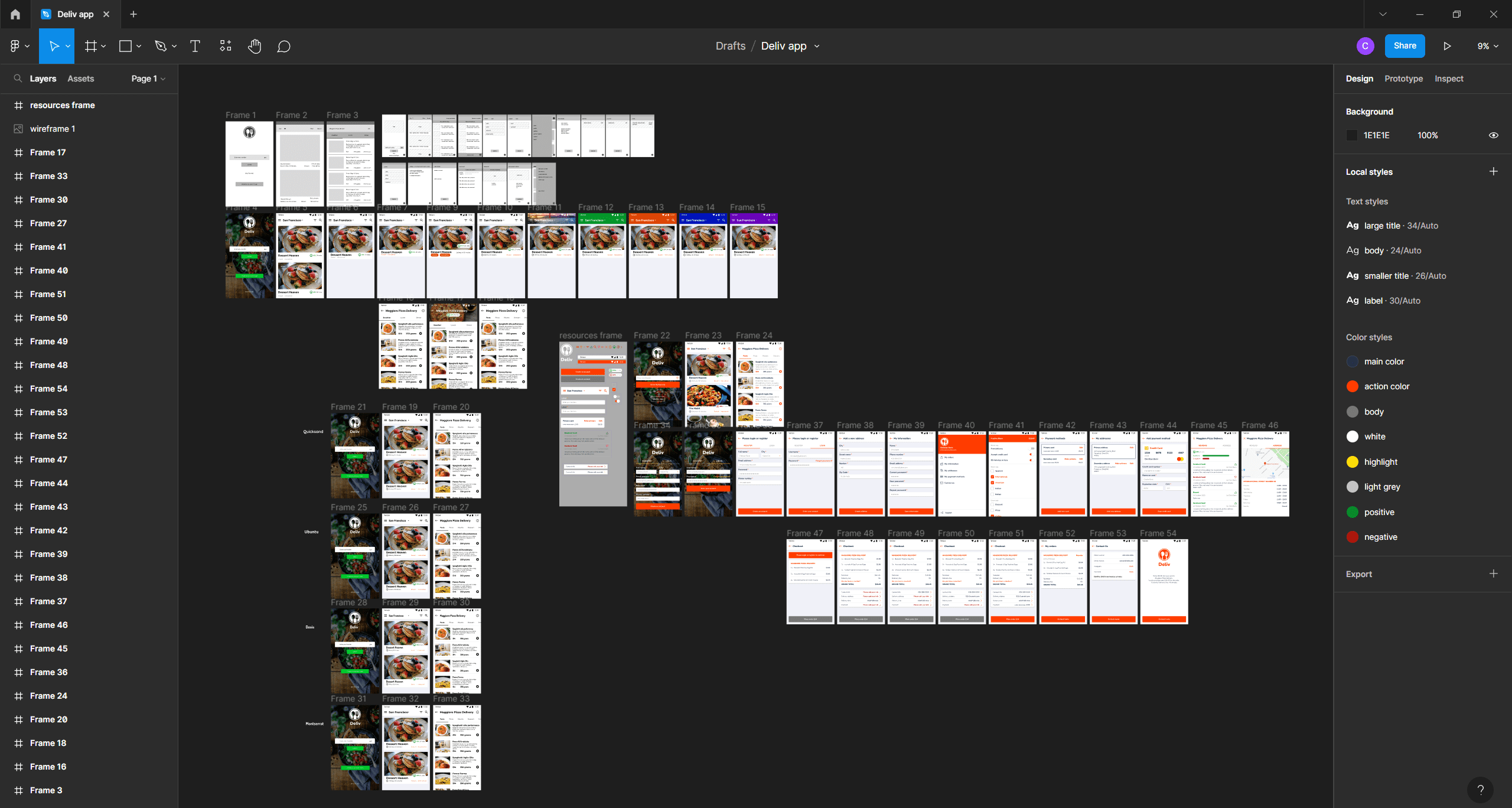
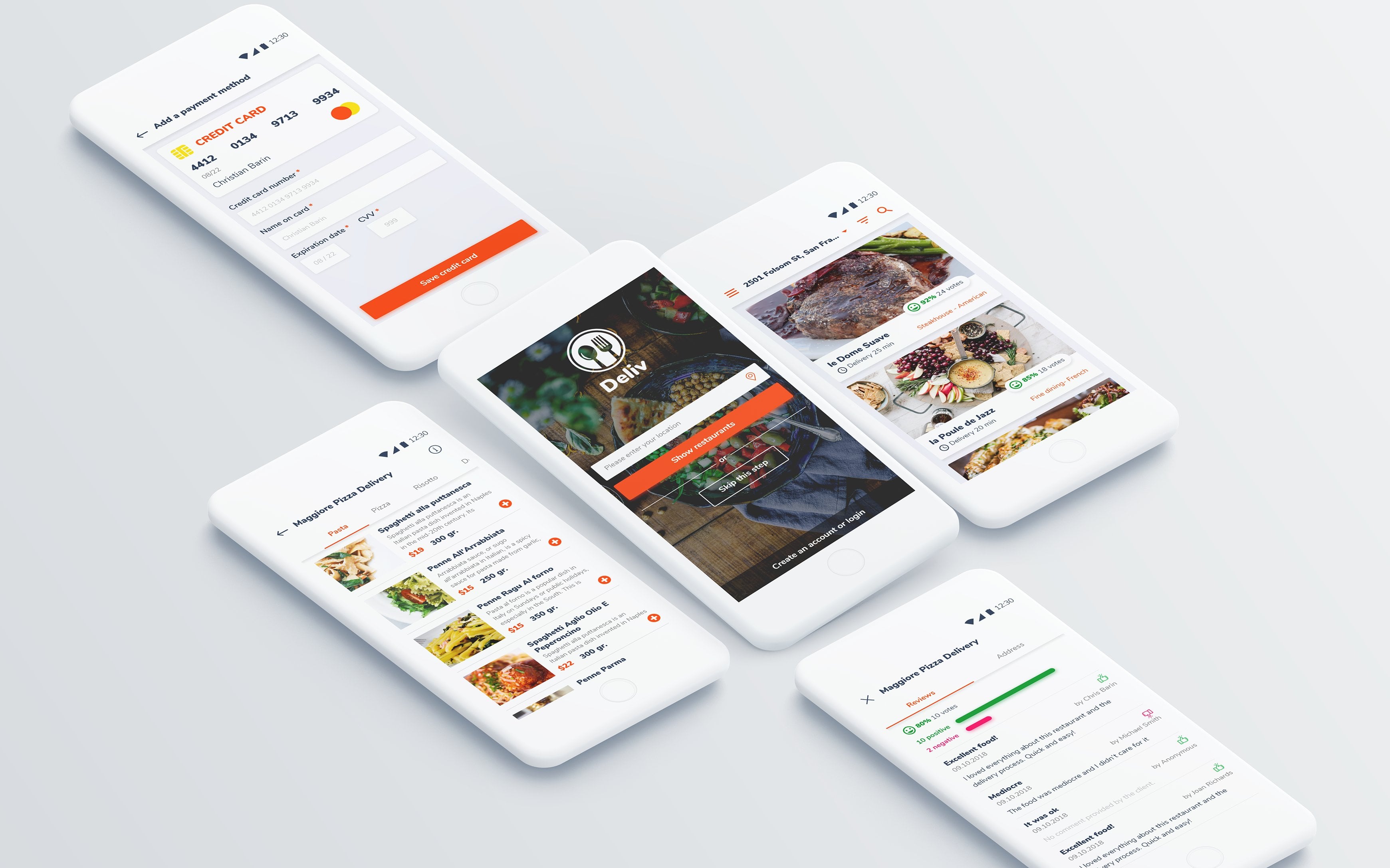
8. Introduction to the project: Welcome back. In the
upcoming section, we're going to design
a food delivery app is going to be
quite the project. The goal is to get familiar
with all the components of a mobile app and create
something that looks great. Please watch each video twice. Once to understand
what's going on. Don't work along, just watch
and see what's happening. And then a second time. Pause as often as you
need to work along. Okay, now, as we're going
through each screen, I'm gonna give you my insight. I'm gonna give you my
thought process into how I make design
decisions quickly. Having said that, you
have to be aware that certain principles
that apply here, they require an
in-depth analysis. We're going to talk about all of those things a bit later on. Right now, I want you
to work as much as possible and leave most
of the theory for later. Now, you may ask Chris other things
that we need to learn. Why are we jumping in into a full-fledged app design
project, a real-world project. And that's because
nothing beats experience. So that's why with jumping
stray then moving on, I also want you to
design standard layouts because this is what
you're going to encounter in your
everyday projects. Sure. There are tons of super creative
out-of-the-box designs on the hands with dribble. But fact is, most of
your clients don't have a fortunate to spend on app
development, on codons. Thus, we're going
to create something that's actually a
real-world project. Something that's based
on my experience of over five years of
working with codelabs, with developers
around the clock. That means applying
best practices and using fairly
standard layouts, you have to be aware that every design decision
that you make can increase or decrease development
costs, coding costs. So while something
may look impressive, There's a very good chance that the developer has the work extra hard to make that happen and the client
has to pay a lot more. I've been down that
road a lot of times. But here's the thing.
I've also been in the client's seat
where I had to approve additional payments
because the final version requires more work than
we initially anticipated. Now, again, I'm going to
bring all this knowledge into this course and I'm
going to teach you how to choose your
battles carefully, designing something awesome that doesn't break the bank. For now. I want you to stay
curious and do your best to watch the entire
quotes until the end. Before we go, I have to ask
you for your understanding regarding certain parts
that will be sped up. Any decent app design project is going to take
days, if not weeks. I'm trying to condense
it down to its essence, trim it down so you can get a great learning experience
in the metal of hours. So that means I have to
edit certain things out. Repetitive actions
that you've seen me do 100 times or things like how to Google
something, you know, finding an icon set,
finding a font, things of that nature, things that are time-consuming, but there's nothing
special about them. If you do have any
questions, please ask away. I'm here to help. If there's anything
you don't understand, please just post a message and I'll answer it
as fast as I can. Okay, let's have some fun with
our first serious project. Please be patient with yourself
in case you struggle at times and stick with
me until the end. Let's go for it at.
9. Exploring the brief: Welcome back. This is our first
serious app project. This is going to be
a food delivery app. And we're going to use this
chance to go through a lot of different screens
and scenarios. This project has a brief that's about
an eight out of ten. Not amazing, but it's certainly not a few
sketches on a napkin. It's twofold as it should be. On one part, we
have the wireframe, which shows us the
most important screens and what content
needs to be included. On the other side, we have a document that describes
what's going on inside the app just in case it's not clear from
the wireframe. Ideally, you should always have both of these when
starting a new project. It's not your job to
come up with them. But if the client
does want that, you should increase your quote
in a very significant way, basically charged
more, I would say at least at the very
minimum, another $1,000. Okay. Attached to the course, you can find the link
for the wireframe, the logo, and the documentation. Now, this business is called
the Live short for delivery, and it's basically an
app that delivers food. And a few cities, we need to list all the
restaurants that offer takeout, but only those who have
their own delivery staff. Okay, good to know.
Now, the company the left doesn't handle
the actual delivery. Now, this area of the
brief is very common. It's the essence of the project and it's
a good place to start as you get a general idea about what you're
about to design. The next phase is critical,
the target audience. And this is going to determine the look and feel of the app. And it's nice to have at
least some inflammation. Now, this app is
for people who are active with disposable income. Both genders, probably single, not married, office job,
unlikely, upper management. We have to paying points, the quality of the food
and the delivery time. Now, these are useful
points because these can help us determine
the look of the app. How we should style LEP. Context is everything. Now I would like to have
a few more details, but like I said, this is
an eight out-of-band. Another thing you should find in these briefs is the app's value. Now we have the
main pain points, so we know what
needs to be fixed, but how does the app do that? How does the app
make people happy? Here, the app has
a few strengths. It's the views,
great delivery time, and real photos of the products. Okay, pretty good, reasonable. In the upcoming
paragraphs with getting key details that will shape
the entire flow of the app. Now, I'm going to skip
through this part, but please read
everything yourself after this lecture
from what I see, I think the user can skip the registration process and
same thing for the address, he can just skip it. Now, typically, registration
is the very first step. But here the client, aka the business owner, has made the clever choice. He doesn't want the
user to get stuck with filling forms without seeing
the value of the app. So that's why we're
giving the user the possibility of
interacting with the app, of actually using good. And that he's convinced he can sign up during the
checkout process. This is a great sign. This shows you that
the owner or the project manager or
the business owner, whoever is running the show, has thought things to do. We have to analyze this
stuff because this tells us our position
in the project. Should we share our own ideas? Do we allow ourselves to be vocal and challenge
certain decisions? Well, it depends on
how well-thought out the project
is and of course, your role, your
job in this case, this is a great sign. Things are under control and we don't need to second
guess the brief. Sometimes clients have no idea. This is not one of those cases. Moving along in case the user is logged in and the location isn't filled in with
just gonna show the city with the most
amount of restaurants. But he can use a drop-down
to quickly change that. Again, sounds good,
quite reasonable. Now, in case the
user is registered, the drop-down will
obviously show his city. Now, the rating system
is percentage-based, 1-100% instead of the
five-star rating, which for us is a good place
to add some personality. We see that our four
categories of ratings. So we'll have to design something that's a bit
creative and interesting. Now, let's pause again. This is another great sign
that things have been analyzed in great detail by
the brains of the operation. Rating systems use the
standard five-star approach, but some of the
biggest companies on the planet have switched
to a like dislike system. This includes YouTube, Netflix, and in some parts of
the world, Facebook. Now, the listing is the fundamental screen
inside the app. So we need a clear understanding
of what needs to be included and what can be
displayed in another place. Now, here we see we need
the photo, a title, rating, cuisine type,
food type delivery time. Without this inflammation,
we can move on. The thing is we could
include e.g. a. Minimum order, right? Or the delivery charge. We could include the
distance in miles or kilometers from the
restaurant to the user. All of this would completely change the structure
of the design. So again, I'm quite happy
that we have all of this information
and we know what needs to be included
and what's optional. We have a few other bits
and pieces here and there, but let's move on
to the wireframes. We have to be aware
that the number of screens shown here isn't
actually accurate. The wireframe typically shows the most important screens and we have to fill in the blanks by using the documentation, e.g. pop-ups, intermediate
screens and whatnot. Obviously, those are not
included in most situations. You're not going to find
them if you do have them. Great news, but in this case, I don't think we have them. Now back to it. Things are pretty well laid out. So I think we're going to
have a good time with it. Simplified of names. These are numbered,
which is awesome. So we might talk about
the location screen, e.g. but it might be quicker to
just call it screen one. If you want to
comment on something, please include the number. That's the best approach. Now back to it. I see we need to include both the left and
the right menu, which is not something
google recommends. But I think this is
needed because of those filters that
are going to help the user find a
specific restaurant. Finally, we have to be careful about the different
flows of the app. We have multiple avenues. A, when the user is
registered, that's important. Be when he doesn't have an account and he
skips the location, so we don't have an address and see when he's not registered, but he provides an address. This won't affect us too much in the initial
design stages, but in the prototyping phase, we're going to have to sort
out all of these scenarios. We're going to have to make
the app and directive. So it's gonna be quite tricky, but we'll see at that point in the prototyping
phase, All in all, we can start the design process by checking out the
competition in this niche, we have to look for inspiration. We have to see what
other people are doing. So let's continue
in the next clip.
10. Analyze the app’s competitors – Part 1: Welcome back. At this point, the brief
shouldn't be a mystery. If you haven't
gone to the width, please pause the
video and analyze it that only the next
step is to check out the app's competition
to see what's going on in this
particular sector. Here we have a niche that's
fairly well-established, food delivery that are more than enough apps
that we can analyze. Another, do one better understand the
project's requirements and to get some inspiration
regarding the overall style. Please note that these
apps are location-based. What I'm about to show you may not be available
in your country, but you do have
several screenshots from each app attached
to the course. The line-up includes the
liver though, Food Panda, the Live, which is an app
that has the exact same name, but it's purely coincidental. Takeaway and then hit Menu. Now, all labs are
constantly updated, so the live versions
might be different. Actually, I'm quite
sure that different. Still, the screenshots will
be the reference point. Okay, let's start out with the live so we can get
it out of the way. Now, the initial
screen is a big mess. We have bank yellow, navy blue, and curiously the main
button is yellow as well. The background seems to
be a picture of the city, but it's blocked by
this solid rectangle, which makes no sense. When you search, even
though you don't understand my
language, Romanian, you might see that this
text is quite low quality, very pixelated, and
somewhat distorted. And that's because these have
not actually texts layers, officially called
strings by codons. Instead, this is an image
that's being stretched out. That's bad practice and it's
not good Looking at all. Okay, now let's switch
to the listing page. Here we immediately see the
little attention to detail. There's no empty
space on either side. So if we drag out some lines, you can see the alignment
is out of whack. The topography is modest, the fonts are boring. There's no diversity
in this region. There's no particular the hierarchy that's easily spotted. Overall of four out of ten. And I'm being generous. When we go inside
the restaurant, we can see the tabs have
these vertical dividers, which I've not often
seen in Android apps. On top of that, there's
no elevation anywhere. You can spot any drop
shadow whatsoever. Now, that's not
exactly a bad thing, but this have falls short
in the design department. Worse than that,
the swipe gesture that's often used to
quickly change dabs. Well, it doesn't actually work. That's quite a shock. Instead, you have to
manually tap on these items, or we could use these arrows, which are from Windows XP times. Now, I honestly have no idea what these
guys were thinking. This is a prime example of
an app that was made by developers and business people know designers with involved, I promise you that
in the top right, care to guess what
that icon does. Is it additional information
about the restaurant, maybe a share function,
Add to Favorites? And the answer is, I don't know. When I tap it, nothing happens. It doesn't have a downstate, so I'm not sure if
it actually works. But moving on, the checkout
is also laughable. Everything is randomly
thrown together. I think they wanted to
center these texts layers, but everything is off. Try as you might, you won't find many
imaginary lines. Nothing is aligned. Oh, and this deliver the
icon, takes the cake. I changed my mind. It's a two out of
ten, another four. Okay. Let's move on to take away.com, which is a company that's buying delivery apps left and right, does nothing blocking us. Like it was in the lives case where you couldn't see anything unless you put in an address
with an S for the location, for the GPS permission. So the app basically
wants our location and immediately a list of
restaurants is going to pop up. Now, I personally
ordered a lot of foods, so I'm actually quite a
heavy user of these apps. Takeaway is not one of them. I don't like it and
let me tell you why. Everything is confusing. Nothing is where I would
expect that to be. Sure. The restaurant
listing is lovely. Nice, clean logos on the left. Clear the bold
titles on the right. Interesting icons underneath. But that's where the
happy train stops. Can you tell me which of these two restaurants
has a higher rating? Because if you've ever
used booking.com, I think you know, there's a
huge difference in quality. Between an 8.0 hotel
and an 8.9 hotel. Or how about IMDB? If you like movies, 6.1 film versus a
6.91, night and day. What I'm trying to say is 4.5 stars for two restaurants
doesn't tell me anything. I need more information in
order to make a decision. Keep in mind, I have over
50 restaurants in my area. So this star system, without any other information, is not good enough. But let's go back to the
design for the moment. I loved the orange. It really shines through and
it has a nice zinc to add. It's fresh. It's grasp the icons of
again, nice and lovely. And we have an
interesting switch that changes the
way the app works, either in the Liberty
mode or pickup. That's well-executed. The fonts used aren't
out of this world. And the same can be
said about their icons, decent, but not great. Inside the restaurant,
everything is well spaced out. But curiously, they went for this weird deal shade for
the call to action color. This is quite odd. Now, there's a tab system that allows you to swipe between categories as expected
by any mobile user. Some dishes have descriptions,
but others don't. Regarding the
photos of the dish. Same story. Now, the checkout
is really lackluster. Lots of dividers, lots of gray, little attention to detail
regarding typography. But then let's pause
the design side. This would be a 6/7
out of ten in my book, the problem, like I said at the beginning, is
the functionality. Just have a look at
the card system. It's somewhere in the top right, but not in the action bar. No, it's actually an FAB
of floating action button, so it just hovers about. That's quite unusual. Deb system has fonts
that are way too big, and this makes it
hard for me to know what's available
in the restaurant. The left menu is actually
on the right side. It's also completely custom. Now, I'm not saying
that's a bad thing, but it's another thing that
I have to get used to. These four icons above
the restaurant listing. Again, quite odd. This is one app that hasn't even considered the official
guidelines of material design. They didn't care at all. And it feels like it overall, the app in my hands,
it feels clunky. It's hard to put into words, but it just doesn't feel right. Overall, this is a
much better AB design than the live the previous one. But I don't think I would rate it more than
a five out of ten, maybe six if I'm super generous. Now, let's go on to help menu, which has a totally
different approach. First, I loved the
onboarding process, meaning the first
few initial screens that tell you about the app. Nice, clean design. And once you enter the app, it shows me a list
of restaurants based on the address
that I put in. Now, the listing is
very easy on the eye. But there's a problem
regarding functionality. You don't have any way to
sort these restaurants. You have to enter each
one and see what's what. And this is the vibe
throughout the app. You have to tap a lot to
get to the finish line. A lot of clicks in short, where some apps wants
you to arrive at the checkout phase and
four tabs or less. Here that number
is easily doubled. You have to put
in a lot of work. When you tap an entry, this is what you get. Again, lovely design. This is an eight and my book
from a design point of view. Here's the restaurant's menu. We have a two column approach, but I'm not sure if this
is the best choice. Should we get to see more items? But the luck isn't all that
great because of this height. It feels too small. It seems unnatural. It feels like something is off. And the fonts, they've
not ready there. It all seems thrown together. Now when dishes have photos, it's a bit of experience, but overall, this
is a mixed bag. The floating action button
is confusing as well. I'm not too sure what's
up with this button. After some investigating,
I do believe that this allows me to do a
group by whatever that is. Basically, it's something about ordering with your friends. But why place it so
front-and-center? Anyway, the background
is a bit too strong, the gray a bit too
dark for my taste. It stands out too much. The dapp system looks
nice enough and the icons from the ActionBar
are interesting as well. It's difficult rated in
some parts it's a seven, maybe even an aid. While in other bonds, is it the other four foot? Now, let's give it a 6.5
and move on to the liver. But we're gonna do
that in the next clip. Thank you.
11. Analyze the app’s competitors – Part 2: Welcome back. We're now at the liver. Do, let's analyze it and see if this is a source
of inspiration. The first impression is great. The topography is spot on, it has character, it adds
value to the design. It's easy to read. The next thing that I notice is the horizontal
card system that's used to showcase feature
the restaurants. The shadow is pretty strong, considering the background
seems to be pure white, but I do like it. Up top. We have some type of ad, but notice how nicely it stands on top of that diagonal line. I also appreciate
how they've used that small icon in
the action bar area. Sure, it's wasted space, but it shows they care. It's all about
branding and making sure that you know that
you're in their app. You're then the liver though. As for the listing itself, I love how the delivery time
is carved into the photo. I appreciate the
hierarchy in the listing. I think that's very
well-executed. We have the title in bold, various tags in a smaller
washed-out color. The delivery time is
set aside and has been given quite a lot of real estate because
of its importance. And finally, we have the
rating system and percentages. But what I truly love is this splash of color
to do the emoji. Now, another way of translating the hierarchy principle
inside the listing is this. You know, where the luck, you can easily scan various areas and know what's
important and what's not. That's the hierarchy principle. The content is easily distinguished and this makes
for a great experience. It feels effortless. Now, if we switch
back to the live, we can see that everything is basically bunched up together. This feels crowded
and basically bland, boring without any taste, even though it features just about the same
amount of elements. Now, going back to
the liver, though, this app doesn't seem to follow the material
design guidelines. At the top, there's
no tab system, nor is this irregular
the action bar. Instead we get to dropdowns, which are very uncommon. In the most recent update. They got rid of them and I'm
happy they made that change. The size of the cards
is quite generous. Well that improves the
impact of the app. You can only fit about to
restaurants inside one screen. And the second one
is a bit cut off. Now, for the small city, this makes sense, right? But for the larger ones
with loads of restaurants, it's gonna be quite difficult. Basically after the
six or seven listings, you're just gonna get bored. Now, the photos make
a big impression and it's definitely the best
looking gap out of the bunch. But I would love to see a
bit of use of this space. Will see what's possible
when we start designing. We also see a bottom bar, which includes the
search feature. Now, okay, pretty good. What's interesting
is the color scheme, white and Thiel, nothing else. The content is left the shine, probably because the pictures
are quite heavy in detail. That's quite smart. And probably we're gonna do
the same in our own design. Even more so considering
the fact that most restaurants don't have
great photos of the food. In most cases, the
photos are dark, the plates are busy and the colors aren't
usually flattering. Again, you can see
the live for that. The difference is night and day. Back to the initial screen, we have an extended
floating action button that helps you fill there. This is well-executed,
but once you tap it, you're going to see
another sign that takes this app to
a nine out of ten, if not more, superb icons that are in tune
with the abs vibe. We get beautiful icons that are in tune with
the apps of vibe. Nice images underneath with
great contrast for text. Clear call-to-action button. There's little to say
on the negative side. Going inside the listing, we see the restaurants
photo at the top and all the menu items are
in the scrollable list. No tab system to speak of. The fonts used are
easy on the eye, then you can easily
tell what's what. I don't like. The fact that there are no
thumbnails for the dishes, especially since there's
enough room on the left side. On the other hand, it
does make it quite airy. It does feel like it has
enough reading room. Okay, now let's add something to our cart and see how that goes. Okay, we get a sticky bar at the bottom that shows
us the current basket, and it's separated by
a shadow at the top. It's curious the button
has a shadow as well. I'm not sure that
I agree with that. Anyway, the checkout is
another strong point. Everything is easy to follow and they've used these
cards intelligently, a bit heavy handed
with that stroke, but still good work. Overall, the app
looks lovely and that's because its elements
are the well spaced out. Their fonts are nice
and interesting and the content
is left to shine. A strong nine out of ten. Let's move on to Food Panda to see another bulge on
the same subject. Here, I immediately recognize
the same one colored style, and this is used to draw
the user's attention. If you can tap it, then it's pink slash red. I do like this
style because this guides the user without
making him think. The first impression is that this is the best designed
app out of the lot, 9.5 out of ten. The main difference
between it and the level is the atmosphere. That's a bit friendlier, while this is a bit
more professional, let's focus on the
listing though. There's more going on
underneath the photo. So this does look a bit busier than the liver to
the fonts used are, okay, but they lacked that special node
that sets them apart. Let's quickly go
back to the liver do and check out
the delivery time. Notice how these numbers stand
out, especially the ones. Ideally, that's the type of personality I'm looking
for in my typefaces. Food Panda also has a
floating action button, probably to help you check out. It's clear enough. The ActionBar is a staple
of how it should be done. It's well-defined, it has proper hierarchy,
well spaced out. If there's one
thing that I would add is the fact that
I wouldn't have liked the search icon to be left aligned with
the hamburger menu. That would have made it perfect. Still, overall, this is one of the best ones I've seen so far. Let's move on to the
restaurants listing page. Here we get tabs
that have placed underneath the
restaurants main photo. This looks nice. It's functional, but I'm not in love with the star system as
it's shown here. I think it gets lost. As for the actual items, that spec ratio is a bit odd. The photos are way too tall and that's gonna be a problem
for the most restaurants. When that other
antennae thumbnails. It's another thing
though one could argue that this is
to plane two basic. We're going to have to
find a good solution in our design when it
comes down to it, neither of these
options work for me. Deliver that was simply abandon the idea of showing
a photo of the dish. But in other Wireframe, we do see it as a
requirement. Overall. This is tied or maybe slightly
behind the liver though. Let's call it the
nine, maybe an 8.5. Now, the thing is I
could easily carry on, but I want you to explore
some of these apps yourself or find similar ones. The goal is to
understand how they tried to solve various issues. I want you to tell me what you like and what you
don't like about them. To sum this up,
the conclusions of this lecture are the following. We should use one
single beautiful color in our app and let
the content shine. We need to be careful
about the aspect ratio of the photos in the
restaurant listing. We need a great
looking font that add something to the design,
something with personality. Finally, we should do
our best to include at least two
complete restaurants in the initial listing screen. As a tip, the more apps you see, the more the inflammation
you're going to get. This process should
take you at least 2 h. But for time considerations, I had to cut it short. Please. Don't be afraid to be
ruthless in your comments. Your goal is to pick apart every component and see if it's something
you should avoid. Or on the contrary, maybe use it as inspiration. Take a lot of
screenshots and put them side-by-side so you can
easily go back and forth. Okay, Let's continue.
12. Create the layout for the first screen: Welcome back. Did you explore the
competition for yourself? Hopefully you've gone through several labs on your own phone, or at least you've looked at the screenshots I attached
to the previous lecture. Now, it's time to
start Figma and create a new project
by clicking here, we're going to take this low, but if you still
find it difficult, I do have a more beginner
friendly course on Figma. If you can't keep up on
your second viewing, it might be best to
watch that course. Okay, let's click
here where it says Untitled and rename
it to add delivery. Now, get the Frame Tool, hotkey f, so we can set
up the first screen. Now, the settings are based
on material design to entry, to keep things super simple, go with 720 by 12, 80, whether these values from, well, basically I'm
doubling the values from the old Samsung Galaxy S Then. Now why doublet? So it will look better
when you review it, when you send it
to your customer, your client, the
other code there. So you can see everything nice and crisp without
getting gold glasses. So that's the only reason
why we're doubling get. It really doesn't matter for
the coder or for the client. It's only a visual thing, right? The coding process is
not affected in any way. More on that later on, but trust me, it doesn't
affect anything. It's just a visual
preference for 2020, 320-20-4720 by 12
80 is totally fine. Next, please find a
wider frame that's attached to the course
and drag it in, import that control Shift K
or whatever you wanna do. Place it to the side
of the first screen. Ideally, you should always have this shown on the
second display, but I'm going to keep it here during our step-by-step process. Okay, So what's the goal? Well, we want to
set up our layout, the foundation of our
project with no details. I repeat no details. We want rectangles
and texts layers in their simplest form after
the first few screens, then we'll start to experiment
with various colors, fonts, and various details. So let's start off
with the first one where we're going to
need the apps logo. And of course, it's
attached to the Gore's. The icon is not
styled in any way, nor does it have any texts. So this is going
to help us keep it in line with the
rest of the design. So that's a good thing. I'm going to center
it and place it in no particular position at
the top of the screen. Next, we're going to add the location field
to do a rectangle. Hot key, click and drag. When we're looking for
the specific sizes, use the properties panel
on the right side. For this one, let's say 600 for the width,
something like that. That's the W here. And for the height, let's go with 80 pixels, something like that,
rough estimates. So this is not the
final size because that comes in the
styling stage later on. Okay, I'll always going
to center everything in the frame to the align
horizontal centers command. This is it right here. Please get used to it. And these other ones right here, these guys are your
new best friends. We're going to use
them a lot just about every single time we do
something inside the frame. So remember to use them. Make the rectangle
a very light gray by using the fill area
in the properties panel. We want great contrast
for the text layer. If you're using a laptop
or a low-resolution, remember that this
panel is scrollable. Okay, get the type
tool hot key D, and write enter your location. So that's enter your location. Now could we use more advanced features
that figma has to offer? Sure, totally. But again, this is not the right stage
for those fancy things. We're going to keep it
basic font, the size. Let's set it to 20 and
center it inside this field. Basically the idea is that we're really making
the wireframe, but we can actually
edit all those fields. On the right side. Let's add
another text that says GPS. Use Control D to
create a duplicate. Place it on the right side. Now, why not an icon? Because we don't want
to break this flow. An icon is a small
design detail. And that's not what we're
working on right now. Okay, we need a submit button, so let's type in
just that submit. Let's use Shift a to
add an auto layout this time around at least one
fancy feature, right? I'm going to enable
any gray fill. Now, you might ask, could we have used the frame for the location field
on auto layout? Yes, of course. But there's a bit
more to unpack there. I would rather keep it as a
standard rectangle so we can focus on the overall thing
for the size of the button. Let's change this field to 90. This will make it much wider. And for the height 20, when you're done with that, centered it inside the screen. I can see that skip
this step is next, but we can have a simple
text layer for that. Remember to hit Escape to
finish editing your text layer, this item won't get a button, it won't get a rectangle
because we have one laptop plus we need another one
for Creighton account. Go above the submit button, hold Alt and drag out the copy. One thing though,
please look for this symbol on your cursor, not this one. This won't help. So this is what
you're looking for. Now, drag it down
and change the text to create an account
slash login. So that's creating an
account slash login. And as usual, you're
going to have to select the frame and center
it, not the texts. By the way, the text is part of the frame and it's
already centered. No. Instead you want this frame centered inside the big frame, which I'll typically
call a screen. Now, if you don't
get it 100 per cent, no worries, that's fine. The thing is quite simple. If you control click the layer, you won't be able to use
these alignment tools. So that's a clear sign that
you didn't select the frame. But now when I do this, they are lit up.
We can use them. Awesome. So overall, this is our
first screen handled. Let's continue after
a quick break.
13. Set up the foundation for the home screen: Welcome back. You can call the second screen, the home screen,
because it's what you typically get when
you open the app, assuming your log
then zoom out by holding Control and
using your mouse scroll, then make room and duplicate
this entire screen. If it has room, Figma will automatically
place it on the right side when you
use control the awesome. Now delete everything inside that except the location field. This is a good chance to
remember our proportions. So the status bar, according to Google Material
Design has to be 720 by 48. So get the rectangle
tool and add it in. Again, 720 is the
standard width doubled, and 48 comes from
the official guide. It's 24 dB, but again, we've doubled it, so
that's where we have what? We're going to leave it, blank, rectangle any random color, and position it
correctly at the top. For the location field, we can use this one to
create the action bar, drag it up along with
those texts layers, and we're going to
resize it to 720, of course, by 112. So that's 112 pixels. Please make sure you change
the color if needed. We want to see them as
two separate things. Even though at the end we might
have them the same color, we do want them as two
separate ones at this point. Okay, now let's handle
the text layers. So we're going to need the
city filter and search. So city filter and search. The first one is
for the left side, while the other two
for the right side. This is one situation
where you are, the speed is quite important. See, there's nothing too
difficult going on here, but it does take time. So that's why you
have to practice and take these steps seriously. You can't do advanced
stuff if you don't master the basics
like these ones here. For the drop-down, let's
use the polygon tool. One of the few cases where you can actually put it to work, hold shift and start dragging. Now, that's going to give you a perfect rectangle
holding down Shift. Then move your cursor to
the side to rotate it. Basically we want
the point downwards. I don't have any
particular size in mind, just fairly small. Now k, Looking good. Now it gets interesting. Remember we want to display
as many restaurants as possible without squeezing and cluttering all the elements. So let's start with a rectangle
that's 600 by 400 pixels. As this will cover the most
of the screen's width. And we'll also have a decent
aspect ratio to begin with. Now, the actual size is
going to be set up later. Okay, place it right
underneath the action bar. For the content. We're going to use fake one, but not Lorem Ipsum. So that's Latin text. Lorem ipsum is just
filler Latin texts. So I'm going to come
up with something on my own for the title, let's go with whatever
dessert have on next to it. Let's play something like this. Delivery time, whatever, 30 min. Right? As for the category, the brief says it's twofold. So it's one for the food type and then another one
for the cuisine type. I'm not sure if that
makes sense for me, but it is what it is. So the first one
should be Desert and the second one
international, I guess. Again, it really doesn't matter. We just want to lay
out some information. So we have something to
work with for the rating. Let's go with whatever, 92 per cent out of 24 votes. So this is going to cover all the elements according
to the wireframe and brief. So please select
everything like so and see if we can fit at least two of them
in one single screen. Remember, that's an
important requirement. And indeed in this case we can
fit two whole restaurants, though this is just
a rough draft. Nothing about it,
There's precise. So we have to take it
with a grain of salt. Now, let's sum it up. So far we've recreated
the first two screens from the wireframe with the purpose of having
something to work with. In the next few lectures, we've talked about
being aware of the impact of our decisions. Specifically about
how the entire app is gonna look like when we're going to have bins of screens with a strong
out of the gate. I'm gonna see you in a second.
14. Sketch out the restaurant details screen: Welcome back. We need to move on to the restaurants detail
screen labeled number three, where all the dishes are listed. So without any further
ado, let's get to work. So copy screened them, but do. And let's start with a top-to-bottom
approach by replacing the title with any
random restaurant name. Let's call it majorly
pizza delivery. That sounds Italian
enough, right? Majority of pizza delivery, the drop-down and Filter
have to be removed, but we'll keep the last
one and rename it. This should say inflammation. This is gonna be
an icon as well, but that's more
at a later stage. When you click it, you'll gonna get the restaurants address screen 15 and the
views that screen 16. So that's what's
going to happen when you click on inflammation. As I said, we don't
need an icon right now because we're still
in the early stages. Okay, if we take a
look at the wireframe, we can see we have some tabs, but it's unclear whether these are the fixed
or of scrollable. We're going to start
with a fixed version and I'm going to use
something like breakfast, lunch, and dinner
as my main items. Now, this means that tab design, so 240 wide rectangle is going to be needed for the
active item because again, that's two for t times 3720. Okay, let's copy
the action bar and drop it size to 96 pixels. Of course, please change
its color so we can see what's going on now back to
the size for the moment. So 96 is big enough from
a usability standpoint, but small enough so it doesn't
eat up way too much space. This is also the
recommended value and the official guide, 48 dB. Let's remove the listings underneath because
we don't need them. We'll create the first
text layer after we've set our rectangle that shows
us the active menu item. So grab the rectangle tool, click an input to
40 by four pixels. Use the properties
panel for that. So this can be left blank
for now, totally black, but make sure you place it
correctly at the bottom edge of the tabs background on
the left side, of course. Now, because this
is a fixed tab, we're going to have to have
in the visual texts layers. So not a single one with three, instead the individual ones, and the first one is
going to be breakfast. It should be written
in the default font. It really doesn't
matter how it looks. But if needed, you can change up the color so you can
see what's going on. Now we can quickly
align it by selecting it alongside this
layer underneath that. So that handles the
horizontal alignment. Just like that. The vertical one de-select and then grab the
text layer with the main background and then use the vertical alignment
command, just like that. So this is going to give
us a pixel perfect result, even if you can't really see it. Now the thing is, I never offset the text layer because of this fourth pixel
layer right here, that would mess up
things quite a lot, so please never do it. Okay, Now, the other items are going to be a piece of cake, duplicate with Alt and Shift, and then relabel as lunch center of it inside the screen with
align horizontal centers. Awesome. Finally, for dinner, we
have to repeat the process, but here's what we're gonna do. Now we're going to
temporarily move the active tab to the right. We're going to align it like so. So this is where the frame
really comes in handy. We can quickly move this
guy without any problems, without having to
select anything else. Okay, now we can
obviously move it and then align that
silky smooth. So far. Obviously remember
to work along on your second viewing for the
best learning experience. There's a lot to do. And if we don't
maintain a decent base, this is going to be gauges. Okay, put it back on the left side and
then we can continue. Let's have a look at the
wireframe yet again. Keep in mind that this
is not the end-all, be-all of our design. We can experiment with various
logs if we have any ideas. But for now we're
going to keep it simple on the first try. In this specific screen, that means a one card layout. If we're not happy with it, we can try a different approach. Though. I really didn't like the two column design that we
saw in the previous video. Now we have to create
an image folder. Let's start with that. An image holder or a
thumbnail for each item. I think this needs to be
a somewhat squared shape, probably a bit on the wide side. So let's start with a regular
rectangle with the size of, let's say 225 by 1AD. Like I said, it's not squared, but it's not too
tall because we saw, it doesn't look all that great. Place it 30 pixels
from the dabs. The main thing with this
image is the aspect ratio. Don't use something to
extreme that forces restaurants to give you a super wide or
super tall photos. That's gonna be trouble. Remember, the liver though, and food panda didn't have
a good system in place. Wait for the title
and description. I have something
prepared in a notepad. The title can be an airbag. Well, for now, again, it really doesn't matter, but using something authentic
makes a bit more sense. The description should be
a paragraph text layer. So click and drag. Because we might want to
change up the content quickly. The lines should be enough though we might
reuse it to only do. We'll see if you want
to use dummy text. I recommend lipson.com. This is the best place for it. This is fake Latin texts that
just fills up this area. Okay. Going back to the listing, we need to have a price, let's say 14 bucks. This is gonna be the third
line in this listing. So we have title
description and then price. Next to the price, let's put the weight
of the product, which is mentioned in the brief. So let's write the 150 g, okay, and right next to it, we're going to need
an Add to Cart texts. Though probably this is gonna
be a button, maybe an icon. Okay, Give me a second
to sort everything out. I like to align
everything precisely, even though it's not absolutely
need that at this point. Ideally we want the
clear imaginary path. What is the user
gonna do is gonna look at the thumbnail
than the price, then the title, than
the product weight, then he's going to
click on Add to Cart. Probably something
along those lines. So we're going to
try to make that happen to the size and color. Even though things are pretty
much bunched them together. Let's wrap things
up with a divider. We can use the line
tool hotkey L. The width needs to be 656. You're going to hear
this value quite a lot. And I'm going to explain why that's the case a bit later on. The height to pixels. This has to be placed 30 pixels from the photo,
from the thumbnail. Ok, this is done. So let's group it and we're going to make
a lot of copies. The idea is to populate
the entire screen with clones to see
where we're at. We get a better
sense of things with just looking to see
how many we can fit. We ideally want it by-products, but with getting
about four and a bit, now, I can live with that. Plus we might be able to gain more space when we start
refining the layout. In the meantime, let's
have a quick break. Thank you.
15. Design concepts for the location screen (1): Welcome back. It's time to get cracking without food
delivery app design, we have a solid couple of screens that are waiting
for some attention. So let's start with
the location screen labeled number one
in the wireframe. And the first idea I want to try out as a full background image, which is a popular
choice in this niche. To find great photos, totally free ones,
use unsplash.com. If the project has
a decent budget, you can also use Adobe Stock, which is absolutely fantastic. Let's stick with the
free one though. Here. We're looking for the
food and we're going to download everything that
sparks or interests. Ideally, a top view image is
probably going to look best, but I'm going to keep
an open mind about it. Once I see something
that's interesting, I'm going to hit the
Download button. So the process is simple. Choose several photos and
save them on your computer. I already have some selected, so I won't waste your time, but I promise you I chose
them exactly like I told you. I labeled them 1-6, so we can easily work along together again on your
second viewing though. Now you could drag
them into Figma, but there's gonna be huge, that's not a good way to work. So this is what I propose. Grab the rectangle tool
and add one to the frame, random size, nothing
in particular. Then from the properties panel, make it as big as the frame, 720 by 12 80, left and top align it so
it covers everything. Now, that's because it sits on top of all the other layers. The effects that go
to the Layers panel and find that it's
highlighted so that helps click drag and move it down in
the last position. We're going to use
this rectangle to place our images inside that. To do that, we're going
to use Control Shift K. But if you don't like that
hotkey, just click here. This is right here, Place Image control
will shift gate. This is going to open
up a browser window and you can look for
the downloaded photos. I always save them on my desktop so I can
quickly find them. Okay, Let's try
image numbered one. This is where the
magic starts to happen with looking for
an interesting image that provides good contrast
for the logo and all the other actions that
are available on the screen. So remember the word
shows several plates of spaghetti and a few
glasses of wine. So it's in line with
the app, with the vibe. Now, the first question is, would the logo be white
or a solid color? If we go for the white, we're going to need
to darken this image. If we're going to
make it a solid color than the background, needs to be as
simple as possible. So let's see what's what. First we're going to
do a color overlay, so to speak, for the opacity, I'm guessing 50% or so, that should give us
a decent contrast. Remember the idea is
to test things out, not to have a perfect luck. Now let's make the logo white. This is another PNG, rather it's an SVG. In short, this means we can resize it without
losing any quality. Plus we can change the fill right from the Properties panel. If this were a PNG, we couldn't do that. So that's nice. Okay, this is pretty good. Now what most beginners
don't understand is that logos don't need to hit you in the face like
a bag of bricks. Just think of what the
liver that we did, albeit on the initial
listing screen, they use the mini
version of their logo. Okay, so back to our design. A dark background makes sense, especially since the textfield is probably going to be white. That makes sense. So let's make that happen. We're going to increase
the rectangles coordinate radius to five pixels to
make it look a bit better, a bit more modern square the
coordinates are very 2005. Now for the buttons,
we're going to do the same five pixels, but we're going to
make them maybe a bright green,
something like that. Just to see how irregular
call-to-action would look like. Take your time with
it and try to cut some coordinates by sampling
colors here and there, all by using the properties
panel on several layers. The idea is to be as
fast as possible, okay, with the new colors, we have to change the
text layers to white. And please don't forget
about skip this step. It's there, but you might
not see it too well. So changes color as well, maybe its position or both. And that the bottom
of the screen, it might look a bit better. So let's try that. So the idea is, we can't judge this luck because we have to compare
it to something else. Not to mention that these
are just broad strokes with not doing fine details just
yet, just quick movements. So we're looking for
the general direction. And once we have something
in mind, after the, we see that this
looks pretty good, we can come back and
refine it to perfection. So the logo might need to
be raised a little bit, but not too much that it
touches the top edge. Grab the Type Tool and let's write the live
right under the Fed so we can get a better sense of things for the formatting. Keep the standard font, but make it bold. Let's see, 60. So fairly bag. Okay, this can work, but let's center it and let's try some other
images in this version. Remember the hotkey
is Control Shift gay. But first you might want to
select the bottom rectangle, hold control, and click it. Just like that. We can now use Control Shift key to
select the second image. Okay, let's put in the
second photo and you're going to notice that the black
overlay is gonna go away. No worries. We can still get
a sense of what's going on. We can put it back in
at the later point. So photo number two, it's a bit too empty to work. We need something rich, extravagant, and
interesting to look at. This gap in the lower-left isn't going to
fly, it's no good. So let's move on to
photo number three. Okay, let's have a look. This is what some
friends eating together. So that's a pretty good concept. But the aspect ratio
isn't all that great. So we lose quite a
lot of the photo. It's not all that
clear what's going on. It could work, but
I'm not certain. Let's try image number four. So let's see what's what. This definitely works. And I think it checks
all the right boxes. I think it's a good choice and
it immediately stands out. It has a top view. It features interesting
multicolored food. Wood table has a nice
cozy feel to it. Pretty good, pretty good. But let's not stop just yet. Let's keep going. So photo number five. Okay. This works well. Again, it's pretty good, but I think the previous
one is a tad better. The main problem here
is the food shown. It's an egg salad, where a lot of good audience
expects good-quality food. We're not talking about up with management would not
talking fine dining. So this an egg salad isn't
the right look for that. Hamburgers past the things like that I think
fit a bit better. Next, image number six. This has a rich, plentiful look, but I'm not
in love with the food itself. It's too focused on desserts. We do see some eggs
in the top side, but it seems to be leaning more towards deserts,
more towards sweets. We can keep it as a backup but option for looks best so far. So let's bring it back in. Okay, when you're ready, please add the black overlay
by hitting the plus symbol. Again, 50 per cent. I think it's quite good. We do have quite a
nice contrast here. Now, this begs the question, what else could we do here? Well, the only idea
that comes to mind is a pure white background or
maybe a subtle pattern. That's maybe an off-white color, maybe a light gray. Now, I'm not going to do
that because apps that are abundant and white,
I usually high-end. Think about the Michelin
star restaurant with a big fashion name, the likes of product. Those are the brands that
can rock a minimalist design with loads of white and
just a splash of color. In conclusion, right now
we're going to stick with this concept photo number four then the 50
per cent overlay, based on what's going to
happen in the next screens, we can come back and
refine this design. I'm going to see
you in a second.
16. Design concepts for the restaurant listing (2): Welcome back. Let's continue with the
restaurant listing screen, which is the second
thing they use it, It's gonna see this is one of the most important
screens in the app. So we do need to experiment
with different looks. From the get-go. I do want to see a version without
a background, so pure white and
one with a light gray that will provide good
contrast to our listing. I came up with those ideas by researching the competition. And these are two
very common styles. So basically white
and light gray. Let's start with actual content. I've prepared this image of bank eggs for the
restaurants cover image. I'm going to place it inside this rectangle by
using Control Shift K, but we need to
talk numbers here. The official material design
guidelines says that we need 16 dB on either side, which means 32
Pexels in our case. Let's do the math. 720, the width of the frame -64, the two on either side, that means 656 pixels. So this is our rectangles with the same as our
dividers after the EU, the sizes from the
properties panel please center at once again, that's always a very
much needed step. It will probably look better with slightly
rounded coordinates. So let's go with five pixels
for the coordinate radius. Let's hit Shift R, so we can add some guides. These aren't
absolutely necessary, but I think they might help. Now we can drag out guides from the left
side of the screen. Just like that. While we're at it, let's
delete the second entry. We don't need that. Okay, so let's talk hierarchy. We have quite a few items here. And the question is, which is the most important one? Now, I'm going to have
to say the title, but very close to it comes the rating as that's the
main value of the app. Next comes the delivery time, which is surely a
deciding factor. And finally, in fourth place, we're likely going to have the tags related
to the food type. So these can be quickly used to filter similar food
types and cuisines. The user can tap on
them on either of them, and the list would
likely reload with that particular filter
applied with talking about the importance
because that's how these items should be
styled and placed, that really impacts it. So that's hierarchy. So for the first version, and I wanted to
stress first version, I'm going to place the
title and the rating on the same line because of
what we just discussed, because of their importance. The tags can occupy
the second row. And I'd like to try to place the delivery time somewhere over the photo similar to what we
saw in food Bandar's app. Let's move this entire element 32 pixels from the
action bar as well. That's if you haven't
done so already. Now, whenever the possible
aim for symmetry, it just makes the design look
that much more polished. Clients, I've never going
to tell you, Hey, you know, the distance on
either side is that the two but from the top is 44. But trust me, the
client will know this. Okay, now for the title, Let's make it four d
pixels and in bold, the default typeface is totally fine with just looking
for the rough idea. This is not going to
be the main typeface. I can assure you, I'm
just trying things out to see if that importance
makes sense. So align the title with
the left guide and leave about 20 pixels between
it and the cover image. For the delivery time, I think I'm going to
place a black rectangle on the top left side
of the cover image. Its size? Well, something like 140 by 50 because I don't plan on keeping this text
layer as it is. It's way too wide, way too long. So this is one place where we can change things up to make
our lives a bit better. I'm going to shorten it
to 30 Min from minutes. And I might even add the clock icon next to
it at a later stage. Now we can make
sure that this is nicely positioned and sorted. We need to change things up in the layers panel so we can
have the proper order. But that's quite easy to do. Once you get used
to Figma bit more, you can start playing
with hotkeys. And that's going to
help you quite a lot. For now. Doing it manually
is totally fine. Next, let's lower the
rectangles opacity to say 30%. This is really going
to help us out. But the question is,
should this be kept white with a black text on top
of it or vice versa. Now, I think a black rectangle
where it's a bit better, Let's try it out. So let's change it from white to black, obviously no border. And then let's switch
to the text layer. This needs to be white, but change its way
to maybe semi bold, so it stands out a bit more. When you're done,
select both of them, incentive them if
you haven't done so already horizontally
and vertically, this item should be placed
in the top left side, right, But why there
and not someplace else? Well, I've seen countless
apps use this location, so I'm just going to
follow that line. Easy, nothing fancy about that. If most steps of doing it this
way, Let's do it the same. Now, the tags can
remain as they are, but we're going to left
align them with the title. This is quite easy
because we have that guide for the distance, again, 20 pixels between them. I think that's totally fine. Actually, let's
make them a medium gray, something like 777. Now a hex code has
six characters, but if you fill in
the first three, the program will put in
the three automatically. As for the rating, I want something similar
to deliver drew. A Smiley face is in order. Now at the best place for
the icons is Lab icon.com. But please be aware that most
icons need a subscription. I won't show you
how I search for the Smiley face because
there is nothing special, but you do have
it attached gate. Here's the end result. You might want to know how to choose awesome looking icons, but we'll get to that later. For the size, 40 by 40
is a good way to go. Usually I would go
for the smaller size, but it's a pretty happy
Eigen. I quite like it. So why not show it off? They said ten pixels
away from the text. By the way, I think it's best we make the percentage bold and green because that's the most important
part and the listing, they come in it than the
line everything nicely. Keep these two on the
same line as the title, but have the element
touch the right side. Okay, We're making
great progress. But it's nothing to
shout about just yet. Remember, this is just
the first version. Let's handle the
top part though, because it's actually
throwing me off. I want to judge the card design
without any distractions. And these gray rectangles
aren't great look at. So let's handle that
in the next video.
17. Set up the status bar and the action bar: Welcome back. I liked the judge of
design in context. Now, could we isolate everything and just
focus on this card, the loan on this listing? Sure. That we could, but why
would we that's why I want to handle the action
bar and the status bar so I can see everything in context so I can judge the
design in its entirety. The first option is
a very clean look. Both the rectangles
should be white, but we'll have to add
the drop shadow to the action bar so
it won't get lost. This is far better
than using the stroke, so don't even consider it. Now to enable a drop shadow, go to the effects area and
click on this plus symbol. Then use this icon
to change the look. Now for the settings 2.4, but I think the default
opacity of 25 is a bit much. Let's drop it to say 15%
and that's it. Good to go. Nothing special. Now, moving along, we're missing important
elements from the status bar. So here's a file that
can help us out. This resource is attached and I expect you to use it
in all your projects. The idea is this, there's nothing special
about the status bar. It's basic and
it's super simple. We shouldn't waste
anytime where they're just copy-paste it
and be done with it. Okay, let's replace the city texts layer
with San Francisco, written in bold, 40
pixels, pure black. This is the myth of
the restaurant's name. It should look the same. Center it with action bar. Left. Align that with our guide
and we can continue. As you get more and more
familiar with Figma, I suggest you learn
the commands to align horizontally and vertically.
They really help. Oh, move the drop-down icon to if you haven't
done so already. Finally, for the sake of time, I'm going to skip ahead
and I'm going to show you the icons I've selected
for this right side. These should be 40
pixels as well. Centered them inside
the rectangle. As I hope you'll seeing using these alignment tools
is like drinking water. You have to do it quite often
if you want to feel good. So both icons for the
pixels and centered, but what about between them? Well, let's go
with 40 yet again, so fat fingers
won't be an issue. Accidental clicks
are quite annoying. Oh, by the way, we forgot the hamburger menu
on the left side. Give me a second
while I handle that. Why is it called
the hamburger menu? It's three lines on
top of each other. So I guess it looks
like a hamburger. No idea. Now, to do the magic of editing, he adds a lovely icon for it. Everything is taken from flap icon.com and you
have them attached, but please don't use them
for your real projects. I attach them for educational purposes so
you can follow along. You will need a
subscription to use lab icon for your clients. Now, I'm going to use my guide to position
it correctly and I'm going to leave 30 pixels between it and San Francisco. Again, make sure you use
align vertical centers on it. You might ask, why didn't
I use what the pixels between these two items to
mirror the space on the right. And that's because the brief tells me that this is going to show the user's address
when he's logged in. So I'm going to need as
much space as possible. We have one final thing
that needs sorting. The drop-down arrow should be resized to something
like 20 by ten. And I think we should place it as close to the
city as possible. Now, 30 pixels
would look better, but I'm going to
stick to ten pixels. Yeah, I'm very happy with that. Now after all is said and done, please select all of these items and center them inside
the action bar. If everything is in order,
nothing should move. Well, maybe one or two pixels. Right? Now, this is
our first design. Let's select the car, then we'll make a few copies. As I said, I wanted to
judge it in context. So I'd like to see
the entire height occupied by restaurants. Overall. It's a rough draft, but it has all the required
elements and we can begin to play with them and come up with at least two of the variations. I'm gonna see you
in the next lecture where we're going
to do just that.
18. Restaurant listing alternatives (2): Welcome back. In this video, we're
going to explore several options for this card. We're going to duplicate
the entire screen, so we're going to keep
things nice and clean. This will also help us
compare all versions. Now before we start, there's a lot of advanced
things that we can do in Figma. Things like
components, variance, auto layout that can give us amazing flexibility and power. The issue with them that
confusing for beginners. While we could spend a few hours talking
about them and doing various small exercises that would seriously delayed
the app project. So my advice is this. Let's focus on the essential
design principles. Later on in the course, we're going to talk about
those more advanced features. Sounds good. Let's go for it. Okay, The first thing
we should try out is a very light gray background. And I've actually
sample the color from Dribble that has a
tint of blue in it. And the color code is f, z though, F1, F eight. And it's very subtle. Please be aware there's no
rectangle set as a background. This is the color for
the entire frame. The text doesn't look great
on this gray background. So let's create the base
rectangle for this card. Here's the process, select
the image by clicking on it. Next Greater copy
by using Control D, D as in duplicate. Move to the Layers panel
and select the bottom one. Okay, Now let's increase
the height to 500. At the moment, it doesn't make a whole lot of sense.
But here's the thing. Remove the background
image as the failed by using
the minus symbol. When that's done, we
can add the regular, the fill color, make it
pure white, of course. And basically that's it. We now have a card and the
contrast is much better. Now sure the text doesn't fit and did other
few things to fix, but this is the process. So again, duplicate,
select the bottom layer, increase the height, and then
play with the fill color. Okay, back to work. Let's select the
image and change the coordinate radius
at the bottom. We've previously used
this field here, but to control
individual corners, we have to click here. My advice is you click on the first one and check the icon. This will tell you the story
of what your logistic. In short, we want 5500. Now we can reposition
the text layers, select both these items and
move them 30 pixels inwards. As for the distance
on the vertical axis, that doesn't matter all
that much at the moment. But try and place them somewhere near the middle of this guard. The right side, same
thing, 30 pixels, but keep this in line with
the title never sent of it. In this situation, this is a matter of knowing
how to use Control and Shift. Let me clear things up. So hold control and
click on the title. Now obviously that's selected, assuming we wanted to
grab desert as well, we have to hold
Control and Shift, check the layers panel for that. So remember control-click helps you select one single layer. If you then want to pick
up multiple layers, use control shift click. Just like that. Keep in mind we're
going to remake all these final adjustments when we get to the
typography lecture, when we're going to
actually pick out fonts. Okay, After the
bit of tinkering, this is our first scarred, this is the first alternative. Now, looking at
them side-by-side, I think it's an improvement, but overall, I'm not
happy about that size. So let's duplicate
the screen once again and try something else. Make sure you have enough room. The sky is the limit in Figma. Now let's say we shrink the car down by say, for the Pexels. So that means that the base
rectangle has to be for 60 and the inner one
needs to be only 360. Give me a moment to use
the properties panel. I'm fast, but I'm not that fast. Okay, we're good to go. Next. We need to handle
these texts layers. And this is where you have
dexterity really kicks in. So rapid-fire, select them
and move them up 40 pixels. So that's four types of here, the up arrow key, if you hold shift as well. Now while we're here, let's add a splash of
color to these tags. They look boring as they are, plus you wouldn't know, you can actually click on them. So let's see what we can do. Any color would be fine, but I would rather not use the same green from the rating. I'd like to avoid any confusion and make them stand
out a bit more. Red or orange is the
complete opposite of green. So let's go with
something like that. Now, the exact color code
really doesn't matter because we're going to set up the color scheme
of bed later on. We have still on the first
option regarding the header. Okay? Right. I'm happy with the new card. And I have to say that
I'm pretty happy with the new aspect
ratio of the photo. It's not as tall
as it was before, but there's still generous
and it looks quite nice. Remember the level that
we had the best vibe. And I think a lot of it
was it's eerie feeling. Everything seemed to have
more than enough space. Nothing was cluttered,
nothing was busy. So I think we're going
to leave it like that. Now, let's think
what else can we do? Let's make a copy
and less thing. Now, we could give the tags are solid background color to show that you can
actually tap them. You can click them. Meaning does an action
available to the user. But because they want the rating to have its
fair share of attention, I think I'm going to move
that above the photo. So let's get to it. Move the rating and
the bottom-right coordinate of the photo. Something like this. Obviously we can't see it, but we can add a fill by
using auto layout shift. They write the text and the
emoji and select the right. Use shift a to create
an auto layout. Then as before, enable a fill. Pure white of
course, squared off, it doesn't look great,
but we can change that by putting in a
large value here. Then let's add the
padding of say, than both horizontally
and vertically. This should do the job. Nice and easy All
to do auto layout. And in case you ever
change the text, make it shorter or longer, the field changes as well. This is one technique and Figma that's actually
really worth it here. And by the way, having
a white background, this is one of the
easiest ways to get great legibility while not
making any compromises. Leave 30 pixels from the
bottom and right edges. As you can see, once I set
up a value in my mind, 30, in this case,
I'm keeping it. Okay. Call it rating in the layers panel in case
you want to stay organized. That's a bit difficult
to do while filming. So I do apologize for that. I was really focusing on
actually teaching you stuff and my layers panel
isn't all that great. Let's take a quick break and
we'll continue in a moment. Thank you.
19. More variations for the card: Welcome back. Let's handle the tags. We're going to use auto layout. Once again, the
width is going to vary depending on the
length of the word. But we want at least 20
pixels on each side. So let's be generous. That's one hotkey that I love. So make sure that
you remember it. Okay, this should be
orange slash red. But don't worry too
much about the shade. Just make sure that
pure white text is really going to pop. It's really going to stand out. Now, I'm going to
move pretty fast because this is standard stuff. You should be able
to follow along. But of course you have to
pause the video often. The coordinates have
to be rounded to the max to match the rating. I'm starting to pick up speed, but hopefully you can follow
along without any problems. Now, here's the thing. The height of the card
is not good enough. We simply can't make this work. Even if we raise the
title just a bit, I suggest we change this up. Now, speaking about
sizing things up, I think I'm going to leave
20 pixels between the tags. And after all is said and done, I think this is how it's
supposed to look like. The thing is not all
your ideas are going to be great and that's
totally fine. What's essential is you
create them as fast as you can and then judge them by
looking at them side-by-side. Let's remove the delivery time
from the top left corner. This should be placed
on the same line as the restaurant's title
for this variation. Let's write the liver, the end 30 min. The default font is
just fine for now, what we're looking
for is balance. This, this card look great. Now, I can say the
diamond love with it. I can say that this rating on
the right side is perfect. At the end of the
day, Let's zoom out and see all the options. Now, to give it
the fifth chance, make sure everything
is buttoned up nicely. If you spend a lot more
time on our design, you'll obviously be more
inclined to like it better. But we started here with no background
and very large cards. That's clearly the worst one. The second version looks nice, but the third one is
definitely better due to the smaller card size. I also liked this
dash of orange. But when I compare these two, I think solid tags
where a mistake, this is too busy and unbalanced. Still it was worth doing it, but now I'm not
going to pursue it. I'm pretty confident
it's not okay. I like the floating rating, but we'll have to
work on it some more. So let's take a break
and we'll continue with our variations and
just a few moments.
20. Final restaurant listing variations (2): Welcome back. I hope you're having fun and that you are
working with me. But of course, on your second
viewing, at this point, we've played around with
various options and we know for certain that we
want to stick with this version but
without the tags. So let's do this. Create another copy of
the latest art board and remove the
orange rectangles. The easiest way is to right-click and choose
remove auto layout. Or you could just redo
it whatever you want. But this is a good chance
for you to know that you can always remove all or layout. I like that color though, so let's apply it to
these texts layers. We removed auto layout, but we still have
an extra frame in the layers panel to remove it, right-click and choose Ungroup. This goes for both of them. Now we're going to
divide them with a hyphen and clean things up. This divider can be black
or something like that. As for the distance
between them, well, I say anywhere 15-20 pixels. The question is, should
we keep this position? I think we can play
with it a bit more. So here's my idea. Let's move the delivery time
underneath the title because the brief says that this is a very important factor
for the users apps. Now, this means
that the eggs will sit on the right side as before, 30 pixels from the edge. Quite soon will start picking fonts and this is going
to look much better. Now, during the break, I took the time to find the clock icon that
matched all the rest. Here are theirs and you can
go with 30 by 30 or 40 by 40, whatever you feel works best. The smallest size is fine
because it's not an action, you can't actually tap it. 40 pixels is what we
used in the action bar. But that's more appropriate because you can
actually click on them. You can tap them. Overall, I'm gonna go with the lower
value because of that. So take a moment and arrange everything between the clock and the time ten pixels, please. Everything needs to be
centered vertically. The clock icon, the delivery diamond, finally,
the categories. And as an optional step, we can shorten the texts to delivery 30 min if you
haven't done so already. I think that's clear this
day it's a great option. It's much shorter,
it's way better. And we could even remove delivery because we
have that clock icon. I think that's still make sense. Single clock icon and 30 min, I think it gets
the point across, but we're going to leave
it in this version. Finally, the rating
design is quite nice, but it's covering a
significant part of the photo. So here's what I propose. I got inspired by the liver due. So I want the rating
to sit on this edge. This should also
balance things out. The thing is, we're
going to need the drop shadow because
it's white on white. By the way, this is called
the pill button, by the way, PEL, as in medicine, because it's fairly round. They good time to place it 30
pixels from the right edge. But here's the
thing. Even though this is not the final font, I think we need to
play with the padding. I don't have anything
specific in mind. It's a method of trying things
out probably a bit wider, probably a bit shorter. See what you like, play with it and see what looks better. I think there's too
much empty space on either side of it. So let's resize it, make it the bid, neither
were they good time with it. In the ideal version, this shape is as wide
as these two tags. But of course, the
tags that are going to change based on the
actual words shown here. International is quite long, but other categories
may be short there. But yeah, that would be the ideal situation
having the same width. Now, overall, I think this is a marvelous improvement
from the previous design. It's much better. The shadow though, it
may be a bit too strong, but once we don't it down, this is going to
look quite lovely. I think six per cent
opacity is just fine. Be aware that the opacity is
controlled from this place. You could also use this area, but I do prefer this field. It's easier. Okay, now looking at
things, zooming out, I believe this is the best version by
far. What do you think? Let me know in the
comments section. And of course, you can always
make up your own version. Now think that once
this is polished, this is going to be a
strong 8.5 out of ten, and that's more than enough. Let's take a break.
21. Creating options for the action bar: Welcome back. Let's get back to the top area. For the moment, we created
something very clean. But is this the right way to go? We went to the width pretty
fast because we wanted to analyze the cards underneath
without being thrown off. But I think we can
explore some options. Let's make a copy, make room, and
let's get started. So the first thing
that comes to mind, and this is very creative, is to use a photo
for this entire, their idea for the action bar. And it can be a picture of San Francisco since this
is the current city. So let's remove the status bar fell and expand the action
bar and that region. Now, why do we
have to remove it? Because it's much
easier to add a photo inside the single rectangle. And if we like it, we can talk to a coder and see how much effort it would
take to make it happen. I know it's possible
I've done it before, but I'm not sure how
difficult is going to be. Now, we'll have that discussion
if we love it for now, Let's see it in action. So I pause the
recording and I went to Unsplash to get several
photos of the bridge. Here they are, and
we're going to repeat the process from
the first screen. Remember the hotkey
control Shift key to insert the photo
inside the rectangle. So here's the first one. We have quite a
few elements that don't work on a
colored background. So in this case we're
going to have to make them all white, please. Nothing else. Just wight nearby the yellow, orange, lime green,
nothing like that. Those are the
devil's worst beds. Now, I'm just playing around, but I'm serious
about this advice. Only use white. Now, this isn't
looking all that bad. We can obviously add another
fill with a low opacity to improve the legibility of this text to get great contrast. But for now, let's keep
going through the photos. By the way, in case you want
to do some quick edits, you can actually do
it from this place. Just click on the thumbnail
and you're going to have loads of options or
double-click on the photo. That's not the point
of this lecture, so I'm not going to dwell on it, but no, it's an option. So again, to edit the photo, you can de-select everything, then select the photo
and check the fill. Click on the image. And then you're gonna get
all of these settings. Basically in short, you
have a lot of freedom. This is not Photoshop. We do still have
quite a few options. Okay, Let's cut it short. In essence, I'm going to
use image number six, but you can check out the
other ones by itself. But you have to think
about the strategy. Do we really want to bring a lot of attention to the ActionBar? The thing is, we love the simplicity of the
liver though, right? This takes us away from that. I don t think it's worth that. Some of these photos look okay. But that's it. They're not amazing,
they're not fantastic. So I think we shouldn't
complicate things. Let's trash this idea. Let's remove it because we want the focus to be kept
underneath, right? Not at the top,
instead underneath. But still, let's try out. Another option may be
with a solid Heather, write something
different, not White. So on a new copy, I'm going to start
experimenting with some bold bright colors,
something vivid. Right at the top of
my list I have green, orange, purple, and blue. Now, I'm going to stack
them side-by-side so we can give each
of them a fair shot. Now, give me a moment while I zoomed through all
of these versions. I'm going to speed
up quite a lot. But in essence, there's
nothing special going on here. Plus I don't have any
particular color-code in mind. What I do have is a place
in the color picker, and that's a bit lower down
in the top right side corner. So not completely
in the coordinator because that's neon territory. So no neon colors, but just a bit lower down. Here they are. Now the question is, do you have a favorite? Do you think that
any color adoption is better than the
pure white one? Because from where I'm standing, I think it's best that
we keep it white. The photos are rich in color. And basically with
asking for trouble here, it's not that I don't like them, but I think why does
a much better option? I think it's a bit
more refined and more than tune with
the spirit of the app. Now, if you think otherwise, continue with you have choice and show me your end result. This is a method of taste, but also how we
interpret the brief. This concludes the lecture. Take a breather and I'm
gonna see you in a minute.
22. Design concepts for the restaurant details (3) screen: Welcome back. We're ready to move on to the
restaurant details design. Let's see what variation we can come up with for this green. But first, let's update that. These rectangles
have to be white. And the one that holds our tabs, knees that drop shadow. Please remember that we have specific settings for the
share though, and that's 2.4. As for the opacity, a thing
that was 15 per cent, but you may want
to play with it. This is quite important when dealing with shadows
because it may show up at the top of the rectangle if you're
not being careful. So make sure that you
check the settings. Okay, let's move on
to the status bar. In the past I've used PNGs, so actual photos
for the status bar, but it's best that you use
an item that's adjustable. The format that you're
looking forward as an SVG. Or you can simply copy, paste this item from any
freebie from the web. Okay, Now, moving on, we're going to need
to add some icons. I took a bit of time to find the matching back arrow
and an information ALL, and these need to be placed exactly like in
screen number two, all on the same line with an appropriate amount of margin. I think we might have skipped adding the guide
to this art board. So let's fix that. Add any rectangle
that's 656 pixels wide. As usual, the properties
panel is the best way to go when you're looking
for the specific size. Then drag out your guides. If you don't see this part, please enable your
Lula's use this hot key. Okay, now remove
that extra layer. It's as easy as that. This is one of those hacks
that I absolutely love. It's quite simple, but it works. This technique came
out of necessity and only a freelancer
that actually values his time has this
type of approach. If you see someone moving a guide pixel by pixel
with this mouse, left, right, left, right. Then you know, he's
far too relaxed. Wherein business. Place this info icon
next to the guide. Okay, when you're done, please repeat for
the other side, but take your time with it and make sure that you do it right. Of course, the easiest way
to arrange these is to dry out the big box that
encompasses them all. Then hit the Alignment command and you've made
quite a big step. Leave 30 pixels between
the arrow and the title. So it's nice and airy. The default font
won't win any awards. We're going to do finishing
touches in the next lecture. This is a bit risky, making it so big, but we'll get everything
sorted soon enough. Now, the main idea here
is to stay consistent. I don't like to use different values on
different screens. Finally, for the
tabs, Let's do this. Select all of them at once because this is the
smartest way to work. Then change the
orientation to center. This makes them stay put
because my plan is to increase that size to 24 pixels. Plus we're going to
change the weight from regular to bold. For the color, for the moment, black is totally fine. We've spent quite a lot of
time arranging them with the help of that line that
shows the active tab. I don't want that effort
to be for nothing. So that's why we changed
the orientation. Okay, let's move on down. Select the first guard
and make a few copies. So this looks a bit
more realistic. Take the line as an example. If it's not the right size, meaning 656 wide, we can
quickly edit it with precision. Select that and use the
properties panel type in 656 and move it into place. By the way, this
is a great chance to use the x field as well. So x is the horizontal access. So if we type in 32 pixels here, that means the layer
will be placed 32 pixels from the left
edge of the screen. So x starts from the left side, y starts from the top. Now again, here's where we need to do some manual editing. Right now, Figma does not have a great feature
that adobe XD has. And that's Repeat Grid. Well, not at the time
of this recording. So to quickly change
all of this content, we're going to have
to do it manually. Give me a second
while I handle that. This is a great chance
to practice your speed. Please never, ever
show you a design with the same content
over and over again. Not to me, not your
client, not to anyone. This shows that you
are lazy and trust me, you don't want that label. This is not hard to do. It's a matter of going
through the motions. So take the time and replace
just about everything. And with that out of the
way, we can continue. E.g. we can focus
on Add to cart, which is the main
action in this green. I've looked long
and hard and I've decided to use this plus symbol. This is from flat icon as well. As I understand that when
you tap this entire region, so this entire area, the product automatically
gets added to the cart. While we've not in the
styling phase just yet, please change the color
of the divider so it won't be as distracting
a very light gray, the likes of ddd should work very well as a
temporary solution. And yes, by the way, you can add leathers in this area, a HEXACO, the color code can
contain not only numbers, but letters as well. So DDD is an actual color code. Now, the hierarchy
from screening but do has to be shown here as well. So I'm going to make the title, the price, and the weight bold. We can set them to 30 pixels. Though that may be
a bit of a squeeze. Once we get rolling, we can get a better sense
of all the spacing. Move the title down by the way, if needed, though,
that's an optional step. Ideally, the title should be
top aligned with the photo, with the thumbnail on the left. The price wait, an icon should be bottom aligned
with the thumbnail, but as an entire unit, so everything is sitting
on the same line. In the meantime, I
wanted to remind you that I want to see
two designs from you. One, a perfect replica with
exactly the same icons, font sizes, and colors as
you see in the course. And another one that's u alone. That means new
photos, new fonts, new icons, new
layout, the works. I also want to see
different content. Don't post your work exactly
like what you see here. Choose different
restaurant names, their eggs, prices,
recipes, et cetera. Now, before we continue, please make these
two menu items. Grade 777 is what we use so far. That's because we
wanted to show they're not active, they're
not clickable. Okay, now let's see
what we can do here. I have two big directions. So one is to use a photo
instead of the action bar, which might work
better than it did in screen number two with
the San Francisco Bridge. And the second thing is to
provide the client with a scrollable tag version instead of the fixed
three tab design. So let's do that
in the next video. After a quick break.
23. Variation for the restaurant details: Welcome back. Let's create a copy
and get to work on the first variation
for this screen. Let's remove the
status bar rectangle and raise up the action bar. And that's because we want to add an image in that region. But here's the thing. We can
make this area even bigger, though it's not as common. We do have that option. From my testing. A height of 270 pixels is
going to work fairly well. So that's 270. The tabs
will of course have to be moved underneath
along with all our dishes. Remember, work smart to better
see what we're working on. Change the background color
to something like maybe gray. This way we'll know where
the tabs need to start. The idea is to create something
similar to Food Panda. They could time because there
are quite a lot of layers. I always recommend
you zoom in and out so you get a better
sense of what you're doing. With this change will no longer be able to fit five
complete dishes, but I think four is good enough. Now we can start building on top of this layer
in the action bar, we're going to add the
restaurants cover the photo. In this case it's
an image of a Beta. I already have
something prepared. The hotkey control Shift K, or use the Place Image command underneath the rectangle tool. Everything in this area
needs to be made white, including the status bar icons. This will take me a minute, but I have the magic
of editing on my side. Okay, now, obviously we
can't read the text, but let's add another fill. Pure black, of course
play with the opacity, maybe 40 per cent, more or less, 50 per cent. See what you like. And there you go. Awesome. This is
looking quite nice. Remember, right now within iteration mode with just
banging out versions, creating version after version. Though the action bar
isn't present per se, we still need two layers, and that's the back
arrow and the dipole. Now let's drop the info icon because it gets lost in the mix. And let's move the
rating elements somewhere in the
middle of this part. That's not 100% required. But I think it's a
nice touch, right? Because this is the cupboard
photo of the restaurant. So I think having the rating
here that makes sense. Pick up the rating from any of the previous screens we created. The drop shadow might
need to be intensified, but it's not going to make
a whole lot of difference. Even if you make it 50 per cent, the opacity of the shadow, it's barely going to be visible. And remember, we're
using our computer, we can zoom in on a phone. You won't notice it. Trust me, when it's
all said and done. This is how the variation
is gonna look like. Now, personally, I like it
more than the clean version, but it's all a matter of taste. I like to let the client decide
it's really a coin flip. So I'm going to keep both
versions in my pocket and we can move on to the
scrollable dab option. Let's use the initial
concept for it. So the scrollable tab is something from Google
Material Design. It's basically one
of two options, fixed, which we already have. Then now we're going
to do the second one. When you make copies, these should all
be side-by-side. Here the main difference is
the menu items are placed on one single text layer and then
pushed towards the right. Remove these two
and come up with five or six food categories. I have something prepared
in the node bad, but you can come up with
something on your own. I'm just going to paste.
So here are, there's, now there are two options
regarding scrollable dabs. You could potentially
just approximate that, wing it and simply align
everything as you see fit. Or you could do it by using
the official measurements, which is what I'm gonna do. First, I'm going to reduce the rectangle's width to one AD, which is the minimum
according to the guide. So it was 240. Now it's going to be 1AD. Next, this has to be placed on 140 pixels away from
the left edge, 10. For remembered how to do that, you can use the x field
from the properties panel. Again, why E104? That's from the material
design guidelines. Excellent. Now, regarding past that, my first tab, this needs to be horizontally aligned
with the rectangle. But of course, that's
a problem because the layer contains
loads of menu items. So in this case, we're just going to have
to approximate that. Now we could be precise
by adding a rectangle on either side and do some
manual back and forth. But it's fine to eyeball it. I have loads of experience, so I'm gonna do just fine. Now when you're done,
please change the color, the Volga, the tabs
to a washed-out gray. We need to show that inactive. The color code we
decided on is 777. Now there's one thing
that I'd like to address. You might be curious about the background and
why I left it white. We could try an off-white color. We already have a
color, the code, but in the end, I decided
to not include that. I tried it off camera when I wasn't recording and
it didn't look right. Just so there are no secrets. Here's how that would look like. It's muddy, dirty, busy, far from the AV look
that we want to create. Now we could potentially
add a background, the white background,
a card for each dish. But that's another thing
I decided to not do. The reasoning is simple. So number one, it would
either pressure space. But two more importantly, this is a list, so cards don't belong here. According to the official
Material Design Guide, all these items belong together. So that's why we're not going to split them up into
separate cards. At the end of the day,
these are the options regarding screen number three. We need to choose a font or a color scheme and apply
some finishing touches. I don't have any other ideas, variations for this green. I think it's time to move on. I'll see you in a moment.
24. Choosing the best typeface: Welcome back. It's time to talk topography
and we're going to use the same iterative process
on these few screens. So select the best
versions and put them side-by-side so we can quickly go back and
forth between them. If you're undecided at
the end, that's fine, but choose three different
screens so we can explore each bond in a
number of situations. I already have mine separated here and we're going
to work on copies. We're going to keep
it simple with one single typeface that
has at least two weights. So that's regular and bold. If it has more, that's great. But another factor is the size. So what we want is for the font to be as
small as possible. And I'm talking kilobytes here. So if we're undecided about
two similar typefaces, we're going to go
with the smaller one. So 600 kb versus
200, clearly 200. What we're looking for is a sans serif font because we
want the clean sharp luck. Finally, the most
important searching point is personality. So we want something
similar to what delivered, who has rounded, interesting and a little bit of personality that adds
value to the design. Now, you might be scratching
your head about that. What does personality mean? Well, let's put it this way. If we use Arial, we won't win any awards. In my book, developed a love of typefaces that fly
under the radar. They are very simple, they don't attract
attention in any way. There, the bland, boring. And that's for the reason
that means they're versatile. They can be used in
any circumstances. In the context of an AB design. We do want our text to
stand out just a bit. So the choices we
make in terms of topography could make
or break the design. So I already mentioned
Ariel, Leto, certain weights of Open Sans
robo though Source Sans Pro and a lot more fall
in this boring category. So let's open up Google fonts. I'm going to disable
syrup and handwritten. And we can go to down. Now, we're looking for at
least four or five choices. The first one that grabs my
attention is Montserrat, which is a favorite of mine. So that's one. The second one is Ubunto. It has a lot of layer. So that's two. New Nieto looks lovely and
I'm going to add it as well, though, says is a bad light, but it has quite
a lot of weight. So this is quite nice.
I'm going to keep it. Now. Quicksand is another one that's quite interesting
and I love it. Now for the sake of
keeping things short, I'm going to stop here. But when you're
doing this yourself, please go to more typefaces. I wouldn't go over then, but at least five. As you practice, you're
going to start developing a mental database of
great looking fonts. And you're going to have a
much narrower word lists for your next project. That's why I didn't waste
time scrolling around. I already knew what
I was looking for. Okay. Download archive extracted. I'm going to show you how I
quickly sort them by size, especially if you
selected lots of them. So inside this folder, search for that TDF and you're
gonna get a bunch of them. And then you can change the
viewing mode to details. And you're gonna get the
size in a separate column. Then you can immediately
see that Ubuntu is far more heavier
versus quicksand, e.g. so I won't cross it
off my list just yet. I want to remove it, but it has to look absolutely fantastic to keep
it as an option. Everybody that develops apps
wants a very low app size. The file size has to
be as low as possible. That gets you more than
stalls and it's great. In my company, this
was really important. We would trim
absolutely everything, even if it was 20 kb. Now let's go back to Figma
and let's see what's what. So I have these copied. The fonts are installed. So let's check out quicksand. Now, there's no magic here, just the magic of editing. You have to select all the
texts layers and change them. Now we could use a
more advanced feature, but this is on purpose. I'm doing it manually because I want you to do it
manually as well. Then in the second
part of the course, I'm going to show you how you
can do this automatically. Well, as close to
automatic as possible. This is very time
intensive process, but you're going to
have to be patient when changing so many layers. Now what's your
first impression? Take a close look and
think about that. Now, one thing, when you
change any typeface, you're going to ruin
your previous alignment. So you might have
some overflow action. Some pods are gonna go outside the bounds
is not a problem. We're going to have to
align everything once more. But, uh, yeah, this
looks pretty solid considering with going
through it pretty fast. Now, we could work with a
higher degree of precision, but again, that's not
the point in this step. Now, let's continue with the next typeface by
creating more copies. Now Nieto, let's see it, right? Please be aware there's also another version
called Nieto sands. Now, this is how it looks like. And my first impression is that it's quite
similar to quicksand, but it's slightly rounder. You can see this, especially
in the delivery time, but there's a close race. It really depends on your taste. Okay, now I'm going to zoom ahead to see everything right. Remember, you have to
do this on your own and that other level by faces
available on Google fonts, there is no alternative
to hard work. Try to be as efficient
as possible. You could select
Bold text layers and change the typeface
directly to that weight. That means you're going
to have to be really fast with your control
click technique. Now, no matter how you do it, it's important that you do it. Plus you do have to have a
good number of texts layers. If we would have done this step at maybe the location screen, when we just started, it wouldn't be relevant. It's like asking to people on the street who
they're voting for. They say candidate X, right? And then you say, hey, you know, a study shows 100 per
cent of people wanted to vote for candidate
X is only two people. Don't fool yourself. Use several types
of texts, layers, headlines bodied
x sub headlines, numbers, white
background, mixed bag, round and so on. But of course, if you
include ten screens, then the difficulty goes way up. So that's why we didn't create all the screens and left
this step at the end. While that is doable, it's much better to
decide the style of an app at the early stages. And three screens is
ideal in my book. Okay, here they are. All the typefaces that
I select that you have this file attached and
I suggest that you open it. But Figma might give
you some warnings. If you don't have those fonts, it may give you some warnings. No worries. Okay, each typeface
has its own strengths. But what I can clearly say from the get-go is that Ubunto
is not worth that. Sure, it looks nice, but not 34 times as
nice as the other ones. Remember, it was way
bulkier in terms of size. Monster AB is also
lovely, but all in all, I think the best looking
one is new Nieto. It has a lot of weights. It's fairly small, so it
won't blow up the app size. And it has this special zing
that makes it stand out, especially when you use
it in the black variant. So black simply means bold times to something
of that nature. Now, considering the
target audience, I think this is a
great first choice. In case something comes up at a later point in the AB design, we can easily change the typeface to any of
these alternatives, as well as explored
some other ones. But yeah, that wraps
up this lecture. We've made great
progress and I want to congratulate you for sticking
with me until this point. I'm gonna see you in a moment.
25. Define and refine our app’s look with styles: Welcome back. It's time to set a
few minutes aside so we can define the AP style. We're looking for the colors, font sizes,
line-height, and so on. And we're going to apply all of these to the rest
of the screens. I know that may be scary, but we have a lifesaver
technique using styles. So let's start with
the easiest of them, the color scheme, right? The process goes like this. We choose a title, say
San Francisco, right? We opened the color
picker and we play around with
various nuances. Was great as that we can see the change in real time, right? So we play around with it. And in the end, I
decided to use 212f. What nine, which is a
dark shade of blue. So do 12 f49. I'm giving you the
exact color codes so you can follow along, but honestly just play with the color picker
until you're happy. Now, this is nearly black, but it's ideal for
lots of texts layers. Now how do we apply it
to lots of texts layers? First, we have to set it
up as a colored style. Click here on these four dots, right next to fill
to the left of plus. It says colored styles, but we don't have any, which is totally fine. Click on this plus
and we're gonna get a pop-up that's asking
us for the name. Call it whatever you
want, like title, color, main color,
primary color, whatever. Head creates style. To show you the palette
of colors styles. Here's a quick example. So select the title
desert heaven, which is currently black. Now click on these
four dots next to Phil and you'll find
that blue we just added. Here it is, one
click and that's it. Now, you may say, Okay Chris, So what will, Here's the thing. Let's de-select
everything right? Notice something in
the top right side, we have colors, styles right
there with a single entry. We can right-click it, and of course we can delete it, but we can also edit that. So from this new panel, we want to change the
color from the Properties. Click here to open
up the color picker and we can go to town. I'm going to make it red or
green or something crazy. And notice how both
titles change. This is the power of styles. This is how you quickly change an entire design and
just a few clicks. Clients always want
to see more options or maybe they changed their
mind with this feature. You have nothing to worry about. I'm going to hit Control Z because I do like
that blue shade. Now when you want to break
up a color and style, simply select the
text layer and use this broken chain icon that
keeps the same blue color, but it's no longer tied
to the color style. Again, I'm going to undo
that Control Z because I do want that two layers
isn't a big deal. But imagine if we have 100 screens and nearly
1,000 texts layers, that's where the color
style is an absolute must. Now to continue, please select V screens and move
them separately. We have to clean
things up just a bit. My choices are the
location screen, the main listing screen where the rating is
floating on the edge, on the top right side. And finally, the Virgin where
we have scrollable tabs, three screens in total, and we can build up our styles. Let's focus on the second one. So the title is blue, shown in new Nieto black
for the size we could go with for D. But I think
34 is a better choice. So that's three for this dialing should
be applied to the restaurant dipole as well. But here's the thing. We also have text styles do. So rather than going to fail, you're going to see
we have the same four dots next to text. Click and you'll see
text styles in this, the exact same process. Click the plus symbol to add it, name it, whatever you want. Just make sure that makes
sense like large tidal. Then we can apply it. Control click desert heaven, and click on that
entry to test it out. Let's make a dramatic change. So we're going to de-select and then we're going to hit Edit. And then we're going to make it 50 pixels tall or
something crazy like that. And yes, it does
work as expected. It escape and then Control Z. Now let's take it from the top. The title is done. What about all these icons? I do like that orange, so let's try it out. Grab the hamburger menu, and let's set it to the
following colored gold. But here's the thing. This icon is inside the frame. The details don't really matter. But here's the sense. If you change the fill from up top which is currently white, it's not going to look well. Instead we're going to have
to change selection colors. This is currently black. That's what we need to change. Ffd see zeros either, which is a lovely
intense orange, then add it as a style. My plan is to apply it to
all of these other icons. The drop-down,
filter and search. Use Control to select
the first one, then add shift to multi-select. And that's it there, the orange, lovely stuff. Please apply the
same color change to the tags from the
bottom right side. As you can see,
with minimal effort with changing the design
in no time at all. What about the clock? I think the same blue is fine. See, here I messed up. I selected the frame and I
change the fill by mistake. There's a lot to talk about, but let's discuss the details in the second part
of the course. For now, focus on the essence,
changed selection colors. If you have an icon
inside the frame, That's the best way to
go about it for now. Just as a small side note, we could have done this previously when we tried
out different typefaces. I know, but I wanted
you to work manually. Gaining speed is the
most important thing as a designer at this
stage of the game. Okay, Going back to it, What about the delivery time? Well, this needs to be shown in new Nieto regular 24th pixels
in a fairly dark gray. Let's go with 777. We can add the color as well
as the character style. I think it's very
likely we're going to use it as the main body text, meaning the description
for each dish. So let's call it body. I want to stress that
I'm not 100% certain. I may change my mind. We're going to see
as we move along. But because we have styles, we can quickly do that. We can quickly change our minds. For the reading. Let's
go with new need TO 20, So fairly small. We can make it gray, That's 777 colored code. And then select the 92 per
cent part and make it black. Black in terms of weight. As for the color, we can sample the emoji because we
changed the font, the alignment may
not be perfect, but that's a quick facts. Now, you may have
a question, Chris, How did you decide on
34th lag for the titles? Why not 30? Why not 36? Why not worthy? The answer is simple. I tried them. I uploaded
the design to my phone. I looked at my
design for my phone and I compare them first between themselves then versus lot of apps that I
previously analyzed. That before it seemed
like the best choice. The same goes for all
of the other ones. It's not something that Google Material Design has set up, is something that I decided. Okay, fast-forward one,
then this is our result. This is how your
project should look like at this stage of the game. Let's take a quick break.
26. Practice your speed: Welcome back. We along screen them, but do and I want to
replace this dummy content. Here are all the resources that I've prepared for this screen. First, the photos, quite
simple, console shift gay. I know in some other
programs you can simply drag and drop images
inside rectangles, but not in Figma. They good time with it. And then when you're
using huge photos, be a bit more patient. Figma might take a few
seconds to process them. Okay, next we're going to do the titles one-by-one,
nice and easy. The votes are up next. Now, you might ask, Chris, why are you
doing all this stuff? Why are you showing it? It's simple on one hand,
it's great practice. You have to exercise. They END out and be prepared. Lazy is not something that
can ever describe me. Secondly, it's important
that we show the client and the developer something
that we're proud of, something that feels real. The effort required to make
an airfield real is minimal, but it dramatically improves
the impact of the app. It feels much, much better. Now, imagine this. You invite some guests
over, some friends, right? And then you have dirty socks
in the middle of the room. Everything else is nice
and clean, all set up. But those dirty socks, man, the ruin, everything. Even though there's
such a small part of the overall room, they focus all your
attention to them. So it's not a great thing, is the same thing
here in design. Having fake repetitive content, lots of Lorem Ipsum, it just breaks the magic. So that's why we have to do it. And just to bring this home, Let's decrease the size of
the photo by 40 pixels. So Control click it and
let's have a look for them. 360, Let's go forward to the 20. And for the card from 470, let's move it to 430. Of course nothing
is aligned anymore, but we know shift helps us move things in ten pixel increments. So within the need for depths, select all of these guys like so remember the
control-click the first one, then hold shift to multi-select. And now we can use
the up arrow four times whilst holding down Shift. Now, is this re-size
absolutely needed? No. But as I said, I want to put in the hard work and see if
I can improve the design. And I think it's
working. Previously. I was a bit hesitant, but now I think it looks fine. Now when you're ready to go, Let's move on to
screen number three. Start with the title, select it and apply
the character style that's called
exactly that title. For the back arrow and
the Information icon, these need to be orange. Moving on down the active
tabs needs to be orange. So you know what you need
to do with this rectangle. Now for the dabs? Well, to be honest,
I'm not sure. Let's start with
the title styling. Obviously it's too big, but we can change it
down to 26 pixels, e.g. as before, the inactive tabs
need a different treatment. So let's fix this. Now. Select all the other items and set them in a
separate text layer. I think that's best. So just use cut and
paste Control X. Okay. So this one needs to be set
in neonatal 26 as before, but in the regular form, you should never change
the size of the font even if it's inactive
is not good practice. As for the active one, this should be made orange. Now again, now here's a tip. You might not know
how much space you should leave between
past-time pizza. After all, we want to emit the space between
pizza and result. All right? But because this
is a single layer, you can't find out
the actual distance. Well, here's the tip at the rectangle between these two and have a
look at the width. Once we have that value in mind, it's actually quite easy with this layer
selected hold Alt, and check the
existing measurement. Then fine tune it with your arrow keys and
you're good to go. Okay, let's move on
down the dish names. Well, I think these should
be the same as the tabs. So Nieto black, 26 pixels, but this time around in blue, we need to apply this
to all the entries. So do what you have to do in
order to make that happen. Now obviously, the
chemical style is the best way
to go about this. So please make sure that
you put it to good use. I'm trying to go as
fast as possible, but I do want you to
understand what's going on. For the description. We're going to have to
use the body styling. Nieto is a bigger font, but I do want to keep
the lines of text, so resize it if needed. But just imagine after
that we apply styles to absolutely everything
in case we want to change something no
matter what it is, size, font, line-height,
whatever color. We're going to have an easy
time where that price and weight applied the
26 title styling and check the position. You want it bottom aligned
with the thumbnail, though you might
have to eyeball it. This font has quite a lot of extra space on the
top and the bottom. And there's nothing
you can do about it. When you click it, you
can see the highlight. It's quite big. Now, I do think the price should be
shown in orange though. Yes, indeed, this
is miles better. Finally, the Add to Cart
should be orange as well. Now, believe it or not, I think we're done
with this green. If there's anything
you want a button up, now's the time for it. I'm not sure if this
has to be so chunky. It's not that important. So let's bring it down to
bold rather than black. The thing is styles of
absolutely fabulous and you could make an entry for just
about every little thing. As you might have noticed, I didn't add every
single styling though, and that's intentional. I don't want to add
too many and then get confused with that. It's time for the break.
27. Finish the first screen: Welcome back. Okay, let's go to
the location screen. Let's take it from the top and make sure that we're
on the same page. The icon needs to be
18180 and pure white. This has to be placed AT
pixels from the top edge. This is a good chance
to use the y field. Remember, y is the vertical axis and it starts from the top. X is the horizontal one and
it starts from the left. Now the name of the app, the live right there. Then if you don't have
it and let's style it. I'm thinking you need all-black. 70, pure white. Oh, I don t think I
added white as a style. The thing is, if we constantly move our
mouse over this region, it's best to have
white here as well. Now centered it on the
canvas and place it about ten pixels from the
eigon, give or take. Okay, now that's done. Next. I think it's safe to say that orange is going to be
the main action color. So let's apply it to
both of these buttons. Keep in mind when
dealing with buttons, it's best you use on auto layout and not a rectangle
and the text layer, That's just best
practice in Figma. What about the text? Well, let's change this
to show restaurants. Let's start out with 26
title and see what's worth. Now, the size itself is okay, but it's a bit too chunky, so let's drop it to bold. This makes a big difference. If you don't see it through
the video, trust me on it. Check it on your phone, and I think you'll
agree with me. The problem I'm having
here is the hierarchy. It's not clear. So let's think about it. We have three available actions. We have entered a location
with a submit button, skip this step and move on to the next screen or create
an account with log n. In general, create an account or login could be considered
two separate things. But I'm going to combine
them to keep things easy. So how should we go about it? While it's fine to have two buttons with the same
level of importance, I think it's best we apply at different styling to
create an account. From what I understand
from the brief, the registration process
isn't all that important. That means show restaurants is the most important
button in this screen. As such, Let's enlarge
it to 656 pixels. We should also change
the height to 90 pixels, just so it stands
out a bit more. Now, that's a lot of bedding, but it's no big deal. Just focus on what's important
and don't get caught up with too many techniques
going up for the moment, the fields need to
match the buttons where so 656 pixels it is, then things are
rapidly changing, but remember to pause as often as you need to put the text. This is officially
called the hand. Please apply the body styling. When the user touches the field, the hand will go away. Now, here's the
technique to make a field to do auto layout. First of all, select
the text and use Shift a, nice and easy. Then add the fill white one. Nice and simple. Change the coordinate
radius to five pixels, so it looks a bit better. I might change this to
ten pixels later on, but for now, it's fine. Oh, by the way, we do need the GPS icon and you have something
attached to the course. I'm going to simply drag
it inside this frame. When you do that,
you're going to notice the default layout isn't right because the
text is not centered. That's not the problem though. De-select the icon and
click on the frame. Move your gaze to
the right side. This is the issue. We need to change the
alignment and with good to go. Okay, we want this to
be 656 pixels wide, so it matches everything. But notice the width and
height are grayed out. And that's because
of these settings, these upset to hug content. And that means the shape will grow based on
what's inside that. Because we know we
need a certain size. Let's change this from
hug to fixed width. Now we can type in
656 and that's great. The height is still
not available, but now you know
how to change it back to where we need to move the search icon to the right. Dragging it won't work. And that's because we
have to change a setting. Click on these three dots
and you'll get a new panel. Here. We want to change
spacing mode from pact, which means close together. We want to build an
option space between. And just like that,
they fall apart. In case you don't like the
padding on either side, you can change it
from this place. 20. I think that's a great choice. By the way, if you don't
understand what I just did with hug contents,
that's just fine. You don't have to
use auto layout. You don't need to
complicate things. But at this stage, I
thought it would be nice to have a glimpse
of how this works. Oh, by the way, please
make the GPS icon orange because you can tap it, you can click it so that can get your IP
address automatically. Okay, now let's think this is the most important
part in this screen. What's next? And that thing, create an account comes second. Now we could give it an
orange button as well, but it would compete
with show restaurants. I think it's best we move it
at the bottom of the screen. But first, let's move
skip this step out of the way for the
styling. Let's do this. Increase the height to 100 pixels so it
can't be overlooked. That's not exactly huge, but it is slightly bigger
than the main call-to-action. Make it pure black, but drop its opacity
down to 60 per cent. No border for that, the idea is to give it a
generous amount of space, but without making it
stand out too much. So that's why I chose black. Make it span the entire
width of the screen. So that means 720 pixels. Align it correctly. And you should now see
what I'm trying to do. When you're done,
change the text to create an account or login with a capital C. The small stuff really matters at
the end of the day. Overall, this is a good design for the second year action. Could we use auto
layout here as well? Sure, of course you can
do that on your own. Now, let's have a good look at our design during a quick Greg. Thank you.
28. A new style of button to have a great flow: Welcome back. We have one main item left. Skip this step. I'm going to use something new, something called
the ghost button. So start with an auto
layout shift they, but instead of adding a fill
like we've always done, we're going to add the border instead so no fill
just the board, the white one fairly thick. I'm thinking three pixels. You should always stay away
from one pixel strokes. They look super fuzzy
and low quality. So this is a ghost
button and it's called that because
it has no body, no fill, no body. That's why it's a ghost right? Now. By the way, make sure
you're spelling is on point and you capitalize
the first letter. Obviously make sure
everything is centered. But here's the thing. You may not have
enough contrast versus the background image depending
on what you have selected. Should we do have
a color overlay, but that may not be enough. Plus when you have no fill, selecting these buttons
is quite difficult to do. So here's what I propose, enable the fill though
and make it pure black, but then lower the opacity
to about 30% or so. I think that's going to
help us quite a lot, both with the contrast and
width selecting this button. Now, let's analyze things. The logo is at the top. You glance at it and you move
down right in the middle, you have this main
area where you have to put in your
address, your location. Awesome. It's big, it's bright,
it stands out. Now the question is, could we add any extra details? And I'm thinking we could add an icon inside the
orange button. But here's what I propose
instead a bleed effect. So select the orange
rectangle and enable a drop shadow in case you
have a border disabled. For the color. We don't want black. Instead we're going to go for the orange. For the settings. I've used this effect
loads of times. And here's what works best. Five for the y
field, five for B. And finally, an opacity
that set to 30%. You could use more. Just remember to
zoom in and out. In. Once you deselect the button, you're going to see what
I mean by bleed effect. It stands out quite a lot. It's like it's glowing and it's an extra detail that
some clients might love. Now, let's see what else. Oh, the coordinate radius, of course five pixels as before, you may want to
try a larger value like ten or 15 up to you. The thing is I don't like the
position of skip this step. It's just floating about. We could bring it closer, but I would rather not get any accidental clicks on
it. So let's do this. Get the type tool and right, or in new Nieto bold 26 pixels, pure white, of course. Now centered
horizontally and move it maybe 50 pixels from
the orange button. Now here's the thing we do want symmetry is something you
should always aim for. So if we have 50 pixels up top, we need 50 pixels between. Skip this step and
this item here. Hold Alt and measure things out. Then if needed, use your
arrow keys on your keyboard. Okay, Awesome, but that's
not the end of it. Get the line to all hotkey L, and let's do some math. We know that these guys
are the 656 pixels wide. And we want to divide there, but without going
across the word, that doesn't make any sense. So I think 50 pixels
is enough for that. So let's do this. 656 -50, that's
606/2, that's 303. Okay. Let's drag out
a line and resize it. Use the properties
panel for depth and when you add the
line hold Shift, so it's perfectly straight
to the pure white. Lines. Don't have any fills, so don't look for it. Instead change the thickness
from here to bedsores. Okay, now let's duplicate it and place it on the other side. It should be quite
easy to align. You do have that
orange button up top, so please use it. When you're ready,
center red with the word and maybe
group it though that's optional Control G. And I really think that
this looks awesome. It's interesting and
it actually helps the user navigates
through his options. Let's have a break
and we'll do a complete run-down after that. Thank you so much.
29. Project overview until this point: Welcome back and
congratulations, you've just finished
the first part about food delivery app. I know it's been
quite a journey, but hopefully you've arrived at this point with
minimal nail-biting, swearing and head scratching, the process is somewhat
difficult in the beginning, very similar to
1,000 piece puzzle. But as you struggled to make
progress piece by piece, the whole image becomes a parent and you
can pick up speed. I can't stress enough the value of patients and dedication. This delivery app is
a real-world project, something you might
encounter in your job. Be it at a design agency or
on any freelancing platform. This is not me bragging, but most designed tutorials
don't show you relapse. It's just pretty
photos and that's it. There's no thought of
functionality behind them. And that's like
learning to ride a bike when the world is filled
with monster trucks. So while you are learning
may be difficult, I'm a firm believer that
the harder the training, the easier of the fight. Meaning when you land the job, you can truly shine. And that's why this
course is the way it is. Now we still have
a long way to go. But look where do we start at a simple wireframe
than the layout? Then some design experiments, we chose a typeface
than a color scheme. And we solve the actual problems trying to fit as
many restaurants and as many dishes as possible
in a single screen without making it look busy
without scrolling too much. We talked about aspect ratio, having the right aspect
ratio for these photos, the chain of command, aka the high-level Kino screen. We use cards, icons, various topography
techniques, and we learned how to use
the assets panel. So again, from the
bottom of my heart, congratulations for
making it this far. Stick with me and
you'll do even better. The first Green was probably
the trickiest though. And that's because you can type in your location
in the field, but you can also use your phone's GPS and your address is going to be
filled in automatically. You can also skip this step. And then the app is
going to show you a restaurants from
the largest city. Now all of this information
is in the brief, and I do hope that you read it. Finally, you can
register or login. So the whole thing is this, knowing how to structure of these four different
actions is no joke. We sorted them by
their importance and we made design
decisions accordingly. So that's why e.g. we use the ghost button. That's why we lowered the
opacity of this rectangle. Okay, Overall, fantastic job. And again, congratulations
for getting here. If you want to finish
the entire thing, you're going to have
to continue watching. Thank you so much. This is Chris signing
out for the moment. Thank you.
30. Create the login and register screens: Welcome back. Let's start with a copy
of the initial screen, hold Alt, and drag a
copy underneath it. This is what we're
going to use to show the login and register fields. Basically, we're going to show what's going to
happen when you click on this button at the
bottom of the screen. Now let's delete a few
things or skip this step, and then create an account, de-select and have a look on the right side to see
all the styles so far. So this is what you should
have on your end as well. Though the textiles
are not set in stone. You could have more,
you could have less. Okay, now, drag the field
and button a bit lower down to make a bit of room login and register can be
shown by using tabs. So grab the line tool
hotkey L and drag one out. With looking for the sixth, five-six in terms of web, use the top-right side for that. So that's 656, pure white
with a thickness of two. Remember to hold shift
when dragging down the line if you want it
to be perfectly straight. Now, above this line,
Let's write register. We do have several styles, but let's do this part manually. This should be shown in new
Nieto bold and their dy. This is something
that's come across in our project quite often. Okay, click on these three dots to get loads more options. Now, I want all my
letters to be uppercase, and that's this option here. The reason behind this choice
is quite simple up of gaze, and that's because of hierarchy. Now, this helps the
users navigate to the screen more on
that a bit later on. This has to be placed 20 pixels from the line, give or take. Of course we're going
to need another tab that's going to be called login. So please write
that in as before, make a copy and replace things. To keep things intuitive, we're going to drop the
weight from bold to regular. Now we could potentially
use a very light gray, the likes of ddd to show that
this is not the active tab, but actually I have
a better solution. So grab the existing line from this screen and
then duplicate it, Control D. Then we're going
to make it four pixels deck, which is the standard according to Google
Material Design. Now for the color, I'm
going to use the following. That's f, d, d, d, z, those seven, which is a shade of yellow, actually gold, which I do like. Now, this stands out, but in the right
amount is not neon, but it's perfectly fine. Okay, Finally, we can resize it by using some math
in the W field. Just add slash due at the end
of it and then hit Enter. And that's going to give
us 328 pixels, That's 328. And with this element, we can now align the dipoles. Remember how that's done? Select register with
the yellow bar and the line horizontally,
this one here. Then move login somewhere in the middle of the
remaining white bar, something like this. You might want to zoom
in for this next bit. Okay, grab the active
bar with the white one, so two things selected and
then right align them again. Now we can select login
along with the yellow bar. So basically we're
constantly grabbing two items at a time and
we're aligning them. Rinse and repeat sent
to these guys as well. And finally, select both bars and move it back into place. Move the gold one to the
left in its original place. And basically that's
the DAB system than we need quite a lot of room underneath
for the other fields. So place this about 60 to
70 pixels from the logo. We're going to have email, password, phone number,
city, and so on. So we're going to need as
much space as we can get. And this is where we're
going to need components. Any repetitive content,
such as a field, should be made into a component because of a simple reason. Now, imagine we're going to have 50 or the 100 fields
inside this project. And then we decide,
Hey, you know what, we might need another look, maybe a different coordinate
radius, a different styling. What then 100 fields. Imagine that. Now, as I said, we could potentially update them manually screen by screen, but I'm using a component
is much, much smarter. Now, in general, you
will find components in the top-left side when
you click on assets. Now we don't have any right now, but we'll get to it in a minute. Still here we can see our page
number, That's number one. Now, in general, components
are kept in a different page. And why is that? Because it's best to see all
of your assets separately. But because I want you to follow this as easy as possible, what we're gonna do is
we're going to do this, grab the frame tool, hockey F, and drag one out
right here on the left side. No specific size in mind, just a random one. Then changes, fill from pure white to maybe
a very light gray. That's because the fields
will very likely be white. And we're going to
have white on white, so we do need decent contrast. Hence, the light
gray background. Now, you can rename this frame
and to rest or resources, resources frame
whatever you want, just so it stands out a bit
and we can identify it. Finally, we can add the
first item here, the logo. Select both layers and move them inside this new frame,
the Resources frame. Then look at the top of stigma
in the middle of this bar. This is the icon with looking
for Create component. And you can tell
it's a component by looking in the layers panel. This is the symbol for
the master component. A massive components simply
means the original one. And because we want to keep the original one nice and safe, we've moved it here in
the Resources frame. Of course, we're going to need
the logo in these screens. So drag out a copy with
all to drag like so. Now this clone, this copy
is called an instance. And again, you can
think of it as a copy of the
original component. Notice this icon in
the layers panel. This is a bit different. This one is empty sea here. But if we click on the
original component, the mass of the
component that's filled, this is a different icon. Now, in case this Resources
frame is too far away, you can always do this. Switch to the assets tab. From here you're going to
have local components. And then underneath
the name of the frame, That's resources in my case. Now from here, you can
simply drag out a copy. No other hotkey,
just click and drag. Always remember to
send them the logo. Then we can use the y field, the place at 80 pixels from
the top of the screen. So that's eight z though. And basically now we're
using components. Now you may ask why, Chris, why should we do it? Because we may change our
mind and make the logo e.g. yellow, right? Oh, actually, I
think we didn't add that color to the color styles. So let's handle that. It's not a big deal.
Select the active tab, use these for doors to
open up the color of the styles menu and
then add that entry, call it highlight
or whatever you want, gold, yellow, wherever. And then we can go
back to Add component. So as I said, it's
very useful because we can change lots and
lots of instances, aka copies by playing with the
original master component. Just like that, changes color
and everything updates. But obviously we needed wide. So let's undo with Control Z. Now you could of course play
with the text underneath, maybe change the
weight, the alignment, the distance, even
the typeface itself. So this is the power
of components. We're going to use
them quite a lot. So don't worry if you don't
want 100 per cent, get it. For now, let's continue.
31. Using components – step by step guide: Welcome back. We have to add quite
a lot of fields for this registration form. Now start by moving the existing one into the Resources frame. Let's also switch to the layers panel so we can
see what we're working on. So this is an auto layout. We have 20 pixels on
either side in terms of padding and 15 at
the top and bottom, It's a fixed width and the
height is set to hug contents. Okay, this is our
starting point. First of all, we're going to
need the label most fields, neither labels, so you
know what they are. Enter your location is a hint. It's something to help
you with the format, but it's not the actual label. So grab the type tool, hotkey D, and let's
add that label. Now for the styling, this is gonna be placed
on a dark background. So let's do this. New Nieto, but 30 in pure white. And most of these fields
are gonna be mandatory. So I say that we add this symbol that's shifted
eight on your keyboard. This is a star or an asterisk
as it's officially called. And this tells the user that
this field is mandatory. He has to fill it in. Now to make it stand out, we're going to use
our accent color, aka our highlight color, and that's the
yellow in this case. Now please be aware that
I've only selected the star, not the entire layer. So that's how I'm going to
apply this color grade stuff. Now, the label has to be
left aligned with the field. But to keep things, Let's select everything and hit Shift a. So we've added another,
the auto layout. This will help us keep
the labeled left aligned, but we can also quickly
change the spacing between the label and the field by
using this part right here. Awesome. Now let's go
with them for now. This is gonna be a lifesaver
if we ever change our mind, remember 2050, 100 fields, this is really going to help us. Now, let's continue.
This GPS icon might be switched with
something else, right? So here's what I propose. First, we have to
select that two ways. The quick one is
to hold Control, move above it and click it. Check the layers panel for that. We've drilled down as low
as we can go or less, just de-select and do this. Double-click once and then
double-click once again. And now we have our GPS, Saigon dragon away from this VL because there's a good chance we might use it loads of times. And we might change it with a filled icon or something
else, a multi-colored icon. So now that it's separated, let's transform it into a component as usual
by clicking here. Great stuff. Now I'm going
to drag out an instance inside this auto layout
inside the field. And why? Because next we're going to
transform the entire thing, the entire field
into a component. Just like that. No worries if you don't
get it right now, just trust me on
this, let's continue. So for now we have three
components in total. We have the logo, the
GPS, and this field. Now it's time to drag
an instance inside this first screen above
show restaurants, but we don't need
the label there. What are we going to do? So in the registration form? Sure. We do need a label,
but not above. So this is what we do. Let's control. Click the label. Focus right here on the
right side of the screen in the middle where
it says layer. Notice we have a
symbol right here. It says create Boolean property. Now, Boolean simply means
it's a yes or a no choice, true or false, one
or z though, binary. Click it and you're going
to get this new window. The default value
should be true. And that's what the name show labeled sounds just about right. Create property and well, nothing seems to have happened. We do see this purple
highlight here. And if we deselect, then click on the
component within the seed, this properties region,
and again show label. But what does it do? Well, let me show you. Now you should see this option
right here, show labeled. And of course we can toggle it and it goes away
or it comes back. This is a Boolean property. We told Figma that
we want to control the label if it shows up or not. But notice if you click on
the original component, you don't have that toggle. And that's normal. The toggle only shows up in instances in
colognes, in copies. The massive component
doesn't have it. This one here. Finally,
you might be disappointed that this field raises up
when the label is hidden. After all, we do want 20 pixels between the field
and the button, right? Well, let's do this. Select the Copy and then
move here, two constraints. Here the default is
set to left and top. We want it set to
left and bottom. To change that,
simply click here. It's as easy as that. And now you can hide the
label is going to stay, but please watch
this lecture again. And when you are ready,
we can continue with the icon and the registration
fields. Thank you so much. And remember, the toggle
only shows up in the copy, not in the original
master component. Okay. Good luck with it.
32. Use instance swap to quickly change icons: Welcome back. I hope you manage to get here. Now, we need lots of
fields for this form, but we have this icon here
that we actually don't need. We saw the Boolean text property
for the texts obviously, but let's apply it here as well. Inside the main component, please select the GPS icon. Notice this is a copy. The original one is above it. We won't touch that one. Okay, focus on layer once again. This is what we're looking for. Apply Boolean property. Why doesn't it say Create? Because we already have one for the label, but no worries. We're going to click
here to make a new one. Call it show icon, though the name really
doesn't matter. As for the default, we're going to
change it to false. And that's because most
fields won't have an icon. Let's go back to screen them
with one and check it out. There, none the icon. And with pretty good notice, there's a slight issue and I don't want to
waste time on it. Now, in the main component, the hint is now centered
and that's not good. So here's what's what. Now we have to change
the following thing. Select the Auto Layout
brain for the field, this one here, and change
its setting to pack. This will of course
affect screen them, but the one that copy
from screen number one, the GPS icon will be
too close to the hand. So that's no good. Here. I went too fast and I
selected the instance field. Notice the layers panel, this is a mistake. I can still change
it to space between, but it's not what we want. So use Control Z and select the auto layout from
inside the instance. That's what we want. Okay, Now it's time to
add loads of fields. So drag the first one and
center it horizontally, placed at about 40 pixels from the yellow
bar, give or take. Of course. The first field should
be called fullName. Replace that label. And I think we need to do
the same thing for the hand. This can say John Doe
or Christian therein. Whenever you want,
you have name, whatever, hit Escape
and with them with it, we're going to have
quite a lot of fields, and this one doesn't
need to be this wide. So here's what I propose. Like the instance,
this one here, this should be set
to fix right here. So we're going to give
access to the web, divide this by two by adding
slash do in this field, and that's the 28. Now, the thing is we also need an empty space
between the fields. So let's remove 20. So that's the, OH,
now you could add -20 in the field or
just type in 308. Now, you might be
surprised to see that this field is not changing. And that's because we have the auto layout
inside this instance. So the instance
itself is neither where you can see the purple
highlight right here. Now, we have to select the
Auto Layout, this one here. Instead of fixed,
we're going to need to change it to fill container. Now you may ask Chris,
why Phil container? Well, the instance is the
container, the blue highlight. Remember? So we're saying, Hey, this field needs to be
as wide as the instance. If the instance
the clone is 308, then so should the field right. Now, if the instance gets
wider, follow that value. The only other option
is her contents. And that simply
means, hey, Figma, make the field as why
does the content itself. And the content in this
case is Christian barren. That wouldn't make sense in
this specific situation. So obviously we're
not going to use it. Let's make another copy
and place it on the right. The label should
say city as well, the hint, let's go with something
basic like select city. On Select a city. I think it's select City. Now, this means we're going
to need the drop-down. We already have one
in screen them, but do next to San Francisco. So select it and move it
to the resources rain. Then let's make it
into a component. Please take your time with it. When you're ready, drag a
copy back to San Francisco. Now, since there's quite small, you may want to use the
assets panel for that, whatever works best for you. When you're ready,
let's think about it. Go back to the city
field and enable an icon with the frame selected, you will have to change
the spacing from packed choose space between. But right now we only have an on or an off option for the icon. And basically that's
not good enough. So we need to be able to swap out these icons to
change them out. Well, luckily we can
do that in Figma. So go back to the
main component. The easiest way
to work is to use the layers panel and
find the GPS Saigon. Here, it's slightly grayed out. Okay, now, move your focus
here on the right side. Here we have another symbol, right in this position
next to where it says GPS. Click it and we're going
to have an instance swap. An instance swap simply means that we can
change the icon. If we de-select that and then select the
master component, you should have three
properties in total. So that's show or
hide the label. Swap the icon, this one here, and finally, show
what a high di icon. Let's go back to
select the city. The two toggles are here, and in-between them,
we get this job down. So we only have two icon
components in this project. So click here and you should find that data
will quite fast. It's as easy as that.
But here's the thing. The difference in size breaks the icon and
that's no good. But we do have an easy fix. So go back to the main
component, the arrow, and then we're going to use
an auto layout shift a. Now the size is totally fine. Now I don't want to bore you
with various explanations, but remember this, if
you're the icons have a different size and you want to be able to
swap them around. Simply use shift day in the Resources frame
on the mass of the component. Let's recap. So in the field component, we selected the GPS
icon and we use the feature called
instance swap property. Once that's applied,
we can go to a clone. So an instance, we can
switch up the icons based on what components we have available in this project. In our case, there's
only two icons, so obviously that's quite easy. Now in case the
icon doesn't fit, we need to use Shift a
on the original icon, aka the main or
master component. Okay, let's continue.
33. Focus on your speed: Welcome back. From time-to-time,
you're going to have these intense sessions where the only thing that
matters is your speed, e.g. right here, where do we do
need quite a lot of fields. Let's get to work
by making a copy of the name field and
dragging it down, change the width to 656 and the field should grow
without any other settings. Move the main call to action down and make room and do your best to blaze through these steps as I work
in the background, let me tell you a few things
about my thought process. So this is part of the game. Now, no matter how many fancy
tricks you use in Figma, this is a part of it. Now assured the
goal is to work as smart and as efficiently
as possible. But at the end of the day, you will have repetitive, tedious tasks, boring tasks, and this is one of them. So rather than
complaining about it, they get as an exercise, as a chance to
improve your skills, C does nothing difficult
that's going on here, but it has to be done. So the way I see it, I like to challenge myself
to do it as fast as I can. During my time as the CEO
of my app design company, five years in total, I've interviewed hundreds of designers and I always
gave them with skills. Sure, I wanted them to
know the hotkeys and have good knowledge about
designing about the program. But I always looked for speed. Speed shows me that
you value your time. Speed tells me that even if
you don't know something, once you learn that
once you get caught up, you're going to do a great job. It's one of those few indicators that employers often look for. Now, while your CV
may be beautiful, It's not enough to
get a great job. Usually that has to be
some type of skills test. And it's easy to see why. Because some designers may take 20 min to do
this repetitive work, does may do it and have that
maybe even less debt, right? This alone tells you a lot
about that specific designer. So focused on your speed, That's how you're going to
make a great first impression. Password web and these
fields are done. But here's something
you may have noticed. Selecting these
text fields wasn't all that great to have
an easier time with it, you could do this. So let's go back to
the main component and select the label. On the right side.
You're going to find this part that says content. And you can see that
this is a field where it shows us
the current text. And obviously this is label. Just above it. We have this icon and it says create
text property. Click it, and
you're going to get a new window for the name
text is totally fine, and the value is also okay. Now, what does this do? Well, select any field. And on the right side, besides show label, show icon, you'll also want to have
this option to change the text right from this place. Now, does this save
you a lot of time? Well, it's up for discussion. I intentionally showed
you this feature after we manually relabeled
all of these fields. Because speed requires practice. It's one thing to
understand that, but it's another
thing to actually do it back to the main component. If we can edit the label, surely we can do the
same thing for the hand. So simply Control click
it to select that and look for the content
on the right side. Click on the same icon and
create a new property. This time around, this
should be called, hence, the name matters because
we have to stay organized. Now we have the handle, the button, but we're going
to need the component. Now, drag it from the
registered screen. We need to place it in
the Resources frame. From here, let's make it
into a component like so. Then select the text and we're going to
do the same thing. We're going to make
the text editable. No need for anything else. Okay. Now, drag out a copy and
keep the text as it is. Create an account. Watch
the spelling though. The distance from the
last field should be the same as from the first
field, the yellow bar. I recommend 40 pixels. That's for the z though, give uptake, of course. When you're ready to move on, make a copy of this green and be as efficient as possible
with your actions. Now, I'm going to
start from the bottom. So the text should say,
enter your account. Again, please watch
your spelling. This is quite important. Remove the name, CD and
phone number fields. Raise up the email and
password fields and make sure they
match the distance from the previous screen. I said flipped the pixels, so let's use that here as well. Then raise up the
orange button as well. Let's work on the DAB. Move the yellow bar towards the right in change up the
weight for these layers. So register this should
be shown in regular. And then login. Obviously that needs to be bold. To finish up, we
need a new layer that's called forgot password. So make a copy of
the label and place it to the right
side if you want, you can also change the
text alignment from left, right align just in case we
might edit that later on. Now, you might notice that
this new layer will be above the instance and
that's totally normal, so don't worry about
it, that's fine. Okay. Make it yellow. And basically, I think
that with just about done, not only do we have
two beautiful screens, but we've learned
a lot about using components and various
properties like Boolean, icon swap or the x property. Okay, see if there's
anything else. And if not, let's continue. Thank you so much.
34. Use component properties – like a professional!: Welcome back. We now know how to use
components quite well. So I'd like to keep on
building on that knowledge. So let's focus on
the action bar. This has to be made into
a component as well. So here's what I propose. Select all the elements
like so now use Control C, Control V to paste it
inside the Resources frame. Or you can simply
drag out a copy, whatever works best for you. Now remove the rectangle
because we don't need that. Now let's do this. Select these three icons, the hamburger menu, the
filter, and the search. These all need to be
made into components. And we do have an
option right here where we can make
multiple components. Hello, a single click.
Just like that. Awesome. Now why
not the drop-down? Because we already have it here in case you don't
please handle that. Okay, let's raise
them up so we can see all the original
components up top. Okay, Now drag out some copies. First, the hamburger
menu than the other two. Okay, it's time for
some auto layouts. So shift a right to be
on the left side shift, and then two icons on the
right side, again, shift a. Speaking of that, remember
to use Shift a on the original mass of the components on the
icons themselves. That's super important. Now we're going to
keep it simple. So we need 40
between the icons on the right and then 20 for
the ones on the left. Now, could we set up
different margins, e.g. ten pixels between the drop-down and the city name
shore of quotes. Those types of details
make things a bit more complicated than
they need to be. So I'm always going to choose simplicity whenever they can. Have a nice background, we're going to have to
select both auto layouts and then use shift. They once again, basically
now this is a single element. And because of that,
we can of course add the fill p Otherwise, please, though we're going to
need to change the padding. The settings are
fairly simple though. 32 pixels on either side. As for the height,
you could keep it set to z though.
And here's why. Move up top. Now, here, both of these drop-downs should
be set to fixed. Now, why fixed? Because we don't need
any flexibility. We want 720 for the width
and 112 for the height. Now, could we make it
flexible, responsive, short? We could, but as I said, let's keep it simple
because that's not needed. Finally, we need to
change the position of the content to center. This is done by clicking
here, simple enough. And one more thing, we need to change the
arrangement to space between fact doesn't
really help us change it. In essence, this is done and we can make it
into a component. Okay, great stuff. Now, let's make it editable, like we just learned. So start with the text control. Click to select that
next to the content. Click on this arrow for the
name text is just fine. And for the default value that
can remain San Francisco. Next, the dropdown. Here's where I
want you to pause, see if you control click it. You may get this layer,
the actual vector. And you might get angry because there aren't
any settings here. The only thing you see is this icon that says
Select instance. And that's famous
way of telling you, Hey, you've actually
selected the wrong thing. I don t think you
need to be here. You can't do anything
to the actual vector. You need to work
on the instance. So you can click here
or you can just use the layers panel to actually
select the instance. You can recognize it by
this empty diamond icon. Okay, good stuff. Now let's apply a Boolean because we might
want to turn it off. This is done by using this icon here from the layer section. Let's change the name
to show drop-down. Now, do we need to apply
a swap instance property? I don't really think
so for this one, we're probably going
to keep this icon. But what about the rest? 100 per cent, we do want that. So start with the
hamburger menu. Click here to create
an instance swap. And when this time, please
name it to, let's say ICAM-1. Then select the filter, not auto layout, but the
instance of the filter, create the new one
and let's call it Icon to finally the search icon, a new property that's
called Icon three. And we're done, but we
have to try it out. So let's make a copy
of this action bar, and let's try to
replace an icon. Let's go with the
hamburger menu. So e.g. say that we want to
replace it with the GPS icon. So does it work? And yes, it does. Now, here's the thing. In case the GPS
icon is distorted, find the mass of the
component and then use shift. They, I already did that. Now, play with it and see
if everything works well. When swapping an icon, you might notice
a drop-down here. You have local components
and preferred. This second one is
useful in case you want to import the
huge library of icons, hundreds of icons,
maybe even thousands. So what you don't want to
do is scroll like a madman. So what you do is you
choose a few icons that are more likely to be used to
change the preferred list. Please do this, select
the main component, then go here and click on
this symbol to edit it. From here, you're going
to get preferred values. And now you can hit
this Plus icon. Basically you can check
the components that you might need more
often than not. In case you can't manage, just use this toggle to
change the viewing mode. And because we have here, let's change something
because I count 123, that doesn't make any sense. So you can actually double-click
here to rename them. E.g. icon left makes much more sense than icon right one and then
icon right two. And that's much better with
just about done with it. I think we forgot
something quite important. What if there's no title? So select it in the
main component, and let's apply a Boolean
property for that as well, because it may happen. So this time around, call it show title e.g. because the actual
texts might change. But what about the two
icons on the right side? Are we always going
to need them? I don't think so. So
let's do the same thing. Show icon, right, one. And then we're going to
have show icon right too. So these can be set
to true by default. And when you're done, go back to the clone, to the instance. And there stood out, we're not going to apply a
Boolean to the hamburger menu, because in most apps, the back icon is always present. Okay, you can remove the title, you can remove the right icons. Now, to be honest, I'm very proud of you for
making it this far around. Trust me, when I first got started learning about
these properties, these components and whatnot, I had a tough time with it. I learned it step-by-step. It was frustrating at first. I wasn't finding the
right properties, but I'm very happy to say that with patients and practice, I eventually got it. And so will you Let's take a break so you can
catch up. Thank you.
35. This is how you use variants: Welcome back. Let's talk about
component variance. So let's take the status bar. We have to reuse it
over and over again. But what if we have 200 screens
and then the client says, hey, I don't want it in white. So we should prepare for that. So drag it from the second screen into
the Resources frame, and let's do this. So I'm not going to
fool around with auto layout for the right side. I'm going to keep it as it is. Instead, I'm going to make it
into a component directly. Now, I want you to notice
something look up top where we usually have the
Create Component bygone. It's no different. It says create variant.
So let's use it. We can now name this one too dark or colored or
something like that. Switch to the other one and call it light or white or whatever. This is going to help
us recognize them. Notice there's a dotted
line around these two guys. So this shows us that we're
dealing with variance. What variations? Now for the second one, let's use the
selection colors and make all the icons white. Then for the background, let's make it orange
with any other color. See what this is going. Basically, we're making options, aka variance for the same thing, for the same element. So if the client
changes his mind, we can flip a switch and
then be done with it. Let's go back to
the second screen and switch to the Assets panel. I'm going to do
that so you can see how this typically goes. You can drag out the status
bar like any other component, nor did the hotkey
just click and drag. Of course you have to align it, but then look on the
right side and you can choose light or dark. And this is totally awesome. Drag another one for the
screen number three. And now here's another
situation for the variance. Say that you didn't put in a password in the login screen. We could show that the
button is disabled, right? So let's select the MainComponent
and create the variant. Let's call it disabled, which is a very common term. Then let's change
up the styling. So let's remove the shadow altogether and then
change the color from the bright orange to any grade that you set
up in the Styles panel. Okay, Now go to that instance and let's switch
it from the default state. Now, the naming of
the default state doesn't make a
whole lot of sense. So let's rename it. Let's change it to active e.g. and now you know what property one doesn't sound all
that great either. So let's rename it to state. So the state of the button,
active or disabled. Then you're gonna get
familiar with all of these terms as time goes by. Developers, coders are very
familiar with them too. And just like that with making great progress with variance. Now before we end, let's handle the third
screen. Here's my approach. Select both of these icons, the back arrow and the info one, and then move them into
the Resources frame. You can resize it at
any point, by the way, in case you want
it bigger than use auto layouts for
each of them just for good measure. Awesome. Make them into a component. Now, go back to screen number three here and something
to be aware of, you can actually drag out a copy of this other action bar. You don't have to use the assets panel or
the Resources frame. It's the exact same thing, no matter what you
choose to rely on. Step-by-step, disabled the drop-down arrow,
we don't need that. Replaced the title width, mature their pizza delivery. Awesome stuff. For the icon on the left, we want the back arrow. Take your time with it. You might not have it
in your preferred list, but we can add it
there in a second. Just take your time with it, then you should be good to go. Hi The icon, right, number one, because we only
need the info icon. Set that up and I
think that we're done. Yeah, overall, this is excellent progress and I'm
super excited about it. Sure you do need
to practice. Sure. This may be totally new
and maybe a bit confusing, but after you do it a few
times, you're going to get it. Trust me, I promise you, you're gonna get it.
Just stick with it. As I said, go to the
main component and edit the left icon at the back-end though to
the preferred list, because it's very likely that we're going to
use it quite a lot. And with that, let's take a
break. Thank you so much.
36. Gain speed: Welcome back. Let's have a look and see how
we can improve the design. First of all, let's handle
screen to the rating system. Drag it inside the
Resources frame and move the icon next
to the other ones. Okay, This is perfect. Now, make it into a component. And when that's done, Lee's drag out a copy. Now, putting back
the emoji inside the auto layout frame may be a bit tricky on the canvas itself. But if you can't manage, just use the layers panel. Drag and drop it. Now, okay, remember, never put a main component inside another
one, that doesn't work. Okay, let's make this into a component and then we're
going to add the very end. Now, we could potentially
do three of them. That's what the brief says, but I'm going to keep
it a bit simpler. So drag in another
MOG, an angry one, and you do have one attached and it's called exactly that angry. This needs to be 40
by 40 and the color that's clearly bad. Now, I don't have
a specific color. Golden mind, just go
with something that looks different enough
from our orange. Some people might mistake
our orange or red, so make sure that you use something that's
different enough. Okay, let's make the angry
emoji or component as well. Then obviously drag out a copy. By the way, I'm constantly
for getting one thing. Whenever you make an
icon into a component, please make sure that
you set on auto layout. So that's shift they, every single icon here needs
this shift, a treatment. Otherwise, it's not
going to look nice. Now, let's see what's what. Now, this might be
a bit difficult, but I really want you
to do it this way. So after you have a variant
of the original card, remove the green emoji, and let's swap it
manually with angry one. Now again, you should use your Layers panel
for this thing. This is the harder way to do it, but I really think it's wet bed. Remember, always
work with colognes, not with original components. I'm going to say
that over and over because it's quite important. Okay? You can also replace the percentages and the number of votes if you haven't
done so already, just make it feel real. And when it's all said and done, you can drag out a copy from the assets panel or anywhere
else and test it out. You can name the property, state or status, or
something along those lines. As for the variance
themselves, good or bad, positive or negative,
green or red, whatever the word
is, best for you. I repeat, nobody actually cares. It's only for you.
What matters most is you keep things
simple and intuitive. Take your time and add
clones to screen number two. After that, I think that we're
just about done with it. Now, could we have
used Auto Layout and various other things for
the restaurant entry? 100% sure that we could make the entire
thing into a component, maybe make a few
variants for those cases where the restaurant is
closed for the day, e.g. but now we're talking about
fine tuning stuff that's usually done at the end
of an expensive project. Basically it's more of
the same techniques. So I'm going to skip
that and call this one. Then. Instead, let's do
this to practice my speed. I'm going to redo the login
and register for verbs, but with a white
background, a clean one. So let's do this. Let's start with a copy
of screen number three. Now, let's see how fast
we can handle things. For the title swap. Please change it out with, please login or register, then no info icon
on the right side. We don't need that. And basically that's
done for the top part. Now for the tabs, Let's resize back the bar to the sixth year. It is half of 720 because
we only need to lay eggs. That's register. And then login. Please replace the text, but we can keep the
styling as it is, orange and bold, and then regular and gray
for the other one, for the inactive one. What I'm going to do
though, is I'm going to enable the all caps
transformation. This is a bit hidden in Figma, but that's totally fine. Okay, this is going to go, remember to send the V
active bar as before, though, before you do that, you might want to
change the text to center text instead of left. That's going to help us
with all the alignment. Okay. Now, the tabs themselves, they take only a minute, but well, I handled that. Think about the fields. They're white and this is a white background and going to be trouble.
So let's think. Now we could enable
a drop shadow. But I really don't
want an ugly one. I prefer soft shadows
that don't stand out. Really visible ones
are quite ugly. So because of that, I think we're going to
use a color background. We're going to change
it. So until then, remove all the entries. Here's the fastest way to work. Grab all the fields from
the other version of this green and then drag
out a copy here. Now place everything 30 pixels from the top and you
should be good to go. I hope you're seeing the
issue with white on white. It's not going to work. Now, the fixed set,
select the art board, and then let's sample the color
from screen them with du. Now, the colored code in
case you're following along is f z though, F11, F8. But it's simpler and
faster to sample it. So that's what the eye
dropper tool is four. So let's put it to
good use, right? But even with the background, the fields still
don't stand out. Plus the label is white as well. So what should we do? Well, this calls
for the very end. Let's go back to
the Resources frame and see what we can do. Always take the time to arrange
all these guys correctly. In general, you
would have them on a separate page with
infinite space, but I wanted to keep them close so you
constantly see them. Okay, let's create
the variant and call it for the simple BG, for simple background or something like that,
that makes sense to you. Now, the label has to be blue, same weight, but
different color. It should look nice. Now, as for the asterisk, that's going to show
quite well in orange, I believe it's
going to stand out. Now. We're going to
see in a minute if it does indeed look nice. Now for the field itself, Let's go with a basic shadow. I'll actually keep the
settings that the defaults. Now here's the thing. We could actually use
a board that as well. Well the tryout,
various other things. But all in all, I'm
pretty happy so far. Now, let's go and try it out. Then. You're going
to see something. When you change all of these fields without the
variant to the new one, only the shadow applies. The label color doesn't
actually change. Here's why. Go back
to the very end. If you want to be able
to edit your level of hens than change the
variant to another state, specifically changes color,
you will have to use a fail. Here we have two colors. But to make this easier,
we're gonna do this. I'm going to remove
the asterisk so the fill won't be mixed anymore. That's what's causing
the problems. Now, it should be
blue, the main color. So now if we go and try it out, you're going to see
this works quite well. We can even change
the content of the label and then
switch between states. So we're changing
the actual texts. And then with applying the
new state and it works, it's all fine and well, that was the issue
we were having mixed under fill and that was screwing up
things for the Figma. But what about the men that though the symbol
that's the risk? Well, the asterisk needs to
be set as another text layer. Let's make that happen. So once you have it, makes sure that it's
arranged correctly, then set up the fill. Now for the first one, this has to be yellow of course, because it's for a
color background. Select that with the
label and then use shift. They, by default, they
are going to be stacked. But you can change the
orientation from here, from vertical to horizontal. And basically we're good to go. Repeat the same thing
on the variant. Add the star, changes
color to our orange, then use an auto layout on
it along with the label. Okay, now I've changed
the orientation. And basically we're good to go. Let me recap, because we had two different colors in the label when we
switched variance, when we switch states, the label remained white. Figma was getting confused. The figs that we've separated
the asterisk and we've applied one color for the label and another
one for the star. Plus one thing that you can
do is set up a textile, call it label or whatever the one labeled I
think is pretty fine. Just in case you
get a double star on the previous screens. That's just because I
manually typed it in, you probably did the same thing. So what you're going to
have to do is you're going to have to
remove it one-by-one. One thing to note
is that I didn't make the asterisk
into a component. There's no need for that, at least not right now. Okay. I think we're pretty good. Please make sure that you watch this lecture at least twice. I really wanted to include
this in the course because it's a mistake I've
done myself when I first got started
with variance. And I think it's
best that you know about it as I work
in the background, let me tell you the takeaway. When you're dealing with
buttons or the fields. Always think about the
States from the get-go and create them asap as
soon as possible. You know, most buttons will
need a disabled state. You know, most fields will
require an on or off label. So that's experience for you. So in the next project, you can immediately create them. And of course you can
take it even further. You can think about
hover states. If this is a website or
active states for the field, maybe validation, maybe a red stroke when you put in the wrong format
for the password. Maybe the password is too
short, things like that. Maybe a green stroke on the
field if everything is fine. Now, all of those things are
best handled at the start. Otherwise, you might have issues like the one
we just encountered. Now, before we end, I would like to change
the position of the buttons at the bottom, 32 pixels from the edge. I've done this before
then other projects, and I think it really
makes sense to the user. Basically you get used to this position and it's
easier for the user. You know that it's there
always at the bottom. Are gay. With that. Let's continue.
37. Using fields the right way: Welcome back. Let's work on add new
address and my inflammation, which are two screens
based on fields. And that's about it. So start with a copy of the last screen and let's
take it from the top. Let's replace the Bible width, add the new address. You can remove the tabs
because we don't need them. But that shows us that we don't have a clear separation here. So we need to do something. Basically, let's add the
shadow from Effects. That's the simplest
way to handle it. Now the settings should
be for the blur. And two for the y. This is a very,
very soft shadow, but that's how you should
generally approach them. If you can clearly see a shadow, then it's probably over done. Okay, Now let's drag some new fields we
need for anecdotal. I loved the fact that
after the copier do Figma realizes that
you want some more. So when you hit Control D, it automatically places
the next copy correctly. This is lovely stuff. Good job. Figma. When you're ready, get to work and replace all of these labels. And hence, I have
my wireframe on the other display so I can
read them out quite easily. This is why it
really pays to have two displays, its city. And then the hand
is, select the city. Next we have street name and they chose a hint that
says Market Street. As far as I know, that's a
real street in San Francisco. If the client is from there, this is going to make
it feel more real. Now, the street number, let's say 548 with
something for the hint. Then finally the zip
code which I googled, it's 94104 dash 5401 game. They get down with
it and never ever leave them at their defaults. Repetitive content is probably the worst thing that you
can do as a designer. Well, one of them, at least. Now for the city, we're going
to need the drop-down icon. So please enable it
from that switch and then use the drop-down
to select the triangle. The spacing has to be changed from packed the space between, but we've already
done it ten times. So I think you can manage. Now for the button, it
should say Create address. And I think that's about it. Now I'm going to zoom to the other screen,
my information, because it's basically
exactly the same thing, the same techniques. Meanwhile, I think the most exciting upcoming
feature is content grid. This is a feature from Adobe
XD that allows you to put loads of content in
with ease. So e.g. let's say that you
have 20 thumbnails and you want 20
different images. Well, rather than inserting
them one at a time, you simply drag them over. And that's that the
program does this thing. Plus it's the same thing
with texts layers. It's one of the most impressive
things about Adobe XD. And now since Adobe
has bought Figma, well, I hope it's
just a matter of time until we get this feature. Now, knowing Adobe, it may take weeks or it may take years, That's, there'll be
for you in a nutshell. It's a huge, powerful company, but some things are incredibly slow,
especially some features. Anyway, these are all the
fields nicely buttoned up. Please make sure you handle everything on your end and then continue with the next lecture only after you made this step. Thank you so much and I'm
gonna see you in a second.
38. Create the left menu: Welcome back. Let's design a
beautiful left menu according to the material
design guidelines, start with a copy of
the previous screen, though you're going to have to delete just about everything. Only the status bar is useful. So we're going to build
this menu from scratch. If you're not familiar
with the left menu, is what you get
when you click on the hamburger menu is how
you get to your settings, your payment methods, and so on. Let's start with a
rectangle for the top area. This needs to be 720
by 288y 288 pixels. That's the standard
144 dp doubled. Now we're going to
make it orange, though this can be a
gradient or even a photo. That's why I actually like this layout even
though it's from Google Material Design
to place it correctly. And after that, let's
place the logo above it. Now, the logo could be
replaced by an avatar. And again, that's a nice
feature of the left menu. It makes it more interesting. But here's the thing
about the logo. We don't want the
text, just the icon. Now we could potentially
create a Boolean property, but let's keep it simple. From the Resources frame, just drag the icon outside. As you can see this as a standalone vector,
no component, nothing. This is totally fine. Bring it into a new screen
and we're going to resize it. I think one-to-five by one-to-five is just right
for this specific rectangle. And that's because it's going to leave us enough room to add a few details like the user's name and
his e-mail address. Now, you may ask, Chris, could we use an
auto layout here? 100 per cent? Of course. Now, do we need
to add an auto layout? No, not really. So that's why I'm going
to keep it simple. Plays the logo 32 pixels
from the left side. And you can use the
x field for that. Or you could
potentially just hold the Alt key and
measure things out, then tap your that'll
keys and that's fine. Now, the distance from the top doesn't matter that
this specific moment. Underneath, Let's write my name, Christian Baron quest Barron. In terms of styling, smaller title, should be fine. Left align it with the icon, and leave about ten pixels
from it, give or take. Of course. Finally, the email address,
Chris baron@yahoo.com. That's not my real email, so please don't use it. Actually don't email
me in general, use the platform to get held fast or of course,
the discourse server. I'm always on there. Okay? This should be shown in the
body style, but pure white. And with all three of
these items selected, we can now move them
up or down to place them in the center of
the orange rectangle. Now again, could we
use an auto layout? Sure, of course, but I'm
fine with it as it stands. Moving on down,
we're going to need quite a few icons
and text layer. Now, the background itself
needs to be pure white though. Select the frame and change
the fill back to pure white. One thing I didn't
mention is the fact that the left menu is actually two-thirds the width
of the screen. But we went full width because it doesn't have
any impact at the moment. So we can continue as it is. Now. It's time for some icons. I already have
something prepared. These are from flat icon.com. I spent quite a lot of
time looking for them. You have them attached and
then also numbered from the top to the bottom so you can have an
easier time with it. Please. Don't use them for
commercial purposes though. You have them just
so you can work along if you want to use
them for your own projects, we have to pay for them. Okay? Now when you drag in
lots of icons inside, you may have some
issues with them. E.g. if I tried to
select the first five of them, look what happens. The fifth icon isn't
being selected right now. I have to make a much
bigger box to grab it. So this can be a bit frustrating to have an
easier time with them. I suggest you do this. So once you manage to select all five of them to
do a box selection, please use Shift a, then change the layout
mode from horizontal, the default in this
case two vertical. Now, one thing that's left
is to set the distance. I'm going to say about 60
or something like that. And that's because we want
to avoid accidental clicks. So we have to be generous
without spacing. Of course, always
centered the icons. This is an absolute must. You may be tempted
to left align them, but please go with center. You can do that
by clicking here. Okay, In terms of
empty space there, d2 pixels as before,
Let's staying consistent. Feel free to use the x field while we have the
auto layout set up. The great thing
about it is that you can always remove
the auto layout. Just click here
on the minus end, basically what then with it. Now, by default, they're
going to be grouped, but no worries, just
right-click and choose Ungroup. Now why would you
want to do that? Because we want to add
some text layers and we might have a hard
time aligning them correctly if the group together. Okay. Now, let me add the first item or the squad just
orders in general. I want this shown
in the label style. So that means new
Nieto 30, bold. If you don't have it, please
set it up as a textile. That's what the color
blue is totally fine. Please align it
vertically and Figma should help you out
with those red lines. But here's the problem. The icons are not
inside this screen. The screen is called
frame for the, but the icons themselves
are much higher up. Basically I drag
them inside Figma, but I probably didn't have
frame for deselected. So Figma didn't place
them inside it. No worries. Select all of them and drag them
into frame 40. That's going to fix it. Okay. This is pretty good. Awesome. I'm going to
fast-forward word while I do all the other ones in order, we're going to have
the following. So the first one, my orders, then inflammation
addresses what address? Payment methods and contact us. These icons are
nice and elegant, but they are fairly serious. You could look for the ones that are a bit more interesting, maybe a bit more playful. Now colored ones
might be tempting, but you have to make sure that they don't make the app look childish because the font is
already on the playful side. So you have to make sure that
you stay away from that. Going to kid friendly
territory might be dangerous. You want to stay
semi-professional. Okay, This is looking good. Let's do at the bottom we're going to have
a logout button. So let's make it happen. So add another text layer. And we're going to do
something like this. The text itself, it's
nothing special. We're going to have a
separate icon for it. Now, just as a side note, we could have used a few
auto layout here and there. So we could adjust
the spacing between the icons and the text as
well as between each row. But you know what, actually
I'm going to let you handle that because it should
be fairly easy to do. Now to finish off the design, let's separate the logout
area by adding a divider. So get the line tool
hotkey L and draw one out, 720 with a single pixel
for the thickness. Now, choose the body gray color. You should have a saved
as a colored style. And the thing with
all with good to go. Here's the thing. This is a modern, clean and professional
left menu. We could do something a
bit more interesting. But again, I'm
going to leave you to it because I do
want to see you a virgin and I wanted to
give you a lot of options. So again, you're going
to have to come up with something a bit
more interesting. For now, we can continue.
39. Create interactive checkboxes: Welcome back. We need to handle
the right menu. Start off with a copy
of the left one. Remove the logout icon and text as well as all
the other icons. Now we can keep the divider
and the text layers. This is gonna be a
filter system that allows the user to change
the list of results. It's what you get
when you click on this icon from the top right
side in screen them, but do. Now for the first
batch of choices, we'll type in these categories. So we're going to have Spanish, American, International, Indian. And finally it Valiant, no gate, take your time with it. You could potentially add a few more or you can
remove some of them, just make sure they fit. Now let's get the rectangle tool with looking to
create a checkbox. 48 by 48 leaves for the coordinate radius
than pixels is just fine. Okay, Let's have a
look at the settings. Let's disable the fill. We don't need that. And let's activate the stroke
or the board the gate. Now the color of the
border is quite important. The thickness, three
pixels please. So now for the color,
so the thing is, if it's too light, it may seem disabled
or inactive. Dark may be seen as
too in your face. So I decided on this
color code, C3, C3, C3. Now feel free to save it. Then you'll colored styles as light gray or something
like that checkbox color. Now I think like grey
works a bit better. Now, this is actually
going to be a component. So let's convert that
by clicking here. When you're ready,
please move it to the Resources frame.
They good time with it. You're going to have to
pan around quite a bit. Remember, zoom out, hit Control, use the mouse scroll, use the spacewalk
key to pan around. Here we want to
create the variant. You should be familiar
with the process by now. Here's the thing. Let's remove the border and make the entire rectangle orange. Again, take your time with it. Don't rush it. Okay. When you're ready, we're going to have to
add the check mark. And as always, I've
prepared something. You have this icon, the batch, drag it inside, but
here's the thing. When you want to align
it inside this square, please make sure that you have a look at the layers panel. That's because it's quite
easy to get disoriented. And you might not know why the alignment tools
don't work as expected. This is what you want. Okay? By the way, please be sure
to rename the property. And actually the two
variants as well. Call them checked and unchecked as what
the property itself. That's state probably
I think that's fine. State status, whatever
works best for you. So again, that's
checked and unchecked. Okay, Let's move
back to the screen. We have to drag
this checkbox from the assets panel and do quite a few moves to
align these correctly. Now, as I'm working
in the background, I do want to say that I really
enjoy teaching AB design. This process itself relies on a few principles
and techniques. Once you've mastered them, you can really focus
on what's important. And that's how the app looks
and feels and functions. Like I said, the million times, nobody cares how you
created the app. It's none of their
business to do components, variance, and auto layouts. The end result is what matters, how it looks, how it functions. That's what matters. It doesn't matter if you
did it in Photoshop, Figma and Adobe XD. Now, obviously you want
to use the best tools for the job and the most
advanced techniques. But again, the focus
on what's important. Okay, back to it. Just in case you need
some flexibility here, please select each checkbox and tidal together and
then use Shift a. You do that for
every single option. We're going to
select all of them. And then you guessed it, we're going to do
another, the auto layout. And here's the thing. We need to have them
because the first one controls the distance between
the box and the text, the checkbox in the text. So say we want 20, well, just select all those
frames and you can quickly change that
spacing is quite simple. And then the big one helps us change the vertical distance. We want 40 e.g. right? Again, simply
type that in. Awesome. Now to give
the user some context, let's add a text
that says Show Only. This does change the
layout a little bit, but I think it's fine. It needs the body text styling and gray for the colored code. We don't want it to
stand out too much. Remember, this is only a
small part of the menu. We actually have two
types of filters. So we have cuisine type
and then food type. When you're all set up, move up the divider
from downstairs. We want about 30 pixels from the last checkbox to the
divider to the line. Awesome. Now the idea is to show
both the client and the developer how this panel
is supposed to look like. So make sure you change the state of two or
three check boxes. Make them orange, then please do the same for
the associated text. Just make them orange. When you're ready to move on, simply grab everything here
and make a copy downstairs. Now, let me speed things up
as I change the food type. So this is going to be pizza, tacos, burgers,
coffee, the works. A few items might not
fit inside the screen, but that's not a big deal. Actually. It's great because we have to show that
this is scrollable. Okay, now here's the thing. We do have the top area
unchanged and that's not cool. Now, in general, when you're
dealing with filters, you should have a
way to clear them. So e.g. if we have
four checkboxes, it would be quite annoying
to manually uncheck them. So let's do this. Let's remove the logo
and the e-mail address. With the remaining text layer, Let's change it to
four active filters. And on the right side, I'd like to use an icon. But I think that text layer
might work a bit better. Being wider is going to
be a bit more useful. So type in clear in all caps, same font of course. One thing though, please leave 32 pixels on the
right side as well. On the left. That's quite easy
to do because we do have the x field that
helps us quite a lot. Now we could have used guides, but overall it's fine. Okay, Let's resize
the rectangle. 2112 pixels, 112 pixels,
the standard height. Okay, when you're ready, you can center the text and
I think we're done with it. Well, not 100% with
the Intel screen, but we're going to finish
it after the quick break. Please be sure to catch
up to this point. Thank you so much.
40. Create toggle switches: Welcome back. The right menu looks nice, but we have a few
toggles to create. This is all based on the brief. I'm not showing it
during the recording because it slows
down all progress. But be sure that I'm constantly checking it out and you
should do the same. Okay. Let me make a copy of show on TV as well as three entries. Do that. Make a copy of this auto
layout, the big one. And then you're going
to have to remove it. Remember, use the minus symbol on the right side, this one. When that's done,
you're going to have a frame by default. I can say that I love
that about figma, but it is what it is. We're going to have
to right-click and then choose Ungroup. Now, you're free to
make those copies. Now, could we have manually typed in some
new texts layers? Yeah, of course. But
I do feel like we need to get comfortable with
getting our hands dirty. Same thing here with
arranging things. You're going to see,
you're going to have to move loads of layers. This is a real project that requires you to
think on your feet. If you're not comfortable
moving things around like this, you're going to
have a big problem. Most projects are
not nice and neat. Then the messy they're clumsy. More often than not, which you see in a course is a very tidy version that's
been prepared than rehearsed. Now in this specific case, I've actually built this project before in Photoshop
and Adobe XD. So I'm quite familiar with it, but I still try my
best to give you an authentic experience by including some mistakes
and messy beds. Okay, Here we are. I removed the checkboxes and all of the texts
layer should be blue and left aligned with everything else, nice and clean. Now let's create
a toggle switch. Start with a rectangle
that's 72 by 33 z though. Now why this specific
size, 72 by 30? Well, I've measured
the other boggles and this seems to
be on the money. Make it very rounded. I like to use super high values. Now for the color,
Let's use C3. C3, C3. You should have it then
you'll Styles panel. Okay, right now please
align it to the right side. You can use the clear
text layer for that. Next on the list, we're
going to have to grab the ellipse tool and
make a perfect circle. The hotkey is 0, 0 from circle. I think it's so
that makes sense. You can hold Shift or you can
use the properties panel. I'm looking for the 48 by 48, the same size as the checkboxes. This has to be white, but of course we can see what's going on with
the white background. So for that we're going
to enable a drop shadow. Now, the settings
that I've found to work best at the following. It's six for the blur and then two for the y
field, 25% opacity. Now the circle has
to be placed on the left side to show
that it's turned off. Of course makes sure it's
vertically centered. When you're ready, move it
to the Resources frame. Remember having everything
well-structured works great. The idea with pages
is that you can make a very nice presentation so anybody can have an easy time
exploiting your project. In this specific case, I'm doing it for
learning purposes. So I'm not going to
break it up into pages because that's not ideal. For the very end. It's actually
quite straightforward. Let's do this. Now. Move the circle
towards the right and change the rectangle from
underneath to orange. Now, the naming should
be simple on or off. And you can rename the
property if you like. Again, status state,
something like that. Now the finishing touches
moved back to the screen, and let's add three of these
to the top of the screen. So let's write the
line them with clear. But here's the thing. It's gonna be tricky to
arrange them correctly. When you try to vertically
align them with the text, the text might move
for different reasons. I'm not gonna get into that. So basically you're not doing yourself any favors this way. So for that reason, we're going to apply on auto
layout for every single row. Then we're going to do when big auto layout, just like that. And we're going to measure
the spacing from underneath. I think we set it to 40. Yeah. That looks just about right. Please have to toggle set to on and that's the
one set to off. I think it looks more
interesting that way. But the labels themselves,
well, a thing, the brief said something
about pre-delivery. Accept credit cards
and 60 min or less. Oh, by the way, this is
a great teaching moment. When you change the text, the auto layout may give
you some headaches. No worries. Here's the facts. Change
the width to fixed. That's going to open
up the width field. And here you can put in 656. You can remember that
value from the divider. That's the entire screen size -32 on either side,
so that's 64. Then total. Finally changed the auto layout from packed to space between. And actually, that's
job, well done. This entire screen
should be all set up. Though it didn't seem
all that complicated. These two menus pushed
us to good work. If you manage to get here, my sincere congratulations,
it hasn't been easy. But now let's take a quick break and we're going to
continue in a second. Thank you.
41. Design cards with components: Welcome back. It's time to create
my payment methods and I'm thinking that we
should use a card for that. And since I know there's
another screen that will use the same card design,
that's my addresses. Then we should make
it into a component. Okay, let's start with a
copy of my inflammation. Let's remove all of the fields, but we're going to
keep the button. Now, this should
say add new card. In the past, I did use a
floating action button and FAB, but I want to make the user feel very comfortable with the
position of this button. So basically it should
always be at the bottom. So we're going to stick
with that position. Now for the action bar, Let's change the title
to payment methods. By the way, you could even
have a plus icon here in the action bar to
add a new credit card. It's really up to you. These decisions should be based on what's
best for the user. A plus in the action bar
is probably not ideal. But considering you won't
use it all that often, you know, you could
potentially use it all in all. I am happy with the
orange button right here. Now, before we do
anything fancy, let's simply add the text
layers, the foundation. So the first one is going
to be primary card, which helps the user know what's the default card, if any. Now, to be honest,
we should include the screen when there's no
payment method selected. But we're going to talk
about that later on. In short, we're
going to skip over quite a few basic screens in the media screens because there's nothing
special about them. We could add at least
ten more screens. But again, it's not
going to be all that exciting node useful. Okay, next, let's add
edit That's thick. Now for the cards number, I'm going to use a
dark that's created by using alt Z, the one B9. So again, that's
by using alt and the numeric keys on
your keyboard, 0139. And once you have a dot, simply copy paste it
a bunch of times. Remember, four characters per group that are four in total. If you can't manage with a dot, just use a star. That's Shift eight. Okay, For the last group, this should be visible so
you can identify the card. Awesome. Now, no discussion about
the styling right now. Let's finish with
the expiration date zero for the slash 28, e.g. and now we can talk about making this into a reusable card. Okay, So let's do this
for the first line. Let's use the smaller
title styling in case you don't have it. That means new needle
black, 26 pixels. But the second line, Let's use the body styling. New Nieto, irregular 24 pixels. Now, in terms of color, edit needs to be orange
since it's an action, it has to show that you can
click at. For the rest. We're just going to use blue. It's super basic. Could we potentially use
gray for the second line? Yeah, I think that
works as well. It's really up to you. I'm going to stick
with blue though. Now for the card itself, we're going to need a bunch of auto layouts to
make this easier. I'm going to add another
action, make primary. This is not useful here, but we're going to need it
for the secondary cards. Right? Now let's take it one at a time. Select these two actions and
set up on auto layout shift. Because we want to be able to control the distance
between them. Let's say in this
case probably 50. Okay, then all three texts
layers need to form one line. So again, grab them
and then use Shift a. Now we can change the
spacing mode from pack, which is the default
space between, because obviously they
need to be split. Now nothing has happened, but that's totally fine. Now for the second row, grab both layers and hit Shift. A same thing we want to set them to space between
instead of back. I hope everything makes
sense up until now. Finally, to be able to add one single field for
all of these guys, we're going to select
everything like so and then use shift a one final time. Not only does this
give us an option to quickly create a
white background, but we can also control the vertical distance
between them. In this case, let's say e.g. we're looking for 32 on either side and 16 for
the top and bottom. That's our padding. Of course we won't
keep square edges. Those have not been, change it to ten pixels, e.g. and I think this should be good. Okay, center it inside the screen if you
haven't done so already. Now we could make this
as flexible as possible, but I always try to keep
things as simple as I can. So select the biggest frame, the one that has the white fill and change it to fixed width. And that's going to
open up the W field. Put in 656. 656 pixels, and
that should be it. But, you know what
I have to say, 40 pixels between
these two lines doesn't make a
whole lot of sense considering we have
such a small bedding. So actually, let's
drop it to 20, but raised the padding to 32 for the top and bottom edges. In case you feel that it's too much, you can turn it down. But overall, I'm happy with it. Okay, let's make this
into a component. I don't like the hotkey. I always have my mouse in
the center of the screen. So clicking the icon from
up top is easier for me. Okay, Now let's drag out a copy and center
it horizontally. I haven't mentioned that. But keep 32, 32 pixels
from the ActionBar. You really have to stay consistent because
it actually helps. Okay, now, for the
selected card, make primary has to be removed because obviously it's
already the primary one. And to show that it's currently
selected, let's do this. We can add the board
of a thick one. The pixels for the color orange
would be a bit too much. So let's go with
blue and yellow. I don t think it would
have enough contrast and it might be a bit
shout in this situation. Okay, Now let's drag the
second card from the assets. This one should have make
primary kept as it is. And to make it feel real, please change up the
last four digits for the credit card as well
as the expiration date. I loved the fact that stigma and knows that I'm in
text editing mode. So I only have to click once to change up these texts layers. Great stuff. Okay, when you're ready, please move on to my addresses. I'm going to zoom to
the wet quite fast. And as I work in the background, let me tell you a
little bit about Figma. What other design programs on the market a few years ago, e.g. affinity or Sketch, figma, the design world by storm. They produce great content and they really managed to build a community and all the little things that people
were asking for. Well, Figma delivered
even though Figma was a super small
and the new company, They did it compared to Adobe, which basically has
unlimited money, unlimited profits,
unlimited people, talent. Well, they actually
moved quite slowly. So that's why some
people myself included. We're a bit disappointed
by the state of Adobe XD. The updates just weren't
coming fast enough. I'm not 100% certain, but if I remember correctly, Adobe XD was in Beta
for at least two years, at least more than that, the Windows version,
the first one came out, I believe it was after the year, maybe a year and a half after the Mac version, I was fuming. I was so angry. See, I've always
been a Windows guy, but I seriously consider getting a Mac just to use Adobe XD. And then when I saw how
Adobe simply wasn't coming along with updates fast enough, the frustration grew. And again, I don't think I'm the only one
that feels this way. So that's why Figma
basically call on like fire. And with that, we're
ready to move on. We finished these two
screens in record time. Plus we can always
come back and make adjustments to the
use of components. Thank you. I'm gonna
see you in a second.
42. Here’s how you can make a beautiful credit card screen: Welcome back. I mentioned that we won't design every single
intermediate screen, like when you don't
have an address or a credit card has not
been put in the system. But we should make the most
of those few screens with a user might change his mind whether he
might drop off e.g. the credit card screen when
he adds one to the app. Let's start by making a
copy of the last screen. Remove both those cards
because we won't need them. Some extra housekeeping. Let's change the call
to action to save credit card does the
likely main action. As for the action bar itself, this should say add
payment method. By the way, in case you
want to get smart with it, you could add fancier titles, like how are you going to pay? Younger people really
appreciate this. Now, if the client
gives you a brief that's aimed at the
younger audience, please don't be afraid
to spice up your copy. Worst-case, the
client doesn't like it and you go back
to the boring stuff. But in case he does like it, you might get yourself a bonus or at least make a
very good impression. So a spice things up
whenever you can. Okay, let's handle the fields. By the way, did you know
that you can change the viewing mode in
the assets panel. So I prefer the
thumbnail version, but there is a list
as well, though, that shows me how messy
I am with my naming. So I would read the switch out to hide that embarrassment. Okay, let's add
for the fields in, though they'll remember
centered them on the Canvas. The first one needs
to beat that into pixels away from the action bar. Change the state to
the simple BG version. Please don't forget to add an
appropriate title and hand. Now, this does take some time, but it's totally okay. Now, the first two fields, I'm going to be credit card
number and then name on car. Now for the credit card number, I found it best to use
12345678 and so on. Smashing the Z TO key doesn't look all that
great To be honest. Now, the other two
fields need to be an expiration date and the v. V. Now, the CVD thing is the short number on
the back of the card. Since these two
fields don't need to be full-width because
they are quite small. This is a good chance to remind ourselves about how we
make them neither were. And that's by using a fixed
width on the instance. And then go down a
level and set up the field itself
to fill container. Okay, I hope this is
starting to make sense. The field is inside something. If that's something is bigger and the field
is set the fill, then obviously the
field will grow accordingly and vice versa. But the default setting in our case is that the
field is set to fixed. Now, no matter how much we change the width of
the main container, the field itself, it's
doing its own thing. We don't want that. So that's why we're changing
it to fill container. Awesome. Now all is fine and well
with these four fields. But there's nothing new or
special here in this green. This is why we're going
to take the time to design something above
all these fields. So grab all of them
and move them down. Start with a rectangle
that's 656 by, let's say 350 or
something like that. Center it and make
it pure white. The idea is to make a
credit card design that shows you what you put inside those fields from downstairs. So as you're typing the text, you see the car change. This is quite nice.
I've done it in the past and it's a nice touch. Now, is this needed? No, it's not. But it makes the screen more interesting and it's
not hard to code, so it's fairly cheap. Now, round out the
coordinate radius by putting in ten pixels, and then let's add the
standard, the shadow. So this is gonna be the
foundation for our guard. Let's get the type tool
and write out credit card. Set this up as a large dipole, and then change it to orange. Now we could potentially
write Visa or MasterCard, but let's keep it generic. Then please use this icon
that you have attached. This is called chip. It's already golden yellow
and it's fairly well sized. All that you have
to do is place at 32 pixels from both edges. The left side and the top. Hold the Alt key for that
and tap your arrow keys. I'm sure there's
becoming second nature by now as you're working along. Now for the number, we're going to use the
exact same format. So simply drag out a copy. Now, here's the
thing. We need to measure the hand from the field. But this is a great
teaching moment. Now you may want to
copy pasted, right? But if you do that, you're gonna get that
specific styling and Figma. And obviously we
don't want that. That's why we made the copy. We want the previous
formatting, right? So the best way to get
rid of any formatting, even when you're
facing something in Microsoft Word from
another website, is this. Use a standard notepad program. So paste it there
and then copy it again and paste it in Word
or big mode, whatever. And if you do that,
you're going to keep the previous formatting, in this case, this
chunky format. Again, I always go
to Notepad when I'm copy-pasting stuff into
emails or any texts editors. And now you know that this
applies to Figma as well. Back to where we need
to leave quite a lot of empty space between each group. So the easiest way, the manual way of doing it, smashed the Spacebar
key and then use copy paste between
every single group. Now the question is, could we use an auto layout? Sure that 100%, but this is how we did it back
in the days of Photoshop. Now what I'm gonna do
in this manual version, I'm going to use Alt to check the distance on the right side. And as long as you don't
have a huge difference, I'm going to be fine with that. Again, we could make this
entire card with auto layout, but I know some people
hate auto layout. So that's why from time-to-time, I'm going to simplify things. In terms of this dense 20 pixels should be good between
the chip and this layer. But the orange
color doesn't work. Instead, let's go for blue. Yellow might work as well, but we'd have to change the white rectangle to
something else a bit darker. And then I think that
would be too much work, especially since we have a
colored main background. So that would be
a bit difficult. Okay, now for the
expiration date, let's add the text layer. This should be shown
in the body styling. And then for the color,
Let's go with gray. As for the name, I'm
honestly undecided. I think probably label is
the best thing for it. Now, the tricky part
is that we have loads and loads of text layers. So we need to make sure they
don't clash between them. But yeah, I think
that's about it. Oh, something I nearly forgot. We do have another icon
for the right side. Have a look at the bad
things before we end. And of course obviously raise
up the fields underneath. But yeah, this is the
type of thing clients appreciate when you
go the extra mile. This wasn't in the brief, it wasn't in the wireframes. I just came up with it. Sometimes the client
may reject the idea. He may not like it. But this was what,
10 min of work, maybe 20 min if you
don't have any icons. But is it lifted for
those clients who really want something special that wants something
with a bit of zinc, I think, yes, by the
way, on your own, please remake this card
with auto layout and make it into a component
and share it with me. I'd like to see how you manage, but it shouldn't be all
that hard to be honest. Let me know in the
comments section. But yeah, with that, we can
continue. Thank you so much.
43. Design a beautiful reviews page: Welcome back. We need to create a
beautiful page for reviews. So let's get to work. The wire-frame shows
me that this has to be split with the
restaurants address. So let's make a copy
of the login screen. Remove the fields because
we don't need them. And they don t think we should
have a button here that either there's a question about how reviews are
supposed to be written. If there's no button. E.g. in my own business, I send out personalized e-mails with a specific length
with every single client. Maybe does the
same process here. Anyway, back to wet. Let's rename the title to
mature their pizza delivery, the name of the
restaurant, the tabs. Well, for the text, makes sure that set to center so we won't have to
reposition them, control clicking them
is the fastest way. This is all good, all set up. So the first one should be reviews and then the second
one obviously address. Now, the latter is
useful in case you want to see how far
away the restaurant is, or maybe you want to pick
up the order yourself. So it does make sense. Now, let's let these two guides. So it's black and orange. And then for the inactive one, that should be
regular and the gray. That sounds like a hip hop song that I believe that
was black and yellow. Anyway, back to it. So let's add the chip design that holds the number of reviews and the percentage though
it has a fill, we can always remove it. Plus we can get rid
of this padding. To be honest, we don't
really need to do that, but I wanted to show you as
many situations as possible, so that's why I did it. Okay, now, let's make sure
that it's aligned correctly. Speaking about the
unnecessary things, this green is actually a pop-up. Don't ask me why. Just trust me, as such, we need an X icon, not the back arrow. So let's take this
chance to swap it out. If you select the action bar, we do have a drop-down here, an icon swap, but there's
no x in our list. No worries. As usual, I have something prepared. It's called x and it's attached. Now, drag this guy into the Resources frame and
make it into a component. Please don't forget to
add an auto layout, so it's going to look nice. When you're done, we can
go back to the action bar. By default, it's going to
show us the preferred icons, but we can change it. But notice how it makes sense. We're starting to have quite
a few components here, and we do have to scroll a bit. So this is why preferred
is super useful. Okay, back to it. We need a few more things. First, some text type in eight, positive and then negative. These should be on
individual texts layers. And because we have 8.2, let's change the text upstairs
to 80 per cent then votes. And that's because I want
to make this as real as possible. For the styling. Let's go with body. We're going to sample
the green from the emoji for the positive one, for the positive votes. Then for the negative votes. Well, we can sample colors
from the assets panel. So I guess we're going to have
to drag in an angry emoji. Then we can sample it, and now I can remove that. One thing that I loved
about Photoshop was the fact that you could sample
colors from absolutely. Anywhere, even
outside the program, as long as you had the eyedropper
tool, select that here, at least in this
version of Figma, after the open up
the Color Picker, you have to manually click
on the eyedropper tool and then choose a color coming
from another design program. That extra click
seems a bit weird. Plus you can sample
from anywhere else, e.g. the interface. Anyway, let's get back to it. Let's add another
rectangle that's about 400 pixels
wide for the height, let's go with 20 pixels, e.g. so this is gonna be the bar that visually shows us the
number of good votes. Make it super rounded. And for the color
green, of course, you might want to add that
color to your styles. Be my guest. Now,
let's keep going. So make sure that you sent
a bit with the text layer. And then when you're done, please do the same for
the negative votes. But this time from 400. Let's divide that by
four and that's 100. Now why did we divide it? Because I have a positive
votes and two negative ones. So afford to one ratio for the hundred and 101 thing
that's bothering me. And that's how this looks
on this colored background. So let's change
it back to white, especially since we do have quite a lot of texts downstairs. Oh, by the way, between the
emoji and the positive votes, Let's leave about 20 pixels. This is basically a summary of all the votes that are
gonna be shown underneath. Speaking about that, let's separate this area
with a divider, get align tool and
added 720 pixels. Please center at, if needed, and make it a light gray. Actually, I think
we have to graze in our styles panel
though the divider, this should be the lighter one. But here's the thing. If we decide, that's how a
divider should look like, we need to go back and fix the other ones from all
the previous screens. Now here's the thing.
I'm not going to spend too much time on that. I'm only going to do a few. But remember we have the dishes screen where there's
quite a lot of dividers. This is where a component
would have been quite nice. But this is a good
teaching moment when you learn the hard way, you do tend to remember it. So please make sure that
you fix all those dividers. To finish up, I'm going to
add the few texts layers, which will be the building
blocks for the actual reviews. And in the next lecture, we're going to style everything. First of all, titled
something that says, I don't know, excellent food
or something like that. Then the date, the
14th of October 2023. Then the author's name by
Chris Barron in this case. Then maybe a few words. The meat of the review,
something like, I loved everything about this restaurant and
the delivery process. Nice and easy,
very professional. And that sounds pretty good. Okay, Let's take a break. And in the next video, we're going to finish this up.
44. How to style a review card: Welcome back. Let's begin to
style this review. Now the main thing we
need to think about is how the user is going
to go to the review. Now, I say that the title
is the most important bit. So let's go for smaller by LDL in terms of
the font formatting. As for the color, blue is the only choice
because orange would imply some type of
action that's available here and that's not the case. Next, the date and
daughter's name, these are not all
that important. So I think we can go for
the body in terms of the font styling and
for the color gray. Bottom align them by the way, if you haven't done so already. Now, the meat of it, the actual review itself. Now I say that this can be
styled as body as well, but let's make it blue
because people might actually want to read it versus the date and
daughter's name, which are the basically
for decoration purposes. Well, it's not
exactly decorative, but people really don't
care about those things. Those are there just to give a boost of credibility, right? So you can see that this
is an actual person. We do need something visual here because it's
just too much text. And I say a thumbs up or
something of that nature. Now we could use the same
emoji, the smiling one. But I think that's a
bit too repetitive. So let's risk it. Here's what I have prepared. But you know what? Rather than dragging it and this screen than panning
around towards the left. Let's actually do this. Now. Let's actually focus on the Resources frame and drag
the icon directly there, because it makes much
more sense here as usual, make it into a component and
then add an auto layout. As usual. Though, you should know that
if there's a positive icon, that should always
be a negative one. And indeed you
have one attached. Now I repeat, this
is a bit risky. We could just use the same
Smiley faces, but you do. Here, I'm trying to deviate, makes something a bit
more interesting. Okay, when you're done
with those resources, Let's go back to
the review screen. Drag a positive vote inside. And let's think about that. First of all, I think
we need a bunch of auto layout and
you know how many? If not, let's go
through this together step-by-step, row by row. So this is the first one, right? And then this is the second one. Now, do we need the third
one for this body text? No, not necessarily. So now let's grab
everything like so. And then Shift a and that's it. So we have three in total for
the first 21 for each row. Obviously we're going to
need to now main settings, space between and then set this up to fill container. Now. Okay, Awesome. Thank
your time with it. By the way, don't rush it. I'm obviously going faster, but you can always pause. Now we do want quite
a lot of flexibility, so this makes quite a lot of sense going for the
fill container, looking great so far. Now let's select the big
frame, the mainframe, and change its width to fixed that so we can set
it up to 656 pixels. 656 pixels. And basically, yeah, that's
job well done though. To be fair, we do need a
bit more work to finish up. Mainly we need to fill up the
screen with other entries. So let's make a copy of this divider from up
top and place it down. No specific spacing
in mind because we're going to create an
auto layout here as well. And that's going to allow us
to type in a specific value. So let's go with
20 for the moment. This also helps us out
with adding or removing the extra lines
while maintaining that divider at the
exact same distance. And with that, let's make
this into a component. As always, we're
going to have to use the separate
Resources frame. You may want to
resize it by the way, or you may want to move
it closer to the screen. Now, it's really up to
you how you set it up, but makes sure that
you have a good time moving back and forth. The main thing is that you
have enough room inside that. Because after we make
this into a component, we can do a variant just
for the **** of it. The only thing that I'm
willing to change right now is to replace the icon, but there's a lot
more potential here. So make sure that you tried to explore the other
design choices. Like maybe a different
color for the title, maybe a different
color background. Various other things
you can do right here. But for now, let's go
back to our screen and actually let's
drag out a few copies. I think we can fit
about Ford and total, though the last one
may be a bit cut off, but that's totally fine. You can change one of them
to the negative variant, just so we have some variety. But before we change the
actual text content, keep in mind one
thing that divider changes position based on
the text above, right? So if it's longer or smaller, that divided the moves, but it doesn't move according
to the next review. As you can see, it doesn't work. And that's because
we didn't give any instructions about that. But here's the thing. If you select all
of these entries and then add them
into an auto layout. That's job, well done. Now, feel free to add or
remove lines of text, and you should see
that it works fine. And indeed this is correct. Now, here's the thing. We could do a boolean
for the title. We can do a variant
where there's no comment, options,
options, options. But right now for
this recording, I'm very happy with this
amount of flexibility. You can do a lot more, but yeah, it's going to
take a bit more time. So for the moment, I think we should just
continue. Thank you so much.
45. My take on going the extra mile: Welcome back. Let me quickly handle the address tab while I
work in the background, I think it's quite essential that I tell you what
I consider the bead, the extra mile, going
the extra mile. Some clients may tell you
that c into the View tab, we could've spent
a bit more time creating various properties
for that component. Turning the Bible on
roll-off, adding a Boolean, adding a variant for
those cases where there's only a title
but no body texts, things of that nature. Now, I don't think that's necessarily going
the extra mile, not in the sense that clients
would appreciate that. See, it's one thing
for you to work hard. And the reward is
that in the future, you won't have to work as hard. Your training is difficult, but then the actual battle
isn't all that hard. So that's what we could've done to prop up these
invariants and whatnot. But it's a whole
another thing to create that credit
card design, e.g. or to come up with
some lovely copy, some lovely text
inside the project. Now, those are the things that the client would appreciate. So please make sure
that you don't mix up those two things. So I'm all for going all out, not being called lazy, but you always have
to keep in mind this. Who does it help? Does it help my ego? Does it help me
practice my skills? Does it help the developer
or does it help the client? Because if you're that the
learning point where you feel like you need all
the practice that you can get the insured, go create all the variants, make it flexible, make
it responsive, whatever. Do it all. But the disappointment
comes when you expect the client to appreciate all those variants
and responsiveness and whatnot when in
fact he has no idea. Even if you explain it in
detail, not going to care. Chances are that's
how things are. You know, the client has
other things to take care of as you're working
through this course. I hope you realize, I hope you at least
begin to realize why I was telling you this stuff
at the beginning, right? Nobody cares how hard
you worked inside Figma, you could have created your
own typeface from scratch, letter by letter,
character by character. Nobody really cares. What they care about is the overall presentation
and that's it. Your effort doesn't
justify your value node. You're the word, the true
value that you can bring as a designer comes for
them loads of other things. Now starting off
with the basic ones, being able to
communicate effectively both with the client and
with the development team. Being punctual, delivering
everything on time. And after all the basics, you have true value
as a designer, as an app designer comes from your experience in being
able to streamline the app, in making it more efficient. Things like hierarchy in the first screen where
there are loads of actions. So you have to have experience and know
how to shut your IT. Now to put it simply, if you, by moving a button and styling
another one differently, making it goes bad. And if that raises conversion
rates by ten per cent, that's absolutely huge, massive. Ten per cent day in day out, weeks and months on end. That's what's really going
to help the business grow. But the skill itself, moving a button or
doing a ghost button, moving a button at the
bottom of the screen. That's nothing. The skill isn't a
valuable thing. So I hope that you realize that the most value that you
can bring to the client doesn't necessarily revolve
around fancy things in Figma, variance properties and
components and whatnot. In my experience,
I've managed to grow my own e-commerce store from $20,000 per month to
$50,000 per month. Just the basic design changes, things like moving the title up, reducing gaps, changing
the size of thumbnails. These are extremely basic. You could watch
for that course on Photoshop and you could still probably achieved those things. So for the more
technical standpoint, they're not difficult. The techniques themselves
aren't the value you having the experience
to suggest those changes. It's you and knowing that, hey, if we always have a button
at the bottom of the screen, this helps the user and intern
generates more revenue, more than sales by saying, Hey, by making the button
gray and disabled and making it light up when all the fields have
been filled in. That improves the
checkout experience and that brings more sales. So that's what you should
bring to the table. Not super crazy prototypes
are super flexible layouts. Those can help. I'm not saying they don't, but more often than not, they'll help you,
not the client. Then you may ask, Chris, How do I get this experience? You get it by working, by doing as many
projects as possible. There are quite a few
websites like this one here that you can really use. But, um, if you really
want to get 20, 30,000 dollar projects for you, you need to start with $501,000 ones and then check the
stats, check their analytics. See after you deliver
this project, stay in touch with the client, asked him to see his analytics, then suggest changes,
design them, have his developers
implement them, and then check the design. In a couple of weeks.
E.g. on the home screen, we have 360 pixels tall photo. Just as a random example, try it 300 pixel one, right? So make it smaller. Then check the conversion rates. If it's from 2% to 2.4 per cent. That's incredible, right? And then you rinse and repeat
until the business grows. And all those little
things that you've tested, you have to remember them. And then when you get
your next project, all those tracks can help
you earn a lot more. So that's the value
you can bring. It's not about advanced
techniques and Figma, it's about what you know. Thank you and good luck.
46. 18 checkout p1Create the checkout screen – step 1: Welcome back. Let's handle the
checkout screen, start to the copy of the payment method screen and remove just about
everything inside that. Well, except for the
button at the bottom. Now for the title
in the action bar, Let's keep it simple
and call it check out. Keep it nice and simple for this version will actually make our lives a lot more complicated in order
to help the client. Now in this phase, we're going to do a
checkout screen where the user is not logged in. If you remember, Screen1 has the option to
skip registration. But if you want to
place an order, you're obviously going
to need an account. Let's do this. Make a copy
of this button and raise it up 32 pixels from the
action bar for the texts, let's write something
like please login or register to continue. Now, this goes against us
having a button at the bottom, but here's what I propose. Let's keep the one
at the bottom, but change it to
the disabled state. So make it gray. Then let's change the text with lace or the word thin bucks. Now the idea is this, the main button
remains at the bottom. Nothing has changed
in that regard. Now the user is still
expects it to see it there, but because you're
not logged in, in comes a new
button at the top. So this is just another
way of going about that. Now, could we use
one single button at the bottom that says login? Sure, of course. But I think that by seeing this Place Order button helps
nudge the use of a long. It basically says, oh, you're so close,
come on, just do it. Showing it entices the
user to keep going. So that's my thought process. Now, we also have to show
the items in the cart. So let's do this. Grab the type tool hotkey D and write out my jaw
their pizza delivery, because you need to know what
restaurant you've selected. Choose the smaller di Belle
from the Styles panel. Now, in terms of color, blue is totally fine, though we could potentially
make it orange to signify that you could go back and order some more dishes. I think actually that makes
quite a lot more sense. Okay, let's, let's
actually do it. Okay, next, let's
add a few dishes. So I have something
prepared in the node bad. So I'm going to
just paste them in. In total what we want
out, three layers, the texts layers,
so the quantity, the dish name, and
finally the price. Now you could potentially hide
the quantity and just use those classic plus
and minus buttons to adjust how many
pieces you want. But unfortunately that takes
up a whole lot of space. This is what I'm thinking. You can tap the entry and the pop-up is going to allow
you to add or remove dishes. And that's because I think it's quite unlikely that you're
going to use it that often. Now for the styling itself, Let's go with body for
all three of them. Though, the price should
stand out a bit more. That's the classic approach. So break the chain
and let's change it to probably bold
instead of regular. Now here's the thing. I never like to mix sizes. So if the ones on the
left of 26 pixels, the one on the right
should be the same. You can change the
weight or the color, but not the size. For whatever reason, it just
feels off when you do that. Okay, Looking good. Now we're going to
need the divider. You can steal one
from the view screen, which is quite glows. Or you could make a new
one, whatever you want. Now, to tell you the truth, I didn't make it
into a component, but you can definitely do that. It may be helpful. Okay, six-by-six pixels
for the width leaves. And now it's time to add auto layouts so we can have
quite a bit of flexibility. So first of all,
the quantity and the dish name shift
day for both of these. Now, okay, now, change the
distance to 20 pixels. Next on auto layout
with the price, okay, change the layout to space between the good time with it. I'm obviously going pretty fast, but you don't have to remember. You have the spacebar
at your fingertips, so use it whenever needed. Next, another one with
the divider shift, they, I'm gonna say I'm gonna
want about 30 pixels here. So easy though. Now, the idea is
that you should have enough space to individually
click on these dishes. Okay, we only have one, but that's going to
change in a second. That's why we're using auto layout because we're
not sure about the sizing. So it's best that we bake in a lot of
flexibility right now. Now, the divider might
force the content into the center
because it's wider. Now, if that happens, please use this part
to left align things. So that's the first
step out of two. The second one is to select the Auto Layout
with both elements. This one here, and now set
it up to fill container. That should give
you a good result. This is our first entry, but we want three and
make a couple of copies. Just drag them out with Alt
and Shift or use Control D. No particular gap in mind. Just place them
wherever you want. Now grab everything, all
three layers and the title and use one
final time shift. They won less Auto Layout. And now we can control
just about everything. E.g. let's go with for D, for the vertical distance
between these guys. Now the question is, do we add a white fill? I think so. I think yes, but
that means we're going to have to
change a few things. I'm not scared though, so let's go for it. So add that fill, the white fill, and
for the padding, let's go with 32 for the either side and then
16 for the top and bottom. Oh, by the way, please round out the coordinates to ten pixels. This is a given, okay? This will obviously go from
side-to-side, full width. But is this something
we want to keep as is? I think we could, but I think a classic hard maybe a bit better. Plus it's a great
teaching moments. So let's go through
this scenario. How do we fix it? So first of all, let's select the big frame and
change it to fixed. With that, we can now
change it to 656. Again, this is the
easiest way of doing it. It doesn't ensure
maximum flexibility, but that's totally
fine in my book, the prices and the
dividers hangout. And if you want to repair them, just select all three
dividers with Control Shift. Basically these
are the culprits. They are the forcing
the car to be wider. So if we change the size 2592, which I know by heart because I've been in this
position before, we now should have
a balanced card. So five-ninths to,
and indeed it works. By the way, we don't
have a component here, but we may need the component
for later down the road. We'll see for now, Let's take it step-by-step. Now the thing is, I do like
the car as it is right now. But I think for
40 is a bit much. So let's change it to 30
for the vertical space, I mean, but you know what, the last divider, this
isn't doing it for me. It doesn't make a
whole lot of sense. So let's Control click
it and remove it. But this doesn't
look good either. There's not enough padding. So we had 16 before, but we're going to
need to ramp it up. So there's going to
be enough height so the user can easily
click on the last entry. Some thinking 32
should work well, and I believe that we've
just about done with it. Place it very close to the top button that the
two pixels to be precise. And I think that we're done. Now. Could we play with it some more? Should we could make it 20 per cent more
than interesting. But you know what, let's
do one final thing. Let's add a drop shadow
just for the **** of it. But I promise you
this is it for now. But this specific case, we'll move on to the
other the cases when you have logged in,
in just a moment. This is it for now. I'm gonna see you in a second. Thank you.
47. Create the checkout screen – step 2: Welcome back. This is
step two of the process. Say you've just
registered, right? You've made an account. What's the car than a lot like? Well, first of all,
let's make a copy. The button from
the top goes away. But let's say that
you didn't put in all your information
like your address, your credit card,
and so on, right? So we're still going to have a few arrows, a few warnings. Let's take it from the top
because you've logged in, you're going to have your total and the ability to
add the voucher. So select the tidal, mature their pizza delivery, and make a copy with control the make sure you select the text and not the
big frame by the way, because this is an auto layout, the copy gets put underneath. The great thing is that you
can tap your arrow keys, the down arrow key, and the layout is going
to change just like that. This is totally awesome. Okay, now I have something
prepared in my Notepad, so let me just copy paste that. In short, it's the
subtotal the delivery fee. Do you have a voucher
and the grand total? So these are all quite common
in most delivery apps. The styling is obviously off, so let's fix it. Please remove both the
color and the formatting. Here's my take. We can start off with new Nieto regular
26 pixels, please. As for the grand
total, bold and blue. So basically three out
of four things are blue. The voucher should be orange because you can
click it locally. You can do that in Figma, you can choose different
colors styles. Now, take your time with it. What matters most
is that you guide the user all of these settings
and take it bit by bit. One step, you could
make grand total black in terms of weight,
make it chunkier. Okay, when you're done, make a copy with Control D. Again, this is going to
be placed underneath, but select both of them and use Shift a to an auto layout, you will have the ability
to change the orientation. Okay? It's not easy sailing just yet because we have
to change it to space between the text alignment needs to be set to write a line. It looks a bit more
visually appealing. Navigate space between
right align text. And if needed, you may need to change this setting
from hug contents, the fill container in case you're still not
sure how this works. Simply try everything
out and see how you do, or just come to this
chord and ask for help. But please always post screenshots so I can
see what's happening. But yeah, this is it
for the top bar, 0, just as an optional step, select the last product. This specific frame here. This is quite important. Now, drag out another divider with the help of the line tool. Make it 59 to 592 pixels wide and change the color to
that specific light gray. I know this may be
a bit tricky to do. So if you can't follow this
specific step, just kept bad, or you could remove
the last entry and duplicate the middle
one that has a divider, never level small thing, hold you back that
are always options. Okay, Let's do the bottom
card, nice and simple. Start out with a simple
texts layer contact info. The next wet, Let's
write a warning. Please add your
information by the Info. This is all written
in Nieto regularly. By the way, the left one should be blue and the right ones, since it's a warning,
it should be read to make sure this
is as clear as day. Let's add the chevron. You might also call it an adult, but you shouldn't confuse
it with the back arrow. That's something else. Okay? Now, immediately you should realize that we need to
make it a component, right? So let me jump ahead
while I move it to the Resources frame and
go through the steps. Remember, this needs to be read and it has to
be an auto layout. Okay, let's go back
to the screen. But the right side use Shift
a on both of these guys. Leave 20 pixels between them. Though we can always
change our mind. Then add another, the auto
layout for the entire row. Change it to space between. Then let's add a fill
of white background. These should all come
at rapid-fire rate. Okay, pure white. Then add your padding. 32.16. Awesome stuff. I hope you're having fun. Center it and change
the width to 656. And believe it or not,
this is our component. Now obviously we still
need to do a few things, but no worries, we are
going to get to the wet. Okay. For the bottom part, Let's see what's, what. Now we still have a
few things to do here, but let's change up an
important setting at the top. So let's compress this card
by changing this value to 20. And that's because we need
more space downstairs. Still has ample reading room, but now we actually get
the love of space here. For our better luck, increase the line height for
these last two texts layers. We need something a
bit more generous. Now, to finish off this lecture, please add a very
light gray stroke to the new entry that
we've just set up. You should have that gray save. Okay, we have a few more minutes and we're gonna be
done with this design. Let's take a quick break and we're going to
finish in a Jiffy. Thank you and
congrats for making it this far. Thank you so much.
48. Using variants in the checkout screen: Welcome back. This is where we
left things off. Let's create the text property. First. For the left text, this is the icon that
you're looking for. Call it exactly that left. And on the right side, you guessed it the
same thing, right? Text. Now we can create
a variant where we simply change the
color of the text. Now to be fair, this is
not absolutely needed, but the variant opens up
a lot of possibilities. You could add a background
color for the right side, maybe an exclamation
mark or an icon. There's loads of things that
you could potentially do, but I'm gonna keep it simple
for time considerations. Called this one normal, then the other one
probably ever. Now, this should be quite
easy to follow at this point. Let's get back to our
design and see Wordsworth. First of all, from
the assets panel, we're going to drag in
four entries in total. Navigate. Now, I'm going to
take the time to replace the content as needed. I'm going to need a few
seconds to handle that, so please be patient with it. Here's the thing. I think I
forgot to change the weight of the texts on the right side
because here's the thing, this needs to be bold, so it stands out. This is where the
user's attention is going to go by default. So the idea here is that we have the delivery time which
is set by default. Again, this is quite important, which is set by default to SAP, which stands for the as
soon as possible asap. And with mentioning gets 60 min again, that's
quite useful. Further down we have the deliver the address and then
the contact info because obviously we do
need the phone number and finally the credit
card number, the payment. So the idea is the user
registered, right? But remember the
fields from that step. It wasn't anything
about his phone number, his address, or his
payment inflammation. So this is why we're
showing it right here. Now. Could we have added all of this in the
registration process? Yes, of course, but that's
not a good practice. So a potential client wants
to first see the app, see all the restaurants. And once we have his attention, we have his interests, then we can ask for more info. But if you slept 12 fields in front of him without
even showing him the app, the restaurants, the dishes. Well, that's frustrating
and most people will leave the
essence of an app. It's to guide the user with
as less friction as possible. People aren't forced
to buy anything. They have tens of
reasons to drop-off. And that's not necessarily
because of your design. May be late for work. Maybe they have
something on the stove, what the kid is crying, or someone at the
door and so on. So once you understand
that people that use these apps are actual real
people with real problems, then it all starts
to make sense. So this is why with making everything so
intuitive, so simple. So you could use this app
even if you're half asleep because nobody needs any
extra fraction in their life. That's why we're only
asking for the West 100% needed at the right point. The one, the
register, no problem. Don't have your card on hand. No problem. But yeah, overall, this is the design. In case you want
to add the shadow, I suggest you first
wrap all these guys, all four into an auto layout. And here's the thing will
avoid the double border. You can use a negative
value here minus one. That's totally awesome, right? And if you really
want to be Becky, after you enable a drop shadow, you can select the first and the last entry and change the
coordinate radius manually. Remember you can set
them up individually. Please notice I didn't
set the coordinate radius in my master component
or my variant. That would have been a problem
for the middle entries. So instead, I decided
to control that, to control the
individual coordinate radius from this place. Okay, let's take a quick break.
49. Think ahead for the prototype: Welcome back. I'm going to jump
straight back in and create a few copies
of this screen. And I'm going to
change the state of the variant step-by-step. I'm also going to
change up the text on the right side to something that looks a bit
more reasonable. Now the idea here is to
think about the prototype. We might make this
interactive so both the client and the developer can have
an easier time with it. The idea is that
you click on one of these warnings and then you're taken to that specific screen, the payment that an
address and so on, that will also reveal
any flaws of any gaps. So e.g. screens that
we didn't include, we simply forgot
to include them. Pop-ups or various
states that were not included in the brief
or than the wireframe. Now, in case you wanna
do a complete prototype, you will need to use this step-by-step approach
that we're taking here, taking you through
every single state. Now, here's the thing, complicated,
super-advanced prototypes. Do. I recommend them? I say it depends on what? On the budget actually, if you're getting paid
something like 500 bucks, no, I probably would not do a complete interactive
prototype, right? Instead, I would do the
most basic interactions just to show the standard
flow of the app. But if this is 423, $5,000 and you want to
impress the client, they ensure that go for it. But there's another case that
you might want to consider. This is maybe for
your portfolio right? Then, yeah, totally. You could do
something special C, It's all about thinking
for the long term, right? If this is a 500
bucks project, sure, it's not worth the
money, you know, doing something
impressive, doing an impressive prototype
for the client. It's not worth it. But if this is one of the very few entries
in your portfolio, then take this chance to create something that can show
off your skills, right? The client gets something extra. Sure. He may not appreciate that. He may not pay you
for that extra thing. But what matters most here
is that you have a strategy. When someone visits
your portfolio, What do you want them to see? Should you want to get paid? Which are the words, of course, but at the beginning of your
career, that's always stuff. So you should feel at ease knowing that you overdeliver by a mile to a pretty
good prototype to go into all of these screens, all of these extra steps. But here's the thing. When you have high expectations, that's when things fall apart. E.g. when you agreed to $500, but then you'd hit with loads more work than the
wireframe suggested. And you think, Hey, I
did plenty more screens. I'm sure he's going
to pay me more. Or, hey, you know,
this prototype took me more than words. But the truth is,
that's not the case. The client won't care. The client won't pay you more. Maybe he might give
you a small bonus, but yeah, basically you
agreed to 500 bucks. And when you have expectations, when you get upset, That's when this is going to
become a nightmare. Now, if you flip it, if you understand
that you're gonna do all these extra bits as an investment in your
portfolio in your future. They ensure this makes sense. Now for us in this
specific case, this is a course about
AB designing and Figma, not about managing your
career as a designer, but I still feel like I should share these bits of
insight with you. Now more than anything, I want you to be happy
and that can happen if you're not getting into this
career with your eyes open. So again, make sure that you
think about your portfolio. You think about the
long run, Right? Okay, let me finish
the other screen, my orders as we chat
about this and that. Here's the thing. After you place an order, you will need the screen
that confirms that, right. But you may also want to reorder the next day or
something like that. So what I'm gonna
do, I'm gonna handle both of those situations here. I hope that you're
gonna be surprised to see how quickly
we can build up a screen in just a
matter of seconds by reusing everything
we've built so far. If there's one last
piece of advice for you regarding
these projects, I say it's this, make sure you allocate
enough time for them. See this part where
we work alone with good music playing in the background with a
nice cup of coffee. This is not the hard part. Should you have to learn how
to use components variance, although layouts, this and that. But this is not the hard part. This is the good part. I could probably finish this entire project
in under the day, maybe even half a day. Who knows? But the tricky part is dealing with the client
or the project manager. It's them not giving you
enough information to go on. It's then being undecided
about this and that, and this formed Figma
into what it is today. This is why designers or the baking in so much
flexibility into their designs
because they're fed up by clients
changing their minds. The main thing that you want as a designer is to move
along to the next project. You have the skills to finish any project in no time at all. If you're just left alone
with a comprehensive, brief and or a good wireframe. But that's not how it
is in the real-world. Imagine if the client says, hey, we want more space
between every row or bigger fields or
rounded buttons, a different typeface, that
different color scheme. Well, that's why we're using
all these advanced features in Figma to basically protect
ourselves against that. Now, sure, in this
specific case, changing the typeface would
still be a bit of a pain here and there because we didn't
set up everything as a style. But as you gain more experience, you can insure yourself
against everything. That's the thing, that's what
you have to take care of. Okay. Let's have a quick break.
50. Final thoughts about the project: Welcome back. I still have the Contact
Us page to create, but that's a very basic
copy of my order. So I'm going to
take a few minutes to go through the motions. Now while I work
in the background, let me tell you how happy I
am that you made it here. I wanted to include the serious
project in this course, not a simple one based on
a couple of screens, e.g. we could have stopped
in the first half of the course with the
first three screens. What I really wanted
this to be real, to prepare you for
the real-world. Now the truth is, it's a lot of repetitive work. It's a lot of preparation. But once you have your
components set up, once you know what
fonts you want to use, what colors and so on, things fall into place and
listen some of my choices. I'm not 100% happy with
the size of the fields. Some spacing's here and there, but we can always take
the time to play with it. From this point, the
sky is the limit. You can make this project
look 20 per cent, maybe 50% better
in 30 min or so. Just put in some solid work. It takes you e.g. 10 h
to build the foundation. But after that, in
the metal of minutes, you can transform the design
into something much better. Please take the time to create your own version based
on what you see here, I'd like to see new layouts, new fonts, better icons of different style of icons that built the lead
different vibe, a different color scheme. Maybe make it more professional, more playful, whatever you
can come up with, Go for it. Now assuming you're totally done with the project and
you want to share it, please don't export any
screens as PNGs instead, hit the share button
from this place. The view, the details here, anyone with the link can view, that's the standard and I
recommend you keep it that way. You could potentially invite someone by putting
in that email. But I like to use this feature Copy link and then send it to
whoever you want. When you want to show
me your version, please use this button
and send me your link. To end this part, you may ask, is this 100% then know that there's always
things that you can do. But for now we can finish the design with a
smile on their face. I hope that you're
proud of yourself. This is totally awesome
and I thank you for sticking with
me until the end. I look forward to seeing
your own version. Thank you and keep watching. There's more to come.
 Chris Barin, Certified Photoshop Expert