Transcripts
1. Trailer of the course: In this figma course, you're going to learn all about the figma prototyping
features and how to leverage them in order to create a real-life
prototype from scratch. You're also going to
learn a workflows and the advanced tips and features
of prototyping in Figma. And I myself have been
a UI UX designer for over three years now and has been using Figma for many years. And I'm passionate
about teaching this to other individuals who
were all self-motivated. And we want to bring
their prototyping and Figma skills
to the next level. And then at the second
part, of course, we're going to create a
prototype from scratch, which I chose a
mobile application from the Figma community. Now we're going to start
with a basic overview of what prototyping in Figma
is and how it works. But before to start introduce
the figma prototyping, we will see the design
process to better understand.
2. Design process: Before we start with
the prototyping, I want to share with
you why prototyping is so important in the user
experience process. So what is user experience and why is prototyping
so important? User experience is a person's
emotion and attitude about using a particular
product, system or service. When we're designing products, it's super important to make
sure that these products are actually solving a problem for the user and they are
useful for the user. Otherwise, the user is
not going to use it. So really simple, a prototype. You can check that in
the very beginning to make sure you are
following the right path. If we look back,
many design teams use the waterfall method. This is a one-way street with not much feedback and
prototyping included. So design teams realized during the last decade that they
need to be another better way to test ideas first and realized early in the process if
things work out in the end. Because with the
waterfall method, once an application is
in the testing stage, it is very difficult
to go back and change what has already been
in the conception phase. So no working software is produced until late
during the life cycle. Hi amount of risk
and uncertainty. The human-centered
design approach is very different because the human being is
in the center of the whole process for
the whole project. And it helps to deal with
feedback as early as possible because the user is involved
in each step of the process. So the interesting thing here is that this
approach is all about improving the
whole experience throughout the whole process, going back and forth
and back again. So you include user research in several steps throughout
your project. Then it's very important
to really listen to the user and understand
their needs and wishes, and really understand what
helps them to process a specific task or generally understand
their daily lives. That helps you in
the end to design something that the
user really needs. It's a non-linear method. So you can go back to
prototyping again and again. So in this course we're going
to focus on prototyping whether it is the same method for whatever medium you use. And I will see you
in the next part.
3. Prototyping: Before we are going
to start building our prototype with our
idea we have in mind. Let's talk briefly about
the basics of prototyping. So prototypes will help you to demonstrate and communicate
your ideas with others. This might be your
colleagues, stakeholders, or users for user testing
and helps you to save time and money because you don't need to build
the whole product. But start with a simple
and cheap prototype. You can test it and learn a lot before you really
build the product. Don't worry, if you're
not a designer, anyone can build a
great rapid prototype. So you don't need any
special skills for that. What is rapid prototyping? So rapid prototyping is
an iterative process. This means that it's repetitive. The process is used to
visualize what a website or an application will look
like in order to get feedback and
validation from users, stakeholder, developers,
and designers. When it gets used well, rapid prototyping will
improve the quality of your designs by enhancing communication between
the various parties, reducing the risk of
building something that no one wants to say it
like that really simple. What do you need
for prototyping? A prototype is not designed to be a fully functional
version of a system, but it's only meant
to help visualize the user experience
of the final product. So if the quality is too low, people won't really believe the prototype is a real product. And if the quality is too high, you'll be working all night and you will never
finished probably. So the quality should
be not too high, not too low, but just right. You can prototype
not just screens, apps or websites, but
almost everything. Prototyping is an excellent
method to test designs. Whatever designs
you are designing, you can already start to think about what kind of screens or interfaces you need
to integrate in your prototype and to
really test your idea.
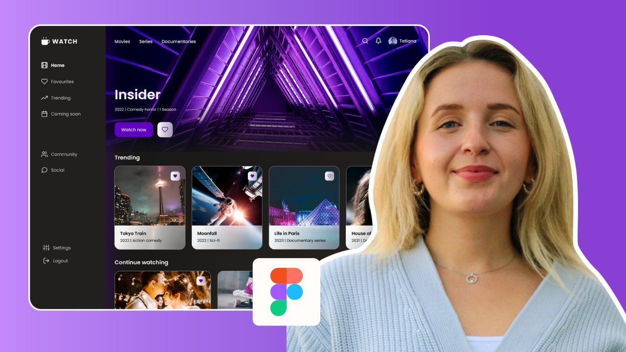
4. Project demo: In this part of the course, we will choose a
mobile application from the Figma community to apply a different types of prototyping and
animations in Figma. As you now see an example
of a mobile application, Dr. app, which I chose
to make our example. This example includes
the different types of prototype,
interactive components, examples and animation in order to prepare a
complete demo of an application and become a real application
installed on a smartphone. Now let's starting to
test the prototype of our application that I
already worked on yesterday. As a first step, click here, gets started to open
the application. Next. We first choose, yes. You come back to the
first screen from here, where to choose the
other button here to write email and password. Sign up. In this step, we can choose the gender, female or male Next, and select age. Next. Here the user can add the
image of his profile, whatever by camera or gallery. Click here to finish
the sign-up steps. It's good. Now we have
created a new account. And that's what
we're going to build it from scratch in
the next parts, of course, and I will see
you in the next video.
5. Add prototype: So now we will choose
this application from the community here,
right, Dr app. And choose with this
pick list Figma. And now we will search on our application.
Yes, that's right. Click here. Get a copy to get the app on your
account workspace. So that's it. Our application is ready to add a prototype and
animations to it. So we will group these
two screens to move them because we don't
need in our example, we are going to choose
this application because I see that it contains different types of
screens from which we can apply several Figma tools. And now I want to
prepare the workspace, the location of some screens. I put this here and this here. Next we terminate with the rest. And this here, we zoom IN here. Copy paste for this screen. We will rename it
creating account. And now select the
elements and delete them. We will use this screen
for loading when the user is waiting for the
creation of his account. After change this
text to creating account and move it in
the center of screen, I see this place is the
best for this phrase. Also from my experience
that the location of loading indicators is always in the center of the
screen. Right here. Rearrange this one
a bit to the left. Start now to do the prototyping
of the first screen. Click here in prototype. Select the screen
and linked it with the second screen in order to build this connection
between them. This window that appeared contains all the
interaction details. Here it is the nature
of interaction chosen. And here it is the action
made by the user that will trigger the
application action on tap, on drag while pressing. And after delay,
when will choose it now and change the delay
to 1,500 milliseconds. So here the animation type for now we choose Smart Animate. This is the end of animation. We choose again that
linear animation and change this parameter of animation delay to
400 milliseconds. But you can choose
the interaction in animation details which you want to build your
first prototype. Let's try now this
first interaction. As you see, we move from screen one-to-two with the
interaction chose. Now complete the second
interaction with the same method. But for this interaction, we choose push animation and change the delay to
300 milliseconds. In-between these two screens, we use the same type
of translation and keep the same parameters
like previous screen. Now for yes, we choose
sign-in screen. Here, just verifying the
interaction details. And like the others, keep
the same parameters. N for n 0 sign up. Here we have a connection from login screen with this
button to homepage. At this level, we
make the interactions between the registration
steps with the same way. And from this button
to the next screen. Then finish for all screens
with the same method. In my opinion that these
parameters have links between screens is special
for this type of application. We can see in other sectors of applications that the type of animation can be changed to give another experience
for the user, e.g. in game applications, always the transitions between
screens be much faster. Also, we change the
duration to 3,000 milliseconds and choose
for animation type. Smart animate. And for this linear, also for animation duration, you should to increase
the parameter to 500 milliseconds returned. Now in the center of workspace. Let's change for
this interaction, the animation type
to smart animate. Linear 500 milliseconds. Let's try now the result
of this interactions. Click here to testing. Next. Here we will
add a back button. Continue now with this option
to the sign-up screen. Sign-up and terminate. This is the delay interaction to open the home screen
of application. Back to workspace and zoom here. First of all, we will add the return icon for the screens. Here from the icon, if I plug-in right
in this field, back to search an icon. Here's the list of
icons which we can choose one to use in the
return between screens, we choose this icon, import icon, Great, the
icon is successfully added. We're just going to
resize and move it. Here in the left of header. You can choose other
icon types from icon. If I plug-in, I recommend to
use this plugin because it contains many icon types as per your application
requirement. Change from here
his color to white. And with copy paste, we added for the others. Again for this ad the same icon and terminate
the other screens so that it will be functional and we can
add an interaction. You should click on the icon
and choose frame selection. Let's now add the
return interaction for screens which contain icons, keep the same settings here. And for animation, we
choose Push the duration to 400 milliseconds and continue to add an interaction
for this screen. But not worked correctly. We will add the frame selection
to the rest of screens. Always it is necessary to
activate this option so that the components can be used at the interactions
between the screens. We turn now to the
translation action and try again to add it. Keep the same options and
continue to the next screens. Does not need to configure the link settings for the
rest of interactions. Figma automatically keeps the same previous
screen configurations. Again, we will test
the progress we have made. Very good. All the icons are working back to design mode and zoom here
in this screen. Copy now the
dashboard screen and rename dashboard underscore one. And the second two,
dashboard underscore two. Here we will add a pop-up when clicked in the
image of profile. Add a rectangle by
clicking from shaped zone. In order to customize
a black layer, we're going to use
a very simple way to make a black tint
on the main screen. Therefore, we
changed the color of the rectangle to black and
decrease the intensity of the color like this after adjusting the rectangle
to the whole screen. But this rectangle
for the pop-up, we will choose at this
place here on the right, at the top, just above
the profile image. Here we change the
radius of the shape. We will choose a white
color, of course. Now adding the
elements of pop up, starting with profile picture. This link to enter
in profile screen. You can also customize
the font size to 25 to be readable for the user. Adding the second link to
enter in the profile settings. And finally the logout button. Here for the logout link, we can choose the red color to differentiate it from
the other's buttons. You can also add a logout
icon from the plug-in. We will choose this icon to give a good experience
for the user. We customize the
height and width of the icon to be more
readable in the pop-up. Changing again the color to red. In your choices, you
must always take into consideration any
type of user who will use your application and ensure to give the same
experience for all. We add the necessary
prototype for this pop-up. We will choose the style to
show and hide the pop-up. When clicking the picture. For logout button,
you should activate the frame selection to use it in the prototype interaction. Now, we choose the
interaction details which are compatible
with our application. Great, Let's try to shoot
our prototype to this level. Nice. The pop-up works fine. Now returning to our workspace to complete the rest
of the prototype. Continue now, add
a pop-up to choose the option who can change
your profile picture. Firstly, changed the name of
this screen to change name. And copy it here
where we can create our pop-up change picture
as a name for this. In the initial screen, we will add an icon here, which means that we can
change the profile picture. Right-click here. Plugins icon of phi. Search here for a camera icon. We can now use this icon, but everyone can
choose their own icon. Oh, it is important
in this part. So we can put it in an ellipse, choosing this part of
the shapes ellipse. Now, move the icon
to centre of circle. The icon has become hidden. It is below the circle. With this option,
Bring to Front, she can move above. We explained exactly the use of this option in
the first course. Getting started with Figma, we resize and move it like this. Grouping the two like this
to move them together. Now we move it inside
a profile picture. Now in the second screen, we will add a pop-up
so that the user can choose the way to
change his profile picture, whatever, choose an
image from gallery, or take a photo with
his smartphone. First, we will add
a black layer using rectangle with low
transparency of black color. We will configure the rectangle
appearance parameters as the previous screen. And now add a
rectangle for papa. Let's change the
color of pop-up to white and add two icons, one for the gallery and the
other for camera option. We will customize these two
icons here. In the pop-up. We will change the width and height of the camera icon to 30, and the same for the other icon. Following feedback from
my previous project, you should always using
the icons to make it easier for the user to
make his choice quickly. So we will add the words, camera and gallery with
the same font for this. We regrouped them like this
to customize together. Don't forget to add
the Back button to the initial screen. Let's go now to add the
interaction between these frames. Change to prototype mode. Choose this icon and linked
with the screen below. For animation, we
choose instant. And the back interaction
to the first screen. Here we change a little on the input fields for the
meal and password field. But first, we will test our
latest prototype change. Let's go get started. Books. The word camera does
not exist in prototype mode. Here on the left, we will check the location of this word
and compare with the others. As you see, it must be moved
here just below the gallery. I don't know why
it is placed here, but always each component must be under the
corresponding screen. And let's try again. Great, the pop-up
appeared correctly. Now we go back to
change on this field's. First, we will adjust
this text input for width 300 and for height 40. And we also change
the font size to 14. With the same method we changed the second filed for password. We are making this change
because I see that these fields are difficult
to read for the user. Afterwards, we will
add icons to give a better experience than
the initial version. I want to move the
email and password to the left in order
to add icons here. So from icon, if I plug-in, we import two icons, one for the password and
the other for the e-mail. I want to choose an
icon like person for male field and a
key for password. After importing the icons, we will move to
the left of field, but we should
customize it foremost. Now I want to change
the color to wait. Great. Now the screen
has become better. But still, you should adjust
this Forgot Password. And the subtitle of screen. Now we will select
all the changes we have made to copy
in the screen below. Before we delete this to put
the new fields in its place. Paste here, and put in
the center of the screen. Unlike the other, we change this. Great. Now we have finished
from this screen, and I will see you
in the next part.
6. Add smart animation: We start now with this screen to add some animation
to this image, changed to design mode. First, we make a
copy for the screen. We copy it just below the other. Always when you want to add
an animation on a screen, you should to duplicate the initial screen and make
the changes on the second. And then we choose the
best configuration and the type of
transition between them. And we changed the name to
on-boarding to point to. Now, what are we going to do? We slide the image
slightly upwards, like this to motion
animation appear to the user when the mouse
hovers over the image. Let's add now the link
between this two screens. So black just the image from the first screen and linked with the second
screen like this. Now you should change
while hovering option and change the animation
effect to smart animate. And we can also
change the delay of animation to 500 milliseconds. Don't forget to
delete this link. We let just the old
links of initial screen. Let's try the changes made. As you see now, when
you hover the mouse over the image, the
animation starts. We pass to the other animation on this button, get started. We will do the same as
the other animation. Copy the initial
screen, and paste here. Change the name to
on-boarding 2.3. Just to differentiate
between screens. We will change the color or increase the saturation of blue. Like this. With the same way, delete the links comes
from the initial screen. We remove the links
between the screens in order to make our
choice of animation. And add a new interaction between this button
and the screen above. We leave the parameters
as the first animation. But you should add the
principal link when clicked, Get Started to pass
to the next screen. Very good. Even the parameters
are configured properly. Just change the
animation type to push and reduce the time of
animation to 300 milliseconds. Here, each of you can choose your own configuration to make
another type of animation. Let's try now the changes
made in the button. Great. The animation
is well set up. When you mouse over the button. And after a few milliseconds, the color changes with
a smooth animation. Just, I noticed that
it is necessary to decrease a little the
delay of this animation. For this animation
to 300 milliseconds. We try another time. Good, it's better now
with the latest changes. So now we do all that again
with the second screen, the button animation
and the image. It's good now, after adding the animations needed
for this screen, they are similar to the
first screen animations. Let's try in prototype mode. Here we have changed the type of animation compared
to the other screen. Whoops, I forgot
to add the link. When I click on the button. We come back here
in prototype mode. We simply add it like
the other interactions. We leave it like that by
default is well configured. Just a remark here. Always the settings
of interactions remains as the last
configuration added. We check now the
rest of the links. And let's try again. Good, all interactions
are parameterized. The next step, we will add different animations
on these buttons. Copy, sign-up screen, and paste here just below
of initial screen. And changed his name to sign up? Yes. With the same way, paced other screen and
move it below this. Here, we changed the
name to signed up. No. One of screens for the animation when the
user wants to choose? Yes. And the other screen for
the animation of NO choice. As seen in the prototype demo at the beginning of the course, when the user hovers
the mouse over one of the yes or no buttons, the color changes
from blue to white. So to start, you have to change the color of two
buttons to blue. Here we choose the same
color of buttons yes, with this color picker. But the word NO is disappeared because she
was the same color, blue. So you should
change his color to white and activate this auction. Bring to front. Now we
have finished this screen. We go to the next one. For this screen, we add
the button animation. Yes. I will change the color
to white for this. And add this option stroke to customize an outline
like the other button, changes color to blue
with the picker color. Again, the same case you should to change the color
of the word yes. Second, we changed the color
of buttons NO, to blue. And again, Bring to Front. Let's continue with
the second screen, changing the color of buttons, unlike the previous screen. But first I will change the size of the
border to be clearer. E.g. I. Fixed a free. This screen is almost ready, like other button just I will fix the size of the
border to three. Let's switch now to
prototype mode to add the animation
between the screens. Firstly, we will remove all links for these
two new screens. And for the initial
screen we start with yes, removed from here. And link the login screen
with sign-up Yes, screen. We chose this type of
animation just to master the different Figma
tools and see more techniques that can help
you in your own projects. And now we add the interaction
animation link yes, with the screen just below, I choose while hovering
auction to trigger the animation and change
the animation to dissolve. And the same for the NO button, unlink it from sign-up screen. Scroll down to this screen where we add the panel
button interaction. We remain now that the
connection between the initial screen and the
screen below signed up. No. Well, we're done for these two animations.
Let's try now. Mixed. As you notice here, when you pass the
mouse over one of the buttons, the color changes. Click. Yes, we directed
to the login screen. And the same for the NO button. Oops, we notice here that the
email and password fields disappeared like this
in login screen. We go back to our workspace
to correct the problem. Change design mode. We always choose this option, group selection to make
it easier for us to move the components without changing the measurements
between them. First, we select all components and we grew up with this option. Then I will put in the center of the screen and click
on bring to front. And we try again. It's good now the fields have
appeared for both screens. So we continue to add another animation on the male and female
options in this screen. Here, we add a simple animation when the user wants to
choose one of his options, the circle expand slightly, as seen in the prototype demo. Like the other examples, we make two copies of
the initial screen. Here, just changing
the screens name to differentiate between them. We start with mail option. Select the button and change
the width and height to 105. Now we're going to
add another type of animation that I have used
in my personal projects. And as I say,
everyone can invent other types of animations and
costume them as they wish. Also, I can change
the font size of them and put them in
the centre of circle. Nice. This screen is ready. We can pass to the next. For this just we will
do the opposite. The changes will be
on the female button. With the same way, you should change the size of button and the font size of f. Now the screens are ready, we pass to the prototype mode. So from the initial screen, I select that option and link
it with the screen below, where I can choose
while hovering for the interaction parameters and instant mode for the animation. We finished with
the female auction. I will link from initial
screen to the second screen, keeping the same settings
for interaction details. Let's try now this
latest changes. The female button
is not working. Come back to the workspace
to check the problem. I select the female blink. Are you should change
here while hovering. Option. Great, return now
to check the prototype. Now the app is working fine. Here just we will complete the steps until the home screen. We will add a spinner
here in this screen, just above creating account. It is necessary in user experience to
add an indicator like the spinner so that
the user knows that there is a process
running in the application. And I will see you
in the next part.
7. Create a Spinner: So here I'm going
to add our spinner. I'm just going to create a rectangle in order to
see our spinner as well. I'm going to create
a circle with you. And we will use the simplest
way to prepare our spinner. Here I'm going to change
the color of rectangle to read and customize on
circle size of 500 by 500. So you can see here that we
have these arc being here. So we can come here. Here. We are going to
make it like 65 per cent. And if you can
leave it like that, or if you want to create
a border radius here, 43 is good for me. So you can see that
you can move it around and later on is
what we are going to do. So this is going to be our
first date of the spinner. We can rename it to
the spinner right top. Okay, this is going to
be our first state. Now we're going to
duplicate another one. So what we are going to do in the next state is
going to rotate down. For that we wanted
like 90 degrees. Here we're going
to change the name of the second
element to spinner. Right bottom. We add the left states
of the spinner, hasty or other element
and detach it like this. After I rotate it to 180 digress and change the name to spinner left. And we finished now
with the last state here and change his digress like this. Also, we changed
the name left top. So we're going to create a
body with all this components. Let's go into combine
them as variant. This is going to
be the position. So it's important that when you are going to smart
animate something, you need the same
names. Ellipse 111. Let's start with this one and
change to prototype mode. Now we link this to the right bottom element
here on interaction details, we choose after delay option and change the duration
to one milliseconds. Leave that in right bottom. But for the animation style, we can choose the
smart animate and for this choose ease
in and out option. Also fix this to
200 milliseconds. With the same way you need to complete the
rest of elements. Keep the same settings here. Change this to after delay. But I'm coming back to the
last state because I forgot to change a duration
to one milliseconds. We complete now the
interaction of last element. We add this type of animation to have after each arc rotate until the end of its cycle and then the other art begins and
the same for the others. In order to have a
complete spinner. The spinner is ready, just go here in the left side and we switch to the assets nav. But after all, you should to change the color of
elements to black. Change the design mode. Select the states, and choose
from here black color. Come back to assets now and make a zoom here for the
creating account screen. Drag the component like this. But there is a little
problem here where you should to decrease the
size of each component. We have now finished reducing the size of all the components. We return now to the screen. As you notice, the
size is reduced and more consistent with the
rest of the screen elements, and we choose the
right top position of starting animation. We move the component in
the center like this. Good. Let's try this spinner. We just choose this screen
and click here to start. We also noticed that the size of spinner is even bigger than
the elements in the screen. So we returned to workspace and you should decrease the size
of all states like this. Good, we move a spinner
to the center like this. And try again. Here it remains just to change the speed of movement
of each component. To have a smooth animation, you should to
adjust the delay of each interaction
between the arcs. I select the first
link and change the animation duration
to 100 milliseconds. And repeat the same for
the rest of states. I think this change will
give us a better result. Good Now to continue, but you can choose
other types of animation and other
interaction details. Everyone at their
choice can adapt the spinner and there are other type of loading indicator. Everyone can try
another type with the same principle of smart animation like
the spinner, e.g. loading buyer linear
progress indicators. We finished the prototype
of this part of a Dr. application and we remove
this two screens now. Now we've finished our
project from which we used several prototyping techniques
and different types of animations that can help
you in your next projects. And I will see you
in the last part of the course where we will
see the final result.
8. Final overview: Finally switch to
prototype mode. And let's go to try
our application. Click and get started and continued to open
our application. Choose this option to
pass to sign up screen. Here, testing this camera icon, which we can add the
corresponding screens for these two options,
camera or gallery. For this step, the
dashboard is open where he can log out and back
to the login screen. Now we have finished, and I will see you
in the next course.
 Amine Abdelkebir, UI/UX Designer