Transcripts
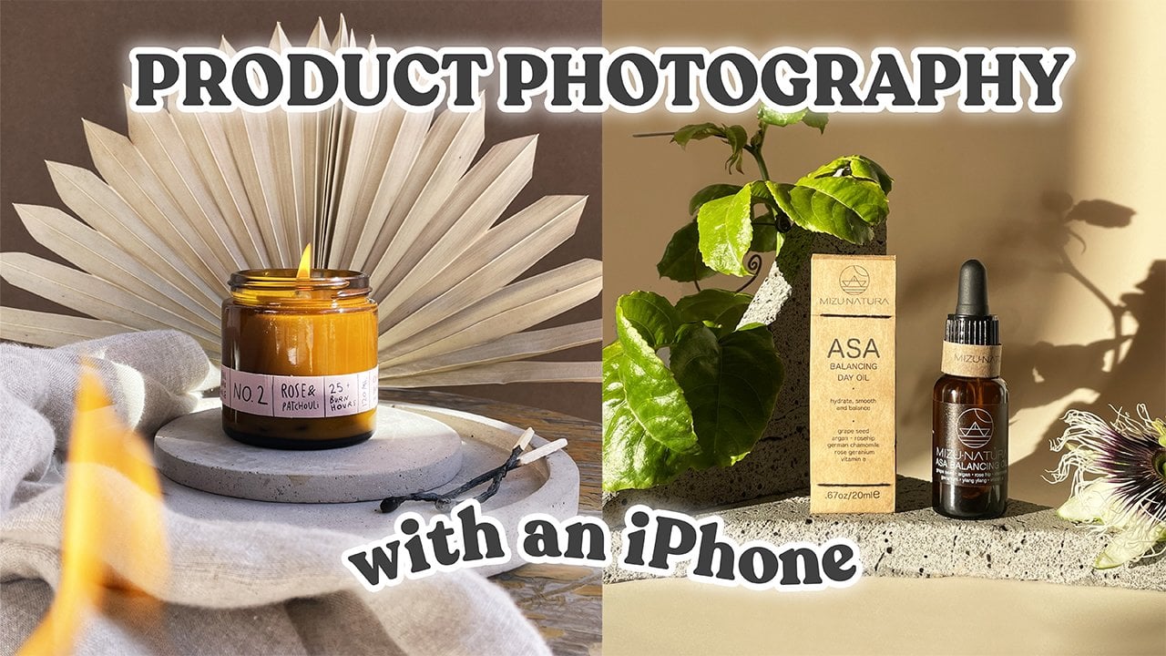
1. Intro: Look at yourself taking the same photos of
the same products for the same clients. Now getting new, exciting
work opportunities, what you need is to elevate
your styling skills. Stand out as a
product photographer with the floating
styling technique. Make people want
to stop scrolling. There is the feed and actually
engage with your photos. Express yourself, experiment, and create unique
product photos. Who are you anyway? I'm you, but we may desire
to create something new. How am I felt greater? My name is Stan C, and you
are on a standard cinema. Check this. So my channel, this is
my Skillshare course. I am a Product Photographer, a YouTuber, and a
content creator. And I worked with jewelry, with skincare, and with
health and wellness brands. Welcome to my three-part
series course on product photography styling. In this episode,
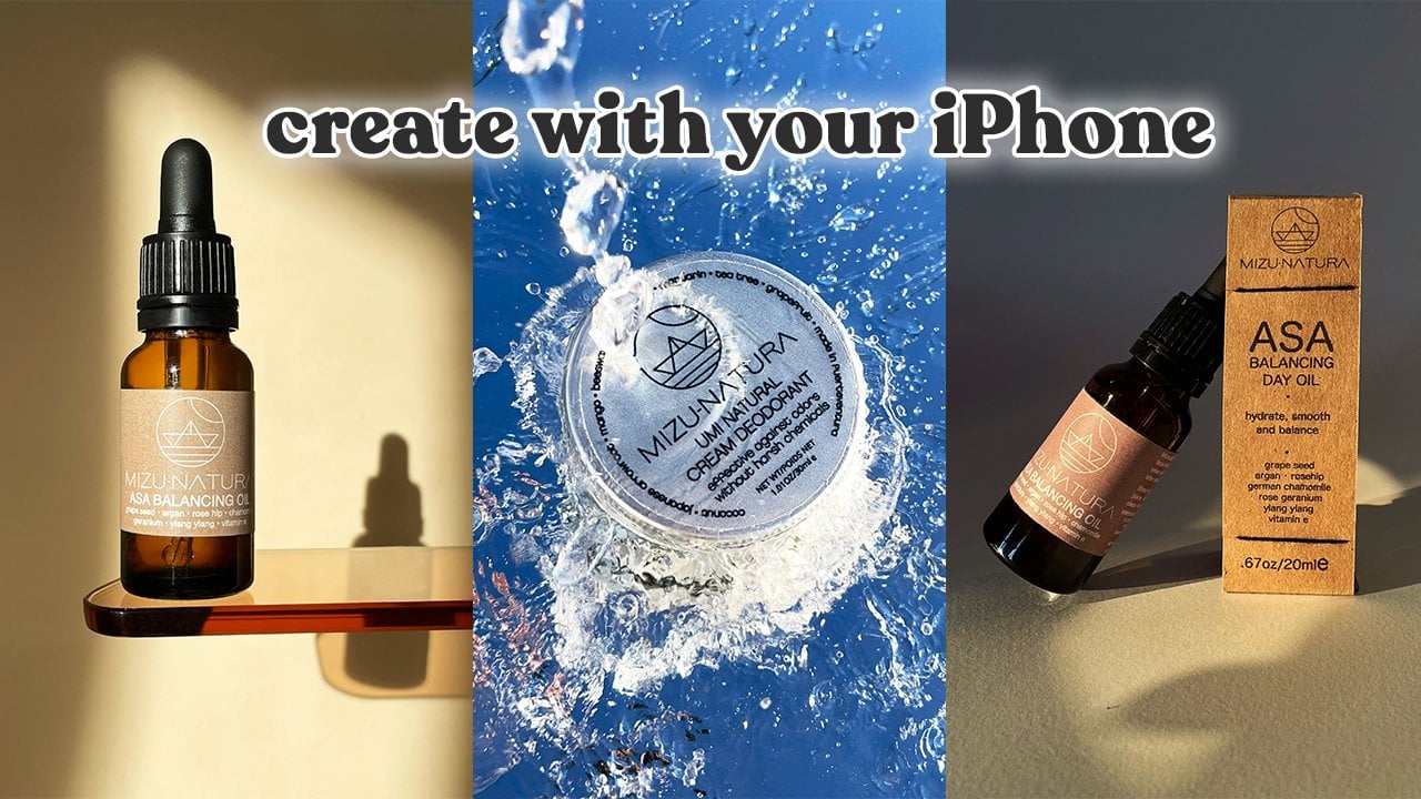
I'll show you how to create floating product photos. Floating is an amazing
styling technique. It has many creative
applications and it's super versatile. By the end of this course, you'll be able to create your
own unique floating photos. And having such photos in your portfolio
makes it super easy for potential clients to choose you for their next
campaign shoes. In the other two
episodes of this course, I'll be teaching tumor
styling techniques, basking in the sun and
artistic still-life. I'll link all the information in the description
to this course. But now, let's take some
photos with an impact.
2. Course Project: The project of this course is to create your own floating photo. How unexpected Write. Submit your photo to the project gallery and
get feedback from me. I'll be looking for
creative application of the technique
I'm going to show you and try to put your own twist and it
makes it really unique. You will use this photo
in your portfolio and start attracting clients
that you want to work with, where maybe you will use
it for your own business. Here's a step-by-step guide on how to tackle this project. Step one, hype yourself
up and get into the creative flow
step to brainstorm ideas for your photo and
create a mood board. Step three, source products,
props, and backgrounds. Step four, set up the scene
and compose the shot. Step five, set up the lights. Step six, take photos and
select the best ones. Step seven, editors
in Photoshop. Step eight, because
a mediocre photo to the project gallery and
get feedback from me. Now, let's start
learning already.
3. Preparing for the shoot: Let's prepare for the shoot. I will create three different
photos with three products. And I will walk you
through the whole process and share my workflow
in Photoshop. The first one is
this Rose Lemonade, then hand cream
called cocoa cooler. And finally, I have
ice cream flavor. Amazing. I already have some ideas
of what I wanted to create. I made a mood board. I
went on Pinterest and Instagram and Behance
for inspiration. And then I sketched
my ideas on paper. This is a great tip. If you want to create something original, don't just try to
recreate someone's idea. Try to put your own spin on it and make it truly your own. So this is what I will
need for the shoot. Some products, some probes, backgrounds, that
light and a good mood. How cheesy was that? Where to get products
by them obviously, or get them from a client, boil them from a friend, or maybe exchange them
for some content. Make sure when you're creating folders
for your portfolio, you are creating the work
you want to be hired for. If you want to work
with skincare brands, take some photos of skincare
products for backgrounds and using simple paper sheets
from a local craft store. Whenever I need a new color, I go there and get it via, Of course, not very doable. You can't really make
a product swatch on them or you can
spill anything on them. If you want a more
durable solution rule for vinyl Deb tropes. But I sometimes use a sheet of transparent acrylic if I want to do a swatch or
something like that. Now let's talk about props. The easiest and the
best solution is to use props that make sense. I know Rose Lemonade here. That's why I'm going
to use some roses. And according to the
ingredients of this lemonade, I could also be using lemon, pear, orange, and ginger. Then I have this Coco
cooler hand cream. I'm going to use
coconut for that. And I have tiramisu ice cream. That's why there is
some coffee beans and chocolate on
a table as well. Another thing to
consider is the size. Perhaps you don't really want the probe to be
bigger than a product because this is the
hero of the shot and improper is just something
that will compliment it. There are so many good options when it comes to the light. You can always use natural light that's
coming from a window, but I recommend
you to use it with a reflector to
balance the light on the dark side of your products and soften
the shadows a little bit. It will create a
more elevated look. Next, there is a very inexpensive light box
that you can buy. It comes with a bulb. It's really easy to use. It's not very strong, and it's really good for
creating some soft shadows. Another very inexpensive
option is just to use some home
lights and bulbs. I have Phillip slides. I can control their color and
intensity through the app, and I love to use them with
my product photography. And finally, there
is a slightly more expensive but still
affordable option of a continuous slide like codex as L6 TWO, I love this slide. It's very easy to use. I can control this
intensity and they create very beautiful harsh
shadows with the slide. But if I put a diffuser
in front of it or add a Okta Box
or soft box on it, it will make softer shadows. In the next lessons
of this course, I'll walk you through
my process of taking photos and editing
them in Photoshop. So let's start shooting.
4. Creating the Rose Lemonade Photo: I will start with the
Rose Lemonade photo. My ideas to shoot it floating
among these pink roses. I'm going for a
monochromatic look. Pink background, pink
bottle and pink roses. I'm going to shoot
all of these elements separately and then
combine them in Photoshop. First, I'm just placing the bottle on this
pink background. This helps to make the
liquid even more pink. Next, I'm going to
set up my lights. I'm just playing with
my Philips Hue lights to see how they
light up the liquid. I encourage you
to use the lights that you have at home as well. Don't be afraid to bring them, even though they're not
professional photography lights. Nobody's going to
know. The main light. I'm using the codex slide. I'm placing it right in
front of the product, making sure to light up the
label and keep it readable. So the setup is beautiful. It's good enough, totally
works for a product like that, but I'm feeling a
little bit extra today, so I'm gonna give you a
tip on how to light IT. Products made out of
glass or something transparent in a way that's
going to elevate it, going to take you
to the next level, to the stratosphere,
okay, for that. So I'm actually
going to use this. This is my transparent acrylic
trade for photography. I created in myself. If you want instructions
there on my YouTube channel, this was a super
budget friendly DIY. Everybody can tackle
that type of stuff. So now let me show
you how to use it. I'm placing my small
lights under the tray. Alternatively, you can use a
sheet of acrylic or glass, maybe a refrigerator shelf even. You need to elevate this and
light up the product from underneath to create this
beautiful ring on the sides. Of course, if you're going
for a different angle, you can just keep
the product standing up and lighted from the back. Here's the photo to always make sure to shoot
in RAW format. Keep your ISO on 100 to minimize the noise on a photo
aperture is five. I don't want it to be
too open, otherwise, the label is not going
to be fully in focus. And the shutter speed really depends on the
intensity of the light. Now let's take
care of the roses. I'm only going to
shoot the flowers, so I cut them first. You may be wondering
why I have chopsticks, but I found that's the best way for me to be covered
rose flower and rotate it in front of the camera to capture it
from different angles. I'm taking a lot of photos, I'm going to choose
the best ones later. I keep the same
camera settings and the GoTalk slide is
in the same position. I'm also taking some photos
of rosebuds and petals just in case it's important
to have a variety. Here are the final photos
I chose from this shoot. I have my fault over lemonade, and I have many photos
of roses and petals. Now, let's take it
to the Photoshop.
5. Editing the Rose Lemonade Photo: Now let's edit our first photo of the Rose Lemonade
in Photoshop. This is the photo I'm
creating in this class. And I wanted to do a disclaimer that instead of focusing on different Photoshop
tools and how to use them and
other basic stuff. I'm going to focus
on my workflow and I aesthetic part
of editing photos. There are so many tutorials on the Internet explaining
this basic things, but there is no
tutorials talking about aesthetic part,
composition, etc. This is the timestamp for you. If you want to come back to
certain part of the video, it will be easy to navigate. So let me start from opening up the selected photos
in Photoshop. All of them are in the raw
format, which is important. Now they're all in
this Camera Raw view, and I'm preparing them for retouching by adjusting
the temperature, exposure, colors, et cetera. I want to match the color of the lemonade to
the real product. So it's important to have
next to me while I'm editing, when I'm happy with the result, I copy these settings, paste them to the other photos, and open all of them. Now they're all
open in Photoshop. Before we begin, let's make sure we have the same workspace. Go to Window
Workspace Photography then gives us three
essential panels, toolbar, adjustments,
and layers. The first thing I'm gonna
do is I'm going to cut out all of the objects
from the photos. I'm going to use
Quick Selection Tool to cut out my objects. I will just draw over an object and Photoshop is
going to create a selection. I will right-click on the
selection and choose Layer via cut that creates a new layer
with this object on it. If I remove the background, It's only this cutout object. And it can even use more
automated solution on a different photo here
I'm going to press the button, Select Subject. Photoshop is going to analyze the picture and
select the subject. I will need to refine
the selection and right-click on it and choose
Layer via cut to cut it out. I'm just going to
repeat this process for all of the other
roses and rosebuds. And then I will start
working on the bottle. When it comes to the
Rose Lemonade bought or some parts of it are Blu-ray. They are not in focus. And when cutting out the bottle, I need to maintain
this soft edge. And the best way to
do that is to use a mask and work with
a soft black brush. After I'm done cutting
the objects out, I can now reattach the boards
are some parts and perfect. And I want this bottle to
look as perfect as possible. At the same time, I don't want to make
it look on the reel. I just need to remove
some dirty bits and make the color of the
lemonade more even. And they definitely need
to smooth out this bottom. For retouching, I'm going to
use three different tools. The first one is the
Spot Healing Brush, and I'm going to use it to
remove some small spots. Then a stamp tool and I can draw over and imperfect
area with IT to cover. And finally, I want to use Patch Tool and I'm
going to work on the whole bottle
trying to make it as perfect as they can
while keeping it real. When it comes to the
bottom of this bottle, I really want to make it smooth. So first, I'm going to use the Quick Selection tool
to select this button. And I will apply a filter. So I'm gonna go to
Filter Noise median. And with this toggle, I can make the area
really, really smooth. The only problem is
it has no noise. So while that area is selected, I'm going to apply a different
filter and I'm going to go to Noise, Add Noise. And I just want to match
the amount of noise on the bottom to the
rest of the bottle. When looking from a
far at this button, It's not very even and they think that what
makes it more real? After some final
touches on the bottle, it's time to make
the composition. The first thing I do is I resize this picture to
four by 54 months. This is the best
format for Instagram. And then I'm going
to transfer all of my roses petal and a rose
bud to this picture. The best way for me to create a composition is to play
with all of the elements. I'm going to put them
in different positions. I'm going to resize them. I'm going to rotate them. But it's important not to rotate them too much because we want to maintain the shadow on the same side for every single
flower and on the bottle. So flipping an object
or rotating it too much would make it very obvious that this does not
really belong there. And we really want
to avoid that. I really want to make it
look like they're roses are floating on different
distances from the bottle. The roses that are floating
closer are going to be bigger and more blurry. I'm gonna go to Filter Blur, Gaussian Blur to choose how
much I want to blur them. And the roses that are
flying farther away are going to be smaller
and also quite blurry. The small rose on the right, it's going to fly
next to the label, since the label is in for Q. So I'm going to keep that
rose in for cues as well. The green rose bud is quite
big and I'm going to make it blurry as well to appear like it's flying somewhere in front. Now I want this picture
to appear more bright, so I'm going to Brightness and Contrast settings and I'm going to change
it up a little bit. And then I'm going to
create a background. So we'll just
create a new layer. And I pick up the
color from the label of the Rose Lemonade
and then filling it in. And this is how I created this Rose Lemonade
floating photo. Okay, the first picture
is officially done. I've already happy
how it turned out. Let me know what you
think about it as well. Now, let's move on to
the second picture.
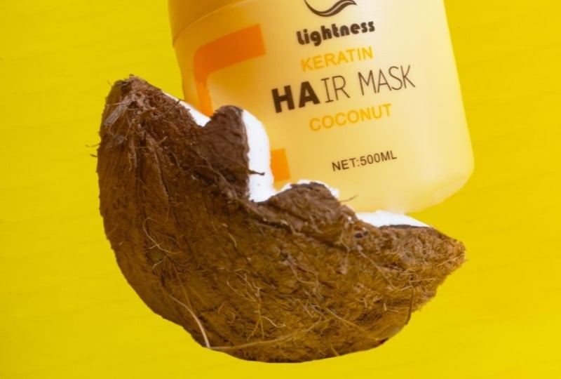
6. Creating the Hand Cream Photo: I'm going to create
the second photo now with this hand cream, the photo is going to be a
bit more complicated to make, but the result is so worth it. I'll need a coconut, some sand, and a neutral
background to do this. I'm going for the beach vibe. The yellow packaging
and coconut. Just make sense
to be on a beach. I'm going to take photos
of all the elements separately and then I'll
combine them in Photoshop. The first photo will be over coconut laying in sand. Here. I'm just trying to imagine
the final composition. I decided to add small stones to create a more natural
look of the sand. I'm using products as my
main light again, this time, I really need to create harsh shadows to
imitate the sunlight. And here is the
final photo I took. The format is rho is
always ISO is set to 100 to minimize the
noise, aperture is 4.5. Keeping it to open would
make the coconut Blu-ray. And I don't want that. Shutter speed depends on the
intensity of the light here. It's just one 160th of a second. Next, I'm going to take a
photo of the other coconut. I'm sticking it on
a chopstick that I secured with some tape
inside of a glass. I'm also adding a gold
reflector to soften the shadow and imitate
the sun even more. Here you can see that
the final photo, this settings are
absolutely the same. And finally, I'm taking
a photo of the cream. I'm doing it very simply. It's laying flat
on the background. I'm using Goldilocks
as the main light. Shooting. This product
is a little bit tricky because of all the
text on the packaging. If I place it on an
angle like this, some letters who alluded
to up more and it becomes hard to read. We
must avoid that. Every letter and the
logo must be very clear. And then I'm also placing two Philips slides on two
sides of the product. I chose this position
strategically. I need two sides of
a product to be in shadow and two sides glowing. You will see why I did
that in the Photoshop. Walk through. And here is the final photo. I have a photo of the cream
and voters have coconuts. Now let's get to editing.
7. Editing the Hand Cream Photo: Let's start with our
second photo now. This is the photo that I'm
creating in this tutorial. I'm going to walk you
through my workflow. I'm going to focus on the
aesthetic choices they make and not so much on different tools I use or techniques I apply. If you want a more detailed
Photoshop tutorial, please let me know and I may
create it in the future. For now, let's dive
deep into this. First, I'm going to
open up the photos of coconuts that I took earlier. They are in row
format and that's why they open in this
Camera Raw for you. This is the place where I
prepare my photos for editing. I'm just going to
change some settings to make these photos brighter, more colorful and warmer. Then I'm just going to copy the settings from
the first photo, paste it to the second one, and open them up
together in Photoshop. The first thing I want to do
is to remove the background. So I'm going to pick up
the Magic Eraser Tool, click on the
background to remove it and the stool isn't perfect. So I still need to work on some areas and I'm
going to work on the edges or the coconut and the sand a little bit
later on as well. But for now I'm just going
to attach this coconut. It wasn't very fresh
when I opened it. So for now I'm just trying
to make it a little bit more perfect
with a stamp tool, with the spot healing brush, and with a patch tool. I still want to keep
it real though. I don't want to make a
cartoon like coconut. Next I'm going to work on
this second coconut photo. I'm just going to use Quick
Selection tool to select it and cut it out
onto a new layer. Then I'm retouching it as well. I need to remove that
chopstick, obviously. And again, I need to make
it a little bit more perfect than it is
while keeping it real. When I'm done retouching
this coconut, I'm going to move it
to the first picture, resize it so that it looks like the same coconut
and I'm going to place it a little bit above. Now we need to work on the cream again using the
Quick Selection Tool. I'm going to cut it out, refine the edges a little bit, and change the color. I'm trying to match the
color to the real product. So it's very handy to have this screen next to me and
look at it when I'm editing. One problem with
this cream though, is that the letters on this packaging are
not very visible. I want to make them brighter, so I'm going to create an adjustment layer with
brightness and contrast. I'm going to make this picture brighter and then work with a mask using a white brush, I'm going to reveal
this brightness. And then when I'm
happy with the result, I'll move it to
the first picture and start playing
with its position. If you remember, during
the photo shoot, I made sure to sides
of the screen are glowing and two sides
are in the shadow. So you can see the side with the shadow is right
under the coconut. And two sides that are glowing. They're not obstructed
by anything. Then I found a photo of this beach on a free
stock footage website, I think is going to
work really well. I think the color
matching is very good, as well as the angle from
which this photo is taken. I'm going to resize it and bluer it to make it
look more natural. Then I'm going to work with
the sand a little bit, removing some parts, drawing
on some parts with a stamp. And when I'm happy
with the result, I'm going to move
to the next phase. I need to add some greenery to make this picture
a little bit more colorful and give it
more this tropical vibe. So I found this photo on a free stock footage
website as well. And using the tool called Color Range from the Select
menu on in Photoshop, I'm going to select
white and I'm going to cut it so that all I'm
left is these branches. I'm going to divide them
using the Lasso tool and move them to the picture
and then blur them as well. I make sure to blur them
a little bit less than our background so they appear closer to the product
than the ocean. I'm going to repeat this
for the second branch. I just really wanted
it to be together. And finally, I found this music splash on
the same website. And now I'm just trying to
remove this blue color. I needed to go in
with the same tools. So I go to Select Color Range, and then I click on the
blue color to remove it. And I do this a couple of
times for this picture because these blues
are different. And once I'm left with
this wide splash, I'm going to transfer
it to my photo and places behind the cream, but in front of the coconuts, I want it to appear like
coconut milk. Like this. Coconut has been just opened. And you can see the
splashes of milk. It's not going to be so
dramatic at the end. For now, I just
need to figure out the basic placement and size. And then I need to
work on the color. So I'm just going in
with some adjustments, layers like brightness
and contrast, hue and saturation
as well as curves. And when I'm quite
happy with the result, I'm going to work the position size and the
look of the splash even more. I'm going to create
a mask so that I can mask some of the splashes. There are this really big parts that I do not want to see. I'm very interested in this small little drops
flying everywhere. And I'm going to draw
them even like in front of the cream to make
it look more natural. And when I look at
the picture now, I see the coconuts are dark
in comparison to this splash. I'm going to make this coconut flesh a
little bit more pride using just the
brightness and contrast filter and applying
the mask to it. Now it's time for
some final touches. I'm going to work on the
edges of these coconuts. I'm going to make them a
little bit more smooth, a little bit more realistic. I want to adjust the color of this hand cream a little bit. And that is it. That is it guys. Alright, the second
picture is done as well. I'm happy about it. It was a little bit
more challenging, a little bit more created. It took me more time, but I use more techniques and tools. Hopefully, you learn
something new. And now let's move on to the third and final
picture of the course.
8. Creating the Gelato Photo: Let's start working
on the final photo. I'm going to shoot
this gelato and a cream background
similar to its scholar, with some coffee beans and
chocolate floating around it. I decided to place it at
least a bit on an angle, so I'm just propping
it with a tape roll, securing it with a little
bit of sticky tape. And I placed a small
acrylic sheet to protect my paper background
from the condensation. Next, I'm setting up my
goddess as my main light. I make sure it's quite
bright and intense. Then I'm using my
Phillips lights to light up the
product from the back. It creates the most
beautiful glow. And I think it's such
an easy way to elevate the look of your photo and
make it more professional. This is how the scene
looks like right now. There is still a big shadow
on the right side and I want to reduce it by
adding another light. It shouldn't be strong. So I'm using my light box
with the bulb for this task. And now I'm just
taking the photos. Here you can see the
final picture i2, the format is wrong. That's super-important. Iso is kept to a minimum to 100. Aperture is five. I want more of the
product to be sharp, not blurry, and
the shutter speed is one-one hundredth
of a second. The next stage is to shoot
many pieces of chocolate. They will be floating around and I need a good variety of sizes. So I'm just breaking
it down and I'm using my chopsticks to hold each
piece in front of the camera. I'm taking many photos
from different angles. It's important to have
a big variety to choose from when editing
the final photo. Here are some photos I
chose from this shoot. The camera settings are
completely the same. The final stage of this shoot is to take photos of coffee beans. Here I'm demonstrating
another method of securing small objects. I created this contraption with some sticky tape
and a paper pin, and it helps to hold a
coffee bean in place. And I can rotate the beam to shoot it from
different angles. Again, I'm creating quite a lot of photos to choose from later. I've taken all the
photos that I need. I have a picture of gelato, I have plenty of photos of
chocolate and coffee beans. Now let's take it
to the Photoshop.
9. Editing grom gelato: Alright, it's time to edit
our third and final picture. So let's start. Here's the photo I'm working on in this Photoshop
walk-through. Isn't the other two
Photoshop tutorials. I'm not focusing so much on different tools and
techniques that I apply, but on my workflow and
my creative decisions. As usual and working with
files in the raw format, they open up in this
Camera Raw view and then preparing the
photo of this Gilat. So for editing, just
adjusting the temperature, exposure contrast and
some other settings. Then I'm cutting it out from the background
using the pen tool. Honestly, this is my
favorite tools to use. I can not use Quick
Selection Tool here because the background color is
so similar to the gelato. If I had another color
of the background, lets say blue, it would show on the packaging and make
the photo more cold. So after cutting it out, I'm slightly or
retouching the packaging. And then I'm starting to
work with the coffee beans. I open all of them
up and proceed to cut them out using the
Quick Selection Tool. Let me skip to the good part. Here. I have all of the beans cut out and transfer
it to the photo. It's time to place them. There are so many ways
of arranging them. I could totally do something to the Rose Lemonade photo
that they've done before. And I could place
them all around the gelato flying at
different distances, make them different sizes. But instead, I'm trying
to arrange them in a cluster and make them much
bigger than in real life. This does two things. You can see that these
are coffee beans, even when you open
Instagram profile, the photos are very small when
you just open the profile. So having a big leg that
makes it very visible. Also, it creates this
mouth-watering feeling like I'm emphasizing the coffee forward
flavor of this gelato. It hints on the amount of
coffee flavor you gonna get. I put all except for the one coffee beans
on the right side of the packaging
because I'm going to add chocolate
pieces on the left. So now I'm opening up all of my chocolate photos
and I'm going to make some basic edits to
match the color of this chocolate to the gelato and coffee beans
as much as I can. Then I will select all of these photos and open them up to cut them out individually using
the Quick Selection Tool. Now let me skip to the good
part again where all of this chocolate pieces
are transferred to the photo and now it's
time to play with them. I'm not following
any rules here, obviously just trying to create a cohesive
and balanced look. I'm playing with the sizes and position of this
chocolate pieces. And I specifically chose
these chunky ones. I think they look
more interesting than this Polish little pieces of chocolate that you
would normally get. I also don't want to have the
same amount of chocolate as the coffee beans because
they think it would really overcrowd this picture. The next phase will be to bluer elements to create
more dimension in the photo. Now it looks quite
unnatural because the top of this gelato
is not all in-focus. It's a little bit Blu-ray, so it's important
to glue everything that's behind the front, right. So I'm going to Filter Blur, Gaussian Blur, and then
blurring individual elements. And those coffee
beans that stay in front of the packaging
will be in-focus. Those that are on this
side of the packaging. Now we're going to
be a little bit blurry and those that are behind are going to be
smaller and more blurry. And the same for the chocolate. Finally, I'm creating
the background. I'm just picking up the color on the gelato itself and I'm creating a new layer and
filling it in with this color. And this is the final photo. Alright, It seems
the final feature of the course is complete. Now, I'm very happy
how it turned out. Let me know what you
think about it as well.
10. You have made it!: What a journey we have made. You learned how to make
products float on your photos. And I created my first
ever Skillshare course. Little did you know, but live tested me while I
was creating the course. You'll have no idea how
many obstacles say, overcame to get this
course out to you. I was documented
every single step, every single obstacle and
every single sound way overcame something on my
stories on Instagram. You're welcome to go and watch it in my highlights
if you want to see the full emotional
damage that they've got. Now it's time for you to
create your projects. I cannot wait to see your
photos in the project gallery. I'm so excited to
connect with you and to see what you created
if you like the score, don't forget to leave a review. It will make this course more
visible for other creators. And if you want to
see more content on product photography, check out my YouTube
channel, Stanza Della. I shared a few videos
where I took photos of the same products with,
with different concepts. So check it out. Also, if you want to connect
with me on Instagram, you can find me at
Stanford up Nova, and slide into my DMs, startup and recession,
letting me know that you found me on Skillshare. I would love to connect with
you over there as well. I post reviews and
stories every single day. And that's it guys. See you in the episode to peace.
 Stancy Nova, Product Photographer & YouTuber