Transcripts
1. Introduction: Hey, what's up?
What are you doing? I'm officially out of ideas. I need to take product photos, but it just can't come
up with anything cool. Looks like you have a fear
of a blank background. What you know, like the writer's block, The
fear of blank page. Hmm, I guess it does make sense. You need to check
out this course on creative styling for mobile
product photography. I took it last week and now
I'm overflowing with ideas. Just look at the photos I took. That, that is really cool. I want to create
something like that. Where is this course?
It's here, skill share. I'm Stan Sonova and
let's dive deep into the creative styling for
iphone product photography. Whether you want to
create content for your own business or you want to become a brand photographer, You can start with just
an iphone in your home. No need for a professional
camera or a photo studio. But of course, if it was that
easy, everyone would do it. So what is the defining factor for success? It's creativity. When you don't have high
quality professional gear, you need to lean into your creativity if
you can come up with creative ideas for product
photography and turn them into reality at
home with your iphone, you can build a
profitable business. In just a few months, I became a product photographer in 2020, shooting photos in my bedroom. And in just two years, I was able to fulfill
three of my big dreams. I quit my nine to five job, I started a Youtube channel, and I moved to an island. This course is a deep dive into the creative aspect of
product photography. You will learn how to find inspiration for your
product photos, how to come up with ideas,
create mood boards, style products with props, and compose your images. It's perfect for beginner and intermediate
content creators. And as a part of this course, you will take your own
creative product photo and get some feedback from me. To get you started on this exciting and
challenging journey of becoming a brand
photographer, take this course to stand
out to your creative ideas. And I will see you
in the next class.
2. Class Project: Thank you for
taking this course. I hope it will help you to take the next big step in
your creative journey. The project of this
course is to take your own creative product photo, using the tips you will
have learned in this class. It may seem easy, but when it comes to actually
doing the task, very few people can do it. Creating this project
will define how dedicated you are to building
your creative career. It will be a great starting
point for your portfolio too. Once completed,
share your project in a project gallery down below, to demonstrate that
you are committed and ready to do the work
to fulfill your dreams. And I'll be happy to
give you some feedback. To complete this project,
you will need to find inspiration for
a product photo. Create a mood board. Gather the props
background and a product set up a mini photo
studio at home style. The product with props,
Compose your image. Take edited on your iphone, submit it to the project
gallery and get some feedback. Go ahead now and download the PDF checklist with all the steps you'll need to take to complete this project. You can find it in the project
description down below. My goal for this course is to deconstruct my creative process. Share it with you and explain all the details so you won't have the fear of
a black background. Think of this course
as a part two to my first course on mobile product photography
and skill share. That one oversees
a few more details like optimizing your
iphone settings, finding props for
product photography, and taking and editing the
photos all on your iphone. In this course, we
are diving deep into the very creative aspect
of product photography. But of course, I
will share with you some other tips
along the way to, if you also want to learn about finding clients for
product photography, I have a very valuable
PDF guide for you. With all the methods that
work for me in a step by step process of communicating with your potential clients, there is nothing as rewarding as working with clients
that value you, that value your creative work, that value your time, and that are ready to
pay you your worth. But of course, it
does take some effort to reach those clients
and keep them happy. This is a very valuable guide, and other creators
don't want to share this information
with you because they're afraid of competition. But I'm a very confident creator and I don't like gate keeping. You will get this guide right
after you finish watching the scores till the end and
leave an honest review. Take a screenshot
of that review and send it to my e
mail or Instagram. And I will send this
guide to you for free. And please leave
an honest review because I highly appreciate constructive feedback so that I can make my courses even better. And yes, I am planning
to release more. Let's move on to the next class.
3. Finding Inspiration for Product Photos: In this class, we'll
learn about finding inspiration for a
product photography. First, let me introduce
the products I will use to demonstrate
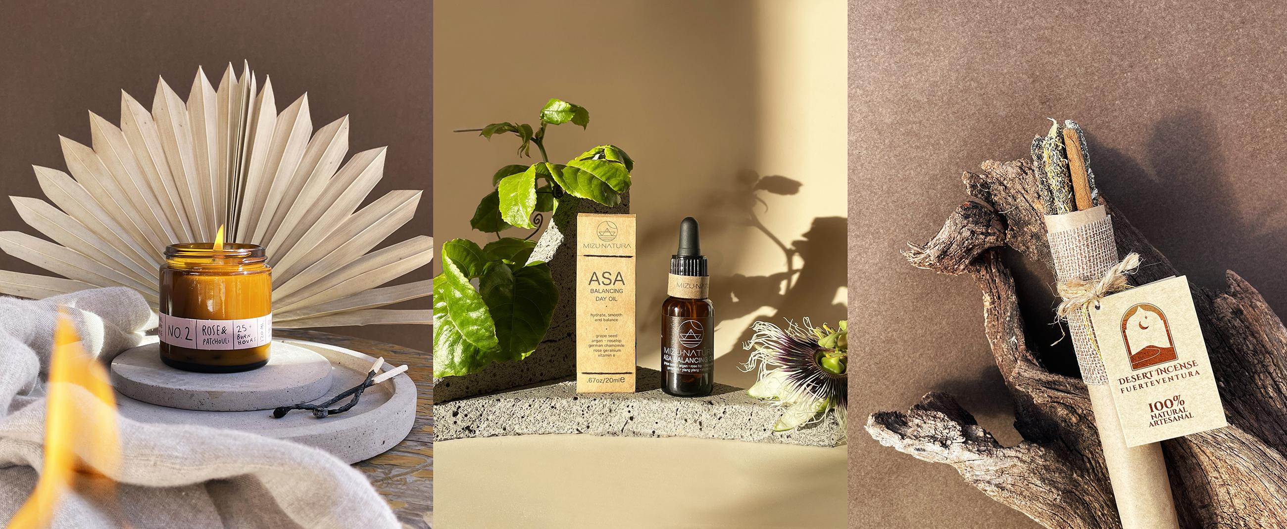
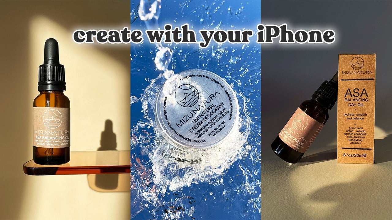
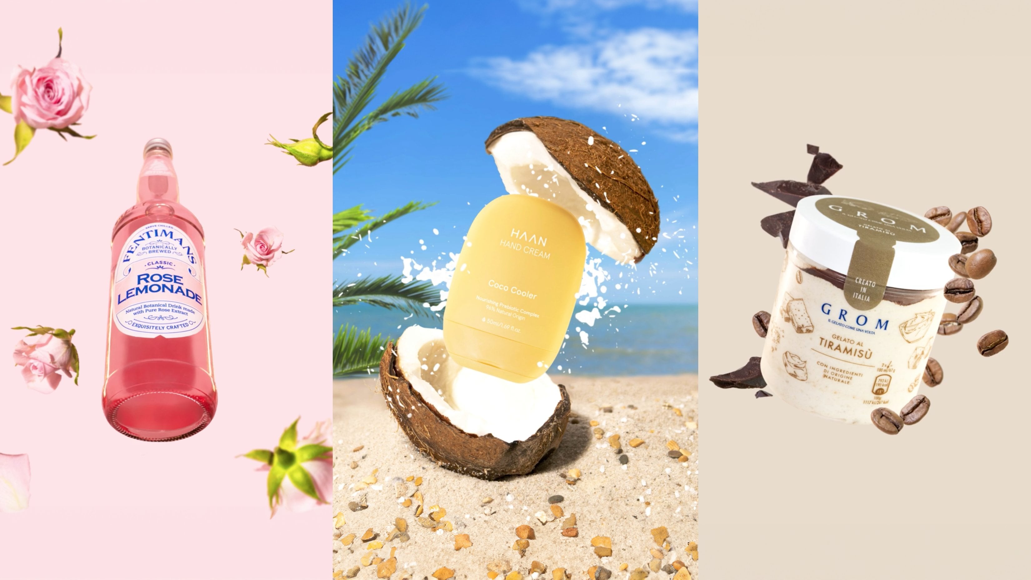
to you everything. In this course, I selected this soy candle
from a brand, Jana. The second product is this Asa balancing oil from Mizuno Tura. The third one are these
handmade incense sticks, 100% natural from
desert incense. These are the type of products
that I like to work with. Health and wellness is my niche. In this course, you will see me create three product photos of these products and I'll explain you
everything in detail. Some people say
that professionals work even without inspiration, but it's pretty hard to put yourself to work when
you're uninspired. And it's even harder
when you're stressed, burnt out, or depressed. The first step to
finding inspiration for your work is to bring
yourself in balance. Don't be too hard on yourself. It's good to stretch your
creative boundaries, but it's not good to push yourself when all
you need is rest. Don't sit and wait for the
inspiration to come to you. Inspiration comes
in the process, you just need to get started. You just need to set
yourself in motion and you will arrive in the mental space abundant with inspiration. You see ideas do not
appear from thin air. They're created on the
basis of other ideas. In fact, there are no
regional ideas under the sun, everything is a
remix of everything. Setting yourself in motion
can be as easy as scrolling. Pinterest, Instagram, or
checking out brand's websites. The first method of finding inspiration for a
product photography is checking out brand's
online presence. Go to their website. Go to their Instagram, their Tiktok,
Youtube, Pinterest. Check out what kind
of product photos they're posting. Already. Read a product description
ingredient list. Sometimes you can use
an ingredient as a pro. Don't miss out on
the opportunity of conveying ascent or a
flavor with an ingredient. Also, checking out
product reviews can be incredibly
beneficial because you can learn something about product
that only a customer would notice and their award can
inspire an idea in your head. Every brand has
mission and values, and those can inspire
some creative ideas too. Usually they're featured
on the website. And if not, you can ask about
it your clients directly. As I'm checking the
brand's online presence, I'm trying to boil down
their aesthetic into three descriptive
words for Miss Natura. It's natural,
minimalistic, and glowing. The products are natural. The packaging is natural. The ingredients are
natural and simple. There are literally five
ingredients in this face soil. There is nothing that
shouldn't be here and it's glowing because it
helps the skin to glow. This face soil in particular has this golden color
that's given, glow. So those words will help me
to come up with my ideas. The descriptors for
the Jana Soy candle are feminine,
mystic, and playful. The design is very playful. The label says, Common
Baby, let my fire. I think that's quite playful. The font is playful as well. It's given feminine because
of this pinky color. It gives feminine because of the ingredients Rose
and ba chui, mystic. Because of the color of
this jar. Dark amber color. And it has a hidden
crystal inside. So you want to make this
candle a part of a ritual. It also smells amazing. I just wish I could convey the smell to you
through the camera. It's so good I can't
wait to light it on. The descriptors for
the desert incense are natural, handmade,
and spiritual. The incense sticks are made out of 100% natural ingredients. The packaging gives a very
handmade quality as well. It's spiritual
because of the label, because of the font
used here as the logo. And you also would
want to make this a part of some kind of
a spiritual ritual. They smell amazing to you, so I'll use all of these
descriptors to help me find inspiration for product photos that I'll create
for these products. The main reason why
we want to learn about the brand and the
product is because you want to create product
photos that will fit in with the brand aesthetic, their vision, their mission. We wouldn't want to
create something that strays away in a totally
different direction. Our product photos should
introduce a new quality, new creative aspect, new
feel to the brand's visuals. But they shouldn't
look out of place. For example, I would
not create photos for Miss Natura in this
bright and colorful, trendy style, because
the main descriptor is natural and that does
not look very natural. The second method of
finding inspiration for product photos is
researching ideas online. I recommend
Pinterest, Instagram, and hands follow some product photographers
photography studios or brands on Instagrams. You will get a constant stream
of new ideas to your feed. There is a list of my
favorite creators in the PDF checklist with all
the steps for course project. So if you haven't downloaded that by now, it's time to do it. When you like a
post on Instagram, the algorithm will show you
even more photos like that, so you can save even more ideas
to your favorites folder. I have a folder
like that where I'm constantly saving new
photos that I like. And I come back to it before every single shoot that I do. Just in case when
I look through it, I will have some new
ideas sparked in my head. Hands is another great
source of finding inspiration that not
many people know about. It's on a professional
network and you can find some really
good ideas there. Not only in the product
photography section, but also in the branding section and in the lifestyle
photography as well. I really like diving deep into rabbit
holes and pinterest. I start by searching
something like skincare, product
photography aesthetic. I open up a photo that I like. I look at the photos below. I click on some photos, there, I find similar photos. And this can go on for hours. I save everything that I like on one big ongoing board
for product photography, and if you want, you
can have a look. I will leave a link for it
down below and you can follow me on Pinterest to stay
updated with that board. It has a lot of photos in
many different styles. As you're looking through
the work of others, you're developing
your own sense of style and your taste for
product photography. When I look at a product photo, I don't see a pretty picture. I see the color scheme,
the background, the angle from which
the photo was taken, The lighting used
for this photo, the position of the products, the props, the special elements, some effects, the editing style, the overall vibe,
and the atmosphere. Deconstructing
photos like this is an essential skill for
every photographer. This is how we learn, and we're going to
talk about it in detail in one of
the next classes. What I want you to take away
from this class is don't just sit and try to come up
with an idea in your head. Instead, go ahead and do some research online
about the brand, on the product, and research
some ideas on Pinterest, Instagram, and B Hands. I do those two things before every single
project that I start. Get started now by selecting a product that you will
use for this project. It can be something
that you already own, something that you will use, or something that your friends have, and you can borrow it. Research brands,
online presence. Read the product reviews
and the description and start compiling some ideas on
an ongoing Pinterest board. In the next class,
we're going to talk about creating mood
boards in detail.
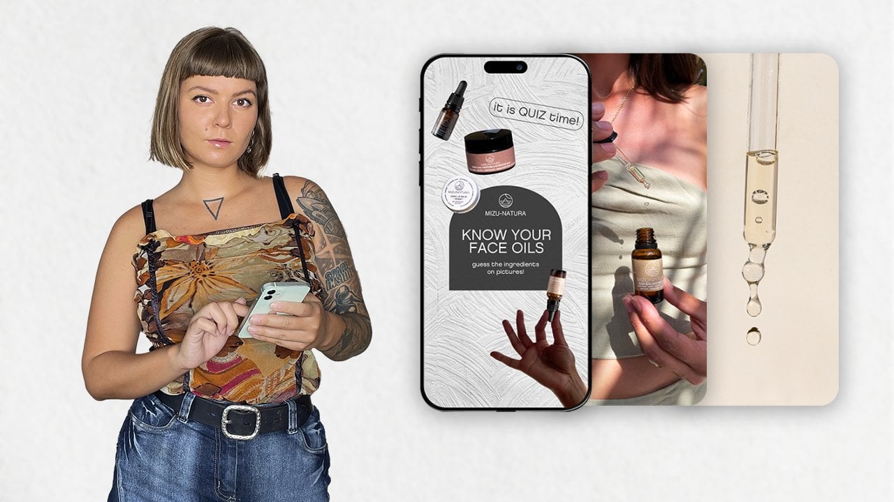
4. Creating Moodboards for Product Photography: Mood board is your point of
reference for the project. It will help you to stay
within the same aesthetic and create a cohesive
project for the brand. Usually product photo shoots
start on a high note, with a lot of inspiration
and motivation, and ideas ready to
be implemented. But with time, you
may find yourself getting more tired and
less and less inspired, especially if some of the ideas didn't work out as planned. In those cases, I recommend
doing two things. The first one is to take a break and the second one is to
look at your moodboard. To get yourself re inspired. Sometimes I just move on to the next idea and come back
to the previous one later. Of course, when you're
working with clients, creating a moodboard
is essential to communicate your vision
for the project to them. And make sure that you're on the same page when it comes to the aesthetic and the ideas
that you're going to create. If by the end of the project
you submit your work and the client says it's not exactly what
they envisioned, you can always come back
to the moodboard and make sure that you were aligned
with them on their ideas, on the references and aesthetic. There are many ways
to create moodboards. I would divide them into categories, personal
and professional. When creating
personal moodboards, you can make them as
sloppy as you wish. You can simply screenshot all the photos that you like and store them in your
iphone gallery. You can create a
Pinterest board. If you're only looking
for ideas on Pinterest, you can create an
Instagram folder. If you're only looking
for ideas on Instagram, you can also create your
Moodboard in Canva. If you will use Canva Teams, that will be a bit more professional because
then your clients can collaborate on the
moodboard and they can add their notes and their
own pictures for you. Another professional
method is to create it in Google Slides because it also has a
collaboration feature. You will add your pictures. They will add their pictures. You will add your notes. They will add their notes. And my favorite way
to create moodboards, personal and professional,
are using Miller Note. Miller Note is this professional
online moodboard tool. They have many templates
on their website. I will leave a link for you down below to check it
out for yourself. There are two main
differences between a personal moodboard and a
professional mood board. For a personal moodboard, you want to have everything
super nicely organized. Maybe there are
different sections of this project and you want
to keep them separate. And of course, the
second difference is nodes with your clients, you want to be super clear why you added a specific
picture to your moodboard. When you're creating
a personal moodboard, you already know that, like, you don't need to
specify anything. But if you edit this
photo, for example, your clients will
think that you're going to recreate
something like this. Pretty much exactly, but
you edit it because you like the color scheme or because you're going
to use the same props, or because you want to shoot
it from the same angle, and you need to specify
that on the moodboard. Now I will create
three mood boards for my three product photos
for dessert incense, Mona, Tura, and Jana. All right, so this
is Miller Note. I'm going to use one
of their templates, the Moodboard template,
to create my Moodboard. Now it's ready for me to fill
in with reference photos. First, I'm going to
go to Pinterest, and there I'm going
to search for Skincare product
photo aesthetic. And this first photo
here, I like it already. I like the shadow play. I like the color scheme. I like the use of rock
and fabric as props. So this one is definitely
going on, my moodboard. I'm just taking a
screenshot of that and adding it to Miller Note. Very easy. Next let's
dive into a rabbit hole. We can start with one photo with some nice vibe and atmosphere
just like this one. Then we're going to have a
look at what's below it. These are some similar pictures. And we're going to keep clicking until we find something
that we like. This one is going
to be the next one. And right below it, I already
see something that I like. This picture with a Bird
of Paradise flower. I have this flowers
growing around me. I could use it for the photo, but what is this one? I like this one so
much because like the product is balancing with
the flower and the rocks. And the name of my product
is Asa Balancing Oil. So this one is for sure
going on my mood board, I might integrate this idea.
I really, really like it. And let me see what else we
can find on Pinterus today. How about this photo right here? I really like the use of
stone props as a part of the background and the light
play in the shadow play. This makes the product
stand out so nicely. So that's also going
to my Moodboard. Next let's go to
my Instagram saved folder and see if we can
find something there. How about this one,
the photo with a stool and the products on it? I really like the
composition here, so it's going on the
Moodboard as well. Is there anything else in my saved folder that I could use? Okay, let's add this one, a close up of the
pipet with oil. I might integrate that
to my idea. Why not? After that, I'm heading
to hens and I'm going to search for natural
skincare, product photography. There are many different
projects on hands. Not just product photography, but also website design, and graphic design and branding. So we're just going
to look through some projects and see if
there is something inspiring. This project right here
is really beautiful. I love the minimalistic
compositions and the color schemes and
everything. It's very beautiful. It's just not exactly what I'm envisioning for my project. But let's keep looking. Maybe there is something
else. This one has a very nice and dark mood. I really like this
product photos, but I think I'm looking
for something in between this project and the
previous one for my ideas. Okay, this is getting closer. I think I'm going to
just add this picture on my moodboard because I do like
the minimalism of it all. Again, the rock
is used as a prop and I like the angle from
which the photo is taken, because it's very,
very powerful. Finally, let me go
back to Pinterest, to my curated Pinterest board
with more than 500 pins, which you can follow. So you will stay updated
with all of my safe ideas. And I'm just going to add this picture right there because I like the light play
on this face oil. And now I'm just going
to add some colors that I could use for my
background or props. And it's time to add some notes to make sure
that I'm being really selective about the
different elements from different photos so I can combine them and make something truly
unique and my own. When you are making
notes for the moodboard, you will need to deconstruct each photo into
different elements, like the lighting, the
composition, the styling, the props, the position
of the products, the angle from
which it was taken, some special effects, vibe, atmosphere, editing style, et cetera. Let me
show you an example. When creating notes
for my moodboard, I just want to highlight
a few important elements in each photo that I could potentially integrate
into my final product photo. Chances are I will not integrate all of these elements
in one photo. But it will give me options. It will give me a
good starting point from which my creative
process will flourish. I can go in a totally
different direction. I can come up with some
original idea and use that my mood board and the
different elements just going to give me a
great starting point. So I'm just highlighting
a few important things. Like for this first
picture, for example, I highlighted that the rock
and fabrica useless props. And that there is a beautiful
shadow play and that the light is very soft and
bright at the same time. And I'm just making notes like that for every
single picture. And that will keep
me on track with my aesthetic and the
vision for the project. And don't worry about
recreating someone's idea. If I just used these
descriptors to create my photo, it would be a totally
new and original picture that wouldn't look
anything like this one. But the best ideas
are created by combining different elements
from different photos. Your new and original
and unique idea will be a remix of a few ideas. And you can add
your own elements to make it extra special. My moodboards are ready and
it's time for you to do your moodboard for
the project using any of the methods that I
shared with you before. And I hope you already
started creating an ongoing Moodboard on
Pinterest or Miller. Next class, we're going to talk about sealing like an artist.
5. Steal Like an Artist: Everyone is after new
and original ideas. Every brand wants to
post something new and every photographer
wants to start a trend that nobody
has ever done before. So why are we creating mood boards and looking
up references online and trying to create
different elements from different
photos and remixing things because the pursuit of originality and uniqueness
is an illusion. Nothing is new under the sun. Everything is a
remix of everything. Every new idea is
created because we are influenced by something or we
have a certain experience, something may appear new to us, but someone else will look at exactly the same thing and say, I think I've seen that before. Let me share with you
six points why it's important to work
with references for a product photography. Using someone's photo as a reference is key to
learning product photography. Choose a photo, deconstruct
it in different elements, and try to recreate it. You won't create
exactly the same photo, but the process will help
you to learn about styling, composition, lighting,
and editing. There is no more
effective way to learn. Using references
will help you to develop your own
sense of style and tasteful product
photography much faster while gaining experience. Working with references for your product photos will
help you to create trend. You work and that's
what the brands are after they want to stand
out on social media, they want to jump on trends. They want those likes
and comments and sales. Someone started the
trend of taking photos with transparent acrylic
trays and some water. And all the brands were asking to create
photos like that for their moisturizers and foaming cleansers and stuff like that. Working with references is absolutely essential when
working with clients because you want to reach an alignment with them
and when everything is presented nicely and organized on a
professional moodboard, it adds professionalism
points to you. Moodboard is one of
the first things that you will show
to your client. And you want to make that
first impression really well, because that will
set the tone for the rest of your
communication with them. Using references means
stealing like an artist. You use their work as
your starting point. You put your own twist
on that idea and you put it in the context of the brand that
you're working with. For example, if you're
taking photos of a candle, you can look for inspiration in the skincare niche and get some ideas from there
as your starting point. And I recommend you to read the book still like an artist, if you want to learn
more about the concept. Working with
references allows you to work faster and smarter. When you will have a
few projects in a week, you will not have enough
energy, inspiration, and time to come up with all
of the ideas in your head. Working with references will allow you to produce a lot of work in a shorter period of
time and make more money. As you gain more and more
experience working with references and deconstructing
ideas on different aspects, you will start to come up with your own original ideas on your head because you've
already seen a lot and you will be able to
implement your ideas because you have the experience and you know how to do
different things. When I started learning
photography in 2011, my teacher gave me
a lot of homework to find the work in the
style that I like and try to recreate it that allowed me to learn faster and
gain experience. And after two months of
this intense learning, I started working as a
professional photographer. I used to take some creative
portraits of people in a photo studio and shoot
some street style. So I'm recommending this
method of learning to you only because it has
worked wonders for me. If you're working
with a client and they show you a reference
that they like, you need to explain to
them that you will not try to recreate something
like that exactly. You will derive
inspiration from it. Ask them what is so special
about this reference? Why are they showing it to you? Help them to deconstruct
it. Is it the light? Is it the props?
Is it the model? Is it the location? Is
it the editing style? Help them figure it out. Now we are ready to talk
about composing images. So let's talk about
it in the next class.
6. Composing Product Photos: In this class, we'll learn
about composing images. I will share with you some photography
composition rules and best practices to create
well balanced photos. Later in the course, when
I'll demonstrate to you how I take product photos
for these products, I will show you the rules in action and also will
break some rules, because to break the rules, you first need to
know the rules. First, let's talk about
the definition of composition in the context
of product photography. It's the aesthetic
arrangement of elements to create a visually pleasing
and memorable image. It's not just capturing
a pretty moment, It's incorporating principles
of design and creativity to create a photo that will showcase the product
in a best light. And that will resonate with viewers on a deeper
emotional level. Next we're going to talk about the importance of composition. We'll cover some basic
composition guidelines and then dive deeper into the advanced
composition guidelines. So why is composition
important nowadays? Product photos are
the first point of contact for
potential customers. We find out about new brands through social media
and website ads. Well composed images can help to enhance
brand credibility. People tend to buy
more from brands that invest in high quality,
professional photos. Also, well composed images can help customers to connect to the products on deeper
level by evoking emotions. And of course, they
help brands to differentiate themselves
in a crowded market. Now let's imagine
that you're scrolling Instagram and you stumble
upon these two ads. Which one would you click on? Would it be the first one where the products are just
positioned on the background? There are not props
that shot from a angle. The only thing
that's telling you something about the
brand is the packaging. Or would it be the second
one with some props, some shadowplay,
interesting backgrounds? I bet it would be
the second one. Brands using poorly composed
product photos have no chance of standing out in
overcrowded social media. And that's why composition is important in product
photography. Let's move on to the basic
composition guidelines. Some people call them
rules or principles. These words are used
interchangeably, but I really want you to
think of them as guidelines. They can help you to avoid
the fear of blank background, but it doesn't mean that
you have to follow them, especially all at once. Now we're going to cover
the rule of thirds, symmetry and asymmetry,
composing with a light negative space
and visual hierarchy. The rule of Thirds is the most ubiquitous
composition guideline. It divides the frame
into three by three grid with two equally spaced
horizontal and vertical lines. Every iphone has a feature that allows you to turn
this grid on so you can align the subject of your photo along
one of these lines, or on the intersection
of those lines. Here are three of my
photos where I used the rule of thirds to
compose my images. Let's talk about
using symmetry and asymmetry to compose
your images. Both are very powerful tools
for product photography and they both create totally different atmosphere
and the vibe. The choice depends on the emotions you want to
evoke with the photo. Have a look at the first photo. If you would divide
it vertically, you would notice that
the left side is the exact mirror
of the right side. Using symmetry creates the
sense of harmony and balance. Now have a look at
the second photo. As you can see, it's
not symmetrical. I showed exactly the same
composition, but farther away. And I added some
magnolia flowers. I played around
with them to create a more dynamic and playful look. Now let's talk about
composing with a light. The light significantly
influences the overall mood, aesthetics and emphasis
within an image. And there are two
types of light, soft light and hard light. Soft light produces gradual
and smooth transitions between highlights and shadows. Hard light results in sharp and well
defined shadows with a more abrupt transition
between highlights and shadows. In the example here, you can see a sun pendant shot
with hard light. It only makes sense for a sun pendant to use
very bright sun. Notice that I'm also using a very interesting
shadow play here. It was created with
a cocktail glass, and it resembles the reflections in the pool or in the ocean. And now this photo has the
vibe of Eternal Summertime, just the perfect mood for
this piece of jewelry. Here are a few more examples
with skincare products. I show the first one
on a very sunny day. And that's why the
prop and the products are creating sharp,
well defined shadows. And they become a part of the composition and
styling elements. I showed the second
photo on a cloudy day, but there was still some
sun peeking through. And that's why you can see this beautiful light
play at the background. But you can notice how the
products and props are casting much softer shadows
than in the first photo. I showed the third photo
during the golden hour, maybe like 20 minutes
before the sunset. And that allowed me to
have this beautiful, well defined frame
at the background. And I placed the product in the light to make it
stand out and glow. The next guideline
is negative space. Negative space is
often referred to as empty or white space or air. It's the unoccupied area around the main
subject of the photo. The use of negative space helps us to focus
on the subject. It draws all of the attention
to the one big element, our product, or a certain
element of the product. It can also make the photo
more aesthetically pleasing. It creates a sense
of elegance and sophistication in
product photography. There is a very fine
line between not having enough negative space and
having too much negative space. It's all about the
visual balance. Let's look at these examples right here in the
first picture here, you can see that
there is not enough negative space
around the products. They appear squeezed into the frame in the
picture number three. On the other hand, we have a lot of negative space
around the products, but it makes them look
insignificant and small. Picture number two
is a happy medium with just the right
amount of negative space. It's important to have enough negative space around products, especially for photos
for Instagram. Whenever a brand or you
will post a picture, the only thing that's
going to be visible from the profile view is the middle
square part of your photo. And you wouldn't want
anything to be cut off. So make sure to focus all of your composition in the middle
square part of the photo. Now let's talk about
the visual hierarchy. It's the intentional
arrangement of props, products, and other elements
within a composition to guide the viewer's attention
to the main subject. Every element within the frame
should have a purpose and certain elements should stand
out more than the others. Products should stand
out more than props. Now let's look at some common mistakes in visual hierarchy. The first one is
distracting color. That purple prop is driving all of the
attention to itself. Second mistake is
distracting placement. That prop and two products on the right look way out of place. And a third mistake
is distracting size. That huge prop on the right is driving all of the
attention to itself. And all the props
and products on the left don't really
matter anymore. Now we are ready to dive deeper into the advanced
composition guidelines. First, I recommend you to master the basic ones,
take some photos, experiment with
them, and then you can start using
the Golden Ratio. Leading lines, framing,
repetition and patterns, and unconventional
perspectives. The first advanced guideline
is the Golden ratio. It's an upgrade of
the rule of thirds. Instead of using a grid that divides a picture in
nine equal parts, we're using a spiral. This spiral has been
observed in nature. It's appearing in the
patterns of sea shells, the arrangement of
leaves and flowers, it's in the proportion
of certain animal bodies and it's in the galaxies. In photography, art,
architecture, and design, the golden ratio is
believed to create a aesthetically pleasing and
harmonious compositions. When composing product photos, you can use the spiral to position your product and
props and other elements. And that way you will create a more visually pleasing
and well balanced photo. Next, let's talk about
the leading lines. The purpose of
leading lines is to create a visual pathway that draws attention to the product or to the certain
element of a product. It makes a composition more engaging and
interesting to look at. The lines can be actual
lines present in the photo, or they can be implied by the arrangement of
elements within a photo. Let's talk about framing. This is one of my favorite
ways to compose my images. It's basically using
objects or elements in the foreground or background to create a frame
around the product, guiding the viewer's
focus to it. In the first example here, you can see a Skincare oil
floating in the frame. By the way, if you want to learn floating product photography, I already have a skillshare
course about that. But you will need some Photoshop skills to be able to achieve this effect by framing the product with
surrounding elements. You highlight its
importance and guide the viewer's eyes to the
intended focal point. In the second photo
here you can see how I'm using two frames
to compose the image. The first frame is this
bathroom shelf and the second one is a
shadow of that shelf. I think it's pretty genius. Here are a few other examples of using framing and
product photography. In the first one,
all you want to look at is the product in the basket. On the second photo,
you can see that I'm using an organic object, a cactus, as my frame. And in the third one, I'm
using a circular prop. But I'm placing it
at the back just to connect the left side of the composition
to the right. One next guideline
we're going to talk about is the repetition
and patterns. It's the intentional use of
repeated shapes, colors, and objects that creates a sense of order and rhythm
within a frame. In the example on the left here, you can see a product photo of some Guasha and Jade rollers. And notice that I'm also using a purple flower to
break this pattern, to break this
composition and make it even more interesting to look at Pattern product photos do such a great job capturing
viewers attention on social media
because as you're scrolling the mess
of Instagram photos, you're finally stumbling
upon something so nice and orderly that you just can't help yourself but
want to look at it. Here are a few other
examples of using repetition and patterns
in product photos. The first photo is a photo of incense sticks with
sharp shadows. It's such a simple
yet dynamic image. In a second photo, I'm
creating a visual rhythm by repeating the shape of the product and by placing
them on the stairs. And the third photo is a
more classic example of a pattern product photo
for the skin care oil. I just took one photo of an open bottle of the
packaging and a closed bottle, and then I repeated
them in Photoshop. And finally, let's
talk about using unconventional perspectives
to compose our images. It means to capture
a product from an unexpected or unusual
angle of viewpoint. An example here you can
see that I captured the face bound from underneath
through a piece of glass. This is not how you
would usually look at this product in your
home when using it. This unique view
evokes curiosity and makes the product stand
out in the social media. Let's look at three
more examples of using unconventional
perspectives. In the first photo, here I'm making some skincare
products float. Again, this is not something
you would see every day. But this allows us to
look at the product from different angles
and it creates a visually appealing and
engaging composition. In a second example, I'm using
a mirror that allows us to integrate the sky as our background and look at
the product from underneath. And in a third photo, I'm showcasing a product
in a unique way. Instead of capturing a perfectly intact rose lemonade bottle, I am smashing it down and adding some real roses to convey the scent and the feeling
of this lemonade. I hope this photos
inspired you to start thinking out of the box
when composing your images. And when you've mastered the basic and advanced
composition guidelines, you can start
breaking the rules. Intentionally, intentionally,
breaking the rules. It can be an opportunity
to experiment and discover unique visual expressions and stand out with your
photography even more. Break the rules when
you want to create more abstract and
artistic compositions and when you want to tell a
story through the image. Now after learning
the composition, we are ready to delve deep
into the creation process.
7. Shooting Product Photo #1: Let's shoot our first concept. All right, now I'm going to take a product photo of the
Aca balancing oil. And I'm going to do
it at home using my iphone 12. Let
me show you how. So It's the golden hour
right now and I have these beautiful sunbeams enter my room through the window. I'm just going to
wait for them to climb a bit higher up the wall. And then I'll move the
table to the left and set up my composition
somewhere here in this area. So for my props, I
have a few options. These are props from btonton. They are fake stones
with flat bottom. So it's easier to stack
them in all kinds of ways and I could just like balance my product
on the top here. These ones I found
on the street, like it's just the best way to find unique props to make
your photography stand out is to keep your eyes peeled for really cool
stuff outside here. Same situations. I found
these two cut offs on the street and I
picked them up and I use them for my
product photography. And I absolutely love how I can style my products and
use different combinations. I'm not really sure
about these props. I think they're too white, too stark for the color
scheme of my project. Even though the product
pops on this photo, I don't think it
really works with the color scheme
of the brand and the overall aesthetic that I'm going for with my
product photos. So this is a no, These ones I actually really, really like. But again, right now, I think I want to
go for something a little bit more textured. Because these, to me, look too perfect when compared
to something like this. Something like a real stone. So I'm going through this one and I need
to hurry up because the light is actually in kind of perfect position
right now. All right? I have lots of
background options that I could use
for this project. Something that fits in with
the brand color scheme. Let's try a few of them and
see which one works best. And actually I'm thinking to use just one background as an infinity background
for this idea. Could use something
quite neutral like this. Could you use
something a little bit more yellow like this? This is actually
really, really good. This color, I think is very
similar to the Prop color, so it wouldn't really look very good. This
one is too brown. It doesn't really complement
anything in here. It just clashes with the
color of the packaging. This brown one, I
think it's too dark. I don't like brown here. It's between these two. It's whether a little
bit more warm and bright or a little bit
more gray and muted. I think I'm going to use
this yellow e beige color to contrast and complement this cold gray
color of the props. I think this way the
whole picture going to look more saturated,
bright and interesting. I'm just going to
use masking tape to tape my background to the wall. Here I can style those props in many
different configurations. And please remember that when styling
products with props, there is no right or
wrong way to do it. It's all about your
artistic vision and intention behind every
action that you take. At the beginning, you may be not very confident in your
creative decisions. You may feel like you don't
know what you're doing. But with time, through consistent practice and
through working with references and developing
your own sense of style and tasteful
proto photography, you will start putting thoughts behind every
single action of yours. For example, here I've just
added a piece of foilge and a flower to add some additional
interest to the photo. Create that beautiful shadow,
play at the background. Adding that much
needed element of nature to this photo
to bring life to it, to convey the sense of beauty. Whenever I'm working
on my photo, I always come back to my
three main descriptors. And as a reminder,
three descriptors for Miss Natura were natural,
glowing, and minimalistic. When I'm taking photos
with an iphone, I always zoom into 1.3 maximum to reduce the lens
distortion. So here it is. Here is the final photo
that I've created for Inatura as balancing oil. I think it's giving natural, minimalistic and
glowing all the things that we want and I think
it's very eye capturing. If you were scrolling Instagram, would you stop to take a
closer look at this photo? And now we are ready to move
on to our next concept.
8. Shooting Product Photo #2: Let's shoot our second concept. All right. It's another day. And I'm ready to take a photo
of the Jana soy candle. I'm going to use the natural
light in the courtyard. I'm about to stab my mini product photography
studio at home. And in this class I'm
going to focus on different types of
light and how you can use it for product
photography to make it look a bit more
interesting and stylized. So let's step deep into that. I'm setting up my mini
photo studio in the shade, so this can be done
inside a room, in an apartment, or a house. I'm bringing my backgrounds the same as I used
before because the color scheme
of this Jana brand is very similar
to the Mzonatura. I'm just testing which of the backgrounds will
work best in this light. I went for the dark brown
one because as a prop, I'm going to use
this leaf and it's going to create
the most contrast, and it's going to create
a very cozy feeling. And for candles,
all I want is cozy. Then I got to styling. At first, I tried placing
the candle on a stool, but it looked very boring and the colors clashed
in a weird way. So I decided to introduce one
of my concrete trays from Biton Fn to introduce a new
color and a new texture. But one wasn't enough, so I added another one to create even more
dimension in this photo. And then I taped this
leaf at the back, so this is how it's
looking so far. And then I wanted
to make sure that I made the right choice
for the background. As you can see, this yellow bash makes the leaf look dirty. We didn't want that.
This gray color had a good contrast
with the leaf, but it made the photo look
cold and not cozy at all. This color was very similar to the leaf,
so I didn't use that. This one, It's just a no, it's like a totally
different tone. I definitely made
the right choice for the dark brown background
for my next styling element. I wanted to add some fabric, and I'm using just
a pillow case. This one is made of linen and it has a very nice,
luxurious texture. When working with fabric, you really need to go
for high end pieces. Otherwise they can make
the photo look cheap. I just fluffed it up and created some folds to add
interest to my photo. For my next styling element, I'm adding burnt match sticks. I think it's a very
nice touch and I really like using props that makes
sense for the product here. I'm just testing how I
want to introduce the fire as a styling element to the
foreground of my picture, and I think it's
going to look fire. And now let me show you
a few lighting options that I could use for this photo. This is soft light. You can see the shadows are not
very well defined. The light is bright,
but it's diffused. You can get the light
inside the room, or you can get the light
on a cloudy day because the sunlight is going to
get diffused by the clouds. This is a light play
practically. It's a sunny bunny. And you'll see in a
little bit how I'm creating it. This is hard light. At this point, the sun
started to move and the sunbeams were entering
at a different level. And they were shining
bright on my scene, even under the roof. As you can see, the
shadows are very sharp, well defined, and the light
is bright and strong. And this is shadow play. I can introduce a shadow
by placing any object. In this case, I'm
using a palm leaf in between my light
source and my scene. First, I'm taking some
photos with a soft light. I just want to create a
few different options for myself to choose from later. I'm using my mood
board as a point of reference and as a way
to reinspire myself. When taking photos, I
always make sure to capture the same scene
from different angles, closer up and farther away. If you want to learn more about taking product photos
with your iphone, which settings to use? How to take photos, precisely, how to select them
and edit them. I recommend watching
my other course, Mobile Product Photography
at home with an iphone. You can find it on
skill share as well. As you can see, I'm
shooting this on a very sunny and bright day, and that means I can create a light play with
a round mirror. I'm just going to create a sunny bunny and
direct it at my scene. This mimics the spotlight in
a professional photo studio. This is such an easy way to
create a stunning effect on a product photo and draw all of the attention
to your product. So I'm just setting up
my iphone on a tripod, and while one hand is directing the sunny
bunny to my product, another one is
pressing the button. My hand with a sunny
bunny wasn't very steady, but I made sure to
capture a lot of photos, so you can choose
the best one later. And here is something that I
was very excited to try out. I wanted to introduce fire
as a styling element, so I just lit up a match stick and I put it in
front of my scene. So this is how it's looking. Here I am, again trying to
capture a lot of photos. And in the end, I actually asked my boyfriend to hold
the mirror for me to create the sunny bunny while I was creating this fire effect. And now I'm ready to show
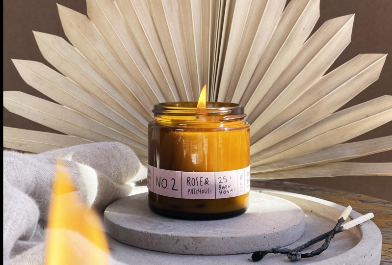
you the final photo. And here's the final photo. I am very proud of this. I like how styled it is. It's definitely not
the lifestyle picture. No, it's very intentional. It's very precise. I love the sunny bunny, how it creates almost
a sharp diagonal shape on the surface of
the candle jar. I love the introduction of the fabric to create
some softness. I love the introduction
of the fire. Continue conveying that
element of coziness. I love the contrast of
the background color with the prop and I
love the match sticks. They add such a nice point
of interest on this picture. I love it a lot, and I
hope you love it too. Now let's move on to our
third shooting concept.
9. Shooting Product Photo #3: Let's shoot our third concept. All right, I'm ready to take a product photo of
the desert incense. And for this idea
I'm going to go very natural and
very minimalistic. And in this class I'm going
to focus more on backgrounds. How to choose backgrounds, how to set up backgrounds
so that you will have a good variation of photos using the same
backgrounds within the same project or from
one project to another. Let's dive deep into that. It's gotten very sunny again, so this is the prop
that I'm going to use. I found it in a
garden and I really, really like this piece
of driftwood, I guess. I'm thinking to create a
very simple composition to make this incense sticks
a part of the nature. And I will need to just probably lean it
on the background, put the product,
position it somehow, and then take a photo. That's going to be very simple. Now, backgrounds, You've
seen these bad boys before. These are just the
backgrounds that fit in with the color
scheme of my project. This is a big benefit
of working with brands in the same aesthetic,
in the same niche. Because you can reuse
the same backgrounds and props from one project to the next and keep
your costs down. However, when you are
working for clients, especially for bigger clients, you can include costs for
backgrounds and props, for models, locations, whatever
you need into your quote, so they will pay for that. I have a couple of
papers here and these are some craft materials. These are foamy, plasticy, synthetic kind of materials from the craft store about
choosing the right backdrops. Since I'm not working
with any kind of liquid products
right now and I'm not planning to do any product
smear or product swatch. I can work with materials like paper and whatever this is, this is something
plasticy, foamy, but it can easily absorb
some spill on it. If I want to work with
products like that, I can put a piece
of glass on top of my background to keep the
color and the texture, but keep it protected
from the liquids. Alternatively, I could also use specialized vinyl backdrops for product photography
or something else, like a bathroom
tile, for example. I really like using
those because they have interesting
texture and color, they look very unique. And in some cases, I can also use walls as
my backgrounds, especially if they have a nice and luxurious looking texture. This is not my favorite, so that's why I'm going to
use my other backgrounds. When it comes to
choosing the color, I always come back
to the brand and the aesthetic of the brand
and the brand color scheme. And I'm trying to make
everything work together. This background color looks very similar to the color
of my packaging. It complements the
color of the wood. It's very natural as well. It makes the picture look very
calm. I kind of like that. If I were to shoot my product on the background
without the wood, it would look really,
really boring. But since I'm breaking
it up, this can work. Here is our next contestant. It makes the photo look
more bright because it's much lighter than
the previous one. When I put it next
to each other, this one is so, so gray. While if it's just alone, it's more beige gray. But since this background is
so bright and such rated, it makes the product
look very dull and gray And it
does not stand out. The background is drawing all of the attention to itself
and I don't like that. So this is enough for me. How about this
background color now? It's very saturated brown. And it complements the color of the text and the logo
on the packaging. Which I think it's
quite flattering. It's very interesting. So now, how about brown background? The prop practically
disappears on this background. It does make the product stand
out more and it is a vibe. The difference between the
background and the prop is just the texture and the product here is
the main character. I wouldn't always
go for this look, but for this idea, I think this is so
far my favorite. I really like how the
product shines here. Our final contestant is this background and
it's just not giving, it's just not the same
as the brown one. I fell in love with the idea of creating a monochromatic look. So we are going with this. Okay, so I'm never skipping this step before
taking any photo. I'm going to clean my lens. I'm really happy with the
photo that I've taken. Now, I want to take
a minute to show you a few different ways of how
to set up your backgrounds. Even if you have two
background colors like this and that, for example, you could already take four different photos. The first way to
set up a background is to set up an
infinity background. You don't see where it
starts and where it ends. There is no lines over here. There's nothing overlapping. It's just one continuous color. But it's going to give me
a gradient on a photo. I could potentially style my product somewhere
here and take a photo, and it will be one
continuous background. Another way to set
up a background is to use one color on the wall, another one on a table
or on the floor. And when I'm taking a
photo of my styled scene, this is just an example. I
wouldn't style it like that. Okay, I can do it straight up or I can do it from this
angle or from that angle. And that way there will be this diagonal line
on the background. For the same projects
with the same colors, I can also set up
this background as an infinity background
and I can swap them. So this background would go on a table and this one
would go on the wall. And that's how with just
two different backgrounds, we can create at least
four different photos. If you add some light play
on it or some shadow play. If you take some photos with a hard light and
some soft light, you're going to have a
great variety of photos for one project with minimal resources and
minimal investment.
10. Conclusion: So now, after you've
seen me create three product photos
and you've seen my whole creative
process in detail, you're ready to take your
own creative product photo. You have everything you
need to get started. And it may seem like a small
and significant thing to do, But when it actually comes
to doing the project, you may find that it's
not as easy as it seems. It only gets easier
with experience. You wouldn't want
to find yourself in a situation when you took on a client project and figured out that you're
unable to deliver. You're unable to deliver
on your promise. But in business, all we want to do is underpromise
and overdeliver. Making this little
project happen is a major step towards making your dream of becoming a
brand creator come true. I hope this course
got you inspired. I hope you're overflowing with ideas and ready to get to work. Don't postpone anything. All it usually takes is
just the first step. And as I mentioned before, you don't even need to
get up from your couch. You can open Pinterest
or Instagram on your phone and start
researching ideas online. If you also want to learn about finding clients for
product photography, I have a free PDF
guide waiting for you. Go ahead and leave a
review under this course and send the screenshot to
my Instagram or E mail. I'm happy to listen to and
implement your feedback to make this learning experience even better and
more fun for you. If you haven't watched
my previous course on skill share about mobile
product photography, I highly recommend you
to check it out as well. Because there I dive in much more detail about finding props for
product photography. Working with the natural light, Optimizing your iphone settings, taking and editing
photos on your iphone. I made these two courses
to work together, and with the PDF guide
about finding clients, you will be ready to start
your creative career. Meanwhile, join my
Youtube community, subscribe to the
Stancino channel to hang out with
me on the island to take some product
photos and to design the lifestyle of
your dreams with me. I hope my course helped you
on your creative journey, and I'll see in my
next one. Peace.
 Stancy Nova, Product Photographer & YouTuber