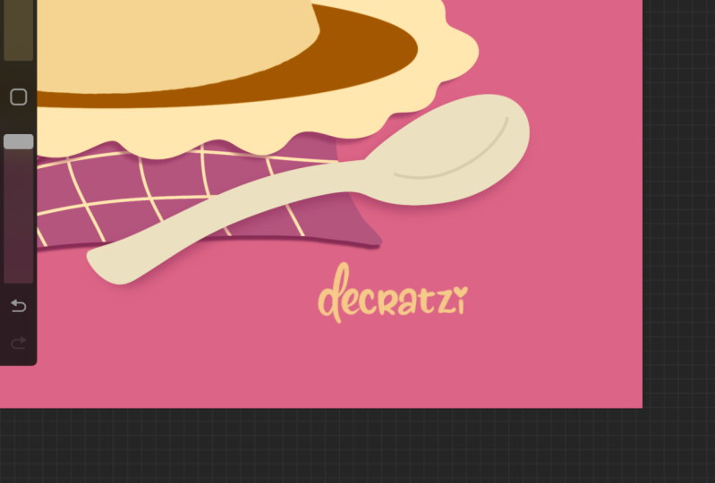
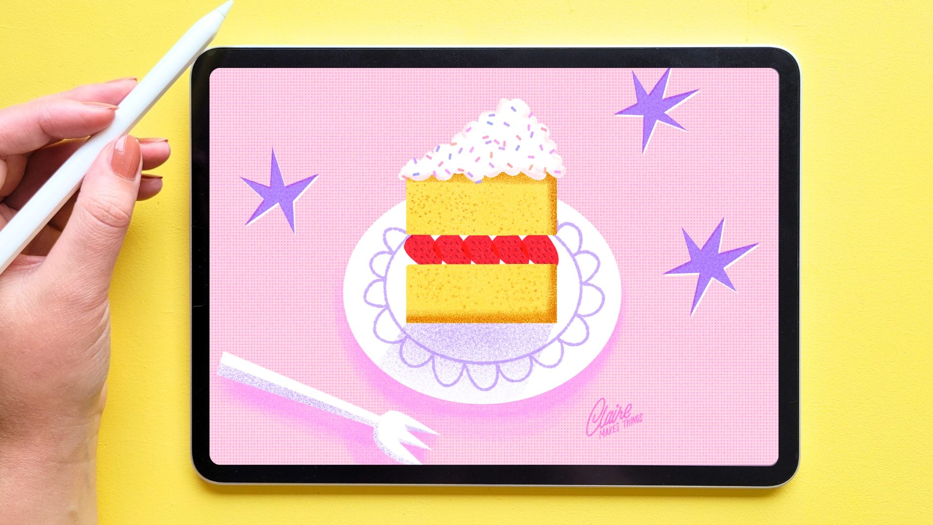
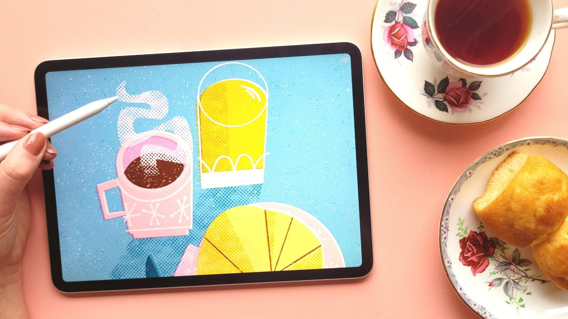
Transcripts
1. Intro: Have you ever felt
stuck in Procreate, digging through brushes,
struggling to find layers, and just wishing that the
whole process felt easier? Over the years, I've found
simple tricks to make my illustration process
in Procreate smoother, faster, and way more fun. And that's exactly why
I'm sharing this class. Like most of you,
I use Procreate on the iPad to do pretty much
all of my illustration work. I'm always looking
for ways to make the process smoother and more efficient because the more you become an expert
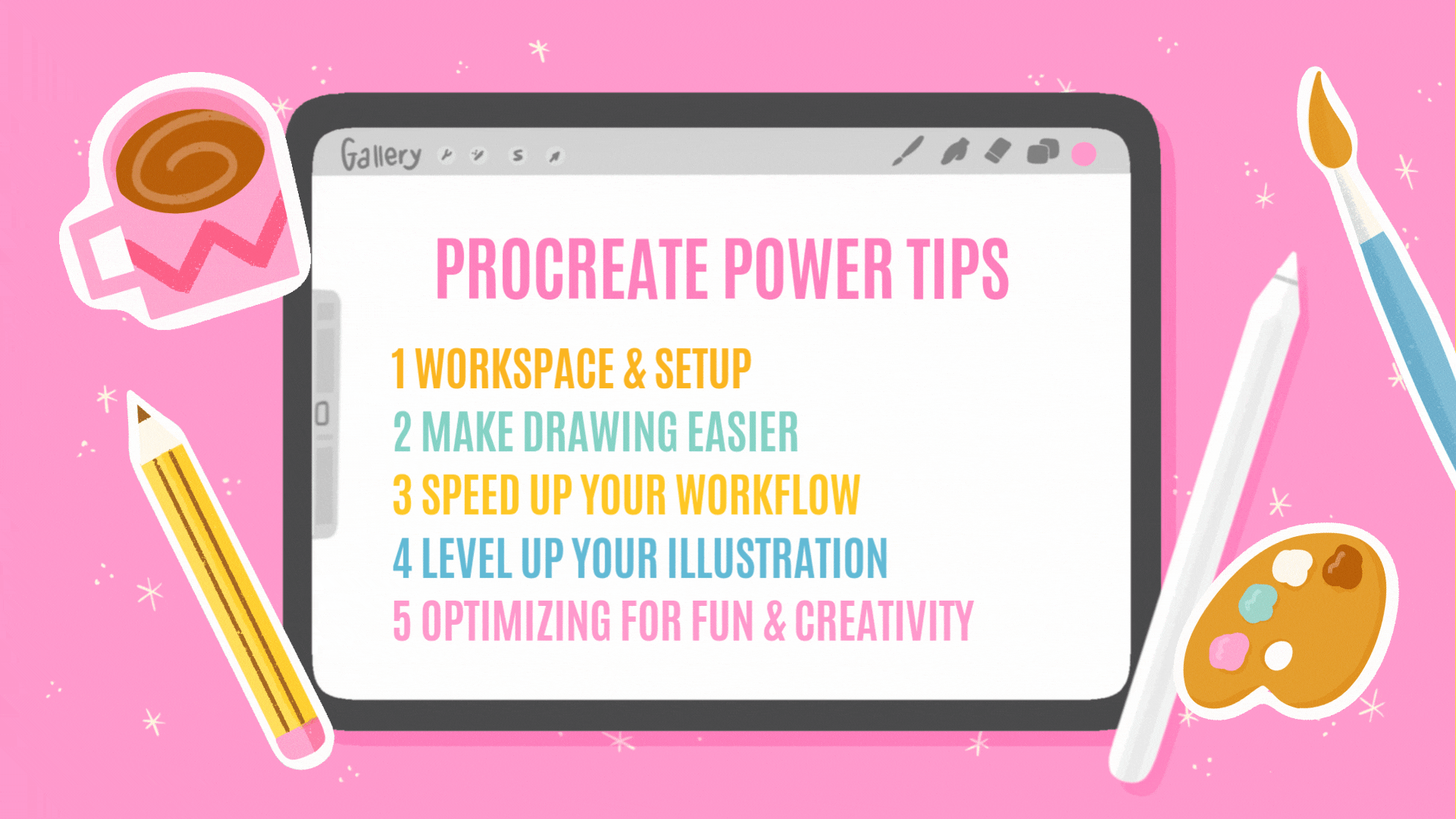
in Procreate, the more fun drawing will be. In this course, we'll
cover a variety of topics. You'll learn how to speed up your workflow using
gestures and shortcuts. I'll help you to stay
organized so you never lose track of your
brushes and your layers, and we'll discover how
to make drawing feel effortless with smart
techniques and fun tricks. This isn't a course about
the basics of Procreate. I'm not going to
cover everything there is to know
about this tool. I just want to give
you options to improve your
illustration process and make drawing more fun. With this class, I want
to put the artist, you, first, not the software. I wish there was a
class out there like this when I started using
Procreate years ago. Whether you're a hobbyist or
a professional illustrator, these tips help you in
your creation process. So let's get started! :)
2. How It Works: Here's how this class works. As I mentioned, this isn't a
basics of Procreate class, and I'm not going
to cover all of the gestures and shortcuts
that Procreate has to offer. Most of the tips I'm going to cover are specific to Procreate, but some go into the
illustration process just to make drawing
easier and more fun. So some of these tips might
apply to, for example, Photoshop or Adobe
Fresco, as well. And some of these
are just things that I discovered that make my illustration
process and lettering easier that I think will
be helpful for you too. The lessons are organized per
step in the drawing process, from setting up and organizing your workspace to
finishing up your project. You can find an
overview of all of the tips in the recap at
the end of each lesson, and you also see
an Apple pencil at the top with the tip
that we're working on. I would suggest to simply follow along, to
open Procreate on a new canvas or an
existing piece that you've made and just follow
along with each tip. In the resources, I added a checklist that you can open as a PDF or in Procreate so that you can
follow along with each tip. For your class
project, you don't need to create
anything from scratch. The student project tab is
going to serve as a library of tips that we find helpful, suggestions we want
to make to other students. So you can simply
make a screenshot of whatever you find
really helpful, and you can also share your work that you used one
of these tips in. Open up Procreate and
let's get started.
3. Workspace & Setup: Firstly, we're going to
talk about a few ways to organize your settings
and your brushes, and these are things that
are really helpful to keep in mind before
you start drawing. Firstly, let's talk
about the brush library. I won't go into everything
about brushes here, but just a couple of ways
that you can organize your brushes and a few ways
that you can find them back. In your recent tab, you'll see the most recent
brushes that you've used, and you can also pin your
brushes to that recent tab. This is the best way to
find your brushes back. The way that you can
pin your brushes is by swiping to the left on
your brush and then pin. Now you have it saved
to your recent tab. Something that has really
changed the way that I work is using the brush memory tool. This allows you to save
certain brush sizes. As you can see in this side bar, you've got the size
slider and opacity. If you tap on that slider
and then tap on a plus sign, you can save sizes
and opacity settings, which I love using when I
want to make sure that I have consistent sizes of my brushes and these get saved in
your brush library, so that's really helpful. You
can save multiple sizes, multiple opacity
settings as well. As you can see, the
size is a percentage. This means that the size of your brush depends on
the size of your canvas. Keep this in mind when you're working with a
different canvas size. You can save multiple sizes and opacity settings and you can turn them back off by tapping and deleting
that saved size. This is the best way to keep track of the size
of your brushes, which is really helpful
when you want to make sure you have a
consistent line width. By the way, my side bar is on the right side
because I'm left handed, so I want to make
sure that it doesn't disappear underneath my hand, but you can change the side of your sidebar in the
actions menu and then preferences and then toggle on the right
hand interface. The last thing I want to
tell you about brushes, if you make any changes
to your brushes, make sure that you have
the reset point turned on. If you tap on a
brush, you can go to the brush studio and make
adjustments to your brushes. If you go to the last
tab, about the brush, you can tap on 'create
a new reset point'. This will make sure that you keep the original
settings of your brushes, and you can always go back to those original brushes by
tapping on 'reset brush'. Especially when you
make changes to default brushes in
Procreate or you buy a set, you want to make
sure that you don't lose the original settings. If you like both,
you can also simply duplicate a brush and make
two different versions. If there are certain actions or preferences that you
want to keep close, the best way to save this
is by using a quick menu. To open it up, tap on the
button in your sidebar, and then the quick
menu opens up. This allows you to save up to six preferences or actions that you use a
lot in this little menu. To set up a quick menu, tap in the middle, and then you can
create a new one, you can rename them
and set up multiple. And tap on each action
to add either actions, filters, preferences, or you can even add
brushes as well. You can either use this to set up the actions that
you use the most. But I also find this
helpful, for example, setting up a quick menu for certain project where
I know that I need a specific group of brushes or specific
actions that I use a lot. That way the quick
menu will remember what actions you are using
for that specific project. If for some reason the
quick menu doesn't pop up, go to the Actions
menu preferences and gesture controls to change
the control for this. Because Procreate is a
raster-based program, all of your art is made up of pixels and you can see that
pixelation when you zoom in. Every time you scale
or move your layers, Procreate tries
to basically move those pixels and connect
them the best way possible. There are different methods
that Procreate uses for this. You'll see those in
the transform menu and then in the
interpolation tab. Here you can see
the different ways that Procreate does this. The best setting for this
is bicubic, simply because this makes sure that
you get smoother edges rather than pixelated lines. It's not going to
prevent quality loss altogether because every time that you move or
scale your layers, you're going to get
some quality loss, but it does
limit it slightly. The only thing is that bicubic
is a little bit slower, but it does create
smoother edges. Next up a little
bit about color. When I start drawing, I either have my
colors saved just in a separate layer or
as a color palette. If you're going to
use a color palette, a great way to keep it
closer is to tap on the three dots and then set to default so that every time
that you open your color menu, you can see your
recent colors and underneath your default
color palette shows up. If you're only using two colors or you want to switch
between them quickly, just tap and hold the
color icon and that will change it to the second
recent color that you use. That way you can switch
quickly between the two. This is really helpful
for quickly switching between colors and just
working a bit faster. You can also, in the color menu, use these two colors at the top. You can select a primary
and secondary color and then use that
quickly as well. Procreate has so many
different preferences and shortcuts, especially what you
do with holding down your pencil and swiping with
your fingers on the canvas. I'm not going to go over
all of these options, but if you haven't already, I would definitely
suggest going to the Actions menu and then preferences and
then gesture controls. Here you can customize your
gesture controls yourself. You can set it to be more helpful for being left
handed or right handed. For example, I have a
lot of stuff turned off that has to do with smudging because I don't want
to accidentally make changes when my palm
touches the canvas, for example, but this is
completely up to you. In the next few lessons,
we're not going to talk too much about
different shortcuts, but when we do and something isn't working or
showing up for you, just go to the gesture controls
and change the settings. If you want to
change the settings again or set them to default, you can reset these anytime. In the next lesson,
we're gonna talk about a few drawing tips that just make drawing
more fun and easier.
4. Make Drawing Easier: Now we're going to
talk about a few tips that will vary from tools in Procreate to tricks that I use for illustrating
in an easier way. Firstly, a preference that is worth experimenting with
is the pressure curve. This controls the way
your Apple pencil responds to pressure on
the screen of your iPad. It's important to find the right pencil pressure to
match your style of drawing. This will make your
screen last a lot longer and your pencil as well. I press quite hard on my screen, so I have to make sure that I adjust the pressure
a little bit. Otherwise, this tip is going to turn into a dagger
really quickly. To edit these settings, open the actions panel and then
go to the preference tab. And here under pressure
and smoothing, you see this little
pressure graph, and the curve is set to a
45 degree angle by default. But you can change this and turn that curve a little
bit more up or down. So to change this, just try a few light strokes on
your canvas and then work up to darker strokes and try to find a curve
that works for you. In this case, simply said, if your curve bends upwards, you don't need to press
that hard on your screen, and if the curve is bending
downwards slightly, you need to press a little more. This is also really
helpful to look at. If you feel like the
Apple pencil just isn't quite working for you or the
pressure doesn't feel right, this is a really helpful
tool to look into. Next up, you probably
already know about this, but drawing guides are really helpful for having a bit more
guidance on your canvas. When I start
sketching and I make compositions and I need a lot of straight
lines, for example, for a piece that has
lots of lettering in it, I really like to turn on the drawing guide,
drawing assist. Now your pencil will just follow the lines of
your drawing guide. In this case, only horizontal
and vertical lines. This is really helpful for creating blocks for your
letters, for example, you can use this
for diagonal lines as well or any way that you
set your drawing guide. Next up, quick shapes. These are incredibly helpful for making perfectly straight
lines and shapes. If you draw a line and then hold your pencil
down on the screen, this line will become
a straight line. If you do that in combination with holding down your finger, now the line will snap
into 15 degree increments. This is really
helpful for creating perfectly horizontal and
vertical lines as well. You can do the same thing
by creating circles, rectangles, squares,
arcs, and polygons. Just draw the shape roughly, hold down your pencil, and the quick shape tool will turn it into a perfect
shape for you. The same thing applies here, if you hold down your pencil
and then hold down a finger, this will turn into
a perfect circle or square or triangle. You can even open up the quick shape menu to edit the shape even
further using nodes. Let's say you want to create a shape but with round edges, there's not really a
perfect way to do this, at least not a quick shape, use the select tool to
create a rectangle and then use the feather menu and then turn it up to
create round edges. Now you can fill up that
shape with your color. You might end up with these
slightly transparent edges. Duplicate the layer a
couple of times and merge them together until
that transparency is gone. Next up, I want to talk
about brushes for a moment, specifically dynamic
brush scaling. This is a setting that by
default is usually turned on. You can turn this off by
going to the actions, and then you can toggle
off dynamic brush scaling. The reason that you'd want this turned on most of the
time, or at least I do is, because I zoom in and
out of my canvas quite a lot. I want to make sure that the
brush size doesn't change. If you have this dynamic
brush scaling turned on, your brush size is going
to stay exactly the same. This is helpful for any brush that you want to
keep consistent. Turning this off
would be helpful for using brushes in a
sketch, for example, it would feel more dynamic and organic and it allows
you to get into really small spaces
when you're zooming in and helps you maintain
seamless textures. This would just help
you to not have to change the size of your brush
constantly in the slider, but you can simply zoom in and out to change the
size of your brush. Just remember that
if your brushes are just not doing what
you want them to do, check for that setting and
that might be the issue. Lastly, the pressure and smoothing settings
of your brush. These settings
correct your curves by reducing any shakiness
in your strokes. You'd want to turn this
up if you're doing something where you want
to have perfect curves. I use this a lot for
lettering, for example, you can change the settings in the brushes
themselves separately, but you can also go to the overall settings
in the actions menu and then to preferences and then
pressure and smoothing. The more stability you add here, the smoother your
stroke will be. And I tend to change this setting quite a lot depending
on what I'm drawing. Specifically for lettering
and smooth curves, I would turn this quite far up, maybe 40, 50%, and then
bring it back down. The stabilization here depends on the speed of your stroke. The faster you draw, the more it will
smooth a stroke out. Motion filtering
is pretty similar. It just makes smoother strokes no matter what speed
you're drawing in. Another thing you can do if you don't want to keep
changing your pressure and smoothing settings is making a streamline version
of an existing brush. For example, I would have a shape brush here pretty basic. I would duplicate it and then turn this one into a
streamline version. So all I do is just
bring up that streamline and that creates a much
smoother version of that brush. Next up, we're going to talk
about a few things that help to speed up your
workflow in Procreate.
5. Speed Up Your Workflow: We're going to talk
about a few things that help you keep your work organized and ultimately make drawing a little bit faster. Firstly, if you're working with lots of layers and you
want to move them around, there are a couple
of ways to do this. So it's actually really easy to move layers from
one file to another by simply selecting
your layers or swiping right on the
layers you want to copy. Then hold those. Go to the Procreate gallery and go to the file that you want
to move your layers to, and then simply drop
them into your new file. The only problem with
this is that if you have any group selected or
masks blending modes, it won't necessarily
copy this the right way, so you might need
to reorganize this. If you simply have
too many layers to move and it's
too complicated, the best way is to just duplicate your file so that
everything stays in place. The easiest way to do this is to go to the Procreate gallery, swipe left on your
file and duplicate. If you haven't used stacks before in the Procreate gallery, this is really helpful for
organizing your files. The way to do that is to just
drop one file onto the other and then Procreate will automatically create a
group or a stack for you. I tend to accidentally draw
on the wrong layer sometimes, especially when
working with loads of layers at once and
it can be pretty frustrating to try and find a specific layer when
you have dozens of them. That's where layer select
comes in really handy. With this, you can move
to a layer automatically without having to open the layer menu and
find your layer. To find this, hold down the button in the
sidebar and then tab and this will open up all the layers that you
find in that specific part, and then you can select the
one that you want to work on. If you don't have
this setup this way, go to the actions menu to preferences and then
to gesture controls, and then go to Layer Select to set this up the
way that you want to. I find it specifically
really useful for making quick adjustments and making sure I do it on the right layer, especially when
finishing up a piece. What also really
helps with keeping your layers organized is to
just turn them to Alpha lock, just to make sure
that you don't draw outside of those
boundaries of your layer. You can either lock those layers or turn on Alpha
lock and this way, you won't draw outside of the existing shapes
of that layer. You have all those options in the layer menu when
you tap on your layer, but a quick way to turn on
Alpha lock is by simply swiping right on your layer with two fingers. And to quickly
turn this back off, swipe again to the
right with two fingers. If you want to quickly copy a drawing and don't want to mess around with all of
the different layers, you can simply copy
canvas and then paste canvas in your
actions menu as well. This is also useful when you
want to copy a drawing to a new file that is completely merged and you don't have to deal
with the layers. Similar to turning on
Alpha lock quickly, you can also turn on
select if you just want to turn on selection
on a specific layer. Quickly turn on the
selection tool by tapping and holding down
your layer with two fingers. I like to use this when I want to draw inside of the
selection of my layer, or for example, when I want to draw inside of that selection, but on a separate layer. If you want to quickly
isolate your layers, instead of turning all
the other ones off, you can simply tap and hold the visibility
checkbox of that layer. That way you can quickly see what that layer looks
like on its own. To turn back on
the other layers, just tap and hold
again on the checkbox. Especially when
cleaning up your files, this is really helpful as well, just to make sure that everything
is on the right layer. Or maybe if you're
missing something, this is a quick way to find it. If you want to make changes to your layers or add textures, for example, on top,
the best way to do this is to work in a
non-destructive way. This means that you're not making changes to
your existing layer, but using masks and
clipping masks on top. This way, you can always
make changes later because you're not
making these changes to your existing drawing. You'll know the layer
is a clipping mask by the arrow to the left
of the layer thumbnail. This is also a really nice way to use blending
modes, for example. This is my favorite way
to add textures and make any changes to the
drawing later that I maybe not sure about
because it's easy to change. In the next lesson,
we're going to talk about a few ways
that you can boost the quality of your artwork and use a couple of really
clever Procreate features.
6. Level Up Your Illustration : These are a few tips for
creating better results and just a couple of clever Procreate features
that I love using. Firstly, let's talk about
the color drop tool. The color drop tool is
helpful for coloring in. But what happens sometimes, especially when you're
using texture brushes, is that it doesn't fill up
your linework perfectly. Sometimes you see these
little gaps, for example. What you want to do is,
when you color drop, hold your apple pencil down and use the threshold
that you see at the top. Don't lift your apple
pencil or finger, but swipe left or
right to adjust how much you want the color
to bleed into other areas. You will see the
blue bar appear at the top of your canvas and that will help you to adjust the amount of color that
bleeds into other areas. This helps to fill up shapes, especially when you're
using texture brushes. In this piece, for example, which is a chalkboard style illustration,
everything is texture. For that, I'm constantly using the threshold to make
sure that these shapes are filled in and that will
save a lot of time coloring in and give your illustration
a much better finish. Another tip for coloring in
is using a reference layer. You can make your color drop
fills a lot faster by using a reference layer and
that basically lets you fill in your line art
like a coloring book. To use this, go to
your line layer, tap on that layer, and
then turn on reference. Now you can create layers
underneath and above and use the color drop tool to fill in parts of that layer. Using reference
layers like this are best when working in
a more graphic style. I tend to have quite
messy sketches, so it doesn't always
work because you need clearly defined lines and
closed shapes for this to work. But it is really useful for
templates, for example, you can create as many
layers below and above your work and keep your colors organized that
way, which is really helpful. If you do tend to work with very clean line art like this, it will save you so much time to be able to color in
your work this way. Next up, I want to show you something that I
discovered recently. This is really helpful
for creating outlines, specifically for let's say when you're creating
stickers or gifts, anything that needs
a neat outline around your shapes or letters. Here's how you can do
this. Duplicate your layer that you want to
add an outline to. Turn the bottom layer to Alpha Lock and then
fill with white. Turn off Alpha lock
again and then go to the adjustments tab and
then to Gaussian blur. Turn up that blur slightly. This depends on the size of
your canvas, to be honest, but maybe around 10% and then go to the selection
tool and set it to automatic selection and turn on the color fill to make sure that it's selected and
I will turn blue. Then next up tab on your
layer in the middle and then use the
selection threshold left and right to
create your outline. Because this is something that's a workaround in Procreate, it's a little
complicated and you need to follow these exact
steps for this result, but it does really
save you a lot of time when you need perfect
outlines like this. If you've been using
your iPad for a while, you probably already
know how to do this. But I want to talk
about it quickly the split screen view.
To open up your split screen, drag up your menu with your
finger from the bottom, and then drag any other screen towards the left or to the
right to open a split screen. You can use a slider
in the middle to adjust the sizes of your tabs. Being able to have two screens open is really helpful
when you're sketching, for example, and you have
your inspiration on one side. But what I really
like to use it for specifically is when
I'm finishing a piece, let's say, a pattern like this and I want to test
it out at the same time. What I would use for that is a repeating pattern tester like this one from
Bardot Brush. To test this pattern, just drag your layer to this page and then you can see how
this looks as a pattern. Because Procreate is still open, you can make
adjustments and then keep making changes here,
which is really helpful. If you've been following
any of my other classes, you probably know
that I love to add little filler elements
to my work like these little stars and dots. I have these saved as stamp brushes because it saves a lot
of time and I love using them this way around my lettering and to fill
up the space as well. What I want to show
you is how you can adjust your stamp
brushes to create these different colors.
Firstly, color dynamics. This is really
helpful for creating more organic brushes because basically it changes the
colors that you're using. If I turn up the
hue in this case, and I have it set to blue, every time I lift up my
pencil and I redo a stroke, I get a slightly different hue and this is really
helpful, when making something like leaves on a tree or fur, for example, you don't want the
constant same color but actually slight change in the colors that you're using. In this case, I want to use this specifically for stamp color. To test this out, go to any
stamp brush that you have. If you don't already, I usually have a bunch
of stamp brushes in the resources in
my other classes, so you can download any of those for free to test this out. Duplicate your stamp
brush to create a second version
using color dynamics. We can turn up the hue slightly. With all of these options here, the higher the percentage, the more color
variation that you get. I mean, you have so
many options here, you can try out what the
different options do. But simply by changing the hue, you can see you already
get a change here. Let's say you want to make
changes to a drawing that has no layers and you forgot what brushes you used or you
just simply made a mistake. There was a little rescue
tool called the Clone tool. To use this, go to
the adjustments tab and then all the way at
the bottom, go to Clone. You can use this tool with
any brush or opacity as well. Just set it to a part
that you want to copy. Then with the brush,
you can clone parts of your design easily. Especially if you
want to make changes somewhere and you just honestly forgot what brush
you were using. This is the easiest
way to copy and paste parts of your drawing. In the last lesson, we're
going to talk about a few ways you can polish your piece
and really make your own.
7. Optimizing for Fun & Creativity: Lastly, we'll have a look at a couple more things that you can use to create your best work and
finish up your project. Firstly, I want to talk about
adjustments and filters. Procreate has a bunch of different options
for adjustments and filter options that
you can use to give your artwork
a unique effect or look. You've got filters
like half tones, glitches, and they can really change the style of
your artwork as well. There are lots of
different options, but I specifically want to
talk about color adjustments. For that, you basically have four different ways that you can apply the color adjustments. Firstly, you can change the
colors of your entire piece. You don't want to make these changes to your current design, make sure that you have a copy. Either duplicate your canvas
or go to the wrench icon, copy Canvas and then paste. This way, you have
your artwork on a separate layer
and you can make adjustments to this without touching your original artwork. So let's go to the
adjustments panel and then the first option, hue, saturation and brightness. With this, you've
got limited options, but enough to brighten up the colors a little bit and
just make slight adjustments. What is really
helpful about this is when you tap on the canvas, you've got the option here
to see the before and after and apply the changes, undo, reset, et cetera. This is helpful if you
just want to brighten up the colors of your final
design just a little bit. But let's say you
want to make changes to only a specific layer, it pretty much
works the same way. Select that layer and then
go to the adjustment panel. This time, let's
try color balance. Here, you've got a
few more options. You can basically change the tones of that
specific layer. Again, you can
look at the before and after there as well. This is why it's so
important to keep your colors as separate as
possible in different layers. That makes it a lot easier to make changes later
if you need to. Thirdly, you can also
apply changes by simply selecting different
parts of your layers. Even if you have stuff
on one layer together, you can still adjust only
certain parts of that as well. Lastly, for an even
more precise result, you can also apply these
changes with a brush. This is helpful for, let's say, adding shading or
highlights or if you have a lot of different colors
and shapes in one layer. As an example, I want to
change the handle of this mug. We're going to
select that layer, and let's go to the hue
saturation brightness option and then the menu that
appears at the top, tap on it, and then
select pencil. Then by using a brush, you can simply select the part that you want
to make changes to. I'm just selecting that
handle and then with that, I can change the
saturation and brightness. As I said, there's lots
of different options in the adjustments. I find this really helpful
towards the end when I might want to just make slight
adjustments to colors mostly. But there are lots of
different filter options as well to add texture here,
which are really helpful. I would suggest to
just have a look and experiment with
these options. When I'm finishing
up my artwork, I sometimes like to test out different color options
towards the end, especially in surface
design when you're working on patterns or greeting
cards, wallpaper, for example, you
might want to try out different color
options or you might be making a collection of the same work but in
different color palettes. For that, I would again copy
and paste the canvas a few times and then go to the adjustment panel and
then to Gradient Map. Gradient maps are an easy way to adjust your colors with
a lot more options, and it gives you just a
lot more variation than just using the hue and saturation and
brightness adjustment. You can save different
options here and you can even add your own
gradient maps as well. This is really easy to use and a fun way to adjust
your illustrations. I would also use this when
I'm working on a project for clients and
they might want to see different color
options, for example. These gradient maps might look a little bit weird in this case, but let's say you're working on something more
abstract or a pattern, it's really great way to try
different color options. One of the last things
that I like to do before finishing a design is
checking the color values. For that, add a new layer
on top of your artwork, fill that layer with black and then change the
blending mode to hue. This is going to convert
everything to gray scale, and then you can easily see the values of your illustration. Value is basically how light or dark your colors are on a
scale of black to white. You don't want everything
to blend in too much because then
everything looks the same. You want a good contrast
in your values. But if there's too much
or something stands out, it might feel a little bit off. In this case, the tone that stands out the most
here is this coffee. What you can do to fix that
slightly is go to that layer. And then use the color
adjustments like we already did and then change the saturation and brightness
or hue slightly so that it just blends in a little bit more with
the rest of our values. You can do the same thing
the other way around with, for example, this layer, it just blends in a
little bit too much. You can almost not see it. For that, I'm doing
the opposite, turning the saturation up
and the brightness down. There you go. This feels a
little bit more balanced. The last thing that you
would usually do when you finish an art piece is
add your signature. I have this saved
as a stamp brush. Saving your signature
as a stamp brush just makes sure that
it is consistent in every artwork that you make
and it's just easy to use. You can do the same
thing, for example, with your social media handle that you save
or a watermark, for example, basically any recurring element
in your artwork. Let me show you
how you can create your signature stamp
brush yourself. For that, let's create a new
canvas, a square canvas, and then a big size, minimum
2000 by 2000 pixels, and then fill up
your entire canvas with your signature or
whatever else you want to add. Make sure to use
only black on white. Then copy canvas, go to the brush library
and create a new brush. Then we're going
to paste our image into the shape tab
and then make sure to invert your canvas
by tapping with two fingers and then to turn this brush from a regular
brush into a stamp brush, let's turn the spacing
all the way to maximum. And in properties turn on
the 'use stamp preview', and you can change
the maximum size here slightly to the
size that you need. Lastly, go to Apple Pencil and
then turn off the opacity. That's it. Now you have
your own stamp brush. This is basically how every stamp brush in Procreate works. Lastly, after I exported
and finished up my artwork, I like to go to the wrench icon and then to Canvas information, just to see the statistics. Especially the tracked
time here is really helpful to know how long it actually takes
to work on something. This is really helpful to
know when you're working with clients and just to plan
projects in the future.
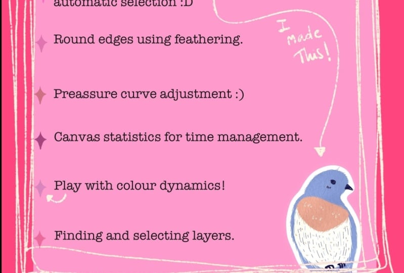
8. Share Your Work!: And that's it!
I know that we didn't cover everything there is
to know about this tool, but I do think that these
are the most helpful. For me, they have
changed the way that I work in the last few
years quite a lot. And I really hope that they're
useful to you, as well. I would love to hear what
was most surprising to you or what you found the
most helpful for your work. So make sure to share that
in the student projects. And if you have any other tips that might help other students, I would love to hear
about this, as well. You can just share screenshots, but also maybe
something that you created recently using
one of these tips.
9. Final Bits: Congratulations on
finishing this class. Don't forget to
share what you found helpful in your student project. I hope that these
lessons showed you that Procreate is just a tool. It's really helpful, but
it's about how you use that tool to make your drawing more fun.
You're the artist. So don't let all of
these tips overwhelm you and control your
artistic choices. Just pick and choose
the tips that you find the most
helpful for your work. Don't forget to leave
me a review below. This really helps me to create new courses on Skillshare
in the future. And for any questions or
suggestions that you might have, you can also use the
discussions tab. I like to regularly add
resources there as well. All of my other classes on Skillshare involve
using Procreate, but I always like to put the
illustration process first. If you enjoyed these lessons, I think that the
following classes would make a good
addition to this one. To the notes in the menu bar, I added links to all of these classes and brushes that I have on
Skillshare, as well. I also love to take
courses myself, and I like to share my
recommendations, suggestions, pro crad brushes, tutorials, and more in my newsletter. Thank you for taking this class, and I'll see you
in the next one.
 Claire Makes Things, Illustrator | Lettering Artist