Transcripts
1. Introduction: Hey, there. I have a fun and quick little procreate
project for us today. Let's paint this cozy
little background to use as our phone wallpaper. So cute, right? You'll
be able to look at your beautiful artwork
every single day and even show it
off if you want to. I've done all the prep
work of figuring out what we'll create and
what colors we'll use. So we can just get started. By the time we're done, you are going to have a
brand new foam wallpaper and that happiness hit for
having created something. And hopefully, you'll have learned a thing or
two along the way. Hey, there, I'm Melanie, and I'm here to be your
creative buddy today. I am a professional artist that runs a business called
the Swimming Owl, and I love to teach too, and I'm here to share the
joy of creating with you. I create artwork for my own self published coloring books
and picture books, and I sell tons of cute
arty gifts in my Etsy shop. You can also follow
me on YouTube or Instagram if you'd like more
happy art in your life. And don't forget to follow me
here on skill share two so that you'll never
miss an announcement about a new class
that I've released. All right, so enough
chit chat for now, let's jump in and go make a brand new phone
wallpaper for you.
2. Your Project: By the end of this
laid back class, you will have completed your
own custom phone wallpaper from start to finish. Using digital painting skills
inside the app procreate. I am providing my original
sketch and color palette, but please feel free to add your own flare to
this wallpaper. For instance, you can change the composition,
the color palette, switch up what brushes you use, really add in your own elements to make this phone
wallpaper yours. I will also be showing you a really cool trick to
create color alternates of your phone wallpaper so that you can switch it out based on your mood or the season and switch things up
whenever you want to. So that'll make
things extra fun. So I think we're ready to
get started. Let's go.
3. Supplies and Downloads: Okay, so for your supplies
and downloads today, we are going to need our iPads, our Apple pencil,
and your phone. If you happen to have an iPhone, it'll make things a little
more streamlined between getting the image off of
your iPad onto your phone, but any type of phone
is going to work. You'll just need to follow a slightly different
process than I do. For your freebie
downloads today, I have included a setup
canvas for you that's at ten 80 by 1920 for
that kind of display, and that also will include
the sketch with it. I've sent you an
optional paper texture, a color palette, and an
organized brush set. The brushes are all
native procreate brushes, aside from two of them that I've made a
few adjustments to. Okay. And quick side note. If your phone is not
best suited for a ten 80 by 1920 aspect ratio, you can just do a quick
Google search to see what best size wallpaper
for your phone would be and set your canvas
to that size instead. I know that my phone isn't
actually quite that ratio, but I'm okay with cropping in or zooming out a bit to make
this work for my wallpaper. All right. So we are ready to talk about setting
up our canvas.
4. Canvas Set Up: Okay, so as I previously mentioned in the
downloads video, I will be using a ten
80 by 1920 canvas. However, if your phone is not best suited for
that aspect ratio, just do a quick Google search to see what the
best size wallpaper for your phone might be and set your canvas to
that size instead. Not a big deal.
Then just pull in the sketch that
I've provided and adjust the size as needed. I'll put some other common sizes up on the screen right now for you to check out and see if maybe those work
better for your phone. To double check this, you can always add the sketch alone to your phone before
you start painting and see how that placement
looks as the background, and then you won't
waste any time. You can either pull in the
prepared procreate canvas file that I have included for you and jump to the next
video right now, or we can set up our own canvas if you need to do that instead. To set up a new canvas, hit the plus button here, and then this little
plus symbol here. And set this to ten 80 by 1920 or whatever aspect ratio
you need for your phone, 300 DPI, and I like to leave the color profile
at Display P three. Then if you want, you
could actually name this phone wallpaper so that you can use this canvas
size in the future. Then you're going
to want to go ahead and add in the sketch. Hopefully, you've saved that
somewhere to your phone. Come to the wrench, go
to add. Insert a photo. I'll click the sketch, and then you can adjust
it if you need to, but I'm going to leave it right where it popped in right there. I like to leave a little room at the top when making a
wallpaper for things like the clock and the battery level so that it's not obstructed
by too many details. For this sketch layer, we need
to leave it at the top and we are going to put it
into multiply mode. Then I'm going to lower
the opacity on this. Probably like 25%
is good for now, but you can adjust that later if you need to see it better. Lastly, this step is
optional, but if you want to, you can put the paper
texture that I've included in the downloads
for you as well, if you'd like a more traditional
look to your wallpaper. To add that paper texture, come to the wrench,
insert a photo again, and I save mine as
photos on my iPad, so they're very easy to access. Go ahead and resize it to fit. Then I'm going to put
this into color burn, and I'm going to leave it at the top along with my sketch and we'll be painting in between the background color
and the sketch layer. Another handy little
trick is to even lock these layers so that you can't ever accidentally
paint on them. To start your new
layer for painting, hit the plus, drag it
beneath your sketch layer. These two layers are now untouchable for now
until you unlock them. You are now officially
all set to paint.
5. Paint The Background: All right. We are ready
to start painting. If you've pulled in
the procreate file I've provided for you,
here's what you should see, a paper texture
at the top that's locked so that you cannot
accidentally paint on it, and you'll notice it's
in color burn mode. You should have a
sketch layer and multiply mode for right here
you should see a little. Then you should have
a layer that says start painting here
in the background. For our sketch, I'm going
to go ahead and lower the opacity on this
down to about 25. Okay. 25%, that is
not super obvious. If you are a person that is paranoid about accidentally
painting on the right layer, you can always lock a layer. That way you cannot
touch it and you won't accidentally paint
on the wrong layer. To do that again, you just swipe over and there's a button that either says lock or unlock, duplicate or delete, hit lock, and now that layer is permanently
out of reach for you. Go ahead and come down to our
start painting here layer. Like all of my other
painting classes, I will be showing you my
process in real time. That means you're going
to see and hear me talk through my choices
and hopes that it will help you also develop
that instinct for painting and making choices
throughout your process. The beautiful thing
about digital painting is how flexible this process is. We can try out textures and colors and delete
and redo if needed. It makes creating and
painting super low pressure. You'll see that
throughout this painting, we're going to follow a simple
formula for each element. Okay. We will put down a
fairly flat base of color and then build up
the texture and more color on top of the base. If you do not see
this layer here, you want to start by making a new layer below your sketch, and we're going
to put down a lot of color into our background. For your brushes,
you should have this paint night set right here if you've
downloaded them from me. You will see lots
of options here. I'm going to start with the rainforest brush
because I really like how it mimics a
cloud like texture, but feel free to play with any of these for
your background. Next, you should also have
this color palette loaded in. It's just called dreamy, feel free to add in
your own colors or use a completely different
color palette if there's something
else calling your name. For the background,
I'm going to be laying in at least
three different colors. I like to keep it
slightly darker towards the edges with some glowy colors towards the horizon line. But like I said, please feel free to make your
background in your own way. The other nifty little
trick that you can do is you can set
a reference photo. Come to the wrench and go
to Canvas, hit reference. Now, it's just going
to show you what your actual canvas
right here looks like. But if you would
like to be able to pull colors from my original, come to image, import
image and you can pull in the background that I've
already provided for you. Okay, using my rainforest brush, I'm going to bring the
opacity down a bit here. Let's start with I'm going to start with
this blue color here. I'm just going to
paint some of this in. Feel free to play with your
brush size and opacity. Because this is the background, we don't have to worry about it. Running into other things, we're going to be covering
up the background. And I'm going to bounce around
now to some other colors. Maybe this middle purple here. Then, like I said, I want to put in at least three colors, then I'll come to one
of these pinks and put this in around my horizon line. Sometimes I like to drag. Sometimes I like to tap. It gives slightly
different textures depending on what you're doing. Then let's come to
a darker purple. We will also be darkening
this in a little bit later with one of our other layers. We'll be using blend modes to make things look
even more interesting. So just bounce around, make something that looks
dreamy and happy to you. When you're ready, we're going to smudge it
just a little bit. To choose the smudge tool. I want to use the same tool that I was just painting with. I'm going to hold down on the smudge tool until I see that little
pop up that came up. I'm going to come back to my brush and show you
that one more time. Lo right up here.
When I hold down, it says smudge with
current brush. That's what I want to do. I want to smudge with
the rainforest brush and I want to do
it very lightly. I'll bring the opacity to
50 is so I don't overdo it. I just very lightly
blend some of this in. Okay, I'm liking this. I think I'm going
to bounce back to my brush and put in a
lighter purple now. I think I went a little dark. Let's just tap some
of this back and maybe don't be afraid to play here too and adjust
your color a little bit. These are not hard
fast rules down here. Change it up if you need to. This color palette
is a starting point. That's how I want you to see it. Okay. One more time
with my smudge. Okay. I think I'm happy with that. I think what I'm
actually going to do is a nifty little trick
that we have in our pocket, thanks to digital painting. I'm going to come over here
to the magic wand and go to huge saturation and brightness on this
background layer. I'm going to just bump up
the brightness a tiny bit, maybe to 53%. I think
that looks really good. I can preview my change,
and I think that's better. I'm going to hit apply and then cancel so that it
doesn't do it twice. I think that's
looking pretty good. I'm happy with it.
I'm ready to move on to the hills and the bushes, but feel free to keep
adjusting this and move on only when you're
ready. Okay. Okay.
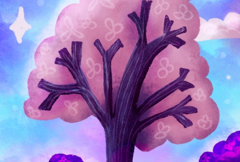
6. Paint The Ground + Bushes: All right. Let's get our main
hill put in first. Let's make a brand new layer above our painted
background layer. Hit the plus and start
on this layer here. I'm going to zoom
in a little bit here so we can see
what we're doing. I'm going to choose
the dry ink brush. It should be up here at the top. It's a really nice
drawing brush. It has some really
nice texture to it. By the way, the two that I
have altered a little bit for us hopefully I'm saying
this, the Nicko brush. Then I have one down here that
I call loaded with paint, really, that's just
an altered version of the wet acrylic brush. It has tapered
ends and the color fluctuates a little bit in the hue and saturation,
which is really fun. It feels like painting
with a real paint brush. The Nico one I just added
in some tapered ends in some slightly different
ways the brush behaves. But for now, I'm starting with the dry ink brush to double
check I'm on the right layer. And for the color, I'm going to choose this kind of
periwinkle color down here. Hey, guys, quick note from
the editing team here, that would be me, Melanie. I'm realizing one
of the reasons this turns out darker for
me in the end than my original was the color I
should have started with here for the hill is that more
aqua color in the middle. So it's the third color
on the bottom row. If you want yours to
look a little more closely to the one that
I made originally, start with that aqua color
and not the periwinkle one. But I still like how
mine turned out today. It just I must have
been feeling a little bit more periwinkle
and moody this day. So to start, I am
literally just going to draw a line and
drop fill color in. So I'm going to
follow the sketch. The line touches both
sides and is not broken, so I should be able to
fill this with color now. However, you may need to adjust what's called
the color threshold. Let's see how we're looking
here when I just pull this down and I did not
lift up my pencil. I can see my threshold
right here says 4%, which is not high enough
because I can see this really big gap here between what's
filled and my line. I'm going to drag that way on my iPad and I didn't
have enough room. I'm going to undo this
two finger tap to undo. And try again. This time, I'm going to pull this over here so I
have more room to drag. I'm going to drag more quickly. Now I'm too high. Now it's at 100%
threshold and it's spilled over my line
into the background. I don't want that. I'm going to come down until it's just my shape
here, which is perfect. 90% worked for me. Yours
might be different. Then I can zoom in and if I want to correct anything if it doesn't look filled enough,
but it looks good to me. Next, we're going to put
in the two little backhlls on a brand new layer. Make a new layer above this one. I'm going to continue using my drying brush and
I'm going to use this top purple color here or maybe this one,
either one of these. I'm going to start
with the middle one because I can always
make things darker. I'm going to do the same idea. Go over my sketch to make the
shape and drop fill color. One more time for this one. Don't forget the nifty
tool of undo and redo. Undo two finger tap, redo three finger tap. You can also just use the
little buttons over here, the little arrows. Undo redo. Next lifts put in
our foreground hills and they're going
to be in front of everything else on
their own layer. Again, come to our
layers, hit the plus, make a new layer above the hills and the
middle hill here. I'm going to use a deeper
darker color because usually things in the foreground should be more
saturated and dark. Let's try either of these
two darker colors here. I think I'm going
to save this for my tree color and maybe try this one here for
the foreground hills. But remember the cool thing is, you can always change that up. You are working
digitally and you have those kind of
flexible options. Sometimes my hand does things, by the way, when I
don't want it to. Draw it in and drop fill color. Those are looking pretty good. That was pretty easy so far. I know right now
they look boring. We need to add in some
texture and color. There are two approaches
you can take here. You can either put
the layer into Alpha lock and then
color over the top, or you can use
clipping masks and blending modes for a
little more control. Let's try the clipping
mask approach here. Let's select the front hill. I'm on the front
hill. Hit the plus to make a new layer above it. We're going to set this to a
clipping mask by tapping on the layer here and
choosing clipping mask. Now, whatever marks we
make on this layer are only going to show up within
the boundary of this shape. The other thing I want
to do with this layer is put it into color burn mode. Color burn is an awesome
blending mode that will take into effect
the color you're painting with and
the color below it, and it's going to make
a darker version. So I'm going to use
a brighter purple, maybe like this one here, and then some sort
of textured brush. I encourage you to try out multiple texture brushes
to see what you like best. I'll be bouncing
between the rainforest, the Niko, and the cotton
brush today for my painting. You may want to play
with the opacity and size and brush this in. I'm going to make my
size a little smaller. And I'm going to make sure
they're darker towards the edges because I'm pretending that my light
source here is the moon, the stars, and the
glow of the horizon. Those light sources would
be hitting the tops of my bushes but not necessarily
down here in the corners. I think that looks pretty good. We can try seeing
what happens if we change up the
color a little bit. This is just a fun
thing to play with. See, that's pink. Like I said, it is
taking into account, taking into account the
different reactions between the color of your brush and the color of
the hill beneath. A little bit of pink on
there looks really pretty. We're going to do
the same effect on these other two layers. The main hill and
the back hills. This is a clipping
mask, right above this, we want to create
a clipping mask above these layers as well. I'm going to come to my main
hill next just because I feel like working in that
progression, actually. Blue Hill, hit the plus, set it to clipping mask. Change this to color
burn cotton brush. I'm going to choose
maybe this color here with a larger brush, since this is a larger
section to fill. Okay. And I'm very gently
laying down some texture. I can even use this same
color that I used to create this hill and it will create
some interesting color here. I think that color is
working really well. That's the color that I
used for the front too. But again, just play with
it, see what you like. I think I'm going to come to that color and stick with that. I know that I need to make
some darker areas around where my tree trunk is beneath these hills or
bushes, I should say, and then over here because
this tree would be blocking the light coming from the moon
and even from the horizon. Not that we're really following a whole lot of rules here. This is a fantasy scene, but to lower the opacity and get just a
little smaller here. And make it really concentrated
right under these hills. Remember, we can always come
back to this layer after doing these two little bushes and see how we feel
about it later. Sometimes after making
changes to one layer, something you did on another
one looks a little bit off and you just need to bounce back and make some adjustments. For the light parts that we're seeing in the finished one, we are going to come
back and create some lighter areas on the layer. Don't worry about that. You can try to put a little
bit of light color in here with some of the pink
and see what it does. It creates an
interesting effect. We're still going to make it
lighter than that, though. Let's go ahead and move on to
these two back bushes here. Tap on that layer, hit the plus to
make a new layer, put it into clipping mask
and into color burn. I'm going to use the cotton
brush again and I'm going to go ahead and start
with the same purple I used to make the hills. Just tap in some texture. Concentrating most
of that texture and darkness towards the bottom. Then maybe I'll
switch up the color just for a little bit of fun. Maybe I'll make the
brush larger but lower opacity and just tap in. That was too dramatic. Tap in a little bit of fun
texture like that. I'm going to lower the opacity because I got a little crazy. There we go. That's cool. Okay. All right. So if
you're not happy with either of any of these layers, go ahead now and make
some adjustments. Otherwise, we are ready to move to our next area of focus, which is going to be our
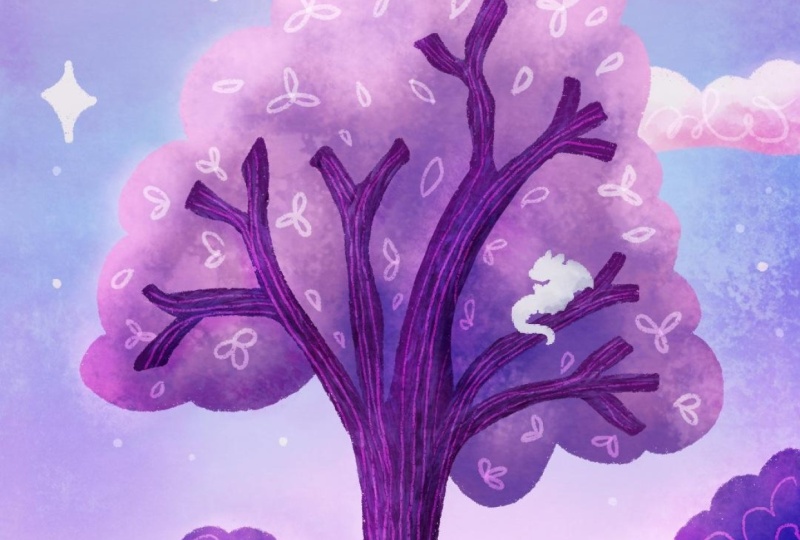
tree, our main subject. Okay.
7. Paint The Tree: All right. Let's move on to this tree. Really quickly, I want to give you one little note though. Don't forget your handy
little tool that if there's ever a color of
something you're not happy with. Go to that layer. For instance, I've noticed
that I have more of this periwinkle bluish color
going on here and it's more teal or aqua in this color or I mean
in this original. If I wanted to change
that, select the layer, go to the magic wand, go to hue saturation
and brightness. And we need to move this
reference out of the way here, and then come to hue and just make a small
adjustment here, maybe brighten it up, maybe
desaturate it a little bit. If you want it to be
closer to the original. I'm okay with it being
different though today, so I'm just going to hit cancel and leave
it the way it is. I like that when I go
to make a piece of art, it's never the same twice when
I come to teach you guys. I think that's important
to acknowledge. Let's work on the tree. For the tree, we're going
to have two main layers, our trunk and leaves. Let's start with the trunk. Let's come up here to
our top layer that we've painted on
but still beneath our sketch and paper
texture and hit the plus. I'm going to select this super bright saturated
purple down here, the dry ink brush and do the
same approach as before, draw in the shape
and drop fill color. I'm making sure to close my shapes so that way I can
actually drop fill color. I always find tracing over my sketch to be kind of like a Zen like moment to
a little bit therapeutic. I don't feel like you have
to follow it exactly. Let it be a guideline, but not a set of rules. I'm ready to try drop filling the color, looks pretty good. I'm going to slide up
a bit here too far. There we go. Then I have some obvious patches
here that are a little empty. Going to fill those
in. That looks good. If you needed to fix any weird little
areas like I've got a little bit of a
funky area right here, I'm going to select
the same brush as my eraser by holding
down on the eraser tool, making it really small
and just erasing away. That area that looked
a bit strange. In this one down a little bit. There we go. Let's make a
new layer for the leaves. This one needs to be tucked
underneath our tree trunk. Make a new layer and then drag it underneath the
tree trunk layer. Mine accidentally
just put itself into clipping mask mode because it thought that's what I wanted. I don't want that procreate.
Thank you, though. I'm going to just turn that off. If yours does that at any point, it's okay, it's fixable. Just undo that. This time, I'm going to use this
middle pink right here. Either that one, or this one. Maybe I'll start with this
one and see how it looks. This one might be a little
tricky because you may not be able to tell if your
shape is closed here, so what you can do is just
draw a line like that. And make sure you
don't have any holes that way you can still
drop full color. And drop fill right
there looks good. Now we just need to add some
texture to both of these. I might try changing the
color of my leaves right now. To do that, I'm going to select maybe this lighter pink here. I'm going to drag
this into my shape. That looks a bit too light.
What about this one? Okay. I think I'll just leave
it the way it was actually. But we do need to go ahead
and add some texture in now. For the tree trunk, let's
try the other approach that I was telling you about before
and just use Alpha lock. Come to your tree trunk layer. Tap the layer, and
instead of clipping mask, this time we're going
to hit Alpha lock. This will make sure
that any strokes we make with our paintbrush stay within the boundary of
this shape of our tree trunk. And I'm not going to change
any blending mode here because I'm on my actual
layer of my painting. I'm going to choose the dry
brush, which is down here. It gives some nice
bark like texture, and I'm just going to choose some different colors to vary up the look of
this tree trunk, and I'm going to follow the direction of the
branches and the trunks. I'm going to be painting
in these directions. So I'm going to start by putting in some brighter purples. Let's see what our
brush shape looks like. That actually looks like
a pretty decent size. I am at about four or 5%. And I'm going to
brush this in and you should notice if Alpha
lock is turned on, none of this is going
onto your leaves. It's only going onto the
tree branch and trunk. Not being super
precise about this, I am just roughly brushing in some fun texture. Okay. Now, at this point, I will go
ahead and switch my color. I just want to create
some interest here. This may take a little
bit of playing to figure out what color
you'd like to pop in. I might go ahead and
select the color we started with and just
make it a little darker. Maybe that bounced
around a bit there. I'm going to put it on
these parts that would be less likely to be touched by moonlight and horizon light. And then towards the end, we're going to put in these
more fun detailed lines that you see in my original. That's going to be done
with a blend mode. Come up to our leaf or
down to our leaf layer, and let's put it into
Alpha lock again. Okay, I am going to use probably
the cotton brush again. Feel free to use whatever
you'd like, though. And since I have it as this
middle pink as my base, I am going to bounce between some lighter pinks towards
the moon and stars, and maybe some darker pinks
and purples around my tree. Let's start with a little
bit of lighter pink up here. I'm going to tap this in because it makes a cooler
texture that way. Lower my brush size. Come down here to
this pink here. I'll switch over to some purple. And even darker. So now, you see the one negative about Alpha lock now is that I can't erase this if I wanted to without
erasing my entire layer. That's the benefit
of the clipping mask is I can turn them on or off. I can restart them while still maintaining my original
shape, whereas here, I now have all of the paint strokes
on this one layer and they can't be undone really either going back several steps or deleting
the layer and starting over. A lot of times, I like to put in a dark color and then bounce
back over the top with the brighter color to add in a little bit more shape and definition again if it got lost. Okay. So once you are happy with that, we're going to move on towards our clouds and don't
forget that at the end. We're going to add in even
more fun details on here. This isn't how it
will end up looking. This is just a really good
base for us to start with. Let's go ahead and move
on to our clouds and moon
8. Paint The Clouds: Okay. Let's put in some
cute little clouds. Come to our layers, tap your tree trunk and
hit the plus to make a brand new layer
above everything else except the sketch
and paper texture. I'm going to come up
to my dry ink brush, and I'm going to choose this almost white color
here in the top corner. I'm just going to draw these
in and drop fill color. Then I'm going to use the rainforest brush
because like I said, it does look very
cloud like to tap in some fun pinky colors to these to give them some
texture and interest. Now, This cloud
is above my tree. I actually want it beneath
my tree, not a problem. We made our layer
above everything else, but what we actually
wanted it to do is be below our trees. We're just going to drag
it beneath our tree layer. Again, Procreate was like, Hey, let me help you out and put
this into clipping mask mode. That's not what I want Procreate.
I want to turn it off. But now my clouds are
tucked behind my tree, which is where I want them. Now I'm going to turn this
into Alpha lock again. I'm going to choose
my rainforest brush. I'm going to start with this
light light pink down here. C see what my size and
opacity look like. Not obvious enough,
opacity all the way up. That's very faint.
That's okay for now. Now I'm going to go ahead
and go to a darker pink here and tap in some
of this texture. That looks much
better. All right. I might go ahead and
come back to my white, make it a little
bit larger and then just tap that back
in over the top. I'm going to turn the
opacity of my sketch down because I'm having a hard time seeing what things
really look like. I need to unlock it, and
then I'm going to put this down to 7% so I can see
a little bit better, and then you can either lock
it again or just leave it. It's up to you. Come
back down to my clouds, zoom out and see
how things look. I want a little more
drama to these clouds. I'm going to choose
a darker pink now like what's in my tree. And tap some of that
in. That looks great. Okay. Those clouds
were pretty darn easy. That's all we needed
to do, and we're ready to move on to
our moon and stars. Okay.
9. Paint The Moon + Stars: All right. For the moon, we once again need a new layer and we want this one to be below the clouds
but above the background. Alternatively, you could put it in front of your
clouds if you'd like, though, because that's a
total personal choice. I'm going to put mine
beneath my clouds. It's probably going
to try to put it into clipping mask mode again. No thanks procreate. I'm going to use
my dry ink brush. I'm actually going
to use this light pink to start with for my moon. If you have a hard time
making a nice arched line, we can utilize a tool Procreate
has called quick shape, and we can hold
down, don't let go, and it will automatically smooth things out and you
can even edit this now. By pushing and pulling holding
on the little blue dots, can pull it this way. It's a neat little
trick for anyone that might have a
little bit of trouble drawing things exactly
the way you'd like. I'm going to tap that to
close the editing mode, make this next shape, holding down so that it
smooths it out for me. Then I'm just going to drag
and drop some color in here. You can decide if you
like that shape or not. If not, feel free to adjust
however you need to. Maybe you want to use the eraser tool to smooth things out, or maybe you need to make it a little plumper
in some areas. There we go. If you want to add some
texture to your moon, you can either use
the Alpha lock or clipping mask approach. I'm actually going to leave mine just like this though and add in some fun texture and interest
later with a blending mode. I'm going to add in some stars on this same layer
though, but this time, I'm going to switch over to
this almost white color, and I'm going to
draw these in with the dry ink brush based on where I have
them in my sketch. I always feel like
my paintings are incomplete without
some sparkling stars. I probably go
overboard with them, but that's how I like it. You can add as few or as many
of these as you would like. In the final layers in
the blend mode layers, I will be adding
more that look a little more subtle
in the background. We'll call these our
hero stars though. I think that's pretty good. Let's move on to
the final details that will really make
this come to life.
10. Final Detail Layers + Blending Modes: All right. We need just maybe three more layers to really polish this up
and make things pop. We will be doing two different
blending modes, again, maybe three to add some highlight details
and some shadows. First, let's go ahead and
hide our sketch layer. You can do that by toggling
it on and off here or even just deleting it if
you don't need it anymore. Now let's start
with our shadows. Let's make a layer
above everything else. Hit the plus, make sure
it's above our tree, and let's put this in
to color burn mode. This will allow us to make some really pretty shadows that will still come
across vibrant, but subtle at the same time. The color that we
choose to paint with on this color burn layer is going to interact with
the color beneath it. So keep that in mind when
using these blending modes. When I do a shadowy
layer like this, I love to either use a blue
or purple to really make fun, saturated shadows that don't
look flat, muddy, or boring. For my brush, I think I'm
going to use the eco brush, but you can use any of
the textured brushes to make your shadows to add a
little more interest and fun. I generally will
keep my brush at a larger size but a lower opacity so that
I can build it up. I'm going to try to place
my shadows in areas where I know that the moonlight wouldn't
be reaching those areas. I also like to brush it brush it in around the edges
to add in some drama. I'm going to start
with this purple here, let's just see
what we have here. That looks really pretty. I love that texture. D. Because this is a
phone background, this is generally where
your battery and time might be showing up
and you might want it a little darker
in the corners. Right now, this looks
really dramatic. I'm going to turn it down the opacity on this
layer and just a bit. But first, I'm just going
to brush some of this in. Remember I can undo if anything is not where
I want it to be. Another fun thing we
can do is if it looks a little too stark, I'm going to choose
the same brush as my smudge tool and just
soften that a bit. Okay. Wherever I have two
things meeting, so the tree trunk
meeting the ground. I like to make more
obvious shadows or harsher shadows right there right along
where a bush meets the ground and then soften it out as you
get further away. Smudge that out just a bit. Let's see. Zoom out and again, maybe add a little more
drama to the trunk. And then maybe
right in here where the tree is blocking
some of that moonlight. This definitely has some
drama. That was too much. I'm going to go ahead and turn the opacity down on this
layer a little bit. And then I'm also
going to bounce to a different color to add a little more interest,
maybe this pink. Yeah, I like that. That's fun. It's coming across more
bluish in certain areas. What if I go lighter. This is just something
really fun to play with because
it's going to give you slightly different
effects based on the texture of your brush, the color you're using,
to have fun with this. One more time, I'm going
to lower this down to, I'm going to go closer to 70%. Then let's look
at it on and off. Yeah, that added some
really fun drama. It is looking much darker
than my original, isn't it? Before we correct that though, let's go in with a new layer to add in our cute
little details. Come to our layers,
hit the plus. This time we're going
to go to vivid light. I really love this blend mode. It allows me to add really playful details
in my dreamy paintings, and it also allows the
color of the brush and the color beneath your
brush strokes to interact. I'm going to use my dry ink
details and a light pink. Since we are in a
vivid light mode and I'm using a light color. Anywhere that's
already a light color is going to come across
is almost white. Then anywhere that's darker, I'm going to see
some of that color and texture really shine through in a pinkier version
of the color beneath it. It's really fun to see
that tint show up. To start, I'm going
to add in some, some more subtle stars
in my background. I'm going to keep
my brush opacity really low and the
size pretty small. I'm just going to.in
some extra stars here. Next, I'm going to add in
some fun scribbly lines to these clouds that are
just really playful. Feel free to do
whatever you'd like though here. No right or wrong. I like to keep this loose and playful because
it's on our phone. We're not going to see
a whole lot of detail. Then I might just add
in some cut lines on this moon here, curves. I think that's super cute. Next, some cute little
leaf shapes on our tree. If you want one part to look a little more
subtle than another, you could lower the
opacity on your brush even more or bump it up to make
it look a little more stark. It's also helpful
to make sure you're zooming out every
once in a while to make sure you're not adding any weird patterns or
unintentional lines, which I seem to do quite often. I'll zoom out and
realize I've put all my little scribbly shapes in a perfect line
across the canvas, and it doesn't look randomized
like I wanted it to. Play with different
textures and shapes here. You might not want to
do these leafy shapes. You might want to do
curly cues or something. Okay, I think that
looks pretty cute now. Next, I'm going to
add in some kind of scribbly wobbly
lines for my trunk. Oops. Here's a good thing to bring up because we're not
in any kind of alpha lock. I have to be careful
about staying on my trunk if that's where
I want that line or texture to be because the line will continue
anywhere I put it. There's no tool like alphao or a clipping mask to constrain
it to a particular shape. We are working in a blend mode that goes over the
entire canvas. Instead of these
straight wobbly lines, maybe you want your
lines to be a little more like curvy
around the trunk. You can do whatever
you would like here. Maybe you'd like to put
a knot in the tree. That could be really cool. All right. I think that is looking
cute. Good to roll. Let's add some scribbly
lines to our bushes. And some branches
down here on these. Because my brush is
at a low opacity, it has the possibility to
build up in intensity. Anywhere I overlap a
line I already made, it's going to get
a little brighter. You can play with
that effect too. Blending modes are
so fun for adding dreamy lighting effects
to your artwork. It's one of my absolute
favorite things to do towards the end
of a piece of art. D. I definitely encourage you to get in there and
play with different modes. You might just find
that it helps you develop a certain
style to your artwork. You're not going to break
anything by playing with them. Don't be afraid of them. Put them on their own layer
and you can turn it off. Or before you go to play with
one, duplicate your canvas. That way you feel like
what was there before is preserved and you're
really not afraid to play. I call this turning
on the lights in my artwork whenever I get
to the blending mode part. Okay. And lastly,
I'm going to put in some cute little grass lines
down here on the ground, just like these little tick
almost tick lines in two, and to add some interest
and texture down here. All right. I think that is looking really cute and
I'm ready to move on. Originally, I was just
going to leave it at this, but I feel like I went
a little dark and dramatic today compared
to my original. That's why I like to show you my process in real time because a last minute decision
I'd like to make here is to add a third layer, a third blending mode
above everything else. I'm going to put it
into overlay mode. I'm going to choose the oro
brush and a light color, and I'm going to brush
some light back in. Apparently, I was just feeling a little moody and dramatic today. I'm just going to brighten
things back up a bit. And I'm going to make this
a little smaller and come around the tops of this tree, maybe add a little
glow like effect. I think it's really cool that even though I've made
this a couple times now, it never quite turns out
exactly the same way twice because our mood affects
how we create our artwork. What's going on in the day might feel a little
differently about our colors from one
day to the next. But you get to see me think about this and
how I might correct things if it went in a direction I wasn't quite
expecting scientist. I think that's a cool way
about showing you this in real time instead of
zooming through or speeding up the footage. I think that is adding in some
much needed magical glow. And that looks much better. It's a little bit intense. I'm just going to
lower the opacity on it just a little bit. I'm just smudging right
now because that was too stark next to the moon
and let's lower the opacity. Toggle it on and
off. Much better. Do you see the difference
that made? There we go. Just like that, we have a super cute background for our phone, but don't leave yet. Next, I'd love to show you how to make some
color alternates, so you can switch this out, change up the colors
really easily.
11. Bonus Making Color Alternates: Okay, now that you have this beautiful, shiny new background, let's duplicate
the file and make some fun alternates for when your mood or
the season changes. Let's back out by
going to gallery. Swiping on your file here
and hitting duplicate. Now, normally mine
would duplicate and create it right
into the stack. For some reason, micro
create app is having a little attitude today and it will put the
duplicate out here. I'm going to tap
on that duplicate. And we can either flatten everything and change
the whole scene at once, or you can change isolated areas for even more
control over the colors. To change single areas, choose that layer and either use the hue saturation tool
or the gradient map tool. That looks like this.
Let's say I want to change the look of
this hill here first. I'm going to come up to
my clipping mask that has the texture on my hill and
I'm going to merge it down. Now I'm on this hill layer here. That's the layer I'm working on. I'm going to come up
here to the wand, hue saturation and brightness. Then, like I said earlier, maybe I wanted it to look a
little more aqua or teal. I'm going to reduce
the saturation and bump up the brightness. That already looks really cool. To preview the change without
automatically making it, you can tap on this little
eyeball preview here. I'll show you what that
change would look like. You can either hit
apply or cancel. Let's just say I'm
going to apply it. Now I've changed one
isolated part of my artwork. I'm going to undo that though. To change the entire scene
with a gradient map, I actually find
it easiest trying to condense all of
your layers like this. Sometimes causes blending
modes to act a little crazy. You always have to
try to merge down first instead of just trying to squish
everything together, because sometimes these layers won't actually do what
you wanted them to. In this case, it
magically did this time. That's not always the case. Instead, the easier way to do it is to save this as an image. Go to share JPEG then just hit Save image
so that it will save it as a JPEG to your iPad. Then back out to
gallery, it photo, select that new saved image that you just saved
to your iPad. Now you have a
nice flat version. There's no layers to deal with, and we can change
the entire mood of the entire scene all at
once. Come to the wrench. Go to gradient map. That's really dramatic. But fun. The first thing we
want to do is lower the opacity of this gradient
map or the intensity of it. I'm going to come down to 45% by taking my finger and pulling this blue bar back to the left. Now all of the gradient maps
won't look quite so intense. They won't affect
it as strongly. I'm going to come
back to the beginning here of my gradient library, and I'm just going
to cycle through these and look at
how fun they are. I really love this aqua
version that I have. You may see some gradients here in mind that
you do not have, and that's because
I've made my own. To make your own, you
can hit this plus here and tap these to
choose different colors, and you can add in more boxes
and make them really weird. This is a really fun
tool to play with. The saturation, the brightness, all of that will affect
what this looks like. So I don't actually want this.
I'm going to cancel that. Start over and it actually is going to
save that gradient. I'm going to delete that because that's
a really goofy one. I'm going to lower this
back down again and let's cycle through these until we find when
we'd like to save. When you find one
you want to save, Again, I'm going to change this. You'll hit here and preview it and then hit apply
when you're ready. I'm going to come back to this Aqua one here and
just see how much of it, how intense I'd like
this to show up. I think I'll put it at
about 60%. Let's preview. That's really pretty
and I'll hit Apply. It's going to automatically try to apply it one more time. I don't want that,
so I'm going to hit cancel and only one at once. And now I have a brand new wallpaper that
I could change this out to maybe winter or
even though in winter, we may not have
all those leaves, but you know what I'm saying, or maybe I'm feeling a little blue one day and I want
a blue background. So I think you should have
a lot of fun with this, make as many alternates
as you want. Make one for each season maybe and swap it out
throughout the year. Have fun. This part is a little bit
addicting and you can make a dozen of
these very easily. Okay. Next, let's talk about applying this
phone wallpaper to your phone. Okay.
12. Apply Your Wallpaper To Your Phone: Okay. If you would like to see how I transfer my images
from my iPad to my iPhone, then this video is for you. If you have an Android
or another phone model, you'll need to follow
your own process to get your image as
your wallpaper. You'll export your image from
your iPad and save it to your preferred storage system like Dropbox or
even your e mail, then download it to
your phone and then apply it to your display in
the settings of your phone. For iPhone users, let's
click the wrench. Click Share. Click JPEG, and then make sure the air drop settings are on on your iPad and on your iPhone, and you can actually
just airdrop this and my iPhone pops up here, I can literally just
send this from my iPad straight to my phone and it will save as an image
into my gallery. So easy. I actually have already
done that though, so I'm not going to
do it right now. I'm actually using my phone
to record this for you. Okay. But once you see that in
your gallery on your phone, you'll either head to
your lock screen or your display settings to
set your new wallpaper. I like doing it in the
lock screen feature or in the lock screen area. Because I can set up
multiple wallpapers that I can just swap between
depending on the day, the season, the mood, et
cetera. It's really cool. Then just look at how cute your new wallpaper is.
You just made that. Every time you look
at your phone, you're going to get a nice
hit of happy chemicals because you created
that. Good job.
13. Thank You! What Now?: Thank you so much for joining me for this fun little project. I hope you've gained some
new skills and confidence in your digital painting
and procreate abilities. Remember that with
each painting, this only gets easier as
you continue gathering information on what tools you like and what color
palettes work best for you, and you're only going
to keep getting better. If you like this class
and you haven't already, don't forget to hit that follow
button so that you'll get notified about next classes
that come out for me. And please consider leaving a quick review in the
review tab alone. Your review will
not only help me, but other students know that you found this fun and useful. And let me know which part of the class was your favorite. Okay, so here's where I will go ahead and leave
you for today. I had so much fun creating
this with you and I hope you did too.
See you next time.
 Melanie Bess, Painting By The Light Of The Moon