Transcripts
1. Introduction: Look, pencils and
paper are great. I started there,
you started there. We owe a lot to that medium. But by now, you've grown
as an artist and you need to break free of the
limitations of your sketchbook. Let's take your lettering
work to the next level by discovering the power of
digital art by using Procreate. Hi, I'm Kristen DiPalma, a lettering and mural artist based in Nova Scotia, Canada. I've been hand lettering
for nearly a decade, and back in 2021, I left my corporate career to
draw letters for a living. Well, I believe in starting
out with pencil and paper to learn the foundation
of drawing letters, like I teach in
my hand lettering for beginners skill share class. The next step is to
bring that skill into the digital world
so you can expand the opportunities for
your artwork and income. Mastering Procreate was
essential for me in order to turn my hand lettering hobby into a full time
career as an artist. It enabled me to work with
big brands like Adidas, Pepsi and Trader Joe's. Even allowed me to design my own line of products
and so much more. Throughout this class, you'll learn all about how to harness Procreate's tools
and features to bring your lettering
designs to life. Whether you're a practice
sketchbook artist looking to expand your skills or a
beginner eager to get started, this class will equip you
with the knowledge and confidence to get started
drawing letters and Procreate. I'm so looking forward to sharing tips and techniques
with you so that you can make the most of
this powerful program. See you in class. Bye for now. No. No that.
2. Class Orientation: When you're first starting
to draw in Procreate, it's going to be a bit of a learning curve as you get comfortable with the new medium. So it can be super
helpful to make the experience as close to drawing in your
sketchbook as possible. And here are a couple
of ways to do that. Get yourself a paper
like screen protector. It adds a bit of texture to your iPad so that it's
not so slippery slidy. I've added a link
to the one that I like to use in the
Discussion tab. For the first little while
or forever, if you want, you can continue to
sketch on paper, but then bring
your sketches into Procreate to refine
and color in. Let's bring one of
your paper sketches to life in the digital world. Choose a lettering
design that you've previously drawn in
your sketchbook or on paper and import it into Procreate so that you can redraw it with your
newfound skills. Try and keep it to
five words or less. Bonus points if you
choose to redraw your class project from my hand lettering for beginners
course on skill share. The components of our
class project will include setting up your canvas,
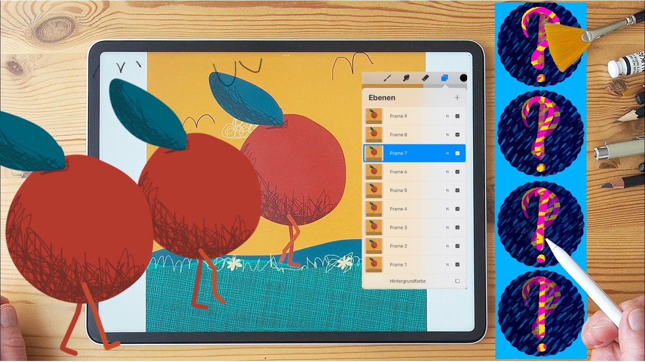
importing your artwork, creating a digital sketch, digitally inking your artwork, and finally, incorporating decorative elements and details. To follow along
throughout this class, you'll want to be sure
to have your iPad, your Apple pencil,
and of course, the Procreate app installed. I've created two handy
project resources to support this class. The PDS guide includes info
about setting up your canvas, selecting your brushes,
using drawing guides, and other helpful
tips and shortcuts. I've also created a
brush set that will come in handy as you're creating
layouts for your lettering. It's called the thumbnail
sketch Layouts, and you'll also find it in
the Project resource tab. I'll reference these
throughout the class, so be sure to keep them
handy as you're watching. Okay, so I had my iPad for about a year and a
half before I started using it regularly as
a tool for my drawing. It's really hard to break out of that comfort zone
of your sketchbook. So it'll feel pretty
weird at first, but that's totally normal. Like any new skill, you're going to
get better as you continue to practice,
practice, practice. Different mediums provoke different styles and approaches. So it'll take some
time for you to discover what your
digital style is. My style evolved because I started incorporating
a lot of color, depth, and textures
that just weren't possible for me with
only pens and paper. So remember, be patient
with yourself and have fun. This is a multi step project. So remember to connect with me as you're working through it. I'd love for you to upload your progress so
that I can offer you personalized feedback
to encourage and help you improve
along the way. Okay, this is gonna
be so much fun. I'm pretty obsessed with
drawing letters and Procreate, and I think that
you'll love it, too. I'll see you in class.
Why did you just ask for? How intrusive are
button plans? Oh
3. Setting Up Your Canvas: In this lesson, we'll create a new file together
in Procreate and get to know where
all the key features are so that you're
set up for success. First things first, make sure you've got a
comfortable workspace. I never actually letter
at my work desk. I'm usually cosied up on the couch with
pillows propping up my iPad and trash TV creating white noise
in the background. This is quite possibly the best part of being
able to draw digitally. So get comfortable
and let's click on that Procreate app icon
to launch the program. First, click on that plus
sign to create a new Canvas. You'll notice that
there are some default sizes in there for you and you can create your own for sizes that
you often work with. But for today, let's
just go to the top right to create an entirely new
canvas for our project. When you're setting
up your canvas size, consider the ways that your art might be
used in the future. Like, will this possibly
become a large mural, or will you offer
it as a print for sale and ensure to create it to the
maximum possible size. Procreate doesn't like when
objects are scaled up, down or rotated in size,
and they'll lose quality. So it's best to
create your artwork at the size that you'll
need it from the get go. Let's go with the size of eight by ten for
our class project. This is a pretty standard size that's great for posting on Instagram or using later
for a print to sell. Be sure to change the measurements
from pixels to inches. When it comes to setting
your resolution, you'll want to work
with 300 DPI minimum. The higher your DPI, the greater the level of detail. Things will look pixelated at a low resolution and
nobody wants that. You'll notice that as you adjust your canvas size and resolution, the number of
layers will change. Make sure that you're giving yourself enough to work with. You'll want at least four, but there are truly
never enough layers. The more the better. You'll see why as we work through
our class project. When selecting your
color profile, try and remember
that CMYK is for print and RGB is for
digital screens. RGB allows for much
more saturated, bright colors that don't translate as well
to print mediums. Most of the work I do is used
for both print and digital. So I usually start
by working in CMYK, just so that I have
the best preview of how the colors will
look once they're printed. So let's go ahead and choose
CMYK for our class project. Before we get drawing, go
to actions, preferences, gesture controls, general, and then disable
paint with finger. This is so that your
fingers don't create random marks all over your
screen as you're working. Trust me, this is a
huge frustration saver. Make sure your
file is set up for success before you
begin drawing. Check your Canvas size, resolution and color profile. Try to think ahead to what you might be using the work
for in the future, as a print or as a mural. Setting up your file properly
will help future you. Okay, now that you're all set up with a new Canvas in Procreate, in the next lesson, we're
going to explore some of the many different brushes
that there are for lettering. I'll see you in class.
No. Okay, sorry. Just one more time.
That's all I need. That's all I need.
Actually one more.
4. Lettering Basics & Brushes: In this lesson, we'll revisit
the basics of drawing letters and get to know some of the default brushes
in Procreate. Remember, as we learned in my hand lettering
for beginners class, drawing letters is all about first drawing the
skeleton lines of your letter forms and then going back in and adding your
thick and thin lines. This is the best way to ensure consistency in your practice. The good news is
that with Procreate, you can ensure that
the thickness of your stems is consistent across your letters because
you can easily copy and paste elements of your letters across
a word like this. A good rule to remember
is that downstrokes equal thick and
upstrokes equal thin. So think about how your hand would naturally
draw the letters. So, for example, a letter A, a thin upstroke, a
thick downstroke, and a thin horizontal crossbar. Or a letter N, a thin upstroke, a
thick downstroke, and a thin upstroke. This applies to both script and serif or San serif
styles of letters. There are infinite brushes
available with Procreate. You'll land on the ones that you like best through
trial and error, but I'll start by
introducing you to a couple of my favorite ones. They're just the default
brushes that come for free with the program,
so nothing fancy. Here are my two go tos. I like to use the six B
pencil brush for sketching. It's really close to a
pencil in real life, so it mimics just like
drawing in your sketchbook. I like to use the
technical pen brush for cleanup and inking. It feels a lot like a
ballpoint pen or a fine liner, so it gives you nice crisp and clean lines for
your final design. You can adjust the settings
of any brush within Procreate by going
to stabilization, stroke path, and
then streamline. This is going to help smooth
out your lines and curves. But note, don't become
too reliant on this. I always want to
make sure that I'm still doing most of
the work and not relying on the program to always snap in place because
unfortunately, procreate doesn't help
when it comes to painting murals or drawing on
chalkboards in the real world. You can also adjust the
size of your brush by going to Apple pencil and
then brush size. Different pressure
and ways of holding your Apple pencil will
impact your brush. The harder you press,
the thicker the line. If you tilt your pencil, it'll shade like the
side of a real pencil. Make sure that you
take some time to explore the various ways to hold your pencil to discover
new ways of making marks. Go to your drawing
guide and turn on your two D grid to
help ensure that your straight lines are
truly straight and that the thickness is consistent
across your letter forms. You can adjust the opacity and size of the grid based
on your artwork. For a straight line,
first, draw your line, and then without
lifting your pencil, hold at the end of your line. That brief hold will snap your wonky line into a
perfectly straight one. This also applies to drawing different shapes like
circles or squares. Experiment with
different brushes to get a feel for what works
best for your style. Play around with adjusting
your brush settings, but try not to become too
reliant on shortcuts. The beauty of hand lettering
is that it's not perfect, and digital shortcuts won't help you if you're painting a
mural in the real world. Now that we understand
a little bit more about the brushes and
settings in Procreate, in the next lesson, we're
going to get to know some different techniques for composition and layout.
I'll see you in class. Crespi Kringles
goes to Christmas. Crespi Krings goes to Christmas. Crespy Chrisp Kringles goes to Christmas. Goes to Christmas.
5. Composition & Layout: In this lesson, we'll
learn the process for creating a strong lettering
layout in Procreate. Similar to working on paper, I always start with
a rough sketch layer and spend most of my time
trying to get the layout as tight as possible before I begin cleaning up and
coloring in the final design. I'm never starting a final
design on a blank page, but always giving myself a rough sketch and
guidelines to work from. I've created a brush set
that will help you explore unique layouts for
your lettering without getting caught
up in the details. Download the brush set under
the project resource tab and then click Open and Procreate to add to
your brush sets. Use each brush as a stamp
on your canvas like this. Then start a new layer and begin roughing
in your message, exploring different layout possibilities for your message. As you might remember from my intro to hand
lettering class, I love sketching small
because it helps you focus your efforts on the composition rather than getting
caught up in the details. You can explore many different
layouts in minimal time. This is a great exercise to revisit some of your
thumbnail sketches from the hand lettering for
beginners class and then redraw them
digitally and procreate. You can import your thumbnail sketch page by taking a photo of it and then importing it
to your Procreate Canvas. Scale it, adjust the opacity, and then create a new
layer so that you can trace over the
elements digitally. Once you've landed on a thumbnail sketch that
you're happy with, let's scale that up
to your canvas size and then begin
refining your layout. I like to get my
sketches as close to final as possible so that I can totally zone out in
the rendering phase and spend my energy
on color and texture, since the layout is
just how I want it. Use the align tool
to snap elements in place and ensure
that your design is centered on your canvas. The orange line that appears
means that you've nailed it. Use the selection
tool to move and scale items around as
needed within your sketch. Isn't that so much easier than
endless erasing on paper? Try and keep your layers
organized to make it easier to move things around and optimize your layout as you're working. Procrit doesn't love scaling
or rotating elements, and they can lose quality. If you do need to scale
or rotate something, be sure to have
bicubic selected. I have no idea what this means, but it seems to help
reduce quality loss. Try experimenting with using the thumbnail sketches
brush set to land on the perfect layout for your artwork without getting
caught up in the details. Refine your chosen sketch
by using tools like a line, select, rotate and scale to move your elements
around your canvas. I'd love to see how
you're doing so far, working on your
composition and layout. Share some of your thumbnail
sketches with me by uploading your progress to the projects tab in Skill Share. I'd be happy to offer you some personalized feedback to help you improve along the way. In the final lesson,
we'll start bringing your sketches to life
with color and details. I'll see you in class.
Why do we own Brooks?
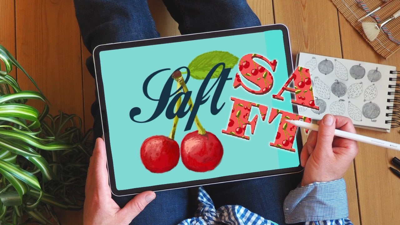
6. Adding Color & Details: All right. In this lesson, we're going to take our
sketch and turn it into a final inked piece
that's ready to share. This is my favorite
part of the process. You can get totally
lost in the details. So get cozy and
let's start drawing. Start by selecting your
sketch layer and adjust the opacity so that you can still see it through
enough to trace. Choose a brush that you'd like to use to ink your final design. I usually use the technical pen. Create a new layer
and begin tracing. I like to make sure
that each key element of the design is
on its own layer. This will really help as
you're adjusting colors or moving things around while you're finalizing the artwork. So try inking one word,
creating a new layer, inking another word, and repeat this process until you've
got everything outlined. Once your words are outlined, you'll start to fill
them with color. First, make sure you're
on the correct layer. Then drag and drop this little paint
bucket to your letter. Next, click on Continue filling up here so that you don't have to drag and drop each time. If the color fills your
entire canvas like this, that means that the outline of your letter isn't
fully enclosed. So you'll have to undo, go back and then
close up any areas. Play around with the color
fill threshold to avoid having an awkward dotted outline all around your filled objects. When you drag and drop
the paint bucket over, don't release the pencil just yet and hold
it for a moment. That'll pop up the menu up here that says color fill threshold. Drag to the right to increase
or to the left to decrease. The higher the
threshold percentage, the more fill you'll
have on your letters. With a lower threshold, you might notice that it
leaves this dotted line all around that you have
to go back and color in. Once your words are filled in, you can then change the color of the elements by turning on your Alpha lock and then
click on Fill Layer. I play around with all kinds of different colors before I land on a palette
that's working for me. So take some time to explore different background
colors and combinations. Try exploring a tool like coolers.co to generate
color palette ideas. There's a website as well
as an app that allows you to export palettes
directly into Procreate. The details are
where your design will really start
to come to life. Experiment with adding
different details in and around your letters to
help them stand out within your design
and add interest. At first, start simple. With more practice,
you'll be able to incorporate advanced
textures and effects. For your class
project, let's try adding just one or two
details to your letters. Let's explore a couple
of those together. Adding a three D block to
your lettering can make your words really stand out
and give them a lot of depth. Select one of the
main word layers in your design and then swipe
right to duplicate it. Drag the new layer down into the right and then
go to that layer, click it and select Alpha
lock to turn Alpha lock on. Then fill it with a color that's darker than
your background color. Go back to turn Alpha Lock off and then start connecting
the block to your letters. Adding subtle gradients can add some really nice texture
to your letters, and they're an easy
effect for beginners. Go to one of your word layers and make sure that Alpha
lock is turned on. Then select a color
that's slightly lighter or slightly darker
than the color of your word. Choose a brush that has
a nice shading effect. I love to use the true
grit variable brush. This comes free in the
True Grit sampler pack that I have linked to in
the project resource guide. Adjust the size of your
shader and then shade in the bottom part
of the word for a nice, subtle gradient texture. You don't have to be
a seasoned artist to incorporate simple
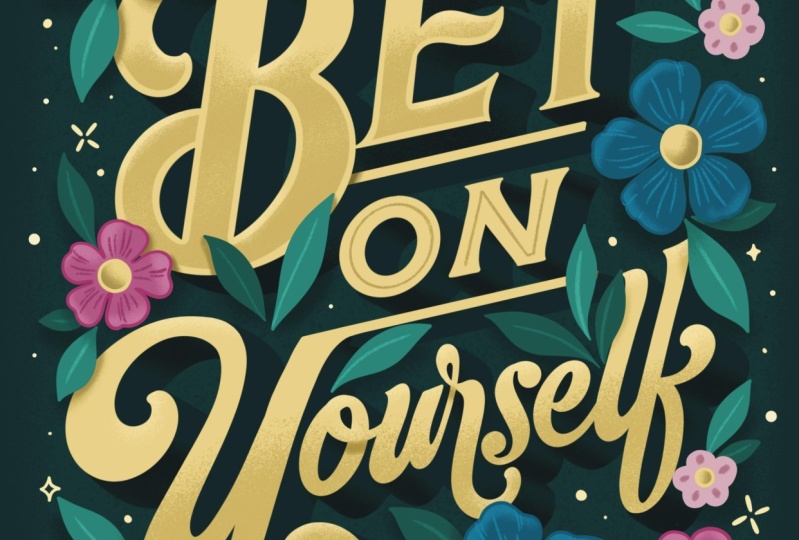
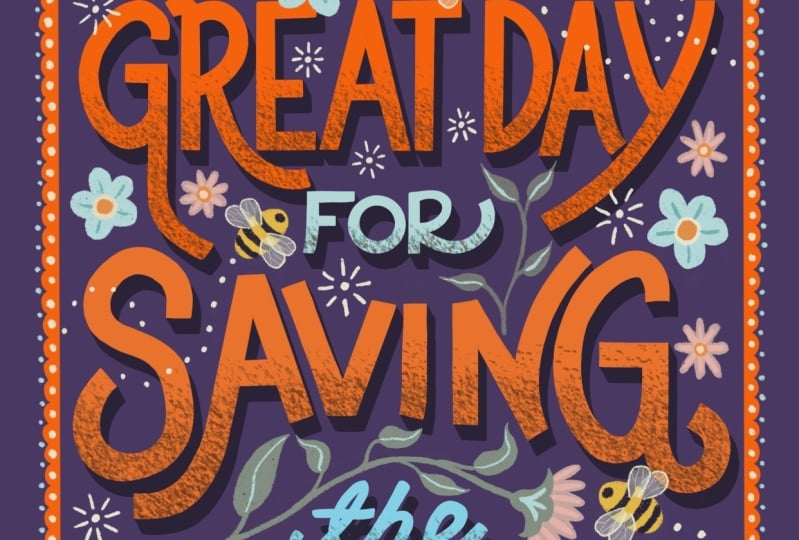
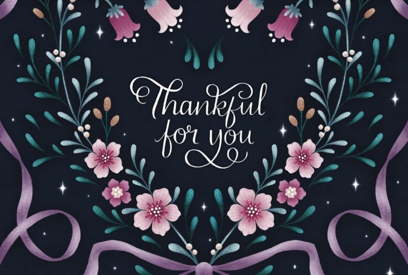
illustrations that will enhance your lettering. Start simple with basic
leaves, flowers, or sparkles. You'll find some
inspiration and ideas in the project resource
guide that you're welcome to copy from to start. Use illustrations to fill in empty spaces within
your lettering designs and use them to
help point back to your message by following the shapes of your
letters wherever you can. There are so many
features within Procreate that will help
you as you're drawing. You'll get more comfortable
in the program with practice. So at first, start simple. You want to be able to really nail the foundation
of your letters, things like straight lines,
consistent thickness, and so on, before you start incorporating
elaborate details. Play around with different
color combinations, and then try adding a block, gradient or simple illustrations that complement your
lettering piece. We're wrapping up the course
and our final lesson we'll recap key learnings and how to stay inspired
with Procreate. Thanks for watching. Why? The cups, I'm in a tea. Like, was that necessary.
7. Class Wrap-up: Hey, you did it.
Big congrats to you for completing the Procreate lettering for beginners class. Throughout this class,
we learned about using Procreate to level up your lettering in
the digital space. We learned all about
creating your artwork to ensure the best possible
resolution and color profile. We revisited some
lettering basics and the many procreate
features that make it easier to nail your letters like snap to
grid and drawing guides. We learned how to use the free thumbnail
sketches brush set for Procreate to come up with creative and unique
lettering designs. We explored how to take your
designs to the next level by incorporating color,
shadows, and textures. If there's just one thing that I hope you take
away from this class, it's that practice, practice, practice is the only
way to improve. Trust and enjoy the process. Remember to upload your project. I'm happy to provide
personalized feedback to help you continue
in your practice. Showing your work is a crucial
part of getting better. It's also a great way to connect with others
in the art community. And be sure to connect with me. Post your projects and
tag me on Instagram at KDP Letters with the hash
tag KDP Skill Share. I'd love to see what
you've created. It's been so great teaching you about lettering
in Procreate. I'm excited to offer you more classes on
Skillshare to help you continue to improve
your practice until then Happy drawing. Perfect.
 Kristen De Palma, Hi! I'm a lettering & mural artist.