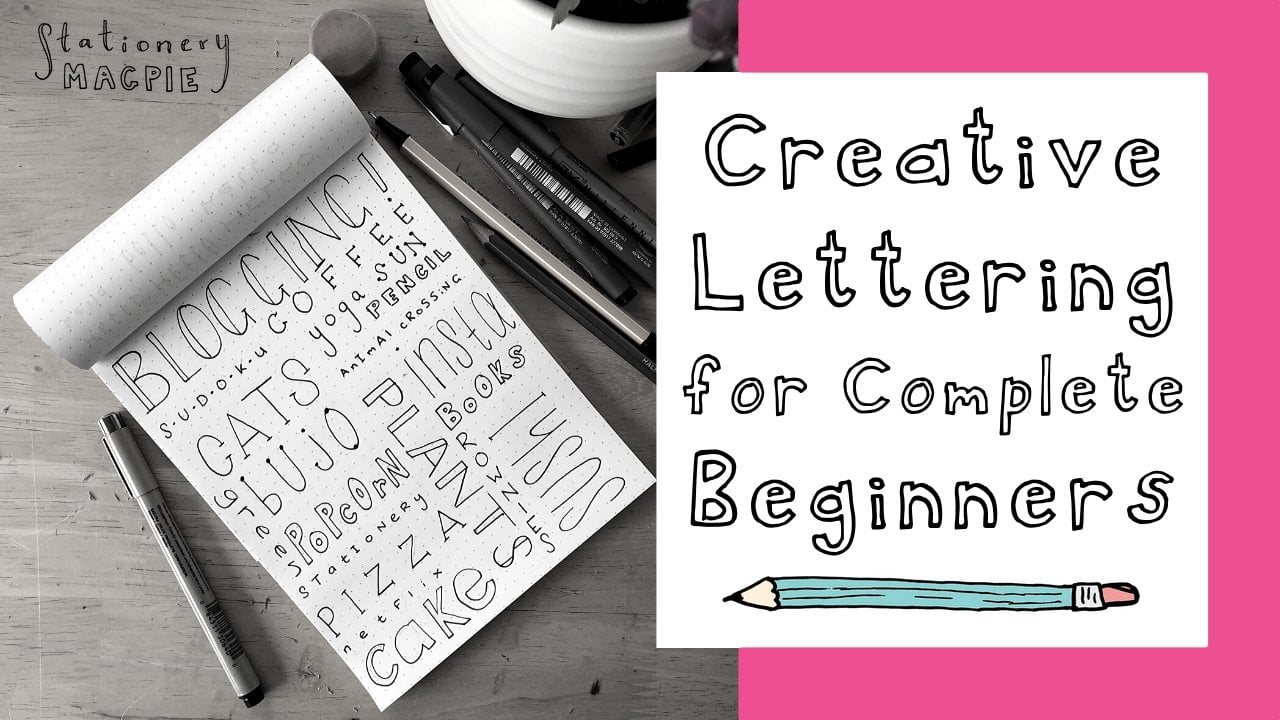
Transcripts
1. Introduction: Do you want to know the secret to mastering hand lettering. There's no secret.
It just takes time. But I have good news. I'm going to give you all the beginner skills that you need to start building a foundation for drawing beautiful letters. Hi. I'm Kristen De Palma. I'm a lettering and mural artist based in Halfax Nova Scotia. That's in Canada. I've been lettering professionally
for nearly a decade. After taking one
Calgraphy class in 2015, I was hooked, and I soon started experimenting until I
landed on hand lettering. Drawing letters was much more at my alley than fancy inks
and calligraphy pens, and it became the perfect
creative outlet for me. I left my corporate
marketing career and turned my love of lettering into
a full time gig in 2021. I've since created
artwork for clients like Adidas, Yagermester,
and Chatelin. I've painted dozens of murals,
taught many workshops. In addition to licensing
my artwork to brands, I've recently launched
my own line of gifting products which are
carried across North America. This class is the perfect intro. If you're looking to build
your lettering skills on a solid foundation, using the exact techniques
and process that I use to turn my lettering hobby
into a full time career. I'll be sharing tips and tricks that I wish I knew
when I started, including common beginner
mistakes that you can avoid tips for mastering
those tricky letters and layout planning techniques. Whether you're a seasoned
artist or new to drawing, you'll pick up tips and
techniques to help you begin to master the
art of hand lettering. I'm so excited to share
what I've learned with you. My goal is to have you leave this class feeling inspired
to continue your practice. Let's get started. Okay.
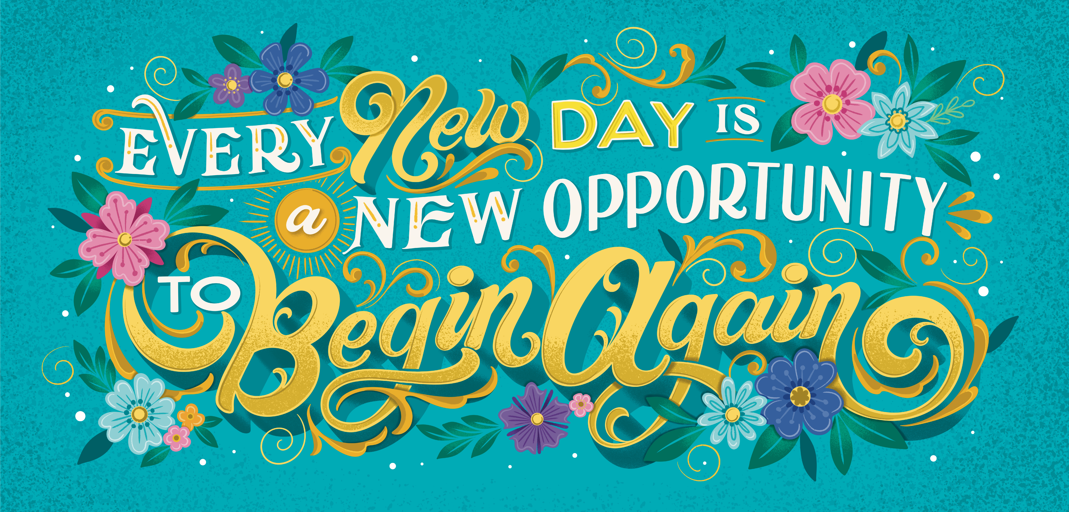
2. Class Orientation: Ra. Hand lettering can bring stories to life
in a meaningful way. Your choice of lettering
style, layout, and colors can all evoke
specific emotions, making your message more
impactful and memorable. Positive messages that
make people feel good are one of my favorite ways
to use my lettering skills. Plus, they're super
popular with brands, and so if you're
looking to offer your lettering services
commercially, it's a smart move. For your class project, you're going to create your very own inspiring lettering piece. Choose a quote or a message
that's meaningful to you, but try to keep it to
less than five words. This is meant to
keep you feeling inspired in your homework space. As a beginner, you don't want to overwhelm yourself
with a lengthy quote. Start simple and with something that feels
personal to you. This will help you
to stay connected and inspired throughout
the process. You'll be able to build on
the techniques we learned throughout the class to
create your final piece. Find some thought starters in the helpful project resource
PDF that I've put together. You can choose from here if you don't have a saying in mind. Our project components
will include Lesson one, lettering terms and styles. Lesson two, structure. This is where we'll learn how to draw letters from scratch. Lesson three, common
beginner mistakes, and how to avoid them. Lesson four, layout. We'll create thumbnail sketches to explore different
layout options. Lesson five sketching. We'll learn how to
scale your sketch up to an eight by ten size. Lesson six, enhancing. We'll start adding
some decorative elements into your piece. Lesson seven finalizing. Finally, we'll finish
your design with ink and color and bring
it fully to life. Afterward, you'll have a motivational piece
that you've created. Keep it in your home office
space, take a picture of it, and use it as your
phone wallpaper or gift it to someone special. In this class, we're going old school and putting
pencils to paper. This is the way that
I started before transitioning to my
iPad and pro create. These days, most of
the lettering work that I do happens on my iPad, but I do think it's
important to build your basic skills
of drawing letters on paper before you begin
incorporating digital tools. This will help you
master digital drawing much faster
and will allow you to focus on the fundamentals
without getting distracted by brushes,
effects, or shortcuts. Okay. Let's talk materials. You'll want to have
these supplies on hand to follow along
throughout the class. Pencil, I usually
like to use a four H. Eraser A white eraser will do. Paper or a sketchbook. I love to use dotted
or grid paper. Pens. I use micron fine liners in a variety of point
weights like one, three, five, but any black
pens or markers will do. Markers in your favorite colors, Bristol paper or cardstock, approximately eight by ten size. Tracing paper or transfer paper. And a ruler. I've put together a helpful PDF guide
that you can use as you work through each
lesson in this class. I'll reference it
in every lesson, so be sure to keep it
handy as you're watching the videos and working
through your project. Okay. I think you're amazing, but you're probably
going to sack a little bit at first,
and that's okay. It's all part of the process. My lettering was basic
before it was beautiful. And I'm embarrassed and
inspired looking at some of my early sketchbooks
to see how far I've come. Try to be easy on yourself
and just go with the flow. You're going to
feel a little bit of a gap between what you're drawing and what you actually want to be drawing,
and that's okay. It's all going to come with
time and consistent practice. In our house, we call
it pencil mileage. Every new mark that you
draw helps you to build your tank of experience so that you can just
keep getting better. Okay. I filled a lot of sketchbooks
before I started being able to do full lettering pieces that I was actually happy with. Before we get started, take a minute and write your
name on a piece of paper in your best style of hand lettering that you can do today. Put it in an envelope. We're going to revisit
this in the conclusion of the class that you can
see how far you've come. Okay. Let's start lettering. It's going to be so much fun. I can't wait to see what
you create with me. Okay. Do you want to feel how sweaty my hands are right now? There's clammy
3. Lettering Terms & Styles: Hi, welcome to Lesson one. Today we'll be talking about the different
lettering terms that I'll be referencing
throughout the class. We'll also talk about the
three basic lettering styles that all hand lettering
is based from. Okay. Don't be too concerned about memorizing
lettering terms. They're helpful to know
and to refer back to, but just know that I
constantly refer to things as little smushy guys or whirly does and
that's totally fine. These are a few of the lettering terms that I'll be referring to throughout the class
that are helpful to know. First of all, the
stem of a letter is the main part that
forms your letter. If we're drawing,
say a lower case T, this would be considered
the stem of your letter. Then when you go
to cross your t's, this part of the letter is
referred to as the crossbar, with lower case letters
like an or a J, the little dot that you add to the top is referred
to as the tittle, which I definitely will not be saying out loud
again in this class. But it's just good to know,
maybe for a trivia night. The A sender of a
letter is the part of the letter that will extend
above the main height. If we are writing our ABCs, This top part of the B is what would be referred
to as the A sender. Then similarly, there are
letters that have D senders, think of a lowercase
letter G or a y. This is referred to
as the D sender. Then a swash would be basically an exaggerated part of a letter for purely
decorative purposes. A letter is a great chance
to add a fancy swash. You can add one off
the tail of the y. This would be referred
to as a swash. There are three basic styles upon which most hand
lettering is based on. These styles can be mixed
within your lettering layouts, and sometimes you'll
see elements of each mixed within the same word. Seraph is a style of
lettering that you might see in a font
like Times New Roman. Basically it's just referring to these fancy little ns that
are on the letter forms. In a letter S, this
would be referred to as the seraph
part of the letter. Seraph could be rounded, they could be sharp like
you see in the S here, or they could be
highly decorative. But in the end, it's
really just referring to these little ends
of the letter form. On the other hand, a ser sans
basically means without. This style has these
decorative ends of the letters removed
for just a clean look, that would be seen in
a font like aerial. This would be considered a
snap style of lettering. As you can see, there's no
pointed or rounded ends. It's just a plain old letter, and that would be referred
to as a son serf letter. You can have serif or son serf style that's
like monoline, which basically just
means that the weight across all the letters
is the exact same. Okay. Or you could have
thick and thin style, which would be similar to this. The key here is just
knowing where to include your thickness and
where it should be thin, and that is something
that we're going to cover in the next lesson. Script lettering. This is my absolute favorite style of lettering because it's
so fancy and decorative. It looks very similar to
cursive style lettering if you are old like me and remember
learning that in school. It also looks similar
to calligraphy. But the main difference
with hand lettering and calligraphy is that
in calligraphy, you're trying to
write all the letters in one smooth stroke. You're really writing
the letters versus hand lettering where you're drawing the letters
piece by piece. Okay. With a script style of letter, you have the opportunity to add some special little
swashes off the letters. The crossbar of the t, it could be straightforward
like that, or there's plenty of opportunity
to add fancy swashes and shapes that complement the style of the piece
you're creating. Okay. Beyond these basic styles, the beauty of hand
lettering is that you can draw letters in so
many different ways. You can draw letters
that look like ribbons, create words out of food, or draw letters from flower
shapes or any shape. Whatever your imagination
can dream up. All lettering is based on
three different styles, Serif San Serif and script. From there, you can
get super creative, but understanding
the foundation of the letters that you're
drawing is super helpful. For our next lesson, review the different
lettering styles and practice some of the
different terms that we'll be referencing
throughout the class. In the next lesson, we'll start the actual fun part
drawing letters. Looks like a real
dump over there. Because of the rock and
all the garbage also.
4. Structure: Hi. In today's lesson, we'll explore setting up proper guidelines to
make sure that you're working from a solid structure before you start
drawing letters. Then we'll explore
building letter forms from skeleton to final. First of all, starting
to draw letters on a blank page without guidelines
is really difficult. You can make it a lot easier on yourself by setting up
just a few guidelines. So get your ruler
handy and set up just a few guidelines for
yourself that are going to make it a lot easier to ensure that your letter
forms are consistent. So first of all, you'll
want to draw a base line. So this is the line that all of your letters are going
to sit on top of. Next, you'll draw your x height. And usually for this one, I will make it just
a light dotted line so I can tell it
apart from my base line. And this is where grid
or dotted paper is super helpful because you
can ensure that your lines are
perfectly straight. Next, you can add
in your cap height, which would be the height
of any upper case letters. For that, you can make it just like a light straight line. Using these guidelines
helps to ensure that all of your lowercase and
uppercase letters are a similar consistency
across a word. You can also add in lines for your A sender and D senders to ensure those are
all the same height. I tend to not use those because I like to make my might be extra swoopy and low compared
to a lowercase g. I don't tend to add in
those guidelines for myself, but you can certainly do that if you will
find that helpful. Keep in mind, I'm not
setting up a baseline, and x height, and
a cap height for myself every single time
I'm lettering a word. I typically will always have
a baseline and for myself, but over time, I've
become a lot more comfortable making my
letter forms consistent. But for you as a beginner, it's super helpful to
have these always in place and that'll help
build that consistency. Now if I were to just
write the word letters, I know that the uppercase letter would touch the baseline
because it's got a rounded top, it would extend slightly
above my cap height. And you can letter along with
me if you've been following along and setting
up your guidelines. I know that my lower
case letters are going to reach the
top of that x height. It just helps add some control. Okay. Perfect. You crossbar. It's a stylistic choice how high you want that
to sit on the word. Typically in a word like
letter where I know I have to have it above
the letter E here. I might just do a straight
crossbar like this. You can also get a
little bit fancier. As long as it's legible. You can have some fancy
crossbars on your letters, and then I'd be going back
in to add my thickness. Remember, you can refer back to the project resource
guide if you need a refresher of what some
of these terms mean. You'll also find really
helpful worksheets with these guidelines already
in place for you. Tip number one is
to draw skeletons. This basically just means
that you want to start out drawing the
bones of the letter before you go about
adding any sort of decorative element
or style to it. So for drawing in our base line, and then let's add
our x height in here. Okay. Let's add our cap height. Let's draw the word
skeleton together. Basically, you can
choose the style. Whether it's script
Serif or San Serif, you want to start with the
skeleton of the letter. I'll do a script style
because that lends itself well to the word
skeleton for some reason. You just want to
start with drawing just like you would
draw a stick figure. You want to draw the stick
figure behind the word. Draw it in the style
of your choice. Basically, it's drawing in your natural hand
lettering style, but just slower and paying
a bit more attention to the letters than you
would if you were just taking a random note. Once my skeleton of the
letter is in there, then I will go back in and I'll add my
thick and thin lines and any stylistic
choices I want to make if my crossbar of my t
if I want to make that fancy, I might add that in and just basically and building
out the letters. Okay. I don't know why I don't go in order.
There's no reason for this. You can go in whatever
order you'd like. Add in your style to it and just build it up until
you're happy with it. This would be a part
of the process where I might notice I think there's a little bit too much space here in between this and the
L. I'd probably erase the Era to give myself a bit
better spacing, and so on. You'll just refine and refine, but always starting with
that basic skeleton of the word first drawing
letters all at once is what leads to looking like those bad bubble letters
from junior high or a bad yard sale sign or
maybe a happy birthday card. By drawing letters
all at once, I mean, if I were to try and draw the
word skeleton all at once, that's when people
draw like this. That's what leads to this
is exaggerated, obviously, but this is what leads to
inconsistent lettering, which can still be
very interesting. I love awkward letter
forms like this, but it will lead to
inconsistencies. If you're not trying to
do a lettering like this, then you definitely want
to start with the skeleton of the word first and
build from there. As you continue to practice, you'll become quicker and
more familiar with knowing how much space to leave in
between your skeleton letters. For now, just enjoy the process and keep
your eraser close by. Oh. Tip number two,
thick versus thin. So knowing where to put
the thick line versus the thin line in a letter form is a very common
challenge for beginners. The key is to try
and think about how your hand would naturally
draw the letter. So thinking of a letter A, you would go up down and across. That's naturally how you
might draw a letter A. So if you think
about it this way, try and remember
that up strokes, so the up part of the A is
going to be light and thin. The down stroke is going
to be heavier and thick. And then horizontals
are always light, and diagonals are
usually light as well. This doesn't apply perfectly
to every single letter form, but for the most part, it does work in each scenario. Always try and
remember up is light. Let's try a trickier letter, maybe like a letter S. Thinking of how you might
draw a letter S, you would go up up. This was my down stroke, the thickness of the S is
going to be all the way down just like this. Thinking of a letter B, down across, down
across, down across. These are my thick lines. It's my downstroke,
horizontally, it's going to be light across
and then it starts to get heavy right around
the round parts of the B. I'd suggest practicing basically the
alphabet and just getting really comfortable and familiar with how your hand
naturally goes to draw the letters and always
remembering that an upstroke is going
to be light and thin, a downstroke is going
to be heavy and thick. A lot of hand lettering is
making optical adjustments, and so oftentimes following exact mathematical
measurements isn't the best way to ensure
proper letter forms. Thank goodness because math
is not my strong suit. We'll learn more about
these optical adjustments with today's third
and final tip. Tip number three, Overshoot. Letters with a rounded top or bottom or a pointed
top or bottom, need to extend slightly
above or just below your baseline in order to account for an
optical adjustment. So what I mean by that? Let's set up our little
guidelines here. So this impacts certain letters. Think of a letter. You'll need to make
sure that the top and bottom of your
extend just slightly above and slightly below the line that your letter
sits on and reaches. This is to account for
that optical adjustment. Without these tweaks in your rounded top
and bottom letters, these letters will
look too small to the eye when placed
within a layout. This applies to an S as well. So an S has that rounded
top and a rounded bottom. Letters like an A. That's
got the pointed top. You want that pointed top
to extend slightly above. It also applies to
a letter V. Okay. If you're stepping back and
looking at a letter or a word that you've drawn and something about it just looks
slightly off. Try checking and making
sure that your letters with rounded tops,
rounded bottoms, or pointed tops, or
pointed bottoms are extended slightly below or above the other letters
within your word. Make sure that you set up for success before you
begin drawing letters. Lightly sketch in your
baseline, your height, Okay. And your CAP height to ensure that your letter forms are
consistent as you practice. Take some time to
practice setting your guidelines up and
then practice script, Serif and son Serif
styles of letters. You can find
inspiration for each of these lettering
styles as well as helpful practice
worksheets to use inside the guide book found under your project resource tab. In the next lesson, we'll review some common beginner mistakes
and how you can avoid them. See you next class. Should
I do one where I'm like, You made it so. Oh.
5. Common Beginner Mistakes: Hi. In this lesson, we'll review some common
beginner mistakes that many lettering
artists make. They're easy to avoid,
so let's review how. As we learned in the
previous lesson, it can be difficult
to know where the thick versus thin lines
go in your letters. Putting the thickness in the wrong spots is a
common beginner's mistake. Remember, upstrokes are thin
and downstrokes are thick. So there are a few letters where this might get a
little bit confusing. The important thing is to think about how your hand would
naturally draw a letter. So some letters that
I often see people putting the thickness
in the wrong area would be like a letter. So if you think about how your hand naturally
draws the letter, it would be up down and up. You think about how
you would draw it in one smooth motion. Some people might go,
I would draw an n like diagonal and down. They're putting the
thickness here and here and aren't quite sure what to do with
the diagonal line. But the correct way would be to think about it as
I first drew it, which is up, up. These are your up strokes. These would be your thin lines. Then the diagonal would
actually be your thick line. Other common letters
are a letter A. Again, thinking about how
you'd naturally draw it, it would be up down
and then across. Horizontals are
tend to be light. Thin then your thin crossbar. Sometimes again,
similar to the n, people might draw it like
this, this, and that, which would lead them to put the thickness on
both sides of the A, which would be
incorrect if you're trying to do a thick
and thin style, you would want to make sure that your thickness is only
on the right side. Other letters that can be
really tricky are like an or a W. With an m, thinking about, you
would draw it up, down. Same with a W. It
would be up up. Thinking about those
strokes that you made up, this is your light down, this is your heavy,
light, heavy down. The W is basically just
the opposite of that. Do heavier, light, heavy down. Okay. So think about how your hand naturally
forms letters, and for the most part, this way of thinking is going to be
really helpful for you. So up, thin, heavy down. It's a great thing to just
practice and get used to the movements that
your hand naturally makes when you're drawing
these letter forms. Not accounting for overshoot is a common mistake that I
see beginner artists make, and that can be easily fixed by just simply ensuring that you're always drawing
in your guidelines. And with any letters that
have a rounded top or a rounded bottom or
a pointed top or a pointed bottom that
you're extending those slightly above or
below the baseline. And this will ensure that optically they look correct
within your layout. So this applies to
letters like an O, and or letters with a pointed top or
bottom like an A or a V. The pointed part is what needs to extend slightly above or slightly
below the baseline. Now, I do have a
trick for drawing the dreaded letter S that can be really challenging
for beginners. It's harder to
simply try and nail those proportions and shapes
in one smooth movement. With a letter S, I'd like to start by drawing a number eight. Very lightly, a small circle, below that, a larger circle. Then over top, starting
with the left side, tracing a nice smooth
curve, Just like this. Having the shape of the eight underneath helps to
ensure that you're getting those nice smooth
and rounded edges, and that you're
keeping the S very proportional because
traditionally, an S, as you can see, extends slightly further right on the bottom of the S
compared to the top. Once you're done and you've got a shape that you're happy with, you can just your little
eighth that's underneath, and no one will ever know. So although you're building your letters by starting them as a skeleton and then building
them into full letter forms, it shouldn't look that way
once your work is completed. So oftentimes what I'll
see from beginners is that they don't
quite know how to smooth out those
connections just yet. So for instance, drawing
a cursive letter A, and we go to add
in the thickness, they might add it in like
this and don't spend the time to smooth out where this thickness connects back into the thin part
of the letter. So it can get looking
really clunky. If you're just adding
your thickness in I straight lines like this. It's easy to tell that this was drawn in pieces
versus smoothing out these lines and making
sure that it looks to the viewer as one smooth shape, and that just takes time and practice in rounding
out these connections. So you're sketching
it piece until it looks like it's
all one shape. A lot of hand
lettering is simply practicing consistency
wherever possible. If you've chose a
specific thickness and thinness for your letters. As I show here with
the T and the H, dot or grid paper can be very, very helpful for
making sure that the consistency is maintained throughout your letter forms. It makes it really easy
to quickly identify if you've added too much
thickness in a certain area, as you can see here
with my letter E, all these other letters
are about one square wide, and here I've gone to
almost two squares wide. So once I fill it in, I can start to see that
that is much too thick. And that I should
adjust that to be consistent throughout
my letter form. This goes for style as well. If you've chosen one style of letters like a san
serif or a serif, it's best to not mix serif with san serif
within the same word. Or to mix serf styles within the same letter form
or within the same word. So just maintaining
that consistency throughout your entire word, and then you can have some fun mixing styles within a phrase. But when it comes
to the same word, don't do what I'm doing here, which is mixing a San serif with a seraph with multiple
different kinds of serfs. It just ends up
looking messy and clunky rather than intentional. There are some
common mistakes that many people make when they're first starting out lettering. You can avoid them by
following these tips. The best way to conquer those
letters that you hate is, you guessed it,
practicing them more. You can also learn so much just by studying letters
out in the wild. So much of lettering is
just training your eye. Practice adding thick
and thin lines to those more difficult
letters like W, and A. Try out the trick for drawing a smooth letter S
while you're at it. Refer to the handy
PDF guide found in the project resource tab for practice sheets
that you can use. In the next lesson, we'll start bringing your
letters to life through thumbnail sketches that explore different layout options.
I'll see you there. Ball. That's good. Great. Okay. What? No. What? Okay. Fine. Yeah. Yeah is.
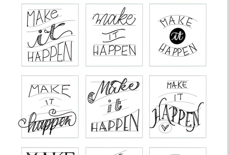
6. Layout: Welcome back. In today's lesson, we'll begin understanding how to lay out your lettering in a dynamic and interesting way
using thumbnail sketches. Okay. The composition of your lettering pieces
is where you should be spending the
majority of your time. Before you ever get
to a final piece, there's so much time
invested in landing on the best possible
layout structure. Thumbnail sketches are my absolute favorite
way to do that. Basically, they're super cute, tiny little baby sketches
of your lettering layout. They're super adorable
and also very helpful. Sketch ideas for your
layout using thumbnails. You're not getting caught
up in the details, or spending too much time on
something that won't work. Thumbnails are a great way to figure out problems and explore different options before landing on the best possible layout. Use the thumbnail
sketches worksheet from your project resource guide or simply draw small squares
on your blank paper. Try and keep them to no
more than four by 4 ". Before placing
letters into layouts, start by drawing simple shapes for your letters to fit into. Try to create at least eight
different layout options and each one should take you just a few minutes to create. To come up with ideas for what shapes to draw to
help inform your layouts, check the project resource
guide for plenty of ideas. At this stage, you're not
getting worried about structure lines or using a ruler or perfecting
your letter forms. It's just about exploring different shapes and ways
to layout your letters. There's a few things
to think about as your brainstorming
layout options. I always start by
thinking about what is the most important word in my lettering piece that
I want to emphasize. Start with the biggest
or most important word and build your
design around that. Use that word as
your focal point. What are your link words? These are words like from, if, two, or the, which are important to include, but won't be the
most important words within your focus
of your design. So what are interesting
ways that you can use to enhance them
within your design? Things like using unique shapes, like a circle or a ribbon? Can you tuck them into
elements of your focus words by using a swash or some creative swirl
within your design? Or could you use things
like an ampersand versus spelling out the
word and, for example? Experiment with different
lettering styles to see what will work best
for your final design. Remember that different styles
convey different emotions. So script can make a word
feel soft and soothing, while a heavy seraph style can be read as bold
and more serious. Okay. To help you come up with creative layouts
for your lettering, try sketching
thumbnails so that you can explore many
different options without investing a ton of
time or getting frustrated if a particular
layout isn't working. Create at least eight different thumbnail sketches
of your chosen. Explore different
shapes, layouts, and lettering styles in each. Then select your favorite one. We're going to bring
this little sketch to our final artwork size
in the next lesson. Remember to upload
your progress so I can offer you
feedback along the way. I'm looking forward to
seeing your progress. By now, I know you're crushing it. I'll see
your next lesson. You know what else
is really good is the way that there's
a hole in my sock, so that perfectly my
toenail just, who is she? Some little a little peek
through. Just a little. How do you? A little Well, hello there, ma'am. Okay. So
7. Sketching: Okay. Hi. In this lesson, we'll take your thumbnail
sketch and scale it up to our final artwork size. This is easier said than den. It's not always that everything scales up perfectly
from your thumbnail. So you'll likely encounter
some challenges that you need to overcome.
But that's okay. It's all part of the process. First, it's important to
get those structure lines that we learned about in
lesson one on your page. Once your structure lines
are plotted on the page, begin lightly sketching
in your letters. Again, referencing
your thumbnail sketch for the style of lettering
that you've chosen. You'll want to be really light. Because again, there's
going to be a lot of erasing at this
stage of the game. Get your letters lightly sketched in there
first as skeletons, and then we're going to go
back in and add any thickness, but now we're just worried about making sure
that our words fit. As we scale them up, you'll notice you'll end up likely with a lot more awkward
space than you did at the thumbnail
stage, and that's okay. That's all part of the process. Get your letters
lightly sketched in and then we'll be able to go back and add our thickness in. A lot of lettering
is problem solving. At this stage, you're
likely going to run into things like having too much
space in a certain area, not having enough space, or needing to adjust lettering styles to better
fit your canvas. Erase, sketch, erase, and repeat until you're really excited about what
you're starting to see. Leave any smaller awkward areas in your design for
now as we're going to explore creative ways to eat those empty spaces
in our next lesson. Okay. There are a few things to keep in mind at this
stage of the process. First of all, this is where you want to be spending
most of your time. You want to get your sketch
as tight as possible before you're bringing in permanent
things like pads or markers. Make sure that when you're
drawing your skeleton letters, you're leaving yourself
enough spacing between each letter
forms that you can go back in and add that
thickness to your letters. If they're too close together, it'll become legible
once you add in things like thickness or if you
want to add a drop shadow. But having enough spacing, you can always fill spacing. You can't really take it
away once you've filled it. Okay So leave yourself
plenty of spacing to be able to go in and add thickness, decoration,
drop shadow. You tend to want to be more generous with your
spacing than not. Before determining
that your sketch is ready to move on to final, go through a mental check list. Spell check. Is it legible? Can certain areas be
interpreted incorrectly? For example, does the loop on your H look like it could
read as the letter P? Are there any areas that
are distracting your eye? So is your eye drawn to a certain part of a word
where it looks too, too, or is there too much
or not enough space? Flip it and reverse it. Looking at your work
upside down or backwards, can help you to identify
letters as basic shapes and symbols rather than focusing on reading the words themselves. This can help you to easily
identify mistakes in your work like too much
spacing or too much thickness. Account for the details. In the next step, we'll be talking about adding
extra elements like shadows or depth or extra
details like stars or flowers. Have you left
yourself enough room in your sketch to
account for those? A lot of the art of lettering comes down to training your eye. And this will come with
time and practice. A sign painting instructor. Thank you, Joe B Carter, once told me that if it
looks right, it is right. And this is really
stuck with me. So much of lettering
is really just training your eye to make
adjustments as you go. Remember to take your time
at this step of the process because it's so much easier
to erase than to redo. Take your time to transition your chosen thumbnail
sketch into a finalized sketch page
that you're happy with. Try and be patient
with yourself as you're finessing and
tweaking everything. And don't worry too much about the small blank areas that might be left in and
around your piece. We're going to learn
how to address those in the next lesson. What do you do? Un tying the web of lies. It's flow. Phone code. Yeah. Yeah.
8. Enhancing: Welcome back. In today's lesson, we'll explore how to use
decorative elements to enhance your lettering pieces and
fill in those awkward spaces. The area around your
lettering piece is just as important as
the lettering itself. There are so many ways to bring your lettering to
life with details, texture and decorative elements that will help to
emphasize your message. I like using decorative elements to direct people's
eyes to the message, using things like leaves, swirls or frames to point
attention to the artwork. Flourishes and swashes add
interest to your lettering, and there are so
many ways you can make letters unique
by using them. Just be careful not
to go overboard. You want to maintain legibility
in your lettering pieces. See some ideas for
using flourishes and swashes to enhance
your lettering in the project resource guide. A lot of knowing what
decoration to add to your lettering pieces
will come with practice, but to start, it's usually about identifying any awkward
spaces in your layout. Are you left with a space above a word that distracts
your eye and is there a way to
adjust your letters or add decorative elements
to fill that space? Try to choose elements that naturally make sense
with the message. For example, use flowers if the message includes something
about growth or blooming. Don't be afraid of
allowing the letters or decorative elements to
interact with each other. This adds so much depth
to your work and makes it feel like the decorations
weren't an afterthought. Don't go overboard. Adding too many
decorative elements can lead to a lettering piece
that's not legible. I was absolutely guilty of this early on in my
lettering practice. Remember to think legibility
first, decoration second. When you're adding
flourishes or swashes, ensure that the letters or words can't be mistaken for others. For example, a swoopy t ends up looking a
lot like a letter L. Here are some different ways that you can enhance
your lettering pieces. Using a decorative frame can
help to contain your design and draw the viewer's eye
to focus on your artwork. It's meant to keep the eye
on your piece and can be really helpful in having your
artwork to feel complete. When you're adding a frame, try using a ruler to
add a straight frame, but have elements of
your artwork break the frame for added
depth and interest. Add a decorative frame made
up of florals or elements that complement the
shapes found in your piece by
following its curves. Don't need to be a seasoned
artist to be able to add in some simple illustrations that will complement your artwork. Start with circles and
other basic shapes to determine where
your illustrations will go within your design. I always start by
looking for areas of the artwork that
look empty or like they feel like they need something a little
extra to feel complete. Then you can start lightly sketching in what you
want the shapes to be. Flowers and leaves
are some of my go to. But you can use whatever
illustrations you would like. Whatever you're using,
I do like to use the illustrations to
point toward the artwork. Rather than lead
the viewer's eye out of the main message
of your art piece, try to use things like leaves or flowers to actually point inward to the main message and keep the viewer's
eye on the page. Find natural opportunities to add swashes or flourishes to your letters that
fill spaces and create interest,
but don't force it. I love to look for
opportunities where my letters and
decorative elements can interact with each other. It gives pieces a lot
of depth and interest. For example, could the
crossbar on your letter T become the top of your
letter H in the word? That's one of my favorite
connections to make. Or could there be a swash
on your letter that curves up to form a little frame around
the rest of your word. Okay. So play around and look for these opportunities
where letters can interact and become decorative
pieces in themselves. When you incorporate
illustrations, look for ways they can interact
with your letters, too. Could the leaves of
your flowers or some of the petals look like they're
overlapping with a word? This can add an extra level
of depth to your work rather than having illustrations appear as after thoughts. Decorative elements can help
to bring your lettering to life and direct the
viewer's eye to your message. Use them strategically
and don't overdo them. Remember, legibility first. Reference the project
resource guide for helpful ideas on how you can enhance your lettering
pieces using frames, illustrations, and opportunities for elements to interact. Work on enhancing your sketch by adding in some
decorative elements to enhance your
piece and fill in any awkward gaps or spaces. In the next lesson, we'll
break out our pens and markers and start creating
our final masterpiece. I'll see you in class. I don't think I can watch this back
because I will throw up.
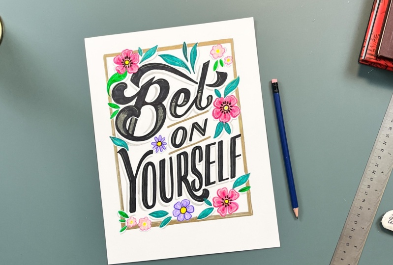
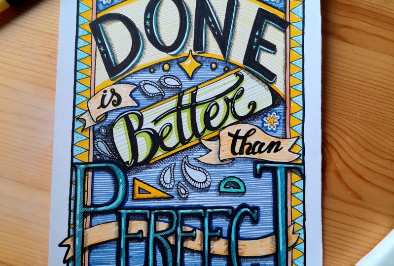
9. Finalizing: There are a few different
ways that you can transfer your sketch
onto your final paper. If you have a light table or a nice window with natural
light, that works great. Today I'll be showing you using the transfer paper method. So now we're going to
take our final sketch and then transfer it to our
final artwork paper. I love to use Bristol paper because it's so nice and smooth. So I've got it here
in nine by 12, but you can use any
size that you'd like. Now that you've got your
final artwork paper, you're going to start by taping down your transfer
paper over top. You want to make sure that
the dull side is facing you. There's a really shiny
side and then a dull side, you want to make sure that it's shiny side down
and tape that into place so that it doesn't move around as
you're transferring. Over top of that, you'll
send to your sketch as best you can on your
final artwork page and tape that down as well. Using a sharp pencil, start lightly
tracing your sketch. You don't have to
press super hard because transfer paper is
a little bit delicate. Just be firm, and trace
out a couple lines, and then it's very helpful so that you
don't get all the way down and then
realize that you've got your transfer paper
on the wrong side. At this point, lift
up your sketch and just be sure that it's
transferring properly. If it is, great, continue on until your full
sketch is traced out. Once you're done tracing, remove your transfer paper
and take a second to appreciate that you've got a beautifully transferred
guide in front of you. Now you can start inking. Remember to take your time
at this step of the process. Part of art is responding to mistakes that happen
along the way, and sometimes they can result in an even better final piece. Start by outlining your letters
using a fine liner pen. If you're holding your breath at this stage of the process, you are not alone. Once your outline is completed, you can start coloring in and filling in your
letters with a marker. Once the letters
are all filled in, you can start coloring in all of your decorative elements and illustrations that you've added. A white gel pen is a really great tool that
acts like a little white out or can help create a bit of an overlap look
when letters cross. Colred or metallic
gel pens can be great for adding details on top of your letters for
some added interest or to add additional emphasis
to a particular word. For larger letters, you
can add more of a fill, and for smaller letters, you can add subtle details. For adding some
depth to your work, try adding a drop
shadow using a pencil. Drawing very lightly,
you're going to build up the color over
time by shading it. Try and think about where your light source is coming from. So what I'm doing here, thinking about the light
source coming from this angle, it would be casting a shadow on the bottom and left side
of all of my letter forms. And so I'm going to make sure
that I'm adding a shadow to the left side and
underside of everything. Okay. And this will
just give it a bit more of a three D look and it will add some interest
to the overall piece. Okay. Take your time
to properly place, transfer, and then
ink your piece. Get creative when it comes to colors and tools
that can further enhance your final artwork like gel pens or pencil shading. Finalize your artwork
using ink and markers so that it can
become frame ready. Remember to upload
your project so that I can see your progress and
admire it along the way. I can't wait to see
what you're working on. Finalize your artwork
using ink and markers so that was that? I was just picturing
you laughing at me and then I laughed
at myself instead.
10. Class Wrap-up: Ra. Okay. Congratulations on completing the intro
to hand lettering. I'm so proud of you. Throughout this class, we
learned about how to build your lettering practice
on a solid foundation, starting with pencils and paper. We started with structure. Remember, make sure you're
setting yourself up for success by having some
guidelines to work from. We learned about avoiding common beginner mistakes by
practicing the fundamentals. Remember, upstrokes are thin
and downstrokes are thick. We sketched small. Using thumbnails to date on your layouts before
you begin sketching is a helpful way to
avoid frustration and build the best
possible final piece. Remember, spend the most
time on your sketch. This is where the
real work happens. A lot of lettering
is problem solving. Remember to upload your project. I'm happy to review
and provide you with personalized feedback
that you can continue getting better
in your practice. Showing your work is a crucial
part of getting better. It's also a great way to connect with others
in the art community. And be sure to connect with me. Post your projects and
me on social KDP letters on Instagram and use the
hash KDP Skillshare. I can't wait to see
what you've created. This has been such a pleasure teaching you how I got
started with hand lettering. I'm so excited to see where
you take your practice, and I look forward to offering more classes on skill share
to help you get there. Coming up soon, I'll be doing a procreate
lettering class, and I'm so excited to share that as soon
as I have it ready. Until then, happy lettering
and thank you for joining me. Did you think I forgot pull
out that envelope from our class orientation
and take a look at the name that you wrote when
you were just starting out. Now you can rewrite it using your newfound skills
and keep it up. Remember, practice
makes progress. Bye for now. Did you think I forgot?
 Kristen De Palma, Hi! I'm a lettering & mural artist.