Transcripts
1. Introduction: Imagine effortlessly bringing
those rich colors and fun textures of
traditional watercolor into the digital
world of procreate. Hi there, Creative. My
name is Shannon Lane. I'm a hand letterer
and an artist. And one of the things I
was passionate about when I first started using
procreate five years ago, was bringing the
beauty and life of traditional watercolor
to the digital canvas. In this class, you'll
learn how to create some vibrant watercolor vegetable illustrations
in procreate, you'll learn how to sketch
from a reference photo. How to set up a
watercolor canvas app, leering, b***ding and
shading techniques. Plus how to capture
highlights and shadows to add depth and dimension
to your artwork. As we progress
through the lessons, you'll paint along with me in real time so that by
the end of this class, you'll have a set of vegetable illustrations to
share for your class project. So whether you're a seasoned
digital artist looking to expand your skills or a
beginner eager to learn, this class is designed for you. No prior watercolor
experience is required. Just a basic understanding of how to navigate
the procreate app. As for supplies, you'll need the procreate app
installed on your ipad, an apple pencil, and the free watercolor brushes and resources available in
the project gallery. Grab your supplies and I'll
see you in the first lesson.
2. Download Your Freebies: To find your class resources, you'll need to open skill
share on a browser I'm using. Safari browser on my ipad. Navigate to the projects and resources section
of this class, then tap on the files
to download them. Since I'm using Safari, the files will be saved to the downloads folder on my ipad. Using the file app, go
to the downloads folder, tap on the file, and it will automatically be loaded into procreate for you. The breast set
fell will be added to the top of the brush library. The Swatch fells will be added to the color palette library. You can tap on the three
dots and then select set to default so that you won't have to be searching for your palette throughout the class.
3. Let's Sketch Our Images: We're going to start off
on a brand new canvas. You can choose whatever size you want I'm using screen size. And now we're going to
import our reference image. Go to the wrench icon in the upper left side,
tap reference. Then you're going to
select Image Import. And then go to where your
image is saved and import it. Then we are going to use the six pencil to
start sketching. When you're sketching an object, you're going to break it
down into basic shapes. So I'm starting with
the middle of the corn, which I can tell is an oval. Then I'm going to add
the husk around it, so I don't like the stiffness of the husk in the reference
image that I'm using. So I'm just going to
tweak it a little bit. This one that is kind
of sticking out. I'm going to bring it
a little bit higher and I'm going to
add a curve to it, so that has a little
bit more character. Then I'm going to
draw another curve in the same direction, and that will be the
first piece of husk, and you can just get rid of any overlapping lines as you go. Then I'm going to kind of mirror that leaf
on the other side. But I brought it a little bit higher and you can already start to see it looking a lot more fun and playful than the original
reference image. Oh, when it comes to drawing
the separation for the corn, I'm also going to simplify this. Rather than trying to draw
each individual kernel. I'm going to draw a curved line from the tip of the corn
right down to the bottom. I'm going to draw three
of these so that I divide it into four sections. Then I'm just going to draw some lines that
are curved upward, and these will separate the corns and create
the individual kernels. When you're finished
adding these lines, your initial sketch is complete. And you can then refine
this even more simply, lower the opacity of
that layer that you just sketched and create
a new layer on top. And refine the design by
cleaning up any edges. Maybe if you want to
simplify a little bit more, all of that is up to you. You're almost ready
to start painting. In the next lesson, I'm
going to show you how to set up a watercolor canvas.
4. Watercolor Canvas Setup: Before we start our
watercolor painting, we are going to
set up our canvas. And one of the best
ways to create a realistic watercolor effect in procreate is to use a
watercolor paper texture. You're going to import the paper texture
that I've provided. Then you're going to
lower the opacity of it that isn't as intense
as the original image. We just want it to be
a very subtle texture. This layer will be
our background layer. Whatever we paint above it, the texture will show through. Then you're going to
duplicate that layer, and this will be our
paper texture layer that will show up
on our painting. Create a new layer in between
those two paper layers and clip the texture that is above onto your
painting layer. You're going to
set the b***d mode of the painting and the paper
texture layer to multiply.
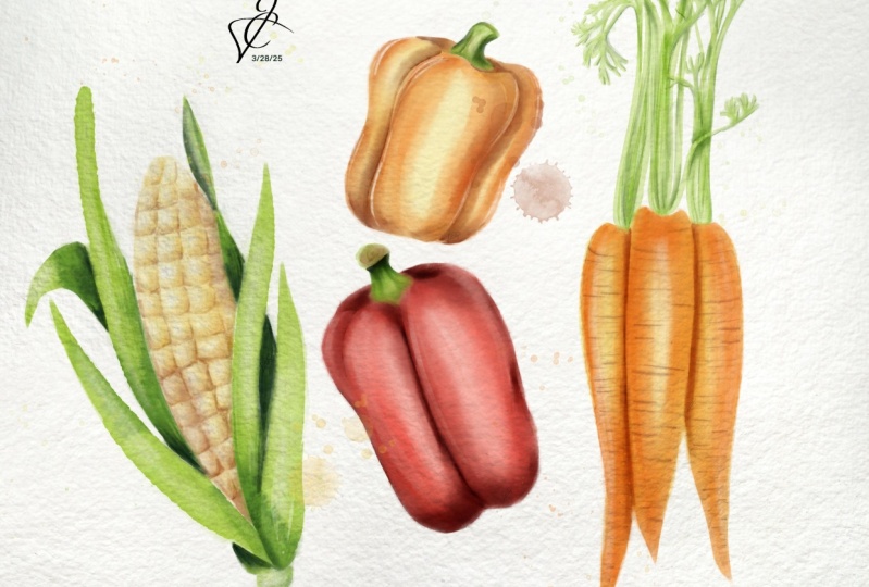
5. Painting Corn: Let's begin by using the
dark edge or brush to apply the lightest yellow from the palette to the
center of the corn. Don't hesitate to leave white
****** or go over areas, as this will help to
build up color and create some color variation that will mimic the authentic
watercolor look. Then you're going to switch to the watercolor, special effects. Brush to b***d those colors together and smooth
out any harsh edges. Now we're going to define
the individual kernels, Switch to a darker
yellow and paint a J shape on the
inside of each kernel. Make sure that you are following the shape of the
lines in the sketch. Then you're going to use the watercolor
special effects brush to b***d the inner side of that line that
you've just painted. So once I finished adding
in that darker color, I felt like my colors
were a little too light. So I switched to
the darker yellow just to build up
the shadow side, B, H, H. Then you're going to switch
to the dark edge writer brush and a darker yellow and
add some more shadows, but this time to the
outside of the kernels. As you paint, make sure that you define the shape
of the kernels. You can go over the shadow to make them darker
in some areas, preferably at the bottom, because we're going to have
that husk that's going to be overlapping and casting a shadow on the bottom part of the corn H. Then once I'm finished, I'm going to create a new
layer and switch to white to paint some highlights in the upper left corner
of each kernel. You can vary the size
of these highlights. You can make some a lot
more prominent than others, preferably at the top, because the bottom
part of that corn is going to be behind the husk, while the top part of the corn is going to be
exposed to more light. So you can have a lot more
high lights in that area with the main part
of the corn finish. We're now going to move
on to painting the huss.
6. Time to Paint The Husk: Start with the
lightest green first, use the dark edge rider brush
to add color to your husk. I'm focusing on the ones
in the foreground first. And you can paint this on a
new layer above the corn, or you can even do it
on the same layer. But if you're working
on the same layer, you need to be precise
because you don't want to cover the yellow
part of the corn. De then to add some shadowing paint, some of your darker green in the areas where the
leaves are overlapping. I made my brush a little
smaller and I'm adding some short choppy lines
starting where the leaves meet. I'm also adding this color to the underside of
the curled leaves, and along the inner part
of the husk as above. Then you're going to use
the special effects brush to b***d that darker
color into the later one. Once you're finished with
the leaves in the front, you can switch back
to your later green. And repeat those same steps to paint the husk
in the background. The reason I didn't add all
of the color to the Us at the same time was just
to make sure that I didn't add my shadows
in the wrong place. Shadows not only add dimension, but they help to
separate large areas of color and add some
definition to your shade. Since these are further behind your first set of leaves
that you painted, you'll need to add
a darker shade of green to create the shadows. This contrast will help
to show the depth of the, Help to show that they
are further behind, Not only the husk,
but also the corn. Then you're going to use
a special effect brush to b***d that dark color
into the lighter one. Just like you did for
the husk in the front. Now to add a little
bit more definition, reduce the size of the dark
edge, right, or brush. Select the darkest green
and draw a thin line of color where the leaves are overlapping or in any areas
where they may be folded. I'm also going to add
it to the inner part of the Us where the corn
would cast a shadow. Then use the special effects to b***d out one side
of your shadow. 0. Now we're going to add some texture to our Us. First, I'm going to
lighten a few areas on not only the
corn, but also the, I didn't leave out as much
white space as I wanted, so I'm going to use a
special effects brush to add some white on a new layer
clipped above the corn. You don't want to
have too much white, so you can reduce the opacity of the brush or the
opacity of the layer. Then on a new layer you're
going to stamp the bleed. Three, brush in
some darker green. Feel free to move
your bleeds around and adjust them until you
get them how you want. You can add as many
bleeds as you want, then use the smudge brush to b***d it into your later color. You can add as many
bleeds as you want. This is all up to you how you want to add your texture
to this painting. Remember to erase any areas that may go where
they shouldn't. Now that this watercolor corn
illustration is finished, you can group all those
layers that you've painted on together and get ready to
start painting our peppers.
7. Let's Paint a Red Pepper: Start by selecting
the light peach color and use it to paint the
shape of the pepper. Remember to leave some of that white showing for a
little bit of color contrast. Then it's time to start
building up your colors. Select a darker red, lower the opacity of that
brush, and add your color. Then b***d it into
that light peach. Using these special effects, you're not trying
to cover up all of your previous color
that you've added. You just want to ***d
those two colors together so that a little
bit of both is showing then raise the opacity
of the and paint that color mainly along the outer edge of each
section of the pepper. Then of course, you're
going to b***d that color into the two previous
colors that you've painted. Now it's time to
add some shadows. Select the darkest red and decrease the size
of your brush and paint a line of color to separate each section
of the pepper. Then you're also
going to add some of that color to the bottom
of the pepper as well, because this is
going to be where your shadow falls
on this pepper. Once I'm happy with the amount of shadowing
that I've added, I'm just going to
b***d it into the rest of the color B. Now we're going to paint
the stem of the pepper. I've selected my dark green and I'm going to paint
the outline of the stem. Then fill the inside of the stem using both
light and dark green. Use the watercolor, special effects brush to
b***d those colors together, reduce the size of the brush, and add those colors again, but this time you're
using just thin lines. Then lightly b***d them into
your first set of green. Then to complete the pepper, it's time to add some
highlights on the new layer. You're going to start
painting some lines on the outer part of each
section of the pepper. In white, I added some fairly large
highlights to the front. So I just used the b***ding brush to smooth
them into the pepper. That's if you're red pepper, now we're going to
change the color a bit and paint an orange pepper.
8. Let's Paint an Orange Pepper: This pepper is very
similar to the red one. The only difference
is that we're using a different color. You're going to
start with a light yellow to pay the base
color of this pepper. Then you're going to build
up the colors incrementally, starting with the lightest
orange to the darkest one. Just like we did for the red pepper 0. Now to paint our shadowing, you're going to switch
to the darkest red. And use it to paint a line of color that separates each
section of the pepper. Again, you're also
going to add some of that color to
the bottom as well, and then b***d those colors
into the color of the pepper. Then you're going
to pay the stem, just like you did
for the red pepper, and add some plays to the outside of each
section of the pepper.
9. Painting Carrots: Use the light yellow to add the first set of
color to the carrots. Then select your
light orange and paint around the outer
part of the carrots. You can leave some space in the upper right
side of the carrot, as this will be the
high light area where your light will
be shining directly. Then I'm using the
special effects brush to b***d my harsh lines. If you need your
highlight to be a little, you can switch to the special effects as an eraser to get rid
of some of your color. And because of the
texture of this, you won't have to go back and
b***d anything because it will erase your color
without any harsh edges. H now it's time to add texture. I'm using a light bred to add some sharp strokes coming from
both sides of the carrot. I've reduced the size
of the dark edge brush, and I'm also tapering the legs by gradually releasing pressure. Then you can switch to a red
and add a few more lanes. You don't want these
lanes to be too harsh, so you can use the smudge
brush to vary lightly, b***d them into the carrots. You may need to
reduce the opacity of this brush just so that it doesn't b***d
them too seamlessly. Once you're finished
adding texture, it's no time to
work on the shadow, so you can select the dark
red and paint a lane of color where the two cars have the front overlap with
the one in the back. Then you're just going to b***d that inner part of the lane
into the carrot at the back. And that is it for
the first part. And then that session we will paint the top of the carrots.
10. Painting The Top of The Carrots: Use your light green to add color to the leaves at the top of the Caros 0. Then on a new layer
eclipsed above, you're going to add some
of that darker color, another darker shade of
green on top of that. And then b***d
everything together. So you should get a few
different variations of green in the top
of these carrots. Now I'm going to add some
highlights to these carrots. Reduce the size of the, and select white to add some highlights
on the outer left and right side of the carrots, and to a few areas
on the leaves. Then to complete the leaves, I'm going to add a few veins
using a dark green color. And reduce the size of
the brush so that I can create very thin,
intricate lines. That is it for your
car illustration. I'll see you in the next lesson, where we add some final
details to the class project.
11. Class project: To complete your class project, you're going to use
the splatter brush and whatever colors you want to stamp some splatters on a new layer above
your paintings. You can add as many
splatters as you want. You can even choose
not to add splatters. If that is not the look
that you are going for, then head to the actions on
to save your illustrations. To share your paintings
open skill share on your browser, on the ipad. Head to the Projects
and resources tab. This class tap the
Create project button. Upload your image, along with any other thoughts or information about your project
that you want to share. Then click the published
button and that's it, Your project is complete. You can also engage
with fellow students by offering positive feedback and comments to their
projects as well.
12. Wrap up: Congratulations. Now that
you've completed this class, there are so many exciting
paths that you can take. You can apply the watercolor
techniques you've learned to other
subjects such as fruits, flowers, or even landscapes. You can continue practicing and experimenting with
different color palettes, textures, and
watercolor effects. Don't be afraid to try
incorporating your personal far into
your creations. I look forward to seeing
what you've created. If you share your
paintings on Instagram, you can tag me at
by Shannon Lane. I would also love
for you to share your experience by
leaving a review so that others who are
interested in learning about creative realistic
watercolor paintings in procreate can know what to
expect from this class. And be sure to follow me on
my skillshare page so that you'll be the first
to know about any new classes in the future. Thank you so much
for joining me. I'll see you soon.
 Shannon Layne, Lettering, Procreate & Art