Transcripts
1. Procreate for Surface Design: Color Palettes + Colorways: As much as I love to work
with physical mediums. There are just some
benefits to working with a program like
Procreate on my iPad. And one of my favorite things
about it is that I can easily change my designs,
including recoloring artwork. My name is Jana Sell, and I'm an illustrator
who works in both physical and digital
mediums, including Procreate. So why is recoloring
artwork so important? Well, there are a
lot of reasons. For one, you can
get more mileage out of work you've
already created. So let's say you made a really
beautiful floral pattern in nice kind of
summary pastel tones. Well, that's just
a few easy steps. We can go ahead and transform that pattern
into something for winter. And you could apply that to
an entire pattern collection. So now you have almost two
collections out of one. Another great reason to
recolor artwork is if you have something that maybe
an art director or a client is interested in, and they love your design, but the colors just aren't quite right for what
they're looking for. With the tools in this class, that won't be a
problem for you to deliver exactly what
they're asking. Or maybe you're kind of
stuck with a design. You have a really strong idea. You haven't gotten to it yet because you're not really sure, what you want the
final outcome to be, what you want those final
colors to look like, or maybe the mood. While we can go ahead
and get started with the basic color palette
that you can recolor later. So I'll start out by
covering just some of the basics of the color
panel in procure. And then I'll talk about how
to create color palettes. From there, we'll talk
about how to properly set up a file so that it's
easy to edit later. And then we'll also
talk about how to edit some more
complicated files, as well as existing artwork
that you may have already created that wasn't
set up to be reclored. There's still some things we can do in those situations, too. This class is great
if you already have a basic working
knowledge of procreate. It's really not meant
for brand new beginners. So if you are new beginner, I would definitely check
out some classes here on skill share on how
to use procreate. Oh that being you said, this isn't an advanced class, either. Just don't feel like
you have to have a ton of knowledge of procreate. If you've played around and made some artwork
in procreate, then you're ready
for this class.
2. Color Panel Basics: Right. So for this first lesson, I'm just going to
go ahead and get started by creating a
new piece of artwork. So, as I mentioned at
the top of the class, this isn't necessarily
for brand new beginners. If you've never
opened Procreate, I'm going to go through
this kind of quickly. So I definitely
recommend looking for maybe beginner level
classes on Procreate here. This is going to be a
step above beginner. So first, I'm just going to tap our little plus sign on
the upper right hand corner. And I'm just going to
use this screen size. I'm not too worried
about quality right now because I'm just kind of demonstrating how I
use color and procreate, so it doesn't really
matter. Okay. So we have our new canvas here. And then we're just
going to start by looking at the color panel. So in the upper
right hand corner, we have this kind of dark. I think it's black, maybe
a really dark brown. I go to tap that, and that'll
bring up the color panel. So if you're on classic mode, you'll have this kind
of gradient of colors. We have our hue here,
saturation here. So we can move this around
to play with the color. And then down here
at the bottom, we have this slider where I
can change the actual hue. So here we can play
with our saturation. So this is going to
be super saturated. And this is the least saturated, which will bring us
to a gray neutral. And then at the bottom, we have our light and our dark. So I do use this part of the color panel
pretty frequently, especially if I'm trying to find colors that contrast
with each other. I like to play around
makes it really easy. And then I'm going to show you this disc panel at the bottom. So here we can go all the
way around the color wheel. I just another way
of doing things. We can also play with color in here. I hardly use this one. I really usually
stick to classic if I'm going to be playing
with color in this way. Okay. Now we have harmony, which is a really
helpful feature, especially if you're
trying to find colors that work well together. So this green, this kind
of bright green that I randomly landed on is
our main color here. And we can change this color by moving
it around the wheel. And then it's going to
find the triadic colors. So that means this is going to be a group of three colors. And these are colors that
will complement this green. So, I can move this around. It's going to
change all of them, but theoretically, they should
all compliment each other. And then we can change this from triadic here to complimentary. So this is actually
straight complimentary. So this is going
to be colors that are the exact perfect
opposite of each other. We can also switch it up
to split complimentary. So that's going to be colors that are splitting
the complimentary. So exact complimentary would
be here in the middle. And this is splitting those up. So we have this kind of orange
color and a fuchsia pink. And then analogous are going to be colors that are
actually kind of similars. So we have this teal, and
then analogous to it is going to be this green
and then a darker blue. And then finally,
we have Tetratic. So it's basically Tetra four. So you'll see here, And we
can just move these around, play with the color
as much as we want. So those are all of
our options here. If you want more
features like that, I definitely recommend checking out Adobe's color features. It gives you a lot more options. These are just some of the
options within procreate. Okay. Then we can
go over to value. So this is just another
way to change the color. You can get really specific with your red greens and blues. And Soe can play with that. I hardly ever use this at all, but it would be helpful if
you do have a hex code. So the hexadecimal
down here in this box, you could paste in
an exact color. If you have maybe
brand colors that you follow and that you're working with, that's a great option. Okay, so let's go to our last
option, which are palettes. So here, I actually have some palettes that
I've created myself. I'm going to scroll
all the way down. There are some default palettes
that come with procreate. So you'll find those here. And then here are the
wounds I've created. If you've already played
around procreate, you might be familiar
with all of these tabs. But I'm going to show you
how we can really make the most of color palettes
and make our own. So we're going to
go ahead and do that in the next lesson.
3. Color Palettes: So to get started with
creating a color palette. We can simply tap this plus
sign and create new palette. You will see there are
some other options, and I am going to go through
these with you as well. If I just tap that,
we're going to have this kind of blank
color palette here, and we could very easily go over to this tab, and let's see. Select this blue. And you'll see actually that the new palette we created
is already showing up here. So all I have to do
is tap that square, and now that's part
of our color palette. Maybe I want. Dark blue. Maybe, let's do an orange. And then we could just
proceed from there, creating our color palette if we already know what colors
we're looking for. And then if I go back
to the palettes tab, you'll see them up here. You also may like colors that you already have
saved in a palette. So I could scroll down and just select any color like this pink. So now you can see that
I have pink selected. It's showing up here
in the upper right, and I can tap into
our new palette. And now it's part
of this new one, so you can definitely mix and match with existing
color palettes that way. Okay. So now we're going to look at some of
our other options. I'm gonna skip New Fork
camera for right now. And I'm actually going
to go New Form photos. So by tapping on that, it's gonna bring up
my photos on my iPad. So I actually have some photos
that I took for this class of flowers in my garden
that I liked the colors, and I thought might work well. All I have to do
is tap on a photo. Let's This has some fun variety. There's just pinks and yellows. So I tap import, and then it already
created brand new palette. Blink and you miss it.
It happened so quickly. So you can see there's
a lot of colors here. It can be a little
bit overwhelming, but it might be a
nice starting point. So anytime that I've
used that feature, I'm definitely not going to
use all of these colors. I like to limit my color
palettes to a degree, but I could go ahead and use
this as a jumping off point. And I'll talk a
little bit more how I make those
decisions coming up. Alright, so let's look
at more of our options. So we do also have this
option new from file. So here's where you
could add a color file. So if you have a
branding tool kit, you could add it from here. Have nothing in these folders. But it's a way to load in
existing color palettes, much like you would in
Photoshop or Illustrator. And then we have
New From camera, which is basically
going to be the same as the New From photos option, except it's going to
turn on my camera, so I could take a photo. And then right now, it just looks black because
I have my case covering it. But if I open up my iPad, and I actually have
these flowers, hydranges over
here. So let's see. I'm just going to ankle this, hold it up, and you can actually see Awfully, you can see that. You can see the camera picking
up those different hues. So look at all these
different variations of this kind of line green. And then all I would
have to do is tap on that And now we have our
color palette from there. It's not something I've really
had a need to use before, but it could be helpful. Okay. So now I'm going to
show you the way that I most commonly like
to make my color palettes, and a lot of times it'll
be from an existing image. But instead of having procreate automatically
make the palette, I like to select
the colors myself. So to do that, I'm
gonna go up here to this kind of wrench
symbol up here. And then I'm going to
go ahead and tap add. And then I'm going
to insert a photo. So I'm going to insert one of
these photos I took before. Okay. And then I'm
just going to zoom in. And the reason I wanted
to use this one. I really like the
kind of contrast between the bright colors and the flowers
and these kind of deep almost purply dark colored
stems and these leaves. So when I pull this
into procreate, you can see that it's selected. I'm just going to tap
the arrow to deselect. And right now, it's just kind
of a layer in this file. So, let's go ahead and create
a color palette from this, so I'm going to
go ahead tap that plus sign and
create new palette. Okay. In order to select
colors from here, I'm going to use my finger, and I'm just going to
hold down and drag. And then you'll see that this kind of color
wheel pops up. So the bottom half of the
wheel is the color that we already have selected up in that upper right hand
corner, that pink. But as I drag, it's picking
up the colors in my photo. So I definitely
want to get, like, a peachy kind of pinky orange. I don't know if there's
really too much pink. Let's see what I can find. Okay, let's go with that. So I have that color loaded up here, and then I'll just tap in
my palette to save it. And then I'm just going to
keep looking for more colors. So I really want to get, like, a deep greasing. That. And I definitely want
something kind of like this purply dark color to And I mentioned before about, you know, what I look
for in a color palette. So there are a few
different things. I like to have a few kind
of key strong colors. So in this instance, it might be this kind
of bright orange, and then probably some
kind of green hue. And then I'm also looking
for a mix of kind of darks and lights as
well as neutrals. So an example of a neutral, let's see if I can
find kind of toned down So that would be a neutral. I don't know if that
really goes, though. It's a little too
close to this orange. I kind of want something
that's gonna contrast more. So I can go ahead and delete
that from my palette. So to delete a color, we can just hold down on it, and then this little
trash icon will come up, and we'll delete that swatch. And sometimes, I'll
just pull a bunch of colors and make
decisions later. So I like to do this. If
I have a strong vision in my head of the colors
I want to use. If I have procreate, make the color palette, then I just don't
have as much control. But there isn't a right
or wrong way to do this. It really depends on you
and how you like to work. So I'm just going to go th and kind of refine
my color palette, and then I'll get
started on my design.
4. Artwork Setup: Alright, so I have
kind of the start of a color palette here. I can always change it up later. Now I'm just going to go ahead
and get started drawing. So the easiest way to recolor artwork is to be very intentional
as you create it. So that means keeping
things in separate layers because that will make things so much easier to recolor later, and we can get really
specific as we recolor. Now there are options for more complex designs to kind
of manipulate the color. But the ways I'm
going to show you later won't give
you as much control as having things laid out
separately on separate layers. So first, I'm just going
to go ahead and I'm actually going to hide
that first layer. And start a new one. And
I'm just going to do a really kind of simple,
stylized flower drying. And first, I'm going to
start with this kind of light, peachy, pinky color. And before I get
started, actually, I will just cover
what I did here. So this color was from my image, this nice peach color,
and I really liked it. So I went ahead and I also made a darker version here
and a lighter version. That's another way that you can use a photo as a baseline, but it might not have
all the variations you need in one photo. So in order to do that, all I did was I hopped
over to the classic view, and then I just kind of played around until I got
a color I wanted. So in order to get
the darker color, You can just move this
down, play the saturation. And then to get that
really light color, I went, you know, all the way to the
lightest and then brought that saturation
down to get almost a white. And that's how I
came up with these. Okay, so now time
to start drawing. And I'm not going
to spend a ton of time walking you
through what I'm doing right now just because the point of this class is
to focus on color. I'm just really drying So
quick, simplistic flowers. And I'm still working within the same layer because these are all going
to be the same color. So it's totally fine that I
haven't changed my layers. But once I start adding detail, I'm going to go ahead
and add a new layer. So I'm going to use
a different color. Things kind of p red. And then if I don't
like what I'm doing, I'm just tapping
with two fingers, that's just a really
easy shortcut to undo. Alright, and then I'm going
to switch colors again, so I'm going to make
another new layer. And to this kind of dark
blue. See how that s. Alright, so this gives us a
little bit to work with now. And I'm just going to
show you a couple of different ways that
we can change colors. And you'll see here why working in layers
is so important. So let's start with this
base kind of peachy color. Let's say I actually
want to change it to that pinky light pink purple. And there's multiple
ways I can do this. So first, I'm going to go ahead and create
a clipping mask. So I'm going to hit the plus
sign to add a new layer, and then I'm going to fill the
new layer with that color. Okay. So that layer is filled. And then to create
a clipping mask, I'm just going to tap
and hit clipping mask. And basically, it's clipping
this layer to these circles. So that's all a
clipping mask does. It's just a really easy way to recolor something
without being destructive. And basically when I
say being destructive, that means changing
the original. So if I change my mind later, all I have to do is delete this pink layer or I can uncheck
it and see the original. So that's how we're preserving the original instead of being destructive
and changing it. And I could do the same
thing with both of these. So this is where
it can be great. If you have two things of the same color
on the same layer. So instead of having
to do this twice, I only have to do it
once for both of these. So, for example, let's
say I actually wanted this orange flower here to be the same color as these
kind of dark blue ones. I could actually add
it to this layer. So to do that, all I would have to do is go
ahead and I'm going to use my two fingers and overlap them, and then it's going to combine
these into the same layer. So you can see in the panel on the right hand side over here
that they're combined now. And then I can add a new layer. So let's choose the start green. I go to drag this from
the circle to fill that layer and tap it
and hit clipping mask. And now I've just changed
those colors all at once. Yeah. So this can come in handy. You know, if you're
working with patterns or very complex designs, and you want to
maybe simplify it. Maybe you do want there
to be less colors. You can combine them
onto the same layer and go ahead and apply
the color that way. So I'm just going to undo
those last few steps. And this is back
to its own layer and different from these, and I'll show you another
way to recolor something. So I have this layer
selected here. And because I want to
work non destructively, I'm going to
duplicate the layers. I'm going to duplicate. I'm just going to
hide the original. And then I'm going to go
ahead and tap on flock. And when I do that,
you'll see this has these gray and
white checks here. So with alpha lock turned on, and I have that green
color selected, and now I can actually
just color to change it. It's hard to see because
it's not that different from that dark blue. Let me try something. Ls, you can see it better. Let's use that orange color. So now I am working. Technically, I am working
destructively because I'm changing the original. There's no going back once
I start coloring this. But if you remember,
I made a copy. So we do still have the original here if we ever want
to go back to it. But basically, all
we're doing is coloring right on over
with a different brush. And because we have
alpha lock turned on, it's only going to apply the color to where there
already was a design. And obviously, this
will take longer, depending how big or
small your brushes, but it could be nice
if maybe you do want this effect or
part of it's colored, part of it isn't, or if
you need a lot of control. That's also an option. So in the next lesson, I'm going to show
you how we can use these different techniques to recolor something that's a
little bit more complicated.
5. Recolor Artwork: Layers: Alright, so let's go
ahead and take a look at something a little
bit more complicated than my first example. So what I have here is going to be the basis for a pattern. So this is my tile
that's going to repeat over and over to
make a seamless pattern. And I have this very
traditional kind of Halloween colors here, this pumpkin orange and a nice, bright purple, lime green. But I want to mix it up, do something a little
bit more of a pastel, kind of softer color. So maybe something that
might be appropriate for baby or kind
of nursery items, and maybe have a
different audience. So I'm going to show you what my file looks
like. So you can see. I do have a lot of
different layers, so things are
separated by color, but it's pretty complex. And then I even
still have some of my original sketches up here. So, what can we do to make
this a little bit easier for ourselves and recolor
this artwork all at once? So I'm going to
show you how we can simplify this so
that we don't have to go through and add a clipping mask to every
single one of these items. So the very first
thing I'm going to do is tap out of here, and I'm going to go
back to my gallery. And then I have my
artwork right here. Oops. And my artwork right here, and I'm going to hit select. And then tap on the artwork. And then now that I
have it selected, I just hit duplicate. And then it duplicated
that artwork here. So, I probably should
have named it, but it's just called
Untitled artwork. And now I'm going to work
from my duplicate file. Just let me x out of that
and open up my copy. And this is just so that I can preserve my original drawing. It's safe, and anything I
do now won't affect it. So let's go ahead and start to organize these layers to
make them easier to recolor. My goal is to get everything that's the same
color on the same layer. And I'm going to do that
starting with this It's a white. It's actually a very,
very light purply gray. Zoom back out, and I want to find
everywhere those appear. So some of them are just
layers on their own, some of them appear in
groups, as you can see here. If you're not familiar
with working in groups, I'm just going to cover
that really quickly. Basically, you can use your
layers to create a group. And that's really nice for
moving everything around, but keeping them in
separate layers. So if I have this selected, and I go to the era up here. I'm moving around every
single one of these layers, so it looks like it's just
one object or drawing. I go to undo that. But in this case, now that I have everything
where I want them, I'm going to take everything
out of those groups. And really quickly, I'll just show you how to make a group. All you have to do is tap
and drag on two layers, and then this group
option will show up. Tap group, and now
I have a new group. So I'm just going to
sat really quickly. And I'm going to
go ahead and start the work of taking these out of the existing groups because we're going to reorganize
all of our layers. So basically, I want
to have a layer that's all that light
purple, gray color. Then the next layer
is going to be this slightly
darker purple gray. And then green is
going to follow that. And then these
little white dots, and then our actual kind of line drawings
around these shapes. So let's go into
our first group. And to pull them
out of the layers. All I have to do is tap and then drag it
up out of the layer. So you can see excuse
me up out of the group, so you can see it's no
longer part of this group. And I'm trying to keep things
in somewhat of an order. And here you can see that I
am using a clipping mask. So let me zoom in. We're looking at this
ghost over here. Now, if I release
the clipping mask, so if I basically tap on it
unchecked clipping mask, you can see that my
lines actually go outside of the initial
shape of the ghost. So how is that going
to work? What can I do to make sure it stays a mask? Well, instead of using
a clipping mask, I'm going to turn it
into a regular mask. So I want to replicate what we did with
that clipping mask. So all I have to do is Whoops. Go ahead and tap on the slayer. So I have it selected. And
then I'm going to tap select. And then I have this set to automatics. So that's
really important. So it's automatically selecting everything that's in that layer. And then from there, I'll go
back to the layers panel. And then you can see
that these kind of, like, gray stripes here. They might be a little
bit difficult to see. But basically wherever
you don't see those stripes is kind
of our selected area. So with that selection made, I'm going to tap on this layer. And then I'm going to hit mask. And then now we've basically
made a brand new mask, and it's gotten rid of all those rough edges
because we're masking them. So everything you can
see in this panel here, this black is being blocked out, and the only thing left
is the white area. And that's kind of the
difference between the clipping mask
and a regular mask. And then at this point, I'm just going to go ahead
and basically rasterize that. So I'm going to make that
selection permanent. So instead of a mask
that I can edit, I'm actually going to basically
erase those excess edges. So to do that, I'm just going to use
my two fingers to combine these And there we go. So now, if I select or hide it. I can move it around. You can see that it's got
these nice edges that were clipped exactly to
where that mask was. Scan. Tap twice. To do. Okay. So I'm gonna
have to do that anywhere that I've used
a clipping mask before. But first, I'm going to keep working with the
skill shape here. So now I can take that
outside of the group. Take this outside of the group. And then there's nothing
in this group anymore, so I'm going to go
ahead and delete it. And you can see why
I wanted to preserve that original artwork
and made this new file, and that's so that we're
not messing with that original because I am going to be making
permanent edits here. Okay, this one, this little
ghost here is all cleaned up. So let's move on to the next
group. And to double check. Okay. So it's this ghost up
in the right hand corner. In ideal world, I would have a name for each of
these layers. I don't. It's a little bit messy,
so please excuse me. But it's not always easy
to do as you're working. So let's go ahead and get these
layers out of that group. I'm basically just trying to
keep them in the same order. Okay. So we've come across
another one of our. This was a clipping mask. So if I zoom in, you
can see that this goes. These little white lines
go outside the edges. So I want that to be clipped to this kind of green background
layer from the bow tie. So I have to do is
tap on the layer of the shape that I want
to clip this to. And then I'm going
to hit select. I have automatic selected still, so that should
automatically be selected. This green layer. You can see the stripes here, everything that isn't selected. Tap on that white
cream color mask. Perfect. Now those lines have
been cut off to that shape. And then I'm just going
to combine those layers. And now there's no edges, and clipping mask is permanent. So I'm just going to go
through with the rest of those ghosts and do
that same process. All right. And then
another trick that will make things go a
little bit faster as you're doing this is that
we can actually select multiple layers at once to
pull them out of a group. So I already have
this layer selected, and I'm just going
to tap and drag. And now I have all of these layers selected
that we're in this group. I'm going to tap and drag up. And then now I've taken them all out of that group at once. So that's just a nice little
tip for saving some time.
6. Recolor Artwork: Changing Colors: All right. So now
I have my layers all nice and removed
from those groups. And now I'm going to basically move everything
that's the same color onto the same layer. So now that I have
all these layers pulled out of their groups, I'm going to start arranging them in a very specific order. So my top layer is going
to be this purple color. So I'm going to
start moving all of the layers that use that purple
at the top of the stack. And this isn't a super
complicated design. So if you have something
where, let's say, you repeat a color, and it's actually layered, there is going to
be more work you have to do to get around that. But this design
isn't super complex. So this should work just fine. All right, so we
actually do have an example of what I was just talking about where we are going to have
to do some editing. So in the bottom
left hand corner, you can see that I have the line that went all the way around
the shape of the ghost, and it's actually over top
of the headphones here. So that is going to
be an issue because the headphones actually are on top of the ghost,
and I want that. So I don't want this line here. So there are a couple
of things I could do. I could find that shape. So it's in this layer here, and I could simply
erase that line. And just clean it up that way. I'm just going to do that. That's a nice quick fix, but you can see I also have kind of double lines here, too. And that's because like I said, the headphones
are coming up. So I would actually
have to all of this. Except I went too far. So it's not totally a perfect
process to erase like that, but it's good if you only
have a small area like this. Another way to get around that is to go ahead and
find the headphones and use the headphones as a mask on this
outline of the ghost. So let me show you what
that would look like. So I have the headphone
selected that green shape. I'm going to tap and just look before, I'm
going to hit select. So we've got that
shape selected. And then I'm going
to scroll back up to the outline of this ghost. And then if I just
hit mask right now, it's actually going
to get rid of everything except for
this headphone area. So let me show you. So you
can see that it's actually masking all of this
outline around the ghost. So what I want actually is
to reverse my selection. So I'm going to hit
undo a couple of times. All right, so I'm going to
go back to the beginning. I'm going to hit select
like I did before. I still have automatic selected, and you can see that this purple area is what we have selected, but I actually want to select
everything but that area. So I'm going to tap invert. And now you can see that everything else
is what selected. So I'm going to scroll
back up and find that ghost outline
tap and mask there. So now we have gotten rid of that outline so that it makes sense
again with our design. And then I want to go ahead and just kind of combine
these like we did before, combine those two layers. And you can actually
see in the thumbnail. It might be a
little jerky to see that that areas
disappeared completely. So that is a permanent change that I've made to my design. Let's see if there's
anything else like that. So far, no. Oh, actually, over here, too, we have the little
tag on the dog here. So we'll have to fix that too. And this one, I'm actually just going to go ahead
and erase rather than going through that process because it's such a tiny area. So here's the
outline of the dog. Go to find my eraser. Testing out the size. And then, I can just go ahead. And raise that little area. Now, let's get back
to reordering things, but I may have to do that again, if anything else comes up, where as I relayer things, it messes with the design. So if we have any other
overlapping areas that are out of order once I change
the order of the layers. All right. Now we have
all of our purple layers. I'm just going to move on
to the next color below it, which is going to be our green. Actually, technically, it's
going to be this white because the white
appears over the green or this really light cream. It only shows up a few times. There's one that's already
here that can stay there. And then we'll move
on to our green. Okay. And then the next layer
below is going to be this kind of medium purple
color where these shadows are. Go. And then automatically, we
already have our really light, kind of gray purple altogether. So before we move on
to our next step, where we're actually
going to combine these layers into one
based on their color. I'm just going to do a
quick kind of a proof read. I guess you could call
it of my design and look for any weird
overlapping parts. See if I have to do any masking since we've reordered
our layers. I think we already took
care of all of them. Like I said, this isn't a
super complicated design. So all looks good to me. So we can go ahead and
start combining layers, which is as simple as pulling these layers
together with our fingers. So I'm just going to
group those together. Now we have our shading that's all grouped or green,
the cream color. And then finally,
these outline layers. This is going to take a
couple of times to do. I'm just going to
keep grouping. Son. So now we've got a much
more simplified design and we can recolor each
of these layers at once, and we're going to totally
transform this pattern. So as I showed you before, we have a couple of options. One would be to use
the Alpha lock, like I showed you
before and use a brush. And we could just color
over to change our colors. I'm going to undo that. That's not really
the most efficient for the purposes here, so undo Alpha lock. And I'm going to go ahead
and create a clipping mask. So let's go ahead and find. I have a color palette
they have in mind. So this kind of
still fall colors, but a little bit softer. Let's try with dark
green for the outline. So we're just going to click
and drag to fill that layer. No going tap on it and
hit clipping mask. And now it's clipping that
color to these outlines. Let's take a look at
the sheets for the gh. So let's use more
about creamy color. Actually, let's
use the soft for. Soft kind of sage, blue green. And then with that selected, all I have to do
is tap fill layer. And I've filled in
all those ghosts. And then we can just play
around with colors now. And see what looks good. And then now this
is the fun part, so we can just play around
with color and see what color combinations make us
happy or achieve our goals. So, for me, I want to make
this a softer color palette, like I said, maybe a little
more nursery baby friendly, so I'm going to play
around with these. Alright, so here we have my final re colored little
ghost pattern here.
7. Complex Art: Adjusting Colors: All right. So now we're going to take
a look at something that's ale bit or a lot
more complicated. So this is the basis
for another pattern. And as it is here, it's somewhat straightforward, so let me show you what
the layers look like. You can see, we have a lot
of layers going on here. I'm using more colors than I
used for that ghost pattern. So it's already getting
a little bit more fussy. So one option would be to go about this the same way
we did with the ghosts, so I could reorganize these layers and
group them by color, and then change them that way. But I won't really be able
to tell what this looks like as a complete pattern
in those new colors. So it's not exactly
a perfect process. And the biggest
drawback and some of the biggest drawbacks to
doing it that way are how complicated these are to reorganize with all these
different colors going on, these different more
complex scenes. Another drawback is how many
layers we could end up with. So, you know, I only have
so much storage on my iPad. Procreate can only handle so many layers based on how
big your canvas size is. So at a certain point, you may receive a
message that we can't add any more layers,
you've reached your limit. So that can be pretty
frustrating, too. So what I ended up doing with
this pattern is actually exporting all of
these layers into photoshop and recoloring
them individually that way. So definitely a more
complicated process. It did take some time,
and I do want to focus this class
solely on procreate. So let me show you another way
that we can change colors. So ultimately, you have
to make the decision if you want to balance
doing more work in something like photoshop or
maybe bringing these into Illustrator and trying to
vectorize these images, which is another good option. Or we can keep the work
here and procreate. And it's going to give us a
little bit less flexibility, but it might save us some
time in the long run. So it kind of depends
how much control you're willing to give up or how much control
you want to have. And then that way, you're going to give
up a little more time. So you'll see what I mean here. So I'm going to go ahead and
pull up the actual pattern. So you can see it got
even more complicated. I added these stars
in the background. There's a lot going on here. But procreate does have some color editing tools that
we can take advantage of. So I'm going to go over to
this magic wand button here. And then we have all these
adjustments that we can make. So we can adjust hue, saturation brightness,
the color balance. We can use curves to edit our
colors and a gradient map. Curves and gradient map are two things that I
don't use very often, but you can see
they already have this preset gradient library. So it does some kind
of cool things here. I might have to explore
this further actually. I've never used it before. But it kind of keeps things
in the same color family. The only thing that isn't
changing is the background. So you would have to change
that yourself separately. And then I'll show you
curves real quick. Actually, let's undo that. So curves is going to
give us this chart here, and we can play around
with the colors. But I'm going to be honest. I don't really know
what I'm doing here. I'm not a photo editor. I'm much more of an illustrator, so I'm not really doing this
kind of editing with photos, but it does give us
some cool effects here. So right now I'm basically
adjusting the red tones. If I switch to green, I'm changing up the green tones. So that just gives you an
idea of what this tab does. So I'm going to undo
all those edits. And then I'll show
you the ones I actually do know how to use. So first, let's do hue
saturation brightness. So hue is pretty
straightforward. That's going to be
focused on color. So we're not messing with the saturation or the
brightness at all. It's only manipulating
the colors. And you can see that I must have this separate
from the others. So, if I look at this layer, I actually have a purple square I actually have a square
background in there, and the rest are transparent. So that's why it's giving
me this funny effect. And then saturation, I can make things
extremely saturated. Basically, that just means
as much color as possible. All the colors at 100%. So I'm not changing
what the colors are. I'm just changing
the saturation. So if I pull it
all the way back, it's going to give us
this gray scale effect. And then finally,
we have brightness. So if I make it as
bright as possible, you can see it just
turned everything white. I bring it all the way down, everything's going to be black. You can see it's kind of getting washed out as I move
to the right here. It's getting really dark
when I move to the left. So you can see that we don't
have as much control over individual elements as we do when we're
working with layers. So now that we've kind
of gone over that, let's take a look at
our color balance. So here you can see all of
our color balance options. So by dragging this
over to the left, I'm boosting that can
up over to the right. I'm boosting that red. So you can see the outlines.
It's very visible. If we're talking about the cyan, you can see it a little
bit in the outlines, but you can see it mostly in these blue tones,
these bluish purples. And you'll notice that this
is just affecting this layer. So I'm not affecting
the background layers. So you could kind
of combine what we learned in one of
our earlier lessons about separating
things into layers and manipulate individual
layers that way. And that would give you a little bit more control than you would have applying these changes
to everything all at once. So this is our
magenta and green. And then finally,
our yellow and blue. I actually kind of
like this bluish look. And then maybe I want to
change my background, so I could do something that kind of goes
with this. Maybe Hm. Something like that. Good work. But I could do some
more playing around and just kind of see
what I think looks best. So you can see there's a
lot less control here. But I did want to show you
that there are options, even if let's say you have
an old piece of artwork, you didn't create
any layers at all. So everything you did
was on one layer. This is a way that
you can manipulate those colors and saturation and play around with those
sliders to get a look that you want or maybe just
get some new ideas. I
8. Bonus: Photoshop: Okay, so as a bonus, I thought I would show you how I went ahead and change
these colors in photoshop. This class is focused
on pro creates. So that's why I'm
treating this as a bonus. If you have some knowledge of photoshop and I've
worked in there before, you might already guess
what I'm about to do. But basically, I'm
going to follow the same process that we did
earlier with those ghosts. Except, I'm going to do
it in photoshop because I can handle large file sizes, and I think it's a little
bit easier to work on desktop when I'm working with something as
complicated as that. So I have all of my
layers separated out. So you can see here for each
of these little scenes. And I'm going to go ahead
and we can actually export to a PSD file
from Procreate. So I'll go up to the
wrench tool over here, and then I'm going
to tap on Share. And then you can
see we have PSD. So I'm going to hit PSD. And then I'm going to
share it straight to my laptop with air drop. Okay. And then
from there, we can go ahead and work in photoshop. All right, so I've
went ahead and opened up our layered
photoshop file. This file has preserved all
of my groups from before. So you can see that, you
know, this painting, which, if I click and drag, she's all in one group,
which is perfect. And then all of our colors are already separated into
their individual layers, but you can see this is a
pretty complicated file. So just like before,
my goal is going to be to get everything that's the same color onto
the same layer, and then it'll just make recoloring and play around
with colors so much easier. The caveat being that
if we were working on a pattern or a
tile for a pattern, you would want
everything to be in their final places because once we put things
onto the same layer, it's going to be a lot
harder to adjust them. So right now, these are group based on
their little scenes. But once we separate them
into layers by color, they're going to
be much harder to separate out and
try to reposition. So I'll show you I do have
opened in another file. This is the final result. So you can see here just how complex this
repeating pattern is, and I definitely wouldn't want
to have to adjust each of these objects and separate them out again once
they're put together. Okay. So for this example, I'm going to act like these
are in their final places, but I am going to rearrange them just to make things a
little bit easier to see. So I'm just going to do
that really quickly. S. Things aren't overlapping
like they were before, so this should be a little bit easier for me to show
you what I'm doing. And I am going to bring
up the background just because sometimes I think it's kind of hard to look at with
the transparent background. Okay, so let's look at the switch in the
bottom left corner. I'm just going to in. So we can see that better. And hopefully you
can see I tried to use larger thumbnails
in this panel, but this layer right here is our top layer with
our ink details. So that's going to be
our very top layer, and I want to go
ahead with each of these little scenes and put all of those ink layers
into the same layer. So just like in Procreate, I'm going to get all of our same colors onto
the same layer, and that's going to involve some shifting around
of these layers. So let's just scroll through
and find our next ink layer. I'm just going to hit command
and hit command and click. Command and click again. So I'm just selecting
these all at once. Okay. So now I've got all
of those selected, and I'm just going to drag them up and out of their groups. So now you can see them
all in order right here. And then I'm just going to right click and click Merge layers. And then now they're
all in one layer. Oh, looks like I might
have missed one. H Right here. I'm gonna drag that back up. Alright. So now, these
are all in one layers. So if I hide it, you can see the ink details disappear,
and now they're back. Okay. So, I'm not gonna
take the time of going through that
with every single one. You should be able to
get the process by now based on the procreate
section of this class. But you would go
through all those steps with every color. All right. So with our ink
details selected, I'm just going to
hold on command. And then I'm going to wait until this little hand shows up, and it has like this
little dotted box around it, and I'm
going to click. And what that's going to do is select all of the
details in that layer. And that's an important detail because this is going to select the actual content of the layer and not just
the entire layer. So let me just deselect. I'm going to hit
Command D to deselect. If I just click on the layer, you can see that
those marching ants, those dotted lines don't appear. So it's selecting everything
that's within the layer, not specifically the content. So once again, I'm going
to hit command and hold down on command
and wait till that little box shows up, click. And then now I've actually selected the content
of the layer. Alright. And then the
next step is pretty easy. So I'm going to go
to my swatches. I'm going to select the color
I want to change it to. I'm just going to pick white there this kind of creamy white, so you'll be able to
see the difference. So with that color selected, I'm going to go down
here to the bottom. Create new filler
adjustment layer. And then I'm going to
choose solid color. And then this will pop up.
We already picked our color, but we could change it when
this window pops up, too. I'm just going to hit okay. And then over in the right, you can see that we've
actually created a solid color layer with a mask. So the mask is everything
that we had selected, and you can see that everything
that everything that was that charcoal inky color
is now this creamy white. Looks kind of weird
as it is now, but I just wanted you to be able to see that very obviously. And then we would go through that exact same process with
all of our other layers. So you can see it only
takes a few steps, obviously, reorganizing
the layers is the part that
takes the longest. And then the great part is that it's really easy to
change colors from here. So, all I have to do is double
click on that solid color, and then I could change it. And I'm just using my little eye dropper tool in these swatches and
changing the colors. It could also move around here. And it's nice that it gives
you this live preview too. So you don't really have to guess or make any commitments. You're going to be able to see what it's going to look like. And then you would
hit okay to commit. And then now we have a
totally different color. So I'm just going
to show you real quick what that looks like. My actual final design. And you can see that I have all these layers over here of solid fill colors and masks. Something else I
did want to point out is that while it is nice, if you can get everything that's the same color
on the same layer, sometimes that does make
things more complicated, especially if you have a design with a lot of different
scenes like this. So sometimes it could make sense to have them
on different layers. But the whole point
is just to save time if you want to play around with color and not have to backtrack and
redo all of your work. Finally, if we did want to commit these and get
rid of the masks, that's pretty easy to do. That could be helpful if you are sending final layered
files to a client. So they might need all of your
colors on separate layers, but they don't need all of the masks and
everything like that. So one of the quickest ways to do that is just to
create a new layer, so I'm going to go to
our icon down here, create a blank layer, and then I'm going to
hold down on command. Click on both of these. And then I'm going
to say merge layers. And then now we can no longer
edit this with the mask. It's just its own layer here. And that's how you
would commit that to be just a simple layer with
no mask, no fill color. It's just going to be
those orange details. So that's just a
quick look on how to go through this
process and photoshop. It can be really helpful if you like to draw free
hand and procreate, but then get more into nitty
gritty details in photoshop. So sometimes I do end up
combining like in this example.
9. Real-world Examples: Before you start
your class project, I thought it might be
helpful to take a look at some real world examples
of recoloring artwork and some reasons why can
be really helpful for you and some ways that you
can make the most of it. So here we have my
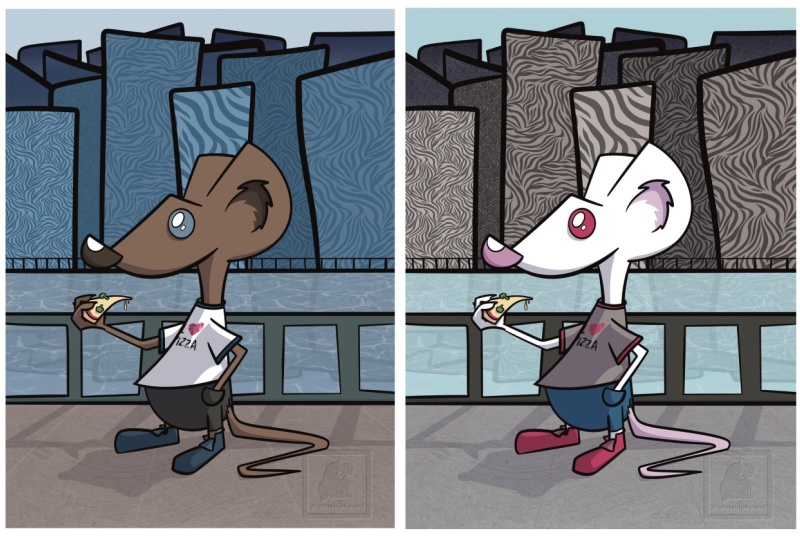
example from class, the switch pattern, and I transformed it
from very traditional, bright, cheery, Halloween
colors to more muted, kind of sophisticated
color palette, something a little bit
modern and on trend. So that's one way
where you can really repurpose your artwork
and try to maximize it. By looking for trending color palettes or updating something for a
different season. It's a nice way to repurpose your artwork without
having to create something new and made a which art print in a simple black
and white design. So don't feel limited to
your original design either. Maybe repurposing your
artwork is as simple as trimming down that
color palette and making it something
much simpler. And then here I have
the same patterns, but in two different color ways. So once again, we have those
bright Halloween colors, and then I have that
muted color palette. And you can see how it really changes the mood
of the patterns, especially something
like the bats. They look appropriate
for maybe like a one Z for a baby, as well. They have a softer
color palette. And then the top row to me, is a lot more party themed, see it being used
for Halloween decor, all sorts of things like that. So really, as you think
about color and your ideas, maybe take some
time to think about the final use case and how you can design very
intentionally for that. And then next, I have an
example of some client work. So I was commissioned
by a friend to make a portrait of
two of her cats, and and I gave her two
different color options. So the differences
are not major. All I changed was the color of the cocktail glass
and the background. So even though the steps
I took in this class, we completely
recolord our artwork. You don't always
have to do that. Sometimes the changes
can be as simple as a background color or changing just a few
colors here and there, can still make a big impact. On the left, we have something that's a little bit maybe more unique and on the right is a
little bit more traditional. And then this is part of
the same client project. I just want to show you the other options that I gave her. I could show you plenty
of more examples, but hopefully this plants some seeds so you can
start thinking very intentionally about
the colors you choose and changing up color
palettes for different uses.
10. Class Project: Okay, so at this point,
I hope you're ready to dive into procreate and go ahead and change up some colors in maybe some existing artwork or a new piece that you
create for this class. So please go ahead and
for the class project, recolor a piece of your artwork. You can use the color
palette that I'm sharing as part of this
class or create your own. But I do ask that you
upload both an image of your original artwork and
then the recolred artwork. I can't wait to compare the
differences between your original and what you've
created for this class.
11. Thank You: Thank you so much for joining
me in this class today. I hope that you find
it useful going forward so that you can make the most out of your artwork. If you enjoy this class and you want to
learn more from me, I do have another
class on Pro Create that's all about creating
labels and stickers, so be sure to check that out and look out for more
classes in the future. You can also follow
me on Instagram at Shane Asal Art or here on Skillshare to stay up to date with the latest
and greatest. And finally, please
leave a review. It's super helpful
to make sure that I'm making relevant classes. I'm always learning
from you all as well. So please leave a review. It's really helpful to me and also other students
here on skill share. That's it for me, so I'll
see you in the next class.
 Shayna Sell, Illustrator and Creator